Archive for the 'Animation' Category
VIFF: Maps, math, madness, and more
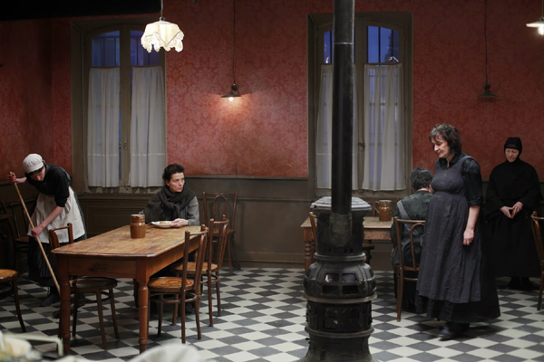
Camille Claudel, 1915.
Kristin here:
We’re halfway through the Vancouver International Film Festival, as we continue to catch up on world cinema in one dizzying ten-day swoop. Here’s a handful of worthwhile films I’ve seen so far.
Another “brave” performance
Critics speak of “brave” performances as those in which the role calls for an actress (seldom, for some reason, an actor) to allow herself to look ugly and awkward or to participate in explicit set scenes. The word got tossed around a lot this year in regard to the two young actresses in Blue Is the Warmest Color, this year’s Palm d’Or winner at Cannes. David and I saw it here and found it disappointingly conventional.
Juliette Binoche’s performance in Bruno Dumont’s Camille Claudel, 1915 (2013) has her eschewing makeup and playing the haggard, aging inmate of an insane asylum. Historically, Claudel was a sculptress and Augut Rodin’s lover before being placed in the asylum by her family. As the title suggests, we see only a small slice of her life, after she has already spent a good deal of time in the asylum, a laudably humane one set in a Catholic nunnery in the mountains.
For much of the film, we stay with her, registering both her annoyance at the antics of her fellow inmates and her compassion for them. She seems to suffer from a persecution complex, cooking all her own food and eating apart from the others (above) through a fear of being poisoned. She attributes her incarceration to Rodin’s and his colleagues’ schemes to steal her studio and sculptures. We have no way of knowing how much of this is true, and hence no way of knowing whether she is really unbalanced enough to be in an institution with incurable cases. Her occasional visits to the complex’s church and her communing with nature help to sustain her.
Well into the film, there is an abrupt point-of-view switch to her brother, the author Paul Claudel, as he pauses en route to the asylum in order to pray. We soon realize that he is a religious zealot, utterly devoted to his own view of Catholicism. The contrast between his dogmatism and Camille’s simple religious sincerity bodes ill for her hopes that he will arrange for her release.
Camille Claudel, 1915 is currently available only on unsubtitled French DVD and Blu-ray.
Math and maps
I am a fan of maps and of scientific exploration of exotic places, and Detlev Buck’s Measuring the World (2012) promised to deal with both in 3D. It weaves together fictionalized accounts of the exploits of two contemporaneous geniuses of the early 19th century: world explorer Alexander von Humboldt and mathematical genius Carl Friedrich Gauss.
I had high hopes for the 3D, imagining scenes a bit like the scene where Michael Fassbender plays with dazzling holograms of space maps in Prometheus–toned down a bit and more scientifically grounded, of course. Unfortunately there was nothing of the sort, with the 3D being used more conventionally for creating depth in the playing space, with branches in the foreground of shots in the Amazonian jungle and that sort of thing.
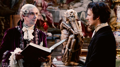
The film turned out to be a rather rollicking depiction of the two careers. The conceit is set up that Karl Wilhelm Ferdinand, Herzog von Braunschweig provided financing for both Gauss and Humboldt. He is caricatured (above) as a frivolous, silly man who reacts in utter incomprehension when handed Gauss’s first book on mathematics–as who would not at the time, given that it introduced startling new insights that revolutionized the field? Ferdinand was in fact a highly educated military man, and he never supported von Humboldt’s work.
Still, the eccentricities of the two seekers of knowledge are entertaining, the scenes of von Humboldt seeking specimens in the Amazon and on into the Andes are exotic, and the whole thing conveys something of the enthusiasm lingering as the Age of Enlightenment was coming to its end.
Measuring the World is available as a region-coded import with English subtitles under its original title Die Vermessung der Welt on DVD, Blu-ray, and Blu-ray 3D.
An African Charmer
The Senegalese film, Tall as the Baobab Tree (2012), is the first feature of a young white filmmaker, Jeremy Teicher, who first visited the village in which the film is set when he was 19 and making a documentary about it. Based on stories of village life he was told at that time by young students, he made Tall as the Baobab Tree at age 22. The local people helped with the script and acted in the film.
As with many African films, the subject relates to a traditional custom which has come in modern times to be viewed as a problem. It reminds me of Ousmane Sembene’s last feature, Mooladé (2004), which dealt with how a village’s women began to resist the practice of genital mutilation. Tall as the Baobab Tree concerns the practice of selling young daughters into marriage.
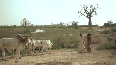
The story centers around Coumba, a teenager who has just passed her school exams. Her older brother falls from a baobab tree (the one seen looming above the scene above), and to pay for his medical costs, the father decides to sell Debo, the younger sister, into marriage. Coumba secretly works as a maid in a nearby resort to pay the costs, but although she succeeds in raising most of the money, the local village elder insists that custom dictates that the promised marriage must go through.
Although the father and village elder are clearly seen as in the wrong, they are not made into villains but are seen as stuck in the patterns of outdated traditions. Much emphasis is put on the education that Coumba has benefited from and that Debo will never experience. A touching scene near the film’s beginning shows Coumba among the students waiting in a group as the names of those who have passed their exams are read out. Clearly this was an actual event captured by the filmmaker, and the joy of the successful students effectively emphasizes education as the means to defeat the more oppressive remnants of tribal traditions.
Teicher describes his experiences and approach in collaborating with the villagers on the film in an interview on the BFI website.
Beyond Ghibli
The films of Miyazaki Hayao (Kiki’s Delivery Service, Spirited Away) and his colleagues at the Ghibli animation studio are the heights of Japanese animation. Beyond them, we in the west tend to know of other Japanese animated films as more simply made anime, with lots of violent action. But, as the program notes state, “it’s time to expand your horizons.” Hosoda Mamoru’s Wolf Children (2012) somewhat resembles the Ghibli films in genre, being a fairy-tale-like fantasy set in the present day.
Hana, a student, is attracted to a young man, Ookami, who decides to sit in on one of her classes. She offers to share her textbook, and as a romance develops, she discovers that Ookami is a shape-shifter, able to change into a wolf. After they have two children, Ookami is killed while in his wolf form. His children have inherited his ability, and Hana moves to a house in the countryside to hide their peculiarities from prying eyes.
The story follows the daughter, Yuki, as she decides to go to school and follow the human half of her nature, and the son, Ame, as he prowls the surrounding forests and mountains, communing with wolves he discovers there. The result has an environmental theme similar to that underlying some of Miyazaki’s films, with particular sympathy for the perpetually hunted wolves.
While the figure animation here is not as subtle as that of the Ghibli films, the settings are beautiful and detailed, with highly textured portrayals of the roiling movements of large cumulus clouds and the rustling of countless leaves in a forest.
Wolf Children looks great on the big screen, but if you can’t catch it in a theater, it’s due out in the USA on November 26, available on DVD or a combination Blu-ray/DVD set.
Wolf Children.
Oscar fever up close
Kristin here:
Most years when I’m at home, I join in our departmental Oscar party, where grad student and faculty get together to watch the broadcast and match wits at predicting the winners. It beats the grimness of sitting home watching the show.
But this year, being a relatively new staff member on TheOneRing.net, I decided to attend their celebration, “The One Expected Party,” for The Hobbit. TORn put on three Oscar parties for The Lord of the Rings, in 2002, 2003, and 2004. Those parties became the stuff of legend within the fandom, having rapidly sold out each time. The nominees and winners from the trilogy dropped by the TORn party each year (fueling the next year’s ticket sales). I wrote about the Oscar parties as part of my coverage of TORn in my book, The Frodo Franchise, but I had never been to any of them.
In planning my trip, I quickly discovered that there are a lot of other activities around the run-up to the Oscar ceremony. I knew, of course, that the Academy of Motion Picture Arts and Sciences offers screenings of the nominated films to their members and to anyone else lucky enough to get a ticket. But our old friend Chen Mei, who works for the Academy library, told me about panel sessions featuring the nominees in various categories and kindly obtained tickets for me to attend two of them.
Obviously the nominees take these events seriously. For both of those I attended, with one exception all the directors of the nominated films showed up to answer questions from a moderator. Obviously they couldn’t hope to influence the members’ votes, since the ballots had already been turned in. They generously gave time to offer insights into their work to audiences who clearly were knowledgeable about filmmaking.
“Oscar Celebrates Animated Features”
This panel discussion took place on the evening of February 21, the day I arrived in Los Angeles. When I got to the Academy’s Samuel Goldwyn Theatre, more than an hour before the 7:30 event, there was already a long line of ticket-holders hoping to get good seats. I gathered from conversations with people around me in line that tickets are getting harder to obtain each year.
 Most of the best seats were roped off, reserved for Academy members and the guests of honor. I got an unreserved one in the second row but way over on the side. It actually gave a pretty good view of the stage. Unfortunately photos are strictly forbidden inside the Samuel Goldwyn Theatre, so I have none to show you.
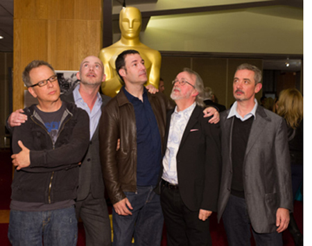
Almost all of the directors of all five nominated features were there: Peter Lord for The Pirates! Band of Misfits; Sam Fell and Chris Butler for ParaNorman; Mark Andrews for Brave (co-director Brenda Chapman being unable to attend); Rich Moore for Wreck-It Ralph; and Tim Burton for Frankenweenie. (All but Burton stuck around to pose for the press; left to right, Moore, Butler, Andrews, Lord, and Fell.)
This line-up of talent should have made for an enlightening evening. Unfortunately the AMPAS had chosen as MC a comic actor, Rob Riggle (Talladega Nights, The Hangover) who turned out to know less about animation than most of the people in the audience did. He was obviously more concerned with being entertaining than with drawing out any solid information about the films. He kept asking the guests what inspired them to make their films, while very little got said about the films’ innovative techniques and the challenges the filmmakers faced–in short, about the films. Despite this obstacle, the guests managed to say some interesting things. There was obviously no audio recording either, so I frantically took notes.
One motif that cropped up several times was the fact that this year’s nominees included three stop-motion films. But as some of the animators emphasized, despite their love for the slow, frame-by-frame manipulation of puppets and objects, they do mix in new technologies. Fell described himself and fellow director Butler as “Luddites who’ve embraced the loom.” For example, although ParaNorman‘s young witch Aggie was animated as a puppet, her dress was an added digital effect. As Butler said, although they basically work with puppets, they will use whatever animation technique will look best on the screen. (Earlier this month, I discussed the use of color laser printing that made the wide variety of character expressions possible.)
Lord twice mentioned the convivial atmosphere created at Aardman’s Bristol studio, where people who love puppet animation have come together as a team. They avoid computer animation whenever possible, preferring “the lovely, amazing toys in the world, stuff the animators work with at Aardman.”
Fell and Butler described their influences as the horror films they saw during their childhoods in England. Butler had watched Night of the Living Dead at age 6, and Fell referred to “video nasties,” as they are labeled in England, very violent films that were banned or at least difficult to see. The age of VHS made such films as Driller Killer available, as Fell pointed out, though Butler hastened to point out that that particular film had not influenced ParaNorman.
Moore, who had directed episodes of both The Simpsons and Futurama, made Wreck-It Ralph as his first feature. Asked the difference between episodic animated TV and features, he responded that in features, characters move through an arc that changes their situation by the end. In TV, the characters start at square one, play out an action, and end up on square one by the end, ready to do the same thing the following week.
Burton was asked the difference between the original Frankenweenie short and the feature. Because the feature was animated, he considers it “a more pure version” of the original live-action short. In working on the style of the set designs for the feature, he went back not to the short itself, but to the drawings he had originally done for it. He also admitted that during the early days when he was had a job at Disney drawing cels for The Fox and the Hound (1981), his drawings of the fox looked “like road kill.”
Interlude: Ground Zero, the Dolby Theatre
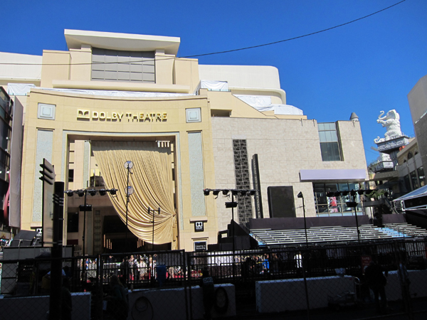
The grand theater on Hollywood Boulevard where the awards ceremony takes place may now be named the Dolby, but it remains the Kodak Theatre on Google Maps and in the minds of the many who still call it that. Then again, I heard people at one of the Academy panels refer to “Grauman’s Chinese Theatre,” despite that fact that the Mann’s chain acquired it decades ago and it has again changed hands.
I was staying in the Hilton Garden Inn, on Highland Avenue a few blocks north of where it intersects Hollywood Boulevard at the corner dominated by the Dolby Theatre’s huge complex. Having a free morning on Friday, I wandered down, looking to take some pictures of the Oscar preparations.
The Dolby Theatre is also a shopping mall. It is surely the only mall in the world modeled on the work of D. W. Griffith, specifically his Babylon sets from Intolerance. Giant white elephants on pillars loom over tourists. (Top, and at left, a view looking toward the back of the complex from the north.)
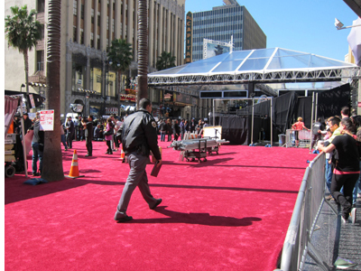
Naturally the block of Hollywood Boulevard in front of the theatre was closed to traffic. Online one could find a complicated schedule of road and even sidewalk closings that went on for as much as a week before the day of the ceremony. Fortunately on this day the sidewalks were still open, so I could join the tourists watching the preparations and snapping photos. The bleachers had been installed, as had the famous red carpet. A larger nearby parking lot was filled with trailers sprouting satellite dishes. The infrastructure for this event is vast, as one would imagine. It’s also far from glamorous.
“Oscar Celebrates Foreign Language Films”
On Saturday morning I got to the Samuel Goldwyn Theatre earlier, about 8:30 am for a 10:00 event. This time I was among the first twenty-five or so in line and got an excellent seat in the third row opposite the podium. Mark Johnson, who until recently ran the foreign-language category, was the MC. David and I have known Mark for years, since the early 1970s, when we were all in graduate school in film studies at the University of Iowa. Between his film education and extensive work in the industry (including producing the Chronicles of Narnia films, Rain Man, Galaxy Quest, A Little Princess, and Breaking Bad), Mark was an excellent choice to host the event, as he had done several times in past years.
All the directors showed up: Michael Haneke for Amour; Kim Nguyen for War Witch; Pablo Larraín for No, Nikolaj Arcel for A Royal Affair; and Joachim Rønning and Espen Sandberg for Kon-Tiki. (I discussed No and A Royal Affair in a report from the Vancouver International Film Festival last year.)
As each director came onstage, Mark graciously asked him to acknowledge any members of his filmmaking team who were in the audience. These included three of the four producers of Amour, Stefan Arndt, Veit Heiduschka, and Michael Katz. When Mark asked where the fourth producer, Margaret Menegoz was, Haneke got off the first zingy of the evening, saying that she would be arriving that evening: “She was picking up the Césars.” (On Friday, Amour won five, for best picture, director, original screenplay, actor, and actress).
Mark’s excellent questions solicited much information. I can’t summarize it all, but here are some highlights, film by film.
Arcel emphasized how difficult it was to finance A Royal Affair, given that it was a big, expensive costume picture: “It’s a risk in Denmark, where we have more the kitchen drama.” Although Zentropa Productions made the film, there was considerable investment from other European countries. One of the film’s stars, Mikkel Boe Følsgaard, was an acting student when he was cast as the eccentric Danish king, and he won the best actor prize at Berlin. Arcel revealed that after making A Royal Affair, Følsgaard went back to resume his acting-school education, where the next unit was on film acting. A Royal Affair was the only nominee shot on 35mm. Rather than following the European art-cinema tradition, he was influenced by his favorite Hollywood films, like Gone with the Wind and Lawrence of Arabia.
No was the third film in a trilogy about the Pinochet years in Chile, the earlier ones being Tony Manero (2008) and Post Mortem (2010). Mark asked Larraín if he had initially planned a trilogy. He said no, “I would say it is mostly the press who have named this a trilogy.” On the other hand, he thinks the term makes sense when applied to these films, and he has no objection. He commented that the film depicts how the same tools of propaganda Pinochet used on the people were turned against him. Rather than staging a violent takeover, “They put him out with the tools of beauty.” His filmmaking team had intended the lead role for Gael García Bernal from the start, despite his being a Mexican actor. The other actors had been with Larraín on previous films and all are well-known in Chile.
Larraín also talked about the four 1983 video cameras that were used to simulate older footage, each of which produced footage with a slightly different look. The team was worried about the various shots not cutting together smoothly with each other and with the archival footage that was integrated into the film. During editing, however, they began to forget which footage was new and which was archival and realized that they were succeeding. “What we shot became documentary, and the documentary shots became fiction.”
Nguyen talked about casting War Witch. Seventy-five per cent of the cast were non-actors. Rachel Mwanza, who played a young African girl forced to serve as a child soldier, was recommended by some documentarists who had filmed her as part of a group of homeless street kids; she had been abandoned by her parents at age 6. The film was shot with an Alexa. Tires constantly burning in the streets of Kinshasa created a haze that the filmmakers used as a filter for the natural light. Nguyen read many autobiographies of child soldiers as models for the voiceover narration in the film.
Rønning and Sandberg were inspired by the story of Thor Heyerdahl’s raft voyage from South America to Polynesia in 1947. Heyerdahl was a national legend, and his documentary record of the trip, Kon-Tiki (1950), won the only Oscar so far awarded a Norwegian film. Heyerdahl’s life was extremely well-documented in his diaries, which guided the scriptwriting. The filmmakers were lucky enough to gain access to a replica of the original raft, which had been made by Heyerdahl’s grandson to repeat the original voyage. The shooting at sea lasted for a month. In addition, however, there were over 500 special-effects shots–making Kon-Tiki, like A Royal Affair, a big-budget, Hollywood-style film. The directors said that with so much drama on TV, they wanted to create an epic that cried out to be seen on a big theatre screen. The effects were mainly for creating sharks and other creatures, extending sets, and occasionally erasing boats or shorelines in backgrounds.
Mark pointed out to Haneke that a lot of Americans know Amour is good but avoid seeing it because they think it’s too grim. Haneke blamed the American media for giving that impression of the film, saying that he considers it to be about love rather than death. But with a smile he also admitted, “I’m afraid it’s partly my fault.” He has gotten a reputation “for inflicting pain on audiences.” From the start he had planned the film around Jean-Louis Trintignant and would not have made it had he refused the part. Emmanuelle Riva, however, he found through the conventional casting process of auditions.
Mark mentioned the fact that the film juxtaposes wide views with close-ups, with few camera distances in between. Some scenes play out in a single long shot. Haneke responded “I want to give my audience time to reflect […] I try to manipulate the audience as little as possible.” Mark pointed out that in spite of this, the spectator always knows where to look. Haneke replied: “It’s all a question of craft.” (This drew applause from the audience.) The apartment in the film was a set, a choice made mainly because the older actors could not work long hours in difficult circumstances. The views seen through the windows were added with computer effects. Haneke dislikes non-diegetic music in films, and so he writes characters who would naturally be playing or listening to music within the story. In the case of Amour, he chose all the classical music before writing the script.
“The Art of Production Design”
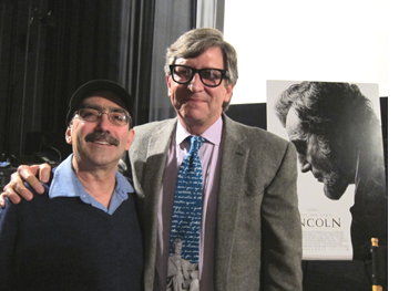
The AMPAS isn’t the only organization hosting events around the presence of so many Oscar nominees being in Los Angeles. Straight from the foreign-film event I went with our friend Jonathan Kuntz, who teaches film and television at Los Angeles City College and the University of California at Los Angeles, to the Egyptian Theatre on Hollywood Boulevard. There the Art Directors Guild, the Set Decorators Society of America, and the American Cinematheque were presenting a similar panel discussion on “The Art of Production Design.” Nearly all the nominees were present (with production designer listed first and set 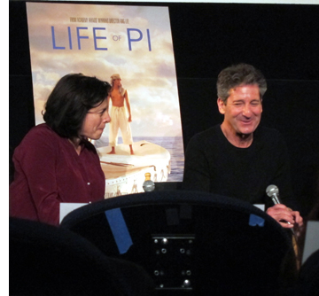 decorator(s) second): Sarah Greenwood and Katie Spencer for Anna Karenina; Dan Hennah and set decorators Ra Vincent and Simon Bright for The Hobbit: An Unexpected Journey; Eve Stewart and Anna Lynch-Robinson for Les Misérables; David Gropman and Anna Pinnock for Life of Pi (at right); and Rick Carter for Lincoln (set decorator Jim Erickson couldn’t attend). The co-moderators were Thomas A. Walsh, Production Designer and Co-Chair ADG Film Society with Academy Governor Rosemary Brandenburg, SDSA.
Greenwood stressed how little time there had been to prepare the sets for Anna Karenina. The production at first was intended to be a conventional version, and location-scouting was done in Russia. The team decided to shoot in London, but there was no unifying conception until twelve weeks before principal photography director Joe Wright decided to stage the action in a set representing a theatre. There ended up being twelve days to actually construct the set, with the designers marking the sets in chalk on the floor and starting to build before there were drawings of them. She describes the theatre set as “rich but minimalist,” since the approach was to remove as many items as possible.
Hennah answered a question from the audience concerning where conceptual design, done for The Hobbit by illustrators John Howe and Alan Lee, ends and production design begins. He responded that conceptual design involves creating the environments as a whole, as if they were real places. “The production design kicks in in terms of what takes place in the parts of that set.” The sets were drawn digitally and then built as 3D models that went to the pre-viz department. Howe and Lee worked in at Weta Digital rather than in the art department, as did an assistant art director. Vincent and Bright both consulted on the color grading, among other roles.
Hennah spoke of the design of the huge Goblin Town set. He conceived it as having been built within a great diagonal rift inside the mountain caused by an earthquake. The Goblins being thieves, they constructed the buildings and bridges out of random stolen items like carts. The layout of the Dwarves kingdom within the Lonely Mountain derived from the idea that the space expanded randomly as the workers removed stone to follow veins of gold.
According to Stewart, the filmmakers did not try to make Les Misérables a faithful reproduction of the stage play. They wanted to do what the stage version couldn’t: “You can’t see big wides and you can’t see up people’s nostrils.” Hence the film utilized sweeping cityscapes with huge buildings and crowds, while the musical numbers are filmed in relentless close-ups. Tom Hooper likes to “make things up on the day,” so Stewart had to make the sets bigger than usual, since she couldn’t plan ahead for what he might improvise during filming.
 Given how much of Life of Pi was shot in tanks, what did the designers have to do? Gropman explained that they designed the interior of the Indian house where the early part of the story is set, with the interiors being constructed in Montreal and the exteriors shot in India. The apartment in the frame story had to be simple and bland, so that it would not reflect the character at all. Since the film was not shot in continuity, a big challenge was keeping track of the deterioration of the lifeboat, which becomes more worn and damaged.
Gropman asked artist Haan Lee, director Ang Lee’s son, to design the raft that Pi builds, and he came up with the idea of the raft as a triangle. The island was based on a single huge banyan tree in southern Taiwan, which was filmed for a day and then built in the studio.
Carter described having spent part of a day in the White House in preparation for Lincoln, including being left alone in the evening in the Lincoln bedroom. He graciously emphasized the importance of the set decoration, by the absent Erickson, as the main aspect of the settings that makes an impression on the audience. Virtually every day during the president’s last year of life was heavily documented, and research informed the set dressings. The designers also spent much time in Richmond, Virginia, the capital of the Confederacy, which Carter considered a city almost as much influenced by Lincoln as was Springfield, Illinois.
A member of the audience asked what effect 3D had had on the designers’ work. The two designers of 3D films gave similar answers. Gropman remarked, “There’s nothing you do where you’re not thinking about foreground, middle ground, and background. […] We’re creating the environment primarily for the actors.” Hennah’s response was, “It doesn’t change anything in terms of how you approach it. […] It’s about giving a feeling of depth and a feeling of separation, which you would do in the real world anyway.” In other words, 2D films have always had plenty of depth cues.
Afterward Jonathan introduced me to Rick Carter, a long-time friend with whom he had gone to school (Jonathan on the left, Rick on the right). He turned out to be the one from the group who won the Oscar the next evening.
The Hobbit, win or lose
TheOneRing.net’s celebration of The Hobbit‘s three nominations (production design, makeup and hairstyling, and visual effects) began on Friday night with an art show. I was one of many volunteers helping out with setting up that and the Sunday night party, so I ventured into the labyrinth of old warehouses east of downtown, an area now established as an arts district.
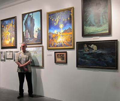
The show drew some major exhibitors, including veteran Tolkien illustrator Tim Kirk, seen above posing with his most famous paintings. I was also delighted to meet some fellow TORn staff members whom I had previously only known from the group email messages we exchange and from their postings on the site. They’re an enthusiastic group who all work on a strictly volunteer basis.
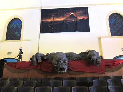
The big event was on Sunday at the Hollywood American Legion hall (at bottom, the entrance, with a representation of the Arkenstone above the door and a life-sized Gollum statue lurking inside to provide a photo op). I helped out with the setup that morning, hanging signs and folding a great many “One Expected Party” T-shirts to be sold in the “Rivendell” room (aka the shop).
The main auditorium, dubbed “The Hall of the Elven-King” for the occasion, was where most of the celebrants gathered to watch the Oscars on a vast TV screen. If they turned around, they would notice that a full sized cave troll from The Fellowship of the Ring was watching along with them:
I managed to watch the first half of the show but then was slotted to help sell T-shirts and CDs by the band that would be playing after the Oscar show ended: Billy Boyd’s “Beecake.” I was there long enough to sit through two of the categories for which The Hobbit was nominated and to be nearly deafened by the cheers–and then groans of disappointment. The fans reassure each other that as with The Lord of the Rings, the third part will scoop up Oscars serving to reward the whole trilogy.
Being in “Rivendell” selling stuff, I missed the second half of the show, but I gather that was not much of a loss. The Oscar fever being exhibited elsewhere in the building and around town turned out to be more interesting than the ceremony itself.
Annies to Oscars: this year’s animated features
Awards scene in The Pirates! Band of Misfits.
Kristin here:
On February 1, the Annie Awards were given out. These are the honors bestowed by the International Animated Film Society. Up for best animated feature were the five Oscar nominees in the same category–Brave, Frankenweenie, ParaNorman, The Pirates! Band of Misfits, and Wreck-It Ralph–plus three others–Hotel Transylvania, Rise of the Guardians, and The Rabbi’s Cat. Rather to my surprise, Wreck-It Ralph took the top honor.
This seems like a good occasion to follow up on some of my entries on animation posted here years ago and to present some comments on the five Oscar nominees.
Mainstream fare
Remember when entertainment journalists were suggesting that there were getting to be too many big-studio animated features in the market each year? Remember when supposedly there just wasn’t that much demand and that cartoons were starting to eat into each other’s box-office takings? No? I do, partly because back on January 23, 2007, I blogged on the subject. I said at the time, “The ‘too many toons’ issue looks to me like a tempest in a teapot.”
For one thing, animated features were actually doing very well at the box-office:
In 2006, the ten highest domestic box-office grossers included four CGI hits: Cars, #2, Ice Age: The Meltdown, #7, Happy Feet, #8, and Over the Hedge, #10. On the worldwide chart, these four films rank high as well: Ice Age: The Meltdown, #3, Cars, #5, Happy Feet, #10, and Over the Hedge, #11. In the domestic market, 6 other toons make the top 100. So, 4 out of 10 toons are in the top ten, while 6 out of 90 live-action films make that short-list. I’m no math whiz, but that looks like 40% versus 6.6% to me.
Since 2006, animated features have increased in number, as witnessed by the fact that the Academy of Motion Picture Arts and Sciences upped the number of nominees in that Oscar category from three to five for the 2010 awards. Actually, the rules are more complicated than that:
All submissions sent to the Academy will be screened by the Animated Feature Film Award Screening Committee(s). After the screenings, the committee(s) will vote by secret ballot to nominate from 2 to 5 motion pictures for this award. In any year in which 8 to 12 animated features are released in Los Angeles County, either 2 or 3 motion pictures may be nominated. In any year in which 13 to 15 films are released, a maximum of 4 motion pictures may be nominated. In any year in which 16 or more animated features are released, a maximum of 5 motion pictures may be nominated.
The 2010 and 2012 Oscars each had five nominees in the category, while for 2011 there were again only three. This year there are again five, and it seems likely that this will continue to be the case.
In 2012all but one Hollywood studio had at least one animated feature among its five top-grossing films. So much for such films crowding each other out of the market. Totals below are worldwide and include the grosses only to December 31:
Sony: Hotel Transylvania, #4 ($313.2 million, still in release; $324.3 million as of Feb. 3)
Warner Bros.: none
Fox: Ice Age: Continental Drift, #1 ($897.3 million)
Disney: Brave, #2 ($538.3 Million)
Disney: Wreck-It Ralph, #3 ($283.6 million, still in release; $376.6 million as of Feb. 3)
Universal: Dr. Seuss’ The Lorax, #3 ($349.6 million)
Paramount: Madagascar 3: Europe’s Most Wanted, #1 ($743.3 million)
Paramount: Rise of the Guardians, #3 ($261.2 million, still in release; $297.8 million as of February 3)
The first six of these films were in the 20 top-grossing American films of 2012; Rise of the Guardians was #30.
(These figures are from “Studio figures hit sky high” by Ian Sandwell, in the January 25, 2013 issue of Screen International. Unfortunately the charts of studio hits aren’t in the online version of the article.)
People no longer suggest that there are too many animated films. In fact, they’re a predictable mainstay of the studios, partly because they have proven themselves capable of generating lucrative franchises, just like those big action-packed CGI fantasy and sci-fi films. People are now suggesting that maybe there are too many of those in the market, cannibalizing each other’s grosses.
The Return of Handmade Animation
In recent years, some members of the industry, the punditry, and the general audience have complained that small, independent films and even foreign fare have elbowed their way into the live-action categories. The best-picture category was reportedly increased from five titles to up to ten slots specifically to make sure that some blockbusters would make the list and draw in a larger audience for the televised Oscar ceremony. Still, The Hurt Locker beating Avatar has been pointed to innumerable times in order to claim that the Academy voters are out of touch with the broad popular audience’s tastes.
Wait a minute. The box-office charts are themselves in touch with the broad audience’s tastes as expressed by tickets sold. The Oscars are supposed to be about honoring the year’s best films, not the biggest earners, aren’t they? This year’s best-picture nominees again reflect the Academy’s willingness to cast a somewhat wide net, with a very low-budget film (Beasts of the Southern Wild) and a foreign one (Amour) sitting cheek-by-jowl with hits like Django Unchained and Les Misérables. Despite the expansion in the number of nominees, the really big hits that also garnered critical acclaim, notably The Dark Knight Rises and Skyfall, didn’t make the list.
The same phenomenon has crept into the animated-feature list. Only two of the nominees come from those six that were in the top-twenty box-office hits: Brave and Wreck-It Ralph. The other three were all box-office disappointments to some extent: Frankenweenie, ParaNorman, and The Pirates! Band of Misfits. (Or, to call it by its funnier British release title: The Pirates! In an Adventure with Scientists!)
These three were all created via stop-motion animation. In contrast, all the hits in the list above were CGI, as was the mid-level grosser, Rise of the Guardians.
This is not to say that the three stop-motion film completely avoided computer effects. As Iain Blair pointed out recently in Variety, they made use of new technologies. ParaNorman worked innovatively with 3D laser printing to create huge numbers of slightly different faces for the puppets. (More on that below)
The Pirates! mainly used puppets, but there digital effects done in-house, creating water, fire, smoke, fog, and so on, including the whale. Basically, Aardman’s using special effects in a puppet film the way live-action films use them. (A 3D printer was used to create different mouths to achieve variety of expression, a technique somewhat comparable to that used for ParaNorman.)
While Frankenweenie used puppets and miniature sets, it also included digital technology, like scenes done against greenscreens with clouds and background vistas added as effects:
So why were the three films made mostly by hand all less successful than the year’s big CGI toons? I would have thought that most people can’t tell the difference, and those who can don’t care. The characters in most CGI animation are basically imitations of puppets, and good stop-motion animation can look nearly as smooth as the digital equivalent. I doubt that audiences are consciously avoiding puppet-based films.
On the basis of these three films, one might almost believe that stop-motion films are become the art-house fare of the animated sector of the industry. I don’t think that’s the case, though. It’s probably just an odd coincidence likely to be limited to 2012. If anything, I suspect that the dominance of the list of nominees by stop-motion films reflects the Academy’s animation wing’s appreciation of the work and skill that goes into such painstaking work. They clearly took note of films that used this technique, including The Pirates!, which was released way back in April. Which is not to say that CGI-based animation involves less work or skill. It just isn’t quite so vivid and obvious.
The Pirates! was unquestionably a failure in the USA. This harks back to my entry kvetching that Flushed Away was sunk by DreamWorks, for lack of trying to turn Aardman into a recognizable brand like Pixar. Now Sony has done the same with The Pirates! In 2011, Sony also released Arthur Christmas to poor business; it’s a hilarious and charming film, well worth a watch. I suspect The Pirates! has little chance for an Oscar, especially without the magical Nick Park name. (Park has won five Oscars on six nominations. He couldn’t win six, since Creature Comforts and A Grand Day Out were nominated opposite each other!) But suppose The Pirates! did win. It would join Wallace & Gromit in The Curse of the Were-Rabbit, that other DreamWorks “flop” that won Best Animated Feature. It made 71% of its worldwide gross outside North America.
Moving on to the other two stop-motion films: One thing that struck me last year after watching previews for ParaNorman, Frankenweenie, and Hotel Transylvania was that there were a surprising number of kids’ films based on horror-film premises. Some kids can take comic-scary stuff, some can’t. The ParaNorman DVD has garnered 246 five- and four-star reviews on its amazon.com page, but also 76 one- and two-star comments, mainly complaining that the film is too scary for young children. Frankenweenie probably aroused similar reactions. No doubt many parents anticipated this problem and didn’t take their kids to see these films. (I haven’t seen Hotel Transylvania, which has done better at the box-office, but it doesn’t seem to have the kind of morbid fascination with dead people and animals that the other two do.)
This year’s nominees
Wreck-It Ralph
I’ve seen all five of the features nominated for the animation Oscar this year. I try and see the big animated films of each year. I’ve been doing that for years now, and in late 2006 I posted an entry about why that is:
Among the new films I’ve seen in the past couple of years, I find that a significant proportion are animated. I don’t think that’s because I prefer animated films but because these days they are among the best work being created by the mainstream industry.
Why would that be? There are probably a lot of reasons, but let me offer a few.
Animated films, whether executed with CGI or drawings, demand meticulous planning in a way that live-action films don’t. David has written here about directors’ heavy dependence on coverage in contemporary shooting. Coverage means that many filmmakers don’t really know until they get into the editing room how many shots a scene will contain, which angles will be used, when the cuts will come, and other fairly crucial components of the final style. This is true even despite the fact that filmmakers increasingly have storyboarded their films (mainly for big action scenes) or created animatics using relatively simple computer animation.
People planning animated films don’t have the luxury of lots of coverage, and that’s probably a good thing. Storyboards for animated films mean a lot more, because it’s a big deal to depart from them. Every shot and cut has to be thought out in advance, because whole teams of people have to create images that fit together—and they don’t create coverage. There aren’t many directors in Hollywood who think their scenes out that carefully. Steven Spielberg, yes, and maybe a few others.
A similar thing happens with the soundtrack. In animated films, the voices are recorded before the creation of the images. That’s been true since sound was innovated in the late 1920s. Pre-recording means that images of moving lips can be matched to the dialogue far more precisely than if actors watched finished images and tried to speak at exactly the right time to mesh with their characters’ mouths. The lengthy fiddling possible with ADR isn’t an option. Most stars are used to recording their entire performances within a few days, picking up their fees, and moving on to more time-consuming live-action shooting.
I think the same remains true, though I would now credit David Fincher with planning his films down to each shot and cut. Still, even the increased use of pre-viz doesn’t seem to keep directors from shooting scenes from multiple angles and in many takes, encouraging a looseness in the editing.
Interestingly, Peter Ramsey, director of Rise of the Guardians, got his start as a storyboard artist for directors that included both Spielberg and Fincher. Ramsey was quoted in a recent Hollywood Reporter story on Rise of the Guardians, discussing that phase of his career: “You start learning to tell stories economically with the camera, connecting ideas on screen with the camera, blocking things so that they are simple but still dynamic.” I think that sort of planning still accounts for the excellence of such a high proportion of animated films.
That’s also why some of this year’s nominated animated films were among the best I saw last year. If David and I were in the habit of making up ten-best lists for current years, The Pirates! and Wreck-It Ralph would undoubtedly be on mine, right alongside films like Holy Motors and Leviathan. But we don’t, so I’ll just offer a few comments, starting with the film I would most like to see win the Oscar and ending with the one that least deserves it.
The Pirates! should win. It has the technical virtuosity that all Aardman features share. It also has a breakneck pace of clever and witty action and jokes.
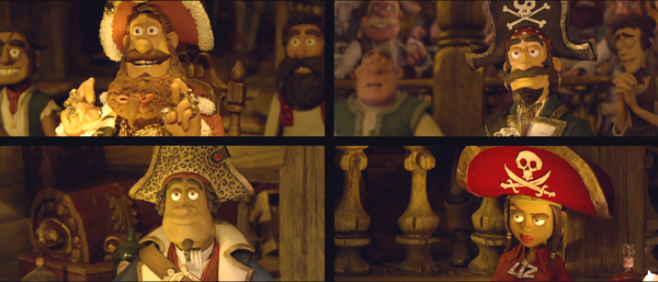
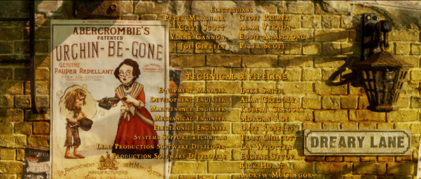
The main plot premise has four pirates vying for the Pirate of the Year award, and the ceremony itself is handled as a parody of Oscar-style shows, down to the split-screen views of nominees in the audience (see top). Aardman films are known for putting jokey items in the sets, to be noticed or not. This time there are so many posters, objects, street and shop signs, and other throwaway gags that the filmmakers felt obliged to reprise them during the final credits!
One thing I noticed in watching the DVD, however, is that a lot of these small posters and maps and so on are not big enough to be read, at least on an ordinary-sized video monitor. Academy voters who didn’t see the film in theaters but watch it on screeners are likely to miss a lot of what makes The Pirates! so funny. Below is one frame of some of the larger items, from the Blu-ray version:
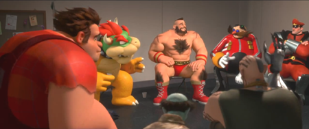
For me, a hair’s breadth behind The Pirates! comes Wreck-It Ralph. Besides winning the Annie for best feature, Wreck-It Ralph also won for in the feature categories for best direction, animated effects in an animated film, voice acting (Alan Tudyk as King Candy), and writing. Wreck-It Ralph has the same rapid-fire humor and inventiveness that characterizes The Pirates! without seeming derivative of Aardman’s approach. The notion of an old-style video-game villain trying to become a hero is original, with Ralph attending AA-style 12-step sessions with other villains (see top of this section). Pulling several characters from different games into the same plotline works well, too. Not being a gamer, I’m sure I missed a great many allusions to real games, but apparently a supplement on the Blu-ray disc will provide that information.
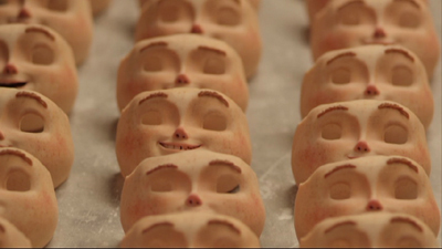
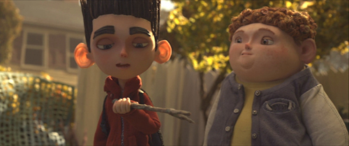
And another hair’s breadth behind Wreck-It Ralph comes ParaNorman, which won Annies in the feature categories for character animation and character design. The filmmakers innovated new 3D laser-printing technology that allowed them to make thousands of separate replacement faces so that the characters’ expressions could be changed frame by frame.
These replacement faces incorporated the color during the printing process, so that features like pink cheeks and freckles no longer had to be hand-painted and thus could be used more freely. (Even the most carefully applied pink applied by hand would shimmer from frame to frame.) As the making-of documentary Peeping through the Veil points out, Coraline, made with a similar face-replacement technique but with hand-painted color, could only use 13 freckles on the heroine’s face, with no pink on the cheeks. In ParaNorman, Norman’s friend Neil (some of whose replacement faces are shown in the illustration above) has innumerable freckles, as well as a pink nose and cheeks–all of which stay exactly in place.
The laser-printed faces also are translucent, allowing for subsurface light-particle scattering, allowing the puppets to have an appearance of realistic human skin (comparable to what was done digitally to create a believable Gollum in The Lord of the Rings and The Hobbit). The effect is particularly noticeable in the many backlit shots, where light passes through Norman’s prominent ears:
The effect of the new facial technology is a remarkably expressive set of characters.
The film’s premise is that Norman can see and interact with dead people, which makes him an outcast at his school, victimized by bullies and avoided by the rest of his classmates. The exception is Neil, equally bullied for his chubbiness and eccentricities. The setting is a New England town that exploits its history of witch-hunting for touristic purposes. As a threat from a real witch’s curse threatens the town, its modern inhabitants prove just as intolerant and prone to mindless violence as their ancestors. Confronted with the ghosts of past witch-hunters, they whip out their guns and become a mob. The whole thing is treated with grotesque stylization in the settings, character designs, and action. It’s highly entertaining, though certainly there are gruesome moments too strong for some children. But the result is a lesson in tolerance that softens the grotesquery.
I’d be pleased if any of these three films won the Oscar.
Distinctly behind these three comes Brave. Our regular readers know that we’re big admirers of Pixar. I’ve posted about Cars; we chatted about Ratatouille; David described a visit by Bill Kinder, Pixar’s Director of Editorial and Post-Production, to our campus; and their films frequently feature in our general discussions of animation. They have their own category in the menu at the right.
Brave represents a distinct recovery for Pixar after the disappointing Cars 2. I’m a fan of the original Cars, but it seems to me that the filmmakers made a huge mistake by turning Mater, so hilarious in the original, into a pathetic figure and Lightning McQueen, so charming to begin with, into a nasty guy who is barely in the film. Brave was definitely better, though I thought it a bit thin. It needed a subplot, maybe involving the mischievous triplet brothers, to flesh it out. Famously including Pixar’s first female lead character, it seemed to me to present an all-too-obvious story of a girl striving to do what everyone tells her girls don’t do (compete successfully with the guys, resist an arranged marriage). Are we really still at that early stage of creating “positive images” for girls? Having just seen Hayao Miyazaki’s extraordinary Nausicaä of the Valley of the Winds for the first time (in a 35mm print as part of the currently touring Miyazaki retrospective), I watched a princess of roughly the same age doing all sorts of daring things to save her country from ecological and military disasters, with none of the other characters ever mentioning that girls are supposed to leave such actions to the boys. It’s just not an issue, but Nausicaä is a pretty positive image. That in a film from 1984. The desire to be politically correct seems to have made the Pixar screenwriters rein in their imaginations a bit.
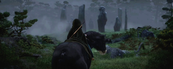
That said, it’s still a thoroughly entertaining film. Perhaps the most obvious strength is its sumptuous, evocative depictions of Scottish landscapes (see bottom). It’s no surprise that Brave won the Annie for best production design in a feature (as well as best editing).
I’m looking forward to Monsters University. Maybe it will have to inventiveness and density that we associate with the best Pixar films.
Fifth comes Frankenweenie. I enjoyed it, but it seemed to betray its origins as a short. Moreover, the logic of its premises escapes me. The early section that shows Victor’s love for his dog Sparky, Sparky’s death, and Victor’s resurrection of him using lightning à la Dr. Frankenstein is consistently amusing. Victor’s appropriation of household gadgets to rig his laboratory in the attic wittily captures the 1930s Universal horror films without trying to stick too closely to them. But then his creepy “friend” Edgar (read Igor) wants to try the experiment on a dead goldfish, which is resurrected–but invisible. This invisibility is never really explained, but it contradicts what happened with Sparky. Other kids try their luck or accidentally turn a rat and other dead animals into monsters, a tactic that seems designed to pad out the plot and generate danger to the community. These creations of monsters all seem to involve the same simple lightning strike that brought back Sparky, so why is he the same loving, cheery pet as before?
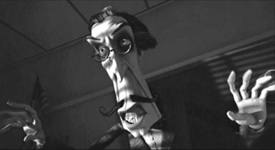
There’s also a sense that Tim Burton is drawing on auteurist tropes that have become distinctly familiar. We have a black-and-white film about the interaction of the living and the dead, as with Corpse Bride. Again there’s a character that resembles a classic figure from horror films of yesterday. In Edward Scissorhands it was Vincent Price, played by himself. In Ed Wood it was Bela Lugosi, played by Martin Landau. Here Landau is back to channel a similar figure, the teacher Mr. Rzyukruski, modeled on Price:
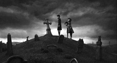
Again, Frankenweenie is an entertaining film, and the combination of smooth stop-motion animation and the CGI backgrounds make for an eerie combination, as in the pet-cemetery scene illustrated above. But it’s not Oscar-worthy. It didn’t win any Annies, but sadly, neither did The Pirates!
One last note. People complain, or at least point out, that a lot of live-action features these days are quite long, well over two hours in many cases. Yet animated features manage to tell their quick-paced, eventful tales succinctly: Brave (93 minutes), Frankenweenie (87 minutes), ParaNorman (92 minutes), The Pirates! Band of Misfits (88 minutes), and Wreck-It Ralph (108 minutes). This, of course, is partly for the benefit of the children in the audience, and partly because animation is so complex and expensive. Still, an adult walking out of any of these films can feel he or she has seen a movie satisfyingly packed with incident that moves along at a lively pace. Live-action directors might want to take a look at just how these films achieve that feeling.
Brave.
Animation in Vancouver
Kristin here:
I didn’t manage to see all the animated films at the Vancouver International Film Festival, but I saw three. That is, I saw two animated features and one documentary about an ambitious and lengthy project that never saw the light of day except in butchered form. The films differ widely in subject and will probably appeal to quite different audiences.
The young
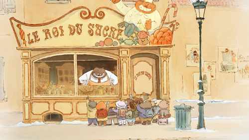
Ernest et Célestine (2012, co-directors Benjamin Renner, Vincent Patar, and Stéphane Aubier) is one of those irresistible cartoons based on a well-loved children’s book series. From 1982 to 2004 , Belgian artist Gabrielle Vincent (1928-2004) created this series, based on the unlikely friendship of a little-girl mouse and an adult bear. The film’s imagery replicates the style of the books’ water-color illustrations (see above). Although the series is not well known in the English-language markets, a few translations have appeared. Most are out of print and apparently very collectible, though there is an English-language volume coming out on November 1. This film version might well foster the popularity of the books internationally.
Bears and mice are here assumed to be dire enemies, a premise set up in the opening as Célestine and her fellow orphans are told a cautionary tale by an elderly lady supervisor. It turns out, however, that mice are Tooth Fairies, and that occasionally involves their visiting bear families to exchange coins for the baby teeth of cubs. Such a mission leads to Célestine visiting a bear family (in the candy shop pictured above) and meeting Ernest, a large bear who vainly attempts to make a living as a street musician. The pair become unlikely friends, and as a result become outcasts living together in Ernest’s cottage in the forest. Eventually each is tried in court for having transgressed the natural boundaries between their species.
Visually the film is charming, though narratively it clearly is intended for small children. Unfortunately the screening I attended had an audience mainly made up of adults, only a few of whom brought children with them. Children accustomed to the break-neck pace of anime and contemporary television cartoons may not have the patience for the calm, leisurely narrative pace in Ernest et Célestine. Young children and those with more appreciation for traditional narratives will delight in it however, and it would be worth seeking it out in art-house screenings and, with luck, in video release. Its message of tolerance and understanding among widely different sorts of “people” is simple but effective.
A book of the art of the film, with illustrations by Vincent, is soon to be released in France.
The old
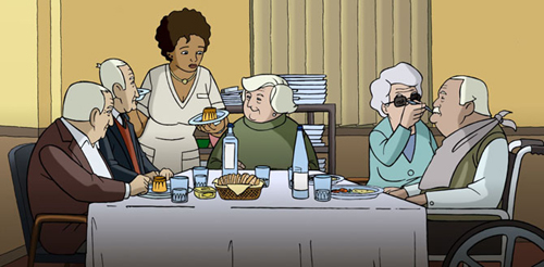
At the opposite end of the age range is Wrinkles (2012, Ignacio Ferreras), a Spanish animated feature about an elderly gentleman, Emilio, whose adult children become fed up with caring for him as he slips into the early stages of Alzheimer’s. They consign him to a slick, soulless care facility and visit him only rarely at holidays. Discouraged and unhappy at first, Emilio gradually comes to appreciate the small pleasures and support the other “clients” at the home can bring each other (see bottom). His roommate, a cynical long-term resident who practices minor con tricks on vulnerable, disoriented neighbors, nevertheless provides humor and support. A still-healthy wife who has nevertheless come to the facility to take care of her husband, an advanced Alzheimer’s patient, shows that love can bring a trace of reaction even from a seemingly unresponsive person.
The story is touching, and the opening provides a surprise moment that conveys Emilio’s encroaching confusion well. The animation, though fairly limited, is well designed and attractive. The endings for the various patients seem to put a distinctly cheerier spin on the grim advance of Alzheimer’s than one would imagine to be appropriate to the subject. Still, the film looks at the subject compassionately and manages several touching scenes.
The ghost
Vancouver was the venue for the world premiere of Kevin Schreck’s documentary, Persistence of Vision (2012). It deals with animator Richard Williams, who made a successful career running a studio primarily making animated commercials and credit sequences. Back in the 1980s and 1990s I must have passed it on London’s Soho Square dozens of times completely unawares.) One of Williams’ employees also devised the technique for merging live-action and cartoons that was used for Robert Zemeckis’ Who Framed Roger Rabbit? (1988), and perhaps the best-known achievement of Williams’ studio was the animation in that film.
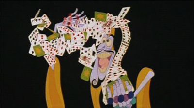
Schreck does a good job of presenting an overview of Williams’ career, but his real fascination is with the one doomed project that Williams pursued for about twenty-five years: a feature-length, absurdly technically complex feature to be called The Thief and the Cobbler. The scene above showing one of the characters performing an elaborate card trick is dazzling to behold. It takes place against a neutral background, but a battle scene, a substantial portion of which is shown in Persistence of Vision, goes much further, combining dizzying shifts through convoluted settings with mind-boggling movements of figures.
Williams’ studio worked on the film from 1964 to 1992, but only part-time, fitting it in among their various commissions. Schreck has tracked down several of the main animators who worked for Williams during substantial stretches of this period, and they give invaluable information about what became a legendary epic. Williams refused to participate, but there is quite a bit of historical documentary footage of him. Much of the original material from the film was destroyed, but Schreck, often with the help of his interviewees and others, tracked down original material in various degrees of completion. Several shivery animated sequences consisting of simple pencil tests are included, as are other scenes in later stages of animation. The result is a precious glimpse into the film that might have been.
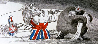
Ultimately Warner Bros. committed to finance and release the film. This might possibly have worked, but by one piece of misfortune, design elements for The Thief and the Cobbler made their way to Disney and were, putatively (and plausibly) used for the Genie and other components of Aladdin (1992). This was a blow to the commercial viability of Williams’ film. That, in combination with Williams’ failure to complete it by the contractual deadline meant that The Thief and the Cobbler was turned over to a completion insurer. Somehow (in a deal not explained in Persistence of Vision), Miramax ended up with the project. They stitched together the existing sequences using new footage, including Disney-style musical numbers, something that Williams had been determined to avoid. In 1993 Miramax released a highly revised version of The Thief and the Cobbler.
Williams seems to have been one of those artists who works best when kept on a very tight leash. The man was brilliant when it came to making TV commercials, some of which are shown in Persistence of Vision. He created some memorable credits sequences, also shown. I vividly remember seeing Tony Richardson’s The Charge of the Light Brigade in 1968. That was two years before I took my first film course, but even then I realized that the credits were better than the film they graced:
Williams did some of the late Pink Panther ones, too. Clearly, given a short, immutable length, he could come up with a gem. Similarly, when he worked as a collaborator on another director’s film, as with Roger Rabbit, he apparently didn’t become overly ambitious and unrealistic in his goals. It was apparently this one mad vision that slowly drew him to overstep the bounds of feasibility.
Williams’ legacy will not rest simply in these credit sequences and ads. Nor will it reside only in the images in Persistence of Vision, ranging from jumpy pencil tests to semi-finished sequences (and the sequences included in the unfortunate Miramax version). Williams wrote a book, The Animator’s Survival Kit, initially published in 2002, and, coincidentally, released in an expanded edition just last month. It is considered one of the basis books in the field and is used by amateurs and pros alike. Williams discusses the new edition in a brief clip, and one can see his sincere enthusiasm and also his restless energy. He also gives master-classes in animation.
Whether Williams could ever have created a narrative structure to pull together the brilliant set-pieces on display in Persistence of Vision is another question. Clearly his colleagues still regard him with a mix of admiration, devotion, and exasperation. Schreck’s film hints at a masterpiece that was mutilated and yet also suggests that the masterpiece itself was a elusive vision that was problematic from the start.
 We enjoyed meeting Kevin and line producer Sarah Timberlake Taylor at the festival. During the introduction to the second of three screenings, Kevin expressed his surprise at the fact that the first and second screenings were both better attended than he expected. From the Q & A, I gathered that the audience included some animation buffs well acquainted with Williams’ career. The Thief and the Cobbler is clearly well known in the world of academic animation history. Buffs will be delighted that Schreck has pulled together so much material and given us as full a look at this lost film, masterpiece or not, as we are ever likely to have.
One problem that Kevin explained is that he cannot release the film into theaters (or presumably on DVD or VOD). It contains extensive clips of copyrighted material, including the various credits sequences and ads by Williams’ studio, short segments from Aladdin and other Hollywood films, as well as The Thief and the Cobbler in its version released by Miramax. This seems a tremendous pity. Given the historical and critical nature of Kevin’s film, it seems possible that such clips could be justified as fair use.
Much has been made of Room 237, the analytical documentary about Kubrick’s The Shining, which was also shown at Vancouver and other festivals. It has a theatrical release in the USA through IFC. Apparently no permissions were obtained from the owners of the copyrights for The Shining and other Kubrick films excerpted in the documentary, with fair use being claimed. As usual, no court cases have so far been filed, and so it is not clear whether fair use actually applies to such extensive uses of clips in historical and analytical studies. Persistence of Vision seems another clear-cut case of fair use, and it would be encouraging to see a distributor courageous enough to release it outside the festival circuit without “permissions” being sought.
October 21: David Cairns has kindly written to point out that there is an epic fan edit of the original footage of The Thief and the Cobbler. It’s incomplete, of course, but it’s 96 minutes long–and obviously a labor of love on the part of Garrett Gilchrist.


