Archive for the 'Animation' Category
Three minutes of “Three Brothers”
Harry Potter and the Deathly Hallows Part 1
Kristin here:
Last wee I went to see Harry Potter and the Deathly Hallows Part 1. Behind the pack, of course, since it had been out nearly a month. But I dislike watching films in a crowd. My ideal is to be alone in the theater, which David and I managed last week with Megamind. In this case I picked the first matinee on a school day and saw the film at our local Sundance multiplex. (Yes, even Sundance runs some popular films to help support the less successful art films.) I figured that noisy youngsters, even if they skipped school to see DH1, wouldn’t go to Sundance. I was right. Four or five adults were sitting about ten rows behind me. I never heard a peep or crackling candy wrapper out of them. The film was really film, too, 35mm.
I had been curious about how the filmmakers would deal with some of the stranger aspects of J. K. Rowling’s seventh and final book. Breaking it into two parts seemed an obvious and smart move, and it does have less of a rushed feeling than the previous adaptations had. But Deathly Hallows the book has some very unconventional aspects.
For a start, Rowling reveals dark, indeed downright nasty things alleged about Albus Dumbledore, who up to this point has been your standard-issue comic-but-wise, twinkly-eyed mentor figure. I wondered if the film would dare to do the same. It does, but so far only as a very minor side issue. In the first part, at least, Harry is obviously distinctly miffed that Dumbledore hasn’t left him more information about how to deal with horcruxes, but he doesn’t seem to feel that his hero had feet of clay.
Second, it seems downright perverse on Rowling’s part that in a long series which has come to focus on the search for horcruxes and should just be working up its climax, she throws another set of mysterious, lost objects, the three Deathly Hallows, at us. Let’s see, six horcruxes, three hallows. What’s the difference? Which should the characters be seeking, and why? Is Voldemort after them, too? In the book, Harry becomes obsessed with finding the hallows, even though the horcruxes are the main point. That last premise, Harry’s obsession, hasn’t shown up in the film, so far anyway, but otherwise the hallows are fully treated in the film.
Finally, Rowling gives us a very long portion of the book where Harry, Hermione, and, for a time, Ron, are fugitives moving from place to place, camping out each night as they try to figure out where the remaining horcruxes are—and not having much luck either with that or with destroying the one they have obtained. I personally think this is a rather daring move. Given that for this long section we are confined entirely to Harry’s point of view, we get little sense of what is happening in the outer world. Naturally the film can’t spend quite as much of its length on this period of nomadic existence. Still, it does devote an unexpectedly long time to portraying it.
Some critics have complained that the action stalls during this portion. Others have noted that the slow-down allows for us at last to linger over the psychological states of the three main characters, who are being worn down by fear, frustration, and the horcrux’s presence. This stretch also displays some beautifully bleak locations, well filmed. Plus, as Rowling no doubt intended, this part of the narrative conveys a real sense of the characters’ seemingly hopeless position: They are in great danger and without any apparent clue as to where to look next.
One minor obstacle that I remember noting when I first read the book is that the hallows are introduced by having Hermione read aloud a fairy tale from the book Dumbledore has bequeathed to her, The Tales of Beedle the Bard. The tale, “The Tale of the Three Brothers,” occupies only about two pages, but having someone read that much text aloud in a film can be deadly.
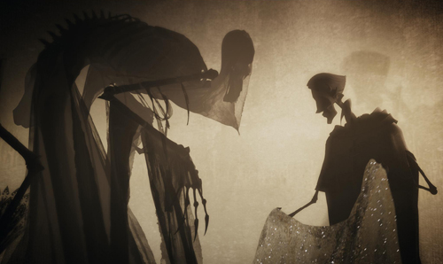
The filmmakers came up with a solution that is both inspired and extremely well executed. As Hermione reads, we see a roughly three-minute animated sequence that illustrates her words. 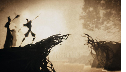 The filmmakers have acknowledged that their model was Lotte Reiniger’s technique of silhouette animation, which she developed in the 1920s and used for such classics as The Adventures of Prince Achmed (1926). For DH1, similar silhouette effects are achieved with 3D digital animation.
I wondered who had designed and animated this little sequence and determined to watch for references to it in the credits. As is typical with effects-heavy films these days, several companies were listed and the credits rolled by too quickly for me to catch much. Still, I don’t think that the little film-within-a-film was mentioned specifically or its creator named as having been attached to it. Even Variety‘s review, which refers in passing to the sequence, doesn’t mention its maker.
A lot of other viewers were impressed enough to try and find out who was responsible. DH1 was released in the US on November 19, and by the next day, Cartoon Brew posted a story on the subject: “A number of readers have written to ask who animated the shadow puppet-inspired ‘Tale of the Three Brothers’ sequence in the new Harry Potter film Harry Potter and the Deathly Hallows. It was directed and designed by Ben Hibon who produced it in association with Framestore.” Surprisingly, it also turns out that the section of Framestore that normally makes commercials did the “Three Brothers” scene.
I spent some time tracking Hibon down, finding some good-quality frames to display here, and locating clips. There are a few interviews with Hibon, plenty of clips and entire shorts, and filmographies. The video quality of some of these clips is dreadful, though, and a lot of the stories one finds via Google are short, repetitive pieces.
Most of this material is not all that easy to find, so herewith a guide to where you can most usefully find information on someone who seems to be an up-and-coming talent.
Hibon has designed video games, made music videos and commercials, done a short “screen” for MTV, and directed a few shorts and a trailer for a feature, A.D., which seems still to be in progress. The fullest filmography is the official one on the website for Hibon’s own company, Stateless Films.
Animation and effects expert Bill Desowitz has interviewed Hibon for Animation World Network. That’s recent, December 3, and deals exclusively with the DH1 scene. On November 23, fxguide posted an interview with Dale Newton, the sequence supervisor for the piece. An older, undated interview with Hibon on It’s Art Magazine concerns the series of five two-minute shorts collectively known as “Heavenly Sword.” These relate to a video game of the same name that Hibon designed. This series is visually quite distinctive, but it’s a far more conventional work than the “Three Brothers” short, being heavily influenced by anime.
Also on November 23, indiewire posted a short background article on Hibon, with several videos. With one exception, which I’ll get to shortly, don’t watch these films here or on YouTube. Why? Because the Stateless Films site has most of them and more. Hibon’s clips are larger and better quality than anything else I checked, plus they’re displayed with a black screen and far fewer distracting graphics than on YouTube. Click on the Archives link to see older works, including samples of Hibon’s work on videogames.
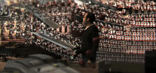
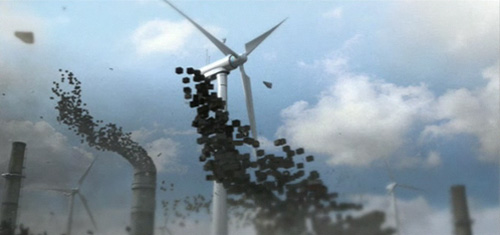
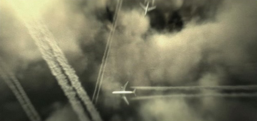
His site is the only place where I found a full version of his ad for the French bank, Crédit Agricole. The point of the ad is that this is the first green bank. It’s a gorgeous piece, full of images of pollution and decay gradually giving way to scenes of places restored to their pristine state and new, clean technology in place. Here are some images, from a vertical descent downward through a series of jet-trails (at bottom), a shot in which a wall of identical canned goods suddenly flies away to reveal a street market with fresh produce on sale, and windmills replacing old factory chimneys that fly apart:
There’s a dream-like quality to the whole thing, with a lot of shots, many with rapid movement, juxtaposed with slow, stately music.
The indiewire clips linked above include two shortened, English-language versions of this ad, with Sean Connery appearing to make the message explicit. There are also some Crédit Agricole ads made by more conventional filmmakers. Watch one or two of those, and you’ll find the contrast dramatic.
None of these sites and others with Hibon clips or shorts has the “Three Brothers” sequence, not surprisingly. That is, YouTube has some horrendous, out-of-focus subtitled auditorium videos, made in perhaps a South American or Spanish theater. Avoid like the plague.
Framestore’s site has some information on Hibon’s sequence, and the only clip from it that I could find. It’s very small and too dark to render the subtleties of the visuals, but there it is. Framestore also animated the two house-elves, Dobby and Kreatur, and there’s some information on that part of the project as well.
The January, 2011 issue of Cinefex has a story on DH1 that will undoubtedly include a section on the “Three Brothers” animation, but I haven’t seen that yet.
One reason that there are so many short pieces on Hibon on the internet is that at almost exactly the same time, on November 22, Variety announced that the filmmaker had been signed to direct a long-dormant New Line project, Pan. It’s a variation on the Peter Pan story, with the roles of villain and hero being switched; here Captain Hook is a detective on the trail of a certain child-kidnapper. The studio acquired the project in 1996, and for a while it looked as though Guillermo del Toro would direct. This time the film might get made, since the Variety story reports that it’s being cast and should start shooting next fall.
Another dispatch from Vancouver
Kristin here:
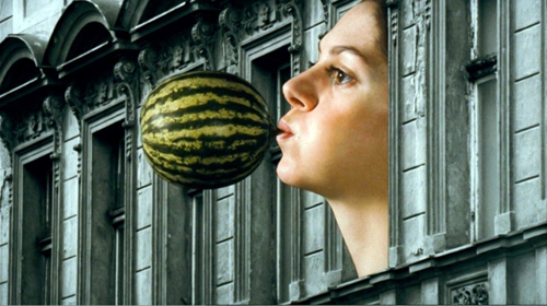
Surviving Life (Czech Republic; dir. Jan Švankmajer, 2010)
I became a fan of Švankmajer’s work back in 1988, when I saw Alice, his first feature. David and I gradually explored his shorts and discovered that some of them were among the great classics of the animation form, perhaps most notably Jabberwocky and Dimensions of Dialogue. Švankmajer mostly concentrated on object animation, often combining found objects like tools, stuffed animals, dentures, and food in bizarre ways to create figures.
But after Alice, Švankmajer continued to make features, and they contained less and less of what he was best at: animation. Faust was all right, but I suffered through Conspirators of Pleasure and skipped Lunacy altogether. The director has claimed that Surviving Life is to be his final film, so I thought I owed him a last chance. It’s lucky I did, since it’s a real comeback for him, and a return to what he does best.
Whether Švankmajer really wanted to eschew live-action filmmaking and take up animation again is a moot point. He appears in a prologue, not exactly as himself but as a pixillated cut-out photographic figure (apart from the same typical cut-ins to real speaking mouths that became rather tedious in Alice). He describes how he intended to make a live-action feature, but with a small budget could only afford cut-out animation. He demonstrates by hopping about the frame like a figure in a child’s TV show. At the end, he checks how much time the prologue has taken up–two and a half minutes–and mutters that it’s not very long. His mordantly amusing speech doesn’t suggest whether he really had tried to make the film with live action. Indeed, the actors who are represented by the cut-out photographs obviously had to act out their movements, in costume, and to provide their voices. How much cheaper all this could be is debatable.
The story is about dreams, and specifically about a man stuck in a dull desk job who dreams of an exotic woman in red. His doctor sends him to a psychiatrist whose office contains photos of Freud and Jung, each of whom listens and reacts with applause or contempt when his own or his rival’s theory is employed. The hero is horrified when he discovers that the psychiatrist is trying to rid him of his dreams when his own desire is to live within them.
We tend not to think of cut-out animation when we think of Švankmajer, but predictably he proves a master of it. At times the technique resembles that of Terry Gilliam in the animated interludes of Monty Python’s Flying Circus, especially in scenes shot in a black-and-white cityscape with surrealist objects emerging from the windows (see above and below). The “actors” appear as smoothly animated photographs except for close shots, when the actual actors are shown. The technique works brilliantly, with the cuts between the image and the real person being smoother than most Hollywood matches on action.
If Švankmajer has chosen this as his swan song, he has gone out reminding us why we admired him in the first place.
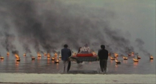
The White Meadows (Iran; dir. Mohammad Rasoulof, 2009)
There are probably a lot of indirect comments on the political situation in Iran in films from that country. Some are obvious to all, others no doubt only to people who live that situation every day. Few, however, can be so overtly allegorical as The White Meadows. Oddly, the allegorical implications are so clear that they can be grasped immediately and do not impinge on the intriguing strangeness of the tale being told.
The central figure is a man who rows his small boat across a highly saline sea, stopping at islands and coastal villages in deserts caked with salt formations. (Yes, another Iranian journey film.) At each stop he gathers the tears of the local people, gradually accumulating a small bottleful. Each stop also yields a fable-like incident that reflects the plight of certain sectors of Iran’s population: a beautiful virgin is sent as a sacrifice to a sea god, an unconventional artist who refuses to paint naturalistically is tormented and sent into exile, and so on. The overall impression is of universal suffering, and the ending suggests that this suffering benefits only the rich and privileged.
The white and tan landscapes and pale blue sky and sea provide stunning locales for this simple tale, shot around Lake Urmia in northeastern Iran.
While watching The White Meadows, one wonders how Rasoulof could get away with such an overt criticism of religious and governmental repression in Iran. He couldn’t, quite. He was arrested alongside Jafar Panahi (who edited The White Meadows) and about a dozen others on March 2. Fortunately he was released fairly soon, on March 17. What his future as a director in Iran is remains to be seen. The government has long tolerated having one set of films for local popular consumption and another that will be confined largely to the international festival circuit. Not surprising, since these days Iran’s filmmaking is one of the few areas in which the country is seen internationally in a positive light. Still, such a bitter yet appealing film clearly stretches such tolerance.
Every year it seems more and more likely that the increasingly tenuous new Iranian cinema will finally be snuffed out, and every year–so far–we see bold and imaginative films coming from that country. We can only hope that with the arrests earlier this year, we are not seeing the long-expected end.
The Strange Case of Angelica (Portugal/Spain/France/Brazil; dir. Manoel de Oliveira, 2010)
The fact that Oliveira was 101 when he made this film, as well as the fact that he is still directing at least a film a year (for last year’s Eccentricities of a Blond Hair Girl, see here), is too extraordinary not to be remarked on. Yet we shouldn’t let it dominate our view of Angelica or tempt us to treat it as an old man’s film. Slowly paced and meditative it may be, but it is also imaginative and full of humor, despite being centered around a young man’s obsessive love for a dead woman.
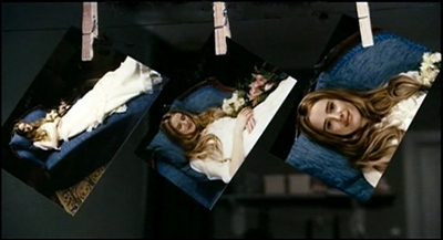
The protagonist, Isaac, is a photographer living in a boarding house in a town in the Duoro Valley region of Portugal. (Oliveira’s first film was a beautiful city symphony, Douro, Faina Fluvial, a poetic study of the river in the same valley made in 1931.) Called upon to photograph a beautiful woman who has died shortly after her wedding, through his viewfinder he sees the corpse open her eyes and smile at him. The same thing happens when he gazes at photos of her hung up to dry:
He falls in love with her, and her ghostly figure visits him at night, wafting him up into the air and flying over the river with him. Although he wakes from dreams several times, we are left in doubt as to whether Angelica really has been appearing to him.
The film seems to be set in contemporary times, and yet it has an old-fashioned look t it. The protagonist photographs men at work with hoes in a nearby vineyard, though his landlady remarks that no one does manual labor anymore. But most obviously, the film has the look and feel of a silent film. The shots of Angelica and the hero flying are superimposed ghostly figures straight out of Edwin S. Porter’s Dream of a Rarebit Fiend (1906). Camera movements are used sparingly, as in many silent films. Scenes often consist mostly of the hero taking his photographs or thinking of his phantom love, and his occasional cries of “Angelica!” could be rendered as intertitles. The use of solo piano music by Chopin reinforces the sense of watching a “silent” film.
Yet there are occasional scenes of dialogue. The best scene in the film may be the one where over the breakfast table the other boarders discuss their concerns about Isaac’s state of mind. The scene ends amusingly with the camera holding on the landlady’s bird jumping around its cage, watched with great attention by her cat.
Oliveira will turn 102 on December 11. He is listed on Wikipedia has being in pre-production for A Missa do Galo.
Kawasaki Rose (Czech Republic; dir. Jan Hrebejk, 2009)
(Note: Many reviews and the VIFF program give the title as Kawasaki’s Rose, but the title on the film is as given above.)
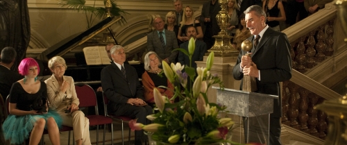
This film creeps up on you. At first it seems poised to be yet another study of a failed relationship among upper-middle-class characters. A documentary is to be made about Pavel Josek, a noted professor famous for his past resistance to the Communists. The sound-man on the shoot is his son-in-law Ludek. His daughter Lucie has been told that a large tumor just removed is benign. Ludek confronts her with the fact that he has been cheating on her during her illness, and he undermines her efforts at disciplining their daughter.
But this conventional soap-opera material gradually opens out as files discovered during research for the documentary seem to reveal that Josek had in fact cooperated with the Communist regime, apparently including his participating in the torture of prisoners. From that point, Ludek recedes into the background and further political and personal revelations give the film considerable depth and complexity.
Kawasaki Rose was beautifully shot in full anamorphic widescreen, with images around the harbor in Göteborg, Sweden being particularly well composed.
While I was watching the film, I was reminded equally of Wajda’s Man of Marble and von Donnersmarck’s The Lives of Others. On the one hand, a film project that digs into the past of a heroic figure who turns out to be not quite so heroic, and on the other a study of the effects of interrogations into private lives under a totalitarian regime.
Kawasaki Rose (the title derives from an origami pattern and is given to a Japanese character in the film who paints flowers) is the Czech Republic’s entry for a foreign-film Oscar nomination. I wouldn’t be surprised if it gets one.
Beyond praise 3: Yet more DVD supplements that really tell you something
Darby O’Gill and the Little People (1959)
Kristin here–
Every now and then I discuss a few DVD supplements that teachers might find useful for their classes, though they might be of interest to others as well. Previous installments can be read here and here.
Darby O’Gill and the Little People (Walt Disney Video)
Yes, you read that right. I can’t claim credit for having discovered this disc’s excellent supplement, “Little People, Big Effects.” Shortly after the second “Beyond praise” entry, Dan Reynolds, who teaches at the University of California Santa Barbara, wrote to recommend it.
Darby O’Gill was one of the few Disney live-action films I missed when I was growing up in the 1950s. I acquired the disc and started by watching the feature. I must say that this is one weird movie.
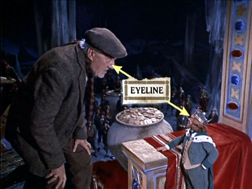
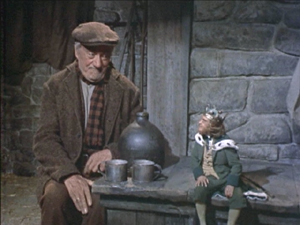
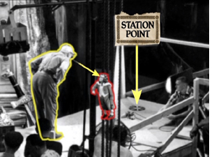
The “little people” of the title are leprechauns, and the special effects used to make them look small are mostly achieved through forced- perspective techniques. In less than eleven minutes, this supplement demonstrates the use of glass paintings, mattes, false perspective, and even a revived Schüfftan process, most famously used for Metropolis, where scale is manipulated by shooting into an angled, partially transparent mirror. Careful calculations allow for over-sized sets in the background to be lined up precisely with normal-scale ones in the foreground, so that the foreground person looks much larger then the background one. Since the two characters, here Darby and King Brian, are supposed to be conversing face-to-face, a manipulation of eyelines, a term we use a lot in Film Art, is necessary. (Despite what my spell-check keeps trying to tell me, “eyeline” is one word in the movie business, as demonstrated above.) In explaining how the actors knew where to look in the shot illustrated at the top, the film shows that “station points” were placed on the floor so that the characters’ eyelines would seem to match up (below). These days actors alone against blue or green screens often have to look at tennis balls to make the direction of their gaze match correctly.)
Clearly some behind-the-scenes footage was made during the production of Darby O’Gill, and this is incorporated into a documentary that includes interviews with master effects expert Peter Ellenshaw, who died in 2007. Ellenshaw worked as a matte painter on half the British classics of the 1930s and 1940s, including Black Narcissus (which has perhaps the greatest matte paintings ever). He then moved to Hollywood in 1950 and began a string of films with Disney that won him an Oscar for Mary Poppins. It’s good to have even these short clips of him demonstrating and discussing his work.
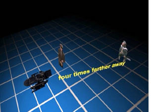
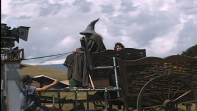
“Little People, Big Effects” should give students (and just about anyone else) a better grasp of perspective and its importance in the representation of depth on a flat screen. I would definitely show it as part of a study of cinematography. If a fifty-year-old film seems a bit out of date, point out to students that, as the narrator mentions, exactly the same techniques were used in many scenes of The Lord of the Rings to make the hobbits and dwarves look small. Similar demonstrations are provided in the supplements to the extended DVD version of The Fellowship of the Ring (Disc 1, “Visual Effects: Scale”).
Elijah Wood sits further from the camera than Ian McKellen in order to make him appear as small as a hobbit
Zodiac (“2-Disc Director’s Cut,” Paramount)
At the end of my first “Beyond praise” entry, I complained about the lack of supplements on the initial DVD release of Zodiac. Then, after the two-disc set with the supplements appeared in early 2008, I forgot to include it in the second entry. Better late than never, so I’m tackling it here. (The supplements are apparently the same for the Blu-ray set.)
As the “DVD Talk” review says. “The self-congratulatory praise is kept to a minimum.”
The main supplement is a 53-minute film called “Deciphering Zodiac.” It’s a good, objective, chronological summary of the film’s production. A lot of talking heads are included, such as the producer, scriptwriter, set decorator. That’s usually a good sign, since it shows that care was taken with the making-of and that enough of the crew members are participating that the account will probably be rounded. There’s a 15-minute making-of specifically on “The Visual Effects of Zodiac.”
Zodiac was primarily shot on professional-level digital cameras, apart from the slow-motion shots, which still need to be done on 35mm due to limitations of the digital technology. Hence there’s a lot of information here on digital techniques. Most of these techniques are used in ways that aren’t necessarily obvious to the viewer. If you want to show students some material on digital effects, this might be a good choice, since it avoids the flashy, obvious effects that so many fantasy and sci-fi DVD supplements concentrate on.
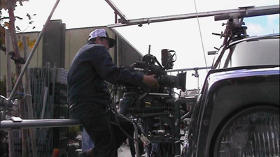
“Deciphering Zodiac” has shots showing the digital camera attached to an elaborate rig around a car, which was used to follow moving cars, including the famous opening tracking shot along a suburban street. The video-assist monitor is often visible in the shots.
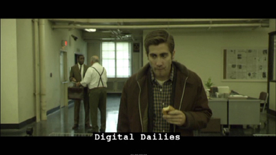
One change that digital filming has made in production has been the frequent use of “digital dailies” rather than dailies on film. (Dailies are the unedited takes just as they come from the camera(s); directors and other key creative people typically watch them at the end of each day.) Several scenes of the “Deciphering” documentary show raw shots and are labeled as digital dailies, something which doesn’t seem to be a common feature of supplements. It’s pretty obvious that the shot of Jake Gyllenhaal below would need to be manipulated in post-production. There’s also informative coverage of the methods used to match location and studio-shot footage, particularly for the scene where the killer shoots a taxi driver.
The visual effects documentary has good explanations of the early shot of a rapid move across the bay toward San Francisco as it looked in the period when the film’s action begins, a shot that was done entirely digitally.
Now that so many best-lists for the decade have included Zodiac, it seems to be an official modern classic. Perhaps a somewhat more dignified way of teaching special effects than using a Transformers movie.
The Dark Knight (Two-Disc Special Edition, Warner Home Video)
The supplements for The Dark Knight make a nice contrast with those for Zodiac. Here the makers of a spectacular action movie avoided digital special effects to a surprising extent. Instead they used practical effects, that is, effects accomplished via physical means while shooting rather than those done in post-production via laboratory or digital manipulation. Digital technology was used, of course, but often for rather modest tasks in planning and in erasure of unwanted elements. It’s also interesting as the first 35mm fiction feature to be shot partially on Imax cameras.
The main supplement is “Gotham Uncovered.” It begins by showing how the Imax camera was initially tested on a single action scene shot on location in Chicago. The results led to additional Imax scenes being added to the film. The advantages of Imax—primarily a huge gain in visual quality due to the larger size of the individual frames—are shown to be balanced against the camera’s limitations. The camera is much larger, making handheld shots difficult. It holds only three minutes of film and has a shallower depth of field. While interesting, this first section is surprisingly lacking in actual footage of the filming, often depending on still photos. We tend to assume that in this day and age, the making-of is taken into account from early on in a production. It’s surprising how often that turns out not to be the case.
A five-minute segment, “The Sound of Anarchy,” shows Hans Zimmer sitting at a computer and talking about the modernist, dissonant music for the Joker character. It’s mildly informative.
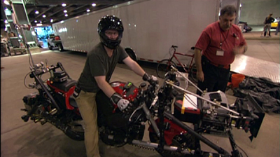
“The Chase” is perhaps the most useful section of the making-of. The decision was made to shoot the scene on Lower Wacker in Chicago. Here digital effects were kept to a minimum, with multiple cameras mounted on vehicles like the motorcycle below. These were special smaller Imax cameras. Only four such cameras existed at the time, though an accident reduced that to three!
One big moment in the chase has the Batmobile crashing into a garbage truck. Again, rather than resorting to digital effects, the crew built miniatures of the two vehicles and the set. The decision was also made to shoot a crash of an 18-wheeler on LaSalle Street using a real truck on location, and the scenes showing the practice sessions for this reveal the kind of planning that goes into the big action scenes that are so common in films these days.
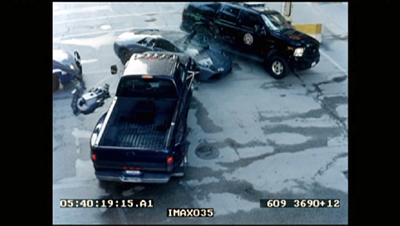
A multi-vehicle crash scene was done with several cameras, which is common practice for unrepeatable actions. (Even on a big-budget film like this, no one would want to crash more than one Lamborghini.) The cameras often show up in each other’s shots, and the supplement shows the resulting footage and how CGI is later used to erase them—again, a very common use of digital tools. Here a camera on a crane is visible at the center left in the original footage of the crash:
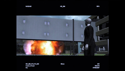
In one scene, the Joker walks out of a hospital, which explodes behind him. A prime candidate for digital effects, one would think. Instead, the filmmakers opted to have a demolition company destroy a real building. CGI was used to plan the scene:
A shorter supplement, “The Evolution of the Knight,” deals mostly with the design process for Batman’s suit and the Batpod. Again the emphasis is on bringing reality into the filming. It’s pointed out that while much of Batman Returns was shot on sound stages, the team decided to try and shoot the sequel in the city streets as much as possible.
Beware of these
I have to admit, one reason that this series appears so rarely is that for every DVD with useful supplements that I find, there are two or three uninformative ones that I have to sit through–or at least sample. In addition to recommendations, let me warn you away from some of the ones I switched off.
I had expected the Slumdog Millionaire DVD extras to be interesting, given the mixture of digital and 35mm shooting, the location work, and so on. But obviously the filmmakers had no idea that the film would be a success, so they seem to have done little behind-the-scenes shooting as they made it. The result is a not terribly informative, bare-bones 18-minute making-of.
Supplements as praise-fests have not gone away. Musicals seem especially to bring them out. “Get Aboard! The Band Wagon” provides 36 minutes of mutual admiration. In “From Stage to Screen: The History of Chicago,” Chita Rivera unintentionally achieves a parody of the gushing movie star who lauds everyone she worked with.
David and I just watched Cloudy with a Chance of Meatballs. I had liked it when I saw it in first run, and predictably, David enjoyed it, too. It’s a clever, well-scripted, well-animated film. We hoped to learn something from its supplements, but the making-of seems to be aimed at children, and young ones at that. The co-directors and some of the other filmmakers look distinctly embarrassed to be participating, partly because a lame comparison of making a film to mashing food together forms a running motif. A pity, since the movie deserves better. As reviewers keep pointing out, the best animated films these days are made for adults as much as for children.
A hundred years, plus a few thousand more, in a day
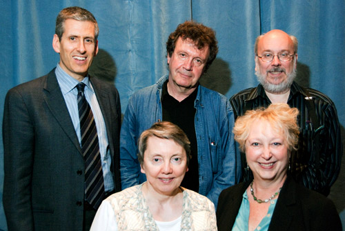
Charlie Keil, Yuri Tsivian, Henry Jenkins, Kristin Thompson, and Janet Staiger. Photo by Joel Ninmann.
Last Saturday we held the symposium “Movies, Media, and Methods” in honor of Kristin’s arrival at age sixty. Four distinguished scholars, all professors from major universities, presented top-flight talks. As a bonus, Kristin gave The Film People a glimpse into her Egyptological work. I report on this very full day in the hope of giving a sense of how stimulating we found it.
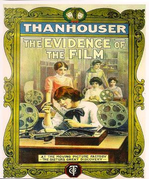
Thanhouser was an American film company that flourished between 1909 and 1917. It has been overshadowed by Biograph because that firm put out more films and, not incidentally, employed D. W. Griffith. But Ned Thanhouser has been diligently gathering his family company’s output from archives around the world and releasing it in informative DVD editions. The most famous Thanhouser production is probably Cry of the Children (1912), a powerful attack on child labor. You could also try the thriller The Woman in White (1917), adapted from Wilkie Collins’ masterful novel. A study in sadism, and more subtle than The Girl with the Dragon Tattoo.
Charlie Keil, an expert in 1910s US film from the University of Toronto, examined Thanhouser’s films with two questions in mind. Did the studio have a “distinctive personality” in its products? And does its output reflect the development of film style across the crucial transitional years of the early 1910s? Borrowing a method that Kristin had applied to Vitagraph films in an essay, Charlie took one film from 1911, one from 1912, and one from 1913. Charlie wasn’t ready to conclude that these specimens displayed a unique studio style, but it was clear that across just three years, big changes in storytelling were taking place.
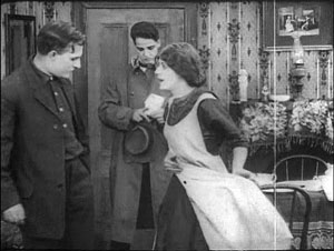
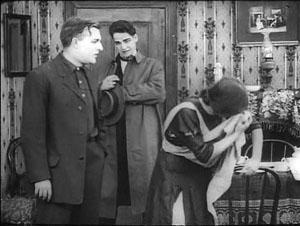
The plot of Get Rich Quick (1911) involves a man who joins a business that is scamming innocent investors. The film uses only five locales and plays scenes in long takes. The Little Girl Next Door (1912) has a more complex plot, with two distinct lines of action that converge on a child’s drowning. It uses many more locales and an ellipsis of a year to trace the changes in a family’s fortunes. It also incorporates cut-in close views and point-of-view editing. The Elusive Diamond (1913) is less psychology-driven than The Little Girl Next Door, but its intrigue relies almost completely on dialogue titles and it includes many close-ups and variation of camera setups.
Three films and three years: A vivid cross-section of the rapid development of what soon became classical visual storytelling. Moving from 18 shots to 53 shots to 74 shots, the films became less dependent on staging and more dependent on editing. At the same time, Charlie didn’t fail to notice how the long takes in Get Rich Quick allow some felicities of performance, particularly the way that the wife’s handling of her apron charts her psychological states. She brushes it aside to show how poor they are, then she uses it as a giant hankie.
Like all good papers, Charlie’s left a lot to be discussed. People asked about how much pre-planning was done at Thanhouser, about the directors and screenwriters on staff, about the division of labor. We were left with a sense that here was another mostly unknown region that would reward further study.
Fernand Léger, Cubist Charlot (1923).
Yuri Tsivian of the University of Chicago carried us into the twenties with an in-depth examination of early Russian reactions to Charlie Chaplin. The paper held many surprises. Chaplin was popular in many countries from 1915 onward, and very soon after he was celebrated by European intellectuals. But Russia lagged behind; there’s no concrete evidence that any Chaplin films were shown there until 1922. Yet the Soviet avant-garde embraced him. How and why?
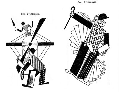
Instead of looking for a dual relationship—Chaplin directly influencing Russian artists—Yuri postulated a “triangular” relationship, in which Chaplin’s image was mediated through other European sources. For instance, Léger’s numerous images of a fragmented Chaplin led Futurists and Constructivists to declare Charlie “one of us.” They loved the idea of man as a machine executing precisely articulated movement, and what they heard of Chaplin’s pantomime and gags led them to praise him. Chaplin, said Lev Kuleshov, is “our first teacher” because he knows bio-mechanical premises better than anyone. According to the photographer and graphic designer Rodchenko Chaplin instructs viewers in how to walk or put on a hat in the most perfect manner.
So strong was this “virtual” image that artists could read Chaplin into the slapstick comedians they did see. Yuri showed that Varvara Stepanova’s striking rendition of Chaplin as an airplane propeller derived from a film he wasn’t in!
Perhaps she didn’t care: Nikolai Foregger suggested that Chaplin himself was unimportant, that the crucial fact was that he created a whole school of comedians within what Yuri called “a collaborative research community”—that is, Hollywood!
Yuri’s paper, in homage to the Russian Formalists, invoked the “law of fortuity” in art. This refers to the possibility that artistic borrowings, blendings, and crossovers are not determined by any broader social processes, as the Marxists were arguing, but are merely contingent. “Life interferes with art from below.” Accidents and unforeseen intersections, such as the Chaplin craze meeting the Constructivist movement, allow artists to seize on whatever is around them for new material. Yuri’s reference was to Kristin’s revival of Formalist methods in her “neoformalist” studies of Eisenstein, Tati, and other filmmakers.
Janet Staiger of the University of Texas at Austin collaborated with us on The Classical Hollywood Cinema, and she has for several years been the leading scholar of reception studies in film and television. In looking at the Indiana Jones series, her paper nodded to Kristin’s work on the Lord of the Rings franchise and her study of fans’ responses to the films.
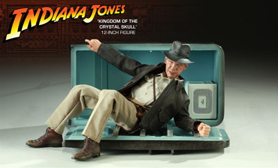
“Nuking the fridge,” Janet explained, has become fan jargon for an outrageous plot twist. The phrase comes from a notorious moment in Indiana Jones and the Kingdom of the Crystal Skull (2008), in which Professor Jones escapes an atomic blast by diving into a lead-lined refrigerator. The moment becomes a crux for clashing fan judgments: This is totally unrealistic vs. Realism doesn’t matter. Janet went on to show how these and other fan responses, entwined in IMDB commentary threads, utilized several different interpretive frames.
One was authorship. Like academics and journalists, fan are auteurists. They assign the director responsibility for major aspects of the film. But this doesn’t mean that they agree in how to use this frame. In the case of Crystal Skull, a certain Kid Mogul asked if Spielberg’s willingness to reinvigorate the franchise was purely mercenary: “Is it just about the money?” Others took a more career-survey approach, noting that after prestige pictures like Schindler’s List Spielberg recalibrated his popcorn movies, particularly by handling violence more gingerly.
Another frame was story-based “lit talk.” Fans disparaging the film found it clumsily plotted and lacking in character development. Several were quite sensitive to narrative coherence, one-off gags (such as nuking the fridge), and pacing. Those defending the film appealed to the emotional burst of the final chase scenes.
Janet’s third frame of reference was what she called “formula dissonance.” She sought to capture what seeing the film would be like for those who knew Indy’s story only through the TV series or video versions of the earlier installments in the franchise. She suggested that the formula was by 2008 quite abstracted and idealized for many fans. Their sense of the franchise was thus tested by the extraterrestrial twist that resolved the Crystal Skull plot. Does it reframe the whole series in a cosmic context, or is it a violation of the premises of the Indy universe?
Janet’s survey of these types of responses made me notice that the assumptions of academic film studies and of journalistic criticism overlap with fan conversation. Fans who liked the film tried to make everything fit by appeal to organic unity, technical proficiency, emotional intensity, and other familiar criteria. It made me suspect yet another reason why “amateur” and “professional” film criticism seem to be merging: Perhaps their conceptual frames of reference aren’t so far apart. But their tastes and their degrees of commitment surely are.
You might have expected Henry Jenkins of the Annenberg School at the University of Southern California to talk about fans too. After all, he practically invented the modern study of media fandom with his book Textual Poachers, and his work influenced Kristin’s study of fan promotion of The Lord of the Rings. Instead he turned to a survey of an artist’s oeuvre. He showed how Kim Deitch’s vast output of stories appropriate imagery from nineteenth and twentieth century mass media and present highly personal versions of the history of popular culture.
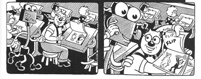
In a way, though, Henry’s talk involved fandom because Deitch is himself a prototypical fanman. He’s an obsessive collector, likely to turn his search for a rare toy or drawing into a Byzantine odyssey on the page. Fascinated by Hollywood scandal, he has constructed a phantasmagoric history of mass media through fictional characters (e.g., fake movie stars) who confront real people (e.g., Fatty Arbuckle). He’s particularly concerned about what he takes to be the warping of animated film by the influences of the mass market, epitomized by the Disney empire. The emblematic moment in Boulevard of Broken Dreams comes when Deitch’s Winsor McKay stand-in addresses torpid animators at a tribute dinner and denounces them for selling out.
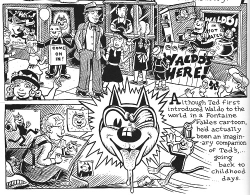
Deitch’s most famous character is Waldo the cat, and Henry traced the powerful connotations of this emblematic figure. Waldo recalls Felix, the most heavily merchandised comics figure before Mickey, as well as the black cat as a figure of deception, witchcraft, and even African-American minstrelsy. Through Waldo, Deitch could hop across the history of film and comics, from McKay to Mighty Mouse and 1940s abstract films. In Alias the Cat!, Deitch finds in the 1910s everything that we associate with media today: serial narrative, stories shifting across different media platforms, an uncertain line between publicity and self-expression, and a mixing of news and sensational fiction.
Henry situated Deitch in a broader trend of comic artists trying to find a new history of their medium, one that dislodges superheroes from a central role. Deitch’s themes of old-fashioned craftsmanship, lovably antiquated technology, adult dread and degeneracy lurking behind children’s stories, and the commodity demands of comic art link him to contemporaries like Chris Ware and Art Spigelman.
Henry’s talk spurred a lot of discussion, including the question of whether we can treat an artist as offering a history that is comparable to academic research. Can Deitch’s hallucinatory vision of American media be a plausible basis for understanding what really happened? On the whole we don’t expect an artist to offer rigorous arguments. An artwork appropriates history for its own end. (Not all the Greek philosophers actually gathered together in the way Raphael depicts them in the School of Athens painting.) How cogent you find Deitch’s critique probably also depends on whether you share his disdain for Disney. His floppy-limbed denizens fuse headcomix grotesquerie with the 1930s animation that most prestige studios abandoned. As in Sally Cruikshank’s sprightly cartoon Quasi at the Quackadero, Deitch’s rubbery frames revive a style in which everything seems to throb and shimmy.
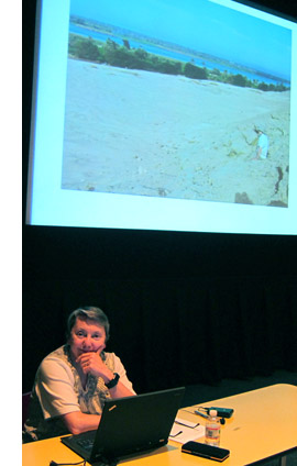
Kristin’s talk, “How I Spend My Winter Vacations: The Amarna Statuary Project and Techniques of Visual Analysis,” had two parts. In the second part, she reviewed her recent work in assembling statues out of tiny bits that had been dumped by archaeologists decades ago. You can read some of this story here. The side of her work most intriguing to students of film, I think, involves her attraction to Egyptian art in the first place.
Egyptian art is often thought of as unrealistic, but during his reign in the fourteenth century BCE the pharaoh Akhenaten introduced a peculiar sort of stylization into it. When he instituted a monotheistic religion centered on the sun god Ra (embodied in the Aten), he also demanded a new pictorial style. Thus the Aten is depicted as a disc shedding rays, a symbol of life and dominion. In addition, the royal family displays biggish hips and thighs, which fit the fecundity theme. More strikingly to our eye, Akhenaten’s family were represented as somewhat distorted, with long and narrow faces, hands, and feet. The ruler’s crown is elongated as well. Several aspects of the new style are present in Kristin’s favorite scene, a beautiful relief carving known as the Berlin family stela.
You can see the Aten’s rays ending in little hands holding ankh signs to the royal couple’s noses. But just as important is the human dimension of the scene, and two sorts of action displayed there: swiveled shoulders and pointing hands.
Unlike the flat, frontal portrayal we associate with Egyptian art, the family members are caught in twisting postures that bring one shoulder forward. Kristin explained:
Akhenaten is lifting his daughter, his foreground arm moving backward to hold her legs, the other moving forward to support her body as he kisses her. She reaches with her rear arm to chuck him affectionately under the chin, while her other arm moves backward in a pointing gesture. On the opposite site, Nefertiti’s foreground arm is held bent and backward to steady the youngest daughter of the three present, who is standing on her thigh and reaching up rather precariously to grab a golden decoration hanging from her mother’s crown. Nefertiti’s rear hand goes forward to steady the second daughter, who is also pointing, this time with her rear arm as she twists to look at her mother. These kinds of gestures can be found again and again in such scenes.
The twisting movement wasn’t unknown among images of workers and private individuals; Amarna artists, presumably encouraged by Akhenaten, applied the device to portraying the royal family.
Just as significant are the pointing gestures we find in the stela. Some scholars have interpreted them as protective gestures, which are found in other images. But Kristin points out:
 In those cases, the protecting figures hold their arms straight, they stare in the direction of the thing to be protected (as one presumably would in reciting a spell), and there is something dangerous present. None of this applies in the scene in the stela.
After pondering this scene quite a lot, it occurred to me that it looked like a really early film, a short scene, perhaps 30 seconds long, that we were to interpret as a tiny narrative. The pointing gestures seemed comparable to pantomime, where one has to interpret movements in the absence of intertitles.
Given that so much Amarna art is about displaying the royal couple as having created life by giving birth to their daughters and as sustaining that life, it seems to me that this stela is full of indications of nurturing. The columns and roof indicate that the parents have their kids in a little shelter to keep them out of the hot sun. The rows of pots behind Akhenaten’s stool are no doubt filled with cool drinks for them. Nefertiti carefully holds onto the two children on her lap while Akhenaten kisses the eldest. My interpretation is that the eldest is saying something like, why don’t you kiss sister, too?” and the one opposite is pointing out the kiss to her mother and saying something like, “Look, daddy’s kissing sister; I want a kiss too.”
This may not sound like the sort of thing kids would say, but the circulation of affectionate gestures among the family members in these casual scenes is nearly universal. The chucking under the chin gesture used by Meretaten here shows up again and again, as do embraces and kisses.
Despite all the stylization, then, Kristin concludes that the stela depicts a scene of intimate affection, complete with a child toying with a mother’s ornament. This homely realism chimes with other realistic tendencies in Amarna art, such as the differentiation of right and left feet and the presentation of plants and animals in non-stereotyped ways. In sum, Kristin’s ability to look closely at film style helped her make discoveries about visual narrative in a completely different domain.
So our Saturday talks included cinema-related material from 1911 to about 2010, and with Kristin’s lecture we flashed back about 3300 years. Every talk was crisp and lucid. We were spared the juggling of empty abstractions, the free-associative rambling, and the self-congratulatory cleverness that plague the humanities. We got knowledge and opinion presented with enthusiasm, modesty, and good humor.
Kristin and I are grateful to our presenters, as well to all the friends old and new who showed up: Leslie Midkiff Debauche from Stevens Point, Carl Plantinga from Michigan, Peter Rist from Montreal, Brenda Benthien from Cleveland, Virginia Wright Wexman from Chicago, Vicente José Benet from Spain (via Chicago) and many others. In all, a day to remember.
For more information on Kristin’s research see my earlier entry. For other cinematic implications of the Berlin stela of Akhenaten’s family , see Kristin’s blog entry here. Her article, “Frontal Shoulders in Amarna Royal Reliefs: Solutions to an Aesthetic Problem,” is available in The Journal of the Society for the Study of Egyptian Antiquities 27 (1997, published 2000).
All of our speakers are represented on the Web: Henry here, Charlie here, Janet here, and Yuri here (and of course on Cinemetrics). For more on Janet’s study of online critics and the frames they inherit, see her essay, “The Revenge of the Film Education Movement.”
Kim Deitch, Boulevard of Broken Dreams.


