Archive for the 'Animation' Category
Between you, me, and the bedpost
Imitation of Life.
DB here:
I do not like finding phallic symbols in movies.
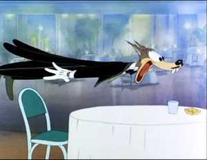
I grant you that there are some films that deliberately evoke the love wand: Tex Avery cartoons, Frank Tashlin and Jerry Lewis movies. Surely the Wolf in Avery’s Red Hot Riding Hood (1943) has more than a Platonic interest in Red’s stage show.
But some critics/ academics look way too hard. For them, as a literature professor of mine put it back in the mid-1960s, phallic symbols are everywhere in art. And I learned fast that he meant everywhere, from the Odyssey to Emily Dickinson. I changed sections.
Films, of course, are full of images that encourage the hunt for avatars of the skin flute. So for forty years, I’ve argued against interpretations of a scene that depend on reading you-know-what into anything that resembles a pole, post, or pylon—any vaguely tubular shape, slender or squat, organic or mechanical. It is a duffer’s mistake to think that film shots including swords, logs, telephone poles, pine trees, skyscrapers, Greek columns, fountain pens, picket fences, shovels, rocket ships, and Pontiac fins always pay homage to the trouser snake.
Except, I must admit, bedposts.
I don’t think I’ve ever slept in a bed with bedposts, not even in those cozy B & Bs that smother you with affection and sugar-sprinkled muffins. But the American cinema likes bedposts. Red-blooded American women in classic movies often have beds braced or decorated with bedposts.
Sometimes those bedposts do some alarming things.
Exhibit A: Start, as we often do (but probably shouldn’t), with D. W. Griffith. In The Birth of a Nation, Elsie Stoneman has just spent a romantic afternoon with Ben Cameron, aka The Little Colonel.
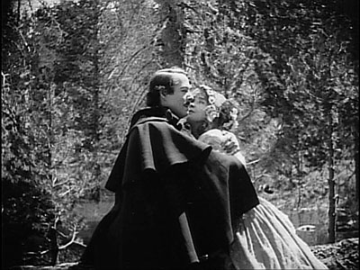
She races into her bedroom, obviously smitten.
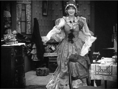
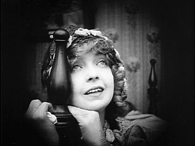
What does she do? She hops to the bed and leans dreamily against the fancy tapering bedpost. Now Griffith gives us the closest image of her that we’ve seen so far in the movie.
And since Griffith never passes up a chance to crosscut between anything and anything else, we get another shot of Ben, perhaps looking off toward Elsie’s house. (We have to say perhaps because Griffith is not terribly concerned with consistent eyelines.) It operates as a typical Griffith signal that one character is thinking about another.
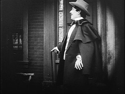
And as if aware that Ben is thinking of her, Elsie rewards her bedpost accordingly.
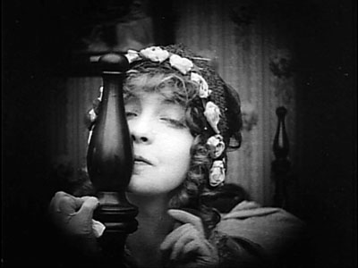
Should you doubt that these bedpost calisthenics are connected with the thought of a guy, I submit Exhibit B. In Bringing Up Baby, Susan Vance (Katharine Hepburn) is taken with David Huxley (Cary Grant). While he showers, she wraps herself around the only thing in the room taller than she is.
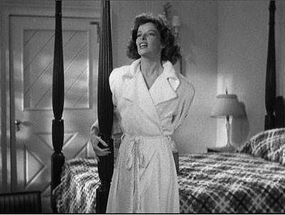
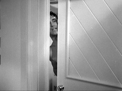
One can easily see why a glimpse of Cary Grant stepping out of the shower could make somebody clutch a support , but wouldn’t a chair have done as well?
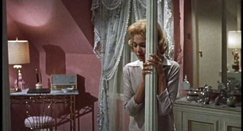
Exhibit C: Douglas Sirk has done interesting bedpost work in Imitiation of Life (surmounting this entry), but surely his triumph is Magnificent Obsession (1954). A blind Helen Phillips (Jane Wyman) has just learned that no operation is likely to recover her sight. Helen rises from her chair, and we hear a wordless choir along with a piano theme evocative of Rob (Rock Hudson), the mysterious man in her life. As if drawn by magnetism, she makes her way through the darkness to a totemic mass, sort of Elsie Stoneman’s bedpost on Viagra. She moves with the solemnity of a priestess paying homage to an angry god.
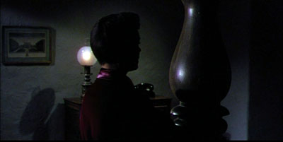
Actually, this thing isn’t exactly a bedpost; it’s a strange thrusting protrusion from a love seat that functions as a room divider. But it’s clearly in the bedpost tradition—as we see when, like Elsie, Helen embraces it and leans her head against it.
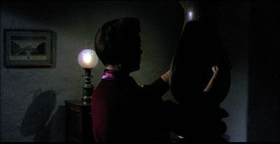
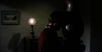
Soon Rob enters, framed by the post, and in no time the couple are in a clinch.
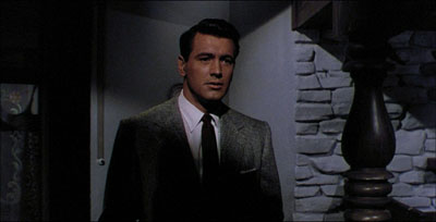
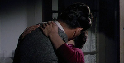
If forced to interpret these items, I’d probably say that Griffith may have included The Bedpost in a moment of frank eroticism, Hawks knew the cliché and exploited it for an actor’s bit of business, and Sirk, sophisticated Euro émigré, used it ironically. But of course these interpretations are open to dispute. I expect someone to start a dissertation on the matter immediately.
I don’t know of comparable scenes in which men, thinking of women, hug bedposts or crawl into big cavities. Bedpost worship can obviously be interpreted as another sign of Hollywood’s bias toward patriarchal values. But its blatancy and more or less witting silliness also respond to that quality that delighted Parker Tyler about Hollywood movies—the way that flagrant symbolism is flung onto the screen but toyed with, to tease us. For Tyler, the “only indubitable reading of a given movie” was
its value as a charade, a fluid guessing game where the only “winning answer” was not the right one but any amusingly relevant and suggestive one: an answer which led to interesting speculations about society, about mankind’s perennial, profuse, and typically serio-comic ability to deceive itself.
Sometimes, then, a bedpost is just a bedpost. But probably not in the movies.
The quotation comes from Parker Tyler’s Three Faces of the Film, rev. ed. (South Brunswick, NJ: Barnes, 1967), 11.
My frame enlargements from a 16mm print of Magnificent Obsession aren’t good enough in the scene I mentioned, so I’ve been obliged to draw my images from the Criterion DVD. That version crops the frame to 2.0:1, which has seemed too radical for many observers, me included. Should it instead be 1.66 or 1.85? The aspect-ratio debate has played out in extensive detail here and here.
Thanks to Lea Jacobs and Jeff Smith for some DVD loans. Jeff also encouraged me to keep this discussion in good taste.
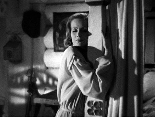
Queen Christina.
(50) Days of summer (movies), Part 1
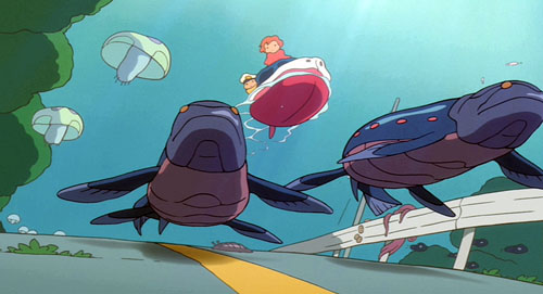
Ponyo on a Cliff by the Sea.
DB here:
Travel took me out of Madison for half of June and nearly all of July. While overseas, I saw only one recent US release. So I caught the American Summer Movies in two gulps–over a couple of weeks early on and over the last month or so. In all, exactly 50 days? Well, were there exactly 50 first dates in that movie?
Herewith, comments on a batch of titles. There are spoilers sprinkled throughout, but most of what I say won’t harm your encounter with the film. Because all my remarks amounted to an even longer blog than usual, I’ve broken it into two parts. The next installment, coming up in a few days, talks about The Taking of Pelham 123, Public Enemies, and Inglourious Basterds.
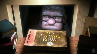
My summer movies were bracketed by two animated pictures. Up is to my mind the most mature Pixar film yet. It has all the virtues we associate with this studio: quick but not frantic pacing, expert handling of resonant motifs, technical brilliance (especially in its depiction of settings), and one-off gags. The poker-playing dogs had me laughing out loud. But as we’ve argued in other blogs (here and here and here), the Pixar team likes to set itself tough challenges. First there is the technical challenge of 3-D, which is easily surmounted. The 3-D effects get more pronounced once the plot lands in South America. More important, I think, is the challenge of representing the emotion of sorrow.
Another movie would have organized its plot around the kid, Russell, and let him meet the elderly Carl in the course of his adventures. That way, Carl would emerge as a merely touching secondary character. But by focusing point of view around Carl’s life, showing his marriage and widowhood, Pete Docter and his team have tackled one of the hardest problems of classic moviemaking. How do you render pure sentiment without becoming sentimental?
The protagonist’s portrait is surprisingly hard-edged. Carl is tightly wound even in his youth, unlike the exuberant and extroverted Ellie. Yet the couple seems to have no friends throughout their marriage, and it becomes easy to see how Carl could will himself into crabby isolation after her death. Thanks to the choice of viewpoint, Carl becomes no mere crank but a truly empathetic figure.
This is fragile stuff, and Docter handles it with tact. Many movies want you to cry at the end, but Up daringly invites you to indulge in its first ten minutes. It then spends the rest of its running time brightening your mood, so that the title could describe the film’s emotional trajectory. It’s one of my two favorite new movies I saw this summer.
Just a few days ago Kristin and I saw Ponyo on a Cliff by the Sea. We’ve been Miyazaki fans since Totoro, and have especially admired Kiki’s Delivery Service and Spirited Away. As with this last and with Howl’s Moving Castle, I have a hard time figuring out the premises of the plot. What rules govern Ponyo’s transformations? Why can’t she become a real girl, exactly? And then why is she permitted to? The well-timed interventions of her mother, like the Witch’s change of heart in Howl, seems a way out of plot difficulties, and as often happens in Miyazaki the plot resolution seems rushed in comparison with the leisurely development of characters’ relationships.
But as usual I was won over by the effortless virtuosity of the imagery and the weird conviction suffusing Miyazaki’s concept of nature. As in Spirited Away, animation becomes animistic. The sea is bursting with hidden forces: goldfish with extraordinary powers of group effort, waves that turn into blue fish, and bubbles as solid and slippery as balloons. Nobody but Miyazaki could imagine the quasi-Wagnerian scale of Ponyo’s race, atop gigantic fish-waves, to catch up with Sosuke and his mother fleeing in their car.
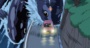
These shots burst with more dynamic shifts of mass and scale than I’ve felt in any official 3-D picture.
Sometimes Nature is scary. Although nothing here is as traumatic as Spirited Away‘s transformation of parents into swine, the tsunami scenes induce genuine awe at nature’s exuberant destructiveness. There follows a reassuring calm. Ponyo and Sosuke glide along the flood waters while ancient creatures zigzag in the depths, and the townspeople quietly accept that their homes have been engulfed. Ponyo is a gentle movie, aimed (as Miyazaki explains here) at a younger audience than was his recent work. It’s suffused with simple human affection, seen in acts of spontaneous generosity. What American movie could include a moment when Ponyo, fish become girl, offers a nursing mother a sandwich to help her make milk for her baby? Again, sentiment without sentimentality. Ponyo offers more evidence that whatever the disappointments we may find in live-action movies, we are living in a golden age of animation.
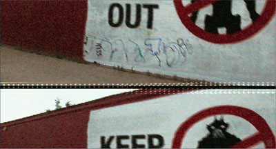
Am I just being perverse in finding Transformers 2: Revenge of the Fallen not as abysmal as others have? Don’t get me wrong. It is not what you’d call good. It is rushed and overblown. What other movie accompanies its opening company logos with gnashing sound effects? Its plot is even more preposterous than the first one’s. Its performers bear that sheen of meretriciousness that fills nearly every Michael Bay project. It is also lazy in its plotting. Worse, I couldn’t really make out the design of the ‘bots. It’s not that the cutting is abnormally swift (a mere 3.0 seconds ASL, about the same as in Up and slower than that in The Hurt Locker). The problem is that the digital camera is swirling around the damn things so fast as they take shape that you can’t get a fix on what they actually look like. All those spinning wheels and dangling carburetors ought to be worth a glance.
But still….For non-Transformers shots Michael Bay at least puts his camera on a tripod, which these days counts as a plus with me. And a minibot humps the heroine’s leg. And John Turturro is in it. Would he grace a movie that signals the fall of Western Civilization?
 In a similar vein but more satisfying was District 9. Its “racial subtext” is as perfunctory and confused as such weighty hidden meanings usually are, and anyhow whatever political points the movie wants to make drift out of view halfway through. Moreover, its “documentary immediacy” is inconsistent: despite footage marked as coming from surveillance and TV cameras, we have unimpeded access to all plot matters. But here the Bumpicam probably allows for cheaper CGI, and as a run-around-shooting-things movie, it needs to keep things simple.
I found the smash-and-grab look far more distracting in The Hurt Locker. Kathryn Bigelow has directed several first-rate movies, notably Near Dark (where she used a tripod), Blue Steel (ditto), and Point Break (tripod mostly). On this project, she seemed to me to be doing more conventional work. There are the titles telling us that time is running out (“16 Days Left”). There’s classic redundancy of characterization, as when we’re told that James is a hot dogger–“He’s reckless!” “You’re a wild man!”–as we watch him be all that he can be, and more. There’s the hapless kid who is so near to the end of his tour that you know he’s a marked man. There are even aching slow-mo replays of explosions bowling guys to the camera. What if war films gave up this convention and just showed bombs going off and bodies hurled around as fast as in reality? Might war look a little less picturesque?
The camera is locked down for these iconic slow-mo shots, but most of the scenes are handled in heat-seeking pans, artful misframings, chopped-off zooms, and would-be snapfocusing that can’t find something to fasten on. The editing plucks out bits of local color and sprinkles in some glimpses of onlookers that tend to turn them into props. I’ve tried to show elsewhere that this trend in rough-hewn technique nonetheless adheres to the conventions of classical style: establishing/ reestablishing shots, eyelines, reactions, and close-ups to underscore story points. Even wavering rack-focus can still orient us to the action quite clearly.
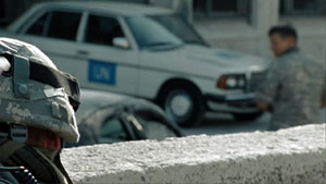
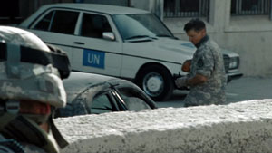
The question is what the harsher surface adds, especially when it’s so pervasive. Habituation is one of the best-proven phenomena in psychology, and movies like this seem to prove that it works. After the first few minutes, we’ve adapted to any visceral punch that the Unsteadicam hopes to provide. Maybe it serves to ratchet up suspense? Doubtful. A director would have to be a real duffer to dissipate suspense in a movie about dismantling an explosive device. The trick is to do something different, as in bomb-disposal movies like the Chinese Old Fish and the British Small Back Room.
Still, the plot is decently engaging, and there’s a taut, unpredictable siege in the desert. That long sequence displays a disciplined interplay of optical viewpoints, a sense of constantly revised tactics, a new aspect of James’s leadership style, and nice details about sharing juice boxes. In another era, The Hurt Locker would have been a studio picture in the vein of Anthony Mann’s bleak Men in War. I suppose it shows that yesterday’s genre film, executed with conviction and a certain edginess, can become today’s art movie.
Speaking of suspense: I thought that the setup to A Perfect Getaway was reasonably engrossing. There was some clever self-referential teasing: our hero’s a screenwriter, and there’s talk of a “second-act twist.” And it was mostly shot on a tripod. I hoped that director-writer David Twohy would have the courage to stick with its initial premise and be Deliverance in Hawaii. But sure enough, the things that smelled like red herrings were red herrings, and the reversal that you feared comes to pass in one of those point-of-view switcheroos that movies now indulge in. Come to think of it, that was the second-act twist. But I did like the strategically placed telemarketer call.
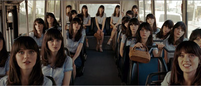
We’re evidently allotted one crossover indie movie per summer, a fact acknowledged in the title of this year’s hit. (500) Days of Summer, which really needs its parentheses not just because everybody now overuses them (there’s even a blog confessing it), but because its strategy is to disarm you with its knowing cuteness. It is so self-consciously winning your teeth will ache. It’s a twentysomething romance of the sort usually called “bittersweet.” The guy’s after love and the girl withholds commitment. Guaranteed result: emotional roller coastering, because we’ve seen her flighty sort before in kooky-girl figures like Petulia. There’s a fantasy musical number with a touch of animation, an avuncular narrating voice sliding in and out, a shuffled time scheme sorted out for us with a sort of daily odometer reading, and pop-culture references including retro ones to The Graduate and Ringo Starr. Everybody smiles a lot, and when they’re not smiling they’re crinkling up their faces.
(500) Days plays by the book. Tom and Summer work for a greeting-card company, a satiric target only a little harder to hit than the Pentagon. As in the movies mentioned above, the cutting is intent on making sure we see everybody deliver every syllable. (What ever happened to offscreen dialogue? Did TV kill it?) (Sorry about the parentheses.) The four-part script layout is as neat as embroidery: the first kiss at the photocopiers comes at 24:00, the splitup comes at 47:00, Tom delivers his diatribe against the lies about love at about 72:00, and the epilogue, with its fatal final line, finishes at 90:00. Yet I’m not curmudgeon enough to despise a movie so desperate to be liked, and at last I found a film whose narration clicks along in syncopation with my little tally counter.
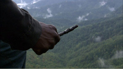
The real indie film I admired in my fifty days was Ramin Bahrani’s Goodbye Solo, or Good Bye Solo as the credit title has it. Kristin and I have registered our admiration for Bahrani’s films here and here on this site, and his latest is no less modest, well-crafted, and affecting. A Senegalese emigre cab driver befriends an enigmatic old man who at the start of the film offers him $1000 to pick him up on October 20 and drive him to Blowing Rock Mountain. Solo infers that William is planning a suicide and so starts to intervene in his life. His involvement with William gets intertwined with his family problems and his hopes of becoming an airline attendant.
Goodbye Solo exemplifies the “character-driven” movie. Solo is sunny, quick-witted, and socially adroit; his audition for the airline managers shows him as an ideal employee. William is just the opposite–morose, aggrieved, profoundly unhappy. The treatment is observational, with lengthy shots (an average of over twelve seconds) capturing dialogue and slowly shifting character response.
 The characters change, but Bahrani and his co-screenwriter Bahareh Azimi, wary of quick fixes, don’t push this too far. It would be easy to make William soften more, even eventually make him likeable, and to keep Solo an indefatigable force for optimism. Instead, if William accepts more of Solo’s ministrations, it’s largely due to his passivity, not a fundamental change of heart. Meanwhile, Solo becomes more anxious and pessimistic, shedding some of that casual charm that captivated us in the opening. Neither executes that neat character arc that Hollywood tends to favor and that’s visible in Up and (500) Days of Summer.
Bahrani’s hatred of cliché obliges him to make his story events mundane and equivocal. As in Man Push Cart and Chop Shop, the plot emerges from variations in routine, a lesson well-taught by European festival cinema of the 1950s. But when you have a stubborn, taciturn character like William, and you’re restricted to another character’s range of knowledge, it’s hard to give the film a forward propulsion. You have a deadline, but no momentum. So plot dynamics arise from Solo’s relation to his wife and daughter, his career goals, and above all his investigation of William’s past–his search for what could drive the man to suicide. And this investigation turns on conveniently discovered clues.
Someday I must do a blog entry on tokens in narratives. Any plot of some complexity seems to need physical objects that encapsulate dramatic forces, spread out information, or become emotion-laden motifs. The photograph is probably the most traditional one, but notes, diaries, rings, and so on are useful too. In Goodbye Solo, William’s tokens move the drama of disclosure forward, and it’s possible to object to the film’s reliance on so many of them.
The problem Bahrani faces is that the film has to give us personal information about William while retaining tact and respect for characters’ integrity. For William to open up into a Tarantino-style confession would tear the movie apart; even a quiet moment of sobbing vulnerability is too indiscreet here. The film needs its tokens, however awkward they may seem as narrative devices, to keep faith with its people.
Staying a little outside the characters, allowing them to retain some private motives, is exactly what (500) Days of Summer doesn’t attempt. Bahrani’s discretion extends to the very last scene. The title becomes a line that someone should speak but doesn’t. Up till now, the quietly precise images have been shot by a camera locked down, but atop a mountain the camera leaves its tripod and supplies some mildly shaky imagery. And now it fits. It’s not just that the drama has reached an emotional pitch. The camera is simply buffeted by the wind. Once more Bahrani lets his world do its work.
You can read about our summer film-related travel here and here and here and here and here.
Overwhelmed by all the material on Pixar and Up, I merely point to two encyclopedic experts: the ever independent-minded Mike Barrier and the always-informative Bill Desowitz, who offers information on Pixar’s approach to 3-D here. For Ponyo background and an interview with Miyazaki, turn again to Bill D, here; he provides a transcript of a conversation between Miyazaki and John Lasseter here. A fat book of Miyazaki interviews and essays has just been published, and it includes some incendiary stuff, such as “Everything that Mr. Tezuka [Osamu, the ‘god of animation’] talked about or emphasized was wrong” (197).
The parentheses in (500) Days of Summer are explained by screenwriter Scott Neustadter at Jeff Goldsmith’s Creative Writing podcast.
Roger Ebert has reviewed nearly all these films and as always he has sensitive things to say, particularly on Goodbye Solo. He’s been championing Bahrani’s films for many years and he offers a warm career appreciation here.
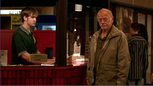
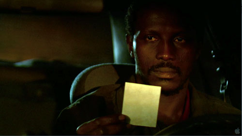
Goodbye Solo.
Forgotten but not gone: more archival gems on DVD
Kristin here-
We don’t make a practice of regularly reviewing DVDs here, but when a special release comes along that makes historically important, hard-to-see films available, we like to point it out. David spotlighted the new Criterion set of Shimizu Hiroshi films, and this week it’s Lotte Reiniger and Belgian experimental silents.
The lady with the flying scissors
Up until recently, the name Lotte Reiniger meant little to most people. Some were aware that she, rather than Walt Disney, had made the first animated feature film, The Adventures of Prince Achmed (1926). Some had been lucky enough to see a few of her shorts, created with a delicate silhouette technique using hinged, cut-out puppets. She had pioneered the approach in the late 1910s and continued to use it in much the same way up to her last films in the 1960s and 1970s.
Now, however, in another of the marvelous revelations that DVDs have made possible, we are in the process of having virtually all of Reiniger’s surviving work become available over a short stretch of time.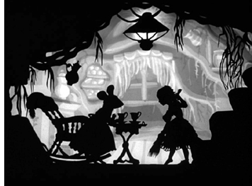
Early this year the British Film Institute released a two-disc set, “Lotte Reiniger: The Fairy Tale Films.” It concentrates on a series of thirteen films Reiniger and her husband Carl Koch made for television during an intensely productive period in 1954-55.
Two of these, Aladdin and the Magic Lamp and The Magic Horse, recycle footage from The Adventures of Prince Achmed, the elaborateness and delicacy of which stand out. Yet the rest of the series, though clearly made on a lower budget and remarkably quickly, are consistently excellent, with considerable detail of gesture and a great deal of wit (as in Thumbelina, right).
The rest of the program includes the 1922 Cinderella (left) which is Reiniger at her prime-though the detail of 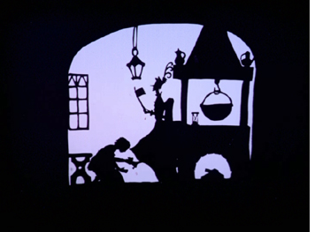 one of the stepsisters slicing off part of her foot to make it fit in the tiny slipper may be a bit grim for some children. The Death-Feigning Chinaman (1928) is a fascinating item, a sequence cut from Prince Achmed and released as a free-standing tale. Reiniger made The Golden Goose (1944) in Berlin late in the war, as she cared for her ailing mother. It was not edited into a silent version until 1963, with a soundtrack being added for TV in 1988. It’s a real treasure that belies the grim circumstances of its making.
The material following chronologically after the thirteen television episodes consists of three films. One, The Little Chimney Sweep, is the only disappointment in the program. It’s a revised, abridged version of a film from 1934, and the voiceover narration and truncated action downplay the subtle touches and charm that characterize all the other films. Fortunately the original survives and will be presented in the DVD program of the musical films.
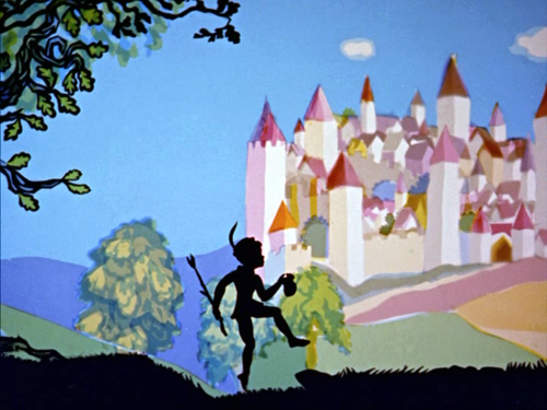
The other two films are in color. I had never seen a color Reiniger film, but both are lovely, like old-fashioned children’s book-illustrations come to life. Jack and the Beanstalk (see image above) is the more polished of the two. Here black silhouette figures move amid brightly colored, stylized landscapes. It doesn’t sound like it should work, but it does. The Frog Prince is more what one would expect, with hinged colored puppets replacing the dark silhouettes. The result is highly engaging, though the lack of expression in the characters, which works so well for the dark silhouettes, might become too apparent in a film lasting more than a few minutes.
Wonderful though it is to have this big dose of Reiniger made available, I wish that the BFI had organized its presentation more helpfully. For a start, there’s no indication that this set is part of an ongoing series that will eventually make most of the filmmaker’s work available. No reference to that fact that the BFI already put out The Adventures of Prince Achmed in 2001, accompanied by an hour-long documentary, Lotte Reiniger: Homage to the Inventor of the Silhouette Film, directed by Katja Raganelli (which isn’t is also on the American disc released by Milestone). No announcement that a set of Reiniger’s music-based animated shorts is due out later this year or that the second set of GPO advertising shorts also due soon will include some Reiniger works (The Tocher and The H.P.O.), though brief references to that future release are buried in a couple of the program notes. (The two Reiniger films are already available on a British DVD called The GPO Story.) Only diligent trawling about the internet reveals such things. There’s a good summary of the situation in the DVD Times review of the fairy-tales set.
The program notes are fairly informative if you want plot synopses, but they provide virtually no historical context. There’s no general introduction to the program or the overall series, just a brief biographical note on Reiniger and notes on the individual films. I would have appreciated some information on the 1954 television series for which many of the films in the set were made.
Speaking of plot synopses, the notes for The Death-Feigning Chinaman miss a key narrative point. The title character, Ping Pong, gets drunk and starts eating a cooked fish that a young couple give him. The description continues, “Ping Pong eats a little of the fish, then tramples it in a drunken rage and falls down in a stupor.” This is a key moment, since his apparent death launches a snowballing accumulation of confusion, confession, and near execution. What actually happens is that Ping Pong chokes on a bone while eating the fish, and it paralyzes him. At the climax, an insect lands on his nose, he sneezes, the bone flies out of his mouth, and he emerges from his “death.”
Another instance of disorganization comes with a charming little color film, The Frog Prince, from 1961. It 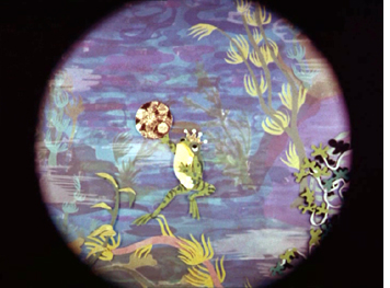 was originally creates as an interlude in a stage pantomime, and on the disc it is presented silent. The program note comments, “No evidence of a soundtrack survives, and indeed sound seems unbefitting for a pantomime interlude. Although surprisingly, the aperture format of this mute positive print is 1:1.375 with an unused soundtrack area.” Yet the short documentary included in the set, The Art of Lotte Reiniger, includes The Frog Prince in its entirety, accompanied by lively and quite appropriate orchestral music. Given that Reiniger’s own production company made this film and she participated in its creation, it seems highly probable that the music used in the documentary was either the intended accompaniment for the film or at least considered suitable for it. A case of the right hand not knowing what the left is doing when this package was being put together, I guess.
The Art of Lotte Reiniger is a fascinating little film, despite the rocky sound quality of the surviving print. The filmmaker shows off her storyboards and puppets, but the really amazing thing is watching how quickly she cuts the silhouettes, freehand, out of black paper.
For those who read German and want as full a dose of Reiniger as possible, an 8-disc box is already available, including Prince Achmed, the fairy-tale and music shorts, and a two-disc set called “Dr. Dolittle & Archivschatze” (Dr. Dolittle and archive treasures).
Animation historian William Moritz provides a biographical note and filmography for Reiniger here. It or something like it would have been a helpful introduction to the DVD booklet.
“This is not a pipe,” the movie
As of February of this year, I have been visiting the Cinémathèque royale de Belgique/the Koninklijk Film Archief, or, unofficially, the Royal Film Archive of Belgium, for thirty years now. (David made his first visit there in 1982.) It has been a tremendous resource for us, and its staff, especially current archive director Gabrielle Claes, have invariably been generous and welcoming.
Being a government-supported institution in a bilingual country, the Archive renders all texts in French and Flemish, from the monthly screening schedules to the subtitles that sprawl across the bottoms of frames. Now, as part of a renovation of the screening venue and museum space, the Royal Film Archive has abandoned all that verbiage and officially renamed itself the Cinematek. That’s not a real word in any language, but it conveys more or less the same thing in French, Flemish, and English. I suspect that the epic subtitles will remain. For full details of the new facility and programming, go here.
Before the name change, the archive had started a DVD series awkwardly entitled “filmarchief dvd’s – les dvd de la cinémathèque.” These are collections of archival films mostly relating to Belgium, and a lot of them are documentaries. The series includes an excellent new two-disc set, “Avant-Garde 1927-1937.” (The archive also publishes modern films, mostly in Flemish.) It’s in fact a trilingual release, with the subtitle “Surréalisme et expérimentation dans la cinéma belge/Surealisme en experiment in de Belgische cinema/Surrealism and experiment in Belgian cinema.” The text of the detailed accompanying booklet is in all three languages, and the discs also offer options for subtitles in any of the three. The producers have taken great care with the music, commissioning Belgian musicians to compose and perform modernist chamber-orchestra scores. These vary considerably, effectively matching the tone and style of each film. The design of the packaging is practical and sturdy: it’s a small hard-cover book with the pages containing the text and the discs fastened onto the endpages.
Belgian silent experimental cinema might sound a bit obscure, but recall that the country had a pretty prominent role in the Surrealist movement, mostly famously with painter René Magritte. Categorizing all the films on these discs as Surrealist is a bit of a stretch. Some fit that designation, but others are more like city symphonies and political documentaries, and a couple defy definition. But if the label attracts more attention, all the better. Henri Storck and Charles Dekeukeleire, the filmmakers whose works dominate the set, are major filmmakers, and the two shorts that fill out the discs are of historical interest–and genuinely Surrealist.
Storck has long been better remembered than Dekeukeleire. He helped form the national film archive in the late 1930s, and he went from experimental cinema in the 1920s to become a prominent documentarist for the rest of his career. His collaboration with Joris Ivens, Misère au Borinage (1933), is a classic in the genre.
Disc One
Storck dominates the first disc with four titles. his Images d’Ostende (1929) is a quiet study of the seaside resort town where the filmmaker was born. It’s a lovely debut, revealing his eye for composition and 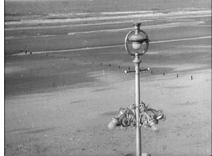 feeling for nature. There’s nothing Surrealist about it. It’s closer to some of the more familiar lyrical studies of the era, like Ivens’ Rain. The accompanying music is modernist with a 1920s feel; a soprano voice weaves subtly through the instrumentation.
The second film, Pour vos beaux yeux (1929), is a fiction film and definitely Surrealist. The story is minimal. A man finds a false eye lying on the ground. He visits a prosthetics shop, makes plans involving maps, and contemplates the eye on a pedestal while wearing a peculiar cylindrical mask (left). Eventually he wraps the eye in a box and attempts to mail the package.
The program notes claim that Storck could not have seen Un chien andalou when he made Pour vos beaux 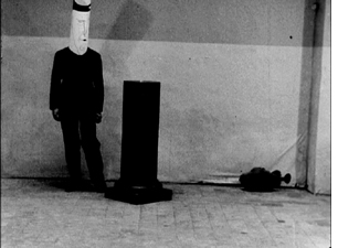 yeux. That’s difficult to believe, given that the film seems almost to be an elaborate riff on that film’s eyeball-slitting shot. There are definite references to Ballet mécanique, and the seashells that line the desk where the protagonist wraps the package recall Germaine Dullac’s La coquille et le clergyman.
Storck had obviously seen Eisenstein films as well, including October. Histoire du soldat inconnu (1932) is made up of footage from 1928, when an anti-war treaty had been signed. The filmmaker uses intellectual montage to make the point that militarism and the institutions that support it are clearly going to make mincemeat of the treaty’s ideals. The approach is pretty simple, juxtaposing marching soldiers with religious processions. At that point in film history, it was probably still a pretty novel idea that one could cut from a pompous politician speaking to a small dog yapping. By now it looks pretty heavy-handed.
Indeed, the next film in the program, Sur les bords de la caméra (also 1932, also incorporating found footage from 1928) uses the same technique with more restraint. It reminded me a little of Bruce Conner’s A Movie, where odd juxtapositions gradually come to seem more sinister and finally disastrous. Scenes of groups exercising, religious processions, shots in traffic and in prison, all add up to a suggestion that a whole population is voluntarily doing regimented things controlled by the police and other authorities.
On my first visit to the Royal Film Archive back in 1979, one of the titles on my to-see list was Impatience, an experimental film by Charles Dekeukeleire. I had seen a reference to it in the British-Swiss journal of film art, Close-Up. Jacques Ledoux, director of the archive, was delighted that anyone should want to see a film by this nearly forgotten director. He urged me to see Deukeukeleire’s other experimental films, all made in the 1920s and early 1930s before he, too, moved into documentary work.
I saw Combate de boxe (1927), made when Dekeukeleire was only 22. Combining negative and positive footage, hand-held camera, rapid montage, masks–pretty much all the devices of the European avant-garde of the day–he strove to give the subjective impressions of the two combatants in the ring. That’s the first of four Dekeukeleire films in this set. It’s an impressive film by a very young, talented man–but not one that suggests the highly original artist that he would soon become.
The last film on disc one skips forward to 1932, when Dekeukeleire made Visions de Lourdes. Beginning with conventionally beautiful mountain vistas, the film slowly moves toward the area around the sacred grotto and finally to shots within the grotto itself. There are shots of shop-windows full of Lourdes souvenirs (including candy made with holy water from the shrine), but these come in fairly late, avoiding a blatant focus on the commercialization of the site and the notion that those hoping to be healed of illness and deformity are being exploited.
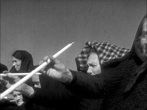
Clearly Dekeukeleire has a more original sense of composition than does Storck. There is a motif of old women selling candles that the filmmaker turns into a series of shots that look like something out of Eisenstein’s Mexican footage–which of course Dekeukeleire could not have seen. (See the image at the bottom, which has enough gap framing to impress even David.) The film is critical of the church, but subtly so–and perhaps mainly because we’ve been cued to take it that way, especially in this case by the dissonant music. I wonder if, in a different context and with a cheerier soundtrack, some of the devout might actually take it as a serious tribute to the healing powers of the saint. They would be mistaken, I think, but the film is understated enough that I think it’s possible.
Disc Two
Dekeukeleire’s two masterpieces, however, were made between these Combat de boxe and Visions de Lourdes. Impatience (1928) is an abstract film that hints maddeningly at a possible narrative situation that never develops. Instead, shots of 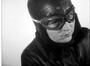 four “personnages,” a woman, a motorcycle, a mountainous landscape, and three abstract blocks are edited together. None of these elements is every seen in a shot with any of the others. Rapid montage, vertiginous views against blank backgrounds, upside-down framings, and ruthless, unvarying stretches of repetition make this one of the most challenging, opaque films of its era.
Perhaps in the wake of post-World War II experimental cinema, where spectator frustration and the denial of conventional beauty and entertainment are often part of a film’s intent (Michael Snow’s Wavelength comes to mind), we are better equipped to understand a film like Impatience, which in its day baffled most reviewers and audiences. Indeed, now Impatience is widely considered to be the best of Dekeukeleire’s avant-garde films.
I think that’s partly because one can at least classify it as an abstract film. For me, his next and longest experimental work, Histoire de detéctive (1929), is even more daring. It purports to present a story in which a 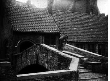 detective named T is hired by Mrs. Jonathan to investigate why her husband has been behaving in a peculiar fashion. T uses a movie camera to record Mr. Jonathan’s actions, and what we see purports to be the results. But, as a title points out, sometimes conditions made T’s filming impossible. What we see are scraps of scenes rather than coherent, continuous footage. The narrative deliberately depends extensively on lengthy intertitles and inserted documents, while the images suggest little in the way of narrative–as when repeated shots show Jonathan lingering on a bridge in the tourist town of Bruges while the intertitles list all the famous sights that he didn’t see (left).
Histoire de détective flew in the face of all contemporary assumptions about the “cinematic” lying in images with as few intertitles as possible. It was audacious in ways that annoyed critics, and its considerable humor went right past most of them. Dekeukeleire apparently realized that his distinctive brand of experimentation had virtually no audience, and he turned to documentaries.
For some reason this program does not include his Witte Vlam (1930), a short Vertovian drama about a protest march broken up by police. It’s not Surrealistic, but no less so than some of the other films included here.
The two final films in the set are by directors who only made one film each. Both refer to Louis Feuillade’s 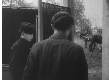 work, suggesting that his serials, though a decade old and more by the end of the 1920s, retained their hold on the Surrealist imagination.
Henri d’Urself’s La perle (1929), is quite self-consciously a Surrealist work about a young man who keeps trying to buy and deliver a pearl necklace to his beloved, only to give it away to a lovely thief who tries to steal it from his hotel room. The thief is only one of several women lurking in the hotel corridors, all dressed in skin-tight body suits that recalls those worn by Musidora in her immortal role as villainess Irma Vep in Les Vampyrs. In true Surrealist fashion, although the hero enters a jewelry shop in a bustling street of a large city, he exits the building directly into country scene (right).
The last and latest of the films in the set is Ernst Moerman’s Monsieur Fantômas (1937), an intermittently 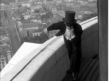 amusing homage to the super-villain of Feuillade’s 1913 serial. Traveling the globe in search of his true love, Fantômas (left, imitating his famous pose from the film’s posters) apparently commits a murder and is investigated by Juve, Feuillade’s clever but perpetually thwarted opponent. Filming on virtually no budget, Moerman set his action mainly on a beach and in an old cloister, thus allowing him to add some of the anti-religious touches so beloved of the Surrealists.
A bit of six-degrees-of-separation trivia: Fantômas is played by Jean Michel, the future father of French actor-singer Johnny Hallyday, who stars in Vengeance, the Hong Kong film by David’s friend Johnnie To that’s playing at Cannes this year.
The Belgian avant-garde cinema of this era is not a little backwater that merits a quick look only by specialists. Storck’s and particularly Dekeukeleire’s works are as sophisticated and challenging as almost anything that was going on in experimental filmmaking of the era, though the latter’s films were so idiosyncratic that they had no noticeable influence.
Back in 1979, when I learned about Dekeukeleire, I was so impressed that I sought to bring him some attention. I wrote an article, “(Re)Discovering Charles Dekeukeleire.” As the title suggests, Dekeukeleire hadn’t fallen into obscurity but had languished there from the beginning. Unfairly so, as I argued in the article, which was published in the Fall/Winter 1980-81 issue of the Millennium Film Journal. With this new DVD set making his and his colleagues work more accessible, I am inspired to revive my old article, which helps explain, I hope, some of what seems to me so original and daring about his early films, particularly Impatience and Histoire de detétective. The piece was written in the pre-digital age, and scanned .pdfs would probably be scarcely readable. So I plan to retype the thing and post it in the articles section of David’s website as soon as possible. [June 4: Done! Now available here.]
I hope that now devotees of animation and experimental cinema will seek out both these DVD sets. The Belgian one is in the PAL format, but without region coding. The Reiniger is also PAL, region 2 coding.
[May 23: Thanks to Harvey Deneroff for a correction concerning the American DVD of Prince Achmed.]
Take my film, please
Kristin here–
As I mentioned in our main entry about Ebertfest, Nina Paley’s animated feature, Sita Sings the Blues, was one of the highlights of the festival. Afterward I had the privilege of moderating the onstage discussion with the director and University of Illinois film professor Richard Leskovsky, who has a special interest in animation.
Sita has not had a regular theatrical release, though Nina has made it available to theaters, festivals, and everyone with access to a high-speed internet link-up. She gives it for free to anyone who wants it, believing that people who see it will pass the word along and that as the film becomes more well-known, it will become more valuable as well. Income should flow in. Nina is confident, some might say cocky about this. The thing is, she may be right. Sita is a terrific film, and I can well imagine a ground-swell of interest gradually building. Indeed, it’s happening already. Here I am, blogging about it, and others are as well. Non-bloggers are emailing their friends. Festivals have booked it up to the end of this year and beyond.
Roger Ebert found Sita early on, and his program notes were also his online review, which begins:
I got a DVD in the mail, an animated film titled “Sita Sings the Blues.” It was a version of the epic Indian tale of Ramayana set to the 1920’s jazz vocals of Annette Hanshaw. Uh, huh. I carefully filed it with other movies I will watch when they introduce the 8-day week. Then I was told I must see it.
I began. I was enchanted. I was swept away. I was smiling from one end of the film to the other. It is astonishingly original. It brings together four entirely separate elements and combines them into a great whimsical chord.
The four elements are: a sketchily animated account of the breakup of Nina’s marriage; the tale of Rama and Sita from the Indian epic, the Ramayana; musical numbers that all borrow recordings of Ms Hanshaw; and three shadow-puppet narrators who try, not always successfully, to recall the details of the Ramayana and its background history. As Roger says, somehow all this achieves complete unity.
The timing of the Ebertfest screening was fortuitous. Within the next few weeks, the DVD release is due. Of course, you can already watch it online and/or burn your own DVD. But for those who can’t or don’t want to, you can buy the DVD package, complete with what is described on the film’s website as a predownloaded copy of the film.
As Roger’s review says, Nina is a hometown girl. She started out doing comic strips and then made some 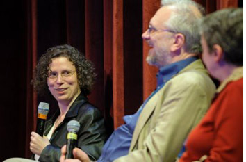 animated shorts before progressing to Sita, her first feature. Her father taught at the University of Illinois. Her mother was an administrator there. Both have supported her in the making and distribution of Sita, and both were present throughout the festival.
Here’s a transcript of our conversation (that’s Nina at the far left, Richard, and me). Applause, laughter, and a fast-talking film director at times defeated my efforts to catch every word of my recording, so some details have been lost.
KT: I know you want to talk about how you’ve been getting the film out to the public, but I’d like to start off by talking about the film itself, which is fascinating. I think we can start with the computer animation. A lot of people think that you were pushing a lot of buttons and somehow the computer was generating the images. But obviously you were generating them yourself by painting and collage and so forth. Could you just start with the process of what you did before you put this material into the computer and then what you did afterwards?
NP: Well, there are a whole bunch of different styles and techniques used in the film. The style of the musical numbers, actually I drew that in Flash using a lot of really simple tools, so the perfect circles have a smoothness that you don’t get by hand. By the way, I want to mention that what you saw was not 35mm. You saw HD-cam, and there are actually 35mm prints of this, and seeing it here was very strange. It was unusually solid, rock solid, a little bit troublingly solid, although that is the ideal that film technology has been striving for. But 35mm prints have all these scratches and splices, and grain and a kind of warmth that moves around, which is almost like a kind of very desirable filter that really warms up the film. So watching it in 35mm is different. I was noticing how computery it looked on the HD projection at this particular size, because I was looking for imperfections that simply weren’t there.
But anyway, yeah, I did some paintings on parchment paper. To me, some things were simple, because I only had me working on the animation, and I used as many computer shortcuts as I possibly could. Most of the technique was what’s called “cut-outs,” so I made pieces of things, moved them around, and the computer does what’s called “tweening.” [i.e., in-betweening, filling in the frames between key points] There’s a little bit of full animation in there. It would take a long time to say everything that I did.
KT: Yeah, but every bit of that visual material was something that you put into the computer in some fashion, so that-
NP: The computer didn’t draw it, that’s for sure. I drew it, whether I started with paper or drawing on a little [digital] graphics tablet or eventually I got what’s called a Cintiq, which is a monitor you can draw on. You can draw straight into a program through the monitor, and so what’s on the monitor-it tricks you into thinking you’re actually drawing on the screen, but it went through both my hand and the computer.
KT: Is this the kind of thing you teach? Do your students learn how to do this kind of animation?
NP: No. I’d love to teach this. A lot of the students are just not [inaudible]. So right now I’m teaching visual storytelling, which is a much more basic class, and I taught something called “classic film and video” for a while at Parsons [School of Design]. I actually really like to teach artists. I’m teaching people who already know what they want to say and already have a voice and just need a little bit of technical-it’s slightly faster if they ask me rather than reading a manual. I learned by reading manuals.
RL: It struck me that you’re a woman artist making an animated feature, and actually one of the very first animated features, done ten years before Snow White and the Seven Dwarfs, was Lotte Reiniger’s The Adventures of Prince Ahmed, which also deals with Eastern myths. You actually did a little bit of the cut-out animation there, too, with the shadow-puppets. That brings a nice circularity-
NP: Well, hopefully this isn’t the last one!
KT: Was that the silent film that you referred to in your film?
NP: I still haven’t seen that film. First of all, everything has influenced me, because everything influences everything else. Culture [inaudible] language, so there’s a language of cell phones, a language of animation that comes from every piece of animation that’s been shared ever. So even if I haven’t been directly influenced by something, I haven’t seen the actual film, I will have been indirectly influenced by it simply keeping my eyes open.
RL: All the Annette Hanshaw songs are accompanied with the Flash animation, but it looked like there was a couple of different styles of Indian art represented there, from different periods. Tell us a little bit about what the choice was.
NP: The Ramayana is thousands of years old, and it also covers an enormous chunk of geography. It’s very popular not just in India but also in Cambodia, Thailand, Polynesia, Indonesia, this huge swath of South and Southeast Asia-parts of China. So there’s just this enormous range of art styles that have come up around it, and the styles I used in the film were influenced by just a tiny, tiny sample of that. Obviously shadow puppets. The designs were derived from puppets from Indonesia, Korea, Thailand, Malaysia, and also India. There’s a whole slew of paintings. There’s lots of Ramayana paintings that were actually commissioned by Muslim [inaudible] who had money. There were collages of these traditional arts. Everything went into the hopper, all going into my head Everything goes in there, grinds up, and comes out.
KT: Traditionally in animation the entire soundtrack is done first, which is not the way it’s done in regular live-action filmmaking, but of course it’s virtually impossible to synchronize cartoons if you have someone doing the voices after the animation is done. So could you tell us a little about the soundtrack and how much of it you had ready by the time you started the visuals?
NP: Well, I should say, the whole production, it’s not like I had everything ready when I started the visuals. The way you’re supposed to make a film, first you’re supposed to write a treatment, and then you’re supposed to write a script, and then you’re supposed to, if it’s animation, have everything designed and do breakdowns and storyboards and this and that, and then at the very end you animate it.
I didn’t have to do that, because it was just me working and it was with a computer. So I came up with things as I was going along. The whole structure of the story was there, because the Ramayana is this very well-established story that’s been told billions of times. I knew that story. I also had the songs, so the first thing that I synchronized and edited was the songs. As I was working on those, I was figuring out how the rest of the film was going to come together. The [inaudible] part of the film was the three narrators, who were just friends of mine who I convinced to go into a recording studio, and I asked some questions about the Ramayana. They were all very busy and went, “Oh, I should have read more before.” The conversation that they had was actually quite typical, because I had so many conversations with so many Indians, who-it was just uncanny, they really captured the twenty-first century zeitgeist of Ramayana, I guess.
RL: That intermission was a bit daring.
NP: I should mention that the 35mm print, depending on where you see it, it has surround sound and the HD only has stereo. If you see it on 35mm, depending on what speaker you’re near, you’ll hear different complete conversations coming out of each. Some of those conversations are extremely funny. I recommend the left rear speaker. There will be Will Franken, who’s a distribution executive, talking about unsellable the film is. And there are people on the front right speaking Hindi. I think they’re saying, “I thought this was a children’s film.”
So, yes, intermission. Old American musicals had intermissions. I was watching some of them while I was working on the film, and sure enough, two-thirds of the way through, intermission comes up. Bollywood films still have intermissions-a three- or four-hour-long Bollywood film has a little gap. So it was a tribute to both old American musical films and all Bollywood films. When I showed the film in Livingston, New Jersey to an audience of primarily Indian-Americans, during intermission they just left for 15 minutes. And they missed my favorite part of the film, which is the part that comes a minute after the intermission.
Nina’s favorite part, shortly after the intermission
KT: I can second that statement about the 35mm, because I was lucky enough to see this film three weeks ago in 35mm at the Wisconsin Film Festival, and it’s a different experience. I’ve enjoyed both of them, but I think there are definite advantages to 35.
It’s actually much easier for most people to see this film on a computer screen or television, because you chose a very unusual way to disseminate the film to the public. Can you talk a little about that?
NP: Why, yes, I can! You can see this film for free online if you go to sitasingstheblues.com and follow a variety of links and get the film. You can get everything from a streaming version from New York Public Television to a 200 gigabyte file from which you can make your own 35mm print if you have $30,000 to download it. Briefly, every file I have for the film is either online now or it’s going to go online. It’s a completely decentralized distribution model. People have compared it to Radiohead’s [inaudible] English model [for their “In Rainbows” album, 2007], but that’s different, because that relied on a single, central location where you got the audio, and it was tracked. It was simply what you decided to pay.
Mine is totally decentralized. I shouldn’t even call it “mine” anymore. It’s yours. This film belongs to you and everybody else in the world. The audience, you and the rest of the world is actually the distributor of the film. So I’m not maintaining a server or host or anything like that. Everyone else is. We put it on archive.org, a fabulous website, and encourage people to BitTorrent it and share it. That’s what’s happening, and we hope people do it more. There’s also broadcast versions, which you can download. If anyone here is from a television station, you can broadcast this for free.
Which begs the question, why is Nina Paley giving her work away for free? Doesn’t she want to get money? The answer is yes, I want to get money, and I believe that I will get money. I think I am getting money from this, because the more people share the film, the more valuable the film becomes. I have told people after screenings that they can get the film for free online, but I have some DVDs which I sell for twenty bucks, and here for twenty-five bucks-the Virginia is still remodeling, so this is for the Virginia.
I should also mention regarding DVDs that we, my mom-Oh, I should mention my mom! Sorry, I[inaudible] my parents, of course, who gave me the gift of life and all that, but my mom, who gave Sita Sings the Blues the gift of being its festival-relations manager, which is a huge, huge job. For those who don’t know, my mom was the main administrator of the math department of the University of Illinois and is a spreadsheet master and business-communications master and stuff like that and has been just essential to the film having such a successful festival life. So, thank you, mom! [Applause]
Anyway, I have made thousands of festival screeners so that festivals will have something to preview, and we’re down to the last 35, or at least we were this morning, and we handed them to the people in the Virginia, and that’s it for DVDs until a few weeks from now I’ll have the new purchasable DVD edition available.
RL: Will there be special features?
NP: Because the film is free, people can subtitle it freely, and the new one will have some subtitles. There’s gonna be more subtitles online. It’s been translated into French and Hebrew and Spanish and Italian and pirate. [applause and laugher covers a stretch of speech] The thing is, the film is now half-way. It will just continue growing, so whatever the DVD is, it’s just snatched off the stuff we have as of this week. So it’ll be the film, it’ll be a bonus feature called Fetch, a film I made, it’ll be some subtitles, I think there’ll be a couple different audio options.
It’ll be a very nice package, because basically what I’m selling is packaging for the film. If you have a computer, you’ve got your own packaging. You just download it. But many people just the same want an actual printed package. There’ll be two editions. There’s the artist’s edition, a limited edition of 4,999 DVDs, because for every five thousand DVDs I sell, I have to pay the licensers more money. You may think that’s too bad, and it’s OK if the other DVD distributors pay the licensers more money, but I [inaudible] paid $5,000 in order to decriminalize the film, so that I wouldn’t go to jail.
Jean Paley from the audience: Fifty thousand!
NP: Fifty thousand, yeah. Fifty thousand dollars is enough.
KT: Which is for the song rights.
 NP: Yes. Those old songs. I cannot thank Roger enough for writing about this film. Also, after he wrote about it on his blog, my colleague, a professor of copyright law here, said, “Does he know about the copyright issue of the songs?” The film uses old songs that were written and performed in the late 1920s. Had they been from 1923, they would be in public domain now. When they were written, they were supposed to be in public domain in the 1980s, but there have been these continuous, retroactive copyright extensions, so they may never enter the public domain.
We were so relieved that Roger agreed that what copyright law has become is really not serving culture or people. These copyright extensions have really gotten way out of control. [applause] They [inaudible] me so much that I actually question copyright fundamentally, but even those who don’t agree, I think, that retroactively assigning copyrights is not actually acting as an incentive for dead artists to create more art.
Whereas these songs. It’s a scandal, these beautiful songs! Many people have never heard of them until seeing my film. That’s just a crime. She was a huge seller in the twenties. Huge! Why is it that we can’t hear her music? It’s because all the rights are controlled by corporations, and anybody who dares to share Annette Hanshaw’s music is risking a lawsuit or jail. As I did. As I decided I was willing to do. I didn’t realize I was doing civil disobedience at the time. I didn’t realize how severe the possible punishments were for doing this kind of thing, but even had I know I would have done it anyway. I have no regrets. Now, I’m turning into a full-time free-culture activist. [applause]
Some of you may know my dad is a retired math professor here. But I grew up in this science and engineering culture. In all these books about copyright, people always talk about scientists and how scientists share information. How it’s really important, this really strong ethic of sharing information. Scientists seek to discover some really great information to share it with the community, and that actually benefits the contributing scientist.
As an artist, it’s actually exactly the same. My status vastly increases as I share this film. But I think it’s quite possible that the way I was growing up here formed me that way, to see it this way. A lot of artists don’t see it this way. People see it as property. I just wanted to share what I’ve been thinking about a lot. [applause]
RL: Has your film prompted an Annette Hanshaw revival?
NP: Not an official one. I should mention that the only reason that these songs exist in a form in which we can hear them at all is because of the efforts of underground record collectors, because the corporations that have the official rights to control this music hadn’t done it. They actually scrapped the masters. There’s no surviving masters of Annette Hanshaw’s recordings, because they were so very valuable that in the forties they were sent for scrap metal. And yet somehow it would be theft if somebody in America released her recordings today.
But yeah, there’s this wonderful network of record collectors who just preserved her stuff on lacquer, and that’s how I originally heard her songs. I was staying in the home of a record collector, and he actually had Annette Hanshaw on 78s. And this is the tip of the iceberg. There’s so much amazing culture that we’ve forgotten all about and can’t get at. There’s this wealth of films that’s just sitting there, that nobody can restore, because if you restore a film you don’t have the rights to, you can get sued for showing it! And it’s very expensive to restore films, so the result is, nobody wants to touch it. Everyone is scared, and our cinematic history is disintegrating. It doesn’t last. Records actually last longer than film.
KT: We should point out that you have a very informative website, ninapaley.com.
NP: Yeah, it’s now blog.ninapaley.com, and there’s also sitasingstheblues.com, and I’m also artist-in-residence at QuestionCopyright.org.
KT: Most of the ways to get the film out to people that you’ve talked about would be DVDs or downloaded copies, but your film is still being shown in a lot of festivals, well into the future.
NP: Yeah, festivals and also cinemas. Hurray for independent cinemas! I support them, and they support me. [applause] There’s some great cinemas programming it. It’s going to be in Chicago at the Gene Siskel Film Center, very soon. And it’s going to be in Vancouver. It’s going to be in some other cities. And there’s no real time limit. There’s no advertising for this film, no paid advertising. The audience is also the public-relations department, so it’s gone completely by word of mouth, word of web, word of blog. There’s absolutely no end time. It can be screened anytime. There are some prints circulating right now, and hopefully any cinema that has a little off time and wants to give it a shot, can program it.
KT: Your mother was telling me that the film will be probably in two hundred festivals.
NP: Not two hundred. I think it’s been in a hundred.
KT: Well, there’s a long list on your website that goes into 2010, I think, so [to audience] you want to tell your friends who live in those various cities, see it on the big screen!
[Note: the list of screenings and festivals on the film’s website numbered exactly 200 as of May 4.]
NP: When I decided to give it away free online, what finally made me realize this was viable was when I realized that this didn’t mean it wouldn’t be seen on the big screen, that the internet is not a replacement for a theater. It’s a complement. Many people will see it online and go, “Wow, I wish I could see this on the big screen!” And so they can, and some people like to see it more than once. Another thing is, you see it online, and that increases the demand for the DVDs. So it’s the opposite of what the record and movie industries say. Actually, the more shared something is, the more demand there is for it. [applause]
RL: Are you doing this for your short films, too?
NP: I would like it for the short films. It’s simply a matter of time. I want to do it with my comic strips. I’m still seeking a volunteer, although someone contacted me from the U[niversity] of I[llinois], I think from the library, whom I need to call. Maybe everything will be scanned and uploaded right here from Urbana, which would be awesome. But yeah, I want to go back. Just as Congress is retroactively extending copyrights, I’m retroactively de-copyrighting all of my stuff and sharing it, because that will make it more valuable. Imagine some original comic strip that everybody knows. That’s much more valuable to people than a comic strip that no one’s ever seen. Andy Warhol, for example. Some Warhol print just fetched some huge price at auction. There was a photo of it up in the newspaper. We all know what Andy Warhol’s prints look like, even though most of us have never seen them in the flesh. We all know that they’re worth a lot, ‘cause they’re famous. They’re famous because people reproduce images of them.
[People do indeed. Here’s another of Nina’s:]


