Archive for the 'Asian cinema' Category
Hands (and faces) across the table
DB here:
In books and blogs, I’ve expressed the wish that today’s American filmmakers would widen their range of creative choices. From the 1910s to the 1960s (and sometimes beyond), US filmmakers cultivated a range of expressive options—not only cutting and camera movement but other possibilities too. Studio directors were particularly adept at ensemble staging, shifting the actors around the set as the scene develops.
You can still find this technique in movies from Europe and Asia, as I try to show in Figures Traced in Light and elsewhere on this site. But it’s rare to find an American ready to keep the camera still and steady and to let the actors sculpt the action in continuous time, saving the cuts to underscore a pivot or heightening of the drama. Now nearly every American filmmaker is inclined to frame close, cut fast, and track that camera endlessly. I’ve called this stylistic paradigm intensified continuity.
As Los Angeles agent and former editor Larry Mirisch once put it in conversation with me: “They used to move their actors; now they move the camera.” Most of today’s prominent directors prefer kinetic camerawork and machine-gun cutting. This tends to make their staging rather simple and static: we get stand-and-deliver or walk-and-talk (subject of a blog entry here).
The result is a split in contemporary American style. Action scenes are often gracefully and forcefully choreographed (though sometimes the editing fuzzes up character position and overall geography). By contrast, conversation scenes, which could be choreographed as well, are handled either as a Steadicam walk-and-talk or simply as seated actors talking to one another, with cuts breaking up the lines and the camera on the prowl. (I discuss some examples in The Way Hollywood Tells It, pp. 128-173.) (1) You sometimes suspect that today’s directors are most at home shooting lots of people hunched over workstations, making the principal form of suspense a LOADING command.
Don’t get me wrong. Like all styles, intensified continuity isn’t a bankrupt option; many fine directors, from the Coens to Michael Mann, have worked vigorous variants on it. What I’m arguing for is more plurality, more tones in the director’s palette. I’ve revived these cranky ideas in discussing a single shot, this time in Variety. Today’s blog entry expands on that brief piece, so you may want to hop over to it here before reading what follows.
Directing us
One task facing any director is to direct—not only actors but us. The filmmaker must direct our attention to what’s important for responding to the drama at any moment. Since the late 1910s, we’ve known that close-ups and frequent cutting do just that. Tight framings and rapid cuts can steer the audience’s attention through a scene. So the question becomes: How can you direct attention without using close views and fast cutting?
Well, for one thing you can place the main action in the center of the picture format. If there are several points of interest in the shot, which is usually the case, you can arrange them symmetrically around the central zone of the shot—in film, usually an zone just above the geometrical center of the picture format. You can also position your main players so that the most important ones are closer and/or facing toward the camera. By turning a character away from the camera, you can drive the audience’s eye to someone else. There are other pictorial cues worth mentioning (lighting, color combinations, patterns in the set design), but these will hold us for now. Add in movement—characters shifting their position, especially coming closer to the camera—and you have a suite of cues that a film shot can provide.
Apart from these purely compositional factors, you the director can exploit some cues that are part of our social proclivities. When we watch other people, we’re attracted to areas of high information—which, for creatures like us, are faces and hands. Faces send signals about what people are thinking and feeling, with the areas around the eyes and mouth telling us most. Hands are the source of gestures, as well as potential threats. And of course if someone is speaking and others are listening, we are likely, all other things being equal, to look at the speaker.
The crucial fact is that in ensemble staging all these cues, and more, are at work at the same time. The director’s skill is orchestrating them so that they support one another, guiding us to see this or that. (On rare occasions, the director will use them to misguide us, but let’s stick with the default for the moment.) For a long time, filmmakers knew intuitively how to coordinate these cues to create rich and intricate shots; I fear that they no longer know how. (2)
That’s what makes one passage in Paul Thomas Anderson’s There Will Be Blood of interest to me. The scene presents Paul Sunday explaining to Daniel Plainview that there’s oil on his family’s property. Daniel and Paul are bent over a map on a tabletop, with Daniel’s assistant Fletcher Hamilton and Daniel’s son HW watching. The scene is presented in a single shot, with a slight camera movement forward at the start.
The composition could hardly be simpler: four people lined up, three at the edge of the table. The heads cluster around the center of the format, with HW lower and off-center; no surprise that he’s the least important character in the scene (though his question to Paul foreshadows action in the film to come). Paul is explaining where the oil is, and the two men’s faces and hands command our attention as they speak.
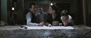
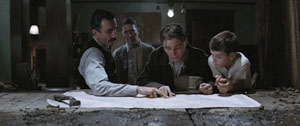
Many directors would have cut in to a close-up of the map, showing us the details of the layout, but that isn’t important for what Anderson is interested in. The actual geography of Plainview’s territorial imperative isn’t explored much in the movie, which is more centrally about physical effort and commercial stratagems.
Questioning Paul about his family, Daniel turns slightly away. This clears a moment for HW to ask about the girls in Paul’s family, and for a moment our attention is steered to the right, to pick up their interchange.
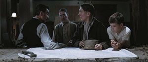
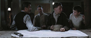
Then Fletcher asks about the farm, and as Paul and Daniel tilt their faces to him, he earns his place in the center of the frame. Before, when we could see the faces of the two men closest to the camera, he was subsidiary, but now he becomes salient. On the left, Daniel shifts away uneasily, turning almost completely away from the camera. In answering Fletcher, Paul turns away in the opposite direction, as if shy or guilty; his awkward gesture of stroking his hat seems to confirm Daniel’s doubts about him.
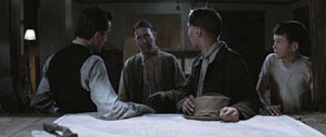
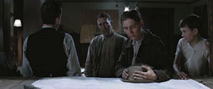
During a pause, Paul turns back to stare directly at Daniel, saying quietly, “The oil is there.” At the same time, Daniel, still turned away, is exchanging a glance with Fletcher. At this point, Anderson’s training of us pays off: we’re ready to detect the slight shift in Fletcher’s eyes, which confirms that Daniel’s looking at him. “Watch their eyes,” as John Ford liked to say.
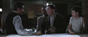
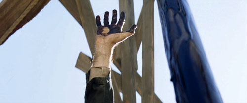
Paul sets out to leave, and he refuses the invitation to stay the night. At this point comes the scene’s biggest gesture. Daniel raises his hand, in the dead center of the frame.
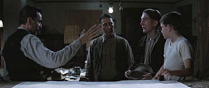
Spreading his long, thin fingers, Daniel commands our attention. He seems at once to be halting the young man and threatening him. But the gesture becomes the prelude to a handshake. Daniel’s characteristic blend of bluff assurance, friendliness, and aggressiveness are packed into this single gesture. (At the climax, other gestures will recall this one.)
Daniel steps closer to Paul, blocking out Fletcher, to make his threat: If he travels so far and doesn’t find oil, he’ll find Paul and “take more than my money back.” Paul agrees and moves away. “Nice luck to you, and God bless.”
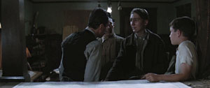
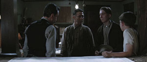
The men watch Paul leave the building. End of scene.
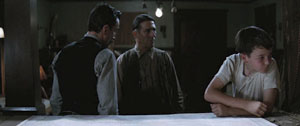
Without any close-ups or cutting, Anderson has skillfully steered us to the main points of the scene, which are carried by the performers. The drama builds through small changes of position, shifts of weight, and facial expressions that accompany the dialogue. (The somber, plaintive music adds an uneasy edge.) Daniel seems more threatening when we don’t see his reaction, and Anderson’s camera forces us to scrutinize Paul’s expressions and body language for signs that this is a scam. It takes confidence to make a raised hand the climax of a scene, but the gesture gains its force by being the most aggressive moment in an arc of quietly accumulating tension.
All the principles involved here—frontality, spacing of figures, slight shifts of compositional focus, actors’ body language—are simple in themselves, but they gain a strong impact by cooperating with one another. The scene’s quiet obliqueness is characteristic of the film, which, at least until the last few minutes, carries us along with hints about where the action might go and what drives its characters.
Yet simplicity shouldn’t imply simplification. Anderson’s willingness to give the shot several points of interest, some more stressed than others, creates an understated tension. The shot’s gravity stems from its conciseness, a quality that Anderson admires in 1940s studio films like The Treasure of the Sierra Madre.
Two more tabletops
The staging strategies Anderson uses aren’t new, as I’ve suggested. They’re part of the history of film as an art form, and many directors have continually relied on them. I don’t think that this is always a matter of influence, although surely filmmakers learned from watching earlier films. Often, directors working within similar constraints intuitively rediscover what other directors have already done.
Consider this scene from Kurosawa Akira’s The Most Beautiful (1944). The setting is a plant where Japanese workers, mostly girls and women, are manufacturing bombsights. The workers have vowed to increase production for the war effort, and they are working to the point of exhaustion. The plant supervisors are worried that the pace will take its toll on the girls.
The scene starts with the eldest supervisor studying the output chart, lying on a table below the frame edge. His colleagues are turned away, at the window. He is the one who must decide how to keep the girls healthy and the output steady. The table and the window will be the two poles of the action, and the actors will oscillate between them. The process starts when the eldest retreats to the window, and one comes forward to study the report.
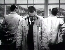
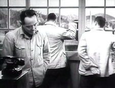
He’s followed by his opposite number, and they echo one other in rubbing their necks. They’re as tired as the assembly-line girls. Their superior turns and says that there’s no point in lowering the quota because the girls are so devoted that they’d push harder anyway.
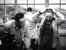
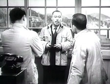
The men have turned to listen to him, driving our attention to his centered, frontal figure. After the elder has turned away again, the man on the right says that this might be the critical juncture. Remarkably, all three men remain turned from us, creating a slight pictorial tension.
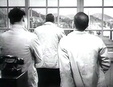
This tension is extended when the supervisor on the left states his confidence in the children, their team leader, and their teacher. This makes the eldest turn around.
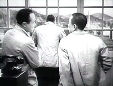
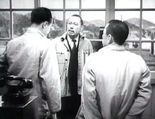
The speaker walks to the window, arguing that the girls will succeed, but the leader turns away again dubiously. He doesn’t offer a decision because an offscreen voice announces that a teacher has come to see them, and they all turn to look.
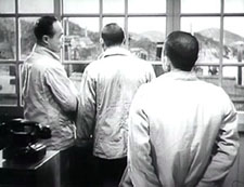
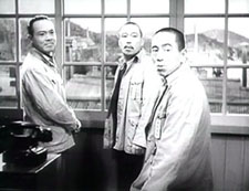
The factory’s problem isn’t solved; the seesawing of the staging has presented that irresolution dynamically. In a single shot, the difficulty of the administrative decision has been expressed in counterweighted movements in and out, by the figures’ frontality and dorsality. Again, it can seem simple, but where a contemporary American director would have given us a prolonged passage of stand and deliver, with intercut close-ups, Kurosawa has created a little ballet out of the men’s uncertainties. Like Daniel’s raised hand, but with even less emphasis, the assistant’s plea on behalf of the girls’ commitment has gained a subtle prominence. Yet all he has done is walk to the window.
I’m not saying, of course, that Anderson took the idea from Kurosawa. Given the initial choice to stage the scene behind a table, and the inclination to present the action in one shot, both directors spontaneously drew on basic staging principles. This is what film directors have always done. So as a finisher, here’s one last tabletop interlude from Cecil B. DeMille’s Kindling (1915). The entire scene is a dense and intricate affair, but let’s pick just one moment. Maggie has become a servant to a rich woman, Mrs. Burke-Smith, and she’s about to be arrested for theft. Detective Rafferty is ready to handcuff her, but Mrs. Burke-Smith changes her mind.
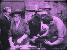
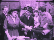
DeMille arranges his actors so that we can’t miss the rich woman’s moment of decision. She is in the foreground, and her face is in the upper center of the frame. The other actors are blocked, so that her expression is the only one we can see clearly at the crucial moment. Her hand gesture, stretching across the central axis of the frame, confirms that she won’t charge Maggie. (For a similar use of “blossoming” actors’ movements in 1910s cinema, go here and look at Figs. 2A10-2A11.) What DeMille knew, Kurosawa discovered afresh, and Anderson hit upon it again.
Strategies of staging, like other principles shaping how films tell stories, lie behind each concrete creative decision the film artist makes. They run as undercurrents through film history, almost never discussed by critics. They form a body of tacit knowledge, flowing across our usual distinctions of period, genre, director, national cinema. We can trace continuities and changes, examining how the strategies are revived, revised, or rejected. They can provide us with subtle but powerful experiences. They constitute a skill set that is available to filmmakers today. . . if any will, like Anderson, seize the chance.
(1) True, Wes Anderson keeps the camera still, but in his frontal, family-portrait framings the cutting and line readings do all the work; dynamic staging isn’t on his menu.
(2) I survey the development of these and other tactics in Chapter 6 of On the History of Film Style. On this site, for one example go here and scroll down to the Bauer material.
Things to like about looking

13 Lakes.
“What I like about looking is how many ways there are to see the same thing.”
Sadie Benning
DB here. Today no extended essay, just some jottings.
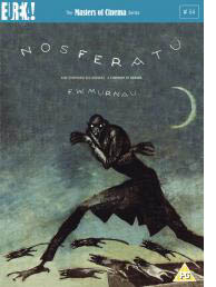 Some day I really must do an extended tribute to the Eureka/ Masters of Cinema DVD line. To call it the UK Criterion is partly right, given the painstaking transfers and the ample supplementary material. But Eureka ventures into some very fresh territory. A company that puts out the terminally peculiar Funeral Parade of Roses (Toshio Matsumoto, 1969) as well as a double-disc set of Mizoguchi’s Sansho the Bailiff and Gion Bayashi deserves points for audacity.
A recent batch of Eureka releases:
*Two cult animation items by René Laloux, Gandahar and Les maitres du temps. Fans of Fantastic Planet and the bande dessinée artist Moebius will snap these up, as much for the large booklets as for the discs.
*Then there’s Nosferatu. You say we’ve already got enough? Nope. First, we can never have too many of this, one of the greatest of silent films. Second, this version looks scarily definitive: a two-DVD set with the Murnau-Stifung restoration and the original score, plus a documentary, plus a book including some primary material along with essays by Enno Patalas, Gil Perez, Thomas Elsaesser, and Craig Keller.
*Sticking with Murnau (who directed, some say, in a white lab coat), Eureka offers a double-disc set of Tabu, also from the Murnau-Stiftung and with previously unseen scenes and title cards.
*Finally, there’s Peter Watkins’ Edvard Munch in its long version, with a booklet including a Watkins “self-interview.”
Unbelievably, many more great movies are on the way. Check the catalogue and preview lineup here.
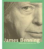 Also from overseas, the Austrian Filmmuseum adds a new title to its Synema book series, alongside Alexander Horwath’s remarkable dossier on Sternberg’s Case of Lena Smith (discussed in an earlier entry here) and many other books on experimental cinema. It’s the first book devoted to James Benning.
I have a personal interest. I met Jim when I came to Madison in 1973. He was working on his MFA in film and art, and he was one of four teaching assistants assigned to me. There was Doug Gomery, already an impressive film historian, soon to go on to fame for his work on the US film industry. There was Brian Rose, one of the most alert cinephiles I ever met, and one of the funniest. There was Frank Scheide, already an expert on Chaplin, Keaton, and their peers. And there was Jim, a master mathematician (helpful for computing grade curves) and the only filmmaker in the bunch. Jim and Frank, both serene, had a calming influence on the rather hyper Rose, Gomery, and Bordwell. It was a great team, my Dirty 1/3 Dozen, and I remember our collective grading sessions fondly.
Jim had already made Time and a Half, but his most famous works, starting with 81/2 x 11 (1974), were yet to come. He left Madison and went on to teach filmmaking at several places, settling finally at Cal Arts. I kept in occasional touch with him and his work. He visited our Wisconsin Film Festival with his remarkable, politically charged Four Corners, El Valley Central, and Los. I’ve seen him more frequently in the last few years because turn up at the same film festivals—me as an observer, him showing gorgeous and provocative films like 13 Lakes, 10 Skies, and One Way Boogie Woogie/ 27 Years Later.
So the book, edited by Claudia Slanar and Barbara Pichler, is very welcome. It just arrived, so I haven’t had a chance to read it through, but I signal it to all those interested in a filmmaker who has been enthralling and surprising us for thirty-five years. Apart from a career chronology and a complete filmography, it features essays by Julie Ault, Sharon Lockhart, Volker Pantenburg, Dick Hebdige, Amanda Yates, Scott MacDonald, Allan Sekula, Michael Pisaro, Nils Plath, and of course Sadie Benning, a mean hand with Pixelvision. Lockhart supplies lustrous shots of some Wisconsin beer bottles in Jim’s collection.
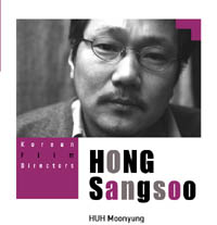 Speaking of books, not beer, the Korean Film Council has just published a series of trim books on major directors, both classic and contemporary. Each volume includes a detailed filmography and a lengthy interview. Some volumes are through-written by a single author, others consist of analyses and appreciations by various hands, including major Korean critics and Asian cinema expert Chris Berry.
The directors honored are Kim Dong-on, Im Kwon-taek, Lee Chang-dong, Kim Ki-young, Park Chan-wook, and Hong Sang-soo. This last volume, edited by Huh Moonyung, includes an homage by Claire Denis and a small essay by me, “Beyond Asian Minimalism: Hong Sang-soo’s Geometry Lesson.”
Books in the series may be ordered here.
Speaking, again, of books. . . The paper edition of Phillip Lopate‘s American Movie Critics: An Anthology from the Silents until Now (The Library of America) has just come out. I found reading the first edition addictive, like eating peanuts and M & Ms. Now we need a second volume including Frank Woods (a critic close to Griffith), Welford Beaton, and other less-known early writers.
In the meantime, the new edition has grown to include an essay on Fincher’s fine Zodiac by Nathan Lee and internet pieces from Stephanie Zacharek (Salon.com) and your obedient servant. I’ve never imagined an essay of mine in a collection that includes my teenage idols Mencken, Macdonald, Sontag, and Sarris, so this volume amounts to a swell early Christmas present. Thanks to Mr. Lopate and Geoffrey O’Brien for all their help.
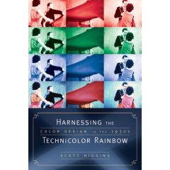
Speaking, yet again, of books. . . A plug is in order for Scott Higgins’ meticulous, engagingly written Harnessing the Technicolor Rainbow: Color Design in the 1930s, just out from Texas. I sat on Scott’s dissertation committee, and I was impressed by his imaginative research methods (e.g., using Pantone swatches as an objective measure of color hues in movies) and his sensitive attention to the way the movies look. Nobody before Scott has analyzed color in film so carefully. Scott is also attentive to production practices, so filmmakers interested in the history of technology should find a lot to chew on here. Several pages of original Technicolor frames support Scott’s case in graceful detail. No beer bottles, however.
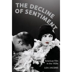
More books from Wisconsin scholars: The above-mentioned Doug Gomery has a new book due out early next year, A History of Broadcasting in the United States. Lea Jacobs’ The Decline of Sentiment: American Film in the 1920s should follow soon. I’ve read the latter already, but both are without doubt worthy of your attention. If you like your American film history at once informationally solid and intellectually daring, you will like these items. Neither Doug nor Lea is a fan of conventional wisdom.
Finally, for fans of Hong Kong cinema: Johnnie To and Wai Ka-fai‘s Mad Detective (I filed a note on it from Vancouver) has been a hit in Hong Kong, beating Beowulf. An analog Lau Ching-wan can thrash a digital Ray Winstone any day of the week. Milkyway Image’s boundlessly energetic Shan Ding has set up a Facebook page as a place to chat about movies and, one hopes, to keep us apprised of developments in Mr T’s upcoming remake of Melville’s Cercle Rouge.
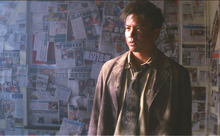
Mad Detective.
PS: Just learned about an informative interview with Jim Benning here, with more ravishing shots from 13 Lakes. This entry also includes several other links to web discussions of Jim’s films.
Sleeves
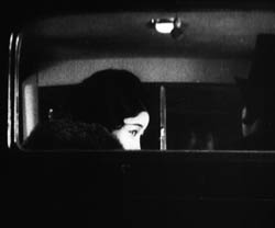
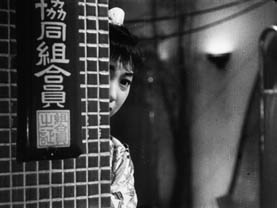
DB here:
Earlier this month, when I was giving a lecture on Mizoguchi Kenji at our university museum, I showed two images from A Woman of Rumor (Uwasa no onna, 1954). It’s a little-known film of his, and it’s probably not up to his finest, but seeing the stills again on the big screen made me want to write about one scene. That scene displays aspects of Mizoguchi’s artistry that I touch on in one chapter of Figures Traced in Light and in the website supplement here.
This blog entry constitutes, I suppose, another supplement. After all, I couldn’t include in the book all the moments in Mizoguchi’s work that I find fascinating. But since comparison is a good way to get under a movie’s skin, my examination of a parallel scene from another movie may have more general interest. Even though Woman of Rumor doesn’t seem to be available on video, maybe looking at this pair of examples would inspire some readers to take an interest in one of the two or three greatest filmmakers who ever lived.
In the court of Regina
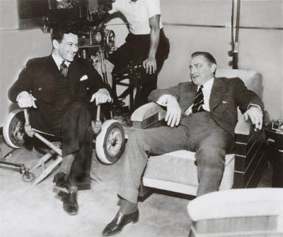
William Wyler and John Barrymore.
What a year 1941 was in the American cinema! We remember it for Citizen Kane but it also brought us How Green Was My Valley (a better film than Kane, I think), and items like Sergeant York (the biggest box-office hit), Dumbo, The Philadelphia Story, Suspicion, Ball of Fire, High Sierra, The Lady Eve, Meet John Doe, The Maltese Falcon, They Died with Their Boots On, and one of the most daring movies ever made in America, The Little Foxes.
An adaptation of Lillian Hellman’s play, The Little Foxes offers a study in unbridled capitalism. It shows how economic interests pit the South against the North and white against black. Psychologically, it analyzes a household gripped by the ruthless domination of the matriarch Regina (Bette Davis), the wiliest member of a family of grasping entrepreneurs. Regina has all but flattened her husband and is trying to make her daughter Alexandra oblivious to the family’s corruption.
The Little Foxes was also bold in its style—in its own way, as venturesome as Citizen Kane. It hasn’t been fully appreciated because Wyler is still thought of as a rather middlebrow talent, an overcautious director who toned down the flamboyance of Gregg Toland’s deep-space and deep-focus compositions.
Some day I hope to blog in defense of Wyler, middlebrow movies, and Midcult art in general. That would involve a detailed analysis of Little Foxes. (1) For now let’s just say that Wyler’s direction of the film won the admiration of no less than André Bazin. Bazin taught us to appreciate Wyler’s work, though with some prompting from Wyler and Toland (as I suggest here). Wyler was also appreciated by Mizoguchi, who, apparently grudgingly, told his screenwriter Yoda that he admired Wyler’s use of the “vertical frame.” (2) Later I’ll suggest one way of understanding that phrase. Mizoguchi met Wyler at the 1953 Venice Film Festival, when Ugetsu Monogatari was up against Wyler’s Roman Holiday for the Silver Lion.
One scene not discussed by Bazin or Mizoguchi, as far as I’m aware, has always gripped me. Regina’s brother Oscar has a wife, Birdie, who has turned into a passive alcoholic. Birdie has learned of plans to marry Xan off to Leo, her shallow son. Her will has been broken by Regina and Oscar, but she summons up the courage to blurt out to Xan that she mustn’t marry Leo, no matter how strongly the family insists. Xan, who has no inkling of how her family twists people to suit their ends, protests that no such thing could happen. But Oscar overhears Birdie warning Xan off.
Birdie and Oscar are about to leave at the end of the evening. Wyler begins with a standard two-shot, very slightly off-center. But as Birdie frantically warns Xan, Oscar’s sleeve and pant leg appear in the lower left of the frame, with the swagged curtain at the doorway hiding his face.
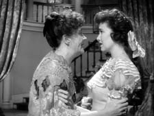
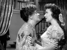
For us, this creates suspense. Only after Birdie has babbled out her warning do the two women notice he’s there. Xan, not knowing how Oscar abuses Birdie, heads off to bed.
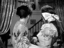
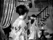
As she climbs the staircase (very important in the film and the original play, this staircase) and heads off to her bedroom, Wyler’s camera arcs to reveal Oscar. Wyler now cuts to show, more or less from Birdie’s point of view, Xan going into her room.
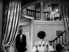

Birdie watches anxiously, then turns to face Oscar, with a look of resigned apprehension.
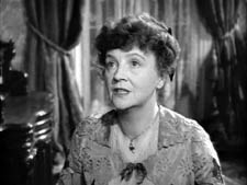
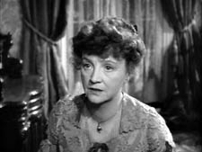
Again suspense: Oscar won’t punish Birdie with Xan watching, but the girl’s departure puts Birdie in jeopardy. In addition, Wyler’s shot of her reaction anticipates the wrath she’ll face. (Patricia Collinge’s fluent performance is equal to the dynamics of Wyler’s visuals.) These cuts anchor our empathy; Wyler has been saving the close-up of Birdie for this moment.
We return to the master framing as Birdie heads toward Oscar, passing into a patch of shadow. As she does so, he raises his hand abruptly.
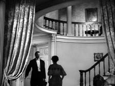
Wyler cuts to a two-shot. Oscar slaps Birdie so hard she seems to bounce against the left frame edge. She cries out and then tries to stifle her voice—a psychologically apt gesture for this woman who muffles her sorrows throughout the film.
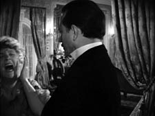
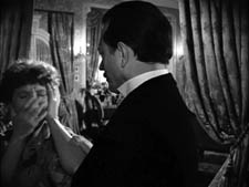
Again, Wyler daringly sets a key action off-center. The brutal discontinuity of the cut, which crosses the axis of action and sharply changes shot scale, accentuates Oscar’s violence. It’s also rather elliptical; run the cut slowly, and you never see his hand strike her.
Xan hurries out of her room and comes to the banister, her face on the upper right balancing the placement of Birdie’s in the prior shot. In the next shot, we see, over her shoulder, Oscar stride out. Birdie follows meekly, assuring Xan that nothing’s wrong. The coda of the scene will emphasize Xan’s puzzled anxiety, a phase in her process of coming to understand the domineering fury that rules her family.
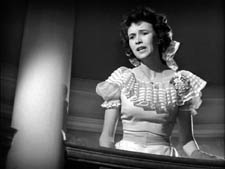
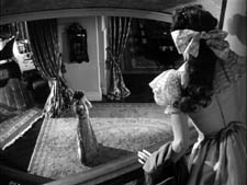
Low- and high-angle shots like this last pair recur throughout The Little Foxes, and I suspect that these are the sorts of thing Mizoguchi was invoking in mentioning Wyler’s “vertical” space. Wyler’s steep angles activate upper areas of the frame that many American directors hadn’t explored.
The act of overhearing a revealing conversation is a standard dramatic convention, but Wyler has refreshed and nuanced it. We know how it would be normally handled. We’d see either a shot showing Oscar stepping fully into the background, or a series of cuts showing first Birdie and Xan and then Oscar listening and watching. Wyler revises the standard schema, taking it for granted that we can pick up on a subtler cue than usual: just a bit of Oscar’s body intrudes.
As a result we have to be more alert. The information isn’t centered, but rather tucked into the lower left. And this option conceals Oscar’s face. Not that we’re doubting he’s angry, but delaying showing his anger builds up greater tension. Wyler, unlike today’s directors, knows when to build up to revealing things that we anticipate, making the final outburst more forceful when it comes. Further, the rest of the scene continues to deny us a clear view of Oscar’s anger, all of which gets squeezed into his gesture of slapping Birdie. It’s Birdie’s reaction that Wyler stresses, and Oscar’s contempt for her is conveyed simply by his bearing, his gesture, and his manner of stalking out of the foyer.
It’s not too much to talk about rigor here. The schemas dominating today’s filmmaking, the stylistic paradigm I call intensified continuity, would demand tight close-ups of everybody from the start. But providing them would make it harder for Wyler to raise the emotion when the startling slap comes. Maybe a contemporary director would render this spike in slo-mo, or with a wobbly handheld camera, but that tends to seem overbearing and pumped-up—as a lot of current stylistic pyrotechnics do. In any case, I’m betting that no American director today would use Oscar’s sleeve in the quietly ominous way Wyler does.
Mizoguchi’s game of vision
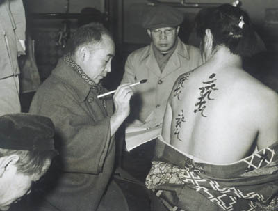
Mizoguchi Kenji, in glasses, during the making of Ugetsu.
Mizoguchi is renowned for his long takes, which are often sustained in distant views featuring considerable camera movement. In the Mizo chapter in Figures Traced in Light, I suggest that these stylistic choices spring from his effort to engage the viewer mesmerically—as he put it, “to work the viewer’s perceptual capacities to the utmost.” He asks us to downshift our attention to the finest details of the action, which he then modulates for expressive effect. I draw examples from various films across his career to show how he creates drama out of remarkably slight differences in character position, lighting, and other factors.
But what happens when he foreswears virtuoso camera movements and single-take scenes and breaks the drama up into several shots? Today, many ambitious directors seem to take pride in stretching out their takes, so cinephiles are sometimes inclined to see a cut as a loss of nerve and a concession to the audience. But I try to show in Figures that Mizoguchi sustains his concern for nuance when he creates an edited sequence. The modulation of fleeting details is to be found in his closer shots too.
In A Woman of Rumor, Hatsuko runs a teahouse that funnels customers to the geisha establishment behind it. She has tried to protect her daughter Yukiko from the shame of her profession. Hatsuko has also been cultivating a young doctor she hopes to marry, giving him money to set up a clinic. Now the doctor, Matoba, has become attracted to Yukiko. The scene I’m examining takes place during the performance of a noh drama. Hatsuko leaves the auditorium and finds Yukiko talking with Dr. Matoba.
As she passes around a screen, she hears Yukiko saying she wants to learn piano in Tokyo. Hatsuko looks left, and Mizoguchi cuts to an approximation of her optical point of view on the couple in the lounge.
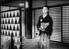
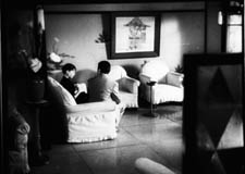
So far, so conventional. Mizoguchi seems to follow the intercutting option for treating a scene of overheard conversation. But he goes further. Having laid out the action, Mizoguchi starts the lesson in just-noticeable-details . . . with a sleeve. He cuts to a reverse shot putting Matoba and Yukiko in the foreground. Hatsuko is still back there, though. We can see her kimono sleeve on the left, poking out from behind the screen.
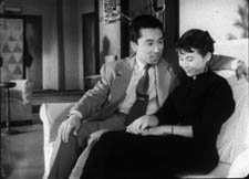
A sharp-eyed viewer might also spot Hatsuko’s shadow on a wall, in the center of the shot, over Matoba’s shoulder. This blow-up shows both the sleeve and her silhouette.
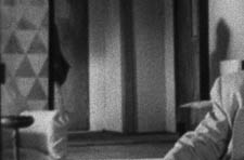
Here, friends, is one reason we want to watch films in 35mm, and projected really big.
It’s now that Yukiko says that she may leave her mother, and Matoba replies, “Maybe I’ll go too.” This is devastating to Hatsuko. The two people whom she loves most seem to care nothing for her. Her shocked reaction is given in a medium-shot showing her shifting out from behind the screen, her face partially hidden.
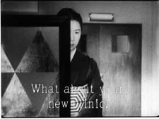
Mizoguchi has picked one variant of the overheard-conversation schema: shot of speakers/ reaction shot of eavesdropper. But he’s done so in his own way, using the barely discernible kimono sleeve to signal Hatsuko’s presence in the full shot of the couple. Likewise, the shot of Hatsuko listening is far from the usual close-up. Like other Japanese directors, Mizoguchi was fond of this arresting single-eye image. He used it earlier in his career, as shown in the first frame at the top of this entry, from Hometown (Furusato, 1930). The second frame is the last shot of his last film, Street of Shame (Akasen chitai, 1956). Quite a shot to end your career on, I’d say.
Most Japanese directors use this single-eye framing as a one-off flourish, but not Mizoguchi. The device epitomizes his demand that we concentrate on a detail. Isolating half a face gives impact to the slightest shift in the eye and eyebrow. Moreover, the split face reappears as a pictorial motif later in the scene.
As Matoba says he’ll go back to Tokyo for his doctorate, Mizoguchi cuts back to the setup for the second shot. Hatsuko moves left to sit on a chair around the corner from the sofa. This prepares for another, more prolonged game of visibility.
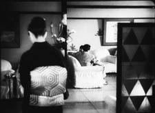
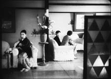
Now we get a thirty-second take of the couple on the sofa. As the scene develops, it becomes evident that Matoba is seducing Yukiko. Hatsuko slips in and out of visibility, her actions responding to and even echoing Matoba’s pressure on the girl. First, as he talks with Yukiko, we see Hatsuko’s sleeve and shoulder, between the vase and his shoulder. But as he slips his arm around Yukiko, her elbow moves aside, in an echo of his gesture.
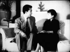
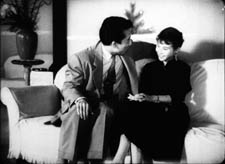
Then, when Matoba presses his attention (“We’ll help each other . . . Depend on me”), Hatsuko’s face pops into view as her fingers emerge to grip the edge of her chair. Mizoguchi then lets her face subside, again slicing it in half.
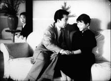
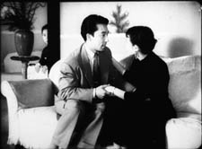
In effect, this shot replays and expands upon the tactic governing the earlier two shots. Again we get the just-noticeable presence of the sleeve, but now rhyming with the action in the foreground. And again we get the facial reaction, impeded by a vertical cutoff, but this time in the distant shot rather than in a closer view. It turns out that those first four shots were training us for this more intricate game of vision.
At the moment Hatsuko’s face is sliced in half, Mizoguchi cuts. Now he prolongs the close view as he had extended the full shot of the couple. In this thirty-second shot, we watch her reaction, played out in slight modulations—changes in her facial expression, changes in the aspect of her face that we see, and changing relations to the curling palm plant in the vase before her.
We get a new angle on Hatsuko, slightly high, as Matoba says, “I’ll tell her.” Hatsuko stands up abruptly and the camera tilts to follow her.
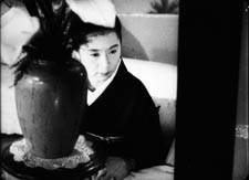
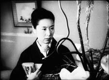
With the simple action of her rising up, Mizoguchi changes his composition sharply. Hatsuko’s position in the frame changes only a little bit, but the massive vase on the left gives way to the curling stalks on the right. Radically refreshing a shot through minimal means is one felicity of Mizoguchi’s art.
Then, as if the full import of Matoba’s betrayal dawns on her, Hatsuko lowers her head sadly. Again her eyes are split up, this time thanks to the twisting stalk. In a characteristic Mizoguchi gesture, she turns from the camera, as if ashamed to face us, but also summoning up reserves for the next emotional shift.
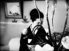
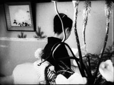
When she turns back, her face burns.
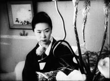
I take this to be the scene’s emotional climax. Mizoguchi could have given it to us much sooner, by having Hatsuko turn angry as she peeped out from behind the screen. Instead, his game of vision allowed him to build patiently toward this unimpeded shot of her reaction. It prepares us for the next stages of the drama, later scenes in which she will confront her patron and launch jealous accusations at Yukiko.
Now we hear the performance ending, and Hatsuko lifts her head. This phase of the scene ends when Mizoguchi cuts to audience members coming into the lounge and greeting her.
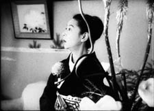
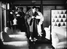
By 1954 Mizoguchi had surely seen The Little Foxes. Had he decided to redo Wyler’s virtuoso staging in his own manner?
Both directors work with similar ingredients: overheard conversation, depth shots, judicious close-ups, and partial views. But the narrational weightings differ. Wyler’s film aligns and allies us with the people talking, whereas A Woman of Rumor ties us to the listener. (3) Wyler’s eight shots take eighty-one seconds; Mizoguchi’s eight shots take about two minutes.
Wyler’s handling is brisk, tense, and remarkably nuanced within the Hollywood tradition. Mizoguchi gives us his scene more sedately, wringing just-noticeable differences out of unassertive performances and simple elements of setting. No slap here, just a drama of wounded pride, lost love, and jealousy played out in the face, back, and sleeve of Tanaka Kinuyo, shifting behind a floral arrangement. What Wyler gives us as one sharp effect, Mizoguchi turns into a delicate, prolonged game of vision.
Am I fussing over minutiae? No; Wyler and Mizoguchi did. We just have to follow where they lead. As I try to show in my essay on blinking in cinema (4), directors attend closely to things that might seem trivial. Our analysis needs to be as fine-grained as their craft and artistry.
Oh, yes: at Venice Ugetsu won the Silver Lion. Wyler had to be content with Roman Holiday’s three Academy Awards.
(1) I sketch some of the possibilities in On the History of Film Style (Cambridge: Harvard University Press, 1997), 225-227.
(2) For more on Mizoguchi’s competition with Wyler, see Figures Traced in Light (Berkeley: University of California Press, 2005), 134.
(3) I’m referring to Murray Smith’s deft analysis of what he calls alignment and allegiance in our relation to film characters. See Engaging Characters: Fiction, Emotion, and the Cinema (Oxford: Oxford University Press, 1995), Chapters 5 and 6.
(4) “Who Blinked First?” in Poetics of Cinema (New York: Routledge, 2007), 327-335.
PS 3 December: Thanks to Michael Kerpan for a name correction, and for the information that Woman of Rumor was once available on a French DVD.
PPS 27 February 2008: Good news. Now Woman of Rumor is available on the wonderful Eureka! Masters of Cinema series, along with the superb Chikamatsu Monogatari. The discs come with voice-over commentary by Tony Rayns and essays by Keiko McDonald and Mark LeFanu.
Scribble, scribble, scribble
Detective (Godard, 1985).
Another damned, thick, square book! Always scribble, scribble, scribble, eh, Mr. Gibbon?
William Henry, Duke of Gloucester, 1781.
David here:
Kristin kept the blogfires burning while I traveled last week and did UW duties this one. I had a great time at the University of Georgia in Athens (but didn’t see Stipe) and at Emory in Atlanta (but didn’t see Scarlett). At both places I met sharp, energetic students and faculty. I have a couple of blog entries backlogged for posting, but now recent items relating to publications get the pole position.
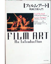 First, a Japanese translation of our Film Art: An Introduction has just appeared. It’s a very handsome version of the seventh edition, rendered by Fujiki Hideaki and Kitamura Hiroshi. We’re grateful to them and to Nagoya University Press for publishing it.
Second, the University of California Press is having a big sale on many outstanding media titles, from Richard Abel’s books on French silent cinema and André Bazin’s classics of film theory to Michele Hilmes’ study of NBC television and Mike Barrier’s new Disney biography, The Animated Man. To get the discount you must sign up for an e-newsletter, but it’s not intrusive.
Among the books of mine on sale, the biggest bargain is the hardcover edition of Figures Traced in Light (2005), originally priced at $65, now going for $7.95 plus postage. (No, apparently I don’t get the full-price royalties.) You can find this item here. There are also paperback copies of Figures (going for $12.95) and of The Way Hollywood Tells It ($15.95). If you’re inclined, hurry: the sale ends on 31 October.
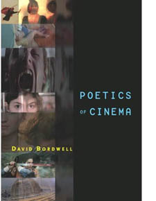 The biggest news, though, is that I just got my author’s copies of Poetics of Cinema, published last week. For a while Amazon was telling some people who pre-ordered it that copies won’t be available until 27 December, but now, despite what it says here, the book seems ready to ship.
Bad news first. Poetics of Cinema is priced at $45 in paperback, with no sellers I know offering it at discount. Go ahead, say it: Very expensive. If you haven’t published a book, you may not know that authors have no say in the pricing of their work. Publishers would never set a price or price ceiling in a contract, and calculations about pricing are based on many factors, including what comparable books sell for. A high cost isn’t my preference, of course; every writer wants to reach as many readers as possible. But unless you blog or self-publish your work, the publisher sets the price.
There are some good reasons for the cost. Running to 500 fairly dense pages and containing over 500 photographs, Poetics of Cinema was a complicated book to produce. I peddled it to other publishers, but they ruled it out as too whopping an investment for them. So Routledge has priced it along lines of comparable books, reckoning in the size of the likely audience (I hope, more than 118.3 readers). I have to thank Bill Germano, then Publishing Director at Routledge, for taking a chance on this project.
From age fifteen or so I’ve been a compulsive writer. Scribble, scribble, scribble. I’ve been at work on one book or another for over thirty years. I’ve got several projects in mind for my next effort, but I’ve held back committing. Is there any point in publishing more books, at least as books?
I mean this as a serious question. Would it have made any difference to me or my readers if Poetics of Cinema appeared as pdfs, available at a price considerably less than $45? Wouldn’t I find more readers? What about variable pricing? If Radiohead can do it, why can’t I? Somebody in film studies should try putting a digital book for sale online; maybe I will. But for a few years at least, this last baggy monster will be available only in dead-tree format.
Poetics: Some puzzles


Gentlemen Marry Brunettes (Richard Sale, 1955).
If you’ve read this far, you may be interested in what the book is about. Most basically, it’s predicated on the belief that we make progress in research by asking questions. Some questions are too deep to be answered—call them mysteries—but others can be answered with a fair degree of precision and reliability. We can turn mysteries into puzzles and puzzles into plausible answers.
Here’s a fairly common sort of composition in Hollywood cinema of the 1940s. This shot from The Killers (1946) displays the sort of steep depth I’ve talked about at various points on this blog and in my other books.
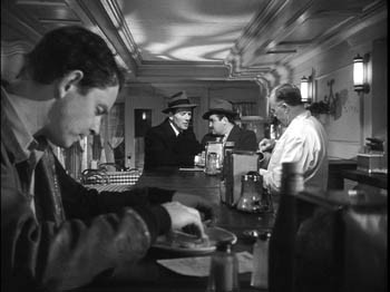
But now here’s an equally tense confrontation at a counter, from Bad Day at Black Rock (1955), made in early CinemaScope.
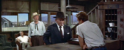
It doesn’t look much like the 1940s shot. The characters stand far from us, and the figure in the foreground doesn’t loom over the background. The shot is more open, the composition more porous. And unlike The Killers, Bad Day doesn’t contain close-ups of the actors in any scenes.
So questions come to mind. Did John Sturges have to stage the scene in Bad Day this way? Did other filmmakers resort to the same choice? What factors created pressures toward this more spacious format? Could more resourceful filmmakers have done something different? And given that such shots are rare today, what changes made it possible for filmmakers in later years to create the tight anamorphic widescreen close-ups we have now (as here in Cellular)?
Despite all that has been written about CinemaScope and other early widescreen processes, no one has explored, shot by shot, what staging options were used by filmmakers. A chapter in Poetics of Cinema called “CinemaScope: The Modern Miracle You See Without Glasses” tries to show how filmmakers used the new format to tell their stories. This led them, I propose, to experiment with some staging strategies that, surprisingly, had precedents as far back as the 1910s.
Take another instance. We’re all familiar with recent films that present alternative futures, like Run Lola Run. A story line runs along and then is interrupted, and we switch to the same characters living a different storyline in a parallel universe. The emergence of such “forking path” movies arouses my curiosity. How do they work? How do they make their alternative-reality stories intelligible to the audience? How is it that we’re able to understand them? (After all, the notion of an infinite number of alternative universes to ours is pretty hard to get your head around.) Are such stories a brand-new innovation, or do they have precedents? (Clue: Remember A Christmas Carol?) Why do we see a cluster of these emerging in recent filmmaking?
I tackle these questions in another essay, called “Film Futures.” There I look at several such movies and try to spell out the tacit rules that filmmakers follow and that audiences pick up on. While this story format probably doesn’t constitute a genre, it does obey certain conventions, and I try to chart those. Some films also make some clever innovations in the format, which I also try to trace. The essay as well suggests how the conventions are handled differently in mass-market films like Sliding Doors and in art films like Kieślowski’s Blind Chance.
These two essays, along with the others in the book, try to explain and illustrate an approach to film studies I call film poetics. At bottom, this is an effort to explain why films are designed the way they are: how filmmakers have made certain choices in order to shape our response to their films. How do movies work? How do movies work on us?
Poetics: The project
Vagabond (Varda, 1985).
As a kind of reverse engineering, film poetics looks at both structure and texture. I argue that we ought to study how films are constructed architecturally, as revealed for instance in plot structure or narration. Poetics also concentrates on stylistic patterning, the way filmmakers organize the techniques available to the medium. Poetics traditionally deals as well with thematics, the subjects and ideas that are mobilized by filmmakers and reworked by large-scale form and cinematic style.
Put it this way: I want to know how filmmakers have confronted problems set by others, or created problems for themselves to solve. I want to know how they draw on the past to borrow or modify or reject creative strategies. I want to know filmmakers’ secrets, including the ones they don’t know they know. And I want to know how all this creative activity is shaped to the uptake of spectators in different times and places.
Some of what I’ve written on this blog could illustrate how the poetics-driven perspective works in particular cases. The book offers more such instances, probed in more detail than is possible here. Using a comparative method, I also trace out some general principles of film form and style as they have developed over history.
The book consists of fifteen essays. Some have been published before; those have been revised for this collection. Other essays are newly written. After a somewhat polemical introduction, the first part concentrates on some theoretical problems. The anchoring essay offers a general introduction to the idea of a film poetics, with several examples. (An earlier version is on pdfs here.) In the same essay, I float a model of how film viewers respond to various aspects of films. I distinguish activities of perception, comprehension, and appropriation, and I suggest that a cognitive perspective sheds light on them.
Part I also contains an essay considering how cinematic conventions work. A poetics-based approach will spend a lot of time on norms, traditions, and received routines, for these are often the basis of filmmakers’ creative choices. This essay argues that some conventions are local and require a lot of cultural knowledge, while others are cross-cultural, compelling us to study why certain cinematic strategies seem to crop up across the world.
The second part of Poetics of Cinema considers narrative, one of the most common ways in which films are organized to affect viewers. I wrote a new essay to launch this section, a wide-ranging study called “Three Dimensions of Film Narrative.” The three dimensions I consider are narration, plot structure, and the narrative world. The essay considers how each of these shapes our understanding of a film’s story. This essay ends with a discussion called “Narrators, Implied Authors, and Other Superfluities.”
Some more tightly-focused pieces follow. One is devoted to forking-path plots. Another concentrates on an odd question: What role does forgetting play in our watching a film? Cognitive theory can offer some answers, and I take Mildred Pierce as an example. There’s an update of an essay that has been something of a golden oldie in film courses, “The Art Cinema as a Mode of Film Practice.” In a supplement to that piece I suggest some new avenues of inquiry and draw on more examples, notably Varda’s Vagabond (Sans toit ni loi).
The longest piece in Part II is devoted to what I call network narratives. Prototypes of this would be Grand Hotel, Short Cuts, Crash, and Babel. This essay tries to show how a poetics of cinema shed light on this format, currently a very popular one. When I started looking at these movies, I was surprised to discover how many filmmaking traditions work in this vein; I append a filmography with nearly 250 items, and today I could update it with several more. (1) I consider how this option has developed distinctive strategies of narration, plotting, and worldmaking. I also survey some common themes running across network tales, such as the role of chance and fate. The essay finishes with more in-depth analyses of four films: Altman’s Nashville, Iosseliani’s Favoris de la lune, Anderson’s Magnolia, and Jean-Claude Guiget’s Les Passagers.
Poetics: More problems
Bus Stop (Logan, 1955).
Part III moves from questions of narrative to questions of film style, no stranger to this blog. The opening essay is a tribute to Andrew Sarris that appraises his role in making readers of my generation style-conscious. It’s the most personal piece in the book. There follows a study of Robert Reinert, a director in the German silent cinema who might have become much better known if his quite demented Nerven and Opium had been as widely seen as Caligari. The essay “Who Blinked First?” considers how our reaction to films is affected by the ways in which actors use their eyes, including how and when they blink. Big deal, huh? Actually, yes.
The monster essay in this section is the CinemaScope piece, of which I’ve given versions in lecture form over the last couple of years. I argue that some directors responded to the new widescreen technology by adapting certain norms of staging and shooting to the new format, while other filmmakers moved in more adventurous directions. The piece uses the model of problem/solution as a way to understand stylistic continuity and change, a framework I’ve floated in On the History of Film Style as well.
The last four studies in Part III are devoted to style in Asian cinema. There are two essays on Japanese film of the 1920s and 1930s, both expanded somewhat from their original versions. There I argue that we can see Japanese directors as building upon, as well as adventurously departing from, stylistic norms shared by most filmmaking countries of the period. This brace of essays fills out some ideas that I fielded in Ozu and the Poetics of Cinema, and they should appeal to that growing body of viewers who have developed a passion for Naruse Mikio and Uchida Tomio. It’s gratifying that several of the films I discuss, which I had to study in archives, are now circulating in touring programs.
Poetics of Cinema concludes with two studies of Hong Kong film, one surveying the stylistic tactics by which that very lively tradition excites its audience, the other analyzing the unique innovations of King Hu. The articles are companion pieces to Planet Hong Kong.
Poetics: The mysteries
A Touch of Zen (King Hu, 1970).
As an approach to answering questions about cinema, poetics blends history, criticism, and theory. It requires that we do research into the artistic history of film, looking at styles, genres, narrative modes, and other traditions. It asks for close analysis and interpretation of films. At the same time, it asks broader questions about what principles govern narrative, stylistic patterning, and the like. I’d say it obliges a historian to concentrate on aesthetics; it makes criticism more historical and theoretical; it ties theory to concrete historical conditions and the fine-grain workings of individual films.
Kenneth Burke used to say that you could get a sense of a book by looking at its first and last sentences. My book’s first essay opens this way:
Sometimes our routines seem transparent, and we forget that they have a history.
I think that this captures my concern to look closely at familiar things in film and try to make their principles a little more evident. Yet in trying to make filmmakers’ choices explicit and tracing out the principles undergirding how we make sense of movies, I’m sometimes criticized for simply stating common sense. Poetics can look bland alongside the skywriting swoops of most academic film theory. But skywriting is blurry and dissolves while you look at it. By contrast, clearly setting out some basics of filmic construction and comprehension offers a firmer place to start answering questions about how movies work and work on us.
Poetics tries to produce concrete, approximately true claims about cinema. Most film theory operates as an application, borrowing big theories of culture, identity, nationhood, and the like and then mapping them onto films. The results are usually thin. It seems to me that most film theory today is not carefully thought through or persuasively argued. For examples, see my essay in Post-Theory, the last chapter of Figures, and my comments here and here on this site.
In trying to establish reliable knowledge about cinema, we won’t answer every question and we will make false steps, but we can make progress. Film poetics is one way we film enthusiasts can join that tradition of rational and empirical inquiry which remains our most dependable path to knowledge. My introduction, though peppered with some pokes at Big Theory, has the serious purpose of making a plea for film scholars to join that tradition.
The final line of the book concludes the essay on King Hu:
The mainstream [Hong Kong] style has given us many beautiful and stirring films, but Hu’s eccentric explorations evoke something that other directors’ works seldom arouse: a sense that extraordinary physical achievement, if caught through precisely adjusted imperfections, becomes marvelous.
To get the full point you need to read the essay, but what should come through here is my concern to highlight filmmakers’ originality when I find it, and to locate it by means of a comparative method. In addition, I hope that what comes through is an appreciation of the sheer exhilaration we feel when a filmmaker has made the right, bold choice. A poetics-based approach probably can’t fully explain this feeling—it may fall under the heading of mysteries rather than puzzles—but at least it can reveal how some forces contribute to it.
My summary, and the size of the book, may leave the impression that I think that I’ve answered these questions fully. Of course I don’t. I try only to make some progress, realizing that offering answers is also an invitation to disagree, to refine the questions and tackle new ones. Nor do I think that these are the only questions that matter. We’re just starting to understand how films work and work on us, and there are a great many areas we haven’t charted. (Performance, to take a big one.) We have to start somewhere, though. I’d hope that by posing some questions and proposing some answers, Poetics of Cinema offers fruitful points of departure.
(1) Some candidates are 25 Fireman Street (1973, Hungary, István Szabó), Feast of Love (2007, US, Robert Benton), Continental—A Film without Guns (2007, Canada/ Stephane Lafleur), The Edge of Heaven (2007, Germany/ Turkey, Fatih Akin), Unfinished Stories (2007, Iran, Pourya Azarbayjani), God Man Dog (2007, Taiwan, Singing Chen [Chen Hsin-hsuan]), A Century’s End (2000, Korea, Song Neung-han), and Why Did I Get Married? (2007, US Tyler Perry).
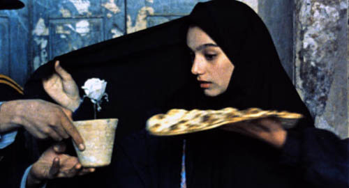
A Moment of Innocence (Mohsen Makhmalbaf, 1996).


