Archive for the 'Asian cinema' Category
Can they make ’em like they used to? continued

DB here:
In the wake of discussions of The Good German, on this site and elsewhere, the idea of a retro-looking movie has surfaced again. American Cinematographer‘s coverage of Casino Royale is very intriguing.
Phil Méheux, the cinematographer, decided that the opening sequence, a black-and-white passage showing Bond earning his 00 status, would pay homage to 1960s Techniscope. Techniscope was an optical process that produced 2.35:1 images without anamorphic lenses. It allowed great depth of field because it could take advantage of the wide-angle lenses available for non-anamorphic cinematography. The most familiar Techniscope images are probably those in Sergio Leone’s westerns.
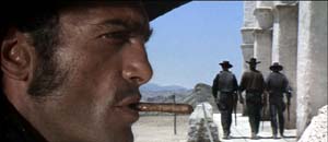 For a Few Dollars More.
Mehaux explains what he wanted for Casino Royale:
With Techniscope, the increased depth of field meant they were able to put things like lampshades and telephone boxes in the foreground, and they didn’t appear amoebic–you could actually see depth in them. In The Ipcress File, there’s a shot where a table lamp is huge in the frame and a man’s face is in the top right-hand corner. I really like that look. Part of the dialogue in our opening sequence was done with very carefully controlled shots that have huge things in the foreground and faces pushed to the corners of the frame. Little things like that echo the Cold War period of spy films.
But, but….
1. In the print of Casino Royale I saw in my local, the opening office scene didn’t really exploit sharp-focus foregrounds. There weren’t that many objects in the foreground, and they weren’t in discernible focus. Of course the cutting was so rapid that it was hard to concentrate on foreground/ background relations.
2. It’s fall of 1965, in Albany, New York. A film geek literally fresh off the farm is in his freshman year of college and goes to every movie in town. He sees The Ipcress File not once but three times. He’s fascinated by its flamboyant technique. He’s just seen Citizen Kane, so he’s impressed by deep staging and big foregrounds in this unheralded spy pic.
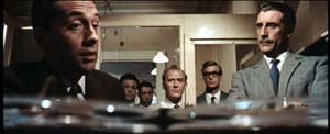
There’s even wilder stuff: a murder victim seen through a hanging lamp, for example.
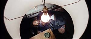
The Geek reads up on long lenses, wide-angle lenses, and so on. Knowing nothing about Techniscope, he wonders how these extravagant shots got made. Just as important, why are they here (apart from looking cool)?
(Spoilers coming up. Skip to 3 if want to retain your innocence.)
After a couple viewings, the Geek begins to get a hunch about what those lampshades are doing there. Throughout the movie, actors are shot in juxtaposition to looming shapes–doors, lecterns, tabletops–which mask large stretches of the set.
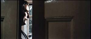
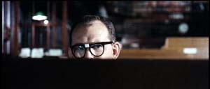
And sometimes those blocking objects are lampshades.
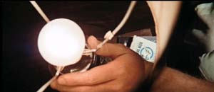
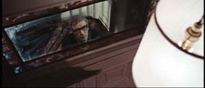
At a climactic moment, our hero escapes from torture and calls his superior officer, who’s framed in the usual off-center way, with a lampshade dominating the shot. It works as a sheer (and pretty) block of solid color.
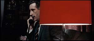
Turns out, however, that this time the shade actually conceals something important. The officer withdraws behind the shade and out pops a guest sitting alongside him.
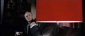
The guest is the arch-villain. Now we know the officer is a traitor.
The Geek dimly realizes three things.
*A movie sets up visual “rules” it will follow or violate. (Later the Geek will call these intrinsic norms.)
*Visual motifs build up across a film, sometimes asking the viewer to notice them.
*A motif can seem gratuitous but that very gratuitousness can be exploited for storytelling purposes. When we see the red lampshade, we assume that it’s another decorative flourish, not a way of hiding information. Earlier sequences suggest that the device is a mannered tic but at the climax it helps spring a surprise. Motifs, the Geek would realize eventually, can fulfill narrational functions–that is, motifs can shape the ongoing flow of story information.
3. Sidney J. Furie was considered a showoffish filmmaker. Michael Caine said he belonged to the look-Ma-I’m-directing school. Certainly the outrageous compositions involving Marlon Brando’s sombrero in The Appaloosa back up that charge.
But like Richard Lester, Ken Russell, and other fancy-pants pictorialists, Furie can at least get us to notice technique. Not bad to cut your cinephile teeth on. Or at least so the Geek thinks, forty years afterward.
4. The AC article also talks about the problem of making poker games interesting. Hong Kong filmmakers figured this out long ago. Martin Campbell, director of the new 007 adventure, should study the crisp card sequences in Wong Jing’s God of Gamblers series. Filmed on a minuscule budget, they put the strained and blandly shot poker scenes of Casino Royale to shame. Incidentally, Wong’s use of diopters yields the sort of nifty depth that Meheux liked in Ipcress.
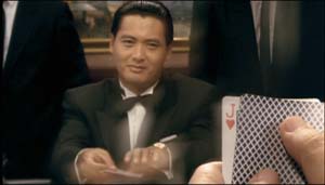 God of Gamblers.
PS: Casino Royale didn’t learn the lessons of the 1960s well enough, in my view. After the sparkling opening credits, it was all downhill. The usual problems: overcut scenes, overcloseupped acting, incoherent chases and fights, uninspired dialogue you recite just before the actor says the line. One landing-strip truck fracas amalgamates Road Warrior, Raiders of the Lost Ark, and Die Hard 2. The makers have indeed updated the Bond franchise. After a series of lame 1970s-looking movies, the franchise has given us a lame contemporary-looking movie.
Granted, I never cared much for the Bond pictures. The Geek liked From Russia and Goldfinger, and Diamonds Are Forever is enjoyable in its wacko way. But for Machiavellian intrigue, Fritz Lang’s Spies remains the gold standard. No one can make ’em like he used to.
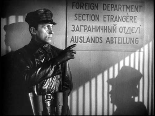 Spies
Spies
Unassigned reading
DB here:
Thanks to the digital engineering efforts of Andy Adams, of Flak magazine, some older research articles of mine are now archived on the site. See the list on the left, or click here. The pieces range from discussions of particular filmmakers (Feuillade, Preminger) and film techniques (e.g., jump cuts) to more general questions about film theory, history, and criticism. Also included is Lingua Franca‘s profile of me. I’ve added some supplementary comments to give a little context. Andy will be adding a couple more essays in the week to come.
This spring my Poetics of Cinema collects other previously published essays, all revised. That collection includes several new pieces as well.
Also, I’ve added two new book reports, one on James Mottram’s The Sundance Kids, the other on Joe Eszterhas’s Devil’s Guide to Hollywood.
A great gift for the film fan on your holiday list: The wonderful book by Teruyo Nogami, Waiting on the Weather: Making Movies with Akira Kurosawa, trans. Juliet Winters Carpenter. This is a trip back to a golden era of Japanese cinema.
Ms. Nogami started as a minor functionary at Toho, shifted to Daiei, and then worked as scriptgirl for Kurosawa. As sharp, funny, and moving as any Japanese film of the 1940s and 1950s, her book gives an engrossing account of the social interactions around moviemaking. You get a sense of the desperate energy of Japanese film production in the late 1940s, when Tokyoites scrabbled for food. Film stock was scarce–directors sometimes could afford to make only one take–and people worked around the clock. To keep going during all-night shoots, crew members injected themselves with philopon (aka speed).
Of course Kurosawa stands at stage center, treated reverently but also with keen observation. You’ll want to read about his relations with producers, composers, cameramen, and tigers. But there are other featured players too. As a schoolgirl Ms. Nogami corresponded with the important 1930s director Mansako Itami, and she took sisterly care of his son Juzo, who would grow up to direct Tampopo and A Taxing Woman.
In all, a document of moviemaking’s many dimensions–technical, financial, artistic, and personal. Donald Richie contributes a warm foreword, and we should thank Marty Gross of Marty Gross Films for initiating the translation.
Cutting remarks: On THE GOOD GERMAN, classical style, and the Police Tactical Unit
DB herer:
For about ten days Kristin and I are off the grid, unable to check email, let alone blog.
In the meantime we’ll backlog some blogs (backblogs) to be posted at intervals. When we get back, we’ll probably divulge where we went.
This is a followup to my entry on The Good German of some days back. I want to talk a bit about editing technique in classical and contemporary film.
Recall that Dave Kehr’s fine reportage on Soderbergh’s Good German appeared in the New York Times. The film is set in postwar Berlin during the late 1940s, and Soderbergh is trying to film it with the production procedures of the time. He’s using boom microphones and incandescent lights, and he’s asking actors to deliver the lines in the forthright manner characteristic of classic studio acting. He’s using prime lenses of fixed focal length (as opposed to today’s zoom lenses with minutely adjustable focal length). Those prime lenses will often be wide-angle ones (e.g., 32mm), the sort that Soderbergh discovered that Michael Curtiz employed at Warners.
Soderbergh will also avoid multiple-camera shooting, which is common for most scenes nowadays; he will shoot single-camera. This has fascinating implications for staging and editing choices. Dave Kehr explains:
If there is a single word that sums up the difference between filmmaking at the middle of the 20th century and the filmmaking of today, it is “coverage.” Derived from television, it refers to the increasingly common practice of using multiple cameras for a scene (just as television would cover a football game) and having the actors run through a complete sequence in a few different registers. The lighting tends to be bright and diffused, without shadows, which makes it easier for the different cameras to capture matching images.
The advantage for directors is that they no longer need to make hard and fast decisions about where the camera will go for a particular scene or how the performances will be pitched. The idea is to pump as much coverage as possible into the editing room, where the final decisions about what goes where will be made.
The danger for a director is that with so much material available, the original vision may be drowned or never really defined; and the sheer amount of exposed film makes it possible for executives to step in (after the director has completed his union-mandated first cut) and rearrange the material to follow the latest market-research reports.
During the studio era it was more typical for directors to arrive on the set, block out their shots and light them with the use of stand-ins; the actors were then summoned from their dressing rooms and, after a brief rehearsal, they would film the lines needed in the individual shot. The crew would then break down the camera and move it to the next setup, as determined by the director.
“That kind of staging is a lost art,” Mr. Soderbergh said, “which is too bad. The reason they no longer work that way is because it means making choices, real choices, and sticking to them. It means shooting things in a way that basically only cut together in one order. That’s not what people do now. They want all the options they can get in the editing room.”
While the editing process now routinely takes months, “I had a pretty polished cut of ‘The Good German’ two days after we wrapped,” Mr. Soderbergh said. “It was shot to go together very, very specifically.”
Let’s start with the concept of coverage.
Shooting to Protect
Consider a traditional conversation scene.
In the classical Hollywood style, most such scenes were shot with a single camera. (In the silent years, big films would be shot with a second camera to provide a negative for foreign markets. This means that in some films, the overseas versions were slightly different, shot for shot, from their US counterparts.)
Your conversation scene will be edited. So how do you film it? Working with only one camera, directors developed procedures for “covering” a scene.
Here’s the default. The entire scene would be played out in a single, distant take, usually called the master shot (sometimes “master scene”–for a long time, filmmakers confusingly called shots “scenes”). The master shot provided an uninterrupted record of the whole scene, and thus served as a reference point for overall set geography, where actors were standing, and so on.
Once the master shot was finished, the filmmakers went on to break the scene down into closer positions. That meant repeating portions of the scene already played in the master. They shot the medium two-shots of the actors talking, the shots of each actor taken from over the shoulder of the other actor, the singles of each player–which might be medium-shots, medium close-ups, or close-ups.
(Sometimes the filmmakers also shot inserts, the detail shots of objects or printed matter that would be inserted into the action, but usually they were filmed another time, or by an entirely different crew under the supervision of an assistant or second-unit director. Often the hands we see in an insert close-up aren’t those of the actor.)
For each different camera position, the actor would have to repeat the relevant bit of dialogue, gesture, or whatever that had already been played out in the master. Must have gotten boring, no?
The question arises: How much coverage do you shoot? Do you have to film from all those angles, and do you have to repeat everything to the max?
One answer says yes. Overshoot. This is the shoot and protect option. Film lots more footage than you can possibly ever use. Film is cheap, and you want lots of options in the editing room. Since in the studio system, directors rarely supervised the editing of their films, the editor worked with the producer, and the producer wanted to readjust the film in the cutting phase–inserting a close-up of the star, tightening the pace, and so on.
Shoot and protect is an insurance policy, and producers still insist on it. In The Way Hollywood Tells It, I quote Swedish cinematographer Sven Nykvist’s remark that American directors shot a lot more coverage than European ones. “I believe that comes from the fact that producers usually have the final cut and they want to have all the material they can get.” In the studio era, producers might want changes and demand reshoots of portions of scenes so the sequence would cut together better.
During the studio era, the most famous director who relied on overshooting is George Stevens. In an interview with Kristin and me, William Hornbeck talked about how Stevens was maniacal about reshooting the scene from every angle he could think of. Then he would run the footage over and over, trying to decide what takes to use. One result of this is a fairly choppy style. The barroom fight in Shane is almost wholly created in the editing room, and some of the cuts are downright clumsy.
Or take the barbecue scene of Giant, where the cuts struggle to extract a throughline of action. Elizabeth Taylor stands on the edge of the crowd, and abruptly Stevens dissolves to an extreme long shot of the festivities.

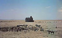
So is the scene ending, as such a reestablishing shot might suggest? No, because we dissolve again to her, now walking to the tree in the foreground, captured in a high angle from a crane.
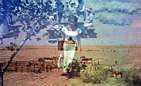
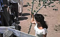
Most directors would have moved Elizabeth Taylor away from the crowd in a single tracking shot, letting the camera follow her approach to the tree. Stevens apparently hadn’t planned or filmed such a shot, so he had to use two dissolves, although there doesn’t seem to be a time lapse. Once Liz gets to the tree, the high angle obscures her face and gesture, so a cut tries to clarify:
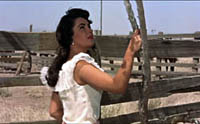
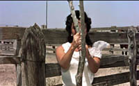
Stevens cuts to a head-on shot of her starting to swing around the tree. But she doesn’t get a chance to complete this gesture because the tree blocks her face and arms. So Stevens cuts away to James Dean, already walking leftward to the car–another interrupted action.
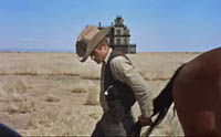
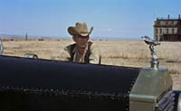
Dean settles down to watch the barbecue from a distance, but instead of getting anything resembling a point-of-view shot, we go back to the uninformative high angle, in which a cowpoke offers Taylor a drink.
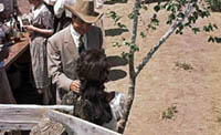
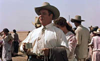
We can’t really see the first man’s gesture, or her reaction, so the dialogue has to carry the whole scene. And this action is interrupted again by another man proposing a toast to the couple. The high angle adds nothing to the scene. Didn’t Stevens film this bit of action from a more straightforward setup? If not, maybe he didn’t protect himself. Whatever happened, this passage seems to be very awkward filmmaking.
Granted, the cuts between Taylor and Dean do parallel them as outsiders and prefigure their alliance later in the film. But the same points could be made with smoother cuts and greater integrity of gesture. The scene’s fragmentation prefigures today’s interruptive editing.
Someone might argue that the jumpy cutting conveys something expressive about the scene (maybe Taylor’s anxiety about making a mistake in front of her new husband’s friends). But this is an all-purpose alibi, which can be invoked to defend any case of poor craftsmanship. My shot’s out of focus because…um…the hero’s uncertain of his identity. Moreover, if we defend the cutting as projecting Taylor’s anxiety, we’re tacitly granting that the scene has failed to convey that through performance, staging, and other techniques.
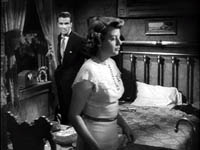
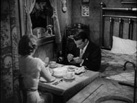
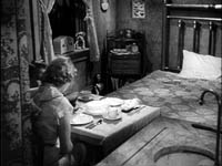
Lest it seem I’m being too mean to Stevens, I’ll just point out that occasionally he took some chances, even using single-shot high-angle staging reminiscent of Mizoguchi. Here’s an example from A Place in the Sun.
Shooting Cut to Cut
“Shooting for protection” sounds a bit defensive and wussy, like you’re afraid to make a choice. Suppose you try another tactic. Suppose you shoot only what you think you will finally cut together.
You might still shoot the master shot for insurance, but maybe not. On the whole, you’d shoot only the angles you’d decided on in advance, or perhaps you would add a few pieces for protection. Basically there would be only one way to cut the scene together. This was called filming “cut to cut” or “cutting in the camera.”
Hitchcock is the most famous exponent of this tactic, thanks largely to his claims that he preplanned everything that appeared on screen. After working out the script, shot lists, and storyboards, he knew exactly what he wanted, he said, and so the actual filming was a little tedious. I think he once remarked that he wished he could phone a film in. In truth, Sir Alfred exaggerated the precision of his planning. Bill Krohn’s excellent book Hitchcock at Work debunks “the myth of the storyboard” (which were often made after filming, to show reporters) and Krohn offers several examples of set improvisation, last-minute changes, tightening during editing, and so on (pp. 9-16). Nevertheless, on the whole Hitch probably shot significantly less coverage than most directors.
So too, evidently, did John Ford. Ford didn’t pre-plan his films to the minute degree Hitchcock claimed, but he achieved enough power in the system to avoid the shoot-and-protect method. According to editor Elmo Williams, whom I once asked about this, Ford had the reputation of giving his cutters almost no range of setups to choose from. If you give ’em a close-up, he supposedly said, they’ll use it. Ford apparently kept track of all the shots he wanted in his head, which may explain some of the mismatches that we find in his films. But it did mean that when the shooting was finished, he could hand the footage over to an editor and go out on his boat.
Another director who filmed coverage sparingly was W. S. Van Dyke, known as Wun-Shot Woody. You can read more about him here.
So there are degrees of coverage, from the maximal coverage of shoot-and-protect to the minimalism of cutting in the camera. Of course you can avoid coverage altogether by shooting your scene in a single take, from a single position (as Hou Hsiao-hsien often does) or with a moving camera. Producers hate this. Christine Vachon calls it “a ‘macho’ style that leaves no way of changing pacing or helping unsteady performances” (The Way Hollywood Tells It, 153). The director who doesn’t provide extensive coverage is a producer’s nightmare.
Camera A + Camera B + Camera C…+Camera N = ?
What about shooting the scene with more than one camera? Before the 1970s, multiple cameras were used chiefly for action sequences, and especially for things that couldn’t be repeated, like an explosion or cars hurtling off a cliff. Multiple cameras were also used for a brief period when sound first came in; watch nearly any film from 1929-1931 on Turner Classic Movies, and you’ll see scenes filmed much as TV sitcoms and soaps are filmed today, with several cameras. (For more on this, see The Classical Hollywood Cinema, Chapter 23.)
On the whole, though, multiple cameras were rarely used until some time in the early 1980s, when shooting schedules were accelerated. Faced with the need to turn out more footage quickly, directors began using “B” cameras to pick up alternate angles. Now a big picture may have “C” camera plus a Steadicam roaming around to grab details. One of my favorite quotes (in The Way, p. 154) is from John Mathieson, DP for Gladiator, who after explaining that by using seven cameras for some scenes, “I was thinking, ‘Someone has got to be getting something good.'” The old Hollywood directors, thinking through the scene shot by shot, knew when they were getting something good; now everybody just hopes.
In effect, as Dave Kehr’s article implies, multiple-camera shooting is today’s equivalent of classic coverage. Soderbergh is right to note that this practice postpones decisions until the editing stage. But it has other knock-on effects on the way the movie looks. I’ll consider just two, which I expand on in The Way.
1) Having reams of footage tends to speed up the cutting rate. Rather than sticking with a few angles, directors offered many choices tend to like a little bit of angle 1, the middle part of angle 2, another stretch of angle 3, and the last bit of angle 4. Four shots arise in the editing process, when maybe a single well-chosen one would do the job.
There are many sources of the fast cutting that rules contemporary cinema, but probably the practice of shooting with A, B, C, and N cameras is one.
2) Multiple camera shooting limits the freedom of camera position that single-camera shooting allows. Obviously, you can’t put Camera B in a position where it will be seen by camera A. In fact, you tend to keep all the cameras at a fair distance from the scene, using long lenses to enlarge the actors.
The implication is that the cameras really don’t work their way into the space as much as they do in single-camera shooting. You can’t put the camera between characters as easily, so Ozu’s characteristic frontal framings aren’t as feasible. Or, going back to Soderbergh’s beloved 1940s, take the variety of angles we find in the conversations between Spade and Gutman in The Maltese Falcon. These can’t easily be replicated with multi-cam staging.
Medium two-shots are also problematic with multiple cameras. (Hence perhaps all the singles and close-ups we get in contemporary films.) And all cinematographers grant that lighting an overall scene so that it looks right from several camera angles requires many compromises.
So I look forward to seeing how, in an age when single-camera coverage is rare, Soderbergh will handle these matters. Will The Good German‘s cutting rate be slower than is common nowadays? (The 1940s and early 1950s saw the widest disparity in average shot lengths in Hollywood’s history, from very short shots to ASLs over thirty seconds.) Will the camera penetrate the space in the manner of the ubiquitous setups of the studio years?
Finally, I’d just like to note that Soderbergh didn’t have to return to the 1940s for inspiration. Classic techniques of coverage, even cutting in the camera, are amply on display in other cinemas.
Mackendrick’s Axiom
Today’s choppy editing style is interruptive rather than integrative. A typical director today doesn’t let a shot ripen to full implication. The cut interrupts the shot rather than coming at the moment that will carry forward what’s been developing in the image.
The British director Alexander Mackendrick once suggested that at each moment the director must prepare the audience for what is going to happen next. If you’re really good, shot A prepares not only for B but for C and D as well. You can study this process in Lang, Ford, Hawks, and other classical directors, but it’s still visible today, I think, if we know where to look.
Yes, the answer is Asian cinema again. Hong Kong, no less.
Johnnie To Kei-fung began his career in television in the 1970s, made a feature in 1980, and returned to shooting TV series in the early 1980s. He shot single-camera cop shows, martial-arts shows, and other dramatic shows. No shot lists, no storyboards–no time! Given the brisk schedules of TV shooting, To mastered the ability to film one shot while thinking about the next three, the way a chess master conceives a string of moves. He makes the determining decisions about the sequence in the flow of production, then fine-tuning them in editing.
Johnnie To shifted to feature filmmaking in 1986, and he has turned out more than forty films since. Sometimes he finishes three films in a single year. His output includes many extraordinary achievements, such as Lifeline (1997), The Longest Nite (1998), Expect the Unexpected (1998), A Hero Never Dies (1998), The Mission (1999), Throw Down (2004) and several others. His two films about Triad life, Election 1 (2005) and Election 2 (2006) have received wide attention, as has his most recent release, Exiled. These last three have been picked up for US theatrical release.
His style can vary a lot from film to film, from the frenetic action of A Hero Never Dies to the hairtrigger poise of The Mission. But in each case you detect a director who makes his stylistic choices and sticks to them. He can structure a scene in his head and he can shoot the result efficiently. He is, we might say, today’s Woody Van Dyke. Except he’s quite a bit better.
Here’s a sequence that exemplifies Mackendrick’s axiom.
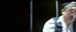
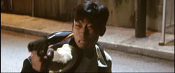
During the climactic gunfight of PTU (2003), a female police officer fires at a gunman. He fires back, and she drops her pistol as she dives back into her car. Then the cop Lo, the hapless slob we’ve been following, seeing the gunman about to fire, dashes out of the shot. This is followed by a shot of the gunman swiveling and firing.
The next shot is the crucial one. Through a rain-speckled car windshield we see Lo fleeing.
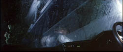
Why shoot from this fancy angle? It does two things at once. It tells us about the fleeing cop’s progress, continuing the action of the earlier shot of him, but it also puts us in the car, implying that the next phase of the action will take place here, rather than on the street. And so it does:
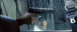
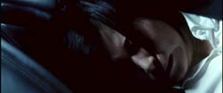
The wounded gunman staggers against the car, and again, instead of seeing his progress from the outside, we’re in the car. We don’t need to see his face, only the gun: director To films the danger. This shot expands on the previous one, keeping us in the front seat, and then gives us new information. The camera tilts diagonally to the policewoman crouching below the window.
The suspense is heightened when To cuts back to the pistol, bumping along the glass.
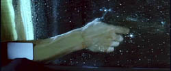
Will the gunman look inside the car? The movement of his arm is continued smoothly in a new angle:
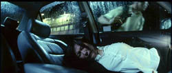
….as he rushes off to the right in pursuit of Lo. Director To gives us both action and reaction in the same concise shot. The policewoman sobs in relief, and this sub-sequence ends with a pause on her.
The sequence has broader implications as well, since this officer has been suspecting all along that Lo has lost his pistol (which he has). Now she has lost hers. After the smoke has cleared, Lo strolls back to her, and the shot echoes the earlier shots taken through the windshield.
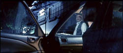
The irony dawns on her–in the heat of battle, it’s easy to lose your weapon–as she glances down at her discarded gun and retrieves it.
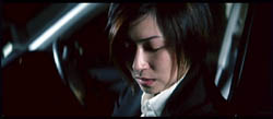
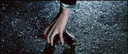
This sequence couldn’t have attained such precision if it were filmed with several cameras snatching shots, hoping to get something; nor with shoot-and-protect coverage. The passage is conceived cut to cut, in the director’s head. Each shot makes one or more points succinctly and leads us crisply to the next bit of action. When I asked Mr. To about the shot of Lo fleeing, seen through the windshield, he seemed surprised that I’d wonder. “Of course! You have to let people know they’ll see her in the car.”
I Wrote a Book, But…; or, What Did the Professor Forget?
My 1988 book, Ozu and the Poetics of Cinema, is available again, I’m happy to report. There’s a little backstory, probably of interest only to those who follow the zigzags of academic publishing.
Around 1990 the British Film Institute declared the book out of print. The US copublisher, Princeton University Press, agreed to keep it in print under two conditions.
First, I would have to pay for the cleaning of the preprint material (the sheets of plastic on which the master copies of the pages were printed). Cost: $1000. Second, I would receive no royalties. I agreed to the terms, since I wanted to have this book, for all its faults, available.
So for about a decade, the book was still out there. I enjoyed the anecdotal value of getting royalty statements reading: Your royalty payment is $000.00. Still, all those decimal places sort of rubbed it in. Wouldn’t $0 have been enough?
As Ozu’s centenary approached in 2003, I contacted Princeton to alert them. Maybe there’d be a bump of interest in Ozu, and they might want to do another printing. But the Press replied that, um, they had some months before declared their edition out of print.
Publishers have a habit of not telling authors about decisions like this. There’s no fun way to announce that a book is orphaned, or maybe slain. Then too there’s the somewhat awkward matter of returning a piece of intellectual property that might become an asset some day. Anyhow, Jerry Bruckheimer wasn’t likely to pick up the movie rights to Ozu and the Poetics of Cinema, and so after regaining copyright control, I took the book on the road.
No surprise: Other publishers were not crazy about reprinting a big fat book with lots of pictures, published fifteen years before and probably bought by every soul who might ever want a copy. I’d hoped that a book on very likely the greatest film director who ever lived might be worth keeping around. But no, alas.
Every month or so, as the Ozu touring program roamed greater North America in 2003 and 2004, a fan would email asking me to sell a copy of the book. Web booksellers were demanding up to $600. The thought of selling one to a book dealer at a jacked-up price, perhaps with a signature affixed, did cross my mind, but I had only two copies of my own.
Eventually I learned of the publishing program launched by the University of Michigan Center for Japanese Studies. The Center had begun posting out-of-print books on Japanese cinema online. I contacted Markus Nornes, who generously sponsored and oversaw the project.
I learn from a correspondent that the book is now available in pdf form online.
Now you can read the book, and can even buy a print-on-demand copy if you want. (I look forward to the $000.00 checks from Ann Arbor.) The downside: The 500-plus pictures range from tolerable to terrible. I also planned to write an introduction with updates and corrections, and I still hope to do that. There’s even talk about replacing some stills, perhaps with color frames.
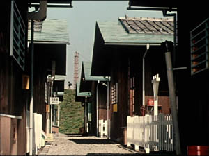
So if you’re interested in Ozu, Japanese film history, or the poetics of cinema, you might want to check this out. Of course you can instead crack your piggy bank and order the single copy of the original I’ve found on what our President calls the Internets.
If I were in an Ozu film, I’d probably now emit a sigh mixing satisfaction and resignation. Then I’d reach for a beer. Or at least an orange drink. No, a beer.
Update, November 10: I’d thought that print-on-demand copies would be available, but Carsten Czarnecki points out that the Center site doesn’t seem to indicate that. I’ll check further.
Update #2, same day: Our keen-eyed web tsarina Meg has found still other copies of the original book available, at prices starting at $118.95, here. Please remit 10 % finder’s fee to her.
Update #3, November 11: Markus tells me that we hope eventually to offer print-on-demand copies, but the technology doesn’t yet meet the Center’s standards. Good! We want nice-looking images, when we can finally get ’em.


