Archive for the 'Comic strips and cartoons' Category
Catching up 99%
Clash by Night.
DB here:
Amplifications, corrections, and updates have been piling up over the last couple of months, and we began to realize that simply appending postscripts to older entries probably didn’t register with many readers. Judging by our stats, revisiting older entries isn’t a priority for most of the souls whom fate throws our way. So here’s some new information about older posts.
*I wrote about Jafar Panahi‘s This Is Not a Film at the Vancouver International Film Festival. Today Variety reported that an appeals court has upheld Panahi’s sentence of six years in prison and a twenty-year ban on travel and filmmaking. His colleague Mohammad Rasoulof’s jail sentence was reduced to a year. Panahi’s attorney says that she will appeal the decision to Iran’s Supreme Court. Be sure to read the Variety story for some background on the despicable treatment of other filmmakers, notably a performer who, merely for acting in a movie, was sentenced to a year in jail and ninety lashes.
 *My trip to the Hong Kong festival last spring was to have included a visit to Japan. But the earthquake and the tsunami decided otherwise. Here are two remarkable items about the country’s catastrophe and the people’s resilience. First, a camera captures what it’s like to be in a car that’s swept away. Then we have photographs of the remarkable recovery that some areas have made–a real tribute to Japanese resilience. (For the links, thanks to Darlene Bordwell and Shu Kei.)
*At Fandor, in response to Once Upon a Time in Anatolia, Ali Arikan wrote a penetrating and personal essay that I wish I’d had available when I wrote my review at VIFF.
*Tim Smith‘s guest entry for us, “Watching you watch THERE WILL BE BLOOD,” was a huge hit and went madly viral. At his site, Continuity Boy, he has posted a new, no less stimulating entry on eye-scanning. It shows that we can track motion even when the moving object isn’t visible!
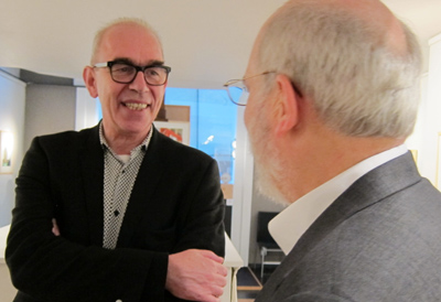
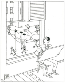
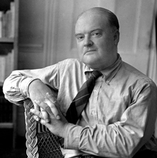
*During my trip to Brussels in early September for the conference of the Screenplay Research Network, I stole time to visit the superb Galerie Champaka for the opening of its show dedicated to Joost Swarte (above). Longtime readers of this blog know our admiration for this brilliant artist, so you won’t be surprised to learn that I had to get his autograph. The show, consisting of work both old and new, was also quite fine; it’s worth your time to explore the pictures, such as the one revealing how Disney was inspired to create Mickey (above). Thanks to Kelley Conway for taking the shot, and to Yves for taking this one. And special thanks to Nick Nguyen (co-translator of two fine books, here and here) for alerting me to the show.
*An update for all researchers: Now that we have online versions of the Variety Archives and the Box Office Vault, we’re happy as clams. (But what makes clams happy? They don’t show it in their expressions, and their destiny shouldn’t make them smile.) Anyway, to add to our leering delight, we now have the splendidly altruistic Media History Digital Library, which makes a host of American journals, magazines, yearbooks, and other sources available in page-by-page format, ads and all. You’ll find International Photographer (too often overshadowed by American Cinematographer), The Film Daily, Photoplay, and many more. Get going on that project!
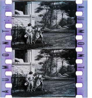 *This just in, for silent-cinema mavens: The Davide Turconi Project is now online, thanks to a decade of work by the Cineteca di Friuli. Turconi was a much-loved Italian film historian who, among other accomplishments, collected clips of frames from little-known or lost films. The archive of 23,491 clips, usually consisting of two frames, is free and searchable. On the left we see a snip from Louis Feuillade’s Pâques florentines (Gaumont, 1910). Paolo Cherchi Usai and Joshua Yumibe coordinated this project, with support from Pordenone’s Giornate del cinema muto, George Eastman House, and the Selznick School of Film Preservation. (Thanks to Lea Jacobs for supplying the link.) For more on Josh’s research, see our entry here.
And while we’re on silent cinema, Albert Capellani is in the news again. Kristin wrote about this newly discovered early master after Il Cinema Ritrovato in July. A recent Variety story discusses some recent restorations and gives credit to the Cineteca di Bologna and Mariann Lewinsky.
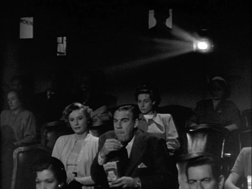
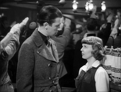
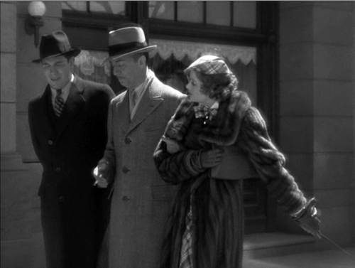
*My entry on continuous showings in the 1930s and 1940s attracted an email from Andrea Comiskey, who points out that when Barbara Stanwyck and Paul Douglas go to the movies in Clash by Night (above), she prods him to leave by pointing out, “This is where we came in.” Thanks to Andrea for this, since it counterbalances my example from Daisy Kenyon, which shows Daisy about to call the theatre for showtimes. And since posting that entry, I rewatched Manhandled (1949). There insurance investigator Sterling Hayden hurries Dorothy Lamour through their meal so that they’ll catch the show. He apparently knows when the movie starts. So again we have evidence that people could have seen a film straight through if they wanted to. It’s just that many, like channel-surfers today, didn’t care.
*Finally, way back in July, expressing my usual skepticism about Zeitgeist explanations, I wrote:
I’m still working on the talks [for the Summer Movie College], but what’s emerging is one unorthodox premise. As an experiment in counterfactual history, let’s pretend that World War II hadn’t happened. Would the storytelling choices (as opposed to the subjects, themes, and iconography) be that much different? In other words, if Pearl Harbor hadn’t been attacked, would we not have Double Indemnity (1944) or The Strange Affair of Uncle Harry (1945)? Only after playing with this outrageous possibility do I find that, as often happens, Sarris got there first: “The most interesting films of the forties were completely unrelated to the War and the Peace that followed.” Sheer overstatement, but back-pedal a little, and I think you find something intriguing.
David Cairns, whose excellent and gorgeously designed Shadowplay site is currently rehabbing Fred Zinnemann, responded by email:
Firstly, I find the start of WWII being equated with Pearl Harbor a little American-centric. Much of the world was already at war when that happened. Secondly, it could certainly be suggested that the two films you cite WOULD have been different without a world war. Billy Wilder and Robert Siodmak were comfortably making films in France before Hitler’s invasion drove them to a new adopted homeland. Those movies might well have happened without WWII, but they would probably have had different directors.
Thanks for this. Your points are well-taken. Not only was I America-centric, but I neglected to point out that before Pearl Harbor America was more or less directly involved in the war. Even though America wasn’t yet in the war in late 1941, a lot of the economy was on a war footing and the industry was already benefiting from the rise in affluence among audiences.
Your point about the particular directors is reasonable too. I think I chose bad examples. All I wanted to indicate was that the Hollywood system continued to function as usual, particularly with respect to narrative strategies. For instance, Chandler wrote the screenplay for DOUBLE INDEMNITY (and apparently was responsible for the flashback construction), and as you say, had another director handled it, at the level of narration it might well have been the same. UNCLE HARRY is a harder case for me, I admit! Maybe I should have chosen THE BIG SLEEP and MURDER, MY SWEET!
David replied with his usual generosity:
That’s OK! BIG SLEEP and MURDER MY SWEET definitely work! Plus any number of non-flag-waving musicals, westerns, swashbucklers (though there’s a little propaganda message in THE SEA WOLF at the end) and certainly comedies and horror. . . .
And then there’s KANE and AMBERSONS.
Better late than never–something you can say about all these updates.
Scriptography
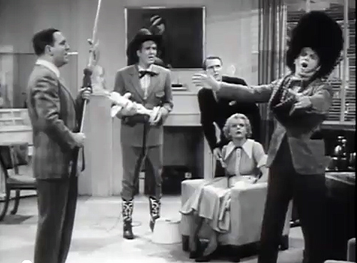
Hollywood screenwriters at work, according to Boy Meets Girl (1938).
It’s not every conference that opens a morning session by asking the men in the audience to take off their underwear.
But I anticipate.
Last weekend I was a guest of the Screenwriting Resource Network’s fourth annual Screenwriting Research Conference in Brussels. I think that a hell of a time was had by all, and I learned quite a bit, including some reasons why people are interested in screenplays.
Schmucks with Underwoods
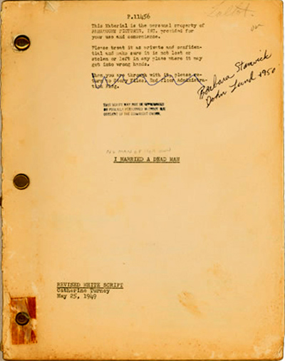
Catherine Turney script for No Man of Her Own (1950).
In my youth, there seemed to be a solemn pact among my peers that we would never study certain areas: censorship, audiences, adaptation (novels into film, particularly), and screenwriting. An earlier generation had, through patient labor, shown decisively that these subjects were dead boring. We, on the other hand, were fired by notions of the director as auteur, and indifferent to what were called “literary” and “sociological” approaches to film. So we triumphantly turned toward The Text—that is, the finished movie.
Things have changed since then. Yet there are still tempting reasons to consider the study of screenwriting a nonstarter if you’re interested in cinema as an art. If you think of the finished film as the achieved artwork, then study of screenplay drafts risks seeming irrelevant. Whatever the screenwriter(s) intended seems irrelevant to the result. So what if six or more screenwriters labored over Tootsie? The movie stands or falls by what we see onscreen.
This was the view presented in Jean-Claude Carrière’s three talks to our group. He suggested that the screenplay is destined to become landfill, and rightly so. It’s like the caterpillar that becomes a butterfly. Once the film has been made, the script has no intrinsic value.
Someone might say, “Wait! We study a painter’s sketches, a novelist’s drafts, or a composer’s early scores. These materials can contribute to understanding the finished work, and sometimes they have an artistic value of their own.” The problem is that in these arts, the preparatory materials are in the same medium as the result. But a script can’t count as a version of the film because prose can’t adequately specify the audiovisual texture of a movie. It’s commonly thought, plausibly, that giving the same script to two directors would result in significantly different films. So the script is at best a series of suggestions for filming, not a sketchy version of the movie. Why not discard it when the film is done?
The study of screenwriting has probably also lain in the shadows because of the proliferation of screenwriting gurus and how-to manuals. Every American over the age of eighteen seems to be writing a screenplay; the Cable Guy who visited me last week was working on two. So all the seminars and advice books have arguably put thinking about screenplays rather close to the amateur-script racket.
Moreover, screenplay studies seem to be part of a broader, paradoxical development in academic film studies. Today scholars have more access to films than ever before, thanks to video, festivals, archives, and the internet. Yet many researchers prefer to talk about everything but the film. More and more scholars want to study just those subjects that my cohort considered dull or irrelevant: censorship and regulation, audiences (composition, demographics, critical reception, fandom), and preproduction factors (storyboards, scripts). In addition, many academics have turned to bigger thematic ideas like film and architecture, film and the city, film and modernity. These trends of research usually make only glancing reference to actual movies, mostly mining them for quick illustrative examples.
In sum, many academics have abandoned the study of film as an artistic medium that finds its embodiment in important works. To get to know particular films more intimately, you increasingly have to go to the Net, to writers like Jim Emerson, Adrian Martin, and other sensitive analytical critics. Talking about screenwriting can seem to be another way of avoiding coming to grips with the intrinsic power of movies.
You can probably tell that one side of me shares some of the biases I’ve listed. But when I remind myself that what people should study aren’t topics but questions, I cheer up quite a bit. For there are, I think, worthwhile questions to be asked about all these areas, screenwriting included. The Brussels event gave some good instances of resourceful, occasionally exciting research into them.
Based on my short acquaintance, most of the research questions seem trained on one of two broad areas: Screenwriting and The Screenplay.
In the trenches
Kinky & Cosy
Screenwriting can be thought of as a practice, a creative activity with both personal and social aspects. How, we might ask, do screenwriters or directors express themselves in the script? How does a media industry recruit, sustain, and reward screenwriters? What are the conventions and constraints at work in a particular screenwriting community?
Questions like this are somewhat familiar to me. When I wrote my first book, on Carl Dreyer, I had to examine his scripts (notably the unproduced Jesus of Nazareth), and that helped me understand his characteristic methods of researching and planning his films. Later, when I collaborated with Kristin and Janet Staiger on The Classical Hollywood Cinema, I recognized a more institutional side of things. We can see from the films of the 1910s that filmmakers were cutting up the space in fresh ways. But this wasn’t a matter of directors simply winging it on the set. Kristin used published manuals and Janet used original screenplays to show that shot breakdowns were planned to a considerable degree before shooting. This habit made production more efficient and controllable.
At the Brussels get-together, Steven Price offered further evidence of this sort, which displayed some of his research on early scenarios for Mack Sennett movies like Crooked to the End (1915). Interestingly, Steven found that sometimes the later version of a continuity script was more laconic than the initial one. Perhaps the gags, once spelled out in the first draft, could be left up to the actors. This is the sort of thing he identified as a “trace” of production practices.
A parallel of sorts emerged in Maria Belodubrovskaya’s paper on screenwriting under Stalin. The Soviets, admiring Hollywood efficiency, tried to come up with a similar system. But their efforts to produce films in bulk were blocked by a censorship apparatus bent on ideological correctness. No surprise there, I guess. But Masha showed convincingly that the very efforts to mimic Hollywood’s “assembly-line” system also discouraged authors from submitting scripts. The writers thought (like many of their LA counterparts) that such a setup denied them creative freedom. In addition, the prospect of story departments providing a stream of screenplays ran afoul of the tradition that gave the director control of the final draft. And the role of producer, as one who could steer the whole process, didn’t exist! So much for the Soviet Hollywood.
What about other media? Sara Zanatta traced out the process of creating Italian TV series. She reviewed some major formats (miniseries, original series, adaptations of foreign series) and then took us through the process of creating individual episodes. Interestingly, it seems that the Italian system, unlike US television, makes the director the boss of it all. Frédéric Zeimat explained how he gained entry to the local screenwriting community through his university education, including work in Luc Dardennes’ workshop at the Free University of Brussels. Eventually he came up with a script that won prizes. He is about to become a showrunner for a sitcom.
One of the most stimulating panels I heard considered the writing of graphic novels and animation. Richard Neupert explored how recent French animation sustained the tradition of individual authorship while still acceding to some international norms of moviemaking. The cartoonist Nix discussed how he faced new problems in transferring his three-panel comic strip Kinky & Cosy from print to television. TV demanded less written text, especially signs, so that the clips could be exported outside Belgium. More deeply, Nix had to rethink how to pace the action and leave a beat (say, two seconds) after the punchline.
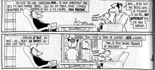
Pascal Lefèvre, one of Europe’s leading experts on comic art, provided a brisk, packed account of the history and practices of scriptwriting for Eurocomics. He described patterns of collaboration, format, and creative choice, placing special emphasis on comics as a spatial art different from cinema. His example was a page from Regis Franc’s ulta-widescreen album Le Café de la plage. Here’s a portion in which two periods of Monroe Stress’s life coexist in a single space. He muses as an adult while his childish self gobbles up food under the guidance of Mom.
Comics space can also change abruptly, as when a window appears in second panel.
Other papers presented less institutionally fixed, more personal versions of screenwriting as a practice. Kelley Conway’s lecture on Agnes Varda exploited unique access to the filmmaker’s notebooks, scrapbooks, and databases. Kelley showed how Varda conceived three of her documentaries by means of strict categorical structures that were then frayed by digressions born out of the material she shot.
Anna Sofia Rossholm provided something similar for Bergman. Out of the vast Bergman archive she quarried sixty “workbooks,” typically one for each film. Whereas Varda’s books were filled with cutouts and images, Bergman was a word man, treating the books as diaries that recorded “this secret I.” Anna Sofia proposed that in his jottings and planning, Bergman not only communed with himself (calling himself an idiot on occasion) but also explored patterns of doubling akin to those we find in the films. The workbooks evidently held a special place for him: he included their pages in films like Hour of the Wolf and Saraband.
David Lean might be thought of as working in between the Hollywood system and the more personal European milieu. Ian Macdonald suggested that one of Lean’s unfilmed projects sheds light on what he calls screenplay poetics. Macdonald seeks, I think, a principled method for studying the creative process. He does this by tracing how a screen idea is transformed in a series of documents generated by the creative team. The process, he points out, is governed by the participants’ various conceptual frameworks. For Nostromo, Lean solicited two screenwriters and oversaw their rather different versions of the novel. Ian showed that Lean seems to have found solutions to adapting the book by fitting it to the three-act structure advocated by Hollywood artisans, a concrete case of a filmmaker accepting a fresh “poetics” or set of creative constraints.
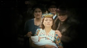
All of these inquiries could lead to more general thoughts about the creative process in cinema. For some filmmakers, it’s a professional task, undertaken with full knowledge that problems and constraints will have to be dealt with. For others, such as Bergman and Varda, it’s obviously deeply personal, even autobiographical. Perhaps most intimate was the film discussed by Hester Joyce. New Zealand filmmaker Gaylene Preston based Home by Christmas (2010; above) partly on audiotape interviews with her father as he recalled his World War II experiences. Her script reconstructed her interviews with actors, then filled in scenes with documentary footage and scenes she imagined. It’s a family memoir on several levels: Preston’s daughter portrays her own grandmother.
The Screenplay: What is it?
Several of these probes into the creative process raise a more theoretical question. How should we best conceive of the screenplay? As a blueprint? A recipe? An outline? These labels all suggest something disposable preliminary to the real thing, the movie. But why can’t we think of the screenplay as a freestanding object? After all, there are films without screenplays, but there are also screenplays—some written by distinguished authors—that were never made into films. And some of these, like Pinter’s Proust screenplay, are read for their own sake.
In cases like this, should we consider the screenplay a literary genre? And if the screenplay for an unproduced film can be considered a discrete object, what stops us from treating a filmed script in exactly the same way? Moreover, why even speak of a single screenplay, when we know that most commercial films at least go through several drafts? Can’t we consider each one an independent literary text? We’re now far from Carrière’s idea that the script finds its consummation in the finished film and as a piece of writing it should wind up in the ashcan.
And not all screenplays are literary texts. The scrapbooks and databases that Varda accumulates are works of visual art, collages or mixed-media assemblages. Are these merely drafts of the film, or do they have an independent existence or value? We seem to be asking the sort of question that Ted Nannicelli poses in his Ph. D. dissertation. Is there an ontology of the screenplay?
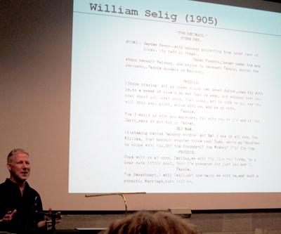
Take a concrete example. Ann Igelstrom’s paper, “Narration in the Screenplay Text,” asked how literary techniques are deployed in the screenplay. When a passage in the script for Before Sunset begins, “We see…,” who exactly is this we? Ann argued that traditional narrative concepts involving the source of the narration, the implied author and implied reader, and the rhetoric of telling can illuminate conventions of screenwriting. Here the screenplay seems definitely a literary text.
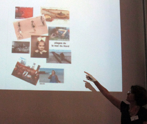
In his keynote address, “The Screenplay: An Accelerated Critical History,” Steven Price (above) declared a more abstract interest in the ontology of the screenplay but proposed that there was no clear-cut way of defining it. Historically, the screenplay takes many forms. Steven pointed out that even in Hollywood, there were many alternative formats, ranging from detailed breakdowns to the “master-scene” method (the option that didn’t specify shots or camera positions). And conceptually, the screenplay carried traces of its original production purposes, as well as other constellations of meaning. (Mack Sennett scripts seem to him part of a Sadean tradition of dehumanized, repetitive recombination.) So if there is a distinctive mode of being of the screenplay, outside of its role in production, it will turn out to be a messy one.
Envoi
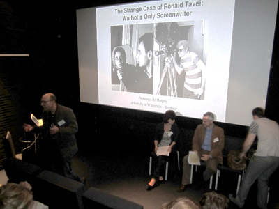
J. J. Murphy presents a paper on Ronald Tavel. Photo courtesy Richard Neupert.
If we conceive studies of screenplay and screenwriting as revolving around specific research questions, those of us interested in film as art can learn a lot. If our interests are in film history, researchers can show how organizations of production and individual choices by screenwriters/directors can shape the final product. For those of us interested in more theoretical explorations, asking about the nature and “mode of being” of the screenplay can’t help but make us think more about the ontology of cinema itself.
And if we want to know films more intimately, being aware of the creative choices that were made by the filmmakers throws a spotlight on aspects of the film we might otherwise not notice. It’s all very well to say we’ll examine the film “in itself,” but our attention is invariably selective. Knowledge of behind-the-scenes decisions can sharpen our awareness of artistic matters. Anna Sofia’s research on Bergman, like Marja-Riitta Koivumäki’s paper on Tarkovsky’s screenplay for My Name Is Ivan, activates parts of the film for special notice.
Because there were split sessions at the conference, and because I was plagued by jet lag, I couldn’t attend every panel and talk. I regret missing papers I later heard were very fine, and I haven’t written up everything I heard. I haven’t sufficiently talked about screenwriting pedagogy, represented in papers like Lucien Georgescu’s dramatic appeal to rethink whether screenwriting should be taught in film schools, or Debbie Danielpour’s stimulating survey of her methods of teaching genre scripting. So this is just a small sample of what these folks are up to. But you can tell, I think, that they’re posing questions at a level of sophistication that my 1960s cohort couldn’t have envisioned. Despite what the cynics say, there is progress in academic work.
As for men’s underpants: All is explained here.
I’m grateful to conference organizers Ronald Geerts and Hugo Vercauteren for inviting me to speak at the gathering. I must also thank conference organizer and old friend Muriel Andrin, along with Dominique Nasta and their colleagues and students from the Arts du Spectacle Department at the Université Libre de Bruxelles. My friends at the Cinematek, Stef and Bart and Hilde, helped me with my PowerPoint. Thanks as well to the Universitaire Associatie Brussel (Vrije Universiteit Brussel / Rits-Erasmushogeschool Brussel) and Associatie KULeuven (MAD-Faculty / Sint Lukas Brussel). A high point of the event was the visit to La Fleur en Papier Doré. Special thanks to Gabrielle Claes for her heartfelt introduction to my talk, not to mention a delicious bucket of moules.
A founding document in the contemporary study of the screenplay is Claudia Sternberg’s Written for the Screen: The American Motion-Picture Screenplay as Text (Stauffenburg, 1997). Other books central to the conference cohort include Steven Maras’s Screenwriting: History, Theory, and Practice, Steven Price’s The Screenplay: Authorship, Theory and Criticism, J. J. Murphy’s Me and You and Memento and Fargo: How Independent Screenplays Work, and Jill Nelmes’s anthology Analysing the Screenplay, which includes many essays by members of the group. See also the affiliated Journal of Screenwriting.
For more information on the Screenwriting Research Network, go here. (Thanks to Ian Macdonald for the link.) The next conference will be held in Sydney, and the 2013 one will take place in Madison, Wisconsin.
P.S. 22 Sept 2011: A panel discussion with Jean-Claude Carrière held during the conference is available here. Although the site is in Dutch, the discussion is in English. Thanks to Ronald Geerts for the information.
P.P.S. Thanks to Joonas Linkola for a spelling correction!
Coke does go through you pretty fast. Richard Neupert at a Coca-Cola machine that exploits a Brussels landmark.
Tintinopolis
Photo by David Bordwell, July 2009. Tous droits réservés.
DB here:
He’s the world’s most famous fictional Belgian, miles ahead of Hercule Poirot. But I ignored him for about sixty years. Tintin wasn’t part of my childhood, and I didn’t get interested in his adventures until recently. Now, though, the scales have fallen from my eyes and I realize that Hergé is a great comics artist. And naturally I see him doing some things that shed light on cinema.
I came to the work obliquely. Since the 1980s Kristin and I have admired the Dutch cartoonist Joost Swarte. When we started to collect his books, lithographs, and CDs back in the 1980s, he was becoming known in the US through Art Spiegelman and Francois Mouly’s Raw. We were much taken with Swarte’s exact drawing style and mordant wit. I then got interested in the crisply drawn “clear line” tradition of French, Belgian, and Dutch cartoon artists stemming from Hergé—Chaland, Floc’h, Goffin, Ted Benoît, etc.—but I still didn’t pay much attention to the master himself.
This spring I gave a talk on La Ligne Claire to Kristin’s reading group, which explores fantasy (especially Tolkien), science fiction, comics, movies, and almost everything else. In preparing that, naturally I had to go back and read Hergé. Now I’m a believer. Some day I may polish that presentation and put it up as a web essay, but for now I just offer some notes, sojourning as I was recently in Tintin’s home town.
His own museum
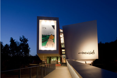
Photograph copyright Nicholas Borel; Christian de Portzamparc, architect.
Brussels has its own superb museum of comic art, the Belgian Comic Strip Centre in Rue des Sables. Last year, however, the Musée Hergé opened in Louvain-La-Neuve.
Louvain-La-Neuve is itself an unusual place: a town created more or less from scratch when the Catholic University of Louvain split off from the Dutch-speaking University of Leuven. Originally designed for students, the town now has a population of about 30,000, with many citizens commuting to jobs in Brussels. This planned city has been hailed as a model of urban design; parking and car traffic, for instance, are underground.
Go through the square to a wooded park and soon you’re in the Musée Hergé. It is one those buildings that aim to awe you. There are few right angles, and huge spaces are dominated by pyramids, cylinders, and other three-dimensional solids, all in muted colors and bearing the sorts of squiggles Herge might use for foliage.
Photograph copyright Nicholas Borel; Christian de Portzamparc, architect.
Architect Christian de Portzamparc‘s statement of principles is here.
 The first floor consists of the lobby, rest rooms, a restaurant, and a space for temporary exhibitions. As luck would have it, a tribute to Joost Swarte’s 40-year career was on display, and it was jammed with material. I could easily have spent the whole day here, even though I’d seen much of the material before. Swarte was also the “scenographer” of the Musée, offering ideas on interior design and decoration. The witty museum logo, as well as details like the signage, seem to be Swarte’s creations.
According to the guidebook, 80 % of Herge’s working material survives. This mountain of sketches, layouts, inked pages, color pages, and the like gives the curators a huge amount to pick from. Although the exhibition halls don’t feel stuffed, you quickly realize that you are in for total immersion.
You start at the third floor, and the first room supplies a survey of Hergé’s career. The information on the walls is pretty skimpy; the details are offloaded onto the headset commentary, I suspect. Charles Trenet’s ditty “Boum!” is playing over and over in this room, presumably not as an homage to Toto le héros but as a broad gesture to the interwar period. There are some intriguing Hergé illustrations here, including a 1939 political cartoon showing a Belgian shaking his fist at German planes flying over Brussels and shouting, “Dirty Boches!” before running to hide in his basement.
Another room is devoted to Hergé’s commercial art–posters, magazine advertisements, and book covers (including one for Christ, King of Business, 1929). Also on display are some striking images from less-known Hergé comic series, such as Quick and Flupke, Tom and Millie, and especially Jo, Zette, and Jocko. From here you move to a room devoted to the characters. Each one (except Tintin) gets a vitrine full of imagery. The final room on the floor is devoted to the cinema. The displays trace many of the situations and characters that Hergé borrowed from films of the 1920s and the 1930s. There’s also a filmed biography of Hergé screening on a loop.
The second floor was what held my interest most intently. One room includes a huge display of research materials for each book–not only notes and photos, but artifacts too. There’s also a case showing early Tintin games, toys, apparel, and other merchandise. The next hall gets to the root of my interest, Hergé’s creative process. Several displays trace the progress of a single page from rough layout to final coloring and printing. He was quite explicit about his aesthetic: Color is applied uniformly, with no shading, which yields “une grande lisibilité.” As I’ll suggest below, story legibility is central.
In this display room as well you can see how Hergé designed pages for periodical publication in landscape mode, then redesigned them for the vertical book format. That entailed cutting out panels, drawing new ones, and even changing gags. The books would then sometimes be recast for later editions. All these multiple versions have kept Hergé scholars busy for decades.
At about age 40 Hergé began to take on collaborators, and he eventually created a team of scenarists, lettering specialists, inkers, painters, and the like. In the next display room, you can see a TV documentary touring the studio and interviewing staff. This room also includes some gorgeous black-and-white ink drawings of pages and one-off projects, like Christmas cards. Your tour of the Museé ends with a room devoted to Hergé’s fame, starting with the famous wishes sent by Alain Saint-Ogan, creator of the breakthrough French comic strip Zig et Puce. In here you find praise from Balthus, Philip Pullman, Andy Warhol, and Alain Resnais: “Belgium belongs to the realm of fantasy. I found this out through reading Tintin.”
All in all, an exhilarating place to visit. It is unabashedly a tribute to Hergé and makes no effort to invoke the controversies around the man. I could find no reference to his wartime career and the political controversies that followed, to his divorce, or to the spiritual quest of his later years. This is the modern art museum in wholly celebratory mode. Still, few exhibitions of comic art I’ve seen make such a persuasive case for the enduring quality of an artist’s achievement.
Cinema on the page
I have taken from the current cinema its devices of découpage: once a character becomes important, you show what he’s doing, you vary the shots, you show the same scene from far off and then quite close.
Hergé, 1939
I’m a man of order, you see, even in drawing. I draw orderly things so one can read what I am drawing.
Herge, 1975
All comic strips and books remind us of cinema in one way or another, and many researchers have analyzed the affinities. The panels can simulate cutting, or panning camera movements, or even the fixed frame in which actions unfold over time. (Blondie is a classic example.) Artists have provided unusual angles and dynamic compositions that have a filmic feel. And like films, comics are usually narratives, stories told in pictures, so we can study how different comics artists use point-of-view, plot structures, suspense, and the like. (I did this last year with a recent twist in the Archie series.)
Most commentators on Hergé mention that he was a film fan and drew many situations from movies of the 1920s and 1930s. Like Hollywood studio cinema, his tales put striking technique in the service of fluent storytelling. Pause to study the narrative and you’ll find a surprising richness to the imagery; start by looking at the pictures as pictures, and you’ll see how composition, color, and detail smoothly advance the action. Hergé was well aware that his polished imagery could stand scrutiny in its own right, but he saw it as serving a larger narrative dynamic. He noted (my emphasis added):
I don’t try only to tell a story, but rather I try above all to tell a story. There’s a slight difference.
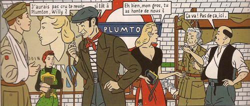
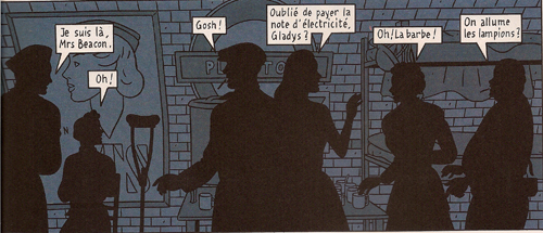
We can get a sense of this approach by contrasting it with one of the best Clear Line followers. Jean-Claude Floc’h’s albums are retro studies of a cozy, more or less imaginary England of the 1920s through the 1950s. He has provided his main characters, Francis Albany and Olivia Sturgess, with fake biographies that tie them to real artistic circles of the period. A series of books set in wartime (Blitz, 1983; Underground, 1996; Black Out, 2010) presents gorgeous tableaux. Here are two panels from facing pages of Underground. Londoners are huddling during a Nazi bombing run.
The images are designed to be compared in detail; we’re to note the slight changes in figures’ position. The story halts while you study the panels (and admire the artist’s finesse). This is technique calculated to dazzle.
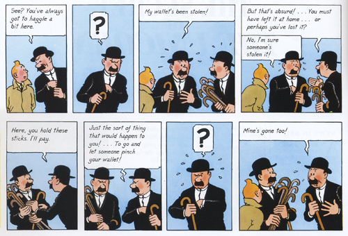
Hergé’s pages warrant the same sort of scrutiny, but you aren’t invited to dwell on them through a flagrantly overdesigned layout. The echoes and rhymes in this passage of the final English-language version of The Secret of the Unicorn are at least as intricate as Floch’s, but they’re at the service of symmetrical gags nestled in a broader comic buildup. Thompson and Thomson have had their pockets picked in a street market.
Hergé erases the background detail to allow us to concentrate on the graphic play of the black-suited figures (“spotting blacks,” as it’s called in the trade). The second panel reverses Thom(p)son’s attitude in the first, and both find a neat mate in the next-to-last panel. The third panel on top is rhymed with the last panel on the bottom. In between, the interplay of the two detectives is given in slightly varied compositions, with the extra walking sticks shifting around in their own patterns. The gag is a variant of the basic premise of Thompson and Thomson’s existence: they are mirror-images in all they do and say.
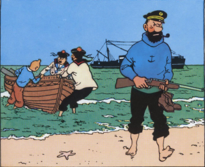
Given this play of variations, how does Hergé achieve narrative flow? One factor is the width of the panels, expanded or pinched according to the information in each and coordinated rhythmically across the page. Hergé also avoids gesture lines. Instead, one panel presents a point of motion as if captured by snapshot, and then the next panel provides the next phase of the movement. We might notice as well how the left-to-right propulsion of his drawings lays out narrative elements concisely. He declared this panel, from Red Rackham’s Treasure, one of two images that gave him most satisfaction:
Solely through the drawing, which shows the captain striding onto the beach with naked feet while his companions haul their boat onto shore, the viewer-reader [spectateur lecteur] mentally reconstructs everything that has already happened: The Sirius was put at anchor, the rowboat was lowered, Tintin and his companions set out; they have rowed to arrive at the island, where the captain climbed out. . . Everything that preceded the action shown in the drawing is expressed by a single composition.
Here’s another subtle technique Hergé used to make his stories flow. Psychologists speak of the “priming” effect. You’ll notice something faster if it chimes with something you’ve recently encountered. The classic experiment uses a string of words. If you’re first shown the word yellow, you’ll identify the word banana faster than if the trigger word is red.
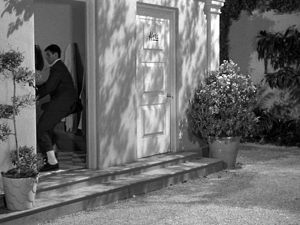
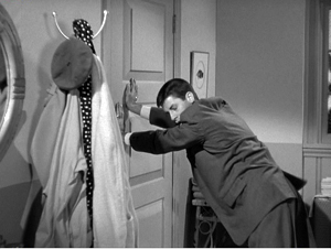
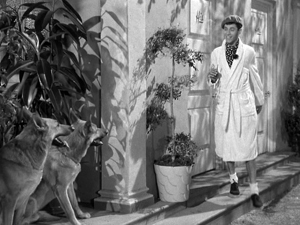
Priming is a basic filmmaking resource. What the screenwriter calls “planting”–the pistol on the mantelpiece in Act I–is a type of longer-range priming. On a smaller scale, one purpose of an establishing shot is to prime certain areas of a locale for future action. Here’s a simple example from Norman Taurog’s The Caddy (1953). Jerry Lewis is fleeing from a pair of German Shepherds and he takes refuge in a men’s changing room.
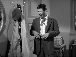
A new shot shows him closing the door, and it makes prominent the coat rack nearby. Eventually Jerry notices it and expresses happiness as only Jerry can.
Using the robe and beret hanging there, he tries to disguise himself.
A close look at my first frame shows that the coat rack was (subliminally?) primed in that shot too; you can glimpse it when Jerry opens the door. This reminds us that the filmmaker can prime our response by including a little something at the end of one shot that ties it to the next. Both Spielberg and Johnnie To are skilful at this; see earlier blog entries (here and here) for examples.
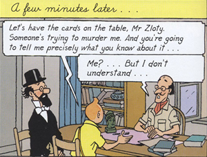
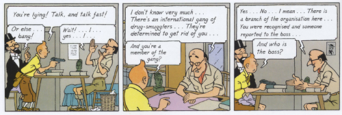
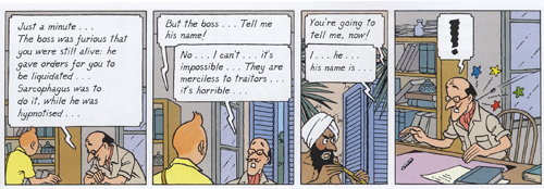
It seems to me that Hergé makes use of fine-grained priming in the flow of his panels. Here’s an example from the final English-language version of Cigars of the Pharaoh. The “establishing shot” shows Tintin and Sarcophagus consulting Zloty. The composition is simple and balanced, with Tintin as the fulcrum. The window behind Zloty is unobtrusively primed.
The next stretch of panels breaks this overall layout down into two sorts of shots: a profile view and an over-the-shoulder view of Zloty.
The first and the third panels are variants, with the framing getting closer as we proceed. Hergé often propels his story through these tighter framings, as if to ratchet up the tension in a filmic way. The more compressed array of figures at the end of the series also allows for more spacious speech balloons, always a major consideration in the Tintin saga. Hergé didn’t reiterate the window in every framing; only the middle panel re-primes it through our angled view of Zloty.
Now the framing will get even tighter on Tintin and Zloty, losing Sarcophagus altogether, and the window will become more salient, even though it’s still a minor element of each design.
The massive balloon at the top of the first frame in this series obliges Hergé to push his figures quite low, but he compensates by letting them lean on the bottom edge as if it were the desktop. (Hergé likewise often makes his characters stand directly on the frameline.) The first panel retains the window frame. The second, another over-the-shoulder shot but even tighter than the first, introduces the shutters in a prominent position behind Zloty. These shutters prime the third frame. They now anchor a crucial action: the Fakir is lurking outside those shutters.
The final panel provides the payoff. The open window frame that seemed at first just a realistic detail becomes necessary to understanding the action. It could have been established in a wider shot, but in keeping with his urge for economy Hergé has primed it in the most compact way possible–as a peripheral element, in the background or on the frame edge. (Compare Taurog’s thrusting the coat rack under our noses.) You have to wonder if such economy of expression will be on display in the Spielberg-Jackson Tintin movie project.
I know, I know: David, it’s just a window. Or: David, it’s just a comic strip. But as film students we ought to be interested in how images shape our experience, and we can learn from any craftsmanship as precise and engaging as Hergé’s.
For more on the Clear Line style, see the series of articles at Paul Gravett’s excellent site.
The official Tintin website is available in an English version here. Since photography is not permitted in the Musée, for illustrative purposes I have drawn on the official images on the building’s website, with copyright and credit as noted in the captions. Bart Beaty, expert on Eurocomics, provides a carefully considered report on his trip through the galleries. The Musée’s catalogue is a trilingual survey of major items on display, although it neglects to illustrate changes in layouts across different editions.
On the aesthetics of comics and cinema, see Manuel Kolp, Le Langage cinématographique en bande dessinée (Brussels, 1992). Principles of page composition, including spotting blacks, are explained in Gary Spencer Millidge, Comic Book Design: The Essential Guide to Designing Great Comics and Graphic Novels.
The best general introductions to Hergé’s artistry seem to me to be Benoît Peeters’ Tintin and the World of Hergé and Michael Farr’s Tintin: The Complete Companion. Both offer occasional comparisons of different editions of the books. See as well Philippe Goddin’s multi-volume set of primary materials. Goddin supplies a shorter sampling of the artist’s creative process in his charming but now rare Comment naît une bande dessinée: Par-dessus l’épaule d’Hergé. For an example of in-depth inquiry into the various changes that a tale underwent from one edition to another, see Étienne Pollet, Dossier Tintin: L’Isle noir: Les Tribulations d’une aventure.
My first and fourth Hergé quotations come from Bob Garcia’s Hergé et le 7ème art, pp. 6 and 9. My second quotation is taken from the English edition of the Musée Hergé guidebook (Moulinsart, 2009), p. 48; I don’t find it to be available for purchase online. My third quotation comes from Numa Sadoul’s Entretiens avec Hergé: Tintin et moi, p. 46. According to Harry Thompson in another good introduction, Tintin: Hergé and His Creation, the young Hergé wanted to be a film director (p. 26).
A very extensive web resource on Floc’h is here. As for Archie’s wedding: It did turn out to be one of those parallel-universe stories. It has developed over seven issues since last September in a “mini-series.” Abrams will be publishing a special collector’s edition, according to the press release, “for the Archie fan in all of us.”
This is probably as good a place as any to mention that Intellect Press has just launched a new journal, Studies in Comics. Details, as well as downloadable essays from the first issue, are here.
PS 24 January 2011: This essay was named one of the best pieces of online comics criticism of 2010 in an exercise conducted by The Hooded Utilitarian of The Comics Journal. What an honor! Thanks to the judges, and congratulations to the other writers who earned places on the list.
Les dessins, textes et symboles extraits de l’oeuvre de Hergé cités dans ce essai sont la propriété exclusive de © Moulinsart S. A. ou © Hergé ou © Casterman et sont montrés à titre de référence et d’exemple.
Photo, uncredited, from this site.
Glancing backward, mostly at critics
DB bere:
As Freud’s mom says in Huston’s film, “Memory plays queer tricks, Siggy.” Herewith, some journeys into the past, launched on a lazy June afternoon.
Ten-best lists are nothing new. The New York Times ran them in the 1930s. Here’s one for 1940 (NYT 29 Dec 1940, p. X5).
The Grapes of Wrath, The Baker’s Wife, Rebecca, Our Town, The Mortal Storm, Pride and Prejudice, The Great McGinty, The Long Voyage Home, The Great Dictator, and Fantasia.
The author’s runner-up titles include Of Mice and Men and The Philadelphia Story. Pretty tasteful by today’s standards, no? Who came up with a list including Hitchcock, Borzage, Sturges, Pagnol, Chaplin, Disney, Milestone, Cukor, and Ford twice?
None other than Bosley Crowther, long-serving Times reviewer who became the emblem of middlebrow taste in endless polemics (including some I’ve mounted). Who knew he was a closet auteurist?
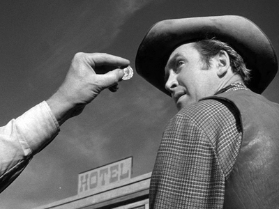
Winchester ’73 (1950).
Now try this one.
The movies live on children from the ages of ten to nineteen, who go steadily and frequently and almost automatically to the pictures; from the age of twenty to twenty-five people still go, but less often; after thirty, the audience begins to vanish from the movie houses. Checks made by different researchers at different times and places turn up minor variations in percentages; but it works out that between the ages of thirty and fifty, more than half of the men and women in the Unites States, steady patrons of the movies in their earlier years, do not bother to see more than one picture a month; after fifty, more than half see virtually no pictures at all.
This is the ultimate, essential, overriding fact about the movies. . . .
Yes, another oldie, this time from Gilbert Seldes’ book The Great Audience (1950). What we’ve been told for years was characteristic of our Now—the infantilization of the audience—has been in force for at least sixty years.
By the way, here are some US features released in 1950: Father of the Bride, Gun Crazy, House by the River, In a Lonely Place, Julius Caesar, Mystery Street, Night and the City, Panic in the Streets, Rio Grande, Shakedown, Stage Fright, Stars in My Crown, Summer Stock, Sunset Blvd., The Asphalt Jungle, The Baron of Arizona, The File on Thelma Jordan, The Furies, The Gunfighter, The Third Man, Twelve O’Clock High, Union Station, Wagon Master, Where the Sidewalk Ends, Whirlpool, Winchester ’73, and probably some other good movies I haven’t seen.
Perhaps not a luminous year, but I’d settle. Especially compared with 2010. Did kids just have better taste then?
Beyond reviewing
Most people conceive a film critic as a film reviewer. The review is a well-established genre, and we all have its conventions in our bones. At a minimum, you synopsize the plot, comment on the acting, mention the pacing or the cinematography, throw in some wisecracks, and recommend or condemn the film. Good reviewers do these things well, but the genre remains a limited one.
Crowther was a reviewer; Seldes was something more. But how to define that extra something? Two long-lived heavyweights can help us.
In the 1935 essay “The Literary Worker’s Polonius: A Brief Guide for Authors and Editors,” Edmund Wilson spells out what he takes to be the duties and genres of literary labor. At the time, the “New Criticism” in the universities had barely gotten started, so most literary criticism Wilson encountered was journalistic and belletristic—that is, reviewing.
Accordingly, Wilson distinguishes different types of reviewers. There the people who simply need work. There are literary columnists who pump out observations on the latest books. There are people who want to write about something else; that’s when you use the book under review as a pretext to ride your hobby horse. There are the reviewer experts, as when a philosopher is called in to review a book of philosophy. Then there’s the rarest, the “reviewer critics.” Here is why such creatures are rare.
Such a reviewer should be more or less familiar, or ready to familiarize himself, with the past work of every important writer he deals with and be able to write about an author’s new book in the light of his general development and intention. He should also be able to see the author in relation to the national literature as a whole and the national literature in relation to other literatures. But this means a great deal of work, and it presupposes a certain amount of training.
In sum, the best critic has to be very, very knowledgeable. But is knowledge enough?
T. S. Eliot, it’s often said, believed that the only qualification of a critic is to be very intelligent. (One example of this claim is here.) What Eliot actually wrote is more interesting. His 1920 essay “The Perfect Critic” is considering Aristotle as a theorist of literature. Of The Poetics he notes:
In his short and broken treatise he provides an eternal example—not of laws, or even of method, for there is no method except to be very intelligent, but of intelligence itself swiftly operating the analysis of sensation to the point of principle and definition.
The final clause is a good description of what I take “poetics” to be as applied to film. We analyze effect (“sensation”) so to discover not laws but principles (governing a genre, a trend, a style, whatever) that we in turn articulate (“definition”). In this analysis, we don’t use a method—that is, I take it, a prior commitment to a system of thought that blocks our seeing the object in its own terms.
Contrary to the common modern view that our personal feelings and ideas color everything we think about, Eliot seems to advocate a more objective way of thinking. Aristotle the theorist is praised because “in every sphere he looked solely and steadfastly at the object.” His search for the principles underlying tragedy, comedy, and epic is contrasted with the dogmas of Horace, the “lazy critic” who offers us precepts, tips from the top about laws to be obeyed. (Sound familiar from screenplay manuals?)
Aristotle, Eliot thinks, was endowed with “universal intelligence”: “He could apply his intelligence to anything.” Such a gift overrides the sort of specialized inquiry that yields “methods.” I read “The Perfect Critic” as recommending that critics try to combine their sensitivity to nuance with Aristotelian intelligence:
Aristotle had what is called the scientific mind—a mind which, as it is rarely found among scientists except in fragments, might better be called the intelligent mind. For there is no other intelligence than this, and in so far as artists and men of letters are intelligent (we may doubt whether the level of intelligence among men of letters is as high as among men of science) their intelligence is of this kind.
This is what it is to be “intelligent” in Eliot’s sense: to be wide-ranging, rigorous, and committed to understanding the artwork both as unique object and embodiment of principle. He finally spells it out in his praise for the Symbolist Remy de Gourmont:
Of all modern critics, perhaps Remy de Gourmont had most of the general intelligence of Aristotle. An amateur, though an excessively able amateur, in physiology, he combines to a remarkable degree sensitiveness, erudition, sense of fact and sense of history, and generalizing power.
So Wilsonian erudition and historical knowledge aren’t enough. You need sensitivity, “a sense of fact,” and “generalizing power”—the ability to see larger implications and principles at work in what you’re writing about. In short, the best critics don’t shy away from probing ideas.
The general go
Where do the ruminations of Wilson and Eliot leave us with writers who go beyond reviewing? Let’s go back to Seldes.
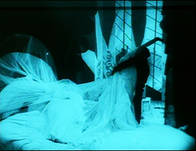
He became one of our best American critics, in fact one of our first media critics, thanks to his “generalizing power.” The 7 Lively Arts (1924) was a trailblazing defense of Tin Pan Alley, comic strips, vaudeville, jazz, and films. Reacting against “genteel” taste, Seldes believed that the bursts of exaltation to be found in the “minor” arts were as profound as anything to be found elsewhere. “Our experience of perfection is so limited that even when it occurs in a secondary field we hail its coming.” Such perfection is to be found, he says, in an instant in The Cabinet of Dr. Caligari, when Cesare seizes Jane and the bed curtains snag her gown. He starts with what Eliot called “sensation,” the piercing arousal.
A moment comes when everything is exactly right, and you have an occurrence—it may be something exquisite or something unnamably gross; there is in it an ecstasy which sets it apart from everything else.
But Seldes goes beyond noting moments that give him a buzz. He tries to explain how and why the vulgar arts can arouse us. It’s hard for us now to realize that what we take for granted as vital popular culture was scorned by the much of the intelligentsia. In 1924 Seldes set out on a crusade to convince his readers that the Keystone Kops, Flo Ziegfeld, Irving Berlin, ragtime, and Fanny Brice offered more of genuine artistry than the Bogus Arts (we’d say middlebrow) that were then ruling high culture. In 1924, this was a thunderbolt:
The daily comic strip of George Herriman (Krazy Kat) is easily the most amusing and fantastic and satisfactory work of art produced in America today.
If the best critics offer not only opinions but information and ideas to back them up, The 7 Lively Arts had both in abundance. Seldes begins the book with the suggestion that the consolidation of the film industry, and particularly the establishment of Triangle, Kay-Bee, and Keystone, was the turning-point in the history of American film. But instead of the usual litany of praise for Griffith’s and Ince’s discovery of “cinematic” storytelling, Seldes condemns them as too quickly seduced by extravagant spectacle. The journeyman Mack Sennett stuck to making “the most despised, and by all odds the most interesting, films produced in America. . . . He is the Keystone the builders rejected.” Far more than the work of Griffith and Ince, Sennett’s comedies exploit what cinema is best suited for: chases, crashes, explosions, “locomotives running wild, yet never destroying the cars they so miraculously send spinning before them. . . . And all of this is done with the camera, through action presented to the eye.”
Seldes wrote about radio, dancing, and other pastimes, but films were his special love. An Hour with the Movies and the Talkies (1929) and The Movies Come from America (1937) combine historical knowledge with subtle appreciation of the forces operating on studio picturemaking. These books thrum with ideas. For instance, Seldes defends the director as the key creative artist in cinema. One reason is that only the director can control pacing.
The director is responsible for the general go of a picture, for making it run off neatly, for controlling the speed of its various parts, for seeing that a romantic episode does not race along while a melodramatic conversation lags. He is, or ought to be, responsible for the interruptions of the main action of the picture so that a comic interlude is not placed too near to the climax of a tragic one, but only near enough to give more intensity to the emotion.
What about the camera? Hollywood movies, he says, have developed a rapid-turnover tradition that favors conciseness and novelty in the flow of images.
When Van Dyke in 1934 [in The Thin Man] wished to show a familiar event in the life of any man who walks a dog—an event which, although familiar, might not be passed by the censors—he merely showed the leash tightening and the hand of the man being jerked back; then the man stood still and a little later the same operation was repeated. . . . The part not only takes the place of the whole, but is more effective because the imagination of the spectator supplies what is missing.
Seldes might have added that once we’ve supplied that missing piece, we laugh at Asta’s ability to puncture Nick Charles’ serious disquisition on murder.
Seldes became a tamer thinker later in life. By the 1950s he was part of the media establishment, producing television shows on culture. He grew disappointed with the film industry, leading to his critiques in The Great Audience. Still, his critical skills persisted. His next major book, The Public Arts (1956), pins his hopes on television but also offers a balanced account of Hollywood’s widescreen revolution. Confronted with CinemaScope and its kindred systems, he worried, again, about pacing.
Wherever the movie touches time, it as mysterious and primordial as the beating of the heart. Absorbed in new techniques, directors may neglect essentials as they did a generation ago when they immobilized the camera to favor the microphone; but, as they recovered mobility then, so I am confident that they will recover the art of using and manipulating time in the substructure of their pictures.
Although he’s seldom discussed in film circles now, Seldes stands out as a worthy critic not because of one-off reviews but in virtue of his pointed, sometimes daring ideas, his knowledge, and the zest they arouse in the reader. These are the payoffs, I think, when a critic leaves reviewing, even the 10-best lists and other fun parts, behind.
My quotations from Seldes come from The Great Audience (New York: Viking Press, 1950), 12; The 7 Lively Arts (Mineoloa, NY: Dover, 2001), 204, 309, and 5; Movies for the Millions (London: Batsford, 1937), 75; The Public Arts (New York: Simon and Schuster, 1956), 55-56. For more on Seldes and his milieu, see Michael Kammen’s excellent intellectual biography, The Lively Arts: Gilbert Seldes and the Transformation of Cultural Criticism in the United States (New York: Oxford University Press, 1996).
My quotation from “The Literary Worker’s Polonius,” comes from Edmund Wilson, Literary Essays and Reviews of the 1920s and 1930s (New York: Library of America, 2007), 490.
Although the terminology is different, Eliot seems to be advancing something similar to Kristin’s arguments about film analysis in the first chapter of Breaking the Glass Armor: Neoformalist Film Analysis (Princeton: Princeton University Press, 1988).
The Thin Man (1934). Seldes forgot that it was Nora, not Nick, who senses Asta’s response to the call of nature.


