Archive for the 'Directors: Antonioni' Category
Going inside by staying outside: L’AVVENTURA on the Criterion Channel
DB here:
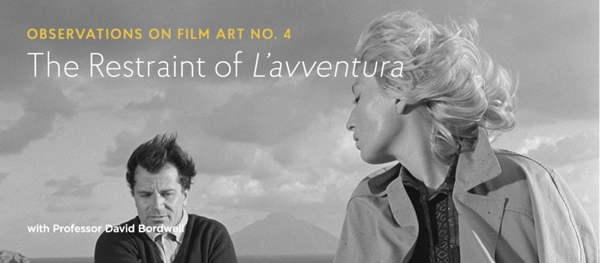
This month, our entry on FilmStruck’s Criterion Channel is a discussion of L’Avventura. This isn’t my favorite Antonioni movie, but it’s one I enjoy and admire—not least because of its striking originality of mise-en-scene. So that’s what I tackle in the Criterion entry.
The installment is here, and if you’re a subscriber you can watch it immediately. Otherwise, there’s a chance to sign up. If you’re not aware of FilmStruck, one of the great adventures in modern film culture, you can check on it here. (The Twitter feed is enjoyable even to non-tweeters like me.) Today, I want to flesh out my entry with some other comments. I hope they’ll be of interest even to those who aren’t signed on to the FilmStruck enterprise.
Two ways of doing deep
Le Amiche (1955).
During the 1950s, Antonioni displayed vigorous experimentation in visual style. Like many directors, he embraced the long take, usually in conjunction with camera movement. Within those parameters, he staged his action both laterally and in depth. But depth staging comes in many flavors.
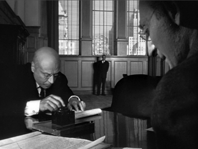
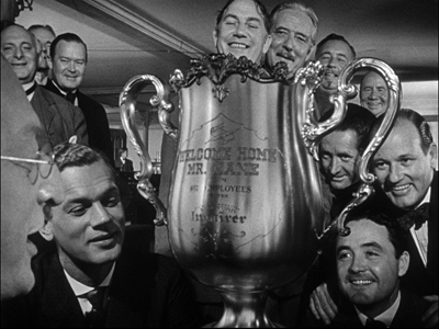
One is the aggressive deep-focus technique of Welles, with large heads or objects very close to the camera in the foreground. Here are two famous instances from Citizen Kane (1941).
This fairly extreme approach was picked up by some 40s and 50s directors, especially those interested in what came to be called film noir.
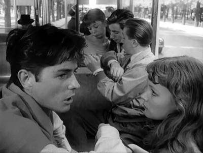
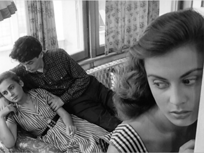
You can find somewhat mild versions of these compositions in early Antonioni, especially in cramped surroundings. A bus ride and a necking party in I Vinti (1953) bring forth some big foregrounds.
Despite occasional shots like these, Antonioni’s early work favors an alternative approach to depth, the one cultivated by Jean Renoir, Mizoguchi Kenji, William Wyler, and others. That approach doesn’t go for Citizen Kane baroque. It keeps the foreground plane fairly distant–say a medium-shot or further–and uses both lateral and fairly deep staging to multiply key points of interest in the shot. Less fancy than the Welles tradition, it allows more naturalistic blocking because it yields more playing space.
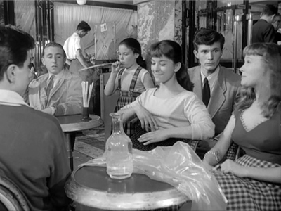
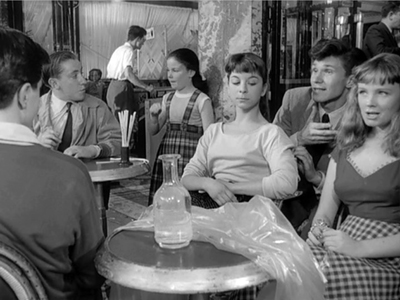
Go back to I Vinti, and we’ll find that most shots aren’t as thrusting as Welles’ images, largely because of their reliance on real locations and naturalistic lighting. The film tends to stages its long takes in mid-range, porous compositions. A two-minute shot of teenagers lounging at a cafe and plotting a murder is rendered in a gentle diagonal that spreads out multiple points of interest.
By the way: Why doesn’t anybody make shots like this any more?
One advantage is that while the packed Wellesian frame tends to make its actors assume fixed poses, the more open frames of the alternative can show more of actors’ bodies and develop gestures and other actorly bits. This happens in the I Vinti café scene, which depends on characters’ changing postures, along with the distraction of the annoying little girl blowing on drink straws.
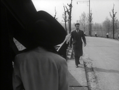
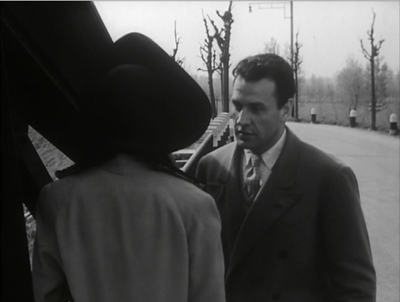
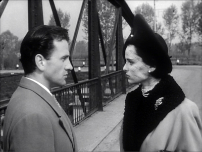
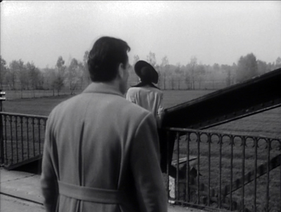
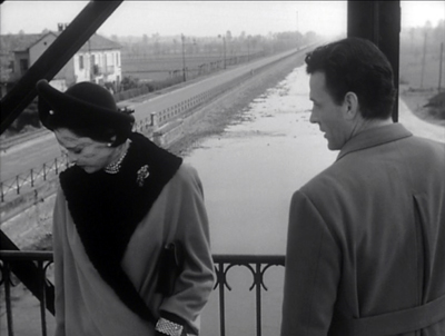
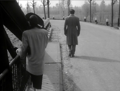
Similarly, Antonioni’s first feature, the noirish romance Story of a Love Affair (1950) makes adroit use of the mid-range foreground. The famous single-shot, 360-rdegree scene between lovers quarreling on a bridge is a paradigm case of how location filming can be made rigorous and purposeful. A complex camera camera movement is coordinated with figures resolutely evading each other in constantly varied medium-shots.
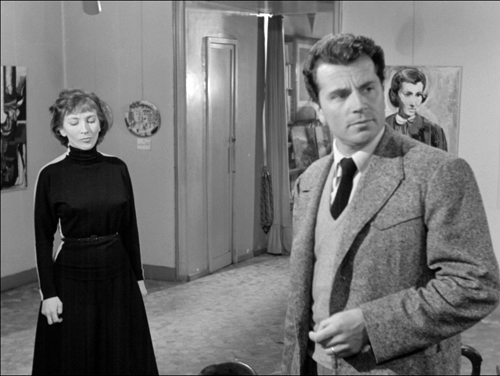
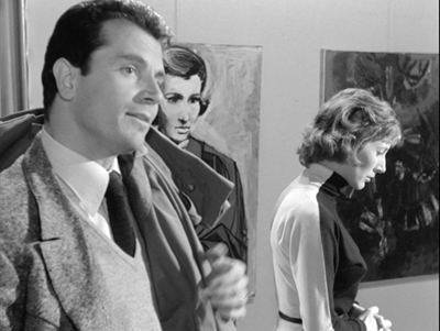
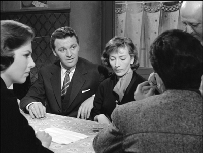
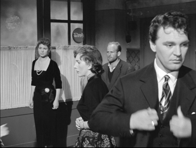
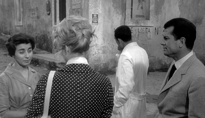
Le Amiche (1955) continues down the same path, with characters alotted distinct pockets of the frame to expose their fleeting reactions.
But there’s now a more intricate choreography, as befits a plot with several story lines. A scene gathering the major characters at a cafe is a magnificent exercise in the Wyler manner, with heads meticulously spotted across the frame.
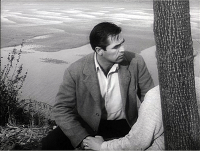
For years I was surprised that L’Avventura (1960) and its successors La Notte (1961) and L’Eclisse (1962) make less use of this sort of precise staging in depth. While the director’s style remains fluid and rigorously patterned, and powerfully exploits urban vistas, it relies more on editing. But looking again at L’Avventura for the Criterion Channel installment, I became convinced that he was exploring a new way to handle staging—one that built upon his mastery of Renoir-Wyler choreography.
From the back or from the front
When a film’s narrative harbors mysteries, they’re often a matter of plot. Something has happened that we don’t fully know about, and the business of the plot is to bring that to light, either in the short term or across the whole movie. In the detective film, there’s a mysterious crime that needs solving, and the clarification will typically come at the climax, when the malefactor (and the motive, and the means) will get revealed. Plot-centered mysteries are easily dismissed as superficial, but the great tradition of literary detection shows that they can be imaginative and gripping, while also exploring literary techniques in sophisticated ways.
There are also mysteries of character—not just whodunit, but something deeper. A narrative might induce us to ask what makes characters do what they do. This can result in fairly superficial probing, as in many psychoanalytic films of the 1940s, but it can, again, prod the storyteller to exploit some aspects of the medium that engage us. At the limit, mysteries of character can lead the narrative to explore the moods and motives of its people, bringing out contradictions of mind and action. Even a potboiler like Gone Girl not only reveals the rage bubbling beneath Amy’s perfect porcelain surface but explains that anger as a response to the Cool Girl role dictated by yuppie culture.
I usually don’t employ the distinction plot vs. character when I’m thinking about film narratives, but as a first approximation it points up the nuances of L’Avventura’s visual strategies. The film has, initially, a clear-cut plot-based mystery: What has led Anna to disappear? Is she dead, or lost, or simply escaping from the situation? This is, in a way, the bait luring us to pursue mysteries of character.
What, to start, does Anna want from her affair with Sandro? She seems alternately flirtatious, cynical, angry, and passionate. And assuming her disappearance wasn’t accidental, what impelled her to leave the party? As for Sandro, what sort of man is he? And why does he, with unseemly haste after Anna’s vanishing, seize Claudia and kiss her violently?
Claudia, for her part, seems to gradually accept her role as the Anna substitute. We’d expect her to be torn by her betrayal of her friend, and maybe she is, but we can’t be sure. With almost no backstory supplied for these people and no plunge into their inner lives through dreams, voice-over, subjective visions, and the like, we’re forced to read their minds and hearts on the basis of what they say and do. This is relentlessly behaviorist cinema.
Here’s where visual style kicks in, I think. Antonioni declared his interest in moving the Neorealist impulse from social observation to psychological revelation.
The neorealism of the postwar period, when reality was what it was, so intensely present, focused on the relationship between characters and reality. What was important was that very relationship, which created a cinema based on “situations.” . . . That’s why, nowadays it’s no longer important to make a film about a man whose bicycle has been stolen. . . . It is important to see what is inside this man whose bicycle was stolen, what are his thoughts, what are his feelings.
How to achieve this psychological penetration? Not through the sort of definite scene structure of a Hollywood film, a crisp slice of action that can be summed up in a story beat.
I believe it is much more cinematic to try and capture the thoughts of a person through an ordinary visual reaction, rather than enclose them in a sentence. . . . One of my concerns in filming is to follow the characters until I feel it is time to stop. . . When all has been said, when the main scene is over, there are less important moments; and to me, it seems worthwhile to show the character right in these moments, from the back or the front, focusing on a gesture, on an attitude.
Antonioni scenes, critics sometimes say, begin a bit before they start and end a bit after they stop.
You might expect from this emphasis on character psychology and the habit of lingering on a scene’s resonance would yield few mysteries. Yet what interests me in L’Avventura is the way in which it doesn’t allow us to “see what is inside” its characters. Perversely, having braked the dramatic momentum in order to probe character, Antonioni goes on to block our access to his people’s minds.
His visual strategies for doing this are many, and they’re flaunted in the film made just before L’Avventura. The witholding of character reaction is flamboyant in Il Grido (1957), maybe over the top.
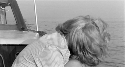
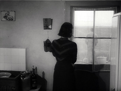
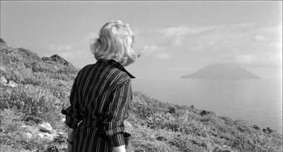
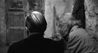
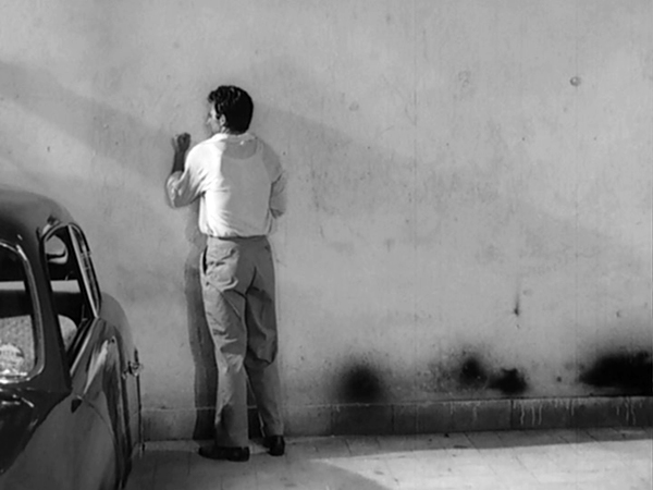
L’Avventura‘s reticent pictorial strategies are more nuanced and naturalistic, and my FilmStruck contribution tries to chart them. For about the first hour of the film, Antonioni lets landscape overwhelms his characters, gives them equivocal facial expressions, refuses the full information of shot/reverse shot cutting, and at crucial moments simply makes his actors turn from the camera, denying us access to their emotional reactions.
What’s just as interesting, the second half of the film selectively returns to the techniques that were initially banned. It’s as if these more familiar image schemas–reverse shots, frontal close-ups, more marked facial reactions–have become suitable to the growing romance between Claudia and Sandro. Now the first hour’s stingy attitude toward psychological information is balanced by a greater degree of emotional exposure, especially on Claudia’s part. By the very end, the two broad strategies coexist uneasily, and some enigmas remain.
During the late 1960s Antonioni changed his style. He turned from deep-focus, wide-angle images to flat telephoto ones, and he began relying on a pan-and-zoom technique. These were partly responses to shooting in color and wider formats, I think, but they also offered the opportunity for a painterly look that he exploited in the films from Red Desert (1964) on. Fellini, Bergman, Visconti, and others took a similar path, as I tried to show in this early blog post.
In 1960 those developments were yet to come. It seems to me that the style of L’Avventura enhances the mysteries of plot and character in a unique and unsettling way. We get a visual surface that entrances us with its measured beauty and teases us with its calm opacity.
Thanks as usual to Peter Becker, Kim Hendrickson, Grant Delin, and the Criterion team for including us in their FilmStruck enterprise.
My quotation from Antonioni comes from his essay “My Experience [1958],” in his book The Architecture of Vision: Writings and Interviews on Cinema (Marsilio, 1996), 7-9.
The L’Avventura discussion on FilmStruck is the fourth in our Criterion Channel series, “Observations on Film Art.” The others are Jeff Smith on the music of Foreign Correspondent, me on Sanshiro Sugata, and Kristin on landscape in Kiarostami. Some clip extracts can be found here and here. Jeff has amplified his installment with further comments on this blog, and I’ve done the same with Sanshiro , as today with L’Avventura. We introduce our collaboration in this entry. The Criterion introduction to us is here.
For more on Mizoguchi’s approach to depth staging, see this summary entry. There’s more on Wyler’s style here. I compare the two directors in this entry on sleeves. I discuss the broader shift from deep-focus techniques to pan-and-zoom ones in On the History of Film Style, Chapter 6.
I Vinti.
TONI ERDMANN, GRADUATION: Mediums, well-done
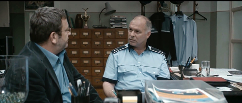
Graduation (Cristian Mungiu, 2016).
DB here:
More from this year’s Vancouver Film Fest, abundant as ever (over 200 features, over 300 films in all).
Comedy, Chaplin supposedly said, is life in long-shot, while tragedy is life in close-up. This is questionable on its face, but put that aside. What about medium shots? Maybe they’re either comic or tragic? Or maybe just neutral? Any shot framing the body from, say, the waist up to the head is the workhorse of most film traditions, and it’s ready to be recruited for almost any purpose.
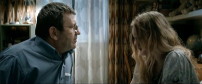
I was led to think about this handy tool when watching two strong and enjoyable films, Cristian Mungiu’s Graduation and Maren Ade’s Tony Erdmann. Both directors made some similar artistic choices, such as that slightly swaying handheld framing that seems de rigueur in many films nowadays–the “free camera,” as the Danes call it. But the two films show different ways of exploiting the medium-shot of people talking. The differences, I think, depend on both genre factors and one crucially diverging choice.
Screwball comedy with a German accent
Toni Erdmann updates screwball comedy: a mischievous madcap disrupts the staid life of an uptight character s/he loves. In classic Hollywood the madcap might be a wild woman (Bringing Up Baby) or a free-spirited man (Holiday), with romantic union the result. The variation here is that the madcap is a father. Winfried tries through pranks and impersonation to loosen up his rigid daughter Ines, who’s striving to be a cool corporate barracuda.
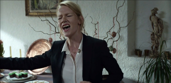
The plot is a series of encounters in Ines’ high-stress professional life. Her rounds of meetings and cocktail parties are constantly invaded by the bulky Winfried. Sometimes he’s his unkempt self (often adorned with splayed monster teeth), sometimes he’s a fake businessman/diplomat named Toni Erdmann. When father shows up, she’s mortified. She resorts to the classic strategies of the screwball target: flight, pretending not to know him, and desperately going along with the masquerade in hope that it will pass. Finally Winfried breaks down her defenses, and we get the obligatory scenes when the by-the-book character finally lets loose (here, through a heartfelt song and later by a creative effort at party hostessing).
The premise of screwball is a bit of a Jonsonian power trip. We’re asked to sympathize with people who have enough leisure and money to punk everyone around them. The cruelty of the put-on, with trusting characters gulled by free spirits, is built into the genre. In Toni Erdmann we have to be ready to accept not only the deflation of a CEO, which is always fun, but also the terrorization of working stiffs like delivery men and mechanics. To the film’s credit, there is a moment when Winfried learns the price that others must pay for a retiree’s cute mischief. Along the way is some sharp satire on corporate predation and its fashions in “coaching” and “team-building.”
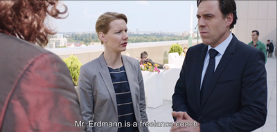
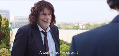
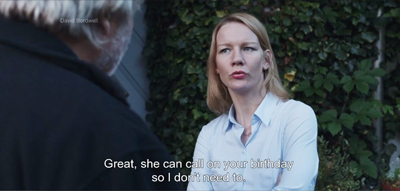
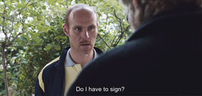
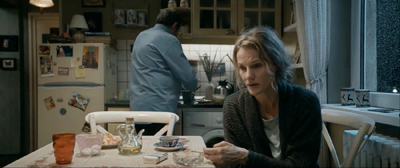
All this is played out in good old medium shots. And those in turn are embedded in good old shot/ reverse-shot.
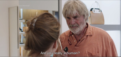
Toni Erdmann relies on shot/reverse-shot technique primarily, I think, because of the need to show reaction shots. A good part of comedy is reaction, and camera ubiquity allows us to watch the gag and the payoff in a tick-tock editing rhythm. Ade can time people’s responses to Winfried’s sinister leer in ways that maximize the laugh.
Shot/ reverse-shot has of course long been a mainstay of classical Hollywood continuity style, partly because it mimics the flow of turn-taking in conversation. Like side-participants in a real-life situation, we shift our attention from speaker to speaker, thanks to the cuts.
Over-the-shoulder framings help anchor us in the space of the scene, so we always know where we are.
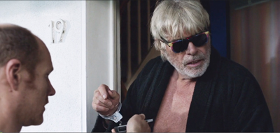
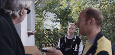
Assisting that sense of stability is the so-called 180-degree system of staging, shooting, and cutting. This keeps all the eyelines, postures, and backgrounds fairly consistent. At several points, though, Ade’s reverse angles “break the line,” shifting us across the axis of action. This creates what’s been called “200-degree-plus” staging and shooting.
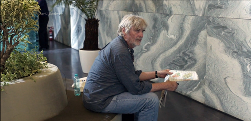
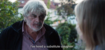
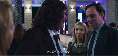
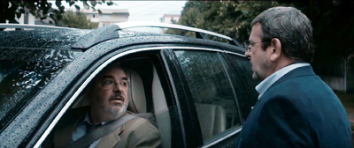
Fortunately, our pragmatic sense of who’s talking to (or looking at) whom overrides the slight jump. The shift can be smoothed if there’s a strong cue–as here, when Winfried turns his head from the courier on his doorstep.
When you have several characters present, and you’re willing to break the 180-degree line in your reverse shots, you can cheat positions from shot to shot in remarkable ways. A cut can magically delete a character for the sake of emphasizing another one’s reaction.
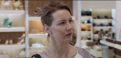
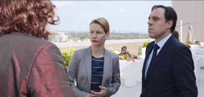
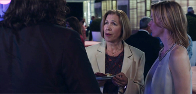
For example, at a fancy party, Winfried-as-Toni approaches a woman and claims he works at the German embassy. The first shot favors the woman, her friend, and a nervous Ines, who tries to pull Toni away.
But when we cut to a reverse of Toni, Ines is no longer beside the blonde woman.
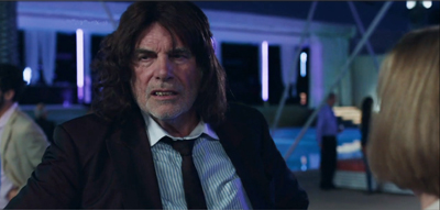
She has been shifted to the left–in fact, moved completely offscreen–in order to supply a clear view of Toni. His sharp glance to the left confirms her position.
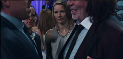
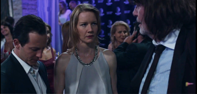
Cheating shot/ reverse-shot positions is a common tactic of classic continuity filmmaking, and Ade uses it freely. The more characters who crowd in, the more chance to cheat them. In some shots during the big party, Ines is close beside her boyfriend as her boss greets Toni. But in the 180-degree reverse angles the couple gets spread out, with the man pushed offscreen entirely, before a new setup brings them back–and deletes the boss.
It’s remarkable how little we notice these shot-to-shot disparities as long as positions are grossly consistent, and as long as we’re given other things to pay attention to. (Dan Levin has studied filmic “change blindness” experimentally.)
Throughout, Ade’s cutting and camera placement help us enjoy, moment by moment, the shocked, bewildered, and bemused responses to Winfried/Toni’s campaign to humanize Ines.
The case of the missing reverse shot
Change the genre from comedy to drama, though, and minimize editing, and you get something else. You get, for instance, Graduation (Bacalaureat).
Mungiu traces a few tense days in the life of Romeo, a provincial doctor living in a bleak housing flat. His daughter is promised a scholarship if she does brilliant exams, but before she can take the first test she’s assaulted and the trauma threatens to wreck her performance. To protect her, Romeo uses his network of friends to arrange for favorable grades. The scheme precipitates crises with the daughter, her boyfriend, Romeo’s wife, his mistress, and a mysterious attacker.
The film is essentially a set of two-handed dialogues, tracing how the pressure on Romeo builds from day to day and hour to hour. These encounters are filmed mostly in medium shots, as in Toni Erdmann, but with one essential difference. The shots are long takes, and they’re kept fairly stationary—that is, no circling or panning of the camera. Handling some scenes in just a single shot, Mungiu often avoids the shot/reverse-shot cutting we see in Ade’s film.
This choice might seem akin to the virtuoso long takes of Iñárritu in Birdman. But as I tried to show back when, Iñárritu’s long takes actually mimic the patterns and effects of shot/reverse-shot editing. In Birdman, we’re denied nothing because the moving camera always picks up the reaction that would normally be captured in a reverse-angle cut. By contrast, Mungiu doesn’t give us the long-take equivalent of continuity editing; he denies us reaction shots quite stringently.
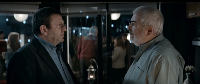
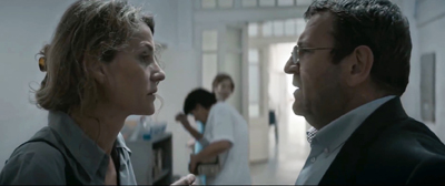
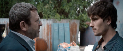
In The Graduation, characters tend to interact in in lengthy profiled two-shots, not 3/4 reverse angles.
This framing gives us some access to the characters’ emotions. It’s worth mentioning, though, that profile shots aren’t strongly informative about a person’s facial expression. A frown or a smile is more “readable” in the 3/4 framing favored by reverse-angle cuts.
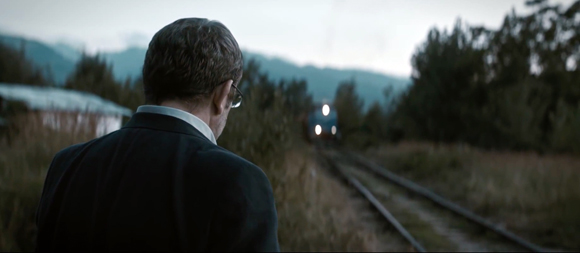
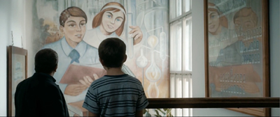
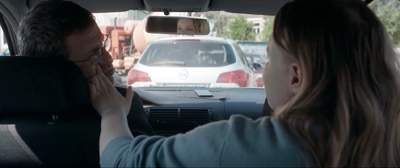
More remarkable, though, are those passages in which Mungiu simply denies us access to Romeo’s facial expressions by pivoting him away from us and denying a reverse shot.
Actors have turned their backs to the audience for a long time in both theatre and film, usually to enhance a gesture, to call attention to another actor, or to delay the revelation of the face. But since the reverse-angle cut is such an ingrained convention, we count on camera ubiquity; we expect to see everything. When characters have their backs to the camera, and the director doesn’t cut to an angle that reveals their reactions, this choice can have powerful narrative effects. It can make the character’s psychology more opaque and mysterious. It can also build suspense as we wait for some clues (in words or gestures) to the character’s response.
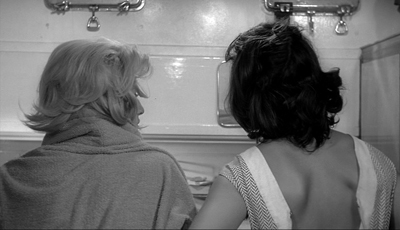
The withheld reverse angle, within longish takes, was a prominent tactic in Antonioni’s 1960s style, as in L’Avventura.
Mungiu isn’t quite so flagrant, favoring 3/4 rear view like the over-the-shoulder view of orthodox shot/reverse shots. This will do duty for orthodox POV cutting: We see what Romeo sees but not exactly through his eyes.
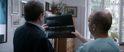
The result is to attach us to the protagonist but not in a deeply subjective way, as Hitchcock might with intense optical POV shots. These shots might suggest a perceptual subjectivity–we see what Romeo sees, more or less–we don’t know how he’s reacting. Sometimes, as when he and a colleague inspect an X-ray, we get almost no sense of the reaction, or what they’re reacting to.
In addition, Romeo is a fairly phlegmatic man anyhow; he’s hard to read even facing front.
His failed ambitions and troubled relation to his wife, as well as the mess he’s making of the exam scheme, seem to have given him a fixed, furrowed anxiety. I doubt that even Toni Erdmann could make him smile.
Still, most directors would probably have filmed Romeo driving his daughter to school, from an angle in front of the car, shooting through the windshield. And most directors would have revealed something of his response when, as his scheme unravels, the school principal orders him not to contact him again or come near his house.
Even more striking, at a climactic moment, he’s questioned by two policemen. I don’t have an illustration for you, but we’re perched over his shoulder and watch the two cops–not unsympathetic–explain to him at length the punishment likely headed toward him. We get no chance to see whether his facade cracks even a little. But observing him so often as a solid lump in the foreground or on the edge of the shot gives him, I think, a sort of obdurate resistance that suggests he will resist what’s coming. In these grim circumstances, stubborn stolidity gains a heroic quality.
Other characters, notably his wife and daughter, get framed in ways that allow us to track their emotions. It seems somewhat ironic that the sunniest, most straightforward and untroubled faces we see are those of the class lined up for the graduation picture.
No surprises here. The head-and-shoulders shot gets a lot of its impact from its coordination with other stylistic choices: the decision to cut (or not to cut), the selection of the angle (frontal, or from behind), and the overall tone of the film (grim or light-hearted). There are no general rules. Contra Chaplin, the close-up can be comic, as in Harold Lloyd. The long-shot can be tragic, as in Hou Hsiao-hsien or Edward Yang or Theo Angelopoulos. As with these shot scales, the workhorse medium shot is coordinated with other techniques to achieve its results in different contexts.
Thanks to Michael Barker of Sony Pictures Classics and Greg Compton of Sony Pictures Entertainment for their generous help in preparing this entry. Toni Erdmann is scheduled for U. S. release by Sony for 25 December. Graduation is distributed by IFC in the Sundance Selects collection; no U. S. release date yet announced.
I discuss the blend of cinematic convention and social intelligence elicited by shot/reverse-shot techniques in the essay “Convention, Construction, and Cinematic Vision,” in Poetics of Cinema, 57-82. On the quick information pickup involved in certain facial views, see Vicki Bruce, Tim Valentine, and Alan Baddeley, “The Basis of the 3/4 View Advantage in Face Recognition,” Applied Cognitive Psychology 1 (1987): 109–10; and Robert H. Logie, Alan D. Baddeley, and Muriel M. Woodhead, “Face Recognition, Pose, and Ecological Validity,” Applied Cognitive Psychology 1 (1987): 53–69.
On the 200-degree-plus style in modern film and television, see The Way Hollywood Tells It, 177-179. On change blindness, an earlier blog entry is here. Another entry bearing on the matter, also VIFF-inspired, is “Where did the two-shot go? Here.”
The laconic rear-view shot became a common tactic of modernist cinema. For other examples, you can see this entry on Béla Tarr. But Mizoguchi got there quite a bit earlier.
Toni Erdmann (Maren Ade, 2016).
Bergman, Antonioni, and the stubborn stylists
DB here:
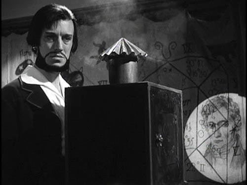
Jonathan Rosenbaum has created quite a stir. His New York Times Op-Ed piece, “Scenes from an Overrated Career,” offers a fairly harsh judgment on the films of Ingmar Bergman. In one sense the timing was awkward; the poor man had just died. But the article wouldn’t have attracted much attention if Rosenbaum had waited a few months, so if creating a cause célèbre was his goal, he chose the right moment.
Timing aside, there wasn’t much in the piece that hasn’t been said by certain cadres of cinephiles for decades. Back in the 1960s, people called Bergman “theatrical,” “uncinematic,” pretentious, and intellectually shallow. He was even accused of hypocrisy. His spiritual, philosophical films always seemed to depend on a surprising number of couplings, killings, rapes, and gorgeous ladies, often naked. Rosenbaum contrasts Bergman with Bresson and Dreyer, more austere religious filmmakers as well as great formal innovators, and this gambit too is familiar from late-night film-society disputes. Jonathan’s case is news in the good, grey Times, but it’s an old story among his (my) generation.
I think that this generational antipathy has many sources. While Bergman had considerable academic cachet, this may have hurt him with smart-alecks like us. Cinephile priests and professors told us that Bergman was a great mind, but we suspected them of snobbery, for they often disdained even foreign filmmakers who dabbled in popular genres. Kurosawa was admired for Rashomon and I Live in Fear rather than for Seven Samurai and Yojimbo. And many of Bergman’s intellectual fans despised the classic tradition of American studio film. Hitchcock had not yet convinced literature profs of his excellence, and Ford was a gnarled geezer who made Westerns. Bergman and his acolytes seemed just too square. Our money was on Godard, especially after Susan Sontag’s magisterial essay on him.
Furthermore, some critics were on our side. Pauline Kael, with her nose for elitism, mocked ambitious European experiments like Marienbad. Andrew Sarris, who had a huge influence on our generation, initially registered respect for the arthouse kings. They proved that an artist could put a personal vision on film, thus buttressing the auteur approach to criticism. But Sarris retreated fairly fast. He was more unflaggingly enthusiastic about American popular cinema, and by contrast he often characterized the new Europeans as gloomy, middlebrow, and narcissistic. (He did, after all, coin the phrase “Antonionennui.”) Sarris made it possible for us to argue that, say, Meet Me in St. Louis was a better film than L’Eclisse or Winter Light. (1)
Of course I’m generalizing; no Boomer’s experience was identical with any other’s. Speaking just for myself, I didn’t have a deep love for Bergman, and I still don’t. I was drawn to his early idylls (Monika, Summer Interlude) and impressed but chilled by the official classics (Smiles of a Summer Night, The Seventh Seal, The Virgin Spring). Persona, I admit, was a punch in the face. Seeing it in its New York opening, I felt that all of modern cinema was condensed into a mere eighty minutes. But no Bergman film afterward measured up to that for me, and after The Serpent’s Egg I just lost interest, catching up with Cries and Whispers, Scenes from a Marriage, Fanny and Alexander, and a very few others over the later decades.
We can talk tastes forever. Maybe you think Bergman is great, or the greatest, or obscenely overrated. I think that there’s something more general and intriguing going on beyond our tastes. What makes this hard to see is that the venues of popular journalism don’t allow us to explore some of the ideas and questions raised by our value judgments.
Critical semaphore
Take some of Rosenbaum’s criticisms, which Roger Ebert has persuasively answered. I’d add that Jonathan is sometimes applying criteria to Bergman that he wouldn’t apply to directors he admires. Bergman isn’t taught frequently in film courses? So what? Neither is Straub/Huillet or Rivette or Bela Tarr. Bergman is theatrical? So too are Rivette and Dreyer, both of whom Rosenbaum has written about sympathetically.
More importantly, Jonathan’s critique is so glancing and elliptical that we can scarcely judge it as right or wrong. A few instances:
*Bergman’s movies aren’t “filmic expressions.” There’s no opportunity in an Op-Ed piece for Jonathan to explain what his conception of filmic expression is. Is he reviving the old idea of cinematic specificity—a kind of essence of cinema that good movies manifest? As opposed to theatrical cinema? I’ve argued elsewhere on this site that we should probably be pluralistic about all the possibilities of the medium.
*Bergman was reluctant to challenge “conventional film-going habits.” Why is that bad? Why is challenging them good? No time to explain, must move on….
*Bergman didn’t follow Dreyer in experimenting with space, or Bresson in experimenting with performance. Not more than .0001 % of Times readers have the faintest idea what Jonathan is talking about here. He would need to explain what he takes to be Dreyer’s experiments with space and Bresson’s experiments with performance.
In his reply to Roger Ebert, Jonathan has kindly referenced a book of mine, where I make the case that Dreyer experimented with cinematic space (and time). Right: I wrote a book. It takes a book to make such a case. It would take a book to explain and back up in an intellectually satisfying way the charges that Jonathan makes.
Popular journalism doesn’t allow you to cite sources, counterpose arguments, develop subtle cases. No time! No space! No room for specialized explanations that might mystify ordinary readers! So when the critic proposes a controversial idea, he has to be brief, blunt, and absolute. If pressed, and still under the pressure of time and column inches, he will wave us toward other writers, appeal to intuition and authority, say that a broadside is really just aimed to get us thinking and talking. But what have we gained by sprays of soundbites? Provocations are always welcome, but if they really aim to change our thinking, somebody has to work them through.
I’ve suggested elsewhere that too much film writing, on paper and on the Net, favors opinion over information and ideas. Opinions, which can be stated in a clever turn of phrase, suit the constraints of publication. Amassing facts and exploring ideas in a responsible way—making distinctions, checking counterexamples, anticipating objections, nuancing broad statements—takes more time. Academics are sometimes mocked for their show-all-your-work tendencies, and I grant that this can be tedious. But we’re just trying to get it right, and that can’t be done quickly.
Now you know why our blog entries are so damn long.
This one is no exception.
Too often film talk slides from being film comment to film chat to film chatter. Even our best critics, among whom Rosenbaum must be counted, make use of a kind of rapid semaphore, signaling to the already converted. Evidently his ideal reader agrees that good cinema is challenging and experimental, directing actresses is a minor talent, and being admired by upscale Manhattanites is a sign of a sellout. Readers will self-select; those who have congruent tastes will pick up the signals. But these beliefs aren’t really knowledge. They’re just, when you get right down to it, attitudes.
I’ll try to explore just one of the issues Jonathan raises but can’t pursue: the question of how stylistically innovative Bergman was. Of course, I can’t write a book here either. I offer what follows as simply the start of what could be an interesting research project.
One stylistic arc
The rise of European arthouse auteurs in film culture of the 1950s and 1960s put the question of personal style on the agenda, but back then we didn’t have many tools for analyzing stylistic differences among directors. We didn’t know much about the local histories of those imported films; as Sarris recently pointed out, L’Avventura was Antonioni’s sixth feature but was his first film released in the US. Moreover, we didn’t know much about the norms of ordinary commercial filmmaking, in the US or elsewhere. (2) Today we’re in a better position to characterize what went on. (3)
In most countries, quality cinema of the late 1940s relied on variations of the Hollywood approach to staging, shooting, and cutting that had emerged in the silent era. Directors moved their performers around the set fairly fluidly and used editing to enlarge and stress aspects of the action. You can see a straightforward example of this approach on an earlier entry on this blogsite.
Many directors of the period built upon this default by creating deep space in staging and framing. Using wide-angle lenses, directors could allow actors to come quite close to the camera, sometimes with their heads looming in the foreground, while other figures could be placed far in the distance. Several planes of action could be more or less in focus. Here’s a straightforward example from William Wyler’s The Little Foxes.
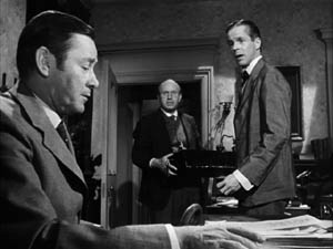
We find directors exploiting this approach not only in the United States but in Eastern and Western Europe, Scandinavia, the Soviet Union, Japan, Mexico, and South America. Here’s an instance from the French film Justice est faite (1950).
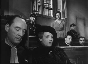
Why did this approach emerge in so many countries at the same time? We don’t really know. It wasn’t simply the influence of Citizen Kane, as we might think. The Stalinist cinema had developed deep-space shooting in the 1930s, and we can find it elsewhere. Probably Hollywood’s 1940s films helped spread the style, but there are likely to be local causes in various countries too.
In any event, during the 1950s two technological changes posed problems for this style. One was the greater use of color filming, which renders depth of field much more difficult. The other innovation was anamorphic widescreen, a technology seen in CinemaScope and Panavision. These systems also had trouble maintaining focus in many planes when the foreground was close to the camera. The flagrant depth compositions we find in black-and-white ‘flat’ films were quite difficult to replicate in color and anamorphic widescreen.
Through the 1960s, the deep-focus style became a minor option and directors found other alternatives to presenting character interactions. The most basic one was simply to station the camera at a middle distance and create a more porous and open staging, with fewer planes of action and simple panning movements to follow characters.
One new approach relied not on wide-angle lenses but on lenses of long focal length. Instead of staging scenes in depth, putting the camera close to a foreground figure, filmmakers began keeping the camera back a fair distance and using long lenses to enlarge the action. This accompanied a trend toward greater location shooting; it’s easier to follow actors on a street or highway if the camera shoots with a telephoto lens. The long lens also reduces the volumes of each plane, so that figures tend to look like cutouts (4). This lens facilitated the development of those perpendicular images I’ve called, in some writing and on this blog, planimetric shots.
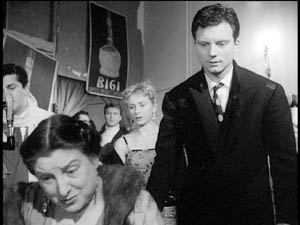
What fascinates me about this general pattern of stylistic change in the US is how many of the Euro auteurs go along with it. Take Fellini, who shifts from the bold depth compositions of I Vitelloni to the fresco-like flatness of Satyricon.
![]()
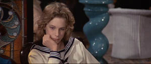
Likewise, Luchino Visconti’s early black-and-white work affords textbook examples of deep-focus cinematography, but in the 1960s he embraced the telephoto look, heightened by what we can call the pan-and-zoom tactic. In Death in Venice, the camera often scans a scene, searching out one player to follow then zooming back to reframe the figure in relation to others. One shot starts with the boy Tadzio, pans right across the hotel salon, to end on von Aschenbach, staring at the boy, and then zooming back to take in the larger scene.
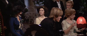
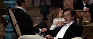
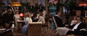
Probably Rossellini’s 1960s films, such as Viva l’Italia! and Rise to Power of Louis XIV, were key influences on this look.
Leaving Europe, there’s Kurosawa, who was the first major director I know of to build zoom and telephoto lenses into his style. Satayajit Ray followed much the same trajectory from the Apu trilogy’s flamboyant depth to the pan-and-zoom close-ups of The Home and the World. Not every filmmaker took the long-lens option, but as it became commonplace in the 1960s, many major directors tried it.
What about Bergman? It seems that in most respects he went along with the general trends. We find deeply piled-up bodies early in his career (e.g., Port of Call, below) and through the 1950s and early 1960s (The Face, below).
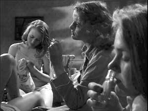
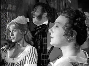
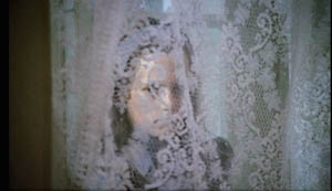
Like his peers, with color and widescreen he shifted toward more open staging, long lenses, and zooms. For example, one telephoto shot of Cries and Whispers zooms back as the little girl emerges, zig-zagging, from behind the lace curtain.
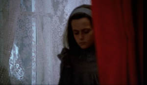
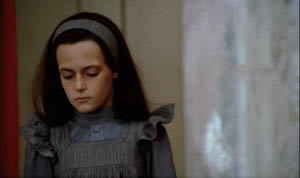
We might conclude that Bergman mostly worked with the received forms of his day. At the level of shot design, The Face might have been shot by the Sidney Lumet of Fail-Safe. But Bergman did innovate somewhat, I think. Most obviously, he sometimes had recourse to the suffocating frontal close-up, as in a childbirth scene from Brink of Life.
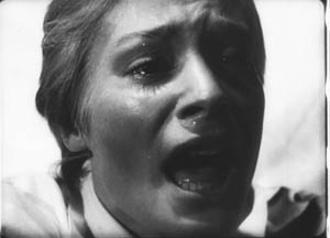
He develops this visual idea by creating heads floating unanchored in both foreground and background. Here’s a famous image from Persona.
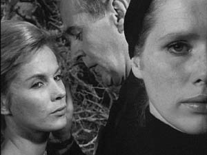
Pace Rosenbaum, I’d say that this sequence, with Elisabeth Vogler apparently quite oblivious to her husband’s mating with Alma, definitely “challenges conventional film-going habits”—or at least conventional ways we read a scene. It seems to combine the deep-space, big-foreground scheme of the 1940s with the tight close-ups of Bergman’s early work, and instead of specifying space it undermines it. We have to ask if what happens in the background is Elisabeth’s hallucination.
My case is very schematic, and we would need to study Bergman film by film and scene by scene to confirm that he stuck to the broad norms of his time. The norms themselves also deserve deeper probing than I’ve given them. (5)
But let’s push a bit further and examine Antonioni, that perpetual foil to Bergman. Broadly speaking, he passed through the same arc, from deep-focus compositions in the 1950s and early 1960s to telephoto flatness in his color work. Yet there are some important differences.
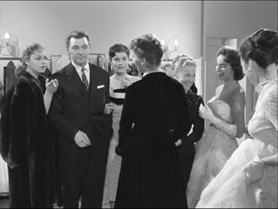
In the 1950s, unlike Bergman, Antonioni employed quite intricate staging, sustained by long takes. He usually didn’t opt for big foregrounds, favoring more distant framings and sidelong camera movements. The most famous instance is the startling 360-degree long take on the bridge in his first feature, Story of a Love Affair, but Le Amiche is also full of intricate staging in mid-ground depth. One scene shows fashion models bustling around after a successful show, congratulating the shop’s owner Clelia. She opens a card from her lover, is distracted by the arrival of her friends coming to congratulate her, and goes off with them. One model darts diagonally forward to investigate the message. All of this is handled in a single graceful take.
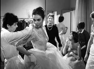
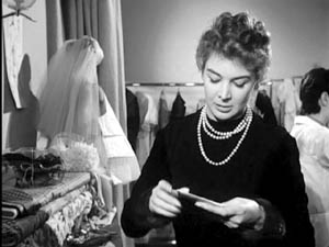
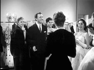
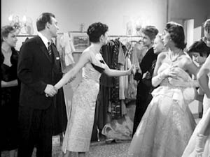
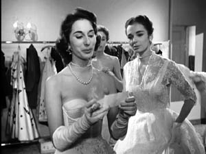
Antonioni relies on the fluid staging techniques developed in the early sound era and taken in diverse directions by Renoir, Ophuls, Preminger, Mizoguchi, and other directors of the 1930s and 1940s. Often, however, Antonioni’s characters move rather slowly and hold themselves in place, and as a result the overall spatial dynamic unfolds in marked phases. (6)
In the trilogy starting with L’Avventura, Antonioni relies on shorter takes and less florid camera movement. Now he emphasizes landscape and architecture so as to diminish the characters. If the expressionist side of Bergman plays up the psychological implications of the drama, the more austere Antonioni plays things down, “dedramatizing” his scenes by keeping the camera back, turning the figures away from us, and reminding us of the milieu. (You see the Antonioni influence on similar strategies in the work of Edward Yang, as I discussed recently on this blog.)
Once color came along, Antonioni changed his style, moving toward less dense staging and at times almost casual framing (as in The Passenger). He also had recourse to the telephoto technique, but I’d argue he brought something new to it. With Red Desert he accepted the abstraction inherent in the long lens and combined that with color design to create a pure pictorialism.
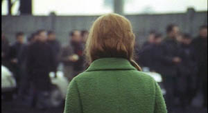
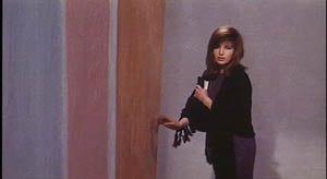
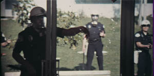
Ironically, Red Desert may have made Antonioni another sort of ‘expressionist’ than Bergman. The stylized palette of the film encourages us to ask if the industrial landscape is really so smeared and bleached out, or if we’re seeing it as Giuliana does. The same sort of painterly abstraction can be found in Zabriskie Point. In one scene, a pan over the travel decals on a family’s car window treats the boy inside as no more than another thin slice of space. Other scenes turn campus policemen into figures in grids.
You might even argue that the pan-and-zoom style gets a kind of meta-treatment in the climactic shot of The Passenger. There in a grandiose technical gesture Antonioni’s concern for architecture, his refusal to underscore a melodramatic plot twist, and his love of camera movement blend with the technology of the zoom. At the time, several of us (maybe Jonathan too) saw this shot as a response to Michael Snow’s Wavelength, relayed through the sensibility of Passenger screenwriter and avant-garde filmmaker Peter Wollen. Now it looks to me like a natural response of a very self-conscious artist to a stylistic trend of the moment.
A bestiary of stylists
To get crude and peremptory: Let’s say that once a director has reached maturity and become a confident artisan, several choices offer themselves. The filmmaker can be a flexible stylist, a stubborn stylist, or a polystylist (sorry for the awkward term).
A flexible stylist adapts to reigning norms. Bergman could be an aggressive-deep-focus director, then a pan-and-zoom director. Both approaches to staging and shooting preserved the expressive dimensions that mattered most to him: performance (chiefly face and voice), Ibsenesque bourgeois tragedy, Strindbergian play with dream and dissolution of the ego, and other elements.
Most of the major 1960s arthouse directors, from Truffaut and Wajda to Pasolini and Demy, were flexible stylists in this sense. So were a great many Hollywood and Japanese directors, such as Lubitsch and Kinoshita. Perhaps Ousmane Sembene, who also died recently, would be another instance. Buñuel becomes a fascinating case: He adopts the blandest, calmest version of each trend, creating a neutral technique, the better to shock us with what he shows.
A stubborn stylist pursues a signature style across the vagaries of fashion and technology. Dreyer from Vampyr onward does this; I argue in the book Jonathan cites that he seeks to “theatricalize” cinema in a way that goes beyond the norms of his moment. Perhaps Hitchcock and von Sternberg (at least in the 1920s and 1930s) fit in here as well. Bresson, Tati, and supremely Ozu were stubborn stylists. Give them a western or a porno to shoot, and they’d handle each the same way. (7)
This isn’t to argue that stubborn stylists never change or always do the same thing. Mizoguchi has a signature style and yet remains fairly pluralistic, at least at a scene-by-scene level. I think that the test comes in seeing how stubborn stylists persistently explore the constrained conditions they’ve set for themselves.
Signature styles help a filmmaker in the festival market, so we don’t lack for current examples of stubborn creators: Godard, Theo Angelopoulos, Hou Hsiao-hsien, Kitano Takeshi, Tsai Ming-liang, and Jia Zhang-ke. Granted, some of these may be rethinking their commitment to their stylistic premises.
A polystylist tries out different styles without much concern for what the reigning norms demand. Polystylistics holds a high place in modernist aesthetics. After the great triumvirate of Picasso, Joyce, and Stravinsky, with their bewildering arrays of periods and pastiches, the idea of the modernist as a virtuoso steeped in several styles became a powerful option. What’s been called postmodernism is no less favorable to polystylism; if you mix styles, you’ve presumably mastered them.
In cinema, some polystylists are just eclectic. Steven Soderbergh can give us the portentous pictorialism of The Underneath or Solaris, the grab-and-go look of Traffic, and the trim polish of Ocean’s 11. More deeply, there are directors like R. W. Fassbinder, Raoul Ruiz, and Oshima Nagisa who seem to pursue polystylistics on principle. It’s as if, rejecting the very idea of a signature style, they set themselves fresh, severe conditions for each project.
After The Boss of It All, we may want to count von Trier as a polystylist, not merely a director who changed his style from one phase of his career to another. Perhaps the best current example is Aleksandr Sokurov; who would dare predict what his next film will look like?
This whole entry is pretty sketchy, I grant you. The categories need further refining. I’ve ignored sound, which is very important. I’ve emphasized visual style, and just shooting and staging within that. (Nothing about lighting, cutting, etc.) So this is tentative—notes perhaps for a book-length argument. But I’ve made my point if you see that some ideas and some historical information can put intuitions about originality into a firmer framework.
And I’ve left the value judgments suspended. If you think originality trumps other criteria, then Bergman doesn’t probably come up as strong as Antonioni, let alone Bresson or Ozu or Dreyer. But if you can entertain the possibility that a great filmmaker can accept certain norms of his time, making those serve other channels of expression, then Bergman can’t automatically be faulted. At least thinking about him and his peers in the context of the history of film art gives us some data to ground our arguments. The world is more interesting and unpredictable than our opinions, especially those we formulated forty years ago.
(1) I actually hold this opinion.
(2) I assume that the arthouse auteurs were no less commercial filmmakers than their Hollywood counterparts. They were sustained by national film industries and supported by the international film trade. Eventually many were funded by Hollywood companies.
My friend and colleague Tino Balio is at work on a book tracing the role of overseas imports in the American film market of the 1940s-1960s, and it should be a real eye-opener to those who persist in counterposing art cinema and commercial production.
(3) Some of what follows is discussed in Part Four of Film History: An Introduction.
(4) I talk about both the deep-focus and long-lens tendencies in Chapter 6 of On the History of Film Style and Chapter 5 of Figures Traced in Light.
(5) For a wide-ranging account of art-cinema norms, see András Bálint Kovács’ forthcoming book, Screening Modernism: European Art Cinema, 1950-1980.
(6) I analyze this tendency, using other scenes from Le Amiche, in On the History of Film Style (pp. 235-236) and Figures Traced in Light (pp. 151-152).
(7) Suo Masayuki’s My Brother’s Wife: The Crazy Family is a softcore film made in a pastiche of Ozu’s style.
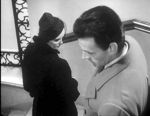
Story of a Love Affair (Cronaca di un amore).
PS, Sunday 12 August: Only a day later, new thoughts about something else I should have said about generational tastes. In the light of the Woody Allen eulogy that appears in the New York Times today, I think there’s more of a sub-generational split than I’d initially suspected. So here’s another gesture toward the sort of history of taste that Jonathan mentions.
Allen is in his seventies, a decade older than Jonathan Rosenbaum and me. He came of age in the affluent decade after the war. Allen saw Bergman films in the mid- to late 1950s, probably against the backdrop of Neorealism, British comedy, and French Cinema of Quality. In that context, Bergman’s movies looked pretty revolutionary.
But Jonathan and I came to maturity, if that’s the right word, in the mid-1960s. When I got to college in 1965, French directors (notably Resnais, Godard, Truffaut) and the Czechs, Hungarians, and others were getting established in US film culture. Bergman, Fellini, and Antonioni were already senior directors and soon they were starting to make what many of us perceived as career mistakes (Juliet of the Spirits, The Passion of Anna, even Blow-Up). Also, of course, concerns about their political alignments came more to the fore as the decade wore on. Many of my friends thought that The Battle of Algiers left all other films in the shade. These factors may have made the Boomers suspicious of “arty” foreign imports, of which Bergman’s work was a central instance. Interestingly, The Dove, a parody of The Seventh Seal and a film-society staple, came out in 1968, when Bergman may have been wearing out his welcome.
[Speaking of parodies, the SCTV skit, “Scenes from an Idiot’s Marriage”, in which Jerry Lewis (Martin Short) suffers the indignities of a cuckolded Bergman hero, is well worth checking out. The SCTV Fellini/ Antonioni parody, “Rome Italian Style,” is also pretty good, especially for its excellently awkward dubbing.]
Interestingly, Scorsese in age falls midway between Allen and us Boomers, and he contributes a Times tribute to Antonioni today. Maybe I have to split the generations even more: Bergman for 1955-1960, Antonioni for 1961-1965, Godard for 1965-1970? (Just kidding.) What strikes me are the differences in the essays. While Allen ranges widely, reports conversations, and praises Bergman in general terms, Scorsese’s piece evokes the texture of L’Avventura, suggesting how disturbing and demanding it was to watch. Maybe he inadvertently backs Jonathan’s claim that Bergman didn’t challenge his audience as much as he might have?
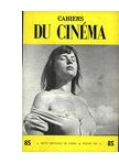 I’m grateful as well to readers responding to my arguments. Michael Kerpan kindly spread the word about my post on imdb and the Criterion Forum. Kent Jones wrote to point out that any argument about Bergman’s influence has to take into account the high regard in which he’s been held in France, among both critics and filmmakers. Kent itemizes not only Godard, Truffaut, and Rivette but Assayas, Téchiné, and Desplechin. It’s a fair point. Antoine de Baecque anchors much of his magisterial history of Cahiers du Cinéma around the mesmerizing power of that busty still of Harriet Anderson, flaunted on a 1958 Cahiers cover and swiped by Antoine in The 400 Blows. In 2003, my old friend Jacques Aumont published a large critical study on Bergman. Cahiers’ next issue will be devoted to the director.
Speaking of French critics and directors, on imdb above Bertrand Tavernier points out that my memory failed. I did see Scenes from a Marriage and Cries and Whispers before The Serpent’s Egg, not after, as my post suggests.
My late Bergman viewing remains gappy. I still haven’t seen the long version of Fanny and Alexander, which everyone assures me is a masterpiece. Last spring, my friend and Bergman scholar Paisley Livingston showed me portions of the TV film The Last Gasp (1995). It’s about Georg af Klercker, the fine Swedish director of the 1910s. It was intriguing, but I was put off by Bergman’s inadequate pastiches of af Klercker’s remarkably poised and complex shots. Now that’s fussy taste, I admit.


