Archive for the 'Directors: Bauer' Category
What’s left to discover today? Plenty.
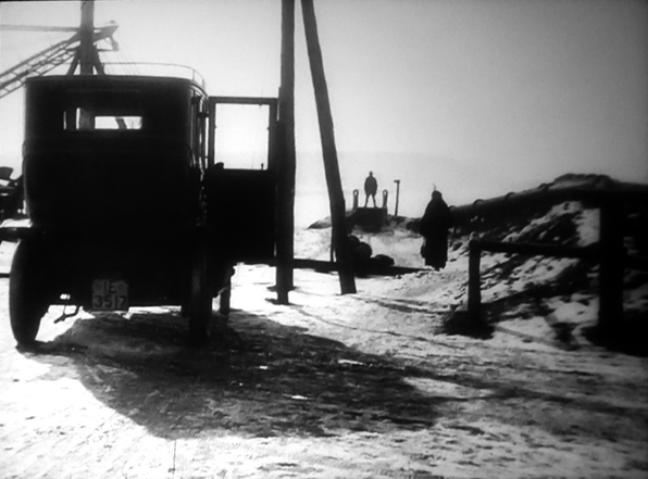
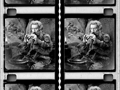
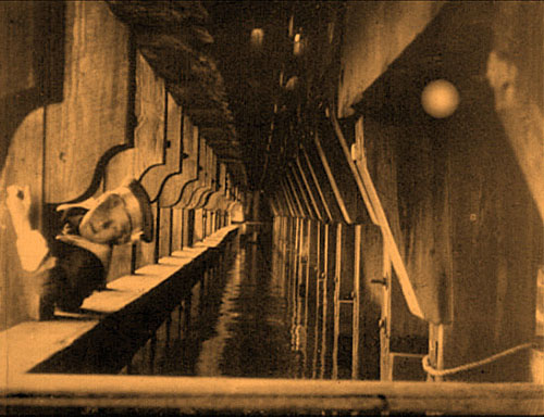
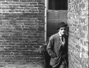
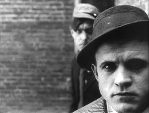
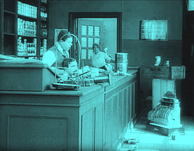
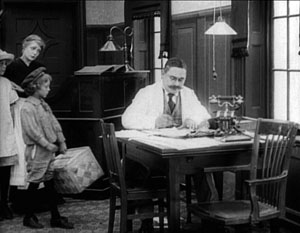
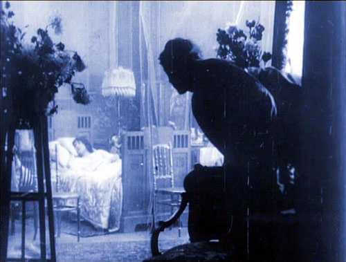
Der Tunnel (William Wauer, 1915).
DB here:
Being a cinephile is partly about making discoveries. True, one person’s discovery is another’s war horse. But nobody has seen everything, so you can always hope to find something fresh. There’s also the inviting prospect of introducing a little-known film to a wider community–students in a course, an audience at a festival, readers of a blog.
A festival like Bologna’s Cinema Ritrovato (we covered this year’s edition here and here and here) offers what you might call curated discoveries. Expert programmers dig out treasures they want to give wider exposure. Such festivals are both efficient–you’re likely to find many new things in a short span–and contagiously exciting, because other movie lovers are alongside you to talk about what you’re seeing.
A year-round regimen of curated discoveries is a large part of the mission of the world’s cinematheques. This is why places like MoMA, LACMA, MoMI, BAM, TIFF, ICA, and other acronymically identified showcases are precious shrines to serious moviegoing.
But other discoveries are made in a more solitary way. Film researchers, for instance, ask questions, and some of those can really only be answered by visiting film archives. Sometimes we need to look at fairly obscure movies. And despite the rise of home video, there are plenty of obscure movies that can be seen only in archives. It’s here that the programmers of Ritrovato and Pordenone’s Giornate del Cinema Muto come to select their featured programs.
Archive discoveries aren’t predictable, and many are likely to be of interest only to specialists. Such was the case, mostly, with our archive visits this summer. But as in years past (tagged here), all our archive adventures yielded pure happiness.
This time I concentrated on films from the 1910s-early 1920s films because I hope to make more video lectures about this, the most crucial phase of film history. (One lecture is already here.) In our archive-hopping, we saw films I was completely unfamiliar with. I re-watched some films I’d seen before and found new things in them. I detected some things of interest in films I hadn’t known. Most exciting was our viewing of a major film that has gone unnoticed in standard film histories.
In the steps of Jakobson and Mukarovský
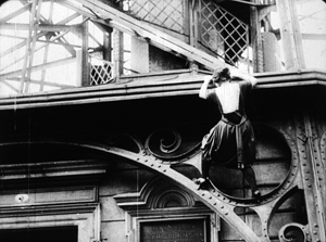
Love Is Torment ( Vladimír Slavínský, Přemysl Pražský, 1920); production still.
First stop was Prague, where I was invited to give two talks. At the NFA we saw two films on a flatbed: a portion of Feuillade’s Le Fils du Filibustier (1922) and a cut-down version of Volkoff’s La Maison du mystere (1922), the latter a big gap in our viewing. The expurgated Maison came off as rather drab, lacking nearly all the big moments much discussed in reports like James Quandt’s from a decade ago. So we search on for the full version. . . .
As for the Feuillade: Le Fils du Filibustier was his last “ciné-roman.” Our two-reel segment, which seemed fairly complete, confirmed his late-life switch to fairly fast, Hollywood-style editing, with surprisingly varied angles.Again, though, we yearn to see the entirety of this pirate saga.
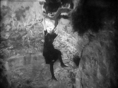
On another day the archive kindly screened several 1910s-early 1920s Czech films for us. Our hosts Lucie Česálková and Radomir Kokes translated the titles and provided contexts. Among the choices were Devil Girl (Certisko, 1918), with a protagonist who’s more of a tomboy than a possessed soul; and the full-bore melodrama Love Is Torment (Láska je utrpením, 1919). The plot, outlined here, involves scaling and jumping off a tower, twice. Once it’s a stunt for a film within the film, the second time (below) it’s the real thing.
Radomir explained to us that one of the co-directors, Vladimír Slavínský, seemed in his 1920s films to specialize in building two reels (often the third and fourth) in a “classical” fashion before letting the other three become more episodic. And indeed, most of the late 1910s-early 1920s films we saw were up to speed with other European filmmaking, in their staging, cutting, and use of intertitles.
We look forward to viewing more Czech films as the opportunity arises. A culture that gave us Prague Structuralism is definitely worth getting to know better. In the meantime, the journal Illuminace, edited by Lucie, is injecting a great deal of energy into local film studies, and the archive is entering a fresh phase with its new director, Michal Bregant.
3D excavations
Der Hund von Baskerville (1914).
In Munich, we reconnected with our old friends Andreas Rost, now retired from administering the city’s cultural affairs, and Stefan Drössler, director of the Munich Filmmuseum. We also reunited with the stalwart archivists Klaus Volkmer, Gerhard Ullmann, and Christoph Michel. Talking with them, we realized we hadn’t been back for over ten years. Klaus and Gerhard were warm and helpful during our earlier visits.
One rainy afternoon, Stefan shared his research on the history of 3D. He presented a spectacular PowerPoint, with rare images and some truly startling revelations. He has given this talk at intervals over the years, but it grows and deepens as he discovers more. Accompanying it, he screened some Soviet 3D films, including the 1946 Robinzon Cruzo. This mind-bending item was made with diptych images, so that the projected image turned out to be slightly vertical. The soundtrack runs down the middle.
The director, Aleksandr Andriyevsky, made excellent use of 3D to evoke the stringy vines and protruding leaves of Crusoe’s island. Amid all the talk today about glasses-free 3D, it’s interesting to learn that Soviet researchers prepared such a system. Stefan’s archaeology of 3D, for me at least, was a pretty big discovery.
At Munich we also saw three silent German titles. Two were associated that resourceful self-promoter Richard Oswald. Sein eigner Morder was a 1914 version of Dr. Jekyll and Mr Hyde, directed by Max Mack from Oswald’s screenplay. Shot in big sets, it spared time for the occasional huge close-up. The other film was Oswald’s semi-comic adaptation of The Hound of the Baskervilles (Der Hund von Baskerville, dir. Rudolf Meinert, 1914), which he had already turned into a play. The sleuth isn’t exactly our idea of Holmes (see above), and he isn’t as quick-witted, I thought, but it was an enjoyable item. Dr. Watson has a sort of tablet which picks up messages; Holmes’ orders are spelled out in lights on a grid. Stefan rightly called it a 1914 laptop.
As for the third film: More about that coming up.
The shadow of Hollywood
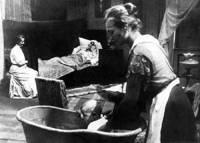
Les Deux gamines (1921).
At Brussels, thanks to the cooperation of the Cinematek, I was able to see several items for the first time, and two held considerable interest. The short The Meeting (1917), by John Robertson, showed a real flexibility in laying out the space of a cabin both in front of the camera and behind it. Most interior scenes in 1900-1915 cinema bring characters in from a doorway in the rear of the set (as Feuillade does in his 1910s films) or straight in from the sides, perpendicular to the camera (as Griffith tends to do). The Meeting shows that the diagonal screen exits and entrances that we see in exteriors were coming into use in interior sets as well.
Another 1917 film, Frank Lloyd’s A Tale of Two Cities, was further support for the idea that American continuity filmmaking was well-established and already being refined at the period. Dickens’ classic tale is handled with dispatch–rapid exposition, smooth crosscutting to set up the plot lines–and the film makes dynamic use of crowds surging through well-composed, starkly lit frames. There are also some remarkably expressive close-ups, evidently made with wide-angle lenses.
To clinch a plot point, the resemblance of aristocrat Charles Darnay to British solicitor Sydney Carton, the star William Farnum plays both characters. Not much of a problem if you keep the characters in separate shots; the good old Kuleshov effect (aka known as constructive editing) makes it easy. At this period, though, filmmakers were perfecting ways to show one actor in two roles within a single shot. The most famous examples involve Paul Wegener in The Student of Prague (1913) and Mary Pickford in Stella Maris (1918).
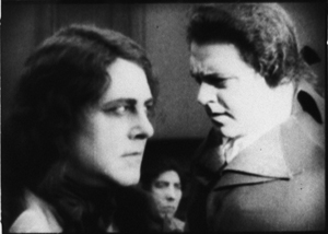
Cinematographer George Schneiderman contrives some really convincing multiple-exposures showing Farnum as both Darnay and Carton. There are some standard trick compositions putting Farnum on each side of the screen, but several images take the next step and let the actor cross the invisible line separating the two halves. At another point, we get a flashy passage showing the two facing one another in court, followed by a “Wellesian” angle of the two characters’ heads in the same frame.
Hollywood’s pride in photorealistic special effects, so overwhelmingly apparent today, has deep roots.
Part of my Brussels visit involved checking and fleshing out notes on certain films I saw many years ago. Some were wonderful William S. Hart movies like Keno Bates, Liar (1915; surely one of the best film titles ever). There was, inevitably, Feuillade as well. The influence of Hollywood was powerful in the ciné-roman Les Deux gamines (1921). This baby, released in 12 parts originally, runs nearly 27,000 feet. At 20 frames per second, it would take six hours to screen. What with changing reels, making notes, counting shots, pausing to study things, and taking stills, Kristin and I took about ten hours to watch it.
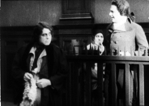
Was it worth it? An adaptation of a popular stage melodrama, it can’t count as one of Feuillade’s major achievements. Two girls are left alone when their mother is reported dead. They are adopted by their gloomy grandpa and tormented by his overbearing housekeeper. They become the target of kidnapping by gangster pals of their father, who has divorced their mother and turned to a life of petty crime. Their allies are their young cousins, a wealthy benefactor, and their godfather and music-hall star Chambertin. Everything ends happily, if you count the father’s redemptive sacrifice on behalf of a pregnant woman.
Les Deux Gamines is determined to delay its ending by any means necessary. Form here definitely follows format; Feuillade fills out the serial structure with plots big and small. (Shklovsky would love it.) There are incessant abductions, escapes, rescues, coincidental meetings, and timely reformations, plus at least three cases of people wrongly assumed to be dead. All of this is accompanied by an endless exchange of telegrams and letters. People are forever piling into and out of carriages, train cars, and taxis. Such material serves as makeweight for some genuinely big moments, including a cliff-hanging scene and a stunning climax in a smuggler’s warehouse stuffed with gigantic bales of used clothing.
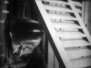
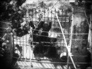
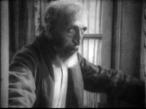
Like Le Fils du Filibustier, this film shows Feuillade trying to change with the times. The supple long-take staging of Fantômas and Les Vampires and Tih-Minh mostly goes away, to be replaced by rapid editing. Feuillade employs standard continuity devices, as when the grandfather discovers that the kids have sneaked out at night and are trying to return by scaling the gate.
Feuillade varies his angles and lighting to accentuate the moment of visual discovery. Elsewhere, some appeals to “offscreen sound” (cutaways to doorbells and telephones) built up to a surprise effect.
But by the energetic standards of, say, Robertson or Lloyd several years earlier, Les Deux gamines is fairly timid. Feuillade doesn’t explore editing resources very much here, not even as much as in Le Fils du Filibustier. The fairly quick cutting pace stems partly from the stratagem of having dialogue titles interrupt static two-shots of characters talking to one another. This sort of proto-talkie-technique yields efficient storytelling but not much visual momentum. Feuillade tried flashier things in other films of the period (see here).
Hours and hours of nothing but Bauers
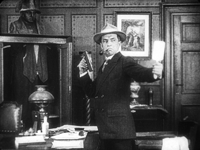
The Alarm (1917).
Yevgeni Bauer, one of the master directors of the 1910s, remains lamentably unknown. About two dozen of his over seventy films survive, but many of the ones we have lack intertitles. A few of his films are available on DVD (most obviously here; less obviously here). He died of penumonia in 1917, between the February revolution and the Soviets’ coup d’état in October. He was only 52.
My first archive-report entry back in 2007 recorded my interest in Bauer, and I’ve returned to his films over the years. Now here I was watching some again, confirming things I found of interest then, and discovering (that word again) new felicities. I hope to say more in those short video lectures on the 1910s, but I can’t leave without giving you a taste of his qualities.
Two of the films I saw this time were from 1917. The Alarm (Nabat) came out in May 1917, just before Bauer’s death in June. Originally running eight reels, it was cut down after the initial release, and that’s evidently the version we have. For Luck (Za Schast’em, September 1917) was directed by Bauer from his sickbed. Both films are fairly hard to follow. The Alarm lacks intertitles, and For Luck has many fewer than it had originally.
The two films are of exceptional interest, though. For one thing, there’s the involvement of Lev Kuleshow, who at the age of eighteen served as art director for the earlier film and, apparently reluctantly, as an actor in the later one. More important, the films remain as beautifully designed, staged, and acted as ever.
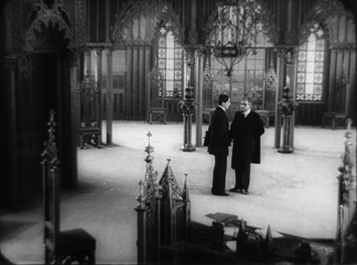
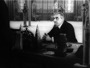
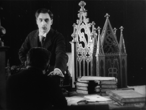
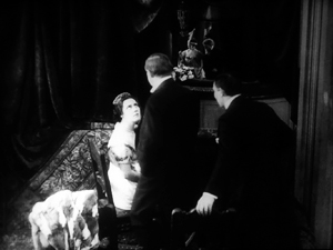
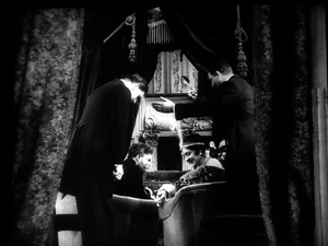
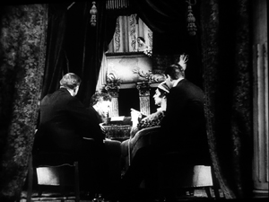
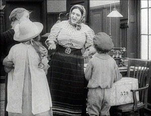
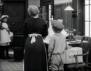
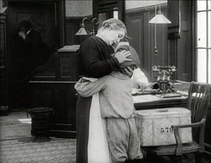
The Alarm is a wide-ranging drama set before the February upheaval. The drama involves romantic intrigues among the upper class, interwoven with a workers’ rebellion against a master capitalist. The millionaire Zeleznov holds court in a vast office with chairs bearing ominous spires and spiky arches; the windows open onto a view of his factory. A long-shot view is above; here’s a sample of how Bauer shows off his decor in something akin to shot/ reverse-shot.
The idea of capitalism as an overreaching religious striving is evoked by turning Zeleznov’s headquarters into a Symbolist cathedral. And looking at the second shot, you wonder whether Kuleshov’s inclination to stage his own scenes against pure black backgrounds has its source in his work for the man he called “my favorite director and teacher.”
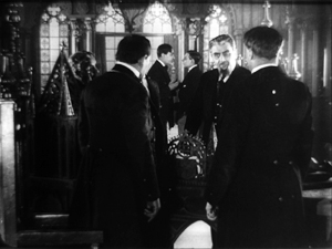
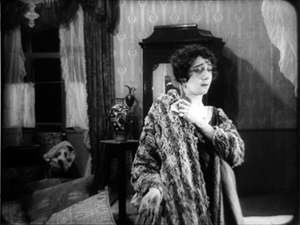
As ever, Bauer makes fluid use of depth. He choreographs meetings of Zeleznov’s brain trust in ever-changing arrangements, and he eases a man out of a boudoir through a mirror reflection over a woman’s fur-draped shoulder.
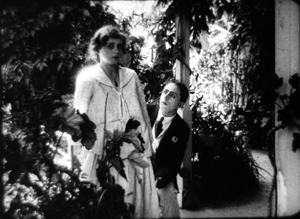
Compared to the scale of The Alarm, For Luck is decidedly low-key–a bourgeois melodrama that extends barely beyond an anecdote. Zoya has been a widow for ten years, and she hopes to marry the loyal family friend Dmitri. But Zoya’s daughter Lee hasn’t yet reconciled to losing her father. The couple hope that Lee has worked out her grief during her dalliance with a young painter (played by Kuleshov), but she reveals that all along she has hoped to marry Dmitri.
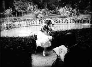
The Alarm used some extravagant sets, both for interior and exterior scenes, but a good deal of For Luck takes place in parks and terraces. The sincere Enrico sketches Lee in front of swans, and they steal some moments in a bower.
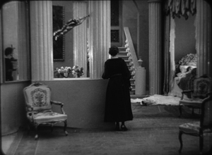
Still, there are some interiors boasting Bauer’s famous pillars and columns, which create massive, encapsulated spaces. Here Zoya looks off, in depth, at the ailing Lee, in bed on the far right.
Sharp-eyed Bauerians will notice the mirror set into the left wall, reflecting Zoya. Kuleshov, who did art direction on this as well as The Alarm, worried more about the trumpet-blowing Cupid floating between the pillars on the left. (“It turned out bad on the screen–incomprehensible and inexpressive.”) He did think that the tonalities of the set worked well: “As an experiment, I put up a set painted in shades of white that were ever so slightly different from one another.”
“Ever so slightly different” isn’t a bad evocation of the tiny variations of shape and shade, light and texture, that characterize Bauer’s ripe, sometimes overripe, imagery. This is a social class on the way out, but it leaves behind a great glow.
Tunnel: Vision
The Tunnel (1915).
In 1913, the popular novelist Bernhard Kellermann published Der Tunnel. It’s not quite science-fiction, more a prophetic fiction or realist fantasy in the vein of Things to Come. The book became a best-seller and the basis of a 1915 film directed by William Wauer.
The plot would gladden the heart of Ayn Rand. A visionary engineer persuades investors to fund building an undersea railway connecting France to the United States (specifically, New Jersey). No meddling government gets in the way of this titanic effort of will. Max Allan buys land for the stations, hires diggers from around the world, and risks everything he has. The obstacles are many. An explosion scares off workers; there is a strike; impatient stockholders raid and burn the company headquarters.
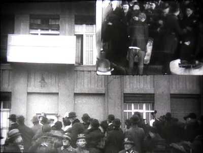
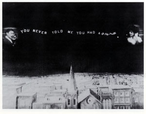
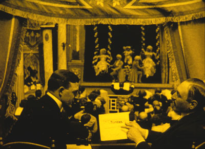
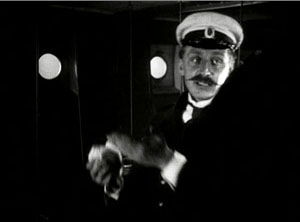
Max Allan moves forward undeterred, though he hesitates when his wife and child are stoned to death by a mob. After twenty-six years, the railway is opened. Max, along with his new wife (the daughter of his chief backer), proves it’s safe by taking the first transatlantic train. The event is covered by television, projected on big screens around the world (above). In the original novel, a film company was commissioned to document every stage of work.
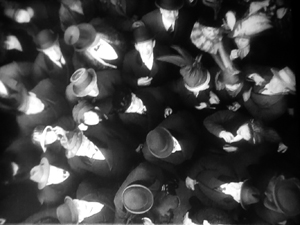
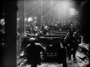
The book skimps on characterization, and the film is even less concerned with psychology. Once the character relations are sketched, Wauer goes for shock and awe. The Tunnel‘s thrilling crowd scenes of work, fire, devastation, riots, and panic look completely modern. Bird’s-eye views of stock-market frenzy anticipate Pudovkin’s End of St. Petersburg, and Wauer creates an Eisensteinian percussion of light and rushing movement as workers flee the tunnel collapse.
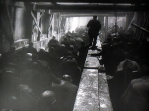
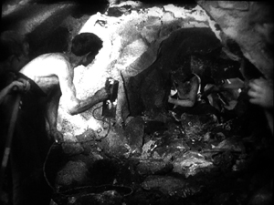
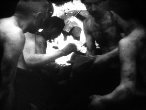
For the sequences showing the tunnel construction, Wauer supplies violent alternations of bright and dark as men, stripped and sweaty, attack the rock face. The variety of camera positions and illumination is really impressive.
Comparisons with The Big Film of 1915 are inevitable. The intimate scenes of The Tunnel are far less delicately realized than the romance and family life of The Birth of a Nation, and the battle scenes in Birth have a greater scope than what Wauer summons up. But Wauer’s handling of crowds is more vigorous than Griffith’s riots at the climax of Birth, and his pictorial sense is in some ways more refined, even “modern.” There’s little in Birth as daringly composed as the static long shot surmounting today’s entry.
Wauer can handle small-scale action very crisply. The opening scene in an opera house creates low-angled depth compositions more arresting than Griffith’s depiction of Ford’s Theatre. Max’s wife, in one box, is watching his efforts to attract funding from the millionaire Lloyd. Wauer constantly varies his camera setups to highlight Max’s wife in the background studying Lloyd’s daughter, sensing in her a rival for her husband. Whether the angle is high or low, the wife’s presence in her distant box is signaled at the top of the frame.
The second and third shots above present similar but not identical setups, adjusted to reset the depth composition.
It was at Munich’s Filmmuseum a decade ago that I first encountered the brooding power of Robert Reinert’s Opium (1919) and Nerven (1919), the latter now available on DVD. I was convinced that Nerven was as important, and in some ways more innovative, than the venerated Caligari. Now the conviction grows on me that in The Tunnel we have another galvanizing, outlandish masterwork of the 1910s. I hope it will somehow get circulated so that wider audiences can discover it. Yeah, that’s the word I want: discover.
Without archivists, no archives. We’re grateful to Michal Bregant, head of the Czech Republic’s archive, for access to films and for his companionship during our visit. Thanks as well to Lucie Česálková, our host; her knowledgable colleague Radomir Kokes (who kindly corrected the initial version of this post); Petra Dominkova, our Czech translator; and Vaclav Kofron, editor of the Czech versions of our books. Lucie supplied the frame enlargement from Love Is Torment. As well: Good luck to the Kino Světozor!
In Munich, we owe a huge debt to archive chief Stefan Drössler, for his generous sharing of information and his and Klaus Volkmer’s rehabilitation of The Tunnel. Stefan also provided the images from Robinson Crusoe and The Hound of the Baskervilles. Coming up is his work for the annual Bonn International Silent Film Festival, 7-17 August. Thanks as well to Gerhard Ullmann and Christoph Michel.
In Brussels, as ever, the Cinematek has made us welcome, and we thank archive director and long-time friend Nicola Mazzanti and vault supervisor Francis Malfliet. Over the last thirty years, a great deal of our research has depended upon the cooperation the Cinematek leadership: Jacques Ledoux, Gabrielle Claes, and now Nicola.
My quotations from Kuleshov come from Silent Witnesses: Early Russian Films, 1908-1919, ed. Yuri Tsivian and Paolo Cherchi Usai (Pordenone: Giornate del Cinema Muto, 1990), 388-390.
There’s a chapter on Feuillade in my Figures Traced in Light, where Bauer is discussed as well. My essay on Robert Reinert is in Poetics of Cinema.
Thanks to Antti Alanen for correction of a misspelled title. Speaking of discoveries, you’ll find plenty on his wonderful Film Diary site. During his recent trip to Paris, he’s writing about art exhibitions, Dominique Paini’s Langlois exposition at the Cinémathèque, and Godard’s Adieu au langage.
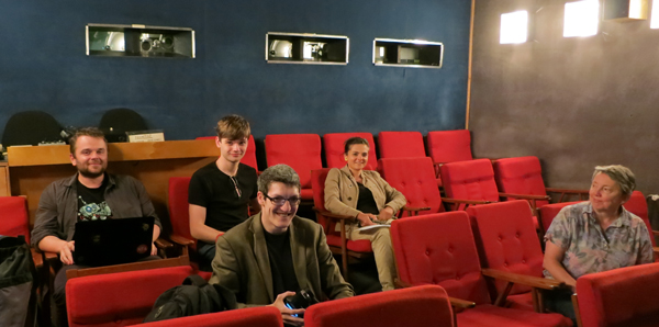
Screening at the Czech Republic’s National Film Archive. From left: Michal Večeřa, Tomáš Lebeda, Radomir Kokes, Lucie Česálková, and Kristin.
What next? A video lecture, I suppose. Well, actually, yeah….
DB here:
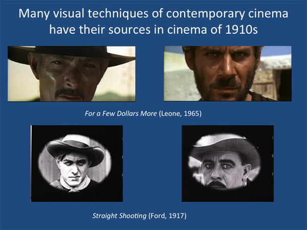
We’ve said several times that this website is an ongoing experiment. We started just by posting my CV and essays supplementing my books. Then came blogs. We quickly added illustrations to our entries, mostly frame enlargements and grabs. Eventually, video crept in. In 2011 we ran Tim Smith’s dissection of eye-scanning in There Will Be Blood. Last year, in coordination with our new edition of Film Art: An Introduction, we added online clips-plus-commentary (an example is on Criterion’s YouTube channel), and near the end of the year Erik Gunneson and I mounted a video essay on techniques of constructive editing.
Today something new has been added. I’ve decided to retire some of the lectures I take on the road, and I’ll put them up as video lectures. They’re sort of Net substitutes for my show-and-tells about aspects of film that interest me. The first is called “How Motion Pictures Became the Movies,” and it’s devoted to what is for me the crucial period 1908-1920. It quickly surveys what was going on in cinema over those years before zeroing in on the key stylistic developments we’ve often written about here: the emergence of continuity editing and the brief but brilliant exploration of tableau staging.
The lecture isn’t a record of me pacing around talking. Rather, it’s a PowerPoint presentation that runs as a video, with my scratchy voice-over. I didn’t write a text, but rather talked it through as if I were presenting it live. It nakedly exposes my mannerisms and bad habits, but I hope they don’t get in the way of your enjoyment.
“How Motion Pictures Became the Movies” is designed for general audiences. I’ve built in comments for specialists too, in particular, some indications of different research approaches to understanding this period of change.
The talk runs just under 70 minutes, and it’s suitable for use in classes if people are inclined. I think it might be helpful in surveys of film history, courses on silent cinema, and courses on film analysis. If a teacher wants to break it into two parts, there’s a natural stopping point around the 35-minute mark.
Some slides have several images laid out comic-strip fashion, so the presentation plays best on a midsize display, like a desktop or biggish laptop. A couple of tests suggest that it looks okay projected for a group, but the instructor planning to screen it for a class should experiment first.
I plan to put up other lectures in a similar format, with HD capabilities. Next up is probably a talk about the aesthetics of early CinemaScope. I’d then like to spin off this current one and offer three 30-minute ones that go into more depth on developments in the 1910s.
The video is available at the bottom of this entry, but it’s also available on this page. There I provide a bibliography of the sources I mention in the course of the talk, as well as links to relevant blogs and essays elsewhere on the site.
If you find this interesting or worthwhile, please let your friends know about it. I don’t do Twitter or Facebook, but Kristin participates in the latter, and we can monitor tweets. Thanks to Erik for his dedication to this most recent task, and to all our readers for their support over the years.
Seed-beds of style
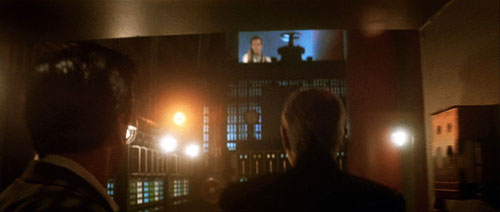
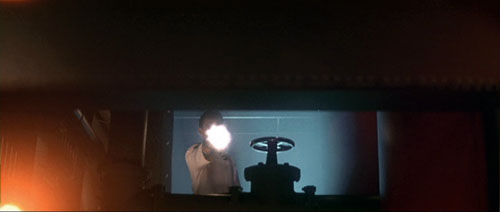
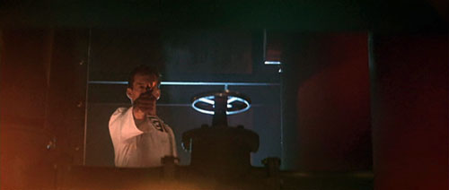
The Hunt for Red October.
DB here:
Seminar, orig. German (1889): A class that meets for systematic study under the direction of a teacher. From Latin seminarium, “seed-plot.”
I retired from full-time teaching in July of 2005. Since then, while writing and traveling (both chronicled on this website), I’ve done occasional lectures. But this fall I tried something else. At the invitation of Lea Jacobs here at Madison, I collaborated with her on a graduate seminar called Film Stylistics.
It was a good opportunity for me. I had a chance to learn from Lea, Ben Brewster, and the students and sitters-in. The class also enabled me to test and revise some ideas I’d already explored, while garnering new ideas and information. I helped plan the sessions and pick the films, but I had no responsibilities about grading. I hope, though, to read the students’ papers at some point after the term is over.
Our goal was to introduce students to studying style historically and conceptually. We focused on group styles rather than “authorial” ones because we wanted to explore particular concepts. How useful is the concept of group norms in understanding broad stylistic trends? Can we explain stylistic change through conceptions of progress toward some norm? Does the model of problem and solution help explain not only a particular innovation but also the group’s acceptance of it? How viable are notions of influence in explaining change? How much power should we assign to individual innovation? Can we think of filmmaking institutions as not only constraining style (through tradition and conformity) but also enabling certain possibilities—nudging filmmakers in certain directions? Does stylistic study favor a comparative method, one that encourages us to range across major and minor films, as well as different countries and periods?
These are pretty abstract questions, so we wanted some particular cases. Lea and I picked three areas of broad stylistic change: the emergence of widescreen cinema in the 1950s, the arrival of sync-sound filming in the late 1920s, and the development of analytical editing or “scene dissection” in the 1910s and 1920s. We tackled these areas in this order, violating chronology because we wanted to move from somewhat hard problems to the hardest of all: Why did filmmakers in the US, and soon in other countries, move toward what has become the lingua franca of film technique, continuity editing?
The results of our research on these matters will emerge over the next few years, I expect. In the short term, during my final lecture Tuesday I went off on what I hope wasn’t too much of a tangent. I got interested in one particular kind of cut, and it led me to see, once more, how different filmmaking traditions can make varying uses of apparently similar techniques.
More cutting remarks
My concern was the axial cut. That’s a cut that shifts the framing straight along the lens axis. Usually, the cut carries us “straight in” from a long shot to a closer view, but it can also cut “straight back” from a detail. What could be simpler? Yet such an almost primitive device harbors intriguing expressive possibilities.
Axial cuts aren’t all that common nowadays, I think. Today’s filmmakers prefer to change the angle when they cut to a closer or more distant setup. But such wasn’t the case in the cinema of the 1910s and 1920s.
In the heyday of tableau-based staging, 1908-1918 or so, filmmakers seldom cut into the scene at all. European directors especially tended to shape the development of the action by moving actors around the set, shifting them closer to the camera or farther away. The most common cuts were “inserts” of details, mostly printed matter (letters, telegrams) or a photograph. But when tableau scenes did cut into the players, the cuts tended to be axial: the framing moved straight in to enlarge a moment of performance. Here’s an instance from the 1916 Russian film Nelly Raintseva.
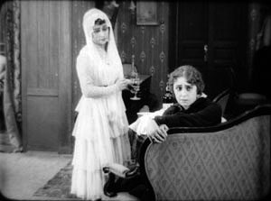
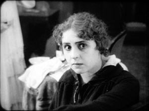
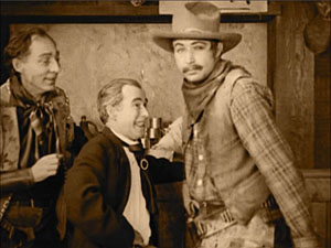
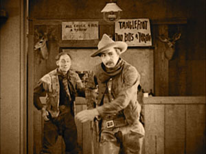
During the mid-1910s, American films moved away from the tableau style toward a more editing-driven technique. This approach often relied on more angled framing and a greater penetration of the playing space, of the kind we’re familiar with today. But axial cuts hung on in American films, even in quickly-cut scenes. Lea pointed out some nice examples in Wild and Woolly (1917), especially those involving movement. In the example below, the first cut carries us backward rather than forward, and the second is a cut-in, but both are along the lens axis.
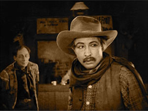
During the 1920s, axial cuts become a secondary tool of the American filmmaker, who now had many other camera setups available. But Soviet filmmakers of the 1920s, who adopted many American techniques in the name of modernizing their cinema, seemed to see fresh possibilities in the axial cut. For instance, in Dovzhenko’s Arsenal (1929), it becomes a percussive accent. The astonishment of a bureaucrat under siege is conveyed by a string of very fast enlargements.
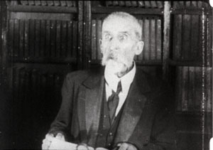
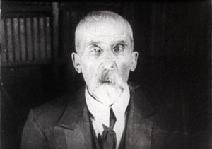
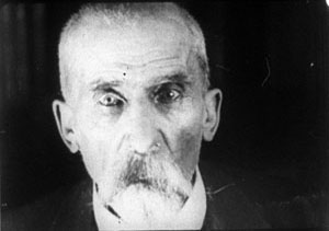
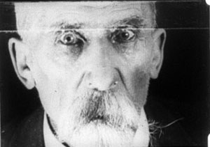
The Soviets called such cuts “concentration cuts,” a good term for the way they make a figure seem to pop out at us. From being a simple enlargement (in tableau cinema) or one among many methods of penetrating the scene’s space (in Hollywood continuity), the axial cut has been given a new force, thanks to adding more shots and making them quite brief.
This aggressive method for seizing our eye—Notice this now!—has appeared in modern filmmaking too, as in this passage from Die Hard (1988).
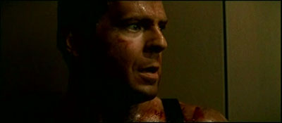
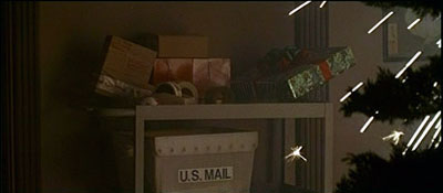
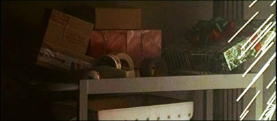
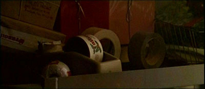
Here the axial cut is clearly subjective, rendering John McClane’s realization that he can use the Christmas wrapping tape in his combat with the thieves. Director John McTiernan employed the device again in The Hunt for Red October (1990). The frames surmounting this entry show the heroes suddenly being fired upon.
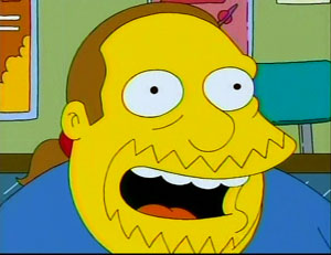
It seems likely that many modern directors became aware of this device from seeing Lydia’s discovery of the pecked-up body of farmer Dan in The Birds (1963). Hitchcock knew Soviet montage techniques, so maybe we have a chain of influence here. In any case, the somewhat overbearing aggressiveness of the concentration cut has often been parodied on The Simpsons. Here’s a recent example.


By the law of the camera axis
Axial cutting can be used more pervasively, as a structuring element for an entire scene. This is what Lev Kuleshov does in a climactic moment of By the Law (1926). Edith and her husband have kept the murderer at rifle point for days, and the strain is starting to show. She becomes hysterical, and Kuleshov uses a ragged rhythm of stasis and movement to convey it. First he cuts straight in from a master shot to a medium shot of her. I reproduce the frames from the film strip, for reasons that will become obvious.
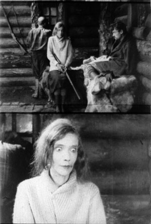
Then Kuleshov cuts straight back to the master setup. Again he cuts in, but to a closer view of Edith as she becomes more frenzied.
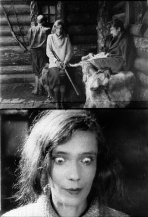
Cut back once more to the long shot, but only for fourteen frames. That shot is interrupted by a shot of Edith already laughing crazily, her head tipped back.
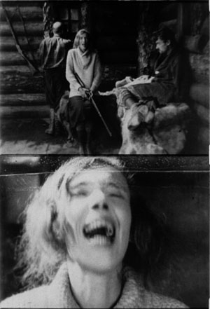
The shot of her laugh lasts only five frames, and this mere glimpse, combined with the blatant mismatch of movement, makes the onset of her spell all the more startling. When we cut back to the long shot her face and position now match.
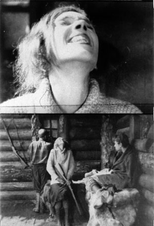
The abrupt quality of her outburst would not have been as striking if Kuleshov had varied his angle. As the earlier examples show, when only shot scale changes and angle remains the same, the cuts can be very harsh, and Kuleshov accentuates this quality with a flagrant mismatch.
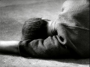
Akira Kurosawa likewise used the concentration cut to provide salient moments throughout his work; it almost became a stylistic fingerprint. At several points in Sugata Sanshiro (1943) he uses the device in the usual popping-forward way. But he varies it during Sanshiro’s combat with old Murai. He reserves dynamic, often elliptical cuts for moments of rapid action, and then he uses axial cuts for moments of stasis or highly repetitive maneuvers. In effect, the moments of peak action happen almost too quickly, while the moments of waiting are emphasized by cut-ins.
So at the start of the match, a series of axial cuts, linked by dissolves, present the fighters in a slow dance. But the ensuing throws are editing briskly. When old Murai is thrown and lies gasping on the mat, axial cuts accentuate his immobility. Kurosawa adds a rhythmic urgency on the soundtrack. After each cut-in, we hear the voice of Murai’s daughter, either offscreen or in his thoughts: “Father will win.” “Father will win.” “Father will surely win.”
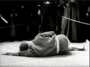
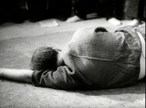
The matching of lines to the editing is at work in the Simpsons parody too, in which the Comic Book Guy’s words are heard in tempo with the concentration cuts. “You. Are. Acceptable.”
Montage and the axial cut
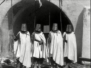
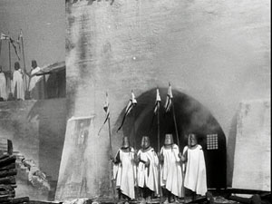
By now it’s easy for us to see that one scene from Alexander Nevsky (1938) opens with a series of axial cuts, out and in.
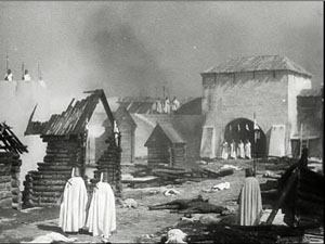
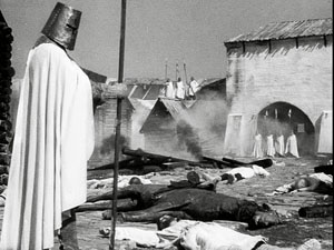
But why would Eisenstein, master of montage, regress to such a primitive device? He had occasionally used axial cuts in his silent films, as when we see Kerensky brooding in the Winter Palace in October (1928).
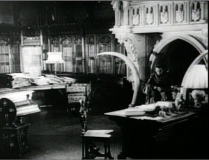
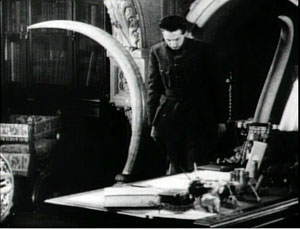
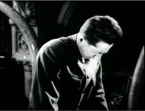
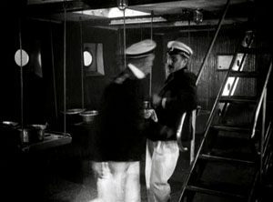
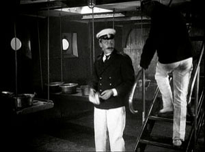
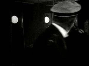
And Potemkin‘s famous cuts in to the Cossack slashing at the camera (that is, the baby, the old lady) are axial. (These cuts are pastiched by Eli Roth and Tarantino in Inglourious Basterds.) At the limit, Eisenstein toyed with the axial cut by moving the figures around during the shot change. In Potemkin, the ship’s officer reports to the captain that the crew has refused to eat. The captain leaves one shot and climbs the stair before Eisenstein cuts in to show him leaving again. The repetition would not be so perceptible if Eisenstein had varied the angle.
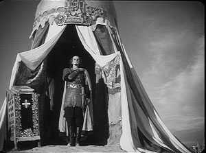
In the 1930s, Eisenstein began thinking about the axial cut as a basic structural element of a scene. In both his theory and practice, he promoted the axial cut to a level of prominence it hadn’t seen since the days of the tableau. Usually the cuts involve static subjects, like most of Kurosawa’s, but he still exploits the cut-ins to create vivid, if spatially impossible effects. At one point our popping in closer to Ivan the Terrible is doubled by him majestically and magically popping out of his tent to meet us, like a thrusting chess piece.
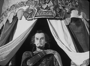
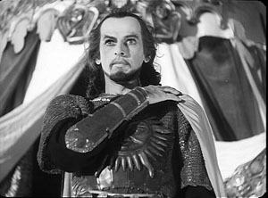
The new primacy of axial cutting comes from Eisenstein’s idea that “montage units” could powerfully organize the space of a scene. He thought that you could imagine filming a scene from only a few general positions, but then varying camera setups within each of these orientations. The montage unit was a cluster of framings taken from roughly the same orientation, as in the Pskov and Ivan scenes.
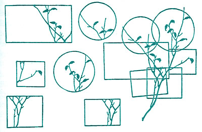
The idea may derive from his study of Japanese art, shown further above, in which he explored how a single image of a cherry branch could be chopped up into a great variety of compositions. In his course at the Soviet film school, he illustrated with a hypothetical scene of the Haitian revolutionary Dessalines holding his enemies at bay at a banquet. After imagining a master shot from the farthest-back position in the montage unit, Eisenstein proposes a series of dynamic closer views.
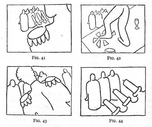
Eisenstein didn’t think that each scene had to be handled in a single montage unit. You could create two or three predominant orientations, with shots from each woven together. Or you could gain a sudden accent when a stream of setups from the same unit was interrupted by one from a very different angle. These ideas he put into practice throughout Nevsky and Ivan the Terrible.
Why? Eisenstein thought that combining shots taken from roughly the same orientation yielded a musical play between constant elements and variation. Each shot shows us something we’ve seen before but also something new, the way a bass line or sustained chords can continue underneath a changing melody. Eisenstein was convinced that this flowing weave of visual elements gave the spectator a deeper involvement in the film as it unfolded—an involvement akin to that found in Wagnerian opera.
The axial cut is a good example of how even a simple stylistic choice harbors rich creative possibilities. It also shows how a technique can change its impact in different filmmaking traditions. In the tableau tradition the axial cut was for the most part an abrupt enlargement heightening a moment of strong acting. In the early days of Hollywood continuity it became one editing option among many, and its power was somewhat muted. For the Soviets, concentration cuts could be multiplied and joined with fast cutting and big close-ups. The result could jolt the viewer by italicizing a face or an object–a purpose that has been taken up by contemporary Hollywood. For Kurosawa, the technique offered a way to contrast extreme movement and extreme stillness. And for Eisenstein, it suggested a global strategy for weaving visual elements into an immersive whole.
The protean functions assumed by this simple device remind us of how much there is yet to discover about film style. Despite all our discoveries over the last three decades, we have only begun. The name is apt: A seminar is where things start.
For more on the staging strategies of the tableau style, see On the History of Film Style and Figures Traced in Light: On Cinematic Staging, as well as blog entries here and here and here and here. You can find examples of emerging Hollywood continuity techniques in this entry on 1917 and this one on William S. Hart and this one on Doug Fairbanks. Sugata Sanshiro is at last available in a good DVD version from Criterion as part of its big Kurosawa box. Eisenstein’s ideas about the axial cut are explained in Vladimir Nizhny, Lessons with Eisenstein, trans. and ed. Ivor Montagu and Jay Leyda (New York: Hill and Wang, 1962), Chapters II and III. In The Cinema of Eisenstein I try to show how these ideas are employed in the Old Man’s late films.
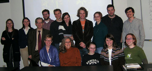
Seated: Leslie Debauche, Lea Jacobs, Rebecca Genauer, Pam Reisel, Amanda McQueen. Standing: Karin Kolb, Andrea Comiskey, Ben Brewster, John Powers, Tristan Mentz, Heather Heckman, Aaron Granat, Jenny Oyallon-Koloski, Jonah Horwitz, and Booth Wilson. Evan Davis had to leave early.
Lucky ’13
The Mysterious X (1913).
Each film is interlocked with so many other films. You can’t get away. Whatever you do now that you think is new was already done in 1913.
Martin Scorsese, quoted in Scorsese by Ebert (University of Chicago Press, 2008), 219.
DB here:
Most historical events don’t abide by clocks and calendars. Seldom does a trend begin neatly on one date and end, full stop, on another. Changes have vague origins and diffuse destinies. When Kristin and I, along with others, argued for 1917 as the best point to date the consolidation of the Hollywood style of storytelling, we realized that it’s a useful approximation but not as exact as a Tokyo subway timetable.
It’s just as hard to argue that a year constitutes a meaningful unit in itself. Who expects anything but tax laws to change drastically at midnight on 31 December? Yet evidently our minds need benchmarks. Film historians, while being aware that trends are slippery and dating is approximate, have long spotlighted certain years as particularly significant.
Take 1939, which has become a sort of emblem of the peak achievements of Hollywood’s Golden Age. We had Gone with the Wind, The Wizard of Oz, Only Angels Have Wings, Stagecoach, Gunga Din, Wuthering Heights, Dark Victory, Young Mr. Lincoln, Beau Geste, Mr. Smith Goes to Washington, Ninotchka, The Roaring ‘20s, and Destry Rides Again. I’d watch any of those, except Gone with the Wind, right now—something I find it hard to say about most Hollywood movies I’ve seen in 2008.
Another strong year is 1960, with La Dolce Vita, L’Avventura, Rocco and His Brothers, The Apartment, Elmer Gantry, Spartacus, Psycho, Exodus, The Magnificent Seven, Shadows, Late Autumn (Ozu), and The Bad Sleep Well (Kurosawa). Arguably, 1960 was owned by the French, who gave us Breathless, Shoot the Piano Player, Paris nous appartient, Les Bonnes femmes, Le Trou (Becker), Moi un noir (Rouch), and Letter from Siberia (Marker). (See Postscript.)
Let’s go back still further. Researchers sometimes split the silent-film period in two, with the first stretch, usually called “early cinema,” running up to 1915 or so. (1) The second phase then runs roughly from 1915 to 1928. (2) So for many historians the year 1915 functions as a tacit pivot-point, and it is remembered not only for The Birth of a Nation but also for Regeneration, The Tramp, Kindling, The Cheat, Les Vampires, Daydreams (Yevgenii Bauer), and several William S. Hart films. But another year holds a special place in the minds of silent film aficionados.
Over a decade ago, the annual Days of the Silent Cinema festival (Il Giornate del cinema muto), took 1913 as its focus. (3) It was an extraordinary year. Denmark produced Atlantis (August Blom) and The Mysterious X (Benjamin Christensen). From France we had L’Enfant de Paris (Leonce Perret), Germinal (Albert Capellani), and Louis Feuillade’s Fantomas series. Germany gave us Urban Gad’s Engelein and Filmprimadonna and Franz Hofer’s obsessively symmetrical The Black Ball. The staggering set of Italy’s Love Everlasting (Ma l’amor mio non muore!, Mario Caserini) was matched by the breadth of Enrico Guazzoni’s Quo vadis? In Russia Bauer released Twilight of a Woman’s Soul. American audiences saw Traffic in Souls (George Loane Tucker) and Death’s Marathon and The Mothering Heart, from a guy named Griffith. Several historians would argue that 1913 marked the first major achievements of film as an artform.
Two outstanding films of that annus mirabilis have recently been issued on US DVD. One is a striking accomplishment, the other a flat-out masterpiece. Both discs belong in the collections of everyone who’s serious about cinema.
Your call is important to us
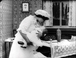
A wife and her baby are alone in an isolated house when a tramp breaks in. As the wife tries to keep the invader at bay, her husband happens to telephone and learn what’s happening. He scrambles to return home. He steals an idle car, and its owner, accompanied by police, race after him. We cut rapidly between the besieged mother and the husband’s frantic drive, as he is in turn pursued. Just as the tramp is about to attack the wife, the husband bursts in, followed by the police. The family is saved.
This is the story of the 1913 one-reel film, Suspense, co-directed by Lois Weber and Phillips Smalley. If the plot sounds familiar, it’s probably because you know that one of D. W. Griffith’s most famous films, The Lonely Villa (1909) tells the same basic tale.There are still earlier versions, including one, The Physician of the Castle (Le Médécin du chateau, 1908), which may have inspired Griffith. The ultimate source seems to be a 1902 play by André de Lord, Au téléphone (translated here).
So Weber and Smalley are reviving an old idea. Their task is to make it fresh. How they do so has been studied in depth by Charlie Keil in his book Early American Cinema in Transition: Story, Style, and Filmmaking, 1907-1913.I can’t match Keil’s subtlety, and it’s better that you see the film first, so I’ll drop only some hints, pointers, and comments.
We’re inclined to say that The Lonely Villa influenced Suspense. But maybe we can capture the situation in a more illuminating way. The art historian E. H. Gombrich has suggested that we can often trace the relationship between artworks in terms of schema and revision. (4) A schema is a pattern that we find in an artwork, one that a later artist can borrow. Most often, later artists copy the schema straightforwardly. This is the usual way we think of influence. But instead of replicating the schema, the next artist can revise it. She can elaborate on it, strip it to its essence, drop parts and add others, whatever—in order to achieve new purposes or evoke fresh responses.
In The Lonely Villa, Griffith uses crosscutting to build suspense. He cuts among the thuggish vagrants trying to break in, the wife and daughters trying to hold them off, and the father learning by phone of the situation and then plunging after them with a policeman. The obvious pattern here is the principle of alternation between different lines of action, all taking place at the same time and converging in a last-minute rescue.
So Smalley and Weber inherit the crosscutting schema, but they go beyond simply copying it. They find ways to revise it, some quite surprising. These revisions aim to create more tension and to dynamize the situation.
The obvious option, at least to us today, would be to use more shots than Griffith does; we think that increasing the cutting pace builds up excitement. Interestingly, however, Suspense uses only a couple of more shots than The Lonely Villa within a comparable running time. (5) We usually expect that American films become more rapidly cut as the 1910s go on, but this isn’t the case here. Shortly, I’ll suggest why.
Smalley and Weber recast Griffith’s parallel editing in several ways. For instance, The Lonely Villa prolongs the phone conversation between husband and wife, building suspense through the husband’s instruction to use his revolver on the thugs. Suspense, by contrast, doesn’t dwell on the telephone conversation but devotes more time (and shots) to the chase along the highway. That’s because Weber and Smalley have complicated the chase by having the husband pursued by the irate motorist and the police, something that doesn’t happen in the Griffith film.
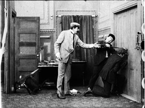
Just as important, Smalley and Weber revise the crosscutting schema through framings that are quite bold for 1913. For example, Griffith’s tramps break into the house in long shot, and they move laterally across the frame.
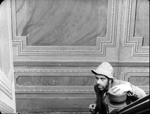
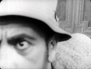
But Weber and Smalley’s tramp sneaks steadily up the stairs, into a menacing extreme close-up.
Elsewhere, Suspense gives us close views of the wife and of the door as the tramp breaks in. There are oblique angles on the back door of the house, and virtually Hitchcockian point-of-view shots when the wife sees the tramp breaking in and he looks straight up at her.
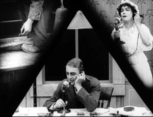
What struck me most forcibly on watching the film again was the way in which Weber and Smalley’s daring framings serve as equivalents for parallel editing. In effect, they revise the crosscutting schema by putting several actions into a single frame. The most evident, and the most famous, instances are the triangulated split-screen shots. They cram together three lines of action: the wife on the phone, the husband on the phone, and the tramp’s efforts to break into the house (here, finding the key under the mat). (6)
Split-screen effects like this were common enough in early cinema, especially for rendering telephone conversations. Eileen Bowser points out that the three-frame division was one variant, with a landscape separating the two callers. (7) Her example is from College Chums (1907).
But my sense is that in early cinema the split-screen effect was used principally for exposition or comedy, not for suspense. Smalley and Weber have made this framing substitute for crosscutting: instead of giving us three shots, we get one, showing the plot advancing along different lines of action. These splintered frames function much like Brian De Palma’s multiple-frame imagery in Sisters, Blow-Out, and other films. There’s also the nice touch of the conical lampshade over the husband’s head, providing a fulcrum for the composition.
Earlier in the film, instead of crosscutting between the tramp outside and the wife indoors, Suspense gives us both in the same shot, with the tramp peeking in behind her.
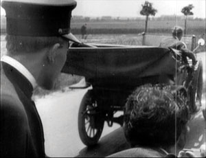
A more ingenious revision of the crosscutting schema comes during the shots on the road. Instead of cutting between the father in the stolen car and the police pursuing him, Suspense packs them into the same frame. This is done not only in long shot but also in striking depth compositions.
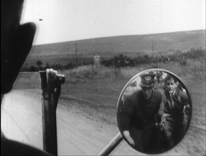
Flashiest of all are the shots showing the pursuers reflected in the rear-view mirror of the father’s car as he races ahead of them.
Again, a single framing has done duty for two shots, one of the father looking back and another showing the cops coming closer to him. By compressing several lines of action into a single frame, our 1913 film doesn’t need to use significantly more shots than the 1909 one.
These are just a few of the imaginative ways in which Weber and Smalley have recast their standard situation. I could have considered as well the unobtrusive use of the knife as a multi-purpose prop, the echoed shots of mirrors, and the shrewd employment of repetitions in the intertitles.
It would take an early-cinema specialist like Keil to trace out all the connections between Suspense and other films of its era. One among many would be the fact that Griffith wasn’t exactly standing still between 1909, the year of The Lonely Villa, and 1913. For instance, his Battle at Elderbush Gulch, made about the same time as Suspense (though released in 1914), displays far more rapid cutting than Weber and Smalley attempt. Griffith also employed a swelling advance to the foreground, like that of the tramp shot I showed above, in The Musketeers of Pig Alley (1912).
Here, Smalley and Weber seem to have replicated a schema that was believed to ratchet up tension, the so-called looming effect.
The very title of the film exhibits self-consciousness about its artistic purpose. By 1913, it seems, American filmmakers were confident enough in their skills to announce their aims. We want, the title seems to say, to arouse you, to make you wait, hanging there, for the resolution. We know how to tell a twelve-minute story cinematically. The film seems uncannily to anticipate all those one-word titles that Hitchcock invoked to unsettle us–Suspicion, Spellbound, Psycho, Frenzy. As in a Hitchcock movie, the fact that we are pretty certain how Suspense will turn out doesn’t seem to dissipate our anxiety. (For more on this paradox of suspense, see this entry.)
Tunnel vision
It was during the Pordenone 1913 season that the full brilliance of Victor Sjöström’s Ingeborg Holm hit me. I had seen the film a couple of times before and found it deeply moving in its restrained treatment of a poignant situation. The film traces the dissolution of a family. Sven Holm is doing a brisk retail business, but his health problems, along with a thieving clerk, plunge the family into poverty. When Holm dies, his wife Ingeborg must take the children into the poorhouse, and from there they are boarded out to foster families. Her plight worsens over the years, and its sorrowful depths are revealed when her son, now grown, returns to visit her.
Ingeborg Holm has long been recognized as a milestone in European film, not least for its effect on improving Sweden’s treatment of the poor. (8) The acting style is muted and delicate, with no mugging or arm-waving. For long periods, the main actors turn from the audience. (9) Just as impressive are the poised compositions, sustained in unhurried long takes. These give what is essentially a bourgeois tragedy a kind of majestic relentlessness. Watching, I remembered what Dreyer had admired in Sjöström’s Ingmar’s Sons (1918):
The film people here at home shook their heads because Sjöström had really a boldness to let his farmers walk heavily and soberly as farmers do. Yes, they used up an eternity to come from one end of the room to the other. (10)
But sitting in the Cinema Verdi in 1993, I spotted yet another level of artistry. Knowing the story of Ingeborg Holm, I was able to watch the shots unfold. I could study how Sjöström was unobtrusively moving characters so that they became shifting centers of interest. Although he didn’t cut in to close-ups, he harmonized his actors’ movements so that at one point you noticed Ingeborg, at another her husband. Performers spread themselves across the frame, arrayed themselves in depth, turned from or toward the camera. Most subtly of all, one actor might mask another one, driving our attention to other parts of the frame. Sjöström could sustain this intricate play of blocking and revealing for minutes on end.
My favorite example of this tactic is the three-minute passage showing Ingeborg’s daughter and son taken away by new mothers. You can read the whole discussion on pp. 191-195 in On the History of Film Style (1997), but here is an excerpt, with stills intercalated. (These stills, grabbed from the DVD, lack a little on the left. The film has been printed and reprinted so many times, and now fitted to the TV monitor, that it has lost some information along that edge.)
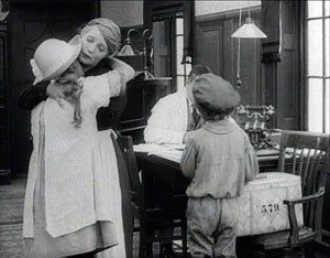
Ingeborg’s entry with her children from the rear doorway establishes the trajectory that will be followed during the scene, as foster mothers come in and take away the children. (Again, the scene is built around movements toward and away from the camera.) In a brilliant stroke, Sjöström immediately plants the young son in the foreground, back to us. The boy will stand there immobile for this first phase of the scene, occasionally serving to block the superintendent.
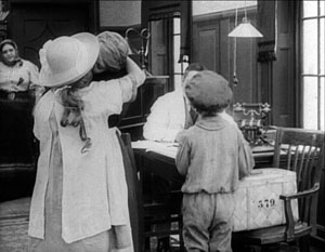
Ingeborg buries her face in her daughter’s shoulder at the precise moment the foster mother enters from the rear left. She passes behind Ingeborg, and as she is momentarily blocked, the superintendent twitches into visibility, handing the woman a document to sign.
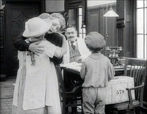
During the signing, when the woman is briefly obscured, the superintendent shifts position again and Ingeborg lifts her face once more. Then Ingeborg and her daughter move slightly leftward as the foster mother comes forward.
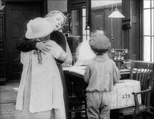
This phase of the scene concludes with the departure of the daughter and the embrace of Ingeborg and her son in the foreground, once more concealing the superintendent.
Granted, I picked one of the film’s most exactingly staged scenes, but there are several other examples. Consider the climax, when the adult son comes to visit Ingeborg: the camera position and staging ask us to recall the scene I’ve just mentioned. Or take a look at the handling of the space behind the counter in the various scenes in the Holms’ shop. One instance surmounts this section.
This choreography is hard to catch on the fly: by the time you notice a change, what prepared for it has gone. To understand the overall dynamic, we must reverse-engineer the effects, moving backward from the result to the conditions. As I studied the film, it became clear that creating shifting centers of interest was basic to the scenes’ effects. All the finesse of acting, both solo and ensemble, would come to little if we weren’t primed to watch the most important area of the shot. Directors of the 1910s became supremely skilful in guiding our eye from one major story point to another within the fixed frame.
Some of the tactics of guiding our attention could be borrowed from other arts. Painting and theatre supplied certain schemas, like placing an item in the center of the picture format and turning faces toward the viewer. But some tactics for directing our eye relied on capacities that were as “specifically cinematic” as cutting was argued to be. Theatre is staged for many sightlines, but cinema is staged for a single one, that of the camera lens. That fact allowed directors to organize the unfolding action in depth, prompting the viewer to notice things at many distances from the camera.
It also allowed a precise blocking and revealing of information that would not work on the stage. In a live theatre performance, the slight shifts we detect in the Ingeborg Holm scene would be apparent to only very few viewers; people sitting in other vantage points wouldn’t see them. For another example of this phenomenon, go elsewhere on this blogsite.
There’s a more basic explanation of what’s going on. Cinematic space is a result of optical perspective, like the space of classic painting. The actors may seem to be standing in a cubical space, but in fact they move within a tipped-over pyramid, with the tip resting at the camera lens. They work inside a ground area that’s the shape of a slice of pie. Here’s a reminder from The Black Ball.
When there are figures close to the camera, as here, they fill up more of the frame, indicating that the field of view has narrowed. Filmmakers of the 1910s had discussed this property of their “cinematic stage,” so as researchers we can confirm that the control of position and timing we observe on screen results from the firm intentions of the makers. They might have echoed Uccello, the Renaissance artist who bent over his drawings late at night and exclaimed: “How sweet a thing is this perspective!”
Suddenly the tableau tradition made sense to me. Directors had to organize both the two-dimensional composition and the tapering three-dimensional playing space in front of the camera. The purpose was to create ever-changing centers of interest, laterally and in depth, flowing along with the key moments in the unfolding action.
By studying the same tactics in Feuillade, Bauer, and others, I found that these principles offered a fruitful way to understand much of what was happening in the films of the tableau era. The dynamic of schema and repetition/revision was at work as well, since I found earlier, more rudimentary uses of these principles; these were then refined during the 1910s. Moreover, the idea helped me generalize beyond that era and analyze later directors, including Mizoguchi Kenji and Hou Hsiao-hsien, who also used staging to shape the viewer’s experience. The results can be found in On the History of Film Style and Figures Traced in Light. Those books largely owe their existence to that flash of awareness kindled by Ingeborg Holm. (11)
We can’t reconstruct Sjöström’s stylistic development with much confidence. (12) His first directed film, The Gardener (Trädgärdsmästaren, 1912) survives, but I saw it before I knew how to watch 1910s movies in this way, so I can’t comment on it. Of the twenty-six films he made from 1912 to 1917, nearly all have been lost. Apart from Ingeborg, I have managed to see Havsagamar (The Sea Vultures, 1916). This retains aspects of the tableau tradition, but virtually no scenes display the intricate staging of his 1913 masterpiece.
In the late 1910s, judging by the films we have, Sjöström seems to have moved quickly toward continuity editing in the American vein. (13) The Girl from Stormycroft (Tösen frän Stormyrtorpet, 1917) contains extended passages of analytical editing, and the scenes display a freedom of camera setup one seldom sees in European cinema of the period. Sjöström clearly understands the principles of continuity down to the smallest detail. For instance, he not only uses the frame-edge cut (the cut that lets a character exit one shot and enter another, as the body crosses the frameline); he accelerates it. Our heroine leaves the kitchen, and in the shot’s final frame she hits the right edge. Another director would have had her exit the frame entirely and held the kitchen shot a little longer, to give her time to get to the next room. But Sjöström simply cuts to her already in another room, completing her trajectory.
Sjöström presumes that the constant pace of her approach and the vector of her movement will smooth the shot-change. It does, but few directors of that day would had such confidence that our mind would create continuity of motion.
During this summer’s archive viewing, I spent some time studying Sjöström’s cutting in The Girl from Stormycroft and subsequent films. I may offer some more thoughts later. For now I’ll just say that in these early years we seldom encounter such a versatile director, one who mastered the tableau tradition and then moved, with apparently little effort, to nuanced continuity editing. More generally, examining his technique isn’t a dry exercise. We never lose by studying craftsmanship. Sjöström’s films succeed because his style carefully guides our moment-by-moment apprehension of the heart-rending stories he has chosen to tell.
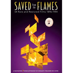
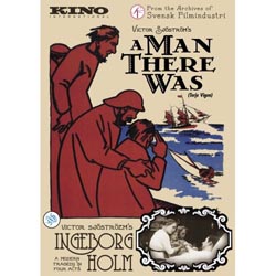
Have I convinced you to surrender your credit-card number? Suspense is available in a dazzling Flicker Alley collection, Saved from the Flames, compiled from the French series Retour de flame. Ingeborg Holm comes with a tinted print of the estimable Terje Vigen (A Man There Was) on a DVD from Kino. The latter disc includes vibrant scores from Donald Sosin and David Drazin.
(1) For the purposes of the outstanding Encyclopedia of Early Cinema (New York: Routledge, 2005), the editor Richard Abel considers that the early cinema constitutes the period from film’s invention ca. 1894 to the mid-1910s.
(2) Silent films were still made into the 1930s, notably in Russia and Japan—a situation that shows the rough-and-ready quality of period divisions.
(3) For an informative series of articles around the 1913 theme, see Griffithiana no. 50 (May 1994).
(4) Gombrich proposes these ideas at various points in Art and Illusion: A Study in the Psychology of Pictorial Representation, new ed. (Princeton: Princeton University Press, 2000). The book is a milestone in twentieth-century humanistic inquiry.
(5) The Lonely Villa (1909) has, in the version I’ve seen, 54 shots in a 750-foot reel (that is, about twelve and a half minutes at 16 frames per second). Suspense has nearly the same number of shots, 56, in about the same running time.
(6) Sharp-eyed readers will recognize one of these shots as Fig. 5.82 in Film Art: An Introduction, 8th ed. (New York: McGraw-Hill, 2008), 187.
(7) Eileen Bowser, The Transformation of Cinema 1907-1915, vol. 2 of History of the American Cinema (New York: Scribners, 1990), 65.
(8) For more background on the film, see Jan Olsson, “‘Classical’ vs. ‘Pre-Classical’: Ingeborg Holm and Swedish Cinema in 1913,” Griffithiana no. 50 (May 1994), 113-123.
(9) Kristin wrote about this technique in “The International Exploration of Cinematic Expressivity,” in Film and the First World War, ed. Karel Dibbets and Bert Hogenkamp (Amsterdam: Amsterdam University Press, 1995), 65-85. She also discusses it in our Film History: An Introduction, 2d ed. (New York: McGraw-Hill, 2002), 67.
(10) Carl Dreyer, “A Little on Film Style,” Dreyer in Double Reflection, ed. and trans. Donald Skoller (New York: Dutton, 1973), 133.
(11) I was probably primed for this by lectures presented by Yuri Tsivian, who has long been studying mirrors in 1910s cinema and calculating how they revealed offscreen space.
(12) Detailed information on Sjöström’s relation to the film industry in these years can be found in John Fullerton’s epic Ph. D. thesis, The Development of a System of Representation in Swedish Film, 1912-1920 (University of East Anglia, 1994). See also Fullerton, “Contextualising the Innovation of Deep Staging in Swedish Film,” Film and the First World War, ed. Dibbets and Hogenkamp, 86-96.
(13) Several people have analyzed Sjöström’s editing. Ben Brewster and Lea Jacobs’ Theatre to Cinema: Stage Pictorialism and the Early Feature Film (Oxford: Oxford University Press, 1997), 133-136 shows how cutting supports the acting in a crucial scene of Ingmar’s Sons. Tom Gunning’s essay “‘A Dangerous Pledge’: Victor Sjöström’s Unknown Masterpiece, Mästerman,” in John Fullerton and Jan Olsson’s anthology Nordic Explorations: Film before 1930(Sydney: John Libbey, 1999), 204-231, argues that Sjöström’s cutting gives his characters a degree of psychological opacity. Most recently, in an unpublished paper Jonah Horwitz discusses patterns of performance, composition, and editing in Terje Vigen (1917).
Twilight of a Woman’s Soul (1913).
PS 31 August: Some corrections. David Cairns writes to point out that the triangle at the top of the frame in the Suspense split-screen isn’t a lamp but simply the shade behind the father’s head, cropped by the masking. Wishful thinking on my part, I’m afraid. By the way, David has an intriguing movie giveaway going on his site.
Roland-François Lack corrects dates on two of my Greatest French Hits from 1960: “The great Marker from that year is Description d’un combat, not Lettre de Sibérie (1958), and likewise Rouch’s Moi un noir is from 1958.” Thanks to him and David. To my original list, I should probably have added Cocteau’s Testament d’Orphée, released in 1960.


