Archive for the 'Directors: Cuarón' Category
Five critics, one of them a killer
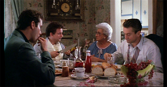
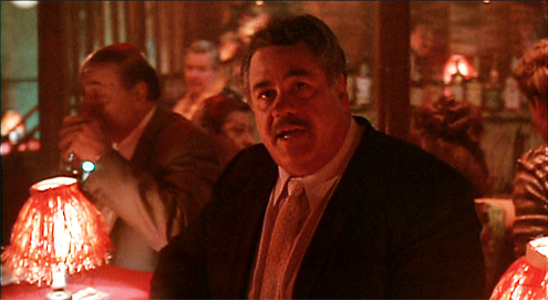
Goodfellas (1990).
DB here:
Fourteen months of being house-bound gave me plenty of chance to catch up on my reading. But the reading was almost all devoted to the book I was writing on mystery plots in fiction, film, and other media. Now that it has been catapulted out to unwary publisher’s readers, it’s time for me to catch up on some 2020 books I like. In this batch, all have a connection to film criticism, and murder, attempted or consummated, creeps into more than one.
Movies for Muggles
Somebody ought to write a history of the one-movie monograph. Early on there were picture books, and roadshow attractions often produced pretty laminated books as souvenirs, filled with PR stories and color images. My vote for the first analytical monograph would be the very ambitious Tu n’as rien vu à Hiroshima! (1962). In the early 1970s, American academic presses began offering critical studies of single films; an early example was the FilmGuide series edited by Harry Geduld and Ron Gottesman. (My favorite entry was Jim Naremore‘s study of Psycho.) Since then many publishers have pursued the format, usually as part of a series.
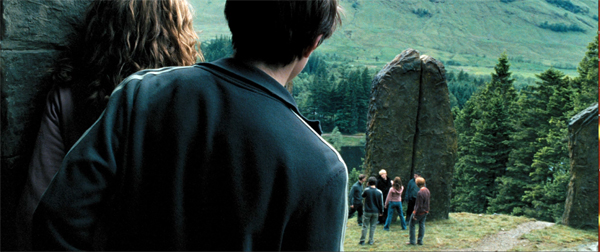
Now we have 21st Century Film Essentials, newly launched at the University of Texas Press. The first two entries are pretty canon-busting. Dana Polan writes on The Lego Movie, and Patrick Keating on Harry Potter and the Prisoner of Azkaban. I haven’t seen Polan’s book, but Keating directly takes up the challenge of the series.
As a franchise film, as a work of digital cinema, as a work of collaborative authorship, and above all as a thoroughly engaging demonstration of the art of storytelling, Harry Potter and the Prisoner of Azkaban is an essential work of twentieth-first century cinema.
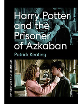 I confess I was skeptical, and still am a little. But Keating’s meticulous analysis and interpretation of the film does convince me that this is a ripe example of modern “hyperclassical” cinema. By that I mean a dense, “through-composed” revision of traditional narrative strategies and film techniques, working smoothly together to create effects at many levels. A hyperclassical film is more thoroughly classical than it “needs to be.” In other words, here’s another counterexample to the notion that “post-classical Hollywood” shows a collapse of traditional norms.
Keating’s argument for the film’s richness, I think, revolves around two central concepts. First is that of narrative viewpoint. Virtually all of Azkaban, unlike the earlier entries in the franchise, is filtered through the consciousness of Harry. We’re attached to him as he experiences the action. That doesn’t, Keating hastens to add, make the film radically subjective; indeed, there are relatively few shots from Harry’s optical viewpoint. Attaching the unfolding plot to a character doesn’t rule out a wider perspective, if only because cinema puts him within a wider frame of a shot or an edited sequence. There’s always the possibility of our registering action or other characters’ reactions. The end of the Quidditch flight is thick with these impacted viewpoints, and elsewhere Cuarón’s constantly moving camera nudges us toward implications that supplement, or sometimes contradict, what Harry is concentrating on.
Keating’s other main concept is connected to the broadening of viewpoint: worldbuilding. This idea is obviously central to Rowling’s achievement, as it has been to franchises since Star Wars. But Keating lifts the idea to a central role in how films engage us. The richly realized world of Potter is only an extreme instance of what every narrative does. Borrowing from critic V. F. Perkins, Keating suggests that any film narrative supplies us with the possibility of many stories that are only hinted at, or merely latent.
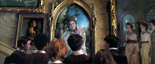
Most movies prune those secondary offshoots, the better to force us to concentrate on our protagonist. But Tom Stoppard showed that Rosencrantz and Guildenstern deserved their own play. Similarly, franchise films, with the ever-present prospect of sequels, crossovers, or reboots, make us aware that any character, even any item of furniture, secretes a new story, or a bunch of them. The Potter films are committed to this spinoff aesthetic, packing in as many suggestions of sidestories as the screen will bear. This principle finds tangible expression in the portraits jammed into the Gryffindor common room and dorms guarded by the Fat Lady.
Overwhelming us with characters and situations, many in motion, this gallery is perfectly in keeping with English traditions of floor-to-ceiling decor. It’s also a groaning feast of other stories that could yet, somehow, intersect with Harry’s fate. Keating’s shrewd commentary on worldmaking is one of the book’s highlights.
Keating ties these ideas to phases of production and division of labor, reviewing how the novel’s viewpoint and worldbuilding strategies are transposed and extended by script, camerawork, editing, performances, set and costume design, and music. Throughout he weaves what he takes to be the film’s binding theme, that of time. Is the future preordained, as Ms. Trelawney insists in her frantic, fumbling lectures? Or is it open, as Hermoine and others tell Harry? This makes the film’s tour de force climax with the Time Turner into a synthesis of restricted viewpoint (we’re with Harry as he witnesses an alternative future) and worldbuilding (the future is what you make it).
I might quarrel with Keating’s suggestion that the impulse driving Harry’s action is a struggle with the dementers. I saw his relation to Sirius Black as more than the subplot Keating considers it. Overall, though, Keating has produced not only a subtle, supple analysis of the film but also a model for how to understand cinematic storytelling in the age of the blockbuster.
Wiseguy’s progress
If Keating’s book is a classical sonata, Glenn Kenny’s Made Men: The Story of Goodfellas is bop. Keating offers a tidy analysis through crisply defined categories. Kenny provides a hardcopy approximation to a packed DVD.
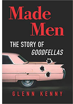 At the center is a 150 page scene-by-scene account of the film: a commentary track in your hands. Alongside that sit chapters that function as bonus materials. They include a brief introduction to the filmmaker just before he started work on the film, chapters on preproduction, the music (Kenny is an expert on pop and rock), the editing, the critical reception, and the ultimate fate of the real-life protagonist Henry Hill. Then, like the narrator of a Criterion video supplement, Kenny surveys Scorsese’s career after Goodfellas. Finally, an epilogue is virtually a monologue: Scorsese talks almost without interruption for twenty-five pages, as if this were the interview rounding off the disc. There’s also a bibliography, a timeline of the production, and the recipe for Henry Hill’s ziti.
It’s overwhelming. Kenny has evidently read everything about the real-life sources of the story, and his interviews turn fan service toward crime reporting. It is no small thing to pursue hard cases who were recruited for bit parts. Kenny has also garnered a lot of information from staff like AD Joseph Reidy, who are seldom given much attention. Keating would probably be happy to see Kenny’s narrative splinter into stories leading to other stories, such as the effects of the film on the careers of Barbara De Fina and Ileanna Douglas.
I compared the book’s central chapter to a DVD commentary. Anybody delivering a voice-over play-by-play regrets that you have to keep up with the film and can’t devote as much time to a big scene as you might like. Thanks to the print format, Kenny is able to pause the film and spiral out from it to fill in backstory or behind-the-scenes dynamics.
Early on, he can give us three pages on Tuddy, both his original (who died in prison) and Frank DiLeo, the actor playing the role. Kenny explains that DiLeo was a music executive who oversaw Michael Jackson’s “Bad” video, which included a Wanted poster of Scorsese in a subway scene, which ties to a sneaky reference to the “Smooth Criminal” video featuring a character named Frank Lideo, played by Joe Pesci. . . well, you get the idea. Likewise, in an astonishing cadenza, Kenny identifies every actor and wiseguy in the long POV tracking shot in the Bamboo Lounge.
His account of the cast rummages through filmographies and personal histories, and adds the sort of oversharing we welcome: “Behind the placid mook mug seen in the movie was a remorseless killer.”
All these exfoliating tales don’t conceal a sustained performance of film criticism. Kenny’s governing idea is that Goodfellas cons us through a bait and switch. Lured in by a rapid-fire opening that arouses a bemused attraction to these bad boys, we’re gradually forced to a more sober, even horrified, realization of their moral and emotional brutality. I think that this fairly reflects most viewers’ experience. But how does the trap work?
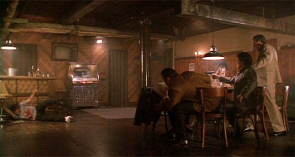
Kenny plots an “arc of disengagement” between the killings of Tommy and Spider. A rise-and-fall pattern links the parallel scenes of the Bamboo Lounge, the Copacabana, and the shabby tavern where the gang meets to whack Morrie. Kenny draws nuanced comparisons with The Godfather and is very detailed on Scorsese’s visual techniques, particularly the freeze-frames and fadeouts, which usually get less attention than the flashy camera moves. One of the book’s main points is that Scorsese, newly aware of how TV commercials trained viewers in quick pickup, deliberately decided to make his fastest-paced movie. And of course the music is central to managing our mood and commenting on the story.
As a seasoned reviewer, Kenny can write. “Frisky newlyweds still hot for each other; you love to see it.” Henry (“a walking appetite”) eventually pulls Karen into his schemes: “The revitalized marriage will find its sense of twisted teamwork.” And digression is welcome when it humanizes the author. Listening to Sid Vicious’ version of “My Way” is comparable to “say, eating the fried chicken from the Kansas City restaurant Stroud’s for the first time.” (The “say” makes the sentence.) A movie about food begs the critic to sample a little synaesthesia, with music evoking mouth-watering chicken. Come to think of it, that linkage of music and food is in Goodfellas too.
I especially enjoyed Kenny’s rebuke to fans who bust this carefully constructed work into “movie moments.” You probably know that one school of criticism thinks that films are more or less loose assemblages of scenes, out of which certain instants become incandescent. Certainly there are such moments in many movies, and sometimes they stand out from a gray pudding. But often strong moments ravish us because they’ve been prepared for by careful craft. So Kenny’s guided tour of Goodfellas shows its affinities with Keating’s holistic approach:
Serrano and his crew reduce movies to anthologies of “cool” or shocking moments, as opposed to fictions whose circumscribed worlds aspire to create beauty or sorrow or horror or joy in some formally coherent whole.
Mon semblable, mon frère.
Dead end at the ocean’s edge
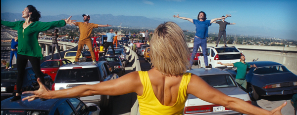
La La Land (2016).
On the other hand, I ought to be out of sympathy with Mick LaSalle’s Dream State: California in the Movies. It’s unabashedly reflectionist, tracing how films project contradictory images of the Golden State. The screen image of California promises pure self-fulfillment, but that leads to loneliness, danger, conformity, and loss of dignity. If Kenny and Keating see movies as made by an army of artisans, LaSalle treats them as springing full-blown from American mythology. There is barely a mention of a director, let alone a sound mixer, in his account.
 Instead, California-ism makes its way to the screen through a surge of a “collective mentality.” For instance, the blockbusters’ endless images of urban annihilation spring from “a people disseminating and celebrating visions of their own obliteration. . . . Something is seriously wrong with the nation producing such visions.” He suggests that “the fear of extraterrestrials is the disguised fear of illegal aliens. . . . the fear of the apocalypse is the disguised fear of terrorism.” Hollywood takes dictation from mass anxieties.
I’ve explained elsewhere (here and here) why I find such claims unpersuasive. I think that reflectionism is every smart person’s mistaken idea about cinema. But sometimes, as with Susan Sontag’s essay “The Imagination of Disaster,” a reflectionist account of a film can activate some valuable ideas and information along the way, and it can host some entertaining writing. These benefits, I think, emerge throughout Dream State. In kaleidoscopic bursts, LaSalle provides suggestive takes on movies familiar and obscure, and the way they link to one another.
For example, he tracks recurring plot patterns. There’s California’s version of the One Great Night, when individual transformation takes place in a few hours of turbid activity (Superbad, Modern Girls). American Graffiti is the prototype, and in just two pages LaSalle evokes the way audience knowledge races ahead of the characters, far into the future. (Curt winds up in Canada, which probably has to be explained to young viewers today.)He’s very good on the cost-of-stardom plot, from What Price Hollywood to La La Land, this last the only film that faces the fact “that every great advance requires sacrifice, and that even though there is nothing like the joy of first love , there is nothing more important than the fulfillment of one’s inner self.”
 LaSalle considers our willingness to take stars as surrogates for us, and here I was reminded of another critic who tried to pierce the Hollywood Hallucination, the great Parker Tyler. He had, I think, a more meta attitude toward the movies, since he avoided straight reflectionism by treating every film as a charade, a narcissistic exercise in make-believe. For Tyler, Hollywood movies were always primarily about Hollywood, filled with symbolic surrogates for their makers and their viewers. In this respect, LaSalle’s opening chapter is agreeably Tyleresque, positing The Wizard of Oz as a film enacting the flight to a dream city; the Emerald City as Hollywood. Like Tyler as well, LaSalle searches for what he calls a movie’s complex finish, as with a glass of wine. Wizard ends not on a note of ambiguity exactly, but on something like a chord that sets off contrary overtones. Tyler’s books were built on this chord.
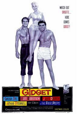
Another critical avenue that LaSalle opened up for me was iconographic: the differences between LA movies and San Francisco movies. He deftly contrasts the ambience and topography of the cities. Noir and disaster films are primarily anchored in LA, while San Franciso movies tend to be steeped in nostalgia (e.g., Jobs, Milk). He keeps finding new angles to comment on. Avoiding the obvious effort to discuss California’s boom during and after the war, he skips back to the months around Pearl Harbor to bring to light films, mostly exploitation quickies like Secret Agent of Japan and Little Tokyo, USA, that rushed to treat Japanese Americans as potential spies. Meanwhile, the unoffending citizens were shipped off to internment. On a lighter note, anybody who’s bold enough to praise Gidget as a more mature film than Easy Rider gets my admiration (and agreement).
LaSalle, who came to California from the east, weaves in bits of memoir that highlight his main theme. And like Kenny, he writes with conversational wit.
“Home is horrible. Oz is horrible, too. . . but at least it’s in color.”
On Saturday Night Fever and Grease: “One seems tough, but it’s soft. (Of course, that’s the New York film.) One seems soft, but it’s hard. (Of course, that’s the Los Angeles film.)”
In Hollywood “integrity is so original it might just work as a strategy.”
In Out of the Past, “sex can kill you, but it’s worth it anyway.”
In San Francisco (1936) “if only to get Jeanette MacDonald to stop singing, the Earth had to intervene.”
Contrasting Monterey Pop to Woodstock‘s utopian fantasy, LaSalle nearly had me on the floor.
This is a model? Hundreds of thousands of intoxicated people, unable to wash, all but sitting in their own slop, cheering for a series of aristocrats that swoop down to entertain them and then leave? Meanwhile, the army flies in food and the slave classes clean out the Port-O-Sans? That’s sustainable as a societal model?
In addition to all this, through engaging appreciation, LaSalle has prompted me to seek out a great many films I hadn’t heard of. That’s another duty of the good critic. After seeing so much–pounding the beat every day–the movie reviewer can steer you to new discoveries.
Cinephile into cineaste and back again
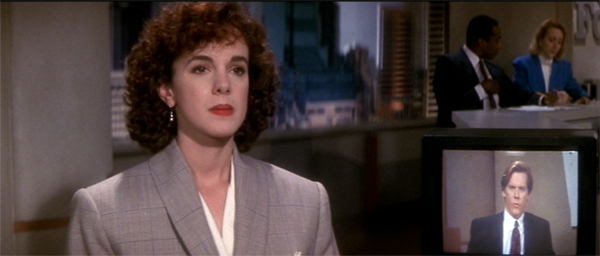
He Said, She Said (1991).
All of these critics have participated in filmmaking. Mick LaSalle has written and produced documentaries. Glenn Kenny has been an actor in several films (including Soderbergh’s Girlfriend Experience). Patrick Keating, who has an MFA in cinematography, has been a DP on independent projects. Reciprocally, director Ken Kwapis started out wanting to be a film critic–in third grade, no less.
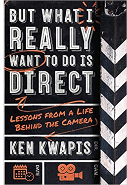 In college he devoured classic movies and gorged on film criticism. Kwapis went on to become a director of consequence, overseeing many features (Sisterhood of the Traveling Pants, He’s Just Not That into You) and TV episodes (The Garry Shandling Show, The Office). Yet he didn’t leave his cinephilia behind. But What I Really Want to Do Is Direct: Lessons from a Life behind the Camera has an intellectual heft rare in career memoirs and moviemaking manuals. It’s at once thoughtful and practical, suffused throughout by an ethic of modesty, tenacity, and what I can only call a desire to remain both a good artist and a decent person. It also contains some first-rate film criticism.
Kwapis intercuts three sorts of chapters. There is the chronological account of the filmmaking process, with advice on taking meetings, establishing rapport on the set, giving actors “playable notes,” and coping with postproduction and marketing. Kwapis insists at every turn that you need to be both firm and flexible, open to every suggestion from the production team but still adhering to your conception of the project.
But this is not auteurism on steroids. If you’re not a Spielberg or a Nolan, the director has to learn tact and strategy. Kwapis emphasizes not abstract technique but the interactive, interpersonal demands of filmmaking, He suggests ways of responding to producers’ notes or actors’ complaints that allow everyone to keep their dignity. Just stepping away from the Video Village, that cluster of people around the monitor, and positioning yourself by the lens is a way of proactively steering the scene. He even gives good advice about bad reviews. His creative process? “I want to stand behind the camera and make sure there’s something alive going on in front of it, something recognizably human.”
A second batch of chapters shows this aesthetic/ethos in action through case studies from Kwapis’ career. Starting with Follow That Bird (1985), the Big Bird movie, and running up to A Walk in the Woods (2015), these chapters are about concrete problem-solving. How do you direct puppets? Or orangutans? Or Rip Torn? How do you support an actor who’s just not physically up to the role? There’s a fascinating account of staging options in The Office, where different situations force choices between developing the action in the “bull pen” or in the conference room.
The 1990s were rife with narrative experiments, and He Said, She Said (1991) was one of them. Unfolding over two days, its first part uses flashbacks to present Dan’s memory of his romance with Lorie, while the second part shifts to her version, with replays and gap-filling scenes that show the biases of his account. Kwapis and his wife Marisa Silver (Permanent Record) decided to divide responsibilities, with him directing the man’s scenes and her directing the woman’s. They also built in stylistic differences.
We pre-visualized each version to create as much contrast between Lorie’s and Dan’s personaities as possible. For example, I often show Dan’s literal point of view of Lorie, while Marisa uses camera movement and choreography to underscore how Lorie feels about herself (i.e., insecure).
They created specific ground rules for shooting the scenes. Kwapis’ portion came first, so that Silver could see it and fine-tune the replay. Kwapis is admirably specific about how their strategy shaped performance and plot, with minor characters in one half becoming major in the second.
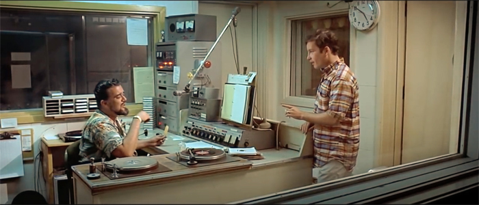
In other words, a cinephiliac idea. (Kwapis prepared for his task by watching Rashomon, The Killing, and Citizen Kane.) The third type of chapter he offers is pure, sharp film criticism, always informed by the demands of craft. His account of American Graffiti is quite different from LaSalle’s, but no less appealing, emphasizing Curt’s visit to Wolfman Jack as an epiphany that needs no formal underlining (“no ham-fisted push-in”).
Other chapters scrutinize 2001, Lawrence of Arabia, The Graduate, I Vitelloni, and other classics. Without being pretentious Kwapis manages to invoke the “objective correlative” (e.g., shoes in Jojo Rabbit) and reflexivity (no big deal). I especially appreciated his detailed analysis of staging in a scene often overlooked in The Magnificent Ambersons: George’s confrontation with a gossipy neighbor, handled in one deftly choreographed close framing.
Kwapis designed the book to explore these three dimensions, but he isn’t puritanical about keeping them apart. Case studies and problem-solving pop up in the general advice sections, and the critical acumen shines through even brief examples of on-set tips (e.g., decisions about a score for Traveling Pants). It all flows together.
The result ranks with Sidney Lumet’s Making Movies and Alexander MacKendrick’s On Film-Making, the most acute personal reflections on Hollywood directing. But like those, it’s more than a testament to the power of craft. It’s also a vision of how, as the first chapter says, to go “beyond success and failure in Hollywood.” You do it, Kwapis maintains, by knowing your plan, respecting your co-workers, inviting discovery through accidents, and staying humane. I like to think that studying films as a critic helped him get there. Not every director, after all, can quote Jean Renoir.
“Only a hack cares about the goddam script”
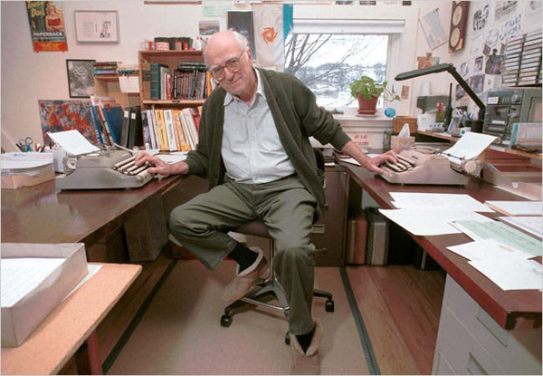
Donald Westlake (David Jennings for the New York Times).
I promised you a murderer, and he arrives in Donald E. Westlake’s Double Feature, a pair of novellas originally published as Enough (1977). The second, Ordo, takes place in Hollywood, when a sailor learns that his first wife has become a movie star and decides to look her up. It’s remarkable in several ways, but the story that grabbed me was A Travesty. On the first page a film critic kills his girlfriend.
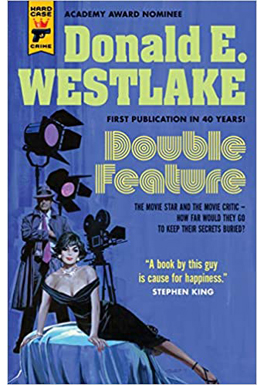 True, it’s an accident, but even then he seems less distressed than he should be. He wipes down the crime scene and slips out. Of course he becomes a suspect. Once he seems to be cleared, the trusting cop lets him mosey along on later investigations. They discover that the critic has a knack for solving crimes, including an old-fashioned locked-room puzzle. He gets caught thanks to a plot twist that owes a good deal to Westlake’s early days writing happily overblown softcore porn.
The plot lives up to its title, being a travesty of whodunits and man-on-the-run thrillers. Westlake invokes mystery conventions like the dying message and the final twist: “As with all Least Likely Suspects, I was in reality the Murderer.” But this guilty protagonist is writing a profound essay on Top Hat and interviewing an over-the-hill director who undermines his belief in the auteur idea that “it’s up to the director to color and shape the material and so on.”
A: Yeah, that’s fine, but you got to have the material to start with. You got to have the story. You got to have the script.
Q: Well. . . . I thought the director was the dominant influence in film.
A: Well, shit, sure the director’s the dominant influence in film. But you still gotta have a script.
Well, that wasn’t any help. What was I supposed to do, go ask three or four screenwriters for suggestions?
A Travesty reveals that Westlake followed East Coast cinephile taste pretty closely. In the passage after this one, the killer regrets placing Brant so high in the Pantheon–a clear reference to Andrew Sarris’s writings. Better to ask a real director like Hawks or Ford or Hitchcock, or even Fuller.
Hip movie references are de rigueur in most mysteries today. (Grudge-reading The Woman in the Window, I thought: Just kill me now.) But how many thrillers in 1977 invoked Marion Davies or Manny Farber’s Negative Space? Our anti-hero argues with a girlfriend about circumstantial evidence in The Wrong Man and Call Northside 777. And as you’d expect, the big clues that reveal the killer to her come from Gaslight.
Westlake has long been one of my heroes; his Richard Stark novels get a chapter in that manuscript I mentioned at the outset. (Go here and here to gauge my dedication.) Like Elmore Leonard, he had a pragmatic approach to movie versions of his work. As far as I know, he complained only of Godard’s handling of The Jugger, which became Made in USA, not that anybody could tell. He wrote screenplays, notably The Stepfather (1987) and The Grifters (1990), and many of his stories have been adapted to the screen (Point Blank, The Outfit).
Nearly all his work I know has a zesty playfulness, and A Travesty is no different. It suggests that, after shooting down movies and destroying reputations, film critics have earned a chance to kill for real. They just turn out to be fairly bad at it.
My stack of reading has barely dwindled. I’ll try to file some more book reports as summer unfolds and the mosquitos discover our shady lawn.
Thanks to Patrick Keating and Mick LaSalle for sending me copies of their books, though I would have bought them anyway. Thanks especially to Patrick Hogan for telling me of his friend Ken Kwapis’s book.
Philip Pullman, a master of the sort of world-building Keating celebrates, argues against dwelling on the story spinoffs harbored by a richly realized milieu. He borrows the scientific idea of “phase space” to suggest that too great a concentration on the indefinitely large possibilities of a story world can freeze a narrative’s progress and distract the reader from the through-line. A story, he says, is a path through a forest and readers are best gripped by sticking to Red Riding Hood’s journey. (Compare Sondheim’s Into the Woods.) Interestingly, he compares this strategy to the cinematic idea of knowing the right spot for the camera, a spot that’s just as valuable for what it excludes as for what it shows. See Daemon Voices: On Stories and Storytelling (Vintage, 2017), 20-24, 122-123.
For more on Parker Tyler, see the chapter in my The Rhapsodes: How 1940s Critics Changed American Film Culture. Avoiding straight reflectionism, Tyler saw the film world as its own sealed-off realm. If the movies reflect anything, it’s not what America thinks but what Hollywood thinks that America thinks. Or rather, what Hollywood imagines that America dreams.
In this entry I write about some of the anti-Japanese films Mick LaSalle discusses.
This entry analyzes the pseudo-documentary style of The Office. I write about 1990s as an era of narrative experimentation in The Way Hollywood Tells It: Story and Style in Modern Movies.
No admirer of Westlake can ignore the addictive Westlake Review or, of course, the official webpage maintained by his son Paul. Westlake’s motto: “My subject is bewilderment. But I could be wrong.”
American Graffiti (1973).
Venice 2018: Big films on the big screen
Roma (2018)
Kristin here:
The Venice International Film Festival has a way of making the time fly–despite the occasional feeling when standing in line for a film that the doors will never open. It seems ages ago that we saw the early-morning press screening of First Man, and yet a mere three days have passed.
So far we’ve had the rare experience of each morning seeing another exciting, excellent, thoroughly satisfying film: First Man (which David has already written about), Alfonso Cuarón’s Roma, and the Coen Brothers’ The Ballad of Buster Scruggs. Can this last? Probably not, but the rest of the program offers rewarding films and so far seems to justify journalists’ claims that this year’s festival is boosting its already growing reputation.
A new (and laudable) tradition?
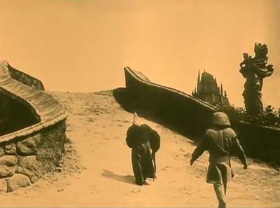
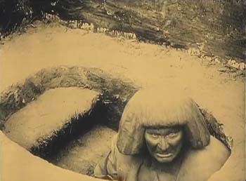
Last year we reported on the restored print of Lubitsch’s 1923 Rosita, which played on the evening before the official start of the festival, accompanied by an orchestra playing a restoration of the original score, edited and conducted by Gillian Anderson. This year the festival organizers followed up on that success by premiering the restored Der Golem (Carl Boese and Paul Wegener).
The large and enthusiastic crowd showed that, given the right presentation, this old film can attract those who think of the festival primarily as a place to see brand-new films before the rest of the world does. In fact, there’s also a healthy restoration thread running through the festival, though silent films tend not to figure in it.
Der Golem is noteworthy as one of a small number of relatively sympathetic Jewish-themed films that came out in the early to mid-1920s in Germany. (I recently wrote about this trend and the newly restored Der alte Gesetz.) It does not manage entirely to avoid stereotypes, but it should be pointed out that the Christian characters come across far worse.
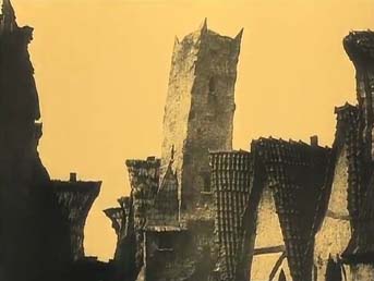
Der Golem is an early entry in the German Expressionist film movement of the 1920s, having come out in 1920, the same year as Das Cabinet des Dr. Caligari. Rather than using painted flats to create a stark, graphic look, as Caligari did, Boese and Wegener’s film features the droopy-clay look employed by Hans Poelzig, perhaps the finest of the Expressionist architects of the day. The result is that the clay buildings of the ghetto and the clay Golem seem at times to merge into each other.
The print looks much better than previous copies available. The Belgian Cinematek held an original negative, thought to be the one for German distribution, rather than the second negative shot for foreign distribution. Prints held in other archives supplied missing footage, as well as tinting and toning information and the graphics for some of the intertitles. The drop in clarity is apparent in the replaced passages, which, interestingly, include the sequence in which Rabbi Löw summons a demon to give him the magical name that will bring the Golem to life. Why this key moment was removed from the negative will probably remain a mystery.
The musical accompaniment was a modern composition by the six members of the Mesimér Ensemble. It fits the current fashion for highly dissonant scores, including the seemingly de rigueur vocal passages. It went well with the film.
I hope the festival organizers will continue this tradition of presenting restored silent films with musical accompaniment as a prelude to the festival. It makes for a relaxing transition into the more film-filled days to come.
Worth waiting for
After the critical and commercial success of Gravity (2013), which I wrote about here and here, there has been much curiosity about Alfonso Cuarón’s long-anticipated next film, Roma. Advance word had it that the film was to be shot in Mexico and in Spanish.
As I’ve already suggested, the film is splendid, and its black-and-white, widescreen images looked great on the huge Salla Darsena screen (from front row, center, of course). As with Zama last year, at the end David asked if we had just seen a masterpiece. Again neither of us had any doubt that we had.
The film may be based on Cuarón’s childhood memories, but it is hardly autobiographical. Instead the protagonist is Cleo, one of the indigenous maids who work for the upper-middle-class family whose dramatic arc parallels her own. Conventionally the maids Cleo and Adela would be present in the backgrounds of scenes or at best be supporting characters. Instead Cleo is our identification figure. Indeed, of the four children of the family, three of them boys, we never have a clue as to which one might represent the director.
The double plot revolves around two desertions. First the husband and father of the family departs on an ostensible trip to a conference in Canada, which is soon revealed as a cover for his leaving his wife for another woman. AT the same time, Cleo is dating a man who professes to love her but who deserts her the moment she reveals she is pregnant.
One might expect this sympathetic tale centered largely around Cleo to center on the family’s harsh treatment of her. Instead, the cruelty is muted and casual. The children clearly adore her, and she them, and the wife says at one point that she loves Cleo as well. Far from firing Cleo upon learning of the pregnancy, the wife comforts her, pays for medical treatment at the family’s hospital, and buys her supplies that she will need. Yet the unkindness is apparent as well. The wife curtly tells Cleo to clean up the dog turds in the courtyard–the accumulation of which provides a running gag. She also carelessly leaves Cleo, who cannot swim, to watch the unruly children at a beach with dangerous waves. This unreasonable demand precipitates one of the film’s most dramatic scenes, shot in an excrutiatingly suspenseful long take.
Cuarón directs with his usual utter control and flair. The film is set in 1971 (when the director would have been ten years old), and the period details are impeccable–especially the family’s Ford Galaxie, which provides a running gag whenf characters try to maneuver it into a narrow garage.
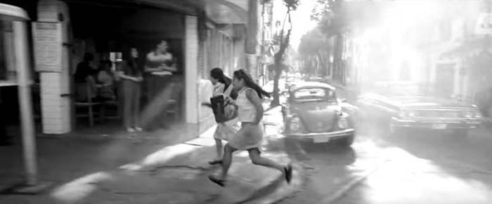
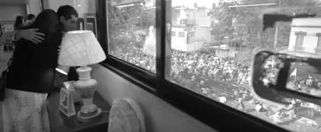
There are the expected long takes and camera movement. One fast tracking shot races along the middle of a busy street, keeping up with Cleo and Adela as they run joyously along block after block to enjoy their time off (top). In another scene, the camera wanders around the upper floor of a furniture store as Cleo shops for a crib, only to end with a pan to the windows and the revelation of the street below full of rioters.
In the ongoing controversy over Netflix’s reluctance to release its productions in theaters, it is particularly ironic that it should be the studio to produce Cuarón’s big-scale film. The promise is that it will be released “in select theaters.” If you live near one of those, don’t miss it.
Socialist Realism lives on
I had hopes of medium height that Mike Leigh’s Peterloo would live up to his previous historical films, Topsy-Turvy (1999) and Mr. Turner (2014). It turned out that Leigh had taken on a project with nearly insuperable obstacles.
While Topsy-Turvy had Gilbert and Sullivan, with its musical numbers and the innate drama of the pair’s occasionally testy relations, and Mr. Turner had painting and a single eccentric personality to focus on, Peterloo is about radical politics. The Peterloo massacre of 1819, which perforce occurs only in the climax of the two-and-a-half-hour film, is a major incident in the history of British radicalism and reform, and it is relatively well-known to the citizens of Great Britain. Elsewhere audiences are likely to be unaware of it.
As a result, Leigh must present a great deal of exposition about the issues and the lead-up to the peaceful protest march at St. Peter’s Field in the Manchester area. The exposition takes the form of a long series of speeches and conversations about those issues. The speeches are largely taken from the historical record, and they impart a great deal of authentic historical information, but they frequently overwhelm the drama.
Many of the speakers are historical characters, about whom we learn relatively little. Leigh humanizes the situation by focusing at intervals on a single poverty-stricken family whose adult men work at the local weaving mills and face dwindling wages from the mill-owners.The opening is clearly intended both to provide a bit of violent action as a hint of things to come, much later, and to introduce us to a young bugler who belongs that poverty-stricken family. We follow his trek home, his arrival there, and, briefly, his fruitless search for work.
If we expect him to become an active protagonist, however, we are disappointed, for he recurs only occasionally and passively thereafter. Instead we move around the various occasions on which speeches are given to rouse the downtrodden population to action. It must, after all, be plausible that roughly 70,000 people from the area would assemble in Manchester for a peaceable demonstration for the vote and representation in Parliament.
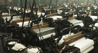
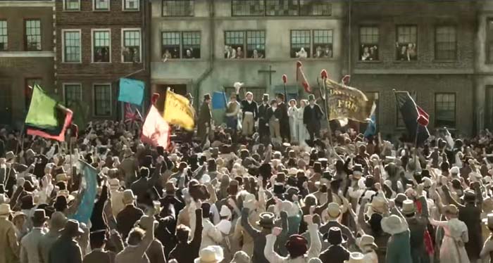
The local politicians who attempt to thwart the protest and possible resulting violence are portrayed as old, ugly, and nearly hysterical in their mingled fear of and contempt for the working classes. Their fears aren’t entirely unreasonable, given that the Luddite movement of 1812 led workers to destroy the labor-saving automatic looms and occasionally the factories that held them. Violence had killed people on both sides of the struggle. Leigh perhaps hints at the “machine-breakers” in his shots of the vast mill interior (above) and some of the dialogue, but only someone familiar with British history of the era would link the Peterlook protestors to the Luddites.
The result somewhat resembles the Soviet Socialist Realist films of the 1930s and 1940s, with their noble peasants and caricatured bourgeoisie and government officials. Not that there’s anything wrong with that, exactly, but the Soviet films seldom tried for actual realism, and Leigh cannot entirely give up his passion for naturalism. The result is an uneasy mixture in Peterloo‘s tone.
Despite its faults, the film is impressive. Produced, again ironically, by Amazon, the film has what must have been Leigh’s biggest budget to date. Authentic costumes have been created for actors and extras enough to at least suggest the tens of thousands present that day (below). The mill and the surrounding slum are convincing, and Leigh has managed to find some unspoiled landscapes to provide a relief from the grimness of working-class life in the era. Amazon will release it in the US on November 9, as part of the film’s slightly premature celebration of the 200th anniversary of the event.
Check out our Instagram page for ongoing photos from the festival.
As ever, thanks to Paolo Baratta, Alberto Barbera, Peter Cowie, Michela Lazzarin, and all their colleagues for their warm welcome of us to this year’s Biennale.
October 31, 2018: Netflix has announced that it will give Roma a theatrical release, starting on November 21 in New York and Los Angeles; it will be in more theaters starting December 7 and open wider on December 14. It will been seen theatrically in 20 countries. There will be several theaters showing it in 70mm.
Peterloo (2018)
GRAVITY, Part 2: Thinking inside the Box
Kristin here:
In my previous entry, I described Gravity as an experimental film. I had thought of it that way ever since seeing trailers for it online back in mid-September. I described it as reminding me “of Michael Snow’s brilliant Central Region, but with narrative.”
Last time I developed that notion in more detail and analyzed the narrative structure of the film. Now I’ll analyze the experimental aspects of the film’s style and the dazzling means by which they were created. I don’t have the technical expertise to explain the inventions and ingenuity that went into creating Gravity, so I have sought to pluck out the best quotations from the many interviews and articles on the film and organize them into a coherent layout of how its most striking aspects were achieved.
As in that entry, SPOILER ALERT. This is not a review but an analysis of the film. Gravity does depend crucially upon suspense and surprise, and I would suggest not reading further without having seen the film.
Screaming on the set
I’ve written about Cuarón’s use of long takes, a stylistic device that has drawn a huge amount of attention in the press. Here the editing is so subtly done that even someone like me, who typically notices every cut, missed a lot of them during early viewings. There are bursts of rapid editing, as when the ISS is struck by debris and is destroyed, or more conventional cutting, as when the camera follows the Chinese pod and surrounding remnants of the station as they heat up in the atmosphere.
The long takes go beyond what Cuarón has done before. In Variety, Justin Chang describes one major difference: “As the movie continues, the filmmakers even add a new wrinkle, which Lubezki calls ‘elastic shots’: Takes that go from very wide shots to medium closeups, then segue seamlessly into a point-of-view shot, so the viewer is seeing the action through the character’s eyes, right down to the glare and reflections on a helmet visor.” Such moments are rare in Gravity, but one occurs in the “drifting” portion, shortly after the segment laid out above:
As Cuarón has pointed out, his long takes eliminate the need to cut in to closer views: “The language I have been working on with Chivo in these recent films is not one based on close-ups. We include close-ups as part of a longer continuous shot. So this all becomes choreography.” Another point he makes in this and other interviews is the influence of Imax documentaries on Gravity: “My process of exploring long takes fits in with that IMAX documentary notion, because when they capture nature it isn’t like they can go back and pick up the close-up afterward. There isn’t that luxury in space either. So then it falls to us to find a way to deliver that objective view, but then transform it into a more subjective experience.” Hence the “elastic shots.”
The long takes often dictate a refusal to cut in to reveal significant action. There is the moment in the epic opening shot, for example, when Shariff is suddenly killed in the background while in the foreground Kowalski tries to help Stone detach from her mechnical arm and into the shuttle. Did you see the flying piece of debris that struck his head? I didn’t, not until the fourth time I watched the film, knowing that it was coming and determined to spot it. It’s there, a little white dot that flashes through the frame in a split second. Shariff’s abrupt movement to the side, stopped with a jerk by his tether, is what we spot, since his bright white suit moves so suddenly and quickly, ending up against the pitch black of space:
A great deal happens in such moments of action, and we are left to spot what we can.
If these long takes are dazzling on the screen, think what they must have been like to witness being made. Lubezki has suggested how complicated the long takes in Gravity and earlier films were to shoot:
There are very few director/cinematographer teams working today as well known for a certain aspect of filmmaking as you and Alfonso are, which is that long extended take, or the seamlessly edited take. What it is like actually shooting those scenes?
I’m going to tell you something, the reality is that the movie was so new that when we finished a shot we would get so excited people would scream on set—probably me before anybody else. There were moments when we were shooting and Alfonso said ‘cut’ we would all just jump and scream out of happiness because we’d achieved something that we knew was very special.
In Children of Men, we also had moments like that. When we finished the first shot inside that car [the aforementioned ambush scene], the focus puller started crying. There was so much pressure that, when he realized he had done a great job, he just started crying.
There is something breathtaking about the achievement of complex long takes that seems not to arise from any other cinematic technique. I have seen Russian Ark three times now, and each time I feel an inexplicable tension, wondering whether the camera team will make it through the entire one-shot film without a mistake. I’ve already seen it happen, and yet it still seems unbelievable that they did.
In Gravity, of course, the “long takes” were not actual lengthy runs of the camera. Nor were they, as in Children of Men, several camera takes stitched together digitally to create lengthy single shots. Rather, they were created in the special-effects animation, with the faces of the actors being jigsawed into them through a complex combination of rotoscoping and geometry builds. (See this Creative Cow article for an example.)
The choice to present the action in long takes was crucial to the look of the film. Most films set in space rely heavily on editing, since for decades the special effects needed to convey space walking were best handled in a series of shots. In Star Trek Into Darkness, Kirk flies through space toward a spaceship breaking up and surrounded by debris, a situation somewhat comparable to that in Gravity. The sequence is built up of many short shots of Kirk against shots of dark space, point-of-view shots through his helmet, and cutaways to characters inside the Enterprise conversing with him via radio. Here’s a brief sample of four contiguous shots:
The sequence conveys little sense of weightlessness, partly because the actor adopts a traditional superhero-style flying pose. With no air in space, there would be no need to compact oneself into a streamlined shape. The fast cutting keeps repeating similar compositions, as with frames 2 and 4 above, with the fast editing presumably intended to generate excitement. (Star Trek Into Darkness has at least 2200 shots in a little over two hours, while Gravity has about 200 in 83 minutes.) Gravity‘s success in creating a realistic environment in space is dramatically evident when contrasted with this film’s more traditional outer-space conventions.
But it turns out that the commitment to the long take led Cuarón toward less common choices about editing, staging, and lighting.
Follow the bouncing axis
For much of the film, there is minimal spatial stability for the characters or for our viewpoint into the diegetic world. There is no ground, so we cannot imagine the camera resting on anything. When outside the space vehicles, the camera moves nearly all the time. In an interview with ICG Magazine, director Alfonso Cuarón was asked, “So with the camera and characters in constant motion and changing perspective, how did you figure up from down?” He replied:
There is no point of departure because there is no up or down; nobody is sitting in a chair to orient your eye. It took the animators three months to learn how to think this way. They have been taught to draw based on horizon and weight, and here we stripped them of both.
Undoubtedly many scenes contain an axis of action running between the characters, but it is not of a traditional kind. Unlike in a classically edited film, in Gravity‘s action scenes in space, the axis is in constant, fleeting motion, and any given center line between two characters must in quick succession run not only left and right but also up and down, diagonally, in almost any direction. Any given screen direction set up by the axis is ephemeral and offers little to help orient us spatially. Eyeline directions mean very little, since there are few cuts to things that the characters have seen offscreen. (True, when characters look offscreen, they establish eyelines, and the camera sometimes pans from Stone or Kowalski to some object they have been looking at. But a pan from a person to an object automatically establishes the spatial relations between them, whether or not the character is looking at the object.)
As a result, the spatial cues used in continuity editing system are not so much eliminated as made irrelevant for long stretches. That system is meant, after all, to guide our understanding of the story space across cuts. There are exceptions, such as a brief shot/reverse-shot exchange: Stone, loosely attached to the International Space Station (ISS) by ropes, pleads with Kowalski not to untether himself from her and float away to die in space, and he insists that it is the only way to allow her to live. When Kowalski and Stone, tethered together, travel toward the ISS, he is always at screen left, she at screen right, with the strap joining them stretched out as a sort of visible axis of action; straight cut-ins to close views of each character, and even at one point Kowalski’s point of view, obey the 180-degree rule and create an almost conventional scene. Actions inside the spacecrafts are more oriented as well. In the ISS Stone moves weightlessly through a series of pods, all the while maintaining screen direction. Similarly, inside the vehicles, especially late in the film when Stone is strapped into seats, she is usually upright, her head oriented toward the top of the frame. Some sustained actions in space also keep her right-side up, as when she removes the bolts holding the parachute cords to the Soyuz landing vehicle.
In part because of such orienting devices, we are seldom seriously confused about where the characters are, or at least not for long. Otherwise we would not be able to comprehend the story action. Still, compared to typical classical films, Gravity conveys little sense of spatial stability. The disorienting simulation of weightlessness for characters and camera dominates the scenes outside the vehicles and creates a style that can truly be called experimental.
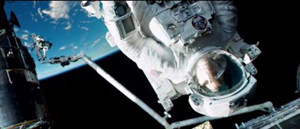
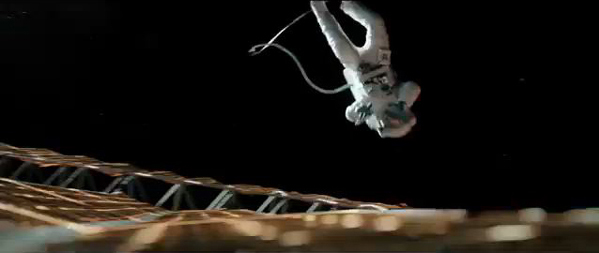
Take the brief segment (about 14 seconds) below, from the 13-minute opening shot. Stone has been standing at the end of a large mechanical arm which gets knocked off the space shuttle by a piece of hurtling debris. It spins rapidly, with the camera framing it from long-shot distance. The camera is not entirely static, reframing slightly, but we can see the earth in the background fairly clearly. Stark sunlight comes from offscreen left, and as Stone’s body whips through space, the shadows move accordingly around her, with the back of her body in deep shadow in the first frame and then her front shadowed in the second:
The fact that the light source, the sun, is offscreen left during this spinning segment suggests that the camera and hence our viewpoint are in a stable position. Yet that position is maintained for only a short time. At this point in the shot, the camera is essentially waiting for her to draw near in order for it to execute a change that will govern the penultimate part of the lengthy shot.
That happens when, after she has spun wildly toward and away from us several times, the camera “attaches” to her, so that we are now seeing her in medium shot and spinning with her. Instead of seeing the earth clearly, we see her while the blurred surface of the earth and the blackness of space alternate rapidly. This was the technique that led me, when I first saw the film’s trailers, to compare Gravity to Michael Snow’s Central Region:
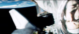
Being closer to Stone, we can see more clearly the shadows coming and going; her face is sometimes illuminated brightly by the sun and sometimes in near darkness:
The function of the attachment to Stone, apart from allowing us to see her fear and confusion, is to show us that her hands are working to detach her from the arm, as a tilt down reveals:
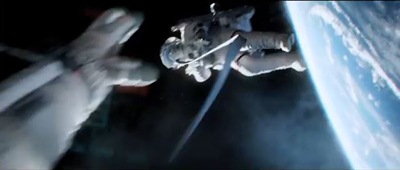
As she soars off the arm and tumbles into the black depths of space, the camera leaves its “attachment” to her, and she spins away from it:
Cuarón’s commitment to the long take thus made him rely more than usual on events taking place within the frame–camera movement and figure movement in particular. Yet these movements had to occur in a microgravity environment radically different from the earthbound surroundings of Children of Men and Harry Potter and the Prisoner of Azkaban. This new constraint led to some technological innovations of remarkable originality.
The LED Light Box
Early on it became clear that moving the actors through space on wires would not create the desired realism of weightlessness, and obviously they could not be whipped about and tumbled in ways that the film ultimately achieved. The actors would have to be relatively static, with the illusion of movement created through other means. One of the main challenges was to have the lighting on their stationery faces support that illusion. And it would have to be done perfectly in order to achieve the photorealistic depiction of space that the filmmakers were after.
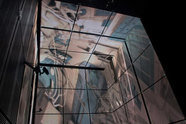
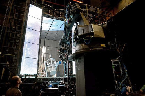
Usually in watching a film heavily dependent on CGI, one notices elements that have been assembled into a single composition but don’t quite match each other. A matte painting that isn’t lit from precisely the same angle as all the other components stands out from the rest (as, it has to be admitted, happens in the best of CGI scenes, including those in The Lord of the Rings). The problem was solved for Gravity using the LED Light Box, a device frequently mentioned in the press coverage of the film but seldom explained. (See image at the top.) The concept is truly revolutionary, although I am not sure to what extent it would work for other films that did not present such peculiar challenges.
In American Cinematographer‘s article on Gravity, “Facing the Void,” cinematographer Emmanuel Lubezki explains why consistency of lighting is crucial and how he came up with his solution:
Lubezki emphasizes that Gravity‘s blending of real faces with virtual environments posed a tremendous challenge. “The biggest conundrum in trying to integrate live action with animation has always been the lighting,” he says. “The actors are often lit differently than the animation, and if the lighting is not right, the composite doesn’t work. It can look eerie and take you to a place animators call ‘the uncanny valley,’ that place where everything is very close to real, but your subconscious knows something is wrong. That takes you out of the movie. The only way to avoid the uncanny valley was to use a naturalistic light on the faces, and to find a way to match the light between the faces and surroundings as closely as possible.”
This challenge led Lubezki to imagine a unique lighting space that was ultimately dubbed the “LED Box.” He recalls, “It was like a revelation. I had the idea to build a set out of LED panels and to light the actors’ faces inside it with the previs animation.” Lubezki conducted extensive LED tests and then turned to [special effects head Tim] Webber and his team to build the 20′ cube and generate footage of the virtual environments, as seen from the actor’s viewpoint, to display inside it. While constructing the LED Box, the crew also solved problems involving LED flicker and inconsistencies.
Inside the LED Box, the CG environment played across the walls and ceiling, simulating the bounce light from Earth on the faces of Clooney or Bullock, and providing the actors with visual references as they pretended to float through space. This elegant solution enabled the real faces to be lit by the very environments into which they would be inserted, ensuring a match between the real and virtual elements in the frame.
This ingenious approach largely did away with traditional three-point lighting in the exteriors. As Lubezki explains in the AC article,
When you put a gel on a 20K or an HMI [Hydrargyrum medium-arc iodide], you’re working with one tone, one color. Because they LEDs were showing our animation, we were projecting light onto the actors’ faces that could have darkness on one side, light on another, a hot spot in the middle and different colors. It was always complex, and that was the reason to have the Box.
The crucial point here is that the lighting was being created by playing the previs animation of the earth, space, the moon, and the large reflecting objects like the space shuttle on the sides of this 20′ by 10′ box. In other words, the moving images from the nearly finished special effects were used to light the faces of the actors, and those faces were later joined to those very same special effects, in a more polished form, to create the final images.
Lubezki gives an excellent description of the Box in his interview with Bryan Abrams, a series of responses which is worth quoting at length. Note that Lubezki refers to the Box as an LED monitor–essentially a giant television screen turned inside out and surrounding the actor:
Can you touch upon some of the pieces of technology and equipment that were created to make Gravity possible?
To make this movie we used many different methodologies. For one of them, we invented this LED box that you’ve probably read about, which is basically this very large LED monitor that is folded into a cube. So all the information and images that you input into this monitor lights the actors, and you can input all of the scenes that were pre-visualized to create the movie—all the environments that we had created—and you can input them into this large cube so space itself is moving around the actors.
So it’s not Sandra Bullock spinning around like crazy, it’s your cameras.
Yes, instead of having Sandra turning in 360s and hanging from cables, what’s happening is she’s standing in the middle of this cube and the environment and the lighting is moving around her. The lighting on the movie is very complex—it’s changing all the time from day to night, all the color temperatures are changing and the contrast is changing. There were a lot of subtleties that you can capture with the box, subtleties that make the integration of the virtual cinematography and the live-action much better than ever before.
The effects of the LED projections are visible in the changes on Stone’s face in the extended example above. Here’s a brief example of changes on Kowalski’s face in the opening shot:
The harsh light in the right frame above is a real lamp. The LEDs could not produce a local, hard light intense enough to simulate the sun. The team placed “a small dolly and jib arm alongside the actors” with a lightweight spotlight. This was moved “according to the progression of the virtual sun.” Such harsh light was necessary because outside the atmosphere there is nothing to filter bright sunlight. Several moments where the actors’ faces and suits are severely overexposed reflect this technique:
The Box also contained a large video monitor, visible to the actor, which displayed the previs animation. Lubezki explains: “This was wonderful in a couple of different ways. The actor sees the environment and how objects are moving in that environment, and at the same time we can see the interaction of that light on the actor. We capture true reflections of the environment in the actor’s eyes, which makes the face sit that much better within the animation.”
Previs as environment
The fact that almost everything in the film was created digitally–including the space suits in which the actors bob and spin in the exteriors–necessitated an extraordinary amount of planning and pre-production. “Pretty much we had to finish post-production before we could even start pre-production, because of all the programming,” Cuarón says. This was one reason why there was such a long gap between Children of Men (2006) and Gravity. Four and a half years were spent in developing the new technology and preparing to shoot.
The team started with geography:
The filmmakers began their prep by charting a precise global trajectory for the characters over the story’s time-frame, so that Webber and his team could start creating the corresponding Earth imagery. Cuarón chose to begin the story with the astronauts above his native Mexico. From there, the precise orbit provided Lubezki with specific lighting and coloring cues. The cinematographer recalls, “I would say, ‘In this scene, Stone is going to be above the African desert when the sun comes out, so the Earth is going to be warm, and the bounce on her face is going to be warm light.’ We were able to use our map to keep changing the lighting.”
Next, the filmmakers defined the camera and character positions throughout the story so that animators at Framestore could create a simple previs animation of the entire movie. [“Facing the Void”]
Lubezki was completely involved in planning the digital lighting. He recalls, “I would wake up at 4 a.m., turn on my computer, I’d say good morning to my gaffer and start working on a scene. I would say, ‘Move the sun 60,000 kilometers to the north.’ That way I could put the lighting anywhere I wanted.”
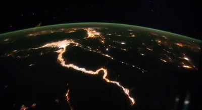
The reference material for the earth imagery came in part from NASA reference footage and photos. You can get a sense of these from the NASA films posted online, although these are mostly done in fast motion, unlike the ones the filmmakers would have used. One good example is “Earth HD.” There, at 2:25 and again at 2:41, one of the most recognizable locations on earth, the Nile Valley and Delta, are visible:
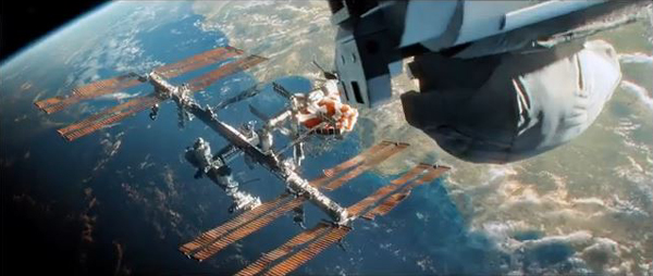
A similar image of the Nile appears on earth as Kowalski and Stone slowly make their way from the space shuttle to the ISS, with him asking her about her hometown and any family she might have waiting for her. (I was also happy to see the area of the site where I work in Egypt, Tell el-Amarna, which lies about midway between the Delta at the upper left and the large bend in the river.)
This geographical plotting included some ellipses. Although commentators have suggested that the film takes place in real time, or nearly so, there are temporal gaps. Shortly after the first pass of the speeding debris field, Kowalski tells Stone to set her watch’s timer for 90 minutes, since he calculates that is when they will encounter the orbiting debris again. That happens when she exits the Soyuz vehicle to detach its parachute. She again sets her timer for 90 minutes, and the debris field shows up at the Chinese station, battering it to the point where it sinks into the atmosphere and breaks up into chunks melting from the friction of reentry. Thus a little over three hours should be passing in the 83 minutes of screen duration.
Cuarón more or less confirms this timetable when he describes the creation of the previs: “The screenplay describes a journey that takes place mostly in real time, with only a couple of time transitions. We travel around Earth three times, so in previs we planned out visuals with specific knowledge of where we’d be in orbit at any given point in the story, whether it was in sunlight or darkness.”
In the film there are very few places where we can assume a significant ellipsis occurs. After Stone enters the ISS, sheds her helmet and suit, and drifts in a fœtal position, there is a gap. It’s probably not long, since she still holds some hope of going to rescue Kowalski, but she pauses to recover after her trying experience. Later, there is a cut from her inside the landing module, not in the suit, to her emerging from the hatch fully suited up–a gap we might assume to be ten minutes or so. Most notably, the cut from the nighttime shot of the earth that includes the aurora borealis at the right to the extreme close-up of frost on the window ellides a longer stretch of time. Stone has become hoarse in the interval as she tries to send a mayday message via radio. In other cases, such as Stone and Kowalski’s slow journey toward the ISS, time seems to be somewhat compressed though not ellided.
Staging without a stage
A lack of depth cues hampered the animators charged with creating the previs. The absence of one major depth cue, aerial perspective (the tendency of layers of space in the distance to turn successively bluer and blurrier due to the filtering quality of the atmosphere), caused problems. Visual-effects supervisor Tim Webber, of the effects house Framestore, remarks:
You can’t rely on aerial perspective because without atmosphere there is no attenuation of image due to distance. And the lack of reference points [in space] can get you into trouble, like not being able to tell if the character is coming toward you or the camera is moving toward him. Even though we played it straight with respect to science and realism, we did put in more stars than you’d be able to see in daylight, just so there’d be some frame of reference to gauge movement.
Presumably Webber is referring here to the movement of the characters and objects through space, not the camera movement. (The lack of any “frame of reference” against which to sense movement is part of what makes the Star Trek scene illustrated above seem so unsophisticated.)
Naturally, since the actors were not standing on a floor or solid ground, the blocking was difficult, but it also had to be planned completely in advance:
Cuarón laughs as he recalls the surprises inherent in blocking characters in a zero-gravity environment. “The complications are really something because you have characters that are spinning. Say you want o start your shot with George’s face and move the camera to Sandra, who is spinning at a different rate. You start moving around her, and then you start to go back to George, only to realize that if you go back to George at that moment, you will be shooting his feet! So then you have to start from scratch. Sometimes you find amazing things accidentally, but sometimes you have to reconceive the whole scene.” [“Facing the Void”]
Finally, after all the planning, the previs animations were made. These had to be refined considerably so that they could adequately serve in the Light Box to illuminate the actors’ faces. According to Bill Desowitz, “The previs was so good, in fact, that the daughter of cinematographer Emmanuel (“Chivo”) Lubezki thought it was the real movie.”
The previs became so sophisticated because it evolved during preproduction. Cuarón recalled that Lubezki’s inspiration to create the LED Light Box changed the planning tactics:
Then that kind of had a ripple effect back into the previz, because originally they were going to just be a model that we could look back at, but we realized that the previz was more than that. That was something that [James] Cameron kept on talking about. He would say “I don’t use previz anymore, I use it as if it is the first painting on a canvas.” In other words it was the stuff that you kept on painting on top of and the thing with that is that it became very clear that in order to use these technologies, we needed to program stuff and the previz was going to have to be precise in terms of camera movements, choreography, timing and light.
As a result, the movie changed very little during principal photography. Senior visual-effects producer Charles Howell told American Cinematographer: “I think there were only about 200 cuts in the previs animation, [whereas] an average film has about 2,000 cuts. Because these shots had to be mapped out from day one, many of the lengthy shots didn’t really change in the three years of shot production. Because we did a virtual prelight of the entire film with, the whole film was essentially locked before we even started shooting.” [“Facing the Void”]
David counted 206 shots in Gravity, not including the two opening titles about life in space being impossible. This suggests that Howell is right, and that the film underwent little revision after the planning phase.
Several years ago I suggested on this blog that animated films, notably those of Pixar and Aardman, were on average better than mainstream live-action films because they had to be planned so carefully and thoughtfully. Gravity, being very close to an animated film, provides more evidence for that claim. Not that thought, time, and money can guarantee quality, but they certainly narrow the odds.
Iris in
The Light Box technology is astonishing enough, but within its confined space there also had to be a way to photograph the actors. In Lubezki’s interview with Bryan Abrams, he explains:
So we built the box, but that wasn’t it. To be able to shoot inside the box, we had to build a special rig that holds the camera and moves with motion control. So we had people build a very narrow, lightweight but sturdy rig to control the camera. If you imagine the big box of LEDs, it has a gap that is almost a foot and a half or two feet wide, and the camera has to go into the box and make all these moves to make the audience believe that Sandra is turning and turning, but it’s really the camera and the environment in the box that is moving. So we built the box, the rig, and then used a company called Bot & Dolly. These guys are from San Francisco, and they use robots from the automotive industry. They redid all the software for us, so we were able to use these robots to move the cameras and the lights around the actors. It was just a big ballet of gadgets and new technology for the film.
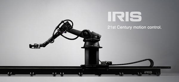
Bot & Dolly is a San Francisco company specializing in robots for the automobile industry. It built or perhaps modified an elaborate rolling, multiply-jointed camera mount called Iris especially for Gravity. It has been used in other features and in ads since then. (See image at the bottom.) An impressive demo film shows the Iris gracefully writhing about, quickly pointing the camera in many directions. (The camera in the film is a Red, though Gravity used an Alexa.) According to ICG Magazine, “The firm devised a Maya-based series of commands that allowed Framestore animators to direct the robots in ways that matched previs action in precise detail.” (Maya is the industry standard computer animation program.)
Typically this camera was inserted through an opening in the Light Box and swooped around the actor, who stood in a gyroscopic basket, seen in the production photo below. The photo shows one side of the Box open, though this would not be the case during shooting:
The combination of the Light Box and Iris made it possible to blend the special-effects shots and the live-action photography of the actors so smoothly that there is no “uncanny valley” effect, no sense of an obvious matte painting stuck into the middle of an image. The shots in Gravity are all photorealistic to a degree that is rare, if not unique, in recent effects-heavy films.
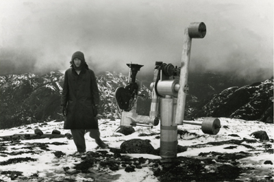
Iris brings us back to the comparison with Central Region. Snow built a special camera mount (below) designed to allow his images to rotate freely in almost any direction. During the three-hour film the camera never repeated any of its trajectories. Some images were close views of the pebbles on the ground; others were upside views of the bleak Canadian mountains in the distance. A nighttime segment was completely black except when the moon occasionally swept through the frame. The one area that the camera didn’t survey was the camera support itself, the “central region” of the title.
The vital difference between Snow’s machine and Iris is that the new system has no fixed anchor. Not only does it slide on a track, but everything it photographs can be digitally altered to erase any traces of the machine. It moves with entire freedom through a constructed space that has no central region, no fixed point around which everything else revolves.
Puppeteers and eyes
Gravity‘s utterly spherical space, beyond anything we normally find in commercial cinema, placed unusual demands not only on camera movement but also upon the actors’ blocking and performances. Our first entry on Gravity begins with a quotation from Sandra Bullock, which included the statement, “No character was like Stone, no film set was ever like these sets, not one member of this crew had ever done this before.” That may seem an exaggeration until one grasps how Bullock and Cuarón’s team built her character.
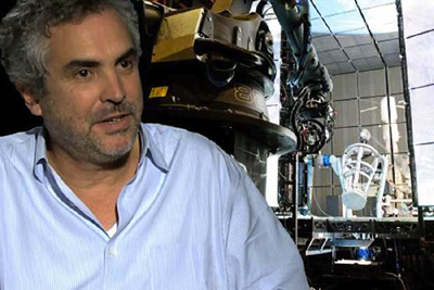
We all know from infotainment coverage that Bullock was isolated in the Light Box through entire days and that it was a trying experience. What doesn’t come through in such accounts is that she was often enclosed in the gyroscopic basket, visible in the photo of the Iris rig and Light Box above, as well as in the same setup visible behind Cuarón in this photo:
That was only the start of it. Anne Thompson’s interview with Cuarón and producer David Heyman reveals some of the details of blocking a character who is unrestricted by gravity:
AC: The physical aspect, not anybody can do what she did. On the one hand the physical discipline she went through to make this film, the training and the workouts. She also has an amazing capability for abstraction. Those emotional performances, it was as if they were an exercise in abstraction, like she was bonded to very precise cues. And physically that was very difficult: she trained and practiced like crazy, together with the stunt people and special effects. And the puppeteers from “War Horse” were helping her, supporting a leg or an arm, all the floating elements, they were creating approaching objects toward her in perfect timing. Then after she practiced so much her whole concern was only about emotions and performance.
Imagine a ballet dancer with really strict physical discipline in terms of what a body has to do, positions and precise choreography, who goes through months of training for one choreography so when they are performing they have expressiveness and emotion.
What was the most challenging scene to realize?
David Heyman: When Sandy comes into the ISS for the first time. She takes off her suit, then goes into fetal position, all in one shot. It was the most difficult. All the objects, getting the suit off, and into fetal position in such a way that it felt effortless, not as it was–she was sitting on a bicycle with one leg tied down leaning back in a 12-wire rig, with puppeteers. One of the things you forget about Sandy’s performance, which seems so truthful, is all the effort and physical exertion that went into making it, the precision of the technical aspects. She had to move her hands at a third of speed — zero G –while talking. Each shot connects with the next at very precise points where her head began and end and begin and end. She’s on a bicycle stringing uncomfortable with people moving around on 12 wires, through it all, with no gravity. Physically the body must not show the tension, so it looks effortless. What I loved about it is the performance behind the visor shines through, her eyes. You can’t slouch your shoulders to show sadness or weight, it’s just the eyes.
Bullock did all this with four 10′ by 20′ walls of LEDs projecting moving images of the earth and of exploding space stations around her. I think it is safe to say that this was a unique kind of performance.
The sounds of silence
As the film’s ominous opening titles point out, there is no sound in space. In keeping with the overall attempt to duplicate the effects of weightlessness immersively, Cuarón’s team limited the track to two types of sound: diegetic sounds heard by the characters and a non-diegetic, modernist musical track. In an interview with Cuarón, Wired‘s Caitlin Roper pointed out that there was an explosion in one of the trailers. Cuarón replied:
Yes, but that’s just the trailer. I honor silence. The only sound you hear in space in the film is if, say, one of the characters is using a drill. Sandra’s character would hear the drill through the vibrations through her hand. But vibration itself doesn’t transmit in space—you can only hear what our characters are interacting with. I thought about keeping everything in absolute silence. And then I realized I was just going to annoy the audience. I knew we needed music to convey a certain energy, and while I’m sure there would be five people that would love nothingness, I want the film to be enjoyed by the entire audience.
As in other areas of the film, we see the compromise between an experimental technique–an attempt to suggest the silence of space–and the desire to provide something more familiar for the broad audience. In this case, music acquires an expanded role, substituting for sound effects and conveying the rapidly shifting emotions of the scenes.
Sound effects are not entirely eliminated. Many sounds that the astronauts would hear via vibrations of things they come into contact with are included. In some cases these are fairly clear, as with the voices heard within their helmets–their own voices or others’ via radio. Other effects are heard in a distorted fashion. Glenn Freemantle, the supervising sound designer and editor, describes the process:
“When [Bullock] is in the suit, you hear her voice and her breathing, and you hear through her suit when she is in contact with things,” he explains. His team captured sounds by recording with contact mics at car plants and hospitals. “We even recorded through water with a [submerged] guitar,” he recalls.
One obvious example of distortion comes in the opening scene, when Stone is unscrewing bolts and sliding a panel out of the transmitting device she is working on. The sounds of the bolts and the sliding metal are audible but muffled, as though they were recorded under water or electronically manipulated.
Yet other sound effects not heard by the characters were relegated to musical expression. As Angela Watercutter put it in a Wired article based on interviews with Cuarón and composer Steven Price,
Every time there’s a collision in the movie the audience doesn’t hear a bang – they hear a sonic boom. The same goes for the characters’ — and, by extension, the audience’s — feelings of anxiety, claustrophobia, and agoraphobia. Much of what is seen in Gravity is terrifying, and when the audience can’t hear the horror of a space shuttle breaking apart or an airlock flying open, Price had to fill the void with his nerve-wracking score.
Cuarón dictated that one of the rules for the film’s score was the eliminating of percussion, to avoid the “cliché of action scoring.” Watercutter continues:
As a result the score for Gravity serves as more than just musical accompaniment – it also provides the movie’s sound effects. There are some non-music sounds that would be space audible, like the ones transmitted by vibrations characters feel in their spacesuits, but for the most part everything that happens in open space is accompanied only by Price’s music and the voices of Stone and astronaut Matt Kowalski (George Clooney), which “freed up the rest of the frequency spectrum for me,” Price noted.
Price used a mix of organic and electronic sounds to meld the natural world of space with the mechanical world one of the space exploration. There are also moments where he took an analog instrument – a cello, for example, or even a human voice – and ran its notes through a synthesizer or processor in order to create a whole new sound. And for the opening song on the score, “Above Earth,” Price took a track he was already working on and slowed it to about 1/60th its original speed. “Basically,” Price said, “what you’re hearing is the space between the notes.”
In an interview with Rolling Stone, Price discussed some of the aesthetic principles and functions he aimed for with his score:
Really it was all very much led by the character of Ryan. I tried to be with her all the time. The idea was that the music was up there in space and we made it very immersive and used a lot of elements and a lot of layering so that things would move around you all the time. The writing of those elements and what they were, were always influenced by what Ryan was feeling and where she was emotionally in the whole thing. And also where the camera was, where things were moving and what point of view the camera was facing, whether it was looking at them or kind of looking through their eyes. Some of it was melodic and some of it was intended to underscore a kind of emotional journey, and then there were a lot of sounds that were there to express real terror. It was those two extremes, really, expressing the beautiful nature of where they were but also absolutely a massively terrifying situation.
With little expertise in musical analysis, I can simply say that I hear the score as a combination of traditional instrumental music and electronically synthesized instrumental music. Under this, typically in tense passages, there are abrupt or charging percussive emphases, not using percussion instruments but, in some cases, deep string chords. Scenes of damage or tension are sometimes accompanied by sounds like stressed, grinding metal. Other sounds like distorted, high-pitched radio waves (in the “ISS” and “Fire” tracks) are included, reminiscent of electronic music of the 1960s.
Other critics have offered suggestive descriptions. Justin Chang’s review refers to “Steven Price’s richly ominous score, playing like an extension of the jolts and tremors that accompany the action onscreen.” David S. Cohen and Dave McNary’s Venice festival coverage characterizes the track: “Much of the action, even the debris storms, plays out against eerie silence, broken only by the score. The silence is more startling after the score builds to deafening crescendos, then stops abruptly. But during the interior scenes, the rumbles and groans of failing space gear are as frightening as the roars of any classic movie monster — even more so because their source is unseen.”
Price has contributed a remarkable score, one which is highly original and yet completely motivated by the story situation it accompanies.
The space between
The immersive, 360-degree surrounding and sound fields made Gravity a natural for 3D exhibition, but they also posed unique problems. Given the long takes, the need for complex camera movements, the demands of the LED Box, and the complicated acting conditions, it would have been very difficult to shoot the film in 3D. In most scenes, of course, there were no real objects juxtaposed in different layers of depth in front of the camera. Even the actors’ placements in long shots would have be created digitally. So the project had to be converted to 3D. But this forced choice actually yielded strong results.
The press coverage of popular cinema has come to treat films shot in 3D (“native” 3D) as pure and admirable and films converted to 3D after shooting as crass and compromised. But is there all that much difference? Even Avatar, the film made with an intention of promoting the universal use of 3D, had some converted footage. With conversion technology improving, the notion of waiting until after filming to create a movie’s 3D is becoming less onerous. As Variety‘s David S. Cohen pointed out earlier this year, Iron Man 3, Man of Steel, Star Trek into Darkness, and Pacific Rim have been post-converted with little objection from the public or press.
That conversion techniques for generating 3D images are not inferior became much more evident during the early decision-making process for shooting Gravity. Nikki Penny, the film’s executive producer, took some test footage shot by in 3D to Prime Focus World, a conversion house that ended up doing 27 minutes of Gravity. The filmmakers were trying to decide whether to shoot the live action portions in 3D or use conversion. In an article on Creative Cow, Debra Kaufman explains what happened:
The production had done a test shoot in 3D, which involved placing the cumbersome 3D rigs inside the cramped space capsule. When Penny brought the 3D live action footage to Prime Focus World, she asked that they test 3D conversion by utilizing a single eye from the same footage. The results convinced Cuarón and producer David Heyman that conversion would not only look as good as shooting in native 3D, and would be much easier and more efficient to accomplish.
That is, the footage shot by one of the two lenses in the 3D setup was separated out. It was then treated as if it were native 2D footage and put through a conversion process to create a 3D image. The result resulted in 3D that was not inferior to the original native-shot 3D. The lesson, I think, is that the question is not usually whether a film is shot in 2D and converted; it’s whether it was planned to be completed as a 3D film (and has sufficient budgets and skills invested in it) .
Gravity couldn’t be shot in native 3D, since in most scenes there were not real objects juxtaposed in different layers of depth in front of the camera. Also, the camera was too cumbersome to fit into the space-capsule sets. With so much of the characters’ surroundings done as CGI, however, the conversion to 3D could be done concurrently with the filming. Kaufman describes the process at Prime Focus World, one of the firms that handled the conversion:
Unlike the more typical post-production 3D conversion, Gravity involved PFW working on the 3D conversion during production. The work on 3D conversion began with six months of pre-production, during which the production’s Stereo Supervisor Chris Parks worked closely with the PFW team to explain his carefully plotted depth map, which contrasted the vast emptiness of space with the tight, nearly claustrophobic quarters of the space capsules.
From the beginning, the challenge for Prime Focus World would be to make sure that the 3D converted footage integrated seamlessly with the extensive 3D CGI. Both the live action footage and CGI would be 3D, but 3D from two different worlds, conversion and visual effects – and they would both be active or “live” during the production process. At the same time, the PFW team wanted to retain the creative flexibility of its View-D conversion process, while integrating the stereo VFX universe. What made it trickier was that, unlike a completed film, Prime Focus would be working with work-in-progress shots and an open edit.
For more on the technical aspects of the integration of converted footage and CGI, along with an example of the stages that went into creating a single shot, see the Kaufman article.
In an essay on ICG Magazine, Vision3 stereo supervisor Chris Parks describes some of the narrative functions of the film’s 3D:
We had a virtual camera at Framestore that let us control depth functions. When Sandra floated off in space, we separated her slightly from the starfield, using 3D to make her feel very small. At another point we went very deep, when we see her POV as her hands reach out to those of another astronaut coming to camera. At the point when they make contact, we increased the interaxial to five times normal, then scaled it back down as they separate and drift apart.
Parks also comments on the scene where Stone and Kowalski look through the shattered windows of the space shuttle and a crew member’s dead body suddenly falls into the shot:
Alfonso asked how the 3D could make this more powerful, but without just throwing something out into the audience to make them duck. We decided to float a little Marvin the Martian doll out into the audience, which is a kind of fun, lighthearted tension-breaker, and then we whip-pan right off that to the dead astronaut, which makes the emotional revelation more jarring.
In fact the Marvin doll (derived from Chuck Jones’s Warner Bros. cartoons) comes diagonally forward from the depths of the shuttle interior, and the camera pans with it as it moves out of the ship past Stone, who watches it and then turns back to look inside again. The corpse falls into the shot from above left, but not out toward the audience. It bumps Stone’s helmet, and the camera pans to reveal it more fully and continue almost nonchalantly onward to show another dead astronaut further back in the shuttle interior.
Finally, Parks points out an expressionist distortion of space for subjective purposes in the dream sequence where Kowalski joins Stone in the Soyuz landing vehicle:
It’s a dream sequence that doesn’t reveal itself as such right away. To give a subconscious impression that something different was happening, we pushed the top right corner into the set while pulling the bottom left corner ahead, skewing the whole view. That sense of unease represents, to me, how 3D can be expanded beyond just giant VFX movies. It’s a tool that can be most effective in very small spaces, as this one shot reveals.
Outside the dream scene, we see the wall panel of instrument controls at an angle to the camera, with Stone in her seat at the left. During the dream, the panel is suddenly turned so that it is almost straight into depth, so that we are pressed up obliquely against it. Stone’s seat at the left is further away from it. The result is that the space is strangely skewed during the dream.
In all, shooting in long takes, building each shot with CGI yet including complex camera and figure movement, canceling the sense of horizons and ground planes, and enhancing all these choices through 3D, has resulted in a film in which stylistic patterning becomes an object of fascination in its own right.
Despite the occasional joke about a Gravity sequel, it seems unlikely that Cuarón will tackle similar subject matter and formal strategies in his next film. Dealing with space without horizons and characters without weight was a formidable task. At the end of his Wired interview, asked what his next film will be, he replied, “Any movie in which the characters walk on the floor.” Welcome back, axis of action.
Most of the frames used here and in Part 1 were taken from a New York Times article containing a clip from the opening shot with commentary by Cuarón.
Thanks to Stewart Fyfe, who shared links to some of the sources cited in this entry.
GRAVITY, Part 1: Two characters adrift in an experimental film
There was no way to rely on anything we knew before this film. No character was like Stone, no film set was ever like these sets, not one member of this crew had ever done this before. We all were doing something that had never been done before.
Kristin here:
Back in mid-September, on the verge of leaving Madison to attend the Vancouver International Film Festival, I mentioned that I had watched one of the trailers for Gravity and thought it looked like “the most exciting new piece of filmmaking this year.” I added that the trailer “called ‘Drifting’ reminded me of Michael Snow’s brilliant Central Region, but with narrative, with the earth and stars spinning past a close-up of Sandra Bullock as the marooned, panicky astronaut protagonist.”
At that point, I wondered whether the film as a whole could keep up that experimental feeling, with vertiginously wheeling actors combined with an untethered camera swooping around them. Or would the narrative gradually lead us into a more conventional style later in the film? It turns out that, to a remarkable extent, the highly unconventional treatment of unanchored space, where up, down, and sideways characters and background change with a breathless rapidity, extends through much of Gravity‘s length. For brief intervals Ryan enters space capsules and sits, right-side up, and the action calms down briefly. Yet these lead to further scenes in space with the same swooping camera. In short, the film turned out to be as remarkable a formal and stylistic achievement as I had hoped.
SPOILER ALERT. This is not a review but an analysis of the film. Gravity does depend crucially upon suspense and surprise, and I would suggest not reading further without having seen the film.
An experimental blockbuster
I am not the only one who was struck by Gravity‘s resemblance to an experimental film. After the film’s opening weekend in the USA, Variety‘s Scott Foundas published an article on the subject: “Why ‘Gravity’ Could Be the World’s Biggest Avant-Garde Movie.” He references the influence of Jordan Belson’s work on 2001: A Space Odyssey and speculates that the final shot of The Shining echoes the ending of Michael Snow’s Wavelength. More specifically he links Gravity to Central Region, shot in 1971 at in a Canadian mountain range; Foundas describes the robotic arm used to shoot the film and how it was controlled by instructions on magnetic tape. (I’ll have an illustration of the robotic arm in Part 2.) To Foundas, the avant-garde aspects of Gravity outweigh its narrative: “‘Gravity’ has more of a plot than ‘La Region Centrale,’ but only barely, and surely no one is telling their friends to see Cuaron’s film because of its great story. Rather, it’s the very absence of a dense narrative line that gives ‘Gravity’ its majesty.”
I think that to say Gravity has “only barely” more narrative than Snow’s purely abstract film is a considerable exaggeration. The film’s story is certainly simpler and more unconventional than other mainstream Hollywood films, but as we shall see, it contains goals, motifs, character traits, careful setups of upcoming action, and other traits of classical narratives.
In an October 11 blog entry, J. Hoberman also stresses the film’s modernism:
Depth and volume are illusory. Mass has no weight. In this 3-D spectacle, best seen on the outsized IMAX screen, Cuarón promotes sensory disorientation–or better, reorientation. […] Gravity is something quite rare–a truly popular big-budget Hollywood movie with a rich aesthetic pay-off. Genuinely experimental, blatantly predicated on the formal possibilities of film, Gravity is a movie in a tradition that includes D. W. Griffith’s Intolerance, Abel Gance’s Napoleon, Leni Riefenstahl’s Olympia, and Alfred Hitchcock’s The Birds, as well as its most obvious precursor, Stanley Kubrick’s 2001. Call it blockbuster modernism.
(Actually I’d say Gravity is better than some of these, notably Napoléon and 2001.)
Hoberman sees more of a balance between style and narrative than does Foundas. In fact, he considers that the film contains “a distracting surplus of backstory.” Presumably he would prefer to do without the references to the death of Stone’s daughter and her subsequent aimless car rides after work, listening to the radio. The space voyage does become an overly obvious extension of that drifting and listening, coming close to turning the film into a maternal melodrama. Presumably the filmmakers felt that simply sending Stone on a mission and having her struggle to return to earth was not enough. In interviews, the co-scriptwriters, Alfonso and his son Jonás Cuarón, emphasized that their basic idea was to create a character arc of her “rebirth” after despair. To some, this arc, with its religious overtones, will seem a bit, as Hoberman says, distracting and even contrived. To others it may be inspiring. At least it is not allowed to come forward very often.
Hoberman stresses the balance of plot and radical style. The film, “premised on the absence of up or down, is naturally abstract although it also has a streamlined and suspenseful narrative that, save for one or two ellipses, might almost be happening in real time.” In Variety, Justin Chang’s review highlights the same balance: “at once a nervy experiment in blockbuster minimalism and a film of robust movie-movie thrills, restoring a sense of wonder, terror and possibility to the bigscreen that should inspire awe among critics and audiences worldwide.”
David and I have often claimed that Hollywood cinema has a certain tolerance for novelty, innovation, and even experiment, but that such departures from convention are usually accompanied by a strong classical story to motivate the strangeness for popular audiences. (This assumption is central to our e-book on Christopher Nolan.) Gravity has such a story, though Cuarón is remarkably successful at minimizing its prominence. The film’s construction privileges excitement, suspense, rapid action, and the universally remarked-upon sense of immersion alongside the character in a situation of disorienting weightlessness and constant change.
That construction derives partly from techniques unique to this project. The weightless dance of characters and camera almost entirely does away with such widely applied spatial premises as the axis of action, eyeline directions, and the establishing of stable spatial relationships. And, as Cuarón pointed out in an interview for Wired, “After all, you learn how to draw based on two main elements: horizons and weight.” Those two factors are virtually gone as well.
The weightlessness and the long takes in the film have been given much attention in the press. Reports refer less often to the “Light Box, one of the film’s most extraordinary innovations. It is a giant inside-out LED monitor that allows the film’s own previs special effects to light the faces and bodies of the actors inside the box, making it possible for those shots to be integrated seamless into the effects shots. Basically, apart from the scenes inside space vehicles, traditional three-point lighting is jettisoned along with spatial relations.
Other technical aspects of the film are innovative. A bold new camera mount, the Isis, was devised to allow the camera to twist and whirl around the actors. The silence of space was respected by the filmmaker, leading them to substitute a eerie musical score to replace sound effects and convey emotions. The blocking and acting, of course, had to be vastly different from methods used in conventional films where the actors have the luxury of walking on a ground plane.
In short, it is hard to think of another mass-audience film in recent years that has so thoroughly departed from the current technological and stylistic conventions of mainstream filmmaking. Jurassic Park and The Lord of the Rings, to be sure; perhaps Avatar. Publications devoted to the techniques of cinema have recognized this. The Cinefex issue dealing with Gravity is not yet out, but on the journal’s blog, Don Shay’s remark is quoted: “Every once in a while, a film comes along that is a game-changer. This is one of those films.” Debra Kaufman, writing about the film’s 3D for Creative Cow, agrees: “Anyone who’s seen Gravity 3D will agree that the 3D was a game changer.” And unlike those earlier game-changers, Gravity has a strong experimental component to it that audiences gladly accept, since it is so well motivated by the story and situation.
In the next blog entry, I’ll survey the innovative aspects of Gravity‘s style and technique. Today, though, I’ll concentrate on the plot–in some ways conventional and in some ways quite strange–that holds it all together.
Who needs psychological depth in a crisis?
Arguably Cuarón had constructed nearly the most sparse narrative that can sustain the experimental style and motivate that style enough to hold the attention of a popular audience. Three characters, then two, then one, all with minimal backstories and simple goals.
Most Hollywood films have two parallel plotlines, usually one involving a romance. Here there is only one, and it primarily concerns an immediate situation, a cycle of deadly threats alternating with stages of Ryan’s progress toward safety. On balance, the focus is more on the suspense and terror of the situation than on the characters. Although there is a little mild flirtation between Stone and Kowalski, it’s more to generate humor and defuse the tension than to suggest any real possibility of mutual attraction.
One indication of the film’s minimal characterization is that fact that we never learn the nature of Stone’s experiment. That would be a logical initial goal for her character. Why has she set herself this particular task, which obviously involved not only scientific expertise in a complex field but also elaborate training to become an astronaut? Where does she work? What might her test achieve? Some reviews have referred to her as a medical expert. As far as I can tell, this is based on one line when she and Kowalski are working together to activate the communications device that is her focus of attention in the opening scene. During the calm before the debris collision, she remarks, “I’m used to a basement lab in a hospital where trays fall to the floor.” She also says that “It’s designed for hospital use.” That’s it. Normally a Hollywood film would redundantly give us information about her job. Here we don’t even get a sketch of it. And why is a medical experiment attached to the Hubble Space Telescope?
Incidentally, the Hubble is detached from the shuttle just before the debris cluster reaches it. We never learn whether it, too, is destroyed in the disaster. Might it have survived, with Stone’s experiment, perhaps activated during her brief delay before obeying the mission-abort command? Might she return to earth to find her experiment a success, with her initial goal miraculously achieved despite the tragic events in space. So little is the narrative concerned with the experiment as a significant goal that such questions are unlikely to occur to a spectator. They came to me only after three viewings.
Stone’s casual reference to working in a hospital lab typifies the limited sort of backstory we’ll get for the most part. Aside from Stone’s recollections of her daughter’s death and her aimless evenings of driving as her form of mourning, the moments of backstory are mere hints. In the opening we learn that Matt’s wife left him when he was in space on a mission. Might he be so obsessed with the beauties of space travel because he, too, is seeking to escape loneliness? We can’t know, since he treats the mention humorously, as if he has managed to shrug off his wife’s betrayal. Of the third character present on the spacewalk, Shariff, we learn that he has a wife and son, something revealed by a photo only after his death. This knowledge serves less to characterize him than to contrast this cheerful fellow with the wifeless Kowalski and childless, unattached Stone.
Stone’s mention of her home in Lake Zurich, Illinois and of her daughter’s death is the last piece of backstory that we get, and it comes slightly under half an hour into the film, during the calm interlude when she and Kowalski are slowly traveling toward the International Space Station (ISS). After this, I believe the only scrap of information from her past that we get is that Stone’s daughter had worried about a lost red shoe.
This lack of information about the characters is probably what led Foundas to say that the film has “barely” more of a plot than Central Region. In the same piece, he speculates, did the executives at Warner Bros. “wonder if they’d just gambled away $100 million on the most expensive avant-garde art movie ever made?”
Kevin Jagernauth reports on indiewire that the studio pushed for a more conventionally constructed film. Cuarón told him about some of the feedback he got from WB:
But at first, the studio suggested that [the Mission Control] team in Houston should get more face time. “…there area lot of ideas. People start suggesting other stuff. ‘You need to cut to House and see how the rescue mission goes.'”
And that’s not all. Part of the emotional journey of “Gravity” rests on Stone’s backstory, which includes a daughter she lost, but this is all effectively communicated without breaking the single location concept. However, Cuarón was advised to perhaps include some flashbacks in the film and even more. “A whole thing with … a romantic relationship with the Mission Control Commander, who is in love with her. All that kind of stuff. What else? To finish with a whole rescue helicopter, that would come and rescue her. Stuff like that,” he explained of some of the ideas that were floated his way.
There’s that conventional second romantic plotline, which in the wake of the film’s success seems such a ludicrous suggestion. The studio’s attitude demonstrates how very much Cuarón was able to get away with and how much of a struggle it must have been. Audience and critical enthusiasm suggests that he and his team managed to include just enough classical storytelling to make spectators identify with the characters even while knowing very little about them.
Why would a film need to establish psychological depth for characters when most of what they’re going to be doing is struggling frantically for their lives, cast adrift in space and bombarded by hurtling space debris? They must summon what skills and psychological strength they have and get on with it. Thoughtful conversations and subtle complexities are irrelevant for the most part. We need to care about these people to be engaged by the film, but that is part of the point of having Sandra Bullock and George Clooney as the leads, playing to the likeable personal qualities that we already associate with these stars.
Challenges and goals
There’s no question that the characters do have goals, but these are largely based on circumstances thrust upon them rather than on character traits. Before disaster strikes, the characters have short-term goals: Stone to solve the glitch with her equipment (and to avoid allowing nausea to cut short her attempt) and Kowalski to enjoy his final space walk and ideally break the record for duration of space walks. Both goals are cut short by the news of approaching debris and the mission-abort order. As we’ve seen, whether Stone achieves her original goal concerning her experiment is never revealed, nor are we encouraged to wonder even briefly as to whether the Hubble might carry it away from the destruction of the shuttle. Kowalski achieves his goal of breaking the record, in a sense, as he comments ironically while detached and drifting in space and awaiting his death. His space walk will last forever, but records are hardly intended to include corpses.
Once Stone spins off into space, alone, her goal is to re-establish contact with Mission Control and Kowalski. His is to rescue her. Once he finds her and tethers them together, their mutual goal is to get to the shuttle, with Kowalski adding the goal of retrieving Shariff’s body. Very quickly these goals are shattered, since the shuttle has been extensively damaged and its other crew members killed. A new short-term goal arises: reaching the relatively nearby ISS.
Kowalski fails to achieve this goal, since the fuel in his jetpack and his inability to grab anything on the ISS’s exterior send him floating off into space. Stone’s goal is now to get inside before she passes out from lack of oxygen. Once inside, her goal is to detach the remaining semi-functional Suyuz landing vehicle and use it to get as far as the Chinese space station, in turn using its landing pod to return to earth.
Discovering that the deployed parachute has become tangled in the ISS, she takes another space walk to detach it from the Soyuz. Another short-term goal that is soon accomplished. As she starts to remove the bolts anchoring the parachute, she states the short-term and long-term goals: “OK, we detach this, and we go home.”
Her purpose, however, seems to be thwarted when the fuel tank of the Soyuz vehicle proves to be empty. Here Stone loses hope, drifting into despair. She decides to turn off the oxygen supply and allow herself to die. Suddenly Kowalski appears and enters the pod, giving her a pep talk and telling her to use the soft-landing function of the Soyuz rather than its take-off capabilities. He disappears, and Stone, reinvigorated and determined, follows the instructions for landing the craft.
In traditional classical films, shifting goals often mark the turning point between large-scale sections of the plot, generally referred to as acts. Despite its unconventional aspects, Gravity’s plot does stick fairly closely to the well-balanced four-part structure that I have claimed is typical of Hollywood narrative conventions. Not counting titles or credits, the story runs approximately 83 minutes. Thus on average the acts would run about twenty-one minutes each.
At about 22 minutes in, Stone and Kowalski achieve their goal by reaching the shuttle, only to discover that it has been destroyed. At 23 minutes, Kowalski declares them the last survivors of the mission. I take this to be the first turning point, ending the setup and beginning the complicating action. Essential premises are reversed as the pair realize that they are stranded in space and they shift their goal, striving next to reach the ISS. Stone’s failed attempt to contact Kowalski by radio once she enters the ISS–she initially hopes to rescue him–and declaration of herself as the mission’s sole survivor happens at roughly 43 minutes. The third act, the development, begins, with Stone meeting numerous obstacles that threaten her new goal of getting back to earth in the Chinese landing vehicle. The last turning point, launching the climax, comes when Stone awakens from her dream about Kowalski and turns the oxygen flow back on, signaling her return to hope and determination to reach earth. That happens at about 66 minutes in, leaving seventeen minutes for her landing, including the brief epilogue of her floating, swimming ashore, and shakily standing up.
Motifs and causal motivation
As I mentioned, strongly innovative films in the Hollywood tradition need the support of classical conventions to keep the narrative clear and appealing. Two of Gravity‘s most traditional techniques are its motifs and its motivations. Motifs can quickly make the characters more vivid, even if they are not particularly rounded or complex. Motivations often involve planting an object or event in advance. In this film, several motifs trace the relationship between Stone and Kowalski.
In the opening, the motif of Kowalski’s wanting to break the space-walking record is introduced early on, stressing that this is his last mission and hinting that he loves his time in space. Similarly, his anecdotes, introduced with the “I’ve got a bad feeling about this mission” running gag, create irony but also suggest how Kowalski inspires Stone. Before setting out on her re-entry flight in the Chinese landing pod, she repeats this line with the same good humor that Kowalski had displayed. Another parallel is set up between the two when Stone detaches the clasp tethering her to the wildly spinning support in the opening scene, and later Kowalski does the same to separate himself from Stone when they are precariously suspended from the ISS (below). She comes back; he doesn’t.
In the early scene where the pair work to activate Stone’s equipment, he refers to her “beautiful blue eyes,” though she points out that hers are brown. Later, when Kowalski has set himself adrift in space, their radio conversation mentions his “beautiful blue eyes,” which are also brown. Though we see nothing of their earlier relationship, such motifs lend it depth, because we sense that the two have already developed a customary way of bantering with each other.
Similarly, in the opening scene, Kowalski tells an anecdote about how, during a previous mission, he had imagined his wife looking up into space and thinking about him, when in fact she had run off with another man. Later, as Kowalski moves toward the ISS dragging Stone tethered behind him, he asks her if anyone is looking up and thinking about her. This elicits her most intimate revelation, that she had had a daughter who died in a freak accident. There is also no Mr. Stone waiting at home for her. Thus although the two characters have different personalities, both are escaping loneliness by a retreat to the beauty and peace of space.
Finally, there is the last shot, with Stone seen from behind against the sky, covered by light clouds. It reverses the opening, when we were in the opposite position, looking down at the earth from space, with the clouds of a huge hurricane prominently visible. There Stone drifted in space, held in place by a large mechanical arm; here she struggles to regain her sense of balance after prolonged weightlessness and succeeds in walking a few steps, thanks to gravity.
Like motifs, careful motivation of action helps us navigate through the plot. Given the rapidity with which new information is thrown at us as the narrative progresses, the screenwriters are careful to set up major premises in advance so that we will quickly understand them when they arrive. In the opening scene, as Kowalski swoops cheerfully around the shuttle, Houston asks about the supply of fuel in his jetpack. He reports that it’s 30% down. Not a lot, but enough that we are prepared for the moment after the disaster when he says he’s running “on the fumes.”
During the opening, the messages from Mission Control thoroughly forewarn us of the rapidly approaching hail of space debris. After it passes, Kowalski has Stone set her watch for 90 minutes, since that is when they can expect the same debris to return–as it does at regular intervals to destroy the ISS and the Chinese station. Stone reminds us of this danger when she exits the Soyuz vehicle to detach its parachute, muttering, “Clear skies with a chance of satellite debris.” The presence of the deployed parachute also sets up the moment when the chutes of the Chinese pod deploy as it nears its splashdown in the final sequence.
As Stone struggles to get aboard the ISS, Kowalski converses with her via radio. They mention her training with landing vehicles. Her only experience has been with simulators, and in every case she crashed them. Still, as Kowalski points out, she knows something about them–a point which proves vital in the dream scene discussed above, where Stone’s mind summons up a memory about how launching and landing space vehicles are not all that different.
Apart from creating a brief scene of suspense, the fire in the ISS introduces the fire extinguisher and demonstrates how, in a situation of weightlessness, the extinguisher propels Stone through space. This prepares us for the crucial scene in which she uses it as Kowalski had used the jetpack, allowing her to reach the Chinese station despite being untethered in space.
Character motivation, fortuitous events, and religion
Throughout the film the cause-effect chain remains fairly straightforward, with one major exception that I’ll get to shortly. But because the characters are reacting to rapidly changing circumstances almost entirely beyond their control, the outcomes are often fortuitous rather than the result of character traits. This is not to say the film uses numerous coincidences. It is not coincidence that Stone manages time and again at the last possible moment to grab a pipe or handle on the outside of a space vehicle. She’s aiming to do that, so she manages it not by coincidence but by luck.
Some of the most crucial events in the film are partly a matter of character motivation, but the outcomes of Stone’s and Kowalski’s actions are fortuitous. Stone apologizes to Kowalski for not having immediately obeyed his order to stop trying to repair her equipment and head for the space shuttle. She presumably continued with the rebooting because she is a dedicated researcher, reluctant to abandon her important work even when in physical danger. Yet as it turns out, reaching the space shuttle interior would have been fatal. When Kowalski and Stone do reach the shuttle, they find it split open, its crew dead–just as the pair would be had they retreated inside immediately. Stone’s delay actually saved the pair, though neither character could know this at the time.
Less obviously, Kowalski accidentally dooms himself. We see him in the opening minutes, cheerfully circling the shuttle and Hubble, playing music, telling anecdotes, and apparently hoping to stay outside the shuttle long enough to set a record. Presumably he has already accomplished his task in the space walk, or perhaps as the most experienced member of the team, he is watching over the other two. He is also, however, wasting fuel–fuel that he doesn’t realize he may need. Later, when forced to travel through space to rescue Stone and then to make it from the shuttle to the ISS, his tank becomes empty just before they reach it. His inability to maneuver without endangering Stone leads to him detaching his tether and stranding himself in space forever.
There are other fortuitous events. Stone is lucky that her Chinese pod lands in a body of water but close enough to shore that she can survive the impact and get onto land easily. It is probably by chance that in entering the Soyuz craft, the weightless fire extinguisher blocks the door and that she pulls it into the craft rather than pushing it out. Later the extinguisher enables her to propel herself to the Chinese station. There are also obstacles fortuitously created, as when Stone discovers that the Soyuz vehicle has no fuel–presumably because its supply tank has been ruptured by flying debris.
There may be one major exception to this dependence on accidental causes and effects: the religious motif. This is a strange motif, since it doesn’t become significant to the plot until fairly late. Early in the complicating action, as Kowalski and Stone journey toward the ISS and he asks her about her life on earth, he’s playing a country song, “Angels Are Hard to Find.” It’s playing when Stone mentions her daughter’s death; Kowalski soon turns it off to pay more serious attention to her story. At the time, the song doesn’t seem relevant. About seventy-two minutes in, the religious motif returns and becomes more prominent. Stone discovers that the Soyuz fuel tank is empty. The vehicle drifts as sunset settles on the earth below. We see vast snow fields and fjords below, and frost forms on the window. (The cut to the frosty window is one of the film’s few apparent ellipses.) There is a brief shot of a Russian icon inside the Soyuz (Christ as a child carried by John the Baptist, I think).
Immediately after this, Stone makes contact with someone on earth. She tries to communicate her mayday call. Gradually she loses hope and begins woofing in echo of dogs she hears on the radio. She says she’s going to die. During this scene she talks of how there is no one on earth who will mourn or pray for her soul. She asks the man to “Say a prayer for me.” She adds, “I’ve never prayed in my life. Nobody ever taught me how. Nobody ever taught me how.” A baby is heard on the radio, and the man apparently sings a lullaby to it. Stone sadly comments, “I used to sing to my baby. I hope I see her soon.” At that point she dials down the oxygen inflow and says, “Sing me to sleep, and I’ll sleep.”
As she falls asleep, a knock on the door is heard off, and Kowalski enters the Soyuz. He drinks some of the hidden vodka, chats, and tells her to use the soft-landing device. Although he sympathizes with her desire to surrender to the eternal peace of space, he encourages her to save herself rather than giving up: “Ryan, it’s time to go home.” After his disappearance, Stone once again strives to save herself.
Once she has reached the Chinese landing pod, she struggles to cope with its instrument control-panel. As the countdown clock starts running, there is a tilt up to a little Budda figure, roughly in the spot where the icon had been on the Soyuz. As Stone works, she talks to Kowalski, asking him to find her daughter: “Tell her that she is my angel.”
Finally, back on earth, in the final shot Stone struggles to rise, muttering “Thank you,” before walking away from the camera, which tilts up to a low angle of her against the sky.
Though this motif appears late in the film, the narrative stresses it. Something is going on here, but what?
Most obviously, Stone seems to become somewhat religious, despite never having prayed before. Perhaps this is simply an emotional change that allows her to reconcile somewhat to her daughter’s death, to feel hope and enthusiasm for carrying on with her attempts to reach earth, and to accept her survival as a gift to her from some sort of deity.
Given that the startling visit of Kowalski, whom we assume to be dead, to the Soyuz and also his providing Stone with the one bit of information she needs in order to carry on, we might assume that this scene presents a sort of miracle. Kowalski’s visit makes him a quasi-angelic figure bringing divine intervention to Stone, perhaps, or simply a vision inspired by a divine power.
Yet his return is cued as a dream, with Stone falling into a sleep that she assumes will end in death. We all have had some sort of experience with a dream providing inspiration or the solution to a nagging problem. As Kowalski points out, Stone should know that taking off and landing are essentially the same thing; it was part of her training. The dream does not give her the knowledge but rather reminds her of it. Indeed, after she wakes up, she still has to struggle to remember what she learned about soft landings and also consults the manual.
Everything in the dream reflects things we already know about the two characters. Kowalski mentioned knowing where the vodka is kept. Earlier he had reminded her of things she knows about landing from her training with simulators. His words to her about the sorrow of losing her daughter and the temptation to surrender to the eternal peace of space recall her own line from the beginning when he asked her what she likes about space: “The silence. I could get used to it.” (Cuarón, in an interview with Anne Thompson, refers to Kowalski’s return as “a projection of herself in a dream.”)
Seemingly Stone gains some sort of religious belief or spiritual consolation. While working on the Chinese pod’s controls, she talks animatedly to the absent Kowalski, whom she apparently envisions meeting her daughter in an unspecified afterlife. The “Thank you” at the end I take to be the conclusion of this monologue in the pod, thanking Kowalski. In a truly classical film, a character mentioning never having learned to pray would surely say a prayer later in the film. Stone never does. I interpret the religious motif as signaling a transformation of her attitudes rather than implying some sort of divine intervention to rescue her. Either way, some viewers might take this motif to be heavy-handed or saccharine, but its ambiguities could prevent others from having such reactions.
It all worked
The combination of narrative techniques that I have just analyzed obviously appealed to many of the the people who have seen the film.
On November 1, Box Office Mojo summed up the film’s career since its October 4 release:
Through four weeks in theaters, Gravity earned $206.1 million, which accounted for just under a third of total domestic box office earnings in October. It’s already the highest-grossing movie ever to be released during the Fall (September or October) and will earn at least another $50 million before the end of its run.
Gravity‘s remarkable success can be attributed in part to Warner Bros.’s great marketing campaign, which helped the movie set an October opening weekend record ($55.8 million). From there, the movie had an unprecedented second weekend hold thanks to world-of-mouth that asserted the movie needed to be seen on the biggest screen possible (and preferably in 3D). Speaking of 3D–Gravity‘s box office has been pumped up by the fact that most people (around 80 percent) are choosing to pay an extra few bucks to see the movie in that premium-priced format.
According to Variety, “Imax contributed 21% of the opening-weekend domestic cume for the film.”
(Even I, no fan of 3D, have seen it in that format at two of my three viewings so far and would do so again.)
Abroad, the film has also done well. As of November 6, its foreign box-office gross is about $207 million, with the film still to open in several major markets, and its domestic take has risen to almost $220 million, expected to top out at $260 million.
[Nov. 10: Box Office Mojo is now estimating that Gravity will ultimately gross about $660 million worldwide. It opened this weekend in the United Kingdom, where 89% of its ticket sales were for 3D screenings.]
This is also one of those rare films people see in theaters repeatedly within a short period. By the end of its opening weekend, three percent of audience members said they had already seen it more than once. On October 21, the film’s official FaceBook page asked fans, “How many times have you seen the film in theaters?” One, two, or three times were common, but even by that date, two and a half weeks into its run, there were a few who had seen it four or five times. Many single and repeat viewers mentioned plans to see it again. Quite a few also specified which formats they saw it in at the different screenings. Dan Fellman, head of Warner Bros.’s domestic distribution, remarked, “This is a phenomenon where people are asking friends and family not only if they’ve seen the film, but where.”
Some moviegoers (and critics) have found the film boring. But those who love it really love it.
Our next entry will deal with the film’s style and how it was achieved.
Coincidences can play many roles in a film’s plot, as we discuss in this entry. You could take Gravity’s ambivalent gestures toward Stone’s spiritual redemption as another example of Hollywood’s strategic ambiguity about controversial themes.
Jason Mittell has written an essay, “Gravity and the Power of Narrative Limits,” which nicely complements my analysis. He concentrates on the film’s relation to traditional genres, discussing how it departs from familiar conventions of science-fiction and survival narratives.
P. S. 9 November: After I linked to this entry on my Facebook page, Meraj Dhir commented that the song Shariff sings as he does his little weightless dance is from a famous number in Raj Kapoor’s 1955 musical Shree 420. Not exactly relevant to my analysis, but fun to know, so thanks, Meraj! You can see the number here.
NOTE: On November 8, after watching the film a fourth time, I revised this post, correcting a few errors and quoting some brief passages of dialogue that I was able to record on this go-through. I have not noted the changes with the usual strike-through lines, since it seemed too complicated and distracting to do so in this case.


