Archive for the 'Directors: Disney' Category
The Getting of rhythm: Room at the bottom
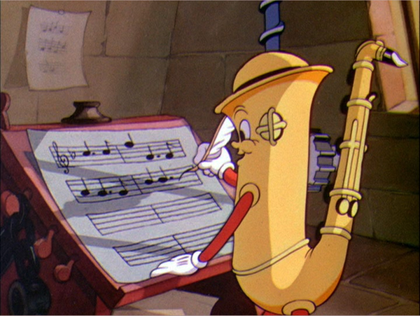
Music Land (Disney, 1935).
DB here:
“The great directors, I’ve learned, have a great sense of rhythm.” So says Alexandre Desplat, who’s again earned two Oscar nominations in the same year (for The Imitation Game and The Grand Budapest Hotel). The statement sounds true but vague. Musicians and musicologists have a firm sense of what the term rhythm means, but how can we understand it in relation to movies?
Well, surely it refers, at least, to the rhythm of the music we hear in the film. But we usually think there’s more involved. There’s rhythm in the movement on the screen. The people and things we see can be infused with a beat and tempo and pace. (Critics of the 1920s considered Chaplin a dancer, like Nijinsky.) There’s a rhythm to the combination of images too, as everybody who’s tried film editing knows. And we think that the story can be told in a way that has a distinctive pace–narrative rhythm, we sometimes call it. But how do these components work together to create an overall rhythm for the film?
When synchronized sound recording entered movies, critics and filmmakers worried a lot about this problem. Filmmakers who had mastered visual storytelling in the silent era had to figure out how to merge spoken language, music, and sound effects with the flow of images. The lazy solution was simply to shoot plays, filling the scenes with dialogue. But both audiences and critics missed the dynamism of silent films. Talkies were too talky.
The opposite solution, to eliminate words as much as possible and simply use music and sound effects, was of limited value. After all, silent film needed the written language of intertitles to make the story clear; why give up the advantages of spoken language? But how then to integrate image and sound into something that engaged the audience–not only through the film’s story but also, perhaps more deeply, through that elusive quality called rhythm?
Today this debate may seem sterile. We think filmmakers have solved the problem. Maybe they have, collectively, but each one faces it at every moment. How do you blend movement, music, pictorial composition, sound effects, and dialogue to create an overall pace that will benefit your movie? No single recipe will work. The rhythm of the Coen brothers’ Raising Arizona is very different from that of No Country for Old Men. Both Gone Girl and Non-Stop are thrillers, but Fincher’s pacing is far more deliberate and understated than Collet-Serra’s; yet both take hold of us.
Filmmakers solve the problem of rhythm in practice, often brilliantly. Those of us who want to understand how films work, and work upon us, want to get specific and explicit. What is this thing called cinematic rhythm? What contributes to it? Can we analyze it and explain its grip? Very few scholars have tackled these questions; they’re hard. In her new book, Film Rhythm after Sound: Technology, Music, and Performance, our friend and colleague Lea Jacobs takes us quite a ways toward some answers.
Mickey-mousing redux
Lea starts from the assumption that the debates of the early 1930s are still relevant. So she looks at some much-praised examples of sound/image integration: the musicals of Mamoulian and Lubitsch and the cartoons from the Disney studio. She studies these paradigm cases more closely than anyone has before. She also goes beyond them to consider the theory and practice of Eisenstein (a big admirer of Disney) and the handling of dialogue in Howard Hawks’ work from The Dawn Patrol (1930) to Twentieth Century (1934).
Central to Lea’s inquiry is the notion of synchronization. How can distinct moments in the image flow, the sound flow, and the narrative action be pinched together, like the toothpick pinning the ingredients in a sandwich? One answer is to rehabilitate the old idea of mickey-mousing. Mickey-mousing makes the patterning of the sound match, in some way, the pattern of onscreen action. Mickey-mousing has had a bad press, but Lea shows that if we look at it afresh, it offer a solid point of departure for thinking about rhythm.
Eisenstein develops the idea of sync, in a fresh but still general way, in his notion of “brickwork” structure–the non-coincidence of image and sound, like the staggered array of bricks in a wall. That is, your cut shouldn’t come on the beat (are you listening, music-video directors?). Save your sync until it can have maximum impact, ideally through accenting some action in the image and maybe a high point in your drama. This is a step beyond the duality synchronous/asynchronous sound that was floated in the early 1930s. Eisenstein shows how all the different lines of pictorial and auditory movement can be woven in a flow that will create various degrees of emphasis. In this “wickerwork” pattern (another of his metaphors), actor movement might coincide with a melodic run rather than a beat, and the cut might accentuate a line of dialogue while the music subsides. Or instead of Hollywood’s underscoring, the music might be abnormally loud, doubling and clashing with dialogue in a “Godardian” manner. At certain moments, several accents in these lines could hit simultaneously. Just as important are the moments when the imagery and the mix get thinned out so that a single element–a word, a chord, a gesture–is isolated.
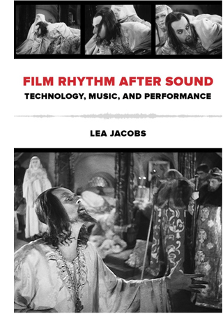 The key example comes from Ivan the Terrible, Part I, in which the ailing tsar asks the Boyars to kiss the cross in allegiance to his baby son Dmitri. In unprecedented detail, Lea tracks how the melody, meter, motifs, orchestration, and dynamics of the music fluctuate in relation to staging, line readings, and narrative developments. In a passage lasting only six minutes, she shows how–as so often happens–Eisenstein’s practice outruns his theory and creates a rich audiovisual texture at an almost microscopic level.
Rhythm is constructed frame to frame, sync point to sync point, and involves very small durations of a half second or a quarter second. This proposition may seem obvious to anyone who has been involved in editing or scoring film music. Classical Hollywood click tracks measured tempi to fractions of a frame, as defined by the sprocket holes, and there are clear indications that composers and editors haggled over durations of five or six frames.
This urge to “think small” and study the finest grain of image and sound carries through Lea’s analysis of rhythm in Disney cartoons. Some have accused Eisenstein’s Ivan of being a live-action cartoon, and there’s no hiding either the old man’s admiration for Disney or his belief that cinema was capable of highly “engineered” effects. Still, music and its mickey-mousing possibilities determine animated films even more strongly than live-action ones. Lea takes Disney’s early sound films as experiments in synchronization.
Early sound cartoons are sometimes characterized as “prisoners of the beat” because they create cycles of motion that are lined up with the musical meter. Lea traces how Disney animation became more fluid and flexible, syncing more around sound events than around rigid beats. She illustrates her case with analyses of Hell’s Bells (1929), The Three Little Pigs (1933), and Playful Pluto (1934). The last two are widely regarded as classic Silly Symphonies, and she sheds fresh light on them through the sort of micro-analysis brought to bear on Ivan.
She shows how sections gain a fast or slow tempo through the interaction of many factors, of which shot length is only one. In particular, Disney directors could change pace through a tool that Eisenstein didn’t have: altering the frame rate of animation. Normal animation is “on twos”; each drawn frame is photographed twice, to last for two film frames. Many stretches of the Disney cartoons are on twos, but sometimes, to create vivid sync points, the filmmakers go “on ones,” allotting one frame for each drawing. This is more expensive and time-consuming, but it allows for the sort of fine control of pace that we find in The Three Little Pigs. There the Wolf launches into “a jazzy, up-tempo gallop” that accelerates the danger bearing down on the pigs. In a similar way, Playful Pluto creates variety by “matching movement to different fractions of the beat and establishing differential rates of movement within the shot.” Imagineering, for sure.
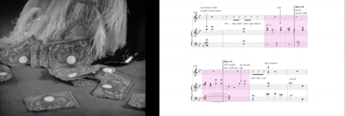
How to convey this fine-grained analysis on the page? Lea uses the familiar tactics of presentation: verbal description, musical scores, and frame enlargements. But she goes farther. At great effort and expense, she has constructed analyses of key passages as video clips, with the film scene running in interlock with a highlighting bar that shifts across the score. Annotations on the score mark actions and sync points. These analyses are designed to be watched as you read along in the book. You’ll see some frame grabs in this entry, but to watch them simply go here, select the Audio/Video tab, and choose what you want to see from the menu. This is a real step forward for film scholarship, and the University of California Press should be congratulated for helping her take it. Why shouldn’t every film book hereafter come garlanded with clips?
No age for rhythm
Monte Carlo (1930).
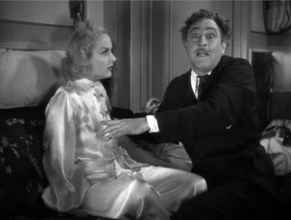
Okay, you might say. Rhythm is of concern to top-down audiovisual masters like Eisenstein and Disney. But there are other notions of film as art–for instance, that performance is central to its storytelling. Lea shows that, again, early sound film explored a more open and porous integration of music and image. Ernst Lubitsch, as Kristin has shown, was one of the masters of image-based cinema in the silent era. Yet as soon as sound came in, he was exploring how to blend music with the mercurial repartee and attitudes of his sophisticated characters. Rouben Mamoulian, who had indulged in sync experiments in the theatre, contributed as well to a broader trend that gave music a central role in structuring scenes.
The result wasn’t exactly “musicals” as we usually understand them, although there might be song numbers; instead, the music worked its way into the crannies of the scenes–pauses in the dialogue, moments when characters cross a courtyard or boudoir. Thanks to post-synchronization (music performed after the film was shot and cut) and sync-to-playback (prerecorded music played on the set during performance), early sound films could boast a tight rhythmic bond of performance style and musical accompaniment. That created a sort of cinematic operetta, one no longer bound to a theatrical space. In “Isn’t It Romantic?” in Mamoulian’s Love Me Tonight (1932), a song begun in a tailor’s shop is passed along through Paris, onto a train, to the open road (soldiers march to it), and eventually to a gypsy campfire, where the heroine hears it from her balcony.
Most historians find strong similarities between such passages in Love Me Tonight and scenes in Lubitsch’s Monte Carlo (1930), but Lea contrasts them. She argues that Mamoulian’s film is more like early Disney in syncing music one-to-one with figure movement and camera movement. Lubitsch (although working earlier than Mamoulian) is interested in synchronization at another level, linking musical segments to dramatically coherent parts and wholes. She shows how one sequence in Monte Carlo accelerates its techniques to culminate in a patter song, creating a curve of rhythmic interest that sculpts the scene’s overall shape. Significantly, as in the famous choo-choo “Beyond the Blue Horizon” number, the song uses noises rather than music to launch its rhythmic arc.
The case-study method leads Lea to some generalizations too, as in her survey of manners of dialogue underscoring. This section of the books seems to me especially rich, because it shows how tactics of underscoring associated with the 1930s “symphonic” scores were already available, at least sketchily, in the early years of sound. At the same time, she’s able to distinguish some creative options, such as the conversion of patter songs to a more conversational tempo, that seem very distinctive of these early sound films and not their successors. She and other scholars can now build upon her survey to track a variety of styles of dialogue underscoring.
 Okay, again, but these early musicals are still very pre-structured, you might say. What about movies that don’t rely on music so much and that give the actors more freedom during shooting?
Enter Howard Hawks.
The book’s last in-depth analysis is devoted to probably the trickiest aspect of the whole problem: rhythm in speech, performance, and narrative. Lea points out that sound film acting required quite exact timing of pauses, glances, gestures, movement around the set, and deployment of hand props–probably tighter timing than in the silent era, with its shorter takes and greater scene dissection. (Consider how often a silent film gives us a close-up of a hand picking up something; in talkies, picking up something seldom gets that emphasis, so that the actor has to integrate the action into the flow of the full shot.) In sound filming, the shooting of the scene and the actor’s performance choices limited what an editor could do to slow it down or speed it up.
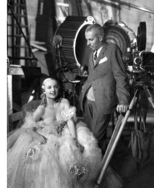
Hawks is a notoriously difficult director to analyze because he doesn’t have an obvious signature style at the visual level. His conception of cinematic art relied upon his players. He famously developed his scenes slowly, letting actors improvise, asking screenwriters to recast the scene, and working out the blocking gradually. In this actor-centered cinema, we’re often told, a lot of the Hawksian tang comes from overlapping dialogue. Lea points out, though, that overlapping dialogue was already in wide use on the theatre stage and Hawks was comparatively late in importing it to film. His earliest 1930s experiments don’t owe much to it, largely because early sound technology couldn’t discriminate voices very well. Lea breaks new ground in showing other ways in which speech patterns, regulated through rhythm as well as pitch and timbre, not only contribute to characterization but supply that zesty bounce we associate with the Hawksian world.
His tactics include shifting actors around the set, letting background and foreground sound alternate in clarity, and shortening scenes. Lea goes on to show how these and other options led Hawks to create the “tough talk delivered in a tough way” that became one of his hallmarks. By measuring the length of actors’ lines in seconds and fractions of a second, she’s able to track a subtle orchestration of voices–long speeches delivered fast (or slow), short speeches delivered slow (or fast), and many varieties in between, all interwoven. Overlapping comes in occasionally, as icing on the cake. When it does, especially in Twentieth Century, Lea is ready to specify it, showing how syllables and phonemes are stepped on or cut off.
Now the control freaks aren’t the directors, the Eisensteins and Lubitsches, but the actors. Working together, they plan their lines, expressions, and gestures down to the word. They make their own music. Hawks, says Lea, gives us rhythm “without benefit of a beat.”
Film Rhythm after Sound is a breakthrough in showing how narrative cinema masters time in its finest grain. We’re used to talking about scenes, shots, and lines of dialogue. Lea has taken us into the nano-worlds of a film: frames and parts of frames, fractions of seconds, phonemes. As Richard Feynman once said of atomic particles, “There’s plenty of room at the bottom.” Of course Lea doesn’t overlook characterization, plot dynamics, themes, and other familiar furniture of criticism. But she shows how our moment-by-moment experience depends on the sensuous particulars that escape our notice as the movie whisks past us. We can’t detect these micro-stylistics on the fly. Yet they are there, working on us, powerfully engaging our senses. Film criticism, informed by historical research, seldom attains this book’s level of delicacy. Analyzing a movie’s soundtrack will not be the same again.
Beyond praise 3: Yet more DVD supplements that really tell you something
Darby O’Gill and the Little People (1959)
Kristin here–
Every now and then I discuss a few DVD supplements that teachers might find useful for their classes, though they might be of interest to others as well. Previous installments can be read here and here.
Darby O’Gill and the Little People (Walt Disney Video)
Yes, you read that right. I can’t claim credit for having discovered this disc’s excellent supplement, “Little People, Big Effects.” Shortly after the second “Beyond praise” entry, Dan Reynolds, who teaches at the University of California Santa Barbara, wrote to recommend it.
Darby O’Gill was one of the few Disney live-action films I missed when I was growing up in the 1950s. I acquired the disc and started by watching the feature. I must say that this is one weird movie.
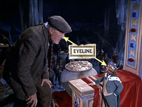
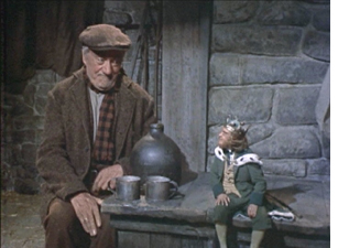
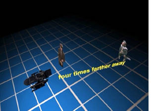
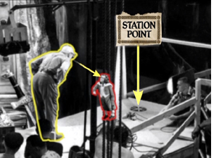
The “little people” of the title are leprechauns, and the special effects used to make them look small are mostly achieved through forced- perspective techniques. In less than eleven minutes, this supplement demonstrates the use of glass paintings, mattes, false perspective, and even a revived Schüfftan process, most famously used for Metropolis, where scale is manipulated by shooting into an angled, partially transparent mirror. Careful calculations allow for over-sized sets in the background to be lined up precisely with normal-scale ones in the foreground, so that the foreground person looks much larger then the background one. Since the two characters, here Darby and King Brian, are supposed to be conversing face-to-face, a manipulation of eyelines, a term we use a lot in Film Art, is necessary. (Despite what my spell-check keeps trying to tell me, “eyeline” is one word in the movie business, as demonstrated above.) In explaining how the actors knew where to look in the shot illustrated at the top, the film shows that “station points” were placed on the floor so that the characters’ eyelines would seem to match up (below). These days actors alone against blue or green screens often have to look at tennis balls to make the direction of their gaze match correctly.)
Clearly some behind-the-scenes footage was made during the production of Darby O’Gill, and this is incorporated into a documentary that includes interviews with master effects expert Peter Ellenshaw, who died in 2007. Ellenshaw worked as a matte painter on half the British classics of the 1930s and 1940s, including Black Narcissus (which has perhaps the greatest matte paintings ever). He then moved to Hollywood in 1950 and began a string of films with Disney that won him an Oscar for Mary Poppins. It’s good to have even these short clips of him demonstrating and discussing his work.
“Little People, Big Effects” should give students (and just about anyone else) a better grasp of perspective and its importance in the representation of depth on a flat screen. I would definitely show it as part of a study of cinematography. If a fifty-year-old film seems a bit out of date, point out to students that, as the narrator mentions, exactly the same techniques were used in many scenes of The Lord of the Rings to make the hobbits and dwarves look small. Similar demonstrations are provided in the supplements to the extended DVD version of The Fellowship of the Ring (Disc 1, “Visual Effects: Scale”).
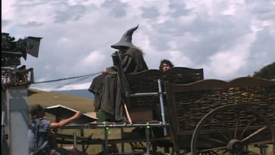
Elijah Wood sits further from the camera than Ian McKellen in order to make him appear as small as a hobbit
Zodiac (“2-Disc Director’s Cut,” Paramount)
At the end of my first “Beyond praise” entry, I complained about the lack of supplements on the initial DVD release of Zodiac. Then, after the two-disc set with the supplements appeared in early 2008, I forgot to include it in the second entry. Better late than never, so I’m tackling it here. (The supplements are apparently the same for the Blu-ray set.)
As the “DVD Talk” review says. “The self-congratulatory praise is kept to a minimum.”
The main supplement is a 53-minute film called “Deciphering Zodiac.” It’s a good, objective, chronological summary of the film’s production. A lot of talking heads are included, such as the producer, scriptwriter, set decorator. That’s usually a good sign, since it shows that care was taken with the making-of and that enough of the crew members are participating that the account will probably be rounded. There’s a 15-minute making-of specifically on “The Visual Effects of Zodiac.”
Zodiac was primarily shot on professional-level digital cameras, apart from the slow-motion shots, which still need to be done on 35mm due to limitations of the digital technology. Hence there’s a lot of information here on digital techniques. Most of these techniques are used in ways that aren’t necessarily obvious to the viewer. If you want to show students some material on digital effects, this might be a good choice, since it avoids the flashy, obvious effects that so many fantasy and sci-fi DVD supplements concentrate on.
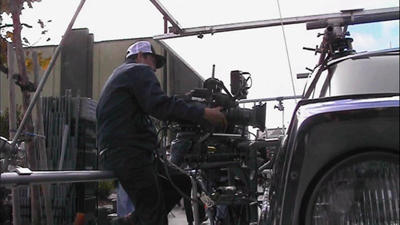
“Deciphering Zodiac” has shots showing the digital camera attached to an elaborate rig around a car, which was used to follow moving cars, including the famous opening tracking shot along a suburban street. The video-assist monitor is often visible in the shots.
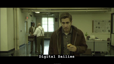
One change that digital filming has made in production has been the frequent use of “digital dailies” rather than dailies on film. (Dailies are the unedited takes just as they come from the camera(s); directors and other key creative people typically watch them at the end of each day.) Several scenes of the “Deciphering” documentary show raw shots and are labeled as digital dailies, something which doesn’t seem to be a common feature of supplements. It’s pretty obvious that the shot of Jake Gyllenhaal below would need to be manipulated in post-production. There’s also informative coverage of the methods used to match location and studio-shot footage, particularly for the scene where the killer shoots a taxi driver.
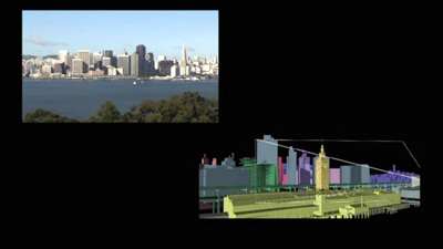
The visual effects documentary has good explanations of the early shot of a rapid move across the bay toward San Francisco as it looked in the period when the film’s action begins, a shot that was done entirely digitally.
Now that so many best-lists for the decade have included Zodiac, it seems to be an official modern classic. Perhaps a somewhat more dignified way of teaching special effects than using a Transformers movie.
The Dark Knight (Two-Disc Special Edition, Warner Home Video)
The supplements for The Dark Knight make a nice contrast with those for Zodiac. Here the makers of a spectacular action movie avoided digital special effects to a surprising extent. Instead they used practical effects, that is, effects accomplished via physical means while shooting rather than those done in post-production via laboratory or digital manipulation. Digital technology was used, of course, but often for rather modest tasks in planning and in erasure of unwanted elements. It’s also interesting as the first 35mm fiction feature to be shot partially on Imax cameras.
The main supplement is “Gotham Uncovered.” It begins by showing how the Imax camera was initially tested on a single action scene shot on location in Chicago. The results led to additional Imax scenes being added to the film. The advantages of Imax—primarily a huge gain in visual quality due to the larger size of the individual frames—are shown to be balanced against the camera’s limitations. The camera is much larger, making handheld shots difficult. It holds only three minutes of film and has a shallower depth of field. While interesting, this first section is surprisingly lacking in actual footage of the filming, often depending on still photos. We tend to assume that in this day and age, the making-of is taken into account from early on in a production. It’s surprising how often that turns out not to be the case.
A five-minute segment, “The Sound of Anarchy,” shows Hans Zimmer sitting at a computer and talking about the modernist, dissonant music for the Joker character. It’s mildly informative.
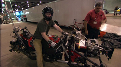
“The Chase” is perhaps the most useful section of the making-of. The decision was made to shoot the scene on Lower Wacker in Chicago. Here digital effects were kept to a minimum, with multiple cameras mounted on vehicles like the motorcycle below. These were special smaller Imax cameras. Only four such cameras existed at the time, though an accident reduced that to three!
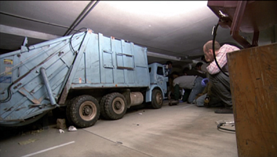
One big moment in the chase has the Batmobile crashing into a garbage truck. Again, rather than resorting to digital effects, the crew built miniatures of the two vehicles and the set. The decision was also made to shoot a crash of an 18-wheeler on LaSalle Street using a real truck on location, and the scenes showing the practice sessions for this reveal the kind of planning that goes into the big action scenes that are so common in films these days.
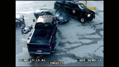
A multi-vehicle crash scene was done with several cameras, which is common practice for unrepeatable actions. (Even on a big-budget film like this, no one would want to crash more than one Lamborghini.) The cameras often show up in each other’s shots, and the supplement shows the resulting footage and how CGI is later used to erase them—again, a very common use of digital tools. Here a camera on a crane is visible at the center left in the original footage of the crash:
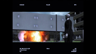
In one scene, the Joker walks out of a hospital, which explodes behind him. A prime candidate for digital effects, one would think. Instead, the filmmakers opted to have a demolition company destroy a real building. CGI was used to plan the scene:
A shorter supplement, “The Evolution of the Knight,” deals mostly with the design process for Batman’s suit and the Batpod. Again the emphasis is on bringing reality into the filming. It’s pointed out that while much of Batman Returns was shot on sound stages, the team decided to try and shoot the sequel in the city streets as much as possible.
Beware of these
I have to admit, one reason that this series appears so rarely is that for every DVD with useful supplements that I find, there are two or three uninformative ones that I have to sit through–or at least sample. In addition to recommendations, let me warn you away from some of the ones I switched off.
I had expected the Slumdog Millionaire DVD extras to be interesting, given the mixture of digital and 35mm shooting, the location work, and so on. But obviously the filmmakers had no idea that the film would be a success, so they seem to have done little behind-the-scenes shooting as they made it. The result is a not terribly informative, bare-bones 18-minute making-of.
Supplements as praise-fests have not gone away. Musicals seem especially to bring them out. “Get Aboard! The Band Wagon” provides 36 minutes of mutual admiration. In “From Stage to Screen: The History of Chicago,” Chita Rivera unintentionally achieves a parody of the gushing movie star who lauds everyone she worked with.
David and I just watched Cloudy with a Chance of Meatballs. I had liked it when I saw it in first run, and predictably, David enjoyed it, too. It’s a clever, well-scripted, well-animated film. We hoped to learn something from its supplements, but the making-of seems to be aimed at children, and young ones at that. The co-directors and some of the other filmmakers look distinctly embarrassed to be participating, partly because a lame comparison of making a film to mashing food together forms a running motif. A pity, since the movie deserves better. As reviewers keep pointing out, the best animated films these days are made for adults as much as for children.
A welcome INFLUENZA
DB here:
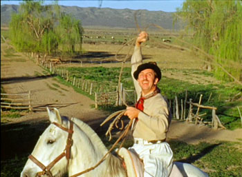
Kristin and I are en route to the Vancouver International Film Festival, after a few days in Seattle visiting Sanjeev and Megan, nephew and niece-in-law. We were completely awestruck by the vast holdings of Scarecrow Video, where even the Warner Archives special-order DVDs can be rented. We also had a good long talk over JaK steaks with Jim Emerson, impresario of the superb website Scanners. Not to mention catching a screening of the lively Walt & El Grupo at the Seattle International Film Festival theatre. As a big fan of Saludos Amigos and Three Caballeros, I was thrilled to learn the background story, as well as to watch gorgeous 16mm Kodachrome footage.
Last year’s trip to Vancouver put us on the road for thirteen days, encountering movie-related stuff (and Obama) in surprising places. This time we took the plane—faster but less relaxing. To get a better look at the landscape, we’ll be taking a train up to Vancouver.
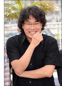 One of the films I’m most looking forward to at Vancouver is Bong Joon-ho’s Mother, brought to this year’s event by Tony Rayns. Alas, Bong himself will not be joining us. I enjoyed meeting him at my first Vancouver visit in 2006, when this blog was in swaddling clothes. He’s completely frank and unpretentious.
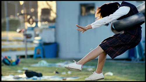
Even before meeting him, I had followed Bong’s career with keen interest. I think he’s one of the best Korean directors, though he probably doesn’t get as much attention as some others. Like the Japanese Kore-eda Hirokazu, Bong is the sort of quiet genre-hopper who’s hard to pin down. His first feature, Barking Dogs Never Bite, is a charming romantic comedy that also offers a portrait of neighborhood life. The mordant Memories of Murder (2003) quietly bends the conventions of the city-cop-in-a-village movie, mixing comedy into a serial-killer tale. Bong’s biggest commercial success came with The Host (2006), a monster movie in the grand tradition that manages to be at once scary, funny, and socially critical. Seeing it again this summer, I was struck by its compact elegance. Bong makes complex narrative and stylistic twists look easy.
Bong has also made some acute short films; he seems to understand that they require the snappy impact of a well-wrought short story. Probably his best-known short is the “Shaking Tokyo” segment of the omnibus movie Tokyo (2008). It focuses on a hikikomori, a young man who has withdrawn from social contact and lives wholly through the TV monitor and the computer screen. Bong’s hero tidily stacks empty pizza boxes along his walls like installation art. Only an encounter with a delivery woman makes him question his robotic seclusion. The ending, which lures our hero outside, provides a Twilight-Zoneish twist.
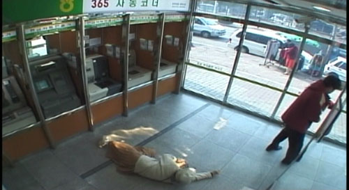
More single-minded, though, is a short I’ve just seen, the little-known Influenza (2004). There are several movies based on surveillance-camera footage; one of the most lyrical, Optical Vacuum, I reviewed here. Bong went instead for narrative. He staged a story in locales covered by surveillance cameras, and then retrieved the footage from the hours of material. Cut together, the shots follow Mr. Cho, a failed salesman who turns to petty theft and violent crime.
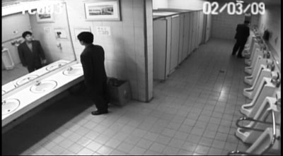
We discover Mr. Cho in men’s rooms, car parks, and ATM stations. The scenes, each shot in a single take, run through various spycam techniques: fixed high angle, black and white imagery, stuttering motion, mechanical scanning of the scene (sometimes leaving the main action behind). We see wide-angles, telephoto shots, barely legible long-shots, and split-screen imagery picking out opposite points of view.
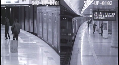
Everything we see is staged, I think. Unrehearsed events seldom look this cogent and poised. Yet sometimes, especially during the climactic crowd scene, some of the action seems to have been left to luck.
Short but not sweet—mostly sour—Influenza shows what an ingenious filmmaker can do by setting himself a single, precise problem. Crossing the border between commercial fiction and avant-garde experimentation, the film deserves wider circulation.
As for Mother, Derek Elley’s Variety review promises the trademark Bong blend of gentle comedy and unsettling drama. And Vancouverites have an extra bit of luck: A program of shorts by Bong and his colleagues from the Korean Academy of Film Arts graces the festival this year. Bong’s next planned project, about the wretched survivors of a new Ice Age, shows him to be as unpredictable and unclassifiable as ever.
Thanks to Bong Joon-ho for his help in preparing this entry. The trailer for Walt & El Grupo is here. And there’s a poignant story of the founding and near-demise of Scarecrow Video here.
The Host.
But what kind of art?
2046.
From DB:
We don’t have to think of film as an art form. A historian can treat a movie as a document of its time and place. A war buff could scrutinize Eastwood’s Iwo Jima movies for their accuracy, and a chess expert could sieve through Looking for Bobby Fischer to discover, move by move, what matches were dramatized. But most of the time we assume that cinema is an art of some sort.
Not necessarily high art. Cinema is often a popular art, or in Noël Carroll’s phrase, a mass art. From this angle, there’s no split between art and entertainment. Popular songs are undeniably music, and best-selling novels are instances of literature. Similarly, megaplex movies are as much a part of the art of film as are the most esoteric experiments. Whether those movies, or the experiments, are good cinema is another story, but cinema they remain.
So, at least, is our position in Film Art: An Introduction. We draw our examples from documentaries, animated films, avant-garde films, mainstream entertainment vehicles, and films aimed at narrower audiences. In other writing, Kristin has done research on high-art movements like German Expressionism and Soviet Montage (she wrote her dissertation on Ivan the Terrible), but she’s also written about popular cinema from Doug Fairbanks to The Lord of the Rings. I’ve indulged my admiration for Hou and Dreyer but also I’ve tried to tease out the aesthetics of Hong Kong action pictures and contemporary Hollywood blockbusters. Ozu gives us the best of both worlds: one of cinema’s most accomplished artists, he was also a popular commercial filmmaker.
Still, people who look upon cinema as an art don’t necessarily share the same conceptions of what kind of art it is. We have different conceptions of cinema’s artistic dimensions, and we won’t find unanimity of opinion among filmmakers, critics, academics, or audiences.
When we study film theory, this sort of question comes to the fore, and so today’s blog will be a bit more theoretical than most. Don’t let that scare you off, though; I’m trying for clarity, not murk.
Dimensions
People have tended to think of cinema as an art by means of rough analogies to the other arts. After all, film came along at a point when virtually all the other arts had been around for milennia. It’s commonly said that film is the only artform whose historical origins we can determine. So it’s been natural for people to compare this new medium with older arts.
Here are the dimensions that come to my mind:
*Film is a photographic art.
*Film is a narrative art.
*Film is a performing art.
*Film is a pictorial art.
*Film is an audiovisual art.
Let me say off the bat that I think that film is a synthetic medium, in the sense that all these features and more can be found in it. It’s like opera, which is at once narrative, performative, musical, and even pictorial. I mark out these dimensions simply to show some emphases in people’s thinking about cinema. As we’ll see, these ideas can be mixed together in various ways.
Film as a photographic art.
La petite fille et son chat (1900).
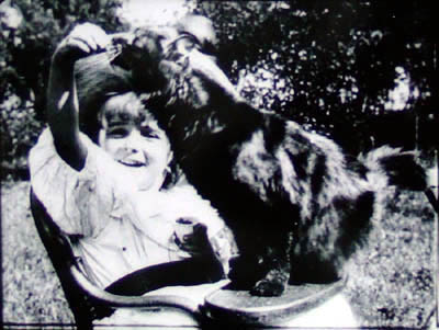
For many early filmmakers, such as the Lumière brothers (above), cinema was a means of capturing reality, documenting the visible world. Movies were moving photographs. Naturally, this conception of cinema leads us to treat documentary as the central mode of filmmaking.
It’s an appealing idea. G.W. Bush reading “My Pet Goat” wouldn’t be as revelatory presented as a painting or a theatre performance. On film we can see the event as it occurred and judge it as if we were in the same room. Even in fictional cinema, you can argue, the physicality of the actors, the tangibility of the setting, and the details–a train’s pistons, wind rustling through grass–could not be rendered, or even imagined, so powerfully in a non-photographic medium. In addition, consider Jackie Chan. His stunts are astonishing partly because we know he really did them and the camera photographed them. In an animated film, or a CGI-based one, a character’s acrobatics or brushes with death aren’t so thrilling.
The great film theorist André Bazin claimed that cinema’s photographic basis made it very different from the more traditional arts. By recording the world in all its immediacy, giving us slices of actual space and true duration, film puts us in a position to discover our link to primordial experience. Other arts rely on conventions, Bazin thought, but cinema goes beyond convention to reacquaint us with the concrete reality that surrounds us but that we seldom notice.
I think that Bazin’s idea lies behind our sense that long takes and a static camera are putting us in touch with reality and inviting us to notice details that we usually overlook in everyday life. (I try out this line of argument in relation to the tactility of Sátántangó here.) Moreover, you can argue that in treating cinema as a photographic art the filmmaker surrenders a degree of control over what we see and how we see it. Bazin made this claim about the Italian neorealists and Jean Renoir: creation becomes a matter of an existential collaboration between humans and the concrete world around us.
An example I used in my book Figures Traced in Light pertains to a moment in Hou Hsiao-hsien’s Summer at Grandfather’s, when a tiny toy fan falls between railroad tracks as a locomotive roars past. The fan’s blades stop, then spin in the opposite direction as the train thunders over it. The blades reverse again when the train has gone. (This detail might not be visible on video.) Did Hou know how the fan would behave? Isn’t it just as likely he simply discovered it after the fact, making his shot a kind of experiment in the behavior of things? Conceived as a species of photography, cinema can yield visual discoveries that no other art can.
Interestingly, cinema didn’t have to be photographic. Many early experiments with moving images were made with strips of drawings, such as the Belgian Émile Reynaud’s Praxinoscope. You can argue that recording glimpses of the world photographically simply proved to be the easiest way to obtain a long string of slightly different images that could generate the illusion of movement. Some filmmakers, such as George Lucas, hold that filmmakers are no longer tied to photography, and that the digital revolution will allow cinema to finally realize itself as a painterly art. More on that below.
Film as a narrative art.
Rope.
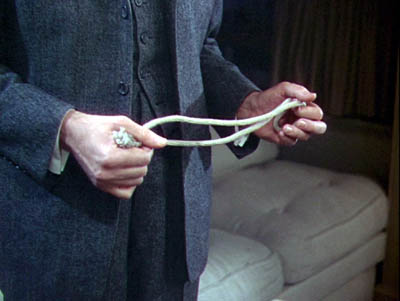
This is at the core of Hollywood’s explicit concerns. Producers, directors, crew, and of course screenwriters will agree that Without a good story, the movie fails. Our Indie and Indiewood filmmakers say they’re trying to find fresh stories, the ones that “haven’t been told yet.” Overseas filmmakers dominated by Hollywood tell us, “We have our own stories to tell.” Even the most celebrated arthouse filmmakers often say they’re interested in character as revealed through action. Resnais, Rivette, Fassbinder, Haneke, and all the rest may have told unusual stories, but still they told ’em.
Likewise, many viewers will say that they go to the movies to experience a story. Reviewers online and in the popular press, if they do nothing else, are obliged to sketch out the film’s plot, though they mustn’t give away the ending. Even in academia, most discussions of films focus on what happens in the narrative.
When we consider film genres, we’re usually concentrating on the narrative aspects of them. Most genres display typical characters and plot patterns. The backstage musical features aging stars and young hopefuls, caught up in the process of putting on a show. The horror film typically centers on a monster’s attack on humans, who must fight back. One type of science fiction shows us an overweening scientist striving to go beyond “what is proper for humans to know.” Both fans and scholars discuss other aspects of genre films, but narrative is often central to their concerns.
Historians have traced in great detail how filmmakers employed cinema as a narrative art, but we’re making more discoveries all the time. How, for instance, have films signaled flashbacks? How do they let us know we’re in a character’s mind, or attached to his or her optical point of view? How have they structured their plots? Can we pick out distinct approaches to narrative–in various periods, or genres, or national cinemas? How have narrative conventions changed over the years? Some of the answers Kristin and I have proposed can be found elsewhere on this site, and in our books and articles.
Film as a performing art.
The Marrying Kind.
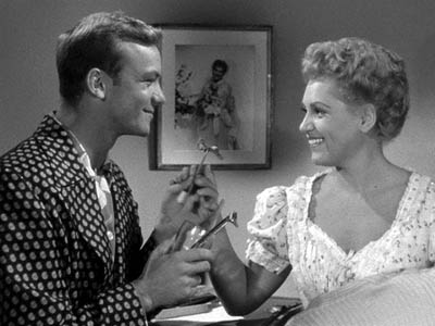
In the West, since Plato and Aristotle we’ve distinguished between verbal storytelling and dramatic presentation, or performance. Films may be stories, but they’re not exactly told: they’re enacted. At Oscar time, we’re especially conscious of this analogy, for the Actor/ Actress nominees usually garner the most public attention.
Hollywood acknowledged cinema as a performing art in the 1910s, when it created the star system. The Star reminds us that film acting isn’t exactly the same as theatre acting, since an elusive charisma puts the performance across. John Wayne, Marilyn Monroe, Keanu Reeves, and many other “axioms of the cinema” aren’t good actors by stagebound standards, but once they show up on screen, you can’t take your eyes off them. This notion intersects with the photographic premise: we say that the camera seems to love them.
You can argue that Andy Warhol revamped this idea. His superstars weren’t photogenic by ordinary standards but their almost clinical narcissism and exhibitionism, captured by the camera, made them as mesmerizing as any matinee idols. Warhol films like Paul Swann create rather disturbing emotions by putting us in the presence of an awkward performer.
Reviewers place a premium on a movie’s performance dimension. After they’ve told us a bit of the plot , they appraise the job the actors did. Some ambitious critics have written wonderful appreciative essays on acting, as in Andrew Sarris’s “You Ain’t Heard Nothin’ Yet” and the collection OK You Mugs. See also the two collections of articles by Gary Giddins, which I discuss in an earlier blog.
Academic film studies has been slow to study acting systematically, partly because of a bias against considering cinema as a theatrical art, and partly because acting is very hard to analyze. But Charles Affron, Jim Naremore, Roberta Pearson, and Ben Brewster and Lea Jacobs have greatly helped us understand performance practices. They show, among other things, that it isn’t just a matter of the face or the voice: a fluttered hand or a willowy stance can be as powerful as a frown or a line reading.
Film as a pictorial art.
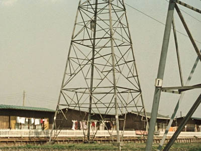
Ohayu (Good Morning).
Progressive opinion in the silent era tended to deny that film was a performing art, since that would make it a form of theatre. No, film had unique capacities. Cinema was essentially moving pictures.
It was a visual art that unfolded in time, so a movie was neither quite the same as a painting (frozen in time) or as a stage play (not pictures but three-dimensional reality). The coming of sound somewhat reduced the appeal of this line of argument, but to a very great extent, students of film technique still emphasize cinema as a visual art.
Theorists argued that the film frame was a pictorial field, not a proscenium stage. Action unfolded in the frame in ways that dynamized space. The choice of angle, camera distance, camera movement, and the like created a visual fluidity that had no equivalent on stage or in other graphic arts. Even cinematic staging was quite different from blocking in a theatrical space. Add to this the ability to join one strip of pictures to another via editing, and we have a unique pictorial artform.
The theorists of the silent era, like Rudolf Arnheim and the Russian montagists, gave us a vocabulary and an orientation to studying visual style, but their legacy hasn’t been fully developed. Journalistic reviewers typically don’t pay that much attention to the way movies look. Nor, surprisingly, do academics. Film studies departments seldom pursue research into visual style and structure.
Here the professors are out of sync with the people whose work they study. Manuals and film schools teach composition, lighting, cutting, camera placement and the like. Professional filmmakers all over the world often think in pictures; they prepare shot lists and storyboards and care very much about the color values and editing patterns of the finished work. We can see their interest in visuals in DVD commentaries and supplements, and as viewers start to absorb bonus materials, perhaps their interest will be whetted too.
Needless to say, a number of avant-garde filmmakers, from Viking Eggeling and Walter Ruttmann to Deren, Brakhage, Ernie Gehr, James Benning, and Nathaniel Dorsky, have also thought of cinema as having the power to refresh, even redeem, our vision. But many of the most important directors aiming at broader audiences are also renowned for their visual styles. To mention just a few: Griffith, Feuillade, Sjostrom, Keaton, De Mille, Murnau, Lang, Dreyer, Lubitsch, and Dovzhenko; Ford, Hitchcock, and von Sternberg; Renoir, Ozu (above), Mizoguchi, and Ophuls; early Bergman, Antonioni, Jancsó, Resnais, Angelopoulos, Tarr, Tarkovsky, Kieślowski, Kiarostami, and Makhmalbaf; Scorsese, Spielberg, Michael Mann, and Tim Burton. Some, like Oshima, Sokurov, and Johnnie To, have been polystylistic, exploring many different visual pathways.
Film as an audiovisual art.
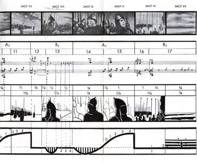
In the 1920s, many theorists feared the coming of synchronized sound, since that would thrust film back toward theatre. The “talkies” would sacrifice visual artistry to Broadway dialogue. This worry was mistaken, but I can sympathize. Probably the mandatory silence of early film pushed filmmakers to find means of visual expression. Would we have Chaplin and the other clowns if they could have spoken at the start?
Yet a great deal of sound cinema wasn’t canned theatre. Film became a synthetic medium blending imagery, the spoken word, sound effects, and music into something that was neither painting nor theatre nor illustrated radio.
Though he’s thought of as the premiere theorist of editing, Eisenstein actually developed this idea of audio-visual synthesis. He was fascinated by the ways in which images and music worked together, creating an idea or feeling that couldn’t be expressed by either one. If shot A followed by shot B gave us something that wasn’t present in either one, then why couldn’t shot A and sound B yield the same results? He believed that Disney’s 1930s films were the strongest efforts in this direction, as when a peacock fanned out his tail to a rippling melody. Eisenstein called it “synchronization of senses.”
Eisenstein sometimes pushed this idea pretty far. His remarkable analysis of one sequence in Alexander Nevsky (sample above) tried to show how the movement of the viewer’s eye across a suite of shots actually mimicked the movement of the music. He made the case tough for himself because the shots contain almost no movement within them: Eisenstein claimed that we read the compositions from left to right, in time with the musical chords!
Not only Disney but many filmmakers of the 1930s experimented with audiovisual fusion–Kozintsev and Trauberg in Alone, Pudovkin in Deserter, Mamoulian in Love Me Tonight, Renoir in the final danse macabre of Rules of the Game, and Busby Berkeley’s Warners and MGM musicals. Welles made Citizen Kane a feast of audio-visual echoes, as when the wobbly descent of Susan’s singing voice is matched by the flickering of a stage light that finally goes out.
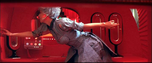
With magnetic and multichannel recording in the 1940s and 1950s, filmmakers could compose very complex sound mixes, and later improvements offered still more possibilities. After Star Wars and Close Encounters of the Third Kind, we expected a movie to be an immersive audiovisual experience, like the light show at a rock concert. Scorsese, especially in Raging Bull and Goodfellas, created powerful mergers of music, sound effects, camera movement, and character movement. So did the Hong Kong kung-fu films of the 1970s and early 1980s. The spellbinding languor of Wong Kar-wai’s films stems largely, I think, from their synchronization of color, slow motion, drifting camerawork, and evocative music.
The avant-garde has pursued more elusive synchronizations of sense modes.The idea of synthesis was floated in the silent era, when experimenters like Oskar Fischinger used musical pieces to anchor their abstract imagery. This tendency has resurfaced in music videos, some of which (Michel Gondry’s in particular) have clear links to the experimental tradition. So too do the shorts and features of Peter Greenaway, especially in his collaborations with composer Michael Nyman. In a film like Prospero’s Books, Greenaway seems to follow Eisenstein in imagining a Wagnerian synthesis of writing, image, and sound.
By contrast, Godard explores all manner of unpredictable junctures between image and sound, with the tracks teasing us but always avoiding a complete coordination. Somewhat similar are the disjunctive image/sound juxtapositions in Peter Kubelka’s Unsere Afrikareise and Bruce Connor’s Report, or the inverse and retrograde organizations of Structural Film soundtracks like Michael Snow’s Wavelength and J. J. Murphy’s Print Generation.
Film academics have begun to analyze image/ sound juxtapositions, studying the development of early talkies and more recent Dolby technology. Arguably, film researchers now pay more attention to music than they pay to imagery. By contrast, most journalistic critics ignore a film’s soundtrack, except occasionally to comment on line readings and pop tunes. As for ordinary audiences, perhaps DVD and home theatre technology have made people more aware of how movies can saturate our senses with audiovisual correspondences.
Three waivers
1. Once I floated these distinctions in a seminar discussion, and a participant mentioned that cinema was also an emotional art. I’d agree that a lot of cinema aims at arousing feelings, but this idea can be found in all the dimensions I traced. Each conception of film favors different means of stirring up emotion.
For example, the photographic approach holds that recording and revealing the world is the most effective way to move spectators, while the narrative approach favors stories as the means to that end. The performance-based approach trusts that we’ll react empathetically to the emotional states displayed by our fellow humans, but the visual-art approach says that cinema can arouse feeling by manipulating pictures in time and space, perhaps even pictures that don’t show any people at all. Eisenstein argued that synchronization of senses was the most powerful form of emotional stimulation, creating in the viewer an “ecstasy” comparable to religious fervor. Beyond these general considerations, it would be worthwhile to tease out the different sorts of emotion that each perspective tends to emphasize.
2. Someone else might ask: What about other analogies? Filmmakers and critics have sometimes compared cinema to music or poetry. Shouldn’t those arts be added to the list?
I think that these comparisons show up principally within the broad idea of film as a pictorial art. The French Impressionist directors of the silent era thought that they were making “visual music,” and Brakhage and Deren’s conceptions of the “film lyric” were mainly pictorial. (See girishshambu for thoughts on the latter.) I’d suggest that filmmakers in the pictorial-art camp have looked to these adjacent arts for models of patterning (meter, rhythm, motif development) and imagery (metaphor and subjective states in lyric verse). Filmmakers are also attracted to the idea that music and poetry tend to be suggestive rather than explicit, conveying powerful feelings in elusive and open-ended ways.
Polemically, filmmakers often conjure up these musical and literary analogies to counter the mainstream cinema’s emphasis on narrative and performance. If we think of film as lyric or rhapsody, story seems less important. The same thing goes, I think, for thinking of film as moving architecture or kinetic sculpture; the analogy again targets film’s pictorial dimension and its non-narrative potential.
3. To think of film as having an affinity with another art form isn’t to say that they’re identical. Thinking of cinema as a performance-based art, for example, doesn’t commit you to saying that film acting is the same as theatrical acting. Instead, thinking along these lines seems to create a first approximation, an initial comparison that lets you move on to notice differences. Once you consider film as a pictorial art, you can then ask in what ways it differs from other pictorial arts, or in what ways this particular movie transforms or reworks the techniques of painting. Ballet Mécanique, which we analyze in Film Art (pp. 358-366), owes a lot to cubism, but its imagery isn’t identical to what Picasso, Braque, and Gris came up with on canvas. All of these analogies seem to work best as frameworks for sensitizing us to both similarities and differences between film and other arts.
And . . . so?
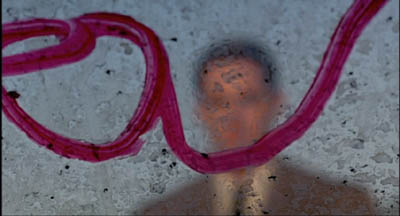
Twin Peaks: Fire Walk with Me.
Each conception of film art harbors a good portion of truth. Each may fail to cover all of cinema, but for certain types of film, or particular movies, some are likely to be more helpful than others.
For example, it’s useful to consider David Lynch as making audiovisual works, in which blinking lights or grooves in pine planks seem uncannily synchronized with throbs and hums and Julee Cruise vibrato. Very often story and acting seem to precipitate out of an enveloping pictorial/auditory atmosphere. This isn’t to say that you couldn’t study narrative or performance in Lynch films; it’s just that taking up the audiovisual-mix perspective will throw certain aspects into sharper relief.
You could also argue that the Hollywood studio era blended many of these appeals into a single strong tradition. Story was important, but so was performance. Visual style was often striking, but so too was an expressive soundtrack that went beyond simply recording the dialogue. Sound effects, musical scores, and verbal hooks between scenes created imaginative resonances with the image track. Contrariwise, we can see some avant-garde traditions as taking a purist tack. In several of his films, Brakhage reduces narrative, purges performance, and bans sound: we have to engage wholly and solely with a pictorial experience.
Just as we can distinguish film traditions along these dimensions, we can contrast writers and thinkers. Some critics are very good in pinning down performance qualities, others excel at plot dissection or visual analysis. Arnheim is sensitive to pictorial values but he has little to contribute to understanding storytelling.
Bazin and Eisenstein are attuned to several of the dimensions I’ve traced out. Bazin’s interest in cinema’s photographic basis also alerted him to pictorial possibilities, like deep-focus and camera movement. Eisenstein, famous for his ideas on cinema’s visual dimension, was as I’ve said interested in sound as well. He was no less concerned with film performance, which he conceived as expressive movement (to be synchronized with properties of the image and the soundtrack). But he voiced almost no interest in narrative or photography.
I warned you that this blog would be theoretical, but I hope the takeaway message is clear. Cinema is teeming with artistic possibilities, and each of these frameworks can illuminate certain areas of choice and control. We don’t need to pick a single creed to live by, but we deepen our understanding of film by being sensitive to as many as we can manage.
