Archive for the 'Directors: Eisenstein' Category
The Getting of rhythm: Room at the bottom
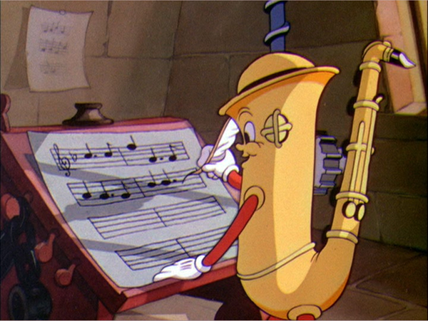
Music Land (Disney, 1935).
DB here:
“The great directors, I’ve learned, have a great sense of rhythm.” So says Alexandre Desplat, who’s again earned two Oscar nominations in the same year (for The Imitation Game and The Grand Budapest Hotel). The statement sounds true but vague. Musicians and musicologists have a firm sense of what the term rhythm means, but how can we understand it in relation to movies?
Well, surely it refers, at least, to the rhythm of the music we hear in the film. But we usually think there’s more involved. There’s rhythm in the movement on the screen. The people and things we see can be infused with a beat and tempo and pace. (Critics of the 1920s considered Chaplin a dancer, like Nijinsky.) There’s a rhythm to the combination of images too, as everybody who’s tried film editing knows. And we think that the story can be told in a way that has a distinctive pace–narrative rhythm, we sometimes call it. But how do these components work together to create an overall rhythm for the film?
When synchronized sound recording entered movies, critics and filmmakers worried a lot about this problem. Filmmakers who had mastered visual storytelling in the silent era had to figure out how to merge spoken language, music, and sound effects with the flow of images. The lazy solution was simply to shoot plays, filling the scenes with dialogue. But both audiences and critics missed the dynamism of silent films. Talkies were too talky.
The opposite solution, to eliminate words as much as possible and simply use music and sound effects, was of limited value. After all, silent film needed the written language of intertitles to make the story clear; why give up the advantages of spoken language? But how then to integrate image and sound into something that engaged the audience–not only through the film’s story but also, perhaps more deeply, through that elusive quality called rhythm?
Today this debate may seem sterile. We think filmmakers have solved the problem. Maybe they have, collectively, but each one faces it at every moment. How do you blend movement, music, pictorial composition, sound effects, and dialogue to create an overall pace that will benefit your movie? No single recipe will work. The rhythm of the Coen brothers’ Raising Arizona is very different from that of No Country for Old Men. Both Gone Girl and Non-Stop are thrillers, but Fincher’s pacing is far more deliberate and understated than Collet-Serra’s; yet both take hold of us.
Filmmakers solve the problem of rhythm in practice, often brilliantly. Those of us who want to understand how films work, and work upon us, want to get specific and explicit. What is this thing called cinematic rhythm? What contributes to it? Can we analyze it and explain its grip? Very few scholars have tackled these questions; they’re hard. In her new book, Film Rhythm after Sound: Technology, Music, and Performance, our friend and colleague Lea Jacobs takes us quite a ways toward some answers.
Mickey-mousing redux
Lea starts from the assumption that the debates of the early 1930s are still relevant. So she looks at some much-praised examples of sound/image integration: the musicals of Mamoulian and Lubitsch and the cartoons from the Disney studio. She studies these paradigm cases more closely than anyone has before. She also goes beyond them to consider the theory and practice of Eisenstein (a big admirer of Disney) and the handling of dialogue in Howard Hawks’ work from The Dawn Patrol (1930) to Twentieth Century (1934).
Central to Lea’s inquiry is the notion of synchronization. How can distinct moments in the image flow, the sound flow, and the narrative action be pinched together, like the toothpick pinning the ingredients in a sandwich? One answer is to rehabilitate the old idea of mickey-mousing. Mickey-mousing makes the patterning of the sound match, in some way, the pattern of onscreen action. Mickey-mousing has had a bad press, but Lea shows that if we look at it afresh, it offer a solid point of departure for thinking about rhythm.
Eisenstein develops the idea of sync, in a fresh but still general way, in his notion of “brickwork” structure–the non-coincidence of image and sound, like the staggered array of bricks in a wall. That is, your cut shouldn’t come on the beat (are you listening, music-video directors?). Save your sync until it can have maximum impact, ideally through accenting some action in the image and maybe a high point in your drama. This is a step beyond the duality synchronous/asynchronous sound that was floated in the early 1930s. Eisenstein shows how all the different lines of pictorial and auditory movement can be woven in a flow that will create various degrees of emphasis. In this “wickerwork” pattern (another of his metaphors), actor movement might coincide with a melodic run rather than a beat, and the cut might accentuate a line of dialogue while the music subsides. Or instead of Hollywood’s underscoring, the music might be abnormally loud, doubling and clashing with dialogue in a “Godardian” manner. At certain moments, several accents in these lines could hit simultaneously. Just as important are the moments when the imagery and the mix get thinned out so that a single element–a word, a chord, a gesture–is isolated.
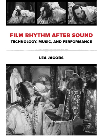 The key example comes from Ivan the Terrible, Part I, in which the ailing tsar asks the Boyars to kiss the cross in allegiance to his baby son Dmitri. In unprecedented detail, Lea tracks how the melody, meter, motifs, orchestration, and dynamics of the music fluctuate in relation to staging, line readings, and narrative developments. In a passage lasting only six minutes, she shows how–as so often happens–Eisenstein’s practice outruns his theory and creates a rich audiovisual texture at an almost microscopic level.
Rhythm is constructed frame to frame, sync point to sync point, and involves very small durations of a half second or a quarter second. This proposition may seem obvious to anyone who has been involved in editing or scoring film music. Classical Hollywood click tracks measured tempi to fractions of a frame, as defined by the sprocket holes, and there are clear indications that composers and editors haggled over durations of five or six frames.
This urge to “think small” and study the finest grain of image and sound carries through Lea’s analysis of rhythm in Disney cartoons. Some have accused Eisenstein’s Ivan of being a live-action cartoon, and there’s no hiding either the old man’s admiration for Disney or his belief that cinema was capable of highly “engineered” effects. Still, music and its mickey-mousing possibilities determine animated films even more strongly than live-action ones. Lea takes Disney’s early sound films as experiments in synchronization.
Early sound cartoons are sometimes characterized as “prisoners of the beat” because they create cycles of motion that are lined up with the musical meter. Lea traces how Disney animation became more fluid and flexible, syncing more around sound events than around rigid beats. She illustrates her case with analyses of Hell’s Bells (1929), The Three Little Pigs (1933), and Playful Pluto (1934). The last two are widely regarded as classic Silly Symphonies, and she sheds fresh light on them through the sort of micro-analysis brought to bear on Ivan.
She shows how sections gain a fast or slow tempo through the interaction of many factors, of which shot length is only one. In particular, Disney directors could change pace through a tool that Eisenstein didn’t have: altering the frame rate of animation. Normal animation is “on twos”; each drawn frame is photographed twice, to last for two film frames. Many stretches of the Disney cartoons are on twos, but sometimes, to create vivid sync points, the filmmakers go “on ones,” allotting one frame for each drawing. This is more expensive and time-consuming, but it allows for the sort of fine control of pace that we find in The Three Little Pigs. There the Wolf launches into “a jazzy, up-tempo gallop” that accelerates the danger bearing down on the pigs. In a similar way, Playful Pluto creates variety by “matching movement to different fractions of the beat and establishing differential rates of movement within the shot.” Imagineering, for sure.
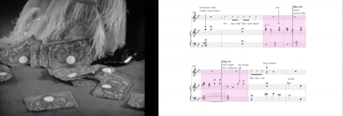
How to convey this fine-grained analysis on the page? Lea uses the familiar tactics of presentation: verbal description, musical scores, and frame enlargements. But she goes farther. At great effort and expense, she has constructed analyses of key passages as video clips, with the film scene running in interlock with a highlighting bar that shifts across the score. Annotations on the score mark actions and sync points. These analyses are designed to be watched as you read along in the book. You’ll see some frame grabs in this entry, but to watch them simply go here, select the Audio/Video tab, and choose what you want to see from the menu. This is a real step forward for film scholarship, and the University of California Press should be congratulated for helping her take it. Why shouldn’t every film book hereafter come garlanded with clips?
No age for rhythm
Monte Carlo (1930).
Okay, you might say. Rhythm is of concern to top-down audiovisual masters like Eisenstein and Disney. But there are other notions of film as art–for instance, that performance is central to its storytelling. Lea shows that, again, early sound film explored a more open and porous integration of music and image. Ernst Lubitsch, as Kristin has shown, was one of the masters of image-based cinema in the silent era. Yet as soon as sound came in, he was exploring how to blend music with the mercurial repartee and attitudes of his sophisticated characters. Rouben Mamoulian, who had indulged in sync experiments in the theatre, contributed as well to a broader trend that gave music a central role in structuring scenes.
The result wasn’t exactly “musicals” as we usually understand them, although there might be song numbers; instead, the music worked its way into the crannies of the scenes–pauses in the dialogue, moments when characters cross a courtyard or boudoir. Thanks to post-synchronization (music performed after the film was shot and cut) and sync-to-playback (prerecorded music played on the set during performance), early sound films could boast a tight rhythmic bond of performance style and musical accompaniment. That created a sort of cinematic operetta, one no longer bound to a theatrical space. In “Isn’t It Romantic?” in Mamoulian’s Love Me Tonight (1932), a song begun in a tailor’s shop is passed along through Paris, onto a train, to the open road (soldiers march to it), and eventually to a gypsy campfire, where the heroine hears it from her balcony.
Most historians find strong similarities between such passages in Love Me Tonight and scenes in Lubitsch’s Monte Carlo (1930), but Lea contrasts them. She argues that Mamoulian’s film is more like early Disney in syncing music one-to-one with figure movement and camera movement. Lubitsch (although working earlier than Mamoulian) is interested in synchronization at another level, linking musical segments to dramatically coherent parts and wholes. She shows how one sequence in Monte Carlo accelerates its techniques to culminate in a patter song, creating a curve of rhythmic interest that sculpts the scene’s overall shape. Significantly, as in the famous choo-choo “Beyond the Blue Horizon” number, the song uses noises rather than music to launch its rhythmic arc.
The case-study method leads Lea to some generalizations too, as in her survey of manners of dialogue underscoring. This section of the books seems to me especially rich, because it shows how tactics of underscoring associated with the 1930s “symphonic” scores were already available, at least sketchily, in the early years of sound. At the same time, she’s able to distinguish some creative options, such as the conversion of patter songs to a more conversational tempo, that seem very distinctive of these early sound films and not their successors. She and other scholars can now build upon her survey to track a variety of styles of dialogue underscoring.
 Okay, again, but these early musicals are still very pre-structured, you might say. What about movies that don’t rely on music so much and that give the actors more freedom during shooting?
Enter Howard Hawks.
The book’s last in-depth analysis is devoted to probably the trickiest aspect of the whole problem: rhythm in speech, performance, and narrative. Lea points out that sound film acting required quite exact timing of pauses, glances, gestures, movement around the set, and deployment of hand props–probably tighter timing than in the silent era, with its shorter takes and greater scene dissection. (Consider how often a silent film gives us a close-up of a hand picking up something; in talkies, picking up something seldom gets that emphasis, so that the actor has to integrate the action into the flow of the full shot.) In sound filming, the shooting of the scene and the actor’s performance choices limited what an editor could do to slow it down or speed it up.
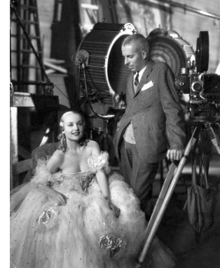
Hawks is a notoriously difficult director to analyze because he doesn’t have an obvious signature style at the visual level. His conception of cinematic art relied upon his players. He famously developed his scenes slowly, letting actors improvise, asking screenwriters to recast the scene, and working out the blocking gradually. In this actor-centered cinema, we’re often told, a lot of the Hawksian tang comes from overlapping dialogue. Lea points out, though, that overlapping dialogue was already in wide use on the theatre stage and Hawks was comparatively late in importing it to film. His earliest 1930s experiments don’t owe much to it, largely because early sound technology couldn’t discriminate voices very well. Lea breaks new ground in showing other ways in which speech patterns, regulated through rhythm as well as pitch and timbre, not only contribute to characterization but supply that zesty bounce we associate with the Hawksian world.
His tactics include shifting actors around the set, letting background and foreground sound alternate in clarity, and shortening scenes. Lea goes on to show how these and other options led Hawks to create the “tough talk delivered in a tough way” that became one of his hallmarks. By measuring the length of actors’ lines in seconds and fractions of a second, she’s able to track a subtle orchestration of voices–long speeches delivered fast (or slow), short speeches delivered slow (or fast), and many varieties in between, all interwoven. Overlapping comes in occasionally, as icing on the cake. When it does, especially in Twentieth Century, Lea is ready to specify it, showing how syllables and phonemes are stepped on or cut off.
Now the control freaks aren’t the directors, the Eisensteins and Lubitsches, but the actors. Working together, they plan their lines, expressions, and gestures down to the word. They make their own music. Hawks, says Lea, gives us rhythm “without benefit of a beat.”
Film Rhythm after Sound is a breakthrough in showing how narrative cinema masters time in its finest grain. We’re used to talking about scenes, shots, and lines of dialogue. Lea has taken us into the nano-worlds of a film: frames and parts of frames, fractions of seconds, phonemes. As Richard Feynman once said of atomic particles, “There’s plenty of room at the bottom.” Of course Lea doesn’t overlook characterization, plot dynamics, themes, and other familiar furniture of criticism. But she shows how our moment-by-moment experience depends on the sensuous particulars that escape our notice as the movie whisks past us. We can’t detect these micro-stylistics on the fly. Yet they are there, working on us, powerfully engaging our senses. Film criticism, informed by historical research, seldom attains this book’s level of delicacy. Analyzing a movie’s soundtrack will not be the same again.
Rebooked
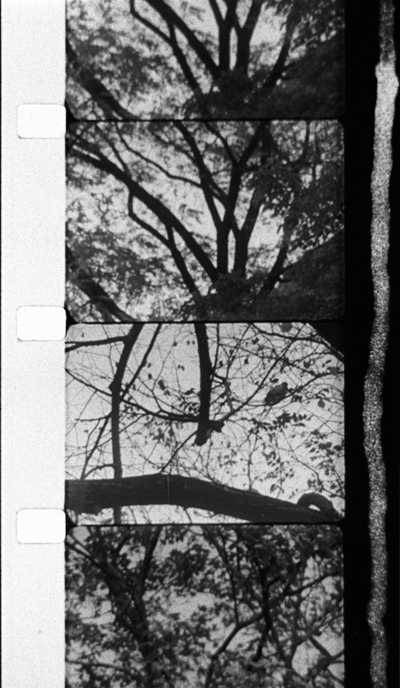
3/60 Baum in Herbst (Kurt Kren, 1960). Hand-drawn soundtrack.
DB here:
It’s time again to write up books that fate and friends have sent my way. And I do mean books, as in printed matter on paper held together by string and glue and wrapped in a decorative cover.
Nothing against e-books, mind you. I’ve put out a couple myself (see right sidebar), and I’ve become more inclined to use them for my research. Every academic sometimes needs to read only parts of a book–a chapter that touches on your project, a bibliography that can help you, chatty footnotes that can suggest a new idea. If your library hasn’t got a copy and Inter-Library Loan is difficult, an e-book can be worth the investment. The only real problem is the prospect of buying, in any format, a book that you must read but that you know will be dire. (Names and titles omitted for the sake of the new year’s mood.) Then at least the e-book, being less expensive, can mitigate the pain of paying, if not of reading.
Direness isn’t on the agenda for the books I have on the desk today. All are worth your attention, in whatever format you can get them.
Before Jan Wahl became a prolific writer of children’s books, he left the US to study in Denmark. There he had the great fortune to be a dogsbody for Dreyer on the making of Ordet. Wahl left the country after the exterior shooting, but he kept in touch with Dreyer for some time afterward. His daily notes of their conversations were vetted and corrected by Dreyer, in hopes of eventual publication. Now, nearly sixty years later, the book has arrived.
Dreyer took a shine to the young Fulbright student and confided to him ideas about his earlier work and his plans for his Jesus film. Dreyer was at that point fairly undecided about many aspects of the Jesus script, including how to end the story. But these are sidelights compared to the central action of Wahl’s memoir, the making of Ordet in the cloudy and rainy summer of 1954.
 Despite the inhospitable weather, Dreyer planned and shot much more action in exteriors than appeared in the final film. The film’s hermetic “theatricality” seems to have been arrived at through pruning landscape images and shots of characters coming and going. An especially intriguing shot of Anne and Anders meeting in a field took a great deal of time:
Anne sets out to deliver a pair of trousers for her father, Peter Tailor, but she takes the long way around in order to have a tryst with Anders. The lovers meet in the field, lingering at a corner in the rye.
The camera had a long traveling movement, its tracks laid on a wooden platform in the shape of an immense letter L whose angle was parallel to the field. On that day, between three and five o’clock there was sufficient light for five takes. . . .
We’re also reminded of Dreyer’s fastidiousness—arranging sheep in ranks around the Borgen farmhouse and demanding that 1925 newspapers should line the drawers in the household. (Seeing a recent paper would “break the spell of concentration should an actor happen to see it.”) It’s a pity that Wahl could not stay through the whole production, which moved to the Palladium studio in the fall, to provide more details like this.
Just as ingratiating are Wahl’s accounts of the village where the film was shot, a tiny place taken over by Dreyer’s project. Wahl lingers over hearthside meals in a land where coffee has almost sacramental significance.
“There is something about coffee that soothes the Danes,” [Dreyer] said, “and puts them in touch with God. . . . On the winter days, which last so long here in Jutland, a warm cup is a balm; they take everyday communion in it.”
The primary value, I think, of Carl Theodor Dreyer and Ordet lies in atmospheric moments like these. I’ll always remember Wahl’s portrait of the gentle but obstinate Dreyer at sixty-five: dreaming of a film on Christ, smoking cigars, and tossing pastry crumbs to the bird that visits his garden every afternoon at three-thirty.
Pop quiz, hot shots:
What firm had the initial idea for VOD rentals? (Hint: Not Netflix.)
What firm had the initial idea for video kiosks? (Hint: Not Redbox.)
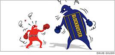
The answers, along with a solid story, can be found in Netflixed: The Epic Battle for America’s Eyeballs. Gina Keating’s brisk business reportage pits upstart Netflix against the well-entrenched Blockbuster in a cage match worthy of its title. Keating starts by demolishing Reed Hastings’s tale that he conjured up the service when he was annoyed by late fees on Apollo 13. In fact, tech entrepreneur Hastings entered the start-up as a fairly passive money guy, while the more retiring Marc Randolph devised the Netflix business model, which included what Keating calls an “intuitive user interface and peerless customer service.”
Keating shows how Randolph’s idea for an online video store on the Amazon model tapped into the expansion of internet retail. Randolph, according to Keating, “had what it took to conceive and launch Netflix. What came next—ruthless optimization and relentless growth—were not his strong suits.” By 2002, Randolph had left the company and Hastings ruled.
 In counterpoint Keating chronicles Blockbuster’s ups and downs, mostly downs. It was already feeble when Netflix launched, and Viacom was perpetually trying to unload it. The decline was evident, however, in 2007 with the coming of CEO Jim Keyes, who had turned around 7-Eleven. Keyes decided to try to make Blockbuster outlets into “full-service entertainment destinations” where, according to Keating,
. . . customers would drop in for pizza and a Coke, or buy a book or a flat-screen television or hang out with their kids on weekends while waiting for a movie to download.
It was at this point that the Onion posted its YouTube video of the Living Blockbuster Museum. Still, Blockbuster should be credited with seeing the future of VOD. Execs tested it in 2001 (answer to Question One), but the concept had to wait until Internet access widened and download speeds picked up.
Netflix made missteps too. The firm let the staff who developed the video kiosk concept depart and form Redbox. (Answer to Question Two.) Hastings was also caught off-guard when Blockbuster Online began to surpass Netflix’s customer base. Still, you come away largely admiring the adroitness of the company. I hadn’t realized the power of Netflix’s software innovations, especially its recommendation engines.
Netflixed concentrates on major players, but Keating does introduce many economic-structural factors to provide higher context. And concentrating on personalities makes for a gripping read. Hastings, who declined to be interviewed for the book, is depicted as a math-mind who could inspire software engineers but who dealt coolly with human feelings in a way reminiscent of Steve Jobs. Carl Icahn, who stalks through many other histories of modern US media, has his moments too, mostly ones of fulmination.
Non-fun fact: A 2005 survey indicated that only 22% of Americans preferred to see a movie in a theatre rather than at home on video. And this was before the surge in VOD.
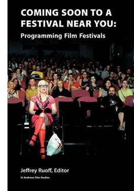 Netflix treated the Sundance Film Festival as a venue for dealmaking and PR. This is just one measure of the importance of such events for film as an art and a business. For decades our bookshelf devoted to film festivals harbored only a few volumes, mostly official histories of Cannes and Venice. By now, however, “festival studies” has become a teeming area of research. This is all to the good. International film culture after World War II, as we pointed out in Film History: An Introduction, has depended centrally on festivals, and film historians have to realize that these gatherings shape the history of cinema in many ways.
Jeffrey Ruoff’s new volume, Coming Soon to a Festival Near You: Programming Film Festivals, gathers several essays about the principles and pragmatics of deciding what’s shown. As Ruoff claims in his introduction, festivals perform many functions: they “celebrate film as an art, affirm different kinds of identity via film, [and] facilitate the marketing of films.”
Given these missions, the programmer functions minimally as a critic who aims to satisfy the audience’s tastes while steering it in novel directions. But the programmer can also be a celebrity in him- or herself, making the festival an extension of the programmer’s tastes, as happens with Michael Moore (Travers City), Roger Ebert (Ebertfest), and Tony Rayns’ Asian selections at Vancouver. This is what Ruoff calls the programmer as auteur.
The programmer is also a historian—reviving work from the past in retrospectives, while acting as a kind of future historian, laying down the conditions for later development in cinematic sensibility. The praise awarded to Bergman and Antonioni at 1950s and 1960s European festivals created a narrative of artistic development that historians who followed would elaborate.
Coming Soon to a Festival Near You offers a potpourri of pieces, from academically inflected accounts of festival history to personal memoirs from programmers and critics. Focus Features producer James Schamus provides a pungent entry on the economics of red-carpet galas, and Bill Pence, a long-standing fest entrepreneur, recounts the development of Telluride. All in all, Ruoff’s volume helps us understand the role of festivals as tastemakers and gatekeepers of world cinema.
 “It is a country, culturally speaking, that respects its avant-garde filmmakers, present, past, and future,” writes Adrian Martin. He’s describing Austria, from which comes the magnificent volume Film Unframed: A History of Austrian Avant-Garde Cinema. Peter Tscherkassky, a major filmmaker himself, has created a collection that manages to be at once sweeping and in-depth. Many of us (but not enough) know work of the “old” masters Peter Kubelka and Kurt Kren, but this anthology skips back to the early 1950s. There we find artists like Kurt Steinwendner, whose Der Rabe (The Raven, 1951) looks to be a stark exercise in neo-Expressionism, done to electronic music.
As the chapters move toward the present, some names and films were familiar to me, most were not, but all emerged as intriguing and provocative. The diverse directions of experimentation are traced by some of our best writers (Maureen Turim, Jonathan Rosenbaum, Steve Anker, Andréa Picard, and Christoph Huber, among others). The hefty volume is filled out with color photographs and many pages of -graphies: bio-, filmo-, and biblio-.
Martin’s foreword, from which my initial quotation comes, sets the stage for a comprehensive reappraisal of this major tradition. We have to thank the film collective sixpackfilm and the Austrian Film Museum, which has become a leader in publishing books and DVD editions that mightily expand our horizons. Thanks also to the government subsidies that allow the book to be available at a very decent price. Next up, one hopes: A big fat DVD compilation.
In the fall of 1988 there materialized at my office an elvish man with a neat white beard and a Compaq laptop. He was perpetually smiling, and he soon revealed why: he had one of the quickest wits and sharpest senses of humor I’d encountered. The Lilly Endowment had awarded him a year’s grant to improve his knowledge of film. Very sensibly, he came to UW.
The faculty all welcomed him, and he became friends with Kristin and me. Tapping away quietly on his laptop, sitting on the far side of the front row (to keep plugged in), he took the most extensive and precise notes on my blahblah that I have ever seen. Recalling those days, I have to smile when I realize that the oldest person in the class was the only one who brought a computer. His notes circulated in samizdat among the grads for years.
 His name was Peter Parshall. A film fan from his youth, Pete had taught film and literature at Rose-Hulman Institute of Technology. He became famous as a beloved, highly demanding teacher: the student slogan was “Peter Parshall picked apart my perfect paper.” After his year in Madison, Pete went on a Fulbright Award to teach American film at the Technical University of Dresden. He retired from Rose-Hulman some years ago but kept active (bicycling, especially) and still teaches film courses.
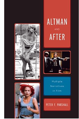
Now Pete has published a probing book on a broad storytelling strategy that goes by many names—thread structure, hyperlinked plots, network narratives. Altman and After: Multiple Narratives in Film provides incisive analyses of several films, while also offering an illuminating set of categories for understanding them. Nashville is a “mosaic narrative,” an effort to surrender forward-driving plot in favor of fragments that pull the characters into teasingly incomplete patterns. Network narratives, with intersecting and culminating plotlines, are exemplified by Pulp Fiction, Amores Perros, Code Unknown, and The Edge of Heaven.
A new and intriguing category is the “database narrative.” Here the film launches a set of events but then replays them differently, providing alternative pathways for events. Sometimes this strategy is motivated as reflecting different points of view, as in Rashomon. But other tales question the very solidity of the narrative world, as in The Virgin Stripped Bare by her Bachelors, Run Lola Run, and The Double Life of Véronique.
Pete’s book has already received praise, with Sarah Kozloff noting in Choice: “For several of these films, Parshall’s discussion is the best analysis available, and teachers and students have much to learn from his searching intelligence.” Altman and After is a fine addition to the growing list of books seeking to understand the permutations of today’s cinematic storytelling.
 Torkell Saætervadet, a Norwegian expert on film technology and cinema design (and on aviation!), won our thanks with his authoritative 2005 text The Advanced Projection Manual. Now the International Federation of Film Archives, which co-sponsored the earlier volume, has brought out his new FIAF Digital Projection Guide.
It’s a comprehensive overview, written with great lucidity and packed with charts and specs. Sætervadet covers the Digital Cinema Package file system, projection systems, 3-D systems, sound formats, and best practices for projectionists, including advice on preparing one’s own DCP hard drive. Along with judicious presentation of rival formats, Sætervadet provides informed opinions, including a persuasive account of why 4K projection is much to be preferred to 2K. As an inveterate sitter in the Raccoon Lodge, I was happy to learn of the importance of the “front-row rule” in measuring resolution in relation to screen size.
This is an indispensable book for anyone interested in current cinema technology. I wish it had been available when I wrote Pandora’s Digital Box. The Guide is available direct from FIAF and from Amazon.uk.
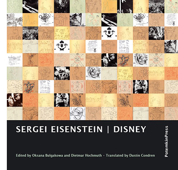
Finally, from the enterprising Potemkin Press comes a new edition of Eisenstein’s writings on Disney animation. An inveterate cartoonist himself, usually somewhere between Cocteau and Keith Haring, the polymath director reflected on Uncle Walt the artist throughout his career, but most deeply while he was at work on Ivan the Terrible. SME made no bones about it:
The work of this master is the greatest contribution of the American people to art–the greatest contribution of the Americans to world culture.
As often happens, Disney furnishes Eisenstein the occasion to launch a fantasia on what he’s been reading and thinking about since the last time he wrote. He hits on the ceaseless, “amoeba-like” change that animation permits and that Disney cartoons exploit. SME’s ruminations lead him into myth, ritual, medieval art, the drawings of Thurber and Steinberg, and much more. Typical is this:
TUSHMAKER’S TOOTHPULLER by John Phoenix, of course, stands in line with other plasmatic fancies. (Never observed this before.) Now I’ve just read some verses on the same topic by Walter de la Mare….
Much of the material is irreducibly private and may never be fully understood. Feel free to unleash your own associations on passages like this:
Octopi: Most plasmatic.
Merbabies.
The tiger is a goldfish.
↓
Lawrence.
↓
Horses like butterflies.
St. Mawr like a fish.
Back in 1986, Jay Leyda and Alan Upchurch gave us Eisenstein on Disney, a fine selection from these energetic, perplexing jottings. Unfortunately that book is currently rare and expensive. Now we have Sergei Eisenstein: Disney, edited by Oksana Bulgakowa and Dietmar Hochmuth. Based on recent archival discoveries, it incorporates more pieces and includes a more extensive commentary and an index. Dustin Condren’s translation reads fluently, and there are many illustrations. The editors employ varying fonts to label passages in different languages, although all passages, including SME’s obsessive cut-and-pastes from books, are fully rendered in English.
Oksana’s Afterword provides a historical account of the manuscript and an in-depth guide to the development of SME’s ideas at the period. She’s particularly helpful in explaining Eisenstein’s flirtation with psychoanalytical ideas. She flavors her account by itemizing the archaeological artifacts the researcher encounters:
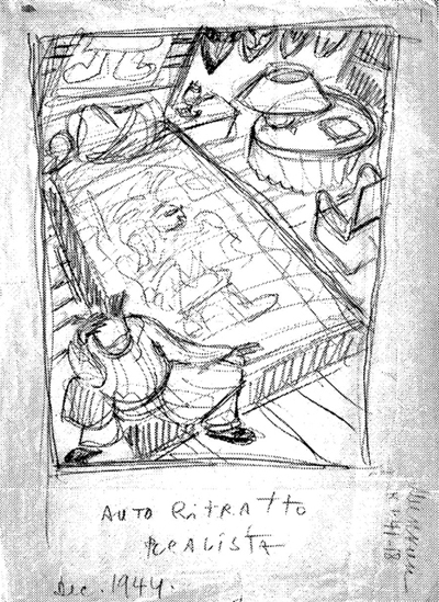
Eisenstein writes on an incredible variety of paper–on the back of his own manuscripts and others’ screenplays, on Mosfilm’s or the film committee’s stationery, on concert programs. The annotations from the year 1944 are scribbled on 1942 calendar sheets. Call numbers for books from the library, telephone numbers, doctors’ prescribed diets, and a grocery list are all found in the text–cream meringues, sultanas, nuts.
When I learn things like this, I like him even more.
Sergei Eisenstein: Disney is a remarkable addition to the Eisenstein literature and ought to provoke lively debate in the animation community as well. But try to find or photocopy the Leyda/Upchurch volume too. It includes SME’s earlier 1932 notes on his drawings, where he floats his ideas about “plasmation,” and it has some different illustrations and its own helpful commentary. Both collections are invaluable to every Eisensteinian, which in a just and righteous world should mean everybody.
P.S. 28 January 2013: Thanks to Manfred Polak for correcting a misspelled name.
Thanks also to Peter Parshall for corrections in my memory of his visit (Compaq, not Apple as I’d said; Lilly grant; 1988; all duly adjusted above.) Details, details. He adds:
You probably don’t remember but the other students complained to you after the first day’s class because of the noise my computer keys made as I clattered away, trying desperately to keep up with the barrage of information coming at me. So when I came up to speak to you in my turn, you suggested that perhaps I shouldn’t use the computer. I was stunned! (All that money! That was one of the very first laptop models manufactured and it had cost a bundle!) The next day, instead of sitting in the back, I sat in the front row so that your voice would drown out my clatter and I announced at the class break that I’d put my notes on reserve. The complaints suddenly stopped.
Then on the first day of spring term, I was startled when a student rushed up to me and asked very anxiously what had happened to my notes!!! (I had taken them off reserve after exams were over, thinking they would no longer be needed.) No, No, he exclaimed. All the students wanted copies for prelims. So I put them back on reserve.
The climax to the joke came three or four years later when I flew into Rochester, NY, for a film conference and taxi-pooled with several other conferees to the hotel. I was delighted to learn that they were all grad students from UW, although I didn’t know any of them. I didn’t mention my name, it being of no scholarly importance, but simply said I taught in Indiana and had spent a sabbatical year at UW. A female voice with a rich British accent popped up from the back seat: “Oh, you’re Peetah Paahshall.” Turns out she had acquired a set of the samizdat. I chuckled at the thought of them still being handed on, from one generation of students to the next. . . . I know I learned a ton that year in Madison and if I could help the learning process for some UW students in return for all your hospitality, I was happy to do so.
Eisenstein, Self-Portrait (1944).
You are my density
DB here:
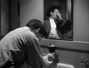
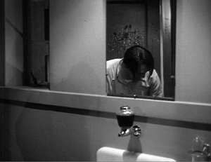
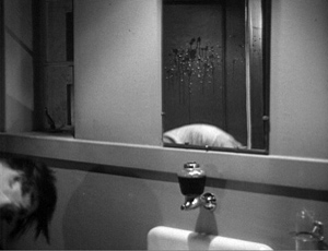
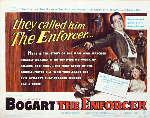
The mobster Joseph Rico is in protective custody; tomorrow he testifies against the big boss. But Rico fears reprisals, so he decides to escape. While a sleepy cop guards him in the washroom, he bends over the sink and rinses his face.
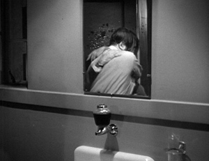
Turning so suddenly that water spatters on the mirror, he grabs the cop in an armlock and slams his head against the sink, just below the frameline.
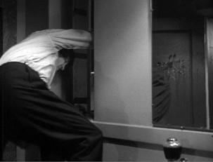
Rico turns to the window to make his escape.
What interests me in this passage from The Enforcer (1951) is not just what happens in the mirror but also what happens on it. While Rico belabors the cop’s head, we’re given a chance to notice the splash of water that hit the mirror when Rico whirled to the attack. While the action is moving forward, we’re reminded of what had triggered it.
We get a sort of parallel reminder in the next scene, when we see the wounded cop again. He’s sporting a big bruise on his left temple, a souvenir of Rico’s assault.
Pfui. Details, you might say. Or you might (correctly) instance this as another case of Charles Barr’s enlightening notion of gradation of emphasis. But it’s worth getting a little more specific, because even this simple scene (by non-auteur director Bretaigne Windust) offers us something to think about, and something for today’s filmmakers to try.
Most films today don’t fully exploit the visual dimension of cinema. True, we have dazzling CGI and fancy camera moves. But when it comes to less flamboyant scenes, directors have limited their options by relying too much on stand-and-deliver and walk-and-talk. There are other aspects of visual storytelling that today’s filmmakers neglect. One aspect is the possibility of gracefully moving actors around the set in a sustained fixed shot. A specific tactic I’ve mentioned before is the Cross, and another involves ways to get people into a room. The option I’m going to sermonize about today is what I’ll call scenic density.
By scenic density I mean an approach to staging, shooting, and cutting in which selected details or areas change their status in the course of the action. I don’t count the bustle of background business, all that street traffic that is so much pictorial excelsior in our movies. Nor do I refer to stuffing the setting with desk and kitchen flotsam, allusive pop-culture posters, and the other distinctive “assets” that will be exploited when the film’s world gets transposed to a videogame. I mean something more expressive and intriguing.
Using it up
Go back to the Enforcer scene. The shot’s composition creates a delimited zone of action. The guard cop is framed tightly in the mirror. When the fight breaks out, it’s initially framed in that mirror–a narrowing of visual importance. Moreover, the shot is designed to highlight the spatter on the mirror. It’s fairly prominent, stuck near the center and, providentially, in the spot that the cop’s head initially occupied. The lighting picks out the drips, and in a shot where the figures move in and out of frame, there isn’t an equally constant center of interest. We’re probably concentrating on Rico’s punishing of the cop, but the dribbles of water remain prominent enough to claim our interest, especially when Rico passes out of frame.
So here’s my first condition for scenic density: the shot keeps several items of dramatic significance salient in the composition.
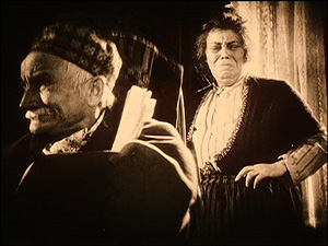
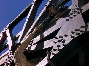
This technical choice asks the filmmaker to think of the frame as a field of dynamic masses and forces. Such an idea was part of the aesthetic of “advanced” European and Japanese silent cinema of the 1920s. Many directors explored this dynamism, often aided by low angles and wide-angle lenses. Here are examples from Eisenstein’s Old and New and Murnau’s Tartuffe.
This pictorial density became especially prominent in American cinema during the 1940s, when low angles, wide-angle lenses, and locations and smaller sets encouraged cinematographers to pack their compositions snugly, as in this shot from Panic in the Streets.
Boris Kaufman, cinematographer for Jean Vigo and Elia Kazan, summed up the principle:
The space within the frame should be entirely used in the composition.
Since cinema is a time-bound art, however, the salient elements in the shot could and should change. But if the frame space is wholly “used,” what room is there for change? The only options are to have the using-up elements shift position, or to reveal that the frame isn’t used up.
Vivid instances, also from the 1940s, can be seen in Anthony Mann’s work, both with and without John Alton. Generally, Mann used the new fashion for depth composition, especially big foreground elements, to heighten scenes of violence. Physical action becomes more aggressive if people rush the camera and halt in tight close-up, especially because wide-angle lenses tend to accelerate movement to the foreground. Mann thrusts violence abruptly to the camera with an almost comic-book effect, as when the club owner is shot in Railroaded, or a man is flung to the floor in Raw Deal.
Even when this in-your-face tactic isn’t employed, the Mann films find ingenious ways to develop what seem to be completely locked depth compositions. In Border Incident, Ulrich confronts the Mexican government agent Pablo, disguised as a Bracero. A looming depth shot is followed by a reverse shot displaying a compact composition.
Is the frame space fully used? The second shot above is opened up when Ulrich leans forward to sock Pablo, creating a vacant spot on the far right for Pablo to fall into. The shot is emptied and re-filled, dense once more.
Memories, memories
Aha, you may be saying. Density just refers to squinchy, fussy shots from an era that favored cheap flash. No. The Enforcer shot isn’t all that cramped. Of course the blank, unchanging walls serve to highlight the mirror-reflected fight and the water dribbling down the glass, but you can imagine how much more jammed and skewed Mann’s treatment of Rico’s escape would be. As for the flashier depth, I just needed some clear-cut cases of density, examples in which details and spatial zones become starkly salient. Now I want to suggest that scenic density can be achieved in something more spacious, even monumental. That has to do with time and memory.
Part of what gives the Enforcer shot its interest is the superimposition of two moments of action in a single space: Rico’s diversionary turn from the washstand, recorded in the splash he made on the mirror, and the struggle taking place a few seconds later. A further trace of that struggle and that splash is visible in the bruise on the cop’s head in the next scene.
That dripping spatter can stand in for the second quality of spatial density I want to highlight: Its capacity to coax us to recall earlier action in the locale. Characters leave their marks and spoors in the space, and those get activated as memories. Unlike the slick surfaces of today’s settings, in classic films the settings can bear the impress of human transit, leading us to recall bits of behavior and emotional states. Let me illustrate from Lang’s Hangmen Also Die (1943).
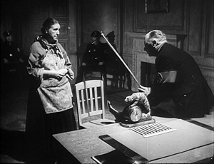
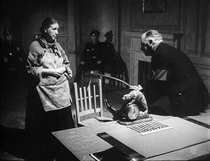
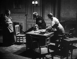
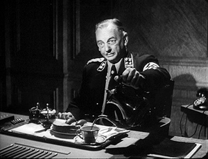
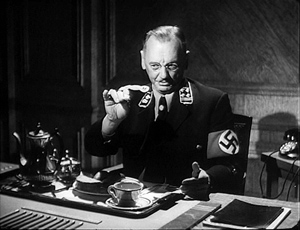
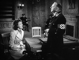
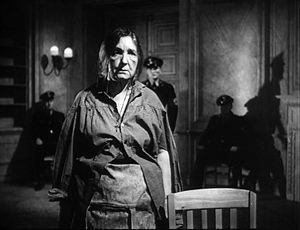
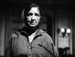
It’s Nazi-occupied Czechoslovakia, and Gestapo Inspector Ritter is questioning Mrs. Dvorak, the vegetable seller who could identify the woman who misled the officers pursuing an assassin. Torture, or at least what we think of as torture, hasn’t started. She is simply standing in front of his desk as he brandishes his riding crop in the manner of a good movie Nazi.
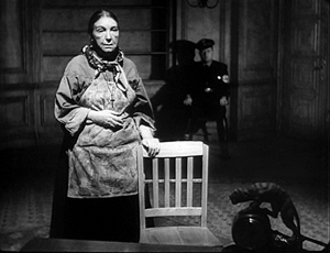
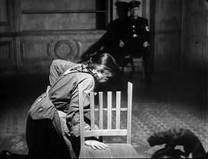
When Mrs. Dvorak denies knowing the woman, Ritter taps the back-rest of the chair. It simply falls off, and we realize it’s not fastened to the chair.
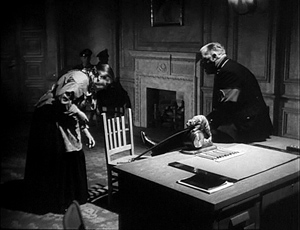
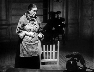
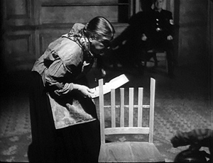
Ritter says, “Pick it up again.” Now we realize that intimidation has been applied for some while; Ritter has made the woman stoop to replace the back-rest many times. She does so again as the camera tracks back. This is nicely detailed too. She starts to pick it up by bending over, finds the effort too painful, and then goes to her knees to pick it up–just as Ritter taps his riding crop against her hand, a teacher gently chiding a slow pupil.
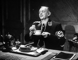
As Mrs. Dvorak rises to put the piece back in place, the camera pans slightly right to pick up the woman bringing in a tray. Happily Ritter sniffs the coffee jug and resumes questioning the old woman.
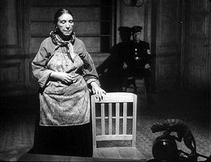
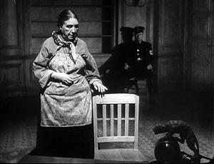
Cut to a shot of her by the chair. “Let’s start from the beginning,” says Ritter, offscreen. Unthinkingly Mrs Dvorak starts to rest her hand on the loose slat, forgetting that the top slat is unattached. It’s a natural response. She’s been standing there for a long time and would like something to rest on, and the chair is temptingly close. (Presumably, that’s its purpose, to taunt the unwary prisoner forced to stand a long time.) Remembering just in time, she yanks her hand away. If she knocks the back-rest off, she’ll just have to pick it up again.
Cut to Ritter. “Don’t be nervous, Mrs. Dvorak. I’m prepared to—”
Cut to Mrs. Dvorak. As he continues, “–devote to you all of tonight,” she forgets herself again and relaxes her hand, this time on the back-rest. It falls off, making her start.
She looks up as Ritter says, offscreen: “Even longer if necessary.” Cut to Ritter, gesturing with a piece of sausage and saying, coaxingly, “Well?”
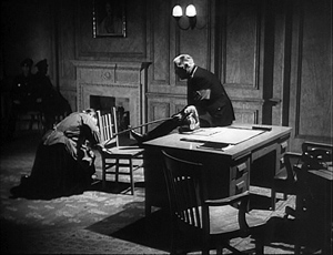
Slowly she goes to her knees again as the camera tracks in on her.
Back to Ritter: “That’s the girl.” Back to her, rising in pain to replace the back-rest.
The scene concludes with Ritter reminding Mrs. Dvorak that she’s in Gestapo headquarters. She acknowledges that she doesn’t expect to leave without giving information. He starts his questioning all over again as the scene fades out.
This quietly suspenseful scene establishes a bit of furniture as a key prop. Once the faulty back-rest is marked for our notice, we’re expected to remember that it’s a means of intimidation–something that Mrs. Dvorak, in her anxiety about refusing to aid the Nazis, twice forgets. Lang’s shots, simple and uncrowded, makes the chair, like the spattered mirror in The Enforcer, preserve the trace of human activity. Yet it’s more acutely integrated into the scene’s drama than the mirror, and remembering how it was used earlier makes us wait tensely to see how it will be used again.
Long-term density
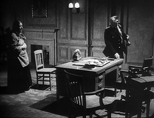
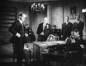
Several scenes later, the Nazis threaten to kill four hundred Czech hostages if the assassin isn’t turned over to them. Mascha Novotny has set out for Gestapo headquarters to denounce the man she helped, but she changes her mind and decides not to betray her country. She will only plead for her father’s life. Once more we’re in Ritter’s office.
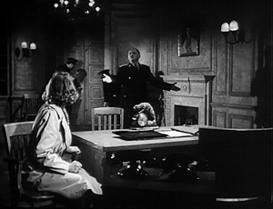
Centered in the frame, standing out as a pale oblong against the grayer background, the fateful chair is made salient during Mascha’s conversation with Gruber. I suspect there’s a sort of spatial suspense here–will she move to the chair and dislodge the precarious piece of wood?–but more important, I think, is the fact that the chair ineluctably reminds us of Mrs. Dvorak and her quiet resistance to pressure.
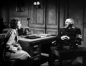
Ritter leaves to consult his superiors. When he comes back, a new composition keeps the chair prominent and lends a new centrality to the clock on Ritter’s desk, surmounted by a snarling cat or something like it. (It’s visible in shadow in the earlier scene with Mrs. Dvorak.) But now the camera arcs to minimize the Dvorak chair and show the beast and Ritter targeting Mascha.
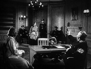
Soon enough, as if to make sure we remember, Mrs. Dvorak is brought back in, having undergone serious torture. The camera positions reactivate our memories of the earlier scene.
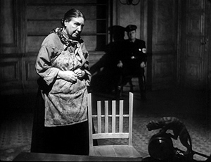
As she continues to lie to protect Mascha, Mrs. Dvorak never touches the chair. Although she has been tortured, she seems wearily defiant, as if her refusal to aid the Nazis has given her some strength: no need to lean on the chair now. As a final cue to our memories, Lang has Ritter play once more with his riding crop, letting its shadow fall on her heart.
The threat is clear: For lying, the old woman will pay with her life.
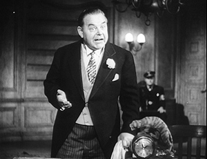
The chair reappears in a later scene, but I’d argue that then it serves more as a pointer to another prop. The resistance movement fights back by framing Czaka, a beer baron sympathetic to the Nazis, as the assassin. Lang could have explicitly recalled the questioning of Mrs. Dvorak by having Czaka lean on the slat and knock it off. Instead, the composition makes Ritter’s clock more important than it was in earlier shots. As Czaka tries to defend himself, the framing blocks our view of the chair but emphasizes the snarling catlike creature on top of the clock. And the chair has shifted a little off and become a bit darker; it’s no longer as salient.
This cluster of scenes from Hangmen Also Die illustrates how scenic density can add layers to a film. One scene recalls another not only by similarity of situation and locale but by tangible marks left on it by earlier action. Having seen Mrs. Dvorak subjected to Ritter’s oily intimidation, we generally expect something like it to be applied to Anna. This conventional situation is given a rich, concrete presentation by the repeated camera positions and the simple chair that, unmoving, enters into the drama.
Of course as a Hollywood director, Lang was pressured to reuse sets and camera setups. That saved money and time. But he turned such repetitions to his advantage by letting certain objects come forward at crucial moments. They not only become part of the drama but prime us to remember them, and what they revealed, in ensuing scenes. And even though Lang never pursued the aggressive, packed deep-focus of other directors working in the 1940s, he shows how roomier, less pressurized compositions could still be charged with echoes of earlier bits of behavior.
Is this sort of visual-dramatic economy, calling on precise memories of concrete actions, lost in today’s American cinema? I suspect it is.
In studying Hangmen Also Die, I was curious about a perennial problem. Was the byplay with the chair a Lang invention on the set, or was it some version of the script, or in the original story by Lang and Bertolt Brecht?
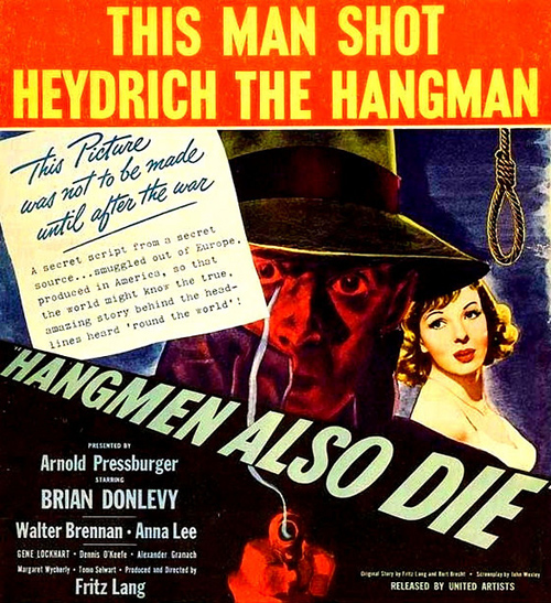
The film didn’t have a secret script, as the poster says, but the sources do remain a bit obscure. A draft of the original story signed by Lang and Brecht, in that order, exists. It indicates only that the greengrocer, called Frau Blaschke, is subjected to eight hours of “the usual Gestapo brutality” and refuses to identify the girl. There were other drafts of the screenplay, but I don’t have access to them, if they exist, and standard sources on Brecht in Hollywood don’t mention this scene’s details.
Somewhere along the line, though, the chair-back business was concocted. I found the shooting script signed only by John Wexley (Brecht claimed that he was robbed of credit) and annotated in pencil, perhaps by Lang. That script indicates that Ritter’s room contains “a vacant chair with its seat close against desk.” and Mrs. Dvorak is standing beside it as the scene begins. Much of the dialogue is the same , with some slight changes notated in pencil, possibly by Lang. But the camera movements indicated are different from those in the final film, and more importantly so are the actions. After Mrs. Dvorak claims that she doesn’t know the woman who helped the assassin, we read the following. I indicate pencil notations with {}.
In her fatigue, she places hand on back-rest of chair. But its dowels are loose and back-rest clatters to the floor.
RITTER (saccharine): Pick it up, Mrs. Dvorak.
CAMERA MOVES IN CLOSE as she obeys, stooping with painful fatigue–she has done this many times tonight.
RITTER: Now put it back in place, Mrs. Dvorak.
(She does so)
As Ritter questions her:
MED. SHOT – MRS. DVORAK. Without thinking, she is about to place hand again on loose back-rest–when she remembers and jerks back.
RITTER’S VOICE: Now don’t be nervous, Mrs. Dvorak…I’m prepared to devote to you all of tonight–and even longer, if necessary.
Mrs. Dvorak, unconsciously reacting to this, once more rests hand on chair. {She jerks back but} The piece of wood clatters to the floor.
MED. SHOT – RITTER. Ritter waits patiently; when she doesn’t move, inquires:
RITTER: Well…?
CAMERA PULLS BACK to INCLUDE Mrs. Dvorak, who stoops to repeat painful routine. Ritter smiles approvingly.
RITTER: That’s the girl.
Nothing here is indicated about Ritter’s riding crop, nor does he initially knock the back-rest off the chair. Mrs. Dvorak does it herself, accidentally. And the scripted line is “Pick it up, Mrs. Dvorak,” not, as in the finished film, “Pick it up again, Mrs. Dvorak.” The film version makes it clear that the byplay with the backrest is part of Ritter’s softening-up technique, something indicated in the script but not spelled out.
The later scenes in the film show other differences, mostly additions of things not mentioned in the shooting script. For instance, the script doesn’t mention the shadow of Ritter’s riding-crop. But the excerpt shows that the shooting script points toward some of the detailing we find in the finished film. It provides the sort of nudges that a director, especially one as oriented to gesture as Lang was, could elaborate on the set.
The Lang/ Brecht story has been published as “437!! Ein Seiselfilm,” in The Brecht Yearbook vol. 28: Friends, Colleagues, Collaborators, ed. Stephen Brockmann (2003), 9-30. The passage I mention, kindly translated for me by Ben Brewster, is on p. 16. Broader background on Brecht’s adventures in Hollywood can be found in James K. Lyon, Bertolt Brecht in America (Princeton University Press, 1980). Chapter 14 of Patrick McGilligan’s Fritz Lang: The Nature of the Beast (St. Martin’s, 1997) offers an account, mostly relying on Brecht’s viewpoint, of the making of Hangmen Also Die. The shooting script is in the John Wexley collection of the Wisconsin Center for Film and Theater Research and the State Historical Society here in Madison. Thanks also to Marc Silberman, renowned Brecht expert, for advice.
Foreground, background, playground
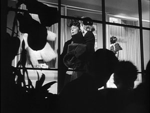
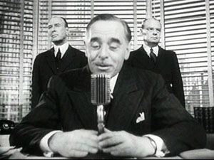
The Devil and Miss Jones (1941); The Hudsucker Proxy (1994)
DB here:
I’ve been waiting for thirty years for Alice in Wonderland. No, not the theatrical release of Tim Burton’s version. That interests me only mildly. I’m referring to the DVD release of the 1933 Paramount picture. I saw it on TV as a kid, and remembered it only dimly. But it bobbed up on my horizon in the summer of 1981 when I was doing research on our book The Classical Hollywood Cinema.
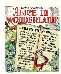 I was in the old Academy library in Los Angeles studying the emergence of certain compositional schemas. I can’t recall what put me on the track, but I requested the shooting script of Alice. What came was Farciot Edouart’s copy, over six hundred pages teeming with sketches for each shot. And a lot of those shots had a startling similarity to good old Citizen Kane.
I was reluctant to attribute pioneering spirit to director Norman Z. McLeod. Instead, I realized that these images’ somewhat freaky look owed more to one of the strangest talents in Hollywood history.
I tried to see Alice in Wonderland, but I couldn’t track down a print. So for years I’ve been waiting to find if it confirmed what I saw on those typescript pages. In the meantime, for the CHC book and thereafter, I’ve bided my time, sporadically looking in on the career of one of Hollywood’s most eccentric creators. He’s the subject of a new web essay I’ve just posted here (or click on the top item under “Essays” on the left sidebar). Today’s blog entry is a teaser trailer for that.
Deep thinkers
It’s commonplace now to say that Citizen Kane (1941) pioneered vigorous depth imagery, both through staging and cinematography. Many of the film’s shots set a big head or object in the foreground against a dramatically important element in the distance, both kept in fairly good focus. But where did this image schema come from?
The standard answer used to be: The genius of Gregg Toland and Orson Welles. In the 1980s, however, I wanted to explore the possibility that something like the deep-focus look had been a minor option on the Hollywood menu for some time. Once you look, it’s not hard to find Kane-ish images in 1920s studio films, from Greed (1924) to A Woman of Affairs (1929).
During the 1930s, William Wyler cultivated such imagery in some films shot with Toland, such as Dead End (1937), and some films shot by other DPs, such as Jezebel (1938). In turn, Toland had undertaken comparable depth experiments in films with other directors. Moreover, yet other directors, notably John Ford, had used this sort of imagery in films shot by Toland and others, such as George Barnes, Toland’s mentor. There are plenty of non-auteur instances too. (See my post on 1933 Columbia films.) We also find similar imagery in films from outside America. Here’s a stunner from Eisenstein’s Bezhin Meadow (banned 1937).
You see how complicated it gets.
What I concluded in Chapter 27 of CHC was that Toland and Welles didn’t invent the depth technique. They fine-tuned it and popularized it. Their predecessors, in the US and elsewhere, had staged the action in aggressive depth and used many of the same compositional layouts. But the wide-angle lenses then in use couldn’t always maintain crisp focus in both planes (below, American Madness, 1932).
Welles and Toland found ways to keep both close and far-off planes in sharp focus. They deployed arc lamps, coated lenses, and faster film stock. Although it wasn’t publicized at the time, we now know that some of the most famous “deep-focus” shots were also accomplished through back-projection, matte work, double exposure, and other special effects, not through straight photography. Again, though, this tactic was anticipated in earlier films. One of my favorite examples comes from a matte shot in Mr. Moto’s Gamble (1935).
Menzies seems to have planned for similar fakery. In the script for Alice in Wonderland we find: “CLOSE UP, leg of mutton. The room and characters in the background are on a transparency.”
The flashy depth compositions of the 1920s and 1930s were typically one-off effects, used to heighten a particular moment. Welles and Toland pushed further by making the depth look central to Kane’s overall design and by featuring such imagery in fixed long takes. The prominence of Kane may have encouraged several 1940s filmmakers, such as Anthony Mann, to make the depth schema part of their repertoire. But as the style was diffused across the industry, the hard-edged foregrounds became absorbed into dominant patterns of cutting and spatial breakdown. The static long takes of Kane remained a rare option, perhaps because they dwelt on their own virtuosity.
Digging up films made around the time of Kane, I found many filmmakers experimenting with the look that Toland and Welles highlighted. You can see touches of it in The Maltese Falcon (1941) and All That Money Can Buy (1941). Above all, there are two remarkable movies directed by, of all people, Sam Wood. Our Town (1940) turns Wilder’s play (itself surprisingly melancholy) into a Caligariesque exercise.
Several shots anticipate the low-slung depth, bulging foregrounds and all, that became the hallmark of Citizen Kane a year later.
Our Town also uses postproduction techniques that yield depth-of-field effects you couldn’t get in camera.
Perhaps even more startling is Wood’s Kings Row (1942), with deep-focus imagery that occasionally rivals Kane‘s.
From the evidence I was encountering, it seemed that Welles and Toland’s accomplishment was to synthesize and push further some deep-space schemas that were already circulating in ambitious Hollywood circles. Connecting some dots, I realized that one of the earliest champions of aggressive imagery in general, not just big foregrounds and deep backgrounds, was William Cameron Menzies.
Menzies frenzies
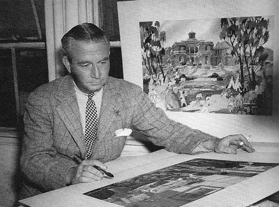
Menzies started out as an art director, most famously for United Artists. He designed sets for Mary Pickford’s Rosita (1923, directed by Lubitsch) and several Fairbanks films, notably The Thief of Bagdad (1924). He won the first Academy Award for set design and went on to a noteworthy career—most famously as production designer for Gone with the Wind (1939). He also directed films, such as Things to Come (1936) and Invaders from Mars (1953). Most significant for my purposes, he was production designer for Our Town, Kings Row, and three other films of the early 1940s directed by Sam Wood. And he designed the 1933 Alice in Wonderland. The drawings I saw in Edouart’s script were by Menzies or his assistants.
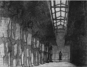
Menzies was one of the chief importers of German Expressionist visuals to the US. Although his early efforts leaned toward Art Nouveau effects, by the end of the 1920s he was cultivating a dark, contorted look keyed to the harsh geometry of city landscapes.
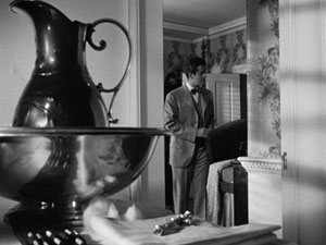
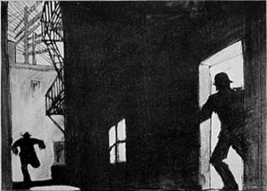
Since the late 1920s, Menzies had explored the possibility of steep depth compositions. He didn’t usually employ a big foreground, but he did favor overwhelming perspective–either abnormally centered or abnormally decentered. Here is his sketch for Roland West’s Alibi (1929) and the shot from the finished film.
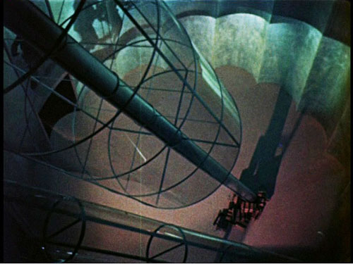
Menzies loved slashing diagonals created by architectural edges and worm’s-eye viewpoints. The harrowing opening of Things to Come is full of such flashy imagery.
Menzies calmed his style down for GWTW, although the sequences he directed bear traces of his inclinations. And in his work for other directors he managed to slip in a few odd shots. Here, for instance, is a typically maniacal central perspective view from H. C. Potter’s Mr. Lucky (1943). Squint at this image and you’ll see that it’s weirdly symmetrical across both horizontal and vertical axes.
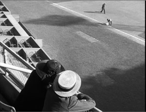
When he met Sam Wood, it seems, Menzies found a director ready to let his imagination roam further. In these collaborations, we get depth shots à la Welles and Toland, but also skewed perspectives. Pride of the Yankees (1943/44) searches for ways to make a baseball stadium look like a Lissitzky abstraction.
Menzies subjects the partisans of For Whom the Bell Tolls (1944) to his sharp diagonals as well.
Alice, we hardly knew ye
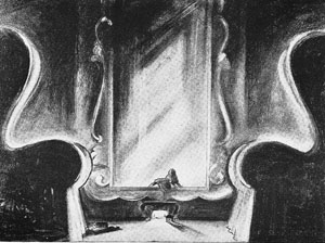
What then of Alice in Wonderland? Back in the early 1980s, I wasn’t permitted to photocopy or photograph script pages. Here is one of the few sketches I later found for the film. Alice crawls into the mirror with looming armchairs in the foreground.
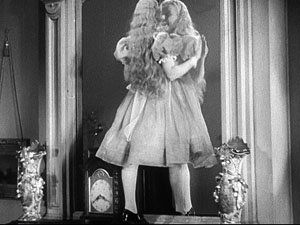
Surely, I thought, the film would be an early example of the depth aesthetic that would be developed by Welles, Wyler, and Wood/ Menzies. Alas, the film has nothing like those imperious armchairs.
In fact, Alice proves a huge disappointment on the pictorial front. Menzies expended all his ingenuity on the special effects, coordinated by Paramount master Farciot Edouart. Although the spfx are not in the league of that other big 1933 effects-film King Kong, they are pretty solid for the time. It’s just that this remains a painfully arch, flatly filmed exercise.
But I look on the bright side. Menzies created some memorable movies, both on his own and with other directors. (Of his directed films, not only Things to Come but Address Unknown, 1944, remain of interest today.) Perhaps most important, his stylistic boldness may have encouraged other filmmakers to try something fresh. Most immediately there is Since You Went Away (1944), a big Selznick production that bears traces of the Menzies touch.
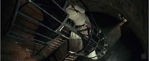
More broadly, Menzies represents a strand in American cinema that never really disappeared. His frantic Piranesian perspectives, canting the camera and filling the frame with grids, whorls, and cylinders, are still in use. And his head-on, wide-angle grotesquerie looks ahead to the Coen brothers. This shot of a department-store manager in The Devil and Miss Jones (1941) could come from any of their films.
Menzies’ films, though mostly not celebrated as classics, gave American cinema the permission to be peculiar. Meet me in the sidebar for a closer look at one of Hollywood’s most eccentric creators. Special thanks to Meg Hamel for going beyond the call of duty in posting that essay.
Invaders from Mars (1953); Shutter Island (2010).


