Archive for the 'Directors: Eisenstein' Category
Seed-beds of style
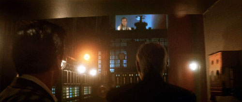
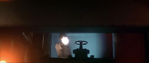
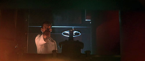
The Hunt for Red October.
DB here:
Seminar, orig. German (1889): A class that meets for systematic study under the direction of a teacher. From Latin seminarium, “seed-plot.”
I retired from full-time teaching in July of 2005. Since then, while writing and traveling (both chronicled on this website), I’ve done occasional lectures. But this fall I tried something else. At the invitation of Lea Jacobs here at Madison, I collaborated with her on a graduate seminar called Film Stylistics.
It was a good opportunity for me. I had a chance to learn from Lea, Ben Brewster, and the students and sitters-in. The class also enabled me to test and revise some ideas I’d already explored, while garnering new ideas and information. I helped plan the sessions and pick the films, but I had no responsibilities about grading. I hope, though, to read the students’ papers at some point after the term is over.
Our goal was to introduce students to studying style historically and conceptually. We focused on group styles rather than “authorial” ones because we wanted to explore particular concepts. How useful is the concept of group norms in understanding broad stylistic trends? Can we explain stylistic change through conceptions of progress toward some norm? Does the model of problem and solution help explain not only a particular innovation but also the group’s acceptance of it? How viable are notions of influence in explaining change? How much power should we assign to individual innovation? Can we think of filmmaking institutions as not only constraining style (through tradition and conformity) but also enabling certain possibilities—nudging filmmakers in certain directions? Does stylistic study favor a comparative method, one that encourages us to range across major and minor films, as well as different countries and periods?
These are pretty abstract questions, so we wanted some particular cases. Lea and I picked three areas of broad stylistic change: the emergence of widescreen cinema in the 1950s, the arrival of sync-sound filming in the late 1920s, and the development of analytical editing or “scene dissection” in the 1910s and 1920s. We tackled these areas in this order, violating chronology because we wanted to move from somewhat hard problems to the hardest of all: Why did filmmakers in the US, and soon in other countries, move toward what has become the lingua franca of film technique, continuity editing?
The results of our research on these matters will emerge over the next few years, I expect. In the short term, during my final lecture Tuesday I went off on what I hope wasn’t too much of a tangent. I got interested in one particular kind of cut, and it led me to see, once more, how different filmmaking traditions can make varying uses of apparently similar techniques.
More cutting remarks
My concern was the axial cut. That’s a cut that shifts the framing straight along the lens axis. Usually, the cut carries us “straight in” from a long shot to a closer view, but it can also cut “straight back” from a detail. What could be simpler? Yet such an almost primitive device harbors intriguing expressive possibilities.
Axial cuts aren’t all that common nowadays, I think. Today’s filmmakers prefer to change the angle when they cut to a closer or more distant setup. But such wasn’t the case in the cinema of the 1910s and 1920s.
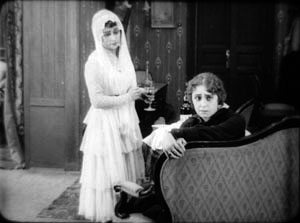
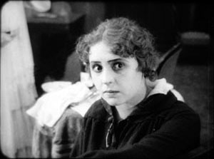
In the heyday of tableau-based staging, 1908-1918 or so, filmmakers seldom cut into the scene at all. European directors especially tended to shape the development of the action by moving actors around the set, shifting them closer to the camera or farther away. The most common cuts were “inserts” of details, mostly printed matter (letters, telegrams) or a photograph. But when tableau scenes did cut into the players, the cuts tended to be axial: the framing moved straight in to enlarge a moment of performance. Here’s an instance from the 1916 Russian film Nelly Raintseva.
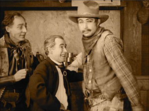
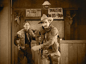
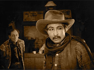
During the mid-1910s, American films moved away from the tableau style toward a more editing-driven technique. This approach often relied on more angled framing and a greater penetration of the playing space, of the kind we’re familiar with today. But axial cuts hung on in American films, even in quickly-cut scenes. Lea pointed out some nice examples in Wild and Woolly (1917), especially those involving movement. In the example below, the first cut carries us backward rather than forward, and the second is a cut-in, but both are along the lens axis.
During the 1920s, axial cuts become a secondary tool of the American filmmaker, who now had many other camera setups available. But Soviet filmmakers of the 1920s, who adopted many American techniques in the name of modernizing their cinema, seemed to see fresh possibilities in the axial cut. For instance, in Dovzhenko’s Arsenal (1929), it becomes a percussive accent. The astonishment of a bureaucrat under siege is conveyed by a string of very fast enlargements.
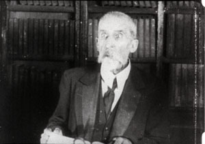
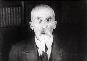
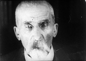
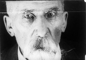
The Soviets called such cuts “concentration cuts,” a good term for the way they make a figure seem to pop out at us. From being a simple enlargement (in tableau cinema) or one among many methods of penetrating the scene’s space (in Hollywood continuity), the axial cut has been given a new force, thanks to adding more shots and making them quite brief.
This aggressive method for seizing our eye—Notice this now!—has appeared in modern filmmaking too, as in this passage from Die Hard (1988).
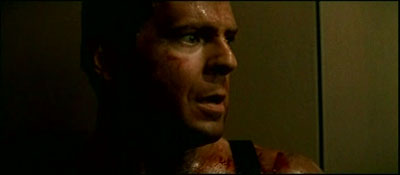
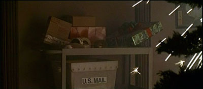
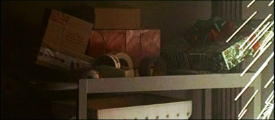
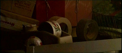
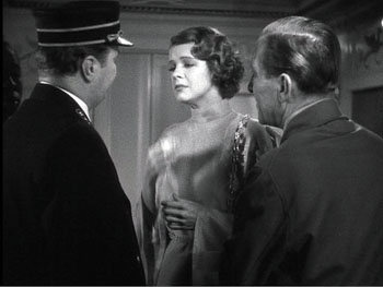
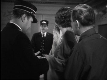
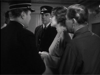
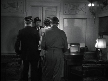
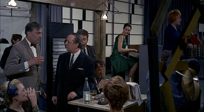
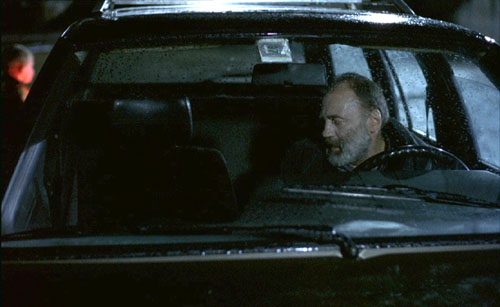
Here the axial cut is clearly subjective, rendering John McClane’s realization that he can use the Christmas wrapping tape in his combat with the thieves. Director John McTiernan employed the device again in The Hunt for Red October (1990). The frames surmounting this entry show the heroes suddenly being fired upon.
It seems likely that many modern directors became aware of this device from seeing Lydia’s discovery of the pecked-up body of farmer Dan in The Birds (1963). Hitchcock knew Soviet montage techniques, so maybe we have a chain of influence here. In any case, the somewhat overbearing aggressiveness of the concentration cut has often been parodied on The Simpsons. Here’s a recent example.


By the law of the camera axis
Axial cutting can be used more pervasively, as a structuring element for an entire scene. This is what Lev Kuleshov does in a climactic moment of By the Law (1926). Edith and her husband have kept the murderer at rifle point for days, and the strain is starting to show. She becomes hysterical, and Kuleshov uses a ragged rhythm of stasis and movement to convey it. First he cuts straight in from a master shot to a medium shot of her. I reproduce the frames from the film strip, for reasons that will become obvious.
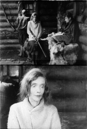
Then Kuleshov cuts straight back to the master setup. Again he cuts in, but to a closer view of Edith as she becomes more frenzied.
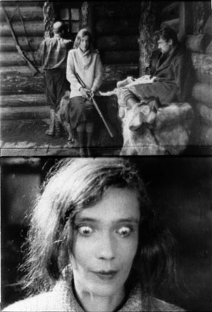
Cut back once more to the long shot, but only for fourteen frames. That shot is interrupted by a shot of Edith already laughing crazily, her head tipped back.
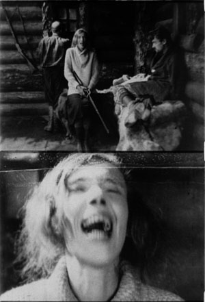
The shot of her laugh lasts only five frames, and this mere glimpse, combined with the blatant mismatch of movement, makes the onset of her spell all the more startling. When we cut back to the long shot her face and position now match.
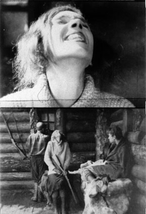
The abrupt quality of her outburst would not have been as striking if Kuleshov had varied his angle. As the earlier examples show, when only shot scale changes and angle remains the same, the cuts can be very harsh, and Kuleshov accentuates this quality with a flagrant mismatch.
Akira Kurosawa likewise used the concentration cut to provide salient moments throughout his work; it almost became a stylistic fingerprint. At several points in Sugata Sanshiro (1943) he uses the device in the usual popping-forward way. But he varies it during Sanshiro’s combat with old Murai. He reserves dynamic, often elliptical cuts for moments of rapid action, and then he uses axial cuts for moments of stasis or highly repetitive maneuvers. In effect, the moments of peak action happen almost too quickly, while the moments of waiting are emphasized by cut-ins.
So at the start of the match, a series of axial cuts, linked by dissolves, present the fighters in a slow dance. But the ensuing throws are editing briskly. When old Murai is thrown and lies gasping on the mat, axial cuts accentuate his immobility. Kurosawa adds a rhythmic urgency on the soundtrack. After each cut-in, we hear the voice of Murai’s daughter, either offscreen or in his thoughts: “Father will win.” “Father will win.” “Father will surely win.”
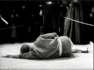
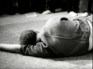
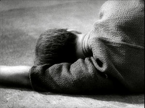
The matching of lines to the editing is at work in the Simpsons parody too, in which the Comic Book Guy’s words are heard in tempo with the concentration cuts. “You. Are. Acceptable.”
Montage and the axial cut
By now it’s easy for us to see that one scene from Alexander Nevsky (1938) opens with a series of axial cuts, out and in.
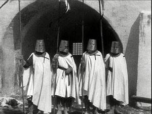
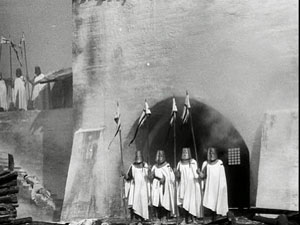
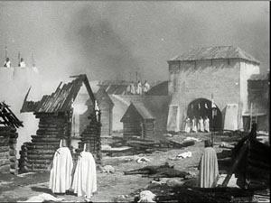
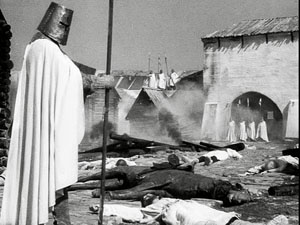
But why would Eisenstein, master of montage, regress to such a primitive device? He had occasionally used axial cuts in his silent films, as when we see Kerensky brooding in the Winter Palace in October (1928).
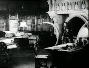
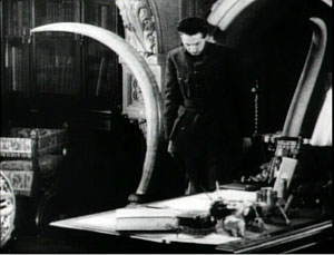
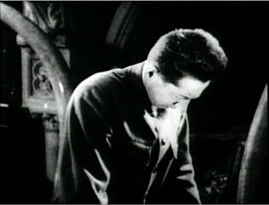
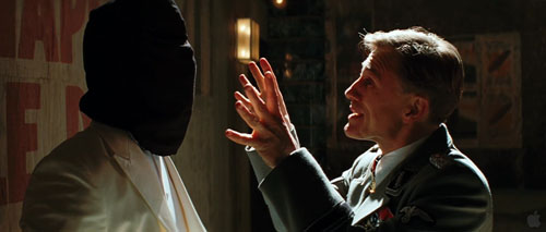
And Potemkin‘s famous cuts in to the Cossack slashing at the camera (that is, the baby, the old lady) are axial. (These cuts are pastiched by Eli Roth and Tarantino in Inglourious Basterds.) At the limit, Eisenstein toyed with the axial cut by moving the figures around during the shot change. In Potemkin, the ship’s officer reports to the captain that the crew has refused to eat. The captain leaves one shot and climbs the stair before Eisenstein cuts in to show him leaving again. The repetition would not be so perceptible if Eisenstein had varied the angle.
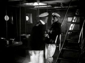
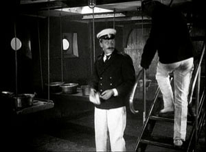
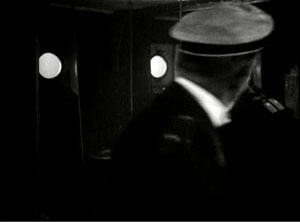
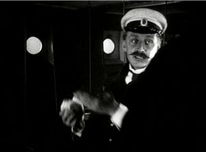
In the 1930s, Eisenstein began thinking about the axial cut as a basic structural element of a scene. In both his theory and practice, he promoted the axial cut to a level of prominence it hadn’t seen since the days of the tableau. Usually the cuts involve static subjects, like most of Kurosawa’s, but he still exploits the cut-ins to create vivid, if spatially impossible effects. At one point our popping in closer to Ivan the Terrible is doubled by him majestically and magically popping out of his tent to meet us, like a thrusting chess piece.
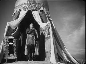
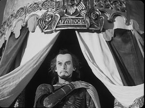
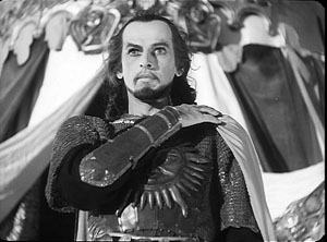
The new primacy of axial cutting comes from Eisenstein’s idea that “montage units” could powerfully organize the space of a scene. He thought that you could imagine filming a scene from only a few general positions, but then varying camera setups within each of these orientations. The montage unit was a cluster of framings taken from roughly the same orientation, as in the Pskov and Ivan scenes.
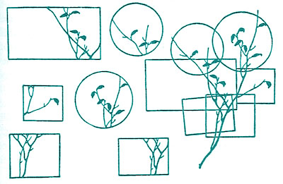
The idea may derive from his study of Japanese art, shown further above, in which he explored how a single image of a cherry branch could be chopped up into a great variety of compositions. In his course at the Soviet film school, he illustrated with a hypothetical scene of the Haitian revolutionary Dessalines holding his enemies at bay at a banquet. After imagining a master shot from the farthest-back position in the montage unit, Eisenstein proposes a series of dynamic closer views.
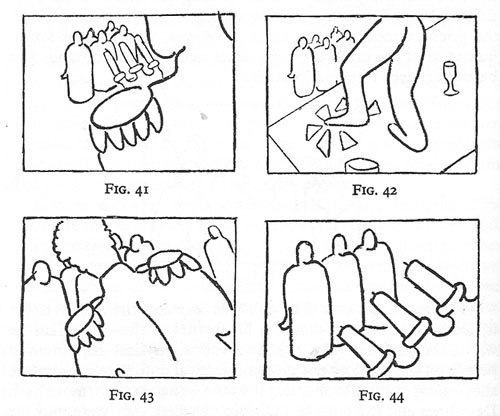
Eisenstein didn’t think that each scene had to be handled in a single montage unit. You could create two or three predominant orientations, with shots from each woven together. Or you could gain a sudden accent when a stream of setups from the same unit was interrupted by one from a very different angle. These ideas he put into practice throughout Nevsky and Ivan the Terrible.
Why? Eisenstein thought that combining shots taken from roughly the same orientation yielded a musical play between constant elements and variation. Each shot shows us something we’ve seen before but also something new, the way a bass line or sustained chords can continue underneath a changing melody. Eisenstein was convinced that this flowing weave of visual elements gave the spectator a deeper involvement in the film as it unfolded—an involvement akin to that found in Wagnerian opera.
The axial cut is a good example of how even a simple stylistic choice harbors rich creative possibilities. It also shows how a technique can change its impact in different filmmaking traditions. In the tableau tradition the axial cut was for the most part an abrupt enlargement heightening a moment of strong acting. In the early days of Hollywood continuity it became one editing option among many, and its power was somewhat muted. For the Soviets, concentration cuts could be multiplied and joined with fast cutting and big close-ups. The result could jolt the viewer by italicizing a face or an object–a purpose that has been taken up by contemporary Hollywood. For Kurosawa, the technique offered a way to contrast extreme movement and extreme stillness. And for Eisenstein, it suggested a global strategy for weaving visual elements into an immersive whole.
The protean functions assumed by this simple device remind us of how much there is yet to discover about film style. Despite all our discoveries over the last three decades, we have only begun. The name is apt: A seminar is where things start.
For more on the staging strategies of the tableau style, see On the History of Film Style and Figures Traced in Light: On Cinematic Staging, as well as blog entries here and here and here and here. You can find examples of emerging Hollywood continuity techniques in this entry on 1917 and this one on William S. Hart and this one on Doug Fairbanks. Sugata Sanshiro is at last available in a good DVD version from Criterion as part of its big Kurosawa box. Eisenstein’s ideas about the axial cut are explained in Vladimir Nizhny, Lessons with Eisenstein, trans. and ed. Ivor Montagu and Jay Leyda (New York: Hill and Wang, 1962), Chapters II and III. In The Cinema of Eisenstein I try to show how these ideas are employed in the Old Man’s late films.
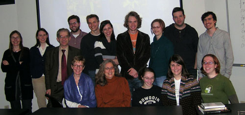
Seated: Leslie Debauche, Lea Jacobs, Rebecca Genauer, Pam Reisel, Amanda McQueen. Standing: Karin Kolb, Andrea Comiskey, Ben Brewster, John Powers, Tristan Mentz, Heather Heckman, Aaron Granat, Jenny Oyallon-Koloski, Jonah Horwitz, and Booth Wilson. Evan Davis had to leave early.
(50) Days of summer (movies), Part 2
DB here:
How I spent part of my summer vacation: notes on three more films.
Gangbusters
Two major directors–one an emblem of goofy bravado, the other emerging as a contemporary master–gave us movies this summer, and both let me down. I have cautiously championed Tony Scott’s recent work because at least he’s willing to go all the way, however misguided the direction. From Spy Games on, he has stuck to the credo that too much is never enough. His technique is swaggering and undisciplined, mannered to the nth degree. Yet I find his fevered visuals more genuinely arresting than the safe noodlings of most of today’s mainstream cinema. Man on Fire and Déja Vu reheat their genre leftovers into something spicy, if not nourishing, while Domino, the cinematic equivalent of hophead graffiti, wraps its sleazy characters in a visual design apparently inspired by the glowing interior of a peepshow booth.
So it’s with a chagrin that I report that The Taking of Pelham 123 is utterly square. The violence isn’t reveled in, the color scheme isn’t garish, the story has a florid villain played by scenery-masticating Travolta, and Denzel Washington has never seemed more passive and drab. In Scott’s DVD commentaries, he insists that art-school training led him to approach cinema with a painterly eye. But this project has the feel of a commissioned magazine illustration, not the delirious wall-size outrage that he could make if given his head.
I’ve respected Michael Mann since I saw Thief on its initial run. Heat seems to me on the whole his best work, though I admire many qualities of Manhunter, The Last of the Mohicans, The Insider, and Collateral. Ali and Miami Vice seem to me lesser achievements, and with Public Enemies he has gone somewhere I can’t follow.
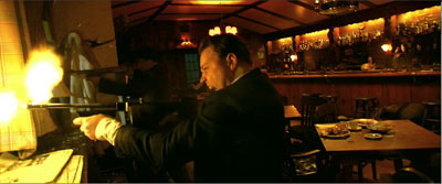
I found it a surprisingly flat exercise, skimming over familiar territory–the charming bandit vs. the square-jawed cop, the struggle of the freebooter vs. the mob, the cynical politics of law enforcement vs. the authentic impulses of the outlaw. The plot is unusually straightforward for Mann, and the last shot, which ought to be a corker, is wasted. Too many scenes are nakedly expository, relying on fussy period detail to carry them. At the same time, more basic exposition seemed to me botched at the outset. In the opening scene, shouldn’t we get a clearer sense of what Dillinger’s sidekicks look and act like? A classically constructed film would dwell on them, characterize them, give them bits of behavior that develop in the course of the film. Mann treats them as part of the scenery setting off his handsome hero. Later, when one of Dillinger’s hired pistoleros goes kill-crazy, shouldn’t we have been set up to see him as a possible risk?
Typically Mann romanticizes, even sentimentalizes, his hard cases in that tough-guy way we know from fiction. But I couldn’t discern any vivid attitude toward his parallel protagonists Dillinger and Purvis. After Heat, where crook and cop both show a willingness to abandon women who want them, it’s probably significant that Dillinger is characterized by his fidelity to Billie. Yet while she’s in jail he’s back to an insouciant night on the town with his familiar floozies. In all, I can’t figure out why Mann made this movie about these people, or why we should care.
Collateral was already veering toward a certain obviousness of construction, when Vincent talks initially about how in impersonal L. A. a dead guy can ride the subway without anyone noticing. In Public Enemies the final line returns to the film’s most underscored motif in a distressingly on-the-nose way. Similarly, one thing I admire about Heat is that it acts as if no other gangster movie has ever been made. Its scenes offer plenty of opportunities for cute citations of old crime movies, especially when Vincent (a different Vincent) catches his wife’s lover watching TV. Instead, Mann treats the material as cut off from cinema, and this saves him from the coyness of so much genre work today.
Is he then a realist? His interviews and DVD commentaries indicate that he thinks of himself this way. Yet he strikes me instead as a genre purist. Each film is sui generis because it aims to recover the authentic dramatic core of the policier, the social comment film, or the wilderness adventure. But in Public Enemies, Dillinger’s visit to the movie house to watch Manhattan Melodrama (1934), even though the event is historically accurate, hits the parallel chords hard. Dillinger, who’s about to be cut down in a few moments, smiles in fascination when Gable says: “Die the way you lived–all of a sudden.” In such scenes, Mann seems to me to have retreated into being a more ordinary filmmaker. The worst thing I can say about Public Enemies is that it risks becoming academic.
Mann’s claims to realism are partly his efforts to deny being a self-conscious stylist. For many of his admirers, me included, his pictorial sense is a large part of what makes his work distinctive. There’s plenty of controversy about the look of Public Enemies, and I have to come down on the side of the nay-sayers. I saw it twice, once in 2K digital projection in a superb multiplex in Europe. My second viewing was on 35mm, in a reliable Madison, Wisconsin venue. The digital version too often teemed with artifacts, blown-out bright areas, and disconcerting shifts in tonal values within scenes. The next two images are successive shots in the HD trailer, and I haven’t adjusted them. The disparities between them reflect the sort of mismatches that struck me in the digital screening.
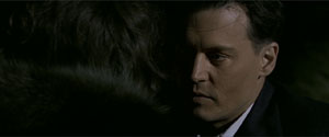
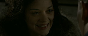
On film, the faces lost the edge enhancement and the mushy textures I saw in the digital version, and the tommygun fire was less tinged with yellow, pink, and orange. On the whole, I thought that the images benefited from the mercies of emulsion.
The chance to take high-definition video all the way, especially in low-light situations, seems to have invigorated Mann creatively, but it may have distracted him from basic craft. Investing wholly in a new look, he belabors even the simplest action through staccato cutting; getting people in and out of cars should not take such effort. Action scenes occasionally succumb to the jittery camera. I consider the climactic bank robbery in Heat somewhat awkwardly staged (though the dazzling sound work there compensates somewhat), and similar short-cuts can be found in the Wisconsin shootout here.
If you find my tone tentative, you’re right. I didn’t care for The Insider on first viewing; it took me a second visit to grasp what I now take as its virtues. That’s why I saw Public Enemies twice. I expect as well that Mann’s eloquent defenders, such as Matt Zoller Seitz, who has done a passionate series of shorts on Mann, will find fault with my evaluation. For the film’s admirers, what I find sketchily indicated they could see as daringly elliptical; what I see as inconsistent they might consider calculatedly ambiguous. The incompatibilities of color and light could be part of Mann’s experimentation too. I see his oeuvre as largely updating cinematic classicism, while others tend to see it as a daring leap beyond it. Maybe I’ll come around eventually. For now, I have to consider Public Enemies the biggest disappointment of my fifty days.
A welcome basterdization
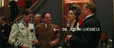
It’s a measure of the changes wrought by the Internets that Inglourious Basterds has in about a month amassed a daunting volume of serious commentary. Without benefit of DVD (let’s be charitable and assume no BitTorrenting), dozens of online writers have dug deep into this movie. As if to demonstrate the virtues of crowdsourcing, this flurry of critical discussion has shown that most professional movie reviewers have tired ideas, know little about film history, and are constrained by the physical format and looming deadlines of print publication. At this point, I’m very glad I’m not writing a book on Tarantino; the sort of secondary sources that normally take years to accrete have piled up in a few weeks, and the pile can only grow bigger, faster.
So what is there left for me to say? A little, though I can’t be sure every point isn’t made somewhere else. In any case, surely you’ve seen it, so I don’t have to warn you about spoilers, do I?
Since I thought Death Proof offered merely proof of the director’s creative death, I went to Inglourious Basterds with low expectations. I came out thinking that it was the most audacious and ambitious American movie I saw in my fifty days of summer viewing.
To deal with the current controversy immediately: I didn’t think its counter-history was intrinsically offensive or immoral, since I remembered those what-if-Germany-had-won counterfactuals in Deighton’s novel SS-GB and Brownlow’s film It Happened Here (1966). Did those express defeatism or an inability to counter the Nazi threat? So why not have a band of vindictive Jews seeking to match the Nazis in ruthlessness (except that their targets, so far as we see, are only soldiers and collaborationists)? We call it fiction.
You can quarrel about whether a revenge plot should carry some signals of the cost to the avenger, but I’m sufficiently convinced that tit-for-tat is embedded in human nature and will always be perceived, however recklessly, as virtuous. In any case, the movie’s emblem of revenge, the powerful image of Shosanna laughing mockingly as she goes up in flames along with the audience, carries the strategic ambiguity of a lot of cunning popular art. It’s at once a glorying in payback, a Jeanne d’Arc martyrdom, and a reminder of the fate of Jews elsewhere at that moment. It doesn’t permit a single easy reading.
Granted, there are some low-jinks, like the misspelled title and heroine’s name; are these jokes on Tarantino’s notorious spelling malfunctions? Yet the movie seemed to me Tarantino’s most mature (to use a term of praise that he hates) since Jackie Brown. I say that not because his other work is juvenile, which it’s not (except for Death Proof). I call Inglourious Basterds mature because it exploits his strengths in fresh but recognizable ways.
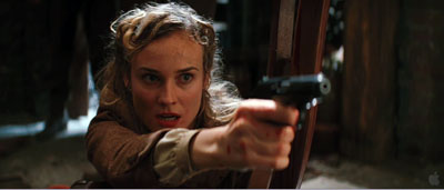
First, strengths of structure. Tarantino’s conception of storytelling owes at least as much to popular literature, particularly policiers, as it does to current conventions of screenwriting.
Take his penchant for repeating scenes from different viewpoints. In Elmore Leonard’s novel Get Shorty, Chapter 2 ends with Harry, seeing Chili at his desk, exclaiming, “Jesus Christ!” Chapter 3 consists of the first stretch of their conversation. Chapter 4 starts with Karen approaching Harry’s office and hearing him say, “Jesus Christ!” This overlapping-scene strategy, sketched in Reservoir Dogs, gets elaborated in Pulp Fiction and Jackie Brown.
Likewise, thrillers and crime novels commonly play on showing how distant lines of action unexpectedly intersect. In Peter Abrahams’ Hard Rain the agent who becomes the hero tells the story of two coal miners, Bazak and Vaclav, who meet after tunneling from two ends of the field. Needless to say, Hard Rain’s own plot enacts the same pattern. Charles Willeford’s chance-driven, parallel-action novel Sideswipe could be a model for the structure of Pulp Fiction. So it should be no surprise that Inglourious Basterds, labeling its long sequences “chapters,” should rely on the stepwise convergence of Shosanna’s plotline and the Basterds’ guerrilla operations, with the UK Operation Kino serving as the first sign of a merger.
So the film is built on large-scale alternation of the principal forces: Shosanna (Chapter 1), the Basterds (2), Shosanna again (3), the Basterds again (4), and finally the two strands knotting at the screening of National Pride (5). Landa also knits the two strands together, of course, starting when he investigates the tavern shootout at the end of (4). In Chapter 5 the alternation gets carried by classic crosscutting. We shift to and fro among Shosanna’s plot, the capture of Raine and Utivich, the conflagration in the auditorium, and the deal struck between Landa and the US command. Yet right to the end both Shosanna and the Basterds have no awareness of each other’s plan: only we grasp the double dose of Jewish vengeance. More than in most films, but typical for Tarantino, we’re aware of the plot’s abstract architecture.
Then there are strengths of texture—the moment-by-moment unfolding of the action. Again pulp fiction offers some models.
In Get Shorty, Leonard develops the scene I mentioned above in an extraordinary way. Chili, Harry, and Karen talk through the night about Chili’s purpose and about the ways of the movie industry. Their conversation runs for a remarkable seven chapters and sixty pages, interrupted only by a brief flashback. When I met Leonard at a book-signing event, I asked him why he took up a fifth of the novel with a single scene. He said that he hadn’t realized it consumed so much space, because it was “fun to write.”
Tarantino can lay bare his chapter-block architecture because his scenes are devoted to this sort of prolongation. You may remember the bursts of violence, but what he fashions most lovingly is buildup. Here the spirit of Leone hovers over our director. In each entry of the Dollars trilogy, you can see the rituals of the Western getting more and more stretched out, filled with microscopic gestures and eye-flicks. Eastwood’s lips stick slightly together and must peel apart when he speaks: This becomes a major event. I’m a primary-document witness to the fact that 1969 cinephiles were stunned by the long opening scene of Once Upon a Time in the West, which after painstakingly establishing the tics of several characters ends by eliminating them. Later, John Woo gained fame by dwelling on Homeric preparations for combat and endlessly extended bouts of gunplay. From these masters Tarantino evidently learned the power of the slow crescendo and the sustained aria.
Leone and Woo’s amped-up passages rely chiefly on imagery and music. Tarantino is no slouch in either department, but he relies, like his beloved pulp writers, on talk. As everyone has noticed, the conversations in Basterds go on a very long time. In an era when scenes are supposed to run two to three minutes on average, Tarantino has only a couple this brief. The introduction at LaPadite’s farm runs over eighteen minutes, by my count, and the more complicated Chapter 2, with intercut flashbacks and flash-forwards, runs about the same length. Thereafter scenes last anywhere between four and twenty-four minutes, and Chapter 5’s crosscut climax consumes a stunning thirty-seven minutes. All but the last depend completely on dialogue. Leonard would probably consider them to have been fun to write.
Talk in Tarantino comes in two main varieties: banter and intimidation. At the coffee shop the Reservoir Dogs squabble and soliloquize; later exchanges will be conducted at gunpoint. En route to the preppies’ apartment, Jules and Vincent chat casually; when they arrive, the talk turns threatening. If Death Proof lets banter dominate, Inglourious Basterds goes to the other extreme. Here talk is a struggle between the powerful and the powerless.
As Jim Emerson points out, nearly every scene is an interrogation. This entails that someone in authority (Landa, Aldo, Hitler, the Germans who question Archie’s accent in the tavern, Zoller) is trying to pry information out of someone else. Intimidation through interrogation gives every scene an urgent shape. Now Tarantino’s digressions (three daughters, rats and squirrels, a card game, the correct pronunciation of Italian) don’t read as self-indulgence, but rather as feints in a confidence game. Here Tarantino’s tendency to write endless scenes, something he confesses in his recent Creative Screenwriting interview on the film, is fully harnessed to more classic, albeit unusually extended, scene structure.
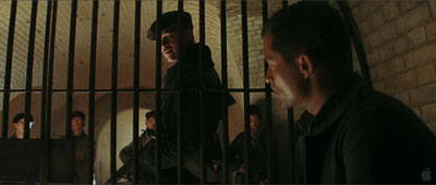
To keep us focused on the lines and the actors delivering them, Tarantino has adopted a classical approach to style. He shoots with a single camera, so every composition is calculated. “I’m not Mr. Coverage,” he remarked in 1994, “. . . . I shoot one thing specifically and that’s all I get.” He foreswears handheld grab-and-go. In Basterds he locks his camera down, or puts it on a dolly or crane. Cinematographer Robert Richardson says that there is only one Steadicam shot in the film.
We don’t usually call Tarantino tactful, but his technique can be surprisingly discreet. He has the confidence to let key dialogue play offscreen: in the café when Landa arrives at Goebbels’ lunch, we stay fastened on Shosanna, a good old Hitchcockian ploy that ratchets up the tenson. Although Tarantino cuts rapidly throughout each chapter (on average every 5.6 seconds), he repeats setups quite a bit. This permits a simple change of angle or scale to mark a beat or shift the drama to a new level.
He can bury details on the fringes of the shot, as when the cut to the tight close-up of LaPadite shows him tossing his match into an ashtray sitting beside Landa’s cap, which bears the insignia of a skull and crossbones. It’s out of focus and on the edge of the screen, but the glimpse of it increases our fear that LaPadite is indeed harboring a Jewish family. As in Jackie Brown, another film that extends its scenes through detailing of performance, lighting, and setting, there seems no doubt that Tarantino, for all his PoMo reputation, appreciates some traditional Hollywood virtues.
He can inflect them, however. Richardson finds that Tarantino has an unusual approach to the anamorphic format.
I naturally move [the framing of characters] to one side or the other, especially when shooting anamorphic, whereas Quentin enjoys dead-center framing. For singles in particular, we’re just cutting dead-center framing from one side to the other, with the actors looking just past the barrel of the lens.
I noticed this tendency most in the reverse angles. Tarantino’s two-shots tend to be simple and symmetrical, shooting the characters in profile, as in the image surmounting this entry. But in over-the-shoulder shots, about half the frame is unoccupied—as if Tarantino were compensating, like his 1970s mentors, for an eventual TV pan-and-scan version of the scene.
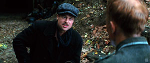
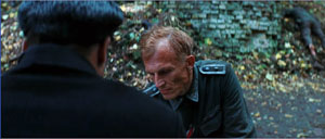
Or take the cliché of arcing the camera around a group of chatting people, picking up one after the other. Tarantino didn’t invent this, but the opening scene of Reservoir Dogs probably helped popularize it. In Chapter 5 he uses the technique in the lobby of the Le Gamaar cinema, only to break its momentum by having the camera trail Landa when he breaks out of the circle and retreats, in a paroxysm of giggles, after Bridget says she broke her leg while mountain climbing.
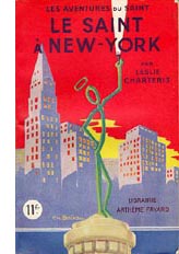 There are many other intriguing touches, like the mixed typography of the opening credits, all of which seem to use fonts derived from 1970s paperback novels. Or the reference to The Saint in New York, perhaps less important for its plot parallels than for the fact that author Leslie Charteris’ later Saint novel, Prelude to War (1938), was banned in Germany and Italy for its attacks on fascism (even warning about the camps). So is reading a Saint novel a covert act of defiance on Shosanna’s part? Later, she applies make-up in fierce strokes, like an American Indian, reminding us that Raine’s Basterds model their tactics on the Apache.
Perhaps most striking is the dairy motif, from the glass of milk in Chapter 1 to Landa’s ordering a glass for Shosanna in Chapter 3. Is this a hint that he suspects her of being the girl who fled the massacre? Or is it a test he offers to any French national he meets? In the restaurant scene, the extreme close-ups of the crème fraiche may underscore the possibility that Landa is looking for signs that she won’t eat dairy products not prepared according to Orthodox dietary rules. Few filmmakers today would trust audiences to imagine this possibility on their own; instead we’d get an explanation to an underling. (“So here’s a quick way to find out if we have a Jew ….”)
Another nest of details involves the film-within-the-film, Nation’s Pride. Many online critics have noticed that it provides the sort of film that Basterds refuses to be: We never see our squad in the sort of Merrill’s Marauders skirmishes we probably expected going in. What I find intriguing about the movie, purportedly directed by Eli Roth, is that despite some anachronisms it exemplifies the sort of confrontational cinema we find in the silent Soviet pictures. Surprisingly, this was a tradition that Goebbels admired. Eisenstein’s Battleship Potemkin, he claimed, “was so well made that it could make a Bolshevist out of anyone without a firm philosophical footing.” So in Nation’s Pride Roth and Tarantino have provided a Nazified homage to Eisenstein: a baby carriage rolls away from a mother, a soldier suffers an assault to the eye reminiscent of the wounding of the schoolteacher on the Odessa Steps, and even Soviet-style axial cut-ins are used for kinetic impact.
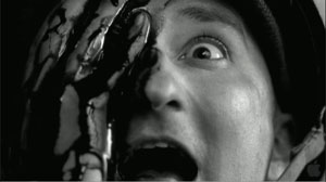
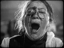
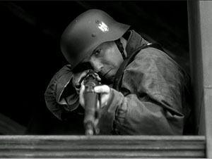
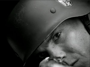
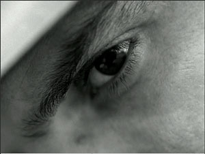
This pastiche of agitprop culminates in the sort of to-camera address we find in Dovzhenko. Zoller shouts, “Who wants to send a message to Germany?” But this is followed by Shosanna’s spliced-in close-up addressing the audience in her theatre.
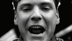
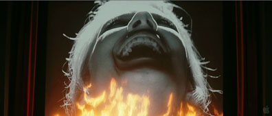
She makes her own confrontational cinema.
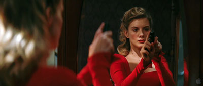
Several years ago the film theorist Noël Carroll speculated that the Movie Brats of the 1970s sought to create a shared culture of media savvy that would replace the traditional culture based on religion, classical mythology, and official history. For the baby boomers, knowledge of the Christian Bible and iconography of American history would be replaced by deep familiarity with movies, pop music, and TV. This secular sacred would bind the audience in a new set of traditions. On this path, Scorsese, Spielberg, and Lucas didn’t go as far as Tarantino has. In his films every situation or character name or line of dialogue feels like a citation, a link in a web of pop-culture associations. (Aldo Raine = Aldo Ray = Bruce Willis, whom Tarantino once compared to Aldo Ray.) The only other filmmaker I know who has achieved this supersaturated cross-referencing is Godard, another exponent of the vivid-moments model (though he uses it to create a more fragmentary whole). Tarantino is the most visible evidence of what Carroll called “The future of allusion.”
But it’s too limiting to see Tarantino’s films as merely anthologies of references. I think he wants more.
Many viewers seem to assume that Tarantino’s film is somewhat cold. The Basterds are grotesques, parodies of men on a mission; Shosanna, though in a sympathetic position, must maintain a frosty demeanor. Even revenge, so central to films that Tarantino admires, is served frigid here, a purely formal postulate, like the urge for vengeance animating classic kung-fu films.
There is cinema that asks you to empathize with its characters. Then there is cinema that aims to thrill you with a cascade of vivid moments. There is How Green Was My Valley (1941) and Citizen Kane (1941). I think that Tarantino’s films mostly tilt to the vivid-moment pole, seeking to win us through their immediate verve, the way film noir and the musical and the action movie often do. The young man arrested by great bits from blaxploitation and biker movies sees cinema not as merely piling up cinephiliac references—though that’s surely part of it—but as a flow of tingle-inducing gestures, turns of phrase, shot changes, musical entrances. There can be pure pleasure in having time to see how actors move, or savor their lines, or simply fill up physical space by being centered in the anamorphic frame. Our fascination with Landa comes, I suspect, from the spectacle of a man who is utterly enjoying himself every second.
We might be tempted to claim that this effort to create what Jim Emerson calls “movie-movie moments” actually breaks the film’s overall unity. But Tarantino keeps nearly everything in check by the architectural clarity of his plot. The carving of the swastika on Landa’s brow sets you squirming, but it reveals itself as the culmination of a process we have seen piecemeal up to now. It’s the last in a string of firecracker bursts that have kept the film humming along.
So I’m not convinced that Inglourious Basterds lacks emotion. The emotions Tarantino aims for will arise not from character “identification” but from the overall structure and texture of the work. We are to be stirred, enraptured, astonished by a procession of splendors big and small. It’s the tradition (again) of Eisenstein, particularly in the Ivan films, but also of Leone and, in another register, Greenaway. Formal virtuosity isn’t necessarily soulless; it can yield aesthetic rapture.
The most sophisticated analyses and interpretations I’ve found online are led off by the indefatigable Jim Emerson (start here to track his many entries on the subject), along with his knowedgeable readers, who furnished a book’s worth of commentary and critique. Jim provides links to many other writers’ work (here, for example), not all of which I’ve been able to absorb. For exhaustive, not to say exhausting, coverage of things Tarantino, visit The Archives.
On Tarantino’s time-shuffling and its relation to crime fiction, see my Way Hollywood Tells It, 90-91. In Chapter 7 of Film Art Kristin and I provide an analysis of the replayed scene in Jackie Brown. Tarantino’s comments on writing the Basterds script are in Jeff Goldsmith’s article, “Glorious,” in Creative Screenwriting 16, 4 (July/ August 2009), 20-29. His comments on coverage come from Gavin Smith, “When You Know You’re in Good Hands,” in Quentin Tarantino Interviews, ed. Gerry Peary (Jackson: University Press of Mississippi, 1998), 102. In the same interview he has illuminating comments on the role of the axis of action. Robert Richardson discusses filming Basterds in Benjamin Bergery, “A Nazi’s Worst Nightmare,” American Cinematographer 90, 9 (September 2009); the quotation here is from p. 47. This feature is available online here.
Goebbels’ remark on Battleship Potemkin is quoted in Klaus Kreimeier, The UFA Story: A History of Germany’s Greatest Film Company, trans. Robert and Rita Kimber (New York: Hill and Wang, 1996), 207. For background on Goebbels’ agenda for German cinema, summed up by Lt. Archie Hicox, see Eric Rentschler, The Ministry of Illusion: Nazi Cinema and Its Afterlife (Cambridge: Harvard University Press, 1996). I talk about axial cutting in Eisenstein and other Soviet directors at various points in The Cinema of Eisenstein.
Noël Carroll’s comments about popular entertainment as a secular alternative to shared religious culture are in his essay, “The Future of Allusion: Hollywood in the Seventies (and Beyond),” in Interpreting the Moving Image (Cambridge: Cambridge University Press, 1998), 244, 261-63. On the idea of an emotionally arousing cinema that doesn’t rely on attachment to character psychology, see my Cinema of Eisenstein.
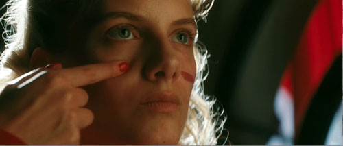
PS 20 Sept 2009: Curt Purcell, at The Groovy Age of Horror, finds a similar plot architecture emerging in the comic-book series Blackest Night.
Picks from the pile
Or rather, two piles. One stack of consumer durables that I brought home from seven weeks in what we Americans call Yurrp, and another stack of things that came while I was gone.
DVDs of course stand out. Apart from items scooped up in Bologna, here are a few highlights. Some are quite old, some very recent, but all were new to me.
The Magnificent Ambersons, on a Region 2 disc from Montparnasse, in cooperation with Cahiers du cinéma. The squarish box houses a slim booklet, a remastered copy, and bonus documents: interviews with Bill Krohn and Jean Douchet, and a 51-minute conversation between Welles and Bogdanovich. Plus the original trailer.
Engineer Prite’s Project, Kuleshov’s first film from 1918. It’s from Absolut Medien in collaboration with Hyperkino, which we wrote about last year. German subtitles only. Comes with a 54-minute documentary by Semyon Raitburt on the Kuleshov effect.
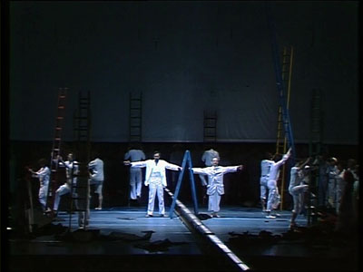
Another German release, but with English subs: Finally, the 1983 Stuttgart production of Philip Glass and Constance de Jong’s gorgeous Satyagraha. For once PoMo staging enhances the story. In the hammering opening of the second act, the mocking laughter of the South African whites comes from a vast row of beer swillers. The pre-HD imagery is a little soft, but my ancient Beta off-air copy can finally be laid to rest. From Arthaus Musik.
Absolut Medien also gives us The New Babylon, one of the greatest but least-known Soviet Montage films. The original Shostakovich score has been used, and the German reconstruction has English subtitles. Apparently a UK edition is on the way. The film is hard to cope with digitally: Lots of fog, smoke, and steam; diffuse photography; shots with significant action in out-of-focus planes. Still, it’s a big improvement on the bargain French edition in circulation. Tom Paulus, a real gentleman, surrendered the last copy in Bruges to me.
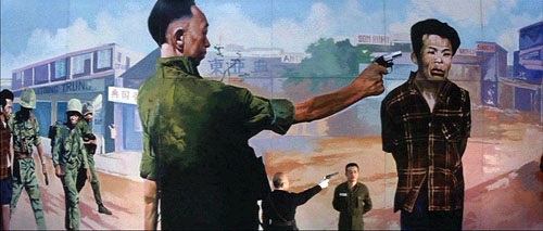
The venturesome French company Carlotta has launched an Oshima collection, though it doesn’t seem to appear on the Carlotta website! I found three must-have items at Fnac: A Treatise on Japanese Bawdy Songs, Japanese Summer: Double Suicide, and best of all Three Resurrected Drunkards. The last is a bizarre masterpiece mixing a boy band up with the Vietnam war and Japanese discrimination against Koreans. About 40 minutes in, Oshima provides the most anxiety-provoking reel change in cinema. All Region 2.
Now for some books and journals:
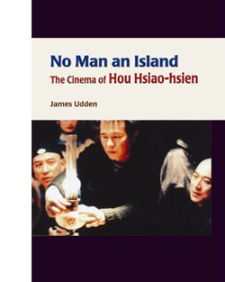 James Udden, one of my last dissertators before I retired, has written the first book-length study of Hou Hsiao-hsien in English. No Man an Island: The Cinema of Hou Hsiao-hsien puts Hou firmly in the context of Taiwanese film history and culture. It offers some provocative suggestions, particularly in arguing that it’s misleading to consider Hou an essentially Chinese director. Jim, who lived in Taiwan and speaks Mandarin, spent many years watching Chinese films from all eras, and he balances this breadth with close study of each Hou film. From Hong Kong University Press.
Eva Laass has just published a wide-ranging study of current narrative strategies in Broken Taboos, Subjective Truths: Forms and Functions of Unreliable Narration in Contemporary American Cinema. She examines Forrest Gump, Thank You for Smoking, Natural Born Killers, Fight Club, and other works in the light of several questions. What different forms of narrative unreliability can be distinguished? Why have unreliably narrated films become so popular in recent years? Which needs do they meet in American culture? Although available from Amazon.de, the book is in English.
I met Steven Jacobs, a brilliant young art historian with wide-ranging expertise, at the Bruges Zomerfilmcollege some years ago. This year he gave me a copy of his 2007 book, The Wrong House: The Architecture of Alfred Hitchcock. Drawing on research in production documents, it’s a careful and imaginative analysis of the master’s use of interior spaces, including discussion of his “staircase complex.” Steven has even reconstructed floor plans for some movies. He is interviewed about the book, in Dutch, here.
For Paolo Gioli admirers, the forty-fifth Pesaro festival catalogue should be welcome. A retrospective of Gioli films is accompanied by essays, an extensive interview with Giacomo Daniele Fragapane, and a detailed, annotated filmography. Everything is bilingual Italian/ English. You can download the catalogue as a pdf here. I hope to post my contribution, with some extra frames, on this site in the next month or so.
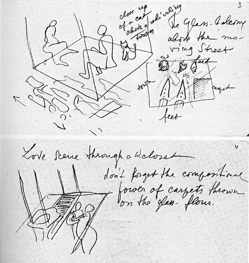
One of Eisenstein’s most ambitious projects was The Glass House (1927-1930). Inspired by skyscrapers, he envisaged a movie set in a high-rise apartment building of the future, with transparent walls and ceilings. He savored the idea of juxtaposing action in different layers (akin to the sequence in M. Giffard’s apartment in Tati’s Play Time). Some of the results can be seen surmounting this entry: a cat curled above a moving street, intertwined lovers seen through a bathroom floor. Another sketch shows a dying woman in the foreground and elevators carrying oblivious people past her.
The bold project is documented in a lovely French volume edited by Alexandre Laumonier and translated by Valérie Pozner and Michail Maiatsky. Glass House contains diary extracts, working notes, and sketches, all thoroughly annotated by François Albera. In a synoptic essay, Albera discusses the role of architecture in Eisenstein’s thinking.
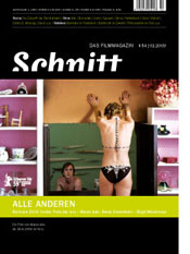 Everyone seems to be talking about the roles of film festivals these days, and a current roundup of opinion can be found in the Cologne-based magazine Schnitt. The magazine is published in German, but for the festival symposium in issue 54, the editors provide English versions of essays by Marco Müller (Venice), Cameron Bailey (Toronto), and many other festmachers. Some radical ideas floating around here, including the suggestion by Lars Henrik Gass (Oberhausen) that subsidies for national film industries, and their festivals, may have to end. (His essay is available in English here.)
In the wake of my homage to the Geneva Theatre/ Smith Opera House, Karen Colizzi Noonan kindly sent me some issues of Marquee, the journal of the Theatre Historical Society of America. Marquee is going strong after forty years, and it remains a lavish production, with big stills and in-depth research. The Society, which is currently updating the standard source book Great American Movie Theaters, holds an annual meeting that includes theatre tours. If you’re at all interested in American film history, you should visit the Society’s website.
There were other items on the two piles, but I have to go. My eyes and ears have some work to do. I’ll leave you with the most unexpected development, film-book-wise, I have encountered upon my return.
Three Resurrected Drunkards.
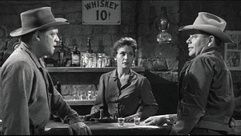
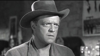
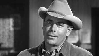
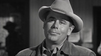
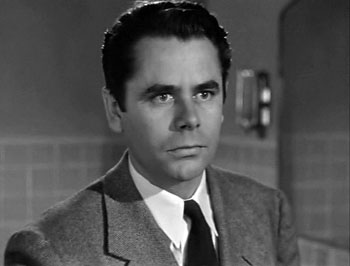
Gradation of emphasis, starring Glenn Ford
DB here:
Charles Barr’s 1963 essay “CinemaScope: Before and After” has become a classic of English-language film criticism. (1) It proffers a lot of intriguing ideas about widescreen film, but one idea that Barr floated has more general relevance. I’ve found it a useful critical tool, and maybe you will too.
Grading on a curve
Barr called the idea gradation of emphasis. Here’s what he says:
The advantage of Scope [the 2.35:1 ratio] over even the wide screen of Hatari! [shot in 1.85:1] is that it enables complex scenes to be covered even more naturally: detail can be integrated, and therefore perceived, in a still more realistic way. If I had to sum up its implications I would say that it gives a greater range for gradation of emphasis. . . The 1:1.33 screen is too much of an abstraction, compared with the way we normally see things, to admit easily the detail which can only be really effective if it is perceived qua casual detail.
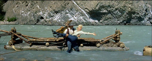
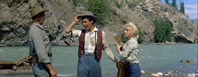
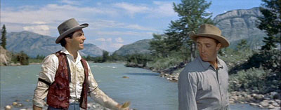
The locus classicus exemplifying this idea comes in River of No Return (1954). When Kay is lifted off the raft, she loses her grip on her wickerwork bag and it’s carried off by the current. (See the frame surmounting this entry.) Kay and her boyfriend Harry are rescued by the farmer Matt. As all three talk in the foreground, the camera catches the bundle drifting off to the right.
Even when the men turn to walk to the cabin, Preminger gives us a chance to see the bundle still drifting downstream, centered in the frame.
The point of this shot, Barr and V. F. Perkins argued, is thematic. As Kay moves from the mining camp to the wilderness, she will lose more and more of her dance-hall trappings and be ready to accept a new life with Matt and Mark. The last shot of the film shows her final traces of her old life cast away.
Cutting in to Kay’s floating bag would have been heavy-handed; if you stress a secondary element too much, it becomes primary. Barr reminds us that any film shot can include the most important information, as well as information of lesser significance. A film can achieve subtle effects by incorporating details in ways that make them subordinate as details and yet noticeable to the viewer. Or at least the alert viewer.
In Poetics of Cinema, I wrote an essay on staging options in early CinemaScope, and Barr’s idea helped me illuminate some of the strategies I discuss. (For earlier comments on Barr on Scope and River of No Return, see my article elsewhere on this site.) Today I want to consider how the notion of gradation of emphasis has a more general usefulness.
Barr contrasts the open, fluid possibilities of CinemaScope with two other stylistic approaches, both found in the squarer 1.33 format. The first approach is the editing-driven one he finds in silent film. This tends to make each shot into a single “word,” and meaning arises only when shots are assembled. Barr associates this approach with Griffith and Eisenstein. The second approach, only alluded to, is that of depth staging and deep-focus shooting, typically associated with sound cinema of the late 1930s and into the 1950s.
Both of these approaches, montage and single-take depth, lack the subtle simplicity of Scope’s gradation of emphasis.
There are innumerable applications of this [technique] (the whole question of significant imagery is affected by it): one quite common one is the scene where two people talk, and a third watches, or just appears in the background unobtrusively—he might be a person who is relevant to the others in some way, or who is affected by what they say, and it is useful for us to be “reminded” of his presence. The simple cutaway shot coarsens the effect by being too obvious a directorial aside (Look who’s watching) and on the smaller [1.33] screen it’s difficult to play off foreground and background within the frame: the detail tends to look too obviously planted. The frame is so closed-in that any detail which is placed there must be deliberate—at some level we both feel this and know it intellectually.
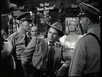
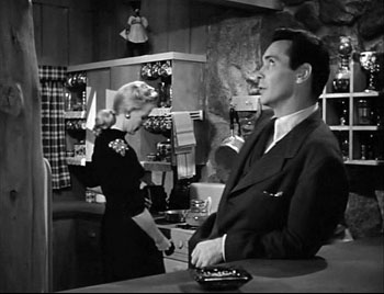
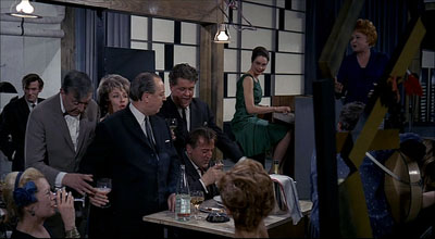
To see Barr’s point, consider a shot like this one from Framed (1947).
The shot, rather typical of 1940s depth staging, displays an almost fussy precision about fitting foreground and background together. That bartender, for instance, stands squeezed into just the right spot. (2) Barr claims that we sense a certain contrivance when primary and secondary centers of interest are jammed into the 1.33 frame like this.
We don’t sense the same contrivance in the widescreen format, he suggests. Barr assumes, I think, that the sheer breadth of any Scope frame will include areas of little consequence, whereas that’s comparatively rare in a 1.33 composition. This is an intriguing hunch, but uninformative patches of the frame may not be intrinsic to the Scope technology. Perhaps the fairly neutral and inexpressive uses of Scope that dominate the early 1950s, the sense of empty and insignificant acreage stretching out on all sides, make us expect that little of importance will be found there. Accordingly, directors can create a sense of discovery when we spot a significant detail in this stretch of real estate.
Anyhow, Barr indicates that if static deep-space staging made the frame too constrained, 1930s and 1940s directors who combined depth with camera movement created more spacious and fluid framings. He suggests that Mizoguchi, Renoir, and others anticipated the possibilities of Scope.
Greater flexibility was achieved long before Scope by certain directors using depth of focus and the moving camera (one of whose main advantages, as Dai Vaughan pointed out in Definition 1, is that it allows points to be made literally “in passing”). Scope as always does not create a new method, it encourages, and refines, an old one (pp. 18-19).
Barr believes that Scope positively encouraged gradation of emphasis, and that widescreen directors of the 1950s and 1960s have made the most fruitful use of the strategy. But he allows directors of all periods utilized gradation of emphasis, even in the standard 1.33 format. This is, I believe, a powerful idea.
Before Scope: Making the grade
Barr’s discussion of silent cinema, relying on notions of editing associated with Griffith and Soviet directors like Eisenstein, is done with a broad brush, but it’s typical of the period in which he was writing. We didn’t know much about silent filmmaking until archivists started to exhume important work in the 1970s. It’s no exaggeration to say that we haven’t really begun to understand the first twenty-five years of cinema until fairly recently.
In a way, the staging-driven tradition of the 1910s, which I’ve often mentioned on this site (here and here and here), exemplifies some things that Barr would approve of. Directors of that period made extraordinary use of the frame and compositional patterning. They staged action laterally, in depth, or both. They let shots ripen slowly or burst with new information. This approach to using the full frame (with only occasionally cut-in elements) has come to be called the tableau style, emphasizing its similarity to composition of a painting—although we shouldn’t forget that these films are moving paintings, and the compositions are constantly changing. The result is that emphasis tends to be modulated and distributed among several points of interest.
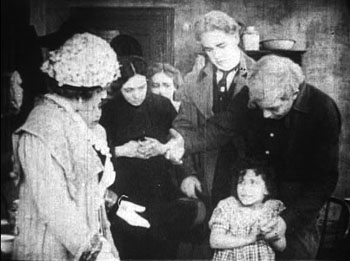
Central to this strategy, I think, was camera distance. American directors tended to set the camera moderately close, cutting figures off at the knees or hips, and by taking up more frame space, the foreground actors tended to limit the area available for depth arrangement or for significant detail.
This shot from Thanhouser’s The Cry of the Children (1912) is a rough 1910s equivalent of the crammed shot from Framed above. (See also the tightly composed shots from DeMille’s Kindling (1915) here.)
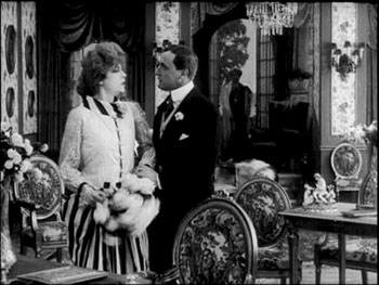
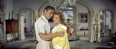
The European directors, by contrast, tended to let the scene play out in more distant shots, creating spacious framings of a sort that would be reinstituted in early CinemaScope. Consider this shot from Holger-Madsen’s Towards the Light (Mod Lyset, 1919) and another from Island in the Sun (1957).
Both, it seems to me, have the type of open composition and the foreground/ background interplay that Barr praises in his article.
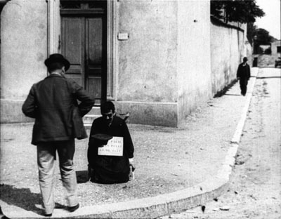
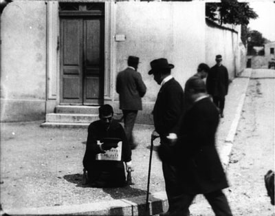
We can go back further. The Lumière brothers’ cameramen made fiction films as well as documentaries, and we occasionally find moments that suggest early efforts at gradation of emphasis. In Le Faux cul-de-jatte (1897), an apparent amputee is begging in the foreground while in the distance a man is walking down the street.
A cop crosses the street from off right and follows the pedestrian.
As the foreground fills up, the man we’ve seen in the distance gives the beggar some money.
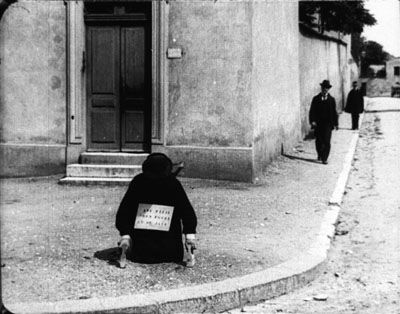
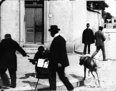
As he goes out left, the cop is still approaching, and a vagrant dog appears.
The cop comes to the beggar, partially blocking the dog, who takes care of other business. (Not everything in this movie is staged.)
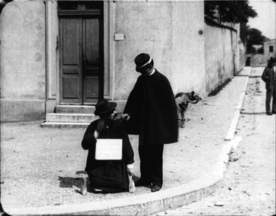
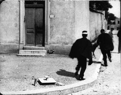
The cop checks the beggar’s papers and finds them to be suspect. The fake amputee jumps up and races off in the distance, with the cop pursuing.
As with many staged Lumière shorts, several figures converge in the foreground in order to create a culminating piece of action. Here the distant man and the cop, both secondary centers of interest, serve as a kind of timer, assuring us that something will happen when they meet at the beggar.
These are just some quick examples. We should continue to study the ways in which, with minimal use of editing, early filmmakers found ingenious ways to create gradation of emphasis. (2)
Some uses of grading
Barr, like most critics writing for the British journal Movie, was sensitive to the ways in which technique has implications for character psychology and broader thematic meanings. Kay’s bundle is one point along a series of changes in her character and her situation. But gradation of emphasis can serve more straightforward narrative purposes as well.
Consider our old friends, surprise and suspense. In the original 3:10 to Yuma (1957) Dan Evans is confronting the ruthless outlaw Ben Wade.
We get a string of reverse shots.
Then in one shot of Wade, without warning, a shadowy figure emerges out of focus in the left background.
Now we realize that Evans has been diverting Wade from the fact that the sheriff’s posse is surrounding him. Now we wait for Wade to discover it; how will he react?
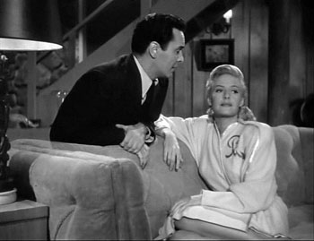
While we’re on Glenn Ford, another nice example occurs in Framed. Mike Lambert has been romancing a woman named Paula, but we know that she and her lover Steve are plotting to fake Steve’s death and substitute Mike’s body.
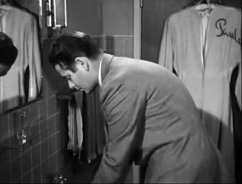
She brings Mike to Steve’s elegant country house, having presented Steve as someone she knows only slightly. When Mike goes into the bathroom to wash up, we notice something important behind him.
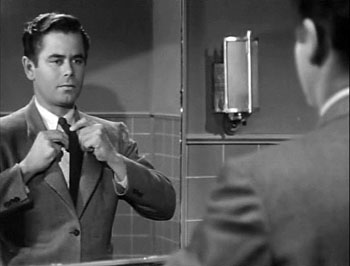
With Mike at the sink, we have plenty of time to recognize Paula’s robe. Director Richard Wallace prolongs the suspense by giving us a new shot of Mike in the mirror, with the robe no longer visible.
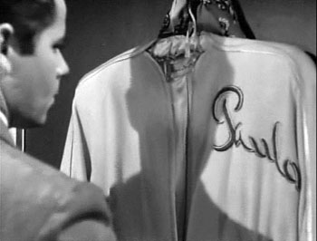
But when Mike turns to leave, a pan following him brings him face to face with what we saw, accentuated by a track forward.
We get Mike’s reaction shot, followed by a cut to Steve and Paula downstairs, suspecting nothing. “So far, so good,” says Steve, looking upward at the bathroom.
The rest of the scene will play out with Mike aware that they’re deceiving him. As often happens with suspense, we know more than any one character: We know the couple’s scheme and Mike doesn’t, but they don’t (yet) know that Mike is now on his guard.
This isn’t as subtle a case as River of No Return, but I suspect that it’s more typical of the way Hollywood filmmakers use gradation of emphasis. Paula’s bathrobe is a good example of what I called in The Classical Hollywood Cinema the strategy of priming: planting a subsidiary element in the frame that will take on a major role, even if initially its presence isn’t registered strongly. My example in CHC was a coat rack in the Dean Martin/ Jerry Lewis comedy The Caddy (1953). In effect, the distant pedestrian in the Lumière film is an early example of priming.
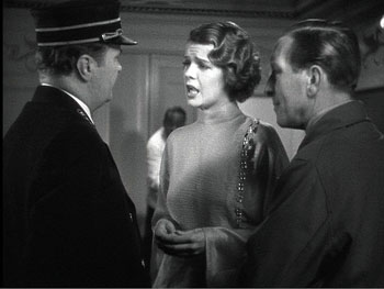
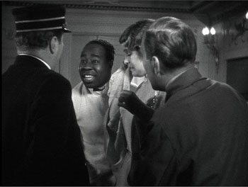
Howard Hawks adopts the Lumière technique in order to sustain a flow of dialogue in Twentieth Century (1934). Here the foreground conversation is accompanied by a procession of people emerging in the distance and stepping up to take part.
The shot concludes, as does the shot of Faux cul-de-jattes, with a retreat from the camera.
The priming of secondary elements here, the summoning of the train attendant and the conductor, obeys Alexander Mackendrick’s dictum that the director ought to construct each shot so as to prepare for what will come next.
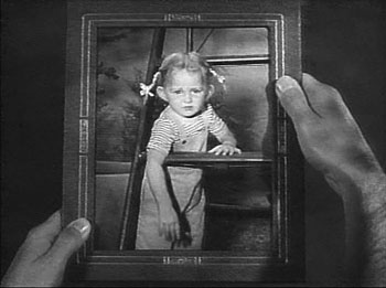
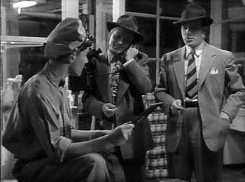
As Barr indicates, the idea of gradation shades insensibly off into general matters of cinematic expression. In The Devil Thumbs a Ride (1947), the bank robber has hitched a ride with an unassuming civilian, and they stop for gas. When the attendant shows a picture of his little girl, the robber gratuitously insults her. (“With those ears she’ll probably fly before she can walk.”)
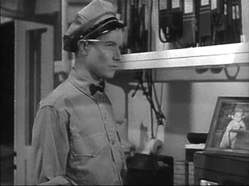
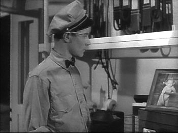
Later, the station attendant hears a radio broadcast describing the fugitive. First he has his head cocked as he listens attentively, but then his gaze drifts to the picture of his little girl.
The attendant is the center of dramatic interest, but when he looks at the picture, so do we (primed by the view of it earlier). Instantly we understand that the attendant’s resolve to call the police springs partly from an urge to get even with the man who insulted his daughter. A minor instance, surely, but it illustrates Barr’s point that the notion of gradation of emphasis leads us to consider “the whole question of significant imagery.”
The more the merrier
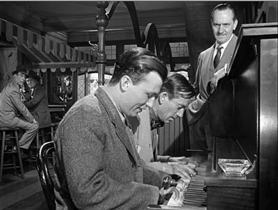
Barr seems to favor a plain style; he prefers Preminger’s quiet framings to the rococo imagery of Aldrich’s Vera Cruz (1954). Presumably the famous shot above from Wyler’s Best Years of Our Lives (1946) would be too obviously composed for Barr’s taste.
But there is merit in considering how a secondary center of interest can vie for supremacy. André Bazin declared Wyler’s shot a bold stroke exactly because its self-conscious precision created a tension between what was primary and what was subordinate. (3) The action in the foreground is of dramatic interest because Homer has learned to play the piano, and this represents a phase of his coming to terms with his wartime disability. Yet the most consequential action is taking place in the distant phone booth, where Fred breaks up with Al’s daughter Peggy. The gradation of emphasis is inverted, and we wait in suspense to find out what happens. Bazin taught us to recognize that what appears to be primary may actually be creatively distracting us from the scene’s principal action. (4)
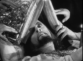
A director can also turn a primary center of interest into something secondary, but powerful. In one sequence of Eisenstein’s Ivan the Terrible I (1944), the apparently dying tsar is being prayed over by churchmen. Ever suspicious, he peers out from under the book, using only one eye.
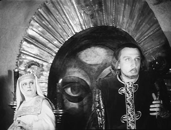
As the scene develops, Prince Kurbsky meets Ivan’s wife and tries to seduce her. In the background an icon’s eye glares out, as if Ivan is watching them.
The single eye, which is a motif we find in other Eisenstein films, becomes a significant one throughout both parts of Ivan. More generally, this device manifests Eisenstein’s conception of polyphonic montage, which explored how the filmmaker can control all the various aspects of his images and make them weave throughout the film—promoting one at one moment, demoting it at another. (5)
Barr’s essay assumes that Eisenstein’s montage stripped each image down to a single meaning. In fact, though, Eisenstein wanted to multiply the sensuous and intellectual implications of each shot by weaving objects, gestures, body parts, musical motifs, and the like into an ongoing stylistic fabric. Each shot’s gradation of emphasis can suggest thematic parallels, deepen the drama, or heighten emotional expression, just as a complex score enhances an operatic scene.
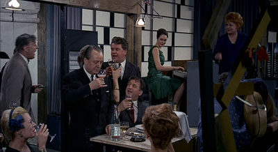
Tati as well likes to create an interplay between primary and subsidiary centers of interest. Or rather, he sometimes abolishes our sense of what is primary and what isn’t. The crowded compositions of Play Time (1967) often bury their gags in a welter of inessential details. During the lengthy scene in the Royal Garden restaurant, a minor running gag involves the dyspeptic manager. He has just mixed some headache medicine with mineral water, but the action is easily lost within the tumultuous image. Even the soundtrack cues us only slightly, with a bit of fizz among the music and crowd noise.
As the manager lowers the glass, Hulot thinks it’s pink champagne being offered to him.
Rolling the stuff in his mouth, Hulot realizes his mistake as he earns a stare from the manager.
There is so much competing sound and activity in the shot that some viewers simply don’t notice this bit at all. In Play Time, gradation of emphasis is often flattened out, leaving us to rummage around the composition for the gag.
Some final notes
Barr was not particularly interested in the mechanics of how we come to notice something in the shot, be it primary or secondary in value. In On the History of Film Style, I suggested that many aspects of technique work to call attention to any element in the field. The filmmaker can put a something in motion, turn it to face us, light it more brightly, make it a vivid color, center it in the frame, have it advance to the foreground, have other characters look at it, and so on. These tactics can work together in a complex choreography. In Figures Traced in Light, I argued that they depend on the fact that we scan the frame actively; the techniques guide our visual exploration. (6)
You can see this guidance at work in most of the examples I’ve mentioned. In River of No Return, we are coaxed into noticing Kay’s bundle because we’re cued by movement (the bundle falls and drifts off), performance (she shouts, “My Things!” and stretches out her arm), music (we hear a chord as the bundle splashes), and framing (Preminger’s camera pans slightly as the trunk drifts away). The critic can refine our sense of the effects that a film arouses, but it’s one task of a poetics of cinema, as I conceive it, to examine the principles and processes that filmmakers activate in achieving those effects.
Finally, we might ask: To what extent do we find gradation of emphasis in current filmmaking? Today’s American cinema relies heavily on editing, using a style I’ve called intensified continuity. Each shot tends to mean just one thing, and once we get it we’re rushed on to the next. The unforced openness of the wide frame that Barr celebrated has been largely banned, in favor of tight singles—even in the 2.40 anamorphic format. It seems that most filmmakers are no longer concerned with gradation of emphasis within their shots.
To find this strategy surviving at its richest, I think we have to look overseas. If you want names: Angelopoulos, Tarr, Kore-eda, Jia, Hou. (7)
(1) It was published in Film Quarterly, vol. 16, no. 4 (Summer, 1963), 4-24. Unfortunately, it’s not available free online, nor is a complete version available in anthologies, so far as I know. If you have access to online journal databases, you can find it. Otherwise, off to the library w’ye!
(2) In the Poetics of Cinema piece (pp. 303-307), I argue that some early uses of Scope tried to approximate such tightly organized composition, despite technological barriers to focusing several planes of action.
(3) See André Bazin, “William Wyler, or the Jansenist of Directing,” in Bazin at Work: Major Essays and Reviews from the Forties and Fifties, ed. Bert Cardullo, trans. Cardullo and Alain Piette (New York: Routledge, 1997), 14-16.
(4) Actually the phone booth is primed for our notice by earlier shots in Butch’s tavern. See On the History of Film Style, 225-228.
(5) For more on Eisenstein’s idea of polyphonic montage, see my Cinema of Eisenstein (New York: Routledge, 2005) and Kristin’s Eisenstein’s Ivan the Terrible: A Neoformalist Analysis (Princeton: Princeton University Press, 1981).
(6) For some empirical evidence of this guided scanning, see the work of Tim Smith at his website and in this entry on this site.
(7) I discuss some of these alternatives in On the History of Film Style and the last chapter of Figures Traced in Light.
Eternity and a Day.
PS 15 Nov. Two more items. First, if the ideas floated here intrigue you, you might want to take a look at an earlier entry on this site, called “Sleeves.”
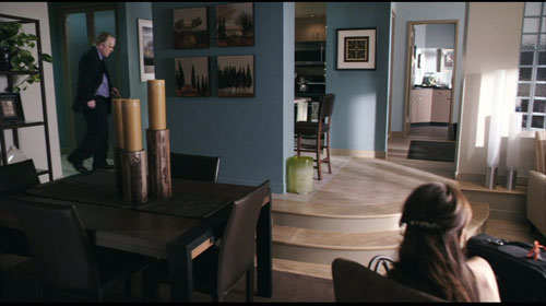
Second, I had planned to include one more example, but forgot it. In Lumet’s Before the Devil Knows You’re Dead, Andy Hanson’s life is unraveling. We follow him back to his apartment, and as he enters on the extreme left, his wife Gina is visible sitting on the extreme right, her back to us.
Gina forms a secondary center of attention, but the key to the upcoming action is revealed in a third point of interest: the black suitcase pressed against the right frame edge. The shot tells us, more obliquely than one showing her leaving the bedroom with the case, that she is planning to leave him. Lumet’s image, reminiscent of the framing of the trunk in River of No Return, shows that gradation of emphasis isn’t completely dead in American cinema. The orange scrap of yarn, knotted to the handle for baggage identification, is a nice touch of realism as well as a welcome color accent that further draws the suitcase to our notice.


