Archive for the 'Directors: Guerin' Category
Three nights of a dreamer
DB here:
The close-up blogathon launched by Matt Zoller Seitz is over, but it contains enough specimens and analyses for a hefty book. It also inspired Jim Emerson to devote a cine-lyric to the close-up. I missed the deadline, so I suppose that this constitutes my sideways contribution to Matt’s enterprise.
Sideways, because a full-blown analysis of In the City of Sylvia (En la ciudad de Sylvia; Dans la ville de Sylvie) would be a breach of decorum. Most people haven’t heard of this new film by José Luis Guerin, let alone seen it. I saw it at the Vancouver festival in September, and it will make its way through the festival circuit over the coming months and should show up on cable or DVD thereafter. But apart from calling attention to it as a remarkable film, I want to look at one of its most absorbing sequences and suggest some of its originality. Lee Marshall has already pointed out one of Sylvia‘s arresting features:
Guerin seems to have created pure drama without recourse to story. We’re always taught that story is the engine of drama. Not here: somehow Guerin has created an almost plotless film that has the dramatic tension of vintage Hitchcock. (1)
Although the story situation is slight, the tension we feel springs partly from vivid stylistic patterns. In other words: Minimal and uncertain story action is heightened by engaging visual narration. This narration in turn derives its power from one of the most traditional devices of filmic storytelling.
Consider the other person’s point of view
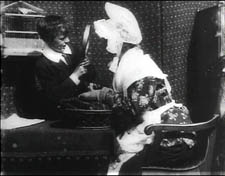
The point-of-view shot is a mainstay of cinematic storytelling, and its history is an intriguing one. Many of the earliest examples we have are motivated as views through optical gadgets. Two films by the Englishman G. A. Smith, both from 1900, handily show the options. Grandma’s Reading Glass justifies the point-of-view image as what the boy sees when he peers at granny through her big magnifier.
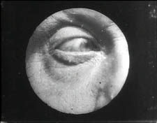
Smith’s As Seen through a Telescope motivates the cut-in POV shot as what our dirty old man in the foreground has an eye for.
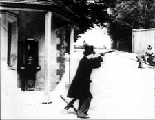
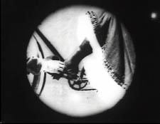
Fairly soon, this use of the magnifying POV shot was mingling with more straightforward ones. In The Birth of a Nation (1915), D. W. Griffith offers a rough-edged example. When the Stoneman brother and sister visit Ford’s Theatre on the night of Lincoln’s assassination, we see Elsie pointing out the famous actor John Wilkes Booth.
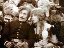
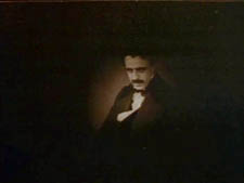
Booth is framed in an iris, which Griffith often uses to underscore an important image. But when Elsie studies Booth through her opera glasses, Griffith, usually not fastidious about such things, supplies the same irised image, now doing duty for the sort of magnifier-masking we get in the Smith films.
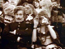
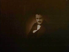
Presumably a more consistent technique would show Booth in long shot first, without the iris, and reserve the optical masking for replicating the view through the opera glasses. This is what happens in Ernst Lubitsch’s Lady Windermere’s Fan (1926), which contains a sequence built entirely around crisscrossed character looks. (1)
The woman of the world Mrs. Erlynne arrives at the racetrack and creates a stir, causing many men to watch her from all over the grandstand.
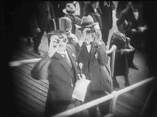
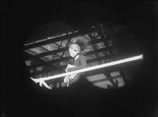
Note that Lubitsch has gone beyond Griffith by fitting the angle of Shot B to the viewer’s orientation, looking up. There are so many POV shots that at one point Lubitsch simply shows her from different angles and deletes the shots of each watching man.
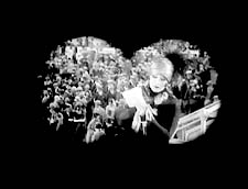
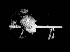
This is a fascinating example of a process we often see in stylistic history. An “overlearned” visual convention can be treated elliptically; the filmmaker can leave out bits and we’ll fill them in. The binocular masking suffices to let us know that Mrs. Erlynne is being studied from afar. Moreover, Lubitsch gets an expressive bonus from being so concise. Now it doesn’t matter who’s watching, just that somebody is—actually, a lot of somebodies.
Later, after much more byplay with people looking at one another and misunderstanding what they see, Mrs. Erlynne sits down. Three gossips have been studying her, but now their view is blocked. So one gossip has to twist around to spy on her, and Lubitsch obligingly gives us a slightly tipped point-of-view framing—a full shot, without masking.
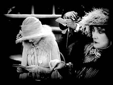
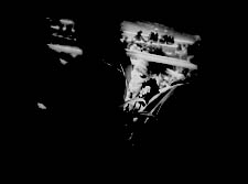
Adjusting her binoculars, the gossip is able to get a bigger view of Mrs. Erlynne, and she racks focus gleefully to catch a gray hair peeping out.
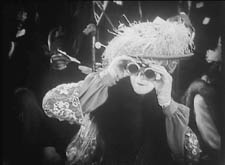

The visual narration in this sequence, already perfectly modulated, supplies the stylistic premise for Hitchcock’s Rear Window and all of its progeny, most recently Disturbia (2007). What might be overlooked is that by the 1920s the view through a device—field glasses, a microscope, a surveillance camera—had become a special, marked case. From then till now, the default POV pattern is the simple shot of a character looking, followed by an unadorned shot of what that person sees, from more or less the correct standpoint. Lubitsch’s sideways shot of the gossip’s view of Mrs. Erlynne, casually introduced, exemplifies the modern norm for presenting a character’s vision, and it’s so common that we seldom notice it.
POV shots: The basics
In his book Point of View in the Cinema, Edward Branigan itemizes the cues that the filmmaker can manipulate in creating a POV construction. (2) To simplify somewhat: Shot A shows a point in space and a character glance from that point. Shot B is taken from a camera position more or less approximating the point in A, and it shows an object. The shot-change presumes temporal continuity between A and B, and we assume as well that the character is aware of the object shown in B.
This seems like a complicated way of stating the obvious, but by teasing these elements apart, Branigan shows that each one can be manipulated in intriguing ways. For example, you can create a disorienting moment by violating the condition of temporal continuity. Ozu does this in Early Summer (1951), when Noriko and Aya decide to peek in at the man Noriko almost married. The two women tiptoe down a hall toward us as the camera tracks slowly backward. Ozu cuts to a forward-tracking shot that momentarily suggests a reverse angle POV on the corridor.

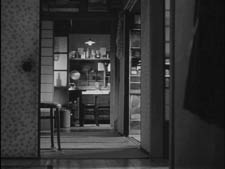
In fact, however, the camera movement is revealed to be the first shot of a new scene, among different characters, and we won’t ever see the man the two women went to spy on.
Here’s another interesting case, not cited by Branigan. In Halloween (1978), John Carpenter shows Laurie looking out a window and seeing Michael Myers in his mask, standing between fluttering washlines.
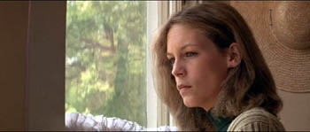

Cut back to Laurie, now frowning slightly.
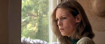
Cut to a second POV shot; but now Michael has vanished.
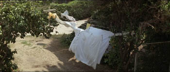
This simple change in shot B’s object, Michael himself, has an uncanny effect. Did Michael just walk away from the washline? If so, this is an odd way to present it. Why not show him walking away? Alternatively, did he just disappear? Surely not; Laurie would be shocked. Carpenter wins twice over. Without obviously violating realism or directly showing that Michael has supernatural powers, he gives Michael the ability to come and go in a ghostly fashion. By the end of the film, when he miraculously disappears after a fall that would kill an ordinary person, we are prepared to believe that he is indeed, as Dr. Sam Loomis says, the Boogyman.
Who is Sylvia? What is she that all the swains commend her?
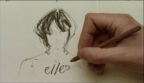
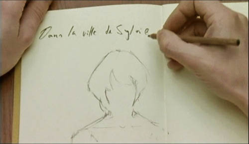
In the City of Sylvia centers on a young man staying at a hotel. We’re given no reason why he’s visiting the city, and no backstory about him. One day he’s sitting at a café. Now, across nearly twenty minutes of screen time he watches women and idly sketches them.
The sequence is a pleasure to watch, partly because of the constant refreshing of the image with faces, nearly all of them gorgeous, most of them female. Either Strasbourg has an extraordinary gene pool, or this café attracts only Ralph Lauren models. Yet the scene builds curiosity and suspense too, thanks to Guerin’s sustained and varied use of optical POV. He gives us an almost dialogue-free exploration of a cinematic space through one character’s optical viewpoint. (Stop reading here if you don’t want to know anything more about the film before you see it.)
The young man, known in Guerin’s companion film Unas fotos en la ciudad del Sylvia as the Dreamer, is almost expressionless as he scans the women’s faces. Slight shifts of his glance are accentuated by his habit of turning his head but keeping his eyes fixed. In over a hundred shots, Guerin uses some ingenious cinematic means to tease us into ever-greater absorption in the Dreamer’s visual grazing.
Fairly far into the sequence, Guerin gives us more or less the orthodox POV construction. The Dreamer looks at one woman at a table, and we see her return his look.
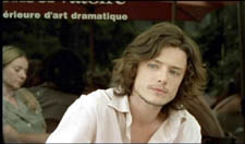
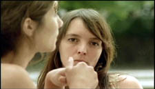
But here shot B isn’t really clean: the hands of the woman on the left sometimes block our view of the principal woman. This obtrusiveness is one of Guerin’s most basic strategies in the sequence. Inevitably, in passages before and after the cut I just showed, what the Dreamer is looking at is partially hidden in layers of faces and body parts.
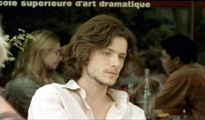
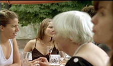
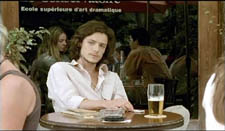
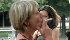
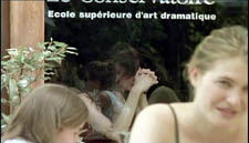
Our prototype of the POV cut presumes a more or less single ‘point’ we are watching in shot B, but throughout this scene Guerin plays with this cue. He tantalizes us with several points to be observed, and he often obscures the most important ones. He also creates some startling juxtapositions. Near the very start we get this shot, which may or may not be the Dreamer’s POV.
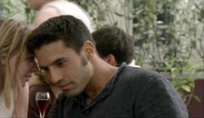

By making the background girl seem to kiss the foreground guy, Guerin, as Eisenstein would say, “christens” his sequence. In effect, the image says: Watch out! Layered space will become important! When I saw this shot, I nearly jumped out of my seat.
The Dreamer is treated no differently, at least at the start. In most movies, the POV construction is set up with a clear, clean framing of our looker in shot A. Here, though, at the start of the scene Guerin peels away layers to get to our man. For the first six shots of the café, we don’t know he’s on the scene. Then he’s shown out of focus, in the background of more prominent action. The woman in the foreground has been primed to be the shot’s subject. At the moment she shifts her gaze and we try to read her expression, a second woman on the distant right shifts aside to reveal the Dreamer behind her.
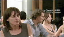
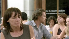
Surely this is the most unemphatic entry of a protagonist we’ve seen in a while! Guerin is able to add planes to block the main ‘point’ of shot B because he’s working with long lenses, a crowded space, and careful choreography. Even focus plays a role, as in this case; our Dreamer is pretty hazy.
One upshot of this strategy is that we’re plunged into a “cubistic” space, in which slightly varied camera angles pick up bits of space we’ve seen in earlier combinations and oblige us to assemble it all in our head. Be thankful for the guy in the blue shirt above, for he plays an anchoring role in several setups that would otherwise float free.

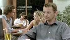
It’s hard to convey in stills how much fascination and frustration that this teasing style creates. Like the Dreamer, we’re given only glimpses of the women, and even though we don’t know his purposes—is he just an artist in search of beauty? a serial killer picking out victims?—the partial views lure us at several levels. We try to complete the faces. We try to infer the women’s state of mind from their expressions and gestures, which are far more animated than our Dreamer’s.
And a search for story plays a part here. We’re primed for some action to start, and we browse through these shots looking for anything that might initiate it. Each face the Dreamer spots promises to kick-start a plot: when the Dreamer gets a full view of one of these women, perhaps things will get going.
Without giving away every detail, I’ll just say that the sequence has a strong visual arc as the Dreamer starts paying more and more attention to certain women. And just as he finally gets a full view of one fabulous face, his attention wanders to . . . another layer, this time one inside the café.
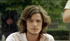
As he gapes at the woman inside, layers pile up, creating a cubistic climax of all the optical obstructions we’ve encountered.
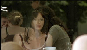
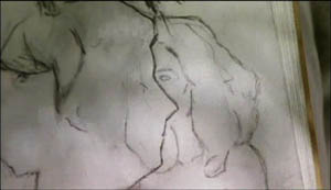
The motif of reflections will take over the rest of the film’s visual design, and eventually we’ll see that some of the Dreamer’s drawings evoke the piled-up and sliced-up faces in the café shots.
Later in the film, the Dreamer will explain why he’s in the city and why he’s scanning women. We’ll have a tram ride that Guerin compares with Sunrise, and a scene in a music club that not only parallels the café sequence but evokes Manet. We’ll also have occasion to compare this film with Bresson’s Four Nights of a Dreamer, a citation signaled from the outset.
All that is to come. Even if the later scenes weren’t as compelling as they are, this café sequence would make Sylvia one of the most adventurous films I’ve seen this year. By revising the simple, long-lived POV schema, Guerin has made it yield fresh feelings and implications. Like Lubitsch’s racetrack scene, this imaginative sequence provokes the jubilation you feel in the presence of calm, precise artistry.
(1) Lee Marshall, “Past Perfect,” Screen International (19 October 2007): 27. The web version is here, but it may require a subscription.
(2) I analyze the visual narration of Lady Windermere, which I think deserves to be ranked with Potemkin and Sunrise, in Narration in the Fiction Film (Madison: University of Wisconsin Press, 1985), 178-186.
(3) Edward R. Branigan, Point of View in the Cinema: A Theory of Narration and Subjectivity in Classical Film (The Hague: Mouton, 1985), 102-121.
