Archive for the 'Directors: Hitchcock' Category
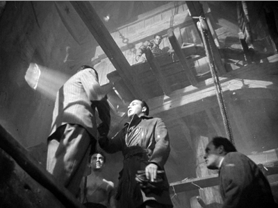
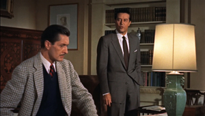
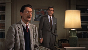
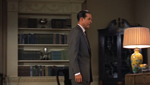
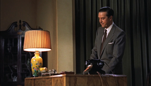
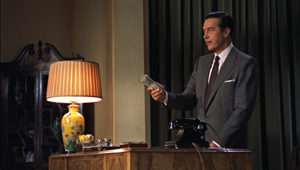
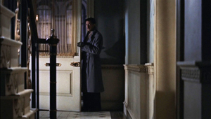
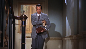
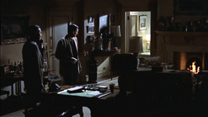
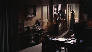
Sir Alfred simply must have his set pieces: THE MAN WHO KNEW TOO MUCH (1934)
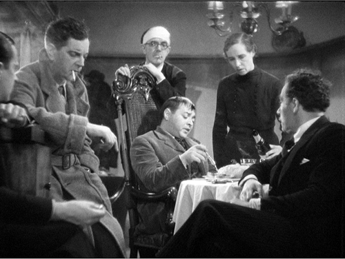
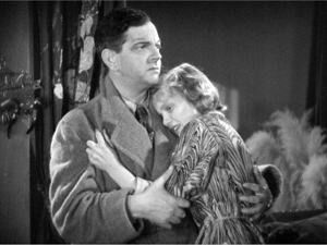
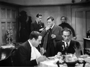
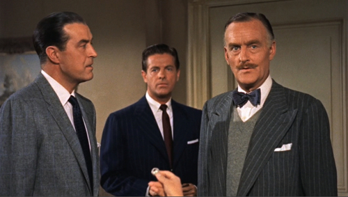
The Man Who Knew Too Much (1934).
DB here:
Hitchcock made six remarkable thrillers from 1934 through 1938, and I have long believed that the first one was the best. I think very well of Sabotage, and both The Lady Vanishes and The 39 Steps are strong contenders. But for me, The Man Who Knew Too Much has got damn near everything going for it.
I came to it a little late. It wasn’t the first Hitchcock I wrote about; that was Notorious, in a 1969 piece that nakedly reveals the limitations of a college senior’s knowledge. Nor was it the first Hitchcock I saw; that was Vertigo, when I was about ten. Inauspiciously for me, when Vertigo was revived for national television broadcast in 1972, I was flying to a job interview in Madison, Wisconsin.
I got that job, though, and soon The Man Who Knew Too Much became very important for me. Seeing it at a film society screening, I was bowled over. Then I discovered that it was available for purchase in a cheap 16mm print. I bought a print and began teaching the film as a model of narrative construction. It worked its way into the first edition of Film Art, in 1979 and hung around there for several editions.
That sample analysis has been available as a pdf on our site, but check it out at the Criterion site, where it’s enhanced with nice frame enlargements and a major extract. The essay makes my case for the movie as an extremely well-constructed piece in the classical storytelling tradition.
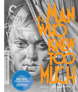 So I was the ideal consumer for a spruced-up DVD/ Blu-ray release, and as usual Criterion doesn’t disappoint. It’s a handsome version, with some fine supplements. We get two rare interviews with Sir Alfred from CBS’s arts program Camera Three (featuring Pia Lindstrom and William K. Everson) and a perceptive discussion with Guillermo del Toro, who makes a vigorous case for the film. So does Philip Kemp in his commentary, which is strong on production background. Kemp offers valuable information on script versions and on Hitchcock’s niche in the English industry. The accompanying booklet includes a lively appreciation by The Self-Styled Siren, aka Farran Smith Nehme.
Interest in Hitchcock seems to be the one constant in the whirligig of tastes in film culture. He is a mainstay of home video and cable television; apparently the films can be re-released in perpetuity. Professors love to teach his films. The techniques are obvious and vivid, and the films offer a manageable complexity that encourages interpretation. Class, gender, power, the law—whatever your favorite themes, they’re all on the surface, yet enticingly ambivalent. Not to mention how much fun these movies are to watch. I’ve always enjoyed introducing “lesser Hitchcock” like Stage Fright and Dial M for Murder and then watching the audience fall under their spell.
Critics navigate by Hitchcock as a fixed pole star. Reviewers compare every new thriller to the classics of The Master of Suspense. Just look at what people write about Soderbergh’s Side Effects. And for those who promoted the auteur approach to Hollywood cinema, Hitchcock was a beachhead. Who could doubt that this man turned out personal projects within the impersonal machine known as Hollywood? And if he could do it, why not Ford, Hawks, Sternberg, Ray, and all the rest? Hitchcock nudged skeptics down the slippery slope toward auteurism.
Even if Hitchcock isn’t to your taste, you can’t avoid his influence. That became obvious around the 1970s, when directors began borrowing from him more or less overtly: Spielberg’s Vertigo track-and-zoom in Jaws (now itself a convention), De Palma’s homages/pastiches, Polanski’s use of point-of-view in Repulsion and Rosemary’s Baby, the endless Psycho sequels and the van Sant remake, and the rest. But Hitch was no less influential in his own day; I’d argue that filmmakers of the 1940s had to raise their game if they wanted to meet the challenge of Rebecca, Foreign Correspondent, Suspicion, Shadow of a Doubt, Spellbound, and Notorious. Billy Wilder told a reporter that Double Indemnity was his effort to “out-Hitch Hitch.”
What was so special? Obviously, the throwaway humor—sometimes airy, sometimes slapstick, sometimes sardonic. And obviously a gift for switching situations around, playing them against cliché, setting us up for a jolt. But I think there’s something else afoot. Part of the Master’s repute rests on virtuosity of film technique. Hitchcock makes movie movies, even when, like Rope or Dial M, they seem “theatrical.” And this movieness is best seen, I think, by considering a term that always comes up with Lord Alfred: the set piece.
Maintaining a tradition
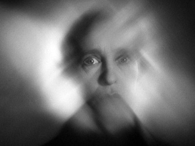
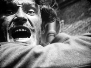
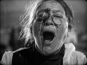
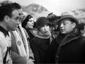
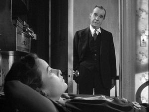
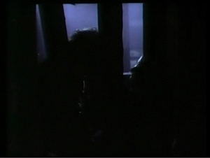
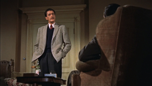
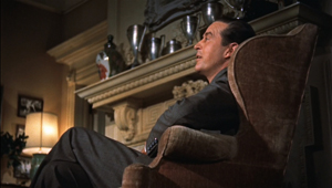
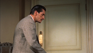
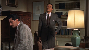
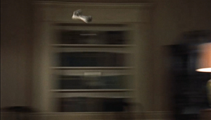
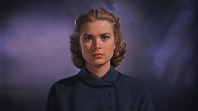
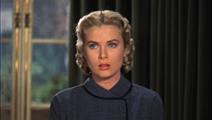
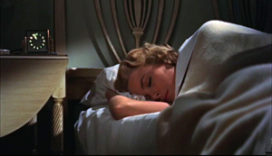
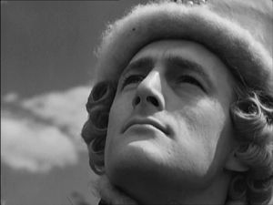
Hitchcock held onto the flamboyant expressive devices of silent and early sound cinema far longer than any other director. For decades he kept alive techniques that many directors thought were old hat: abrupt cuts to details of gestures and objects; blurry point-of-view images to suggest distraught or befuddled states of mind (as above); very brief insert shots to accentuate violence. Compare Battleship Potemkin with Foreign Correspondent’s assassination scene.
Hitchcock built entire films around classic silent techniques. The Kuleshov effect governs Rear Window; the German “entfesselte” or “unchained” camera dominates Rope and Under Capricorn. Rope and Dial M revive the aesthetics of the German kammerspielfilm, or “chamber play.” The Germanic look was alive and well in the spiderweb shadow-work of Suspicion, while both French Impressionism and German Expressionism inform the dream sequences of Spellbound and Vertigo. He also preserved the “creative use of sound” that was the hallmark of directors like Clair and Milestone. While others had pretty much given up the expressionistic use of music and effects, Hitchcock was always ready to draw on them. The hallucinatory Merry Widow Waltz haunts Shadow of a Doubt, while Hitchcock’s penchant for giving us two pieces of information simultaneously, one in the image and another on the soundtrack, let him design scenes visually and push a lot of dialogue offscreen.
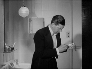
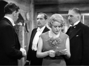
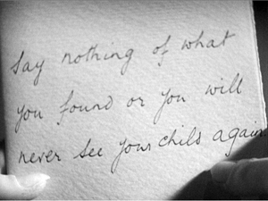
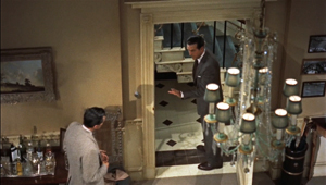
This flexibility of technique modulates from scene to scene. In The Man Who Knew Too Much, note-reading is presented in three ways, in rapid succession. First, Bob finds Louis’ note in the hairbrush.
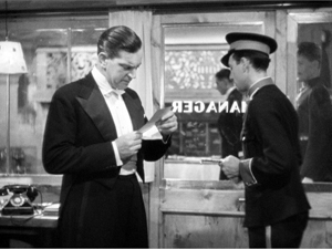
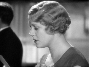
Soon Bob gets a message from the front desk. What does it say? Hitchcock hides that by, for once, not supplying subjective point of view.
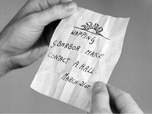
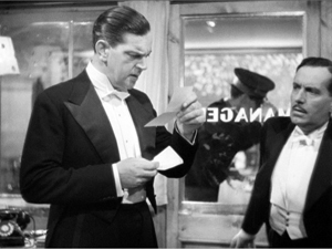
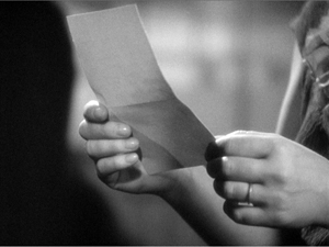
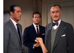
Only when the note is passed to Jill do we get to see it, but with a twist. Nobody but Hitchcock would add an extra shot that cuts to the note in her hand without revealing what it says.
That extra shot is what Eisenstein called a primer; as with dynamite, you need a little charge to trigger the blast.
We often forget that classic silent directors used their pictorial techniques for suspense. Lang’s Mabuse films and Spione furnish plenty of instances, but so do the Soviet montage films. The scene in which the police wait for the worker to return to his wife in The End of St. Petersburg now looks like pure Hitchcock, and of course the Odessa Steps sequence was the Psycho shower of its day. So it isn’t surprising that Hitchcock would turn his silent-film virtuosity toward creating scenes of high tension and threatened violence. Nor is it surprising that his skills would crystallize in “set pieces.”
Everybody talks about Hitchcock’s fondness for set pieces. It’s part of his brand. We have the Statue of Liberty climax in Saboteur, the milk carried up the staircase in Suspicion, the milk-and-razor scene and the final suicide in Spellbound, the spectacular rescue of Alicia at the end of Notorious, and the efforts of Bruno to retrieve the lighter in Strangers on a Train.
But, come to think of it, what makes something a set piece?
Game, set piece, match
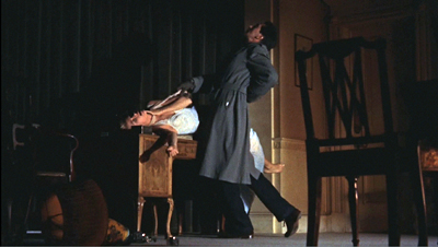
Foreign Correspondent (1940).
As commonly understood in the arts, a set piece is a fairly self-contained portion of a larger work. It has a distinct beginning and end, and it’s understandable and impressive if extracted from its original. It’s designed to be a bravura display of concentrated virtuosity. In music, an example would be an operatic aria like the Queen of the Night’s in The Magic Flute: it is so flashy and complete in itself that it can enjoyed on its own, in a concert setting.
Two early uses of the term shed light on its implications. In stage parlance, a “set piece” is an item of the set that can stand alone, like a gate or fake tree. In pyrotechnics, a “set piece” is a carefully patterned arrangement of fireworks; here again, it implies a display that dazzles the audience.
In the silent era, I’d suggest, the clearest exponent of set pieces is Eisenstein, who became known as “the master of the episode.” Many of his big scenes, like the Odessa Steps massacre, are developed at such length that they function as mini-films. But you can consider passages in Chaplin and Keaton as set pieces—the dance of the breadrolls in The Gold Rush perhaps, or the windstorm in Steambout Bill, Jr. The musical would seem to be a natural home of the set piece, with numbers standing out against more mundane scenes. In modern cinema, again under the aegis of Hitchcock: De Palma offers plenty, and perhaps the prize fights in Raging Bull constitute a string of them. Today the home of the set piece is the action picture; the chases and fights are the main attraction, and the genre challenges directors and crew to find new ways to intoxicate us.
The aesthetic of the set piece implies that some scenes function as filler while others get the whipped-up treatment. If that’s right, many great directors don’t favor mounting set pieces. Ozu, Mizoguchi, Dreyer, Hawks, and others present what we might call “through-composed” films. Just as Wagnerian opera and its successors minimized set pieces, these filmmakers create a surface texture that doesn’t create self-contained high points. (I grant you that the immolation of Herlofs Marthe in Dreyer’s Day of Wrath might count.)
Given the detachable quality of set pieces, it’s true that some of Hitchcock’s can seem implausible or gratuitous. How essential is Guy’s lighter to any plausible scheme of Bruno’s? If you want to kill Roger Thornhill, why send him to a crossroads in Midwest corn country? (A knife in the back on the Greyhound is more reliable.) It was this tendency to sacrifice story logic for stunning anthology bits that Raymond Chandler deplored:
The thing that amuses me about Hitchcock is the way he directs a film in his head before he knows what the story is. You find yourself trying to rationalize the shots he wants to make rather than the story. Every time you get set he jabs you off balance by wanting to do a love scene on top of the Jefferson Memorial or something like that.
Chandler has a point. How do you integrate a set piece into a whole movie? (I’ll make some suggestions shortly.) But first, give Hitch his due. For him, I think a set piece was a compact repository of inherently cinematic ideas carried to a limit within a sequence. A set piece is a challenge: How much can you squeeze out of a situation?
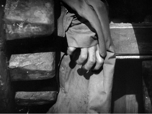
Go back to Foreign Correspondent. Setting an assassination in Amsterdam allowed Hitchcock to integrate the idea of a clue based on a waywardly turning windmill. So far, Chandler’s objection seems tenable: The windmill is just a gimmick. But once Hitchcock sets his hero exploring the lair, he can create a set piece that answers a question that no one ever thought to ask before: How do you eavesdrop in a windmill?
Johnny Jones has to evade the killers by crawling up alongside the giant gears, then down, then up again. At each step he barely escapes being spotted. When he seems safe, his topcoat gets snagged in the grinding gears, so he has to slip his arm out of it—just in time to avoid being crushed.
Yet once Jones is freed from the coat, it’s carried around the gearwork and might be spotted by the gang. And the old diplomat upstairs, mind hazed by drugs, is likely to reveal Jones’ presence. Hitchcock squeezes seven minutes of suspense out of all this, with a casual air that suggests: Of course, dear chap, any director worth his salary can see that a windmill harbors all kinds of excruciating menace. All in a day’s work, you know.
A whispered terror on the breeze
If anything is a set piece, the Albert Hall sequence in The Man Who Knew Too Much is. Philip Kemp’s commentary for the Criterion DVD considers it Hitch’s first, although aficionados would probably consider the “knife” sound montage of Blackmail at the very least a rough sketch for what would come. Lucky you: The entire Albert Hall sequence is excerpted on the Criterion site.
A set piece benefits from a simple premise. Here, Jill’s child is being held hostage, which keeps her from informing the police of what little she knows about the plot. We know that during the concert an assassin will try to shoot a diplomat.
You can imagine Chandler asking: Why plug Ropa during a concert, with all those witnesses? Why not when the target is on the sidewalk, shot from a rooftop for easy escape? You can hear that bland replying murmur: Raaaymond, it’s only a moovie…
So we have some conditions for a set piece: a compact piece of action limited in time and space. But there’s also a strong time marker. Ramon the assassin is to wait for a dramatic pause in the score; it’s followed by a shattering choral outburst that will muffle the pistol shot. We’ve been given a rehearsal of the passage in a gramophone record, but since we don’t hear the whole piece then, we can’t predict exactly when the chorus will hit its peak.
Hitchcock magnifies this uncertainty by letting the piece, Arthur Benjamin’s Storm Clouds Cantata, play out in its entirety. Its combination of lyrical and dramatic passages blend into a stream of music that coincides with the emotional action onscreen. I suspect that the piece, composed specifically for the film, glances at the most celebrated new choral piece of the era, William Walton’s Belshazzar’s Feast (1931). It too has a charged dramatic pause followed by a tremendous choral blast: “Slain!” You can listen to it here, and you can hear some of the musical affinities at 27:11 and after.
So the self-contained quality of the sequence is enhanced by the unfolding soundtrack, as well as its “bookend” structure: Jill arrives at the Albert Hall/ Jill leaves. (Hitchcock was very fond of this coming-and-going bracketing; many scenes of The Birds are built out of this.) But to be a set piece we need virtuosity too, right?
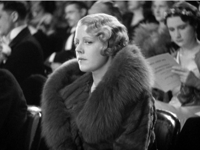
As our Film Art essay indicates, Hitchcock structures the scene using nearly every technique in the silent-cinema playbook. We get dynamically accentuated compositions, crisp point-of-view editing, subjective vision (even blurring as Jill drifts into a panicky reverie), and suspenseful crosscutting back to the gang holding Bob and Betty prisoner. The techniques build to their own crescendo, with more and shorter shots of Jill, the orchestra players, and the curtain concealing Ramon. As the climax approaches, details of the players’ performance pass in a flash. As another layer, though, all these visual techniques are synchronized with the musical structure of the piece. Most obvious is the slow tracking shot back from Jill as the female soloist launches in:
There came a whispered terror on the breeze./ And the dark forest shook.
The text has always teased me, because in my early years of studying the film I couldn’t hear everything there. Now that the Storm Clouds Cantata has become a minor concert piece, we have a full version of the text. It’s the description of an especially ominous storm, one that drives birds away and makes trees tremble in fear. The only creature left, vulnerable to the gale, is a child:
Around whose head screaming/ The night-birds wheeled and shot away.
The orchestral and choral forces mount on the line that has always come through the sound mix:
All save the child—all save the child.
The line is ambiguous. Its literal sense is that all the creatures have fled the oncoming storm except the child (“all save the child”). But Hitchcock’s cutting and the film’s overall context leave it as an imperative: the child must be rescued. Thus the musical dynamics and the text stress, for us and presumably for Jill, that Betty’s safety depends on what she does.
Soon the cantata’s text finds another analog in the concert hall. The choir sings of the storm clouds finally breaking and “finding release.” That phrase, repeated with rising intensity, yields the dramatic pause and then the final outburst that is to cover Ramon’s pistol shot. But now we have to see this phrase as prophecy and comment: Jill’s scream during the pause is the release of her tightened anxiety. And of course the line slyly signals the release of the suspense built up through the whole sequence.
With Hitchcock, you always get more.
In all, the sequence becomes exactly what a set piece ought to be: compact, with sharp boundaries and a strongly profiled arc of interest, elaborated with a great variety of technical resources and a thrusting emotional impact. But is it too much of an independent sequence? One can imagine Chandler worrying that Hitch doesn’t care much about how to hook it up with everything else. Let’s see.
This scepter’d isle
There’s no doubt that a plot driven by set pieces can seem episodic, just a matter of pretty clothes clipped to a slender line. In action movies it’s a classic problem, which, say, Speed doesn’t fully solve but Die Hard does.
You can mask an episodic plot, though, through some stratagems. First, make your filler material charming. The Man Who Knew Too Much gives us comedy in the dentist office and in the Tabernacle, with Bob and Clive mumbling messages through hymnody. You can also whisk the audience from scene to scene so quickly that the viewer has to concentrate on local connections. This is one purpose of what I’ve called the hook, the transition that smoothly links the end of one scene with the beginning of the next. If you’ve got some plot holes, strengthen your hooks–especially those that hide your gaps.
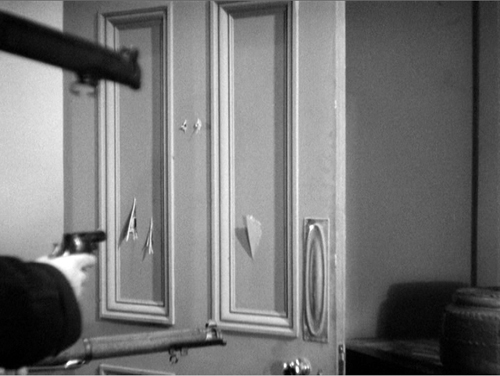
The Man Who Knew Too Much has some nifty hooks. I especially like the way the fingers pointing to the bullet hole are followed by a shot of Ramon’s head: effect and cause neatly given by a straight cut. Then there’s the contrast of the fire in the fireplace dissolving to the skier pin, a sort of thermal hook. But probably the most memorable one is Betty’s line about Ramon’s brilliantined hair.
This hook is a motif as well, and recurring images or sounds like this can help knit together your movie. In Foreign Correspondent, we get hats and birds in various scenes. Here, as our Film Art essay indicates, teeth, the skier pin, sharpshooting, the cantata’s main theme, and other motifs weave through the overall structure of the film.
You can as well knit your big scenes together through certain narrative patterns, such as a trip or a search, both strategies that Hitchcock employs in many movies. In The Man Who Knew Too Much, Bob’s investigation of the gang follows the menu set out in Louis’ note: the sun emblem, Wapping, G. Barbour, and A. Hall. This serves as a sort of map for the middle act of the film. Once Bob has cracked the message, though, the film shifts into a new register. Jill, who has been waiting passively at home, takes over the role of protagonist. And her actions will fulfill another motif: that of interruption and distraction.
The film begins with Betty’s dog disrupting Louis’ ski jump. That’s an innocent accident, as is the moment when Jill nearly spoils Roman’s skeet shooting. But soon afterward Abbott’s chiming watch deliberately breaks Jill’s concentration, making her lose the shooting match. In effect the Albert Hall sequence offers payback: With her scream Jill not only disrupts the performance but spoils Ramon’s aim as Abbott had spoiled hers.
The Albert Hall sequence fits into the film in a less obvious way, one that plays along the thematic dualities that marble the movie. Throughout the film contrasts “Englishness” with “foreignness,” the latter split between allies (Louis, Ropa) and enemies. The Storm Cloud Cantata and what follows represent a sort of triumph of England over her adversaries.
At the St. Moritz resort, the Lawrence family is set off from Louis, their French friend, and two men: Abbott the German and Ramon the Latin. (He’s handily fudged; he has a Spanish name but calls the English “extraordinaire.” And his hair is greasy.) “Sworn enemies, eh?” Jill says half-humorously to Ramon before losing the skeet shoot. After Louis’ death Bob is at a loss in the hotel, unable to speak German or Italian, and distracted while Betty is kidnapped. The English aren’t at home in this world.
Once Bob and Jill have returned to London, they join the family friend Clive, a Wodehousian upper-class twit but gifted with loyalty and tenacity. Bob and Clive have learned from Gibson of the Foreign Office that the gang intends to assassinate the diplomat Ropa. They must tell what they know; the killing could prove as catastrophic as the assassination that triggered the war of 1914-1918. Yet Bob keeps mum. He might be enacting E. M. Forster’s dictum: “If I had to choose between betraying my friend and betraying my country, I hope I would have the guts to betray my country.”
The conflict between family love and civic duty is played out in the rest of the second act, when the men’s investigation takes them to a working-class neighborhood of Wapping. There, we learn that behind respectable English institutions—a dentist, eccentric religion—foreign elements lurk. Bob has solved Louis’ riddle, but at the cost of becoming another hostage. Bob and Betty re-meet, in a characteristically subdued stiff-upper-lip encounter that denies Abbott the tearful scene he expected. The dignity with which Bob conducts himself, asking about Betty’s dressing gown and her school grades while staring defiantly at the gang, leaves the others abashed.
Clive has escaped, though, and has managed to send Jill to the Albert Hall. That musical set piece initiates the film’s climax dramatically but also thematically. For one thing, Benjamin’s cantata reaffirms another bit of Englishness. A national choral tradition runs back to Purcell and Handel, was sharpened in Mendelssohn’s Elijah, and was revived in the early twentieth century by Elgar’s Dream of Gerontius and Vaughan Williams’ Sea Symphony. Hitchcock and screenwriter Charles Bennett could have used Bach or Beethoven, but the choice of this brooding, mildly modernistic piece reminiscent of Walton is a nice bit of propaganda for British musical culture of the interwar years.
More importantly, the concert sequence solves the film’s ideological problem: How to save the world without destroying your family? Jill’s impulsive scream doesn’t divulge what she and Bob know about the gang, but it does serve to derail the gang’s plan and save Ropa. And by leading the police to follow Ramon to the hideout, she in effect chooses to risk Betty and Bob for the capture of the gang. Here, perhaps, the sheer drive of the action muffles the significance of her choice; Chandler complains that Hitchcock tended to take refuge from plot problems in “wild chases.”
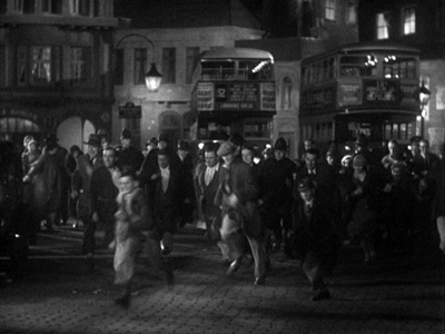
What follows, in the middle of some violence that remains shocking today, is a vigorous reassertion of Englishness. The vignettes during the siege display stalwart national virtues. A postman insists on making his rounds during the gunplay. An inspector swipes sweets and pauses for a cup of tea. The police reluctantly take up arms, only after several of their unarmed number are mowed down. Slipping into adjacent buildings, snipers move a piano while its fussy owner rescues his potted plant. And a cop who was slated to go off duty finds a warm mattress to die on. This unassuming valor, so different from Ramon’s petulant swagger and Abbott’s self-congratulatory sadism, will win out. The victory is announced by the pent-up crowd rushing jubilantly forward as the siege ends.
In any other movie the mother would have been huddling with the child and the man would grab a rifle to pick off his enemy on the roof. But making Jill the crack shot reasserts another quintessentially English image: the hunting, shooting, riding mistress of the estate. She gets her second chance to fire, bringing down Ramon when even the police sniper hesitates. It’s also a bit of guilty revenge for the death of Louis, whom Jill danced into the line of fire. Hitchcock, as usual, renders it elliptically: we see Jill grab the gun but not fire it. As she and Bob and Betty are reunited, the movie that began with the line, “Are you all right, sir?” ends with a mother reassuring her weeping daughter, “It’s all right.”
This, we might say, is how you integrate set pieces into your movie—narratively, stylistically, and thematically. Others would disagree with me, but nearly forty years of living with this film hasn’t made me change my mind. The Man Who Knew Too Much is Hitchcock’s first thoroughgoing masterpiece.
Thanks to Abbey Lustgarten, UW-Madison alum, for her excellent production job on the Criterion disc. Thanks also to Peter Becker and Casey Moore for coordinating the posting of our Film Art piece with this blog entry.
For more on Chandler and Hitchcock, see William Luhr, Raymond Chandler and Film (New York: Unger, 1982), 81-93. My quotation comes from Raymond Chandler Speaking, ed. by Dorothy Gardiner and Kathrine Sorley Walker (Books for Libraries Press, 1971), 132.
Hitchcock probably doesn’t deserve 100% of the credit for the Foreign Correspondent windmill scene; it was designed by the great William Cameron Menzies.
When I wrote the Film Art analysis back in the 1970s, Kristin hadn’t elaborated her ideas about how large-scale parts, or acts, can shape a film. Yet I think that the three parts that the analysis mentions constitute pretty well-articulated acts. The first part has as its turning point Bob’s realization that when Gibson traces Betty’s call, police will converge on Wapping and endanger her. So Bob and Clive set out to save her. That decision comes about twenty-six minutes into the movie. I’d mark the end of the second act with Abbott’s sending Ramon on his mission after playing the cantata recording; that comes at about fifty-three minutes into the film. At this point we know everything we need to know, so the premises can play out. The last act is shorter, as climaxes tend to be. The Albert Hall sequence and the final shootout and rescue take up the final twenty-three minutes, capped by a very brief epilogue of the reunited family. For more on act structure, see Kristin’s entry here, mine here, and my essay on action movies, as well as Kristin’s Storytelling in the New Hollywood and my The Way Hollywood Tells It.
A final note: Frank Vosper, who plays Ramon, was a well-known stage actor and playwright. His most famous play is Love from a Stranger (1936); the film version was released in 1937. Another successful Vosper play was the fantasy comedy Murder on the Second Floor (1929), in which a writer devises a play consisting of all the clichés of sensational mystery fiction. But the Vosper play that piques my curiosity most is his 1927 drama called—I’m not kidding—Spellbound.
See? With Hitchcock you always get more.
The Man Who Knew Too Much.
A dose of DOS: Trade secrets from Selznick
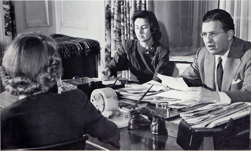
David O. Selznick dictating a memo in 1941. Secretaries are Virginia Olds (back to camera) and Frances Inglis.
DB here:
Tucked neatly within over 4500 archive boxes in Austin, Texas, are tens of thousands of items of information about how the Hollywood studio system worked. The trick is to find the ones you’re looking for…and the ones you didn’t know you should be looking for.
Those archive boxes are housed at the Harry Ransom Research Center at the University of Texas. This magnificent research library holds cultural records of inestimable value, from Whitman and Poe manuscripts to the papers of David Foster Wallace. Among the Center’s impressive film collections, the jewel in the crown is the David O. Selznick papers—a vast trove of material related to the career of the man who produced, some would say over-produced, Gone with the Wind, Rebecca, Spellbound, Duel in the Sun, and other classics of the Hollywood system.
Selznick has been studied from many angles, partly because his collection provides exceptionally full accounts of his activities. He kept, it seems, nearly everything, most famously memoranda. While chainsmoking cigarettes, swallowing amphetamines, writing amateur poetry, and revising scripts and visiting sets and critiquing rehearsals and watching rushes and retaking scenes and checking on rivals’ films, Selznick found time to dictate a blizzard of memos.
From his youth he loved to write memos–“I could sell an idea much better in written form than I could verbally”–and he became adept at dictating them. The results were precise, punchy, and often eloquent. Usually signed DOS (the O being a middle initial he bestowed upon himself), these communiqués could be lapidary (a one-liner asking if the cast is protected from sunburn) or epic. After getting Selznick’s dense, eight-page telegram explaining why Since You Went Away’s nearly three hours could not be reduced, a colleague replied: IF I WERE YOU I WOULD MAKE NO FURTHER CUTS IN SYWA. YOU MIGHT TAKE ABOUT TEN MINUTES OUT OF YOUR TELEGRAM.
In his later years Selznick contemplated publishing a collection called Memo Strikes Back. After he died in 1965, his son encouraged film historian Rudy Behlmer to make a compilation. The result, Memo from David O. Selznick (1972), is a superb collage portrait of the man’s personality and creative years. In the 1980s, the Ransom Center acquired the papers that Behlmer worked through, along with physical artifacts, including costumes from GWTW.
Me-mos, they were called by many, since they seemed to reflect the compulsive micromanaging of their creator. Directors and staff smarted under Selznick’s insistence that he control every creative decision. But for those of us coming afterward, Selznick’s criticisms, complaints, demands, reminiscences, agonies of frustration, and I-told-you-sos help us grasp the concrete problems of filmmaking.
Last week I went to Austin hoping to get some information about how Hollywood creators of the 1940s regarded the task of storytelling. DOS delivered as he did on the screen: splashily.
Paper traces
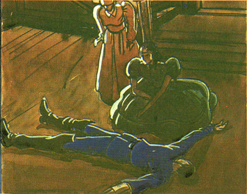
William Cameron Menzies production sketch for Gone with the Wind.
Most commentary on movies stops with the films as we find them. Critics who concentrate on producing interpretations are particularly inclined to play down primary-document research. “We already know,” a famous English critic once told me, “all we need to know.”
In my youth I mostly agreed. Criticism starts with watching and listening closely to what’s happening on the screen. But it doesn’t have to end there. That’s because doing systematic research into film depends on asking questions. And if we’re going beyond a single movie and asking questions about craft, norms, preferred practices, and regulative principles shaping a filmic tradition–in short, questions of film poetics–evidence from practitioners can help a lot.
Hollywood, for instance, has produced a rich array of published materials–interviews, trade coverage, promotion, technical papers–that offer evidence of what filmmakers thought they were doing. You have to read them with a jaundiced eye and be alert for rhetoric, but there’s still a lot to be found in Hollywood’s public presentation of its doings. There’s an even richer lode of unpublished script drafts, production memos, correspondence, transcripts of meetings, court cases, and the like. Mountains of such material remain locked up in studio files. This is what makes the paper collections at major universities, at the Margaret Herrick Library of the Academy, at the Museum of Modern Art, and at other institutions precious to those of us studying film history.
Collections like these are grist for the perpetual flow of celebrity biographies and accounts of Hollywood as a business. What, though, can they tell us about the history of film form and style?
Like some published material, these items can suggest how aware filmmakers were of their creative choices. When I was teaching, and the class focused on details of framing or cutting, some students were skeptical. “This is reading too much in,” they’d say. “The director couldn’t have intended that!” And it’s true that sometimes things we think were carefully planned came about through accident or sudden inspiration. Still, in other cases a document shows that filmmakers were consciously aiming at fine-grained effects.
Moreover, archive documents can indicate the array of creative options available—the extent to which one artistic choice is preferred over alternatives that wouldn’t work as well. If filmmaking is problem-solving, we learn about the costs and benefits of competing solutions. We gain a better sense of what can and can’t be done within a tradition when we glimpse filmmakers struggling to decide between expressive possibilities.
Yet another benefit of paging through archival documents is the recognition that we can’t neatly separate filmmaking as business from filmaking as an art. We commonly imagine a studio producer ordering a director to take the cheapest option, to trim costs in every way. Surely this happened a lot. Surprisingly often, though, the suits did and still do invest a lot in artistic effects, even innovative ones. When writing our book The Classical Hollywood Cinema: Film Style and Mode of Production to 1960, we were struck by the power of the idea of the “quality film,” that mixture of novelty, showmanship, and high production values that justifies time and resources. A flamboyant crane shot, a complicated lighting scheme, a gorgeous musical score, flashy special effects—in the Hollywood tradition and others, these are appeals worth paying for, even if not every viewer appreciates them.
Perhaps above all, studying records can call our attention to aspects of the film that your initial impression didn’t pick out. A critic can’t notice everything. Examining collections such as Selznick’s, or those housed in our Wisconsin Center for Film and Theater Research, have taught me that what appears effortless or perfunctory on the screen can be the product of intense thought, protracted debate, and hours of hard work. Once you re-tune your attention, even minor moments can be worth thinking about, if only because the filmmakers labored patiently over them.
Getting what you pay for
Since You Went Away (1944).
Selnick was a fussbudget on a scale that makes Schulz’s Lucy look laid-back. He sought control over every aspect of the film, from purchase of material through production, post-production, publicity, and distribution. Gone with the Wind’s volcanic success seemed to confirm the wisdom of his endless tracking of every detail. Because that tracking is made explicit, not to say vehement, in his memos and other correspondence, we get glimpses of Hollywood’s artistic strategies large and small.
Start small. In The Classical Hollywood Cinema: Film Style and Mode of Production, I wrote about the “rule of three”–the guideline that presses filmmakers to state important story information three times, preferably with variations (serious/ funny/ pathetic). I gleaned that precept from reading published work, and I could check it by studying the films. Still, further evidence is always welcome, so it’s nice to see a transcript of a story conference during the prolonged rewriting of Portrait of Jennie (1949). The hero, the painter Eben Adams, comes to a coastal town in search of his dream-girl, and DOS suggests:
In every scene he is to ask: “Do you remember a girl named Jennie Appleton?” Use rule of three–two [townfolk] do not remember her–the third one does. . . “Remember her well. . . pretty young thing with dark hair.”
More recently, I’ve been wondering whether studio screenwriters of the 1930s and 1940s were consciously adhering to something like today’s notion of a three-act structure. I’ve found scattered evidence from memos elsewhere that refer to a movie’s “first act” or “last act,” but nothing that indicates a commitment to an overarching three-part layout.
I haven’t found clear-cut evidence in DOS’s papers either, but in another story conference on Jennie, Broadway showman Jed Harris is reported as saying: “The second act–he must get the picture back because that’s all he’ll ever have of her.” In the finished film, Eben doesn’t search for the portrait, but Harris’s remark indicates that he had some sort of multiple-act structure in the back of his mind. He adds later: “The picture at this point is about 1/3 gone, and from here you have the machinery of trying to stop what is impossible to stop.” Far from definitive evidence, but teasing.
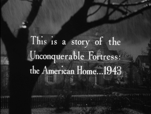
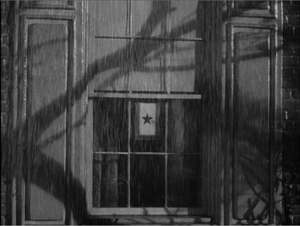
Now consider a medium-size example. Kristin and I have argued that many Hollywood films have a symmetrical opening-and-closing structure, often presented as an epilogue that mirrors the beginning. More recently I suggested that this bookend structure often displays an advance/ retreat pattern. At the start, the camera may move into a space or a character may come toward us; at the end, the camera may retreat and/or the characters may turn away or walk into the distance. On Since You Went Away (1944), Selznick sweated over ways to frame this panorama of the American home front. Early on he decided to start his film with an exterior view of the Hilton family home. This image dissolves to a closer view showing a star in the window, which indicates that a member of the family is in the armed forces.
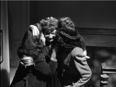
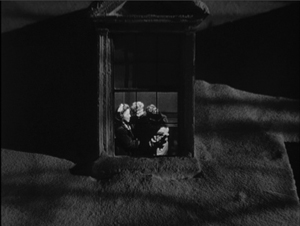
Eventually Selznick decided to end the film by pulling back from a miniature of the house, with a single camera movement replacing the two unmoving shots that started things off. Anne is joyfully embracing her two daughters; they’re inserted as a matte into the upstairs window.
Selznick considered redoing the opening as a slow camera movement in to the window, but only if the miniature was good enough. Perhaps it wasn’t. And at one point he wanted the final shot to start with the star in the window, at least for purposes of the preview screening, “to parallel that at the beginning of the picture.” Again, that wasn’t accomplished, but his playing with possibilities reflects his tradition’s commitment to symmetrical openings and closings.
It would have been far cheaper simply to have ended the film on the three-shot of the women, shown at the top of this section. But Selznick wanted “a nice rounded feeling” in his epilogue, and he was prepared to pay for it. True, he was exceptionally finicky, but going to a lot of trouble and expense to get this formal rhyme was not unusual in studio practice. The hardheaded film business is willing to invest in vivid, emotionally gripping artistry identified with quality moviemaking.
Stylistic trends
Portrait of Jennie (1949).
In broad terms, it’s fair to say that American studio films of the 1940s display a more self-conscious use of long takes, sustained camera movements, and deep-focus cinematography than we find in other eras. (Actually, it’s a trend we find throughout the world at the time, for reasons that aren’t well understood.) But these new techniques didn’t replace traditional analytical editing. They worked within it. Continuity cutting, established in America in the late 1910s, remained the dominant stylistic framework for filmmakers.
Citizen Kane‘s fixed single-shot scenes in depth were very unusual in cinema of the period. More commonly, deep-focus shots, like moving-camera shots, served as establishing framings or otherwise became part of conventionally edited sequences. This middling or compromise style can be found in dozens of films of the forties, and Selznick seems to have more or less consciously gone along with it.
He worried about what he called “cuttiness,” the tendency to break every scene into brief single shots of the players. Often, he suggested, a well-handled two-shot would work better. He told his editor on Since You Went Away to avoid “the conventional treatment of close-ups and reactions.”
It most definitely is not necessary always to treat every one of our scenes with dead center close-ups, and direct cuts or over-the-shoulder angles, when an intimate scene is played between two people.
He goes on to tell a second-unit director that a scene of a couple in a car could be played in one or two setups, perhaps in a single shot “if we could get an interesting composition on the two of them rather than a dead center two-shot on individuals.”
Selznick saw Hitchcock as an editing-biased director and so after signing him to make Rebecca (1940), he warned him and other members of the team to avoid over-cutting. Again, the preference was for a tight two-shot.
The new scene between the girl and Mrs. Danvers on the arrival at Manderley (Script Scenes 130A, 130N and 131) may be very cutty as described in the script, and perhaps ought to be protected in a close two-shot of ‘I’ [the heroine] and Mrs. Danvers, or some other angle that will keep us from playing it in too many short cuts.
In most cases, however, Selznick gave himself an out by treating faster cutting as an alternative. He consistently wanted coverage, as he indicates immediately for the Rebecca scene just mentioned.
However, I suggest we make the short cuts also, as this may be the best way of playing it after all. If we use the camera to move up to Mrs. Danvers for the finish, which is the way I think it should be used, then perhaps the first shot of her should be retaken also.
As the last sentence indicates, Selznick sometimes opts for camera movement to avoid cuttiness. Perhaps the American Hitchcock’s interest in tracking shots that follow characters, particularly glamorous women, through the set stemmed from Selznick’s belief in the power of occasional camera movements. He notes that a tracking shot introducing Alida Valli in The Paradine Case (1948) is too bumpy, asking why the staff couldn’t manage “something as simple as going up to a woman’s face, and then pulling back from it across a set, without the camera shaking in the manner of early silent pictures.”
Yet these longish takes aren’t to be the dominant stylistic approach. Sustained takes often block off choices in post-production. Producers, then and now, want coverage, and you didn’t have to be a micromanager like Selznick to want your directors to give you options for rebuilding scenes in the cutting room. We see this when Selznick objects to John Cromwell’s playing entire scenes in lengthy shots.
This is of course nonsense, since as often as not an incomplete take is better than the identical portion of a complete take. . . . It seems folly to spend hours getting a complete scene instead of just picking up those sections of the beginning or middle or end that have been fluffed.
Some directors resisted by shooting long takes without coverage. Hitchcock did this in one sequence of The Paradine Case and then promoted this “three and a half-minute take” to the Hollywood community, perhaps to make it harder for Selznick to change it. Nonetheless, Selznick cut the scene up. Once freed from Selznick, of course, Hitchcock was able to pursue the long-take option to extremes with Rope (1948) and Under Capricorn (1949).
Despite wanting flexibility in editing, producers can be seduced by the prospect of “pre-cutting” a film–planning the shots so exactly that the film can be “pre-visualized.” The director can thus avoid taking shots that won’t be used. Selznick was proud of William Cameron Menzies’ precise production planning on Gone with the Wind, and this made him believe in the power of the storyboard. When he rewrote a script, which was often, he was inclined to have artists immediately prepare fresh drawings of sets and shots.
Hitchcock had promoted himself as someone who drafted a film on paper so thoroughly that shooting became efficient and predictable. Selznick was therefore startled when Hitchcock proposed a long shooting schedule for Rebecca. “In view of the many speeches he has made to me about how he pre-cuts a script, so as to shoot only necessary angles, it is a mystery to me as to how he could spend even 42 days.”
During shooting, DOS became furious with the pace of production, declaring Hitchcock “the slowest director we have had.” Hitchcock, he believed, was spending more time getting his few angles than directors who shot in normal fashion. Yet Selznick remained susceptible to the dream of pre-cutting. Some years later, he predicted that Since You Went Away wouldn’t take much time in the editing room because the scenes “will be camera-cut to an extra-ordinary degree, and putting it together should take no time at all.” The film’s editing occupied several months.
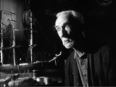
Selznick, then, was attracted to current trends of longish takes and the fluid camera, but like nearly all his peers he saw these as subordinate to the overarching demands of analytical editing, whether through traditional protection coverage or through “pre-cutting.” Something similar seems to have governed his interest in depth staging and deep-focus cinematography. Peppered throughout the memos I examined are his concern for “foreground pieces,” props that can enliven a shot. A miniature sailing ship in Portrait of Jennie, he suggests, is too big for its placement in the shots as taken. “It would have been a far better foreground piece for another angle.” So it became such a piece, as the still surmounting this section indicates.
Of Since You Went Away DOS notes:
I think that lately we have been overlooking chances for good foreground and background planes in our set-ups. I don’t want to over-do this but of a lot of our shots could be much more interesting in this regard.
In particular he emphasizes the bronzed baby shoes introduced in the film’s opening, as the camera glides through the Hilton family parlor picking up traces of the departed father. A later scene, in which Anne writes a letter to her husband Tim, seemed the ideal chance to re-use that prop. “Photographically, I thought it would be much more interesting with the shadow of the shoes, or using the shoes as foreground pieces.” This composition, if it was shot, didn’t appear in the final film, but it shows once again that filmmakers can be aware of broader trends of their period, and that they’re willing to go to considerable trouble to join them.
A striking example of the insistence on participating in the deep-focus trend appears in the files around Spellbound. After arriving in America, Hitchcock occasionally produced some big-foreground depth images, as below in Shadow of a Doubt (1943), and in Notorious (1946).
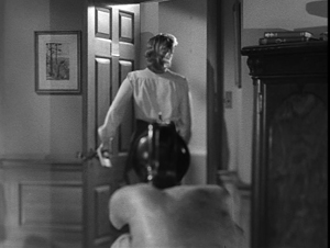
Such compositions were rare in most films Hitchcock did under Selznick, but in Spellbound Selznick realized the value of keeping up-to-date. The most famous big foreground in the film (and in all Hitch’s work) is seen at the climax, when Dr. Murchison trains his revolver on Constance as she edges out of his office.
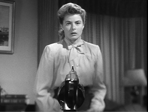
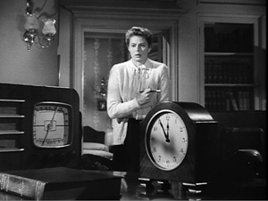
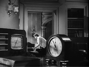
This bizarre shot is somewhat anticipated by a less aggressive setup. Constance hears over the radio that the police have tracked J. B. to Manhattan, and she goes into the next room to pack to follow him. The action is handled in a canonical post-Kane composition.
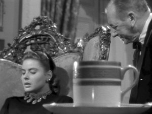
The production records make me wonder whether this shot (presumably using a larger-than-life clock and radio) was filmed under Hitchcock’s supervision. It may have replaced an even more complex shot that cinematographer George Barnes objected to. (I’m still gathering information on this.) In any event, Selznick realized that a minor transitional scene could be dynamized by a flamboyant, difficult-to-achieve image: a throwaway mark of quality.
Pendulum swings of innovation
Since You Went Away.
I’ll save other things I found for future work. Let me finish by talking about how Selznick’s “directing at a distance” shows a craftsman’s concern for novelty and pictorial storytelling.
Hitchcock famously shot the Old Bailey scenes of The Paradine Case with several cameras in an immense set. Selznick may have okayed this tactic on this occasion because it would speed up Hitchcock’s schedule. (Selznick had hoped it would take only one day; it took three for principal photography and several more for pick-up inserts.) But both before and after Paradine, Selznick was interested in extending multiple-camera shooting beyond its normal uses.
Multiple-camera coverage of ordinary scenes had a heyday in the early years of sound, but afterward it was usually reserved for unrepeatable action (fires, stunts, cars going off cliffs) or very big scenes. Selznick had deployed several cameras, including the lightweight Eyemos, during the dance at the airplane hangar in Since You Went Away. Like Welles, he also considered using the tactic for ordinary dramatic scenes. He writes in 1947:
I have long felt that sooner or later, probably when economic necessity dictates, this method of shooting will come into vogue, with far more time spent on rehearsal, far less time on shooting, enormous savings and better quality. I know that for years I have been discussing with Hitchcock my feeling that we could take a film of a particular type, thoroughly rehearse it, and shoot it in a week–and this is just what Hitch is planning to do on The Rope [sic].
Selznick anticipated the practice of multiple-camera television production. It’s intriguing to think of Hitchcock taking this idea and simply substituting one camera for many, creating another technical stunt that could be publicized.
DOS was sensitive to conventions and often sought to refresh them. For one back-projected scene of Portrait of Jennie, he advises Dieterle “to avoid the awful-looking, head-on, two-shot process setups and angle camera in different ways: perhaps with lower cameras, one shooting across Adams at Spinney and the other shooting across Spinney at Adams.” This echoes his concern for finding unusual angles on the process arrangement in Since You Went Away‘s driving scene. He likewise encouraged unusual staging, recalling
the love scene between Freddie March and Janet Gaynor in A Star Is Born, the one in which he takes her home the first night, after the kitchen scene, where the entire scene is played on Freddie’s back; and the love scene in Nothing Sacred in the crate after Carole Lombard has fished Freddie March out of the river. Both of these treatments enormously enhanced the value of these scenes, which shot conventionally would not have been necessarily so effective.
In the first instance, the conversation is handled by an unusually prolonged over-the-shoulder shot that doesn’t show March replying to Gaynor. In the second, the romantic dialogue is emphasized by the darkness of the crate and our inability to see either actor clearly.
Yet Selznick worried about becoming too “arty” as well. During the filming of Since You Went Away he confessed:
I feel that I am at least partially responsible for our increasing tendency to play scenes on people’s backs. . . . In Jane’s attack upon the colonel after the breakfast scene, we are on neither one principal nor the other, but on the colonel’s back and Jane’s back . . . In the church scene there has been talk of playing it on the three backs, but I have tried in the script to indicate that we should not do this.
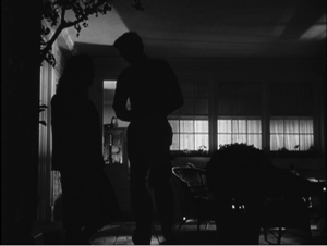
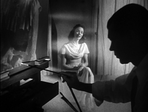
Stark lighting is of course common in 1940s cinema generally, but Selznick favored it in the 1930s as well, in the shots above and more famously in Gone with the Wind. By the 1940s, Since You Went Away and Portrait of Jennie include scenes steeped in rich shadow areas, cast shadows, and silhouettes.
But here, as elsewhere, DOS’s urge for innovation was curbed by anxiety about going too far. In a memo to Cromwell on Since You Went Away, he wrote that “all of us (mostly myself) are overdoing the silhouette business. . . . Let’s from now on all use this silhouette effect very sparingly, and only when it’s absolutely indispensable to our mood.”
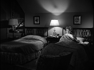
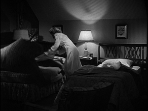
Perhaps what I’ve called his middle-of-the road approach was less a balance and more of a pendulum swing between extremes. He could sometimes foreswear the grand, almost monumental look of many scenes and demand something quieter. At the end of the day when Anne’s husband has left for war, she looks at his unmade bed.
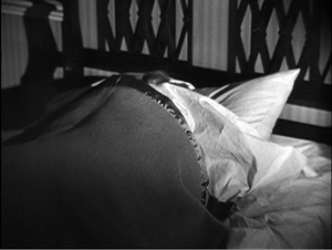
She leaps up and wriggles into it, covering her face with the blankets, and starts to cry.
Commentators often fasten on the twin-beds convention as an example of the naive timidity of studio-era Hollywood. Yet every convention offers opportunities for expression. When Anne rises, the sight of one rumpled bed and one pristine one brings home the husband’s absence in a simple, powerful image, and her plunging into it directly conveys her longing to be in his arms.
I’m absolutely positive that this gag will not get over unless we see the two beds in the clear, one made up and one not made up, before she hops into the other bed. I think these two beds constitute good storytelling.
When the hard-bitten Ben Hecht saw Since You Went Away, he cabled Selznick: “It made me cry like a fool.”
You can certainly argue that Selznick the fussbudget was his own worst enemy. His micromanagement raised his budgets and drove away his collaborators. As the production values grew more inflated, it was hard to recoup costs, let alone turn big profits. Ten years after Gone with the Wind premiered, Selznick’s fiefdom lay in ruins. He withdrew from production, millions of dollars in debt. He wrote in a confidential 1948 memo:
In the final analysis it is my fault for two reasons: (1) my production methods; (2) my tolerance through the years of the wastefulness. . . . The most successful series of pictures ever made in the history of the business has produced profits which are perhaps not more than twenty per cent of what they should be.
Ideas matter in any domain, even in studying Hollywood. And not just the ideas of critics, historians, and theorists. The practicing artisans of the studio system had rich ideas about preferred ways to build plots, to shoot and cut scenes, to mix sound and add music. These norms were seldom stated outright. Were Selznick less interfering, less prone to hesitate between alternatives, less obsessed with minute details, we would not know as much about the workings of the system he sought to rule. He distilled into typescript and double carbons many notions that ordinarily went unstated. His plump files teem with ideas about how films were made, and how their creator thought they should affect audiences. Thanks to institutions like the Ransom Center, his work is preserved to enlighten us about filmmakers’ secrets, even the secrets they don’t know they know.
I’m very grateful to Emilio Banda and the rest of the staff at the Harry Ransom Center, who helped me during my visit. Thanks also to Steve Wilson, Curator of Film there, for advice. And of course thanks to my family–Diane, Darlene, Kewal, Kamini, Megan, and Sanjeev–who made our trip to Austin so enjoyable.
My quotations come from the memos I examined, as well as from other items in Rudy Behlmer’s Memo from David O. Selznick. I also drew on Ronald Haver’s David O. Selznick’s Hollywood (Knopf, 1980), the initial edition of which is surely the most gorgeous book ever published about the American film industry. Haver’s study is not only spectacularly illustrated but deeply researched, and it, like Behlmer’s, is indispensable for the study of the studio system. The Menzies production sketch is taken from the Haver volume.
No less indispensable is Leonard J. Leff’s Hitchcock & Selznick (Weidenfeld and Nicolson, 1987). After sifting through both the Selznick collection in Austin and the Hitchcock collection at the Academy’s Margaret Herrick Library, Leff produced a detailed account of the two men’s creative work. Hitchcock’s long take in The Paradine Case is promoted in Bart Sheridan, “Three and a Half Minute Take…,” American Cinematographer 27, 9 (September 1948), 304-305, 314.
Paul Ramaeker offers a subtle account of Portrait of Jennie as a “supernatural romantic melodrama” at The Third Meaning.
For more on 1940s stylistic norms, see The Classical Hollywood Cinema, chapter 27, and On the History of Film Style, chapter 6. The first essay in my Poetics of Cinema discusses Hitchcock in relation to trends of the period, concentrating on Rope and long-take options. On Citizen Kane and rationales for deep-focus cinematography, you can go here. I mention a bit about the fashion for the “fluid camera” in 1940s Hollywood in this entry.
William Cameron Menzies served as art director and more for Gone with the Wind, and he and was pressed into service ad hoc for later DOS projects. I think he may have influenced the shadow-drenched style of Since You Went Away and Portrait of Jennie. I wrote about Menzies’ work, and again about deep-space work in 1940s Hollywood, here and here. See also David Cairns’ enlightening essay in The Believer.
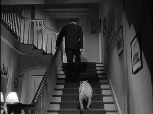
Since You Went Away: “I think that Miss Keon had better start preparing a script of retakes and additional scenes. I think we missed a wonderful opportunity in the Christmas scene in not having a shot from the angle of the family, or from the bottom of the stairs, of the Colonel going up the stars with Soda behind him.”
DIAL M FOR MURDER: Hitchcock frets not at his narrow room
Dial M for Murder (1954).
DB here:
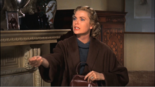
This cut makes you say: Huh? Margo’s hand is shamelessly out of proportion and, judging by the men’s stares, we’re somehow looking through her torso.
Yet does anybody notice it? The cut reminds us that Hitchcock can get away with murder, cinematically speaking. Probably you didn’t need reminding, but even an inveterate Hitchcock watcher (I saw Dial M for Murder when I was about seven years old) can still be shocked by the old guy’s sheer bravado.
In 1979, Dial M was revived, and a restored version began a tour as a re-release, playing in 3D around the US and Europe. It ran in New York’s 8th Street Playhouse in 1981, and Kristin and I caught it in London at about that time. Most relevant to today’s entry, in September of 1981, it screened in a 3D retrospective at what was then called the Festival of Festivals, the earlier incarnation of the Toronto International Film Festival. According to Variety, the late-night show turned away a thousand people.
It’s good to report, then, that about thirty years later it returns to what has become one of the most important festivals in the world. Last night Dial M, muscled up in a digital restoration, screened to a sold-out house at TIFF. Preparing some remarks to introduce it, I found myself captivated once again by this curious project. Overshadowed by Rear Window, which was released later the same year, it now seems quite a daring movie, and not just because of this brazen cut. This newest restoration is very welcome, for it gives us an occasion to see what Sir Alfred can sneak past us.
Naturally, there are spoilers ahead, so if you haven’t seen the film you probably shouldn’t read past the next couple of sections.
3D: Device, demand, decline
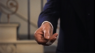
During the 3D boom of early 1953, Warner Bros. was an enthusiastic participant. House of Wax, released in April, had proven a huge success; ultimately it would earn $9.5 million and become the top 3D release of the period. Jack Warner halted production from April through early July in order to retool the studio for the new process. Jack announced several pictures going into stereoscopic production, including Lucky Me, Helen of Troy, Them, and A Star Is Born. None of these wound up in the new format, but two others, Hondo and Dial M for Murder, did.
At summer’s end, 3D was starting to flag, largely, it seems, because screening the films posed so many problems. No system had been standardized, and different studios embraced various formats. Late in 1953, some interest perked up, chiefly because of Hondo and MGM’s Kiss Me Kate, but very soon the fad was over. In early 1954 most 3D releases played in their flat forms, and some were released only that way. In April, a month before Dial M opened, Variety ran a story headlined “3-D Looks Dead In United States.”
Dial M had been shot in summer of 1953. According to Bill Krohn, Warners was obliged by contract to wait until the original play had concluded its run, so the release was delayed until May 1954. By then even Jack had lost faith in the format. Dial M was the first Warners 3D picture that the studio permitted to be shown flat in first run, and most exhibitors took that option. 3D, Hitchcock reflected, was a nine-day wonder, “and I came in on the ninth day.” The picture still did reasonably well, earning $3.5 million–but Rear Window returned nearly three times that to Hitchcock’s new home, Paramount.
Wider, deeper, in color
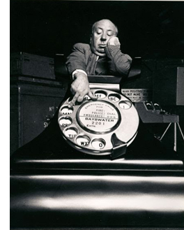 Dial M for Murder confronted Hitchcock with three new technical challenges. Most obviously, the demand that the film be shot in 3D created problems with the bulky camera (“the size of a room,” Grace Kelly remembered, with some exaggeration). It couldn’t focus some shots as closely as Hitchcock would have preferred. The extreme close-up of Tony Wendice dialing, like the shot that starts the opening credits, had to be made with a giant telephone and a big fake finger, a piece of effects work that Hitchcock happily publicized.
Moreover, cinematographers were still figuring out how to judge each shot’s best convergence point (roughly, the way the two lenses defined the location of the screen’s surface) and interocular distance (the distance between the two lenses, mimicking the spacing of our eyes). Misjudging these factors could lead to distortions, such as making actors look closer together or farther apart than intended. Hitchcock worried about the “waste space” around his players in the initial footage the crew shot. In addition, directors had to be careful when the convergence point was set beyond foreground figures. If the figure was cut off by the frameline, a partial torso could be floating out at the audience. (The same threat can arise in today’s 3D films.) Interestingly, there are very few shots in the film’s first half that use a vertical frameline to bisect a character, and almost no over-the-shoulder reverse angles, which were, according to one cinematographer, risky.
Hitchcock’s concern for too much empty space might have been aggravated by the studio’s demand that the film be in widescreen. With the rise of CinemaScope, most studios had decided to release films in wide formats, and Warners was no exception. Dial M was released in 1.85:1.
Finally, although Hitchcock had shot in color before, this was his first outing with Eastman Color, a single-strip emulsion that eliminated the need for three-strip Technicolor. (Indeed, Eastman Color made several new processes, like 3D and CinemaScope, feasible.) But the new stock was somewhat less sensitive to light than Technicolor, and one advantage of shooting single-strip—the fact that you no longer needed the big Technicolor camera—was lost because of the 3D apparatus.
Faced with these obstacles, Dial M can look like a step backward. In Hitchcock’s interview with Truffaut, he agreed, claiming to have been “coasting, playing it safe. . . . I was running for cover again.” He had been planning a more personal project that fell through, and it was Warners that suggested he do Dial M, a property they’d acquired. After seeing the play, he agreed, but even while shooting, Grace Kelly recalled, he was already planning Rear Window.
At first glance, Dial M for Murder seems like the epitome of photographed theatre. Nearly all the action unfolds in the apartment of Tony and Margot Wendice, mainly in their living room. We get brief views of the bedroom, the terrace, and the hallway outside. Only about five minutes, or about 6 %, of the film take place on the street or in Tony’s club.
Both Frederick Knott, author of the play and screenplay, and Hitchcock failed “to take full advantage of the screen’s expansive powers,” opined Brog. of Variety. “As a result, ‘Dial M’ is more of a filmed play than a motion picture.” In talking with Truffaut, Hitchcock seemed to agree. “I just did my job, using cinematic means to narrate a story taken from a stage play.” In another interview he elaborated:
I think that’s the job of any craftsman, setting the camera up and photographing people acting. That’s what I call most films today: photographs of people talking. It’s no effort to me to make a film like Dial M for Murder because there’s nothing there to do.
Actually, I think there was a lot there to do, and Hitch did it.
Acknowledging the source
We could counter Hitchcock’s just-a-job-of-work argument easily by citing what he did with the famous attempted strangulation. Swann, alias Lesgate, has slipped out from behind the curtain. After waiting tensely for Margot to lower the phone, he wraps the scarf tightly around her neck and thrusts her onto the desk. She squirms, frantically grabs a pair of scissors, and stabs him in the back. Next, according to Knott’s stage directions:
Lesgate slumps over her and then very slowly rolls over the left side of the desk, landing on his back with a strangled grunt.
No viewer will ever forget the far more hideous death that the would-be killer suffers onscreen. After flopping over Margot, apparently dead, he snaps back to life spasmodically, as if jolted by bursts of electricity. His body yanks itself erect, his arms twisting helplessly as he tries to withdraw the blades, before he turns over and hits the floor . The impact drives the scissor blades further into his back. Hitchcock celebrates the moment with an Eisensteinian overlapping cut to a close-up of the scissors. He had a special pit dug, he proudly told a reporter, to make the lens flush with the floor.
So much for just setting up the camera and photographing the people acting. We could point to other alterations from the play, such as the strained drawing-room courtesies that frame the whole story. “Let me get you another drink,” is the film’s first line, as Margot and Mark pull out of a passionate clinch. At the end, nabbed, Tony offers to pour his wife and her lover a drink, and then asks the detective: “I suppose you’re still on duty, Inspector?” There’s also the peculiar mustache motif. The play text and the film dialogue mock Lesgate/ Swann slightly for growing one, but the film adds the mini-gag of self-satisfied Inspector Hubbard calmly combing his own mustache.
Fine as these isolated moments are, Hitchcock’s treatment is more thoroughgoing. He does, as he tells us, use cinematic means “to narrate a story taken from a stage play.” But those means are unusual and instructive.
Hitchcock had already experimented with plots confined to tight quarters–a lifeboat (Lifeboat, 1944) or a parlor and hallway (Rope, 1948). It’s plausible, as many critics have noted, that he tried the same thing with Dial M. But those earlier films seem more technically radical. You couldn’t ask for a much more cramped space than a lifeboat, unless you wanted a phone booth (which Hitchcock did consider for a film). Similarly, Rope‘s experiment with very long takes (it has only 11 shots) made it extraordinary for its day. From this perspective, Dial M can look like a retreat. It expands its range of action in modest ways, and it doesn’t try for a consistent long-take look. There are nearly seven hundred shots, and the average runs a little under ten seconds, quite normal for the period.
Yet limiting the action largely to the apartment wasn’t exactly taking the line of least resistance. In adapting a play, there’s always a temptation to open things up. Most plays include a great deal of action that takes place before the play’s opening scene, or in other locales offstage. In other words, the plot of the piece is highly selective and concentrated in both space and time, while the broader story—the sum of all the incidents that contribute to the action—is recounted or suggested on stage. Most film adaptations “ventilate” the original by dramatizing these scenes, as Brog. apparently would have preferred.
Hitchcock resisted the temptation to open out the play. Showing scenes that take place before the stage action (perhaps the theft of Margot’s handbag, or Tony’s stalking of the shady Swann/ Lesgate) would have lost the tight focus of the original. Moreover, we can gain an extra layer of interest when action is recounted rather than dramatized: we get both past events and present attitudes toward them. (In other words, sometimes we should tell rather than show.) Most intriguing, though, is Hitchcock’s comment to Truffaut that opening up a play “overlooks the fact that the basic quality of any play is precisely its confinement within the proscenium.” Hitchcock wanted “to emphasize the theatrical aspects.”
Hitchcock wasn’t alone. In the 1940s, several filmmakers were rethinking the problem of filming theatre, and they were exploring ways to bring out the “theatrical aspects” of the material. In a brilliant 1951 essay, André Bazin pointed out that filmmakers were now confident enough in their creative choices to adapt plays while acknowledging the pleasure of purely theatrical conventions. These films, he suggests, engage us by acknowledging the theatricality of theatre.
Bazin pointed to Olivier’s Henry V (1944), which begins in an Elizabethan playhouse and gradually moves its scenes to realistic settings. He mentioned as well Cocteau’s Les Parents terribles (1948), which, somewhat in the manner of Dial M, finds an equivalent for the play’s single-room set by expanding the film’s locale just slightly to take in an entire apartment. Other examples would include Welles’ Macbeth (1948), Melville’s Les Enfants Terribles (1950), and H. C. Potter’s The Time of Your Life (1948). Earlier in the decade, the obviously artificial sets and to-camera addresses of Our Town (1940) and Wyler’s handling of the parlor and staircase in The Little Foxes (1941) suggest a sort of para-theatre, cinema that supplements or amplifies stage conventions rather than trying to escape them.
That Hitchcock should join this trend toward new forms of filmed theatre is surprising. Earlier in his career, as a director nurtured by the silent movies and particularly American and German films, he had been an advocate of “pure cinema.” That meant, above all, editing and pictorial storytelling. Talky scenes were anathema. He wrote in 1937:
If I have to shoot a long scene continuously I always feel I am losing grip on it, from a cinematic point of view. . . . What I like to do always is to photograph just the little bits of a scene that I really need for building up a visual sequence. I want to put my film together on the screen, not simply to photograph something that has been put together already in the form of a long piece of stage acting.
Yet in 1948, he explained that he had yearned to film scenes in long takes.
Until Rope came along, I had been unable to give full rein to my notion that a camera could photograph one complete reel at a time, gobbling up 11 pages of dialogue on each shot, devouring action like a giant steam shovel. As I see it, there’s nothing like a continuous action to sustain the mood of actors, particularly in a suspense story.
He took much the same approach in Under Capricorn (1949).
Why does the montage-oriented director ten years later make two of the showiest long-take films in Hollywood history? I’ve suggested in an essay in Poetics of Cinema that there was something of a long-take contest among American directors in the decade after Citizen Kane. The competition was propelled partly by new equipment that permitted long, flowing camera movements. This “fluid camera” trend, as it was called in American Cinematographer, pushed ambitious directors toward shots that might run several minutes. Welles, Preminger, Minnelli, Cukor, Ophuls, Siodmak, Joseph H. Lewis, and several other directors tried their hands at virtuoso long takes, and in some cases those were applied to stage adaptations. Welles stretched one shot in Macbeth to the length of a whole camera reel.
With Dial M, Hitchcock largely gave up the long take (though a few shots run a minute or so), but he tried something else. He offered a form of filmed theatre that has its roots in silent moviemaking, and he explored ways to transpose it to 3D cinema.
A chamber play
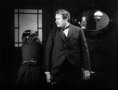
Sylvester (1924).
In fall of 1924 Hitchcock went to Germany, where he toured the magnificent Ufa facility and became acquainted with the work of the industry’s outstanding creators, especially Lang and Murnau. Most writers have emphasized his acquaintance with the Expressionist films of the early 1920s, and he sometimes mentioned his admiration for The Cabinet of Dr. Caligari. But he also praised Lubitsch, who was no Expressionist, and when asked about his major influences, he answered, “The Germans. The Germans.” It’s not farfetched to assume he was aware of another trend in local production, the one known as Kammerspiel.
The Kammerspiel, or “chamber play,” emerged in German theatre, and the film equivalents appeared in the early 1920s. The Kammerspiel film typically confined itself to a few settings and emphasized psychological conflicts among a small cast of characters. Surprisingly, the major instances, such as Shattered (Scherben, 1921), Backstairs (Hintertreppe, 1921), and Sylvester (aka New Year’s Eve, 1924), weren’t adapted from plays but were original scripts by Carl Mayer. The most famous Kammerspiel film, which Hitchcock would likely have seen during his visit, was Der letze mann (aka The Last Laugh, released December 1924), directed by F. W. Murnau. Extensive tracking shots were rare in most silent movies, but Murnau built his film around them. He and Mayer, who had scripted Der letzte Mann, came to America and there made Sunrise (1927), famous for its elaborate camera movements.
Another major director pursued the chamber aesthetic well beyond the silent cinema. Carl Dreyer had made a Kammerspiel film, Michael (released September 1924), and he carried the lesson of the trend back to his native Denmark with The Master of the House (1925), an adaptation of a popular play. Like Dial M, the film concentrates on one locale—a family’s apartment, built out of hundreds of detailed shots of the actors and sets, with almost no camera movements. Later, Dreyer would apply the Kammerspiel aesthetic to other play adaptations, Ordet (1955) and Gertrud (1964), but presented in long, gradually unfolding tracking shots.
With a Kammerspiel aesthetic, you get something fairly distinct from what we think of as filmed theatre. The baseline prototype of filmed theatre is the PBS/ Metropolitan Opera model: a live performance captured by several cameras. The cameras don’t really penetrate the space; they give us different angles and shot scales (usually thanks to different lens lengths), but we don’t have a sense that the camera is in the thick of things. A more flexible form of filmed theatre occasionally inserts the camera among the performers, as with certain shots of Wenders’ Pina. But for Hitchcock, Dreyer, and the chamber-film aesthetic, the space of the “stage” becomes completely permeable. The actors are stuck in the set, but the camera can go anywhere there. The camera can scan the space, jump below or above it, even rotate. The result feels both theatrical and cinematic—a concentrated stage piece heightened by the tools of cinema.
Locked inside these four walls
Films in the Kammerspiel mode find drama in intimacy and routine. Sometimes called “doorknob cinema,” these films draw suspense out of prosaic activities: crossing a room or simply waiting for someone to come through a doorway can become major turning points. Dial M is doorknob cinema par excellence; a latch comes close to being a character. But the director’s problem is to dynamize this enclosed space, to make furniture and entryways and trips back and forth across a parlor engrossing. So it’s a question of how to film it all.
The proscenium tradition of Western theatre pretends that the setting’s fourth wall has been removed. We look through it to the action. PBS-style canned performances preserve this convention, keeping us on the auditorium side. But Kammerspiel-style filming doesn’t adhere to this. Not only does the camera shoot from angles that would be unavailable to a spectator in a playhouse, but it may show all four walls of the set. Dreyer’s Master of the House does this, freely cutting from one side of the action to another, so rigorously that we could sketch a complete floorplan of the rooms.
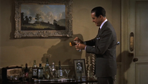
Dial M does much the same. Consider that bar table against one wall. It’s shown straight on in many shots, but at least once the drinks are shown in the foreground (with striking 3D saliency) and behind Margot and Mark we see the other wall behind them, the one “through which” we’ve seen action before.
Why go to the trouble of showing the fourth wall? It supplies visual variety while expanding the play in a way that is at once “theatrical” (the space is still enclosed) and “cinematic” (the camera can go anywhere). Allowing a fourth wall also permits more complex staging effects. Characters can now make a circuit around the entire set. This is notable in Dreyer’s late films, when the character’s walk is covered in a single tracking shot, as if the set’s four walls have been ironed out on the screen.
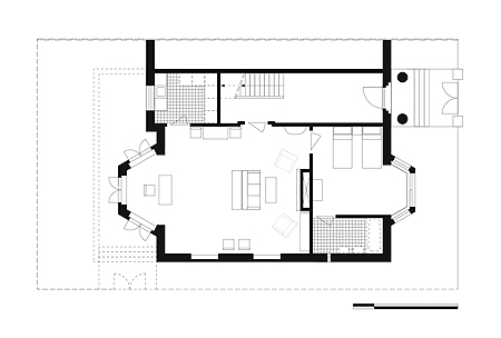
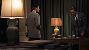
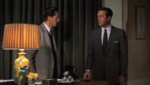
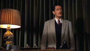
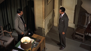
Hitchcock does the same sort of thing through cuts. In one scene, we follow Tony as he finally takes control over Swann, convincing him to kill Margot. Here the showing of the fourth wall can mark off a privileged portion of the scene. To get a sense of how this happens, we can look at a plan of the apartment provided by Steven Jacobs in his stimulating book The Wrong House.
The living room is the biggest space, with the kitchen (never shown) and hallway above it. To the right of the living room are the bathroom (never shown) and the bedroom. The street is at the far right of the diagram, the terrace and garden at the far left.
The living room is the main arena of action. In the left area are the French windows, with Tony’s desk and desk chair in the alcove. The drinks bar, flanked by two chairs, stands along the uppermost wall. Adjacent to the right chair is the crucial main doorway. In the center of the room, facing the fireplace at the right, is the sofa and coffee table, with a narrow table running behind the sofa. Two wingback armchairs are angled alongside the fireplace. On the long bottom wall are bookshelves, hanging pictures, two chairs, and a china cabinet (not pictured).
During most of the film, we are oriented to the apartment from camera positions facing the wall with the drinks bar and the doorway (the top area of the floor plan). At a crucial passage, however, Hitchcock takes us around the entire living room, clockwise.
Tony has been unveiling how much he knows about Swann’s crimes. In this movie, the desk is the place of power, where both the phone and Tony’s account book are. Starting at the desk, Tony builds up the pressure. He moves along the familiar side of the room to confront Swann as he wipes the glasses.
He controls their conversation, even when he pauses to sit down and face a looming Swann.
These shots get Tony to a midway resting point. He explains that he’s already framed Swann as the man blackmailing Margot. This pushes Swann into an angry sulk. Hitchcock uses Swann’s static profile as a pivot, in order to switch camera positions 180 degrees. As Tony continues to squeeze Swann, we see a corner of the fourth wall we just more or less occupied.
Call this the “stick” part of the sequence. When Tony proposes a carrot—a thousand pounds in exchange for killing Margot—we follow him from the new side we’re on. Swann turns uneasily away, and a slight change of angle accentuates his shift.
As Swann edges to the fireplace, Tony strolls rightward, passing a bookcase and the china cabinet. When he gets to his desk, he reaches into a drawer.
“You can take this hundred pounds on account.” He tosses the money across the room, and the camera pans with it across the fourth wall. The sheaf of bills lands in the wingback chair Tony had relaxed in earlier.
Swann doesn’t touch the money but advances to the desk to check Tony’s claim that the bills can’t be traced. So we make another half-circuit of the room.
Now we’re back in the zone in which the shot started. When Tony says that the murder will take place “approximately where you’re standing now,” Hitchcock cuts to a low-angle shot of Swann, starting. (This is one of many examples gainsaying the idea that a low angle confers power on an individual.)
This entire passage, the culmination of Tony’s efforts to recruit Swann to his cause, is rendered in a series of fairly short shots, not long tracking movements. And indeed the “wild wall” with the bookcase would have been much more difficult to manage in a single take. Probably that’s one reason Rope doesn’t show us its fourth wall.
After this patient, quietly bravura passage, Hitchcock starts a new one, this time from a high angle.
The orientation, one we haven’t seen before in the film, marks a fresh phase of the action: it’s the first of many rehearsals and replays of the killing. This section of the scene gains force by its contrast with earlier low-angle shots and the steady circuit we’ve made of the living room.
Echoing frames
Naturally, Hitchcock dynamizes Knott’s play by means that we’ve seen in other of his films. There are passages of subjective cutting, in which we’re given the optical point-of-view of a character. Early in the film POV shots are assigned to Tony, but as Margot gets drawn into his trap, Hitchcock gives her subjective shots too. The pivot comes when during Hubbard’s questioning. Tony steps out from behind the Inspector and her glance flicks to check his expression. She’s telling the lie he coached her to tell. Our alliance starts to shift to her–and to Hubbard, through whose eyes we’ll see what happens in front of the house at the climax.
At the climax, when Inspector Hubbard brings Margot out of prison to solve the case, a comparable peekaboo dance takes place through her vision, with Tony replaced by Mark.
There’s also the remarkable passage of mental subjectivity reminiscent of 1940s montage sequences, in which Margot’s trial and condemnation are compressed into abstract shots showing her as if facing the judge (above). These images again at once open up the play a bit and keep faith with the tightly circumscribed premises of the film. As Hitchcock explained to Truffaut, he handled the court proceedings in such a stylized fashion because shifting the action to another concretely defined space would have destroyed what he’d built up. “People would have started to cough restlessly, thinking, ‘Now they’re starting a second picture.'” The passage also reinforces our emotional attachment to Margo that was initiated during Swann’s attack.
Keeping the action within one set also allows Hitchcock to exploit a tactic that’s common to Hollywood films but that seldom gets such a workout—the repeated setup that carries echoes of earlier actions. I’ve supplied examples in an earlier entry, on Nolan’s The Prestige, but needless to say Hitchcock gives us a master class in reiterated or rhyming setups. The several tours of the apartment activate different props and zones while also highlighting key areas, such as the desk and the door that will come back later. When you have only a few sets, you can layer the audience’s sense of the scene’s progress by calibrating your camera positions to evoke earlier shots of the same bit of space.
For example, when the police are investigating Swann’s death, a high angle ironically echoes Tony’s rehearsal of the murder plot (above). Another straightforward instance is seen in the low angle on Tony in the wingback chair. We first see it when Tony offers his purring explanation of how he’ll frame Swann (above). That shot is recalled quite precisely when, after having adjusted to Swann’s death, he relaxes in the chair after setting up the framing of Margot.
The hallway area receives more prolonged development, with the carpeted stairs becoming more prominent as the film proceeds.
In the second shot above, Hitchcock denies us what any other director would show: a closer view of Tony slipping the key under the carpet as he’s talking casually to Margot. It’s a token of respect for our intelligence, I think. He knows we’re watching Tony’s hand, even in long shot.
Not until Swann arrives do we get the variant of the framing that will be modified at the climax, when Tony comes back from the police station.
Both of these shots play out as parallels and variants, as each man reaches for the key under the stair carpet.
A similar framing presents the grisly aftermath of the murder attempt, contradicting Tony’s confident patter about the plan.
Later, the key framing shows Inspector Hubbard setting the trap for Tony, in a shot recalling the trap Tony set for Margot. When Tony is caught and tries to escape, Hitchcock cuts to the prime orientation to show his path barred.
Of course, filming several shots from the same general setups can save time during production, but shrewd directors turn those repetitions to narrative advantage. In this case, they let Hitchcock have his cake and eat it too: he can stay concentrated on a single set, but he can create a web of associations among different phases of the action. The narrow rooms of Knott’s play are transformed by cinema.
Superflat?
The widescreen format forced upon Hitchcock may have been another source of his worry about “waste space.” He used lampshades and other items of furniture to balance the 1.85 compositions. More important, his use of 3D has long seemed rather conservative. Is it?
There are almost no instances of objects popping out from the screen surface; the famous example is Margot’s hand plunged out and toward the scissors on the desk during Swann’s attack. The space is discreetly layered, as when the bottles on the bar table or the bedstead moved to the living room command the foreground of shots. On the whole, Hitchcock follows both advice and custom in using the frame as a window: the depth is on the other side of the screen, tapering toward the distance. This was recommended practice at the time, and still is today.
More important, 3D Westerns like Fort Ti and Hondo and 3D musicals like Kiss Me Kate have settings stretching into the far distance, so you can show an extreme range of depth behind the screen/window. But if you’re shooting an apartment set, you don’t have much distance to play with. The result is a “shallow depth” that is at odds with a central trend of 1940s cinema and many 3D productions of the day.
Like other directors working in the 1940s and early 1950s, Hitchcock sometimes embraced tight depth compositions with big foreground heads or objects. Here are shots from The Paradine Case (1947) and I Confess (1953).
Color filming made shots like these more difficult, as the film speed didn’t allow the lenses to be stopped down so far. Accordingly, for Rope and Under Capricorn, Hitchcock either spread his actors out clothesline-fashion or kept the foreground far enough from the lens so that the depth of field could be managed.
3D added more constraints. Fox cinematographer Charles G. Clarke recommending putting nothing very close to the camera and relying on 50mm lenses for medium shots (rather than the wider 35mm ones common in 2D black-and-white filming). Hitchcock’s cinematographer Robert Burks had shot Hondo and is said to have worked uncredited on House of Wax, so he was aware of the emerging 3D conventions. But the relatively flat spaces of Dial M yielded depth shots that don’t spread its faces across great distances. In many of the shots shown above, you can see that when figures are arrayed in some depth, the foreground is fairly far away from the lens. We have a convenient comparison in the opening of Shadow of a Doubt (1942) and a late scene in Dial M.
In the later film, Milland in the foreground is further from the lens, and Cummings is closer to him than the landlady is to Joseph Cotten. In most shots in Dial M, the space of the set is shallower, and the characters are typically packed closer together, than in the deep-focus films of the 1940s.
Paradoxically, then, it was harder to get aggressive depth compositions in 3D films than in 2D ones. But Hitchcock seems to have taken advantage of the shallow space of the Wendice apartment to concentrate on his actors, often isolated in single shots rather than the jammed frames of the 1940s. Given the wider frame, his compositions may seem bland, and sometimes they display the waste space he deplored. Still, his approach throws nearly all the emphasis onto the “theatrical” features of line readings, postures, gestures, and facial expressions.
Moreover, seeing the 3D screening at Toronto right after seeing digital 2D copies, I was struck by how many planes are out of focus in the 3D version. Presumably the 2D transfers have always been taken from one or the other of the dual-camera negatives. The result is a harder-edged image than what 3D creates with its staggered overlap of images.
Focus is extremely selective in the 3D version, with often only a face or even a cheek crisp and everything else significantly softer. For example, it’s not easy to discern in the 2D versions that in 3D, Margo’s face is the only plane in focus in the first shot below; both the bouquet and Mark, as well as everything else, is not as sharp. Later, Hitchcock makes the bedside clock salient by letting it be the only item fully in focus, but I don’t think you’d know that from the harder-edged image on display on the DVD and the download version.
Unlike the 1940s deep-focus style, then, Dial M‘s color 3D puts very few planes in focus, accentuating the shallowness of the space of the scene. The foreground furniture and lamps would be distracting if they were in focus (as, say, they tend to be in The Ipcress File). Like a silent-film director practicing the “soft style” of the 1920s, Hitchcock uses 3D to surround his characters with cushiony, vaguely defined planes.
I’m tempted to see Hitchcock flaunting shallow space in one of the more remarkable moments in Tony’s murder rehearsal. As we’ve seen, high angles trace Tony’s path around the parlor. They also highlight the suitcase that hasn’t been visible in earlier shots, what with all the low angles. But when it’s necessary for Tony to show Swann where he’ll hide the key, we get something quite unlike the rest of the film.
Most directors would either shoot the scene from inside the apartment, framing it in the doorway (as the set is filmed when Hubbard reveals the lost key), or from some vantage point in the hall, probably from rather close to the carpet. Instead we get a cut from the master-shot high angle straight in to another high angle, but taken with a much longer lens.
Peering through the chandelier at Tony’s ploy, riveting our attention on the key, this shot emphasizes depth in a way that few other shots in the film do. Yet the long lens has the effect of squeezing the planes together, negating the effect of 3D and relying on monocular depth cues like distance and the out-of-focus chandelier. It might as well be an axial cut out of Kurosawa.
This image, like the two shots I started with, the implausible and underhanded cut showing Margot displaying her key to the three men, reminds us that Hitchcock is always ready to tell stories of the unexpected, in unexpected ways. And these ways celebrate the ability of film to transform whatever it touches.
Years after Dial M, Hitchcock may have soured on the theatre-driven phase of his career. Yet Wordsworth’s sonnet in praise of sonnets celebrates what you can accomplish within a “scanty plot of ground.” By embracing the theatrical trappings of Dial M for Murder, Sir Alfred does more than tell a suspenseful tale. He fastidiously demonstrates that cinema’s power is unpredictable.
At Toronto, the digital version of Dial M was shown in the original 1.85:1 aspect ratio. The 2004 DVD employs a 4:3 ratio. The version circulating on iTunes HD rental and the 3D Blu-ray disc announced for October, are in 1.77. I’m drawing my frames from the 1.77 version, the closest I can get to the original release.
The 4:3 DVD is not the full-frame film that was recorded in camera. The 1.77 version of Dial M that I worked from includes more material on the sides than can be seen in the DVD release. Correspondingly, a little is trimmed from the top of the 1.77 shots and more is cut from the bottom, and these portions are visible on the DVD. For those who want to study Hitchcock’s visuals, the forthcoming 1.77 Blu-ray is probably to be preferred. But the 1.33 version offers a chance to see how that shot of Margo’s hand was made. Some lady was apparently kneeling underneath the camera.
Speaking of cameras, initial publicity for Warners’ switch to 3D refers to the creation of an “All-Media Camera” that could shoot any aspect ratio and either 2D or 3D. There is evidence that Hondo and subsequent releases were shot on this device; its workings are explained here.
The 1981 Toronto Festival of Festivals’ screening of Dial M is covered in Sid Adilman, “‘Chariots’ Races to Most Popular Film Nod At Toronto Fest,” Variety (22 September 1981), 6. Variety‘s original review of the film is available in the 27 April 1954 issue, p. 3.
Thanks to Steven Jacobs for permission to reproduce his floor plan of the apartment. It originally appeared in his The Wrong House: The Architecture of Alfred Hitchcock (010 Publishers, 2007). Wesley Aelbrecht executed the drawing. Steven analyzes the use of the set on pp. 101-109.
Information on 3D during 1952-1954 comes from three standard sources, Adrian Cornwell-Clyne’s 3-D Kinematography and New Screen Techniques (Hutchinson, 1954); New Screen Techniques, ed. Martin Quigley, Jr. (Quigley, 1953); and R. M. Hayes, 3-D Movies: A History and Filmography of Stereoscopic Cinema (Scarecrow, 1989). See also Thomas M. Pryor, “Warners Reviving Full Film Output,” New York Times (25 June 1953), 23, and “3-D Looks Dead In United States,” Variety (26 May 1954), 1. Some rules for shooting 3D are formulated in Charles G. Clarke, “Practical Filming Techniques for Three-Dimension and Wide-Screen Motion Pictures,” American Cinematographer 34, 3 (March 1953), 107, 128-129, 138.
3-D Film Archive, an invaluable website stuffed with rare images, is run by Bob Furmanek. Particularly helpful entries are here and here. Also check the Home Theatre Forum for posts by Bob.
Hithcock’s remark about 3D creating “waste space” is quoted by Barbara Berch Jamison in “3-D Spells ‘Murder’ for Alfred Hitchcock,” New York Times (11 October 1953), X5. The passage is somewhat opaque, though, and Hitchcock might instead, or also, be referring to the widescreen format. Other quotations come from François Truffaut, Hitchcock (Simon and Schuster, 1967), pp. 156-159 and the 1963 interview “Hitchcock” by Ian Cameron and V. F. Perkins in Alfred Hitchcock Interviews, ed. Sidney Gottlieb (University Press of Mississippi, 2003), p. 51.
Hitch’s comments on editing versus long takes come from two essays, “Direction,” from 1937, and “My Most Exciting Picture,” from 1948, a transcribed interview. Both are available in Hitchcock on Hitchcock: Selected Writings and Interviews, ed. Sidney Gottlieb (University of California Press, 1995), pp. 253-261 and 275-284.
For information on Hitchcock’s career, I’ve drawn on Patrick McGilligan’s Alfred Hitchcock: A Life in Darkness and Light (HarperCollins, 2003) and Donald Spoto’s The Dark Side of Genius: The Life of Alfred Hitchcock (Little, Brown, 1983). See also Bill Krohn, Hitchcock at Work (Phaedon, 2000), p. 130.
Bazin’s essay, “Theater and Cinema,” is available in What Is Cinema? vol. 1, ed. and trans. Hugh Gray (University of California Press, 1967), pp. 76-124. My quotation of the stage directions from Knott’s play come from Frederick Knott, Dial “M” for Murder (Dramatists Play Service, 1954), p. 37. You can read Wordsworth’s “Nuns Fret Not at Their Convent’s Narrow Room” here.
Kristin discusses German Kammerspiel films in our Film History: An Introduction, pp. 95-96. Her remarks on the genre and on Backstairs can be found on Antti Alanen’s blog. I consider Dreyer’s treatment of kammerspiel conventions in The Films of Carl-Theodor Dreyer (University of California Press, 1981). The first essay in my Poetics of Cinema connects Rope with 1940s trends in long-take shooting and the “fluid camera.” See as well Herb A. Lightman, “The Fluid Camera,” American Cinematographer 27, 3 (March 1946), 82, 102-103, and “‘Fluid’ Camera Gives Dramatic Emphasis to Cinematography,” American Cinematographer 34, 2 (February 1953), 63, 76-77. Some of these ideas are discussed in our blog entry, “Bergman, Antonioni, and the Stubborn Stylists.”
I’m grateful to Cameron Bailey, Jesse Wente, Andrew McIntosh, and Brad Deane for enabling me to participate in the screening.
P.S. 12 Sept 2012: Richard Allen of NYU points out to me that John Orr, in his book Hitchcock and Twentieth Century Cinema explores Hitchcock’s Kammerspiel affinities in Dial M and other films. “It is Hitchcock, not Lang,” Orr writes, “who renews the European Kammerspiel tradition in the age of sound and Hollywood colour” (p. 63). I regret that I haven’t read that book, but now I intend to! Excerpts available on Google books suggest that my arguments go in different directions than Orr’s. In any event, Orr is a distinguished film scholar whose work always rewards attention.
P.P.S. 16 Sept 2012: I should also have referenced the special 3-D issue of Film History 16, 3 (2004), which includes articles by William Paul and John Belton, among others. In another essay, Sheldon Hall discusses Dial M, concentrating on manipulations of point-of-view, with other material on the film’s relation to the play. The whole issue is well worth reading, and I regret not recalling it when writing this entry.
P.P.P.S. 11 Oct 2012: At Twitchfilm, Jason Gorber provides thoughts on the digital restoration and an interview with Jesse Wente, who supervised the programming of Dial M for TIFF.
P.P.P.P.S. 11 Oct 2012: At 3Dfilmarchive.com, Bob Furmanek and Greg Kintz provide a dazzling consideration of the new restoration and the Blu-ray release, along with detailed production background and many original documents. Using production documents and photographs, Bob indicates that the Warners All-Media Camera was used on Dial M, and my entry has been revised to reflect the likelihood that this was the case. I’d appreciate further information from interested readers on that gadget, beyond the usually cited passages from John Wayne’s Hondo correspondence. A minority opinion claims that the machine was unworkable and Warners films were shot in the Natural Vision system, but I’ve seen no evidence that would support this. Thanks again to Bob for keeping me in the loop.
Graphic content ahead
Kristin here:
Recently I received the June issue of Empire magazine. After the shock of realizing that, Ack! It really is almost June, I turned to the letters to the editor. I received an even worse shock when I read this one:
I recently discussed 2001: A Space Odyssey with my Film Studies teacher (I’m an A-level student), and mentioned (what the back of the DVD case says): “One of the most mind-blowing jump cuts ever conceived.” He told me the bone to satellite scene is actually a match cut. I then read issue 262 of Empire, and was very happy to see a Stanley Kubrick special. I noticed you also called it a “stunning jump cut”. After being told what a jump cut and what a match cut is and seeing a few examples (the jump cut at the start of Don’t Look Now, and then the match cut in 2001: A Space Odyssey), I am now confused as to why the DVD and Empire would call it a jump cut when it is a match cut.
Robby Burke, via email
It is a match cut. The offending writer has been put into a small room with only Eisenstein films for company. The moral of this story is always listen to your teachers, kids. And good luck to Owen Robinson on your Kubrick Film Studies unit. This is turning into hospital radio.
No wonder Mr. Burke is confused. His teacher and Empire both gave him answers that I would consider wrong, or at best imprecise to the point of vagueness. This rather surprised me. I enjoy reading Empire, which has somehow managed to keep itself fat and glossy when magazines like Entertainment Weekly have shrunk to the size of brochures. It even has occasional useful articles, like its retrospective section on Back to the Future in the April, 2010 issue. (As far as I can tell, this section has never made its way to the Empire website.)
The term “match cut” is, out of context, virtually meaningless. There are different kinds of match cuts, and not specifying which type one is referring to will leave Mr. Burke and the rest of us clueless as to what the teacher and the unnamed staff member for Empire mean.
Thinking I was missing something about the term “match cut,” I looked it up on Wikipedia and discovered that the teacher and the Empire staff member might have gotten their misinformation from the entry on that phrase. Its definition of a “match cut” is:
A match cut, also called a graphic match, is a cut in film editing between either two different objects, two different spaces, or two different compositions in which an object in the two shots graphically match, often helping to establish a strong continuity of action and linking the two shots metaphorically.
While the Empire use of “match cut” was only vague, this definition is simply inaccurate. The author goes on to say:
Match cuts form the basis for continuity editing, such as the ubiquitous use of match on action. Continuity editing smoothes over the inherent discontinuity of shot changes to establish a logical coherence between shots. Even within continuity editing, though, the match cut is a contrast both with cross-cutting between actions in two different locations that are occurring simultaneously, and with parallel editing, which draws parallels or contrasts between two different time-space locations.
I’ll agree that continuity editing is designed to smooth over the potentially disruptive quality of cuts. Matching anything within a scene is definitely different from cutting from an action in one place to a different action in a different place. But graphic matches are neither synonymous with “match cuts” nor the basis for continuity editing.
I also discovered that the “Further Reading” list at the bottom included two items, one of which was Film Art: An Introduction. One of those good news/bad news situations. The good news is, if you read the book, you will find out what graphic matches, and matches in general, really are. The bad news is, if you don’t, you might blame us for the contents of the Wikipedia entry.
A little detour into history
Most people don’t realize this, but David and I invented the term “graphic match.” As we recall, this happened in 1975. David was teaching a course that involved screening Yasujiro Ozu’s second color film, Ohayu (1959), a wonderful comedy about television, farting, and small talk. We had never seen the film before and were watching a 16mm print of it.
When the two shots below passed before our eyes, we both gasped and lunged for the projector. We ran the film back and watched the cut again. There was no doubt that Ozu had deliberately placed a bright red sweater in the upper left quadrant of the frame in one shot and a bright red lamp in the same basic position in the next shot. We didn’t know what to call this technique, so we dubbed it a “graphic match.” Two years later, when we started writing Film Art: An Introduction, we included the term as one technique of film editing and used Ozu’s match on red as one example. By now “graphic match” has been picked up to the point where we occasionally see it used in print.
If people, however, are tossing that term and “match cut” around so inaccurately–and even equating the two–then some definitions and examples seem in order.
Matcharama
“Match” as applied to editing simply means that some element is carried over from one shot to the next. That doesn’t necessarily mean that this element creates a sense of continuity.
In general, “continuity” means that a coherent space and time are continuing over the cut, so that the spectator’s understanding of a story isn’t disturbed by a sense that bits of time have been left out or that characters have changed positions at the cut. Most people watching a mainstream narrative film probably aren’t even aware of the editing, especially in conventional conversation scenes.
More specifically, “continuity” means a set of guidelines or loose “rules” that American filmmakers devised, mostly during the 1910s, to allow them to help create that clarity of narrative action in time and space. Within a scene, the most basic of these is the 180-degree rule or “axis of action,” the invisible line that runs through the scene perpendicular to the camera. If the camera stays on one side of that line, characters will stay in a consistent spatial relation to each other. Character A will be on the left in every shot, Character B on the right—unless one of them walks to a different part of the setting. In other words, the axis creates consistent screen direction.
The most basic kinds of matches are on appearance, position, action, and eyelines. Everyone knows that if a character is wearing a blue hat, showing her wearing a red one after the cut is a continuity error. Her appearance has not been matched. The same is true if she is resting her cheek on her hand in one shot, but has both hands flat on the table after the cut. If she is walking in one shot, she should not be running or standing still in the next. Even if the shots are made with a single camera and the actress repeats her actions, her position and movement should ideally be repeated so precisely that her action appears continuous. That’s a match on action, one of the most common continuity devices.
Smooth matches on action are difficult, especially if, as often happened in classic studio filmmaking, the two shots are made hours or even days apart. Even a supreme technician like Hitchcock can err. Here is a flagrantly mismatched passage from Suspicion. In the long shot, Johnnie (Cary Grant) reaches for the teapot with his left hand and starts to pour.
But then Hitchcock cuts in axially, the teapot is back where it was, and Johnnie once more reaches for it. By the time he’s pouring now, Lina has turned to watch him.
Editors traditionally like an overlap of 2-4 frames when they’re matching action on cuts, but this is a much longer overlap, something on the order of four seconds. Why we don’t usually notice such things is a source of considerable discussion in film circles.
The eyeline match is also very common. If a character looks at something offscreen, a cut shows us something in a different space, and we tend to assume that the character is looking at what we now see. Screen direction is important here, since if the character looks off right, when the next shot appears, we assume he is now offscreen left.
Not all continuity devices involve matches of these kinds. Crosscutting and flashbacks may move the action away from the space and even the time of a scene, but there are other cues that help us keep track of the ways in which these new spaces relate to the storyline.
None of this requires what we would consider a graphic match. Of course, if we see the same characters in the same setting from shot to shot, there will be an overall graphic consistency. They’re wearing the same costumes, and the background colors probably won’t shift greatly. But precisely because of that general consistency, we probably won’t notice the graphic qualities of the scene as being that important as elements of the editing. We’re busy following the story.
Graphic matches precise enough to be noticed as such tend to jolt us a little out of our smooth concentration on the story action. They are not the basic of continuity, as the Wikipedia definition claims. On the contrary, they often appear in films outside the continuity tradition. Abstract films often play on the graphic similarities (matches) or contrasts (mismatches) among shapes from shot to shot. Such abstract play is, in effect, their subject, and we pay attention to the pictorial flow as we would pay attention to story in a conventional narrative film.
When close graphic matches or jolting graphic contrasts appear in narrative films, they may or may not play a narrative role. The famous bone/spaceship cut in 2001 is a graphic match. It’s not a match on action, since two different objects in completely different times and places are shown. It’s not a jump cut for the same reasons.
Here the graphic match is not really very close. The sky is bright and blue behind the bone, while it is dark behind the spaceship. Similarly, the bone is light in color, while the spaceship is initially dark, though it does brighten slightly as it moves. The only graphic element matched is the general shape and motion of the two objects.
The function, I assume, is to jolt the audience with the dramatic transition across millions of years and from earth into space. Thus here the graphic match has a narrative function, though it does not create the smooth movement from one scene to another that classical films tend to have. It’s more like what is sometimes called a “shock cut,” one which startles the viewer. The cut to the screeching cockatoo in Citizen Kane is one of the most famous examples, though it primarily involves sound and a strong graphic contrast.
A transition somewhat similar to the one in 2001 occurs early in Aliens, an example which we use in recent editions of Film Art. A dissolve moves from a close-up of Ripley’s sleeping face to a view of part of the earth seen from space. Again there is a passage through time and space, though the interval is presumably only a few months. Here the graphic match is much closer than in the 2001 transition, with the colors as well as the shapes being kept fairly consistent. This graphic similarity and the dissolve that emphasizes it ease us from one scene to another rather than jolting and surprising us.
In the hands of an experimental filmmaker or of an unconventional director like Ozu, who avoids obeying Hollywood’s continuity guidelines, graphic matches don’t necessarily play a narrative role. They are included as an extra layer of engagement for the viewer. We don’t, or at least shouldn’t, expect to be able to interpret them. I would contend that the link between the red sweater and the red lampshade is there for pure pleasure. You can come up with an interpretation of the graphic match if you try hard enough—but if you do, please don’t tell me about it. I suspect it would interfere with my enjoyment of that scene when I next watch Ohayu.
I don’t think the cut serves even so modest a function as establishing space at the beginning of a scene. Here’s the shot that actually begins the scene and leads to the sweater and lampshade shots:
And here’s the one that follows the lampshade shot:
The woman is a minor character. She and her husband live in the suburban housing complex where the much of the action is set. They are more modern in their habits than their neighbors, wearing western clothes rather than kimonos and owning the only TV in the complex. They function primarily to introduce the two young boys in the central family of the story to TV, since they hospitably let the local kids visit them to watch it. The scene following the graphic match shows the wife packing to move. Their absence will precipitate a crisis when the boys demand that their parents buy them a television. The strife among the family members forms the basis for much of the rest of the action.
So the packing scene is important. Yet Ozu uses two shots that he wouldn’t need, thus delaying the scene’s beginning. The extreme long shot of the housing complex doesn’t tell us which house will form the setting for the upcoming scene. The red sweater is in the distance, but barely visible. We certainly wouldn’t notice it or get any clues about the narrative from it. Yet Ozu cuts to a closer view of the sweater and a towel. The houses in the background are all identical, and we don’t know which one belongs to which characters or which we will enter in the next shot.
The first interior view would be a logical establishing shot for the scene. The modern furnishings and especially the television box let us know where we are, and the boxes might hint that the inhabitants are packing to leave. So we are not surprised when we see the modern wife in the subsequent shot. But Ozu puts in the other two as part of his typical series of transitional shots that show the spaces between locales where action occurs.
The graphic match, I would suggest, is simply part of Ozu’s distinctive style. It’s playful and fits in with the general graphic beauty of his films, which includes bright splashes of color, careful compositions using the lines of the sets, and precise placements of props.
Returning to the Wikipedia entry for “match cut,” there is a section that mentions several examples, including the one that inspired Mr. Burke’s letter:
Stanley Kubrick’s 2001: A Space Odyssey contains a famous example of a match cut. After an ape discovers the use of bones as a tool and a weapon, there is a match cut to a spacecraft or satellite in orbit. The match cut helps draw a connection between the two objects as exemplars of primitive and advanced tools respectively.
Michael Powell and Emeric Pressburger’s A Canterbury Tale contains the influence for the 2001: A Space Odyssey match cut in which a fourteenth century falcon cuts to a World War II aeroplane. The sense of time passing but nothing changing is emphasised by having the same actor, in different costumes, looking at both the falcon and the aeroplane.
An early example comes from Orson Welles’s Citizen Kane which opens with a series of match dissolves that keeps the lit window of C.F. Kane’s in the same part of the frame while the cuts take us around his dilapidated Xanadu estate, before a final match dissolve takes us from the outside to the inside where Kane is about to die.
Another match cut comes from Lawrence of Arabia (David Lean, 1962) where an edit cuts together Lawrence blowing out a lit match with the desert sun rising from the horizon. Director David Lean credits inspiration for the edit to the experimental French New Wave. The edit was later praised by Steven Spielberg as inspiration for his own work.
How the author knows that A Canterbury Tale (see below) influenced 2001 is not clear. The site footnoted (here) simply says that the cut (below) “anticipated” Kubrick’s scene in 2001. The film was released in the U.S. in early 1949, so possibly Kubrick saw it and remembered the scene nearly twenty years later. By the way, Powell and Pressburger create a double graphic echo, roughly matching the two similar dark objects against a light sky and making the two shots of the men looking upward strongly resemble each other as well.
The Citizen Kane opening, with its precise placements of the one lit window from shot to shot, is a good example of graphic matches. I am not going to touch the question of what a “match dissolve” is.
The cut from the match to the Jordanian desert horizon in Lawrence of Arabia is a trickier case. The match is placed in the left half of the anamorphic widescreen frame, while the sun rises in the right half. Moreover, the match shot is very bright, while the desert scene is fairly dark, with the sun only beginning to glow above the horizon a short way into the shot. Graphically there is not much to link them, though I think the spectator does get a strong sense of a connection between the match and sun. I’d say it’s a conceptual link, not a graphic one. It’s a link that we make on the basis of two bright objects that are not compositionally or spatially matched but simply juxtaposed.
Mr. Burke, your inquiry was perfectly reasonable, and I hope I have helped clear up your confusion.
We supply two flagrant examples of mismatched action, figure placement, and setting in Bringing Up Baby in this blog entry. Interestingly, probably no one but a professional notices them, because the relative positions of the major figures are consistent, as are the overall compositions of the shots. But then, as Dan Levin points out, we are not that sensitive to continuity disruptions in the real world either!
A Canterbury Tale.


