Archive for the 'Directors: Hou Hsiao-hsien' Category
Hou Hsiao-hsien: Film culture finally comes through
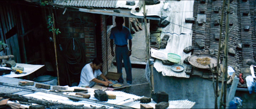
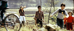
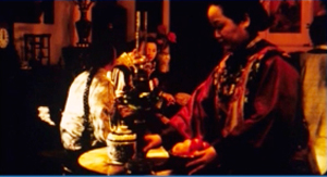
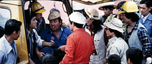
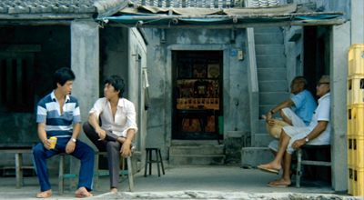
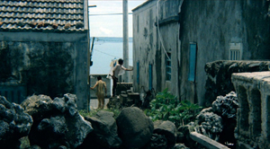
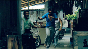
The Green, Green Grass of Home (1982).
For today, let’s call “film culture” that loose agglomeration of institutions around non-mainstream cinema. Film culture includes art house screening venues, festivals, magazines like Film Comment, Cinema Scope, and Cineaste, distribution companies (Janus/Criterion, Milestone, Kino Lorber et al.), critical websites, and not least the new channels of distribution and exhibition like Fandor, Mubi, and the impending FilmStruck.
Although the system is decentralized, there’s usually a fairly predictable flow of films through it. A film is shown at festivals, written up by critics, and picked up by distributors. Then it gains some exposure in theatres or more festivals, and it eventually becomes available on DVD, cable, and streaming services. And now we expect the process to move fairly quickly. Mustang played Cannes and many festivals through summer of 2015; it moved to theatres in the US and elsewhere in the fall. Only a year after its premiere, you can buy it on disc.
We’ve also been aided by the emergence of multi-standard video players and the willingness of some disc-publishing companies to release versions with subtitles in several languages. All too often, though, “film culture” displays gaps and delays. It took six years for Asgar Farhadi’s wonderful About Elly (2009) to make its way to minimal visibility in the US. Fans of Godard have been prepared to wait years to see his many films that didn’t get even video release in English-speaking territories. (Soigne ta droite! played Toronto in 1987, never got a theatrical release in America, and showed up on US DVD in 2002; the Blu-ray came out eleven years after that.) Two of the most egregious examples of this time lag involve the works of the outstanding Taiwanese filmmakers of the 1980s and 1990s: Hou Hsiao-hsien and Edward Yang.
 Most of Hou’s films had no proper US release. When they were available for booking, as from Wendy Lidell’s heroic International Film Circuit, they circulated for one-off screenings. Some of his major films, such as City of Sadness (1989), still remain difficult to see. Edward Yang’s work was similarly obscure. When we ran a retrospective at our UW Cinematheque in 1998, we had to borrow prints from his family.
Both of these extraordinary filmmakers had to wait many years for the exposure that is standard for European arthouse releases. After six features in seventeen years, Yang found a Western audience with Yi Yi (2000). Hou took even longer; twenty-seven years after his first feature, he gained some recognition with The Flight of the Red Balloon (2007) and last year, The Assassin. Meanwhile, many of these directors’ early films remain largely unknown, prey to ancient distribution contracts and the belief that the films would cost too much to revive and market.
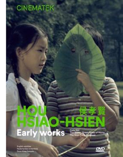
Today’s entry and the next one celebrate the welcome news that important works by these two filmmakers are at last available on the disc format. Today I’ll concentrate on the three early Hou films from the Cinematek of Belgium: Cute Girl (1980), The Green, Green Grass of Home (1982), and The Boys from Fengkei (1983). Next time, I’ll consider Criterion’s release of Edward Yang’s masterpiece A Brighter Summer Day (1992).
Hou, early and late
Hou’s films are no stranger to this site. Among the first things I posted, back in 2005, was one of a batch of supplemental essays to my book, Figures Traced in Light: On Cinematic Staging (2005). That book devoted a chapter to Hou’s staging principles, with background on what I took to be the evolution of his technique. It was, I think, the first sustained view of Hou’s style, and it included discussion of his earliest films. These were scarcely known in the West and not considered in relation to his more famous work.
The online essay expanded my treatment of those titles. Because that essay is more or less buried elsewhere on the site, and it’s somewhat clunkily laid out by today’s standards, I’m reprinting it, with revisions, here, along with some bits from Figures. But first some background on these early works.
Hou began in the commercial, mainstream Taiwanese-language industry. Most local films had a strong genre identity: martial-arts movies, romantic comedies, or melodramas of family crises. Hou’s first directorial effort, Cute Girl, centered on a romance between two city dwellers who re-meet when the man is called to a surveying task in the countryside. Cheerful Wind (1981) reunites the two stars, Kenny Bee and Feng Fei-fe, in a more serious story of how he, a blind man, wins her love. In the pastorale The Green, Green Grass of Home, Kenny plays a schoolteacher brought to a village, where he meets another teacher and a romance blossoms. This film, however, expands to include dramas, big and small, involving several families; it also incorporates an ecological theme by encourage safe fishing policies.
In making these early films Hou discovered techniques that not only suited the stories he had to tell but also suggested more unusual possibilities of staging. He pushed those techniques further in his later films, with powerful results. The charming early films show him developing, in almost casual ways, techniques of staging and shooting that will become his artistic hallmarks. One basis of his approach, I argue, is his adoption of the telephoto lens.
How long is your lens?
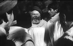
Around the world, from the late 1930s through the 1960s, many films relied on wide-angle lenses—those short focal-length lenses that allowed filmmakers to stage action in vivid depth. One figure or object might be quite close to the camera, while another could be placed much further in the recesses of the shot. The wide-angle lens allowed filmmakers to keep several planes in more or less sharp focus throughout, and this led to compact, sharply diagonal compositions, as in Welles’ Chimes at Midnight (1966).
Although Citizen Kane (1941) probably drew the most attention to this technique, it was occasionally used in several 1920s and 1930s films made throughout the world. The great French critic André Bazin was the most eloquent analyst of the wide-angle aesthetic, and his discussion of Kane, The Magnificent Ambersons (1942), The Little Foxes (1941), and The Best Years of Our Lives (1946) has strongly shaped our understanding of this technique.
The 1960s saw the development of an alternative approach, what we might call the telephoto aesthetic. Improvements in long focal-length lenses, encouraged by the growing use of location shooting, led to a very different sort of imagery. Instead of exaggerating the distances between foreground and background, long lenses tend to reduce them, making figures quite far apart seem close in size.
In shooting a baseball game for television, the telephoto lens positioned behind the catcher presents catcher, batter, and pitcher as oddly close to one another. Planes seem to be stacked or pushed together in a way that seems to make the space “flatter,” the objects and figures more like cardboard cutouts. The style was popularized by films like A Man and a Woman (1966).
The telephoto look quickly spread, employed by directors as diverse as Sam Peckinpah and Robert Altman, whose 1970s films also use the long lens, controlled by zooming, to squeeze a crowd of characters (M*A*S*H, 1972; Nashville, 1975) into the fresco of the anamorphic frame.
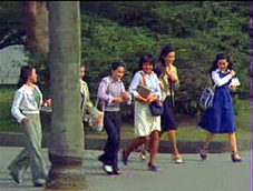
Hou Hsiao‑hsien came to filmmaking via the romance films so common in Taiwan in the 1970s, and this genre employed the long lens extensively. Working with low budgets, most filmmakers relied on location shooting. The telephoto allowed the camera to be set far off and to cover characters in conversation for fairly lengthy shots (as in Diary of Didi, 1978, below). In this respect, the directors were not so far from their Hollywood contemporaries; Love Story (1970) employs these techniques on a bigger budget.
Indeed, Love Story (a big hit in Taiwan) may have pushed local filmmakers toward using this technique in their own romantic melodramas; sometime the influence seems quite direct (Love Story and Love Love Love, 1974)
With these norms in place, Hou’s inclination toward location shooting and the use of nonactors, along with his attention to the concrete details of everyday life, allowed him to see the power of a technique that put character and context, action and milieu, on the same plane. His crowded compositions are organized with great finesse in order to highlight, successively, small aspects of behavior or setting, and these enrich the unfolding story, as Figures tries to show in his masterpieces of the 1980s and 1990s. Using a long lens (usually 75mm–150mm) he began to exploit some “just-noticeable differences” that the lens creates as byproducts.
Hou saw unusual pictorial and dramatic possibilities of the telephoto lens, and they became central to his distinctive way of handling scenes. A current norm of production practice yielded artistic prospects which he could explore in nuanced ways. Figures provides the detailed argument, but let me highlight three points here.
Exploiting the flaws
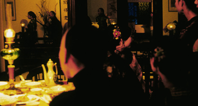
Flowers of Shanghai (1998).
One byproduct of the long lens is a shallow focus, as we can see in the examples above. Because the lens has little depth of field, one step forward or backward can carry a character out of focus. Hou stages in depth–and at a distance–but allows the layers to slip out of focus gradually.
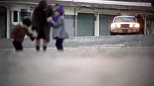
Savoring the effects of gently graded focus is a common feature of Hou’s later work. The masher at the train station in Dust in the Wind (1987) moves eerily in and out of focus in the distance. In Daughter of the Nile (1988), there’s an astonishing shot showing gangsters approaching a victim’s SUV outside a nightclub: at first they’re only barely discernible blobs (seen through the vehicle’s narrow windows) but then they gradually come into ominously sharp focus in the foreground, preparing to attack one of the boys inside. The slight changes of focus train us to watch tiny compositional elements for what they may contribute to the drama. More recent examples abound in Flowers of Shanghai (1998), above, where it’s the foreground planes that dissolve.
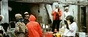
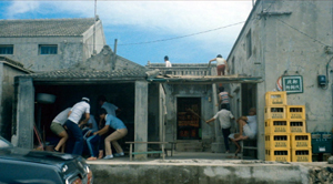
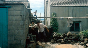
Hou’s three first films don’t use the option quite so daringly; here the degrees of focus concentrate on the principal players but still allow us to register the teeming life around them (Cute Girl; Green, Green Grass).
Hou can put sharply different dramatic situations on different layers. In Green, Green Grass, the departure of the little girl, saying farewell to her host family, plays out slightly closer to the camera than the departure of the eccentric teacher.
This principle operates as well in the creatively distracting street and train-platform scenes of Café Lumière (2004).
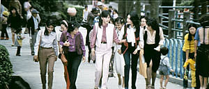
Secondly, the long lens yields a flatter-looking space. It has depth, but the cues for depth that it employs are things like focus, placement in the picture format (higher tends to be further away), and what psychologists call “familiar size”—our knowledge that, say, children are smaller than adults, even if the image makes them both of equal size. One favorite Hou image schema is the characters stretched in rows perpendicular to the camera, and the telephoto lens, by compressing space, creates this “clothesline” look more vividly. We can find the clothesline staging schema in the early Hou films (Cute Girl, Cheerful Wind).
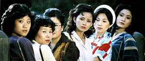
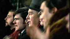
Another favorite schema is the “stacking” of several faces lined up along a diagonal (Cute Girl). This can be seen as a refinement of a schema that was in wider use, as an example from Love Story indicates.
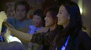
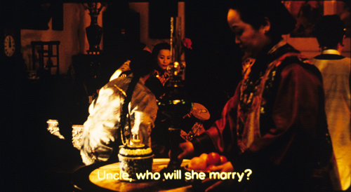
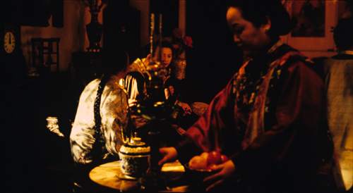
But Hou uses this sort of image more subtly. The telephoto lens lets him stack faces in ways that encourage us to catch a cascade of slight differences (Millennium Mambo (2000)). In many scenes of Flowers of Shanghai (1998) this principle is carried to a degree of exquisite refinement without parallel in any other cinema I know. In one shot, the faces are stacked in the distance, behind a lantern, and a slightly shifting camera reveals slivers of them.
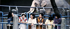
In general, because Hou is committed to a great density of information in the shot, the compression yielded by the long lens tends to equalize everything we see. Minor characters, or just passing strangers, become slightly more prominent, while details of environment can get pushed forward as well. The zoo scenes of Cute Girl enjoy showing us our characters in relation to the creatures around them.
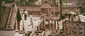
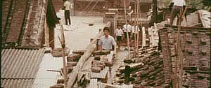
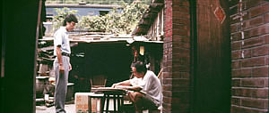
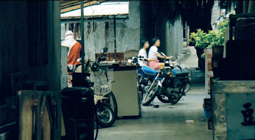
In the shot surmounting today’s entry, the tile rooftops of The Green, Green Grass of Home, secured by bricks and pails and tires and baskets, become just as important as the figures below them.
In Green, Green Grass, Hou develops the equalized-environment option in one particular scene. A long-lens distant view catches the teacher coming to the father’s house along a corridor of rooftops.
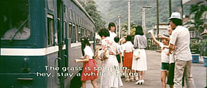
When the teacher confronts the father, instead of tight framings on each man, Hou cuts to another angle that activates yet another range of environmental elements—principally the train passing in the background, prefiguring the trip that the man’s son and daughter will take in an effort to find their mother.
Because the long lens has a very narrow angle of view (the opposite of a “wide-angle” lens), it affects the image in a third major way. If you use a long lens in a space containing several moving figures, people passing in the foreground will block the main figures: they pass between the camera and the lens. Hou elevates this blocking-and-revealing tendency to a level of high art.
In Figures Traced in Light, I argue that many great directors, from the silent era forward, have staged action in the shot so as to block and reveal key pieces of information, calling items to our attention at just the right moment with unobtrusive changes of figure position. The possibility of blocking and revealing arises from the “optical pyramid” created by any camera lens. (Lots more on that pyramid in Figures and in this video lecture.)
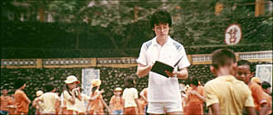
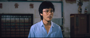
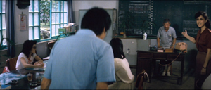
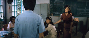
Hou showed himself capable of using the blocking-and-revealing tactic in traditional ways. Take this simple encounter in Green, Green Grass, when the new teacher Da-nian meets Su-yun, the young teacher with whom he’ll fall in love. The scene begins on him, then cuts to a reverse angle as he’s introduced to the principal.
The others are turned toward the principal in the background; the whole composition pushes our eye toward him. Then the teacher steps left to judiciously block the principal. The woman on the far left turns her head and we’re nudged to look at her. Da-nian swivels slightly too.
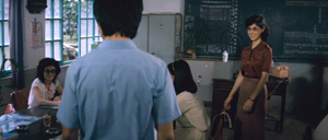
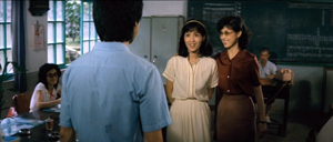
Then the key introduction: Da-nian shifts aside a little, the teacher continues to block the principal, and the central woman turns toward us.
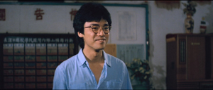
The climax (quiet, nifty) of this shot comes when Su-yun rises to meet Da-nian. She commands the center of the frame, frontal and radiant. Like any good classical director, Hou then gives us a reaction shot mirroring the first shot of this “simple” sequence: Da-nian is more than happy to meet her.
Imagine how a contemporary Hollywood director would handle this–lots of cuts, everybody in singles and close-ups, transfixing track-in to Su-yun, maybe a boingo music track–and count yourself lucky to have encountered, for once, an unfussy craftsman.
Hide and seek
The Green, Green Grass introduction scene involves a wide-angle lens, but Hou’s skill with slight character movement shows up in long-lens images too. In fact, I suspect that using the telephoto lens on location made him sensitive to the resources of masking and unmasking bits of the shot.
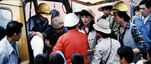
The loveliest example I know in the early films is the Cute Girl shot I analyze in Figures, when Fei‑Fei confronts the surveyors and the man in the red shirt serves as a pivot for our attention; the staging shifts our eye back and forth across the frame, according to small changes of character glance.
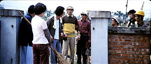
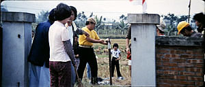
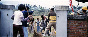
A less drastic example occurs when the surveying team starts quarrelling with the locals around a walled gate: The team’s blocking of the gate gives way to movement into depth and a struggle there between them and the townsfolk.
In all, it seems to me that these three resources of the long lens—the shallow focus, the compressed space, and the narrow angle of view—supplied artistic premises for Hou’s shooting and staging in the later films. This is not to ignore his use of the wide-angle lens on occasion, particularly interiors, as in the schoolteachers’ introduction scene. Once the lessons of the long lens had been absorbed, Hou could apply the staging principles that he’d developed to other kinds of shots and story situations. Sometimes he kept his style smooth and limpid, but at other times he offered the viewer some unusual challenges.
Peekaboo pictures
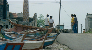
The Boys from Fengkuei (1983).
Presumably Hou could have kept making good-natured, crowd-pleasing movies for many years, but changes in his professional milieu gave him new opportunities. In the early 1980s Taiwan film attendance declined sharply, and Hong Kong films began to command more attention than the local product. The rash of independent companies had concentrated on speculation, not long-term investment, so only the government’s Central Motion Picture Company could initiate recovery. Ambitious government officials launched a “newcomer” program that offered support for cheap films by fresh talents. Even if the new films could not win back the local audience, they might gain renown at foreign film festivals. At the same period, a local film culture began to emerge, relying upon critics who were sympathetic to the creation of a New Taiwanese Cinema.
Hou was no newcomer, but working within the New Cinema framework he could reconceive his practice. The key question for all directors, he recalls, was: What is it to be Taiwanese? His New Cinema films would focus on political and cultural identity, and they did it through an approach to cinematic storytelling that in many respects ran against the conventions of his earlier films. His first New Cinema feature, The Boys from Fengkuei (1983; included in the Cinematek set) reminds us of how “young cinemas” have often represented a return to Neorealism.
Instead of introducing us to clear-cut protagonists and a dramatic situation, the film immerses us in a milieu, that of the small town of Fengkuei. The first fifteen minutes are episodic, casually showing a gang of teenage boys playing pool, lounging about, playing pranks, and above all getting in fights. Initially, the one who’ll become the main figure is minimally characterized; the emphasis, as the title indicates, is really on the group. The boys drift to the big city, where they try to get by and meet others their age. Throughout, local color and everyday routines drive the action more than character goals and traditional drama do.
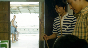
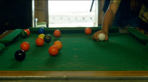
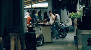
This somewhat diffuse approach to narrative, in various countries, has proven well-suited for filmmakers who want to explore psychological development and social-cultural commentary. So it accords with the impulse toward understanding national identities that animated New Taiwanese Cinema. In addition, I think that this looser conception of storytelling allowed Hou to refine some of the stylistic options he had already explored. Now the extended, fixed telephoto shot with varying planes of focus appears as a more indeterminate pictorial field, as in our rather oblique introduction to the boys–partial framed figures drifting in and out of the frame–and their poolroom hangout. Emphasizing incomplete views and vague figures outside the door, Hou gives us a more precise array of balls on the table than he does of his characters in space.
Likewise, even though Hou has surrendered his very wide anamorphic frame, he finds ways to balance human action and tangible surroundings in the ways he did with city landscapes and village rooftops in the earlier films. The bullying of a motorcyclist and a pursuit by a rival gang aren’t rendered with the aggressive cuts and angles we’d expect in violent scenes in the Hong Kong action pictures then ruling Taiwanese screens. It’s as if Hou, along with his colleagues, is rejecting that other Chinese-language tradition.
Which is to say that when conflict comes, Hou turns to “dedramatization,” that tendency (again related to Italian Neorealism and its successors) of tamping down peaks of action. Now his characteristic long lens creates detached shots, sometimes with planimetric flatness, sometimes with tunnel vision. These images play out chases and fights in a way that minimizes their physical impact but reminds us of the design and details of the characters’ world.
Hou’s insistence on the fixed, distant telephoto take is now put in the service of obscured vision. The people who passed through the frame in the earlier films, blocking and revealing the action judiciously, may become more salient than the action itself–which is itself often offscreen, or swathed in shadow, or shielded by aspects of setting. The early films’ fixed long take enabled us to see story action fully, but, now, in its refusal to cut away, the camera can suppress story information.
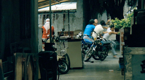
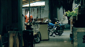
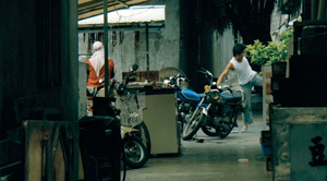
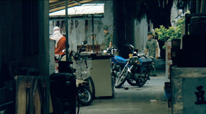
Early in the film, a street fight passes in and out of a far-off intersection among stalls. The dust-up stirs only slight interest from passersby, before bursting back into the alleyway and coming to the camera.
The masking of the fight by the setting can be seen as an extension of the way the walls in the Cute Girl surveying quarrel intermittently cut off our vision, but here it’s far more drastic and sustained.
I’ve drawn my examples from the early stretches of The Boys from Fengkuei, so as not to preempt your own discoveries as the plot carries the gang to the big city. In these scenes Hou in effect teaches us how to watch his movie. But I think I’ve said enough to suggest how Hou’s fresh conception of narrative, born of a renewed interest in local culture (already present in another register in the first three films), allowed him to carry his stylistic explorations to new levels.
Hou saw certain pictorial possibilities in the long lens, and after developing them to a certain point in popular musicals, he recast them when he took up another kind of storytelling. He realized that leisurely, contemplative narratives permitted him to refine these visual possibilities, and they could become powerful, nuanced stylistic devices. And he didn’t stop, as the films following his New Cinema works vividly show. His visual imagination seems unlimited.
A more general lesson follows from this. Norms of form and style are resources for artists. Some artists follow the schemas that they inherit, while others probe them for fresh possibilities. A few can even make a handful of schemas the basis of a rich, comprehensive style. Ozu did this with the techniques of classical Hollywood editing; Mizoguchi did it with depth staging in the long shot. Like these other Asian masters, Hou reveals how much nuance a few techniques can yield, even when deployed in crowd-pleasing, mass-market movies. And now, thanks to the vagaries of film culture, more viewers can come to appreciate his achievement.
The frames from Diary of Didi and Love, Love, Love are, alas, cropped video versions, but that condition doesn’t keep us from recognizing the telephoto lensing in the originals.
The Cinematek collection also includes sensitive English-language introductions to the films by Tom Paulus and enlightening audiovideo essays by Cristina Álvarez López and Adrian Martin.
The indispensable English-language sources on Hou are James Udden’s in-depth career survey, Richard Suchenski’s monumental anthology, Emilie Yeh and Darryl Davis’ study of New Taiwanese Cinema, and two monographs on City of Sadness, one by Bérénice Reynaud, the other by Abe Markus Nornes and Emilie Yeh.
The fullest account I’ve offered of Hou’s style are in Figures Traced in Light and in a video lecture, “Hou Hsiao-hsien: Constraints, traditions, and trends.” See also the several blog entries touching on his work. A broader account of the historical tradition to which he belongs can be found in both Figures and On the History of Film Style, as well as in entries under Tableau staging and in the video lecture mentioned already.
The Boys from Fengkuei.
Hou Hsiao-hsien: A new video lecture!
The Puppetmaster (Hou Hsiao-hsien, 1993).
DB here:
The Hou Hsiao-hsien seminar held in Antwerp at the end of May was an event I was sorry to miss. The title announced a focus on Hou’s style of “just-noticeable differences,” a phrase I used to describe his rich and nuanced staging. Coordinator Tom Paulus assembled a stellar lineup of scholars:
Cristina Álvarez López, critic and researcher, co-founder and co-editor of Transit and frequent contributor to mubi.
Adrian Martin, wide-ranging critic and scholar, whose recent book, Mise en scène and Film Style, made him a natural choice for this gathering.
Bérénice Reynaud, expert on Chinese cinema and author of the first book on Hou in English, a fine monograph on City of Sadness.
Richard Suchenski, coordinator of the major Hou retrospective now touring the world and editor of a vast anthology (discussed in an earlier post).
James Udden, author of the first career monograph on Hou in English (discussed hereabouts) and reporter for us on The Assassin (here and here).
A bout of bronchitis kept me home. Chris Fujiwara, author of books on Preminger, Jerry Lewis, and Jacques Tourneur, kindly filled in for me.
But I had prepared a talk, dammit, and I chafed at the prospect of junking it.
The talk was called “The Drawer, Two Women, and the Little Toy Fan.” It centered on aspects of Hou’s 1980s and 1990s work that seemed to me to have influenced works by other filmmakers in the region. The talk ended with some speculations on developments in Hou’s own films over the last fifteen years.
Remembering that all redemption comes from the Web, I decided to put the thing up on our Vimeo channel. While fiddling with it, I realized that it was pretty narrowly addressed to Hou specialists. So I expanded it by offering more context and background, and gave it the unsexy title of “Hou Hsiao-hsien: Constraints, traditions, and trends.”
The lecture is available here on my Vimeo channel.
It can serve as an introduction to some ideas about Hou I floated in Figures Traced in Light. I’ve added comments on Hou films after Flowers of Shanghai, and I consider other filmmakers (Kore-eda, Tsai Ming-liang, Edward Yang) as well. It has pretty pictures, many drawn from 35mm prints.
I regret to report, though, that my voice-over narration, the first I recorded at home rather in a studio, is a bit ragged. And, sorry to say, the talk runs nearly seventy minutes. I take consolation in Adorno’s reply to someone who complained that The Authoritarian Personality was too long: “We didn’t have time to make it short.”
Thanks to Tom Paulus of the University of Antwerp and the Photogénie blog for sponsoring the seminar. Thanks as well to Bart Versteirt and Lisa Colpaert of the Vlaamse Dienst voor Filmcultuur vzw and to Nicola Mazzanti of the Cinematek. And of course I owe big thanks to Erik Gunneson of our department of Communication Arts who, as ever, helped me record and post the video lecture.
See our previous entry for more information about events related to Hou’s visit to Belgium. Our site has other material on Hou here and especially here and here.
Here’s a good place to acknowledge what Abé Markus Nornes and Emilie Yueh-yu Yeh have done in making available their pioneering work on City of Sadness. Long ago they put up a fascinating website on the film, which they have now updated on several platforms. Staging Memories, the free interactive iBook for Mac and iPad, can be downloaded from the Apple Bookstore. You can buy a paperback edition from Michigan Publishing here, and the PDF version of that can be viewed for free here.
In the talk I mention how Hou’s work has affinities for the “tableau” style developed in the 1910s. This isn’t a question of direct influence, but an instance of convergence: Similar early choices in a process (long take, long shot, fixed camera) led to similar options and opportunities further down the line. (A case of path dependence in film style?) You can find more on the tableau style in On the History of Film Style, Figures Traced in Light, and some entries on this site, particularly this one and these. The tableau style is also discussed in another video lecture, “How Motion Pictures Became the Movies.”
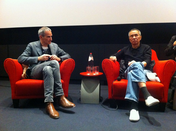
Olivier Assayas and Hou Hsiao-hsien at the Master Class held at the Royal Film Archive of Belgium. Photo courtesy Nick Nguyen.
THE ASSASSIN: Personal reflections from James Udden
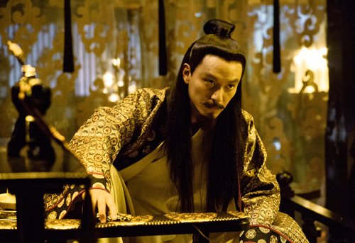
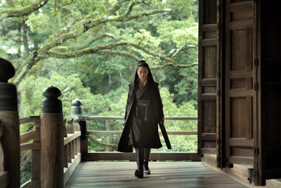
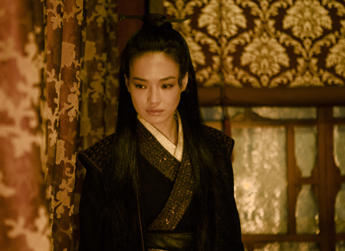
The Assassin (Nie Yin Niang; Hou Hsiao-hsien, 2015).
DB here:
Last week there was a big Hou Hsiao-hsien event in Belgium. A seminar hosted by Tom Paulus of the University of Antwerp and the Photogénie blog featured many speakers along with Hou and his collaborator Chu Tien-Wen. (I was scheduled to go but was felled by bronchitis and couldn’t travel.) That event was followed on Wednesday by a master class with Hou, Chu, and Olivier Assayas at the Royal Film Archive of Belgium. Under the auspices of curator Nicola Mazzanti, the Cinematek, as it’s known, has embarked on restoring Hou’s oeuvre and is currently playing a retrospective. (The accompanying catalogue is here.) Wednesday evening was capped by a gala screening of The Assassin.
One of the seminar participants, Jim Udden, is no stranger to this site. His was the first book in English on Hou’s career (No Man an Island) and he contributed an on-set visit to this site when Hou was shooting The Assassin. Over the years he has built up a strong personal relation with Hou and Chu. Here are his initial impressions after the Brussels screening.
Films by Hou Hsiao-hsien are usually to be experienced first, and understood only much later, and often after some effort. This premise applies with special force to The Assassin.
It is about the most direct experience of a film I’ve ever had. I didn’t understand very much of the plot, or even the language. The subtitles were only in French, and the Chinese was – while recognizably Mandarin – so classical in nature, so foreign in syntax and rhythm compared to vernacular Chinese today that even native Mandarin speakers are going to need a subtitled translation. Even then, those who could read the French subtitles admitted that much of this eluded their comprehension.
Yet I was curiously grateful for the linguistic barriers. I found myself resisting looking down at the subtitles for fear of missing the sheer surfeit of details. I was confronted by a string of arresting image/sound couplets that would make even a dedicated sensibilist blush. For those who seek the comforts of linear narratives, The Assassin, comprised of images and shots so ravishing, so exquisitely wrought, so overwhelming in their layered details, will smack of empty formalism. But if you’re open to the deftly poetic, or rather to defiant poetic obliqueness, and if you’re willing to follow cinema beyond the confines of narrative, you will encounter a film unlike any others–including other Hou films.
The Assassin is not Flowers of Shanghai, the other Hou film replete with almost unfathomable beauty. The new work marks a return to the glorious landscapes of Hou’s earlier films, taken mostly on locations in mainland China. These landscapes are melded seamlessly with interior shots, erasing the divide between indoors and outdoors. The two large sets built in Taiwan that I saw back in December of 2012, when the team commenced shooting in Taipei, were not closed off from the outdoors. They were open-aired sets with only grates and panels acting as walls. This arrangement allowed maximum flexibility, so that the same two buildings could stand in for dozens of interior locations in the finished film.
Only watching the film last Thursday did I detect a deeper purpose beyond the already demanding task of capturing historical details of the Tang Dynasty. That purpose becomes evident in a scene midway through the film where Nie Yingnaing is attempting to assassinate her cousin. Long takes are shot through diaphanous veils with a shallow depth of field that makes for an unpredictable and undulating texture. Evidently Hou and company filmed this scene only when a gentle wind could waft through those semi-opaque veils. When the veils were in front of the camera, they revealed flickering candles stirred by unseen breezes. Yet gentle winds at times opened up the veils and the image would appear with a new clarity. The interior shots are in effect landscapes themselves, albeit human ones. They doubtless owe a great deal to the remarkable assistance of Huang Wen-ying, Hou’s production designer.
There were two opposing traditions in classical Chinese painting. The court painters favored urban settings and rendered human action in vibrant colors. Alternatively, the scholarly painters employed subdued colors or monochrome schemes to render lonely hermits engaging in Taoist retreats to Nature. Hou, working with Huang Wen-ying and Mark Lee, defies both of these.
True, the exterior shots reveal craggy rocks, and the mists and the human forms are dwarfed by nature. And yes, Hou said he had an interest in landscapes only after he visited China and realized these landscapes were actually “realistic.” Still, just as the interiors look nothing like court paintings of the past, these exteriors are utterly unique. No Chinese landscape painting–no actual Chinese landscape for that matter–has a palette quite like these. In Hou’s earlier films the landscapes, while beautiful, were all undeniably real. But these are almost hyperreal. Do places in China actually look like this? If the tourism board on the mainland is hoping this film will boost visits to these stunning locales, this could very well backfire. Seeing these places in person could not match how they appear in these frames.
It is hard to know whether The Assassin is indeed a swordplay film (wuxia pian), that most venerated of Chinese genres. Aside from the brief instances of the Nie Yingniang, the female protagonist, jumping down from challenging but not impossible heights, and aside from one incident involving a sorcerer, this is indeed a film “grounded in the earth” as Hou himself described in the Master Class. If this is a historical film, this is most decidedly not the nationalist bluster of recent big-budgeted historical films coming out of Mainland China. This film does not flaunt flying errant knights, or celebrate the bombast of past Chinese historical glories. This is the grandeur of sheer, subtle, seemingly boundless beauty. It has to be seen, it has to be watched, it has to be experienced. It does not necessarily have to be understood.
In the end, The Assassin is a film by Hou Hsiao-hsien, and yet it is unlike any film he has made before. It has the signature long takes, yet he seemingly has reinvented them. The fight scenes do have a great deal of editing, yet they remain oblique through both staging and montage, and strangely beautiful.
This is the same Hou I encountered back in 1989, my first year in Taiwan. Long before I decided to become a film scholar, I was an unsuspecting viewer about to see a film called City of Sadness by a director I had never heard of before. A film I did not understand, but which I experienced at a very deep level. It is a film that changed my life. A film that was a beginning of a journey, even if I did not know it at the time. That journey continues with these words, written by a scholar who cannot really analyze what he has just experienced. He can only, slowly, emerge from an intense cinematic rapture.
We hope to post more about the Antwerp event and Hou’s career over the next week or so. In the meantime, here is Hou at a press conference discussing his plans for his next film.
The Assassin (2015).
BIRDMAN: Following Riggan’s orders
DB here:
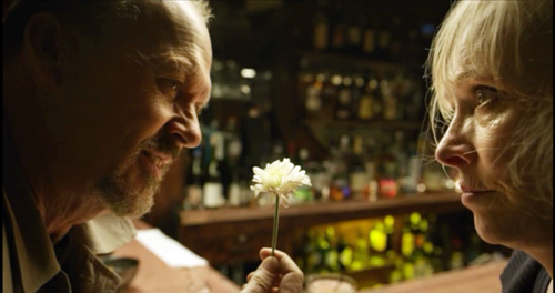
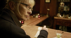
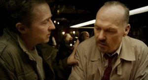
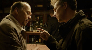
In a Broadway bar, the New York Times drama critic has just told Riggan Thomson that her review will destroy his play. Riggan snatches up her review of another production, reads it quickly, and declares it packed with meaningless “labels.”
There’s nothing in here about technique. There’s nothing in here about structure. Nothing here about intention.
Happy to oblige, Mr. Thomson. Spoilers ahead.
Structure: Icarus rises
Birdman’s plot covers six days at a critical period in Riggan’s life. He’s an over-the-hill movie star identified with playing the crime-fighting superhero Birdman. Now he’s directing and starring in a play he has based on Raymond Carver’s short story “What We Talk about When We Talk about Love.” The film’s plot starts on the day before the first preview, when during a rehearsal Riggan hires the arrogant but talented actor Mike Shiner. Three nights of more or less bungled preview performances follow. The climax comes on opening night. In the play’s suicide scene, the despondent Riggan shoots off his nose. The Times critic publishes a rave review and Riggan, recovering in the hospital, finds that he has a Broadway triumph. His response to that, however, is rather ambivalent.
The film feels a little odd—“quirky” is the official term—but its blend of comedy and drama is constructed along familiar lines. The major characters have goals. Riggan wants to prove he can do something valuable, while paying homage to Raymond Carver, who encouraged him when he was starting out on the stage. Riggan is also disturbed by his failures as a father and husband; mounting this play about love would seem to be an act of penance. The protagonist’s search for authentic success and psychological stability might remind you of 8 ½ and All That Jazz, which also endow their protagonists with flamboyant fantasy lives.
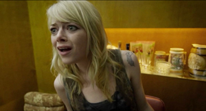
The other characters state their goals in that confessional mode typical of melodrama. (Extra motivation: in the world of the theatre people are always ready to overshare.) Mike wants to express himself artistically and to make Riggan’s play conform to his standards of honest realism. Lesley, the female lead and Mike’s girlfriend, wants to make her Broadway debut a success. Jake, Riggan’s producer, is trying to pull the whole thing off. Riggan’s scowling daughter Sam is looking for a settled life after a stint in rehab, while Riggan’s girlfriend and second lead Laura wants to have a child. As the plot develops, in true Hollywood fashion, the major characters achieve their goals.
Structurally, the plot falls into the four parts that Kristin has found to be common in Hollywood features.
The Setup lays out the premises for the action—identifying characters, explaining their motives, and articulating their goals. It’s packed with exposition, ranging from the old standby in which a character announces what the other character knows (“You’re my attorney. You’re my producer. You’re my best friend”) to the meeting with the press in which Riggan’s past as a movie star and his hope for this production are redundantly laid out. The thirty-minute setup ends with the first botched preview and Riggan’s moment with his ex-wife Sylvia. He explains that the production means everything to his self-respect.
The Complicating Action, a counter-setup which redirects character goals, centers mostly on the effects that Mike has on the show. Since he drunkenly improvised during the first preview, Riggan realizes they have to come to some understanding. Mike’s onstage antics in the second preview threaten Lesley’s hopes for a breakout career. They break up, and Mike and Sam begin flirting. Mike also steals the spotlight in a newspaper feature about the production, even swiping Riggan’s story about Carver’s encouragement. More deeply, Mike’s rants against Hollywood make Riggan feel even more fearful that his play will be a disaster and he’ll be a laughingstock. All of these anxieties come to focus in an extended inner dialogue between Riggan and Birdman, who insists that he will fail and will have nothing left. Riggan is ready to cancel the show, but Jake pushes him forward.
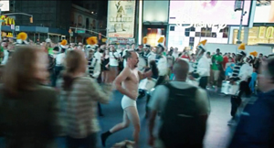
About an hour in, near the midpoint, we get the Development. This typically consists of a holding pattern. The plot doesn’t advance much. Riggan’s conflict with Mike deepens and his worries about the show mount. Lesley thanks him for giving her a chance, he reprimands himself again for being a bad dad to Sam, and Sam and Mike become a couple. A comic interlude, probably the film’s most widely-known scene, adds to Riggan’s debasement. He’s locked out of the theatre and, wearing just his underpants, races around the block through a Times Square crowd.
Reentering the theatre, he plays the crucial motel scene by lurching down the aisle and onto the stage, where he enacts the suicide. It’s also during the Development that Riggan meets Tabitha, the Times critic, and learns that, sight unseen, she plans to roast his play. The next morning his fantasies take over and, urged by Birdman, he enjoys a swooping and soaring flight around the theatre district.
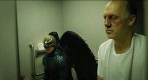
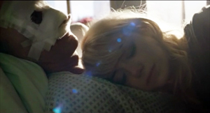
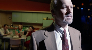
The fourth part, the Climax, begins with the intermission during the premiere. The audience drifts onto the sidewalk, praising the first act. Backstage Riggan tries to calm his nerves. After confessing to Sylvia that he once tried suicide, he takes the pistol on stage and prepares for the motel scene. On stage, as if succumbing to Birdman’s rhetoric, Riggan confesses, “I don’t exist.” He blasts off his nose. After a brief montage, the epilogue shows us the result. Recovering in the hospital, Riggan has a successful play, a sympathetic ex-wife, and a daughter reconciled to loving him. Even Birdman, sitting on the toilet, is for once silent.
But the very last moments are equivocal and for once you won’t get the spoiler from me. Suffice it to say the tag is ambiguous in magical-realist fashion.
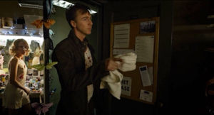
The plot helps us trace character change along classical lines. Key locales mark phases of the action. Sam and Mike meet on the rooftop twice, Riggan visits the bar twice, and Riggan’s ex Sylvia comes to his dressing room once in the Setup and once in the Climax. Whenever we return to the stage we see a version of either the apartment quarrel or the motel suicide. (We do glimpse, also twice, a hallucinatory scene of dancing reindeer, associated with Laura.) The main arenas are the stage and Riggan’s dressing room, which is the site of eight major scenes. The corridors snaking around the theatre serve as transitional spaces. As the film goes on, González Iñárritu tells us, the corridors get narrower and dingier. The fairly rigid time-structure of the plot finds a counterpart in a to-and-fro spatial pattern that measures Riggan’s jagged decline.
I’ve barely mentioned one of the crucial factors in the film’s narration. From the start Riggan hears the voice of Birdman admonishing him to return to superhero movies and give up this arty stuff. At certain points, it seems that Riggan gains some telekinetic powers, enabling him to smash flower pots, furniture, and light bulbs with the wave of a hand. These moments can be construed as subjective, in the sense that he “actually” destroyed them in a normal rage but felt that he was disposing of them through a superhero’s powers.
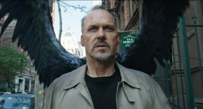
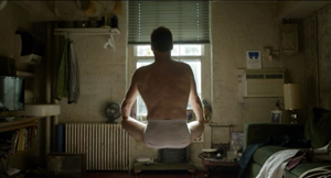
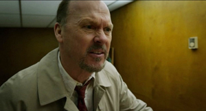
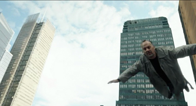
These powers are suggested at the start with an image of him levitating during meditation. They come to a kind of climax when he launches himself, a trench-coated Birdman, into the air, in a flight that serves as a counterweight to the humiliation of his naked canter through Times Square. Again, the film’s narration suggests that it’s all in his mind: after he lands and returns to the theatre, a cab driver pursues him demanding his fare.
The nagging voice of Birdman supports another kind of structure, a thematic one pitting East Coast and West Coast values. The material is traditional, being given sharp expression in The Band Wagon. The opposition goes back at least to Twentieth Century (1934, a Hollywood satire on Broadway pretensions) and Merton of the Movies (1922, a Broadway satire on Hollywood vulgarity). Of course the two artforms feed off one another. Twentieth Century started as a play, and Merton was made into a movie. The Producers began as a movie mocking Broadway, it became a hit Broadway musical, and the musical was made into another movie.
Birdman revisits these well-worn themes. Mike and Tabitha excoriate Riggan for his trashy films; only the theatre is real art. By contrast, Birdman’s croaking whispers remind Riggan that millions of ordinary folk like his blockbuster movies, while the theatre is for phonies. Mike’s narcissism and pretentiousness, the absurdity of his notion of realism, and the snobbishness of Tabitha all support Birdman’s point. As is common in such movies, the Eastern elite is shown as a pushover for superficial seriousness and ham acting. At the same time, Riggan sincerely wants to pay homage to the emotional core of Carver’s story; he may just not realize how bad the idea is.
The eternal Hollywood/Broadway opposition is sharpened in the light of new entertainment trends. Birdman tells Riggan that old superheroes—presumably those of the vintage of Michael Keaton in Batman (1989)—have it all over “posers” like Downey and the new generation. This motif refers, I think, to the modern trend toward troubled superheroes, set up in Burton’s Batman and carried to neurotic extremes in later comic-book sagas. But of course Riggan personifies the troubled superhero himself.
The sense of Riggan being old-school is reinforced by another familiar thematic duality, that of the young versus their elders. Riggan’s conflict with his daughter recycles the motif of a father so obsessed with work and seduced by false values that he ignores his daughter. (What is it with our filmmakers and this father/daughter thing? Is it just a way to pair older men with cute younger women in a safe way?) Sam berates him for being invisible in today’s world.
You hate bloggers, you mock Twitter, you don’t even have a Facebook page. You’re the one who doesn’t exist. . . . You’re not important. Get used to it.
The modern definition of entertainment includes the Internet, a realm that Riggan enters only by accident during his skivvy promenade. Sam’s denunciation reiterates Birdman’s insistence that Riggan doesn’t exist, except that she makes it worse: even if he returned to the Birdman role, no one would care.
The presentation of superheroics in Riggan’s fantasy mocks summer tentpoles, and would appear to express director Alejandro González Iñárritu’s distaste for action extravaganzas. But the movie is pretty hard on the theatre world too. It’s unfair for Mike and Tabitha to castigate Riggan now that playing a superhero has become artistically legitimate. The only performers Riggan can imagine replacing his wounded cast member are accomplished actors (Harrelson, Fassbender, Renner) who also star in franchise entertainments. The new entertainment economy shows that Riggan was a pioneer; now everybody wears a cape. But these stars routinely do serious films, even Broadway drama, along with tentpole movies. Why can’t Riggan cross over too?
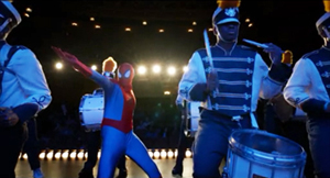
The disruption that arrives when popular entertainment invades the sacred space of the theatre finds a hallucinatory expression during the climactic montage. Now street drummers and superheroes crowd the stage of the St. James. What price Tabitha’s Art of the Theatre with Spidey drawing big crowds?
At the end, Riggan earns his accolades as an actor, but what he’s been after, hinted at in the references to Icarus and the liberation of his flight over the city, is validation of his worth. Once he realizes he is indeed loved (by ex-wife, daughter, best friend), he’s happy to pay the price of his nose. He gains a new superhero cowl, a gauze-bandage mask, and a surgical version of Birdman’s beak. And now that flight is no longer fleeing, he can consider all his options.
Technique; or, Intensified continuity without cutting
This plot could easily have been presented in a manner typical of today’s moviemaking, both indie and mainstream. That is, there might have been hundreds or probably thousands of shots. But Birdman, we’re told by people who should know better, consists of a single shot.
Any viewer can see that’s not true. Depending on how you count the opening quotation from Raymond Carver (is it part of the credits, or a separate shot?), there are sixteen discernible shots in the movie. Apart from the titles, the opening gives us three quick images—a seaside landscape with jellyfish, two shots of a plunging comet—and the final portion of the film provides a montage of nature scenes, interiors, and stage performers.
Admittedly, these shots account for little of the running time. The bulk of Birdman consists of what appears as a continuous shot running a little over 101 minutes. In production, several shots were merged seamlessly into the one that we perceive. The hospital epilogue consists of another long take, that lasting about eight minutes, and it too may have been assembled from separate takes.
Filmmakers confront a lot of options for handling long takes. The boldest, probably, is the static framing that doesn’t use camera movement. This option is employed in early cinema (viz. the Lumiêre films), in the tableau tradition I’ve gabbled about fairly often, and by some very rigorous directors like Hou Hsiao-hsien, Andy Warhol, and Jean-Marie Straub and Danièle Huillet. But most films using long takes rely upon camera movement.
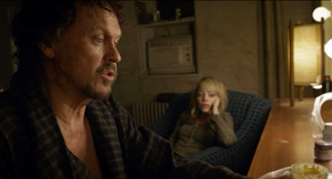
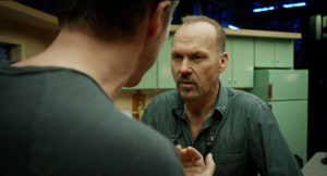
In Birdman, unsurprisingly, the camera movements are typical of Hollywood’s modern intensified continuity style. For example, we often get the push-in on a character close-up.
We get orthodox Steadicam movements trailing a character from behind or backing up as he or she strides toward us. This yields the familiar walk-and-talk.
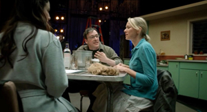
And we get the standard treatment of people around a table, with the camera circling it to pick up each one’s reaction at a critical point.
To a great extent, then, Birdman’s long-take style stitches together schemas that are well-established in contemporary Hollywood. Another current device is the occasional depth shot yielded by wide angle lenses. This technique was well-established in Hollywood in the 1940s, and today’s filmmakers rely on the same sort of tools that classic cinematographers used: strong lighting and wide-angle lenses.
The wide-angle lenses used on Birdman, only 14mm and 18mm, don’t always create wire-sharp focus in depth, but they provide enough visibility to create depth effects. Sometimes the rear plane is made sharper through racking focus.
More pervasively, in many long-take films, the camera movements replicate the patterns we find in an edited scene. Editing gives the camera a kind of ubiquity: it can go anywhere. Tethered to unfolding time, the long take sacrifices the ability to change views instantly. Yet in such films the action is staged and framed so that nothing important escapes our notice. The action gets spelled out as precisely as it would if the scene were edited.
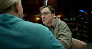
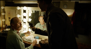
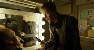
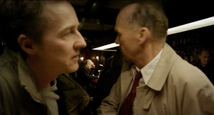
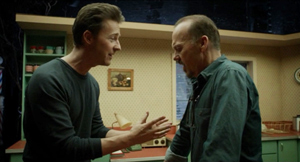
People have wondered a lot about the hidden edits that blend Birdman‘s long takes, but more important, I think, are the ways that the style adheres to standard editing patterns within its long takes. For example, the over-the-shoulder angles of shot/reverse-shot are mimicked by a camera arcing to favor first one character, then another.
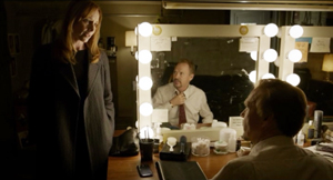
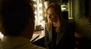
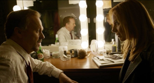
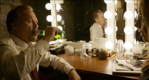
We can get shot/ reverse-shot effects via mirrors.
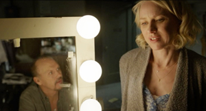
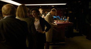
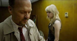
A pan can also approximate a point-of-view shot, as when Tabitha sees Riggan at the other end of the bar.
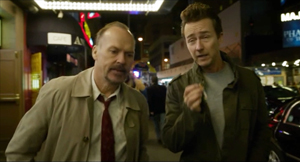
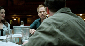
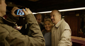
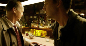
Throughout, the ensemble staging motivates shifts that would normally be covered by cuts. Mike and Riggan are seen from behind the bar, but when customers spot Riggan and ask Mike to take a picture, the camera sidles around the bar.
As Mike and Riggan turn back to the bar we are effectively 180-degrees opposite to the first setup.
With cutting, a similar shift would have been motivated by changing the axis of action through shifts in staging.
Long-take shooting can’t mimic editing perfectly. An unbroken shot doesn’t yield the instantaneous change of angle supplied by a cut. But the scene can’t be allowed to go dead while the camera operator shifts to a new spot. So the interval between one sustained angle and another has to be filled up by dialogue and physical action. One way to motivate the change of camera position is through the actors’ changing positions. In the bar scene, the fan’s photo op motivates the camera move.
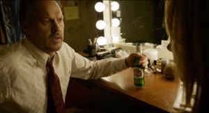
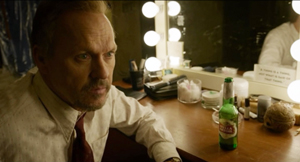
Alternatively, the actor’s gestures can provide some wedged-in bits. When Riggan and his wife have an intimate talk at his dressing table, he executes some business with a beer bottle that justifies shifting the angle to favor him.
Once we’re on him, he turns serious and the dialogue and facial expression motivate a push-in.
In normal shooting and cutting, the technique is fitted to the unfolding action. With a commitment to the long take, the director must fit the action to the technique. This is why, I think, González Iñárritu and his DP Emmanuel Lubezki spent months blocking the action on a sound stage and hiring stand-ins to move around the sets they’d built. Long before the actors came on the set, the filmmakers had mapped out many wedged-in bits of action they’d execute.
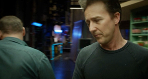
Giving up cutting forces other storytelling decisions. A narrative film typically distributes knowledge among its characters, and so the long-take camera must carve a path through the story world that either restricts or expands what we know. The mobile long take sticking with one character tends to restrict our knowledge. The long take that shifts among characters gives us a wider range of information. And whenever one character leaves another, there’s a forced choice: Which one does the narration follow? This is a choice in any storytelling medium, but in the long-take film the options are narrower: the issue is which one the camera will follow.
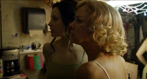
Birdman stays mostly with Riggan, but in the Complicating Action and Development sections, the narration needs to give us information on the doings of Mike, Lesley, and Sam. So, in another act of fitting and filling, the choreography must make those characters adjacent to some other action. The mazelike playing space of the film, in the bowels of the theatre, facilitates these comings and goings, so that we can drop one character and pick up another. When Lesley and Laura kiss, Mike interrupts them and Lesley hurls a hair dryer at him. He ducks out.
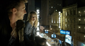
We could stay with Lesley and Laura, or follow Mike. We follow Mike so that we can shift to the new scene, with him visiting Riggan to complain about the pistol and then joining Sam on the roof. Nothing more of consequence will happen between Lesley and Laura; following Mike will lead us to the next story bit. The camera sees all that matters.
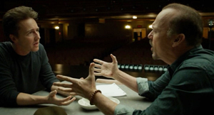
The long take’s muffled mimicry of orthodox editing pays some dividends. Arcs and short pans work when characters are close together, but if an encounter is played out in medium shot and one character pulls away, the camera is forced to pick a target. Whom will it follow? This effort becomes quite expressive when Mike is punching up Riggan’s table scene. Just as Mike takes over the rewriting of the lines, he hijacks the camera.
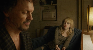
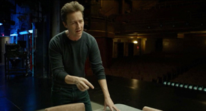
Things start with the usual circling shot.
As Mike’s pitch builds, he breaks from the neutral two-shot and circles Riggan. The camera favors him as he walks off, returns to the table and exhorts Riggan to turn up the tension. (“Fuck me!”)
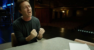
Now that the two are in proximity, we can see Riggan, infected by Mike’s energy, deliver a more spirited line reading.
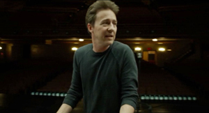
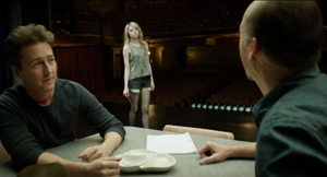
The scene ends with a segue to the next passage of walk-and-talk, as Sam comes onto the stage in depth.
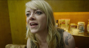
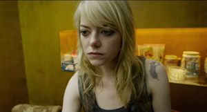
In such scenes, the obstinate commitment to the long take itself motivates a dramatic effect. Later, Sam’s tirade about Riggan’s irrelevance gains force because the camera swings to her and stays fastened there.
In a cutting-based scene, there would have been the temptation to show Riggan’s reaction while Sam is unloading on him. True, we could get the same delayed revelation of his response by letting her tirade play out before cutting to him. But given our tacit adherence to the long take, and given the initial framing, we can’t see both of them. The refusal of editing itself justifies holding on her and suppressing his response. In the same way, showing her somewhat chastened pause and then following her walking past him motivates finally revealing his reaction.
A bonus: This scene’s concealment of the reverse angle—what is Sam seeing?—anticipates the film’s final image.
What about the long take’s effect on time? The plot’s tension relies upon the pressure of time. A great many actions are jammed into a short, continuous span. This is a common effect in films built around both a deadline and a confined space. Birdman‘s long take, with its rapid tracking movements and hurly-burly entrances and exits, enhances the pressure. But we need to note how much this result relies on another sort of “hidden editing.”
We often hear that the long take ties us to “real time.” And clock duration, with one minute onscreen equaling one in the story, is indeed a convenient, normative default. Yet suitably cued, a long take can halt duration in the present to give us flashbacks, as we’ve seen at least since Caravan (1934). Films by Angelopoulos, Jancsó, and others have shown that the long take can compress or expand story duration, and even replay events. The remarkable Iranian single-shot feature Fish and Cat of 2013 is full of ribbon-candy time wrinkles.
Once more, Birdman plays it straight. Like a normal movie, it uses sound bridges and night-to-day transitions to skip over stretches of story time. The film is a clear-cut example of the difference between story time (the years of Riggan’s career and the others’ lives), plot time (six days), and screen time (about 110 minutes). The central long take creates ellipses akin to traditional scenic links, and it does so in ways that are easy to grasp as we’re watching.
Intention: The expected virtues of ignorance
The crucial creative decision behind the film was the choice to shoot the extended take. González Iñárritu asserts that he didn’t model the technique on Rope but rather on the long takes of Max Ophuls. He also acknowledges that he was enraptured by Aleksandr Sokurov’s Russian Ark, a feature film that was indeed shot in one long take (thanks to video, but without CGI blending).
The status of the long take has changed across the history of film. In the first twenty years or so, it was more or less taken for granted as the most basic way to shoot a scene. Longer takes became rarer in most national cinemas during the 1920s, with editing becoming the preferred technique for building up action. Even complicated camera movements were consigned to comparatively brief shots.
The long take in today’s sense emerges most vividly in the early sound period, when directors began to use it creatively. During the 1930s, some long takes would be static or relatively so, in films like John Stahl’s Magnificent Obsession (1936) or musicals, especially those featuring Fred Astaire. Other long takes would make extensive use of camera movement. A great many early talkies begin with a fancy traveling shot before moving to more orthdox, editing-driven scenes. And the musicals of Busby Berkeley flaunted outrageous crane shots. In Japan, the USSR, France, Germany, and many countries, the sound cinema brought a renaissance of long takes, propelled by camera movement.
For the most part, this technical choice was felt to serve the story. You sustained the shot because the rhythm of performance benefited, or because you wanted to explore a space through a camera movement. In Dreyer’s Vampyr (1932), the tracking shots are designed to create uncertainties about where characters are when they go offscreen.
Behind the scenes, though, the filmmakers felt a certain pride in making a solid tracking or crane shot. A lengthy camera movement was a challenge because the cameras were big and bulky, they had to roll smoothly on tracks or other supports, lighting had to be controlled carefully, and equipment noise might be picked up.
Despite the difficulties, in the 1940s, some American directors seemed to have welcomed longer takes. The new interest probably owed something to new technology, such as the crab dolly’s ability to edge the camera through narrow spaces and turn in many directions. With complex camera movements easier, the takes could become longer. At a time when most films averaged eight to ten seconds per shot,Otto Preminger could make Daisy Kenyon (17 seconds), Centennial Summer (18 seconds), Laura (average 21 seconds), and Fallen Angel (33 seconds). There were as well Billy Wilder with Double Indemnity (14 seconds) and A Foreign Affair (16 seconds), Anthony Mann with Strange Impersonation (17 seconds) , and John Farrow with The Big Clock (20 seconds). This isn’t to mention the big long-take films of the period from The Lady in the Lake to Rope and Under Capricorn. The opening of Ride the Pink Horse contains a remarkable long-take tracking shot, and one shot in Welles’ Macbeth consumes a full camera reel.
It seems that for some directors sustaining the take was itself the main concern. The more complex the locale—a crowded room, a busy street, an overgrown landscape—the more that the sustained camera movement would be considered, at least by those in the know, as a difficult technical accomplishment.
The result was virtuosity, but with an alibi. Long takes are flashy. But…they can save money. (All those script pages covered fast, no need for editing.) They can be justified as realism. (The action can build over “real time.” Besides, don’t we see reality in a “continuous shot,” not cuts?) They can be motivated as subjective. (By staying with a character over a stretch of time, we become identified with him or her.) Regardless of these reasons, or excuses, there’s an undeniable bragadoccio associated with the protracted camera movement. Your peers in the industry will recognize what you’ve done, and cinephiles will applaud your bravado.
The Movie Brats seized on the virtuoso camera movement and long take as a mark of prowess. A new competition sprang up between Scorsese and DePalma, encompassing Raging Bull, Bonfire at the Vanities, Goodfellas, and Snake Eyes. Even a straight-to-video heist movie like Running Time (1997), choosing to hide its cuts in the Rope manner, has a bit of playground swagger. (Bruce Campbell is in it too.) No wonder that Christine Vachon remarks that shooting a whole scene in one is a “macho” choice.
It’s in this context that we can appraise González Iñárritu’s declared intentions. He was clearly drawn to the virtuosic side of the very long take, and his DP Emmanuel Lubezki had made the complex camera movement his signature with Children of Men and Gravity. After Snake Eyes showed that CGI could stitch together several long takes into a seamless whole, many directors saw that digital filmmaking could extend the shot beyond anything in analog cinematography. A new level of virtuosity was called for, not only the logistics of choreography but the skills of hiding the cuts. Do it right, you might even get tossed an Oscar or two.
The filmmakers justify Birdman‘s technique on familiar grounds. There’s realism:
We are trapped in continuous time. It’s only going in one direction. . . .This continuous shot [yields] an experience closer to what our real lives are like. (González Iñárritu)
There’s subjectivity.
I thought [the continuous take] would serve the dramatic tension and put the audience in this guy’s shoes in a radical way. (Lubezki)
To really not only understand and observe, but to feel, we have to be inside him. [The one shot] was the only way to do that. (González Iñárritu)
Is it showoffish? No, it serves the story.
All the choices we made were serving the purpose and dramatic tension of the characters, not about “Look how impressive we can be.” All the shots were meant to serve the narrative of the film. (González Iñárritu)
But there’s still virtuosity—art conceived as a triumph over self-imposed obstacles.
It was risky! Every scene—good or bad—I had to leave in. It was an endless strand of spaghetti that could choke me! Every note had to be perfect. (González Iñárritu)
I’ve never cared much for González Iñárritu’s films; they always seem too close to their influences. (My remarks on Babel are here.) Still, Birdman seems to me a fascinating example of how traditions can be revisited, or at least repackaged. I can also appreciate the skill with which the whole affair has been brought off. But I also wish that critics and mainstream filmmakers would be more accurate and comprehensive when talking about film form and style. Birdman isn’t a single-shot movie, and to insist on that point isn’t just pedantry. Part of the critic’s job is to look at what’s there, and a full account of the movie (which mine isn’t) would need to reckon in the other shots the film presents.
Critics should acknowledge that the long take has other expressive possibilities, some of them impossible to reduce to the patterns of continuity editing. To go back to Hou Hsiao-hsien, Flowers of Shanghai consists of thirty-five shots, nearly all made with a gently shifting camera. But Hou’s mobile long takes retain the intricacy of his static shots in earlier films. The camera may circle the action, but at each moment it’s not only following one character’s movement but drawing into view other movements, greater and lesser, nearer and farther off–the whole thing building up gestures and dialogue and facial reactions, as if by brush strokes, into a rich sense of characters coexisting in a story world and a social system. The result is a gradation of emphasis, to use Charles Barr’s neat phrase, that enriches our sense of the drama.
And sometimes the camera will not see all. Hou accepts the limits of the long take by making some action visible, some action partly visible, and some action unseen, even within the frame. Characters and props slide in to block the main action, sometimes shifting “against the grain” of the camera’s movement. The film’s visual flow doesn’t replicate the schemas of traditional scene analysis; often we must strain to see a gesture or reaction.
Hou’s isn’t the only way to use long takes, but it’s one that deserves more attention. Granted, he and other explorers in this vein will never win an Oscar. But our critics, too often dutifully repeating PR talking points, should signal that the enjoyable virtuosity of Birdman is only one way to employ the rich resources of cinema.
I’ll save for another time a reply to Riggan’s question to Tabitha: “What has to happen in a person’s life for them to become a critic anyway?”
My background information on Birdman‘s technique comes mostly from Jean Oppenheimer’s article, “Backstage Drama,” American Cinematographer 95, 12 (December 2014), 54-67. So does the quote from Lubezki above. A shooting script for the film is here. Information about the concealed digital cuts is in Bill Desowitz’s Indiewire piece.
Kristin’s model of four-part plot structure is discussed in several entries and in my essay “Anatomy of the Action Picture” and the book chapter “Three Dimensions of Film Narrative.”
The idea that a camera movement can recapitulate the pattern of analytical editing was floated by André Bazin and developed in detail by John Belton, “Under Capricorn: Montage Entranced by Mise-en-scène,” in his Cinema Stylists (Scarecrow, 1983), 39-58.
For more on the long take, see our entry “Stretching the shot.” The Christine Vachon quotation is linked there, as is De Palma’s sense of competing with Scorsese. The first essay in my Poetics of Cinema discusses trends in long-take shooting and camera movement in the 1940s. See as well Herb A. Lightman, “The Fluid Camera,” American Cinematographer 27, 3 (March 1946), 82, 102-103, and “‘Fluid’ Camera Gives Dramatic Emphasis to Cinematography,” American Cinematographer 34, 2 (February 1953), 63, 76-77. On Dreyer’s camera movements in Vampyr, see my book The Films of Carl Theodor Dreyer. I discuss Angelopoulos, Hou, and long-take staging generally in Figures Traced in Light: On Cinematic Staging. On this site, I discuss Hou’s staging practices here and here. And for discussions of intensified continuity style, see The Way Hollywood Tells It.
Two frames from Flowers of Shanghai (1998) are below, showing the camera’s slight movement around the central lantern and Pearl’s face, as well as the shift in the young man’s posture as he waits for an answer to his question. He’s in the process of clearing a bit of space for us to glimpse the older man, Hong, who’s sitting between him and Pearl.
P.S. 24 Feb 2015: Thanks to Paul Mollica for a name correction!


