Archive for the 'Directors: Keaton' Category
The ten best films of … 1928
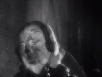
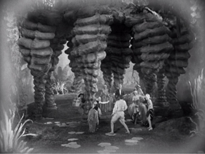
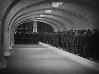
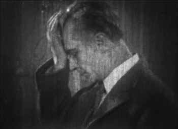
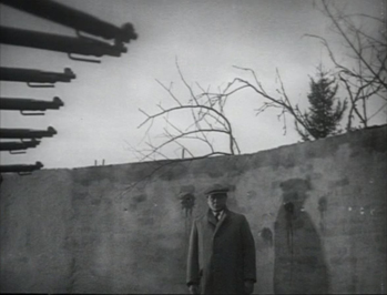
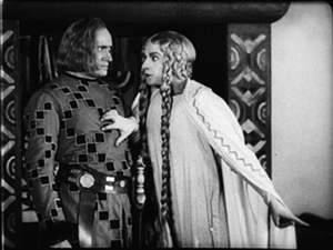
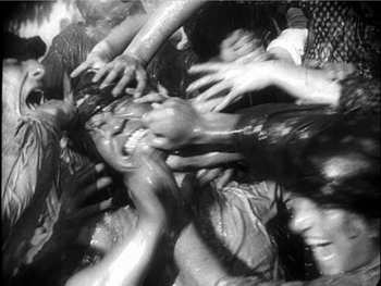
La passion de Jeanne d’Arc
Kristin here:
Time for our twelfth annual alternative to the usual list of the ten best films of the current year. Instead, I offer a list from 90 years ago, in part for fun and in part to call attention to some lesser-known classics that are worth discovering. (See here for our lists from 1917, 1918, 1919, 1920, 1921, 1922, 1923, 1924, 1925, 1926, and 1927.)
The year 1928 marked the triumphant conclusion of the silent cinema. Very few sound films were made that year, and those that were often included only music, perhaps sound effects, and occasionally some passages of dialogue. Sound was not innovated because the silent cinema was in aesthetic decline. Quite the contrary. It was initially an enhancement that film-industry people assumed would make films more lucrative. In most cases the “talkies” that followed over the next few years were inferior to their silent predecessors, in part due to the limitations of the new sound technology. Those who opposed the addition of sound could point to the films of 1928 as evidence that the young art form had already reached a peak of perfection that was being tarnished by the addition of recorded sound.
In compiling this year’s list, I came up with eight titles that seemed unquestionably to belong on it. There were another six on a list of possibilities for the final two slots. More than in past years, this year gave me a chance to go back and rewatch films I hadn’t seen in a long time, in some cases since graduate school in the 1970s. Some held up well, some not so much. In a few cases, restorations made since my first viewings revealed new strengths in films I remembered from poor prints.
As always, there are films that have been lost but which plausibly could have filled out the list, most notably Ernest Lubitsch’s The Patriot and F. W. Murnau’s 4 Devils.
First, the eight obvious choices, in no particular order apart from #1.
1. La passion de Jeanne d’Arc.
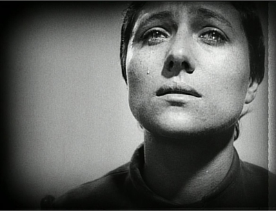
Not every year includes a film that is not only one of the tops of its year but of all cinematic history as well. Carl Theodor Dreyer’s final silent film is one such masterpiece.
Jeanne d’Arc seamlessly blended the stylistic traits of the great artistic film movements of the 1920s, German Expressionism, French Impressionism, and Soviet Montage and made something new and unique of them.
Expressionist designer Hermann Warm’s past credits had included two films that have featured in these lists, Robert Wiene’s Das Cabinet des Dr. Caligari and Fritz Lang’s Die müde Tod. Warm collaborated with French theatrical designer Jean Hugo to create spare, white, off-kilter sets that focus our attention on the spiritual drama. Fast editing conveys subjectivity, as in the scenes where Jeanne is threatened with torture and where the citizens are suppressed when they riot after her execution. Rudolph Maté’s cinematography is startlingly dependent on close shots, particularly on the face of Jeanne, played by Renée Falconetti in one of the most intense and affecting performances in any film.
The steady progression of the action condenses days of trial testimony into one apparently continuous story. Between the sets and this inexorable march toward Jeanne’s martyrdom, there is a sense of both spatial and temporal disorientation that focuses our attention intensely on the central conflict.
Until 1981, prints of Jeanne d’Arc were indistinct and incomplete. A pristine print that restored the original visual quality and detail was found in Norway. (The film was among the early ones to be shot on panchromatic film stock without the actors’ using makeup. The result is a detail of texture in the faces that enhances the performances tremendously.) This print is the basis for the Criterion Collection’s edition of the film.
It’s a film that one can see over and over and still be overwhelmed at the originality and intensity of Dreyer’s vision. We saw it projected last November in Houghton, Michigan, with Richard Eichhorn’s recently composed accompaniment, “Voices of Light,” essentially an oratorio and film score rolled into one. We were somewhat trepidatious about whether the score would be distracting, but it proved very effective. Once again, I was reminded of how great this film is. (“Voices of Light” is an optional accompaniment on the Criterion edition linked above.)
2. October
If Jeanne d’Arc gains intensity through a nearly claustrophobic treatment of space, Sergei Eisenstein creates an epic tenth-anniversary celebration of the 1917 Revolution in his October (finished and released a year late).
Perhaps the most extreme example of Soviet Montage’s frequent avoidance of a single protagonist, October cuts among a wide variety of the people involved in the revolution. Workers pull down a statue of the Tsar. Lenin speaks at Finland Station. Kerensky and his officials luxuriate in their Winter Palace headquarters. Sailors wait on the Aurora battleship. Elderly citizens try to protect the specious February Revolution. Female soldiers are summoned to protect the Palace from the attacking Red forces. Looters steal bottles from the Tsar’s wine-cellar. The result is a sort of patchwork collage of the Revolutionary events leading up to the storming of the Winter Palace and the attack itself, with a slow build to an exultant climax as the Red forces triumph.
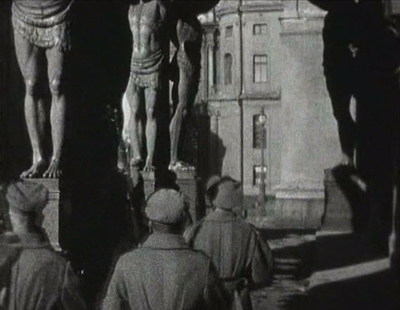
Eisenstein was given extraordinary access to the locales of the actual events, so that the vast halls of the Winter Palace and the trappings of royalty (Fabergé eggs and fancy crystal liquor bottles) give a sense of reality rare in fictional reenactments. (There was a time when October was plundered for “documentary” footage of events which had not been recorded by cameras at the time.) He used the settings to ridicule the anti-revolutionary forces, as when young cadets are summoned to help fight the Red forces and are dwarfed by the muscular colossi that line one area of the Palace’s exterior (above).
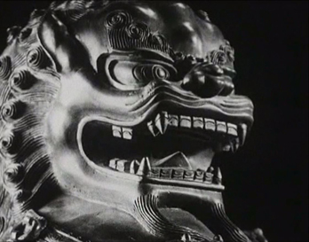
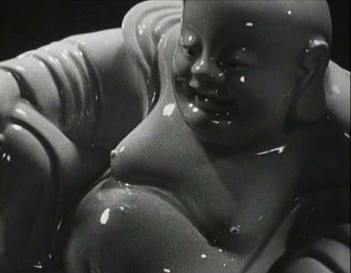
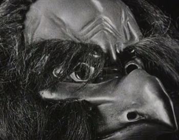
The film also represents Eisenstein’s experiments with “intellectual montage,” where he attempts to convey ideas strictly through juxtaposing series of images. In belittling the phrase “for God and country,” he tries to reduce the notion of “God” to absurdity by linking a long series of increasingly exotic depictions of deities from different religions.
Whether Soviet audiences of the late 1920s could make anything of such passages is impossible to know for sure, but one suspects that some of them would have been incomprehensible. Still, it is exciting to see an artist playing with such possibilities. Certainly the technique lived on, whether from the simple juxtaposition of cackling hens and gossiping women in Lang’s Fury or Jean-Luc Godard’s dense, often impenetrable strings of images, especially in his political films.
October exists in many versions. Beware the heavily cut versions under the title Ten Days That Shook the World. These images were taken from the 2008 release by the Soviet Ruscico company in its “Kino Academia” series.
3. Spione
Despite the widespread enthusiasm for Lang’s Metropolis, his other big films of the 1920s–Dr. Mabuse, der Spieler, Die Nibelungen (Siegfried and Kriemhilds Rache), and Spione–seem to me better. Metropolis is perhaps flashier in its design and conception and certainly very entertaining, but it’s also sprawling and implausible and essentially pretty silly.
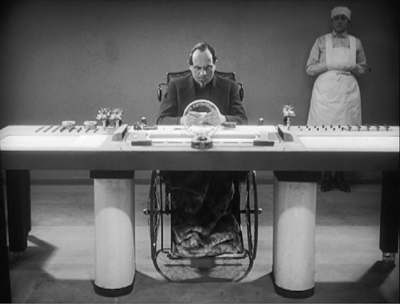
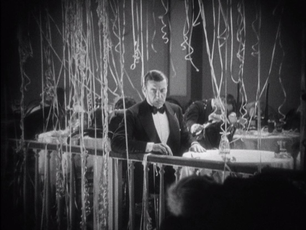
Spione, on the other hand, has a tight, fast-paced narrative. It’s sort of Dr. Mabuse boiled down to one feature instead of two, and with the villainous Haghi (again played by Rudolf Klein-Rogge) as a banker secretly masterminding a spy ring rather than a gambling racket. There are no great “heart vs. hand” themes here–just a rattling good tale stylishly presented. Expressionism has disappeared in favor of a streamlined look (above), and Lang’s editing has sped up since Mabuse.
There’s not much point in detailing the plot here, since it would involve too many spoilers. Discover it for yourself if you haven’t already.
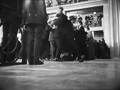
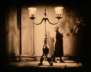
Spione circulated for years in the truncated American release version, which is how I first saw it. A 2004 Murnau Stiftung restoration of the complete version was a revelation, not only for its more complete narrative but for its superb visual quality. It’s a feast of shots that only Lang could have composed (above and bottom). These frames are from the Eureka! DVD, but the company has subsequently released it in dual format DVD and Blu-ray. Kino Classics has also released it in Blu-ray. The same company has put out a boxed-set of all Lang’s silent films (including Die Pest im Florenz, directed by Otto Rippert from Lang’s script). We were given this recently and haven’t had time to explore it, but it looks like a must for any fan of Lang.
4. L’Argent
Marcel L’Herbier makes his second and final appearance on this annual list with his epic adaptation of Emile Zola’s L’Argent, updated to contemporary Paris. (See the 1921 entry for El Dorado; I also wrote about the Flicker Alley releases of the restored versions of L’Inhumaine [1923] and Feu Mathias Pascal [1925].)
Inspired by Abel Gance’s even more epic Napoléon (1927), L’Herbier set out to make a film that would require a large budget. To obtain that, he made a deal for his own company, Cinégraphic, to co-produce with the mainstream studio, Cinéromans. The result contains brightly lit sets of big banks and expensive apartments, as well as shots made in the Paris Bourse over a three-day weekend (above). L’Argent also had an all-star cast. It included Brigitte Helm and Alfred Abel fresh off Metropolis, thanks to the German distributor, UFA. It also meant that Cinéromans tampered with the film, re-editing and shortening it.
Given L’Herbier’s reputation as an aesthete and an avant-garde filmmaker, L’Argent was dismissed by many at the time as a purely commercial endeavor. It remained unseen and hence virtually forgotten for decades. A screening at the New York Film Festival in 1968 surprised and impressed the spectators. The real recognition of the film as a major artwork came, however, in 1973, when critic and theorist Noël Burch published his monograph, Marcel L’Herbier (Paris: Seghers, 1973). In it he hailed L’Argent as a masterpiece, devoting the entire final chapter to an analysis of it. Burch also wrote the entry on L’Herbier for Cinema: A Critical Dictionary: The Major Film-makers ([New York: Viking Press, 1980], Vol. Two, pp. 621-28), edited by Richard Roud; again Burch devoted much of his text to L’Argent.
I have expressed my reservations about L’Herbier’s films in earlier entries, but for me L’Argent is the big exception: stylistically daring and narratively engaging. Perhaps adapting Zola led L’Herbier to make a more conventionally suspenseful film than usual. Referring to the French Impressionist movement in general, Burch wrote, “L’Argent undoubtedly marks the end of the period of experimentation, since it is itself the culmination of all these experiments–not just L’Herbier’s, but those of the first avant-garde and even, to a certain extent, of the entire Western cinema (with the exception of the Russians)” (Roud, pp. 624-25).
The story involves two powerful bankers who spar for control of one large bank’s standing on the stock market. One, the villainous Saccard, aims to send a famous aviator on a perilous flight across the Atlantic to promote his bank’s oil holders in Latin America–while seducing the aviator’s wife during his absence. The other, Gundermann, tries to thwart him by buying up shares of his rival’s bank and then selling them to cause a drop in the bank’s value.
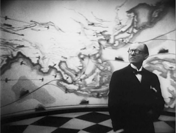
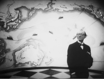
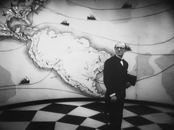
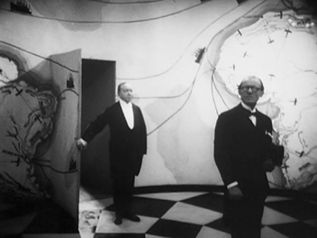
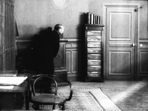
In portraying all the complex machinations going on, L’Herbier adopts a restless camera, frequently moving among and around characters rather than following them. The most striking example comes early on, when an underling comes to visit Gundermann and waits in an odd, unfurnished room decorated with a map of the world. As he looks around, the camera circles him until a servant unexpectedly appears through a door and escorts him in.
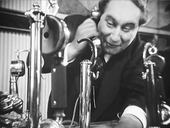
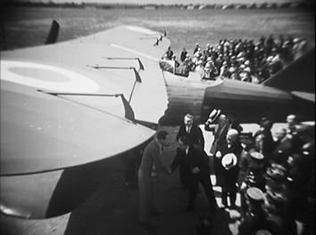
The odd distortions in these shot exemplify another cinematographic technique that was in increasing use during the late 1920s: conspicuous wide-angle lenses. On the left below, Saccard is nearly dwarfed by one of his telephones, while on the right the scene of the aviator’s departure makes the plane’s wings jut into the foreground and extend far into the background.
There are some subjective moments, carrying forward the tradition of French Impressionism. Yet for the most part the restless camera, the distorting lenses, the odd angles (see the top image of this section), and the unusual crosscutting are not subjective, which makes this an atypical Impressionist film. Instead they suggest the unnatural, disconcerting world of capitalism, of money and those who struggle over it. Perhaps by minimizing character psychology and striving to represent more abstract concepts, L’Herbier briefly carried Impressionism to a more political–and dramatic–level.
In 2008, L’Argent was released on DVD by Eureka! in the UK as a “Special 80th Anniversary 2 x Disc Edition.” The source material was a beautiful fine-grain positive struck from the original negative, with something close to L’Herbier’s original intended cut. It includes Jean Dréville’s Autour de “L’argent,” a 40-minute making-of (surely one of the first of its type), recorded during the original production. The DVD is still in print and is, as far as I know, the only release of this restored version.
5. Steamboat Bill Jr.
This was the first Keaton film I ever saw, and I immediately became a fan. (The director is credited as Charles Reisner, but we all know that Keaton was primarily responsible for the direction of his films of this period.) It’s not as good as The General (what is?), but it beats out The Cameraman, Keaton’s other feature of this year, by a nose.
Keaton plays the dandified son of a gruff steamboat owner. He returns home from school and gets put into working clothes by his father, whose deteriorating steamboat is competing for tourists with a larger, newer boat. Naturally young Bill is in love with the daughter of the other steamboat’s owner. The action mainly consists of Bill, Sr. trying to prevent Bill, Jr. from clandestinely meeting his girlfriend.
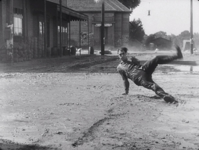
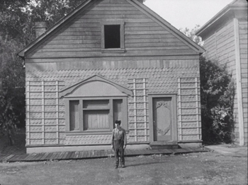
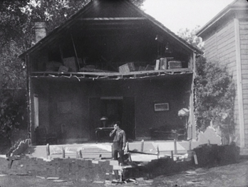
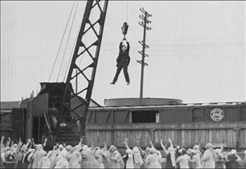
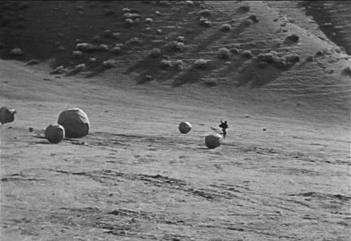
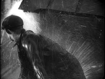
There’s lots of humor along the way to the climax, in which a huge storm hits the town. It’s a classic sequence of Keaton pulling variant gags on the situation of being in a high wind (above) and surrounded by collapsing buildings and flying objects. Perhaps Keaton’s most famous, and dangerous, gag comes when he pauses in front of a house’s façade, which tears loose and falls straight down on him–with a window sparing him from being crushed.
Reportedly the top of the frame missed his head by six inches, but we know Keaton was a little crazy in how far he would go for a laugh.
Steamboat Bill, Jr. was the last film Keaton made with his own production company. The Cameraman was made at MGM, and though it is very good, thereafter his career slowly declined after his move to that studio. This will, alas, be the last Keaton film represented in this series.
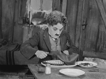
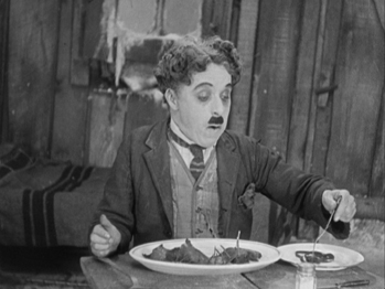
6. The Circus
Coincidentally, The Circus was the first Chaplin film I ever saw. I happened to take my first film course at the point where Chaplin had re-released The Circus, accompanied by a new musical score he composed himself. (Skip, if you can, the added opening, with Chaplin singing a maudlin song over an excerpt from later in the film.) The re-release was 1969, though I must have seen it in 1970 at Iowa City’s art-house, the Iowa. (Also coincidentally, my father managed the Iowa when he was at the university there on the GI bill in the years immediately after World War II. He was dating my mother at that point, and there she saw Day of Wrath. Hence when David and I became a couple in the mid-1970s, she understood what the book he was currently working on was about. But I digress.)
The print I saw at the Iowa was pristine.
Up to that point, The Circus had been unavailable to most viewers, though I suspect bootleg prints circulated among collectors. It’s among the least known of Chaplin’s features, and it’s still hard to see. There’s a Park Circus DVD available in England, consisting of the re-release version equally in mint condition; that’s the one I’ve taken these illustrations from. More recently the film has been released as a Blu-ray/DVD combination. There is also an Artificial Eye Blu-ray available, which gets high marks from DVD Beaver. I haven’t seen this and don’t know whether it’s the re-release version or the original.
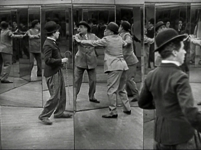
Chaplin plays his Little Tramp character, introduced wandering around the sideshow attractions near a circus. Mistaken for a pickpocket, he flees among the booths, occasioning a brilliantly staged triple scene in a hall of mirrors. When he first enters it, he is alone and struggles to figure out how to exit. A short time later, pursued by the pickpocket, the two stumble into the room, and a comic chase ensues (above). Finally, a cop is chasing Charlie, who tries to confuse him by luring him into the mirror maze. It’s a set of gags that builds, with the figures popping unexpectedly into the foreground when we had assumed that the real actors were in the depth of the shot. Each scene in the maze is handled in a single take from the same camera setup.
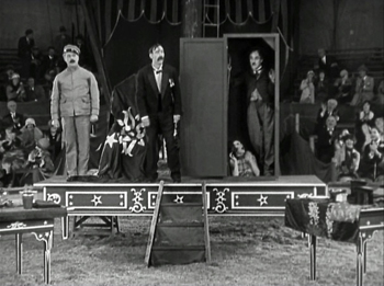
The flight from the cop leads the Tramp into a failing circus cursed with a group of highly unfunny clowns. Charlie inadvertently and unwittingly becomes a sensation for his antics, including his invasion of a magician’s act.
The cruel circus owner hires him, supposedly as a prop man, and the show becomes a huge success. Charlie falls for the maltreated daughter of the owner, who in turn becomes smitten by a handsome tightrope walker. Trying to impress the daughter, the Tramp goes on when the tightrope walker fails to show up one day. The result is a classic extended scene of Charlie on the high wire, executing a series of comic moments before the whole thing is topped off by a group of monkeys who escape and end up swarming over him as he struggles to keep his balance.
I hope now that The Circus is becoming more available, it can takes its place beside Chaplin’s other features.
[December 29: Thanks to Valerio Greco for alerting me that a restoration of the original version of The Circus is underway in Bologna, to be released by The Criterion Collection.]
7. The Docks of New York
I’ve already written about this, Josef von Sternberg’s final silent feature, in 2010 on the occasion of The Criterion Collection’s release of it alongside Underworld and The Last Command in an essential box-set. The six films von Sternberg made with Marlene Dietrich after she came to Hollywood generally get more attention than any of his silents. If I were allowed three of his films for a proverbial desert-island situation, I would take Underworld, The Docks of New York, and Shanghai Express.
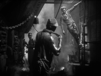
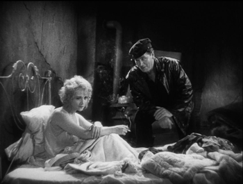
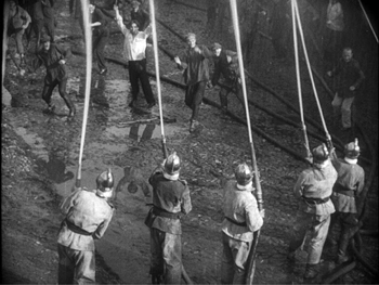
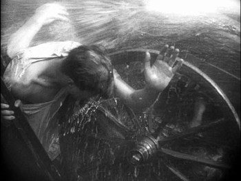
Docks is a concentrated dose of the atmospheric cinematography the director is famous for, in this case employed to create the grungy settings of the film. In the opening, the oil and sweat on the stokers’ bodies (above) is palpable, and the fog, hanging nets and lanterns, and smoke of the dockside sets establish the sleezy, hopeless milieu that drives the heroine to attempt suicide.
Apart from the impressive visuals, the film gains much of its appeal from its two central performances. Betty Compson manages to gain our considerable sympathy for “the Girl” in a remarkably short time, and she has to–the film is only 75 minutes long and she spends her first onscreen appearances unconscious after her near-drowning. George Bancroft, known mostly for supporting roles in westerns, came into his own as the protagonists of three von Sternberg films–including Thunderbolt but not The Last Command. Here he again plays the big lug with a well-hidden heart of gold.
Unfortunately the von Sternberg silents set from The Criterion Collection is out of print. Track it down somewhere or hope for a Blu-ray release.
[December 29: Peter Becker of The Criterion Collection tells me that, although a Blu-ray release is not yet scheduled, there is a good possibility that it will happen.]
8. Storm over Asia
After Mother and The End of St. Petersburg, Storm over Asia (the original title translates as “The Heir of Genghis Khan”) is the last of Vsevolod Pudovkin’s three great silent features. Unlike the first two, it is set in Mongolia. The Soviet industry officials were concerned to portray the Revolution in the various other countries that along with Russia made up the Soviet Union.
The story takes place during the Civil War years that followed the Revolution. A young Mongolian peasant tries to sell a valuable fox fur at a trading post, but the British dealer cheats him. The peasant strikes him and is forced to flee into the mountains, where he joins the Red partisans fighting the British imperialists. (This does not follow historical fact, since the British occupied parts of Siberia and Tibet, but not Mongolia. In reality, for a brief period in 1921, White Russian forces drove out the Chinese from Mongolia. In response, the Red Army moved in, supporting the Mongols in their quest for independence.)
The British shoot the protagonist but discover on him a document that seems to identify him as the heir of Genghis Khan. So they set him up as a puppet ruler in order to control the local population. Eventually he rebels and leads a storm-like assault that defeats his oppressors.
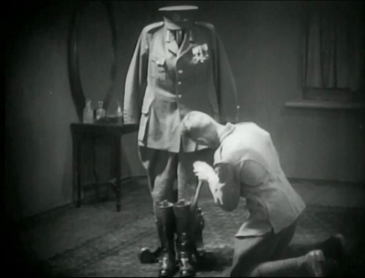
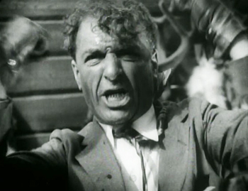
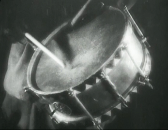
Storm over Asia uses many of the Soviet Montage devices that by 1928 were fairly conventional. For instance, there are many rapid, rhythmic alternations of shots. When the fur trader reacts angrily against the protagonist’s resistance to being cheated, brief shots of his angry call for troops to capture the young man alternate with shots of a drum being beaten. The final “storm” battle uses rapid montage as well. There is also the usual visual symbolism mocking the enemy, as exemplified by the empty officer’s uniform in the shot above.
Early Montage films tried to do away with a single central character in favor of a focus on the masses. October, for example, has no main hero. In Storm over Asia, though, the story arc is definitely crafted around the Mongol’s growth into a rebellious leader of his people. We will see Eisenstein opting for a central identification figure in Old and New (1929).
My illustrations were taken from the old Image release, apparently no longer available. The Blackhawk print has been released by Flicker Alley.
Those are the eight films I put on my “top” list. I thought of stopping there, but the number ten is sacred for such lists, plus part of the point here is to throw a spotlight on lesser-known films.
I gathered a second group of films that might claim the remaining two slots. These were mostly films that were already hallowed classics when I was in graduate school: King Vidor’s The Crowd, Jean Epstein’s La chute de la maison Usher, René Clair’s The Italian Straw Hat, and Victor Seastrom’s The Wind. Beyond that there were the more recently rediscovered and much admired film, Paul Fejos’ Lonesome and the still little-known The House on Trubnoya, by Boris Barnet.
Oddly, the three American films on this list have some distinct similarities. The Crowd and Lonesome are surprisingly parallel. Lonesome follows two lonely people in New York finding each other and falling in love in one hectic day. The Crowd starts with a somewhat similar situation–both even involve dates at Coney Island–but follows the couple through several years of happy times and misfortune during their marriage. The Wind is less realistic, dealing with a sensitive young woman who travels to the west and, plagued by the incessant wind and a real or imagined rape, slips into madness. All three strive to reject the conventional Hollywood romance. Unfortunately all three, however admirable for most of their plots, lead to abrupt, implausible happy endings.
I saw The Italian Straw Hat in my graduate-school days and found it remarkably unfunny, given its reputation. Returning to it now, I still find the first two-thirds largely devoid of humor. (The dance scenes during the wedding party seem interminable, with no little vignettes or gags among the characters at all.) The last portion picks up, but on the whole it’s hardly the model French farce it is held to be. Certainly Clair made a leap forward in skill and sophistication in his early sound films. (Les deux timides, also 1928, is no doubt a better film.)
The Italian Straw Hat probably owes its classic standing in part to the fact that the Museum of Modern Art acquired and circulated it early on. Curator and critic Iris Barry adored it and lauded it in a 1940 essay (reproduced in the booklet included in the Flicker Alley release.) I wonder how many others of the films considered classics have become so because they were among the few silents available in the decades before the 1960s, when film studies and archival curatorship began to be more comprehensive. Knowing the range of international films we know now, would these films have become quite so highly respected above others? I found myself reluctant simply to fill out my list with old standards. The choice was difficult.
Wanting to avoid carrying on the older canon at the expense of more recently rediscovered films for at least one of my films on this list, I always try to include a little-known but worthy film here. This year there is only one (if you don’t count L’Argent), and that is Barnet’s The House on Trubnoya.
The final slot goes to Epstein’s The Fall of the House of Usher. I have always considered this a somewhat tedious film, but the restoration of the film’s full length and improved visual quality in the Epstein box-set released in 2014 by La Cinémathèque Française makes it far more interesting and effective.
So here is the completion of my list.
9. The House on Trubnoya
Boris Barnet was a member of Lev Kuleshov’s school in the early years after the revolution. He played a major role in Kuleshov’s The Extraordinary Adventures of Mr West in the Land of the Bolsheviks, and he began directing films on his own with the wonderful serial, Miss Mend. He made more films, and some others may show up in our coming lists. Right now, there’s The House on Trubnoya.
The House on Trubnoya is included in Flicker Alley’s major DVD set, “Landmarks of Early Soviet Film.” (I can’t believe that we didn’t feature this on our blog, but it includes eight major Soviet films of the silent era.) The copy on the back of the box describes Barnet’s film as “often described as one of the best Soviet silent comedies.” I’m not sure that’s a major distinction, though Kote Miqaberidze’s Georgian satire My Grandmother (1929; available on DVD and Fandor’s Amazon streaming site) is quite funny, as is Ivan Pyriev’s The State Functionary (aka The Civil Servant; not, as far as I know, available on home video). But The House on Trubnoya is my favorite among the comedies I’ve seen.
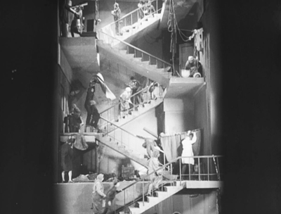
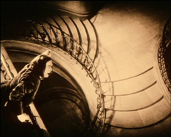
It’s a satire on middle-class citizens’ maltreatment of their servants, though it doesn’t become Soviet-style preachy until well into the story. The film begins by setting up the titular house (on a well-known street in Moscow). We see it via its staircase and landings in the morning, rendered in a vertical view that looks startlingly like an iPhone image (above). It also recalls the seven levels in the staircase elevator shot climbing upward to 7th Heaven, though who knows whether Barnet had seen that by the time he planned his film. The residents of the various apartments emerge to use the communal stairway as a junkyard and work area, dumping trash, splitting firewood, beating curtains, and generally abusing the rules of the building, as one conscientious young Party member points out.
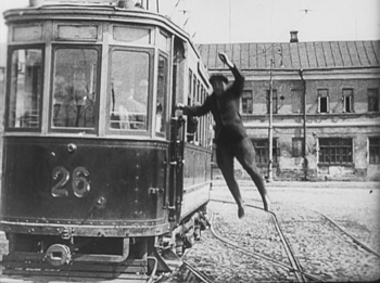
We are introduced to a barber, whose lazy wife makes him do all the chores. Then suddenly we’re with a professional driver with his own car. Just as suddenly we’re watching a peasant girl chase her runaway duck through a maze of traffic and nearly get hit by a tram. As the driver brakes hastily and jumps out to see if she’s hurt, there’s a freeze-frame.
A narrating title declares, “”But wait, we forgot to tell you how the duck ended up in Moscow.” Reverse motion leads to another title, “A day earlier.” A flashback to the heroine’s comic departure from a train station in the middle of nowhere shows the very uncle whom she is going to Moscow to visit arriving at the station just after she has left. Finding herself lost in Moscow with her duck, the heroine gains employment as a put-upon maid serving the barber and living in the house on Trubnoya. Her political awakening and the rehabilitation of the House on Trubnoya form the rest of the plot.
The House on Trubnoya is, in short, an imaginative, clever, and funny Soviet Montage film. Barnet’s other films are worth exploring as well. Check out The Girl with the Hatbox from 1927; it didn’t make last year’s top items, but it was on the long list.
10. La Chute de la maison Usher
Jean Epstein, who was probably the finest of the French Impressionist directors, has figured in these ten best lists before, in 1923 for Cœur fidèle, in 1924 for the little-known L’affiche, and 1927 for his masterly La Glace à trois faces.
I have long considered La Chute de la maison Usher interesting for its use of German Expressionist-inspired sets, but the fuzzy, incomplete prints that for decades were the only available versions made it difficult to enjoy. The restored version on the complete DVD set of Epstein’s works, which I discussed here, makes it far more interesting.
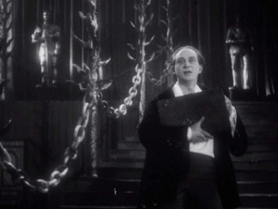
Taking its slim plot from Poe, the film follows a visit by an elderly man to the isolated castle of his old friend, Roderick Usher. Usher is painting a portrait of his beloved wife, but it is soon made clear that each time he presses the brush to the canvas, a little of her life is drained away–though the local doctor is mystified by her decline.
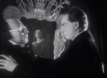
The film retains some of the traits of Impressionism, as when Madeline’s reaction to the effects of her husband’s painting are rendered in a superimposition of negative and positive images of her face.
The film has a minimal plot, but its focus is largely on experimentation in creating an eerie atmosphere. Shots of books falling in slow motion from their shelves, of curtains blowing in a cold wind that seems perpetually to invade the house, of frogs copulating in a nearby pond, and of the Expressionist-derived decors contribute less to a linear plot than to a mood of undefined menace.
The castle’s exterior is represented by obvious cardboard models, which tends to undermine the effect created by the interiors. The cheapness of these models is particularly noticeable in the climactic scene of the destruction of the house. This is unfortunate, but one must give Epstein credit for having done so much with so little.
This will be Epstein’s final appearance in our “Ten Best” lists, but I would like to call attention to his other 1928 film, Finis Terrae, the first of what the Epstein box-set collects as his “Poémes Bretons.” These are less Impressionistic, though Finis Terrae has a few impressive subjective shots. They are more realistic and poetic, largely involving the sea.
As I wrote at the beginning, 1928 was part of the period when the American industry was on the cusp of making sound standard in its films. Other national cinemas followed at various paces. One film that did not quite make my top-ten list demonstrates what must have worried film theorists and critics–and no doubt some filmmakers.
The restored version of Lonesome includes some dialogue sequences in a film otherwise accompanied by recorded music. There is an enormous contrast between the silent and sound footage. The story is largely told visually, but the dialogue scenes, clearly done in a sound-proof studio, are delivered in a stilted fashion by the young actors who are otherwise so casual and lively. The prospect of whole films being made in that fashion clearly disturbed lovers of films like La Passion de Jeanne d’Arc and Steamboat Bill, Jr. Watching Lonesome gives a dramatic insight into this slice of cinema history–a period that fortunately lasted only a few years as the technology improved and as filmmakers increasingly managed to make sound films that were just as imaginative, artistic, and engrossing as their silent predecessors.
January 6, 2019: Thanks to Docks of New York fan Tony Lucia for a correction on that section.
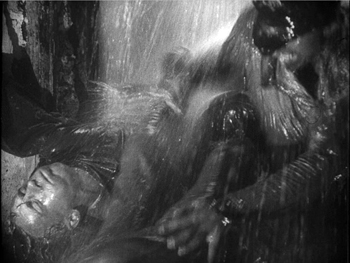
Spione
The ten best films of … 1927
Underworld.
Kristin here:
Once again it’s time for our ten-best list with a difference. I choose ten films from ninety years ago as the best of their year. Some are well-known classics, while others are gems I have found while doing research for various projects–though I have to admit that most of the films on this year’s list are pretty familiar.
One purpose of this yearly exercise is to call attention to great films of the past, for those who are interested in exploring classic cinema but aren’t sure where to start. (Previous lists are 1917, 1918, 1919, 1920, 1921, 1922, 1923, 1924, 1925, and 1926.)
Hollywood dominates this year, with half the list being American-made.
There are reasons for the lack of international titles. This year was was the tenth anniversary of the Russian Revolution, but although Vsevolod Pudovkin’s celebratory film The End of St. Petersburg is here, Sergei Eisenstein did not finish October in time and it came out in 1928. (I remember the third anniversary film, Boris Barnet’s Moscow in October, as good but not necessarily top-ten material.) Some major directors didn’t release a film or made a lesser work. Dreyer was at work on The Passion of Joan of Arc, but it, too, wasn’t released until 1928. Lubitsch made The Student Prince in Old Heidelberg, a good but not great entry in his oeuvre. Japan’s output is largely lost. Yasujiro Ozu made his first film in 1927, but his earliest surviving one comes from 1929. Most of Kenji Mizoguchi’s 1920s films are gone, including those from 1927.
1927 was the year when Hollywood dipped its toe in sound filmmaking, but we need not worry about the talkies for now. Instead, all ten titles are examples of the state of sophistication that the silent cinema had achieved by the eve of its slow demise. (Sunrise‘s recorded musical track does not a talkie make.)
Hollywood, comic
The General is often listed as a 1926 film. This is technically true, in a sense, but I choose not to count its world premiere in Tokyo on December 31, 1926. Its American premiere was scheduled for January 22, 1927 but was delayed until February 5 by the popularity of Flesh and the Devil, which was held over in the theater where Keaton’s film was eventually to launch.
David recently posted an entry on how the great silent comics moved from shorts in the 1910s to features in the 1920s. His example was Harold Lloyd’s Girl Shy, one of our ten best for 1924. Keaton moved into features slightly later than Lloyd, excepting The Saphead (1920), an adaptation of a play, in which Keaton was cast in the lead but over which he had no creative control. Once he did tackle features, he soon became adept at tightly woven plots with motifs and sustained gags. The General, based on a real series of events during the Civil War, has a solid dramatic structure that is more than just an excuse for a bunch of humorous bits. (A dramatic film, The Great Locomotive Chase, was produced by Disney in 1956 and based on the same events.)
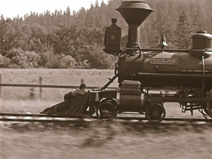
The French title of The General is Le Mécano de la General. One might call Keaton that, since The General‘s comedy is essentially a long set of variations on the humor to be gotten out of the physical characteristics of a Civil-War-era train and its interactions with tracks and ties. Keaton had always been fascinated by modes of transportation and other mechanical sources of gags: an earlier train in Our Hospitality, boats in The Boat and The Navigator, a DIY house (One Week), film projection in Sherlock Jr., and so on.
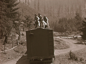
At the beginning, Keaton’s character, Johnny Gray, tries to enlist in the Confederate army, but he is rejected without explanation. The officers consider him more valuable as a train engineer. Later, when Johnny is taking troops up to the front, a group of disguised Union soldiers steal his beloved engine, “The General.” Pursuing the thieves, he ends up deep in Union-occupied territory and takes his engine home, just in time to participate in a battle and prove his worth as a soldier.
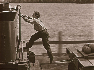
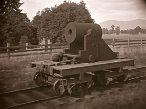
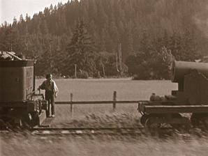
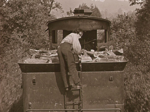
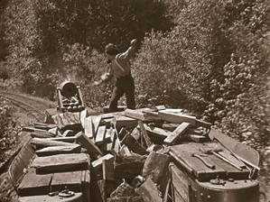
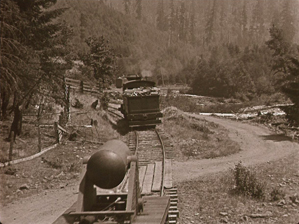
The perfection of Keaton’s construction of gags is evident in one famous scene where Johnny’s engine is towing a cannon pointed up at an angle that would clear the cab if it were fired. Johnny has just loaded it with a cannon-ball and lit the fuse; he is returning to the engine when he foot becomes caught in the hitch attaching the cannon to the fuel car. The hitch drops, jolting against the ties so that the cannon slowly sinks to point straight ahead. A cut to a side view shows Johnny noticing this and panicking.
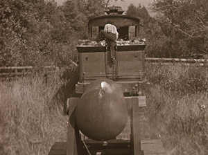
A view from behind the cannon emphasizes his danger as he starts to climb into the fuel car but gets his foot caught in the chain, a situation made clear by a cut-in. Once he is atop the wood-pile, he throws a log which fails to shift the cannon’s aim.
A cutaway establishes the Union soldiers who have stolen the General, approaching a lake in the background. Back at the pursuing engine, Johnny gets onto the cowcatcher, as far from the cannon as he can get. A return to the previous framing shows Johnny’s engine starting to turn on a curving stretch of track with the lake in the distance. The cannon follows.
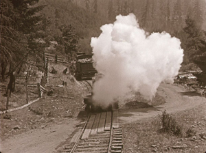
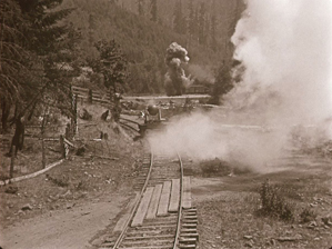
As Johnny’s engine moves just out of the cannon’s trajectory, it fires. This would be enough for the pay-off of this elaborate gag, but the smoke quickly blows aside (possibly a wind machine offscreen left?) and we see the explosion in the distance near the General. As so often happens with Keaton’s gags, we are likely to gasp in amazement at the moment’s sheer physical complexity and ingenuity, as well as Keaton’s dexterity, before we start laughing.
The consensus among most critics and historians is that The General is Keaton’s finest film. In my opinion it goes beyond the top ten for a year to the top ten, period. Participating in the 2012 Sight & Sound poll of scholars and filmmakers, I put it in my list of ten films. It only made it to number 34 among voters, but then, my opinions didn’t coincide too well with the “winners.” Only two of the top ten were on my list. Such exercises are hardly definitive, given how difficult it is to choose among films at the highest levels of brilliance. That’s why David and I tend to stay away from them–except for films made ninety years ago.
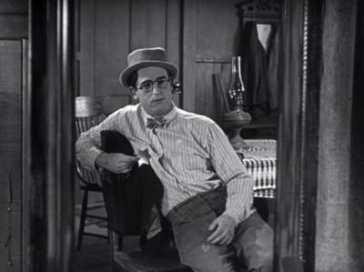
Harold Lloyd’s The Kid Brother is similarly one of his finest, along with Girl Shy (featured on my 1924 list and discussed by David in a FilmStruck introduction and his entry linked above). As David points out, Lloyd’s features usually give his character a flaw to overcome. Here, as a country boy overshadowed by his tough father and two older brothers, he believes himself to be timid and not worth much. He eventually proves himself, of course, partly from a desire to save his father, who is wrongly accused of stealing some money, and partly through the encouragement of Mary, owner of a medicine show passing through town, with whom he falls in love.
Harold Hickory is quickly set up as fantasizing that he is as capable as his father, the local sheriff, when he holds his father’s badge against his chest (see the top of this section). Not just a prop for character exposition, however, the badge leads him to be mistaken for the real sheriff. In trying to pass himself off as a convincing sheriff, he sets in motion a series of events that lead to the accusation of theft against his father and his attempts to recover the money from the real thieves.
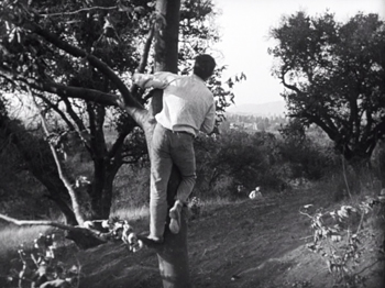
As with Keaton, one of Lloyd’s strengths was an ability to plan a gag to use the whole frame, whether in depth or from side to side. The film stages several scenes in depth, as when the dishonest medicine-show men who will eventually steal the money arrive to try to get a permit to perform in town. As they arrive, Harold is seen in depth, wearing his father’s hat and badge, thus setting up the idea that they will believe that he is actually the sheriff. A more extended example occurs later, when he meets and is attracted to Mary, he climbs a tree to call after her as she leaves him, disappearing again and again behind a hill in the distance, and reappearing each time he climbs higher.
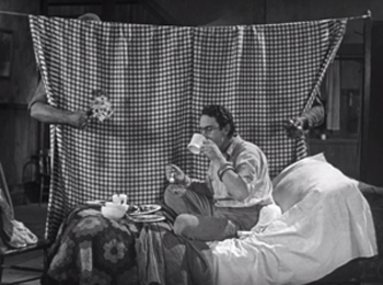
Lloyd skillfully employed shallow space equally well. When the medicine-wagon is destroyed by fire, Harold invites Mary to spend the night at his house. A disapproving neighbor lady soon takes her away, and Harold sleeps on the couch he had made up for Mary, complete with a tablecloth hung to give her privacy. Believing Mary still to be in bed, the two brothers separately sneak in to court her by primly handing her breakfast and gifts around the edge of the cloth. A shot from the other side shows Harold pretending to be Mary and enjoying being served food by the brothers when it is usually he who does the cooking.
Like The General, The Kid Brother demonstrates the sophistication that the great silent comedians had achieved by the late silent period.
As with the Lloyd films included in previous lists, The Kid Brother was released in the 2005 New Line boxed set, “The Harold Lloyd Comedy Collection,” now out of print and available only from third-party sellers. Sold separately, Volume 2 is still in print; it contains The Kid Brother and The Freshman, as well as other important Lloyd films. Volume 3 is still available new from third-party sellers. Volume 1 is available from third-party sellers, mainly in used (and higher-priced copies).
Hollywood, serious
The popular impression seems to be that the gangster genre originated in the early sound period. Wikipedia’s entry on the subject treats Public Enemy (1931), Little Caesar (1931), and Scarface (1932) as the first gangster films. There had been occasional silent films that could fit into that category, notably The Musketeers of Pig Alley (1912, D. W. Griffith) and Alias Jimmy Valentine (1915, Maurice Tourneur). In 1927, however, Josef von Sternberg made Underworld, which basically defined the genre that would soon become more prominent.
It has the gangster’s little mannerism, with “Bull” Weed bending coins to show off his strength (possibly the source of the cliché of the gangster flipping a coin). There’s the emblematic and ironic death, as when Bull’s nemesis “Buck” Mulligan is shot and falls at the foot of a cross-shaped memorial arrangement of flowers in the shop he uses as a front. There’s the thug with a heart of gold redeemed by the loyalty of a friend.
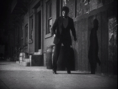
Von Sternberg is most often associated with Marlene Dietrich, whom he directed in seven films in the 1930s. He built three of his last four films of the late 1920s, however, around the burly star George Bancroft (below left). (We will encounter the second in next year’s list.) He’s also associated with beautiful design and cinematography, and the look of Underworld often anticipates the films noir of the 1930s (above, top, and below right).
I’ve already written about Underworld in greater detail than I have room for here–with additional pretty pictures. That was on the occasion of Criterion’s release of a set containing von Sternberg’s last three silents. Still indispensable but out of print and selling for high prices when you can find it. (Time for a Blu-ray?)
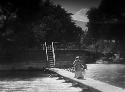
Late in her life, I asked my mother (born in 1922) what the earliest film she could remember seeing was. She replied that she couldn’t give me the title but recalled an image: a woman floating on a lake supported by reeds. I was quite astonished, partly because of all possible late 1920s films she had mentioned one which I could identify instantly from that brief description and partly because her memory had retained an impression of one of the great classics of the silent cinema. Living on a farm in Ohio, my mother probably saw it in a late run and so probably was six or seven at the time.
The presence of Sunrise on this list will hardly come as a surprise to anyone. Murnau has been a regular, appearing in our 1922, 1924, 1925, and 1926 entries. His first Hollywood film was thoroughly Murnauesque in style. It’s story of village versus country with a lingering touch of Expressionism in the rural scenes (below left) and modern design on ample display in the city (below right). The action could be set equally plausibly in Germany or the USA, except for the English-language signs in the city.
The plot is simplicity itself, with none of the characters even given a name. A Man is seduced by a Woman from the City, who convinces him to drown his Wife “accidentally” and flee with her to the gaiety of urban life. He nearly pushes his Wife into the lake while rowing across to the mainland but relents and tries to gain her forgiveness. This all occupies less than half the film, and most of the rest consists of the couple going forlornly to the city, with the Wife heartsick and the Man pathetically trying to reassure her. Once they reconcile, there is a long stretch of them having a good time in the city before heading home.
Yes, a good time. One might expect the city to be a hotbed of decadence that contrasts with their virtuous country life, but apart from an aggressively flirtatious gentleman, most of the people they meet are kind to them. A friendly photographer thinks they are a newly married couple and takes their portrait, sophisticated patrons at the dance-hall appreciate their performance of a country dance (below), and so on.
This meandering little set of unconnected vignettes does not conform to the Hollywood ideal. It presumably aims to guarantee that we believe in the husband’s redemption and the couple’s future happiness after their symbolic “re-marriage.” It holds our attention partly because of the charm of the two lead actors, George O’Brien and Janet Gaynor, and partly because the visual style always gives us something to look at. Murnau uses his “unfastened” German-style camera movements, not only in the famous track to the marsh early on but in a movement over diners’ heads accomplished by placing a camera on a support suspended from a track on the ceiling. (This technique was being widely adopted in Hollywood during the second half of the 1920s.)
Plus there’s that memorable scene of the Wife drifting on the lake, supported by reeds.
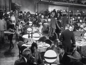
Sunrise is available in the elaborate 2008 12-disc boxed-set “Murnau, Borzage and Fox,” though the print is the usual soft, rather dark one available elsewhere. (The main gems of the box are the rare Borzage silents, including Lazybones, one of my 1925 picks.) Eureka! put out an edition of Sunrise as the first entry in its “Masters of Cinema” series. It contains not only the same print but a second print, a Czech release with distinctly better visual quality. (The image of the restaurant directly above was taken from it, while the others are from the “Fox Box.” I have not made a comparison between the two, but apparently the Czech version has significant differences from the American one.) This edition is out of print. Eureka! now offers the same two prints and supplements as a DVD/Blu-ray combination. Note that (despite what the Amazon.uk page says), this is a region 2 DVD and region B Blu-ray; both would require a multi-standard player in the USA and other regions.
The same “Fox Box” set contains Frank Borzage’s 7th Heaven, one of his best-loved films. By rights it should not be a great film. It is intensely sentimental, depends on huge coincidences, and has a thoroughly implausible ending, not to mention a saccharine religious theme that runs through it. Yet somehow it manages to be the greatest hypersentimental, coincidence-ridden, implausible, pious film ever. I cannot explain how or why.
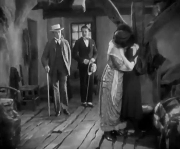
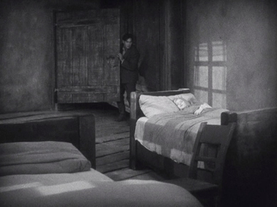
Borzage’s film looks a lot like Sunrise, and it is often assumed that the resemblance arises from a straightforward influence of Murnau upon Borzage (e.g., his Wikipedia entry states that Borzage was “Absorbing visual influences from the German director F. W. Murnau, who was also resident at Fox at this time”), even though 7th Heaven was released four months earlier. There is something more complex at work here. The two films’ resemblances are not surprising, since German films had been drawing excited attention among American filmmakers for the past two years or so. The Last Laugh wasn’t a popular success, but its US distributor, Universal, showed it privately for cinematographers and others in the industry interested in studying it. Variety had been a hit. Its techniques of false perspective in sets and cameras moving freely through space soon caught on. For example, the sordid flat that the heroine Diane shares with her sister in 7th Heaven has a rough wooden floor sloping up toward the back (left). A similarly sloping floor appears in the bedroom in Sunrise (right)
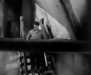
German producer Erich Pommer’s first American film, Hotel Imperial (released by Paramount at the beginning of 1927), used a camera elevator, hanging sometimes from a track in the ceiling and sometimes from an improvised support on a dolly (see here for an image of it attached to the latter). The famous vertical elevator shot in 7th Heaven, following Chico and Diane as they ascend to his garret apartment at the top of the building was probably the most flamboyant use of the unfastened camera to that point. Below, in a later shot, the camera follows Chico back down as he goes to fetch water.
German style alone does not explain the film’s status as a great classic, though the slightly exotic look perhaps helped to make the garret romantic enough to be called “heaven” by its inhabitants as they fall in love. As with Sunrise, the Germanic look lends a certain fairy-tale quality that helps smooth over the plausibility issues.
Beyond this, there is again the charisma of the main actors. Janet Gaynor (who was in two of this year’s greatest films) and Charles Farrell (a slightly awkward but appealing actor) became the ideal couple of the late 1920s, co-starring eleven more times between 1927 and 1934. Equally, there is the ineffable directorial sincerity that comes across in Borzage’s best films, a trait often summarized as “romantic” or “naive.”
Unfortunately the print of 7th Heaven in the “Fox Box” is virtually unwatchable. Apparently the French DVD is from a better source than the Fox release; this DVD may be the source of a version which has been posted on YouTube with bright yellow Greek subtitles. The two frames above were extracted from that online copy. Another film calling out for restoration.
Germany: farewell to Expressionism
Expressionism probably would have ended in Germany in 1926, with the releases of Murnau’s Faust and Fritz Lang’s Metropolis. Both films went over budget and schedule, with Lang’s being late enough to be released on January 10, 1927. Both films contributed to the decline of the large production company, UFA, which had to rely on loans from Hollywood to keep going. Murnau was by this point in America, and he never worked again in Germany. Lang had to produce his next film, Spione (destined for our 1928 list), himself, and he opted for a more streamlined modern look.
Metropolis mixes Expressionism with the sets representing the futuristic science-fiction city. The pleasure garden of the wealthiest class (above), as well as the catacombs and chapel of Maria far under the city are Expressionist, and even in the city sets the crowds often move in the choreographed fashion typical of the style.
Expressionism remained thereafter as a minor stylistic option. (Alexandre Volkoff’s 1928 French-German co-production Geheimnisse des Orients used Expressionist sets to create a fairy-tale Middle-East, rather like The Thief of Bagdad [1924].)
Metropolis has received so much attention that there is no need to plug it again as a great classic. In fact, it has been hyped to the point of being over-valued. Any of Lang’s other films from 1922 to 1928 is arguably better. It has a mawkish main premise (the heart must mediate between head and hands in labor disputes) and plot flaws (why would Fredersen destroy the substructure of his city when his power and dominance depend on maintaining it?), neither of which is a problem in Lang’s other films of this period. It deserves to be called a masterpiece for its audacity of vision, technical innovation, and many great moments.
Fans of the film will be aware that the long-lost scenes of the film were discovered in South America and restored to the film, rendering it nearly complete (running 148 minutes in Kino Lorber’s Blu-ray release). The recovered footage was unfortunately in very worn condition, and restoration can only do so much. The film is, however, much improved by having it.
David has already written on the strengths and weakness of this “great sacred monster of the cinema,” including a discussion of how the restored footage enhances it.
Back in 1970, when I was an undergraduate and first dipping a toe into film studies, G. W. Pabst was considered one of the major figures of German cinema, close to if not quite as great as Lang or Murnau. In my first film course the incomplete version of The Joyless Street was shown. (I liked it much better when it was restored.) I saw The Love of Jeanne Ney shortly thereafter. By now, however, The Joyless Street and Pandora’s Box have become the Pabst classics upon which his reputation is largely based. Whether Jeanne Ney‘s gradual fall into relative obscurity is the cause or the effect of its being difficult to see is hard to say. (I could only find it as a 2001 DVD by Kino, so-so but acceptable in quality.) Either way it’s a pity, since it deserves to be better known.
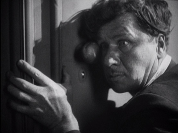
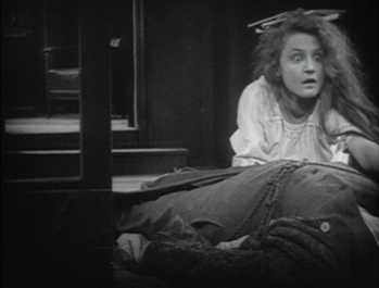
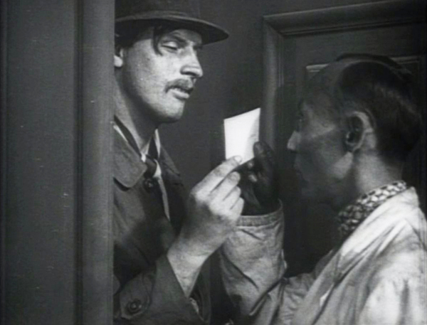
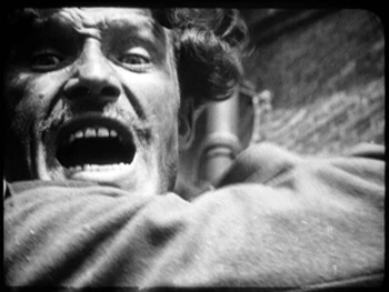
An adaptation of Ilya Ehrenburg’s novel of the same name, Jeanne Ney is set in the Civil War period that followed the Russian Revolution of 1917. The story begins in the Crimea, where Jeanne’s anti-Bolshevik father is a political observer. During the capture of the town by the Red forces, Jeanne’s lover, Labov, kills her father in self-defense. She forgives him and flees to Paris. Jeanne gets a job as a secretary in her miserly uncle’s detective agency, primarily to be a companion to her blind cousin. (Gabriele is played by Brigitte Helm, who was also Maria in Metropolis, thus making her our second actress appearing in two of this year’s top ten films.) A rascally opportunist, Khalibiev (played with sleazy relish by Fritz Rasp, see bottom) tries to marry Gabriele for her money, even though he actually lusts after Jeanne. Killing and robbing the uncle, he pins the murder on Labov.
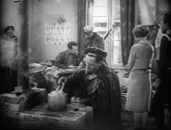
Stylistically the film is a fascinating mix typical of the late 1920s, when influences were passing rapidly among European countries. It strives for a certain degree of the realism characteristic of the Neue Sachlichkeit movement that Pabst had helped to establish with The Joyless Street. The first part is influenced by the Soviet films that had become popular in Germany only the year before, and the Crimea-set portion could pass for a Soviet film, though not one of the more daring ones. The execution scene (below left), with the rifles sticking into the frame dramatically, was already calling upon a composition typical of the Montage movement. The interrogation of Jeanne takes place in a cluttered headquarters just set up by the conquering Reds (complete with authentic costumes and “typage” casting); the framing emphasizes both Bolshevik ideals and realism, placing in the foreground a soldier trying to make tea.
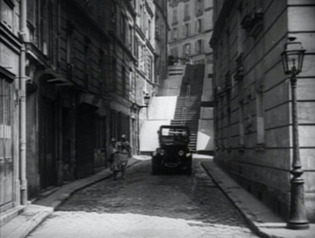
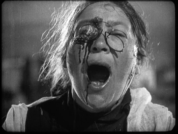
For the longer Parisian portion of the film, Pabst shot on location, as the French Impressionists were doing. He mixed this sense of realism (below left) with subjective scenes, including Jeanne’s superimposed vision of her wrongly-accused lover being executed. The film has one great set-piece, the cousin’s gradual discovery of her father’s murder as Khalibiev stands watching, thoroughly spooked by her blind staring face (below right).
Time to bring this film back into the canon.
Much more familiar is Berlin, die Sinfonie der Grossstadt, with which Walter Ruttmann brought the city symphony into the mainstream and solidified a growing strain of realism in German cinema. There had been short films and features that wove together visual motifs from urban life (e.g., Charles Sheeler and Paul Strand’s Manhatta, 1921), mostly captured on the fly though occasionally staged.
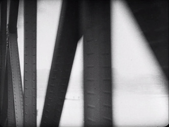
Ruttmann has been mentioned on previous ten-best lists for his abstract animation. Berlin begins with some moving abstract shapes that gradually give way to a train journey. During this real objects create abstract patterns, as when the girders of a bridge create a flicker effect as they flash by (below left).
The journey ends in a major station in the city. From there on, Ruttmann cuts together scenes to create what was to become a familiar city-symphony time-frame, a day in the life of a metropolis. Empty, silent streets lead to an early-morning dog-walker (above right) and then the bustle of the workday, lunch, and finally nightlife.
To this point most experimental films had been short and either abstract or surrealist. That experimentation could emerge from the documentary mode was a new concept, and Berlin, though it may not seem very radical to us today, helped to establish this new approach. The fact that it was co-produced by Fox Europa gave it distribution in mainstream theaters, and it has had a great influence on subsequent filmmaking, right up to the present. Coincidentally, that influence is demonstrated by the recent release of Alex Barratt’s London Symphony: A Poetic Journey through the Life of a City (2017). Flicker Alley’s liner notes include:
The release of this Blu-ray coincides with the 90th anniversary of Walter Ruttmann’s Berlin, Symphony of a Great City (1927), one of the most important examples of the original city symphonies. Ruttmann was one of the great pioneers of experimental film, and Barrett and [James] McWilliam [composer] have worked hard to bring a similar sense of poetic playfulness to London Symphony, while also updating the form for the 21st Century.
Berlin is available in several DVD editions, but the definitive one is in a two-disc set including Ruttmann’s Die Melodie der Welt, the first German sound film, both in restored versions from the Filmmuseum series, as well as Ruttmann’s short abstract films. I note that this is available on Amazon in the USA, but be aware that it’s PAL and so requires a multi-standard player.
The essence of French Impressionism in 38 minutes
I know most readers will expect a much, much longer French film about Napoléon to be in this spot, but I’m opting for Jean Epstein’s modest but brilliant short feature, La Glace à trois faces (“The three-sided mirror”). Perhaps no other film of the Impressionist movement managed to create a plot that combines the subjective techniques that delve into character psychology with the presentation of events through fleeting impressions rather than linear causality. Most Impressionist films today seem a bit old-fashioned, adhering to the modernism of the era. La Glace seems familiar to aficionados of Resnais or Antonioni.
Epstein divides his brief tale of his protagonist, an unnamed playboy, into three parts devoted to the women–a wealthy society woman, a modern sculptor, and a modest working-class woman–who are all having affairs with him at the same time. Each tells her tale of his callousness and neglect to a sympathetic listener, and each presents a very different view of him. Intercut with their stories are scenes of the protagonist taking a solo ride in his sports car (above), speeding through the countryside and stopping at a local fair. Throughout he seems happier than he had with any of his lovers.
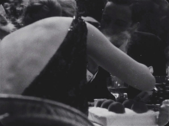
The individual scenes are brief, with quick cutting presenting glances and gestures, often from angles that prevent our getting a good look at what is happening, as with this moment in a restaurant.
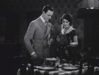
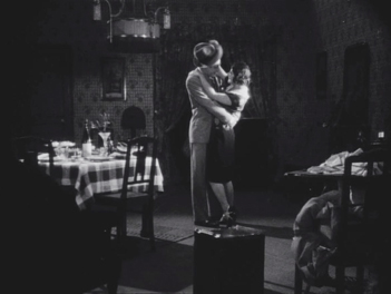
We grasp what is going on primarily because the events are extremely simple. In each case the protagonist is with one of the women and abruptly walks out on her. The third tale, told by the working-class Lucie, is cut together in nearly random chronological order and with parts of the action missing. Lucie has prepared a romantic dinner at her home, but the man arrives, greets her, looks over the table, and leaves. In this snippet, however, his looking over the table is followed immediately by a shot of him just after his arrival, as Lucie embraces him and removes his hat.
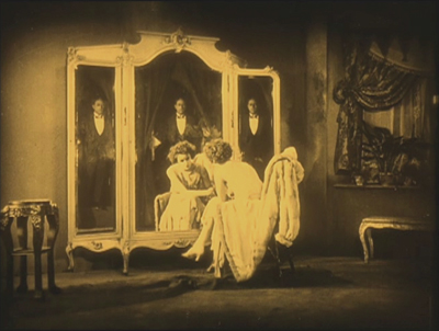
The narrative achieves closure, but the film ends with an emblematic shot of the hero superimposed over a three-sided mirror, emphasizing the differences in the three women’s perceptions of him. La Glace à trois faces goes perhaps as far as any silent film does in using challenging modernist tactics, frustrating the viewer with a lack of clarity about causes and traits. It was a new form of narration that had little immediate impact on the cinema. The film was barely seen at the time. It would not be until decades later that similar techniques became common.
La Glace is available in the boxed-set of several of Epstein’s films, which I described and linked here. It is also included in Kino’s “Avant Garde” set on the 1920s and 1930s.
Tracing the birth of a Bolshevik
One can see why the Soviet government liked Pudovkin best among the major Montage directors. His films, while employing the fast cutting, dynamic angles, and other stylistic traits of the movement, are fairly straightforward and comprehensible compared to, say, Eisenstein’s pyrotechnics in October.
While the latter concentrates on the events of the Revolution proper, with no single character singled out for us to identify with, Pudovkin works up to the Revolution by following the radicalization of a peasant. The unnamed “Village Lad” sets out from his impoverished rural home to find work at a factory in the big city. We see the fomenting of a strike over dangerous working conditions and extended work hours, which begins as the Lad arrives. Ignorant of politics and the class struggle, he seizes his chance to join the scabs replacing the workers. Even worse, he betrays some of the strike’s leaders to police.
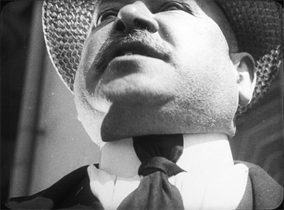
The story moves away from the Lad, who really is not very prominent in the narrative and is never characterized enough to gain much sympathy. As World War I begins, the film focuses on stock-market manipulation and war profiteering. Using typical typage casting, Pudovkin caricatures the capitalists as fat cats out for themselves (above). Eventually we see the Lad again, now wiser in the ways of the world and ready to serve the Bolshevik cause. By the end, the Reds attack the Winter Palace in a suspenseful scene, though one much shorter than the one in October.
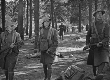
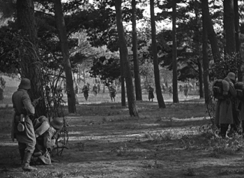
Pudovkin featured on our list last year, for his best-known film, Mother. There the hero and his mother gain a good deal more sympathy than the Lad does, and The End of St. Petersburg is as a result perhaps a less entertaining film than Mother. Still, it is a masterly film and one of the gems of Soviet Montage.
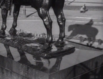
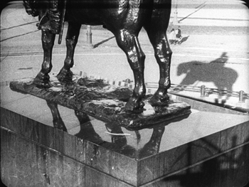
While rewatching End on DVD, I realized that the main editions available used the same version of the film, a sonorized “restoration” done by Mosfilm in 1969. What other changes might have been made are not apparent (some films “restored” in that period were recut), but the images are severely cropped. The left side of the frame is missing, more than what one would expect would be necessary to add a sound track. The top and bottom, too, are missing portions. Only the right edge seems more or less intact.
Take this famous image. The film has set up a motif of statues that come to stand for the imperial-era city. At one point there is a depth shot past an equestrian statue looming in the foreground while the Lad and his companion are seen as tiny figures walking across the square in the background. Compare the DVD image with one taken from an archival 35mm print.
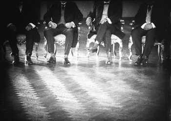
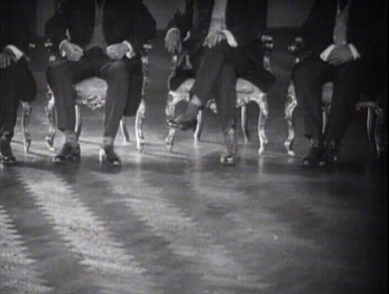
This is bad enough, but when Pudovkin starts using the edges of the frame to make ideological points, the result nearly negates the his meaning. A famous shot shows a row of seated military officials with their heads offscreen. The 35mm image cuts them off precisely at the collar. The DVD print goes down to mid-chest, while losing much of the fourth man on the left. One might say that the same simple metaphor is being presented, but it’s not as instantly apparent what Pudovkin is implying here.
So while I recommend this film, I have to caution readers that it is not currently easy to see it in an acceptable print. An older 16mm copy or a 35mm screening in an archive would be ideal but not accessible to very many. If you want to see it, even in this faulty version, the Image and Kino releases both contain the Mosfilm print. The Image DVD has End paired with Pudovkin’s very worthwhile first sound film, Deserter (1933). Since it was a sound film to begin with, Deserter is not significantly cropped here and is quite good visually. Unfortunately this version is long out of print. The Kino DVD includes Dovzhenko’s Earth (1930) and Pudovkin’s short comedy Chess Fever (1925). It is available for sale and streaming on Amazon. Perhaps our friends at one of the home-video companies dedicated to putting out restorations on DVD and Blu-ray might consider tackling this key title.
For readers who prefer streaming, The Kid Brother, Sunrise, and Metropolis are currently available at FilmStruck on The Criterion Channel. Underworld, The General, The Love of Jeanne Ney, Berlin: Symphony of a Great City, La Glace à trois faces, and The End of St. Petersburg are held in MUBI‘s library, but none is currently playing there. We haven’t checked any of these versions.
Flicker Alley’s London Symphony is available for streaming here and on MOD Blu-ray.
Our colleague Vance Kepley has written a book in the Taurus Film Companion series on The End of St. Petersburg. It seems to be slipping out of availability on amazon.com, can still be had at amazon.co.uk, and is available directly from the publisher. Malcolm Turvey discusses some of the films on our list in his The Filming of Modern Life: European Avant-Garde Film of the 1920s.
December 28, 2017: Our thanks to Manfred Polak, who sends some good news about a restoration and possible upcoming availability of one of our films: “A restored version of “The Love of Jeanne Ney” was shown in an open-air event in Berlin last August. This version also aired on German-French TV station Arte, and it was available for legal download and streaming in HD for three months. I think there might be a DVD or Blu-ray of this version in a few months.”
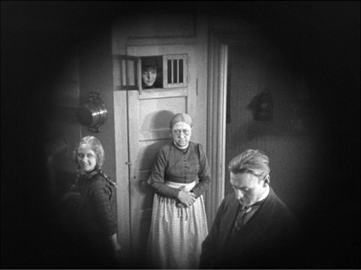
The Love of Jeanne Ney
Off-center 2: This one in the corner pocket
DB here, again:
We got a keen response to my entry on widescreen composition in Mad Max: Fury Road. Thanks! So it seemed worthwhile to look at composition in the older format of 4:3, good old 1.33:1–or rather, in sound cinema, 1.37: 1.
The problem for filmmakers in CinemaScope and other very wide processes is handling human bodies in conversations and other encounters (such as stomping somebody’s butt in an an action scene). You can more or less center the figures, and have all that extra space wasted. Or you can find ways to spread them out across the frame, which can lead to problems of guiding the viewer’s eye to the main points. If humans were lizards or Chevy Impalas, our bodies would fit the frame nicely, but as mostly vertical creatures, we aren’t well suited for the wide format. I suppose that’s why a lot of painted and photographed portraits are vertical.
By contrast, the squarer 4:3 frame is pretty well-suited to the human body. Since feet and legs aren’t usually as expressive as the upper part of the body, you can exclude the lower reaches and fit the rest of the torso snugly into the rectangle. That way you can get a lot of mileage out of faces, hands and arms. The classic filmmakers, I think, found ingenious ways to quietly and gracefully fill the frame while letting the actors act with body parts.
Since I’m watching (and rewatching) a fair number of Forties films these days, I’ll draw most of my examples from them. after a brief glance backward. I hope to suggest some creative choices that filmmakers might consider today, even though nearly everybody works in ratios wider than 4:3. I’ll also remind us that although the central area of the frame remains crucial, shifts away from it and back to it can yield a powerful pictorial dynamism.
Movies on the margins
Early years of silent cinema often featured bright, edge-to-edge imagery, and occasionally filmmakers put important story elements on the sides or in the corners. Louis Feuillade wasn’t hesitant about yanking our attention to an upper corner when a bell summons Moche in Fantômas (1913). A famous scene in Musketeers of Pig Alley (1912) shows Griffith trying something trickier. He divides our attention by having the Snapper Kid’s puff of cigarette smoke burst into the frame just as the rival gangster is doping the Little Lady’s drink. She doesn’t notice either event, as she’s distracted by the picture the thug has shown her, but there’s a chance we miss the doping because of the abrupt entry of the smoke.
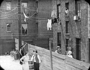
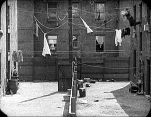
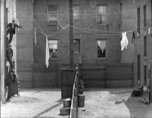
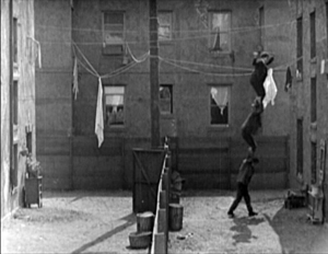
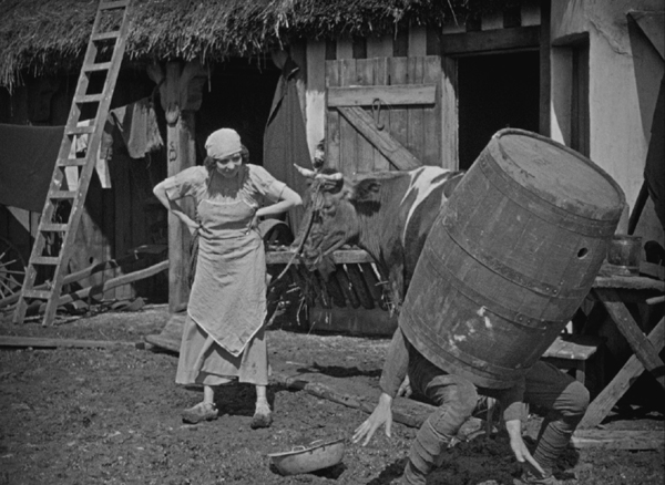
In Keaton’s maniacally geometrical Neighbors (1920), the backyard scenes make bold (and hilarious) use of the upper zones. Buster and the woman he loves try to communicate three floors up. Early on we see him leaning on the fence pining for her, while she stands on the balcony in the upper right. Later, he’ll escape from her house on a clothesline stretched across the yard. At the climax, he stacks up two friends to carry him up to her window.
Thankfully, the Keaton set from Masters of Cinema preserves some of the full original frames, complete with the curved corners seen up top. It’s also important to appreciate that in those days there was no reflex viewing, and so the DP couldn’t see exactly what the lens was getting. Framing these complex compositions required delicate judgment and plenty of experience.
Later filmmakers mostly stayed away from corners and edges. You couldn’t be sure that things put there would register on different image platforms. When films were destined chiefly for theatres, you couldn’t be absolutely sure that local screens would be masked correctly. Many projectors had a hot spot as well, rendering off-center items less bright. And any film transferred to 16mm (a strong market from the 1920s on) might be cropped somewhat. Accordingly, one trend in 1920s and 1930s cinematography was to darken the sides and edges a bit, acknowledging that the brighter central zone was more worth concentrating on.
That tactic came in handy with the emergence of television, which established a “safe area” within the film frame for video transmission. TV cropped films quite considerably; cinematographers were advised in 1950 that
All main action should be held within about two-thirds of the picture. This prevents cut-off and tube edge distortion in television home receivers.
Older readers will remember how small and bulging those early CRT screens were.
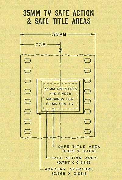
By 1960, when it was evident that most films would eventually appear on TV, DP’s and engineers established the “safe areas” for both titles and story action. (See diagram surmounting this section.) Within the camera’s aperture area, which wouldn’t be fully shown on screen, the safe action area determined what would be seen in 35mm projection. “All significant action should take place within this portion of the frame,” says the American Cinematographer Manual.
Studio contracts required that TV screenings had to retain all credit titles, without chopping off anything. This is why credit sequences of widescreen films appear in widescreen even in cropped prints. So the safe title area was marked as what would be seen on a standard home TV monitor. If you do the math, the safe title area is indeed 67.7 % of the safe action area.
These framing constraints, etched on camera viewfinders, would certainly inhibit filmmakers from framing on the edges or the corners of the film shot. And when we see video versions of films from the 1.37 era (and frames like mine coming up) we have to recall that there was a bit more all around the edges than we have now.
All-over framing, and acting
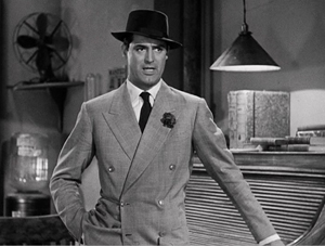
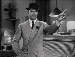
Yet before TV, filmmakers in the 40s did exploit off-center zones in various ways. Often the tactic involved actors’ hands–crucial performance tools that become compositional factors. In His Girl Friday (1940), Walter Burns commands his frame centrally, yet when he makes his imperious gesture (“Get out!”) Hawks and DP Joseph Walker (genius) have left just enough room for the left arm to strike a new diagonal.
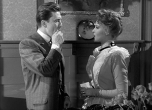
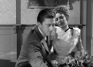
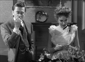
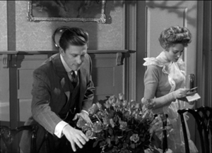
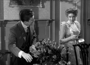
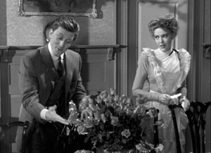
The framing of a long take in The Walls of Jericho (1948) lets Kirk Douglas steal a scene from Linda Darnell. As she pumps him for information, his hand sneaks out of frame to snatch bits of food from the buffet.
As the camera backs up, John Stahl and Arthur Miller (another genius) give us a chance to watch Kirk’s fingers hovering over the buffet. When Linda stops him with a frown, he shrugs, so to speak, with his hands. (A nice little piece of hand jive.)
The urge to work off-center is still more evident in films that exploit vigorous depth staging and deep-focus cinematography. Dynamic depth was a hallmark of 1940s American studio cinematography. If you’re going to have a strong foreground, you will probably put that element off to one side and balance it with something further back. This tendency is likely to empty out the geometrical center of the shot, especially if only two characters are involved. In addition, 1940s depth techniques often relied on high or low angles, and these framings are likely to make corner areas more significant. Here are examples from My Foolish Heart (1950): a big-head foreground typical of the period, and a slightly high angle that yields a diagonal composition.
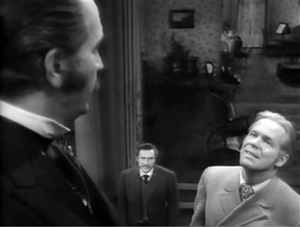
Things can get pretty baroque. For Another Part of the Forest (1948), a prequel to The Little Foxes (1941), Michael Gordon carried Wyler’s depth style somewhat further. The Hubbard mansion has a huge terrace and a big parlor. Using the very top and very bottom of the frame, a sort of Advent-calendar framing allows Gordon to chart Ben’s hostile takeover of the household, replacing the patriarch Marcus at the climax. The fearsome Regina appears in the upper right window of the first frame, the lower doorway of the second.
In group scenes, several Forties directors like to crowd in faces, arms, and hands, all spread out in depth. I’ve analyzed this tendency in Panic in the Streets (1950), but we see it in Another Part of the Forest too. Again, character movement can reveal peripheral elements of the drama.
At the dinner, Birdie innocently thanks Ben for trying to help her family with their money problems and bolts from the room, going out behind Ben’s back. The reframing brings in at the left margin a minor character, a musician hired to entertain for the evening. But in a later phase of the scene he will–still in the distance–protest Marcus’s cruelty, so this shot primes him for his future role.
At one high point, the center area is emptied out boldly and the corners get a real workout. On the staircase, the callow son Oscar begs Marcus for money to enable him to run off with his girlfriend. (As in Little Foxes, the family staircase is very important–as it is in Lillian Hellman’s original plays.) Ben watches warily from the bottom frame edge. Nobody occupies the geomentrical center.
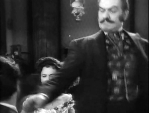
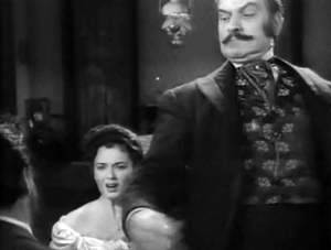
Later, on the same staircase, Ben steps up to confront his father while Regina approaches. It’s an odd confrontation, though, because Ben is perched in the left corner, mostly turned from us and handily edge-lit. Marcus turns, jammed into the upper right. Goaded by Ben’s taunts, he slaps Ben hard. Here’s the brief extract.
The key action takes place on the fringes of the frame, while the lower center is saved for Regina’s reaction–for once, a more or less normal human one. Even allowing for the cropping induced by the video safe-title area, this is pretty intense staging.
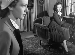
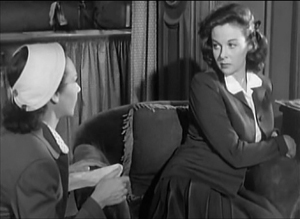
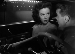
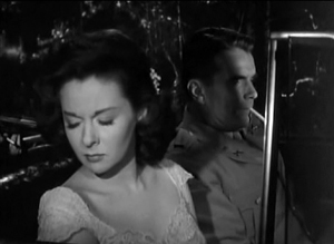
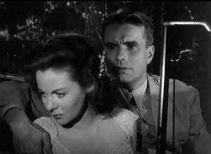
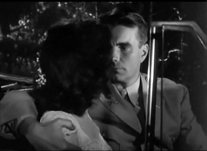
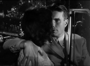
The corners can be activated in less flagrant ways. Take this scene from My Foolish Heart. Eloise has learned that her lover has been killed in air maneuvers. Pregnant but unmarried, she goes to a dance, where an old flame, Lew asks her to go on a drive. They park by the ocean, and she succumbs to him. Here’s the sequence as directed by Mark Robson and shot by Lee Garmes (another genius).
In the fairly conventional shot/ reverse-shot, the lower left corner is primed by Eloise’s looking down at the water and Lew’s hand stealing around her.
Later, when Lew pulls her close, (a) we can’t see her; (b) his expression doesn’t change and is only partly visible; so that (c) his emotion is registered by the passionate twist of his grip on her shoulder. Lew’s hand comes out from the corner pocket.
Perhaps Eloise is recalling another piece of hand jive, this time from her lost love.
For many directors, then, every zone of the screen could be used, thanks to the good old 4:3 ratio. It’s body-friendly, human-sized, and can be packed with action, big or small.
Mabuse directs
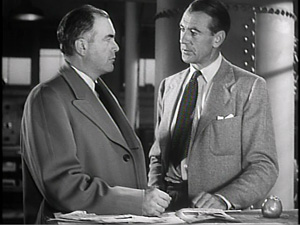
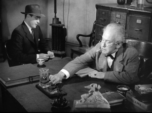
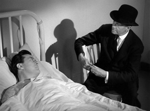
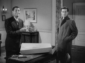
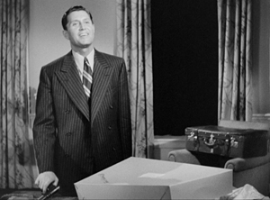
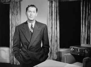
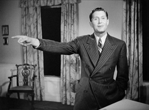
In other entries (here and here) I’ve mentioned one of the supreme masters of off-center framing, Fritz Lang. Superimpose these two frames and watch Kriemhilde point to the atomic apple in Cloak and Dagger (1946).
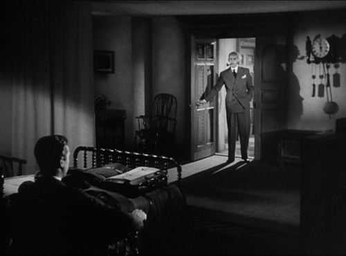
From the very start of Ministry of Fear (1944), the visual field comes alive with pouches, crannies, and bolt-holes. The first image of the film is a clock, but when the credits end the camera pulls back and tucks it into the corner as the asylum superintendant enters. (The shot is at the end of today’s entry.) Here and elsewhere, Lang uses slight high angles to create diagonals and corner-based compositions.
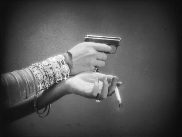
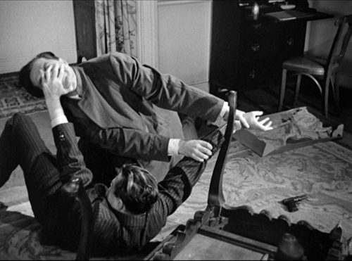
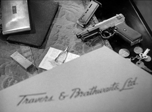
In the course of the film, pistols circulate. Neale lifts one from Mrs. Bellane (strongly primed, upper left), keeps her from appropriating it (lower center), and secures it nuzzling his left knee (lower right).
Later, Neale’s POV primes the placement of a pistol on the desktop (naturally, off-center), so that we’re trained to spot it in a more distant shot, perilously close to the hand of the treacherous Willi.
Amid so many through-composed frames, an abrupt reframing calls us to attention. Unlike Hawks and Walker’s handling of Walter in His Girl Friday, Lang and his DP Henry Sharp (great name for a DP, like Theodore Sparkuhl and Frank Planer) gives things a sharp snap when Willi raises his hand.
Lang drew all his images in advance himself, not trusting the task to a storyboarder. Avoiding the flashy deep-focus of Wyler and company, he created a sober pictorial flow that can calmly swirl information into any area of the frame. It’s hard not to see the stolen attack maps, surmounting today’s entry, as laying bare Lang’s centripetal vectors of movement. No wonder in the second frame up top, as Willi and Neale struggle in a wrenching diagonal mimicking the map’s arrows, that damn pistol strays off on its own.
Sometimes film technology improves over time. For instance, digital cinema today is better in many respects than it was in 1999. But not all changes are for the better. The arrival of widescreen cinema was also a loss. Changing the proportions of the frame blocked some of the creative options that had been explored in the 4:3 format. Occasionally, those options could be modified for CinemaScope and other wide-image formats; I trace some examples in this video lecture. But the open-sided framings in most widescreen films today suggest that most filmmakers haven’t explored the wide format to the degree that classical directors did with the squarish one.
More generally, it’s worth remembering that the film frame is a basic tool, creating not only a window on a three-dimensional scene but also a two-dimensional surface that requires composition–either standardized or more novel. Instead of being a dead-on target, the center can be an axis around which pictorial forces push and pull, drift away and bounce around. After all, we’re talking about moving pictures.
Thanks to Paul Rayton, movie tech guru, for information on 16mm cropping.
My image of the safe areas and the second quotation about them is taken from American Cinematographer Manual 1st ed., ed. Joseph C. Mascelli (Hollywood: ASC, 1960), 329-331. The older quotation about cropping for television comes from American Cinematographer Handbook and Reference Guide 7th ed., ed. Jackson J. Rose (Hollywood: ASC, 1950), 210.
I hope you noticed that I admirably refrained from quoting Lang, who famously said that CinemaScope was good only for…well, you can finish it. Of course he says it in Godard’s Contempt (1963), but he told Peter Bogdanovich that he agreed.
[In ‘Scope] it was very hard to show somebody standing at a table, because either you couldn’t show the table or the person had to be back too far. And you had empty spaces on both sides which you had to fill with something. When you have two people you can fill it up with walking around, taking something someplace, so on. But when you have only one person, there’s a big head and right and left you have nothing (Who the Devil Made It (Knopf, 1997), 224).
For more on the stylistics and technology of depth in 1940s American film, see The Classical Hollywood Cinema: Film Style and Mode of Production to 1960 (Columbia University Press, 1985), which Kristin and I wrote with Janet Staiger, Chapter 27, and my On the History of Film Style (Harvard University Press, 1997), Chapter 6. Many blog entries on this site are relevant to today’s post; search “deep-focus cinematography” and “depth staging.” If you want just one for a quick summary, try “Problems, problems: Wyler’s workarounds.” Some of the issues discussed here, about densely packing the frame, are considered more generally in “You are my density,” which includes an analysis of a scene in Lang’s Hangmen Also Die (1943).
Ministry of Fear (1944).
The ten best films of … 1925
The Big Parade (1925).
Kristin here:
As all about us in the blogosphere are listing their top ten films for 2015, we do the same for ninety years ago. Our eighth edition of this surprisingly popular series reaches 1925, when some of the major classics of world cinema appeared. Soviet Montage cinema got its real start with not one but two releases by one of the greatest of all directors, Sergei Eisenstein. Ernst Lubitsch made what is arguably his finest silent film. Charles Chaplin created his most beloved feature. Scandinavian cinema was in decline, having lost its most important directors to Hollywood, but Carl Dreyer made one of his most powerful silents.
For previous entries, see here: 1917, 1918, 1919, 1920, 1921, 1922, 1923, and 1924.
The lingering traces of Expressionism vs the New Objectivity
The Joyless Street (1925).
Last year I suggested that German Expressionism was winding down in 1924. It continued to do so in 1925. Indeed, no Expressionist films as such came out that year. What I would consider to be the last films in the movement, Murnau’s Faust and Lang’s Metropolis, both went over budget and over schedule, with Faust appearing in 1926 and Metropolis at the beginning of 1927.
Murnau made a more modest film that premiered in Vienna in late 1925, Tartuffe, a loose adaptation of the Molière play. The script adds a frame story in which an old man’s housekeeper plots to swindle and murder him. The man’s grandson disguises himself as a traveling film exhibitor and shows the pair a simplified version of the play, emphasizing the parallels between the hypocritical Tartuffe and the scheming housekeeper.
The film has some touches of Expressionism but cannot really be considered a full-fledged member of that movement. The lingering Expressionism is not surprising, considering that some of the talent involved had worked on Robert Wiene’s Das Cabinet des Dr.Caligari: screenwriter Carl Mayer, designers Walter Röhrig and Robert Herlth, and actors Werner Krauss and Lil Dagover.
The visuals include characteristically Expressionist moments when the actors and settings are juxtaposed to create strongly pictorial compositions. These might be comic, as when the pompous Tartuffe strides past a squat lamp that seems to mock him, or beautifully abstract, as when Orgon is seen in a high angle against a stairway that swirls around him:
A restored version is available in the USA from Kino and in the UK in Eureka!‘s Masters of Cinema series. (DVD Beaver compares the two versions.) The restoration was prepared from the only surviving print, the American release version; it runs about one hour.
The other German film on this year’s list, G. W. Pabst’s The Joyless Street, contrasts considerably with Tartuffe. It was arguably the first major film of the Neue Sachlichkeit or New Objectivity trends in German cinema. I have already dealt with it in a DVD review entry shortly after its 2012 release. The restoration incorporated a good deal more footage than had been seen in previous modern prints, but it remains incomplete.
Once more the comic greats
The Gold Rush (1925).
For several years now these year-end lists have mentioned Charles Chaplin, Buster Keaton, and Harold Lloyd, in various combinations. Early on it would was Chaplin alone (Easy Street and The Immigrant for 1917) or Lloyd and Keaton alone (High and Dizzy and Neighbors for 1920). In a way most of these films were placeholders, signalling that these three were working up to the silent features that were among the most glorious products of the Hollywood studios in the 1920s. In our 1923 list, each found a place with a masterpiece: Chaplin’s A Woman of Paris, Keaton’s Our Hospitality, and Lloyd’s Safety Last.
This year we may surprise some by giving Lloyd a miss. For years The Freshman was thought of as his main claim to fame, perhaps alongside Safety Last. I think this was largely because The Freshman was the one of the few Lloyd films that was relatively easy to see. (Perhaps also because Preston Sturges dubbed it an official classic by making a sequel to it (The Sin of Harold Diddlebock, aka Mad Wednesday, 1947.) Now that we have the full set of Lloyd’s silent features available, it emerges as a rather tame entry compared to Safety Last, Girl Shy, or our already-determined entries for 1926, For Heaven’s Sake, and 1927, The Kid Brother. Let’s just call The Freshman a runner up.
Keaton’s Seven Chances takes one of the most familiar of melodramatic premises and literally runs with it. James Shannon discovers from his lawyer than he stands to inherit a great deal of money if he is married by 7 pm on his 27th birthday–which happens to be the day when he receives this news. A misunderstanding with the woman he loves leads to a split, and in order to save himself and his partner from bankruptcy, Shannon determines to marry any woman who will volunteer in time. Hundreds turn up.
The result is another of the extended, intricate chase sequences that tend to grace Lloyd’s and Keaton’s features, and to a lesser extent Chaplin’s. In fact Seven Chances has a double chase. The first and longer part involves a huge crowd of women gradually assembling behind Shannon as he unwittingly walks along the street. This accelerates and keeps building, exploiting various situations and locales, as when the chase passes through a rail yard and Shannon escapes by dangling from a rolling crane above the women’s heads. Eventually the action moves into the countryside, where the brides temporarily disappear, taking a short cut to cut Shannon off, and he ends up in the middle of a gradually growing avalanche.
Seven Chances is available on Blu-ray and DVD from Kino.
Of all the films on this year’s list, Chaplin’s The Gold Rush is probably the most widely familiar. The Little Tramp character, here known only as a “Lone Prospector,” blends hilarity with pathos in a fashion that is actually typical of relatively few of the director/performer’s films overall. It is, however, how many people think of him.
The Gold Rush looks rather old-fashioned compared with Seven Chances. Although the opening extreme long shots of an endless line of prospectors struggling up over a mountain pass are impressive, much of the action takes place in studio sets, sometimes standing in for alpine locations. Both the cabins, Black Larsen’s and Hank Curtis’, are like little proscenium stages, with the action captured from the front. Yet the film depends on its brilliant succession of gags and on the Prospector’s status as the underdog who is also the resilient and eternal optimist.
The best bits of humor arise from Chaplin’s ability to create funny but lyrical moments by transforming objects metaphorically. Given the plot, some of the best-known gags arise from meals. One is the dance of the rolls, part of a fantasy sequence in which the Prospector dreams of entertaining a group of beautiful women at dinner (above), when in fact the women stand him up. Trapped by a storm in a remote cabin, the Prospector and his partner cook one of his shoes. He serves it on a platter and carefully “carves it, with the leather becoming the meat, the nails bones, and the laces spaghetti.
Many home-video versions of The Gold Rush have been released, but the definitive restoration of the 1925 version is available from the Criterion Collection.
The Golden Age in full swing
Lazybones (1925).
When people speak of the “Golden Age” of the Hollywood studio system, they usually seem to mean the 1930s and 1940s (and the lingering effects of the system in the 1950s). A look at Hollywood films of the 1920s shows that it was already functioning at full steam. Three features of 1925 display the utter mastery of continuity storytelling and style and a sophistication that matches films of subsequent decades.
Lady Windermere’s Fan may be the best silent made by Ernst Lubitsch, who has appeared on these lists before. It arguably ranks alongside Trouble in Paradise and The Shop around the Corner as one of the best films of his entire career. It’s a loose adaptation of the Oscar Wilde play, but it’s pure Lubitsch throughout.
Anyone who thinks that the classical Hollywood system was merely a set of conventions that allowed films to be cranked out with minimal originality could learn a lot from Lady Windermere’s Fan. Its completely correct use of continuity editing, three-point lighting, and the like does not preclude imaginative touches and methods of handling whole scenes. There’s the sequence when Lord Windermere visits the mysteriously shady lady Mrs. Erlynne in her drawing-room. The camera is planted in the center of the action, with frequents cuts as the two characters move in and out of the frame and even cross behind the camera. There’s not a hint of a mismatched glance or entrance across this complex and unusual series of shots. There’s the racetrack scene, as everyone present watches and gossips about Mrs Erlynne in a virtuoso string of point-of-view shots.
The racetrack scene ends with a wealthy bachelor following Mrs Erlynne out of the track. The camera moves left to follow her, keeping her in the same spot in the frame. As the man gradually catches up, Lubitsch uses a moving matte to hint at their meeting without showing it or cutting in toward the action.
A good-quality transfer of Lady Windermere’s Fan is only available on DVD as part of the More Treasures from American Film Archives 1894-1931. (Beware the copy offered by Synergy, which according to comments on Amazon.com is from a poor-quality, incomplete print.)
The one title on this list whose inclusion might surprise readers is Frank Borzage’s Lazybones. I remember being bowled over by this film during the 1992 Le Gionate del Cinema Muto festival in Pordenone, which included a Borzage retrospective. I found the more famous Humoresque (1920) a disappointment, but Lazybones was a revelation. This is another case of a film that was simply unknown when film historians started writing about the Hollywood studio era. It was not discovered until 1970, when it was found in the 20th Century-Fox archives. As a result, Lazybones was, as Swiss film historian Hervé Dumont put it in his magisterial book on the director, “revealed as the most poignant–and the most accomplished–of Borzage’s works before Seventh Heaven.”
Year by year since we started this annual list, I looked forward to recommending Lazybones, and now we arrive there. I rewatched it for the first time to see if it really deserved to make one of the top ten. The answer is yes. For me, this is as good as 7th Heaven, or as near as makes no difference.
It’s difficult to describe the plot of Lazybones, since it doesn’t have much of one. Steve (played by the amiable Buck Jones) is a very lazy young man living in a rural village. He has a girlfriend, Agnes, whose mother scorns him. The girlfriend has a sister, Ruth, who returns home with a baby in tow. In despair, Ruth leaves the baby on a riverbank and tries to drown herself (image at top of section). Steve rescues her, and she explains that unknown to her family, while she was away she married a sailor who subsequently went down with his ship. She has no proof of this and knows her tyrannical mother will assume that the baby is illegitimate. Steve decides to keep her secret and adopt the apparent foundling himself.
All this happens during the initial setup. Then the little girl, Kit, grows up into a young lady. Along the way, not all that much happens. Steve, lacking any goals, stays lazy, which sets him apart from the energetic, ambitious protagonists of most Hollywood films. Kit is shunned by her classmates and the townspeople, and Steve tries to shelter her from all this. He loves Agnes but quickly loses her to a richer, more respectable man. He goes off to fight in World War I, becomes an accidental hero, and returns home after perhaps the shortest battlefront scene in any feature of the period. Kit finds a boyfriend.
What makes all this riveting viewing is its mixture of quiet comedy and poignancy. Steve is so amiably and unrepentantly loath to work that he is scorned by nearly everyone, and yet he commits an act of great kindness for which he gets no credit at all, except from his devoted mother. It is clear that these snobbish townspeople would scorn him even if they knew how he has kept Kit out of the orphanage and made a happy life for her.
The film is beautifully shot, and Borzage displays such an easy mastery of constructing a scene, particularly in depth, that it is easy to miss the underlying sophistication. Early on, Agnes and her mother arrive at Steve’s house. As Agnes waits outside the fence in the foreground, Steve tips his hat to her, in the foreground with his back to the camera. The mother passes by him toward the house, her mouth fixed in a sneer. We may think that Steve is oblivious to this, but once she passes out of the frame in the foreground, he puts his hat back on and slips it down over his face rather cheekily as he glances at her, his gesture suggesting his indifference to her opinion of him. (Note also the subtle touch of his lazily fastened suspenders.)
Borzage has mastered the use of motifs that are so characteristic of Hollywood cinema. There’s a running gag about the dilapidated gate of the picket fence around Steve’s and his mother’s house, with each person remarking “Darn that gate!” as they struggle through it. The repetition becomes cumulatively funnier because about two decades pass in the course of the film without the thing being fixed. The acting, particularly of Buck Jones and Zasu Pitts (as Ruth), is affecting.
It’s difficult to convey the charms of such an unconventional film, but give it a try and you may be bowled over, too.
A superb DVD transfer of Lazybones was included in the lavish Murnau, Borzage and Fox box (2008). The 20th Century-Fox Cinema Archives series offers it separately as a print-on-demand DVD-R. I’ve not seen it but suspect that there would be some loss of quality in this format. Besides, every serious lover of cinema should have that big black box sitting on their shelves next to the Ford at Fox one.
Returning to the more familiar classics, my final Hollywood film of the year is King Vidor’s The Big Parade.
Apart from its success and influence, however, The Big Parade remains an entertaining, funny, and moving film. Vidor’s scenes often run a remarkably long time, suggesting the rhythms of everyday life. One such action involves James fetching a barrel back to where he and his mates are staying so that he can turn it into an outdoor shower. When nearly back, he encounters Melisande, whom he initially can’t see. His stumbling about and her increasing laughter at his antics are played out at length (see top), as is a supposedly improvised scene shortly thereafter where James tries to teach Melisande how to chew gum.
A very different sort of prolonged scene is the long march of James and his comrades through a forest full of German snipers in trees and machine-gunners in nests. They begin by walking through an idyllic-looking forest, then increasingly encounter fallen comrades, and finally reach the Germans.
For years the prints of The Big Parade available were less than optimum, with some based on the 1931 re-release version, where the left side of the image had to be cropped to make room for the soundtrack. A 35mm negative was discovered relatively recently, however, and is the basis for the superb DVD and Blu-ray versions released in 2013.
Finally, I turn you over to David for some comments on films that fall within his specialties.
Eisenstein, action director
Watch this. Maybe a few times.
These two seconds, violent in both what they show and the way they show it, seem to me a turning point in film history. Here extreme action meets extreme technique. The spasms of the woman’s head, given in brief jump cuts (7 frames/5/8/10), create a sort of pictorial fusillade before we get the real thing: a line of riflemen robotically advancing into a crowd.
It’s not usually recognized how often changes in film art are driven by showing violence. Griffith’s last-minute rescues usually take place in scenes of massive bloodshed; not only The Birth of a Nation but the equally inventive Battle at Elderbush Gulch use rapid crosscutting to treat a boiling burst of action. The Friendless One’s pistol attack in Intolerance is rendered in flash frames that Sam Fuller might approve of. Later, the Hollywood Western, the Japanese swordplay film, the 1940s crime melodrama, the Hong Kong action picture, and many other genres pushed the stylistic envelope in scenes of violence. Hitchcock’s vaunted technical polish often depended on shock and bloodletting, from a bullet to the face (Foreign Correspondent) to stabbing in the shower (Psycho). The free-fire zone of Bonnie and Clyde and Peckinpah’s Westerns took up the slow-motion choreography of death pioneered by Kurosawa. Extreme action seems to call for aggressive technique, and intense action scenes can become clipbait and film-school models.
Sergei Eisenstein is celebrated as the theorist and practitioner of montage, whatever that is; but he insisted that what he called expressive movement was no less important. Just as montage for him came to mean the forceful juxtaposition of virtually any two stimuli (frames, shots, elements inside shots, musical motifs), so he thought that expressive movement ranged from a haughty tsar stretching his stork neck (Ivan the Terrible) to peons buried up to their shoulders, squirming to avoid horses’ hooves (Que viva Mexico!). In Eisenstein, psychology is always externalized, crowds move as gigantic organisms, and any action can turn brutal. (I fight the temptation to call him S & M Eisenstein.) We can trace influences—Constructivist theatre, the chase comedies coming from America, his interest in kabuki performance—but when he moved into cinema from the stage, Eisenstein became an action director, in a wholly modern sense.
Eisenstein’s first two features bracket the year 1925. Strike was premiered in January, The Battleship Potemkin in December. The first was apparently not widely seen outside Russia until the 1970s, but the second quickly won praise around the world. Potemkin’s centerpiece, the Odessa Steps sequence, became an instant critical chestnut, proof that cinema had achieved maturity as an art. Owing nothing to theatre, this massive spectacle was as pure a piece of filmmaking as a Fairbanks stunt or a Hart shootout. But of course Eisenstein went farther.
The Steps sequence was probably the most violent thing that anybody had ever seen in a movie. A line of soldiers stalks down the crowded staircase. A little boy is shot; after he falls, skull bloodied, his body is trampled by people fleeing the troops. Another man falls, caught in a handheld shot. A mother is blasted in the gut, and her baby carriage, jouncing down the steps, falls under a cossack’s sword. A schoolmistress who has been watching in horror gets a bullet in the eye–or is it a saber slash? The sequence ends as abstractly as it began, if “abstractly” can sum up the horrific punch of these images.
The film is much more than this sequence, of course, but every one of its five sections arcs toward violence, and each payoff is shot and cut with punitive force. The mutiny itself is a pulsating rush of stunts, unexpected angles, and cuts that are at once harsh and smooth. The whole thing starts with a rebellious sailor smashing a plate (in inconsistently matched shots) and ends with the ship confronting the fleet, a challenge rendered by percussive treatment of the men and their machines.
In Strike, Eisenstein rehearsed his poetry of massacre, along with a lot of other things. Instead of rendering an actual incident, as in Potemkin, here he portrays the typical phases any strike can go through. The plot starts with injustices on the shop floor, escalates to a walkout, and then—of course—turns violent, as provocateurs make a peaceful demonstration into a pretext for harsh reprisals. Throughout, Eisenstein experiments with grotesque satire and caricature. The workers are down-to-earth heroic; the capitalists are straight out of propaganda cartoons; the spies are beastly, the provocateurs are clowns. Every sequence tries something new and bold, and weird.
The most famous passage, well-known from his writings if not from actual viewing, is the climax. Here a raid upon workers in their tenements is intercut with the slaughter of a bull. Montage again, of course, but what isn’t usually noticed is the remarkable staging of that police riot, with horsemen riding along catwalks and fastidiously dropping children over the railings. For my money, more impressive than this finale is the earlier episode in which firemen turn their hoses on the workers’ demonstration. The workers scatter, pursued by the blasts of water, until they are scrambling over one another and pounded against alley walls. This is Strike’s Odessa Steps sequence, and for throbbing dynamism and pictorial expressiveness–you can feel the soaking thrust of the water–it has few equals in silent film.
For Eisenstein, the bobbing, screaming head in my clip was the “blasting cap” that launched the Odessa massacre. Is the woman the first victim of the troops, or is her rag-doll convulsion a kind of abstract prophecy of the brutality to come? Yanked out of the actual space of the action, it hits us with a perceptual force that goes beyond straightforward storytelling. Kinetic aggression, making you feel the blow, is one legitimate function of cinema. Eisenstein is our first master of in-your-face filmmaking.
After many tries, archives have given us superb video editions of Potemkin and Strike, both available from Kino Lorber. Potemkin’s original score captures the film’s combustible restlessness. Strike seems to have been shot at so many different frame rates that it’s hard to smooth out, but the new disc makes a very good try, and it’s far superior to the draggy Soviet step-printed version that plagued us for decades.
Chamber cinema
Every so often a filmmaker decides to accept severe spatial constraints, creating what David Koepp calls “bottle” plots. Make a movie in a lifeboat (Lifeboat) or around a phone booth (Phone Booth) or in a motel room (Tape) or in a Manhattan house (Panic Room) or in a remote cabin plagued by horrors (name your favorite). In the 1940s several filmmakers were trying out a “theatrical” approach that welcomed confinement like this; Cocteau’s Les Parents terribles, H. C. Potter’s The Time of Your Life, and of course Rope are examples. Today’s filmmakers are still exploring “chamber cinema.” The Hateful Eight is the most recent instance, with most of its chapters set in Minnie’s Haberdashery.
Typically, the chamber films in any period aren’t “canned theatre” like the PBS or English National Theatre broadcasts. Chamber films push the camera into the space, often showing all four walls and letting us get familiar with the rooms the characters inhabit. But this requires not only a carefully planned setting but also a good deal of cinematic skill in smoothly taking us to the primary zones of action.
Carl Dreyer was one of the earliest exponents of chamber cinema. He had seen initial examples in German Kammerspiel (chamber-play) films like Sylvester (1924) and had made a mild version himself in Michael (1924). Dreyer took the aesthetic to new heights in The Master of the House (1925).
Long before Akerman’s Jeanne Dielmann, Dreyer gave us a film about housework. Ida’s husband Victor is unemployed, so while he loafs and drifts around town, she struggles to keep things going. He pays her back with scorn and abuse. The plot is structured around two days, which yield a before-and-after pattern. At the end of the first, Ida leaves Victor, and a month later, his realization of his mistakes is revealed by his behavior in the household. The drama comes not only from the characters’ conflicts but from the way they handle everyday things like butter knives and laundry lines.
Rendering the household in all its specificity obliges Dreyer to rethink continuity filmmaking. He lays out the geography of the home by shooting “in the round” and cutting on the basis of eyelines and frame entrances. (He displays the same confidence in the “immersive camera” that Lubitsch displays in Lady Windermere’s Fan.) He trains us to notice landmarks, to associate bits of action with particular areas of the apartment, and to sense the characters’ changing emotions in relation to small adjustments in composition. The film is an exceptionally fluid, assured one, and it prepares for more daring Dreyer experiments to come: the fragmented interior spaces of La Passion de Jeanne d’Arc, the creeping camera of Vampyr, and the intensely theatricalized late films Day of Wrath, Ordet, and Gertrud. Little-known at the time, The Master of the House has come to be regarded as one of the most quietly perfect of silent films.
The most lustrous edition of The Master of the House is the Criterion release. It contains an in-depth interview with Danish film historian Casper Tybjerg and a visual essay that Abbey Lustgarten and I prepared. Criterion has posted an extract from the essay. More about this release is here.
In connection with the eleventh edition of Film Art: An Introduction, to be published in mid-January, we have added ten new online Connect video examples. These include one based on clips from the Blu-ray of The Gold Rush, which the Criterion Collection has kindly allowed us to use. We discuss two contrasting styles of staging used for comedy effects in the isolated cabin set.
The Dumont quotation is from his Frank Borzage: Sarastro à Hollywood (Cinémathèque française, 1993), p. 108.
Lea Jacobs and Andrea Comiskey have examined the complicated early distribution of The Big Parade in their “Hollywood’s Conception of Its Audience in the 1920s,” The Classical Hollywood Reader, Steve Neale, ed. (Routledge, 2012), p. 97.
Eisenstein’s aesthetic of expressive movement, and its relation to montage, is discussed in David’s The Cinema of Eisenstein. On Dreyer’s “theatricalized” cinema see his The Films of Carl Theodor Dreyer, and this essay on its sources in 1910s tableau filmmaking. Eisenstein’s exactitude in matching gesture to sound and cutting is demonstrated in Lea Jacobs’ Film Rhythm after Sound, reviewed here.
Lev Kuleshov’s second feature, The Death Ray, doesn’t make our top-ten list for 1925, but as a bonus we include its poster (by Anton Lavinsky), which must rank among the most beautiful of that year.


