Archive for the 'Directors: Kiarostami' Category
Stuck inside these four walls: Chamber cinema for a plague year
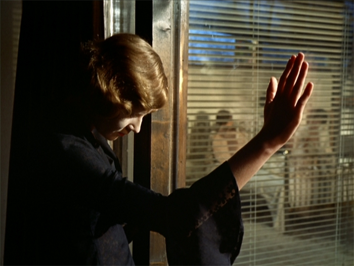
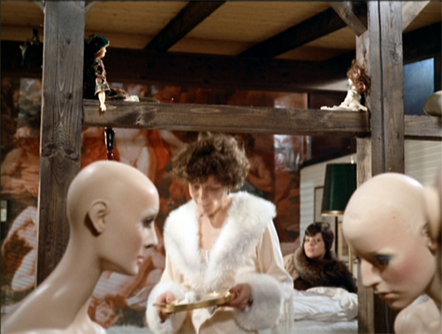
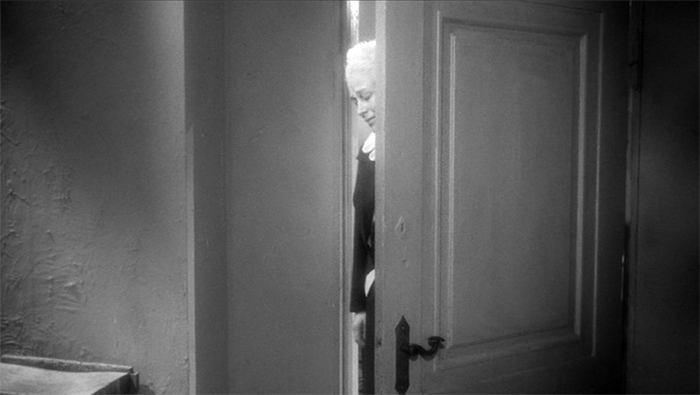
The Bitter Tears of Petra von Kant (1972).
Privacy is the seat of Contemplation, though sometimes made the recluse of Tentation… Be you in your Chambers or priuate Closets; be you retired from the eyes of men; thinke how the eyes of God are on you. Doe not say, the walls encompasse mee, darknesse o’re-shadowes mee, the Curtaine of night secures me… doe nothing priuately, which you would not doe publickly. There is no retire from the eyes of God.
Richard Brathwaite, The English Gentlewoman (1631)
DB here:
We’re in the midst of a wondrous national experiment: What will Americans do without sports? Movies come to fill the void, and websites teem with recommendations for lockdown viewing. Among them are movies about pandemics, about personal relationships, and of course about all those vistas, urban or rural, that we can no longer visit in person. (“Craving Wide Open Spaces? Watch a Western.”)
Cinema loves to span spaces. Filmmakers have long celebrated the medium’s power to take us anywhere. So it’s natural, in a time of enforced hermitage, for people to long for Westerns, sword and sandal epics, and other genres that evoke grandeur.
But we’re now forced to pay more attention to more scaled-down surroundings. We’re scrutinizing our rooms and corridors and closets. We’re scrubbing the surfaces we bustle past every day. This new alertness to our immediate surroundings may sensitize us to a kind of cinema turned resolutely inward.
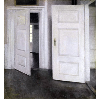
Long ago, when I was writing a book on Carl Dreyer, I was struck by a cross-media tradition that explored what you could express through purified interiors. I called it “chamber art.” In Western painting you can trace it back to Dutch genre works (supremely, Vermeer). It persisted through centuries, notably in Dreyer’s countryman Vilhelm Hammershøi (below).
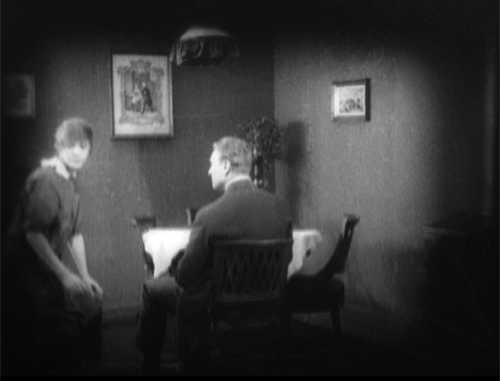
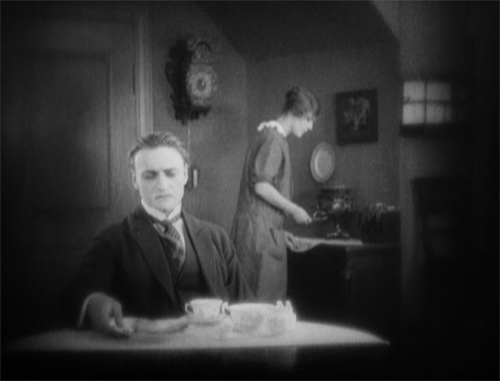
Plays were often set in single rooms, of course, but the confinement was made especially salient by Strindberg, who even designed an intimate auditorium. For cinema, the major development was the Kammerspielfilm, as exemplified in Hintertreppe (1921), Scherben (1921), Sylvester (1924), and other silent German classics. Kristin and I talk about this trend here and here.
In the book I argued that Dreyer developed a “chamber cinema,” in piecemeal form, in his first features before eventually committing to it in Mikael (1924) and The Master of the House (1925). Two People (1945) is the purest case in the Dreyer oeuvre: A couple faces a crisis in their marriage over the course of a few hours in their apartment. (Unfortunately, it doesn’t seem available with English subtitles.) But you can see, thanks to Criterion, how spatial dynamics formed a powerful premise of his later masterpieces Vampyr (1932), Day of Wrath (1943), Ordet (1955), and Gertrud (1964).
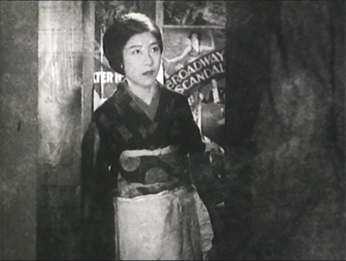
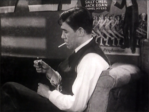
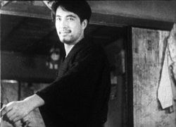
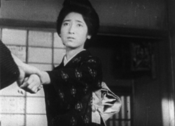
Dreyer wasn’t alone. Ozu tried out the format in That Night’s Wife (1930), swaddling a husband, wife, child, and detective in a clutter of dripping laundry and American movie posters.
Bergman exploited the premise too, in films like Brink of Life (1958), Waiting Women (1952), his 1961-1963 trilogy, and Persona (1966). (All can be streamed on Criterion.)
Chamber cinema became an important, if rare expressive option for many filmmaking traditions. Writers and directors set themselves a crisp problem–how to tell a story under such constraints?
The challenge is finding “infinite riches in a little room.” How? Well, you can exploit the spatial restrictiveness by confining us to what the inhabitants of the space know. Limiting story information can build curiosity, suspense, and surprise. You can also create a kind of mundane superrealism that charges everyday objects with new force.
On the other hand, you need to maintain variety by strategies of drama and stylistic handling. Chamber cinema–wherever it turns up–offers some unique filmic effects, and maybe sheltering in place is a good time to sample it.
Herewith a by no means comprehensive list of some interesting cinematic chamber pieces. For each title, I link to streaming services supplying it.
Bottles of different sizes
From David Koepp I learned that screenwriters call confined-space movies “bottle” plots. There’s a tacit rule: The audience understands that by and large the action won’t stray from a single defined interior. In a commentary track for the “Blowback” episode of the (excellent) TV show Justified, Graham Yost and Ben Cavell discuss how TV series plan an occasional bottle episode, and not just because it affords dramatic concentration. It can save time and money in production.
Usually the bottle consists of more than a single room. The classic Kammerspielfilms roam a bit within a household and sometimes stray outdoors. But their manner of shooting provides a variety of angles that suggest continuing confinement. Dreyer went further in The Master of the House. He built a more or less functioning apartment as the set, then installed wild walls that let him flank the action from any side. Then editing could provide a sense of wraparound space.
The variations in camera setups throughout the film are extraordinary. Dreyer would create more radically fragmentary chamber spaces in La Passion de Jeanne d’Arc (1928), while his later films would use solemn, arcing camera movements to achieve a smoother immersive effect. (For more on Dreyer’s unique spatial experimentation, here’s a link to my Criterion contribution on Master of the House. I talk about the tricks Dreyer plays with chamber space in Vampyr in an “Observations” supplement on the Criterion Channel.)
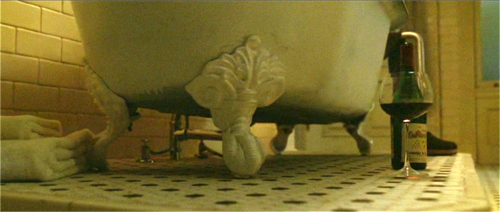
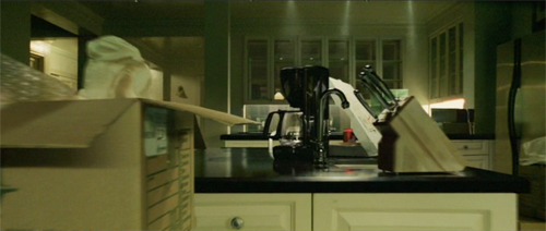
Likewise, Koepp’s screenplay for Panic Room allows David Fincher to move 360 degrees through several areas of a Manhattan brownstone. The film also offers a fine example of how our awareness of domestic details gets sharpened by a creeping camera.
Trust Fincher to find sinister possibilities in a dripping bathtub leg and a kitchen island.
Confined to quarters
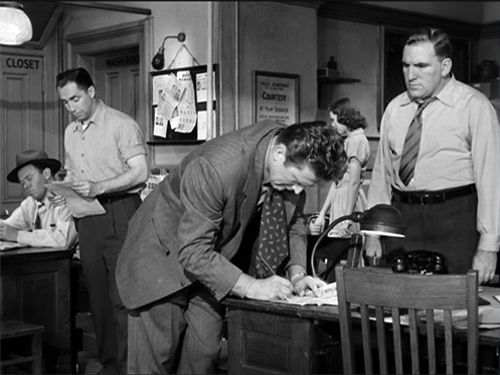
Detective Story (1951).
Many chamber movies are based on plays, as you’d expect. Unlike most adaptations, though, they don’t try to “ventilate” the play by expanding the field of action. Or rather, as André Bazin pointed out, the expansion is itself fairly rigorous. They don’t go as far afield as they might.
Bazin praised Cocteau’s 1948 version of his play Les parents terribles (aka “The Storm Within”) for opening up the stage version only a little, expanding beyond a single room to encompass other areas of the apartment. This retained the claustrophobia, and the sense of theatrical artifice, but it spread action out in a way that suited cinema’s urge to push beyond the frame. The freedom of staging and camera placement is thoroughly “cinematic” within the “theatrical” premise.
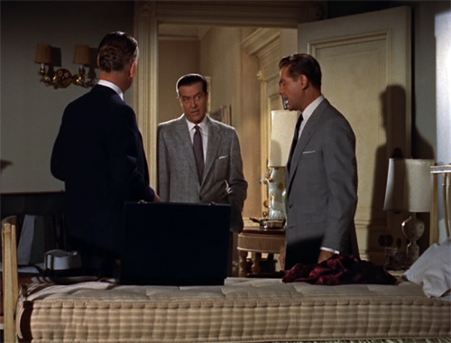
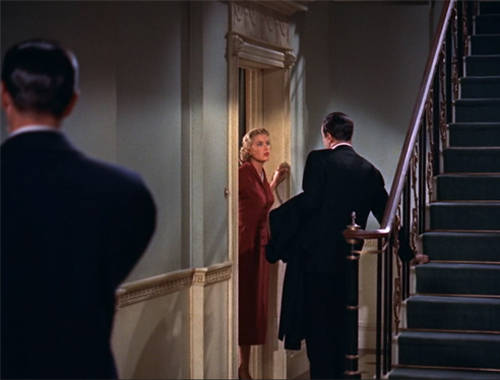
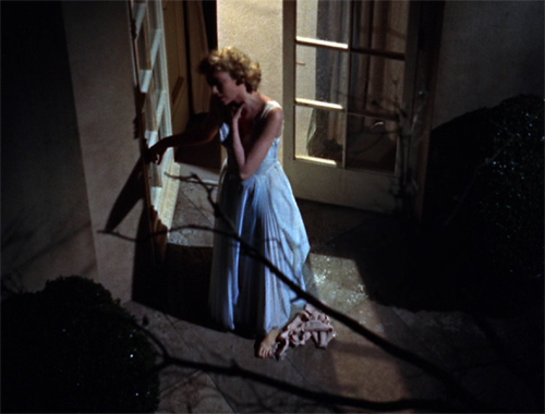
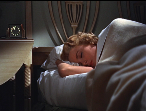
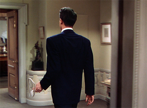
Depending on how you count, Hitchcock expanded things a bit in his adaptation of Dial M for Murder. Apart from cutting away to Tony at his club, Hitchcock moved beyond the parlor to the adjacent bedroom, the building’s entryway, and the terrace.
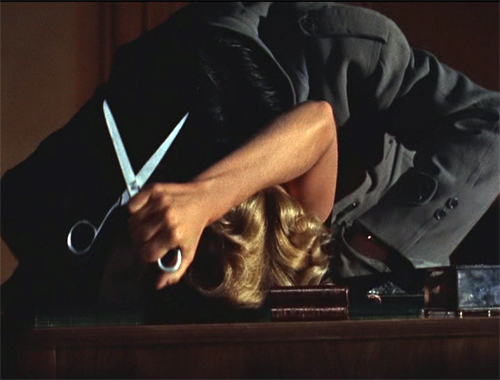
An earlier entry on this site talks about how 3D let Sir Alfred give an ominous accent to props: a particularly large pair of scissors, and a more minor item like the bedside clock.
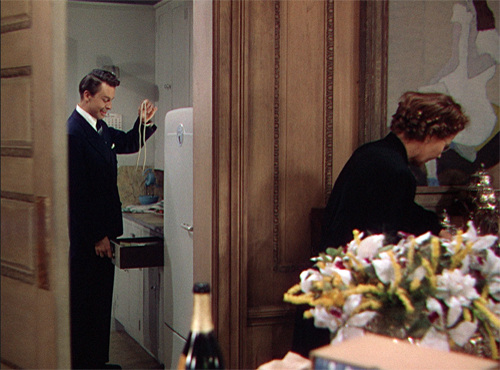
Hitchcock gave us a parlor and a hallway in Rope (1948), but when Brandon flourishes the murder weapon, the framing audaciously reminds us that we aren’t allowed to go into the kitchen.
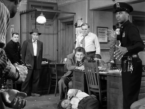
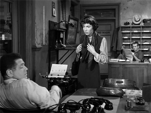
Bazin did not wholly admire William Wyler’s Detective Story (1951), despite its skill in editing and performances; he found it too obedient to a mediocre play. True, the film doesn’t creatively transform its source to the degree that Wyler’s earlier adaptation of The Little Foxes (1941) did; Bazin wrote a penetrating analysis of that film’s remarkable turning point. Detective Story is more obedient to the classic unities, confining nearly all of the action to the precinct station. Although I don’t think Wyler ever shows the missing fourth wall, he creates a dazzling array of spatial variants by layering and spreading out zones of the room. In his prime, the man could stage anything fluently.
As Bazin puts it: “One has to admire the unequaled mastery of the mise-en-scène, the extraordinary exactness of its details, the dexterity with which Wyler interweaves the secondary story lines into the main action, sustaining and stressing each without ever losing the thread.”
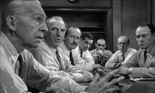
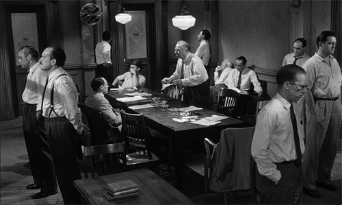
Some films are even more constrained. 12 Angry Men (1957), adapted from a teleplay, is a famous example. Once the jury leaves the courtroom, the bulk of the film drills down on their deliberation. Again, the director wrings stylistic variations out of the situation; Lumet claims he systematically ran across a spectrum of lens lengths as the drama developed.
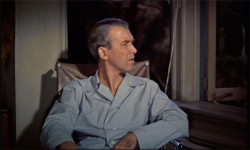
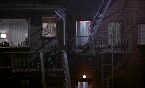
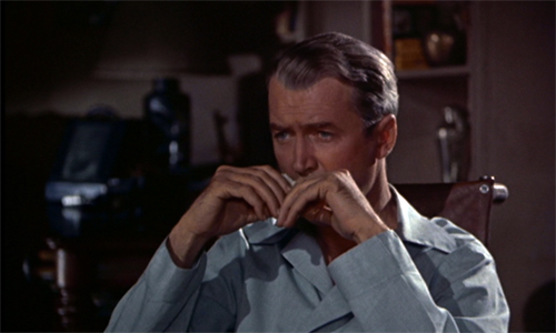
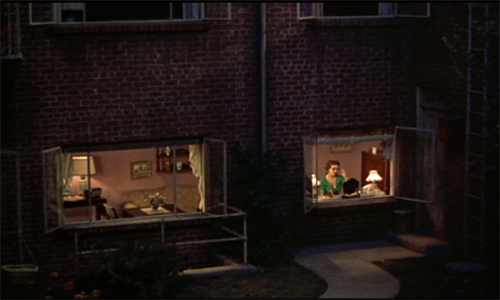
But you don’t need a theatrical alibi to draw tight boundaries around the action. Rear Window (1954), adapted from a fairly daring Cornell Woolrich short story, is as rigorous an instance of chamber cinema as Rope. Here Hitchcock firmly anchors us in an apartment, but he uses optical POV to “open out” the private space.
With all its apertures the courtyard view becomes a sinister/comic/melancholy Advent calendar.
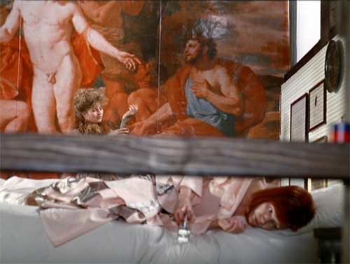
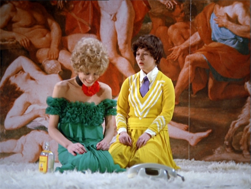
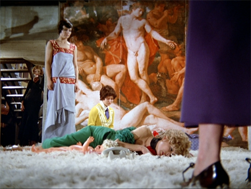
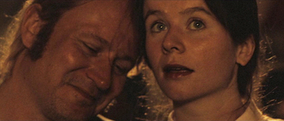
Fassbinder’s Bitter Tears of Petra von Kant (1972) denies us this wide vantage point on the outside world. This space seems almost completely enclosed. But Fassbinder finds a remarkable number of ways to vary the set, the camera angles, and the costumes. We’re immersed in the flamboyant flotsam of several women’s lives. The result is a cascade of goofily decadent pictorial splendors.
It’s virtually a convention of these films to include a few shots not tied to the interiors. At the end, we often get a sense of release when finally the characters move outside. That happens in 12 Angry Men, in Panic Room, in Polanski’s Carnage (2011) , and many of my other examples. Without offering too many spoilers, let’s say Room (2015) makes architectural use of this option.
On the road and on the line
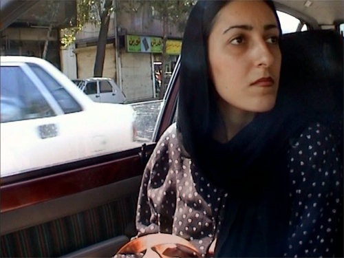
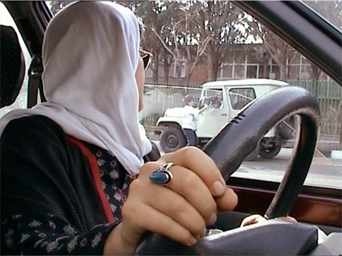
Filmmakers have willingly extended the bottle concept to cars. The most famous example is probably Kiarostami’s Ten (2002), which secures each scene in a vehicle and mixes and matches the passengers across episodes. The strictness of Kiarostami’s camera setups exploit the square video frame and always yield angular shot/reverse shots. They reveal how crisp depth relations can be activated through the passing landscape or in story elements that show up in through the window.
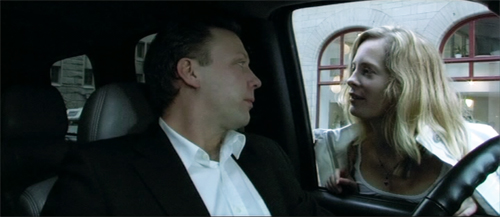
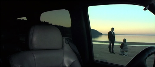
Perhaps Kiarstami’s example inspired Danish-Swedish filmmaker Simon Staho. His Day and Night (2004) traces a man visiting key people on the last day of his life, and we are stuck obstinately in the car throughout. This provides some nifty restriction, most radically when we have to peer at action taking place outside.
Staho’s Bang Bang Orangutang (2005), a portrait of a seething racist, takes up the same premise but isn’t quite so rigorous. We do get out a bit, but the camera stays pretty close to the car. I discuss Staho’s films a little in a very old entry.
Like autos, telephones provide a nice motivation for the bottle, as Lucille Fletcher discovered when she wrote the perennial radio hit, “Sorry, Wrong Number.” The plot consists of a series of calls placed by the bedridden woman, who overhears a murder plot. The film wasn’t quite so stringently limited, but the effect is of the protagonist at the center of several crisscrossed intrigues.
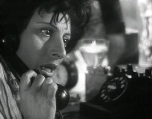
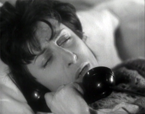
A purer case is the Rossellini film Una voce umana (1948), in which a desperate woman frantically talks with her lover. It relies on intense close-ups of its one player, Anna Magnani.
It’s an adaptation of a Cocteau play, which Poulenc turned into a one-act opera. In all, the duration of the story action is the same as the running time.
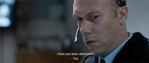
I wish Larry Cohen’s Phone Booth displayed a similarly obsessive concentration, but we do have the Danish thriller The Guilty, where a police dispatcher gets involved in more than one ongoing crime. We enjoyed seeing it at the 2018 Wisconsin Film Festival.
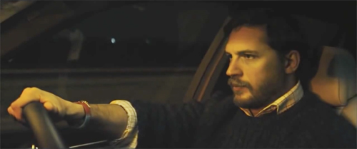
And of course car and phone can be combined, as they are in Locke (2013)–another play adaptation. Tom Hardy plays a spookily calm businessman driving to a deal while taking calls from his family and his distraught mistress. Those characters remain voices on the line while he tries to contend with the pressures of his mistakes.
House arrest, arresting houses
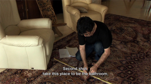
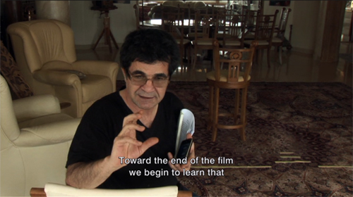
Sometimes you must embrace the chamber aesthetic. In 2010 the fine Iranian director Jafar Panahi was forbidden to make films and subjected to house arrest. Yet he continued to produce–well, what? This Is Not a Film (2012) was shot partially on a cellphone within (mostly) his apartment.
Wittily, he tapes out a chamber space within his apartment. Then he reads a script to indicate how absent actors could play it and how an imaginary camera could shoot it.
But his imaginary film still isn’t an actual film, so he hasn’t violated the ban. So perhaps what we have is rather a memoir, or a diary, or a home video? Panahi’s virtual film (that isn’t a film) exists within another film that isn’t a film. Yet it played festivals and circulates on disc and streaming. The absurdity, at once touching and pointed, suggests that through playful imagination, the artist can challenge censorship.
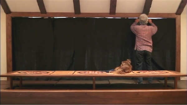
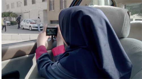
Panahi slyly pushed against the boundaries again with Closed Curtain (2013, above). Shot in his beach house, it strays occasionally outside. Next came Taxi (2015), in which Panahi took up the auto-enclosed chamber movie, with largely comic results.
More recently, he has somehow managed to make a more orthodox film, 3 Faces (2018), which considers the situation of people in a remote village.
The chamber-based premise needn’t furnish a whole movie. As in Room, Kurosawa’s High and Low (1963) is tightly concentrated in its first half. We are in two enclosures, a house and a train. The film then bursts out into a rushed, wide-ranging investigation. Large-scale or less, the chamber strategy remains a potent cinematic force.
They say that the last creatures to discover water will be fish. We move through our world taking our niche for granted. Cinema, like the other arts, can refocus our attention on weight and pattern, texture and stubborn objecthood. We can find rich rewards in glimpses, partial views, and little details. Chamber art has an intimacy that’s at once cozy and discomfiting. Seeing familiar things in intensely circumscribed ways can lift up our senses.
So take a break from the crisis and enjoy some art. But return to the world knowing that for Americans this catastrophe is the result of forty years of monstrous, gleeful Republican dismantling of our civil society. Rebuilding such a society will require the elimination of that party, and the career criminal at its head, as a political force. This pandemic must not become our Reichstag fire.
Yeah, I went there.
Thanks to the John Bennett, Pauline Lampert, Lei Lin, Thomas McPherson, Dillon Mitchell, Erica Moulton, Nathan Mulder, Kat Pan, Will Quade, Lance St. Laurent, Anthony Twaurog, David Vanden Bossche, and Zach Zahos. They’re students in my seminar, and they suggested many titles for this blog entry.
Bazin’s comments on Detective Story come in his 1952 Cannes reportage, published as items 1031-1033, and as a review (item 1180), in Écrits complets vol. I, ed. Hervé Joubert-Laurencin (Paris: Macula, 2018), pp. 918-922, 1059. My quotation comes come from the review, where he does grant that Wyler is the Hollywood filmmaker “who knows his craft best. . . . the master of the psychological film.”
The tableau style of the 1910s probably helped shift Dreyer toward the chamber model, which he learned to modify through editing. I discuss Dreyer’s relation to that style in “The Dreyer Generation” on the Danish Film Institute website. Also related is the web essay, “Nordisk and the Tableau Aesthetic.”
Some other examples could be mentioned, but I didn’t find them on streaming services in the US. It would be nifty if you could see the tricks with chamber space in Dangerous Corner (1934); fortunately it plays fairly often on TCM. There’s also Duvivier’s Marie-Octobre (1959), a tense drama about the reunion of old partisans.
I especially like the 1983 Iranian film, The Key, directed by Ebrahim Forouzesh and scripted by Kiarostami. It’s a charming, nearly wordless story of how a little boy tries to manage household crises when Mother is away. It has the gripping suspense that is characteristic of much Iranian cinema, and the boy emerges as resourceful and heroic (though kind of messy). Kids would like it, I think.
Also, I’ve neglected Asian instances. Maybe I’ll revisit this topic after a while.
P.S. 1 April 2020: Thanks to Casper Tybjerg, outstanding Dreyer scholar, for corrections about the nationality of The Guilty and the Staho films.
Gertrud (1964).
Is there a blog in this class? 2018
24 Frames (2017)
Kristin here:
David and I started this blog way back in 2006 largely as a way to offer teachers who use Film Art: An Introduction supplementary material that might tie in with the book. It immediately became something more informal, as we wrote about topics that interested us and events in our lives, like campus visits by filmmakers and festivals we attended. Few of the entries actually relate explicitly to the content of Film Art, and yet many of them might be relevant.
Every year shortly before the autumn semester begins, we offer this list of suggestions of posts that might be useful in classes, either as assignments or recommendations. Those who aren’t teaching or being taught might find the following round-up a handy way of catching up with entries they might have missed. After all, we are pushing 900 posts, and despite our excellent search engine and many categories of tags, a little guidance through this flood of texts and images might be useful to some.
This list starts after last August’s post. For past lists, see 2007, 2008, 2009, 2010, 2011, 2012, 2013, 2014, 2015, 2016, and 2017.
This year for the first time I’ll be including the video pieces that our collaborator Jeff Smith and we have since November, 2016, been posting monthly on the Criterion Channel of the streaming service FilmStruck. In them we briefly discuss (most run around 10 to 14 minutes) topics relating to movies streaming on FilmStruck. For teachers whose school subscribes to FilmStruck there is the possibility of showing them in classes. The series of videos is also called “Observations on Film Art,” because it was in a way conceived as an extension of this blog, though it’s more closely keyed to topics discussed in Film Art. As of now there are 21 videos available, with more in the can. I won’t put in a link for each individual entry, but you can find a complete index of our videos here. Since I didn’t include our early entries in my 2017 round-up, I’ll do so here.
As always, I’ll go chapter by chapter, with a few items at the end that don’t fit in but might be useful.
[July 21, 2019: In late November, 2018, the Filmstruck streaming service ceased operation. On April 8, 2019, it was replaced by The Criterion Channel, the streaming service of The Criterion Collection. All the Filmstruck videos listed below appear, with the same titles and numbers, in the “Observations on Film Art” series on the new service. Teachers are welcome to stream these for their classes with a subscription.]
Chapter 3 Narrative Form
David writes on the persistence of classical Hollywood storytelling in contemporary films: “Everything new is old again: Stories from 2017.”
In FilmStruck #5, I look at the effects of using a child as one of the main point-of-view figures in Victor Erice’s masterpiece: “The Spirit of the Beehive–A Child’s Point of View”
In FilmStruck #13, I deal with “Flashbacks in The Phantom Carriage.”
FilmStruck #14 features David discussing classical narrative structure in “Girl Shy—Harold Lloyd Meets Classical Hollywood.” His blog entry, “The Boy’s life: Harold Lloyd’s GIRL SHY on the Criterion Channel” elaborates on Lloyd’s move from simple slapstick into classical filmmaking in his early features. (It could also be used in relation to acting in Chapter 4.)
In FilmStruck #17, David examines “Narrative Symmetry in Chungking Express.”
Chapter 4 The Shot: Mise-en-Scene
In choosing films for our FilmStruck videos, we try occasionally to highlight little-known titles that deserve a lot more attention. In FilmStruck #16 I looks at the unusual lighting in Raymond Bernard’s early 1930s classic: “The Darkness of War in Wooden Crosses.”
FilmStruck #3: Abbas Kiarostami is noted for his expressive use of landscapes. I examine that aspect of his style in Where Is My Friend’s Home? and The Taste of Cherry: “Abbas Kiarostami–The Character of Landscape, the Landscape of Character.”
Teachers often request more on acting. Performances are difficult to analyze, but being able to use multiple clips helps lot. David has taken advantage of that three times so far.
In FilmStruck #4, “The Restrain of L’avventura,” he looks at how staging helps create the enigmatic quality of Antonionni’s narrative.
In FilmStruck #7, I deal with Renoir’s complex orchestration of action in depth: “Staging in The Rules of the Game.”
FilmStruck #10, features David on details of acting: “Performance in Brute Force.”
In Filmstruck #18, David analyses performance style: “Staging and Performance in Ivan the Terrible Part II.” He expands on it in “Eisenstein makes a scene: IVAN THE TERRIBLE Part 2 on the Criterion Channel.”
FilmStruck #19, by me, examines the narrative functions of “Color Motifs in Black Narcissus.”
Chapter 5 The Shot: Cinematography
A basic function of cinematography is framing–choosing a camera setup, deciding what to include or exclude from the shot. David discusses Lubitsch’s cunning play with framing in Rosita and Lady Windermere’s Fan in “Lubitsch redoes Lubitsch.”
In FilmStruck #6, Jeff shows how cinematography creates parallelism: “Camera Movement in Three Colors: Red.”
In FilmStruck 21 Jeff looks at a very different use of the camera: “The Restless Cinematography of Breaking the Waves.”
Chapter 6 The Relation of Shot to Shot: Editing
David on multiple-camera shooting and its effects on editing in an early Frank Capra sound film: “The quietest talkie: THE DONOVAN AFFAIR (1929).”
In Filmstruck #2, David discusses Kurosawa’s fast cutting in “Quicker Than the Eye—Editing in Sanjuro Sugata.”
In FilmStruck #20 Jeff lays out “Continuity Editing in The Devil and Daniel Webster.” He follows up on it with a blog entry: “FilmStruck goes to THE DEVIL”,
Chapter 7 Sound in the Cinema
In 2017, we were lucky enough to see the premiere of the restored print of Ernst Lubitsch’s Rosita (1923) at the Venice International Film Festival in 2017. My entry “Lubitsch and Pickford, finally together again,” gives some sense of the complexities of reconstructing the original musical score for the film.
In FilmStruck #1, Jeff Smith discusses “Musical Motifs in Foreign Correspondent.”
Filmstruck #8 features Jeff explaining Chabrol’s use of “Offscreen Sound in La cérémonie.”
In FilmStruck #11, I discuss Fritz Lang’s extraordinary facility with the new sound technology in his first talkie: “Mastering a New Medium—Sound in M.”
Chapter 8 Summary: Style and Film Form
David analyzes narrative patterning and lighting Casablanca in “You must remember this, even though I sort of didn’t.”
In FilmStruck #10, Jeff examines how Fassbender’s style helps accentuate social divisions: “The Stripped-Down Style of Ali Fear Eats the Soul.”
Chapter 9 Film Genres
David tackles a subset of the crime genre in “One last big job: How heist movies tell their stories.”
He also discusses a subset of the thriller genre in “The eyewitness plot and the drama of doubt.”
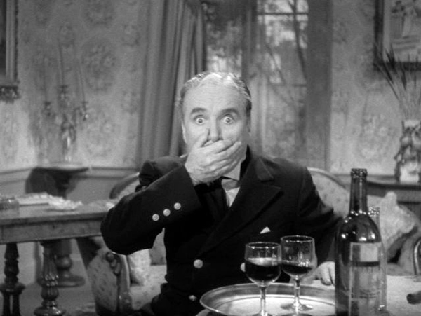
FilmStruck #9 has David exploring Chaplin’s departures from the conventions of his familiar comedies of the past to get serious in Monsieur Verdoux: “Chaplin’s Comedy of Murders.” He followed up with a blog entry, “MONSIEUR VERDOUX: Lethal Lothario.”
In Filmstruck entry #15, “Genre Play in The Player,” Jeff discusses the conventions of two genres, the crime thriller and movies about Hollywood filmmaking, in Robert Altman’s film. He elaborates on his analysis in his blog entry, “Who got played?”
Chapter 10 Documentary, Experimental, and Animated Films
I analyse Bill Morrison’s documentary on the history of Dawson City, where a cache of lost silent films was discovered, in “Bill Morrison’s lyrical tale of loss, destruction and (sometimes) recovery.”
David takes a close look at Abbas Kiarostami’s experimental final film in “Barely moving pictures: Kiarostami’s 24 FRAMES.”
Chapter 11 Film Criticism: Sample Analyses
We blogged from the Venice International Film Festival last year, offering analyses of some of the films we saw. These are much shorter than the ones in Chapter 11, but they show how even a brief report (of the type students might be assigned to write) can go beyond description and quick evaluation.
The first entry deals with the world premieres of The Shape of Water and Three Billboards outside Ebbing, Missouri and is based on single viewings. The second was based on two viewings of Argentine director Lucretia Martel’s marvelous and complex Zama. The third covers films by three major Asian directors: Kore-eda Hirokazu, John Woo, and Takeshi Kitano.
Chapter 12 Historical Changes in Film Art: Conventions and Choices, Traditions and Trends
My usual list of the ten best films of 90 years ago deals with great classics from 1927, some famous, some not so much so.
David discusses stylistic conventions and inventions in some rare 1910s American films in “Something familiar, something peculiar, something for everyone: The 1910s tonight.”
I give a rundown on the restoration of a silent Hollywood classic long available only in a truncated version: The Lost World (1925).
In teaching modern Hollywood and especially superhero blockbusters like Thor Ragnarok, my “Taika Waititi: The very model of a modern movie-maker” might prove useful.
Etc.
If you’re planning to show a film by Damien Chazelle in your class, for whatever chapter, David provides a run-down of his career and comments on his feature films in “New colors to sing: Damien Chazelle on films and filmmaking.” This complements entries from last year on La La Land: “How LA LA LAND is made” and “Singin’ in the sun,” a guest post featuring discussion by Kelley Conway, Eric Dienstfrey, and Amanda McQueen.
Our blog is not just of use for Film Art, of course. It contains a lot about film history that could be useful in teaching with our other textbook. In particular, this past year saw the publication of David’s Reinventing Hollywood: How 1940s Filmmakers Changed Hollywood Storytelling. His entry “REINVENTING HOLLYWOOD: Out of the past” discusses how it was written, and several entries, recent and older, bear on the book’s arguments. See the category “1940s Hollywood.”
Finally, we don’t deal with Virtual Reality artworks in Film Art, but if you include it in your class or are just interested in the subject, our entry “Venice 2017: Sensory Saturday; or what puts the Virtual in VR” might be of interest. It reports on four VR pieces shown at the Venice International Film Festival, the first major film festival to include VR and award prizes.
Monsieur Verdoux (1947)
Barely moving pictures: Kiarostami’s 24 FRAMES
24 Frames (2017).
DB here:
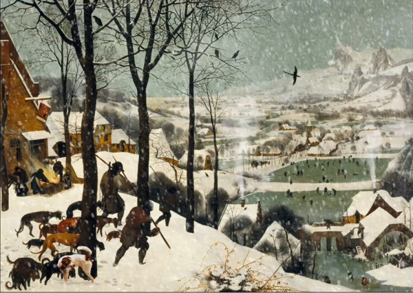
It might seem an act of vandalism. To overwrite one of the world’s most famous paintings, the elder Pieter Bruegel’s Hunters in the Snow, with digital effects could be condemned as vulgar at best and scandalous at worst. In the lower left, we see a dog pissing on a tree. Yet no one ever accused the late Abbas Kiarostami of bad taste. Of weirdness, yes: His Lumière tribute (1995) consisted of a close-up of a frying egg.
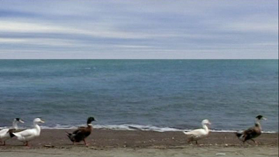
Eggs aside, Kiarostami’s experiments mostly have a stubborn stringency. He made a film wholly out of reaction shots, and another out of static takes of landscapes. Yet neither was an arid exercise. Shirin (2008) yielded poignancy as it let us study women responding to a romantic spectacle (film? theatre piece?). The minimalist Five Dedicated to Ozu (2003) was at once meditative and sensuous, speckled with moments of relaxed humor (the parade of the ducks) and building to a curious suspense, as we stare at brackish water trembling in a downpour.
So when the first segment of Kiarostami’s 24 Frames (2017) decorates Bruegel’s masterwork, we ought to expect that something’s up. The explanation offered in the film’s prologue is that the filmmaker is curious about what happens around the instant portrayed in the image.
For 24 Frames I started with famous paintings but then switched to photos I had taken through the years. I included about four and a half minutes of what I imagined might have taken place before or after each image that I had captured.
This declaration, apparently opposed to Cartier-Bresson’s doctrine of the “decisive moment,” leaves creative wiggle room. Kiarostami and his colleagues used digital manipulation to alter his stills, adding layers of figures and movements.
But how do we determine the punctual instant of each of the twenty-four shots? What’s the before or after? Many shots contain several moments of pause that might be the original frozen moment, but Kiarostami doesn’t give them special emphasis. After the Bruegel, we get twenty-three gradually changing natural scenes, nearly all mini-narratives based on stasis, rhythmic cycles, hesitations, and bursts of action. Five showed Kiarostami venturing into the territory of Structural Film, and especially the open-air tendency mastered by James Benning. With 24 Frames we get that monumental impulse recast by photorealistic animation: landscapes teased into little stories by the miracle of rendering, mo-cap, and drag-and-drop.
The birds and the beasts were there
The Bruegel is defaced for a reason. The original painting lays out strategies that the following sequences will pursue. Human bodies will play a subsidiary role; they appear in only two sequences, and, like Bruegel’s hunters, they are mostly turned away from us. We’ll also see snow, birds, dogs, trees, a scraggly bush, and water (the frozen pond). Just as important, Bruegel’s composition warns us how to watch. He draws our eye into the distance, and there lots of tiny figures will grace the scenes ahead.
Kiarostami’s decorations insert more previews. He introduces a herd of cows, blatantly fake falling snow, smoke that prepares us for mist and cloud formations. Dogs and birds are set into motion and given sounds; we’ll spend a lot of time tracking these vagrant creatures, and their cries will help us navigate the frames. The revised painting becomes a matrix of pictorial and auditory motifs that will be combined and varied throughout the movie.
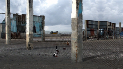
Eventually the landscapes will include a wider menagerie, including lions and horses. At one point a duck seems to size up a possible mate, who approaches from the distance.
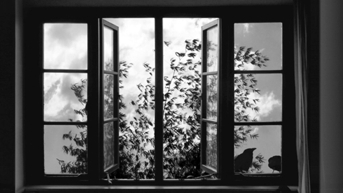
As here, most shots are centered, with the primary action taking place in the central third and sometimes accentuated by an aperture. The apertures often get geometrical. After several open landscape shots, the sixth sequence introduces a major compositional formula–the grid, typically a window, that will striate and cross-hatch our view. It yields a sort of Advent-calendar effect, as we follow birds or beasts hopping from one cell to another.
More variation: Most of the shots are planimetric. The camera is fixed at right angles to a background plane, and figures move horizontally. As the film goes along, though, an oblique angle may show up, as with the duck courtship. Kiarostami applied planimetric framing brilliantly in Through the Olive Trees (1994), but there too it interacted dynamically with less rigid compositions.
Maybe this is Kiarostami’s real Lumière homage. As in the earliest staged films, the single shot is given a simple arc. Figures arrive in the frame, do something, then depart. But sound is tremendously important too. Quiet activity is interrupted by brusque action–too often, a gunshot. More than you might expect, violence provides a spike of action before calm returns.
What holds these crisp, gorgeous shots together? Pairings, for one thing. The creatures we see often become couples. Lions mate, birds scrap with each other, ducks flirt, deer double up, and one gull mourns a fallen companion. Yes, I’m indulging in anthropomorphism. This movie firmly encourages you to try mind-reading Nature’s kingdom.
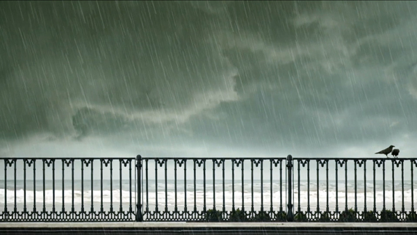
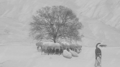
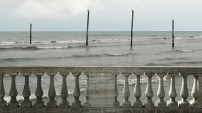
There’s a trace of surrealism. Some dreamlike images, impossibly hard-edged, are reminiscent of Rousseau. Sheep in a snowstorm huddle while a dog stares out at us and a wolf prowls in the distance. You might think of Paul Delvaux when you see a balustrade that has been built athwart rolling surf, as gulls squat placidly on the poles beyond.
Not least, I think, Kiarostami is responding to one problem of digital cinema–the way that a fixed digital shot makes certain portions of the frame go dead. Photographic film keeps the whole frame nervous, thanks to its teeming granular structure, but image compression simply reiterates “unchanging” information until something moves. When an area doesn’t harbor motion, it looks like a slice of stillness.
Kiarostami exploits this feature of the medium. Again and again, his image seems preternaturally frozen, a nature morte, before it twitches back to life. The effect, to recall his before-and-after idea, is of a still image reanimated. An inert animal seems dead to the world before we detect a breath or a shift of position. The most striking example seems to me the soft silhouette of a bird, a mere lump for seconds on end.
Rudolf Arnheim would have loved the fluid play of Gestalts that this simple composition arouses.
To show you more would spoil the pleasures of this delightful, melancholic, rapturous film. Let’s just say that it ends with a human figure slumped over and turned from us while the wind shakes trees outside a window. Warmth and drowsiness inside, a mild tempest outdoors. But in that same shot, a radiant human face, brought to slow-motion life, turns to us before it surrenders to a kiss. The fact that the face belongs to Teresa Wright, in one of the greatest films of the 1940s, ends Kiarostami’s career on a note of gentle jubilation.
Thanks to Brian Belovarac of Janus Films for help with this entry. Thanks as well to Jim Healy, Mike King, and Ben Reiser of the Wisconsin Cinematheque.
24 Frames is being circulated to theatres and museums; please try to see it on the big screen, where all the little details can pop out at you. Eventually, it will show up on disc and FilmStruck‘s Criterion Channel.
For background on the making of the film, see the Janus press page. Imogen Sara Smith offers a sensitive appreciation in “In Our Time: Abbas Kiarostami’s 24 Frames” on the Film Comment site. For more on Kiarostami, including Certified Copy (2010), see our blog’s tag. I discuss his planimetric approach in Through the Olive Trees in On the History of Film Style, soon to appear on this site in an updated pdf.
24 Frames.
Watch again! Look well! Look! (For Ozu)
Okada Mariko and Tsukasa Yoko with Ozu, on the set of Late Autumn (1960).
DB here:
Ozu was born on 12 December (in 1903) and died on 12 December (in 1963). He has been gone fifty years, yet his films are as fresh, inviting, funny, and moving as ever. As chance would have it, my book Ozu and the Poetics of Cinema was published twenty-five years ago. Two events of the past few months have brought me back to him.
First, my biannual summer course in Antwerp, held under the auspices of the Flemish Film Foundation, was focused on him. As I’ve explained in earlier years (2011, 2009, 2007), at this Summer Movie Camp, across a week we immerse ourselves in films and wrap lectures around them. It was a joy to see a dozen of his films, mostly in good 35mm prints. Our sessions provided an occasion for me to rethink some things I said in the book, as well as to notice more about how these dazzling, apparently simple films work and work upon us. I learned as well from the comments and questions of many of the participants. The whole experience didn’t shift my opinion, stated on an earlier Ozu anniversary, that “no director has come closer to perfection.”
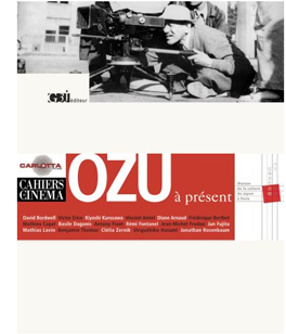 The second occasion: Two enterprising Ozuphiles have just published a collection of essays, Ozu à présent (Paris: G3j publishers). Diane Arnaud and Mathias Lavin have worked very hard for several years gathering pieces from filmmakers (Erice, Kurosawa Kyoshi) and critics like Hasumi, Frodon, Rosenbaum, and Jun Furita Hirose. Many other contributors have previously written on the director: Basile Doganis (Le Silence dans le cinéma d’Ozu), Benjamin Thomas (essays for Positif), and Clélia Zernik (Perception-cinéma). As for the editors, Diane has books on Sokurov and Kurosawa Kyoshi, while Mathias has written on Oliveira and art history generally. The entire collection is stimulating and beautifully produced.
As the title indicates, it’s centrally about Ozu’s continuing influence on modern cinema. I was asked to contribute a preface, which Diane and Mathias have kindly allowed me to reproduce below in revised form. I’m now chiefly aware of what I neglected (no mention of Wenders’ Tokyo-Ga) and didn’t know about (for instance, Claire Denis’ admiration for Ozu). These and many other matters are taken up by the book’s contributors. But I think my piece may be of interest as a small update of my Ozu book.
In 1988, most of Ozu’s surviving films weren’t easy to access. Things have changed. And since I wrote the essay, virtually all the extant work has appeared on DVD, on cable television, and in the Criterion collection on Hulu Plus. As his films become more and more familiar, we can expect ever-greater acknowledgment of his centrality. Already, the 2012 Sight and Sound poll of critics put Tokyo Story just below Vertigo and Citizen Kane; the directors’ poll put it at the very top.
Why not watch an Ozu film today? Go beyond Tokyo Story, fine as it is, to Early Summer, Passing Fancy, Brothers and Sisters of the Toda Family, An Autumn Afternoon, The Only Son, The Flavor of Green Tea over Rice, Ohayo, Diary of a Tenement Gentleman, What Did the Lady Forget?, Dragnet Girl, Where Now Are the Dreams of Youth?, I Was Born, But… and on and on.
Catching up with Ozu
Ozu is a major presence in today’s international film culture. When I began seeing his work in the early 1970s, about half a dozen Ozu movies were in circulation, and of those only Tokyo Story was known to nonspecialist cinephiles. As late as the 1980s, I had to travel to archives in Europe and the US to see his rarer films. Now even the most obscure early 1930s titles are issued on DVD, and the films have been widely distributed in touring packages. They are screened all over the world, a process lovingly recorded on Twitter. Ozu is better known to a broad public than Mizoguchi Kenji is—an ironic turn of affairs, given that in many countries Mizoguchi gained fame during the 1950s and 1960s, when Ozu was unknown.
Even more famous throughout the west was, of course, Kurosawa Akira. His influence on mainstream cinema has been robust and pervasive. If slow-motion violence has become a convention in American films since Bonnie and Clyde, that is directly traceable to the director of Seven Samurai. The use of very long lenses to cover a scene, common in American cinema of the 1960s and thereafter, owes a great deal to Kurosawa’s strategies in films like I Live in Fear and Red Beard. Editing on the camera axis for visceral impact, a Kurosawa signature technique, has bumped up the visual excitement in many American action pictures.
Ozu has not had such a direct influence. He is much less easy to assimilate. With few exceptions, his signature style has been far less imitated, and it has even been misunderstood. His effect on modern cinema, it seems to me, has been far more oblique, with directors paying him tribute in discreet, sometimes unexpected ways.
Brand Ozu
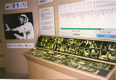
Ozu wing, Kamakura Cinema World, 1996.
Ozu was careful to mark his uniqueness. He designed his films to be sharply different from those of his contemporaries. His home base, the Shochiku studio, encouraged directors to develop personal styles, and he was allowed to make artistic choices that could only be considered eccentric. At first glance, Ozu’s films may seem to melt into a broader idea of “Japanese artistic culture,” but the more films we see by his colleagues, the more idiosyncratic his works look.
Having allowed Ozu to make such singular films, Shochiku has exacted a reciprocal obligation: his legacy now serves as a trademark for a film studio. For the world at large, Japanese cinema consists of Kurosawa and Toho studios’ Godzilla, Nikkatsu action, and anime. Shochiku had its tradition of modest, humane dramas of working-class and middle-class people, treated with that mixture of humor and tears known as the “Kamata flavor” (after the Tokyo suburb where the studio was located). That tradition was sustained by Ozu and his colleagues through the 1950s as a brand identity. The forty-eight Tora-san films (Otoko wa tsurai yo, “It’s Tough to Be a Man”) became what we’d call a frachise for Shochiku from 1969 through 1996.
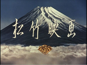
But as media became globalized, and as merchandising became central to sustaining filmmaking, Shochiku’s product came to seem narrowly local. Accordingly, the firm turned its attention to its most famous employee. Shochiku’s familiar postwar logo, a view of Mount Fuji, had become for westerners part of Ozu’s iconography.
Now Shochiku tried to reclaim its trademark by reminding viewers that he belonged to a bigger family.
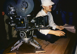
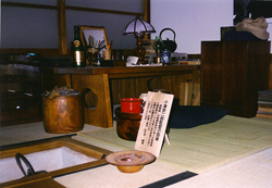
For the local market, Shochiku tried a bit of merchandising, such as phone cards with scenes from Ozu movies. More ambitiously, there was Shochiku Kamakura Cinema World, a theme park established in 1995 at a cost of $125 million. It held many attractions devoted to American cinema, and it even allowed customers to visit a movie in the making, but one wing was devoted to Shochiku’s legacy properties, including a replica of a street from the Tora-san series. There were as well Ozu memorabilia, including a three-dimensional tableau of an effigy Ozu directing a scene in Tokyo Story. The adjacent vitrine housed a reconstruction of his work area at home, complete with whisky bottle and bright red rice kettle.
Cinema World closed in 1998, a financial failure. But Shochiku persisted and declared in 2003 that it would host a worldwide celebration of Ozu’s hundredth anniversary. That celebration consisted of a new touring program of 35mm prints of his films, with ancillary ceremonies and festival activities, and several new DVD releases. Shochiku went further and commissioned Hou Hsiao-hsien’s Café Lumière, a film in homage to the great director. For festivals and arthouse cinemas, Hou’s tribute was aimed to recall Ozu’s greatness and, by association, Shochiku’s place in film history.
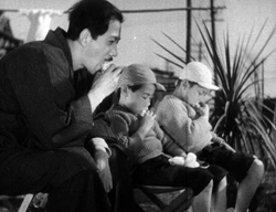
As directors have sought to retain the Kamata flavor in later decades, we find hints and traces of Ozu as well. A film like 119: Quiet Days of the Firemen (1994), in which middle-aged men in a small village fantasize about romance with a young researcher, might bring to mind the overactive imaginations of the grown-up schoolboys of Late Autumn (1960). Kore-eda Hirokazu’s Still Walking (Aruitemo aruitemo, 2008) is a family drama made in full awareness of the Ozu tradition. Not surprisingly, Yamada Yoji, impresario of Tora-san, has invoked the Shochiku tradition in several productions (notably Kabei: Our Mother, 2008, and Ototo, 2010). At the start of 2013 Yamada, at 81 years of age, released an updated remake of Tokyo Story.
Ozu comes to America
Days of Youth (1929).
Since at least the early 1920s, the Japanese cinema has responding to the American cinema. During the classic period, American films did not dominate the Japanese market, as they did in many other countries, but filmmakers were nevertheless acutely conscious of Hollywood. In particular, the founding of Shochiku in 1920, with a self-consciously modernizing orientation under Kido Shiro, created a ferment that changed Japanese cinema forever.
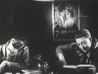
Like other Kamata/ Ofuna directors, Ozu relied crucially on American cinema. There are visual citations (the Seventh Heaven poster in Days of Youth), lines of dialogue about Gary Cooper and Katharine Hepburn, borrowed gags (from A Sailor-Made Man in Days of Youth), and even an extract from If I Had a Million in Woman of Tokyo. More deeply, his early films absorbed the analytical editing of 1920s Hollywood. He broke every scene into a stream of precise, slightly varied bits of information in the manner of Ernst Lubitsch and Harold Lloyd.
Ozu paid American cinema a deeper tribute. Having grasped that system of axis-of-action continuity that Hollywood had forged from the late 1910s, he created his own system as an alternative. Instead of a 180-degree organization of space, he proposed a 360-degree one. This allowed him to absorb the Americans’ innovations and yet give them a new force. Cuts would use eyelines, shoulders, and character orientation, but would often show characters looking in the same direction, their figures and faces matched pictorially from shot to shot.
A cut on movement could be made by crossing what American directors called “the line.”
Further, Ozu realized that the establishing shot, that depiction of the overall space of the action, could be prolonged and split into several shots. The result was a suite of changing spaces that could be unified by shape, texture, light, or even analogy (one window/ another window). These transitional sequences substitute for fades and dissolves, turning ordinary locales into something at once evocative and rigorous.
All of these transformations of Hollywood’s stylistic schemata are rendered more palpable by a single, simple choice that is more single-minded than anything to be found in Hollywood: The camera is typically placed lower than its subject. This constant framing choice acts as a sort of basso continuo for the melodic variations Ozu will work on two-dimensional composition and three-dimensional staging.
This entire stylistic machine might seem to be aimed wholly at working out its own intricate patterns, and indeed to some extent that is what happens. The aficionado can appreciate the refinements, the theme-and-variants structuring, created by Ozu’s cinematic narration. There’s playfulness as well; how funny, he seems to say, that editing and composition can play hide-go-seek with quilts and ketchup bottles. Just as important, all these techniques nudge us to arouse our attention—to the possibilities of cinema, but also to the shapes and surfaces of the world as they change. Alongside the characters’ drama is a realm at once stable and ceaselessly shifting; the characters and their drama are subject to the same forces of mutability. Ozu’s modest pyrotechnics activate the world his characters inhabit, subject them and their actions to the same suite of transformations, and have the larger purpose of reawakening us to our world.
Made in USA
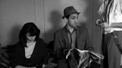
As Ozu’s films became known in the west, citation-happy directors of the 1980s took notice. An example is the moment in Stranger Than Paradise (1984, above), when Eddie reads off the list of horses running in the second race: “Indian Giver, Face the Music, Inside Dope, Off the Wall, Cat Fight, Late Spring, Passing Fancy, and Tokyo Story.” After a pause, Eddie says to bet on Tokyo Story. We know from Jarmusch’s account of visiting Ozu’s grave that he was a passionate admirer, but his films seem to me to show his debts chiefly in their “minimalist” approach to their action.
More elaborately, Wayne Wang offers a self-conscious homage in Dim Sum (1985). This story of a widow, her brother-in-law, and her daughter transfers an Ozu situation to San Francisco and a Chinese-American community. Should the daughter marry and leave her mother alone? The uncle, who runs a declining bar, urges the girl to do so. The situation, he says, reminds him of “an old Japanese movie” in which a parent urges the child to start a family. As in Ozu, the generations are sometimes captured in “similar-position” (sojikei) compositions.
To the generational split of the Ozu prototype, Wang adds the cultural division between modern America, the daughter’s home, and Hong Kong, home not only to the mother but all the friends in her age group. The generational contrasts would be elaborated upon in Wang’s later Joy Luck Club (1993), which counterpoints the experience of four mothers and four daughters.
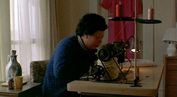
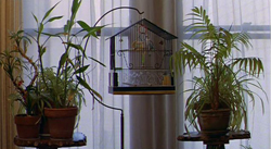
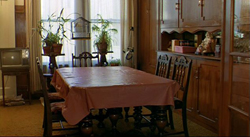
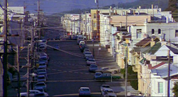
Well aware of the Ozu parallels in the plot, Wang elaborates them through some stylistic choices. The film starts with a static thirty-second shot of curtains blowing alongside a sewing machine. The mother comes into the frame, pours tea, takes pills, and starts the machine. The next sequence consists of isolated details—a birdcage, a table.
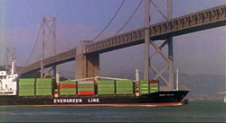
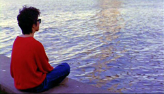
Only then do we get a placing shot of the street, but it serves here as a transition taking us out of the home (Ozu would probably have included part of the window frame), then to San Francisco Bay and then to a young woman seen from the rear sitting on shore.
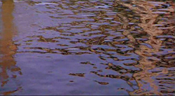
No drama is forthcoming–no conversation, not even a voice-over suggesting the young woman’s thoughts. The lyrical capstone of the sequence comes with a nearly abstract shot of the water, perhaps the woman’s point of view, but unaccompanied by language or music.
Wang has given us an imagistic preview of details to be seen later. Not only will we come to recognize the young woman as the daughter Laureen, but we’ll see the household furnishings, street locations, and bridge views at various points in the film.
The rest of the film is not as disjunctive as this opening, and Wang soon settles into the sort of loose, leisurely plotting that characterized independent film of the period. But the objects and cityscapes we see don’t become dramatically significant; they are part of the ambience of the characters, somewhat in the Ozu manner. But neither do they take on the elaborate variations and minute adjustments we find in Ozu’s “hypersituated” objects and recurring locations. Still, of all American directors Wang has most willingly adapted Ozu’s aesthetic to his own personal concerns, while paying homage to a director who was just starting to be appreciated as both storyteller and stylist.
Otherwise, the balance-sheet seems to me virtually empty. Every young American filmmaker seems to have studied Kurosawa, but which of them knows Ozu—or, like Eddie, have bet only on Tokyo Story? Filmmakers elsewhere have been more generous and discerning.
Citation, pastiche, and parody
Hou Hsiao-hsien, no cinephile in his youth, came to admire Ozu later in life, and he used citation in a more thoroughgoing way than Jarmusch had in Stranger than Paradise. Liang Ching, the modern-day protagonist of Good Men, Good Women (1995), leads a sort of parallel life with a Taiwanese woman she’s playing in a film: Chiang Bi-yu, along with her husband, who joined the anti-Japanese resistance on the mainland in 1940. But the parallel is a contrast as well, since Liang is unhappy in her love relationships and seems to lack any sense of social commitment. Her drifting, rather lost style of living is counterpointed not only to the courageous and energetic Chiang but also, via a televised movie, to Ozu’s postwar world.
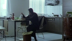
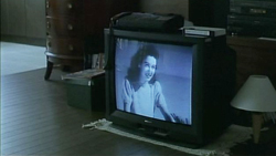
Early in the film, Liang is awakened by the beeping of her fax machine. As she droops at her kitchen table, her television monitor runs the bicycling sequence from Late Spring (1948).
These cheerful shots of Noriko and Hattori on an outing provide yet another contrast to Liang’s brooding torpor about the death of her lover Ah-wei. They also suggest another way to be a heroine, quietly strong and capable of both love and defiance. And the chaste outing we see in Late Spring contrasts sharply with the intense eroticism of the flashback that follows this morning scene, showing Liang and her lover caressing each other before a mirror. Unlike Ozu’s couple, they need a narcissistic magnification of their passion. If Good Men, Good Women’s overall plot condemns the Japanese for their army’s invasion of China, Hou from the start reminds the audience of another Japan, one that after the war became, at least in Ozu’s hands, a place of humane feeling. This is no one-off joke as in Jarmusch’s citations; the Late Spring extract deepens the thematic reverberations of Hou’s film as whole.
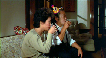
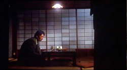
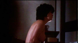
Likewise, instead of the sporadic invocations of Ozu’s style provided by Wayne Wang, the early films of Suo Masayuki show more engagement with the Ozu manner—particularly because they are turned to comic ends. Suo’s first feature, My Brother’s Wife: The Crazy Family (Hentai kazoku: Aniki no yomeson, 1984) was a curiosity: a softcore pornographic film shot in a distinctly Ozuian style. Only in Japan can an erotic film spare the energy to borrow so explicitly from a master of the cinema. While the newly married couple has thumping intercourse upstairs, the husband’s father, sister, and brother sit calmly downstairs, sighing or frowning slightly in response to the gymnastics overhead. One evening the father comes home from a drinking bout and the son, like the son in An Autumn Afternoon, warns him to cut back.
Suo gives us the father sitting alone in an Ozuesque shot, and as his head slumps, Suo cuts to the wife upstairs, rolling her head forward in a similar gesture.
True to the exhaustive geometry of pornography, the brother graduates to sadomasochism, the adolescent son becomes fixated on his sister-in-law, and the young daughter takes up work in a “soapland” parlor. Thus is the Ozu family drama turned upside down, with the father observing everything with a bemused, helpless smile. Suo, who had studied film under Hasumi Shiguéhiko, turned in a well-crafted film that was a virtual parody of the late Ozu style. Of course, by the time he started, Suo was able to study video releases and mimic the Ozu look shot by shot.
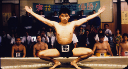
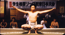
In Suo’s next films, parody turned into pastiche. Fancy Dance (Fanshi dansu, 1989) and Sumo Do, Sumo Don’t (Shiko funjatta, 1992) display a fanatically precise understanding of Ozu’s unique use of space. Suo adheres to the low camera height, builds scenes out of slightly overlapping zones, and avoids camera movement. He indulges in the master’s penchant for head-on shots that can be matched graphically across a cut, leaving us to notice the variations of color and texture within remarkably similar compositions.
Suo will even follow Ozu’s penchant for graphically matched movement across cuts. His sumo opponents spread their arms in a continuous movement as smooth as that displayed by Ozu’s drinking buddies.
Westerners often ignore Ozu’s penchant for social comedy in the Lubitsch vein, but Suo’s films happily explore this dimension. American and European filmmakers seem aware only of Ozu’s postwar films, but Suo the cinephile grasped that the 1930s college comedies offered fertile resources. Suo’s youth pictures show young people giving up modern popular culture in favor of Japanese traditions that are so old that they become fashionably retro. In Sumo Do..., a ragged college sumo team discovers that the sport turns them from slackers into adepts. In Fancy Dance, a talentless rocker, forced to live in the Buddhist monastery he has inherited, eventually learns that Zen can be cool.
Shall We Dance? (1996) modifies the Ozu look into something more generically Kamata-toned, but Suo still shows traces of the master’s rigor. For example, the first time that the camera moves is when the bored executive takes his first tentative lesson in ballroom dance. The film’s social critique is not as harsh as that in Ozu’s 1930s work, but it does dramatize the stifling limits put on both the salaryman and his family.
Just-noticeable differences
Five Dedicated to Ozu.
The two most famous Ozu homages, both from his anniversary year of 2003, are more puzzling. For neither Hou’s Café Lumière nor Abbas Kiarostami’s Five Dedicated to Ozu can be easily categorized as citation, assimilation, or pastiche. How have these two masters paid tribute to him?
Café Lumiere could easily be simply a Hou production that happened to be in Japan. It’s imbued with his characteristic narrative maneuvers, themes, and style. Even the cutaway long shots of trains, recalling some of Ozu’s urban iconography, would be perfectly at home in Hou’s work, which has made memorable use of trains (Summer at Grandfather’s, 1984; Dust in the Wind, 1987).
Likewise, Kiarostami’s Five Dedicated to Ozu might seem to take Ozu as a pretext for a foray into “pure cinema” in the manner of Shirin (2008) or the video installations Sleepers (2001) and Ten Minutes Older (2001). Unlike Hou, though, Kiarostami didn’t conceive his film as a tribute; only after having premiered it at Cannes was he invited to attach it to the fall 2003 Ozu centenary. As a result, he changed the title from the original one, Five. In explanation, Kiarostami claims that the protracted long shots in the first four episodes are akin to Ozu’s style:
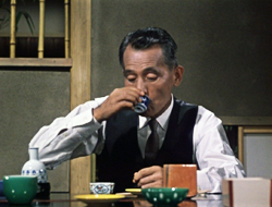
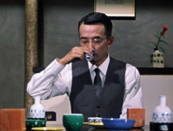
His long shots are everlasting and respectful. The interactions between people happen in the long shots and this is the respect that I believe Ozu felt for his audience . . . In his mise-en-scène he respected the rights of the audience as an intelligent audience. His films were not usually very technical, which would make them appear nervous and melodramatic in the manner of today’s montage facilities.
Although Kiarostami’s statement isn’t perfectly clear in translation, he seems to suggest that Ozu favored lengthy and distant shots and avoided editing—a common misconception about the director. There is, in short, something of a mismatch between each of these directors’ “Ozu films” and the oeuvre of Ozu.
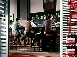
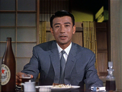
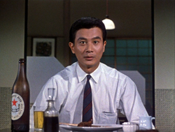
Café Lumière has recourse to one of Hou’s favorite maneuvers, casting rising pop-music stars in his films. Hitoto Yo, who had her first hit “Morai-Naki” in 2002, became his lead performer. This was a shrewd marketing move, as she is of both Japanese and Taiwanese ancestry and personifies the “fusion” aspect of Hou’s Shochiku project. Likewise, the male star Asano Tadanobu , an idol of Japanese cinema, has appeared in Thai, Russian, and even American films (e.g., Thor, 2011). Asano is also a pop musician and model. These strategic choices would, I think, have been appreciated by Ozu, who designed his scripts around Shochiku’s biggest stars and was not above “product placement” of favorite alcohol brands in his bar settings. Just as important, as with his Taiwanese films, Hou puts his young stars into a rigorously paced, controlled mise-en-scène—one owing little to Ozu technically, but a great deal to his model of incessant attention.
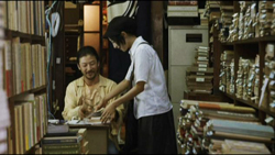
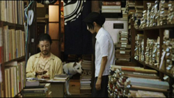
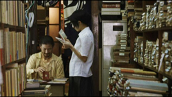
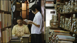
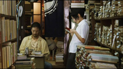
At one level Café Lumière is a family drama, a little reminiscent of Ozu’s Tokyo Twilight (1958). While visiting her parents, Yoko tells her mother she is pregnant and has no intention of marrying the child’s Taiwanese father. Her family must come to terms with this, and the situation is handled with even more subdued reactions than we would find in Ozu. At another level, the film is about a search for sound. Yoko meets the book dealer Hajime while she is researching a Tawainese-Japanese composer from the 1930s. For his part, Hajime has the hobby of recording the sound of Tokyo subways, trains, and trams. Ozu leaves it to the viewer to notice the subtle attenuation of his music and noise effects, while Hou announces and thematizes these components as part of his cross-cultural drama.
Hou, like Ozu, is a director of “just-noticeable differences,” the details that change slightly across a shot or scene. The first encounter that we see between Yoko and Hajime is a lengthy long-lens two-shot. Yoko pays for books that Hajime has kept for her, and as the couple move slightly, we can glimpse Hajime’s dog in the background, a bit of characterization for him. She moves aside to let us see it, then shifts back to allow us to concentrate on their dialogue.
This dynamic blocking and revealing of elements, characteristic of Hou’s staging, shapes the space as an unfolding spectacle, with new facets for us to discover. On the file cabinet on the right, splashes of light from the street outside come to fill the spot Yoko had occupied.
As the couple talk and listen to extracts of the composer’s piano music, illumination ripples over the shop interior, a reminder of the city turmoil that lies outside this cramped sanctuary, and Yoko leans back into the light.
The rest of the film will vary the locations to which we return—a coffee bar, Yoko’s apartment—with slight differences measuring the time that has passed. Likewise, the minimal, barely-started romance, crystallized in meetings over coffee, is nuanced by ever-changing patterns of light. We must watch the people, their gestures and slight displacements, as well as the space that they inhabit and the changing levels of illumination. We must attend to both the drama and its aura, both the café and the lumière.
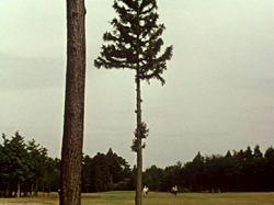
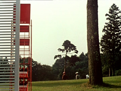
Kiarostami calls Five Dedicated to Ozu “a real experimental film,” and he’s right: It could as easily have been called Five Dedicated to Warhol. Like American Structural Film, Five… asks us to sink into a fixed frame showing landscape views, and to concentrate on minutiae. A piece of wood, caught on the waves lapping to shore, breaks in two. One piece stays on the sand, while the other is carried out to sea. People stride or stroll along the sea front. Unidentifiable objects at the water’s edge shift uneasily and gradually become recognizable as dogs; but soon they dissolve into spindly black skeletons as the image brightens into dazzling abstraction. Ducks stroll through the shot, each one making a padding sound. Finally, the moon is reflected in a pond at night; the reflections quiver, broken by thunderclaps. For long periods the image is black and we must listen to birds, frogs, and some mysterious creatures.
“I think,” Kiarostami explains, “we should extract the values that are hidden in objects and expose them.” That sensitivity to just-noticeable differences that Hou achieves through the long take and intricate staging, Kiarostami achieves with the cooperation of nature. He is willing to trust to chance, a force that will collaborate with him and invent something he couldn’t conceive. Both filmmakers ask for a patience that most contemporary cinema cannot tolerate. In a general sense, Ozu becomes a model of a possible cinema—not through specific technical choices, as with Wang and Suo, but through an overall effect: a cinema delighting in the textures and weight of our world.
Still, something has been lost. To make us wait and watch today, the director must “gear us down” through long takes and stasis, through deferring, stretching, or purging narrative. Ozu, miraculously, solicits this heightened perception in less strenuous ways, through a cascade of cuts, rapid dialogue, and an engrossing story. The contemplative aspect of his cinema was simply another dimension of a work that incorporated dynamic storytelling. When cinema was newer, it seems, much was possible. Hou and Kiarostami, like Béla Tarr and a few others, have found in a slow pace and minimal drama today’s best analogues to the sharp-edged awareness of the world that came so spontaneously to Ozu in a more industrial mode of production. In a larger sense, though, Ozu and Hou would agree with what Kiarostami claims could be alternate titles for his film: Watch Again! Look Well! or simply Look!
Peter Bosma‘s report on last summer’s Film College can be read here. Thanks as well to Peter for a rare Ozu-related document. I’m grateful as well to Nicola Mazzanti, Gabrielle Claes, Stef Franck, and Bart Versteirt for making my stay in Antwerp so enjoyable, especially including the beer, moules, and frites. Earlier reports on the annual Summer Movie Camp can be read here and here and here.
Once more, thanks to Diane Arnaud and Mathias Lavin for having solicited the essay.
My quotations from Kiarostami come from the interview included in the Kimstim DVD of Five Dedicated to Ozu. On Hou’s staging principles, see Chapter 5 of my Figures Traced in Light: On Cinematic Staging. I’ve discussed Hou’s staging on this site as well, here and here (with Ozu in the mix). Other entries on Ozu on the site can be found listed on the right. My book Ozu and the Poetics of Cinema is available as a free pdf file, with color illustrations, from the University of Michigan. As ever, thanks to Markus Nornes for making the book available in this format.
Finally, some years ago Lorenzo J. Torres Hortelano, author of a book-length study of Late Spring, wrote to tell me that the Noh play performed in Late Spring is Kakitsubata, not the one I had claimed. I found that he was correct, but had no way to change the book’s mention of it. Seeing Late Spring again last summer, I was reminded of Prof. Torres Hortelano’s message and now want to call readers’ attention to my error in the book. Prof. Torres Hortelano is also the author of The Directory of World Cinema: Spain and World Cinema Locations: Madrid. I thank him for the correction.


