Archive for the 'Directors: Kuleshov' Category
The ten best films of … 1926
The Adventures of Prince Achmed.
Kristin (with some help from David) here:
David and I have been offering this greatest-of-90-years-ago series almost as long as this blog has existed. For earlier annual entries, see 1917, 1918, 1919, 1920, 1921, 1922, 1923, 1924, and 1925.
I approached 1926 with the assumption that it would present a crowded field of masterpieces; surely it would be difficult to choose ten best films. Instead it turned out that some of the greatest directors of the era somehow managed to skip this year or turn in lesser films. Eisenstein had two masterpieces in 1925 but no film in 1926. Dreyer made a film that is a candidate for his least interesting silent feature, The Bride of Gromdal. Chaplin did not release a film, and Keaton’s Battling Butler, while a charming comedy, is not a plausible ten-best entry. The production of Lang’s Metropolis went over schedule, and it will appear on next year’s list, for certain.
Still, the Soviet directors were going full-tilt by this time and contribute three of the ten films on this year’s list. French directors on the margins of filmmaking created two avant-garde masterpieces. Two comic geniuses of Hollywood already represented on past lists made wonderful films in 1926. A female German animator made her most famous work early in a long career. I was pleased to reevaluate a German classic thanks to a sparkling new print. Finally, Japan figures for the first time on our year-end list, thanks to a daring experimental work that still has the power to dazzle.
The Russians are coming
Vsevolod Pudovkin’s Mother was a full-fledged contribution to the new Montage movement in the Soviet Union. By the 1930s, that movement would be criticized for being too “formalist,” too complex and obscure for peasants and workers to understand. Nevertheless, being based upon a revered 1906 novel of the same name by Maksim Gorky, Mother was among the most officially lauded of all Montage films. It tells the story of a young man who is gradually drawn into the Russian revolutionary movement of 1905. His mother, the protagonist of the novel, initially resists his participation but eventually herself joins the rebellion.
Along with Potemkin, Mother was one of the key founding films of the Montage movement. Its daring style is no less impressive now than it must have been at the time. One brief scene demonstrates why. Fifteen years before Mother, D. W. Griffith was experimenting in films like Enoch Arden (1911) with cutting between two characters widely separated in space, hinting that they were thinking of each other. By 1926, Pudovkin could suggest thoughts through editing that challenged the viewer with a flurry of quick mental impressions.
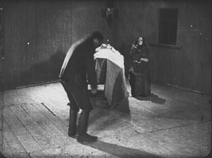
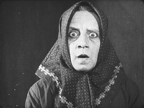
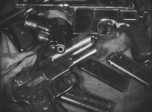
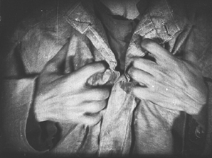
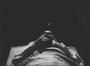
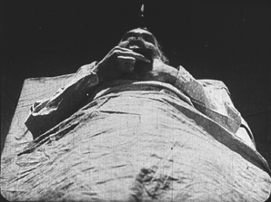
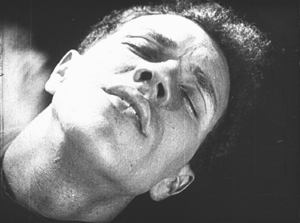
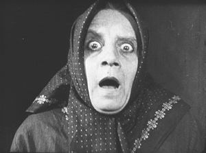
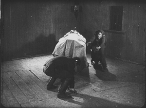
As the Mother sits beside her husband’s dead body, her son, a participant in the 1905 failed revolution, comes in. He is about to bend down and open a trap-door in the floor (73 frames). A cut-in shows her horrified reaction (12 frames), and there follows a brief close shot of some guns she had seen him hide under the floor in an earlier scene (11 frames). Even shorter views of a man clutching his chest (8 frames), two jump-cut views of the dead husband (3 frames and 2 frames), and a tight framing of the son being shot follow (8 frames). We return to her face, registering even greater horror (15 frames). A return to the initial long shot shows her leaping up to try and stop her son from taking the guns out to participate in a seditious act (31 frames).
The series of five shots goes by in a few seconds, and we are challenged to grasp that the guns are a real memory, while the shots of the man’s chest and her son’s anguished face are visions of what might happen. The shots of her husband’s body suggest that she could soon end up sitting by her son’s corpse as well. The jumble of recollection, imagination, and reality are remarkably bold for this relatively early era.
Mother also contains two of Pudovkin’s most memorable scenes, the breaking up of ice in the spring as a symbol of the Revolution and the final violent attack on the demonstrators, including the heroine.
Mother was released on DVD by Image Entertainment in 1999, but it seems to be very rare. An Asian disc, perhaps a pirated edition of the Image version, is sold on eBay. I’ve never seen the film on DVD and can’t opine on these. The time is ripe for a new edition.
Pudovkin was one of the filmmakers who had studied with Lev Kuleshov during the early 1920s, when Kuleshov made the famous experiments that bear his name. Pudovkin played the head of the gang of thieves in The Adventures of Mr. West in the Land of the Bolsheviks, which I included in the ten-best list of 1924.
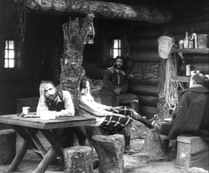
Kuleshov had moved on as well to direct his most famous film and probably his best silent, By the Law, based on Jack London’s story “The Unexpected.” Set in the Yukon during the gold rush, it involves five people who are cooperatively working a small claim and discover gold. Taking advantage of a warm autumn, they stay too long and are trapped for the winter. One of the men kills two of the others, and the heroine, Edith and her husband Hans are left to determine the fate of the killer, Dennin. Edith insists on treating him strictly according to the law. After enduring the harsh winter and a spring flood, the couple finally act as judge, jury, witnesses, and, after finding Dennin guilty, executioners.
The great literary critic and theorist Viktor Shklovsky (one of the key figures of the Russian Formalist school) adapted the short story, condensing it by eliminating the opening section of Edith’s backstory and a few scenes in which a group of Indians appear occasionally to help the prospectors. The result is a concentration on the tense drama of a three people trapped together in a tiny cabin.
In the 1924 entry, I mentioned that Kuleshov’s team emphasized biomechanical acting and that Alexandra Kokhlova was adept at eccentric acting. She delivers a bravura performance here, as Edith moves closer to a breakdown as the months go by.
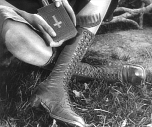
Kuleshov also puts into practice the experiments in imaginary geography that his classes had made. Although in this film he didn’t unite shots made in widely separate spaces, he did favor scenes built up of a considerable number of detail shots before finally revealing the entire space in an establishing shot. Edith, for example, though glimpsed briefly asleep early on, is introduced in a later scene by a shot of her boots and Bible, followed by a shot of her head as she read the Bible. The scene also contains close shots of the other characters before a general view of the cabin interior shows where each of them is.
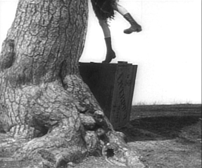
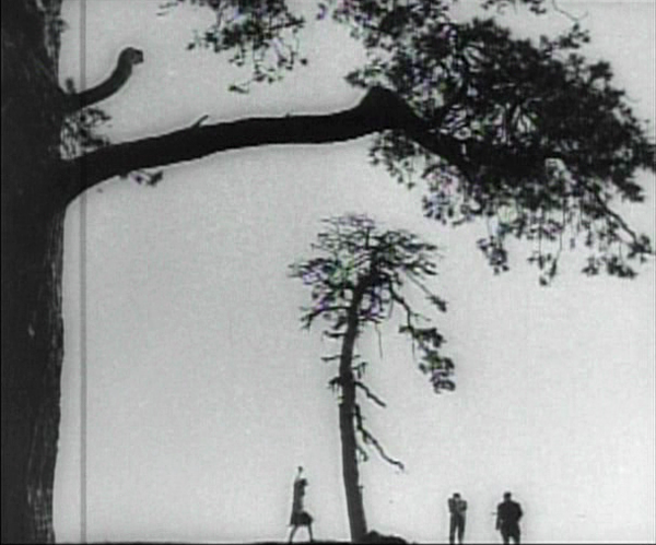
The scene of the execution includes one of the most famous images of the Monage movement, a framing with the horizon line at the bottom edge of the frame and the sky dominated by trees (see bottom). Any number of framings of tall features such as trees and telephone poles against a huge sky appeared in Montage and non-Montage films, and this device became so common as to be a trait of the Soviet cinema of the late 1920s and early 1930s.
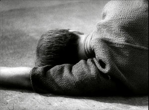
The desire to hide the actual hanging led Kuleshov to stage is behind the larger of the two trees, as Edith and Hans struggle to carry out their sentence on Dennin. This leads to some eccentric framings, such as our view only of Edith’s legs as she teeters on the box where Dennin stands, presumably adjusting the noose (see top of this section).
A beautiful print of By the Law is available on DVD from Edition-Filmmuseum.
Grigori Kozintzev and co-director Leonid Trauberg did not study with Kuleshov, but they shared a passion for eccentricity. Having started out in the theater, in 1921 both contributed to the “Manifesto for an Eccentric Theater,” a dramatic approach based on popular forms like circus and music-hall. In 1922 they founded the “Factory of the Eccentric Actor” group and two years later transformed it into FEKS, devoted to making films.
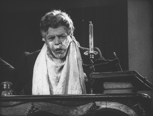
The Overcoat (also known in English as The Coat), their second feature, was based on a combination of two short stories by Gogol, an author whose grotesque creations were very much in tune with their own tastes. It tells the story of a poor, middle-aged low-level government clerk, Akaky Akakievich, who is bullied over his shabbiness, particularly his worn-out overcoat. Scrimping to buy a new one, he finally purchases a magnificent new coat and finds his status suddenly raised–until the coat is stolen.
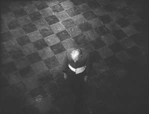
Andrei Kostrichkin was a mere twenty-five years old when he played the fiftyish clerk, but he was highly effective and provided another model of the eccentric actor. As Akakievich he stands with bent legs and twisted torso, as if flinching away from a blow, and walks in tiny steps along perfectly straight lines through the hallways in his office building. When he applies to a Person of Consequence for help in recovering his stolen coat, the official leans over his desk to look downward, with a high-angle point-of-view framing of Akakievich appearing dwarfed by the other’s superiority.
The script of The Overcoat was adapted by another Russian Formalist critic and theorist, Yuri Tynjanov.
Unfortunately The Overcoat does not seem to be available on any form of home video.
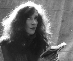
Petit mais grand
The IMDb lists 23 directing credits for Dimitri Kirsanoff from 1923 to the year of his death, 1957. He is largely remembered, however, for one film, the 37-minute Ménilmontant, a melodrama about the travails of two sisters orphaned as children by a violent crime. Each is later seduced by a callous young man who leaves the heroine a single mother and her sister reduced to prostitution. It belongs to the French Impressionist moment. (We deal with Impressionist films in other entries: La roue, L’inhumaine, L’affiche, Coeur fidèle, The Smiling Madame Beudet, Le brasier ardent, Crainquebille, and El Dorado, as well as DVD sets of Impressionist films by the Albatros company and by director Jean Epstein.)
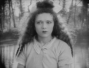
The story itself is simple and indeed might be thought clichéd were it not for two factors. First, there’s the performance of the delicately beautiful Nadia Sibirskaïa as the protagonist. There’s also the lyrical, melancholy use of the settings, initially in the countryside and later in the desolate working-class Parisian district whose name gives the film its title. The simplicity of the narrative also makes it one of the most successful of the attempts to tell a story visually, eschewing intertitles.
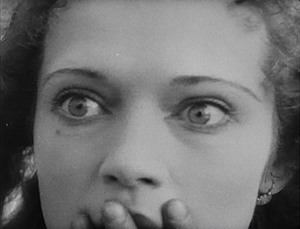
The film’s most famous scene is its abrupt, shocking opening. With no establishing shot, there is a series of rapid shots of details of faces, hands, a window, and an ax, during which we can barely discern that a man has committed a double murder. The spectator cannot possibly know who these people are and why the murders occur.
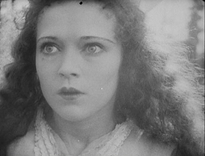
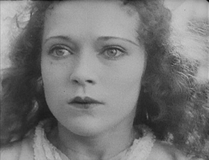
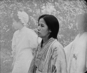
Instead of offering an explanation, the action then shifts to two little girls playing in the woods. As they return home, the camera begins to concentrate on one of them, apparently the younger, as she arrives at the murder scene and reacts in horror. Kirsanoff presents her expression in a series of five shots, linked by what David has termed axial cuts, from medium shot to extreme close-up as she gradually realizes what has happened.
There had certainly been axial cuts before this, including in Potemkin, but Kirsanoff probably went further than anyone of the era by including so many shots, by making each so short, and by moving his camera forward in such small increments. It is difficult to notice every cut, particularly the one from the third to the fourth shot, and the effect adds an unsettling quality to an already intense moment.
After this opening, a funeral scene reveals through labels on the grave that the murdered man and woman are the children’s parents. We might have suspected that the killer was a jealous husband discovering his wife with her lover. As it is, we never learn whether the crime was the result of a love triangle or the random act of a madman.
The rest of the film establishes the sisters now grown up, working in a workshop making artificial flowers and sharing a small flat in Menilmontant. The heroine’s brief romance leads to a baby, and superimpositions and other Impressionist techniques depict her despair and contemplation of suicide. Beautifully melancholy atmospheric shots of the streets of the neighborhood punctuate the action and underscore the dreariness and hopelessness that the heroine faces. The ending, though an improvement in the heroine’s lot, does little to dispel the overall grimness of the story.
Menilmontant is included in the out-of-print set “Avant-garde – Experimental cinema of the 1920s & 1930s.” It has been posted twice on YouTube in a low-rez format.
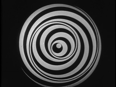
Even shorter is Anémic cinéma, the only venture into film directing by the great French Dadaist, Marcel Duchamp. It’s hard to compare a roughly seven-minute abstract film with narrative features, but this short is so innovative and influential that it’s also hard to leave it off the list.
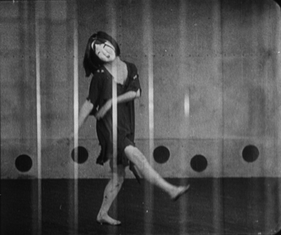
Duchamp went through a phase of spinning artworks, including some “Rotoreliefs” that he attempted to sell as toys. These were similar to some Victorian optical toys, such as the Phenakistopscope and the bottom disks of Zoetropes. See Richard Balzer’s website for a collection of such devices, as well as “The Richard Balzer Collection” on tumblr, which contains gifs that animate some of the disks, done by Brian Duffy. Some of these resemble the spinning spirals and embedded circles that Duchamp used for his short. (See the top of this section.)
These spinning abstract circular images alternate with slowly spinning disks with sentences laid out as spirals. These involve either alliteration or puns or both. Unfortunately the English subtitles cannot render these in a way that conveys the original intent. For example, “Esquivons les ecchymoses des esquimaux aux mots exquis” becomes “Let us dodge the bruises of Eskimos in exquisite words.” The meaning is the same, and even the echo of the first syllables of “Eskimos” and “exquisite” is retained. Nevertheless, the similar syllables in two other words in the original are lost, as are the echoes of “moses,” “maux,” and “mots.” It is rather as though someone attempted to render “Peter Piper picked a peck of pickled peppers” into another language quite literally. (The Wikipedia entry includes a complete list of the sentences in French.)
Duchamp’s purpose was presumably to create an artwork with minimal means, including quasi-found objects, the disks he had made for another purpose. His idea is clearly reflected in the title, Anémic cinéma, which suggests a weakness or thinness of means. “Anémic” is also an anagram for “cinéma.”
Anémic cinéma is available in the same collection as Menilmontant, linked above. it is also available in the similarly out-of-print set, “Unseen Cinema.” There are numerous versions on YouTube, varying in quality. Some of these have been manipulated by other artists.
Lloyd and Lubitsch
Though Chaplin and Keaton might have had off-years in 1926, Harold Lloyd did not. Over the past several years, Lloyd has gradually been gaining the admiration he deserves. He used to be known largely for Safety Last (1923) and The Freshman (1925), two excellent films which, however, are not his finest. Girl Shy (1924) and The Kid Brother (1927) are better known now for the masterpieces they are. For Heaven’s Sake (directed by Sam Taylor), which clocks in at a mere 58 minutes, is just as good.
Lloyd plays a breezy millionaire, J. Harold Manners, who unintentionally helps Brother Paul found a mission in the downtown slums of Manhattan. He falls in love with Hope, the missionary’s daughter, and decides to help out around the place. By this time Lloyd was known for his spectacular chase scenes, and there are two here. Initially he puts a twist on the chase, luring a growing crowd of criminals into racing after him, ending in the mission. Gaining their respect, Harold makes the mission a happy social center.
The romance provides one of my favorite comic intertitles, leading into a love scene: “During the days that passed, just what the man with a mansion told the miss with a mission–is nobody’s business.” The love scene in turn includes a visual joke that emphasizes the rich boy – poor girl contrast.
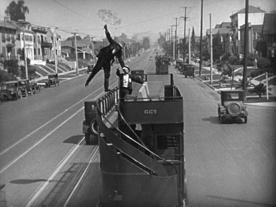
Harold’s rich friends hear that the pair are to be married and determine to kidnap him to prevent the inappropriate match. The result is a lengthy chase through the streets of Manhattan, with the drunken thugs rescuing Harold and using a variety of means to get him back to the mission in time for the wedding–as when the drunken leader of the group demonstrates his tightrope-walking abilities on the upper railing of a double-decker bus (see above).
Two years ago, when I put Girl Shy on my list, the New Line Cinema boxed set of Lloyd films was out of print and hard to find, and the separate volumes appeared to be going out of print as well, with Volume 1 not being available at the time. The situation has changed, and the boxed set, though apparently still out of print, is now available at reasonable prices from various third-party sellers on Amazon and Barnes & Noble. The set contains a “bonus disc” with extras, including interviews and home movies. The same is true for the three individual volumes (here, here, and here). For Heaven’s Sake is in Volume 3.
Inevitably, coming directly after Lady Windermere’s Fan, probably Ernst Lubitsch’s greatest silent film, So This Is Paris does not quite live up to its predecessor. Still, it’s a very fine, clever, and funny film, and it marks Lubitsch’s last appearance in these lists until sound arrives.
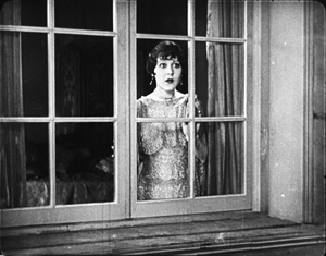
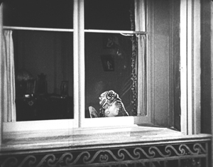
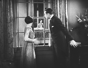
The opening scene, running nearly twenty-five minutes, is as good as anything Lubitsch did in this era. Set in Paris, it’s a slow build-up of misunderstandings and deceptions involving two affluent couples in apartments across the street from each other. One couple, Maurice and Georgette Lalle, are practicing a melodramatic dance in Arabian costumes. Their marriage seems to be a rocky one. Across the street, Suzanne Giraud is reading one of the lurid “Sheik” novels that were popular at the time, involving “burning kisses” in its final scene. Put into a romantic mood by this, she looks out her window and sees the head of a man in a turban at the window opposite–Maurice relaxing after his strenuous rehearsal.
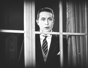
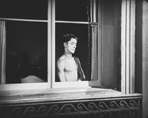
Her husband Paul arrives home, and she kisses him passionately. Apparently not used to such affectionate greetings, he is puzzled until he, too, looks out the window. By now Maurice has doffed his turban and necklaces and appears to be not only naked but also examining a piece of his anatomy.
Paul jumps to the conclusion that this sight is what caused Suzanne’s unaccustomed display of passion. He calls her to the window, and we see Maurice in depth through the two windows.
Suzanne then asks if Paul is going to stand for such a thing, and he goes to the other apartment to confront Maurice. Instead he finds Georgette, who turns out to be an ex-lover of his. She introduces him to Maurice, who is very friendly and charms Paul. The latter who returns home and claims that he has beaten Maurice and even broken his cane on him, though in fact he had simply forgotten it. Shortly thereafter Maurice visits Suzanne to return the undamaged cane and takes the occasion to flirt with her. It’s a beautifully plotted and developed farcical scene. The film is based on a French play and could easily have become stagey in its adapted form. Yet the byplay between the two apartments via the windows allows Lubitsch to avoid any such impression; the misunderstandings based on optical POV recall the racetrack scene of Lady Windermere.
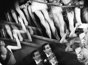
The rest of the film develops the two potentially adulterous affairs, primarily with Paul secretly taking Georgette to the Artists’ Ball. Here Lubitsch uses an elaborate montage sequence to convey the wild party, with superimpositions and shots taken through prismatic lenses.
Such sequences were primarily developed in German films and were still fairly rare in American ones in 1926. Similar techniques convey Paul getting drunk on the champagne he and Georgette are awarded when they win a dance contest–the announcement of which on the radio broadcast of the ball alerts Suzanne to her husband’s presence there with another woman.
So This Is Paris is less famous than Lubitsch’s earlier American comedies primarily because it has never appeared on DVD. Marilyn Ferdinand, in a blog entry that gives a detailed description of the film, writes that Warner Bros. claims not to own the rights to the film anymore and therefore has made no effort to bring it out on home video. On the other hand, a four-minute excerpt of the dance montage sequence was included in the Unseen Cinema set (disc 3, number 18), and the credit there is “Courtesy: Warner Bros., Turner Entertainment Company.” Whatever the rights situation is, a home-video version of this film is in order. A beautiful 35mm print is owned by the Library of Congress, so there is hope.
Two German flights of fancy
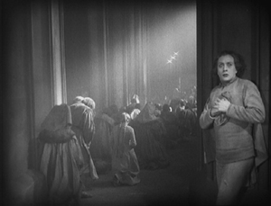
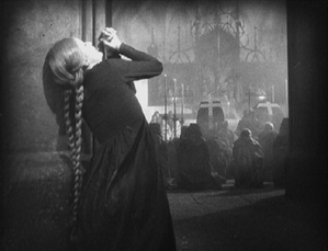
I must confess that I was disappointed the first time I saw F. W. Murnau’s Faust, and I have never warmed up to it in later viewings. I am delighted at having occasion to look at it again for this 1926 list, since a recently discovered and restored print reveals that the main problem before was the poor visual quality of the print formerly in circulation.
Different local release prints survived in a number of countries, but there were basically two original versions made: the domestic negative for German release and the export negative. These were shot using two camera side-by-side on the set, as was the standard practice in much of the silent era, given the lack of an acceptable negative-duplicating stock. The primary camera contributed most of the shots to the domestic negative, though in some cases where the second camera yielded a superior take, that was used in the domestic negative. Conversely, inferior takes from the primary camera sometimes made their way into the export negative. The result, as we now know, was that both the visual quality and in many cases the editing of the scenes was markedly different in the two negatives.
The version familiar for decades originated from the export negative. Recently the domestic negative was rediscovered, and the Friedrich Wilhelm Murnau Stiftung restored the that version using the that negative, supplemented with material from a variety of other prints. The result closely approaches the original German release version, including the original decorated intertitles. The contrast in quality between this restoration and the old, familiar Faust is remarkable.
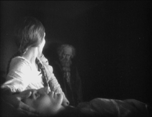
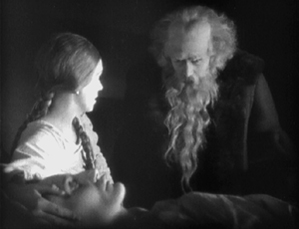
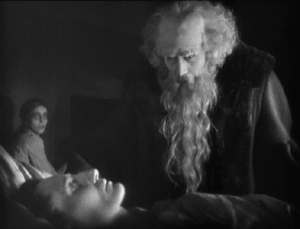
Given how dark the film is, details in the backgrounds could easily be lost. The scene in which Faust is called to help a woman dying of the plague is revealed to have dramatic staging in depth against a very dark room contrasted with the stark foreground underlighting of the woman’s haggard face. Faust enters from behind the daughter and comes forward to her, after which his movement is balanced by the daughter retreating into that same dark background.
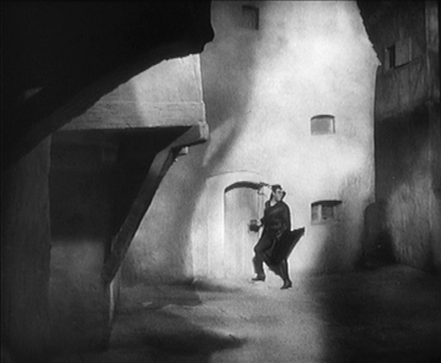
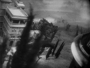
The famous aerial journey of Mephisto and Faust from Germany to Italy (below left) always looked rather hokey, but the detail revealed in the extraordinarily extensive model makes it far more impressive. Similarly, when one can actually see the sets, visual echoes become apparent. For example, Faust first encounters Gretchen and follows her into the church, where he finds himself barred from entering by his pact with Mephisto. Later, when Gretchen has been abandoned, she laments when not permitted to enter there.
No doubt some motifs of this sort were visible in the earlier print, but their clarity here enhances both the beauty and the craft of Murnau’s film.
Faust is available in several editions on DVD and Blu-ray. DVDBeaver ran a detailed comparison among seven of these, including a selection of frame grabs. To my eye, the 2006 DVD “Masters of Cinema” version of the domestic print, released by Eureka!, looked the best. (The two-disc set also includes the export version.) The Blu-ray from the same source, released in 2014, looked slightly darker. The box for the Blu-ray also includes the DVD, however. These releases are Region 2. The film is available on Blu-ray in the USA from Kino.
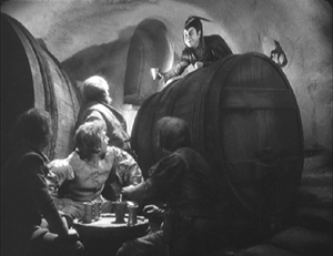
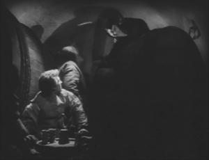
Both Eureka! releases’ supplements include a booklet, a commentary track, a Tony Rayns interview, and a lengthy comparison of the domestic and export versions. One particularly striking example is drawn from the scene in which Mephisto talks with Gretchen’s brother in a beer hall, with the domestic version on the left.
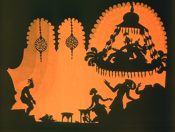
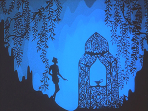
While watching Faust, I kept grabbing frames, far too many to be used in this entry. They were simply too beautiful or impressive to be passed over, and they made my final selection of illustrations difficult. The only other film for which this was true this year is Lotte Reiniger’s silhouette-animated feature, The Adventures of Prince Achmed. The restored, tinted print that is currently available is even lovelier than the older black-and-white version.
Reiniger seems to have invented the use of jointed silhouette puppets, and she still is the first artist one thinks of in relation to this form of animation. She continued to practice it until the 1970s. (See the link below to a collection of many of her short films.) Her one feature film remains her most famous and is probably her masterpiece.
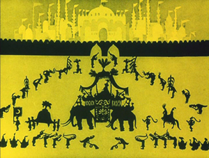
It involves far more than simple black figures moving against a light background. As the frame at the top of this entry shows, her characters, furnishings, and locations, all rendered in paper with scissors, were often elaborate indeed. Characters wore feathers, jewelry, fancy wigs, and other decorative elements. The hanging platform has many little tassels, and the lamps are rendered in delicate filigree. The backgrounds are not blank but have varying layers of saturation that suggest a depth effect, the equivalent of atmospheric perspective. At the left in the top image, a series of identical curtains start out a dusky orange and in three stages lighten until there is a bright, solid glow at the center.
In the frame at the left below, the same sort of shading creates the depth of a cavern, setting off the tracery of the foliage and the kiosk in which the hero finds the magic lamp. On the right, very simple shading suggests a vast and elaborate palace in the background, while Reiniger fills the foreground with many small figures, all marching out to surround the procession of the caliph.
By choosing a classical fantastic tale, Reiniger found the perfect subject matter to fit the technique that she invented. Both the subject matter and the sophistication of the animation give her films a timeless look. Her reputation remains high today as a result. One scene in Harry Potter and the Deathly Hallows Part 1, “The Tale of the Three Brothers,” was made in a style inspired by Reiniger’s work. (I discuss it here.)
A restored, tinted version of The Adventures of Princes Achmed is available from Milestone. A combination Blu-ray/DVD release of the film is available from the BFI. (I have not seen this version.) Note that these have somewhat different content. The BFI version has five Reiniger shorts from across her career along with a booklet. The Milestone version has only one of the shorts, but it includes a documentary about Reiniger. (This documentary was on the 2001 BFI release of the film on DVD but is not listed among the extras on its Blu-ray.) See also the BFI’s collection of many of her shorts, “Lotte Reiniger: The Fairy Tale Films,” which I discussed here.
[Dec 27: Thanks to Paul Taberham for pointing out that Prince Achmed also has no intertitles and gets along without them very well.]
Into the asylum
David here:
Few western viewers of 1926 saw any Japanese films, but Japanese audiences had been watching imported films for a long time. Hollywood films could easily be seen in the big cities, and The Cabinet of Dr. Caligari (released in 1922), La Roue (released in early 1926), and other films from Europe had made a strong impression on local filmmakers. One fruit of this influence was the wild Page of Madness (Kurutta ichipeiji, aka “A Crazy Page”).
Directed by Kinugasa Teinosuke and based on a story by the renowned experimental writer Kawabata Yasunari, the film bore the influence of German Expressionist and particularly French Impressionist cinema. Page of Madness set out to be a bold exercise in subjective filmmaking. But it wasn’t widely seen at the time, and wasn’t revived until 1971, when Kinugasa discovered a print in his house (reportedly, among cans of rice). Apparently the version we have is slightly edited.
A woman has been confined to a madhouse, and her husband has taken a job as a janitor there to stay in touch with her. Many of the scenes are presented as the hallucinations of the wife and other inmates, while abrupt flashbacks attached to the husband fill in the past. But this story is terribly difficult to grasp. There are no intertitles (perhaps an influence of The Last Laugh, shown in Japan earlier in 1926), and the film is a blizzard of images, choppily cut or dissolving away almost subliminally.
Viewers of the period had the advantage of a synopsis printed in the program, and there was a benshi commentator accompanying the screening to explain the action. Because we lack those aids, the film seems more cryptic than it did at the time. Even when you know the story, though, Page of Madness often surpasses its foreign counterparts in its free, unsignalled jumps from mind to mind and time to time. It remains a powerful example of narrative and stylistic experiment, from its canted framings and single-frame cutting to its frenzied camera movements and abstract planes of depth (thanks to scrims à la Foolish Wives, 1922).
For nearly fifty years it has remained a milestone, a grab-bag of advanced techniques and likely the closest Japan came to a silent avant-garde film.
Page of Madness is not commercially available on home video. It is occasionally shown on TCM, and a reasonably good print is on YouTube. Aaron Gerow’s A Page of Madness: Cinema and Modernity in 1920s Japan is an indispensable guide to Kinugasa’s eccentric masterpiece.
By the Law.
News! A video essay on constructive editing
DB here:
In connection with our textbook, Film Art: An Introduction, we’ve created several videos examining film techniques. Thanks to Peter Becker and Kim Hendricksen of Criterion Classics and Janus Films, we’ve been able to include clips from film classics, from Ashes and Diamonds to Ugetsu Monogatari. Because our publisher McGraw-Hill sponsored the production of these pieces, most of them are on a dedicated website called Connect, accessible only to students and teachers using the book in courses. We’ve made one video freely available on Criterion’s own site, where Kristin discusses some editing techniques in Agnès Varda’s Vagabond.
But not everybody who reads Film Art is in a course using the online supplements. And some people who aren’t reading Film Art might still enjoy learning more about the topics we cover. Moreover, we’ve had such good response to the Connnect clips that we decided to create a longer, more wide-ranging piece, also suitable for classrooms. So we prepared another video and today are making it available to anyone.
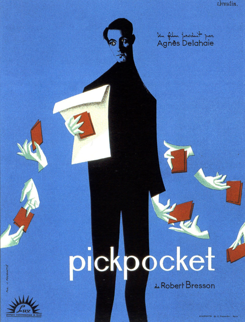
The Connect pieces mostly concentrate on single scenes, whereas this one roams across several films before focusing on a single example. Specifically, we look at the technique of constructive editing, which we discuss in Chapter 6 of FA. The video draws examples from silent films including Harold Lloyd’s Number, Please? (1920) and Lev Kuleshov‘s Engineer Prite’s Project (1918), while our more recent examples include The Social Network and The Ghost Writer. Thanks again to Criterion, the extract we focus on comes from Bresson’s brilliant Pickpocket (1959).
This piece is produced by Erik Gunneson, a local filmmaker who did an excellent job on the Connect materials. I wrote the script and narrated. (A cold I couldn’t shake off betrays itself in my voice.) We did the work in our production facility here at the University of Wisconsin–Madison Department of Communication Arts.
The links flagged above indicate blogs that are related to this new video. Some others are “What happens between shots happens between your ears” and “The Movie looks back at us” and “They’re looking for us.” There’s also “Three nights of a dreamer,” discussing a passage in In the City of Sylvia that may be a slantwise homage to Bresson’s editing technique.
Just to be clear: The twelve-minute video is available to anyone who’s interested. You can watch it below or on Vimeo. Erik, Kristin, and I hope you enjoy it.
PS 4 November 2012: Our discussion of the Kuleshov effect has led some to ask us whether the several videos on YouTube are authentic footage of Kuleshov’s experiments. Alas, they are not, but Kristin and I don’t know their provenance. However, in Oksana Bulgakowa’s documentary on the Kuleshov effect, available on YouTube, there are some fragments of the surviving footage, starting at 4:28. Oksana has also helped complete the experiment by inserting a substitute for a missing shot. In addition, I’m reminded by Joe McBride and Katharine Spring of Hitchcock’s famous explanation of the Kuleshov effect, available on the DVD, A Talk with Hitchcock. An excerpt from that is posted on YouTube, probably illegally.
Seed-beds of style
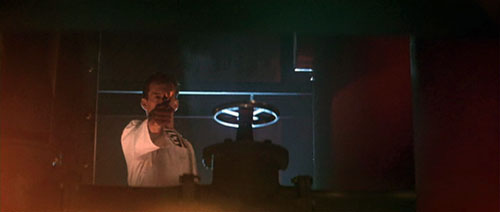
The Hunt for Red October.
DB here:
Seminar, orig. German (1889): A class that meets for systematic study under the direction of a teacher. From Latin seminarium, “seed-plot.”
I retired from full-time teaching in July of 2005. Since then, while writing and traveling (both chronicled on this website), I’ve done occasional lectures. But this fall I tried something else. At the invitation of Lea Jacobs here at Madison, I collaborated with her on a graduate seminar called Film Stylistics.
It was a good opportunity for me. I had a chance to learn from Lea, Ben Brewster, and the students and sitters-in. The class also enabled me to test and revise some ideas I’d already explored, while garnering new ideas and information. I helped plan the sessions and pick the films, but I had no responsibilities about grading. I hope, though, to read the students’ papers at some point after the term is over.
Our goal was to introduce students to studying style historically and conceptually. We focused on group styles rather than “authorial” ones because we wanted to explore particular concepts. How useful is the concept of group norms in understanding broad stylistic trends? Can we explain stylistic change through conceptions of progress toward some norm? Does the model of problem and solution help explain not only a particular innovation but also the group’s acceptance of it? How viable are notions of influence in explaining change? How much power should we assign to individual innovation? Can we think of filmmaking institutions as not only constraining style (through tradition and conformity) but also enabling certain possibilities—nudging filmmakers in certain directions? Does stylistic study favor a comparative method, one that encourages us to range across major and minor films, as well as different countries and periods?
These are pretty abstract questions, so we wanted some particular cases. Lea and I picked three areas of broad stylistic change: the emergence of widescreen cinema in the 1950s, the arrival of sync-sound filming in the late 1920s, and the development of analytical editing or “scene dissection” in the 1910s and 1920s. We tackled these areas in this order, violating chronology because we wanted to move from somewhat hard problems to the hardest of all: Why did filmmakers in the US, and soon in other countries, move toward what has become the lingua franca of film technique, continuity editing?
The results of our research on these matters will emerge over the next few years, I expect. In the short term, during my final lecture Tuesday I went off on what I hope wasn’t too much of a tangent. I got interested in one particular kind of cut, and it led me to see, once more, how different filmmaking traditions can make varying uses of apparently similar techniques.
More cutting remarks
My concern was the axial cut. That’s a cut that shifts the framing straight along the lens axis. Usually, the cut carries us “straight in” from a long shot to a closer view, but it can also cut “straight back” from a detail. What could be simpler? Yet such an almost primitive device harbors intriguing expressive possibilities.
Axial cuts aren’t all that common nowadays, I think. Today’s filmmakers prefer to change the angle when they cut to a closer or more distant setup. But such wasn’t the case in the cinema of the 1910s and 1920s.
In the heyday of tableau-based staging, 1908-1918 or so, filmmakers seldom cut into the scene at all. European directors especially tended to shape the development of the action by moving actors around the set, shifting them closer to the camera or farther away. The most common cuts were “inserts” of details, mostly printed matter (letters, telegrams) or a photograph. But when tableau scenes did cut into the players, the cuts tended to be axial: the framing moved straight in to enlarge a moment of performance. Here’s an instance from the 1916 Russian film Nelly Raintseva.
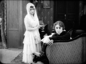
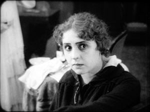
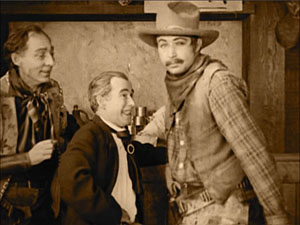
During the mid-1910s, American films moved away from the tableau style toward a more editing-driven technique. This approach often relied on more angled framing and a greater penetration of the playing space, of the kind we’re familiar with today. But axial cuts hung on in American films, even in quickly-cut scenes. Lea pointed out some nice examples in Wild and Woolly (1917), especially those involving movement. In the example below, the first cut carries us backward rather than forward, and the second is a cut-in, but both are along the lens axis.
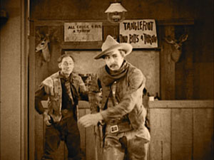
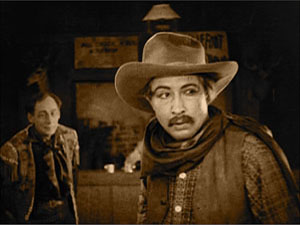
During the 1920s, axial cuts become a secondary tool of the American filmmaker, who now had many other camera setups available. But Soviet filmmakers of the 1920s, who adopted many American techniques in the name of modernizing their cinema, seemed to see fresh possibilities in the axial cut. For instance, in Dovzhenko’s Arsenal (1929), it becomes a percussive accent. The astonishment of a bureaucrat under siege is conveyed by a string of very fast enlargements.
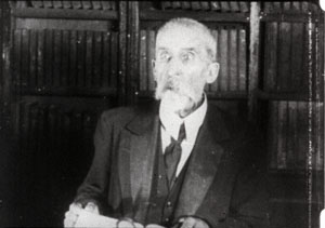
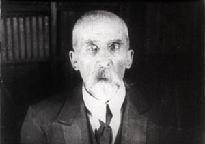
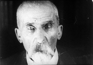
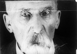
The Soviets called such cuts “concentration cuts,” a good term for the way they make a figure seem to pop out at us. From being a simple enlargement (in tableau cinema) or one among many methods of penetrating the scene’s space (in Hollywood continuity), the axial cut has been given a new force, thanks to adding more shots and making them quite brief.
This aggressive method for seizing our eye—Notice this now!—has appeared in modern filmmaking too, as in this passage from Die Hard (1988).
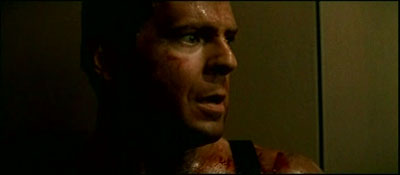
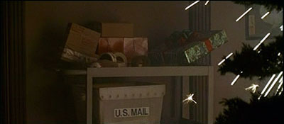
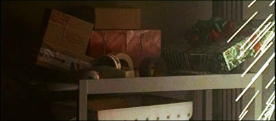
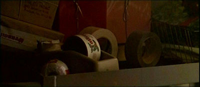
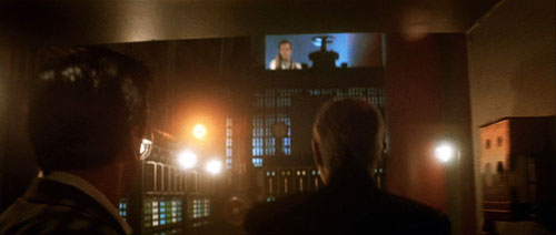
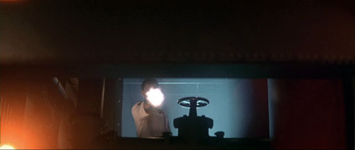
Here the axial cut is clearly subjective, rendering John McClane’s realization that he can use the Christmas wrapping tape in his combat with the thieves. Director John McTiernan employed the device again in The Hunt for Red October (1990). The frames surmounting this entry show the heroes suddenly being fired upon.
It seems likely that many modern directors became aware of this device from seeing Lydia’s discovery of the pecked-up body of farmer Dan in The Birds (1963). Hitchcock knew Soviet montage techniques, so maybe we have a chain of influence here. In any case, the somewhat overbearing aggressiveness of the concentration cut has often been parodied on The Simpsons. Here’s a recent example.


By the law of the camera axis
Axial cutting can be used more pervasively, as a structuring element for an entire scene. This is what Lev Kuleshov does in a climactic moment of By the Law (1926). Edith and her husband have kept the murderer at rifle point for days, and the strain is starting to show. She becomes hysterical, and Kuleshov uses a ragged rhythm of stasis and movement to convey it. First he cuts straight in from a master shot to a medium shot of her. I reproduce the frames from the film strip, for reasons that will become obvious.
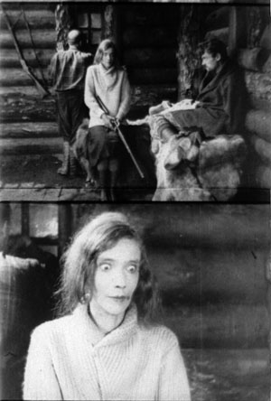
Then Kuleshov cuts straight back to the master setup. Again he cuts in, but to a closer view of Edith as she becomes more frenzied.
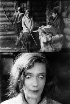
Cut back once more to the long shot, but only for fourteen frames. That shot is interrupted by a shot of Edith already laughing crazily, her head tipped back.
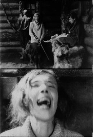
The shot of her laugh lasts only five frames, and this mere glimpse, combined with the blatant mismatch of movement, makes the onset of her spell all the more startling. When we cut back to the long shot her face and position now match.
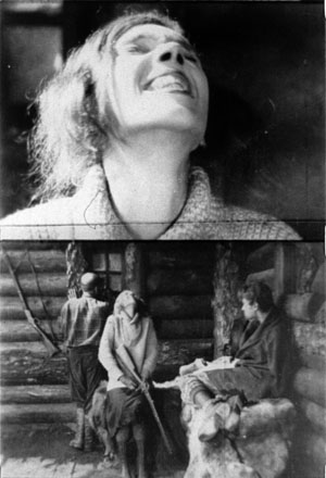
The abrupt quality of her outburst would not have been as striking if Kuleshov had varied his angle. As the earlier examples show, when only shot scale changes and angle remains the same, the cuts can be very harsh, and Kuleshov accentuates this quality with a flagrant mismatch.
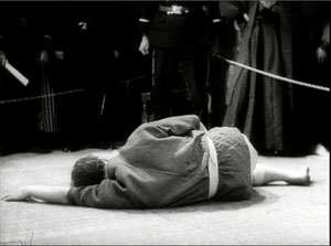
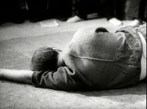
Akira Kurosawa likewise used the concentration cut to provide salient moments throughout his work; it almost became a stylistic fingerprint. At several points in Sugata Sanshiro (1943) he uses the device in the usual popping-forward way. But he varies it during Sanshiro’s combat with old Murai. He reserves dynamic, often elliptical cuts for moments of rapid action, and then he uses axial cuts for moments of stasis or highly repetitive maneuvers. In effect, the moments of peak action happen almost too quickly, while the moments of waiting are emphasized by cut-ins.
So at the start of the match, a series of axial cuts, linked by dissolves, present the fighters in a slow dance. But the ensuing throws are editing briskly. When old Murai is thrown and lies gasping on the mat, axial cuts accentuate his immobility. Kurosawa adds a rhythmic urgency on the soundtrack. After each cut-in, we hear the voice of Murai’s daughter, either offscreen or in his thoughts: “Father will win.” “Father will win.” “Father will surely win.”
The matching of lines to the editing is at work in the Simpsons parody too, in which the Comic Book Guy’s words are heard in tempo with the concentration cuts. “You. Are. Acceptable.”
Montage and the axial cut
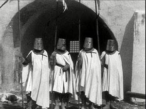
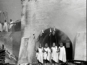
By now it’s easy for us to see that one scene from Alexander Nevsky (1938) opens with a series of axial cuts, out and in.
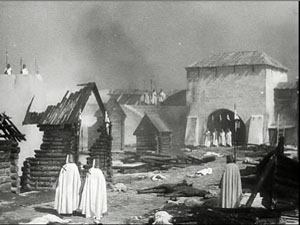
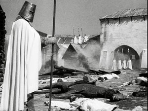
But why would Eisenstein, master of montage, regress to such a primitive device? He had occasionally used axial cuts in his silent films, as when we see Kerensky brooding in the Winter Palace in October (1928).
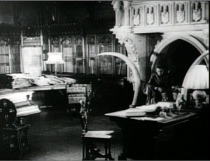
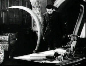
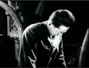
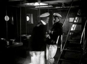
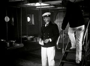
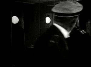
And Potemkin‘s famous cuts in to the Cossack slashing at the camera (that is, the baby, the old lady) are axial. (These cuts are pastiched by Eli Roth and Tarantino in Inglourious Basterds.) At the limit, Eisenstein toyed with the axial cut by moving the figures around during the shot change. In Potemkin, the ship’s officer reports to the captain that the crew has refused to eat. The captain leaves one shot and climbs the stair before Eisenstein cuts in to show him leaving again. The repetition would not be so perceptible if Eisenstein had varied the angle.
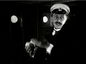
In the 1930s, Eisenstein began thinking about the axial cut as a basic structural element of a scene. In both his theory and practice, he promoted the axial cut to a level of prominence it hadn’t seen since the days of the tableau. Usually the cuts involve static subjects, like most of Kurosawa’s, but he still exploits the cut-ins to create vivid, if spatially impossible effects. At one point our popping in closer to Ivan the Terrible is doubled by him majestically and magically popping out of his tent to meet us, like a thrusting chess piece.
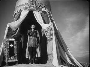
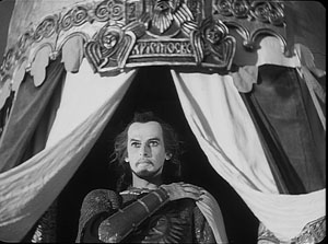
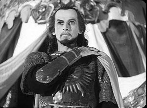
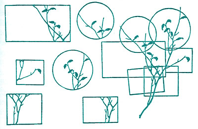
The new primacy of axial cutting comes from Eisenstein’s idea that “montage units” could powerfully organize the space of a scene. He thought that you could imagine filming a scene from only a few general positions, but then varying camera setups within each of these orientations. The montage unit was a cluster of framings taken from roughly the same orientation, as in the Pskov and Ivan scenes.
The idea may derive from his study of Japanese art, shown further above, in which he explored how a single image of a cherry branch could be chopped up into a great variety of compositions. In his course at the Soviet film school, he illustrated with a hypothetical scene of the Haitian revolutionary Dessalines holding his enemies at bay at a banquet. After imagining a master shot from the farthest-back position in the montage unit, Eisenstein proposes a series of dynamic closer views.
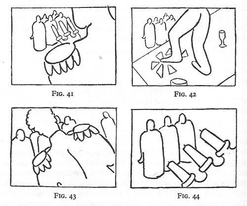
Eisenstein didn’t think that each scene had to be handled in a single montage unit. You could create two or three predominant orientations, with shots from each woven together. Or you could gain a sudden accent when a stream of setups from the same unit was interrupted by one from a very different angle. These ideas he put into practice throughout Nevsky and Ivan the Terrible.
Why? Eisenstein thought that combining shots taken from roughly the same orientation yielded a musical play between constant elements and variation. Each shot shows us something we’ve seen before but also something new, the way a bass line or sustained chords can continue underneath a changing melody. Eisenstein was convinced that this flowing weave of visual elements gave the spectator a deeper involvement in the film as it unfolded—an involvement akin to that found in Wagnerian opera.
The axial cut is a good example of how even a simple stylistic choice harbors rich creative possibilities. It also shows how a technique can change its impact in different filmmaking traditions. In the tableau tradition the axial cut was for the most part an abrupt enlargement heightening a moment of strong acting. In the early days of Hollywood continuity it became one editing option among many, and its power was somewhat muted. For the Soviets, concentration cuts could be multiplied and joined with fast cutting and big close-ups. The result could jolt the viewer by italicizing a face or an object–a purpose that has been taken up by contemporary Hollywood. For Kurosawa, the technique offered a way to contrast extreme movement and extreme stillness. And for Eisenstein, it suggested a global strategy for weaving visual elements into an immersive whole.
The protean functions assumed by this simple device remind us of how much there is yet to discover about film style. Despite all our discoveries over the last three decades, we have only begun. The name is apt: A seminar is where things start.
For more on the staging strategies of the tableau style, see On the History of Film Style and Figures Traced in Light: On Cinematic Staging, as well as blog entries here and here and here and here. You can find examples of emerging Hollywood continuity techniques in this entry on 1917 and this one on William S. Hart and this one on Doug Fairbanks. Sugata Sanshiro is at last available in a good DVD version from Criterion as part of its big Kurosawa box. Eisenstein’s ideas about the axial cut are explained in Vladimir Nizhny, Lessons with Eisenstein, trans. and ed. Ivor Montagu and Jay Leyda (New York: Hill and Wang, 1962), Chapters II and III. In The Cinema of Eisenstein I try to show how these ideas are employed in the Old Man’s late films.
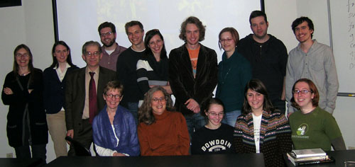
Seated: Leslie Debauche, Lea Jacobs, Rebecca Genauer, Pam Reisel, Amanda McQueen. Standing: Karin Kolb, Andrea Comiskey, Ben Brewster, John Powers, Tristan Mentz, Heather Heckman, Aaron Granat, Jenny Oyallon-Koloski, Jonah Horwitz, and Booth Wilson. Evan Davis had to leave early.
The movie looks back at us
DB, still at the Hong Kong International Film Festival:
Abbas Kiarostami has the widest octave range of any filmmaker I know.
His humane dramas of Iranian life, from The Traveller to The Wind Will Carry Us, have justly won acclaim on the arthouse circuit. He has written scripts as well, some—like the under-seen The Journey (1994)—that are as compelling as a psychological thriller. He can conjure suspense out of the simplest acts, such as whether an adult will rip up a child’s copybook (Where Is the Friend’s Home?) or whether a four-year-old boy locked in with his baby brother can figure out how to turn off a stove (The Key). Indeed, I think that one of the great accomplishments of much modern Iranian cinema, with Kiarostomi in the vanguard, has been to reintroduce classic dramatic suspense into arthouse moviemaking.
But at times Kiarostami has moved to an opposite pole, that of extreme minimalism and “dedramatization.” The drift toward a hard-edged structure was there in Ten (2002), which gave us one of his drive-through dramas—people conversing in the front seat of a car—but in severe permutational form (different drivers, different passengers). Rigor was pushed to an extreme in Five Dedicated to Ozu (2003): Five lengthy shots of water landscapes, each many minutes long, taken at different times of day. The biggest dramatic action was the ducks walking through the frame. With Kiarostami, it seems, we cinephiles can have it all—Hitchcock and James Benning in the same filmmaker.
Now Shirin (aka My Sweet Shirin, 2008) marks another highly original exploration. I don’t expect to see a better film for quite some time.
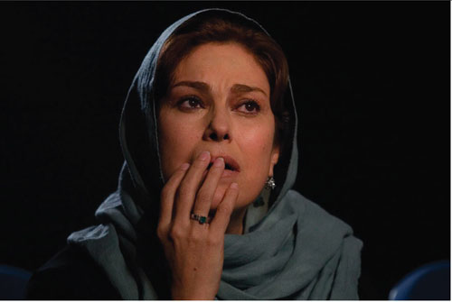
After a credit sequence presenting the classic tale Khosrow and Shirin in a swift series of drawings, the film severs sound from image. What we hear over the next 85 minutes is an enactment of the tale, with actors, music, and effects. But we don’t see it at all. What we see are about 200 shots of female viewers, usually in single close-ups, with occasionally some men visible behind or on the screen edge. The women are looking more or less straight at the camera, and we infer that they’re reacting to the drama as we hear it.
That’s it. The closest analogy is probably to the celebrated sequence in Vivre sa vie, in which the prostitute played by Anna Karina weeps while watching La Passion de Jeanne d’Arc. Come to think of it, the really close analogy is Dreyer’s film itself, which almost never presents Jeanne and her judges in the same shot, locking her into a suffocating zone of her own.
Of course things aren’t as simple as I’ve suggested. For one thing, what is the nature of this spectacle? Is it a play? The thunderous sound effects, sweeping score, and close miking of the actors don’t suggest a theatrical production. So is it a film? True, some light spatters on the edge of the women’s chadors, as if from a projector behind them, but no light seems to be reflected from the screen. In any case, what’s the source of the occasional dripping water we hear from the right sound channel? The tale is derealized but it remains as vivid on the soundtrack as the faces are on the image track. What the women watch is, it seems, a composite, neither theatrical nor cinematic—a heightened idea of an audiovisual spectacle.
Moreover, there are the faces. We see some more than once, but new ones are introduced throughout. Spatially, they float pretty free; only occasionally do we get a sense of where the women are sitting in relation to one another. All are stunningly beautiful, whether young or old. We get an encyclopedia of expressions—neutral, alert, concentrated, bemused, amused, pained, anxious. During a battle scene, faces turn away, eyes lower, and hands shift nervously. The best person to review this movie is probably Paul Ekman, world expert on the nuances of facial signaling.
The weeping starts, by my count, about thirty-eight minutes in, during a rain scene uniting the two lovers Shirin and Khosrow. Thereafter, tears run down cheeks, along jaws and mouths, down necks and nostrils. The film is an almost absurdly pure experiment in facial empathy. It arouses us us by our sense of the story unfolding elsewhere, somewhere behind us, enhanced by lyrical vocalise and brusque sound effects, but above all by these eloquent expressions. It’s a feast for our mirror neurons. If you’re interested in reaction shots, you have to recall Dreyer remarking that “The human face is a landscape that you can never tire of exploring.”
I once asked Kiarostami how he got the remarkable performances in shot/ reverse-shot that we see in films like Through the Olive Trees and The Taste of Cherry. He said that he simply filmed one actor saying all his lines and giving all his reactions, then filmed the other. Often the two actors were never present at the same time, especially when he shot the car sequences. This montage-based approach, creating a synthetic space simply by cutting, has been taken to an extreme in Shirin, where the soundtrack supplies the reverse shot we never see. We’re told that Kiarostami filmed his female actors here reacting to dots on a board above the camera! Indeed, Kiarostami claims he decided on the Shirin story after filming the faces. Despite that, Shirin becomes one of the great ensemble pieces of screen acting, although the actors almost never share a real time and space. (Take that, green-screen wizards!) Like Godard, Kiarostami has been busy reinventing the Kuleshov effect (perhaps by way of Bresson).
This catalogue of female reactions to a tale of spiritual love reminds us that for all the centrality of men to his cinema, Kiarostami has also portrayed Iranian women as decisive, if sometimes mysterious, individuals. Women stubbornly go their own way in Through the Olive Trees and Ten. The premises of Shirin were sketched in his short, “Where Is My Romeo?” in Chacun son cinema (2007), in which women watch a screening of Romeo and Juliet. But the sentiments of that episode are given a dose of stringency here, particularly in one line Shirin utters: “Damn this man’s game that they call love!”
One last note: Kiarostami built movie production into the plot of Through the Olive Trees. Now he has given us the first fiction film I know about the reception of a movie, or at least a heightened idea of a movie. What we see, in all these concerned, fascinated faces and hands that flutter to the face, is what we spectators look like—from the point of view of a film.
For more on the production background, see the lengthy interview with Kiarostami here.


