Archive for the 'Directors: Kurosawa Akira' Category
Some cuts I have known and loved
DB here, belatedly:
We’ve been so busy revising our textbook, Film History: An Introduction, for its third edition that we’ve had no time to see new movies, let alone blog on our regular schedule. To those loyal readers who have been checking back occasionally, we say: Thanks for your patience. An entry that should intrigue you is in the works, possibly to be posted very soon.
In the meantime, here’s an item on a subject I’ve been meaning to slip in at some point. It’s a tribute to cuts I admire.
Warning: Superb as Eisenstein’s, Ozu’s, and Hitchcock’s cuts are, I’m deliberately leaving them out. Too obvious!
Kata and cutting
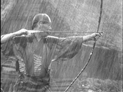
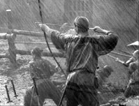
Okay, Kurosawa is an obvious choice too, but I can’t pass up some of the first outstanding cuts I noticed in his work, back when I was projecting movies for my college film society. The cuts occur during the climactic battle of Seven Samurai (1954).
As is well-known, Kurosawa shot the sequence with several cameras using different focal-length lenses. What is less often acknowledged, I think, is the power of certain cuts as they combine with fixed camera positions. In his last films, Kurosawa would rely strongly on long-lens shots that pan over the pageantry of his crowd scenes, but here he exploits static frames.
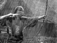
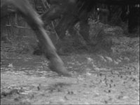
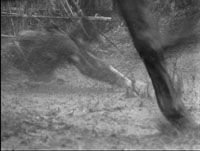
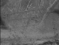
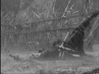
In the eye of the battle, Kambei fires his arrow in one shot, and a horseman falls victim to his marksmanship in the next. So far, so conventional. But what’s unusual is that we don’t actually see the arrow hit its target. Kambei fires, and Kurosawa cuts to an empty bit of the town square, churned with mud and dimly visible through horses’ legs. Only after an instant does a fallen bandit skid into the telephoto frame.
The same thing happens when Kambei shoots his second arrow: we must wait for the victim to plunge into the frame.
The result, I think, is a sense of exhilarating inevitability. The camera knows that the horseman will fall, and it knows exactly where. That’s a way of saying that Kurosawa’s visual narration fulfills our expectation, but with a slight delay. The empty frame prompts us to anticipate that the man will be hit—why else show it?—and we have a moment of suspense in waiting to confirm what we expect. Moreover, the force of Kambei’s arm is given us through a principle of Movie Physics: motion communicated to another body is magnified, not diminished, and the fixed frame allows us to see just how far the bodies are propelled. The arrow must have been Homerically powerful if it sends these men to earth with such impact.
Most directors would have panned to follow the victim as, wearing the arrow, he tumbled off his horse and hit the ground. This choice would have been natural given the multiple-camera situation. Instead Kurosawa had his camera operators frame the exact spot the stuntman would hit and wait for the action to hurtle into the shot. The patient expertise of Kambei’s marksmanship has its counterpart in the confidence of Kurosawa’s style. (1)
The moving image, Mr. Griffith, and us
Then there’s Intolerance (1916).
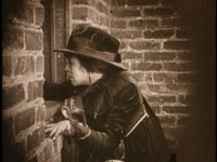
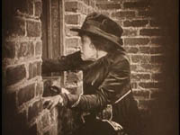
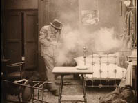
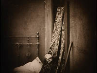
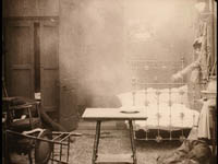
The Musketeer of the Slums is trying to seduce the young man’s wife, the Dear One. He pretends he can retrieve her baby. But his earlier conquest, the Friendless One, has followed him to the tenement, and at the same time the Boy has learned about the Musketeer’s visit. As the Musketeer attacks the Dear One, the Boy bursts in. The two men struggle and the Boy is momentarily knocked out; the Dear One has swooned. So no one sees what really happens next: From the window ledge the Friendless One fires her pistol and downs the gangster. She flees, and the boy believes that he is the killer. He will be charged with the murder.
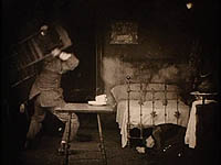
Here’s what I admire. Griffith sets the situation up with his usual rapid crosscutting—the Musketeer and the Dear One struggling, the Boy returning, and the Friendless One crawling out on the ledge. When the fight starts, Griffith shows the Friendless One growing wild-eyed at the window. She fires once, and Griffith gives the action to us in three shots: a medium shot of her in profile, a medium-long shot of the pistol at the window (irised so we notice it), and a long-shot of the room, as the Musketeer is hit.
Griffith repeats the series of shots when the Friendless One fires again.
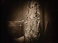
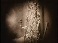
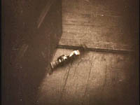
This time the Musketeer staggers out to the hall and dies. Neatly, Griffith gives us three more shots, but omits the setup showing the Friendless One. Cut to the curtains again, with her hand waving the pistol, then to another long shot of the room as the gun is tossed in, and finally to a close-up of the pistol landing on the floor.
If you’re looking for a pattern, the pistol in close-up is in effect substituted for the shot of the Friendless One at the start of each cycle. But I’m most interested in the shots of the pistol. The first one at the window goes by at blinding speed—ten frames in the two prints Kristin and I have examined. (2) That works out to a bit more than half a second, if you assume 16 frame per seconds as the projection rate, which was common at the time.
Okay, fussy, but I’ve already confessed that I turn into a frame-counter, when I get the chance. The second shot of the pistol poking out of the curtains, parallel to the first, is also ten frames long. Griffith seems to have been a frame-counter too.
What’s most remarkable is that the long-shot of the pistol being flung into the room is even briefer than these closer views—only seven frames long, or less than half a second at 16fps. As a nice touch, the close-up of the pistol landing in the corner is twice that (15 frames).
In the decades that followed, directors would believe that long shots shouldn’t be cut as fast as close-ups, so the Intolerance passage can strike us as a typical Griffith misjudgment. But I admire his willingness to cut long shots so fast. It certainly creates a percussive accent. In case we didn’t catch the story point, the close-up of the pistol hitting the floor clinches it.
This is the sort of sequence that the Soviet filmmakers probably learned from. They may even have gotten ideas from Griffith’s interspersed black frames (two by my count) before each of the shots of the pistol thrusting out of the curtain. (3)
Behind the desk
Speaking of the Russians, one of my favorite cuts in Pudovkin’s movies comes during a confrontation in The End of St. Petersburg (1927). The somewhat oafish young worker known only as the Lad, who has sold out his comrades, attacks the boss Lebedev in his office. He seizes the boss and shoves him down, jamming him between his desk and the window. We see the action from one angle and then what seems to be an opposing angle.
Actually, this is a big discontinuity. Using the desk, the telephone, and the window as reference points, we can see that in the first shot, the Lad moves in from the left side of the desk to push the boss down. In the second, he has come in from the right side and Lebedev’s head is pointing in the opposite direction. We can see the weirdness of this more clearly if we simply flip one of the frames: now it looks like a consistent change of angle.
Pudovkin has created an impossible event. But the cut gives the strong sense of graphic conflict that the Soviets (not just Eisenstein) sought, creating a kind of visual clatter to underscore the violence of the action. It’s possible that Pudovkin actually flipped a “correct” framing to create the disjunction, as some of his contemporaries did. (4)
Meg, all aflutter
Pudovkin’s cut reminds us that filmmakers can get away with a lot if they change the angle drastically. It’s harder to spot a cheated element or a mismatch if the new shot makes us reorient ourselves. Why does this happen? That’s a subject for research, as I’ll suggest at the end.
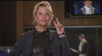
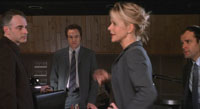
Here’s another tricky item. In Kate & Leopold (2001), Kate has brought her time-traveling guest to an audition for a butter commercial. In the studio, he’s behind her as she tries to convince her colleagues to watch him. As she talks, she first watches Leopold in the monitor above them, then swivels to talk to her boyfriend and other suits. The camera positions change 180 degrees.
This drastic shift works to prepare us for a remarkable cut a little later. Kate waves her hand, saying she only needs two minutes. She pivots her body, moving her hand downward.
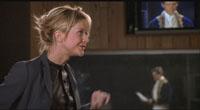
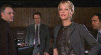
Cut 180 degrees to a setup similar to the one we’ve seen earlier: She drops her hand to her side as she swings to us.
The gesture is smoothly matched. The only trouble is that it’s executed by the wrong hand. In the first shot Kate is wiggling her left hand, but in the second, it’s her right hand that continues the movement and drops to her hip.
I don’t think that many people would notice this. Indeed, when I first saw the film, I felt a bump hereabouts, but when I watched it over again on DVD, it looked fine to me. Then I watched it again and saw what was wrong. Even then, I thought I might be hallucinating. It’s one of the trickiest cheats I know of, and it’s beautifully done.
The real question is: Why don’t we notice it? We usually say, “Because we’re watching the story and ignore little irregularities.” But that’s not very satisfactory. Why isn’t the wave of Kate’s hand part of the story? We certainly notice it as expressing her attitude—hence as part of the story. And if you didn’t notice the disjunction in my End of St. Petersburg example, the same question arises: Isn’t the Lad’s attack on the boss the very story action we’re watching?
Consider the alternative. If director James Mangold had matched the left hand, it would have to cross the center of the frame as Kate pivots, shifting from screen left to screen right before landing at her hip. It would have been ostentatious and somewhat graceless, and perhaps that would have been distracting. So the mismatch is perhaps a line of least resistance, a compromise–as so many stylistic choices are.
In addition, Kristin suggests that our pickup is made easier by the placement and action of the hand. In both shots it’s quite central and moving in the same direction at the same rate, so that it’s easy to read as a graphically continuous element across the cut.
Perhaps too the fact that we’re switching our position 180 degrees leads us to expect, wrongly, the sort of reversal we get here—the way that we think our reflection in a mirror is the way we really look. And of course the earlier 180-degree switch, in which no mismatch occurs, probably serves to prime us for the shift in orientation this provides.
Mangold doesn’t mention the cut in his director’s commentary on the Kate & Leopold DVD, but when I asked him he said: “I think of shots as blocks, like legos or words. I don’t want them to resolve–come to an end. . . . Movement cuts work as long as the action is somewhat similar. The tough continuity cuts when you have a mismatch are the still ones.” Even if the mismatch here was accidental, it works very well. More generally, like other mismatches this one obliges us to think about what we see and what we don’t see when we watch a movie.
Hawks’ eyes
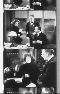
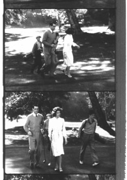
Among the many pleasures of Howard Hawks’ movies are their lovely matches on action. Of course his editors had a lot to do with this, but Hawks clearly had to provide the right footage so that it could be precisely matched. Bringing Up Baby (1938) yields a crisp cut as Susan, perched on the constable’s desk, strikes a match. (I show the cuts from a 16mm print; enough of this video stuff.)
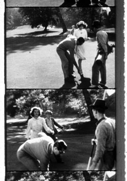
Here Hawks seems to rely on what’s been called the two-frame rule: If you’re going to match on action, overlap the action by two frames to show a bit of the action again. This allows the audience time to absorb the fact of the cut and then to see the action as continuous. But Hawks could be quite cavalier about his matches as well. The golfing scene from Bringing Up Baby is full of wild cuts.
The caddies advance and recede, Susan and David are caught in different postures, and at some cuts they’re striding across different parts of the course. These cuts have a swagger about them, as if Hawks is daring us to spot his outrageous cheats. How many of us do?
All these trompe l’oeil effects can be studied psychologically, and prominent researchers who have tested such effects in the laboratory are attending our 11-14 June meeting of the Society for Cognitive Studies of the Moving Image. Dan Levin studies discontinuities in film from the standpoint of “inattentional blindness”; here he’s interviewed by Errol Morris. Barry Hughes of Arizona State University at Tempe has probed the two-frame rule, and he’s talking in Madison as well. Go here for more information; I’ve plugged the event previously here.
Next time, we expect: Secrets of film restoration.
(1) Kurosawa has prepared us for this passage when Kikuchiyo’s sword attacks the bandits earlier in the sequence. There too a shot of his flailing stroke is followed, after a pause on a patch of mud, by a falling horseman. But the calm deliberateness of Kambei’s drawing of his bow enhances the sense of inevitability, I think. Kiku does his damage through furious energy, but Kambei hits his mark thanks to a mature warrior’s almost contemplative precision.
(2) Forget checking these frame counts on DVD. I get several different counts, depending on the player I use. For reasons discussed here, DVDs don’t preserve the original film frames, and in a fast-cut passage you can lose any sense of how many frames the shot lasted.
(3) By the way, Griffith died on 23 July 1948, my first birthday.
(4) For more on this extraordinary movie’s use of discontinuity editing, see Vance Kepley, Jr., The End of St. Petersburg (London: Tauris, 2003).
Hands (and faces) across the table
DB here:
In books and blogs, I’ve expressed the wish that today’s American filmmakers would widen their range of creative choices. From the 1910s to the 1960s (and sometimes beyond), US filmmakers cultivated a range of expressive options—not only cutting and camera movement but other possibilities too. Studio directors were particularly adept at ensemble staging, shifting the actors around the set as the scene develops.
You can still find this technique in movies from Europe and Asia, as I try to show in Figures Traced in Light and elsewhere on this site. But it’s rare to find an American ready to keep the camera still and steady and to let the actors sculpt the action in continuous time, saving the cuts to underscore a pivot or heightening of the drama. Now nearly every American filmmaker is inclined to frame close, cut fast, and track that camera endlessly. I’ve called this stylistic paradigm intensified continuity.
As Los Angeles agent and former editor Larry Mirisch once put it in conversation with me: “They used to move their actors; now they move the camera.” Most of today’s prominent directors prefer kinetic camerawork and machine-gun cutting. This tends to make their staging rather simple and static: we get stand-and-deliver or walk-and-talk (subject of a blog entry here).
The result is a split in contemporary American style. Action scenes are often gracefully and forcefully choreographed (though sometimes the editing fuzzes up character position and overall geography). By contrast, conversation scenes, which could be choreographed as well, are handled either as a Steadicam walk-and-talk or simply as seated actors talking to one another, with cuts breaking up the lines and the camera on the prowl. (I discuss some examples in The Way Hollywood Tells It, pp. 128-173.) (1) You sometimes suspect that today’s directors are most at home shooting lots of people hunched over workstations, making the principal form of suspense a LOADING command.
Don’t get me wrong. Like all styles, intensified continuity isn’t a bankrupt option; many fine directors, from the Coens to Michael Mann, have worked vigorous variants on it. What I’m arguing for is more plurality, more tones in the director’s palette. I’ve revived these cranky ideas in discussing a single shot, this time in Variety. Today’s blog entry expands on that brief piece, so you may want to hop over to it here before reading what follows.
Directing us
One task facing any director is to direct—not only actors but us. The filmmaker must direct our attention to what’s important for responding to the drama at any moment. Since the late 1910s, we’ve known that close-ups and frequent cutting do just that. Tight framings and rapid cuts can steer the audience’s attention through a scene. So the question becomes: How can you direct attention without using close views and fast cutting?
Well, for one thing you can place the main action in the center of the picture format. If there are several points of interest in the shot, which is usually the case, you can arrange them symmetrically around the central zone of the shot—in film, usually an zone just above the geometrical center of the picture format. You can also position your main players so that the most important ones are closer and/or facing toward the camera. By turning a character away from the camera, you can drive the audience’s eye to someone else. There are other pictorial cues worth mentioning (lighting, color combinations, patterns in the set design), but these will hold us for now. Add in movement—characters shifting their position, especially coming closer to the camera—and you have a suite of cues that a film shot can provide.
Apart from these purely compositional factors, you the director can exploit some cues that are part of our social proclivities. When we watch other people, we’re attracted to areas of high information—which, for creatures like us, are faces and hands. Faces send signals about what people are thinking and feeling, with the areas around the eyes and mouth telling us most. Hands are the source of gestures, as well as potential threats. And of course if someone is speaking and others are listening, we are likely, all other things being equal, to look at the speaker.
The crucial fact is that in ensemble staging all these cues, and more, are at work at the same time. The director’s skill is orchestrating them so that they support one another, guiding us to see this or that. (On rare occasions, the director will use them to misguide us, but let’s stick with the default for the moment.) For a long time, filmmakers knew intuitively how to coordinate these cues to create rich and intricate shots; I fear that they no longer know how. (2)
That’s what makes one passage in Paul Thomas Anderson’s There Will Be Blood of interest to me. The scene presents Paul Sunday explaining to Daniel Plainview that there’s oil on his family’s property. Daniel and Paul are bent over a map on a tabletop, with Daniel’s assistant Fletcher Hamilton and Daniel’s son HW watching. The scene is presented in a single shot, with a slight camera movement forward at the start.
The composition could hardly be simpler: four people lined up, three at the edge of the table. The heads cluster around the center of the format, with HW lower and off-center; no surprise that he’s the least important character in the scene (though his question to Paul foreshadows action in the film to come). Paul is explaining where the oil is, and the two men’s faces and hands command our attention as they speak.
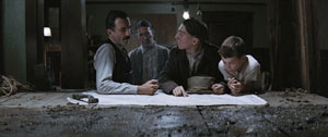
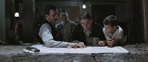
Many directors would have cut in to a close-up of the map, showing us the details of the layout, but that isn’t important for what Anderson is interested in. The actual geography of Plainview’s territorial imperative isn’t explored much in the movie, which is more centrally about physical effort and commercial stratagems.
Questioning Paul about his family, Daniel turns slightly away. This clears a moment for HW to ask about the girls in Paul’s family, and for a moment our attention is steered to the right, to pick up their interchange.
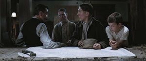
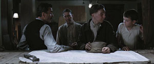
Then Fletcher asks about the farm, and as Paul and Daniel tilt their faces to him, he earns his place in the center of the frame. Before, when we could see the faces of the two men closest to the camera, he was subsidiary, but now he becomes salient. On the left, Daniel shifts away uneasily, turning almost completely away from the camera. In answering Fletcher, Paul turns away in the opposite direction, as if shy or guilty; his awkward gesture of stroking his hat seems to confirm Daniel’s doubts about him.
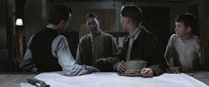
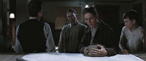
During a pause, Paul turns back to stare directly at Daniel, saying quietly, “The oil is there.” At the same time, Daniel, still turned away, is exchanging a glance with Fletcher. At this point, Anderson’s training of us pays off: we’re ready to detect the slight shift in Fletcher’s eyes, which confirms that Daniel’s looking at him. “Watch their eyes,” as John Ford liked to say.
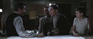
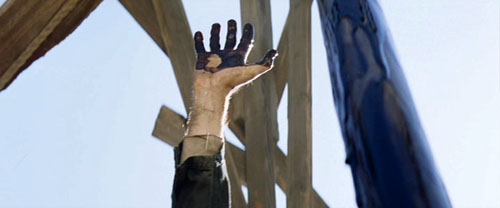
Paul sets out to leave, and he refuses the invitation to stay the night. At this point comes the scene’s biggest gesture. Daniel raises his hand, in the dead center of the frame.
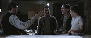
Spreading his long, thin fingers, Daniel commands our attention. He seems at once to be halting the young man and threatening him. But the gesture becomes the prelude to a handshake. Daniel’s characteristic blend of bluff assurance, friendliness, and aggressiveness are packed into this single gesture. (At the climax, other gestures will recall this one.)
Daniel steps closer to Paul, blocking out Fletcher, to make his threat: If he travels so far and doesn’t find oil, he’ll find Paul and “take more than my money back.” Paul agrees and moves away. “Nice luck to you, and God bless.”
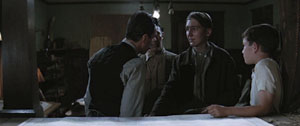
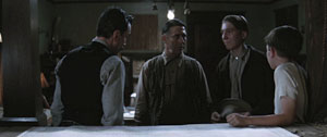
The men watch Paul leave the building. End of scene.
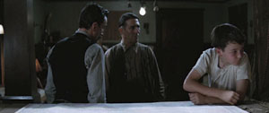
Without any close-ups or cutting, Anderson has skillfully steered us to the main points of the scene, which are carried by the performers. The drama builds through small changes of position, shifts of weight, and facial expressions that accompany the dialogue. (The somber, plaintive music adds an uneasy edge.) Daniel seems more threatening when we don’t see his reaction, and Anderson’s camera forces us to scrutinize Paul’s expressions and body language for signs that this is a scam. It takes confidence to make a raised hand the climax of a scene, but the gesture gains its force by being the most aggressive moment in an arc of quietly accumulating tension.
All the principles involved here—frontality, spacing of figures, slight shifts of compositional focus, actors’ body language—are simple in themselves, but they gain a strong impact by cooperating with one another. The scene’s quiet obliqueness is characteristic of the film, which, at least until the last few minutes, carries us along with hints about where the action might go and what drives its characters.
Yet simplicity shouldn’t imply simplification. Anderson’s willingness to give the shot several points of interest, some more stressed than others, creates an understated tension. The shot’s gravity stems from its conciseness, a quality that Anderson admires in 1940s studio films like The Treasure of the Sierra Madre.
Two more tabletops
The staging strategies Anderson uses aren’t new, as I’ve suggested. They’re part of the history of film as an art form, and many directors have continually relied on them. I don’t think that this is always a matter of influence, although surely filmmakers learned from watching earlier films. Often, directors working within similar constraints intuitively rediscover what other directors have already done.
Consider this scene from Kurosawa Akira’s The Most Beautiful (1944). The setting is a plant where Japanese workers, mostly girls and women, are manufacturing bombsights. The workers have vowed to increase production for the war effort, and they are working to the point of exhaustion. The plant supervisors are worried that the pace will take its toll on the girls.
The scene starts with the eldest supervisor studying the output chart, lying on a table below the frame edge. His colleagues are turned away, at the window. He is the one who must decide how to keep the girls healthy and the output steady. The table and the window will be the two poles of the action, and the actors will oscillate between them. The process starts when the eldest retreats to the window, and one comes forward to study the report.
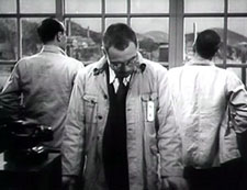
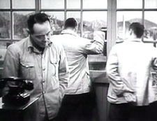
He’s followed by his opposite number, and they echo one other in rubbing their necks. They’re as tired as the assembly-line girls. Their superior turns and says that there’s no point in lowering the quota because the girls are so devoted that they’d push harder anyway.
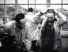
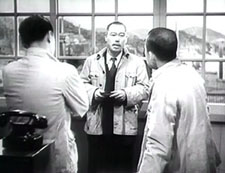
The men have turned to listen to him, driving our attention to his centered, frontal figure. After the elder has turned away again, the man on the right says that this might be the critical juncture. Remarkably, all three men remain turned from us, creating a slight pictorial tension.
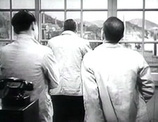
This tension is extended when the supervisor on the left states his confidence in the children, their team leader, and their teacher. This makes the eldest turn around.
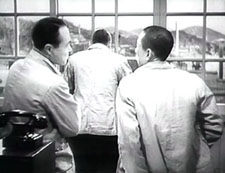
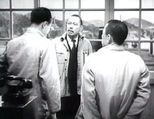
The speaker walks to the window, arguing that the girls will succeed, but the leader turns away again dubiously. He doesn’t offer a decision because an offscreen voice announces that a teacher has come to see them, and they all turn to look.
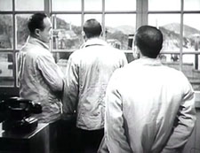
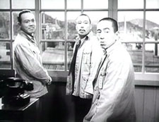
The factory’s problem isn’t solved; the seesawing of the staging has presented that irresolution dynamically. In a single shot, the difficulty of the administrative decision has been expressed in counterweighted movements in and out, by the figures’ frontality and dorsality. Again, it can seem simple, but where a contemporary American director would have given us a prolonged passage of stand and deliver, with intercut close-ups, Kurosawa has created a little ballet out of the men’s uncertainties. Like Daniel’s raised hand, but with even less emphasis, the assistant’s plea on behalf of the girls’ commitment has gained a subtle prominence. Yet all he has done is walk to the window.
I’m not saying, of course, that Anderson took the idea from Kurosawa. Given the initial choice to stage the scene behind a table, and the inclination to present the action in one shot, both directors spontaneously drew on basic staging principles. This is what film directors have always done. So as a finisher, here’s one last tabletop interlude from Cecil B. DeMille’s Kindling (1915). The entire scene is a dense and intricate affair, but let’s pick just one moment. Maggie has become a servant to a rich woman, Mrs. Burke-Smith, and she’s about to be arrested for theft. Detective Rafferty is ready to handcuff her, but Mrs. Burke-Smith changes her mind.
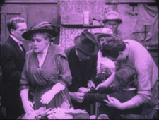
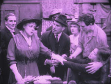
DeMille arranges his actors so that we can’t miss the rich woman’s moment of decision. She is in the foreground, and her face is in the upper center of the frame. The other actors are blocked, so that her expression is the only one we can see clearly at the crucial moment. Her hand gesture, stretching across the central axis of the frame, confirms that she won’t charge Maggie. (For a similar use of “blossoming” actors’ movements in 1910s cinema, go here and look at Figs. 2A10-2A11.) What DeMille knew, Kurosawa discovered afresh, and Anderson hit upon it again.
Strategies of staging, like other principles shaping how films tell stories, lie behind each concrete creative decision the film artist makes. They run as undercurrents through film history, almost never discussed by critics. They form a body of tacit knowledge, flowing across our usual distinctions of period, genre, director, national cinema. We can trace continuities and changes, examining how the strategies are revived, revised, or rejected. They can provide us with subtle but powerful experiences. They constitute a skill set that is available to filmmakers today. . . if any will, like Anderson, seize the chance.
(1) True, Wes Anderson keeps the camera still, but in his frontal, family-portrait framings the cutting and line readings do all the work; dynamic staging isn’t on his menu.
(2) I survey the development of these and other tactics in Chapter 6 of On the History of Film Style. On this site, for one example go here and scroll down to the Bauer material.
Unassigned reading
DB here:
Thanks to the digital engineering efforts of Andy Adams, of Flak magazine, some older research articles of mine are now archived on the site. See the list on the left, or click here. The pieces range from discussions of particular filmmakers (Feuillade, Preminger) and film techniques (e.g., jump cuts) to more general questions about film theory, history, and criticism. Also included is Lingua Franca‘s profile of me. I’ve added some supplementary comments to give a little context. Andy will be adding a couple more essays in the week to come.
This spring my Poetics of Cinema collects other previously published essays, all revised. That collection includes several new pieces as well.
Also, I’ve added two new book reports, one on James Mottram’s The Sundance Kids, the other on Joe Eszterhas’s Devil’s Guide to Hollywood.
A great gift for the film fan on your holiday list: The wonderful book by Teruyo Nogami, Waiting on the Weather: Making Movies with Akira Kurosawa, trans. Juliet Winters Carpenter. This is a trip back to a golden era of Japanese cinema.
Ms. Nogami started as a minor functionary at Toho, shifted to Daiei, and then worked as scriptgirl for Kurosawa. As sharp, funny, and moving as any Japanese film of the 1940s and 1950s, her book gives an engrossing account of the social interactions around moviemaking. You get a sense of the desperate energy of Japanese film production in the late 1940s, when Tokyoites scrabbled for food. Film stock was scarce–directors sometimes could afford to make only one take–and people worked around the clock. To keep going during all-night shoots, crew members injected themselves with philopon (aka speed).
Of course Kurosawa stands at stage center, treated reverently but also with keen observation. You’ll want to read about his relations with producers, composers, cameramen, and tigers. But there are other featured players too. As a schoolgirl Ms. Nogami corresponded with the important 1930s director Mansako Itami, and she took sisterly care of his son Juzo, who would grow up to direct Tampopo and A Taxing Woman.
In all, a document of moviemaking’s many dimensions–technical, financial, artistic, and personal. Donald Richie contributes a warm foreword, and we should thank Marty Gross of Marty Gross Films for initiating the translation.


