Archive for the 'Directors: Murnau' Category
The ten best films of … 1926
The Adventures of Prince Achmed.
Kristin (with some help from David) here:
David and I have been offering this greatest-of-90-years-ago series almost as long as this blog has existed. For earlier annual entries, see 1917, 1918, 1919, 1920, 1921, 1922, 1923, 1924, and 1925.
I approached 1926 with the assumption that it would present a crowded field of masterpieces; surely it would be difficult to choose ten best films. Instead it turned out that some of the greatest directors of the era somehow managed to skip this year or turn in lesser films. Eisenstein had two masterpieces in 1925 but no film in 1926. Dreyer made a film that is a candidate for his least interesting silent feature, The Bride of Gromdal. Chaplin did not release a film, and Keaton’s Battling Butler, while a charming comedy, is not a plausible ten-best entry. The production of Lang’s Metropolis went over schedule, and it will appear on next year’s list, for certain.
Still, the Soviet directors were going full-tilt by this time and contribute three of the ten films on this year’s list. French directors on the margins of filmmaking created two avant-garde masterpieces. Two comic geniuses of Hollywood already represented on past lists made wonderful films in 1926. A female German animator made her most famous work early in a long career. I was pleased to reevaluate a German classic thanks to a sparkling new print. Finally, Japan figures for the first time on our year-end list, thanks to a daring experimental work that still has the power to dazzle.
The Russians are coming
Vsevolod Pudovkin’s Mother was a full-fledged contribution to the new Montage movement in the Soviet Union. By the 1930s, that movement would be criticized for being too “formalist,” too complex and obscure for peasants and workers to understand. Nevertheless, being based upon a revered 1906 novel of the same name by Maksim Gorky, Mother was among the most officially lauded of all Montage films. It tells the story of a young man who is gradually drawn into the Russian revolutionary movement of 1905. His mother, the protagonist of the novel, initially resists his participation but eventually herself joins the rebellion.
Along with Potemkin, Mother was one of the key founding films of the Montage movement. Its daring style is no less impressive now than it must have been at the time. One brief scene demonstrates why. Fifteen years before Mother, D. W. Griffith was experimenting in films like Enoch Arden (1911) with cutting between two characters widely separated in space, hinting that they were thinking of each other. By 1926, Pudovkin could suggest thoughts through editing that challenged the viewer with a flurry of quick mental impressions.
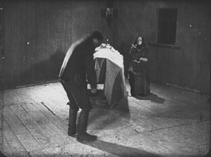
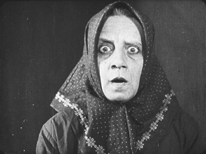
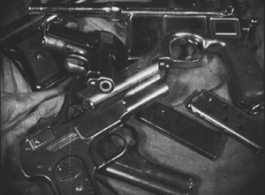
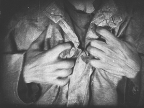
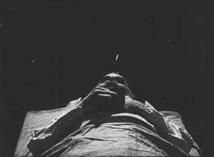
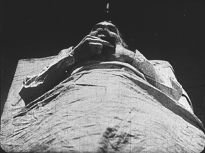
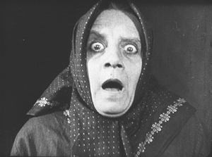
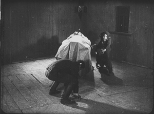
As the Mother sits beside her husband’s dead body, her son, a participant in the 1905 failed revolution, comes in. He is about to bend down and open a trap-door in the floor (73 frames). A cut-in shows her horrified reaction (12 frames), and there follows a brief close shot of some guns she had seen him hide under the floor in an earlier scene (11 frames). Even shorter views of a man clutching his chest (8 frames), two jump-cut views of the dead husband (3 frames and 2 frames), and a tight framing of the son being shot follow (8 frames). We return to her face, registering even greater horror (15 frames). A return to the initial long shot shows her leaping up to try and stop her son from taking the guns out to participate in a seditious act (31 frames).
The series of five shots goes by in a few seconds, and we are challenged to grasp that the guns are a real memory, while the shots of the man’s chest and her son’s anguished face are visions of what might happen. The shots of her husband’s body suggest that she could soon end up sitting by her son’s corpse as well. The jumble of recollection, imagination, and reality are remarkably bold for this relatively early era.
Mother also contains two of Pudovkin’s most memorable scenes, the breaking up of ice in the spring as a symbol of the Revolution and the final violent attack on the demonstrators, including the heroine.
Mother was released on DVD by Image Entertainment in 1999, but it seems to be very rare. An Asian disc, perhaps a pirated edition of the Image version, is sold on eBay. I’ve never seen the film on DVD and can’t opine on these. The time is ripe for a new edition.
Pudovkin was one of the filmmakers who had studied with Lev Kuleshov during the early 1920s, when Kuleshov made the famous experiments that bear his name. Pudovkin played the head of the gang of thieves in The Adventures of Mr. West in the Land of the Bolsheviks, which I included in the ten-best list of 1924.
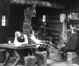
Kuleshov had moved on as well to direct his most famous film and probably his best silent, By the Law, based on Jack London’s story “The Unexpected.” Set in the Yukon during the gold rush, it involves five people who are cooperatively working a small claim and discover gold. Taking advantage of a warm autumn, they stay too long and are trapped for the winter. One of the men kills two of the others, and the heroine, Edith and her husband Hans are left to determine the fate of the killer, Dennin. Edith insists on treating him strictly according to the law. After enduring the harsh winter and a spring flood, the couple finally act as judge, jury, witnesses, and, after finding Dennin guilty, executioners.
The great literary critic and theorist Viktor Shklovsky (one of the key figures of the Russian Formalist school) adapted the short story, condensing it by eliminating the opening section of Edith’s backstory and a few scenes in which a group of Indians appear occasionally to help the prospectors. The result is a concentration on the tense drama of a three people trapped together in a tiny cabin.
In the 1924 entry, I mentioned that Kuleshov’s team emphasized biomechanical acting and that Alexandra Kokhlova was adept at eccentric acting. She delivers a bravura performance here, as Edith moves closer to a breakdown as the months go by.
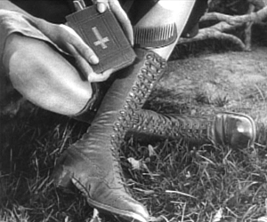
Kuleshov also puts into practice the experiments in imaginary geography that his classes had made. Although in this film he didn’t unite shots made in widely separate spaces, he did favor scenes built up of a considerable number of detail shots before finally revealing the entire space in an establishing shot. Edith, for example, though glimpsed briefly asleep early on, is introduced in a later scene by a shot of her boots and Bible, followed by a shot of her head as she read the Bible. The scene also contains close shots of the other characters before a general view of the cabin interior shows where each of them is.
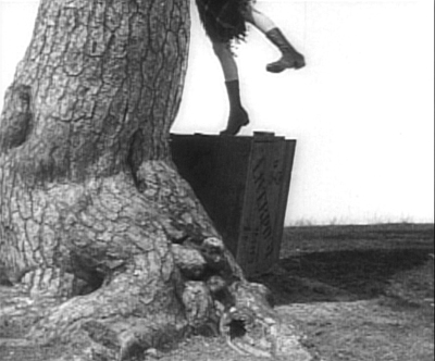
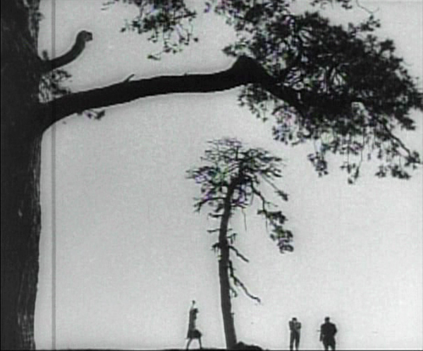
The scene of the execution includes one of the most famous images of the Monage movement, a framing with the horizon line at the bottom edge of the frame and the sky dominated by trees (see bottom). Any number of framings of tall features such as trees and telephone poles against a huge sky appeared in Montage and non-Montage films, and this device became so common as to be a trait of the Soviet cinema of the late 1920s and early 1930s.
The desire to hide the actual hanging led Kuleshov to stage is behind the larger of the two trees, as Edith and Hans struggle to carry out their sentence on Dennin. This leads to some eccentric framings, such as our view only of Edith’s legs as she teeters on the box where Dennin stands, presumably adjusting the noose (see top of this section).
A beautiful print of By the Law is available on DVD from Edition-Filmmuseum.
Grigori Kozintzev and co-director Leonid Trauberg did not study with Kuleshov, but they shared a passion for eccentricity. Having started out in the theater, in 1921 both contributed to the “Manifesto for an Eccentric Theater,” a dramatic approach based on popular forms like circus and music-hall. In 1922 they founded the “Factory of the Eccentric Actor” group and two years later transformed it into FEKS, devoted to making films.
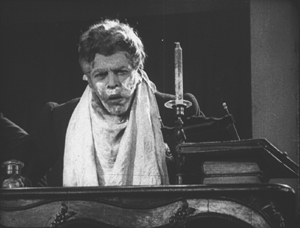
The Overcoat (also known in English as The Coat), their second feature, was based on a combination of two short stories by Gogol, an author whose grotesque creations were very much in tune with their own tastes. It tells the story of a poor, middle-aged low-level government clerk, Akaky Akakievich, who is bullied over his shabbiness, particularly his worn-out overcoat. Scrimping to buy a new one, he finally purchases a magnificent new coat and finds his status suddenly raised–until the coat is stolen.
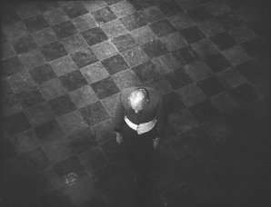
Andrei Kostrichkin was a mere twenty-five years old when he played the fiftyish clerk, but he was highly effective and provided another model of the eccentric actor. As Akakievich he stands with bent legs and twisted torso, as if flinching away from a blow, and walks in tiny steps along perfectly straight lines through the hallways in his office building. When he applies to a Person of Consequence for help in recovering his stolen coat, the official leans over his desk to look downward, with a high-angle point-of-view framing of Akakievich appearing dwarfed by the other’s superiority.
The script of The Overcoat was adapted by another Russian Formalist critic and theorist, Yuri Tynjanov.
Unfortunately The Overcoat does not seem to be available on any form of home video.
Petit mais grand
The IMDb lists 23 directing credits for Dimitri Kirsanoff from 1923 to the year of his death, 1957. He is largely remembered, however, for one film, the 37-minute Ménilmontant, a melodrama about the travails of two sisters orphaned as children by a violent crime. Each is later seduced by a callous young man who leaves the heroine a single mother and her sister reduced to prostitution. It belongs to the French Impressionist moment. (We deal with Impressionist films in other entries: La roue, L’inhumaine, L’affiche, Coeur fidèle, The Smiling Madame Beudet, Le brasier ardent, Crainquebille, and El Dorado, as well as DVD sets of Impressionist films by the Albatros company and by director Jean Epstein.)
The story itself is simple and indeed might be thought clichéd were it not for two factors. First, there’s the performance of the delicately beautiful Nadia Sibirskaïa as the protagonist. There’s also the lyrical, melancholy use of the settings, initially in the countryside and later in the desolate working-class Parisian district whose name gives the film its title. The simplicity of the narrative also makes it one of the most successful of the attempts to tell a story visually, eschewing intertitles.
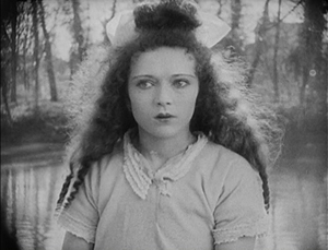
The film’s most famous scene is its abrupt, shocking opening. With no establishing shot, there is a series of rapid shots of details of faces, hands, a window, and an ax, during which we can barely discern that a man has committed a double murder. The spectator cannot possibly know who these people are and why the murders occur.
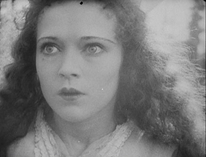
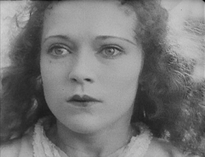
Instead of offering an explanation, the action then shifts to two little girls playing in the woods. As they return home, the camera begins to concentrate on one of them, apparently the younger, as she arrives at the murder scene and reacts in horror. Kirsanoff presents her expression in a series of five shots, linked by what David has termed axial cuts, from medium shot to extreme close-up as she gradually realizes what has happened.
There had certainly been axial cuts before this, including in Potemkin, but Kirsanoff probably went further than anyone of the era by including so many shots, by making each so short, and by moving his camera forward in such small increments. It is difficult to notice every cut, particularly the one from the third to the fourth shot, and the effect adds an unsettling quality to an already intense moment.
After this opening, a funeral scene reveals through labels on the grave that the murdered man and woman are the children’s parents. We might have suspected that the killer was a jealous husband discovering his wife with her lover. As it is, we never learn whether the crime was the result of a love triangle or the random act of a madman.
The rest of the film establishes the sisters now grown up, working in a workshop making artificial flowers and sharing a small flat in Menilmontant. The heroine’s brief romance leads to a baby, and superimpositions and other Impressionist techniques depict her despair and contemplation of suicide. Beautifully melancholy atmospheric shots of the streets of the neighborhood punctuate the action and underscore the dreariness and hopelessness that the heroine faces. The ending, though an improvement in the heroine’s lot, does little to dispel the overall grimness of the story.
Menilmontant is included in the out-of-print set “Avant-garde – Experimental cinema of the 1920s & 1930s.” It has been posted twice on YouTube in a low-rez format.
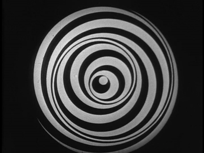
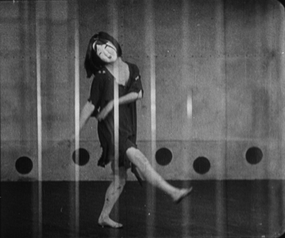
Even shorter is Anémic cinéma, the only venture into film directing by the great French Dadaist, Marcel Duchamp. It’s hard to compare a roughly seven-minute abstract film with narrative features, but this short is so innovative and influential that it’s also hard to leave it off the list.
Duchamp went through a phase of spinning artworks, including some “Rotoreliefs” that he attempted to sell as toys. These were similar to some Victorian optical toys, such as the Phenakistopscope and the bottom disks of Zoetropes. See Richard Balzer’s website for a collection of such devices, as well as “The Richard Balzer Collection” on tumblr, which contains gifs that animate some of the disks, done by Brian Duffy. Some of these resemble the spinning spirals and embedded circles that Duchamp used for his short. (See the top of this section.)
These spinning abstract circular images alternate with slowly spinning disks with sentences laid out as spirals. These involve either alliteration or puns or both. Unfortunately the English subtitles cannot render these in a way that conveys the original intent. For example, “Esquivons les ecchymoses des esquimaux aux mots exquis” becomes “Let us dodge the bruises of Eskimos in exquisite words.” The meaning is the same, and even the echo of the first syllables of “Eskimos” and “exquisite” is retained. Nevertheless, the similar syllables in two other words in the original are lost, as are the echoes of “moses,” “maux,” and “mots.” It is rather as though someone attempted to render “Peter Piper picked a peck of pickled peppers” into another language quite literally. (The Wikipedia entry includes a complete list of the sentences in French.)
Duchamp’s purpose was presumably to create an artwork with minimal means, including quasi-found objects, the disks he had made for another purpose. His idea is clearly reflected in the title, Anémic cinéma, which suggests a weakness or thinness of means. “Anémic” is also an anagram for “cinéma.”
Anémic cinéma is available in the same collection as Menilmontant, linked above. it is also available in the similarly out-of-print set, “Unseen Cinema.” There are numerous versions on YouTube, varying in quality. Some of these have been manipulated by other artists.
Lloyd and Lubitsch
Though Chaplin and Keaton might have had off-years in 1926, Harold Lloyd did not. Over the past several years, Lloyd has gradually been gaining the admiration he deserves. He used to be known largely for Safety Last (1923) and The Freshman (1925), two excellent films which, however, are not his finest. Girl Shy (1924) and The Kid Brother (1927) are better known now for the masterpieces they are. For Heaven’s Sake (directed by Sam Taylor), which clocks in at a mere 58 minutes, is just as good.
Lloyd plays a breezy millionaire, J. Harold Manners, who unintentionally helps Brother Paul found a mission in the downtown slums of Manhattan. He falls in love with Hope, the missionary’s daughter, and decides to help out around the place. By this time Lloyd was known for his spectacular chase scenes, and there are two here. Initially he puts a twist on the chase, luring a growing crowd of criminals into racing after him, ending in the mission. Gaining their respect, Harold makes the mission a happy social center.
The romance provides one of my favorite comic intertitles, leading into a love scene: “During the days that passed, just what the man with a mansion told the miss with a mission–is nobody’s business.” The love scene in turn includes a visual joke that emphasizes the rich boy – poor girl contrast.
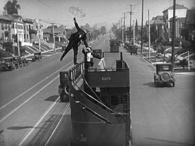
Harold’s rich friends hear that the pair are to be married and determine to kidnap him to prevent the inappropriate match. The result is a lengthy chase through the streets of Manhattan, with the drunken thugs rescuing Harold and using a variety of means to get him back to the mission in time for the wedding–as when the drunken leader of the group demonstrates his tightrope-walking abilities on the upper railing of a double-decker bus (see above).
Two years ago, when I put Girl Shy on my list, the New Line Cinema boxed set of Lloyd films was out of print and hard to find, and the separate volumes appeared to be going out of print as well, with Volume 1 not being available at the time. The situation has changed, and the boxed set, though apparently still out of print, is now available at reasonable prices from various third-party sellers on Amazon and Barnes & Noble. The set contains a “bonus disc” with extras, including interviews and home movies. The same is true for the three individual volumes (here, here, and here). For Heaven’s Sake is in Volume 3.
Inevitably, coming directly after Lady Windermere’s Fan, probably Ernst Lubitsch’s greatest silent film, So This Is Paris does not quite live up to its predecessor. Still, it’s a very fine, clever, and funny film, and it marks Lubitsch’s last appearance in these lists until sound arrives.
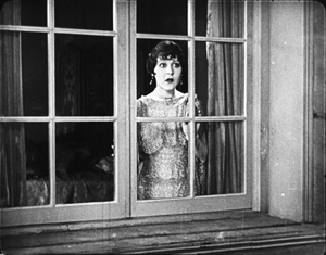
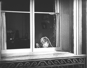
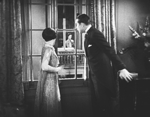
The opening scene, running nearly twenty-five minutes, is as good as anything Lubitsch did in this era. Set in Paris, it’s a slow build-up of misunderstandings and deceptions involving two affluent couples in apartments across the street from each other. One couple, Maurice and Georgette Lalle, are practicing a melodramatic dance in Arabian costumes. Their marriage seems to be a rocky one. Across the street, Suzanne Giraud is reading one of the lurid “Sheik” novels that were popular at the time, involving “burning kisses” in its final scene. Put into a romantic mood by this, she looks out her window and sees the head of a man in a turban at the window opposite–Maurice relaxing after his strenuous rehearsal.
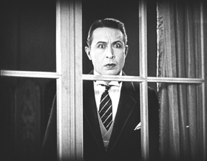
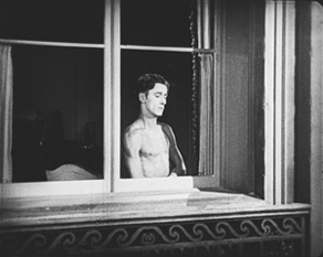
Her husband Paul arrives home, and she kisses him passionately. Apparently not used to such affectionate greetings, he is puzzled until he, too, looks out the window. By now Maurice has doffed his turban and necklaces and appears to be not only naked but also examining a piece of his anatomy.
Paul jumps to the conclusion that this sight is what caused Suzanne’s unaccustomed display of passion. He calls her to the window, and we see Maurice in depth through the two windows.
Suzanne then asks if Paul is going to stand for such a thing, and he goes to the other apartment to confront Maurice. Instead he finds Georgette, who turns out to be an ex-lover of his. She introduces him to Maurice, who is very friendly and charms Paul. The latter who returns home and claims that he has beaten Maurice and even broken his cane on him, though in fact he had simply forgotten it. Shortly thereafter Maurice visits Suzanne to return the undamaged cane and takes the occasion to flirt with her. It’s a beautifully plotted and developed farcical scene. The film is based on a French play and could easily have become stagey in its adapted form. Yet the byplay between the two apartments via the windows allows Lubitsch to avoid any such impression; the misunderstandings based on optical POV recall the racetrack scene of Lady Windermere.
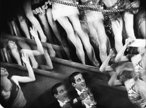
The rest of the film develops the two potentially adulterous affairs, primarily with Paul secretly taking Georgette to the Artists’ Ball. Here Lubitsch uses an elaborate montage sequence to convey the wild party, with superimpositions and shots taken through prismatic lenses.
Such sequences were primarily developed in German films and were still fairly rare in American ones in 1926. Similar techniques convey Paul getting drunk on the champagne he and Georgette are awarded when they win a dance contest–the announcement of which on the radio broadcast of the ball alerts Suzanne to her husband’s presence there with another woman.
So This Is Paris is less famous than Lubitsch’s earlier American comedies primarily because it has never appeared on DVD. Marilyn Ferdinand, in a blog entry that gives a detailed description of the film, writes that Warner Bros. claims not to own the rights to the film anymore and therefore has made no effort to bring it out on home video. On the other hand, a four-minute excerpt of the dance montage sequence was included in the Unseen Cinema set (disc 3, number 18), and the credit there is “Courtesy: Warner Bros., Turner Entertainment Company.” Whatever the rights situation is, a home-video version of this film is in order. A beautiful 35mm print is owned by the Library of Congress, so there is hope.
Two German flights of fancy
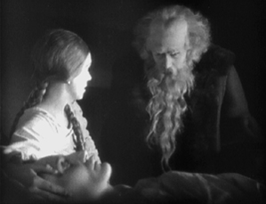
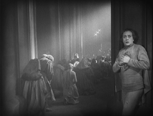
I must confess that I was disappointed the first time I saw F. W. Murnau’s Faust, and I have never warmed up to it in later viewings. I am delighted at having occasion to look at it again for this 1926 list, since a recently discovered and restored print reveals that the main problem before was the poor visual quality of the print formerly in circulation.
Different local release prints survived in a number of countries, but there were basically two original versions made: the domestic negative for German release and the export negative. These were shot using two camera side-by-side on the set, as was the standard practice in much of the silent era, given the lack of an acceptable negative-duplicating stock. The primary camera contributed most of the shots to the domestic negative, though in some cases where the second camera yielded a superior take, that was used in the domestic negative. Conversely, inferior takes from the primary camera sometimes made their way into the export negative. The result, as we now know, was that both the visual quality and in many cases the editing of the scenes was markedly different in the two negatives.
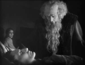
The version familiar for decades originated from the export negative. Recently the domestic negative was rediscovered, and the Friedrich Wilhelm Murnau Stiftung restored the that version using the that negative, supplemented with material from a variety of other prints. The result closely approaches the original German release version, including the original decorated intertitles. The contrast in quality between this restoration and the old, familiar Faust is remarkable.
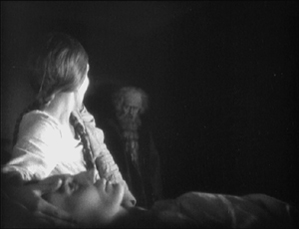
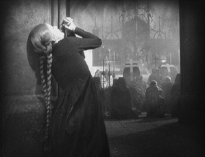
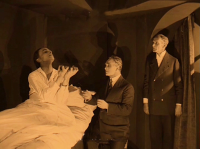
Given how dark the film is, details in the backgrounds could easily be lost. The scene in which Faust is called to help a woman dying of the plague is revealed to have dramatic staging in depth against a very dark room contrasted with the stark foreground underlighting of the woman’s haggard face. Faust enters from behind the daughter and comes forward to her, after which his movement is balanced by the daughter retreating into that same dark background.
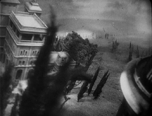
The famous aerial journey of Mephisto and Faust from Germany to Italy (below left) always looked rather hokey, but the detail revealed in the extraordinarily extensive model makes it far more impressive. Similarly, when one can actually see the sets, visual echoes become apparent. For example, Faust first encounters Gretchen and follows her into the church, where he finds himself barred from entering by his pact with Mephisto. Later, when Gretchen has been abandoned, she laments when not permitted to enter there.
No doubt some motifs of this sort were visible in the earlier print, but their clarity here enhances both the beauty and the craft of Murnau’s film.
Faust is available in several editions on DVD and Blu-ray. DVDBeaver ran a detailed comparison among seven of these, including a selection of frame grabs. To my eye, the 2006 DVD “Masters of Cinema” version of the domestic print, released by Eureka!, looked the best. (The two-disc set also includes the export version.) The Blu-ray from the same source, released in 2014, looked slightly darker. The box for the Blu-ray also includes the DVD, however. These releases are Region 2. The film is available on Blu-ray in the USA from Kino.
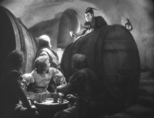
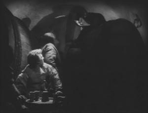
Both Eureka! releases’ supplements include a booklet, a commentary track, a Tony Rayns interview, and a lengthy comparison of the domestic and export versions. One particularly striking example is drawn from the scene in which Mephisto talks with Gretchen’s brother in a beer hall, with the domestic version on the left.
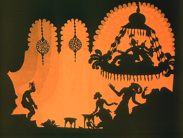
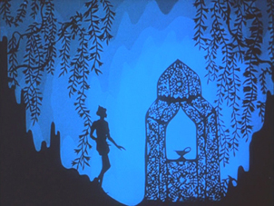
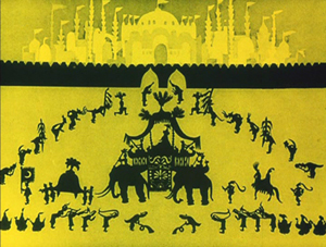
While watching Faust, I kept grabbing frames, far too many to be used in this entry. They were simply too beautiful or impressive to be passed over, and they made my final selection of illustrations difficult. The only other film for which this was true this year is Lotte Reiniger’s silhouette-animated feature, The Adventures of Prince Achmed. The restored, tinted print that is currently available is even lovelier than the older black-and-white version.
Reiniger seems to have invented the use of jointed silhouette puppets, and she still is the first artist one thinks of in relation to this form of animation. She continued to practice it until the 1970s. (See the link below to a collection of many of her short films.) Her one feature film remains her most famous and is probably her masterpiece.
It involves far more than simple black figures moving against a light background. As the frame at the top of this entry shows, her characters, furnishings, and locations, all rendered in paper with scissors, were often elaborate indeed. Characters wore feathers, jewelry, fancy wigs, and other decorative elements. The hanging platform has many little tassels, and the lamps are rendered in delicate filigree. The backgrounds are not blank but have varying layers of saturation that suggest a depth effect, the equivalent of atmospheric perspective. At the left in the top image, a series of identical curtains start out a dusky orange and in three stages lighten until there is a bright, solid glow at the center.
In the frame at the left below, the same sort of shading creates the depth of a cavern, setting off the tracery of the foliage and the kiosk in which the hero finds the magic lamp. On the right, very simple shading suggests a vast and elaborate palace in the background, while Reiniger fills the foreground with many small figures, all marching out to surround the procession of the caliph.
By choosing a classical fantastic tale, Reiniger found the perfect subject matter to fit the technique that she invented. Both the subject matter and the sophistication of the animation give her films a timeless look. Her reputation remains high today as a result. One scene in Harry Potter and the Deathly Hallows Part 1, “The Tale of the Three Brothers,” was made in a style inspired by Reiniger’s work. (I discuss it here.)
A restored, tinted version of The Adventures of Princes Achmed is available from Milestone. A combination Blu-ray/DVD release of the film is available from the BFI. (I have not seen this version.) Note that these have somewhat different content. The BFI version has five Reiniger shorts from across her career along with a booklet. The Milestone version has only one of the shorts, but it includes a documentary about Reiniger. (This documentary was on the 2001 BFI release of the film on DVD but is not listed among the extras on its Blu-ray.) See also the BFI’s collection of many of her shorts, “Lotte Reiniger: The Fairy Tale Films,” which I discussed here.
[Dec 27: Thanks to Paul Taberham for pointing out that Prince Achmed also has no intertitles and gets along without them very well.]
Into the asylum
David here:
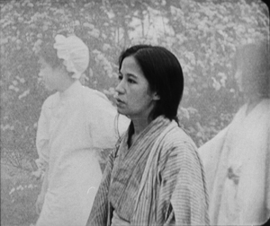
Few western viewers of 1926 saw any Japanese films, but Japanese audiences had been watching imported films for a long time. Hollywood films could easily be seen in the big cities, and The Cabinet of Dr. Caligari (released in 1922), La Roue (released in early 1926), and other films from Europe had made a strong impression on local filmmakers. One fruit of this influence was the wild Page of Madness (Kurutta ichipeiji, aka “A Crazy Page”).
Directed by Kinugasa Teinosuke and based on a story by the renowned experimental writer Kawabata Yasunari, the film bore the influence of German Expressionist and particularly French Impressionist cinema. Page of Madness set out to be a bold exercise in subjective filmmaking. But it wasn’t widely seen at the time, and wasn’t revived until 1971, when Kinugasa discovered a print in his house (reportedly, among cans of rice). Apparently the version we have is slightly edited.
A woman has been confined to a madhouse, and her husband has taken a job as a janitor there to stay in touch with her. Many of the scenes are presented as the hallucinations of the wife and other inmates, while abrupt flashbacks attached to the husband fill in the past. But this story is terribly difficult to grasp. There are no intertitles (perhaps an influence of The Last Laugh, shown in Japan earlier in 1926), and the film is a blizzard of images, choppily cut or dissolving away almost subliminally.
Viewers of the period had the advantage of a synopsis printed in the program, and there was a benshi commentator accompanying the screening to explain the action. Because we lack those aids, the film seems more cryptic than it did at the time. Even when you know the story, though, Page of Madness often surpasses its foreign counterparts in its free, unsignalled jumps from mind to mind and time to time. It remains a powerful example of narrative and stylistic experiment, from its canted framings and single-frame cutting to its frenzied camera movements and abstract planes of depth (thanks to scrims à la Foolish Wives, 1922).
For nearly fifty years it has remained a milestone, a grab-bag of advanced techniques and likely the closest Japan came to a silent avant-garde film.
Page of Madness is not commercially available on home video. It is occasionally shown on TCM, and a reasonably good print is on YouTube. Aaron Gerow’s A Page of Madness: Cinema and Modernity in 1920s Japan is an indispensable guide to Kinugasa’s eccentric masterpiece.
By the Law.
Murnau before NOSFERATU
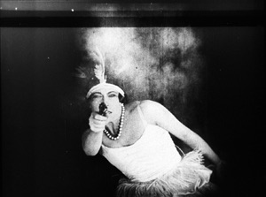
Der Gang in die Nacht (The Dark Road, 1921).
DB here:
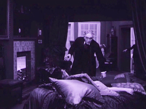
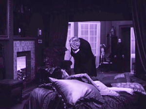
For many decades, The Last Laugh (Der Letze Mann,1924) was the F. W. Murnau film. If you were a film buff in the fifties or sixties, that staple of film societies and college courses was probably the first Murnau you saw. Eventually you got to those French favorites, Sunrise (1927) and Tabu (1931). Nosferatu (1922) and Faust (19226) came along in there somewhere. Tartuffe (1926), great as it is, has always seemed a specialized taste.
Today, I think, Nosferatu is probably the one everyone sees first. It fits the modern taste for horror movies, and it is genuinely scary. It popped up in music videos, got remade by Herzog, and will be forever remembered for the vampire’s spindly, ratlike silhouette and the wholly fitting name of the performer, Max Schreck.
Eventually Murnau aficionados caught up with lesser-known Burning Soil (Der brennende Acker, 1922), Phantom (1922), and The Finances of the Grand Duke (Die Finanzen des Grossherzogs, 1923), the latter two available on good DVD versions. But what about Murnau’s very earliest films?
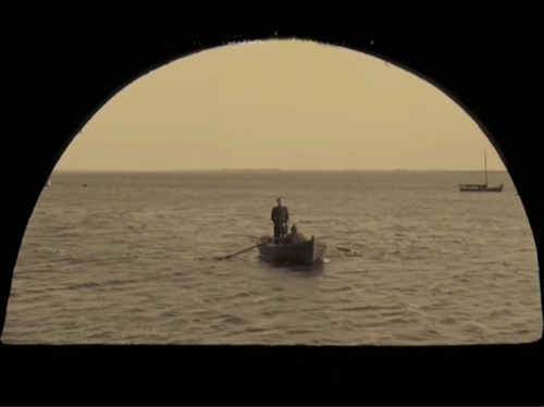
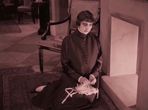
Of the nine films he made before Nosferatu, only two survive more or less complete. They circulated in unsatisfactory condition for many years, but Schloss Vogelöd (The Haunted Castle, 1921), which Murnau made just before Nosferatu, eventually emerged in a splendid restoration based on original negative material. Now we have a digital restoration of Murnau’s earliest surviving film, his seventh: Der Gang in die Nacht (The Dark Road, or “Path into Darkness,” 1921).
And what a restoration it is! The Munich Film Museum’s team has created one of the most beautiful editions of a silent film I’ve ever seen. They started with four reels of camera negative, then carefully integrated material from other sources. Thanks to digital manipulation, I couldn’t tell where the alien footage was.
You look at these shots and realize that most versions of silent films are deeply unfaithful to what early audiences saw. Compare a shot from the lamentable YouTube bootleg and a shot from this version. The smallness of the YouTube image here improves it; blow it up on a big monitor and it goes horribly blotchy.
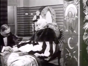
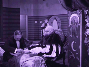
In those days, the camera negative was usually the printing negative, so what was recorded got onto the screen. The new Munich restoration allows you to see everything in the frame, with a marvelous translucence and density of detail. It will project fine big. Forget High Frame Rate: This is hypnotic, immersive cinema.
Der Gang in die Nacht will be shown in the Museum of Modern Art’s “To Save and Protect” series on 13 and 14 November. If you can get there, you should go! If not, we can hope that the film will soon appear on DVD. Remember DVDs?
Silents, golden
The canonized classics of Expressionist cinema, from The Cabinet of Dr. Caligari onward, are superb films, no doubt. But there are lots of other major movies from the period. The German industry flourished during World War I, and even the postwar inflation encouraged a burst of moviemaking. Hundreds of films were produced every year. I’m no expert, but of the seventy or so I’ve seen nearly all are fascinating and surprising. From the brute force of Der Tunnel (1915) and the demented monumentality of Homunculus (1916) to the weirdness of Algol and I.N.R.I. (both 1920), the peculiar pleasures of Sappho (1921) and the splendors of The Nibelungen (1924), I’ve been captivated by this cinema. Caligari is merely the dark and spiky tip of a mighty iceberg.
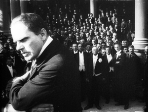
Der Gang in die Nacht is derived from a screenplay by the Danish scenarist Harriet Bloch. It’s an example of the “nobility film,” a genre cultivated by the Nordisk studio where Bloch worked. In these stories, an upper-class man becomes obsessed with a working-class woman, and she leads him to disaster. The most famous “nobility film” of the era is Dreyer’s The President (1919), when the genre was already somewhat old hat.
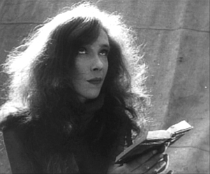
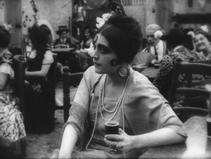
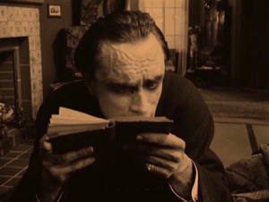
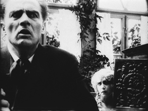
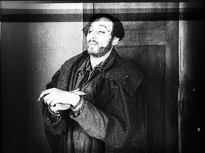
In Murnau’s film, the well-to-do protagonist is Dr. Eigil Börne. Uneasy with his courtship of his wispy fiancée Helene, he plunges into an affair with the dancer Lily. They move to a seaside cottage, where their idyll is interrupted by the spectral figure of a blind artist. (Regrettably, we never get a glimpse of his paintings.) The Painter is played in nearly full Cesare mode by Conrad Veidt: drifting through the landscape and clutching at the air. After Dr. Börne restores the Painter’s sight, Lily falls in love with him and leaves Börne. Unhappiness ensues for all, and yes, suicide is involved.
With only four delineated characters, the plot’s emphasis falls on their reactions to each others’ changing feelings. It’s a surprisingly unsensational melodrama, with no blackmail, threats of murder, or guilty secrets. It’s just about people’s emotional attachments waning, often for reasons they don’t understand. The drama of shifting, elusive moods looks fairly modern.
The playing is deliberate, with a range of acting styles. The drooping Helene, the skittish Lily, the somnambulistic Painter, and the raging Börne may seem to come in from four different movies. But Börne is on a knife-edge from the start, when he nervously leaves Helene. He broods fiercely during his night at the theatre, well before he succumbs to Lily’s charm. Like Scotty in Vertigo, he’s ready to fall. And as a complacent bourgeois, he doesn’t grasp the romantic fascination projected by the passive, wraithlike Painter. Nor is Lily merely flighty and treacherous. The Painter seems to stir her to a genuine love very different from her flirty seduction of the doctor. Helene, mournful throughout all this, is last seen in her sickbed stroking a newspaper photograph of Börne.
The concentration on four characters, each trembling with uncertainty, and the meshing of their moods with the stormy seaside, suggested to one observer an analogy with current stagecraft.
Here for the first time filmmakers try to incorporate the Kammerspiel [chamber play] into a film play. A strong, affecting plot with only a handful of characters has been developed through the smallest psychological details, the unity of locale and characters, the intimate interweaving of the atmospheric mood and the characters’ emotional life. All this has been achieved with the most sophisticated use of facial expression and cinematic direction.
1921 is usually taken as the year that the Kammerspiel genre began, with Scherben (Shattered) and Hintertreppe (Backstairs). Der Gang in die Nacht, which came out before either of these, isn’t usually considered an example. It’s interesting that the review I quoted, based on a December 1920 press screening, sees Murnau’s film as anticipating the trend. Perhaps the more rigorous concentration of time and space in the later films made critics take them for purer prototypes of the genre.
Knowing this background, I think, makes Der Gang in die Nacht more intriguing than it might at first seem. But another context is important too. The film shows Murnau’s debt to an important stylistic tradition. What he did with it is in sync with other filmmakers learning their craft at the same time. (Some spoilers ahead.)
Tableau + insert = proto-continuity
During the years 1908-1920, many filmmakers relied a “tableau” style of filmmaking. The used long shots and long takes, with the actors shifting in expressive patterns around the setting. The tableau might be broken up with titles or close-ups of letters or diaries, but the drama is developed through action played out in the distant framing.
Early historians, and many still today, portray this approach as merely “theatrical.” In fact, because of the way the camera lens creates a pyramidal playing space (the tip resting on the lens), the tableau approach is very different from proscenium theatre, which has a wide, lateral playing space. The result is a choreography of figure movement in breadth and depth that is no less “cinematic”—that is, specific to the film medium—than editing.
Want clarification? There’s a video lecture here, and more discussion in these entries.
In the course of the 1910s, however, filmmakers started to alter this approach. For one thing, they started to cut up the tableau more. American filmmakers were most radical, often abandoning the long shot altogether and building scenes out of several partial views—medium-shots and close-ups. But most European filmmakers were more conservative. They began to use what researchers have come to call the scene-insert method.
The tableau (the “scene”) would be interrupted by one or two closer views of a face or gesture, before returning to the main framing. Almost always the inserted shot is taken from the same camera position as the long shot. The cut is “axial,” along the lens axis of the camera. It enlarges a slice of space given in the wider view, then usually cuts back along the axis to reestablish the tableau.
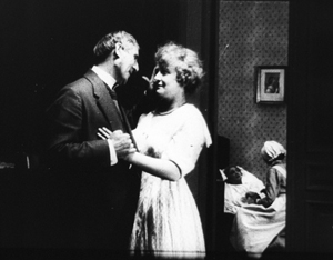
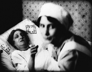
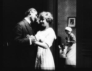
Here’s a simple example from Joe May’s delightful serial Die Herrin der Welt (Mistress of the World, 1919-1920), when a nurse in the room in the background rises.
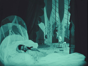
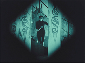
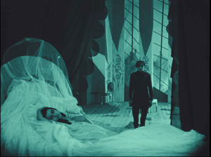
The axial approach is used throughout Caligari too. When Cesare invades Jane’s bedroom, we cut straight in and then cut back as he approaches.
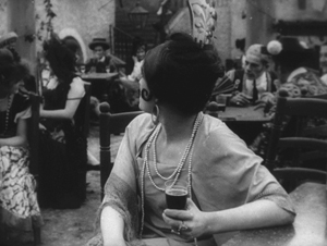
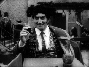
In Kristin’s book Herr Lubitsch Goes to Hollywood (available as a pdf) she traces several instances in other German films, as in this passage from Carmen (1919), with Don José way back at the rear of the tavern–but still on the lens axis.
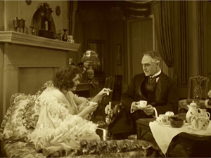
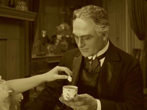
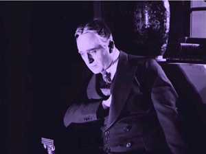
Der Gang follows the scene-insert method often. The only closer view during Lily’s tea flirtation with Börne emphasizes her teasing gesture and his reaction.
The result is a minimal version of analytical editing, a sort of rough, proto-continuity approach to breaking up a scene into details. It can be thought of as a transitional phase toward a fully “classical” style of staging and cutting, and indeed in the 1920s more and more European filmmakers adopt versions of the Hollywood method.
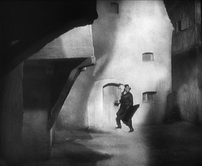
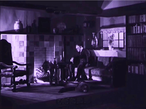
Already, we can see some filmmakers thinking in terms of an establishing shot rather than a tableau. Murnau’s long shot below is probably too far distant to permit a complex play of depth of the sort we see in Caligari and Carmen. It’s designed, we might say, to be cut into.
During this transitional period, we find films exploring the scene-insert method in intriguing ways. The most evident is the tendency to make the cut-in shot very close.
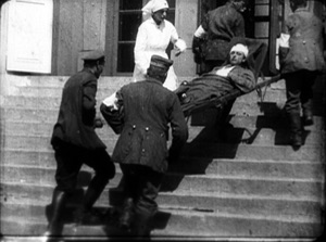
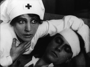
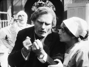
In Paul Leni’s Dr. Hart’s Diary (Das Tagebuch des Dr. Hart, 1918), for instance, we get a rather distant shot showing the wounded Count Bronislaw carried out of the ambulance, followed by a very tight medium-close-up of him and Jadwiga, the Red Cross nurse.
An American director would have been more likely to soften this sudden enlargement with a mid-range two-shot of the couple before providing the intense close-up of their faces.
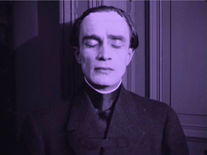
This abrupt jump into a surprisingly close view isn’t uncommon in European cinema of the period, and it’s particularly salient in German films. The insert is often taken with a wide-angle lens, which can accentuate the curves and edges of a face. Murnau’s fondness for the wide-angle lens is a constant throughout his career. A fragment from his first, lost film The Blue Boy shows a wide-angle depth composition, and there’s an astonishing wide-angle close-up of the distraught painter in Der Gang.
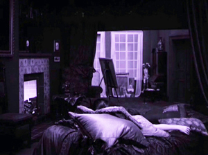
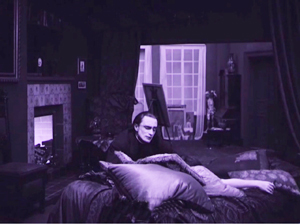
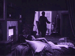
Like many directors working in this line, Murnau balances the power of the sustained long shot with the momentary spike of the closer view. A good example comes in the beautiful passage when Börne discovers that Lily is dead. The setup is given in a classic tableau framing, with only her arm extending out from cushions on the divan. Then the Painter’s head lifts into center frame from behind the pillows, a slow revelation of his pain.
After alternating cuts to Börne hammering at the door, the Painter rises and floats to the door in the back wall. (The rear door is a fixture of the tableau tradition, as it allows for dynamic movement in depth within the visual pyramid.) Once the doctor is admitted, he rushes forward and pauses as the Painter glides into the background.
As Börne wails, Murnau pushes us into the parlor to the Painter, standing in the distant corner like an upright corpse—an alternative version of grief.
Like many films of the period, not only German but also French and Italian ones, Der Gang in die Nacht exploits the resources of the tableau—the graceful, expressive coordination of actors who perform with their whole bodies—while saving the blunt force of the isolated face for a climactic accent. No wonder that film theorists of the late ‘teens and early 1920s were fascinated by close-ups; they were seeing a great many vivid ones.
Not haunted, just mysterious
There were a lot of variants on these techniques. As if to give us the tableau and the wide-angle insert in a single frame, Robert Reinert cultivated a looming deep-focus style that suggests a Citizen Kane of the 1910s. The first frame is from Opium, the last two from Nerven (both 1919).
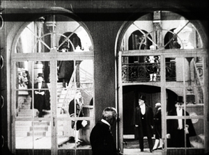
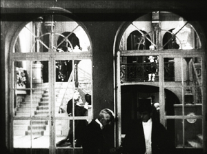
And the extraordinary Weisse Pfau (The White Peacock, 1920) of E. A, Dupont comfortably switches from a dizzying gridded tableau (two men arriving at a theatre lobby, caught in an architectural Advent calendar) to a violent climax using highly fragmented editing.
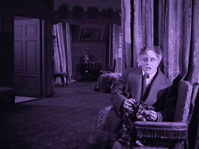
By 1921 the simplest version of the tableau-plus-insert method was rapidly going out of favor. To get a sense of how techniques were changing at the time, you should watch Murnau’s Schloss Vogelöd (1921) immediately after seeing Der Gang in die Nacht.
The plot is a bit friendlier to our pulpy tastes, involving a past murder that is brought to light during a country house party. (No spooks haunt the castle, just the lingering effects of mysterious death.) Again, there’s a chamber-play aspect to it. Virtually all the action is confined to the mansion of the host, von Vogelschrey, and plays out in a couple of days and nights.
Schloss Vogelöd was released only three months after Der Gang in die Nacht. In the sparkling restoration provided by the Murnau Stiftung, Schloss runs almost exactly as long as the earlier film. But what a difference! I count 231 shots in Der Gang, with 163 of those being images, not titles. I count 511 shots in Schloss, with 356 of those being images. Assuming a common projection speed, the later film is cut over twice as fast.
The sheer number of shots is important, but the crucial factor is that many of the shots in Der Gang retain one particular framing, interrupted by titles or a diary or letter insert. Not only does Schloss have more shots, it has more varied setups. Murnau is shifting his camera positions more often, as were his peers Lang and Dupont, along with other Europeans and of course the Americans.
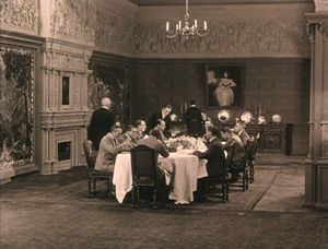
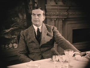
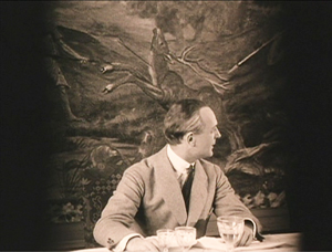
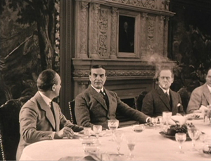
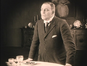
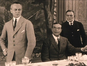
Here’s an example. At a meal, the vengeful Count Oetsch hints that Baron Safferstädt is the murderer. The scene runs about three minutes and contains 16 shots and five titles, played out across six distinct setups. I sample them here.
In a loose sense, the cuts are axial, enlarging or de-enlarging parts of the table as observed from one general orientation. (The judge who stands up and looks left is at the foot of the table.) But within this overall orientation, there’s a variety of setups we don’t find in Der Gang. We aren’t far from that spatial ubiquity and adherence to an axis of action that was pioneered in 1910s Hollywood and would become increasingly common in Europe during the 1920s. The downside: The development of more finely broken-down scenes led to a loss of the complex choreography within a single shot that was common in the early 1910s.
Der Gang in die Nacht was filmed in August-September of 1920; Schloss Vogelöd was shot in February and March of 1921. In between Murnau made Marizza, genannt die Schmuggler Madonna (Marizza, called the Smuggler’s Madonna, not shown until 1922). The fragments of this that have survived are very rudimentary filmmaking, much simpler than anything in either of the other two films.
The faster cutting and more varied setups of Schloss may, as Kristin has suggested, owe something to the arrival of American films. Banned until January 1921, they may have inspired German directors to push further toward analytical editing. She has also mentioned in Exporting Entertainment that some American films did slip through the ban and get screened during the war years, so directors could have had an inkling of what Hollywood was up to.
In any event, Der Gang in die Nacht admirably lays out one set of directorial options that emerged as filmmakers of the first “movie generation” (Murnau, Dreyer, Gance, Lang, Dupont et al.) shifted away from the pure tableau style. All became virtuosos of editing, but they never forgot the power of the sustained long take.
Thanks to Stefan Drössler of the Munich Filmmuseum for information on the restored Der Gang in die Nacht. Thanks as well to Sabine Gross for her translation of German material. As ever, I owe an enormous debt to Gabrielle Claes and Nicola Mazzanti of the Cinematek in Brussels.
The review citing Der Gang as a Kammerspielfilm is reprinted in Film-Kurier (30 December 1920), 2. I was led to this by Lotte Eisner’s Murnau (University of California Press, 1964), 92. Although it’s long been out of print, her book remains a very useful source. Also helpful are Los Proverbios chinos de F. W. Murnau, vol. 1, ed. Luciano Berriatúa (Filmoteca Española, 1990) and Friedrich Wilhelm Murnau: Ein Melancholiker des Films, ed. Hans Helmut Prinzler (Deutsche Kinemathek, 2003).
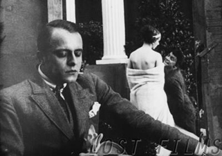
Schloss Vogelöd is available on two DVD editions, one from Kino and the other from Masters of Cinema. My frames come from the Kino edition, chiefly because they’re brighter than the higher-contrast MoC edition, and thus more legible on the Net. Both editions have their strong points, as DVDBeaver indicates. Surviving frames of Murnau’s first film are available on the Lost Films website.
Many issues of tableau style and its relation to editing technique are discussed in my On the History of Film Style, Figures Traced in Light: On Cinematic Staging, and Poetics of Cinema. On this site, among entries on the tableau tradition, the entry most relevant to today’s piece is “Not quite lost shadows.” I discuss Danish approaches to the tableau in the essay “Nordisk and the Tableau Aesthetic” and the case of Dreyer’s relation to his peers in “The Dreyer Generation,” on the Danish Film Institute website.
Karl Friedrich Schinkel, The Banks of the Spree Near Stralau (1817).


