Archive for the 'Directors: Ozu Yasujiro' Category
Three nights of a dreamer
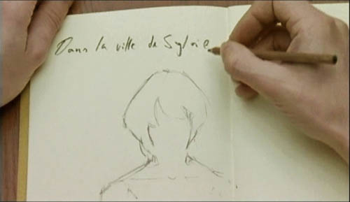
DB here:
The close-up blogathon launched by Matt Zoller Seitz is over, but it contains enough specimens and analyses for a hefty book. It also inspired Jim Emerson to devote a cine-lyric to the close-up. I missed the deadline, so I suppose that this constitutes my sideways contribution to Matt’s enterprise.
Sideways, because a full-blown analysis of In the City of Sylvia (En la ciudad de Sylvia; Dans la ville de Sylvie) would be a breach of decorum. Most people haven’t heard of this new film by José Luis Guerin, let alone seen it. I saw it at the Vancouver festival in September, and it will make its way through the festival circuit over the coming months and should show up on cable or DVD thereafter. But apart from calling attention to it as a remarkable film, I want to look at one of its most absorbing sequences and suggest some of its originality. Lee Marshall has already pointed out one of Sylvia‘s arresting features:
Guerin seems to have created pure drama without recourse to story. We’re always taught that story is the engine of drama. Not here: somehow Guerin has created an almost plotless film that has the dramatic tension of vintage Hitchcock. (1)
Although the story situation is slight, the tension we feel springs partly from vivid stylistic patterns. In other words: Minimal and uncertain story action is heightened by engaging visual narration. This narration in turn derives its power from one of the most traditional devices of filmic storytelling.
Consider the other person’s point of view
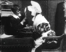
The point-of-view shot is a mainstay of cinematic storytelling, and its history is an intriguing one. Many of the earliest examples we have are motivated as views through optical gadgets. Two films by the Englishman G. A. Smith, both from 1900, handily show the options. Grandma’s Reading Glass justifies the point-of-view image as what the boy sees when he peers at granny through her big magnifier.
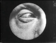
Smith’s As Seen through a Telescope motivates the cut-in POV shot as what our dirty old man in the foreground has an eye for.
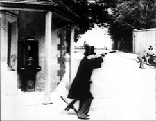
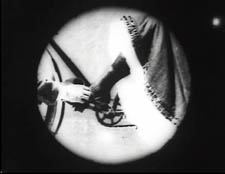
Fairly soon, this use of the magnifying POV shot was mingling with more straightforward ones. In The Birth of a Nation (1915), D. W. Griffith offers a rough-edged example. When the Stoneman brother and sister visit Ford’s Theatre on the night of Lincoln’s assassination, we see Elsie pointing out the famous actor John Wilkes Booth.
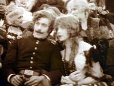
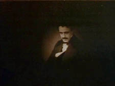
Booth is framed in an iris, which Griffith often uses to underscore an important image. But when Elsie studies Booth through her opera glasses, Griffith, usually not fastidious about such things, supplies the same irised image, now doing duty for the sort of magnifier-masking we get in the Smith films.
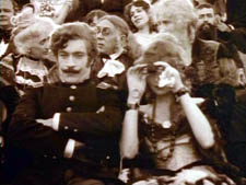
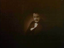
Presumably a more consistent technique would show Booth in long shot first, without the iris, and reserve the optical masking for replicating the view through the opera glasses. This is what happens in Ernst Lubitsch’s Lady Windermere’s Fan (1926), which contains a sequence built entirely around crisscrossed character looks. (1)
The woman of the world Mrs. Erlynne arrives at the racetrack and creates a stir, causing many men to watch her from all over the grandstand.
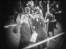
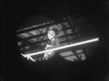
Note that Lubitsch has gone beyond Griffith by fitting the angle of Shot B to the viewer’s orientation, looking up. There are so many POV shots that at one point Lubitsch simply shows her from different angles and deletes the shots of each watching man.
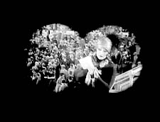

This is a fascinating example of a process we often see in stylistic history. An “overlearned” visual convention can be treated elliptically; the filmmaker can leave out bits and we’ll fill them in. The binocular masking suffices to let us know that Mrs. Erlynne is being studied from afar. Moreover, Lubitsch gets an expressive bonus from being so concise. Now it doesn’t matter who’s watching, just that somebody is—actually, a lot of somebodies.
Later, after much more byplay with people looking at one another and misunderstanding what they see, Mrs. Erlynne sits down. Three gossips have been studying her, but now their view is blocked. So one gossip has to twist around to spy on her, and Lubitsch obligingly gives us a slightly tipped point-of-view framing—a full shot, without masking.
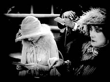
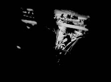
Adjusting her binoculars, the gossip is able to get a bigger view of Mrs. Erlynne, and she racks focus gleefully to catch a gray hair peeping out.
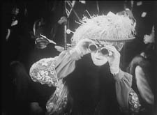

The visual narration in this sequence, already perfectly modulated, supplies the stylistic premise for Hitchcock’s Rear Window and all of its progeny, most recently Disturbia (2007). What might be overlooked is that by the 1920s the view through a device—field glasses, a microscope, a surveillance camera—had become a special, marked case. From then till now, the default POV pattern is the simple shot of a character looking, followed by an unadorned shot of what that person sees, from more or less the correct standpoint. Lubitsch’s sideways shot of the gossip’s view of Mrs. Erlynne, casually introduced, exemplifies the modern norm for presenting a character’s vision, and it’s so common that we seldom notice it.
POV shots: The basics
In his book Point of View in the Cinema, Edward Branigan itemizes the cues that the filmmaker can manipulate in creating a POV construction. (2) To simplify somewhat: Shot A shows a point in space and a character glance from that point. Shot B is taken from a camera position more or less approximating the point in A, and it shows an object. The shot-change presumes temporal continuity between A and B, and we assume as well that the character is aware of the object shown in B.
This seems like a complicated way of stating the obvious, but by teasing these elements apart, Branigan shows that each one can be manipulated in intriguing ways. For example, you can create a disorienting moment by violating the condition of temporal continuity. Ozu does this in Early Summer (1951), when Noriko and Aya decide to peek in at the man Noriko almost married. The two women tiptoe down a hall toward us as the camera tracks slowly backward. Ozu cuts to a forward-tracking shot that momentarily suggests a reverse angle POV on the corridor.

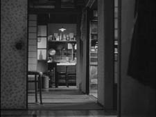
In fact, however, the camera movement is revealed to be the first shot of a new scene, among different characters, and we won’t ever see the man the two women went to spy on.
Here’s another interesting case, not cited by Branigan. In Halloween (1978), John Carpenter shows Laurie looking out a window and seeing Michael Myers in his mask, standing between fluttering washlines.
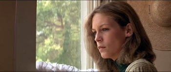

Cut back to Laurie, now frowning slightly.
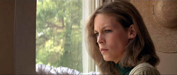
Cut to a second POV shot; but now Michael has vanished.
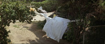
This simple change in shot B’s object, Michael himself, has an uncanny effect. Did Michael just walk away from the washline? If so, this is an odd way to present it. Why not show him walking away? Alternatively, did he just disappear? Surely not; Laurie would be shocked. Carpenter wins twice over. Without obviously violating realism or directly showing that Michael has supernatural powers, he gives Michael the ability to come and go in a ghostly fashion. By the end of the film, when he miraculously disappears after a fall that would kill an ordinary person, we are prepared to believe that he is indeed, as Dr. Sam Loomis says, the Boogyman.
Who is Sylvia? What is she that all the swains commend her?
In the City of Sylvia centers on a young man staying at a hotel. We’re given no reason why he’s visiting the city, and no backstory about him. One day he’s sitting at a café. Now, across nearly twenty minutes of screen time he watches women and idly sketches them.
The sequence is a pleasure to watch, partly because of the constant refreshing of the image with faces, nearly all of them gorgeous, most of them female. Either Strasbourg has an extraordinary gene pool, or this café attracts only Ralph Lauren models. Yet the scene builds curiosity and suspense too, thanks to Guerin’s sustained and varied use of optical POV. He gives us an almost dialogue-free exploration of a cinematic space through one character’s optical viewpoint. (Stop reading here if you don’t want to know anything more about the film before you see it.)
The young man, known in Guerin’s companion film Unas fotos en la ciudad del Sylvia as the Dreamer, is almost expressionless as he scans the women’s faces. Slight shifts of his glance are accentuated by his habit of turning his head but keeping his eyes fixed. In over a hundred shots, Guerin uses some ingenious cinematic means to tease us into ever-greater absorption in the Dreamer’s visual grazing.
Fairly far into the sequence, Guerin gives us more or less the orthodox POV construction. The Dreamer looks at one woman at a table, and we see her return his look.
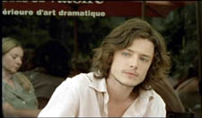
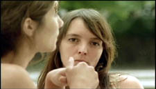
But here shot B isn’t really clean: the hands of the woman on the left sometimes block our view of the principal woman. This obtrusiveness is one of Guerin’s most basic strategies in the sequence. Inevitably, in passages before and after the cut I just showed, what the Dreamer is looking at is partially hidden in layers of faces and body parts.
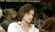

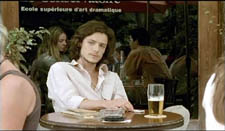

Our prototype of the POV cut presumes a more or less single ‘point’ we are watching in shot B, but throughout this scene Guerin plays with this cue. He tantalizes us with several points to be observed, and he often obscures the most important ones. He also creates some startling juxtapositions. Near the very start we get this shot, which may or may not be the Dreamer’s POV.


By making the background girl seem to kiss the foreground guy, Guerin, as Eisenstein would say, “christens” his sequence. In effect, the image says: Watch out! Layered space will become important! When I saw this shot, I nearly jumped out of my seat.
The Dreamer is treated no differently, at least at the start. In most movies, the POV construction is set up with a clear, clean framing of our looker in shot A. Here, though, at the start of the scene Guerin peels away layers to get to our man. For the first six shots of the café, we don’t know he’s on the scene. Then he’s shown out of focus, in the background of more prominent action. The woman in the foreground has been primed to be the shot’s subject. At the moment she shifts her gaze and we try to read her expression, a second woman on the distant right shifts aside to reveal the Dreamer behind her.
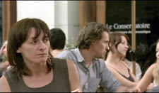
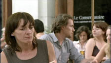
Surely this is the most unemphatic entry of a protagonist we’ve seen in a while! Guerin is able to add planes to block the main ‘point’ of shot B because he’s working with long lenses, a crowded space, and careful choreography. Even focus plays a role, as in this case; our Dreamer is pretty hazy.
One upshot of this strategy is that we’re plunged into a “cubistic” space, in which slightly varied camera angles pick up bits of space we’ve seen in earlier combinations and oblige us to assemble it all in our head. Be thankful for the guy in the blue shirt above, for he plays an anchoring role in several setups that would otherwise float free.

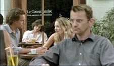
It’s hard to convey in stills how much fascination and frustration that this teasing style creates. Like the Dreamer, we’re given only glimpses of the women, and even though we don’t know his purposes—is he just an artist in search of beauty? a serial killer picking out victims?—the partial views lure us at several levels. We try to complete the faces. We try to infer the women’s state of mind from their expressions and gestures, which are far more animated than our Dreamer’s.
And a search for story plays a part here. We’re primed for some action to start, and we browse through these shots looking for anything that might initiate it. Each face the Dreamer spots promises to kick-start a plot: when the Dreamer gets a full view of one of these women, perhaps things will get going.
Without giving away every detail, I’ll just say that the sequence has a strong visual arc as the Dreamer starts paying more and more attention to certain women. And just as he finally gets a full view of one fabulous face, his attention wanders to . . . another layer, this time one inside the café.
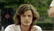
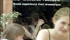
As he gapes at the woman inside, layers pile up, creating a cubistic climax of all the optical obstructions we’ve encountered.
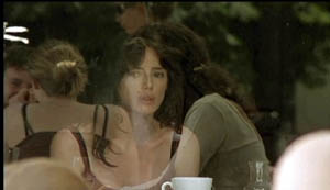
The motif of reflections will take over the rest of the film’s visual design, and eventually we’ll see that some of the Dreamer’s drawings evoke the piled-up and sliced-up faces in the café shots.
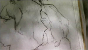
Later in the film, the Dreamer will explain why he’s in the city and why he’s scanning women. We’ll have a tram ride that Guerin compares with Sunrise, and a scene in a music club that not only parallels the café sequence but evokes Manet. We’ll also have occasion to compare this film with Bresson’s Four Nights of a Dreamer, a citation signaled from the outset.
All that is to come. Even if the later scenes weren’t as compelling as they are, this café sequence would make Sylvia one of the most adventurous films I’ve seen this year. By revising the simple, long-lived POV schema, Guerin has made it yield fresh feelings and implications. Like Lubitsch’s racetrack scene, this imaginative sequence provokes the jubilation you feel in the presence of calm, precise artistry.
(1) Lee Marshall, “Past Perfect,” Screen International (19 October 2007): 27. The web version is here, but it may require a subscription.
(2) I analyze the visual narration of Lady Windermere, which I think deserves to be ranked with Potemkin and Sunrise, in Narration in the Fiction Film (Madison: University of Wisconsin Press, 1985), 178-186.
(3) Edward R. Branigan, Point of View in the Cinema: A Theory of Narration and Subjectivity in Classical Film (The Hague: Mouton, 1985), 102-121.
Asian media empires, and the greatest of all filmmakers
DB here:
I owe you a final report on my viewings in Vancouver, but while I’m preparing that, I want to signal three publications, two printed books and one online book.
America seems to have cornered the market in branded entertainment. Movies and comics have given us Mickey Mouse, Shrek, Barney the dinosaur, Batman, Jughead, and all those other lovable characters you can’t escape. Once in a while another country gets into the game, as with Tintin (Belgium), the Smurfs (Belgium), and the Teletubbies (Britain). But for sheer numbers, the US’s only real rival, it seems, is Japan.
The cliché is that the Japanese make the hardware and we make the software. But Astro Boy (originally Mighty Atom), Speed Racer, Mighty Morphin Power Rangers, Sailor Moon, Pokémon, Cutie Honey, and Super Mario Brothers beg to differ. And if Zatoichi and Godzilla add their weight to the argument, you’ll back off fast. The Japanese have given the world an unending spate of sagas and characters, often of marked peculiarity. Ranma ½ changes from a boy to a girl and back again, and Mothra, even just being himself, is fairly creepy.
 All of which makes Ken Belson and Brian Bremner’s Hello Kitty: The Remarkable Story of Sanrio and the Billion Dollar Feline Phenomenon (Wiley) an informative study and a breezy read. The pudgy cat with no mouth generates about $500 million in annual sales, half of Sanrio’s total, and she adorns over 20,000 products, including vibrators.
Belson and Bremner trace Ms. Kitty’s rise from humble beginnings in 1974 to her current status as a media superstar. Just as important, they put her in several intriguing contexts. They trace the rise of the kawaii (cuteness) sensibility throughout Asia, where Peanuts‘ Snoopy became the model. They show that Miss Kitty is emblematic of Japan’s shift from “hard” manufacturing industries to “soft” culture-based ones like comics and videogames. Some consumers, though, choke on all this sugar, and the authors haven’t omitted mention of those media jammers who want to turn our heroine into a hellcat.
The book is especially good at characterizing the distinctive Japanese belief that a product must arouse an emotional attachment in the consumer. Sony does it through sleek design, Tamagotchi the digital pet did it through guilt-tripping. Ms. Kitty might seem the epitome of blandness, her awww quotient and neoteny-driven features rendering her vacuous. Yet the lady has a touch of mystery. You’ve seen a smile without a cat, but here is a cat without a smile. Snoopy shamelessly exposes his fantasy life, but who knows what she’s feeling? Lust? Caution? Is she quietly judging us? Fill in the blank.
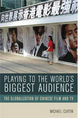 For a more comprehensive analysis of how Asian media empires work, go to Michael Curtin’s brand-new Playing to the World’s Biggest Audience: The Globalization of Chinese Film and TV (University of California Press). Michael is a close friend and colleague, so in principle I’m biased; but I’d think this a terrific book if he were a stranger. Among many other things, it shows that media globalization isn’t a one-way flow, from Hollywood to ROTW (Rest of the World). Asian media are globalizing too, and the process is both fascinating and far-reaching.
The book provides both history and contemporary analysis. Michael shows that Shaw Bros. pioneered the concept of an entertainment conglomerate in Asia, and he traces their policies across several decades. The story starts in Hong Kong, with its curiously transnational film industry, but the tale sweeps across media (TV, telephony, internets) and territories: Taiwan, Singapore, and mainland China. Michael has interviewed many major players, so if you want to know what’s really behind Golden Harvest, Media Asia, China Star, Star TV, Celestial, and other companies, this is the place to go. In the area I know a little, Michael offers the shrewdest and strongest analysis of the rise and precipitous fall of the Hong Kong film industry I’ve seen.
Playing to the World’s Biggest Audience will attract scholars and business people wanting to understand the dynamics of Asian media. I think as well that fans of Asian film, music, and TV can get a lot out of it. If you’re put off by the first chapter’s theoretical layout, skip to chapter two and jump into the compelling story of how entrepreneurs from southern China assembled a media juggernaut that now enthralls over a billion spectators.
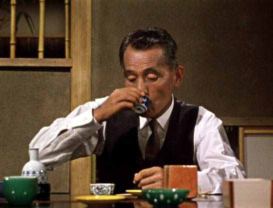
 Finally, about a year ago on this blog I wrote an entry about the online arrival of my Ozu and the Poetics of Cinema, thanks to the publishing initiative of the Center for Japanese Studies at the University of Michigan. Now an improved online edition of this scarce out-of-print book has just gone online. You can download the whole shebang if you want.
In the first version, posted a year ago, the pictures were hard to see, so we made digital versions of all the original stills. The monochrome ones look very nice, and the color ones (not an option for the print edition) look fine. In addition, if you click on a still in the sidebar, you can enlarge it and even download it. Thanks to web tsarina Meg Hamel, we have a permanent link in the list of books on the left.
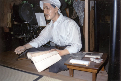
There’s also a new introduction, in which I explain a bit about the background of the book, talk about the approach it takes, position it within trends of film studies, and suggest what Ozu means to me. My introduction also shows some rare pictures, including snaps from a strange exhibition about Ozu’s life. The exhibition has vanished now, but maybe that’s an appropriate tribute to an artist who made mutability everlastingly vivid.
A toast to Markus Nornes, Bruce Willoughby, Kristi Gehring, Terry Geitgey, and all the other people who took pains to make this improved online Ozu possible.
Cinema for cheeseheads
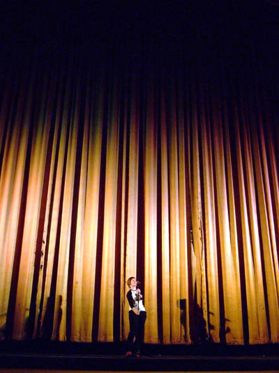
Meg Hamel introducing a film at the gigantic Orpheum Theatre.
DB here:
Today a chatty, catching-up blog filled with peekaboo links. Lots to do, know what I mean? Or do you?
Excuses, excuses
Kristin and I meant to blog about the Wisconsin Film Festival last weekend. We really did. But I missed the first night because my plane from Hong Kong got in late, and on Saturday I felt enough jetlag to mope around in a desultory fashion. I did see Fay Grim, Ten Canoes, Vanaja, and of course Johnnie To’s Exiled (better than ever on that CinemaScope Orpheum screen). Kristin saw several more films than I did, and that was part of the problem: She was too busy watching films to blog about them. By the time she finished, the festival was over and we faced some looming deadlines.
Regrettably, we simply let our festival blog go. Kristin drove off to Toledo for a conference of the American Research Council in Egypt. A fine conference it was too, but preparing for that took away some time for blog duties. To meet our Internets obligations, I pulled out a general essay that was sitting on the shelf. It turned out to be one of our most popular ever.
 Over the same days I was occupied with two publishing projects. First is the online version of my 1988 book Ozu and the Poetics of Cinema, available here. In the original book, the frames taken from color films were reproduced in black and white. Markus Nornes of the University of Michigan, who first suggested putting the book online, wanted to replace those with color frames. Since virtually all the book’s pictures came out poorly in the pdf scans posted online, we decided to replace the black-and-white images with scans from my original negatives. Kristi Gehring, our stalwart assistant, digitized all the black-and-white stills, and Markus found the color frames. So in the next few months the good folks at the University of Michigan should be replacing the tawdry stills with nicer ones. A bonus: Markus and his colleagues are working on giving the stills a click-to-enlarge feature.
I’ll also be adding a new Foreword to the book. That will reflect on the book’s approach and its reception, and I’ll add corrections and new thoughts. In all, the updated online version should be available in late September. It’s been quite a struggle to revive the old thing, as I’ve chronicled earlier, but several people have taken a lot of trouble to help, and I’m grateful. Because, you see, I believe that Ozu is the greatest filmmaker who ever lived.
The second publishing project is my Poetics of Cinema collection. Delays, endemic in academic publishing, have pushed it past its spring release date. I’ve just gotten page proofs, and indexing should take place in August. So the thing is now slated for October. It’s rather big and expensive: 500 book pages, with about 500 stills. About half the essays are new to the volume. If you want to lay down your plastic before seeing it, you can order it here.
Coming attractions
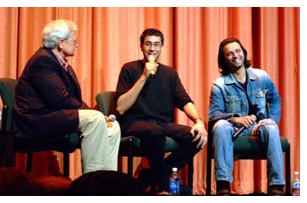 At the moment we’re preparing for Roger Ebert’s Festival of Forgotten and Overlooked Films, which comes up later this week. Previous years’ sessions have been excellent. Alongside, you see a 2006 photo of Roger interviewing Ramin Bahrani and Ahman Razvi, director and principal actor of Man Push Cart. Ramin’s new film, Chop Shop, is now in the Directors’ Fortnight at Cannes.
This year should be lots of fun: a chance to meet Herzog, Alan Rickman, Joey Lauren Adams, and other creative film folk…and to see Roger and Chaz again. The films run the gamut from Holes to Beyond the Valley of the Dolls. Kristin and I will be moderating the screening of Sadie Thompson, with an orchestral score by Joseph Turrin. Another musical event: a performance by Strawberry Alarm Clock. (Now I do feel old.) We hope to post at least one blog, with pix of course. Other blogomanes will be present, notably the audacious David Poland and the hyperenergetic Jim Emerson.
Speaking of festivals: the biggest of them all is coming up, and to celebrate it Turner Classic Movies is running, on 16 May, Richard Schickel’s documentary Welcome to Cannes. It samples the glitz but also affords information about the caste system of screening passes, the role of Cannes in easing films into the world market, and even the harm that a Cannes prize can do to a director. There’s neat footage of Godard and Truffaut preparing to shut down the festival in May of 1968–an event that a couple of interviewees claim was a turning point in the festival’s history. Along with the docu, TCM will screen four Palme d’or nominees/winners: The Big Red One, Blowup, Taxi Driver, and Pale Rider. But one question remains: Why does nobody think of the French as cheeseheads like us?
 When we get back to Madison from Ebertfest, we have just enough time to pack for a month in New Zealand. Brian Boyd has arranged for us to come as guest lecturers to the University of Auckland, under the auspices of the Hood Fellowship.
Kristin will be lecturing mostly from her Lord of the Rings study, The Frodo Franchise (for instance, here), but she also offers a talk on her Amarna research. I’ve got a more varied agenda: talks on CinemaScope, on ShawScope, on the history of cinema style, on the cognitive approach to film theory, and on scene transitions, as well as a visit to the Philosophy department. One or more of these items may materialize as an essay on this site some day. We’ll also be visiting the University of Otago, in Dunedin, for a brief stay and a lecture apiece.
While dwelling among the Kiwis, I hope to write a short online essay reflecting on our 1985 book The Classical Hollywood Cinema, which amazingly still arouses some discussion. I’ll also be thinking about plans for two further books, one on Hong Kong cinema and the other on a new approach to film theory.
We’re planning to maintain our blog while we’re away, recounting our activities down under, and posting some more general pieces that I’ve already prepared.
Just butter, hold the popcorn
But what about our film festival just past? To be blunt: A hell of a time was had by all. We screened 182 films and attracted our biggest audience to date, with 28,700 tickets sold. Not bad for a festival that starts on Thursday night and ends on Sunday night, held in a town of about 240,000. Isthmus, our free arts-and-politics paper, offered an outstanding preview, and other local coverage was enthusiastic, natch. The event earned a glowing first-page write-up from Charlie Olsky in Indiewire. The official wrapup is here. For more on Madison cinephilia, go to our earlier entry.
We know whom to thank. Festival director Meg Hamel, The Boss of It All, is pictured at the top, channeling Judy Garland’s Palladium sessions. Technical supervisors Erik Gunneson and Jared Lewis are the calm and cheerful gents pictured below. We also owe a lot to Tom Yoshikami, Karin Kolb, Stew Fyfe, and a host of volunteers, as well as to several university agencies, notably the Department of Communication Arts and the International Institute.
With Sundance 608 opening in a couple of months, we might be able to spread next year’s fest between the downtown (cozy, near the students, lots of eateries) and the west side (the Borders-Whole Foods demographic). And with our University Cinematheque screening weekly, Madison film culture offers something for everybody.
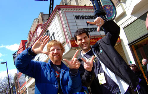
Erik and Jared pay homage to the canted angles of Hartley’s Fay Grim.
Welcome back, Suo-san

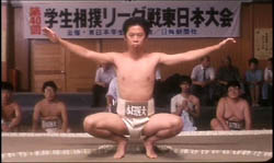
Suo Masayuki, one of Japan’s most ingratiating directors, found an international triumph with Shall We Dance? (1996). He had started his career with an odd little softcore porn film, Abnormal Family (1983), shot as an admiring pastiche of Ozu’s style. His Fancy Dance (1989) was also fun, but he really hit his stride with Sumo Do, Sumo Don’t (1992), which remains a sure-fire crowd pleaser.
Suo worked comic variations on an ingenious theme: How Japanese youth fail to appreciate the beauty of their traditional culture. The garage-band ska singer in Fancy Dance is obliged to retreat to a monastery, where he discovers that Zen is really, really cool. Sumo Do converts sullen college kids to the virtues of ritualized wrestling. Shall We Dance? works in reverse, obliging an uptight salaryman to rekindle his marriage by learning ballroom dance. Suo’s films celebrate pleasurable fusions between Asian and Western cultures.
Suo’s meticulous, understated style is a kind of modern revision of Ozu’s. Fancy Dance and Sumo Do pay homage to the master’s college comedies, and in Shall We Dance? the first tracking shot occurs when the hero takes his first tentative dance steps. In Figures Traced in Light, I mention Suo as part of that trend toward planimetric shooting and compass-point cutting I discussed in an earlier blog. As you see from the opening images, he tries out the precise sort of graphic matching between shots that was a hallmark of Ozu’s style.
 Suo has been very quiet for the last decade, but now he’s back. I Just Didn’t Do It is arousing keen local interest, partly because of its controversial subject matter. Japan is known as a low-crime society, but gradually questions of police brutality have emerged. Suspects can be kept in custody for up to 23 days, and unique among industrial nations, 95% of all people arrested confess!
In Suo’s new film, a young man is accused of groping a schoolgirl in the subway. It’s a daring move for a director known for light comedies. The film stars Kase Ryo, from Letters from Iwo Jima, and veteran Yakusho Koji, seen most recently in Babel. Read more about it here, noting that the Economist’s contents tend to evaporate into the pay-only archive. The film’s official website, in English, is here.
I Just Didn’t Do It, Suo says, is a film “I simply had to make.”


