Archive for the 'Directors: Tsai Ming-liang' Category
Venice 2017: Sensory Saturday; or, what puts the Virtual in VR?
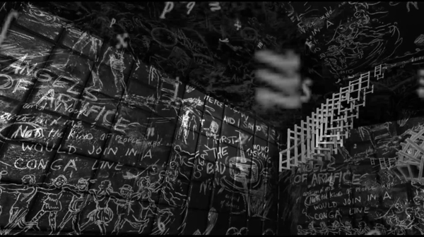
La Camera Insabbiata (2017) by Laurie Anderson and Hsin-chien Huang.
DB here (still at the Mostra):
Kristin and I are Virtual Reality novices, so when we got a chance to sample some pieces at Venice VR, we jumped. The demand was great for the 22 pieces on display, and you had to book each encounter separately in advance. The event was held on its own island, Lazzaretto Vecchio, which was startling in itself; the facility was once a hospital for plague victims.
We took in four pieces in one afternoon and may go back to see some others. We didn’t see exactly the same ones, so my report and speculations are limited to mine. Apart from being fairly wild, sometimes creepy, sensory experiences, they set me thinking about how VR seems to work as a medium.
Angels of artifice
My quartet was a varied assortment, each somewhat parallel to a film genre or narrative prototype. The first was Greenland Melting, by Catherine Upin, Julia Cort, Nonny de la Peña, and Raney Aronson-Rath. It’s part of a Frontline documentary series, and it follows the format, but with immersion. Presenters addressed the camera (me) and took me via helicopter to the glaciers so I could watch them heaving themselves into the sea.

The camera took me underwater as well, and I experimented with voluntarily bobbing under and above the waterline; it worked. Again, as in a film, the transitions between shots was managed through quick dissolves.
La Camera Isabbiata, by Laurie Anderson and Hsin-Chin Huang, is an installation running 20 minutes. It presents a fantasy landscape that you can move through. With two controllers, one in each hand, you choose one of several virtual domains to explore. As far as I could tell, all of them were based on cavernous arrays of blackboards chalked with graffiti. (See the image surmounting today’s entry.)
I first chose the sound domain, which asked me to speak. My words were not only played back to me, but then assumed vase or candy-bowl shapes of gleaming color.
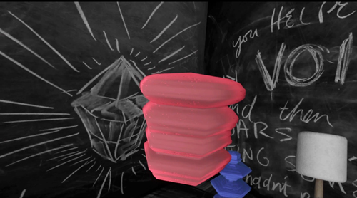
Getting bored with hearing myself and seeing my words made solid, I switched to flying.
Flying was most excellent. Once I figured out how the remotes governed direction, speed, and angle, I could steer a swift path through, over, and around those huge black surfaces. The sense of self-initiated optical flow was powerful, although there were no other cues (e.g., balance, air pressure) to mimic actual flight. But I could have fun playing with this a long time. This was pure subjective POV cinema, or first-person gameplay if you like, and everything was one single shot.
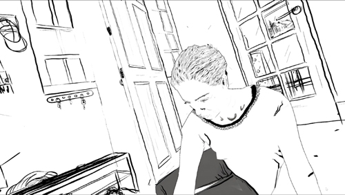
If La Camera Isabbiata put the onus on the user to initiate everything, Draw Me Close: A Memoir by Jordan Tannahill, made me respond to a situation. Once the goggles went on, I was guided to a black-and-white broken-line image of a woman on her sickbed. The artist’s voice-over presented the situation of his mother, dying of cancer, and me-as-him visiting her. Unseen by me, except as her avatar in the goggles, a performer filled the role of the mother, occasionally taking my hand and responding to my responses with more or less scripted comments.
I made my way to a cartoon bed and actually sat on it. The illustrated woman spoke to me, with Tannahill’s voice-over responding. On instructions, I went outside to fetch her paper, but coming back in I moved into a flashback of Tannahill (me) as a little boy playing with Mum. She chatted with me and I feebly responded, and followed her instructions to make colored marks on paper stretched out on the floor.
Later that night Tannahill’s narration guided me to a more unpleasant memory, one reminiscent of Terence Davies’ Distant Voice, Still Lives. It was a minimal narrative to match the images, but I could fill it thanks to the familiarity of the scenario and the tactility of furnishings (bed, door) and physical human contact.
The Deserted, a 55-minute piece, was frankly billed as “a film by Tsai Ming-liang.” A series of fixed long-shots joined by cuts shows a typical Tsai situation: a young man and his mother live in a ruined temple. He apparently administers electrotherapy to his back and chest; he floats in his bath with a fish; it rains in buckets and water comes seeping in to where you’re hovering. A woman in white, perhaps a ghost, appears at times, once in the man’s bathtub.
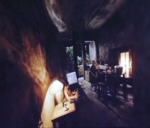
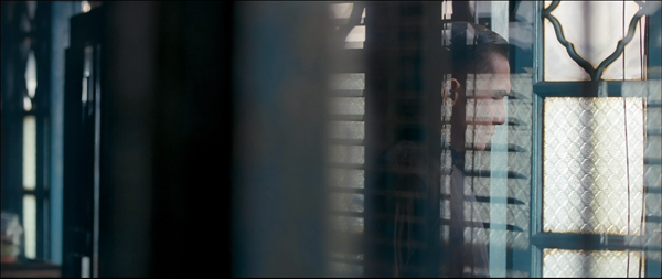
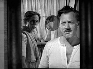
You make the choices in La Camera Isabbiata, and you role-play in Draw Me Close, but in The Deserted you’re locked down as a witness. No images from the piece seem to be available, but this, from a shot of a camera monitor, roughly indicates the film’s first shot (which isn’t as distorted as this looks).
You can’t move to another spot, and you can’t even crane your neck to peek around corners. You can swivel your head to look 360 degrees horizontally and vertically. But nothing much happens behind your back or over your head. All the action, such as it is, takes place squarely in front of you. Given Tsai’s penchant for static long takes and deep areas of space, The Deserted isn’t putting you inside a real or virtual space; it’s putting you inside a Tsai film.
Reality has the most bandwidth
Since I’m no expert on VR, all I have are initial observations based on this sampling and on a bit of reading.
First observation: VR doesn’t have to be photorealistic to engage you. The image in Draw Me Close is quite impoverished in terms of real-world cues, and the shots of The Deserted are almost shockingly fuzzy. (Tsai, a fan of razor-sharp focus, would never let them in one of his film films.) Other pieces in Venice VR, visible on monitors while users were getting the full dose, are often quite cartoonish. Why are they then so compelling?
E. H. Gombrich suggested long ago that illusion can rely more on stimulation than simulation. That is, choose just a few sensory triggers and you’ll be aroused even if the image isn’t particularly lifelike. Baby geese can, if primed properly, take a box for their mothers, and frogs can snap at anything floating in a fly-ish sort of way around their heads. Outlines, it seems, are central for creatures like us, but they don’t have to be detailed. We also respond, fast and stupidly, to configurations that suggest faces.
Try not to see Jesus, or Janis Joplin, in the tortilla, or a stare on the wings of a Caligo butterfly.
As caricaturists and camouflagers know, a few distinctive features can suffice to summon up the target, and the same goes for the partial and degraded input we see in Draw Me Close and The Deserted. In addition, concepts play a role; our ideas about what to expect in certain surroundings, such as a household, help the illusion cohere. And the information needs to be consistent. When I turn my head in Tsai’s temple, nothing I see contradicts the other cues.
A second point: The VR experiences subtract on some channels of input and compensate on others. Normally, perceptual reality is massively redundant. Our sensory systems reinforce one another. Tilting your head sends signals about balance and vision, while sight and sound and touch and muscular activity offer mutually confirming information. And when things are uncertain, you can always test your environment by moving around.
But the VR systems I encountered impoverish the input on certain channels. Standing in the helicopter of Greenland Melting, I saw the passenger seat beside me as vividly three-dimensional, but when I tried to grab it for support, nothing was there. In The Deserted, I looked down and didn’t see my feet; in fact I was an eye in a bubble floating midway up the wall, where the camera was. And in neither of these pieces could I move voluntarily to poke around much in the space.
I could do that in La Camera Insabbiata, but it was an impoverished environment along other parameters. I could fly, but not touch any of the surfaces–which were without color or shadow, beyond a spotlight that shifted to follow my attention (presumably guided by eye-tracking software). I couldn’t land atop one one of the monoliths, or bump into an edge.
Reciprocally, Draw Me Close provided other sensory inputs: locomotion (though not wholly voluntary), touch (initiated by the performer playing Mum, and by the prop bed and door), and an array of skimpy visual-spatial cues. In principle, smell could have been included. Why not, then, go the whole hog and use a photorealistic rendering of the space and Tannahill’s mother? Perhaps a very faithful representation of Mum and the household would have raised the problem of the Uncanny Valley.
Just as important, we might ask: Since a performer is always required for the piece, why not simply play out the scenes with her and the user? Just go for reality, not virtual reality. I’m guessing that the move toward drawn imagery marks the project as stylized enough to be a media artifact, rather than a piece of interactive theatre. (Though it is partly that.) Here, I’m thinking, the impoverishment of information on certain channels was a deliberate aesthetic choice, rather than being obligated by computer processing power, though that would probably have been a factor too.
One of the biggest compensations for what’s missing in some channels would seem to be good old peripheral vision. This is a very strong cue to immersion, and it can override inputs that contradict it. I remember being in one of the Disney World attractions back in the 1980s, a wraparound theatre that put visitors at the center of a travelogue. Even though there were plenty of cues that you weren’t in front of Buckingham Palace–such as your awareness of people around you looking in different directions–if you concentrated on the filmed display, there was a compelling illusion that you were riding down the street toward the Palace.
Peripheral vision would seem to be a powerful sensory trigger for creatures like us. This was the insight that drove widescreen cinema and the curved screen of Cinerama. But efforts to activate peripheral vision maximally come at a cost. You lose the frame and thus a sense of significantly composed imagery. The Disney display had, as I recall, borders at top and bottom, but in modern VR those too are abolished. VR gives with one hand and takes away with the other, so to speak: Greater immersion yields less of the pictorial structuring that’s inherent in framing. Tsai’s film somewhat overcomes this problem by making the surrounding space neutral and fairly uninformative, but the result still loses the sharp dynamic of offscreen and onscreen space we find in his feature films.
One more thought, which seems more solid than the others. Some have asked whether VR can accommodate narrative. I had presumed so theoretically, but now I’m convinced. Greenland Melting told a real-world story, an alarming one at that. Draw Me Close had emotion-laden scenes, a crisis and climax, and a flashback. The Deserted presented a typical Tsai scenario of humid stasis–a thin narrative, but a narrative. (As often in Tsai, what we miss in psychology and causal density we get in slight spatial changes and pictorial surprises.) It wouldn’t be hard to “narrativize” the Camera Insabbiata soaring, either, say by prodding me to go on a cosmic scavenger hunt. I conclude that of course VR can deal with narrative.
John Landis worried that VR was too wedded to long takes to suit cinematic storytelling. That worry was in turn tied to the assumption that narratives must guide your attention. True! But it’s wrong to assume that only continuity editing can shape a film story. Our attention can be precisely guided through long takes. Indeed, to a degree the sort of open and exploratory attitude some find in VR was already there in locked-down long-take directors like Mizoguchi, Akerman, Hou, and Tsai. And they told stories, plenty of good ones.
Many thanks to Peter Cowie, Alberto Barbera, Michela Lazzarin, and all of their colleagues for inviting and assisting us. Special thanks to Andrea Vesentini for guiding us through the array of events at Venice VR.
For details on Venice VR, go here. Variety covers the Venice event in articles by Elsa Keslassy and Nick Vivarelli. Patrick Frater interviews Tsai on The Deserted here. I found this Wired piece a good VR primer, and Ty Burr offers an update in MIT Technology Review.
Gombrich’s key essay on simulation and stimulation is “Illusion and Art,” available without illustrations here. In full form it appeats in Illusion in Nature and Art, edited by Gombrich and Richard L. Gregory (Scribners, 1973), 193-243.
For discussions of how storytelling cinema guides attention within the shot, see the categories Film Technique: Staging and Tableau Staging.
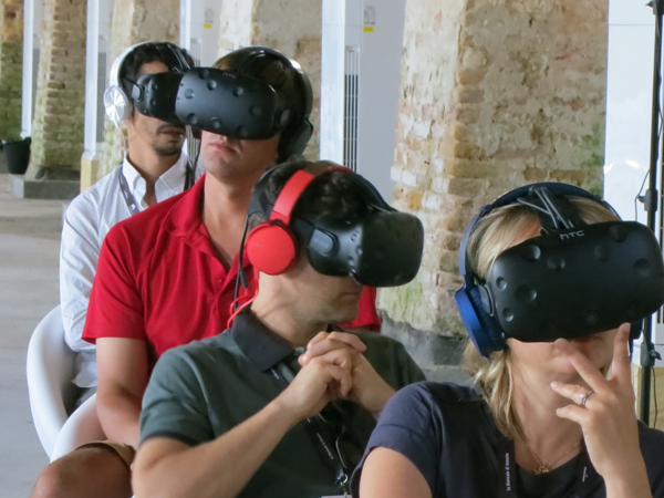
Better than a cellphone? Viewers at Venice VR.
Hou Hsiao-hsien: A new video lecture!
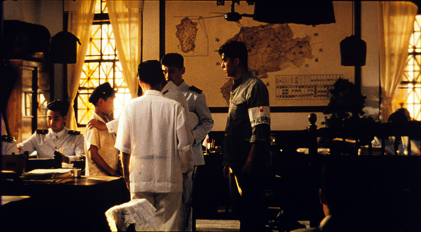
The Puppetmaster (Hou Hsiao-hsien, 1993).
DB here:
The Hou Hsiao-hsien seminar held in Antwerp at the end of May was an event I was sorry to miss. The title announced a focus on Hou’s style of “just-noticeable differences,” a phrase I used to describe his rich and nuanced staging. Coordinator Tom Paulus assembled a stellar lineup of scholars:
Cristina Álvarez López, critic and researcher, co-founder and co-editor of Transit and frequent contributor to mubi.
Adrian Martin, wide-ranging critic and scholar, whose recent book, Mise en scène and Film Style, made him a natural choice for this gathering.
Bérénice Reynaud, expert on Chinese cinema and author of the first book on Hou in English, a fine monograph on City of Sadness.
Richard Suchenski, coordinator of the major Hou retrospective now touring the world and editor of a vast anthology (discussed in an earlier post).
James Udden, author of the first career monograph on Hou in English (discussed hereabouts) and reporter for us on The Assassin (here and here).
A bout of bronchitis kept me home. Chris Fujiwara, author of books on Preminger, Jerry Lewis, and Jacques Tourneur, kindly filled in for me.
But I had prepared a talk, dammit, and I chafed at the prospect of junking it.
The talk was called “The Drawer, Two Women, and the Little Toy Fan.” It centered on aspects of Hou’s 1980s and 1990s work that seemed to me to have influenced works by other filmmakers in the region. The talk ended with some speculations on developments in Hou’s own films over the last fifteen years.
Remembering that all redemption comes from the Web, I decided to put the thing up on our Vimeo channel. While fiddling with it, I realized that it was pretty narrowly addressed to Hou specialists. So I expanded it by offering more context and background, and gave it the unsexy title of “Hou Hsiao-hsien: Constraints, traditions, and trends.”
The lecture is available here on my Vimeo channel.
It can serve as an introduction to some ideas about Hou I floated in Figures Traced in Light. I’ve added comments on Hou films after Flowers of Shanghai, and I consider other filmmakers (Kore-eda, Tsai Ming-liang, Edward Yang) as well. It has pretty pictures, many drawn from 35mm prints.
I regret to report, though, that my voice-over narration, the first I recorded at home rather in a studio, is a bit ragged. And, sorry to say, the talk runs nearly seventy minutes. I take consolation in Adorno’s reply to someone who complained that The Authoritarian Personality was too long: “We didn’t have time to make it short.”
Thanks to Tom Paulus of the University of Antwerp and the Photogénie blog for sponsoring the seminar. Thanks as well to Bart Versteirt and Lisa Colpaert of the Vlaamse Dienst voor Filmcultuur vzw and to Nicola Mazzanti of the Cinematek. And of course I owe big thanks to Erik Gunneson of our department of Communication Arts who, as ever, helped me record and post the video lecture.
See our previous entry for more information about events related to Hou’s visit to Belgium. Our site has other material on Hou here and especially here and here.
Here’s a good place to acknowledge what Abé Markus Nornes and Emilie Yueh-yu Yeh have done in making available their pioneering work on City of Sadness. Long ago they put up a fascinating website on the film, which they have now updated on several platforms. Staging Memories, the free interactive iBook for Mac and iPad, can be downloaded from the Apple Bookstore. You can buy a paperback edition from Michigan Publishing here, and the PDF version of that can be viewed for free here.
In the talk I mention how Hou’s work has affinities for the “tableau” style developed in the 1910s. This isn’t a question of direct influence, but an instance of convergence: Similar early choices in a process (long take, long shot, fixed camera) led to similar options and opportunities further down the line. (A case of path dependence in film style?) You can find more on the tableau style in On the History of Film Style, Figures Traced in Light, and some entries on this site, particularly this one and these. The tableau style is also discussed in another video lecture, “How Motion Pictures Became the Movies.”
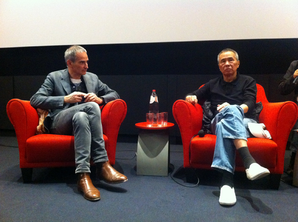
Olivier Assayas and Hou Hsiao-hsien at the Master Class held at the Royal Film Archive of Belgium. Photo courtesy Nick Nguyen.
Picking up the pieces; or, a Blog about previous blogs
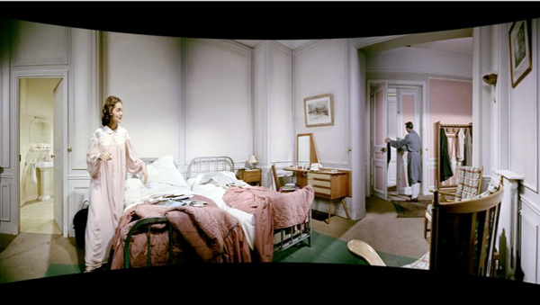
A not-so-intimate bedroom scene from Cinerama Holiday (1955).
DB here:
Many of our blog entries are written in response to current events–a new movie, a film festival in progress, a development in film culture. Later we sometimes add a postscript (as here) bringing an entry up to date. Today, though, enough has happened in a lot of areas to push me to post the updates in a single stretch. It’s a sort of aggregate of chatty tailpieces to certain entries over the last year or so. Should the impulse seize you, you can return to an original entry, and there are other peekaboo links to keep you busy.
Out and about
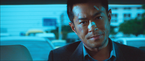
Drug War.
Kristin wrote in praise of Neighbouring Sounds when she saw it at the Vancouver International Film Festival in 2012. Roger Ebert gave it a five-star rating, and A. O. Scott placed it on his annual Ten Best list. This network narrative is Brazil’s official entry for the Academy Awards. Sample Neighbouring Sounds here; the DVD is coming in May.
The annual Golden Horse Awards at Taipei have finished, and the Best Picture winner was the Singaporean Ilo Ilo, which neither Kristin nor I have seen. It would have to be exceptionally good to match the other films nominated, all of which we’ve discussed: Tsai Ming-liang’s Stray Dogs, Wong Kar-wai’s The Grandmaster, Jia Zhang-ke’s A Touch of Sin, and (probably my favorite film of the year so far) Drug War, by Johnnie To Kei-fung. Stray Dogs did bring Tsai the Best Director award and his actor Lee Kang-sheng a trophy for best lead. Wong’s Grandmaster picked up six trophies, including top female lead and Best Cinematography. Jackie Chan won an award for Best Action Choreography. Although his CZ12 struck me as pretty dismal as a whole, its closing montage of Jackie stunts from across his career was more enjoyable than most feature-length films. In all, this has been a splendid year for Chinese-language cinema.
Back in the fall of 2012, I celebrated Flicker Alley‘s admirable release of This Is Cinerama, a very important film for those of us studying the history of film technology. Now Jeff Masino and his colleagues have taken the next step by releasing combo DVD-Blu-ray sets of two more big pictures, Cinerama Holiday (1955), the sequel to the first release, and South Seas Adventure (1958), the fifth and last of the cycle. Both are in the Smilebox format, which compensates for the distortions that appear when the curved Cinerama image is projected as a rectangle. Fortunately, Smilebox retains the outlandish optics to a great extent. The image surmounting today’s entry would give Expressionist set designers a run for their money, and it recalls the Ames Room Experiments. Cinerama wrinkles the world in fabulous ways.
Filled out with facsimiles of the original souvenir books and supplemented with a host of extras putting the films in historical context, these discs are fine contributions to our understanding of widescreen cinema. Because film archives don’t have the facilities to screen Cinerama titles (if they even hold copies), we have never been able to study, or even see, films that now look gloriously peculiar. Dare we hope that, from The Alley or others, we’ll get The Wonderful World of the Brothers Grimm (1962), a strange, clunky, likeable movie?
Bookish sorts
Spyros Skouras and Henri Chrétien.
2013 saw the first of our online video lectures, one on early film history and the other on CinemaScope. The response to them has been encouraging, but as usual nothing stands still. If I were preparing the ‘Scope one now, I would draw from the newly published CinemaScope: Selected Documents from the Spyros P. Skouras Archive. Skouras was President of 20th Century-Fox, and he kept close tabs on the hardware he acquired from Chrétien in 1953. This collection of documents, edited by Ilias Chrissochoidis, shows that Skouras saw ‘Scope as a way to follow Cinerama’s path and boost the studio’s profits. “I would hate to think what would have happened to us if we had not created CINEMASCOPE. . . . Certainly we could not have continued much longer with the terrific losses we have taken on so many of our pictures.” ‘
Scope didn’t rescue the industry, or even Fox, from the postwar doldrums, but some of the behind-the-scenes tactics of the format’s first years are revealed here. For example, Skouras hoped that filmmakers would put important information on the surround channels deployed by the format, in the hope that theatre owners would make more use of them. “Such scenes would have to be unusual ones, but even with my limited imagination I can visualize many scenes in which dialogue would be heard from only the rear or the sides of the theatre.” This seems fairly extreme even today.
Jeff Smith is a swell colleague here at UW–Madison. (He and I are teaching a seminar that’s just winding down. More about that, I hope, in a later entry.) In his May guest entry for us, Jeff wrote about the new immersive sound system Atmos. But he’s been busy filling hard covers too. Research articles by him have appeared in three new books on film sound.
 To Arved Ashby’s Popular Music and the New Auteur: Visionary Filmmakers after MTV Jeff contributed “O Brother, Where Chart Thou?: Pop Music and the Coen Brothers”–surely required reading in the light of Inside Llewyn Davis. He’s also a contributor to two monumental volumes that will set the course of future sound research. David Neumeyer has in The Oxford Handbook of Film Music Studies gathered a remarkable group of foundational chapters reviewing the state of the art. Jeff’s piece charts the changing relations between the film industry and the music industry, from The Jazz Singer to Napster and file-sharing. For another doorstop volume, The Oxford Handbook of New Audiovisual Aesthetics, edited by John Richardson, Claudia Gorbman, and Carol Vernallis (three more top experts), includes a powerful essay in which Jeff shows how techniques of intensified continuity editing have their counterparts in scoring, recording, and sound mixing. Not to mention his forthcoming book on an altogether different subject, Film Criticism, the Cold War, and the Blacklist: Reading the Hollywood Reds. All in all, a busy man–the kind we like.
My March essay, “Murder Culture,” devoted some time to the women writers of the 1930s and 1940s who created the domestic suspense thriller–a genre I believe has been slighted in orthodox histories of crime and mystery fiction. The piece brought friendly correspondence from Sarah Weinman, editor of a new anthology from Penguin: Troubled Daughters, Twisted Wives. She has assembled a fine collection, boasting pieces by Vera Caspary, Dorothy B. Hughes, Charlotte Armstrong, Dorothy Salisbury Davis, Margaret Millar, Patricia Highsmith, and Elisabeth Sanxay Holding (whom Raymond Chandler considered the best suspense writer in the business). These stories will whet your appetite for the excellent novels written by these still under-appreciated authors. Sarah’s wide-ranging introduction to the volume and her headnotes for each story will guide you all the way.
Finally, not quite a book but worth one: “The Watergate Theory of Screenwriting” by Larry Gross has been published in Filmmaker for Fall 2013. (It’s available online here to subscribers.) The essay is based on the keynote talk that Larry gave at the Screenwriting Research Network conference here in Madison.
Digital is so pushy
From Doddle.
Back in May, I provided an update on the progress of the digital conversion of motion-picture exhibition. Today, 90% of US and Canadian screens are digital, and over 80% worldwide are. (Thanks to David Hancock of IHS for these data.) I wish I could say the Great Big Digital Conversion was at last over and done with, but we know that we live in an age of ephemera, in which every technology is transitional. As I was finishing Pandora’s Digital Box in 2012, the chatter hovered around two costly tweaks.
The first involved higher frame rates. One rationale for going beyond the standard 24 fps was the prospect of greater brightness to compensate for the dimming resulting from 3D. Peter Jackson presented the first installment of his Hobbit film in 48 fps in some venues, and James Cameron claimed that Avatar 2 and its successor would utilize either 48 fps or 60 fps. And in January of this year some studio executives predicted that 48 fps would become standard.
Not soon, though. The Hobbit: The Desolation of Smaug will play in 48 fps on fewer than a thousand screens. Bryan Singer, who praised the process, has pulled back from handling the next X-Men movie at that frame rate. The problem is partly cost, with 48fps demanding more rendering and vast amounts of data storage. As far as I can tell, no one but Jackson and Cameron are planning big releases in the format.
The other innovation I mentioned in Pandora was laser projection. It too will brighten the screen, and according to its proponents it will also lower costs. Manufacturers are racing to build the machines. Christie has presented GI Joe: Retaliation in laser projection at AMC Theatres’ Burbank complex, and the firm expects to start installing the machines in early 2014. Seattle’s Cinerama Theatre is scheduled to be the first. NEC, the Japanese company, premiered its laser system at CineEurope in May. A basic NEC model designed for small screens (right) will cost about $38,000—an attractive price compared to the Xenon-lamp-driven digital projectors currently available. But the high-end NEC runs $170,000!
How to justify the costs? One Christie exec suggests branding: “Laser is a cool term that audiences immediately identify with.”
Perhaps the most important innovation since last spring’s entry involves an electronic delivery system. In October, the Digital Cinema Distribution Coalition, a consortium of the top three theatre chains along with Warners and Universal, launched a satellite and terrestrial network for delivering movie files to theatres. Theatres are equipped with satellite dishes, fiberoptic cable, and other hardware. The new practice will render the current system of shipping out hard drives obsolete, although the drives will probably continue for a time as backups. The DCDC has scheduled over thirty films to be sent out this way by the end of the year, and 17,000 screens in the Big Three’s chains are said to be hooked up. For more information, see David Hancock‘s IHS Analyst Commentary.
In the 1990s, satellite transmission was touted as the best way to send out digital films, and it was tried with Star Wars Episode II: Attack of the Clones in 2001. Sometimes things move in spirals, not straight lines.
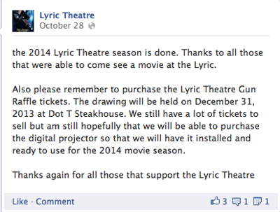
Speaking of the Conversion, an earlier entry pointed out the creative strategy used by the Lyric Theatre in Faulkton, South Dakota to finance its digital changeover. A gun raffle was announced on the Lyric’s Facebook page. Top prize was planned to be a set of three weapons: an AR-15 rifle, a shotgun, and a 1911 pistol.
The theatre’s screening season concluded, but the raffle is going forward, on New Year’s Eve, no less.
Television in public, movies in private
Dr. Who: Day of the Doctor (2013).
I can’t stand all this digital stuff. This is not what I signed up for. Even the fact that digital presentation is the way it is right now–I mean, it’s television in public, it’s just television in public. That’s how I feel about it. I came into this for film. —Quentin Tarantino
Spirals again. When attendance began to slump after 1947, Hollywood tried a lot of strategies–color, widescreen processes like Cinerama and ‘Scope, stereo sound, and not least “theatre television.” Prizefights, wrestling matches, and even operas were transmitted closed-circuit. Now theatre television is back, made possible by The Great Big Digital Convergence.
Godfrey Cheshire predicted some fourteen years ago that as theatres became “TV outside the home,” what we now call “alternative content” would become more common.
Pondering digital’s effects, most people base their expectations on the outgoing technology. They have a hard time grasping that, after film, the “moviegoing” experience will be completely reshaped by–and in the image of–television. To illustrate why, ponder this: if you were the executive in charge of exploiting Seinfeld’s last episode and you had the chance to beam it into thousands of theaters and charge, say, 25 dollars a seat, why in the hell would you not do that? Prior to digital theaters, you wouldn’t do it because the technology wouldn’t permit it. After digital, such transpositions will be inevitable because they’ll be enormously lucrative.
Godfrey’s prophecy has been fulfilled by all the plays, operas, and other attractions that run in multiplexes during the midweek or Sunday afternoon doldrums. His Seinfeld analogy was reactivated by last month’s screenings of Dr. Who: The Day of the Doctor in 3D. It was shown on 800 screens in seventy-five countries, from Angola to Zimbabwe, while also being broadcast on BBC TV (both flat and stereoscopic). The Beeb boasted that the per-screen average for the 23 November show beat that of The Hunger Games: Catching Fire. Globally, it took in $10 million, despite being available for free on TV and the Net. In the US, the event was coordinated by Fathom, a branch of National Cinemedia, a joint venture of the Big Three chains.
While some complained about dodgy 3D in the show, a surprisingly fannish piece in The Economist declared that “this landmark episode was buoyed up with fun, silliness, and hope.” The larger prospect is that other TV shows will take the hint and host season premieres or end-of-season cliffhangers in theatres. Many art house programmers would kill to show episodes of Game of Thrones or Mad Men, or even marathon runs of House of Cards. If it happens at all, I’d bet on Fathom getting there first.
I’ve had little to say, in this arena or in Pandora, about streaming and VOD, but these are becoming important corollaries of the Great Big Digital Convergence. Netflix in particular is expanding its reach, growing its subscriber base, creating original series, and enhancing its stock value, despite some ups and downs. At the same time, it’s pressing studios and exhibitors for the reduction in “windows,” the periods in which films are available on different platforms.
 The theatrical window was traditionally the first, followed by second-run theatrical, airline and hotel viewings, pay cable, and so on down the line. Now that households have fast web connections, streaming disrupts that tidy business model. In October Ted Sarandos, Chief Content Officer for Netflix (right, with Ricky Gervais), suggested that even big pictures should go day-and-date on Netflix.
“Why not follow with the consumer’s desire to watch things when they want, instead of spending tens of millions of dollars to advertise to people who may not live near a theater, and then make them wait for four or five months before they can even see it?” he added. “They’re probably going to forget.”
Exhibitors howled. Sarandos quickly recanted, saying only that he wanted people to rethink the current intervals between theatrical and ancillary release.
Some observers speculated that his October remarks were staking out an extreme position he intended to moderate in negotiations down the line–possibly to suggest that mid-budgeted pictures would be good ones to experiment with on day-and-date. Perhaps too Netflix was emboldened by the much-publicized remarks of Spielberg and Lucas in a panel last June, when they indicated that the future for most movies was VOD, with multiplexes furnishing more costly entertainments for the few. (In the same session, Lucas predicted that brain implants would allow people to enjoy private movies, like dreams.)
In any event, windows are already shrinking. In 2000, the average theatrical run was 170 days; now it’s about 120 days. With about 40,000 screens in the US, films play off faster than ever before. Video piracy, which makes new pictures available well before legal DVD and VOD release, puts pressure on studios to shorten windows. It seems likely that the windows and the intervals between them will shrink, perhaps allowing films to go to all video formats as quickly as 30-45 days after the theatrical release ends.
Studios have incentives to shorten the windows, if only because a single promotional campaign can be kept going long enough for both theatrical and home release. In addition, buying or renting a movie with a couple of clicks encourages impulse purchasing, and the cost feels invisible until the credit-card bill comes. Nonetheless, commitment to day-and-date home delivery would be risky for the studios.
Hollywood is more than ever before playing to the global audience. Even with the VOD boom, digital purchase and rental constitute a small portion of the world’s movie transactions. According to IHS Media and Technology Digest, theatrical ticket sales, purchase and rental of physical media (DVD, Blu-ray) add up to nearly 12 billion transactions, while Pay Per View, streaming, and downloads come to only about a billion or so. (These categories omit subscription services like cable television and basic VOD on Netflix, Hulu, Amazon, and the like.) Moreover, customers in 2012 spent about 61 billion dollars buying tickets to movies, buying DVDs, and renting DVDs. Tania Loeffler of the IHS Digest writes of North America, the most developed market for digital sales and rental:
Movie purchases made online in North America increased year-on-year by 36.6 per cent to reach 29.2m transactions. The rental of movies online also increased, to 112m transactions, an increase of 57.3 per cent over 2011. Despite this strong growth, movies purchased or rented via over-the-top (OTT) online movie services still only accounted for a combined $836m, or 3.3 per cent of total consumer spending on movies in North America.
By contrast, worldwide consumer spending on theatrical movies actually grew in 2012, to a whopping $33.4 billion–over 50 % of all movie transactions. (Thank you, Russia and China.) And despite the decline of disc purchases and rentals, Loeffler estimates that physical media will still comprise about thirty per cent of worldwide movie transactions through to 2016.
Theatrical releases continue to offer studios the best deal. Because the prices of streaming and downloaded films are low, there is less to be gained from them. True, if windows shrink, the studios will demand that Netflix and its confrères price VOD at high levels, say $25-50 for an opening-weekend rental. But consumers used to cheap movies on demand could balk at premium pricing.
At present, digital delivery of movies to the home provides solid ancillary income to the distributors, even if it doesn’t yet offset the decline in physical media. Add in Imax and 3D upcharges, and things are proceeding well for the moment. Like the rest of us, moguls pay their mortgages in dollars, not percentages or transactions. As long as some hits keep coming, we should expect that studios will maintain an exclusive multiplex run for major releases, as the most currently reliable return on investment.
Orpheum metamorphosis
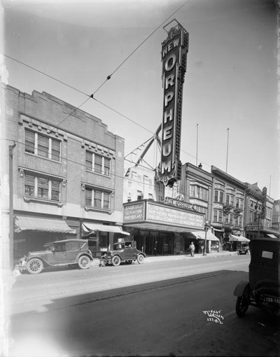
The New Orpheum Theatre, 216 State Street, 1927.
Another note on exhibition relates to the last commercial picture palace in downtown Madison, Wisconsin. My July 2012 entry related the conspiratorial tale of how the grand old Orpheum Theatre on State Street fell on hard times. In fall of 2012 the building seemed slated for foreclosure, but then maybe not. Last month Gus Paras, a hero of my initial post, stepped forward and bought the old place. According to Joe Tarr in our politics and culture weekly Isthmus, there’s a lot of work to do.
Plaster is crumbling off sections of the ceiling, the result of years of water damage from a leaky roof. The walls are littered with scratches and marks, in bad need of a paint job. A plastic garbage can sits in the theater, collecting water leaking from an upstairs urinal. Paras even found dried-up vomit in two spots on the carpet.
Making matters worse, Monona State Bank, which controlled the property while it was in foreclosure, filled in the “vaults” behind the theater, which means replacing the building’s frail boilers and air conditioning will be much more complicated and expensive.
“I don’t have any idea how I’ll get the boiler in and out,” Paras says. “The stairs are not strong enough.”
Envoi
Have any of you worked on a film, say, 10 years ago, and it comes out on Blu-ray and you look at it and think, “This isn’t the film I’ve shot”?
Bruno Delbonnel (DP, Inside Llewyn Davis): Always. Always.
Barry Ackroyd (DP, Captain Phillips): I’ll be watching and it’s in the wrong format.
So what is it like to devote your lives and careers to creating images that you know exist only momentarily in their absolute best state, that may never be seen by most people the way you would like them to be seen?
Sean Bobbitt (DP, Twelve Years a Slave): At least you get a chance to see it once. All you can do is hope that people will see an approximation of that. I’ve been to screenings where I’ve had to get up and walk out because I just couldn’t bear to watch the film in the state it was in. But at the end of the screening, people say, “That was fantastic. That was beautiful. Well done!” and you’re thinking, “If only they had seen the real thing.” We would drive ourselves mad if we worried too much about it.
On shrinking windows, see Andrew Wallenstein and Ramin Setoodeh, “Exhibitors Explode over Netflix Bomb,” Variety (5 November 2013), 16. The chart on this page doesn’t appear in Variety‘s online edition of the story. Tania Loeffer’s report, “Transactional Movies: The Big Picture,” appeared in IHS Screen Digest (now IHS Media and Technology Digest) for April 2013, 123-126. Douglas Gomery discusses the theatre television plans of the 1940s-early 1950s in his Shared Pleasures: A History of Movie Presentation in the United States, pp. 231-234. My envoi comes from a revealing conversation among cinematographers at The Hollywood Reporter.
A 2012 catchup blog chronicling earlier phases of these developments is here.
P.S. 23 December 2013: David Strohmaier, the creative force behind the Cinerama restorations, has put online the stirring original trailers for Search for Paradise (low resolution and high-definition) . David attended the U of Iowa when Kristin and I did, though alas we didn’t meet him. He deserves a big thank-you for all his work in making these extraordinary films available to us.
The Grandmaster.
Where did the two-shot go? Here.
Our Sunhi (Hong Sangsoo, 2013).
DB here:
I’ve complained here and there about the rudimentary staging of scenes in mainstream American movies. (Short version of common practice: Cut a lot and move the camera instead of moving the actors.) But just as rare as complex staging, in the age of intensified continuity cutting, is the sustained and stable two-shot.
Two actors exchanging lines in a continuous, unmoving take was one building block of mature sound cinema. Today’s directors almost never resort to it. Their face-offs are “given energy” by a drifting or arcing camera, or lots of cuts, or, if they feel like moving the actors around, the Steadicam walk-and-talk.
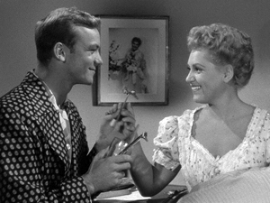
But the prolonged, balanced two-shot can yield remarkable results. A medium-shot or medium-long-shot framing can work to a human dimension, giving prominence to the actors’ bodies. It doesn’t let their surroundings swamp them, and it doesn’t reduce them merely to faces. It lets the actors act with not just facial expression but with their posture and their upper bodies. And it nicely balances dialogue with the flow of pictorial information. We can watch both actors, with one reacting to the other, as in The Marrying Kind (1951).
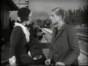
Sometimes the two-shot is played with the faces in profile, as in early sound pictures like The Criminal Code (1931).
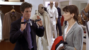
But directors quickly understood that if you prefer, you can angle the actors so that we get a 3/4 view of one or both. The tactic sacrifices realism (who stands in such ways in real life?) but it’s a piece of artifice we gladly accept. It’s visible in my Marrying Kind example, as well as here in Two Weeks Notice (2002).
Of course two-shots are still with us, but they usually serve to set up passages of shot/ reverse-shot cutting. The sustained two-shot carrying long stretches of dialogue is increasingly rare in Hollywood cinema. It surfaces more often, I think, in indie works (Jarmusch, Linklater, and Hartley, for instance), European films (Garrel, for instance), and perhaps most notably some Asian films.
For reasons not yet well understood, during the 1980s stylistically ambitious directors in Japan, Taiwan, and China began building scenes out of long, static takes. Sometimes those are distant framings, unfolding in elaborate blocking; to my mind Hou Hsiao-hsien is the great master of this. But no less prominent are those films that present simply staged shots of two or more characters in which action and reaction are captured by a fixed camera. Often these shots avoid 3/4 views. That is, we may get two characters in profile, or two characters facing the camera directly. The result is a more abstract, even ceremonial look and feel.
I was remembering this tendency while watching several of the films on display here at the Vancouver International Film Festival. I saw one film very largely made of two-shots. I saw a couple in which the two-shots serve mostly as points of punctuation, breathing space between scenes that are cut up in more orthodox ways. And I saw one film that climaxed in a two-shot showing the actors holding their ground for about fourteen minutes. All were from Asia.
Both visual and plot-based information follows; in other words, as often happens hereabouts, there are spoilers.
The Return of Kids Return
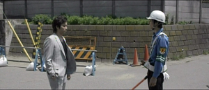
Kids Return: The Reunion, directed by Shimizu Hiroshi, is a sequel to Kitano Takeshi’s 1996 film. The disaffected high-school buddies Shinji and Masaru were last seen riding a bike and declaring that they would show the world what they’ve got. Now, many years later, they haven’t shown much. Masaru is a low-level gangster who has lost the use of his left arm in a jailhouse brawl. Shinji holds a boring job as a security guard, and he’s about to give up boxing. The two meet by accident and resume a more distant version of their friendship. Masaru gets more deeply embroiled in the yakuza world, but he does convince Shinji to stick with prizefighting. As Shinji struggles to improve his skill, Masaru sets out to avenge his betrayed boss, with murderous results.
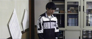
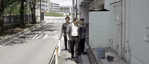
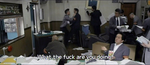
The new version doesn’t have the dry, laconic quality of Kids Return, and the film doesn’t employ Kitano’s characteristic planimetric framing and compass-point editing. But the incessant over-the-shoulder framings of most movies are avoided; when we cut to a character, he or she is usually isolated in the frame. And some moments recall the cartoon-panel cutting of Kitano. One scene shifts from the yakuza boss, Masaru, and the thug Yuji in a coffee shop to a soundless shot of their young subordinate at the office simply staring off into space. Cut to the three men strolling back to the office, with Yuji commenting that the kid never keeps the sidewalk clean.
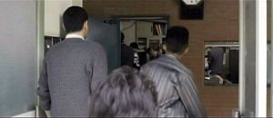
A pan following the men into their building shows the office open and men inside. Yuji bolts past his boss and flings himself at a policeman, who is one of several ransacking the place for evidence.
Most directors wouldn’t include the enigmatic shot of the functionary, but it yields a little question–what is he reacting to?–that the next shots gradually answer.
So cutting plays an important part in building up many scenes. But occasionally Shimizu pauses to draw a moment out. When Murasu and Shinji meet after many years, a nearly thirty-second shot squares them off.
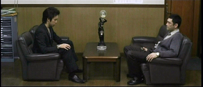
Instead of embracing and pounding each other’s back in the American fashion, they stand awkwardly opposite each other, and the anamorphic widescreen image stresses the tentativeness of their reunion. Later, when Murasu’s boss suggests he leave town and work for another boss, a poised two-shot (at the top of this section) lets us watch the interplay between them across two minutes. Again, the ‘Scope ratio helps, and the fixed frame adds a comic touch by setting at frame center the hideous, ticking clock that Yuji has bought the boss.
I don’t want to suggest that there’s anything particularly radical about Shimizu’s two-shots. Kids Return: The Reunion simply reminds us that a two-shot can usefully vary the film’s pace and lend gravity to moments of character reflection.
Absurdist anatomy
Something stranger goes on in Anatomy of a Paperclip, the winner of the Dragons and Tigers Award here at VIFF. The story is an exercise in grotesque nonsense, a sort of Japanese Theatre of the Absurd.
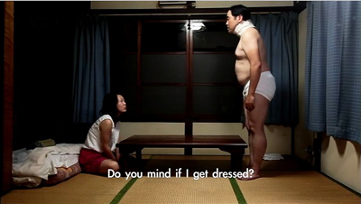
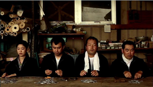
In an undefined town outside time (no cars, videos, or cellphones), a harsh boss rules over a crude cottage industry. Three, sometimes four, workers sit along a bench and make paper clips by snipping and twisting wire. The most hapless is Kogure, a lumpish loser wearing a neck brace. Bullied by two outlaws who constantly make him surrender his money and take off his clothes, eating with painstaking regularity in the same cheap restaurant, he returns home every night to sleep. A butterfly visits him and apparently leaves a pupa behind. As Kogure trudges through his days of petty humiliations, the pupa swells to human size, even bigger than the pods in Invasion of the Body Snatchers.
Director Ikeda Akira shot the film in fifteen days over weekends and holidays. It’s partly in the planimetric mode, with the camera lined up perpendicular to a back wall or lines in the setting.
Even more than Kids Return, the mug-shot and police-lineup staging recall linear, minimalist manga. A great deal of the film’s feel, that of a frozen, almost robotic world, derives from this deliberately “flat” look.
In Anatomy of a Paperclip, the profiled two-shot functions as part of the overall visual pattern. Although some conversations show 3/4 views of the characters, and even yield occasional OTS (over-the-shoulder) framings, many two-shots preserve the geometrical right angles of the master shots.
Another function of our two-shot, then: To play its part in a film’s overall pictorial design, suggesting expressive qualities like rigidity, automatism, and deadpan humor.
Two’s company, four’s a crowd
Hong Sangsoo has made the two-shot–usually profiled and showing characters drinking heavily at a restaurant table–into a central formal device. His films are conversation-driven, and he has rung an ingenious series of variations on duologues. They are typically presented in ways that stress similarities and contrasts among characters, often to mildly satiric effect. We see A and B in one setting, then perhaps B and C in another setting, then A and C in the first setting, and so on. For examples, see this entry.
In the more formally complex Hong films, these variants may be played out as intermingled points of view (The Power of Kangwon Province) or as alternative versions of the same events (The Virgin Stripped Bare by Her Bachelors) or just weird déja-vu (Turning Gate). In an earlier entry, I suggested that Hong exploits our inability to remember certain things precisely, so that we may forget when we first heard a recurring line of dialogue or saw a shot that is echoed by the shot we’re now seeing.
Our Sunhi is about a hugely momentous event that hasn’t, to my knowledge, been dramatized on film before: a professor writing a grad-school recommendation. Sunhi approaches Professor Choi for a reference that will help her study in the States. As she coaxes him into revising his initially cool letter, he becomes attracted to her, as does another university employee Jaehak. Meanwhile Sunhi meets her old lover Munsu, and he becomes attracted to her all over again.
Here the formal rondelay that mocks male vanity–a Hong specialty–doesn’t involve fancy tricks with time or parallel viewpoints.Instead, what circulates are comments about Sunhi, pulled from the professor’s letter (“She has artistic sense,” “She’s honest and brave”) and passed from man to man. The points of circulation come in eleven duologues, each shot in one or two symmetrical long takes. Sunhi meets Jaehak, then Choi, then Jaehak again, then Munsu. Soon Munsu is going out drinking with Jaehak, with whom the prof has coffee before having a rendezvous with Sunhi. Connecting these nodal scenes are brief shots of characters walking through streets, meeting one another by accident, and at the finale, converging in a palace park. As you’d expect, these connecting bits are typically made parallel to each other through framing, situation, music, or other devices.
The two-shots are very long; the longest runs over eleven minutes. It presents a sort of climax, in which a drunken Sunhi reaches out to clutch Jaehak–a gesture of greater intimacy than she has shown any other man.
But soon enough she is meeting the professor for a date in the park. In the very last scene, when she goes off to the toilet, Hong gives us a tiny joke. All three of the men finally meet, waiting for her, and at last a two-shot becomes a three-shot.
This sheerly formal gag is pretty esoteric, I grant you, but it’s typical of Hong’s urge to tweak the simplest materials. In his hands, the lowly two-shot becomes a structuring constraint, a way of deliberately limiting his choices to show us what he can do with it–not least, comic variation.
Two heads, better than one?
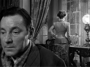
During the 1940s, directors in various countries began to rethink the layout of their two-shots. Instead of giving us matching profiled or 3/4 views, they began to arrange their players so that one figure was significantly closer to the camera, yielding what I’ve called a big-foreground composition. In America, the most flamboyant early versions came from Orson Welles (Citizen Kane and The Magnificent Ambersons) and William Wyler (The Little Foxes, below). This strategy encouraged staging in depth and even letting players turn their backs to one another.
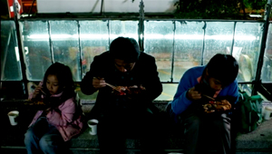
Tsai Ming-liang’s Stray Dogs is the most elliptical and visually variegated film of this VIFF bunch. It’s less a story than a situation: A father, mother, and two children try to survive on the streets. The father picks up odd jobs, while the mother finds work in a supermarket. They wash in public restrooms and scrounge castoff food, sometimes thanks to the mother’s rescuing market goods past their sell-by date. At night, the father and the kids huddle in a makeshift hut, until the mother finds a somewhat better squat in a ruined office building.
Every scene except one consists of a single take, but the connections between scenes are far more oblique than in the other films in this entry. For instance, the mother is seen weeping beside her sleeping children in the opening shot, but then she vanishes from the plot for a while before reappearing in the supermarket, now with her hair cut shorter. The clear and continuous duration of the scenes is offset by a narrative organization that skips over a lot of time and refuses to explain everything that happens in the interim.
Tsai’s visual strategies are quite diverse. Unlike Hong Sangsoo and others in this trend, he doesn’t always keep his camera within a mid-range zone. A scene’s single take can be a striking extreme long-shot or a tight close-up, often of the father (played by the still remarkably waif-like Lee kang-sheng) eating, drinking, or just reciting a poem.
Stray Dogs makes little use of two-shots, and his “clothesline” layouts aren’t quite as frieze-like as those in Anatomy of a Paper Clip.
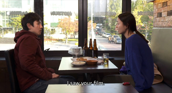
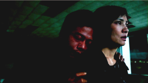
He saves his devastating two-shot for what is, in this quiet and melancholy drama, as close as we get to an intimate climax. The image at the top of this section shows the husband and wife, her face looming in the foreground while he stands behind her.
Why is this shot, only three minutes longer than one in Our Sunhi, so fiercely hard to take? Hong Sangsoo fills his restaurant shot with gab and plot development. Tsai’s shot, reminiscent of the big-foreground compositions of Welles and Wyler and many afterward, is almost completely unchanging. Neither husband nor wife speaks for fourteen minutes; the only action we see in most of the shot consists of him occasionally swigging alcohol from the bottles he’s stolen and some tears running down her cheek. And we have no idea of when the shot will end because there’s no obvious trajectory set up for it. Like the fixed close-up of a weeping face that ends Tsai’s Vive l’amour, this shot could go on forever.
About thirteen minutes in, the husband grasps his wife’s shoulders and leans his head wearily against her neck.
In a context scoured of what we normally think of as drama, such tiny movements become major events. The father seems at once apologizing for his drinking and trying for a reconciliation.
Tsai has reserved his two-shot for his climax. Instead of becoming a resource judiciously salted through the film (Kids Return: The Reunion) or a stylized extension of a cartoonish world (Anatomy of a Paper Clip) or a core schema for the film’s visual design (Our Sunhi), the two-shot here, rendered as an aggressive image of faces close to the camera, becomes the marker of a mysterious turning point in two lives.
All the films are very much worth seeing for their own reasons. Treating them together, though, reminded me of the power lurking within one very basic cinematic resource.
Last year I considered long-take shooting and staging techniques in that edition of Dragons and Tigers, with comments on Tsai Ming-liang’s Walker.
Just in case this occurred to you: No, Wes Anderson didn’t invent these techniques. This entry and some others explain.
For more on varieties of staging, see On the History of Film Style and Figures Traced in Light: On Cinematic Staging. On this site, you can visit the supplement to Figures here, and the categories Film Technique: Staging and Tableau Staging.
Stray Dogs.


