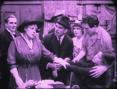
Archive for the 'Directors: Weber' Category
Something familiar, something peculiar, something for everyone: The 1910s tonight
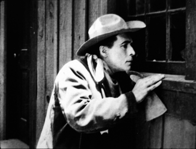
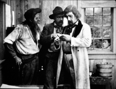
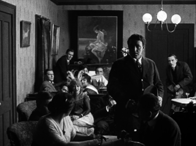
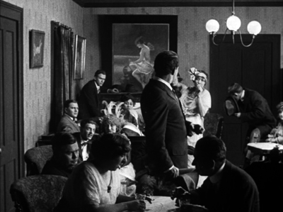
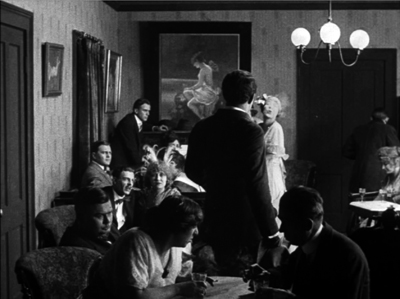
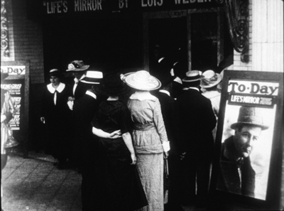
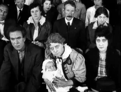
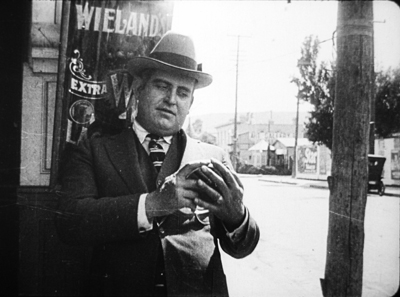
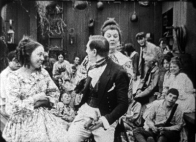
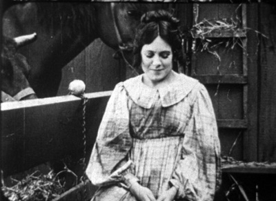
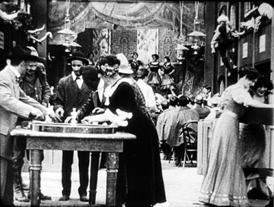
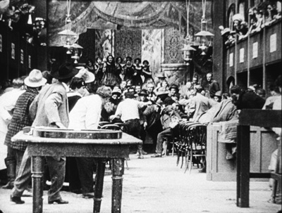
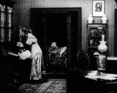
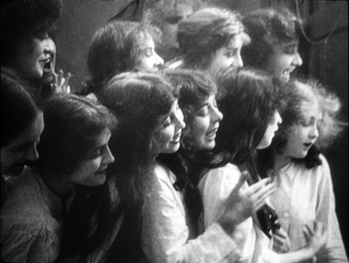
Idle Wives (1916), produced by Lois Weber and Phillips Smalley.
DB here:
This year I’ve been bouncing between two magnificently creative decades in US film, the 1910s and the 1940s. In autumn I’ve been caught up in things involving Reinventing Hollywood, but those were followed by some big doings on campus.
In spring I was lucky enough to be in residence at the John W. Kluge Center at the Library of Congress. That enabled me to watch nearly a hundred feature films from 1914-1918. I did a talk at the Library reporting on some of that work, and I’ve offered some preliminary observations on those in earlier entries.
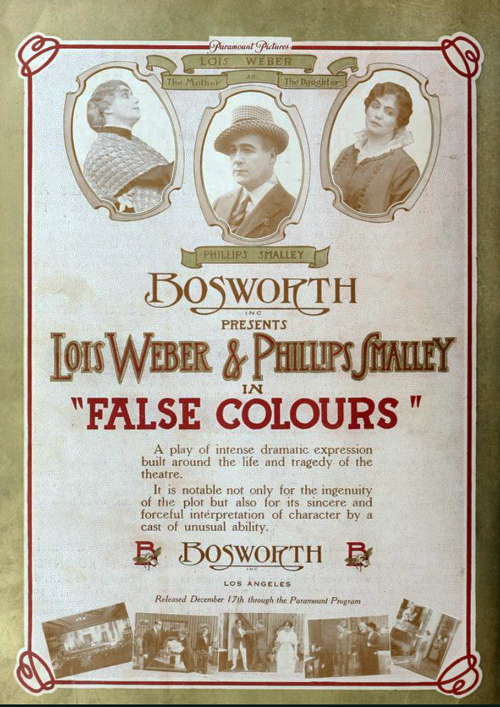
Last week, Jim Healy of our UW Cinematheque brought some of the films that had impressed me during my DC stay. There was a Saturday marathon of The Iced Bullet (1917), Alias Jimmy Valentine (1915), The Bargain (1914), Will Power (1913), and The Man from Home (1914). For our Film Studies Colloquium across two Thursdays we screened False Colours (1914; incomplete), The Case of Becky (1915), Idle Wives (1916; incomplete), and Ben Blair (1916). Some of these I’ve written about in earlier entries, here flagged by links.
The Saturday screenings were accompanied by the lively, indefatigable playing of David Drazin. David worked for many hours and without having seen the films in advance. He’s a superb artist.
Seeing the films again, of course I found more to say.
Revival and revision
The Case of Becky (1915).
One of the secondary arguments in Reinventing Hollywood is that many storytelling techniques of silent film subsided during the 1930s but were revived during the 1940s. Silent films were full of dream sequences, subjective points of view, fantasy projections, and flashbacks. Those got elaborated and consolidated for the sound cinema by Forties filmmakers.
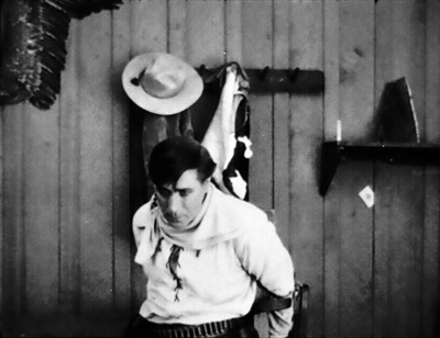
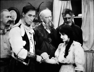
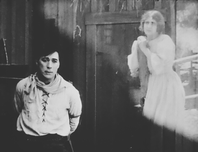
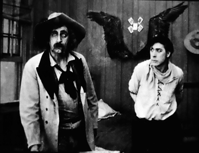
So it wasn’t surprising to find that The Bargain, a fine William S. Hart western, squeezed a lot of mental imagery into a single scene. The Sheriff has arrested Jim Stokes and retrieved the money he stole. Lashed to the bedpost, Jim remembers his wedding and the woman he’s betrayed, presented in a slow dissolve to the past.
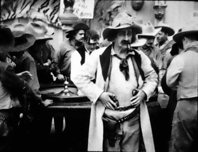
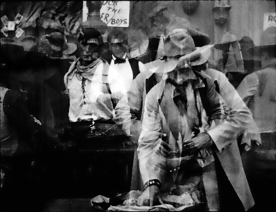
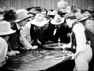
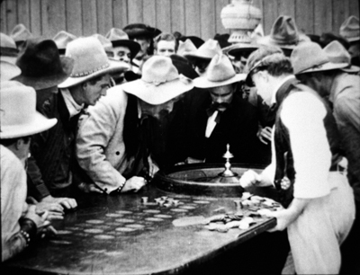
Meanwhile, downstairs in the saloon casino, the Sheriff succumbs to an impulse and loses all his money at roulette. Then he remembers, via another dissolved-in flashback, that he scooped up the stolen money too.
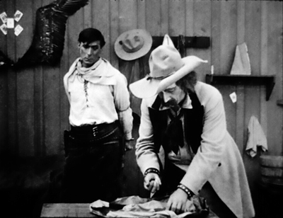
Back in the present, he digs that money out of his poke and bets it—and loses.
Later, in the hotel room, Stokes learns of the Sheriff’s folly and has a good laugh. But then he imagines Nell waiting for him, shown in a split-screen image.
At which point the Sheriff imagines his telegram arriving at his town, announcing Jim’s capture and the recovery of the money. That vision reminds him that he can’t return without the money he has squandered.
This makes him strike the central bargain with the thief he’s captured.
In a 1930s film, these visualized memories would most likely be presented verbally, as part of the stream of dialogue. (“When I think of marrying Nell….””I’ve promised to bring the money back…”). But 1910s American films tended to use dialogue titles sparingly; a lot of the films we saw asked the viewer to grasp the situation without benefit of words. The Bargain has only nineteen dialogue titles in 77 minutes (at 16 frames per second).
The Bargain is a good example of how purely pictorial storytelling was used to explicate a situation. Interestingly, today’s films are rather close to this tendency: fragmentary flashbacks and mental visions are common in mainstream movies.
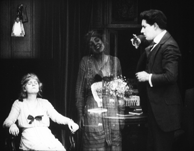
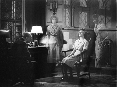
Another echo struck me, this time in The Case of Becky. This is an early story of split personality, a narrative premise popularized after The Strange Case of Dr. Jekyll and Mr. Hyde (1886). Here the young woman Dorothy (Blanche Sweet), under the sway of the sinister hypnotist Balzamo, develops a second identity, the surly and disruptive Becky. Becky isn’t really very dangerous, but when a young doctor, himself a master of hypnosis, falls in love with Dorothy, he determines to cast out Becky. He does so in a passage of intense mind control, visualized through a double exposure of Becky departing Dorothy’s body.
What interested me is that the same visual device was used by Arch Oboler in Bewitched (1945), one of the earliest psychoanalytical films of that era. The heroine’s two sides are summoned up by the shrink.
I suspect that Oboler got wind of the Selznick/Hitchcock Spellbound (1945) and rushed a B-film into production. (He could move fast because he adapted one of his radio plays.) Bewitched was released five months before the Selznick/Hitchcock film. It’s not great movie, but it has a sort of pre-Psycho pitilessness, and it’s always nifty to see a 40s film picking up on a silent-film device.
Cutting things up and filling the corners
My main research questions about the 1910s revolved around stylistics—matters of staging, lighting, shot scale, variety of camera setup, and editing choices. For about twenty years I’ve been exploring how, to put it broadly, the long-take, intricately staged tableau cinema was largely replaced by films dependent on continuity editing. By focusing on the years 1914-1918, I thought I could track the transition in finer grain.
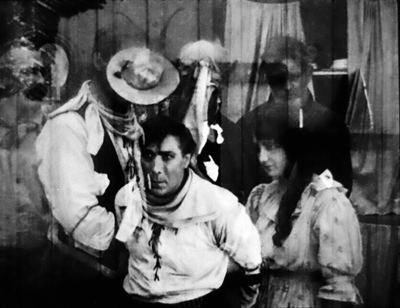
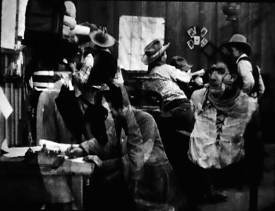
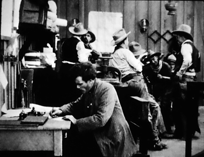
Many films were already building their scenes out of several shots. Go back to The Bargain, from 1914. A series of shots shows Stokes surrounded at the door and window, while also giving us a brief shot from a new angle incorporating tight depth, as the men at the window get the drop on him.
This freedom of camera placement within a single set is typical of the Hart films (see here and here), and of other films by Reginald Barker. It was sometimes visible in Alias Jimmy Valentine from the year before (1913), but it’s more pronounced in The Bargain. Several scenes in the hotel room where Stokes is tied up display a fairly wide array of camera setups.
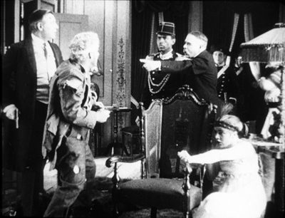
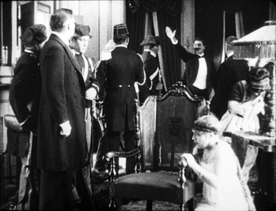
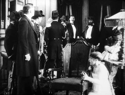
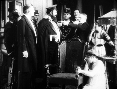
At the other extreme, The Man from Home (1914), credited to Cecil B. De Mille and Oscar Apfel, displays the tableau approach in full bloom. One long take at the climax shows a packed salon. To take just the high points of some pretty dense choreography: Ivanoff bursts in to confront his errant wife, who crumples in the lower right.
Pike holds off the Earl of Hawcastle, now partnered with Ivanoff’s wife. Hawcastle rushes to the right rear to open the curtains (stepping into a spotlight). Summoning the police, he returns to the middle ground to demand the arrest of the fugitive Ivanoff.
But a functionary arrives in the background, lifting his arm to signal the arrival of the bearded Grand Duke Vasili. Vasilii stalks in to take command of the middle ground and confront Hawcastle. Throughout. shrewd shifts of actors’ position open pockets of action, and the performers turn from the camera to drive our eye into depth.
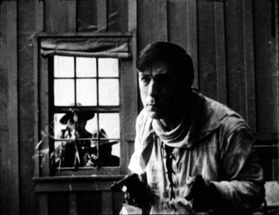
Throughout most of this tableau, broken by occasional titles, Ivanoff’s treacherous wife is crouching in the lower right. This is an example of the “all-over staging” we find in 1910s cinema. Often corners and edges of the frame will be activated and demand to be noticed. For example, in The Bargain Stokes is observing a scene through a window. Cut inside the room, and Stokes can be seen way off to the right in a single pane.
Later directors would have placed the window nearer frame center so that Stokes’ face would be more quickly noticed.
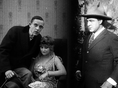
Sometimes we find the filmmaker trusting the audience—or at least a modern audience—too much. In Ben Blair (1916), Ben is lured into a brothel and pulls his pistol in order to escape. But in the master shot, off to the right, the astute viewer can see the louche Sidwell, who’s aiming to marry Flo, cozying up to a hooker before he rises to flee the room. He has already met Ben and fears being recognized.
Director William Desmond Taylor doesn’t supply what I expect Barker would provide: a separate shot of Sidwell seeing Ben and rushing out of the room. Nor does Taylor provide a gradually unfolding tableau that would, by means of figure movement, frontality, centering, and other cues build to a crescendo revealing Sidwell’s presence—the sort of thing we see in The Man from Home. As it is, many viewers may miss the main point of the scene, which is to divulge Sidwell’s sexual betrayal of Flo.
But maybe this was best. Cutting straight in to Sidwell might have suggested that Ben recognizes him immediately. But he doesn’t. As Ben turns, Sidwell is ducking away. Ben has revealed, and seems to be concentrating, on a new center of interest, the woman who’s impudently blowing out cigarette smoke at him. He, like us, is distracted from Sidwell’s departure.
Still, we’re supposed to spot Sidwell even if Ben doesn’t. Only much later, after Sidwell has nearly convinced Ben to give up on courting Flo, does Ben realize that it was Sidwell he saw in the brothel. That’s done through a split-screen flashback of Sidwell starting guiltily beside his floozy.
Again, the shot is a little clumsy in showing Sidwell looking toward the camera, as if Ben saw him directly; but it seems to be another mental image, representing Ben’s now-clear impression that Sidwell was in the brothel.
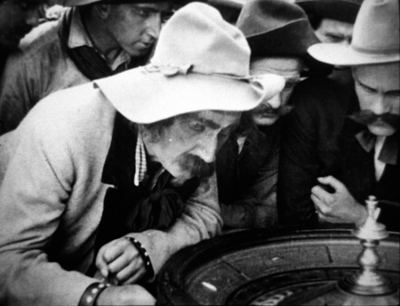
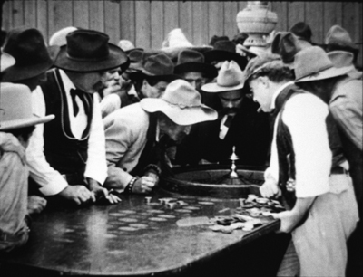
We don’t have to puzzle over such matters in The Bargain. Barker had mastered the precision necessary for off-center details. When the Sheriff is risking his money at the roulette wheel, a close-up reveals that the croupier is controlling it.
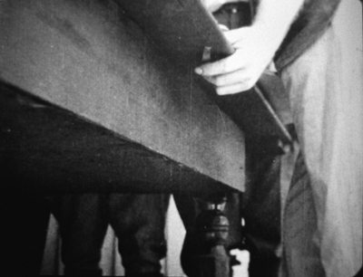
But here’s the neat part. At the turning point, when the Sheriff loses everything, Barker gives us close-ups of the Sheriff and the croupier, but not the hand pressing the button.
We’re sufficiently trained to spot the croupier pressing the button in the long shot (again, off-center). There’s no need to show the gesture again because the priming close-up has told us the game is fixed. Interestingly, that insert shot doesn’t come at the very start of the Sheriff’s gambling jag, so initially we might think the wheel is honest. We get the revelation just when the Sheriff is about to bet the money he can’t afford to lose. That boosts the dramatic tension.
Movies within movies
The Iced Bullet (1917).
While stylistics was my prime research focus, I couldn’t help but notice some bold narrative initiatives. A good example of a playful one was The Iced Bullet (1917), which has a Russian-doll structure (like many 40s films).
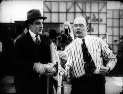
The inner tale recounts how a scientific detective solves an attempted murder, one using the method tipped in the title. But that’s swallowed up in a prologue and epilogue showing a foppish author crashing the Ince studio. He manages to interfere with filming, evade the guards, and take refuge in an executive’s office. He has brought along his screenplay, The Iced Bullet, which he hopes to direct and star in.
At the desk he falls asleep and dreams the detective story we see. At the film’s end he wakes up and flees the studio, pursued by watchmen. One trade paper of the time suggests that the comic frame story was devised in order to expand and elevate the murder story–which may explain why the film has been credited to both Reginald Barker and Charles Swickard. Maybe one directed the frame story and one the embedded one.
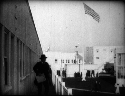
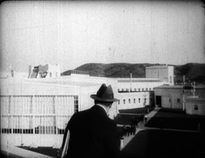
As the frame story stands, it offers us not only a comic pretext but precious views of the vast Ince studio.
There are also some nerdish in-jokes. C. Gardner Sullivan, author of the whole film we see, appears as the executive whose office is commandeered, while Barker shows up as a raging director trying to get the aspiring screenwriter off the set.
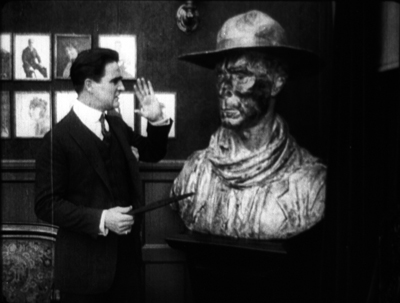
And when that invader takes over Sullivan’s office, he scoffs at a huge bust of William S. Hart, by now a major star.
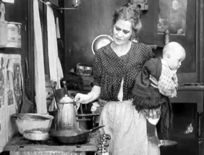
The year before, Lois Weber and her husband Phillips Smalley had given us a more intricate film-within-a-film structure. The central story of Idle Wives centers on the plights of three women. Anne Wall is a wealthy but disillusioned wife who leaves her husband John to take up settlement work. She lives with Alberta, who has married John’s brother Richard. The couple has been disowned by John’s mother and sister. In her charity duties Anne meets Molly Shane, who has left her family to run off with the no-good Larry. Anne helps Molly through her pregnancy and reconciles her with her family. John, seeing how Anne has changed the lives of unfortunate women, welcomes her back and faces down the disapproval of his mother and sister.
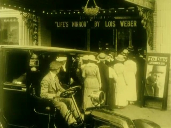
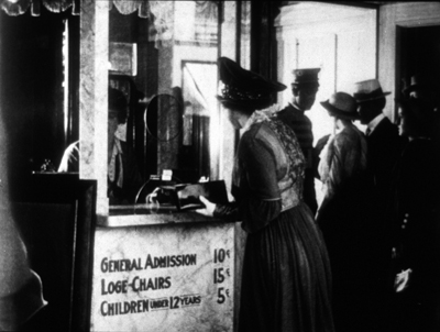
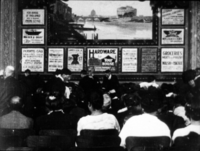
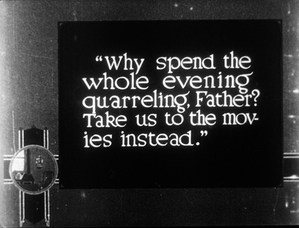
This story is enclosed within another one, involving three other women. The Jamiesons, though wealthy, have an empty marriage. When Jamison meets an old girlfriend, they decide to go see a movie. They’re trailed by Mrs. Jamieson. At the same time, Mary Wells disobeys her mother and goes out with the thug Tough Burns. They wind up going to the same movie theatre. And the poor, hard-working Smith family, whose daughter is longing to escape, decides to take a day off and go to the theatre as well. All of them join the audience for Life’s Mirror, a film by none other than….Lois Weber. It stars Weber and Philips Smalley, who’s given his own poster.
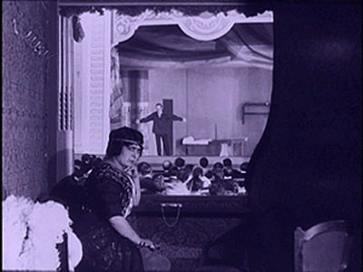
This frame story, not in the source novel, is pretty stunning. In the first reel the people assemble at the theatre, which, as you see up top, flaunts the Weber-Smalley brand. These scenes are fascinating representations of moviegoing culture of the time, showing the ticket booth and the auditorium.
Just as important is the way that seeing the movie affects the characters in the frame story. Shots show people in the audience reacting to the fictional world.
The point of the film is that the characters, recognizing their counterparts on the screen, improve their behavior. Cinema is granted the power to divine the problems of its audience, and to heal their lives.
Or so we’re told from contemporaneous synopses. Because, in one of the great losses of American silent cinema, we have only the first and second reels of Idle Wives. Fortunately, those constitute the prologue and the initial exposition of the inner story.
How does the frame story turn out? According to the fullest contemporary account I’ve seen, in the epilogue Jamieson sees his wife weeping in the aisle, sends her rival away, and reconciles with her. Mary is shocked into realizing the risk of dating Tough Burns, who seems ready to reform after seeing his fictional double behave so cruelly. The Smiths agree to be kinder to one another, and the daughter of the family realizes the danger of fleeing home.
Two network narratives, then, in a single movie. Idle Wives has over twenty individuated characters, linked by kinship or domestic circumstances. (For instance, in both stories some characters live in the same building.) It becomes didactic, as Weber’s films often are, with the theatre presenting a placard that underscores the lessons, and opening titles that address the audience directly. Idle Wives was fairly described by a review as “a preachment on the sacredness of the home, also on the power of the motion picture.”
For most film historians, the great experimental film of 1916 was Intolerance, another tale of parallel situations and fates. But the same month that Griffith’s ungainly masterpiece was released saw the appearance of Idle Wives—in its way, no less daring, and by today’s standards startlingly modern. How many other remarkable films have been lost or have gone unnoticed? Like archaeologists excavating a site, we have a lot more digging to do to understand the glories and unpredictable experimentation of the cinema of the 1910s.
Thanks to my hosts at the Kluge Center last spring: Ted Widmer, Emily Coccia, Travis Hensley, Callie Mosley, Mary Lou Reker, and Dan Turello, as well as the team in the Moving Image Research Center–Karen Fishman, Dorinda Hartmann, Josie Walters-Johnston, Zoran Sinobad, Rosemary Hanes, and Alan Gevinson–along with the Culpeper dynamic duo Mike Mashon and Greg Lukow. We in Madison are especially grateful to Lynanne Schweighofer and George Willemen for preparing a reconstructed version of Ben Blair. Thanks also to Jim Healy, Mike King, and Roch Gersbach for arranging the Madison screenings.
Some of David Drazin’s piano accompaniments are available on DVDs from Texas Guinan (that’s right, tguinan at aol.com).
Idle Wives has been posted online by the New Zealand Film Archive and the Library of Congress. An informative puff piece from the era is “The Smalleys Turn Out Masterpieces With Actors or With Types,” The Moving Picture Weekly 3, 14 (18 November 1916), 18-19, 26. The most comprehensive guide to Lois Weber’s career is Shelley Stamp’s Lois Weber in Early Hollywood (University of California Press, 2015). I discuss the Smalleys’ little masterpiece Suspense (1913) here. Reinventing Hollywood has a chapter on the psychoanalytic cycle of the 40s, including Bewitched.
On all-over staging, and bungling the tableau, see the entry “Looking different today?” We have some entries on decentered framing, one on Mad Max: Fury Road and another on Fritz Lang’s use of corner frame space.
Idle Wives (1916).
Ladies at all levels
La cigarette (1919)
Kristin here:
Earlier this month Flicker Alley released another of its ambitious collections of historic films, Early Women Filmmakers: An International Anthology. The dual-format edition contains three discs DVDs and three Blu-ray discs. Its ambitions are reflected in part by the volume of material included (652 minutes) and in part by the range of its contents, from well-known classics to obscure titles.
The collection was one of the last projects curated and produced by the late David Shephard. As with many of Flicker Alley’s releases, it was a joint project with Film Preservation Associates (Blackhawk Films) and Lobster Films of Paris, working with several film archives. The films are arranged chronologically, with the earliest being Les chiens savants (1902), a music-hall dog act attributed to Alice Guy Blaché, and the latest Maya Deren’s classic experimental film, Meshes of the Afternoon (1943).
The publicity for the collection emphasizes that “More women worked in film during its first two decades than at any time since” (from the slipcase text). I would be interested in how such a claim was arrived at. It seems unlikely to me, if only because the film industries of the major producing countries have grown enormously since the silent and early sound periods. Still, despite this claim, the notes in the accompanying booklet (written by Kate Saccone, Manager of the Women Film Pioneers Project) describe how the DVD/Blu-ray release “reclaims that stature of ‘woman director’ and celebrates it in all its glory.” (One film included, Discontent [1916], is listed as “by Lois Weber”; in this case she wrote the screenplay, which was directed by Allen Siegler.) Thus the program does not survey the range of filmmaking work women performed–but such a survey would be essentially impossible. The lack of detailed credits on early films makes it difficult to determine even the director of a given film.
The silent films
It is not really possible to discuss all the films, but I’ll mention some and link to earlier entries where we’ve discussed some of them.
Of the 25 titles on the three discs, fourteen are silent. Six of these give an overview of work of Blaché, with three French films and three made after her move to the US.
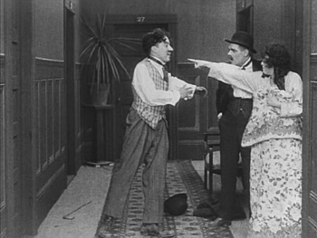
Lois Weber is represented by three films, starting with perhaps her best-known work, Suspense (1913). With its unusual angles (see above), elaborate split-screen phone conversations, and action shown in the rear-view mirror of a speeding car, this is one of those films you show people to demonstrate how wonderfully inventive directors around the world became in that incredible year. I am also very fond of her feature, The Blot (1921).
The third Weber film, Discontent (1916), may surprise those familiar with her socially conscious features. In the mid-1910s Weber worked in a variety of genres. While David was doing research recently at the Library of Congress, he watched some incomplete or deteriorated Weber films that haven’t been seen widely. He wrote about False Colors here and here. Discontent is a comedy with a moral. An elderly man is living in a home for retirees, but he envies his well-to-do family. Finally they invite him to live with them, and naturally everyone ends up annoyed by the situation–including the protagonist, who winds up returning to the home and his friends.
Mabel Normand apparently directed quite a number of her films for Mack Sennett, and Mabel’s Strange Predicament (1914) is one of them. Its cast also includes Charles Chaplin and was his third film to be released, although it was the second shot and the first one in which he wore a version of his Little Tramp costume. Not surprisingly, he steals every scene he’s in. Normand even plays second fiddle to him, with her character forced for a stretch of the action to hide under a bed, where she is barely visible while Chaplin performs some funny business in the same room. (The print seems to have been assembled from two different copies, the bulk of the film being in mediocre condition with the ending abruptly switching to a much clearer image.)
One curious item in the program is Madeline Brandeis’ The Star Prince (1918). According to her page on the Women Film Pioneer’s Project, Brandeis was a wealthy woman who made films, mainly centering around children, as a hobby. Some of these were apparently intended for educational use. The Star Prince, her first film, is clearly aimed at children. A few of its adult characters are played by young adults, while children play both children and adults. This becomes a bit disconcerting when we assume for a long time that the prince and princess are perhaps seven or eight, until they fall in love and become engaged.
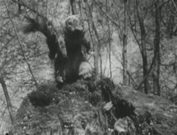
Despite the amateur filmmaking, there are some attempts at superimpositions and other special effects to convey the fantasy, as well as an charmingly clumsy pixillation of a squirrel puppet, the position of which is changed far too much between exposures.
This is the sort of local production, made outside the mainstream industry, that so seldom survives, and it is a welcome balance to the more sophisticated works that make up the bulk of this collection.
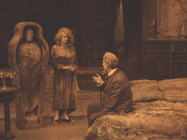
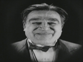
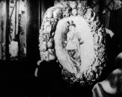
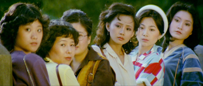
Speaking of which, the next part of the program consists of two features by one of the best-known female directors, Germain Dulac. The first, La cigarette, appeared in 1919. It’s melodrama about an fifty-ish Egyptologist, who has just acquired the mummy of a young princess who was unfaithful to her older husband. The professor begins to imagine that he is suffering a similar fate when his young and beautiful wife (see top) begins spending time with an athletic young fellow.
I remember seeing this film nearly forty years ago and thinking it was pretty weak. Luckily I have seen many films from this era since and know better how to watch them. Seeing it again I liked it quite a bit. It’s beautifully shot and well acted, and its sympathetic depiction of the doubting husband and the clever and resourceful wife is more subtle, in my opinion, than that of the marriage in The Smiling Madame Beudet (which is also included in this set). I was glad to have a chance to see the film again and recognize it as being among Dulac’s best work.
The silent section of the program ends with Olga Preobrazhenskaia’s The Peasant Women of Ryazan (1927). The title emphasizes that Preobrazhenskaia’s film is set in a provincial area. Ryazan, the capitol, is about 120 miles southeast of Moscow, so it is not one of the far-flung regions of the USSR. Still, it would have been distant enough at the time to have its own distinctive culture. Peasant Women gives us plenty of local costumes and customs without giving the sense of this being ethnography first and narrative second. Exotic though it may seem to us, this would have been recent history to Russians when it first came out.
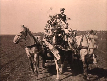
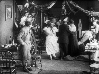
Although most synopses claim that the story runs from 1916 to 1918, it actually begins shortly before World War I, probably in 1914, as the heroine Anna marries Ivan in a lively wedding scene including a carriage ride for the bridal couple (below). Shortly thereafter news of the war comes, and Ivan reluctantly departs for to serve in it. Anna is left in the household of her lecherous father-in-law, who rapes and impregnates her. The war goes on and ends, with the Revolution taking place entirely off-screen.
The second woman of the title is Wassilissa, a tougher sort, who applies to convert a decaying local mansion (we are left to assume that it was confiscated in the wake of the Revolution). She is seen at the end as being the prototype of the new Soviet woman, though Preobrazhenskaia throughout avoids hitting us over the head with overt propaganda.
The sound films
Perhaps not surprisingly, most of the directors on the third disc, devoted to sound films, are likely to be more familiar to modern viewers. Nevertheless, Marie-Louise Iribe and her film Le Roi des Aulnes (1920), were completely unknown to me. She was the niece of designer Paul Iribe and worked primarily an actress during the 1920s, and this seems to have been her only solo directorial effort. (IMDb lists her as the co-director of the 1928 version of Hara-Kiri, which she also starred in.)
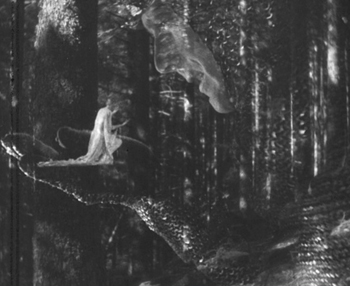
Le Roi des Aulnes is one of the musically based movies that were popular in the early sound era, being based on both Goethe’s and Schubert’s versions of “Der Erlkönig.” It’s nicely photographed, and the part of the father is played by Otto Gebühr, known for being trapped by his resemblance to Friederick der Grosse into playing that role time after time from 1921 to 1941. He’s predictably excellent here, though the stretching of the short poem into a 45-minute film forces him to register worry and eventually grief throughout. Indeed, despite extrapolated incidents, such as the injury of the father’s horse and the need to procure a new one, a great deal of repetition occurs: lots of riding through marshes and menacing appearances by the Erlkönig, who is portrayed as a large man in chain-mail.
The special effects are the most impressive thing about the film, using double superimpositions in widely different scales, with the giant king holding a small fairy on his palm.
Despite its problems, the film is a valuable addition to our examples of this mildly avant-garde trend that flourished for a short time.
Most of the rest of the directors are well-known and can be mentioned more briefly.
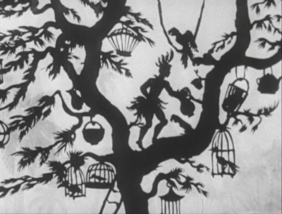
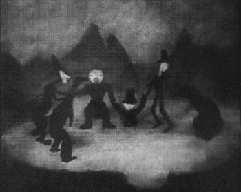
The great animator and innovator of silhouette animation Lotte Reiniger is represented by three short films: Harlequin (1931), The Stolen Heart (1934), and Papageno (1935). I have written about Reiniger’s complex compositions, including her subtly shaded backgrounds. Of the directors represented here, she is the one who enjoyed the longest career, from 1916, when she would have been 17, to 1980, when she was 81. I discuss a BFI boxed set of some of her 1950s films here. I haven’t been able to find a complete filmography, but William Moritz estimates that she made “nearly 70 films.”
Alexandre Alexeieff and Claire Parker’s A Night on Bald Mountain is similarly familiar. Like Iribe’s Le Roi des Aulnes, it falls into the genre of illustrations of existing musical pieces, being an illustration of a piece of the same name by Modest Mussorgsky, as arranged by Nikolay Rimsky-Korsakov. It was created by manipulating hundreds of pins on a large frame called a pinboard, invented by Alexeieff, his first wife Alexandra Grinevsky-Alexeieff (whom he divorced in order to marry Parker in 1940), and Parker. The textured effect is quite unlike that of any other type of animation.
Dorothy Davenport was a prolific actress from 1910 to 1934. She is perhaps most remembered as the widow of Wallace Reid, a star who died from the effects of morphine in 1923. She directed seven films over the next decade, ending with the film in this set, The Woman Condemned (1934), mostly either uncredited or signing herself Mrs. Wallace Reid.
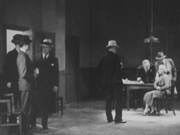
The Woman Condemned is a B picture, produced independently and distributed through the states’ rights system. It’s a competently done murder mystery that gains some interest by withholding a great deal of information from the audience. There are two main female characters, the victim and the accused (seen below in an interrogation scene), and we have very little idea of their motives and goals until the climax of the film. The revelations involve a twist on the same level of groan-worthiness as “and then she woke up.” But again, having a little-known B picture adds to the wide variety of films presented here.
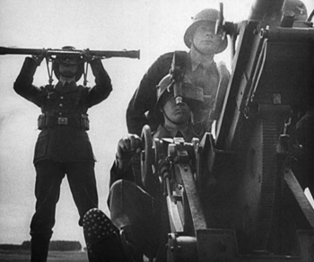
One can hardly study early women directors and skip over the favored documentarist of the Third Reich, Leni Riefenstahl. Day of Freedom (1935) is a good choice for inclusion, occupying only 17 minutes of screen time and amply demonstrating Riefenstahl’s undeniable gift for creating gorgeous images from ominous subjects.
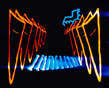
Experimental animator Mary Ellen Bute is represented by two contrasting abstract shorts, the lovely black-and-white ballet of shapes, Parabola (1937) and the vibrant and humorous Spook Sport (1939), the latter (below) made with the collaboration of Norman McLaren.
Dorothy Arzner, the only woman to direct mainstream Hollywood A films from the 1930s to the and 1940s, is introduced via a clip from one of her most famous films, Dance, Girl, Dance (1940). In the scene, Maureen O’Hara’s character interrupts her dance routine to tell off an audience of mostly men who are cat-calling her.
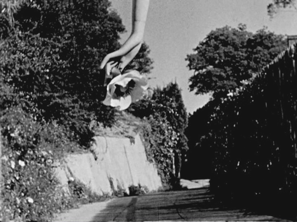
Maya Deren’s first film, Meshes of the Afternoon (1943) ends the program (see bottom). It is a happy choice, since of all the films in the program, it has undoubtedly had the greatest influence on the cinema. Much of the subsequent avant-garde cinema has turned away from music-inspired abstraction and opted for ambiguity, psychological mystery, and impossible time, space, and causality.
Valuable though this collection is, I cannot help but think that some of the directors represented have been oversold. Saccone sums them up:
Together, these 14 early women director have produced bodies of work that are inspiring, controversial, challenging, invigorating, and thought provoking. These women were technically and stylistically innovative, pushing narrative, aesthetic, and genre boundaries.
Surely not all of them meet these criteria. We would hardly expect one hundred per cent of the male directors of the same era to be “technically and stylistically innovative,” so why should we expect all of the work by fourteen varied female directors to be so? Saccone quotes Tami Williams’ book, Germaine Dulac: A Cinema of Sensations. on how the director searched “for new techniques that, in the light of official discourse of governmental and social conservatism, and the modernity of the new medium, were capable of expressing her progressive, antibourgeois, nonconformist, and feminist social vision.” Saccone sees this search in The Smiling Madame Beudet, where “Dulac utilizes cinema-specific techniques such as irises, slow motion, distortion, and superimposition, as well as associative editing, to give visibility to the inner experiences and fantasies of an unhappily married woman …”
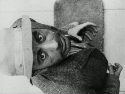
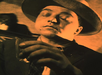
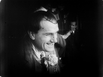
Readers might infer that Dulac innovated these techniques. Yet they had already been established as conventions of French Impressionist cinema, notably in Abel Gance’s J’accuse (1919) and La roue (1922) and Marcel L’Herbier’s El Dorado (1921). For example, Dulac surely derived the distorted image of Beudet that conveys his wife’s disgust (below left) from a similar shot of a drunken man in El Dorado (right).
This is not to say Dulac isn’t a fine filmmaker or that she had no new ideas of her own. Only that she didn’t single-handed discover these techniques, but rather she turned the emerging repertoire of Impressionist techniques toward portraying a woman’s experience.
In some cases films that were co-directed by these women are presented as their sole efforts. Lois Weber’s Suspense was directed, as were many of her early shorts, with her husband, Phillips Smalley. Quotations from interviews with both Weber and Smalley make this clear. In 1914, Smalley said of his wife, “She is as much the director and even more the constructor of Rex pictures than I.” “Even more” because Weber often wrote the screenplays for their films and in at least some cases edited them. Weber later described how Smalley worked from her scripts: “Mr. Smalley got my idea. He painted the scenery, played the leading role and helped direct the cameraman.” Directing the cameraman is part of the job of a director.
The list of films in the booklet attributes Night on Bald Mountain entirely to Claire Parker, though on the backs of the disc cases the credit is to Claire Parker and Alexandre Alexeieff. Alexander Hackenschmied (aka Hammid) is not mentioned in the list of films, and the booklet refers to him as having a “close collaboration ” with Deren, even though he and Deren are both listed as directors on the original credits of Meshes of the Afternoon.
Still, if the collection does not make the case that all of the women represented were wildly talented and innovative, it does show the variety of ways in which women managed to work both in and out of the mainstream industry. It’s valuable collection of historical examples and should be welcomed by anyone interested in the silent and early sound eras.
It is worth noting in closing that viewers should not expect all of these films to be presented in the usual beautiful restorations we are used to from Flicker Alley. Some of these films are indeed gorgeous, including the two Mary Ellen Bute shorts, Peasant Women of Ryazan, Day of Freedom, Meshes of the Afternoon, and La cigarette (though the latter has some small stretches of severe nitrate decomposition). Other prints are quite good or at least acceptable. A few of the films simply do not survive in any but battered or faded prints, notably Discontent and The Star Prince. But we are lucky to have them at all.
The quotations from the Smalley and Weber interviews are from Shelley Stamp’s Lois Weber in Early Hollywood (University of California Press, 2015), pp. 26-27.
[May 23] Many thanks to Manfred Polak, who has drawn my attention to a higher estimate of Reiniger’s lifetime production of silhouette films. Her friend and executor, Alfred Happ, put the figure at about 80. The source is an exhibition catalog from the Stadtmuseum Tübingen, which houses Reiniger’s archived material: Lotte Reiniger, Carl Koch, Jean Renoir. Szenen einer Freundschaft. Die gemeinsamen Filme. ed. Heiner Gassen and Claudine Pachnicke (Stadtmuseum Tübingen, 1994).
Carl Koch was Reiniger’s husband and collaborator; Reiniger created an animated sequence for her supporter and friend Jean Renoir’s La Marseillaise. According to Manfred, “Alfred Happ and his wife Helga were Reiniger’s closest friends and caretakers in her last years in Dettenhausen (near Tübingen, Germany). After Reiniger’s death, Alfred Happ was the administrator of her estate. If you ever come to Tübingen, visit the Stadtmuseum (City Museum), where her estate is hosted now. A part of it is shown in a permanent exhibition.” He also provided a link to a touching account of Reiniger’s friendship with the Happs.
Meshes of the Afternoon (1943)
Wayward ways and roads not taken
DB here:
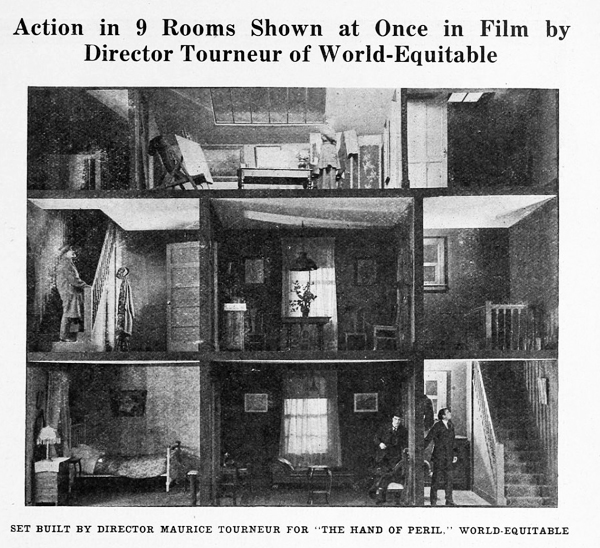
The Hand of Peril (1916) was trumpeted as something new in movie storytelling. It avoided the “cut-back”—that is, crosscutting between different lines of action. In this film, according to the Motion Picture News story above, “nine rooms of a house are shown, with action occurring in each room simultaneously. . . . The action occurring in one room . . . would have to be ‘flashed back’ were the nine rooms not shown.”
Variety found the innovation valuable for pacing. The movie “unfolds in the first four reels with the speed of a race horse. The suspense is constant and there isn’t any let-up whatever until the last few hundred feet.” It’s not clear whether the whole action took place in the house, but for the scenes that did, it appears that the cutaway set served a reference point, a sort of macro-establishing shot. This view gave way to cut-in closer views of the scenes in specific rooms.
Another trade journal noted: “The experiment is quite novel and attractive and fits in admirably in the story, but if it will prove of general worth cannot be told yet.” Now we can tell. This was a road not taken. Crosscutting remained in force, being far more cheap and flexible than dollhouse sets.
No copies of The Hand of Peril are known to have survived. Yet the fact that it was made suggests just how energetic the 1910s were in raising striking creative possibilities—some of which became conventional, some of which fell by the wayside. Seeing this sifting and winnowing at work was a constant delight during my recent stay in the Kluge Center at the Library of Congress. Watching nearly a hundred American features from 1914-1918 drove home to me how excitingly strange movies can sometimes be.
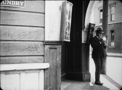
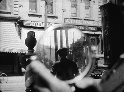
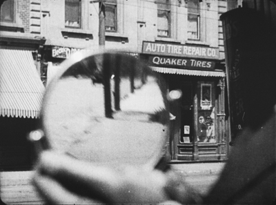
On the one hand, the conformist side of the films was there in abundance. Most of what I encountered were variants of an emerging “classical Hollywood cinema,” as they (we) say. Some efforts were crude, some smooth, but you could tell what the filmmakers were going for, and it was a thrill to see obscure films effortlessly exploiting schemas that would become central to our films. What a kick to see, in The Sign of the Spade (1916), a detective using a hand mirror to trail a suspect, with beautiful control of POV, frame composition, and rack-focus.
Hitchcock, eat your heart out. Well, wait until you start making films.
Yet looking for norms sensitized me to non-normative things—not merely clumsy efforts, but genuine attempts to try something different. Different and, to our eyes, often odd. American features of the 1910s include cuts and framings and camera moves and lighting choices and performance bits that no one now could imagine using.
My viewing companion James Cutting compared the week’s worth of films he saw to the Cambrian explosion in evolution, a period where all manner of organisms burst forth in profusion—before selection pressures wiped many out. While filmmakers were mastering classical plotting and continuity style, lots of other stuff was going on.
Have a look. Actually, several looks.
Widescreen, no. Tallscreen, yes.
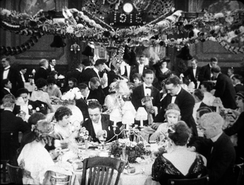
Ready Money (1914).
In this shot, the story action is taking place at the nightclub table, but the society types gathered there are overwhelmed by all the hubbub around and above them. And we aren’t given closer views to help us sort it all out.
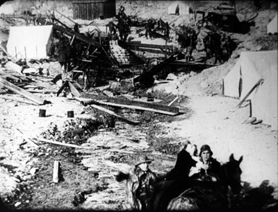
In all periods of film history, directors usually tried to center the action. Yet in early years, they sometimes favored framings that would today be considered strangely decentered. One of my favorite tactics from the ‘teens involves putting important elements in the bottom of the frame, notably in extreme long shots. In The Spoilers (1914), Cherry flops back in her saddle when she sees the devastated mining camp.
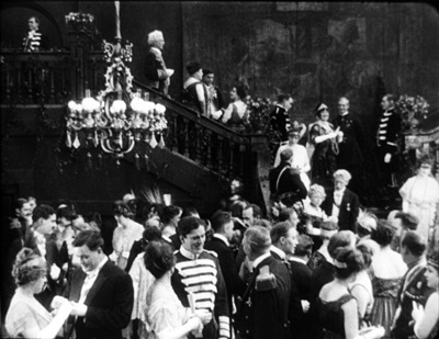
At the big reception in The Sowers (1916), a modern director would have put Paul and the dignitaries he greets in the foreground, and let Princess Tanya descend in the distance. But William C. de Mille creates a vast vertical composition, setting Paul in his braided uniform in the lower third of the frame and putting Tanya far back on the staircase.
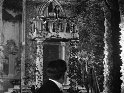
Such top-heavy shots look odd to us, but they have a sort of grandeur, and the taste for them can be acquired. You can see a more intimate example in the fine recent release of Thanhouser films restored by the Library of Congress. The opening sequence of The Picture of Dorian Gray (1915) shows Dorian at the theatre, in a box in the foreground with Romeo and Juliet playing onstage behind him.
Even in the teens, I think this is an outlier. Most theatre scenes are handled with cutting to reverse angles of the audience and the onstage players. When there’s a box in the foreground, it’s usually anchored as such, as in Feuillade’s Fantômas (1913) or Willliam Wauer’s Der Tunnel (1915).
The strange symmetry of the Dorian Gray composition, aided by putting Dorian’s head along the vertical axis rather than off to the side, and by putting the object of his attention, the actress, directly above him, is really startling. The all-over quality of these compositions usefully remind us that every inch of frame space is there to be used if you have the imagination. We’ll see this hypersaturation of the frame in some later examples, but eventually the tactic would go away. Shots would put the human figures in the center of the format, or in long shots place them gracefully on foreground right or left.
Scene + insert
Both European and American directors of the 1910s employed what I’ve called the tableau approach. Within a fixed camera setup and fairly distant framing, the viewer’s attention is controlled through staging, either lateral or in depth. I’ve given plenty of examples elsewhere of how flexible and precise this style can be. A beautiful example occurs in Lois Weber’s False Colours, which I’ve already analyzed along these lines.
During the years I examined, directors were already discarding this approach in favor of cutting-based ways of guiding our eye. Some freely put the camera at various points around a set or an outdoor scene. (In all national cinemas of the period, we find more variety of camera placement on location than in sets, for obvious reasons.) More common was the tendency toward what was called the “scene-insert” method. A master shot of middle range (the “scene”) would be followed by a closer view of something within that space (the “insert”). Very often that cut would be an axial one—that is, a setup straight along the camera axis. Although sometimes decried as a mistake, the axial cut has been used by filmmakers of all eras.
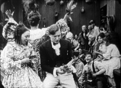
The corn-husking bee in The Hoosier Schoolmaster (1914) illustrates how a basic tactic of the tableau style may be integrated with the scene-insert method. The new schoolteacher is boarding with Mrs. Means, who’s trying to get him to marry her daughter. As the community gathers (that corn won’t husk itself), Mrs. Means forces her daughter on him. The teacher, though, is more attracted to the demure town outcast Hannah. First, Mrs. Means stands behind the schoolmaster and her daughter. Back to us, she addresses the hayseeds.
She moves away to show Hannah in the background. In the tableau approach, this blocking-and-revealing action is usually repeated throughout the shot, but here it’s a one-off device. As soon as it happens, the schoolmaster turns to look back.
Now comes an axial cut to Hannah in the background.
Simple and efficient, this is a good example of the scene-insert method, here enabled by a bit of depth staging. Later stretches of the scene will use the blocking-and-revealing tactic in conjunction with further axial editing.
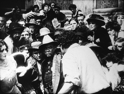
Sometimes the “insert” phase takes a turn that doesn’t look so simple. Consider this shot from The Spoilers (1914). In another wildly decentered framing, the hero Roy Glenister has jumped down from a balcony (upper right) to land on the floor of a big dance hall as seedy as anything in Deadwood. He lands and faces the crowd in the far distance, while the foreground area of gamblers clears away in a panic, so we can see him a bit better.
This is a very distant framing, so we get an axial cut in to him crouching before the surly crowd.
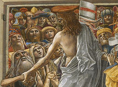
This is a striking insert because in order to give a sense of the massed crowd Roy faces, the director has apparently stacked people up—by height, and perhaps on risers of some sort—so that a welter of faces appear piled up against him. The showgirls at the very top of the frame are on the stage, but the people in the middle were on the same floor as Roy in the master shot. The technique is reminiscent of the stacking of crowds we find in classic Western painting. Here’s a detail from one of the weirdest pictures I saw in the National Gallery, Christ in Limbo by Benvenuto di Giovanni (ca. 1436).
Later filmmakers would presumably have used a high angle to let us see the faces; but then we’d lose the looming effect of Roy’s back in the foreground. Artistic choices are always trade-offs, and here, for the sake of a strong expressive effect, director Colin Campbell has sacrificed spatial realism in a way that probably wouldn’t occur to a contemporary filmmaker.
The shift from long shot to a closer view here is pretty extreme. At several points in my viewing I noticed that when using the scene-insert method, filmmakers often didn’t try for a smooth gradation of shot scales. The old triumvirate long shot/ medium shot/ close-up aims to lead the viewer gradually to the heart of the action, but in the 1910s directors seemed almost impatient to get to the meat of things.
So, for instance, in William Desmond Taylor’s Pasquale (1916), the good-hearted hero is trying to keep up appearances at the wedding of the woman he loves. We get a cut from a very long shot to a tight close-up, accentuated by the vignetting that isolates Pasquale’s face. No medium-shot eases the transition.
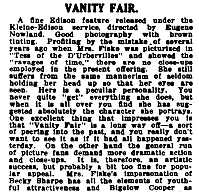
For modern audiences, I think this is a bit of a bump–but nothing compared to the scene-insert leap we get in Vanity Fair (1915). In what is everybody’s idea of what those old movies look like, Becky is exploring the parlor. It’s a very distant shot, atypical for an interior of this scale. And the abrupt jump to a very close insert shows not Becky but the photograph she studies.
This is quite odd. Even stranger, the camera stays back from Becky throughout the film.
It’s unusual for an American movie of 1915 to avoid inserts, especially since Becky is played by the famous Minnie Maddern Fiske, who had popularized the part on stage. Where are the star close-ups, as in Pasquale? Are we dealing with simple incompetence? Apparently not, Variety suggests.
This seems plausible. By shooting most scenes in anachronistic long shots, the director could play down the fifty-something performer portraying a young girl. In the process he could associate the classic story with pre-teens photodramas, which seldom used close-ups. This deliberate anachronism suggests that filmmakers were already aware of the choices of shot scale they now had, and what the scene-insert method committed them to.
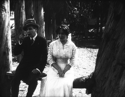
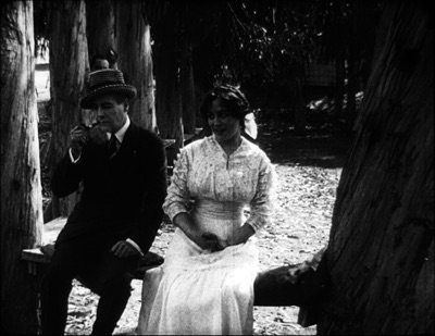
What survives of Weber’s marvelous False Colours offers a great many lessons in the range of 1910s techniques, but one sequence flaunts the all-over long shot and the jolting insert. The conman Bert has persuaded his wife Flo to pose as the missing daughter of the wealthy actor Lloyd Phillips. In this scene, Flo and Phillips have retreated to a park bench to get better acquainted. Bert hides behind a tree to watch them.
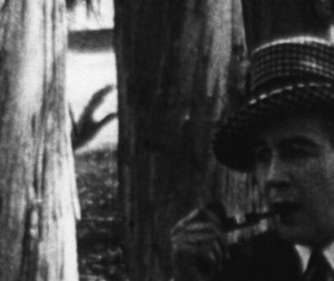
This is a pretty standard situation, but it’s handled in an eccentric way. As the couple sit in awkward silence on the bench, in the far left background Bert creeps in. Problem is, you can barely see him: only his hand, on the far, far left center, is visible in silhouette as it approaches the tree, followed by a dark blot. Thanks to Photoshop, I give you the insert that Weber denies us.
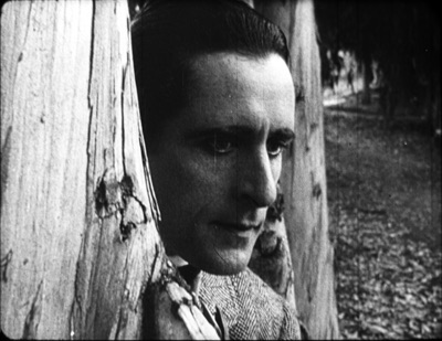
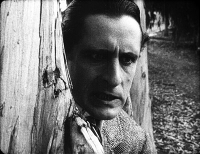
Who would see this? Maybe a viewer from the time, trained in different viewing skills–someone used to the frame’s being packed full? I consider this possibility in an older entry. And there’s certainly a slice of light space left vacant to allow for the hand, creating an extreme case of aperture framing. Anyhow, Weber then does what Taylor did with Pasquale. She cuts from the fairly distant shot to a big close-up of Bert peering out from the tree.
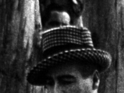
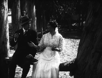
Compared to the bare hint of his arrival with the fugitive hand, this strenuous shot is overcompensation. All we needed was a sort of medium shot of him listening, preferably with the couple in the foreground to orient us. That shot comes, but again in an eccentric way. At first, Phillips blocks our view of Bert, so the actor in the rear has to raise his head–creating the impression of floating just above Phillips’ hat. Again, I supply a blow-up.
And when Flo, lying, says in a dialogue title that her mother talks of Phillips constantly, Bert’s head jerks up angrily. He’s still stuck atop Phillips’ hat. Another huge close-up reinforces his reaction.
Maybe it’s all a mistake? Did Weber screw up a simple scene? Why not just settle Flo and Phillips a little more to the right on the bench, leaving plenty of space on the distant left for Bert to creep behind the tree and peer out, perfectly visible to us throughout? Then, if you insist, you could have the big close-ups of Bert’s reaction? Or did the DP not allow for Phillips’ blocking Bert? (Remember, they didn’t have reflex viewing back then; the viewfinder didn’t show exactly what the lens took in.)
I can’t say. Maybe this is bold, maybe just a botch. But scenes like this in False Colours demonstrate the far-reaching possibilities that people were trying out in the Cambrian explosion of film style.
Jam sessions
Liberty Belles (1914).
In Ready Money, The Spoilers, and other instances we’ve already seen a penchant for stuffing the frame with figures, props, and items of setting. People at the time apparently noticed it too. Charlie Keil, in his indispensable survey of film style from 1907-1913, writes:
Critics advised against “crowded groupings” for numerous reasons: first, if a massing of characters seemed unnaturally pressed together, it would expose the limits of the shooting conditions and destroy the illusionism that cinema was meant to sustain; second, such unnatural staging would violate the standard of composition derived primary from photography, which stressed balance and order; and third, overly compressed staging might obscure the central narrative action and create problems of comprehension for the viewer.
Widescreen, as I’ve mentioned before, poses problems. How do you fit in the human body? How do you fill up the lateral expanse, or do you leave it empty? The squarer rectangle of the 1.33 (or even narrower) frame of early cinema allowed bodies to be packed in, and we’ve seen a surprising vertical dimension to the compositions. Filmmakers found ingenious ways to jam in their figures, especially when they began moving them closer to the camera. By 1914, with the “American foreground,” the front line of action might get pretty crowded.
The climax of Kindling (1915) shows that Cecil B. DeMille was no slouch at filling up the midshot space and then developing the scene through small gestures and changes of posture. It’s far too long for me to run through here, but I think you get the idea.
The blocking and revealing, the slight changes that hide or unmask someone behind someone else, the tendency for actors to freeze so that one performer’s movement draws our eye: all these tactics of long-shot tableau staging are played out in small compass. Call it a jam session.
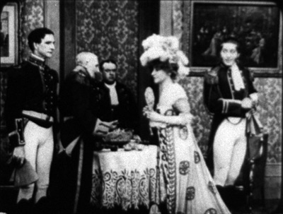
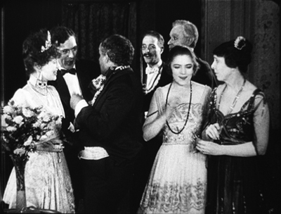
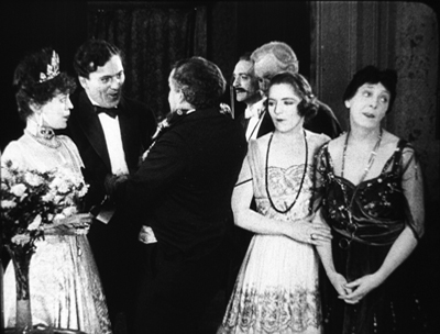
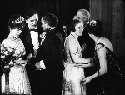
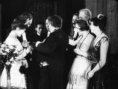
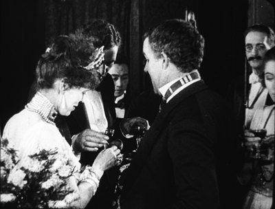
Cecil’s brother William followed suit in a film of the following year, The Heir to the Hoorah (1916). This comedy of class differences centers on three newly rich gold miners, all bachelors. The roughnecks Bud and Bill urge Joe to marry Geraldine so that there will be an heir to their fortunes. Geraldine’s mother, Mrs. Kent, invites the men to a dinner with her swanky friends. For once, the rich folks aren’t snobs but are good-natured folks–and they have to be, for the clumsy ways of Bud and Bill would outrage anyone less tolerant.
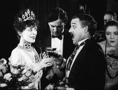
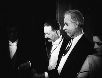
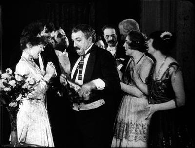
William C. de Mille often avoided long shots and instead covered scenes in fairly tight medium shots and plans américains. Just before the guests go into dinner, they’re huddled together in just such a composition. On the left, Bud is chatting with Joe and a fancy lady. On the right, Geraldine and her mother watch. Behind them are the lady’s husband and Bill. At first the action is on the right, as Mrs. Kent frets about the deplorables Geraldine has brought into the house.
Faces now get diced and sliced, masked and shifted. The gag is set up by servants emerging out of distant darkness. A small aperture opens up so we can see Bud and the others on the left picking up their drinks from a tray.
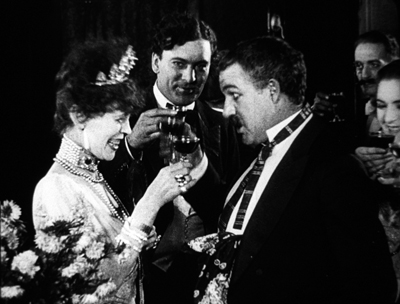
The insert is a surprisingly tight long-lens shot of the group on the left, though with others hovering around the right frame edge. Drinks are taken, a toast proposed.
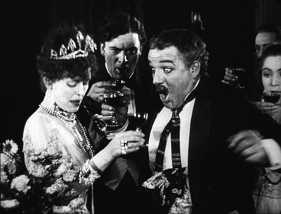
And Bud proceeds to spill his drink on the lady, who responds without rancor.
Another insert shows a reaction shot of Bill and the lady’s husband, also unflapped, before cutting back to the full “scene.” By now, with waiters coming out from behind foreground figures, there are nine characters crammed into the shot.
There’s more to come when Bud’s spur gets caught in the lady’s gown, but you get the idea. Axial cuts carve into this mob and shove bits and pieces of faces, bodies, and gestures out at us. The principles of tableau staging are squeezed down into medium shots. William C. de Mille was a pioneer of multiple-camera shooting for ordinary scenes, and he may well have used a separate camera for the long-lens shots (even though the position of Geraldine on the right is wildly cheated between shots 2 and 3 and 3 and 4).
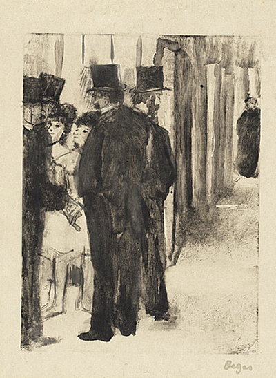
Later Hollywood filmmakers would favor much cleaner images of groups, with heads evenly spaced out across the frame. But visual artists had long explored the bunched-faces option. Here, for instance, is Degas’ daringly unbalanced and crowded Pauline et Virginie of 1876.
Yet these somewhat wild experiments weren’t dead ends. They remained artistic possibilities to be explored more, when other filmmakers hit upon them. Altman’s and Jancsó’s crowded telephoto shots revive the packed frames we see in the 1910s, and other filmmakers found artistic rewards in fanning out figures as in the lovely frame above from Liberty Belles. Those cute girls come back to life in Hou’s Cute Girl (1981) and Millennium Mambo (2001).
Even The Hand of Peril‘s dollhouse set didn’t go absolutely extinct, as admirers of Jerry Lewis (The Lady’s Man), Godard (Tout va bien), and Wes Anderson (The Life Aquatic with Steve Zissou) know. Film style, it seems, knows few dead ends, only detours.
There’s a tendency to think that the history of style constitutes an ever-expanding menu of options. Today, you can cut the way Griffith or Eisenstein or Godard did, right? A similar case has been made for technological change. For decades it was much harder to make a color film than a black-and-white one, but now filmmakers can pursue either option. Most filmmakers in the silent era couldn’t make a talkie, but today’s filmmakers can go silent if they want.
Yet it’s proven surprisingly hard to make a contemporary film look and sound like one from an earlier era. On the sheerly technological front, it’s not easy to recapture the tonal range of orthochromatic nitrate, or the sound texture of early talkies, or the saturation of Technicolor. As for style—how you stage, how you cut, how you frame, and so on—again certain things are hard to recapture. It seems that certain stylistic possibilities, like purely technological ones, have been taken off the menu.
Why is style so hard to recapture? Some elusive nuances of lighting and color depend on technological factors we can’t recreate. IB Tech can’t easily be mimicked with a dropdown menu. On other dimensions, the range of creative options in earlier eras just doesn’t come easily to today’s filmmakers. But maybe by looking at those films we can reconstruct that range. We might also encourage filmmakers to take the sort of chances people did at the very beginning of what we have come to call Hollywood.
This is, I think, my last post for a while on my 1910s adventures at the Library of Congress. I must move on to other projects. As ever, I’m tremendously grateful to the John W. Kluge Center, and particularly its director Ted Widmer, for enabling me to conduct this research under its auspices. A special thanks to Mike Mashon of the Motion Picture Division, and all the colleagues who have been helping me in the Motion Picture and Television Reading Room: Karen Fishman, Alan Gevinson, Rosemary Hanes, Dorinda Hartmann, Zoran Sinobad, and Josie Walters-Johnston. Thanks as well to James Cutting for enjoyable discussion as we watched old movies together.
The new collection of Thanhouser films that includes The Picture of Dorian Gray also provides an enjoyable tour of the LoC Culpeper facility I blogged about in the spring.
I’m grateful to Charlie Keil for ideas and help with sources. The passage I’ve cited from him is in Early American Cinema in Transition: Story, Style, and Filmmaking, 1907-1913 (University of Wisconsin Press, 2001), 134-135.
The quotations from Variety come from anonymous reviews of The Hand of Peril (24 March 1916), 24, and Vanity Fair (29 October 1915), 22.
Other entries about my DC viewing are Anybody but Griffith, Movies in the mountain, and on the machine, Film noir, a hundred years ago, and When we dead awaken: William Desmond Taylor made movies too. More generally, see the category of entries on Tableau staging and my books On the History of Film Style and Figures Traced in Light: On Cinematic Staging. The relation of the tableau style to Hou’s work is considered in the latter, as well as here.
On the difficulty of replicating older film styles, see our blog entries on The Good German and forging a film.
Building the set for The Life Aquatic (Wes Anderson, 2004).
Anybody but Griffith
Motion Picture News (19 December 1914), 148.
DB here:
For almost two months, I’ve been in Washington, DC at the Library of Congress. The John W. Kluge Center generously appointed me Kluge Chair in Modern Culture. This honor has enabled me to work with the enormous collection of the Motion Picture, Broadcasting and Recorded Sound Division to sustain my research in American narrative cinema of the 1910s.
I wanted to go more deeply into an area I mapped out in the video lecture, “How Motion Pictures Became the Movies” and in the books On the History of Film Style and Figures Traced in Light. The general question was: How did the norms of storytelling technique develop between 1908 and 1920? More specifically, I hoped to trace out an array of stylistic options emerging for the feature film. What range of choice governed staging, framing, editing, and kindred film techniques?
Theatre, but through a lens; painting, but with movement
If you’ve seen that lecture, or just followed this blog from time to time, you know that I’ve sketched out two broad stylistic trends operating at the period. One, celebrated as a breakthrough for a hundred years, involves the development of continuity editing. That trend was explored by several historians of early film, including Kristin in the book we did with Janet Staiger, The Classical Hollywood Cinema: Film Style and Mode of Production to 1960.
Critics and historians who saw editing as the essence of cinematic technique called the second trend “theatrical” and regressive. Directors in that trend supposedly simply planted the camera in one spot and let it run, recording performances and not bothering to cut up the scene into closer views. This “tableau” tradition was superseded by an editing-based style–and, many thought, a good thing too.
Over the last twenty years, however, scholars have reappraised that apparently static and passive camera. Lea Jacobs and Ben Brewster’s trailblazing book, Theatre to Cinema: Stage Pictorialism and the Early Feature Film (1997) traced film’s many debts to theatrical plotting, set design, and especially performance. In a parallel series of articles, Yuri Tsivian proposed that the “precision staging” of the 1910s had deep affinities with traditions of painting and visual culture. Lea, Ben, and Yuri showed that the tableau tradition offered rich creative choices to filmmakers.
For my part, I was concerned to explore how ensemble staging worked in a moment-by-moment fashion to call the viewer’s attention to key aspects of the action. Editing does that by cutting to closer views. In the tableau method, emphasis arises from composition, movement, and other pictorial strategies.
In light of all this research, it seems clear that during the 1910s the tableau strategy developed into a powerful expressive resource. After Figures Traced in Light (which found the tradition still alive in directors like Angelopoulos and Hou), I continued to collect examples of creative staging at this early period. The results led me to analyze films by Yevgenii Bauer, Danish directors, and other Europeans.
 Evidently the tableau persisted until 1920 or so in Europe, especially Germany, but the editing-centered option had already become dominant in America. But how long, and in what ways, did tableau methods hang on in the US? Or was the switchover quite quick? By 1917, Kristin had posited, continuity editing had crystallized as the primary storytelling style. I thought I’d try some depth soundings of the period.
Since my time was limited, I had to focus. Charlie Keil’s superb Early American Cinema in Transition: Story, Style, and Filmmaking 1907-1913 (2001) analyzed a great many films of that phase in depth, particularly with respect to editing techniques. So I thought I’d start with 1914 and simply try to see as many features from that year as I could. I then would sample items from later years. My only rule was to watch films that aren’t part of the canon–no Griffith, Chaplin, Fairbanks, Pickford, Fatty et al. I did, however, try to see rare things by Lois Weber, Reginald Barker, and other well-regarded filmmakers.
What did I come up with? I’m still watching and thinking, but let me share a few items that excite me. Clearly, despite plenty of audacious editing, the tableau technique was alive and well in America in 1914-1915. And the more I see, the more I’m inclined to rethink the terms under which I value Mr. D. W. Griffith.
Tableau trickery
A simple illustration of how a fairly distant tableau can vividly guide our attention shows up in The Case of Becky (1915), directed by Frank Reicher.
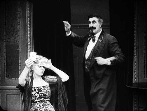
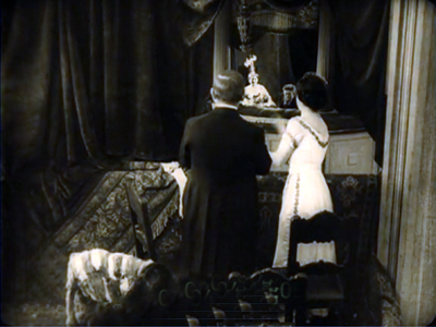
Before an audience, the sinister hypnotist Balsamo hypnotizes Becky. From a deck of cards he has selected the ace of hearts, and in her trance she has to find it. There’s almost no movement in the frame: Balsamo stays frozen, as does Becky, except for her one hand flipping over the cards.
No need for a close-up: With Balsamo as still as a statue, every viewer will be watching that tiny area of the screen occupied by her hands, and we wait for her to find the ace. When she does, Balsamo accentuates her minimal gesture by twisting his arm and freezing into another pose.
Is this, then, simply filmed theatre? Not really. First, many tableau framings, like the Case of Becky instance, put the actors closer to us than stage performers would be.
Just as important, the perspective view of the camera yields a chunk of space very different from that of proscenium theatre. In cinema, for instance, depth is more pronounced, and actors can be shifted around the frame to block or reveal key information. This isn’t pronounced in the Case of Becky example because the two characters are more or less on the same plane and the background is covered by curtains. But consider this shot from The Circus Man (1914), by Oscar C. Apfel.
The circus owner Braddock has been sent to prison for murder and attempted robbery, a plot engineered by Colonel Grand. Now Braddock has served his sentence, and in a scene too complex to trace entirely here (but maybe in a later entry), he bursts in past the butler to confront Grand. Here’s what we see.
Such a scene would be inconceivable on the stage because of the audience’s sightlines. People sitting in the left side of the auditorium couldn’t see Braddock’s entrance, because he’d be concealed by Grand, who’s standing in the foreground left. Audience members on the right side of the auditorium couldn’t see Braddock either, because Mrs. Braddock and David are standing on the right foreground.
The shot makes sense from only a very limited number of points, only one of which is occupied by the camera. Maybe a few people in the center of the theatre would have a fairly clear view of such an action, but as we’ve seen with The Case of Becky, they wouldn’t be so close to the players.
The sheer fact of optical projection means that cinematic space is narrow and deep, while stage space is broad and (usually) fairly shallow. On the stage, players tend to be spread out laterally, allowing for many sightlines. Cinematic staging can be deep and diagonal.
On the other hand, the tableau shot isn’t perfectly analogous to a painting. While the lens chops out a perspectival pyramid in three dimensions, the movement in the frame creates a two-dimensional flow–a cascade of planes and edges very different from what we’d get in a painting. This flow can be used to reveal or conceal bits of space as the action develops.
You can see this compositional flow clearly in an earlier phase of the Circus Man sequence. Before Braddock bursts in, David has been arguing with Colonel Grand in the foreground. David’s and Grand’s heads occupy the area that Braddock will soon claim. Just before that entrance, Mrs. Braddock pulls David back a bit to the right, and Grand recoils fractionally to the left. This creates a hole that Braddock can come into (as above).

This sort of slight shifting is akin to what we see in the astonishing poorhouse sequence of Victor Sjöström’s Ingeborg Holm (1913), analyzed here. Clearly the Americans were executing the same sort of choreography as the Europeans, which turns the static image of a painting into something more dynamic, a sort of micro-dance.
Flo and flow
The married couple Lois Weber and Phillips Smalley are responsible for a little masterpiece of early cinema, Suspense (1913), which I’ve discussed here. It’s become a classic largely because its audacious close-ups and cutting seem to anticipate classic Hollywood style. But seeing, or sort of seeing, two other films by Weber and Smalley suggest that they were no less adept at the tableau method.
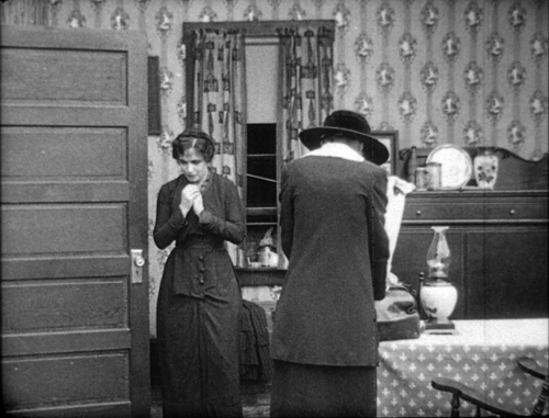
I say “sort of seeing” because the copy of Sunshine Molly (1915) was so deteriorated that in long stretches only faint outlines of the people and locales were visible. The plot was pretty clear, but the images were so blotchy that only a few furnish clear frames. Still, it would seem to have been quite a good film. With False Colours (aka False Colors, 1914), two or three reels were missing. But what was there was pretty spectacular, and one scene is really striking if you’re interested in staging.
As with The Circus Man, at first glance things look stagebound. Dixie’s long-separated father comes to the foreground where she stands waiting with the theatrical manager. He abandoned her as a baby, and now that she’s found success as an actress she spurns him.
But no stage arrangement could yield the layout we get in this shot. While father and daughter and manager occupy the “forestage,” we see Flo, who has impersonated Dixie in an effort to get the father’s money, step into the gap. (Flo is played by Lois Weber.)
Thanks to the depth of the “cinematic stage,” we get what Charles Barr calls “gradation of emphasis”–not just two layers of space, as in The Circus Man, but action and reaction in depth, as we wait for the foreground action to develop. That action hits its high point when the father touches Dixie’s chin.
This gesture partly masks Flo, who briefly turns away as well. The emphasis falls firmly on the father’s contrition. Dixie still refuses him, and so he says farewell, re-exposing Flo turning in the background.

As he departs, so that we get the full force of his encounter with Flo, Dixie turns from the camera. We must concentrate on the moment in the background when the imposter shows remorse for having won the love of the man she deceived.
At the door
You might object: “But David! Those examples are still very stagebound. The Case of Becky shot is itself on a stage, and the others, despite all their depth, show boxlike rooms from straight on. They seem firmly tied to a proscenium concept. Shouldn’t we expect something more natural?”
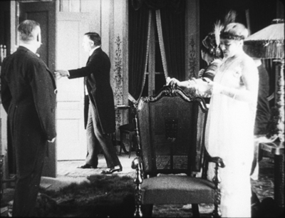
Fair enough, so I submit this earlier phase of the False Colours scene. This time we have a doorway, framed diagonally, that cuts off a lot of playing space. And we see obliquely into a corner of a room, not straight on to a back wall. Yet you still get an interplay of faces and bodies, carrying to a daring extreme the blocking-and-revealing tactics we’ve seen in The Circus Man and in the later phase of the False Colours scene.
Dixie comes to Flo with Flo’s mother. At this point Flo recognizes Dixie as the daughter she’s been impersonating and is deeply ashamed. You won’t be surprised by the dazzling precision of the frontal placement of Flo, no matter how far she is from the camera.
Flo is consoled by her mother, and Dixie shuts the door discreetly.
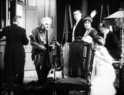
But why so much empty space on the left of the door? Because now the theatre manager is coming, and the framing shows us what Dixie doesn’t know: Her father is standing there alongside the manager.
There’s a moment of suspense before the father hesitantly steps to the doorway and Dixie sees him for the first time in seventeen years.
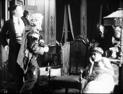
He blots out everything but her reaction, until Flo’s face slides into visibility. Cornered, she’s terrified to be confronting the man she has deceived.
The father’s valet has obligingly slid into the left to balance the frame, but he stands as frozen as the hypnotist Balsamo had been, looking patiently downward, to make sure we concentrate on the pitch of drama taking place in the distance. This is as purely “cinematic” a scene as anything involving editing.
And who needs close-ups?
Griffith is a great director, but other filmmakers of his period were exploring cinematic possibilities he didn’t consider. Their editing is often more subtle and careful, and the exponents of the tableau style achieve a pictorial delicacy mostly at variance with his work.
More and more, this Founding Father of Hollywood seems to me an outlier–an eccentric, raw, occasionally clumsy filmmaker who went his own way while others refined a range of stylistic practices. I’m starting to think he favors a brute-force approach, in both physical action and the evocation of sentiment. The result is powerful, but… Well, I’m reluctant to say it, but after my two months of immersion in Anybody But Griffith, he’s starting to seem somewhat crude.
I’m tremendously grateful to the John W. Kluge Center, and particularly its director Ted Widmer, for enabling me to conduct this research under its auspices. A special thanks to Mike Mashon of the Motion Picture Division, and all the colleagues who have been helping me in the Motion Picture and Television Reading Room: Karen Fishman, Rosemary Hanes, Dorinda Hartmann, Zoran Sinobad, and Josie Walters-Johnston.
Ben Brewster and Lea Jacobs’ Theatre to Cinema is available for download here.
For our blog entries relevant to the tableau tradition, go here. Lois Weber made many other important films, notably Hypocrites (1915), Where Are My Children? (1916), Shoes (1916), and The Blot (1921). See the exceptionally detailed Wikipedia entry for more information.
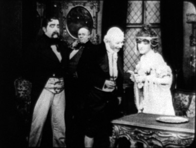
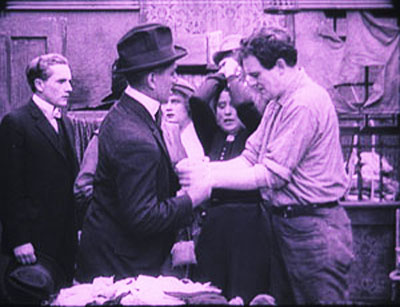
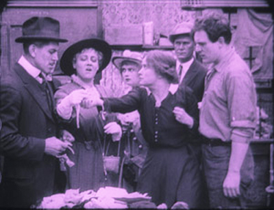
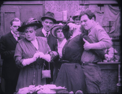
False Colours (1914).


