Archive for the 'Directors: Tati' Category
That reminds me …
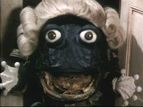
Enter the Frog Footman in Alice
Kristin here:
One film I can’t work up much enthusiasm about is everywhere, and another I very much want to see doesn’t seem to have a North American distributor. Luckily each reminds me of an older film that isn’t widely enough known. This seems like the perfect chance to point them out.
Recently the latest Screen International, in its new monthly format, arrived, with literally back-to-back reviews of the two films: Tim Burton’s Alice in Wonderland and Sylvain Chomet’s The Illusionist.
Let me say first off that Johnny Depp looks great in eyeliner, as in Pirates of the Caribbean. He looks positively grotesque with pink lips and raccoon eyes. Of course, grotesque could work well for Alice, especially as adapted by Burton. Yet the reviews suggest that the film is actually tamer than one would expect. Screen International’s Brent Simon calls Burton’s film: “A gorgeously mounted but fundamentally humdrum telling of Lewis Carroll’s fantasy novels” (March 2010 issue, p. 61). Variety’s Todd McCarthy makes a similar remark: “But for all its clever design, beguiling creatures and witty actors, the picture feels far more conventional than it should; it’s a Disney film illustrated by Burton, rather than a Burton film that happens to be released by Disney.”
Back in 1951 Disney did a fine version of Alice in Wonderland, one which does capture something of the lunacy of the original. It also benefited from the talent of some of the studios’ best artists, including Mary Blair. Always worth going back to.
But if one wants a truly surrealist, unconventional adaptation, I doubt if anything can top Jan Švankmajer’s feature Něco z Alenky, aka Alice. David and I saw it in a theater when it was released in the U.S. in 1988. It was my first exposure to the great Czech surrealist animator, and we gradually caught up with his earlier films. At the time it had a considerable success on the art-cinema circuit, though I’m not sure how well known it is among younger film fans.
Švankmajer had used both live-action, as in his morbid documentary The Ossuary (1970), and stop-motion animation of objects, as in his brilliant, dark look at human relations, Dimensions of Dialogue (1982). DVD anthologies of his shorts are available. Kino Video’s “The Collected Shorts” volume isn’t as complete as its name may imply. It’s missing several films including The Last Trick, his first but far from least film, and what may be his very best, Jabberwocky (1971), a non-narrative short incorporating Carroll themes. If you’ve got a Region 2 or multi-standard player, opt instead for “Jan Švankmajer: The Complete Short Films,” from the British Film Institute. It has a third disc with extras.
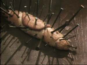
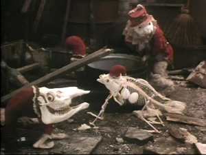
Alice is suffused with a marvelous imagination. Many of the characters are museum specimens. The White Rabbit begins as a stuffed creature in a Victorian glass case, freeing himself by pulling up the nails that keep him rigidly posed. Breadrolls sprout quills made of nails, and unnatural skeletons of creatures straight out of a Bosch painting creep about.
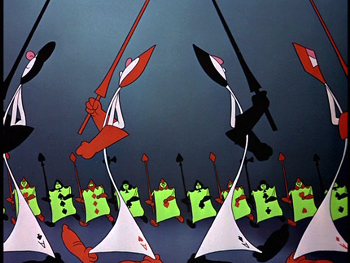
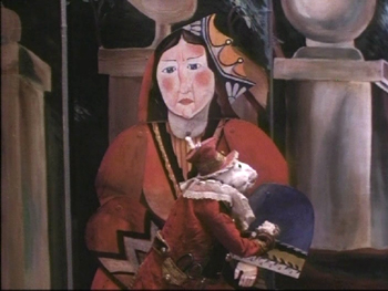
Švankmajer takes advantage of the mingling of two-dimensional figures based on playing cards and three-dimensional figures in ways that few adapters of Alice in Wonderland have managed, as when the White Rabbit passes the Queen of Hearts in a stage setting built of painted flats:
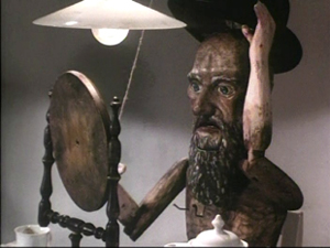
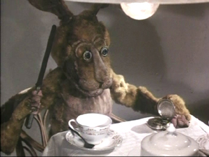
The Mad Hatter in Švankmajer’s film is definitely not Johnny Depp. He’s an antique wooden puppet of the sort that often crops up in the filmmaker’s work. He’s also not as loquacious as the chap in the book. The March Hare, who is definitely mad, steals the scene from him. Buttering a watch’s innards is a pure Švankmajerian gesture.
Alice was Švankmajer’s first feature film. In it he mixed live-action in with the stop-action more than in most of his shorts, presumably in part as a way to save money in making a much longer film. When Alice is full-size, she is played by a real girl, but when she shrinks she becomes a pixilated doll. It works well in this case, but the filmmaker depended more and more on live-action in his later features, like Faust (1994), with animated interludes becoming rarer and rarer. I found these features less entertaining and original and more heavy-handed in their social commentary. (The shorts contained vicious satire, but it was often rendered in bizarre, striking ways that made it palatable.) After thoroughly disliking Conspirators of Pleasure (1996), I gave up on his new films and stuck with the old ones. He’s making one now, called Surviving Life, which he apparently has said will be his last.
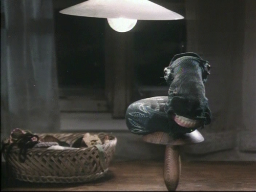
A final word on Alice. As should be obvious, this isn’t your charming adaptation for children, at least small ones. Alice points that out during the credits, “Now you will see a film made for children. Perhaps.” Most kids these days seem to be more hard-boiled than in my youth, but seeing this film at age 10 would have left me with nightmares. The White Rabbit, scarier than any fuzzy little bunny I’ve ever seen (including the one in Monty Python and the Holy Grail), runs around with scissors, quite willing to obey the Queen of Hearts’s order, “Off with her head!”; the little skeleton creatures crawl over Alice; and creepy glass eyes give staring life to inanimate objects like the Frog Footman or the sock that turns into the Caterpillar:
They tend to stare right out at us, too.
Tati on Parade
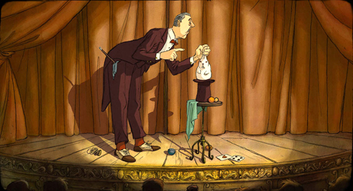
Most readers of this blog will be familiar with the great Jacques Tati. But it was news to me that he had left an unproduced screenplay, finished in the 1950s and now adapted by French animator Sylvain Chomet. Those who saw Chomet’s first feature, the 2D animated film The Triplets of Belleville (2003), probably noticed the occasional Tati homage lurking in the backgrounds and on the walls. Now Chomet’s admiration for Tati has emerged front and center in his second animated feature. The Illusionist‘s protagonist is modeled directly on Tati; he’s a old-fashioned magician eking out a living in the fading world of music-halls. (The Russian trailer has been posted here; apparently that’s the only footage on the internet so far.)
The Illusionist premiered at the Berlin Film Festival this year and met with a warm reception from critics. Writing in Screen International, Lisa Nesselson calls it “a delightfully bittersweet valentine to the music-hall tradition” and says that its animation “simply could not be better” (March, 2010 issue, p. 62). Leslie Felperin’s Variety reviews dubs it “a very happy marriage of Tati’s and Chomet’s distinctive artistic sensibilities.”
While we are waiting for an American distributor to pick up the film (ahem!), let me recommend Tati’s least-known feature. After his financial difficulties in the wake of Play Time‘s high budget and tepid box-office performance, the director set out to make Traffic, his last film featuring his M. Hulot character. Funding on this film collapsed midway through shooting, but Swedish TV stepped in and bailed the production out. Traffic came out in 1971, and in exchange for the assistance Tati made the 85-minute telefilm Parade (1974).
It has been available on French DVD (now out of print), but now the British Film Institute has released its own edition. The transfer isn’t the greatest, though it seems to be the same or similar to the French version. It smooths over the peculiarities of the original film. David and I saw it in 35mm in Brussels (where we also saw The Triplets of Belleville). It was obvious that while most of the film had been shot on somewhat fuzzy video in front of a live audience, some acts had been staged in a studio on crystal-clear 35mm. It was an oddly mixed format for an odd film. The BFI version also features optional English subtitles. Given the paucity of audible speech, they don’t seem vital.
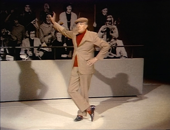
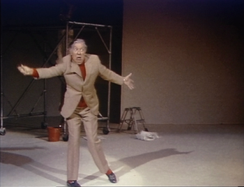
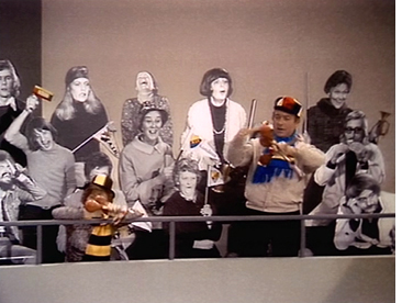 After the audience files in and takes their seats and an opening parade introduces the main acts, Tati steps forward as emcee and informs the spectators that they will be as much a part of the show as the performers onstage. Sure enough, the audience has been staged by Tati, accoutered in outrageous, colorful outfits and instructed to turn their heads back and forth rhythmically during his tennis routine or to bounce balloons around. Occasionally “ordinary” people from the stands step forward to challenge the acts onstage, trying and sometimes succeeding in out-doing them in magic or musical performances. The black-and-white life-size cutout people that had been used as extras in the backgrounds of scenes in Play Time return here as prominent members of the audience and even the stage acts. In the scene of Tati’s mime of a goalie (see below), the cutouts provide an unmoving backdrop to the action.
The BFI DVD includes a brief but informative booklet with essays by Philip Kemp and Jonathan Rosenbaum. As Kemp 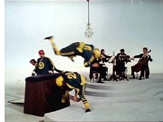 points out, the acts out of which Tati built his film are, apart from himself, not much to boast about: “His colleagues’ juggling, acrobatics, and, literally, horseplay (much use is made of an upright piano that doubles as a vaulting-horse) are diverting but nothing special.” Yet that, I suspect, is part of the underlying strategy. The film is quite Tatiesque, despite its lack of M. Hulot or a real plot. The juxtaposition of the three separate spaces of the audience, the stage, and the carpenters’ shop directly abutting the performance space, allows the creation of the sort of visual jokes that Tati loves. It also permits a flow between roles, as when the “carpenters” emerge briefly to juggle with their brushes or to play their tools like xylophones before returning to work. All these performers are quite good, but really great acts would distract from the best act of all: Tati’s overflowing visual imagination.
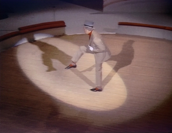
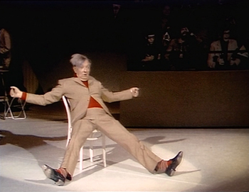
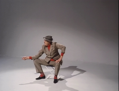
Ultimately, though, the main boon of Parade was to preserve for posterity Tati’s famous series of sport-based pantomimes that he had developed in the 1930s, when he was a successful stage performer. He started off on the same music-hall stage that he celebrates in Parade and now, posthumously, in The Illusionist. Some of these mimes, such as the man-and-horse trick rider, the over-confident goalie, the over-the-hill boxer, or the disappointed fisherman (bottom) may have remained unchanged across Tati’s career. (After he became famous as a filmmaker and actor, he often had the chance to perform these brief skits on TV variety and talk shows.)
Horse-man
Goalie
Boxer between rounds
Tennis in slow motion
There’s one magic moment in these mimes, however, that Tati presumably updated. During the tennis match, he lapses briefly into slow motion. Not a slow motion achieved in the camera, which keeps running at normal speed. No, he mimes a player as seen in slow motion, quite convincingly and yet moving in ways that one wouldn’t consider possible for the human body. It’s hard to describe, but believe me, it’s amazing to watch.
Tati’s performances as the postman in Jour de fête or as Hulot in the four films featuring that character are usually not flashy. They’re designed to merge into the story and make the hero one of many amusing characters in an ensemble. But in Parade, with the pantomimes performed outside a narrative context and primarily against dark or blank white backgrounds, we can savor the man’s dazzling skill. His utter control of every gesture echoes his directorial mastery of every stylistic component of his films. In Parade, the moments when he tries to subdue a flapping fish before it escapes or when his head snaps back in reaction to an imaginary opponents’ blows are mindboggling in their precision. He was a great actor before he was a great filmmaker, and fortunately that early skill lingered long enough to be recorded.
Gone fishing
Where in the world is M. Hulot?
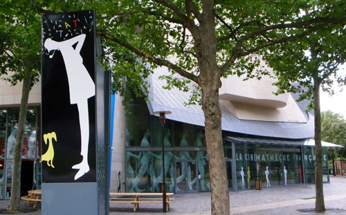
Early last month I posted an entry on Jacques Tati’s friend and long-time artistic collaborator, Jacques Lagrange. I mentioned that there is currently an exhibition on Tati at the Cinémathèque Française-though it closes August 2. On my last day in Europe David and I took the fast train from Brussels to Paris to see it. It was our first visit to the Cinémathèque since it moved into its handsome, surprisingly restrained Frank Gehry building, on the corner of the Rue de Bercy and the Rue Jean Renoir.
I have to confess to being a little disappointed. The exhibition seems to follow the current belief among curators that such events are meant more to be clever and entertaining than informative.
To be sure it was fun to ride up to the fifth floor, where the Cinémathèque’s exhibition space is, in an elevator that played the garbled loudspeaker voice from the opening of Les vacances de M. Hulot and had the meaningless escape-plan diagram from Play Time hanging on its wall. It was a treat to enter through a hallway that had all the original skyscraper-based posters from the travel agency in Play Time lining it. But beyond that, I couldn’t see much rhyme or reason to the layout.
Some of the objects on display were replicas of props and set elements from the films, while others were the originals, with not much labeling to tell which was which. The original fish from the fountain in Mon oncle was there in a central location, but the rest of the real props were in a small room on the side. There glass cases occupied a wall, so that the highest ones were almost impossible to see.
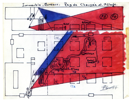
We skipped a lot of the reproductions and the video clips and spent time studying some small, traditional flat cases with script pages, old family photos, and, most intriguingly, pages of plans for the shooting of Mon oncle and Play Time. These were not like traditional sorts of scripts or production schedules, and we tried to figure out the meaning of the columns and color-coding. (At left, a plan for the movements of Hulot and the camera down the escalator and among the cubicles in Play Time.) Unfortunately these documents were arranged in a collage fashion, so that one page overlapped another and one couldn’t read the entirety of any of them. About the best one can say as a result is that it’s good to know that all this material was saved, so that a researcher might someday be able to make sense of it all.
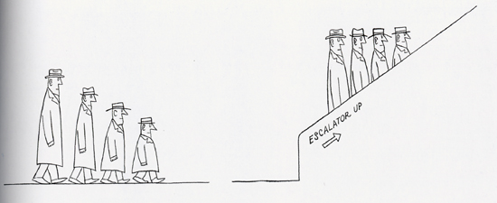
A surprising amount of the exhibition was given over to artworks inspired by Tati, including some new ones apparently done for this event. Some captured the spirit of the filmmaker fairly well, while others didn’t, but they seemed to diffuse the focus of the whole. There were earlier artworks as well, whether to suggest that they influenced Tati or simply to relate him to some sort of zeitgeist was unclear. It was fascinating to note how much the work of the great American cartoonist Saul Steinberg shared what we think of as a Tatian sense of humor. (See below for a specimen.) Whether Tati knew Steinberg’s work is another matter. And I doubt that Play Time’s grim little eating scene, with its green, neon-lit faces, owes anything to Edward Hopper’s “Nighthawks” painting (the one in the diner at night) or that the comparison tells us much about either.
These and other comparisons in the exhibition owe much to the curators’ decision to stress the overused concept of “modernity.” Tati and the modern, what a concept! The films have the distinct advantage of being utterly clear in their implications about society, and it seemed to me that the exhibition plays a lot with the notion of the Tatian sensibility without a systematic coverage of the man’s work.
The co-curator of the exhibition and designer of the catalogue, Macha Makeïeff, appears in a four-minute online interview (no English subtitles). That interview takes place in the exhibition space, so those who can’t make it to Paris in the next week and a half can get a glimpse of it.
The catalogue reflects the content of the exhibition, though interestingly, there are no pictures of the original props and costumes from the display. (Maybe there was some sort of legal restriction imposed by Tati’s estate.) Some of the replicas show up, as do a very few of the original documents that so intrigued us 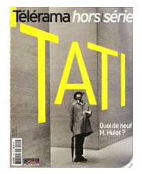 (printed very small). There’s the requisite section where filmmakers write about their admiration for the Master. These include David Lynch (who might conceivably be said to reflect a Tatian influence only in The Straight Story) and more obvious students of his work, Elia Suleiman and Otar Iosseliani.
There are a few designs by Lagrange and Pierre Etaix reproduced, and some other interesting and useful items. Still, one would actually be better off buying the special issue of Télérama issued in conjunction with the exhibition. (The Play Time plan illustrated above comes from it, not the catalogue.) It reproduces more of the original objects and documents from the exhibition than the catalogue does, and it consists of a lot of short articles and far more historical photos than the exhibition contains. Apart from everything else, it reproduces a picture from Tati’s quietly hilarious and lengthy fashion-photo shoot for the September, 1979 issue of French Vogue. The special issue is available online from fnac.
So, all in all, we were glad we went. That’s partly because there were some gems to be found in the exhibition, such as some footage of the false-perspective buildings of Tativille being built and moved. In addition, we had a lovely day in Paris.
[July 23: Two colleaguess have taken exception to my statement that David Lynch’s work displays little influence from Tati. Jonah Horwitz, currently a graduate student in film here at the University of Wisconsin-Madison, makes these cogent remarks via email:
I think the Tati influence–really just a PLAYTIME influence– is evident in the way he stages gags, often in ELS with ample “dead time” between actions, or an eternity spent waiting for a gag to reach fruition. (I would even argue that the Tati influence can be detected in Lynch’s subtly disorienting long shots, in general.) There are definitely examples in STRAIGHT STORY, but also in a variety of other things he’s done, features, television, and experimental shorts alike.
An example of a pretty obviously PLAYTIME-derived gag (I’d even call it an homage) of this sort is in the final episode of TWIN PEAKS, which Lynch directed. Audrey Horne has locked herself to the bars of a bank vault as an act of civil disobedience. A decrepit bank manager responds to her request for a glass of water. In two lengthy ELSs, interrupted by a reaction shot of Audrey, Lynch makes us wait and watch as the manager waddles from one end of the expansive bank lobby (made to seem even larger by the wide-angle lens) to a water fountain at the other–and back again.
Jonathan Rosenbaum has blogged on the subject here, with additional cogent remarks.
Jonathan also refers on my claim that the title of Tati’s masterpiece is Play Time rather than Playtime, as it is usually written. He’s undecided on that issue. My opinion is based on the way the title is written in the credits and posters, with a capital T and the hint of a space between the words. In my analysis of the film (in Breaking the Glass Armor), I wrote “The difference is not negligible, since the separation puts more emphasis upon the implications of the two words (especially “time”), while retaining the meaning of the single term” (p. 250, footnote). Of course, it’s possible that the title is really PlayTime, but that sort of capitalization of an internal letter in a single word was still pretty rare in those days (apart from CinemaScope), and once it did come into vogue in the eBay, PayPal age, I doubt Tati would have resorted to it.
I forget just when it happened, but years ago Leonard Maltin’s Movie Guide (which tends to be quite careful in its attempts to make all titles match the way they appear in a film’s credits) changed its spelling from Playtime to two words. At the same time, it sensibly upped the number of stars awarded the film from two and a half to four. I am happy to see what I assume is my influence there. Perhaps more people have decided to watch the film on the basis of those one and a half extra stars.
Jonathan adds, “For me, the cinching argument either way would be how Tati spelled the title himself. I’m sorry that I never thought to ask him, during the brief period in 1973 when I worked for him.”
David and I never met Tati, but we did receive a letter from him. In 1974 we had hopes to bringing him to Madison for a visit. He replied (10 October 1974) that he was currently involved in a lawsuit with his producers and could not make a commitment. Alas, we were never able to lure him here, but in the letter he mentions “Playtime,” spelling it as one word. My own belief is that when the film came out no one had noticed that the title was supposed to be two words, and Tati simply adopted what was then the universal way of referring to the film. Perhaps it wasn’t important enough to him to make an issue of. As I pointed out in the entry on Lagrange, his sketch for the hat-watering gag clearly has the title as two words. The best evidence on the subject, however, is presumably the way the title is spelled on the final script, which I’ve never seen. Maybe the capital T on “Time” was just a whim of the designer’s, but whatever the case, I still think it makes more sense as two words.]
La main droite de M. Hulot
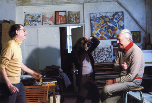
Jacques Lagrange and Jacques Tati, with artworks by the former in the background
Kristin here–
David and I have occasionally mentioned the listserve of students and faculty, past and present, of the film studies area here at the University of Wisconsin-Madison. Apart from job listings and inquiries for information about obscure films, the listserve offers a chance to discuss information and ideas-some of which have inspired blog entries for us.
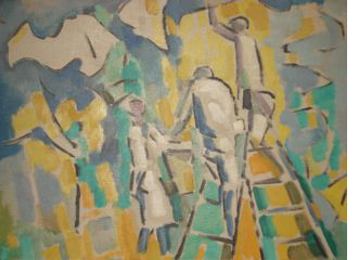
Back in March, dissertator Charles Michael informed us that he had inherited a 1953 French painting by Jacques Lagrange (Les jardiniers, below). Seeking more information, he discovered that Lagrange had been a close friend and collaborator of Jacques Tati, working on all his films from Les Vacances de Monsieur Hulot onward. Naturally, as big Tati fans (the first essay I ever wrote for publication was on Les Vacances), we were intrigued.
Lagrange’s work with Tati
Lagrange (1917-1995) is best known as a painter and designer of tapestries, though he did a few theatrical sets. (The fullest online biographical sketch, in tortuous English, is available here.) He met Tati in 1947. The two hit it off, and they would spend afternoons or evenings bouncing ideas off each other. The film credits read “Avec la collaboration artistique de Jacques Lagrange,” a general phrase that reflects how the artist contributed at several stages of filmmaking. He worked on all the scripts as well as sketching settings and gags. He described their working method: “With Tati, the script usually started from a general idea. His second film grew out of the idea of a vacation, with the railway station, suitcases, trunks, trains. MON ONCLE is a more ‘social’ film. At Pecq, Alexandre Dumas’ villa has been carefully preserved, but in Saint-Germain, everything has been demolished. Like me, Tati favored the preservation of our heritage, as well as alluring modern buildings . . . . In writing a script, he started with sketches, not fully worked-out designs. Tati had trouble explaining what he wanted, so I had to interpret. I did thousands of sketches on restaurant napkins.”
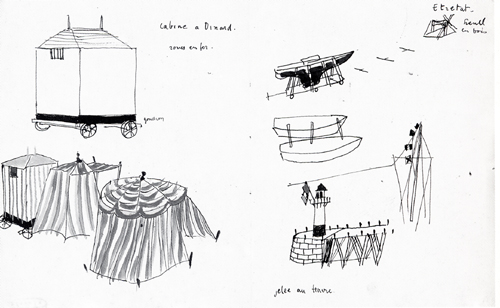
Here’s his drawing of the bathing cabines that lead to M. Hulot being mistaken for a peeping tom, as well as the boat being painted that slides into the sea. Whether it was made on a napkin, I don’t know, but I doubt it:
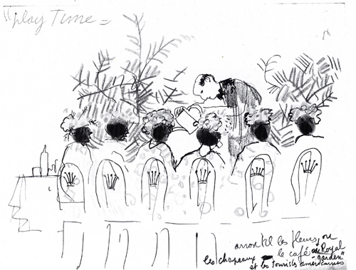
And the gag of the waiter “watering” the ladies’ hats in Play Time. At this early stage the idea was evidently that the waiter would use a watering can for the plants in the background. In the final gag, he appears to pour champagne onto the flowery hats (a funny framing that David illustrated here):
This sketch, by the way, provides pretty strong evidence supporting my claim that Tati intended the film’s title to be written as two separate words.
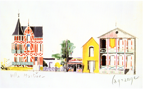
Lagrange went beyond such rough gag sketches. He also worked on the sets of Tati’s films, as this elegant painting for the “Hôtel de la Plage” and the guest-house where Martine stays in Les Vacances:
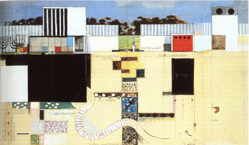
He designed the famous modern house in Mon oncle, including this combination bird’s-eye and profile view of the entire yard:
Tracking down Lagrange
Obviously Lagrange was a crucial collaborator of Tati’s, and yet he seems to be virtually unknown in the U.S. He has received more attention in Europe. In 2005, a slim coffee-table volume, Jacques Lagrange: Les couleurs de la vie: Peinture et tapisserie, by Robert Guinot, was published. It does not reproduce any of Lagrange’s work for Tati, but a four-page chronology (pp. 77-80) gives the best summary of Lagrange’s friendship and work with Tati that I have found.
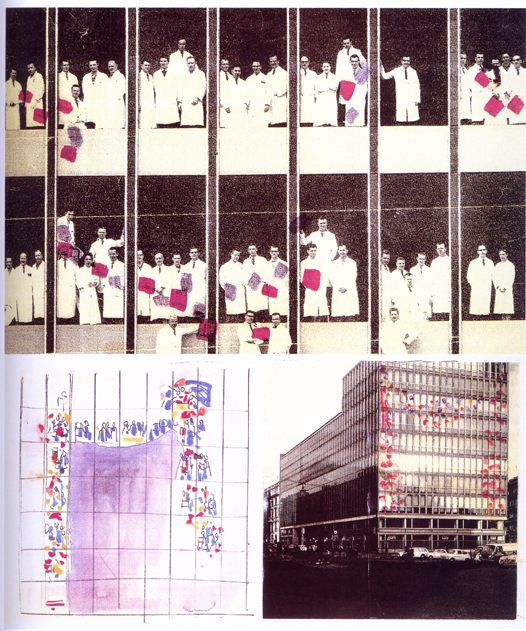
French books on Tati make reference to Lagrange. François Ede and Stephane Goudet’s book, Play Time (Cahiers du cinéma, 2002), quotes him on the construction of the film’s sets (p. 42) and includes some sketches for gags: the crown-topped chairs that leave impressions on the clothes and backs of those who sit in them (p. 57) and the scene of waiters carrying a placard shaped like a chef past diners who seem to be reminded of a corpse (p. 128). There’s also quite an intriguing graphic experiment with an unused gag for the film. Apparently somehow colored objects (folders?) held by people inside one of the glass-sided buildings would have formed a shape as seen from outside:
Marc Dondey’s Tati (Ramsey, 2002) reproduces some drawings for Les Vacances, including the beach scenes above, on pages 90-91, as well as the hat-watering sketch and the quotation above. (A book published in April under the same name, by the same author, but with a different cover is presumably a re-edition of this sumptuous volume; the number of pages is identical.)
Within the past several years there have been a few exhibitions devoted to Tati. One, La ville en Tatirama/La Città di Monsieur Hulot, was held at the University of Bologna. Devoted to three of Tati’s films, Les Vacances, Mon oncle, and Play Time, it produced a marvelous catalogue of the same name (Mazzotta, 2003) with a series of essays in French and Italian. This catalogue includes what may be the largest number of Lagrange’s Tati designs yet published, juxtaposing each with a selection of production photos from the relevant scene. The color painting of the Les Vacances buildings and the plan of the Mon oncle set are from this volume. Unfortunately the catalogue is now out of print and hard to find.
I say “perhaps” because I haven’t had a chance to see the catalogue for the Cinémathèque française’s current major exhibition, “Jacques Tati: Deux temps, trois mouvements,” running in Paris until August 8. David and I may get a chance to see it during our upcoming European travels. If so, we’ll report back. One Lagrange painting is visible in the photos on the Cinémathèque’s website, and no doubt there are other items by him as well.
(Books and exhibitions that include Lagrange’s work all credit the collection of Hyacinthe Moreau-Lalande, about whom I have been unable to find any information.)
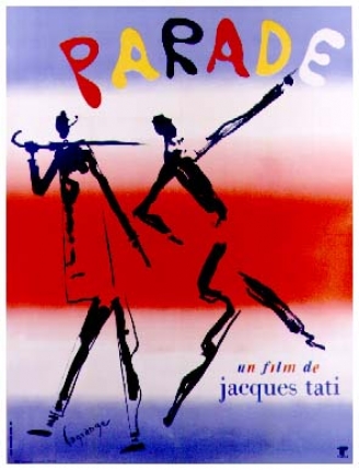
Despite the length of Lagrange’s collaboration with Tati, he designed a poster for only one of the films, the last one Tati completed:
A word on Pierre Étaix
As I was looking around at Amazon France for Lagrange material, I ran across a beautiful, fairly recent art book on the work of another Tati collaborator, Pierre Étaix. The book is Étaix dessine Tati (ACR Édition, 2007), by Francis Ramirez and Christian Rolot.
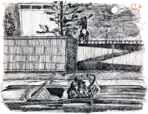
Étaix’s relationship with Tati’s differed considerably from Lagrange’s. It lasted only from 1954 to 1958, the period of the production of Mon oncle. An aspiring actor and filmmaker, Étaix was credited as an assistant director, though he also worked as a gagman. He produced thousands of drawings, collages, and paintings. Some, like those of Lagrange, were ideas for gags. This one involved Hulot getting himself into a fix where he is hanging upside down in a tree as two young lovers in a car pull up and stop underneath:
The gag ended up not being used, though Tati fans will recognize it as having appeared considerably later in Traffic. It’s amusing here to see it being played out by the gate of the Arpel household.
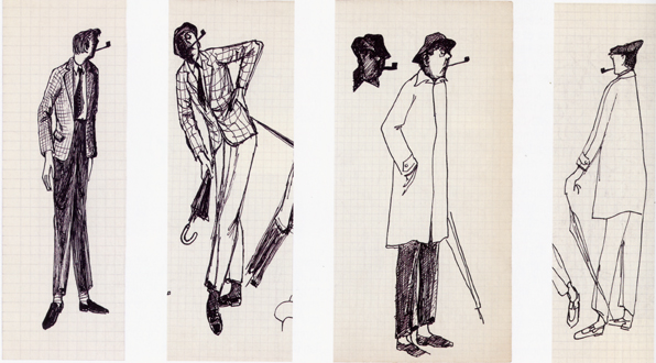
A fascinating set of drawings resulted from an assignment that Tati handed Étaix: to sketch visualizations of Hulot. Of course, M. Hulot had appeared in Les Vacances already, but only in his vacation clothing. His familiar short trenchcoat, umbrella, skull-fitting hat, and suede shoes hadn’t figured in that film. Only the pipe was already iconic of the character. Today it seems odd that there was some consideration of making Hulot distinctly more fashionable than he ended up being:
Tati’s influence is quite evident in the short films and the features that Étaix directed and starred in during the 1960s. He had some success with these, including an Oscar for his 1962 short, Happy Anniversary. He has continued to work as an actor, mostly in small roles (including in his friend Jerry Lewis’ still unreleased The Day the Clown Cried). Unfortunately legal problems have kept his 1960s films entirely out of circulation, as is explained on his official website.
David and I saw a couple of them in the early 1970s. I recall them as being charming comedies, definitely worth seeing. As of now, though, Étaix’s main presence on the screen is as one of Michel’s silent, sinister accomplices in Bresson’s Pickpocket.
The work of both Lagrange and Étaix reveals a great deal about Tati’s artistic methods. Perhaps the new burst of publishing that continues in the wake of the centenary of his birth (1907) will bring more such revelations.
Thanks to various Filmies: Charlie Michael, Colin Burnett, Tim Youngs, and Ben Brewster.
Gradation of emphasis, starring Glenn Ford
DB here:
Charles Barr’s 1963 essay “CinemaScope: Before and After” has become a classic of English-language film criticism. (1) It proffers a lot of intriguing ideas about widescreen film, but one idea that Barr floated has more general relevance. I’ve found it a useful critical tool, and maybe you will too.
Grading on a curve
Barr called the idea gradation of emphasis. Here’s what he says:
The advantage of Scope [the 2.35:1 ratio] over even the wide screen of Hatari! [shot in 1.85:1] is that it enables complex scenes to be covered even more naturally: detail can be integrated, and therefore perceived, in a still more realistic way. If I had to sum up its implications I would say that it gives a greater range for gradation of emphasis. . . The 1:1.33 screen is too much of an abstraction, compared with the way we normally see things, to admit easily the detail which can only be really effective if it is perceived qua casual detail.
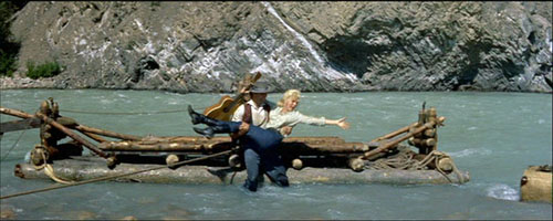
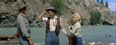
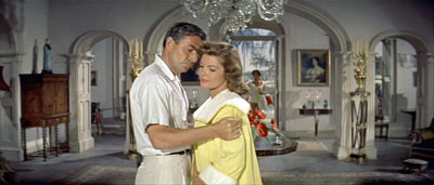
The locus classicus exemplifying this idea comes in River of No Return (1954). When Kay is lifted off the raft, she loses her grip on her wickerwork bag and it’s carried off by the current. (See the frame surmounting this entry.) Kay and her boyfriend Harry are rescued by the farmer Matt. As all three talk in the foreground, the camera catches the bundle drifting off to the right.
Even when the men turn to walk to the cabin, Preminger gives us a chance to see the bundle still drifting downstream, centered in the frame.
The point of this shot, Barr and V. F. Perkins argued, is thematic. As Kay moves from the mining camp to the wilderness, she will lose more and more of her dance-hall trappings and be ready to accept a new life with Matt and Mark. The last shot of the film shows her final traces of her old life cast away.
Cutting in to Kay’s floating bag would have been heavy-handed; if you stress a secondary element too much, it becomes primary. Barr reminds us that any film shot can include the most important information, as well as information of lesser significance. A film can achieve subtle effects by incorporating details in ways that make them subordinate as details and yet noticeable to the viewer. Or at least the alert viewer.
In Poetics of Cinema, I wrote an essay on staging options in early CinemaScope, and Barr’s idea helped me illuminate some of the strategies I discuss. (For earlier comments on Barr on Scope and River of No Return, see my article elsewhere on this site.) Today I want to consider how the notion of gradation of emphasis has a more general usefulness.
Barr contrasts the open, fluid possibilities of CinemaScope with two other stylistic approaches, both found in the squarer 1.33 format. The first approach is the editing-driven one he finds in silent film. This tends to make each shot into a single “word,” and meaning arises only when shots are assembled. Barr associates this approach with Griffith and Eisenstein. The second approach, only alluded to, is that of depth staging and deep-focus shooting, typically associated with sound cinema of the late 1930s and into the 1950s.
Both of these approaches, montage and single-take depth, lack the subtle simplicity of Scope’s gradation of emphasis.
There are innumerable applications of this [technique] (the whole question of significant imagery is affected by it): one quite common one is the scene where two people talk, and a third watches, or just appears in the background unobtrusively—he might be a person who is relevant to the others in some way, or who is affected by what they say, and it is useful for us to be “reminded” of his presence. The simple cutaway shot coarsens the effect by being too obvious a directorial aside (Look who’s watching) and on the smaller [1.33] screen it’s difficult to play off foreground and background within the frame: the detail tends to look too obviously planted. The frame is so closed-in that any detail which is placed there must be deliberate—at some level we both feel this and know it intellectually.
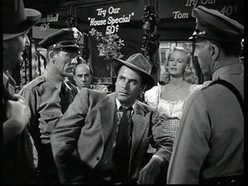
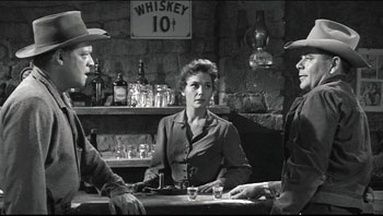
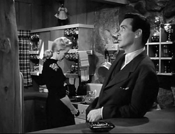
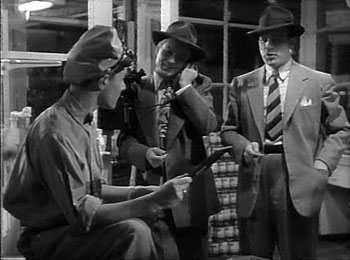
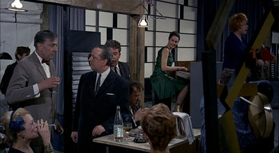
To see Barr’s point, consider a shot like this one from Framed (1947).
The shot, rather typical of 1940s depth staging, displays an almost fussy precision about fitting foreground and background together. That bartender, for instance, stands squeezed into just the right spot. (2) Barr claims that we sense a certain contrivance when primary and secondary centers of interest are jammed into the 1.33 frame like this.
We don’t sense the same contrivance in the widescreen format, he suggests. Barr assumes, I think, that the sheer breadth of any Scope frame will include areas of little consequence, whereas that’s comparatively rare in a 1.33 composition. This is an intriguing hunch, but uninformative patches of the frame may not be intrinsic to the Scope technology. Perhaps the fairly neutral and inexpressive uses of Scope that dominate the early 1950s, the sense of empty and insignificant acreage stretching out on all sides, make us expect that little of importance will be found there. Accordingly, directors can create a sense of discovery when we spot a significant detail in this stretch of real estate.
Anyhow, Barr indicates that if static deep-space staging made the frame too constrained, 1930s and 1940s directors who combined depth with camera movement created more spacious and fluid framings. He suggests that Mizoguchi, Renoir, and others anticipated the possibilities of Scope.
Greater flexibility was achieved long before Scope by certain directors using depth of focus and the moving camera (one of whose main advantages, as Dai Vaughan pointed out in Definition 1, is that it allows points to be made literally “in passing”). Scope as always does not create a new method, it encourages, and refines, an old one (pp. 18-19).
Barr believes that Scope positively encouraged gradation of emphasis, and that widescreen directors of the 1950s and 1960s have made the most fruitful use of the strategy. But he allows directors of all periods utilized gradation of emphasis, even in the standard 1.33 format. This is, I believe, a powerful idea.
Before Scope: Making the grade
Barr’s discussion of silent cinema, relying on notions of editing associated with Griffith and Soviet directors like Eisenstein, is done with a broad brush, but it’s typical of the period in which he was writing. We didn’t know much about silent filmmaking until archivists started to exhume important work in the 1970s. It’s no exaggeration to say that we haven’t really begun to understand the first twenty-five years of cinema until fairly recently.
In a way, the staging-driven tradition of the 1910s, which I’ve often mentioned on this site (here and here and here), exemplifies some things that Barr would approve of. Directors of that period made extraordinary use of the frame and compositional patterning. They staged action laterally, in depth, or both. They let shots ripen slowly or burst with new information. This approach to using the full frame (with only occasionally cut-in elements) has come to be called the tableau style, emphasizing its similarity to composition of a painting—although we shouldn’t forget that these films are moving paintings, and the compositions are constantly changing. The result is that emphasis tends to be modulated and distributed among several points of interest.
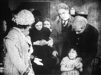
Central to this strategy, I think, was camera distance. American directors tended to set the camera moderately close, cutting figures off at the knees or hips, and by taking up more frame space, the foreground actors tended to limit the area available for depth arrangement or for significant detail.
This shot from Thanhouser’s The Cry of the Children (1912) is a rough 1910s equivalent of the crammed shot from Framed above. (See also the tightly composed shots from DeMille’s Kindling (1915) here.)
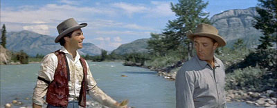
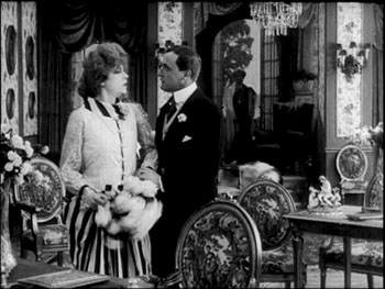
The European directors, by contrast, tended to let the scene play out in more distant shots, creating spacious framings of a sort that would be reinstituted in early CinemaScope. Consider this shot from Holger-Madsen’s Towards the Light (Mod Lyset, 1919) and another from Island in the Sun (1957).
Both, it seems to me, have the type of open composition and the foreground/ background interplay that Barr praises in his article.
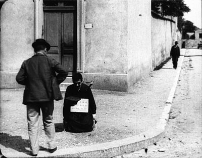
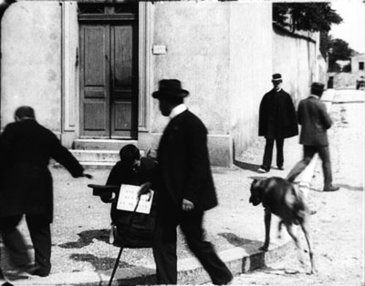
We can go back further. The Lumière brothers’ cameramen made fiction films as well as documentaries, and we occasionally find moments that suggest early efforts at gradation of emphasis. In Le Faux cul-de-jatte (1897), an apparent amputee is begging in the foreground while in the distance a man is walking down the street.
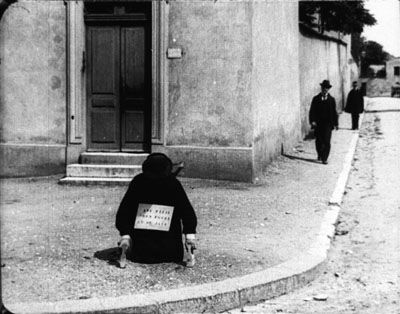
A cop crosses the street from off right and follows the pedestrian.
As the foreground fills up, the man we’ve seen in the distance gives the beggar some money.
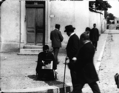
As he goes out left, the cop is still approaching, and a vagrant dog appears.
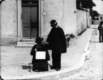
The cop comes to the beggar, partially blocking the dog, who takes care of other business. (Not everything in this movie is staged.)
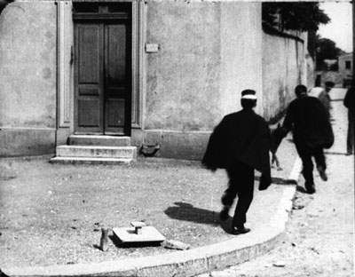
The cop checks the beggar’s papers and finds them to be suspect. The fake amputee jumps up and races off in the distance, with the cop pursuing.
As with many staged Lumière shorts, several figures converge in the foreground in order to create a culminating piece of action. Here the distant man and the cop, both secondary centers of interest, serve as a kind of timer, assuring us that something will happen when they meet at the beggar.
These are just some quick examples. We should continue to study the ways in which, with minimal use of editing, early filmmakers found ingenious ways to create gradation of emphasis. (2)
Some uses of grading
Barr, like most critics writing for the British journal Movie, was sensitive to the ways in which technique has implications for character psychology and broader thematic meanings. Kay’s bundle is one point along a series of changes in her character and her situation. But gradation of emphasis can serve more straightforward narrative purposes as well.
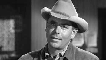
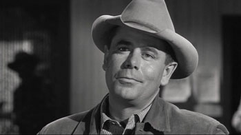
Consider our old friends, surprise and suspense. In the original 3:10 to Yuma (1957) Dan Evans is confronting the ruthless outlaw Ben Wade.
We get a string of reverse shots.
Then in one shot of Wade, without warning, a shadowy figure emerges out of focus in the left background.
Now we realize that Evans has been diverting Wade from the fact that the sheriff’s posse is surrounding him. Now we wait for Wade to discover it; how will he react?
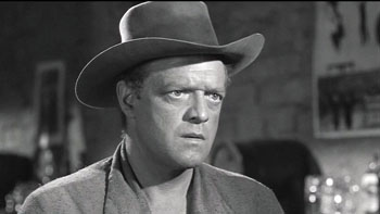
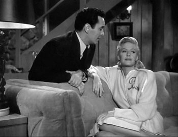
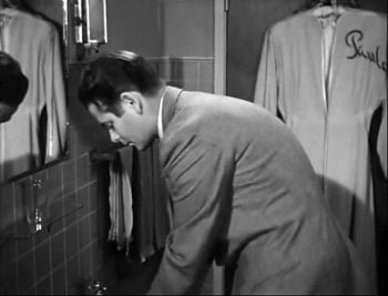
While we’re on Glenn Ford, another nice example occurs in Framed. Mike Lambert has been romancing a woman named Paula, but we know that she and her lover Steve are plotting to fake Steve’s death and substitute Mike’s body.
She brings Mike to Steve’s elegant country house, having presented Steve as someone she knows only slightly. When Mike goes into the bathroom to wash up, we notice something important behind him.
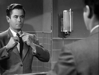
With Mike at the sink, we have plenty of time to recognize Paula’s robe. Director Richard Wallace prolongs the suspense by giving us a new shot of Mike in the mirror, with the robe no longer visible.
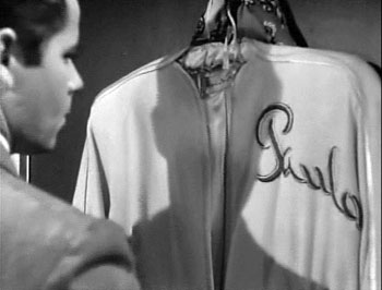
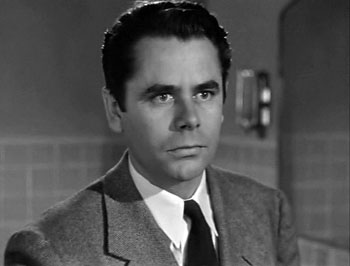
But when Mike turns to leave, a pan following him brings him face to face with what we saw, accentuated by a track forward.
We get Mike’s reaction shot, followed by a cut to Steve and Paula downstairs, suspecting nothing. “So far, so good,” says Steve, looking upward at the bathroom.
The rest of the scene will play out with Mike aware that they’re deceiving him. As often happens with suspense, we know more than any one character: We know the couple’s scheme and Mike doesn’t, but they don’t (yet) know that Mike is now on his guard.
This isn’t as subtle a case as River of No Return, but I suspect that it’s more typical of the way Hollywood filmmakers use gradation of emphasis. Paula’s bathrobe is a good example of what I called in The Classical Hollywood Cinema the strategy of priming: planting a subsidiary element in the frame that will take on a major role, even if initially its presence isn’t registered strongly. My example in CHC was a coat rack in the Dean Martin/ Jerry Lewis comedy The Caddy (1953). In effect, the distant pedestrian in the Lumière film is an early example of priming.
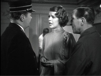
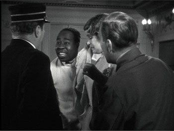
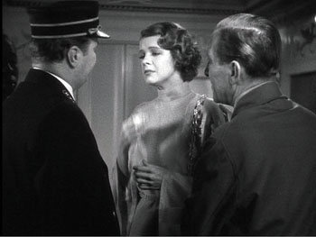
Howard Hawks adopts the Lumière technique in order to sustain a flow of dialogue in Twentieth Century (1934). Here the foreground conversation is accompanied by a procession of people emerging in the distance and stepping up to take part.
The shot concludes, as does the shot of Faux cul-de-jattes, with a retreat from the camera.
The priming of secondary elements here, the summoning of the train attendant and the conductor, obeys Alexander Mackendrick’s dictum that the director ought to construct each shot so as to prepare for what will come next.
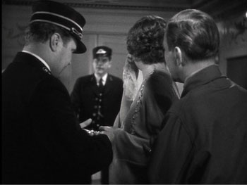
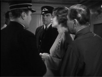
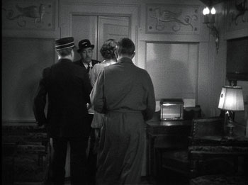
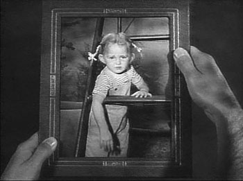
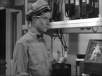
As Barr indicates, the idea of gradation shades insensibly off into general matters of cinematic expression. In The Devil Thumbs a Ride (1947), the bank robber has hitched a ride with an unassuming civilian, and they stop for gas. When the attendant shows a picture of his little girl, the robber gratuitously insults her. (“With those ears she’ll probably fly before she can walk.”)
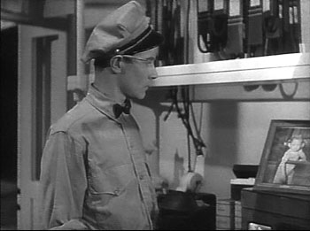
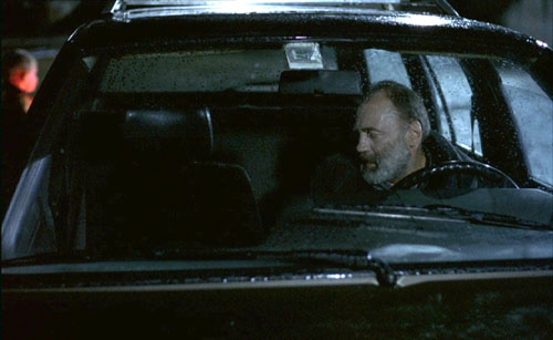
Later, the station attendant hears a radio broadcast describing the fugitive. First he has his head cocked as he listens attentively, but then his gaze drifts to the picture of his little girl.
The attendant is the center of dramatic interest, but when he looks at the picture, so do we (primed by the view of it earlier). Instantly we understand that the attendant’s resolve to call the police springs partly from an urge to get even with the man who insulted his daughter. A minor instance, surely, but it illustrates Barr’s point that the notion of gradation of emphasis leads us to consider “the whole question of significant imagery.”
The more the merrier
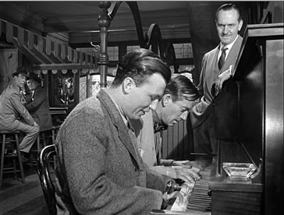
Barr seems to favor a plain style; he prefers Preminger’s quiet framings to the rococo imagery of Aldrich’s Vera Cruz (1954). Presumably the famous shot above from Wyler’s Best Years of Our Lives (1946) would be too obviously composed for Barr’s taste.
But there is merit in considering how a secondary center of interest can vie for supremacy. André Bazin declared Wyler’s shot a bold stroke exactly because its self-conscious precision created a tension between what was primary and what was subordinate. (3) The action in the foreground is of dramatic interest because Homer has learned to play the piano, and this represents a phase of his coming to terms with his wartime disability. Yet the most consequential action is taking place in the distant phone booth, where Fred breaks up with Al’s daughter Peggy. The gradation of emphasis is inverted, and we wait in suspense to find out what happens. Bazin taught us to recognize that what appears to be primary may actually be creatively distracting us from the scene’s principal action. (4)
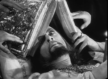
A director can also turn a primary center of interest into something secondary, but powerful. In one sequence of Eisenstein’s Ivan the Terrible I (1944), the apparently dying tsar is being prayed over by churchmen. Ever suspicious, he peers out from under the book, using only one eye.
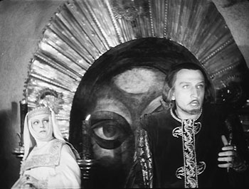
As the scene develops, Prince Kurbsky meets Ivan’s wife and tries to seduce her. In the background an icon’s eye glares out, as if Ivan is watching them.
The single eye, which is a motif we find in other Eisenstein films, becomes a significant one throughout both parts of Ivan. More generally, this device manifests Eisenstein’s conception of polyphonic montage, which explored how the filmmaker can control all the various aspects of his images and make them weave throughout the film—promoting one at one moment, demoting it at another. (5)
Barr’s essay assumes that Eisenstein’s montage stripped each image down to a single meaning. In fact, though, Eisenstein wanted to multiply the sensuous and intellectual implications of each shot by weaving objects, gestures, body parts, musical motifs, and the like into an ongoing stylistic fabric. Each shot’s gradation of emphasis can suggest thematic parallels, deepen the drama, or heighten emotional expression, just as a complex score enhances an operatic scene.
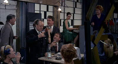
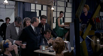
Tati as well likes to create an interplay between primary and subsidiary centers of interest. Or rather, he sometimes abolishes our sense of what is primary and what isn’t. The crowded compositions of Play Time (1967) often bury their gags in a welter of inessential details. During the lengthy scene in the Royal Garden restaurant, a minor running gag involves the dyspeptic manager. He has just mixed some headache medicine with mineral water, but the action is easily lost within the tumultuous image. Even the soundtrack cues us only slightly, with a bit of fizz among the music and crowd noise.
As the manager lowers the glass, Hulot thinks it’s pink champagne being offered to him.
Rolling the stuff in his mouth, Hulot realizes his mistake as he earns a stare from the manager.
There is so much competing sound and activity in the shot that some viewers simply don’t notice this bit at all. In Play Time, gradation of emphasis is often flattened out, leaving us to rummage around the composition for the gag.
Some final notes
Barr was not particularly interested in the mechanics of how we come to notice something in the shot, be it primary or secondary in value. In On the History of Film Style, I suggested that many aspects of technique work to call attention to any element in the field. The filmmaker can put a something in motion, turn it to face us, light it more brightly, make it a vivid color, center it in the frame, have it advance to the foreground, have other characters look at it, and so on. These tactics can work together in a complex choreography. In Figures Traced in Light, I argued that they depend on the fact that we scan the frame actively; the techniques guide our visual exploration. (6)
You can see this guidance at work in most of the examples I’ve mentioned. In River of No Return, we are coaxed into noticing Kay’s bundle because we’re cued by movement (the bundle falls and drifts off), performance (she shouts, “My Things!” and stretches out her arm), music (we hear a chord as the bundle splashes), and framing (Preminger’s camera pans slightly as the trunk drifts away). The critic can refine our sense of the effects that a film arouses, but it’s one task of a poetics of cinema, as I conceive it, to examine the principles and processes that filmmakers activate in achieving those effects.
Finally, we might ask: To what extent do we find gradation of emphasis in current filmmaking? Today’s American cinema relies heavily on editing, using a style I’ve called intensified continuity. Each shot tends to mean just one thing, and once we get it we’re rushed on to the next. The unforced openness of the wide frame that Barr celebrated has been largely banned, in favor of tight singles—even in the 2.40 anamorphic format. It seems that most filmmakers are no longer concerned with gradation of emphasis within their shots.
To find this strategy surviving at its richest, I think we have to look overseas. If you want names: Angelopoulos, Tarr, Kore-eda, Jia, Hou. (7)
(1) It was published in Film Quarterly, vol. 16, no. 4 (Summer, 1963), 4-24. Unfortunately, it’s not available free online, nor is a complete version available in anthologies, so far as I know. If you have access to online journal databases, you can find it. Otherwise, off to the library w’ye!
(2) In the Poetics of Cinema piece (pp. 303-307), I argue that some early uses of Scope tried to approximate such tightly organized composition, despite technological barriers to focusing several planes of action.
(3) See André Bazin, “William Wyler, or the Jansenist of Directing,” in Bazin at Work: Major Essays and Reviews from the Forties and Fifties, ed. Bert Cardullo, trans. Cardullo and Alain Piette (New York: Routledge, 1997), 14-16.
(4) Actually the phone booth is primed for our notice by earlier shots in Butch’s tavern. See On the History of Film Style, 225-228.
(5) For more on Eisenstein’s idea of polyphonic montage, see my Cinema of Eisenstein (New York: Routledge, 2005) and Kristin’s Eisenstein’s Ivan the Terrible: A Neoformalist Analysis (Princeton: Princeton University Press, 1981).
(6) For some empirical evidence of this guided scanning, see the work of Tim Smith at his website and in this entry on this site.
(7) I discuss some of these alternatives in On the History of Film Style and the last chapter of Figures Traced in Light.
Eternity and a Day.
PS 15 Nov. Two more items. First, if the ideas floated here intrigue you, you might want to take a look at an earlier entry on this site, called “Sleeves.”
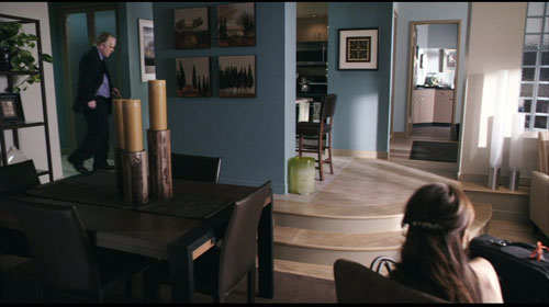
Second, I had planned to include one more example, but forgot it. In Lumet’s Before the Devil Knows You’re Dead, Andy Hanson’s life is unraveling. We follow him back to his apartment, and as he enters on the extreme left, his wife Gina is visible sitting on the extreme right, her back to us.
Gina forms a secondary center of attention, but the key to the upcoming action is revealed in a third point of interest: the black suitcase pressed against the right frame edge. The shot tells us, more obliquely than one showing her leaving the bedroom with the case, that she is planning to leave him. Lumet’s image, reminiscent of the framing of the trunk in River of No Return, shows that gradation of emphasis isn’t completely dead in American cinema. The orange scrap of yarn, knotted to the handle for baggage identification, is a nice touch of realism as well as a welcome color accent that further draws the suitcase to our notice.


