Archive for the 'Directors: Tati' Category
Summer show and tell
DB here:
I came back from a month in Europe to find a stack of magazines, books, and DVDs waiting. There was Before the Rain, much Cecil B. DeMille, and a mass of Anthony Manns (some discussed on Jonathan Rosenbaum’s blog). How will I ever catch up? I was reconciled to the idea that I’d die before reading every book I owned, but now I have to face the same conclusion about movies on discs.
Herewith some items from my trip to Amsterdam, Bologna, and Brussels that I couldn’t squeeze into earlier blogs. I end with the movie I watched upon my return.
DaViD’s DVD depredations
In Bologna, I learned that Oksana Bulgakowa is at work studying how cinema captured everyday human gestures at earlier points in history. Visit her site, where a DVD is available on her research.
Speaking of DVDs, travel inevitably brings them into your baggage, despite the high prices and the abysmal exchange rate.
*At Bologna our Copenhagen pals gave us the new Danish Film Institute DVD, Danish Experimental Classics 1942-1958. Not quite yet available for sale, it should show up here—as has a third collection of Jørgen Leth movies. While you’re sniffing around the site, eyeball the archive’s new state-of-the-art storage facility.
*Hubert Niogret, indefatigable director of documentaries on Asian cinema, has also produced an excellent collection of interviews, Mémoires du cinéma francais: De la libération à nos jours. Together we sampled an outstanding Bologna specialty, gramigna con salsiccia.
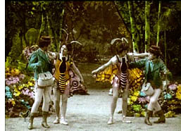 *Isabel Biver passed along the latest installment of Imagination in Context, a series of books and discs about early cinema and Antwerp. Animalomania includes English-language text and some nice films, including a hand-colored fantasy about butterfly collectors who wind up with pretty girls dressed as butterflies.
*At a sale table I found the Index DVD of Ivan Ladislav Galeta’s works, which includes the remarkable Two Times in One Space (1976/1984). I caught up, finally, with the Austrian Film Museum’s reconstruction of Frank Borzage’s The River.
*In Brussels I picked up the StudioCanal collection of Méliès films, which complements the recent Flicker Alley collection. Of course then I had to splurge on Laurent Mannoni’s gorgeous book, L’oeuvre de Georges Méliès.
 *Also snagged a batch of Gosha and Uchida swordplay movies, but in the Japanese line my real finds were a French edition of Night and Fog in Japan, one of Oshima’s finest (also just out in the UK) and the Carlotta set of three 1930s Mizoguchi films: The Downfall of Osen, Oyuki the Virgin, and Poppies. All drawn from 16mm copies, these items vary drastically in quality. Osen is superb, but Oyuki is iffy, and Poppies is a rain of scratches, the worst copy I’ve ever seen.
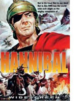
*To top things off, Tom Paulus of the University of Antwerp, bestowed upon me his extra copy of Edgar G. Ulmer’s Hannibal (1960) in SuperCineScope. This is what friends are for.
Interlude: Some Europix, arty and otherwise
My last sigh x 3
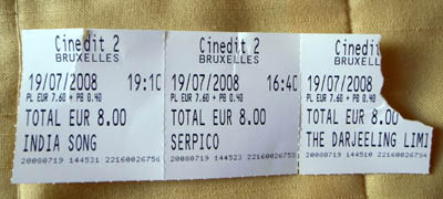
Every summer the Arenberg cinema holds a retrospective season, Ecran total, and it helps make Brussels a great film city. This time there were cycles dedicated to Delphine Seyrig, Al Pacino, the Japanese New Wave, and children, as well as a batch of classics. Prints are usually fresh, and the programming is very eclectic. So Saturday, the day before I flew home, I saw three movies at the Arenberg. I liked the West Anderson better than I expected to, though the clash between the overall feyness and a child’s death left me a little stranded emotionally. I had forgotten the Lumet since the initial release; not up to Prince of the City methinks, but a sturdy, earnest piece of work. The Duras proved as mesmeric as ever, and still unthinkable on DVD (even though I have two DVDs of it). All in excellent prints and pinpoint-sharp projection. Cinephilia satisfied: No need to watch anything on the plane home the next day.
No need to eat much either, because of a delicious late meal with our old friend Geneviève van Cauwenberge, head of the film and media program at the University of Liège.
Trafficking
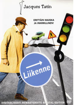 For my avant-birthday, Kristin (a) bought me a beautiful Krazy Kat page; (b) took me out for sushi; and (c) settled in with me to watch the new Criterion disc of Jacques Tati’s Trafic. It’s been one of our favorites for a long time; I saw it on initial release in Paris while researching my dissertation. It’s not as densely loaded as Play Time, nor as structurally rigorous as M. Hulot’s Holiday. (Kristin wrote about both these films in her book Breaking the Glass Armor; my bias aside, her analyses are really illuminating.) Trafic has its own charms, though, and Gary Giddins gets at several of them here. We’ve collected versions on tape and even a Finnish DVD, which calls him Tatin, but the Criterion looks to be the best version yet. (Still, why not anamorphic?)
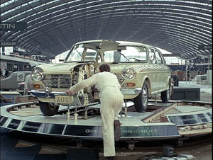
Trafic is definitely odd, with a choppy opening and quickly-cut extreme long shots. This time around I was struck by how much a landscape artist Tati was. Sometimes he built his own massive milieu, as in Play Time, and sometimes he merged his constructed spaces with the real world, as in the houses of Mon Oncle. In Hulot and Trafic he exploited the vastness of real spaces, usually the backdrop for human foibles made minuscule. Trafic gives us a un-picturesque European countryside. Sliced by superhighways, the bland vistas are dotted with rusted cars, empty fields, and forlorn gas stations. Drivers hiking off for fuel or trying to patch up their vehicles dwindle to pathetic dots in the image. Cities are no better, choked with pale cars that advance fitfully. Then there’s the huge convention center housing the auto show. The opening gag of men stepping carefully over stretched strings that we can’t see etches tiny gestures into a monumental frame. Masters of ambivalent vastness: Antonioni, Angelopoulos, Tarr….and Tati?
The setpiece of Trafic is of course the car crash, and it, like Tati’s characteristic running gags (e.g., cheap busts of historical figures as bonuses for gas fillups), reminds us of the follies of the car culture. In a sense, the entirety of Trafic seems an outgrowth of Play Time‘s final sequence, which turns a traffic roundabout into a carousel. But here there’s little sense of a mundane world transformed into a playground. Instead, modern misery remains the norm, as pedestrians zigzag their way through infinite gridlock.
Beyond the satire, which can get fairly caustic, I have always loved Tati for juxtapositions so weird and remote that you wonder if they could count as gags. Then you wonder if you’re the only person to notice them. In Play Time, everybody gets the running gag about the drunk at the bar of the Royal Garden tipping over on his stool. Far less evident is a moment I always find disconcerting. When the air-conditioning at the restaurant is finally switched on, the air vents make the loose skin on one woman’s back ripple. The denunciation of flabby bourgeois comfort comes and goes in a flash, and when I first noticed it in the 1970s I thought: Is it accidental? Did Tati mean for me to see it? Does anybody else notice? And does this count as a gag, or just, well, peculiar?
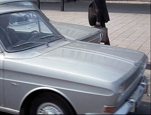
Likewise, in Trafic, Tati can cut from a bisected car on display to a quasi-abstract angle on traffic, with one fender sliding past an identical one.
We’re supposed to notice the purely sculptural analogy of split cars. And we’re supposed to find it at least a little funny. Right? Right?
Whether you agree or not, Tati’s vacant long-shots and unpredictable cutting leave space for such musings. Comedy with a question mark, from one of the dozen or so greatest directors who ever lived.
Kristin is now at Comic-Con, armed with fan-friendly T-shirts and a carrier bag from Lambiek. Her mission: to sell a copy of The Frodo Franchise to each of 125,000 attenders. Expect dispatches from her in the days to come.
P. S. My thanks to the staff of the vaults at the Royal Film Archive of Belgium, who were extremely helpful during my visit. I didn’t manage to photograph everybody, but I owe special gratitude to the supervisor Marianne Winderickx, pictured below.
PPS 24 July: Olli Sulopuisto clears up my Tatin puzzlement: “In Finnish the trailing n is the mark of a possessive, similar to ‘Jacques Tati’s…'” Thanks to Olli.
Funny framings
DB asks: Can a film shot be amusing in itself?
Of course a shot can show us a gag that’s funny. If Jerry Lewis or Adam Sandler is going to fall off a ladder into a Dumpster, we want to see everything clearly. Here the framing can be modestly functional. But can the very choice of lens, angle, scale, or composition play a stronger role? Can camerawork itself provide the gag?
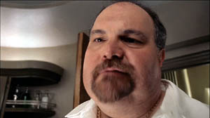
Barry Sonnenfeld, cinematographer for the Coens and now a prominent director, thinks so. He’s remarked that an extreme wide-angle lens is inherently funny. In the commentary for the DVD of RV, he explains, “You just put a big 21mm lens really close to [Will Arnett’s] face and you get comedy without him having to do anything.” I don’t have an RV frame handy, but here’s an example from Big Trouble, with both the wide lens and the low-angle creating the sort of grotesque disproportions that Sonnenfeld finds funny.
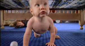
Sonnenfeld got this idea, he claims, by working on the Coens’ early films, which used wide-angle shots for cartoonish exaggeration. In Raising Arizona, the angle and lens length make the wandering baby loom; we’re not used to seeing an infant rampant.
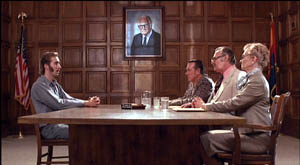
But the Coens had a broader approach to funny framings than Sonnenfeld acknowledges. For instance, they created humor by means of geometrical tableaus. In H. I.’s parole hearing in Raising Arizona, an absurd solemnity is set up by the symmetrical layout of actors. At the apex of the triangle, a portrait of Senator Barry Goldwater blesses the occasion.
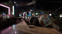
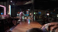
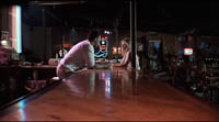
Even more memorable is the forward tracking shot down the bar top in Blood Simple. The camera, encountering a drunk sprawled in its path, simply crawls over him.
The silent comedians knew how to use camera position to build up their gags. Long ago Rudolf Arnheim praised the opening scene of Chaplin’s The Immigrant. As a ship rocks treacherously, we see Charlie from the rear heaving and kicking on the railing. As Arnheim puts it, “Everyone thinks the poor devil is paying his toll to the sea.” (1)
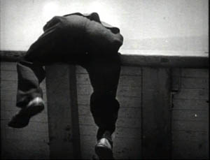
But then Charlie turns toward the camera to reveal he’s been struggling to reel in a fish.
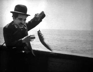
Here the framing creates the gag by what it doesn’t show. “The element of surprise,” Arnheim notes, “exists only when the scene is watched from one particular position.” The camera setup also makes an expressive analogy; we probably never noticed the similarity between vomiting and wrestling a fish.
One of my favorite comic framings occurs in The General. Buster’s train is hurtling along, and a cannon on one car is suddenly trained on him. The first shot gives us the situation with maximum clarity, in a profiled shot. But then Keaton cuts to another angle, showing the cannon in the foreground and Buster trying to escape it.
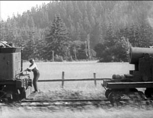
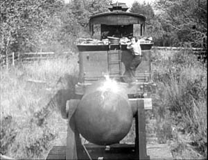
Nothing much has changed in the scene’s action, just the camera setup. But now we get to watch the cannon draw a bead on Buster. Audiences invariably laugh at this shooting-gallery image.
Jacques Tati is in many ways the modern heir of Keaton, and humor in his sequences often stems simply from a juxtaposition of elements in a single frame. An older man ogling a pretty woman on the beach is funny in a standard way, but in M. Hulot’s Holiday, we get more.
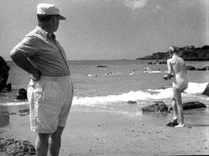
No words are spoken, but Tati’s staging and framing juxtapose the very different bodies in telling ways. We’re invited to note the difference between age and youth, paunchiness and health, passing yearning and its likelihood of fulfillment.
Play Time, Tati’s masterpiece and one of the greatest films ever made, offers an abundance of subtly comic framings. The shot below promotes the film’s theme that modern architecture has homogenized the world. The posters present the same building in different locales, with only stereotyped add-ons to distinguish the US, Hawaii, Mexico, and Stockholm. As one of the ladies on Barbara’s tour says, “I feel at home everywhere I go.”
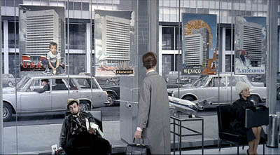
Again, though, a juxtaposition adds to the humor. Throughout Play Time, Tati suggests the disparity between the joy of travel as promoted by our culture and the stress of hustling from place to place. The promise of the posters is undercut by the dazed traveler who’s flopped underneath them, clutching maps and flightplans. And he in turn contrasts with the no-nonsense businesswoman on the far right.
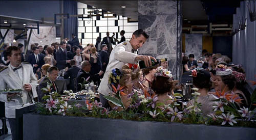
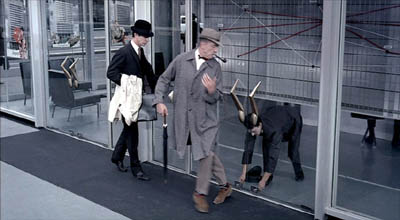
Tati can create comedy by the exact placement of the camera; a foot to the left or right and the gag would vanish. In the image at the start of this entry, the waiter is pouring champagne, but he seems to be watering the ladies’ flowery hats, which mask their champagne glasses. The same sort of exactitude of placement occurs in a shot we use as an illustration in Film Art (p. 195). M. Hulot is leaving an office building when it’s closing. As a guard locks down a doorway, his cap falls off and Hulot is startled: the guard seems to have grown horns.
Can we find funny framings in current films? Yes! I was prompted to write this blog while rewatching Shaun of the Dead. Zombies have overrun London, and two groups of human survivors meet. Shaun is leading one, Yvonne is leading the other. Instead of being presented as a mingling of the two groups, the scene plays out along two lines of people. Have a look.
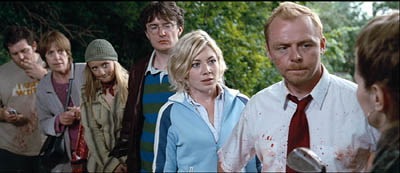
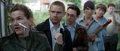
The gag’s premise is that each survivor has a counterpart in the other line. There are two posers in brown leather jackets, two can-do girls, two matrons, and two distracted videogame geeks. I wonder how many first-time viewers catch this? (Kristin did, I didn’t.)
These mirror-image depth shots set up the real gag, which pays off in another clever composition. When the two groups set off on separate paths, each member passes and smiles awkwardly at her/his lookalike, while the framing underscores their likenesses.
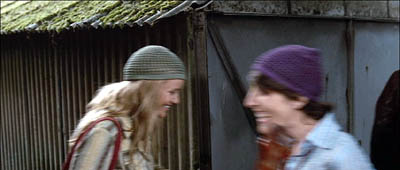
As they walk through the frames, the similarities increase.
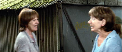
The framing makes a clever point about conformity and social stereotypes. Ending the procession with the two gamers, oblivious to the danger and to one another, tops the topper, as gag writers would say.
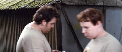
Tati would have loved these shots.
Of course I’ve simplified things for the sake of making my point. It’s not that the camera is somehow capturing a free-standing event by selecting the most amusing view. In all these examples, the staging is calculated to match the camera position. Staging, like camerawork and other film techniques, creates filmic narration. I’m only suggesting that in these scenes, the staging wouldn’t work on its own to create humor, nor would a simply functional framing. Choices of lens, camera position, and the like seem to be critical in making the gags work.
Finally, a borderline case that intrigues me. In last year’s Crank, our hero is in overdrive thanks to a constant intake of drugs. Stepping into an elevator, he faces a man who starts speaking Japanese. Naturally, his line is subtitled.
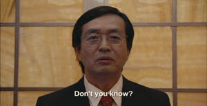
But then we get this:
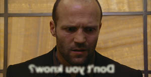
The idea of the head-on reverse angle is carried to comic extremes by reversing the subtitle as well (and blurring it to reaffirm the hero’s muzzy mental state).
I think that aspiring filmmakers can learn a lot from this tradition. Our films need more pictorial creativity, which often doesn’t require fancy CGI. Stylistic handling can add fresh layers to a basic story situation, and astute filmmakers can be alert to the possibilities of comic compositions and funny framings.
(1) Rudolf Arnheim, Film as Art (Berkeley: University of California Press, 1957), p. 36.
PS 4 May: Owen Williams writes to point out that the gag in Crank depends not just on a reverse framing but a play on the idea of lens focus. “The subtitle is fuzzy because it’s supposed to exist in real space (at least in this character’s head), with the letters hanging in mid-air in front of the Japanese man. Therefore in the reverse angle they appear out of focus (fuzzy) because they are closer to the camera. It’s a great gag.” Thanks, Owen.
PPS 8 May: I’ve gotten a lot of correspondence about this blog entry. Here are some nifty supplements:
Kent Jones was reminded of the shot in High Anxiety in which the camera moves to a picture window, with people dining behind it, and then crashes through the glass.
Sam Adams recalled a shot in Killer of Sheep that had something of the same effect, showing men trying to load a car engine onto the bed of a pickup truck. But the context isn’t itself comic. Sam reflects: “Based on the examples you choose, it seems that ‘comic framing’ invariably involves a level of self-consciousness, a feeling that the audience is being deliberately toyed with by the figure behind the camera. We get a sense that the scene has been staged for our amusement, rather than feeling that we must identify emotionally with whatever the characters are going through (which even in comedies is often quite sad).”
Stew Fyfe found a host of in-jokes in the Shaun of the Dead shots:
“Viewers of British television might notice an extra parallel between the shots. The actors playing each of the group leaders, Simon Pegg (Shaun) and Jessica Stevenson (Yvonne), were the leads in the sitcom Spaced (also directed by Edgar Wright, the TV predecessor to Shaun). Also split between the two groups are Lucy Davis (Shaun’s Group, hat) and Tim Freeman (Yvonne’s group, second in line), from original The Office and Dylan Moran (Shaun’s group, glasses) and Tamsin Greig (Yvonne’s group, hat), the leads of the sitcom Black Book. Yvonne’s mum (second matron) is played by Julie Deakin, who played the drunk and desperately lonely/horny landlady in Spaced.”
Thanks also to Bryan Wolf for a note on the same subject.
Finally, this from Jeremy Butler:
“I like your example from The General, but my favorite example of comic framing from Keaton’s work (and one I use in class to illustrate how he was more “cinematic” than Chaplin) is in Sherlock, Jr. Buster runs along the top of a freight train, and is then flushed to the tracks by a spout from a water tank. What makes it funny, I’d suggest, is the choice to frame it from the side, at a right angle to the tracks (much like the first General frame in your example). It minimizes the size of Buster’s body and contrasts him with the size of the train cars. Plus, it emphasizes the movements in opposite directions of his body and the train.
All these elements make it visually funny in a way that would not be apparent if it were filmed from an oblique angle or from behind the train.
But then, maybe I just like to show it because it’s the scene in which Buster literally broke his neck–which he didn’t realize until decades later when being x-rayed for something completely different!”
Thanks to everyone who wrote in with comments and who linked to this entry.
First shots
DB here:
Over at the Scanners site, Jim Emerson is running a fascinating thread. He invites readers to write about their favorite first shots.
I haven’t joined in, largely because, as with all lists, I have too many favorites and I get tangled up in comparisons. What intrigues me is the idea behind Jim’s proposal.
We all accept that first shots are important. We often analyze films by comparing the beginning to the end, and I routinely ask my students to note the first and last shots of a movie we’ll discuss. But were first shots always as important as we now take them to be? The historian in me thinks that this is a fruitful question.
Consider the films most frequently listed on Sight and Sound magazine’s Ten Best lists from 1952 to 2002. All are classics. But can you recall the first shot of very many of them?
Battleship Potemkin, The Rules of the Game, Citizen Kane, L’Avventura, 8 1/2, The Passion of Joan of Arc, Vertigo, L’Atalante, The Bicycle Thief, The General, Greed, The Magnificent Ambersons, The Searchers, Singin’ in the Rain, Tokyo Story, 2001: A Space Odyssey, and Ugetsu Monogatari.
Now if you’re a keen fan of any of these, you doubtless know the first shots well. But for most of those you’ve seen but not fetishized, I have the hunch that the first shot may not be particularly memorable.
Yet what about the first shot of A Hard Day’s Night or The Conversation or The Player? You’re likely to recall those first shots after a single viewing, and they will stay with you. Nowadays we may even remember the first shots of certain movies that we don’t particularly like.
If you recall only one curtain-raiser on the Sight and Sound list, I suspect it will be that of 2001. As my friend said as we walked out of a Manhattan screening back in 1968, “The sun rises like you’ve never seen it before!” This makes me wonder if there’s a historical breaking point somewhere here.
Was there a moment when directors started to feel that they had to weight the first shot heavily, to treat it as a dense moment that the viewer should savor? The first shot of a film could be as vivid and bristling with implication as the first sentence of a novel. When might directors have begun to think along these lines? Did it start, like so much else in cinema, in the 1960s, and Kubrick entered the first-shot sweepstakes?
Historically, it seems that many first shots serve simply to set up the locale for the first scene. This might be the central function of opening shots inr many classics I just mentioned. No larger implications may hover around the first image.
Sometimes, though, the first shot cunningly plants a story element that seems unimportant at the moment but will become crucial later. My favorite example is the first shot of Harold Lloyd’s wonderful The Kid Brother (1927). (If you haven’t seen this film, go rent it immediately. Better yet, buy the box set, because everything on it is very fine; Lloyd is one of the great, underrated American filmmakers.)
Before I suggest a possible answer to the question of when first shots became attention-getters, here are some speculations about what such shots can do.
*The first shot can present a sort of Ultimate Cause, the basis for everything that follows. In The Birth of a Nation, the first shot shows black slaves brought to America from Africa.
*Sometimes the first shot, however brief, has emblematic significance. The first shot of Battleship Potemkin portrays waves breaking on shore, symbolizing the force of revolutionary consciousness. Eisenstein’s Ivan the Terrible starts with a shot of the tsar’s crown as the coronation is about to start: the whole film will be about the struggle for power. The “No Trespassing” sign at the start of Kane has been widely interpreted as urging us not to judge Kane too simplistically.
*Several of Jim’s contributors have pointed out how thematic elements get set up in an opening shot. Rules of the Game might be another instance: The long tracking shot that follows a radio cable plunges us into a world in which the naïve pilot is a celebrity, and it sets up a mechanical world (radio broadcast, the plane) that will be echoed in the Marquis’s music boxes later. In Play Time, it’s impossible to know what sort of building we see in the first shot–establishing not only the looming anonymity of modern architecture but the sort of games Tati intends to play with our perception. It also introduces the motif of reflections, an important source of the film’s themes of how old Paris has been spoiled by modern technology.
*Likewise, the First Shot Project contributors have mentioned how the initial image can establish the film’s tone. A good example is the direct-address prologues of The Girl Can’t Help It and Will Success Spoil Rock Hunter? Another is the dissolve from the Paramount logo to the jungle mountaintop in Raiders of the Lost Ark, which signals the sort of tongue-in-cheek homage we’re about to get.
*Sometimes a fairly mundane initial shot becomes salient not in the film that follows but in the context of the director’s other works. In the case of The Passion of Joan of Arc, the book that is opened in the first shot links to all the other books that feature so prominently in Dreyer’s films. Long ago I argued that the book, and the act of writing in it, become important structural principles of how his films tell their stories.
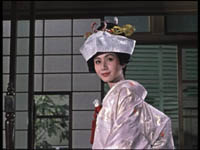
*The first shot can set up a visual-design motif that will get developed in the course of the film. The most famous example is probably the opening door that starts The Searchers. As with Kane‘s “No Trespassing” this motif will serve to bookend the film, recurring not only at intervals but also in the very last shot. Ozu’s Autumn Afternoon opening–surely one of the greatest first shots in cinema–sets up red, white, and silver color elements that will be picked up in the daughter’s wedding dress at the climax.
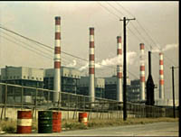
Nowadays, many directors seem to think that they have to start the film with a dazzling long take with complicated camera movements. One example is De Palma’s Bonfire of the Vanities, which he seemed to try to top in Snake Eyes. P. T. Anderson goes all out for virtuoso camera movement at the start of Boogie Nights but then settles on a static long take for Punch-Drunk Love. As in the early sound era, a fancy opening shot can crop up in a more or less ordinary film too, such as the SkyCam- and CGI-driven introduction of the nightclub in The Birdcage. The convention of the flashy first shot is so widespread that The Player‘s opening can satirize it.
Actually, it isn’t that new an idea. Fairly far back in film history, directors seem to have realized that first shots should be freighted with implication. There probably isn’t only one moment when this strategy arises, but I’d suggest looking first at the period when synchronized sound comes in. Most films at the time were pretty static and theatrical in their reliance on dialogue, so a flashy opening shot or sequence could reassert “This is cinema.” The bravura tracking shot was a common way directors chose to draw the viewer into the film’s world, as at the start of Threepenny Opera or of Scarface. Maybe this is a key moment in which filmmakers began to realize that the opening shot of a film should grab or puzzle the viewer and let us reflect a little on the fact that it’s doing so.
Things that seem to us to be current innovations can go pretty far back. There’s a more general implication too. As critics and cinéphiles, we tend to notice particulars–this sequence, this film. But we can also study the history of film forms and styles. We can try to map out the broader principles and patterns, the sources and trends–the items on the menu, we might say–that shape filmmakers’ individual choices.


