Archive for the 'Experimental film' Category
Ponds and performers: two experimental documentaries
Pina 3D.
Kristin here, reporting from Vancouver:
Entertainment and arts journalists seem to have some telepathic way of agreeing upon what will be the big hooks upon which to hang their stories. This year one such hook is the notion that auteurs are finally working in 3D, and this will somehow help determine whether the technique continues to spread. In Hollywood, those auteurs primarily include Spielberg, with The Adventures of Tintin due out in December, and Scorsese with Hugo, the adaptation of a bestseller based on the last years of Georges Méliès.
Two major directors have already brought 3D into film festivals and arthouses. Herzog contributed the one film that even people who dislike 3D (including me) admit uses the technique justifiably: The Cave of Forgotten Dreams. His countryman Wim Wenders’ Pina 3D (Pina–Ein Tanzfilm in 3D) is also a documentary. It creates a portrait of the late Pina Bausch primarily through a collection of scenes where dancers from the current Tanztheater Wuppertal troupe perform excerpts from several of her choreographed pieces.
As usual, the 3D seems superfluous. The opening shot of the theater, with its surrounding stretches of paved surfaces and its rows of trees, looks almost like a model. This is partly due to the almost complete lack of movement. Only some tiny figures on a bench shifted slightly and proved that this was a real space. Within the dance scenes, the 3D effect is more pronounced, but I suspect I would have found the dancing equally dramatic and original had the print been in 2D. One thing I will say for it was that the scenes are bright enough to look good in 3D. The 3D print of Miike Takashi’s Harakiri: Death of a Samurai, which we saw immediately after Pina, displays the notorious loss of light filtered through the glasses. Lowering the glasses a few times during the screening, I got the impression that the print was actually about twice as bright as it was seen through the glasses.
I heard some complaints that Pina offers little information about the choreographer herself. Another objection was that none of the dances are shown complete. Even the lengthiest excerpts, from Bausch’s well-known staging of The Rite of Spring, present only a small portion of the whole ballet. My own reaction was that the variety of shorter scenes gives someone unacquainted with Bausch’s style a good overview of her work.
Rather than go through archival material to present a biographical portrait of Bausch, Wenders chose to highlight each of the members of her troupe with a portrait in medium close-up and a short statement by each about their relationship to the choreographer. I found this helped in keeping track of the performers, who reappear in various combinations throughout the dance scenes, sometimes in solos or pairs, sometimes as a group. Their words about Bausch, though brief, collectively suggest their devotion to her, a devotion that pushed them to collaborate with her in inventing avant-garde moves suited to themselves and yet contributing to a recognizable overall style.
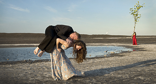
Wenders begins with the dancers on the theater stage, but what differentiates Pina from standard records of dance performances is the filmmaker’s decision to stage some of the short scenes out of doors, in landscapes, city streets, and large empty buildings. One shot looks out over a vast quarry, with a young man bursting up over the edge of it and dancing wildly on the sandy space beside it. Another has a woman performing simple steps on point against the backdrop of a large, rusty factory. A pond in the midst of barren fields forms the stage for a composition juxtaposing a woman carrying a man in the foreground with one carrying a tree at the rear (see above). A few brief scenes have the dancers performing on the corners of busy city streets.
The result gives more an impression of Bausch’s approach to choreography than an overview of her life, but it surely will lure many viewers to seek to learn more about her.
Two Years at Sea
Ben Rivers’ Two Years at Sea neatly straddles the boundary between documentary and experimental film. It appears to be a portrait of an eccentric middle-aged man, Jake, living by himself in a sprawling house in a Scottish forest. The title is never explained, nor is the subject’s name ever given. This film’s natural venues are festivals and perhaps galleries, where notes can supply the information that as a young man Jake spent two years as a sailor, saving up money to live his dream of getting away from urban environments and living close to the land.
Jake makes an excellent subject, almost never glancing at the camera but simply performing his chores, relaxing, or hiking in an unself-conscious way. In the final lengthy shot, he falls asleep on camera. Yet in fact, as we can know only through the program notes or during the filmmaker’s Q&A, Jake plays a somewhat fictionalized version of himself. (The real Jake is more gregarious and welcomes guests.) Rivers suggested some things that his subject might do, and Jake agreed: taking a shower, building a raft from which to fish on a local pond, and mostly notably, raising a small trailer into a pine tree to form a sort of tree house. The framing of the shots showing the trailer rising through the branches hides just how this was accomplished, resulting in a touch of magic realism.
Jake’s home is not a small shack but a rambling building in need of some repair. It is crammed with stuff, empty cans, tools, ancient mattresses, and worn-out objects that the owner can salvage for other uses. Similarly, the yard is overrun by old vehicles, heaps of firewood, and spare parts of unknown machines. Amongst all this apparent junk, Jake has rigged a shower, a stove, an aged washing machine, and a place to sleep. His only company is a cat, although photos glimpsed at intervals—a woman’s face, some children, Jake as a young man building a wall—hint at a past that is never made explicit. Surprisingly, he has a fairly modern car, presumably his means of supplying his needs from an unseen nearby town. He also apparently has a generator, running the lights, washing machine, and a few lamps.
The irony seems to be that Jake has escaped to nature and yet seems almost overwhelmed by the sheer volume of manufactured objects around him. The placement of the trailer atop a tree suggests that now Jake is fleeing the crowded environment he has himself created. Once the trailer is secured, he drags up a small mattress to sit on, cleans the window with his sleeve and, sits contemplating the trees outside.
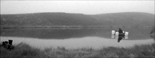
The techniques with which Jake’s routines are recorded are as Spartan as Jake’s chosen life. Rivers has avoided digital filmmaking, choosing to shoot on black-and-white anamorphic 16mm. He hand-processed the footage at home, creating a grainy, occasionally blotchy image. There are many lengthy takes of actions with slow rhythms. Most is one in which Jake, having built a raft out of a frame covered with an inflated mattress and held afloat by four empty plastic bottles that look like giant marshmallows, launches it, he clumsily paddles a short distance out on the pond, and we watch him fish and drift slowly across the wide screen (see below), ending up near the shore and again paddling further out. He never tells us what he is doing or why, and the filmmaker provides no voiceover. We are left with the impression of a man who does exactly what he wants to do when he wants to do it, whether the practical act of chopping wood or the simple contemplation of something in the landscape because he finds it interesting.
Ultimately, as with any film about someone who has fled to a simpler life, we are lured to contemplate our own occasional fantasies of giving up society’s complex challenges and joys and living somewhere isolated and peaceful. It’s a rare person who would ultimately decide to do so, but here the filmmaker builds a portrait of someone who has.
Two Years at Sea.
PS, October 18: Ben Rivers takes part in a conversation about artists and funding in the UK on Frieze Magazine.
The smoking section
Twenty Cigarettes.
DB here:
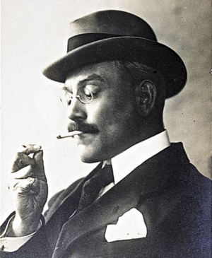
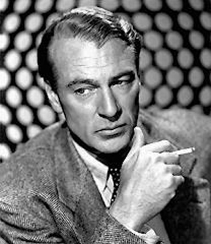
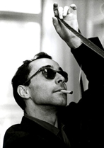
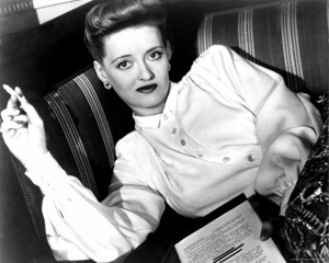
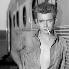
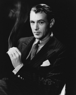
Reflect for a moment on the powerful role played by the cigarette in twentieth-century photographic portraiture. Before our recent worries about lung cancer, why were artists, movie stars, and other celebrities so often artfully posed with a tobacco product? Sometimes the imagery seems to evoke sophistication, presenting the subject as a man or woman of the world.
Or the portrait can suggest a relaxed, informal moment, a cigarette break.
That moment of relaxation can be extended to suggest contemplation or meditation, with the eyes gazing off into the middle distance. Despite the pretty face, this person is deep.
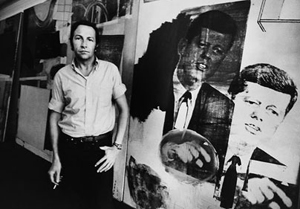
Alternatively, the cigarette can also suggest that painting or writing is a pretty casual affair. Smoking while working, the artist becomes an artisan. Maybe creating masterpieces is no more highfalutin than laying pipe.
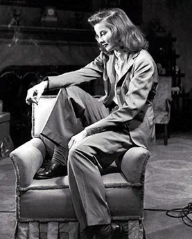
And of course there’s the erotic side. A cigarette can make you look attractively dangerous.
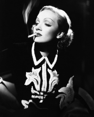
In Golden Age studio portraiture, the smoke can become a compositional arabesque.
I’m not suggesting that James Benning set out to subvert this glamourous, stylized tradition in Twenty Cigarettes, which I caught at the Hong Kong Film Festival. But I think his film presents smoking as never seen before–defamiliarizing it, the Russian Formalist literary critics might say. And the movie’s not solely concerned with smoking. It resonates a bit with something I looked into in an earlier entry, on facial expressions in The Social Network. But here the film asks a different question: How expressionless can a face be?
Studied neutrality
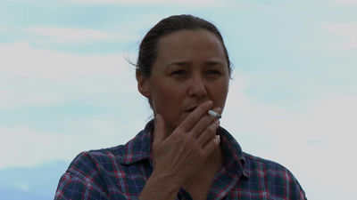
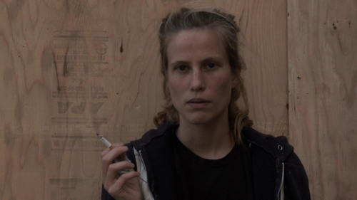
A person in a medium shot smokes a cigarette. Repeat nineteen more times, showing smokers who suggest different ethnic and social identities. They are framed against outer walls, gardens, skies, or rooms. As in the Structural Film tradition, we witness an activity whose end is more or less known, and this forces us to study the minutiae of the process. But how much time the shot takes isn’t completely determined. Some smokers smoke faster than others, some shots run longer, and occasionally Benning halts the shot before the cigarette is quite finished.
In each shot, the smoker doesn’t talk and seldom looks at the camera. No one else is visible or audible (except, in one take, a voice distantly shouting, “Fuck you!”) Benning put himself out of sight during the filming of each take. By cutting the smokers off from all social intercourse, the film reminds us that it’s probably more usual for to people smoke while doing something else, like reading or watching TV or talking with friends. Benning forces us to watch the act of smoking in an almost artificially pure state. The film quickly becomes a study in smoking styles—quick non-inhalant puffs, luxuriant drags, little exhalations, slow streams curling out of nostrils. The ciggie is held tipped up in a dainty salute, or jammed between fingers. Solitary smoking becomes a sort of social-science experiment: If you can’t walk around, talk to others, window-shop, or whatever after you’ve lit up, how will you behave?
You’ll behave, Benning’s film suggests, by putting on the most blank expression possible. The portraits of artists and movie stars above use the cigarette to enhance the subject’s attitude–frankness, cool regard, disdain, pensiveness, intellectual seriousness. The cigarette, even the smoke, signifies. Nothing in the cigarette-portrait tradition prepares us for the almost frightening neutrality we see on the faces of Benning’s people. What are they thinking? Are they feeling anything?
It’s rather hard to maintain a poker face in a social interaction. Engaging with others, we spontaneously send signals of interest or mutual understanding, if only through raised eyebrows or a quick smile. But Benning’s lone smokers are eerily blank. Even what might seem to be an expression is often simply the person’s face at rest. (Some resting faces are read as non-neutral, as when an elderly person seems perpetually frowning or hangdog.) In the film, when the person’s expression changes, that’s usually because of the smoking; the twenty people squint or frown or tighten their jaw as they suck or exhale. For once facial movement is divorced from emotional signaling, and the result is a kind of anti-Shirin, Kiarostami’s portrait gallery of people caught up (apparently) in spontaneous bursts of emotion.
Benning’s film brings to mind the Warhol Screen Tests, and he has acknowledged the influence. Yet unlike Warhol, Benning gave his people the same specific task to execute. He’s like Hou Hsiao-hsien, who has explained that he got performances from his nonactors by letting them occupy themselves with eating and smoking. Warhol, as I recall, left things up to his performers, and so they might fiddle with props, run through a range of expressions, or simply stare innocently or challengingly at the camera. (To avoid reproduction rights problems, let me just send you here to sample some possibilities. On this page Nico the superstar seems herself to recreate the mystique of the classic studio portrait.)
Twenty Cigarettes yields something different from the Screen Tests I’ve seen. Using the cigarette as a constant feature, pulling smoking out of its usual place in our habits and social exchange, denying the tradition that shows smoking as connoting attitudes and emotions in people onscreen, Benning enables us to watch, across some ninety minutes, faces that aren’t dramatizing themselves or sending signals. No stars, these folks, let alone superstars. No narcissism either.
Yes, through dress and hair and demeanor we quickly characterize these men and women by type (housewife, hipster, working man). And each face carries marks of experience we can’t help but wonder about. At times I found myself looking for wrinkles and the other signs of smoking’s skin damage. And yes, the subjects know the camera is there, so to some extent they are posing themselves. Even granting all this, it seems to me that Twenty Cigarettes gives us a disconcertingly pure example of what happens when people make a tremendous effort to show as little of themselves as possible. We get to study what lived-in faces look like when they aren’t participating in social life but are aware that the camera is watching them.
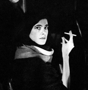
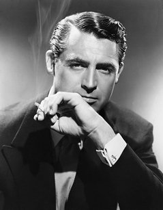
Cigarette pictures, as if you didn’t know: Susan Sontag, Cary Grant, Louis Feuillade, Gary Cooper, Katharine Hepburn, Robert Rauschenberg, Jean-Luc Godard, Bette Davis, James Dean, Gary Cooper again, and Marlene Dietrich.
The website Celebrities with cigarettes includes many studio portraits. For examples from the Warhol Screen Tests, go here. On this page Nico the superstar seems herself to recreate the mystique of the classic studio portrait. Background on the making of Benning’s film can be found in this interview at Cinema Scope. On MUBI Neil Young provides a stimulating and painstaking analysis of Twenty Cigarettes.
Thanks to J. J. Murphy for discussions about Warhol, the subject of his forthcoming book, and of course to James Benning for his assistance.
Twenty Cigarettes.
Time piece
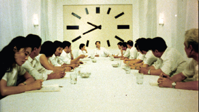
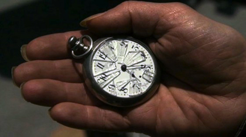
Christian Marclay, The Clock (2010).
DB here:
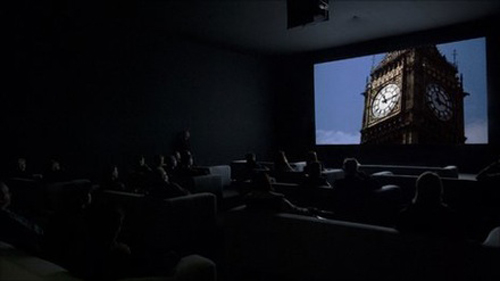
Normally I wouldn’t comment on a movie after seeing only 10.4 % of it, but there are always exceptions. The Clock, which played at the Paula Cooper Gallery during our stay in Manhattan, runs 24 hours. It’s a compilation of over 3000 film clips, mostly from Hollywood but also from Europe and Asia. Some of the footage is easily recognized, but a lot of it I couldn’t identify.
The premise, or gimmick, is that every snippet of a scene is purportedly connected in some way to the passing of time measured on a clock. Characters check their watches, or the camera shows a wall clock or digital alarm clock or countdown device. There are tiny clocks and gigantic ones. If the whole thing has a star, it might be Big Ben, who reappears surprisingly often.
A nice idea, but why stretch it over twenty-four hours? So that the creator Christian Marclay can assemble scenes that synchronize perfectly with the passage of time in projection. A shot shows a watch at 11:55 AM; you look at your watch; it’s 11:55 AM. Wherever the piece is screened, it must start precisely at the corresponding local time. The Clock isn’t just about clocks; it is a clock.
The project teases you into lame puns, which I’ve been unable to resist. But my visits set me thinking about what makes The Clock unique and pleasant. Maybe it’s a little too pleasant.
Collage without closure
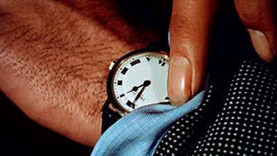
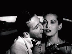
The Black Cannon Incident (1986).
In its collage of compiled material, what The Clock does is quite familiar to cinephiles. For a long time, experimental filmmakers have built works out of footage from mainstream movies. One of the most famous, Joseph Cornell’s Rose Hobart (1935), powerfully illustrates how the collage principle can pry images from their narrative context and call attention to their poetic or graphic qualities. The assemblage artist Bruce Conner did something similar in A Movie (1958), which creates anassociational form out of newsreels and old Hollywood sequences. Although both Rose Hobart and A Movie still evoke vague narrative expectations, Craig Baldwin whipped together found footage to create a hallucinatory narrative in Tribulation 99: Alien Anomalies under America (1991). An urgent, hard-bitten voice-over tells of CIA conspiracies and interplanetary conquest while we see images scavenged from cheap science-fiction films.
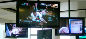
Nowadays plenty of filmmakers, especially on the Web, have snipped footage from old films to develop a theme. Jim Emerson has done it with close-ups, and Matt Zoller Seitz, Aaron Aridillas, and Steven Santos have created a video essay around guns in American film. Last summer, at the new facility of the Cinematek in Brussels, I found thematic loops running on their video monitors. Sometimes there was an interplay among them, so that characters one screen seemed to be looking at those in another. Some of the Cinematek loops in fact centered on clocks.
So the principle of compilation collage didn’t seem new to me. But Marclay refreshes it by the other central premise of The Clock: its time structure, which syncs moments indicated onscreen with moments of viewing.
Some fiction films (e.g., Cleo from 5 to 7, Nick of Time) and TV shows (e.g., 24) have played with the conceit of making the duration of the piece (“real time”) correspond to the amount of time covered in the plot. (Usually, however, the film fudges it.) But in The Clock, there’s no overarching plot, so the duration of that action can’t be determined. Marclay gives us real time with a vengeance, in the relentless correspondence between screen clocks and audience clocks.
Without this exact synchronization, The Clock would be an enjoyable but unexceptional found-footage movie. The onscreen clocks check the flow of the images like centers of magnetic force. They form nodes around which each set of shots revolves, like a musical key that a melody can drift from and return to.
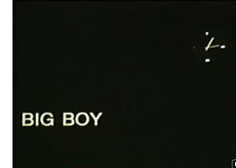 This patterning too has parallels in the experimental film tradition, I think. What P. Adams Sitney famously called Structural film was a 1960s-1970s trend that often built the awareness of time into a film’s overall pattern. A simple example is Robert Nelson’s Bleu Shut (1970). A clock runs in the right corner of the frame to measure the time consumed by a film that is, we’re promised by a woman’s breathless voice-over, “exactly thirty minutes long.” (She lies.)
A less explicit instance is Hollis Frampton’s Zorns Lemma (1970). In its central section, one by one a string of images replaces one-second shots of signs marking the letters of the Latin alphabet. The shot-changes set up a steady beat, and the pattern locks in a sense of momentum. Although we’re surprised by what images replace the letters, our expectations get focused on the inevitability of all the alphabet shots being deleted. There’s no literal clock, but we can sense this event slowly fulfilling itself. In addition, some of the replacement images show processes moving toward completion, such as dried beans steadily filling up a container. I’m tempted to say that in many Structural films, an actual or tacit clock tracing the film’s movement toward closure becomes a sort of non-narrative equivalent of a deadline in a storytelling movie.
The Clock doesn’t provide exactly that sense of closure, since it has no end point. It’s on a loop and, like a real clock, can be reset according to the time zone of the venue. But the nodal clock images make us aware of the film’s relentless unfolding, and its sync principle has affinities with the Structural tradition’s commitment to a precise time-based architecture. That tradition had its own sources, of course, including the experiments of the Fluxus movement, a trend that also influenced Marclay.
Top-down time
Tracing parallels shouldn’t lead us away from the unique qualities that make The Clock so appealing. For one thing, the fact that there isn’t a continually running readout, as in Bleu Shut or in an iPod slider, enables the film to test our feeling for passing time. Not every shot shows a clock; indeed, most shots in the portions I saw don’t. As we get captivated by clock-less images and follow their development within a scene, the arrival of a timepiece reminds us of the structuring principle. The appearance of a clock creates something like a punchline, while also letting us realize how loose our sense of duration in a movie usually is.
This test-like quality of the film, an important aspect of Structural film that Sitney points out, is reinforced by Marclay’s central idea. We are primed to scan the shots for clocks. Indeed, the search for the clock can reshift our sense of what is important about the scene. In an earlier entry, I discussed how Alfred Yarbus’ experiments in tracking eye movements assigned people tasks, such as estimating the social status of people in a painting. This created “top-down,” concept-driven search behavior. The Clock does the same thing, with the only explicit instruction being the title and our background knowledge of the piece’s procedures.
The result of our top-down search that we pay attention to clocks in the corners of shots or out of focus in the background, in scenes in which time isn’t really at stake. Normally we probably wouldn’t notice these items, but spotting them gives us a reward and allows us to admire Marclay’s cleverness. Some scenes seem to lack clocks altogether, but that doesn’t make them filler; a stretch of clockless footage only sharpens the fun when one shows up.
With shots pried free of narrative demands, you start to discriminate details, like the designs of numerals and brand identities. As you see the names Bulova, GE, Tissot, Hamilton Beach, and all the rest, you realize that it isn’t only James Bond films that use watches for product placement.
I’ve said that the film isn’t narrative in the same way that Craig Baldwin’s fantasy collages are. Yet it does tease us with some narrative expectations. If you recognize the footage, then you can summon up your memory of the story. If you don’t recognize the footage, you might still recognize the generic situation (investigation, pursuit, lovers’ confrontation, awakening in the morning). And the whole shebang does get you thinking about the role of time in narrative.
In this regard, the film makes an almost didactic point: Stories, at least those we’ve become used to, need clocks. They set the story world in motion, they measure its changes, and above all they provide deadlines that generate suspense, surprise, and satisfaction. The Clock makes deadlines especially apparent as we approach noon, when we get not only images from High Noon but also a flurry of other 12:00 PM shots (Titanic, for one). Noon is a really important moment in Central Standard Movie Time. I didn’t see the midnight stretch of The Clock, but I bet it’s a hell of a show.
Perfect timing
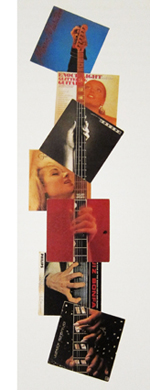 Like the compilation filmmakers, Marclay wants crosstalk among his bits, but the stretches of The Clock I saw don’t create much friction. There’s a lot of continuity from shot to shot: One character in one movie walks out a door, and we cut to another character from another movie entering a new locale. Music links scenes smoothly. Although Marclay was influenced by the diffuse, chance organizations promoted by John Cage, some of his earlier work emphasized through-line linkages and blending as well. Marclay’s famous record-album collages allow a unified figure to emerge as a gestalt binding together disparate images. On the right, you can see this happening in Guitar Neck (1992), which virtually diagrams the sort of smooth juxtapositions we get in The Clock.
The result has a fairly slick texture. It goes down easily. I admire the way that Marclay and his assistants have rummaged through a vast archive and pulled together a majestic, utterly entertaining assembly. But emotionally it’s mostly cold. The year-end obituary tributes on Turner Classic Movies, reminding us that the perfect faces and bodies gliding past us are definitively gone, are more throat-catching than anything I saw here. Along another dimension, so are Conner’s A Movie and his dissection of the JFK assassination, Report (1963-67). Just as important, none of what I saw seemed to me particularly challenging or discordant, and in this regard The Clock parts company with the comparable film traditions.
Structural film was notoriously demanding, ruffling viewers’ perceptions and trying their patience. And experimental compilations were often seeking to shake us up, sometimes in absurd ways. An earlier blog entry of ours illustrates how Baldwin’s Mock Up on Mu (2008) builds disconcerting scenes out of bits taken from other movies. A man and woman constantly shift their identities and positions while their conversation continues without missing a beat.
Crucial to the classic compilation films is the central innovation of collage: the fragments do not blend into a smooth whole. There are clashes between one shot or clutch of shots and the next. There’s also a sense of material differences. Each piece of scuffed or distressed footage retains something of its own integrity. In his sound work, Marclay too claimed an interest in the “sound patina” of vinyl LPs:
When a record skips or pops or we hear the surface noise, we try very hard to make an abstraction of it so it doesn’t disrupt the musical flow. I try to make people aware of these imperfections and accept them as music; the recording is a sort of illusion, while the scratch on the record is more real.
But the shots in The Clock are mostly scrubbed clean of imperfections, presenting a sleek surface that facilitates the flow across shots. The movie is a pure product of the DVD era, with all those gleaming images so easily appropriated. At times Marclay manages to match weather conditions, with rain in one scene carrying over into the next. This tactic creates an intriguing sense that the two movies are set in a shared world, but it makes the gaps between the images even narrower.
For about twenty years there has been a controversy in the gallery world about whether the burgeoning tradition of “artists’ films” owes anything to avant-garde film traditions. It’s often summarized as the difference between the white cube of the gallery and the black box of the movie theatre. By setting The Clock alongside collage compilation films, am I guilty of comparing apples and oranges? For instance, the films have fixed beginnings and endings, whereas The Clock is an installation that can be entered at any point. It’s not a film but rather, to use a current phrase, a “time-based audiovisual work.” Moreover, some will argue that Marclay’s lineage doesn’t consist of Cornell, Conner, Baldwin, and Structural Film but rather Fluxus, Minimalism, Punk, and Scratch-and-Mix. (Marclay has devised a turntable he can play like a guitar.)
All of which carries some weight, but I see enough common features between the two traditions to make my main point: Based on what I sampled, this is an ingratiating work, virtuosic in a Postmodernist way. But it doesn’t risk the roughness, the boring patches, and the confusions of the film traditions I’ve invoked. Perhaps the most condemnatory thing you can say about The Clock is that it runs like clockwork.
But maybe things get more disruptive in the 89.6 % I wasn’t able to see.
This entry was written fairly early in The Clock‘s Manhattan run. (Thanks to James Schamus for tipping me to it.) I had no trouble getting in at 10:40 AM and staying until about 1:15. But it quickly became a sensation. A friend and I tried to visit on a chilly Friday night and confronted a long line. I heard from others that the line was just as forbidding at 5:00 AM. The problem, of course, is that you could wait a very long time, since there’s no set point when many are likely to leave. (Nobody will say, “This is where we came in.”) This New York Times article traces the rise of the Clock cult. The article also confirms that midnight is a high point of the video.
Yet another Times piece discusses The Clock as akin to recorded music, making some points related to mine above. Here is a loving account by Jerry Saltz, who logged nineteen hours on duty. Easy to enjoy and admire, Marclay’s piece probably deserves to be added to Christian Lander’s list of Stuff White People Like.
A good overview of the artist’s earlier work can be found in Jennifer Gonzalez et al., Christian Marclay (London: Phaidon, 2005). My quotation comes from p. 33.
On the experimental compilation film, see William C. Wees, Recycled Images: The Art and Politics of Found Footage Films (New York: Anthology Film Archives, 1993). See also Stefano Basilico, ed., Cut: Film as Found Object in Contemporary Video (Milwaukee Art Museum, 2004). P. Adams Sitney’s Visionary Film, second edition and thereafter, provides the most influential account of the Structural tradition. Scott MacDonald discusses Zorns Lemma at length in Avant-Garde Film: Motion Studies. For incisive analyses of how compilation and Structural films elicit particular activities from their viewers, see James Peterson’s Dreams of Chaos, Visions of Order.
Thanks to Jim Kreul and Jonathan Walley for guidance in the controversy about artworld and filmworld traditions. Jonathan’s essay “Modes of Film Practice in the Avant-Garde,” in Tanya Leighton’s collection Art and the Moving Image: A Critical Reader, is a useful guide to these and other trends. I advance some notions about the user-friendliness of another artist’s film project in this entry on Matthew Barney’s Cremaster cycle. Kristin and I have written about associational form in Conner’s A Movie in our book Film Art: An Introduction.
The buddy system
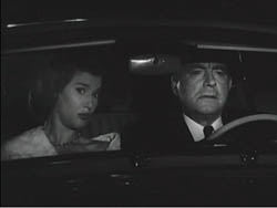
Sweet Smell of Success.
DB here:
Many of our friends write books, and what are friends for if not occasionally to promote each other’s books? Here’s an armload of titles, most of them recently published. They’re so good that even if the authors weren’t our friends and colleagues, I’d still recommend them.
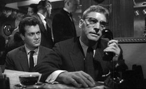
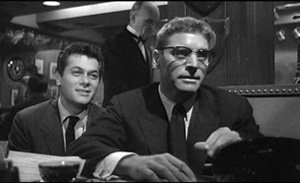
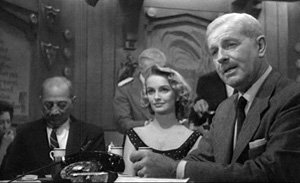
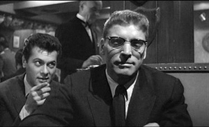
James Naremore has made major contributions to film studies since his fine monograph on Psycho, published way back in 1973. That book remains one of the most sensitive analyses of this much-discussed movie. Now he has another monograph, on the stealth classic Sweet Smell of Success. When I was coming up, Alexander Mackendrick wasn’t much appreciated, and this movie slipped under the radar. More recently it has emerged as one of the model films of the 1950s, and not just for James Wong Howe’s spectacular location cinematography. It’s a very brutal story, with Tony Curtis playing against type as venal press agent Sidney Falco and Burt Lancaster as J. J. Hunsecker, a monstrously vindictive newspaper columnist.
Jim’s book provides a scene-by-scene commentary but also more general analysis of production circumstances and directorial technique. An enlightening instance is what Mackendrick called “the ricochet”—when character A talks to character B but is aiming at character C. This allows the filmmaker great flexibility in framing and cutting, often showing C’s reactions while we hear the dialogue offscreen. In the shots surmounting this blog, Sidney is needling J. J. by asking the Senator if he approves of capital punishment. Jim’s book joins his work on Welles, Kubrick, and film noir as part of a subtle reassessment of American postwar cinema.
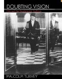 With the current revival of interest in André Bazin’s film theory, it’s fruitful to look again at the “classical” theoretical tradition in which he participated. “Classical” here refers to the very long period before the emergence of semiotic and psychoanalytic theories of cinema in the 1960s. The newer theories have somewhat beclouded our recognition of how imaginative and wide-ranging the old folks were. In Doubting Vision: Film and the Revelationist Tradition, Malcolm Turvey scrutinizes four thinkers who saw film as having the power to show us things beyond (or above, or below) surface reality. In the spirit of analytic philosophy, Turvey carefully lays out the positions of Béla Balázs, Jean Epstein, Siegfried Kracauer, and Dziga Vertov before asking whether their claims hold up.
I’m not giving much away by revealing that Malcolm thinks the revelationist tendency has its problems. But his purpose isn’t simply to reject the position. He treats it as an instance of what he calls “visual skepticism,” the idea that we ought to treat our ordinary intake of the world as something suspect. This idea, Malcolm argues, is central to modernism in the visual arts. He extends his critique of visual skepticism to more recent theorists as well, notably Gilles Deleuze, and he shows how his own ideas apply to films by Hitchcock, Brakhage, and other directors. Malcolm’s book is a model of theoretical clarity and probity, and a stimulating read as well.
Skepticism of another sort is central to Carl Plantinga’s Rhetoric and Representation in Nonfiction Film. One result of semiotic theory was to question whether a film could ever adequately represent reality. If a movie is only an assembly, however complex, of conventional signs, it can’t give us access to something out there. Even a documentary, some theorists argued, had no privileged access to the real world, let alone to general truths. “Every film is a fiction film” was a refrain often heard at the time. Carl tackles this assumption head-on by carefully arguing that just because a documentary is selective, or biased, or rhetorical, that doesn’t mean that it can’t affirm true propositions about our social lives.
Like Malcolm, Carl brings a philosopher’s training in conceptual analysis to debates about the ultimate objectivity of any documentary. In adopting a position of “critical realism” opposed to skepticism, Carl examines the realistic status of images and sounds, the way documentaries are structured, and filmmakers’ use of technique. He shows, convincingly to my mind, that a documentary may offer an opinion and still be objective and reliable to a significant degree. Carl’s 1997 book went out of print before it could be published in paperback. He has enterprisingly reissued it as a print-on-demand volume, and it’s available here.
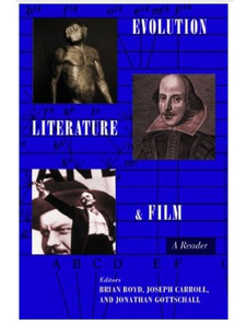 To take film theory in another direction, there’s Evolution, Literature, and Film, edited by Brian Boyd, Joseph Carroll, and Jonathan Gottschall. As a wider audience has become aware of the power of neo-Darwinian thinking, more and more scholars have been arguing that evolutionary theory can shed light on aesthetics. The most visible effort recently is Denis Dutton’s The Art Instinct.
For some years Brian, Joe, and Jonathan have been in the forefront of this trend, with many books and articles to their credit. Their anthology pulls together broad essays on biology, evolutionary psychology, and cultural evolution before turning to art as a whole and then focusing on literature and cinema. There are also pieces displaying evolutionary interpretations of particular works, and a finale that provides examples of quantitative studies of genre, gender variation, and sexuality, including an article called “Slash Fiction and Human Mating Psychology.”
Among the film contributors are other friends like Joe Anderson, a pioneer in this domain with his 1996 book The Reality of Illusion, and Murray Smith, who provides an acute piece called “Darwin and the Directors: Film, Emotion, and the Face in the Age of Evolution.” There are also essays of mine, drawn from Poetics of Cinema. In all, this book presents a persuasive case for an empirical, broadly naturalistic approach to the arts.
By the way, the same team is involved with an annual, The Evolutionary Review, edited by Alice Andrews and Joe Carroll. Its first issue offers articles on Facebook, musical chills, women as erotic objects in film, and Art Spigelman’s In the Shadow of No Towers (by Brian Boyd).
Some books emerge from conferences, and Tom Paulus and Rob King’s Slapstick Comedy is a good instance. Based on “(Another) Slapstick Symposium,” held at the Royal Film Archive of Belgium in 2006, the anthology brings together a host of experts who look back at madcap comedy in American silent film. There are essays on particular creators—Griffith, Sennett, Fatty, and Chaplin, inevitably—as well as pieces on slapstick parodies of other movies and the genre’s relation to modernity, also inevitably. Tom Gunning offers a fine analysis of Lloyd’s Get Out and Get Under (1920), concentrating on a complex string of gags around an automobile. The collection gathers work by some of the outstanding scholars of silent film while also, of course, making you want to see these crazy movies again.
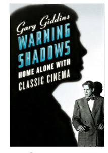 You also want to see all the movies lovingly evoked by Gary Giddins in Warning Shadows: Home Alone with Classic Cinema. As indicated in another blog entry, I find Giddins one of the best appreciative critics we’ve ever had. Any essay, indeed almost any sentence, cries out to be quoted. Here he is on Edward G. Robinson:
His round, thick-lipped, putty face could brighten like paternal sunshine or shut down in implacable contempt or stall with crafty desperation or pontificate with ingenuous wisdom; his short, stumpy, erect frame could sport a tailor-made as smartly as Cary Grant.
Some of the pieces in Giddins’ latest collection were designed to accompany DVDs, but they will outlast this evaporation-prone genre. Other reviews come from the New York Sun, which gave him freedom to mix and match his subjects: Young Mr. Lincoln and Lust for Life (both biopics), Lady and the Tramp and Miyazaki movies. The collection opens with Giddins’ thoughts on how changes in film exhibition, from nickelodeons to digital screens, have altered our relationship with the movies. This isn’t just nostalgia, because his survey allows him to celebrate the power of DVD to exhume forgotten titles. The standards for a film classic, he notes, “are gentler and more flexible” than those in appraising other arts. “The passing decades are a boon to the appreciation of stylistic nuance that gives certain melodramas and genre pieces the heft of individuality.”
Who was Segundo de Chomón? In the 1970s, I kept finding that films I thought were by Méliès turned out to bear this mysterious signature. You imagine a man in a cape and a floppy hat. Photographs show someone a little less operatic, but with a superb mustache. Today he’s far from a mystery, although many of his movies can’t be fully identified. Several scholars have followed his trail, none more thoroughly than Joan M. Minguet Batllori in Segundo de Chomón: The Cinema of Fascination.
Chomón started as a cinema man-of-all-work in Barcelona, translating film titles, distributing copies, and producing films for Pathé. After moving to Paris in 1905, he continued working for the company and established his fame with trick films. He returned to Barcelona to create a production company, but that failed. On he went to Italy, where he specialized in visual effects, most famously for Cabiria (1914).
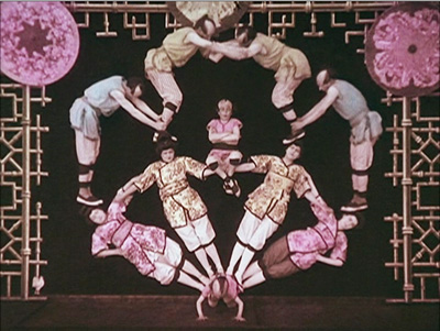
In his Parisian Pathé years, he was in charge of all the studio’s trick films, which included not only stop-motion, superimpositions, and other effects but also marionettes and animation. Joan argues that he was a prime exponent of the “cinema of attractions,” Tom Gunning’s term for that early mode of filmmaking which aims to startle and enchant the audience. A famous instance is Kiriki, acrobats japonais (1907), which shows gravity-defying stunts.
Chomón accomplished this by shooting from straight down, filming the performers on the floor. They had to simulate leaps and flips as they rolled along each other’s bodies, and then they had to slip perfectly into position. This English edition of Joan’s book on Chomón, full of information and providing a “provisional filmography” along with many pages of gorgeous color images, will be available soon here.
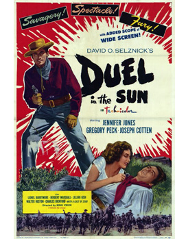 We recently noted the anniversary of our book on classic studio cinema, a 1985 project in which we bypassed talking about exhibition. That part of the industry has been a scholarly growth area in the years since, and one of the newest yields is Epics, Spectacles, and Blockbusters: A Hollywood History, by Sheldon Hall and Steve Neale. It’s a chronological account of Big Movies, from the earliest features to the digital era, and it concentrates on how such films have been marketed and shown. It explains how exhibition changed across the decades, and how we got the phenomenon of the “roadshow” movie, the film shown selectively (only certain cities), at intervals (perhaps only one matinee and one evening screening), and at more or less fixed prices. My middle-aged readers will remember roadshow releases like The Sound of Music (1965), although there were many before and even a few since.
Sheldon and Steve trace in unprecedented detail the cycles of blockbusters that have run throughout American cinema. In the process they refreshingly redefine the very idea. We don’t usually think of The Best Years of Our Lives as a Big Movie, but it runs three hours and was considered a “special” production, comparable to the more obvious sprawl of Duel in the Sun. The authors bring the story up to date by considering today’s event movies as a “Cinema of Spectacular Situations.” Yes, that category includes comic-book films, Inception, and, of course, the 3D sagas that may finally be wearing out their welcome. (My editorializing, not theirs.)
Japanese cinema is endlessly fascinating in all its eras; I’d argue that in toto it’s one of the three greatest national cinemas in film history. The postwar period is exceptionally interesting because of the American occupation (1945-1951) and its effects on Japanese film culture. This period has already provoked one of the best books we have on Japanese cinema, Kyoko Hirano’s Mr. Smith Goes to Tokyo, and it finds a worthy accompaniment in Hiroshi Kitamura’s Screening Enlightenment: Hollywood and the Cultural Reconstruction of Defeated Japan. Kyoko focused on how US policy shaped domestic filmmaking, while Hiroshi asks how the Occupation helped American studios penetrate the local market.
Over six hundred Hollywood movies poured into Japan during the period, and Hiroshi traces how local tastemakers as well as U.S. policymakers drew audiences to them. Young Japanese learned about the Academy Awards, assembled in movie-study clubs to discuss what they were seeing, and were urged to consider even a gangster tale like Cry of the City (1950) as demonstrating the humanistic side of democracy. A center of this activity was Eiga no tomo (“Friends of the Movies”), a magazine that went beyond entertainment news and tried to reshape the tastes of young people. In sharp prose and vivid evidence, Hiroshi captures the ways in which American cinema promised to help heal a devastated country.
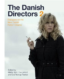 The Danish Directors, by Mette Hjort and Ib Bondebjerg, has become a standard companion to the most successful “small cinema” on the European scene. Now it has a successor in The Danish Directors 2: Dialogues on the New Danish Fictional Cinema, edited by Mette, Eva Jorholt, and Eva Novrup Redvall. Once again, we get lengthy, in-depth interviews covering the value of film education, the vagaries of funding, and filmmakers’ creative decision-making. Lone Scherfig, Christoffer Boe, Per Fly, Paprika Steen, and many other major figures are included. (Disclosure: The editors were kind enough to dedicate the book to me.)
While the first volume is a rich storehouse of information on Danish film in “the Dogma era,” the newest volume shows how directors (some of whom made Dogma projects) have gone beyond it. In preparing 1:1, a film about Danes and Arab immigrants living in a housing project, Annette K. Olesen had a full script but concealed it from the non-professional cast. After getting the performers comfortable with ordinary situations, she began staging scenes while encouraging improvisation. Screenwriter Kim Fupz Aakeson incorporated the improvised material into revisions of the script.
By contrast, the prolific director-screenwriter Anders Thomas Jensen (Adam’s Apples, The Green Butchers), relies on strong structure, with lean expositions and sharply defined climaxes. He appreciates clean filming technique too.
It’s easy to make something that’s ugly and handheld, but you have to take telling stories with images seriously. You have to take the language of film seriously. Many Danish directors have started doing this in recent years and it’s wonderful, because there was a time when everything looked Dogma-like and I found myself thinking, “It’s got to stop now.”
To those who think that Danish cinema is at risk of becoming a cinema of cozy liberal reassurance, this collection offers many salutary signs. Every director speaks of the need to keep innovating, to push ahead provocatively. Simon Staho, whose Day and Night seems to me one of the most adventurous Danish films of recent years, aims at utter purity: “My task is to figure out how to add as little as possible to the black screen. The damned problem is that you have to add image and sound!”
What makes all these books exciting to me is a willingness to test ideas–sometimes very general ones–about cinema and the wider world by examining film as a distinctive art form. Even the most conceptual books on this week’s shelf are firmly rooted in the particular choices that creators make and the concrete ways that viewers respond.
Next stop: Vancouver International Film Festival. Whoopee!
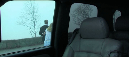
Day and Night.


