Archive for the 'Experimental film' Category
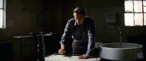
Revisiting INCEPTION
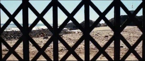
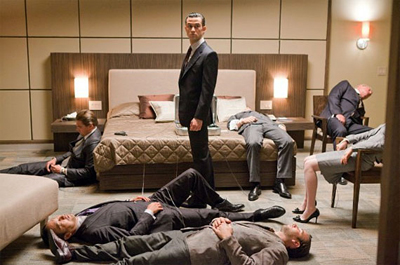
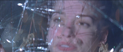
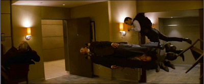
Inception.
Heading cross-country from Chicago in Dad’s old Honda Prelude, we’re no further than Wisconsin on the first day when Jonah turns from the passenger seat and tells me he’s working on something.
Christopher Nolan, on the origins of Memento
We were driving my dad’s old car from Chicago to Los Angeles. It must have been the second day of driving–we were past Minnesota.
Jonathan Nolan, on the origins of Memento
It’s rare when a filmmaker confirms hypotheses put forward by critics. But that seems to have happened to us.
An enormous amount had been written about Inception, both on the internet and in print, before we wrote our blog entry last week. For the most part, we avoided reading about the film, fearing spoilers and statements about the film that might influence our own initial take on it. Since then, we’ve read Jeff Goldsmith’s in-depth interview with Christopher Nolan published in Creative Screenwriting (not yet available online). There Nolan broaches several ideas about his approach to the film, and some of those square with our analysis. Today we highlight a few of those remarks and tease out their implications. We end with comments from some readers.
Exposition rules
Kristin here:
My contribution to last week’s entry concerned the film’s dependence on nearly continuous exposition, which I thought of as a major formal device across the film. In the Creative Screenwriter interview, Nolan says that exposition was a particular concern of his in making the film.
Ten years ago he envisioned the film as a heist caper:
“One of the fascinating things about the heist movie, and one of the reasons I took this as the model, is that the type of exposition that in most films is problematic, boring, tricky, hard to get through—in a heist movie becomes the meat of it,” Nolan says. “It’s part of the entertainment simply because the process of a heist movie and that sort of procedure, the way they put things together, becomes the reason you’re watching the story.”
Usually in a heist film we get a big dose of exposition as the team’s leader explains the plans for the crime to his colleagues. Then we watch the plan unfold, with exposition added well into the film as needed. In Inception, however, the heist explanation becomes nearly continuous. Goldsmith comments, “Nolan smartly flipped this conceit on its head and instead of keeping the audience at a distance, he decided to take them along for the entire ride. The subtle re-configuration allows for the audience and the characters to sweat together whenever any hiccups arise in the well-thought-out plan.” In fact, the “well-thought-plan” unfolds only as we watch the film.
Nolan also comments on this idea of the audience being active, saying that he wanted to involve viewers alongside the characters:
“Exposition is such a massive demand,” he admits.” It’s something you have to just try and imbue in the relationships of the characters. You never want to find yourself in a scene where characters are passively receiving information in some way, because you don’t want the audience passively receiving information. You want them engaged with that dramatization.”
The implication here is that the audience becomes involved in the plot not through learning about the characters’ backgrounds and traits, as most spectators seem to expect in standard Hollywood films—even blockbusters. Instead, our relationships with the characters (apart from Cobb) come through learning new information along with them and being attached so closely to them while they work through the mechanics of the plot.
The result, at least for many viewers, seems to be a feeling of dissatisfaction at not being able to get close to the characters in a more conventional, detailed way. The advantage, if one wishes to consider it as such, is that we are forced into a struggle to understand the workings of the plot.
Yet we are not entirely with the characters in their achievement of the mission, because we move back and forth among the levels of the dream, as none of them does. Thus we may be attached to the characters in the parceling-out of exposition, but we know much more than they do at any given moment once the second dream (the hotel) begins. The result comes through further experimentation on Nolan’s part, this time with intercutting.
Prestigious patterning
The Prestige.
DB here:
In our earlier entry I argued that Inception uses the dream subject matter to set up a heist plot and to motivate a pattern of embedded narratives. Normally, embedded stories are presented as sealed off from one another, like concentric circles. One interest of the film, I thought, lies in the freedom with which Nolan crosscut among these nested tales.
After further reading and re-viewing, I’m forced to ask: Which is the real center of his interest–embedded stories or crosscutting? And this question leads me to think about his development as a filmic storyteller.
In college Nolan studied literature (a good model for aspiring filmmakers, who too often focus only on movies). To this training he attributes his interest in form. “I wrote Memento very much as a puzzle box. I was fascinated by the idea of structure.”
For Nolan, I think, form has centrally to do with the sorts of juxtapositions you can create by crosscutting. You could say he treats crosscutting the way Ophuls treats tracking shots or Dreyer treats stark decor: an initial commitment to a creative choice, which in turn shapes the handling of story, staging, performance and other factors.
Moreover, his fondness for crosscutting favors actions taking place in different time frames. Traditionally, a crosscut sequence switches between lines of action taking place at the same time. While Smith walks his dog, we see Jones stalking Smith’s wife. The Dark Knight has many sequences that crosscut simultaneous lines of action. When crosscutting isn’t presenting simultaneous actions, it’s often alternating between present and past. An influential example is Hiroshima mon amour, in which the female protagonist’s memories of occupied France are juxtaposed with her visit to Hiroshima in the present. Here, as often happens, the switch to an earlier time is motivated as a character-based flashback, an expression of the persistence of her memories.
Nolan’s interest in crosscutting various time frames doesn’t quite square with tradition. He was much influenced by Graham Swift’s 1983 novel Waterland, as he has pointed out over the years. Here is what he says in the CS interview.
“It opened my eyes to something I found absolutely shocking at the time,” Nolan says. “It’s structured with a set of parallel timelines and effortlessly tells a story using history—a contemporary story and various timelines that were close together in time (recent past and less recent past), and it actually cross cuts these timelines with such ease that, by the end, he’s literally sort of leaving sentences unfinished and you’re filling in the gaps.”
What initially intrigued Nolan, it seems to me, is the idea of taking a story that could be told in straightforward chronology and breaking it into two or three discrete phases. He then cuts among scenes within the phases, without motivating the shifts as character-centered flashbacks.
The story of his first feature, Following, could have been told in 1-2-3 order. Instead, within a framing situation of an interrogation, the plot breaks the protagonist’s tale into three phases, all quite close in time, and then cuts among them. Within each phase, the action is chronological (so far as I can see), but the three “eras” are intercut. Nolan is careful to keep us oriented as to which time zone we’re in through things like the protagonist’s appearance (sloppy, well-groomed, bruised) and a burst of black frames that signals a shift to a different zone. Eventually all three phases get linked up, so, for example, the last thing we see of phase one leads smoothly to what we saw as the first imagery of phase two.
The same concern to break up a linear story is at work in Memento. Again, different phases of the same tale are intercut. But now a forward-moving module is accompanied by one moving backward. Again, these are kept distinct through time markers (color footage vs. black-and-white), and the reverse-chronology one is filled with tokens and echoes that remind us that what we’ve already seen actually took place after what we’re seeing now.
The Prestige expands crosscutting in another direction. Christopher Priest’s original novel is based on the discovered-manuscript convention. Adam Worthy, a publisher, begins reading a book by Alfred Borden, Secret Methods of Magic. What follows are several other memoirs, treating events at different points in history, with some going back as far as 1866. These texts are not intercut or even nested. They stand as solid blocks, presenting overlapping time schemes and varying points of view on the central rivalry between the two conjurers Borden and Robert Angier.
For the film of The Prestige Nolan and his screenwriter-brother Jonathan again create a basically linear chronology. Once more it is fractured into discrete phases. There is a present (Cutter showing a bird trick to the little girl Jess), the recent past (Alfred arrested for killing Robert and awaiting trial), a more distant past (Robert visiting Nicolai Tesla in Colorado), and thanks to Alfred’s journal, the most remote days when the two became competitors and Alfred created the Transported Man illusion.
But The Prestige treats its time zones somewhat as if they were embedded stories. I think that this is partly because we have two protagonists and a split point-of-view pattern. The biggest cue, however, is the way that the Nolans absorb the discovered-manuscript convention into the film. In a classic embedded structure, a character recalls or recounts a string of events with its own integrity, and sometimes the frame story involves a character reading a letter or memoir. In the film, this situation is provided by journals kept by the rival magicians. Now Nolan can cut freely among nested stories. At one point we have Alfred, jailed for murder, reading Robert’s journal, in which Robert tells about reading Alfred’s journal in Colorado. Alfred’s version of events is embedded in Robert’s version, which is in turn embedded in the moment of Alfred’s reading in prison.
Moreover, instead of Following‘s rather mechanical demarcation of phases (black frames signal a shift between phases), the narration of The Prestige is quite fluid, joining distant periods through smooth hooks of imagery and sound. Sometimes the sound comes from one period but the shots are in a distant one. We’re introduced to this strategy in the very opening: Cutter’s voice-over is in the present, but the image is two layers into the past.
So it seems to me that in The Prestige Nolan’s interest in crosscutting different timelines became more audacious, working with not only linear events but embedded stories. The interest in nested stories emerges much more explicitly in Inception, as I suggested in the earlier post. But what I didn’t see then was that using dreams to motivate embedded plotlines changes the time game.
A dream within a dream can’t be said to be taking place earlier than the surrounding dream, the way a flashback or discovered manuscript necessarily presents past events. The dream realms can’t be ironed out into a chronological structure as the phased plotlines of Following, Memento, and The Prestige can. In fact we find our old friend simultaneity at work among all the phases (dreaming while dreaming while, etc.). And Nolan’s film invokes the convention of the climactic deadline (actually, four of them). So in a perverse way, Inception‘s formal gambit is more traditional than the time-scrambling of the earlier films. But because we seldom see embedded stories intercut, the result is also pretty daring–something akin to that abstract filmic time that Griffith creates by intercutting four historical epochs in Intolerance.
From this perspective, Inception marks a step forward in Nolan’s exploration of telling a story by crosscutting different time frames. You can even measure the changes quantitatively. Following contains four timelines and intercuts (for the most part) three. Memento intercuts two timelines, but one moves backward. Like Following, The Prestige contains four timelines and intercuts three, but it opens the way toward intercutting embedded stories. The climax of Inception intercuts four embedded timelines, all of them framed by a fifth, the plane trip in the present. For reasons I mentioned in the previous post, it’s possible that Nolan has hit a recursive limit. Any more timelines and most viewers will get lost. What can he do next?
Letters, we get letters (and links)
DB again:
We’re grateful to several people who linked to our posting, especially Jim Emerson at Scanners, who continues to compile ideas about a movie he doesn’t like much. Other people wrote us directly to share some ideas. From Jason Mittell of Middlebury College:
I really appreciate and agree with the idea that the motivation for the film is to tell nested or embedded stories, with the shared dreaming device essentially as a framing convenience rather than thematic imperative. One parallel I was surprised D&K didn’t raise was with the embedded narration of The Prestige. I teach the latter in my narrative theory course as a case study specifically to explore how the film plays with storytelling levels, with the dual journals/letters, voice-over, flashbacks, etc. Inception makes this layering more literal in terms of parallel worlds, but I do see some important precedents forged in Nolan’s earlier work.
I agree with Jason’s suggestion about The Prestige and decided to develop the point he suggested. I didn’t dwell on the film in the earlier entry beyond noting that it’s discussed at some length it in the ninth edition of Film Art: An Introduction. It’s good to know that Jason (who maintains an excellent blog here) finds the film a lively way to introduce narrative concepts in his teaching.
Jim Healy pointed out another example of a film with several nested story lines.
As for complicated embeddings since The Matrix, I was a big fan (maybe the only one) of Carpenter’s Ghosts of Mars, which has, I think, a flashback within a flashback, within a flashback, within a flashback.
James Kreul wrote with another example of nested-goal crosscutting schemes:
You might consider looking at Matthew Barney’s Cremaster 3, or at least the segment available on DVD called “The Order.” “The Order” has simultaneous action on 5 different levels of the Guggenheim Museum. If you watch it linearly, it seems very much like a video game, as the protagonist has to achieve certain goals on each level. The DVD also gives you the option, however, of toggling between the different levels across the duration of the segment, so that even if the protagonist isn’t on level 1, you can watch level 1 (there was a variation on this for the multiple-screen video installation version of the piece).
“The Order” itself is nested within the larger narrative of the protagonist (Barney, the “Entered Apprentice”) working his way up the Chrysler Building to confront “the Architect,” and there is a parallel between the climax of the Order and the climax of the action with the architect. The website synopsis describes “The Order” as a “choric interlude,” and even though the Barney character is called the Entered Apprentice in the both the larger and nested narrative, the nested version is a “fantastical incarnation” of the character. But there’s nothing to mark it explicitly as a dream or the subjective experience of the character (as far as I can remember). The two versions of the character are instead connected by the fact that Barney plays both of them and by certain motifs (he loses teeth in the larger narrative, he has a bloody mouth in “The Order”).
In any case, it might be a useful example if you return to the idea of narrative strategies within a nested structure. “The Order” also has various thematic connections with the other films in the series (each level in the Guggenheim references the 5 films in the series) so that this “middle film” both looks back and looks forward to the other films in the series. It was released last.
Jim’s reference to Barney’s Cremaster series reinforces our sense that Nolan is exploring some avant-garde techniques but anchoring them in familiar genres, plot patterns, and the like. Motivation, in other words.
Speaking of motivation, I wrote in an aside in the original post: “Likewise, the backward progression of Memento’s plot is partly justified by the clinical condition of short-term memory deficits. I grant you, why this ailment supports a reverse-chronology tale is a bit puzzling.” In reply David Wigram wrote to point out that most movies want to align the viewer with the protagonist’s thoughts and feelings. Accordingly,
In Memento Nolan needs to keep the audience as clueless about the recent past as Leonard is, otherwise this identification is lost. The only way to do this is with the looping reverse form that was used. All the other aspects of the conceit flow from this necessity. I seem to remember interviews in which Nolan talked about trying to find the technique required to tell this story, and how everything fell into place when he did. But even if it was reverse-engineered, even if the filmmmaker simply wanted to make a fractured-time narrative and needed a story – any story – to tell, I think story and storytelling in Memento (of anterograde amnesia in the protagonist and a looping reversed chronology) are perfectly and elegantly matched.
I find David’s point persuasive. It illustrates how an overarching formal commitment confronts you with a cascade of obligatory choices, and how those choices can be motivated.
If you want to restrict the plot to Leonard’s range of knowledge, you have a problem because he forgets what happened to him a few minutes before. Then our knowledge will always be greater than his, creating a very externalized, objective narration. In other words, if the events are told chronologically, then we see what Leonard will soon forget. But a reverse-order plot suppresses our knowledge of the recent past, thus approximating the character’s range of knowledge in any particular scene.
This creates a new problem to solve, however, because we now still have knowledge outside Leonard’s ken—knowledge of the future story events. For instance, we know that he will be betrayed by Natalie and will shoot Teddy. Yet in a way our future knowledge doesn’t hurt the plot’s unfolding, because this is a film noir. In a noir we often sense that harm is destined to befall the protagonist. This sense of fatality is sometimes specified by a frame story anticipating the protagonist’s end, as in Double Indemnity and Sunset Boulevard. Here, instead of using a flashback, Nolan conjures up the doom scenario by reverse-order presentation. Motivation again, this time by that quasi-genre we call film noir. Would the structure work so well with a Western?
Like Inception, Memento finds a structure that meets Hollywood’s demand that the presentation be motivated by appeal to genre and character psychology. A good counterexample is provided by Gaspar Noë’s Irreversible, in which the 3-2-1 ordering of scenes isn’t justified by such factors. As often happens outside Hollywood, a play with form doesn’t need such motivations–or alibis, if you like.
The Nolan brothers’ memories of Memento are taken from Christopher Nolan, Memento and Following (London: Faber, 2001), p. 233. In the same volume (pp. 97-99), Nolan offers some comments on structure echoing those we quote here. The remarks on Inception come from Jeff Goldsmith, “The Architect of Dreams,” Creative Screenwriting (July/ August 2010), 18-26. CS is well worth subscribing to, and its free podcasts are very informative. On Memento, Andy Klein’s careful reconstruction from 2001 remains admirable. On Christopher Priest’s reaction to the film version of his novel, see The Magic: The Story of a Film; see also our entry here. For a discussion of the sort of audiovisual hooks Nolan employs in The Prestige, see this web essay. Another entry on this site considers Nolan’s visual storytelling in The Prestige. We also have a post discussing Barney’s Cremaster project.
P. S. 31 August: Who can keep up with all the Webchurn on Inception? We won’t try, but simply point you to two reactions that pictorialize the embedded-dream device: here and here.
Scientific American weighs in on lucid dreaming. And again here.
P. S. 2 Sept: Sean Wietner makes this point about how Nolan motivates slow motion:
In an interview with Elvis Mitchell on his KCRW program The Treatment, Nolan mentions that he’s had a hard time being comfortable with the aesthetics of slow motion — he’s never known what it’s best used for. So he was quite chuffed about the falling van in Inception — finally, a good reason to use slow-motion. He makes similar comments about cross-cutting that echo your blog post; he’s so pleased to be “forced by” (my paraphrase) the narrative to cut parallel action like this.
This is one of the things about Nolan that sticks with me, and I think it’s related to the perception some have of him as chilly. I think it speaks to a larger issue that touches on ideas like Hitchcock’s plausibles, and their Body Snatcher infiltration of audience mores. There are times when Nolan comes across as the King of the Plausibles, the overplanner who can’t deal with being painted into a corner, so rather than deal with that messiness he erects massive scaffolding. He requires a time-dilation mechanic so he can have the freedom to play with the classic cinematic device of slow motion!
Thanks to Sean for his comment!
A hundred years, plus a few thousand more, in a day
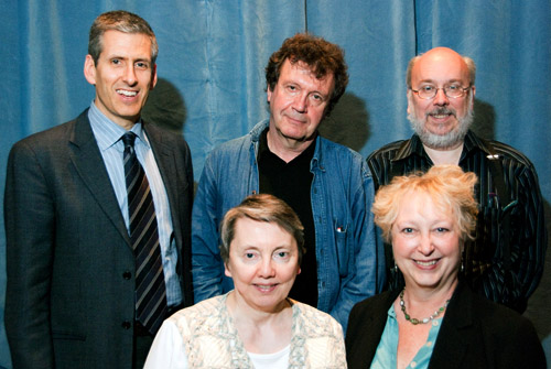
Charlie Keil, Yuri Tsivian, Henry Jenkins, Kristin Thompson, and Janet Staiger. Photo by Joel Ninmann.
Last Saturday we held the symposium “Movies, Media, and Methods” in honor of Kristin’s arrival at age sixty. Four distinguished scholars, all professors from major universities, presented top-flight talks. As a bonus, Kristin gave The Film People a glimpse into her Egyptological work. I report on this very full day in the hope of giving a sense of how stimulating we found it.
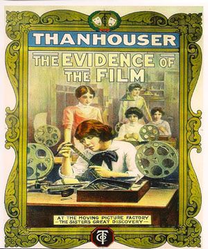
Thanhouser was an American film company that flourished between 1909 and 1917. It has been overshadowed by Biograph because that firm put out more films and, not incidentally, employed D. W. Griffith. But Ned Thanhouser has been diligently gathering his family company’s output from archives around the world and releasing it in informative DVD editions. The most famous Thanhouser production is probably Cry of the Children (1912), a powerful attack on child labor. You could also try the thriller The Woman in White (1917), adapted from Wilkie Collins’ masterful novel. A study in sadism, and more subtle than The Girl with the Dragon Tattoo.
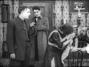
Charlie Keil, an expert in 1910s US film from the University of Toronto, examined Thanhouser’s films with two questions in mind. Did the studio have a “distinctive personality” in its products? And does its output reflect the development of film style across the crucial transitional years of the early 1910s? Borrowing a method that Kristin had applied to Vitagraph films in an essay, Charlie took one film from 1911, one from 1912, and one from 1913. Charlie wasn’t ready to conclude that these specimens displayed a unique studio style, but it was clear that across just three years, big changes in storytelling were taking place.
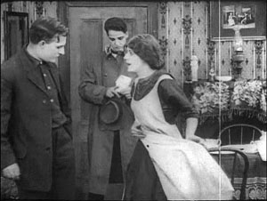
The plot of Get Rich Quick (1911) involves a man who joins a business that is scamming innocent investors. The film uses only five locales and plays scenes in long takes. The Little Girl Next Door (1912) has a more complex plot, with two distinct lines of action that converge on a child’s drowning. It uses many more locales and an ellipsis of a year to trace the changes in a family’s fortunes. It also incorporates cut-in close views and point-of-view editing. The Elusive Diamond (1913) is less psychology-driven than The Little Girl Next Door, but its intrigue relies almost completely on dialogue titles and it includes many close-ups and variation of camera setups.
Three films and three years: A vivid cross-section of the rapid development of what soon became classical visual storytelling. Moving from 18 shots to 53 shots to 74 shots, the films became less dependent on staging and more dependent on editing. At the same time, Charlie didn’t fail to notice how the long takes in Get Rich Quick allow some felicities of performance, particularly the way that the wife’s handling of her apron charts her psychological states. She brushes it aside to show how poor they are, then she uses it as a giant hankie.
Like all good papers, Charlie’s left a lot to be discussed. People asked about how much pre-planning was done at Thanhouser, about the directors and screenwriters on staff, about the division of labor. We were left with a sense that here was another mostly unknown region that would reward further study.
Fernand Léger, Cubist Charlot (1923).
Yuri Tsivian of the University of Chicago carried us into the twenties with an in-depth examination of early Russian reactions to Charlie Chaplin. The paper held many surprises. Chaplin was popular in many countries from 1915 onward, and very soon after he was celebrated by European intellectuals. But Russia lagged behind; there’s no concrete evidence that any Chaplin films were shown there until 1922. Yet the Soviet avant-garde embraced him. How and why?
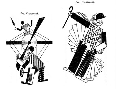
Instead of looking for a dual relationship—Chaplin directly influencing Russian artists—Yuri postulated a “triangular” relationship, in which Chaplin’s image was mediated through other European sources. For instance, Léger’s numerous images of a fragmented Chaplin led Futurists and Constructivists to declare Charlie “one of us.” They loved the idea of man as a machine executing precisely articulated movement, and what they heard of Chaplin’s pantomime and gags led them to praise him. Chaplin, said Lev Kuleshov, is “our first teacher” because he knows bio-mechanical premises better than anyone. According to the photographer and graphic designer Rodchenko Chaplin instructs viewers in how to walk or put on a hat in the most perfect manner.
So strong was this “virtual” image that artists could read Chaplin into the slapstick comedians they did see. Yuri showed that Varvara Stepanova’s striking rendition of Chaplin as an airplane propeller derived from a film he wasn’t in!
Perhaps she didn’t care: Nikolai Foregger suggested that Chaplin himself was unimportant, that the crucial fact was that he created a whole school of comedians within what Yuri called “a collaborative research community”—that is, Hollywood!
Yuri’s paper, in homage to the Russian Formalists, invoked the “law of fortuity” in art. This refers to the possibility that artistic borrowings, blendings, and crossovers are not determined by any broader social processes, as the Marxists were arguing, but are merely contingent. “Life interferes with art from below.” Accidents and unforeseen intersections, such as the Chaplin craze meeting the Constructivist movement, allow artists to seize on whatever is around them for new material. Yuri’s reference was to Kristin’s revival of Formalist methods in her “neoformalist” studies of Eisenstein, Tati, and other filmmakers.
Janet Staiger of the University of Texas at Austin collaborated with us on The Classical Hollywood Cinema, and she has for several years been the leading scholar of reception studies in film and television. In looking at the Indiana Jones series, her paper nodded to Kristin’s work on the Lord of the Rings franchise and her study of fans’ responses to the films.
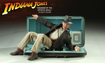
“Nuking the fridge,” Janet explained, has become fan jargon for an outrageous plot twist. The phrase comes from a notorious moment in Indiana Jones and the Kingdom of the Crystal Skull (2008), in which Professor Jones escapes an atomic blast by diving into a lead-lined refrigerator. The moment becomes a crux for clashing fan judgments: This is totally unrealistic vs. Realism doesn’t matter. Janet went on to show how these and other fan responses, entwined in IMDB commentary threads, utilized several different interpretive frames.
One was authorship. Like academics and journalists, fan are auteurists. They assign the director responsibility for major aspects of the film. But this doesn’t mean that they agree in how to use this frame. In the case of Crystal Skull, a certain Kid Mogul asked if Spielberg’s willingness to reinvigorate the franchise was purely mercenary: “Is it just about the money?” Others took a more career-survey approach, noting that after prestige pictures like Schindler’s List Spielberg recalibrated his popcorn movies, particularly by handling violence more gingerly.
Another frame was story-based “lit talk.” Fans disparaging the film found it clumsily plotted and lacking in character development. Several were quite sensitive to narrative coherence, one-off gags (such as nuking the fridge), and pacing. Those defending the film appealed to the emotional burst of the final chase scenes.
Janet’s third frame of reference was what she called “formula dissonance.” She sought to capture what seeing the film would be like for those who knew Indy’s story only through the TV series or video versions of the earlier installments in the franchise. She suggested that the formula was by 2008 quite abstracted and idealized for many fans. Their sense of the franchise was thus tested by the extraterrestrial twist that resolved the Crystal Skull plot. Does it reframe the whole series in a cosmic context, or is it a violation of the premises of the Indy universe?
Janet’s survey of these types of responses made me notice that the assumptions of academic film studies and of journalistic criticism overlap with fan conversation. Fans who liked the film tried to make everything fit by appeal to organic unity, technical proficiency, emotional intensity, and other familiar criteria. It made me suspect yet another reason why “amateur” and “professional” film criticism seem to be merging: Perhaps their conceptual frames of reference aren’t so far apart. But their tastes and their degrees of commitment surely are.
You might have expected Henry Jenkins of the Annenberg School at the University of Southern California to talk about fans too. After all, he practically invented the modern study of media fandom with his book Textual Poachers, and his work influenced Kristin’s study of fan promotion of The Lord of the Rings. Instead he turned to a survey of an artist’s oeuvre. He showed how Kim Deitch’s vast output of stories appropriate imagery from nineteenth and twentieth century mass media and present highly personal versions of the history of popular culture.
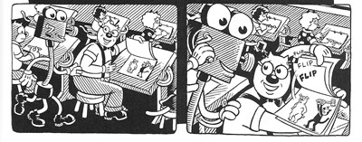
In a way, though, Henry’s talk involved fandom because Deitch is himself a prototypical fanman. He’s an obsessive collector, likely to turn his search for a rare toy or drawing into a Byzantine odyssey on the page. Fascinated by Hollywood scandal, he has constructed a phantasmagoric history of mass media through fictional characters (e.g., fake movie stars) who confront real people (e.g., Fatty Arbuckle). He’s particularly concerned about what he takes to be the warping of animated film by the influences of the mass market, epitomized by the Disney empire. The emblematic moment in Boulevard of Broken Dreams comes when Deitch’s Winsor McKay stand-in addresses torpid animators at a tribute dinner and denounces them for selling out.
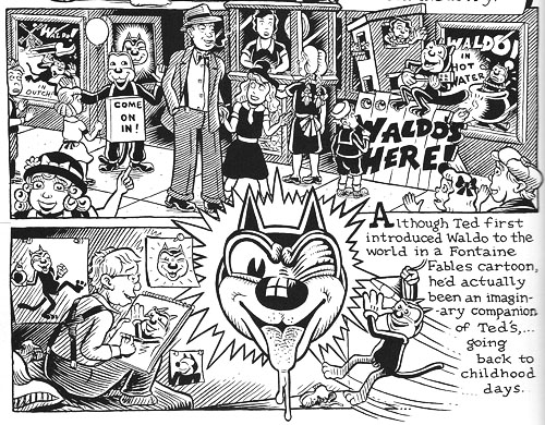
Deitch’s most famous character is Waldo the cat, and Henry traced the powerful connotations of this emblematic figure. Waldo recalls Felix, the most heavily merchandised comics figure before Mickey, as well as the black cat as a figure of deception, witchcraft, and even African-American minstrelsy. Through Waldo, Deitch could hop across the history of film and comics, from McKay to Mighty Mouse and 1940s abstract films. In Alias the Cat!, Deitch finds in the 1910s everything that we associate with media today: serial narrative, stories shifting across different media platforms, an uncertain line between publicity and self-expression, and a mixing of news and sensational fiction.
Henry situated Deitch in a broader trend of comic artists trying to find a new history of their medium, one that dislodges superheroes from a central role. Deitch’s themes of old-fashioned craftsmanship, lovably antiquated technology, adult dread and degeneracy lurking behind children’s stories, and the commodity demands of comic art link him to contemporaries like Chris Ware and Art Spigelman.
Henry’s talk spurred a lot of discussion, including the question of whether we can treat an artist as offering a history that is comparable to academic research. Can Deitch’s hallucinatory vision of American media be a plausible basis for understanding what really happened? On the whole we don’t expect an artist to offer rigorous arguments. An artwork appropriates history for its own end. (Not all the Greek philosophers actually gathered together in the way Raphael depicts them in the School of Athens painting.) How cogent you find Deitch’s critique probably also depends on whether you share his disdain for Disney. His floppy-limbed denizens fuse headcomix grotesquerie with the 1930s animation that most prestige studios abandoned. As in Sally Cruikshank’s sprightly cartoon Quasi at the Quackadero, Deitch’s rubbery frames revive a style in which everything seems to throb and shimmy.
Kristin’s talk, “How I Spend My Winter Vacations: The Amarna Statuary Project and Techniques of Visual Analysis,” had two parts. In the second part, she reviewed her recent work in assembling statues out of tiny bits that had been dumped by archaeologists decades ago. You can read some of this story here. The side of her work most intriguing to students of film, I think, involves her attraction to Egyptian art in the first place.
Egyptian art is often thought of as unrealistic, but during his reign in the fourteenth century BCE the pharaoh Akhenaten introduced a peculiar sort of stylization into it. When he instituted a monotheistic religion centered on the sun god Ra (embodied in the Aten), he also demanded a new pictorial style. Thus the Aten is depicted as a disc shedding rays, a symbol of life and dominion. In addition, the royal family displays biggish hips and thighs, which fit the fecundity theme. More strikingly to our eye, Akhenaten’s family were represented as somewhat distorted, with long and narrow faces, hands, and feet. The ruler’s crown is elongated as well. Several aspects of the new style are present in Kristin’s favorite scene, a beautiful relief carving known as the Berlin family stela.
You can see the Aten’s rays ending in little hands holding ankh signs to the royal couple’s noses. But just as important is the human dimension of the scene, and two sorts of action displayed there: swiveled shoulders and pointing hands.
Unlike the flat, frontal portrayal we associate with Egyptian art, the family members are caught in twisting postures that bring one shoulder forward. Kristin explained:
Akhenaten is lifting his daughter, his foreground arm moving backward to hold her legs, the other moving forward to support her body as he kisses her. She reaches with her rear arm to chuck him affectionately under the chin, while her other arm moves backward in a pointing gesture. On the opposite site, Nefertiti’s foreground arm is held bent and backward to steady the youngest daughter of the three present, who is standing on her thigh and reaching up rather precariously to grab a golden decoration hanging from her mother’s crown. Nefertiti’s rear hand goes forward to steady the second daughter, who is also pointing, this time with her rear arm as she twists to look at her mother. These kinds of gestures can be found again and again in such scenes.
The twisting movement wasn’t unknown among images of workers and private individuals; Amarna artists, presumably encouraged by Akhenaten, applied the device to portraying the royal family.
Just as significant are the pointing gestures we find in the stela. Some scholars have interpreted them as protective gestures, which are found in other images. But Kristin points out:
 In those cases, the protecting figures hold their arms straight, they stare in the direction of the thing to be protected (as one presumably would in reciting a spell), and there is something dangerous present. None of this applies in the scene in the stela.
After pondering this scene quite a lot, it occurred to me that it looked like a really early film, a short scene, perhaps 30 seconds long, that we were to interpret as a tiny narrative. The pointing gestures seemed comparable to pantomime, where one has to interpret movements in the absence of intertitles.
Given that so much Amarna art is about displaying the royal couple as having created life by giving birth to their daughters and as sustaining that life, it seems to me that this stela is full of indications of nurturing. The columns and roof indicate that the parents have their kids in a little shelter to keep them out of the hot sun. The rows of pots behind Akhenaten’s stool are no doubt filled with cool drinks for them. Nefertiti carefully holds onto the two children on her lap while Akhenaten kisses the eldest. My interpretation is that the eldest is saying something like, why don’t you kiss sister, too?” and the one opposite is pointing out the kiss to her mother and saying something like, “Look, daddy’s kissing sister; I want a kiss too.”
This may not sound like the sort of thing kids would say, but the circulation of affectionate gestures among the family members in these casual scenes is nearly universal. The chucking under the chin gesture used by Meretaten here shows up again and again, as do embraces and kisses.
Despite all the stylization, then, Kristin concludes that the stela depicts a scene of intimate affection, complete with a child toying with a mother’s ornament. This homely realism chimes with other realistic tendencies in Amarna art, such as the differentiation of right and left feet and the presentation of plants and animals in non-stereotyped ways. In sum, Kristin’s ability to look closely at film style helped her make discoveries about visual narrative in a completely different domain.
So our Saturday talks included cinema-related material from 1911 to about 2010, and with Kristin’s lecture we flashed back about 3300 years. Every talk was crisp and lucid. We were spared the juggling of empty abstractions, the free-associative rambling, and the self-congratulatory cleverness that plague the humanities. We got knowledge and opinion presented with enthusiasm, modesty, and good humor.
Kristin and I are grateful to our presenters, as well to all the friends old and new who showed up: Leslie Midkiff Debauche from Stevens Point, Carl Plantinga from Michigan, Peter Rist from Montreal, Brenda Benthien from Cleveland, Virginia Wright Wexman from Chicago, Vicente José Benet from Spain (via Chicago) and many others. In all, a day to remember.
For more information on Kristin’s research see my earlier entry. For other cinematic implications of the Berlin stela of Akhenaten’s family , see Kristin’s blog entry here. Her article, “Frontal Shoulders in Amarna Royal Reliefs: Solutions to an Aesthetic Problem,” is available in The Journal of the Society for the Study of Egyptian Antiquities 27 (1997, published 2000).
All of our speakers are represented on the Web: Henry here, Charlie here, Janet here, and Yuri here (and of course on Cinemetrics). For more on Janet’s study of online critics and the frames they inherit, see her essay, “The Revenge of the Film Education Movement.”
Kim Deitch, Boulevard of Broken Dreams.
That reminds me …
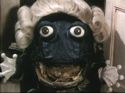
Enter the Frog Footman in Alice
Kristin here:
One film I can’t work up much enthusiasm about is everywhere, and another I very much want to see doesn’t seem to have a North American distributor. Luckily each reminds me of an older film that isn’t widely enough known. This seems like the perfect chance to point them out.
Recently the latest Screen International, in its new monthly format, arrived, with literally back-to-back reviews of the two films: Tim Burton’s Alice in Wonderland and Sylvain Chomet’s The Illusionist.
Let me say first off that Johnny Depp looks great in eyeliner, as in Pirates of the Caribbean. He looks positively grotesque with pink lips and raccoon eyes. Of course, grotesque could work well for Alice, especially as adapted by Burton. Yet the reviews suggest that the film is actually tamer than one would expect. Screen International’s Brent Simon calls Burton’s film: “A gorgeously mounted but fundamentally humdrum telling of Lewis Carroll’s fantasy novels” (March 2010 issue, p. 61). Variety’s Todd McCarthy makes a similar remark: “But for all its clever design, beguiling creatures and witty actors, the picture feels far more conventional than it should; it’s a Disney film illustrated by Burton, rather than a Burton film that happens to be released by Disney.”
Back in 1951 Disney did a fine version of Alice in Wonderland, one which does capture something of the lunacy of the original. It also benefited from the talent of some of the studios’ best artists, including Mary Blair. Always worth going back to.
But if one wants a truly surrealist, unconventional adaptation, I doubt if anything can top Jan Švankmajer’s feature Něco z Alenky, aka Alice. David and I saw it in a theater when it was released in the U.S. in 1988. It was my first exposure to the great Czech surrealist animator, and we gradually caught up with his earlier films. At the time it had a considerable success on the art-cinema circuit, though I’m not sure how well known it is among younger film fans.
Švankmajer had used both live-action, as in his morbid documentary The Ossuary (1970), and stop-motion animation of objects, as in his brilliant, dark look at human relations, Dimensions of Dialogue (1982). DVD anthologies of his shorts are available. Kino Video’s “The Collected Shorts” volume isn’t as complete as its name may imply. It’s missing several films including The Last Trick, his first but far from least film, and what may be his very best, Jabberwocky (1971), a non-narrative short incorporating Carroll themes. If you’ve got a Region 2 or multi-standard player, opt instead for “Jan Švankmajer: The Complete Short Films,” from the British Film Institute. It has a third disc with extras.
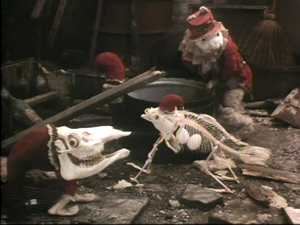
Alice is suffused with a marvelous imagination. Many of the characters are museum specimens. The White Rabbit begins as a stuffed creature in a Victorian glass case, freeing himself by pulling up the nails that keep him rigidly posed. Breadrolls sprout quills made of nails, and unnatural skeletons of creatures straight out of a Bosch painting creep about.
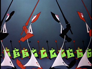
Švankmajer takes advantage of the mingling of two-dimensional figures based on playing cards and three-dimensional figures in ways that few adapters of Alice in Wonderland have managed, as when the White Rabbit passes the Queen of Hearts in a stage setting built of painted flats:
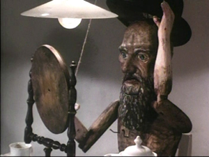
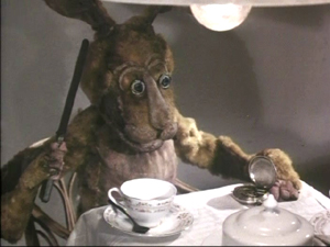
The Mad Hatter in Švankmajer’s film is definitely not Johnny Depp. He’s an antique wooden puppet of the sort that often crops up in the filmmaker’s work. He’s also not as loquacious as the chap in the book. The March Hare, who is definitely mad, steals the scene from him. Buttering a watch’s innards is a pure Švankmajerian gesture.
Alice was Švankmajer’s first feature film. In it he mixed live-action in with the stop-action more than in most of his shorts, presumably in part as a way to save money in making a much longer film. When Alice is full-size, she is played by a real girl, but when she shrinks she becomes a pixilated doll. It works well in this case, but the filmmaker depended more and more on live-action in his later features, like Faust (1994), with animated interludes becoming rarer and rarer. I found these features less entertaining and original and more heavy-handed in their social commentary. (The shorts contained vicious satire, but it was often rendered in bizarre, striking ways that made it palatable.) After thoroughly disliking Conspirators of Pleasure (1996), I gave up on his new films and stuck with the old ones. He’s making one now, called Surviving Life, which he apparently has said will be his last.
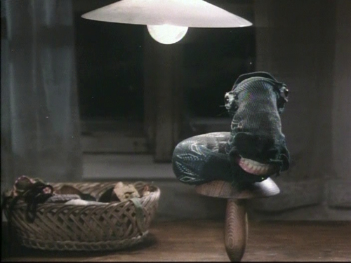
A final word on Alice. As should be obvious, this isn’t your charming adaptation for children, at least small ones. Alice points that out during the credits, “Now you will see a film made for children. Perhaps.” Most kids these days seem to be more hard-boiled than in my youth, but seeing this film at age 10 would have left me with nightmares. The White Rabbit, scarier than any fuzzy little bunny I’ve ever seen (including the one in Monty Python and the Holy Grail), runs around with scissors, quite willing to obey the Queen of Hearts’s order, “Off with her head!”; the little skeleton creatures crawl over Alice; and creepy glass eyes give staring life to inanimate objects like the Frog Footman or the sock that turns into the Caterpillar:
They tend to stare right out at us, too.
Tati on Parade
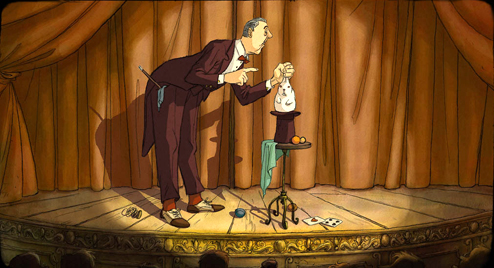
Most readers of this blog will be familiar with the great Jacques Tati. But it was news to me that he had left an unproduced screenplay, finished in the 1950s and now adapted by French animator Sylvain Chomet. Those who saw Chomet’s first feature, the 2D animated film The Triplets of Belleville (2003), probably noticed the occasional Tati homage lurking in the backgrounds and on the walls. Now Chomet’s admiration for Tati has emerged front and center in his second animated feature. The Illusionist‘s protagonist is modeled directly on Tati; he’s a old-fashioned magician eking out a living in the fading world of music-halls. (The Russian trailer has been posted here; apparently that’s the only footage on the internet so far.)
The Illusionist premiered at the Berlin Film Festival this year and met with a warm reception from critics. Writing in Screen International, Lisa Nesselson calls it “a delightfully bittersweet valentine to the music-hall tradition” and says that its animation “simply could not be better” (March, 2010 issue, p. 62). Leslie Felperin’s Variety reviews dubs it “a very happy marriage of Tati’s and Chomet’s distinctive artistic sensibilities.”
While we are waiting for an American distributor to pick up the film (ahem!), let me recommend Tati’s least-known feature. After his financial difficulties in the wake of Play Time‘s high budget and tepid box-office performance, the director set out to make Traffic, his last film featuring his M. Hulot character. Funding on this film collapsed midway through shooting, but Swedish TV stepped in and bailed the production out. Traffic came out in 1971, and in exchange for the assistance Tati made the 85-minute telefilm Parade (1974).
It has been available on French DVD (now out of print), but now the British Film Institute has released its own edition. The transfer isn’t the greatest, though it seems to be the same or similar to the French version. It smooths over the peculiarities of the original film. David and I saw it in 35mm in Brussels (where we also saw The Triplets of Belleville). It was obvious that while most of the film had been shot on somewhat fuzzy video in front of a live audience, some acts had been staged in a studio on crystal-clear 35mm. It was an oddly mixed format for an odd film. The BFI version also features optional English subtitles. Given the paucity of audible speech, they don’t seem vital.
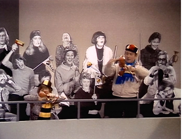 After the audience files in and takes their seats and an opening parade introduces the main acts, Tati steps forward as emcee and informs the spectators that they will be as much a part of the show as the performers onstage. Sure enough, the audience has been staged by Tati, accoutered in outrageous, colorful outfits and instructed to turn their heads back and forth rhythmically during his tennis routine or to bounce balloons around. Occasionally “ordinary” people from the stands step forward to challenge the acts onstage, trying and sometimes succeeding in out-doing them in magic or musical performances. The black-and-white life-size cutout people that had been used as extras in the backgrounds of scenes in Play Time return here as prominent members of the audience and even the stage acts. In the scene of Tati’s mime of a goalie (see below), the cutouts provide an unmoving backdrop to the action.
The BFI DVD includes a brief but informative booklet with essays by Philip Kemp and Jonathan Rosenbaum. As Kemp 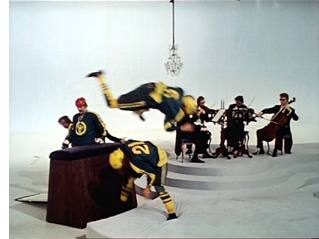 points out, the acts out of which Tati built his film are, apart from himself, not much to boast about: “His colleagues’ juggling, acrobatics, and, literally, horseplay (much use is made of an upright piano that doubles as a vaulting-horse) are diverting but nothing special.” Yet that, I suspect, is part of the underlying strategy. The film is quite Tatiesque, despite its lack of M. Hulot or a real plot. The juxtaposition of the three separate spaces of the audience, the stage, and the carpenters’ shop directly abutting the performance space, allows the creation of the sort of visual jokes that Tati loves. It also permits a flow between roles, as when the “carpenters” emerge briefly to juggle with their brushes or to play their tools like xylophones before returning to work. All these performers are quite good, but really great acts would distract from the best act of all: Tati’s overflowing visual imagination.
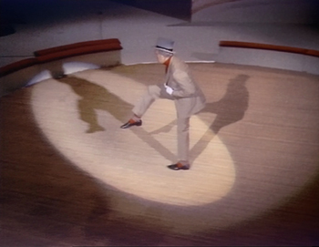
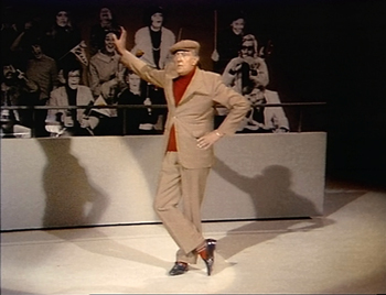
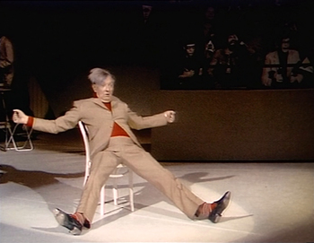
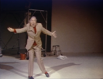
Ultimately, though, the main boon of Parade was to preserve for posterity Tati’s famous series of sport-based pantomimes that he had developed in the 1930s, when he was a successful stage performer. He started off on the same music-hall stage that he celebrates in Parade and now, posthumously, in The Illusionist. Some of these mimes, such as the man-and-horse trick rider, the over-confident goalie, the over-the-hill boxer, or the disappointed fisherman (bottom) may have remained unchanged across Tati’s career. (After he became famous as a filmmaker and actor, he often had the chance to perform these brief skits on TV variety and talk shows.)
Horse-man
Goalie
Boxer between rounds
Tennis in slow motion
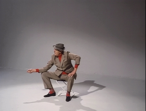
There’s one magic moment in these mimes, however, that Tati presumably updated. During the tennis match, he lapses briefly into slow motion. Not a slow motion achieved in the camera, which keeps running at normal speed. No, he mimes a player as seen in slow motion, quite convincingly and yet moving in ways that one wouldn’t consider possible for the human body. It’s hard to describe, but believe me, it’s amazing to watch.
Tati’s performances as the postman in Jour de fête or as Hulot in the four films featuring that character are usually not flashy. They’re designed to merge into the story and make the hero one of many amusing characters in an ensemble. But in Parade, with the pantomimes performed outside a narrative context and primarily against dark or blank white backgrounds, we can savor the man’s dazzling skill. His utter control of every gesture echoes his directorial mastery of every stylistic component of his films. In Parade, the moments when he tries to subdue a flapping fish before it escapes or when his head snaps back in reaction to an imaginary opponents’ blows are mindboggling in their precision. He was a great actor before he was a great filmmaker, and fortunately that early skill lingered long enough to be recorded.
Gone fishing
Sticky splices and hairy palms
Venusville (Fred Worden and Chris Langdon, 1973).
DB here:
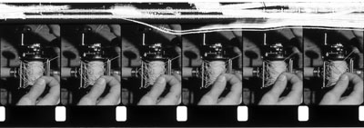
Just as CDs gave us a taste for sterile sound, the DVD has made us prize the clean image. We like sleek, hard-edged frames that look good on computer monitors and home-theatre screens. So who would put up with a shot like the one surmounting today’s entry?
 Mark Toscano, for one. He’s a film preservationist for the Academy of Motion Picture Arts and Sciences Film Archive. Among other tasks, he searches out and preserves experimental and avant-garde cinema, particularly work from West Coast filmmakers. And he savors shots like that hairy palm.
We normally think that someone preserving a film must at the minimum do a cleanup—remove all the specks, hairs, rips, and bad splices—before going on to more serious fixing, like correcting faded color. But what if the filmmaker left in the dirt and glue blobs deliberately? Or what if the filmmaker developed a fondness for the wear and tear that the movie accumulated over years of use? What’s a dutiful archivist to do?
The virtues of degradation
Mark is aware that archivists can have a big impact on film culture. By selecting films to save, they expand the canon and invite researchers to consider work that might otherwise be missed. “A curator’s enthusiasm can fuel new scholarship.” So part of Mark’s mission is to bring the inventiveness of lesser-known avant-garde filmmakers to new prominence.
Surprisingly, sometimes the archivist has to convince a filmmaker that work is worth saving. Robert Nelson had decided that most of his films were of little interest and in 1999 began redoing some and even destroying others. The scrapes you see on The Awful Backlash (above), a film about a tangled fishing reel, are the result of Nelson’s decision to rub out parts of the soundtrack.
Above all, a preservationist can widen the audience by programming collections like the one Mark brought to our Cinematheque last week. His Friday program was a feast of LA experimental film from the 1960s and 1970s. The menu ranged from gorgeous abstractions like Fred Worden’s Throbs (1972) and Pat O’Neill’s 7362 (1967) to exercises in dry wit like Morgan Fisher’s Turning Over (1975), about the momentous instant when a car’s odometer flips from 99,999 miles to 100,000. There was Kathy Rose’s Mirror People (1974), a sinister exercise in fairy-tale animation, headcomix-style, and Diana Wilson’s charming stop-frame still life Rose for Red (1980). One of the program’s implications was that on the Left Coast, avant-garde films were less cerebral than the official classics of the East Coast establishment. Films like David Wilson’s Stasis (1976) and Gary Beydler’s indescribable Pasadena Freeway Stills (1974) show that Structural Film could offer sheer entertainment. Mark’s notes on several of these titles can be found here.
The day before the screening, Mark gave a talk to our departmental colloquium called “Print (de)Generation.” He was paying ironic homage to our colleague J. J. Murphy’s 1974 classic, Print Generation (which Mark is restoring). But his title captures as well the problems of preserving films that don’t aim at pristine imagery.
If you assume that your job is to find the best existing form of the film and conserve that, what do you do with experimental work? Sometimes the films are designed to look messy. Sometimes they acquire a wear and tear that is like the patina on a sculpture or piece of furniture, when the signs of time’s passing become part of the texture of the piece.
Mark gave many examples of the decisions he faces in preserving the deliberate roughness of some work. Ben VanMeter (in spirit and approach, Mark feels, the most classically hippie West Coast filmmaker) corrugated the film strip of Acid Mantra; or, Rebirth of a Nation (1968). The legendary but little-seen Maltese Cross Movement (1967) by Keewatin Dewdney is a dazzling exercise in process structure, and the speckling on the images comes from creative choices. Shots were intercut with black frames—not black film frames, but frames dabbed with opaque paint. Inevitably, flakes of paint migrated across nearby footage.
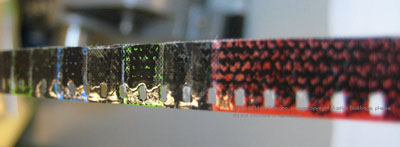
Brakhage’s films call for special delicacy. Mark showed lovely photos of film strips that Brakhage had painted upon, or welded together with thick splices that look like chain mail, as in the fourth reel of 23rd Psalm Branch (1967).
The Garden of Earthly Delights (1981) incorporates bits of grass, ferns, and insect wings.
How do you preserve such a thing? Brakhage endlessly revised some of his work, and came to appreciate the flaws that reprinting shooting and editing introduced into a film. When Mark called him about eradicating a hair that had crept into Flight (1974), Brakhage replied: “That hair is the axis around which the entire film revolves.” [Please see PS at bottom of post.]
Feelthy peectures
Mark’s talk highlighted Chris Langdon, a little-known Cal Arts filmmaker who worked with John Baldessari, Robert Nelson, and Fred Worden. Worden collaborated on Venusville, (1973), a deadpan satire on Structural Film. Shots of a palm tree tremble in front of us, while we hear puzzled comments from offscreen filmmakers. The image gets grubbier as the film proceeds, as if the viewers were looping it in their search for clues.
Langdon’s work vividly displays the West Coast impulse to hold nothing sacred. You would think that the endlessly self-ironizing Warhol was beyond teasing, but Bondage Boy (1973) makes a good try. We see a fellow wrapped in plastic and chains and struggling half-heartedly while assuming some fairly un-erotic postures. The soundtrack is “These Boots Are Made for Walking.” Langdon made fifteen to twenty films per year in a great many styles, and even created trailers for some of them, including Bondage Boy. She also came up with trailers for unmade films, as in Love Hospital Trailer (1975; above).
Mark’s passion and persistence brought Langdon’s films back to notice very recently, at a Redcat retrospective curated by Mark, Steve Anker, and Bérénice Reynaud. “I guess I was just a little incredulous that anyone would remember those films, and a little wary about it, to be honest,” said Langdon, who now prefers to be known as Inga. “But after a while, I thought it was pretty cool.” Scholars will be lining up to write about her work, with its wild humor and ties to Structural and Punk cinema.
You might not expect the Academy to preserve avant-garde cinema, but it’s a great testament to the institution that it cares so much about all kinds of film. Mark generously praised his colleagues Mike Pogorzelski and Joe Lindner (both Wisconsin alums), who support his efforts. In turn, we’re grateful to people like Mark who devote themselves to recovering films in a way that respects filmmakers and their work—especially when that work seems defaced or distressed. He teaches us that imperfections aren’t always faults. Everything in the world spoils eventually. Why shouldn’t artists acknowledge that? No surprise to learn that Mark owns few CDs but hundreds of LPs. He’s a master in bringing the Vinyl Aesthetic to film.
Mark Toscano keeps a blog titled “Preservation Insanity,” with more images of despoiled imagery, here.
Film preservation and restoration have formed a running thread for Kristin and me, from our trips to Bologna’s Cinema Ritrovato to our reportage on visits from archivists like Grover Crisp.
Currently there’s a blogathon on preservation sweeping the Internets. You can read about it at the Self-Styled Siren and Ferdy on Film, both of whom are keeping running tally on the entries. Please consider contributing to the National Film Preservation Foundation.
You can read more about the West Coast experimental tradition in David E. James, The Most Typical Avant-Garde: History and Geography of Minor Cinemas in Los Angeles (Berkeley: University of California Press, 2005) and Chapter 6 of Paul Arthur’s A Line of Sight: American Avant-Garde Film since 1965 (Minneapolis: University of Minnesota Press, 2005).
PS 19 February: Marilyn Brakhage posted this correction to the Frameworks listserv (ellipses in the original):
I’m glad to see Mark’s work getting some more, deserved attention. However, after reading the blog (which I can’t seem to respond to directly) just thought I’d mention — for the sake of historical accuracy — that the comment from David Bordwell that “Brakhage endlessly revised some of his work . . . ” is simply not true. When a work was done, it was done, and he moved on. He did not re-make/re-edit old work like some filmmakers do. . . . Perhaps Mr. Bordwell was thinking of the inevitable problems in print variation coming through the labs over the years (that the filmmaker, of necessity, had to adjust to), or the “translations” that resulted from blowing up 8 mm to 16 mm versions for distribution purposes. But I wouldn’t call that “revising” his work. (I’m sure he wanted the “translations” to be as true as possible to the original.) . . . And the hair that had “crept into Flight” was there from the beginning — accepted and used by Stan when he began to edit the film. It wasn’t something that happened over time.
I regret my misunderstanding of Mark’s remarks on the subject, and I’m grateful to Marilyn for setting the record straight.
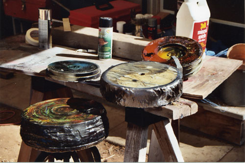
Robert Nelson’s painted and resin-sealed cans of film. Another approach to preservation? Images courtesy Mark Toscano.


