Archive for the 'Festivals: Vancouver' Category
Vancouver: First sightings
Big Tech as Pac-Man: The New Corporation: The Unfortunately Necessary Sequel (2020).
DB here:
Every festival has had to adjust to COVID-19. This year the venerated Vancover International Film Festival continues with some in-person events at the VIFF Centre and the Cinematheque, but most of the screenings are done remotely. The streaming resource is available only in British Columbia and is a wonderful option for regional cinephiles.
Over the next two weeks, we’ll continue our annual tradition of covering some of the outstanding films mounted by this superb festival. As usual, we hope to guide local viewers while the event is in progress and to signal readers about upcoming releases in their territories.
Deep dives
Undine (2020).
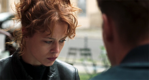
No lyrical drone vistas, no establishing shot, no title telling us where and when we are, no voice-over trying to lure us in. Just bam, here it is, deal with it. Any movie that starts with a reaction shot in OTS (over the shoulder) of a fiercely downcast woman gets points automatically. The fact that she goes on to threaten to kill the man she’s talking to is just a bonus.
That threat, made by the protagonist of Christian Petzold’s Undine, is about the only hint that she’s capable of homicide. She seems otherwise a well-adjusted young woman free-lancing as a guide in Berlin’s Urban Development Center. As in other Petzold films, thriller conventions are invoked but suspended while a deepening personal drama emerges. At first, we tag along with Undine in her rebound-affair with Christophe, an engineer specializing in repairing underwater equipment. All is going well enough, but there are signs of trouble, particularly a near-death experience in a lake. Then, after the midpoint, tension ratchets up with two quick twists that put new pressure on Undine to take violent action.
Sorry to be so oblique, but this is one of those movies with a real plot, and since it’s eventually coming to the US, I’m avoiding spoilers. Admittedly, the last twenty minutes take off into new territory, and I found myself unable to know what to expect next. (It’s one of those movies that seems to end several times. That is often a good thing.) But the unruffled precision of Petzold’s direction, the thriftily paid-out backstory, and his gift for suspenseful storytelling mitigate the quasi-supernatural tint of the twists. I tend to see them as GOFAC (Good Old-Fashioned Art Cinema), ambiguous moments that may flow from the characters’ imaginations.
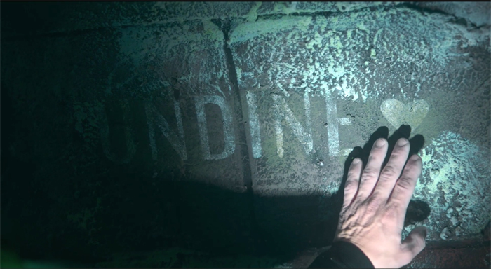
An undine is a water nymph, the heroine’s lover is a diver, her job is to lecture on the rebuilding of Berlin over the years, and his job is to explore a submerged city (which hosts a slab bearing her name). All this was for me a reminder that ambitious directors can invest genre conventions with poetic lyricism. Admirers of Barbara (2012), Phoenix (2014), and Transit (2018) will need no urging to visit a film I found completely absorbing.
A film from two billion years from now
Last and First Men (2020).
On the visual level, Jóhann Jóhannsson’s Last and First Men is a good example of what we call “abstract form” in our book Film Art. The filmmaker builds a film out of patterns of sensuous visual qualities. Everyday objects can yield these qualities (our example is Ballet Mécanique), but abstract form can also be found in unusual, even unidentifiable sources.
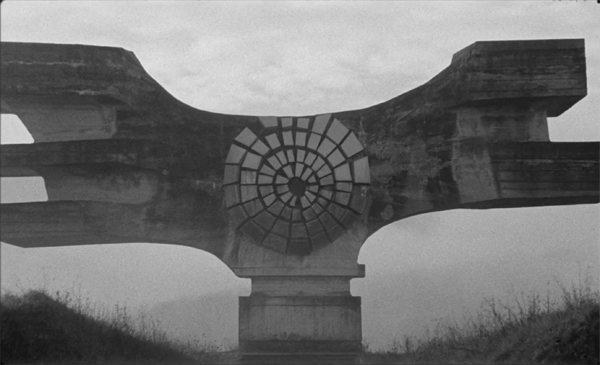
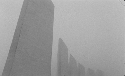
That’s what we get here. The shots reveal structures and textures in immense, brutal constructions of metal, stone, and cement. Are they sculptures? Totems of some bizarre religion? Remnants of blasted modernist buildings? Fragments of space ships crashed to earth? The moving camera reveals their shapes, textures, and off-kilter strains for symmetry. You lose all sense of scale: these might be the size of dinner tables or tabernacles. Most are set against the sky, alternately misty or searingly bright.
No story connects our views of these strange monuments. On the soundtrack, though, a woman’s voice recounts the history of the future. After two billion years, the narrator represents the “eighteenth species” of humans, and via telepathy she informs us of the impending end of human life on Neptune.
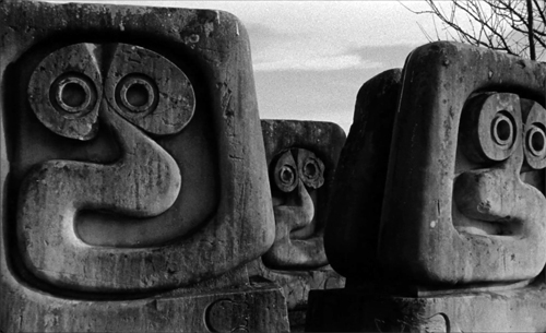
We never see any of those events, just the ruins calmly surveyed by the camera. Almost never does the commentary sync up with the shots. The woman’s account of future humans might at first seem to match the carved, staring blocks we see, but she goes on describe them as furry or translucent.
The disparity between description and depiction emphasizes the gap between tracks.
For most of the film, then, we have a split. The image track explores abstract, nonnarrative form. The soundtrack supplies a narrative, actually a Very Grand Narrative. The text, it’s revealed in the credits, comes from Olaf Stapledon’s 1930 science-fiction novel, Last and First Men.
There’s yet a third layer. Jóhannsson, a brilliant composer who died in 2018, gave us memorable concert music and film scores (Sicario, Arrival, The Miners’ Hymns). Along with the voice-over we hear a sometimes radiant, sometimes jarring orchestral accompaniment created by Jóhansson and electronic composer Yair Elazar Glotman. The music doesn’t cooperate much with the voice-over. As the commentary proceeds with a businesslike dryness, the music often flows and eddies on its own course.
The fact that the three channels of picture, voice, and music seldom converge actually sets your imagination free. There’s no need to see the images as illustrating the text, or the music as operatically enhancing either one. We’re allowed to keep the realms separate, or to test obscure correspondences. We can, for instance, see the expressive qualities of the shots as enduring remnants of human will–eccentric, obstinate, and obscure as it can be. The music’s alternation of drone passages, scraps of choral lyricism, and ominous rumbles might seem to chart humans’ up-and-down fate in the late Anthropocene. The narration, recited by Tilda Swinton, adds a quality of stoic dignity to the mix. And you’re invited to try out metaphors, as when cavities in what seems to be an elongated cathedral suggest eyeholes for staring across space.
The disparity of channels is enhanced by another mystery I haven’t seen mentioned in reviews. The images betray their origins on 16mm film. There are light leaks on the frame edges, specks of white suggesting dust on the negative, and even bits of grit and hair in the aperture. Perhaps you can see the hair snagged in the upper right of the image below.
These flaws have not been digitally removed. Indeed, the film’s opening moments linger on black frames flecked with white dust, priming us to watch for faults in these images.
The effect is to add an archaic quality, as if this is all found footage from long before the end recounted on the soundtrack. Since the narrator tells us that humankind goes through many near-extinctions until the big one, these relics may be from one of those future collapses–or, perhaps, from our own past, remnants of a calamity we’ve forgotten. The text speaks of “the debased rites of your religions long ago,” and those big-eyed humanoids are reminiscent of Australian aboriginal art.
In all, it’s a bleakly beautiful experiment. The film premiered with live orchestral accompaniment in the 2017 Manchester International Festival, and it must have been hypnotic. The film and soundtrack are now available on a CD/Blu-ray combination, as well as on vinyl.
Meet the New New Boss, same as the Old New Boss
The New Corporation: The Unfortunately Necessary Sequel (2020).
The scathing 2003 documentary The Corporation took seriously the idea that corporations were persons. Their behavior, considered clinically, is that of a sociopath. Now Joel Bakan and Jennifer Abbott’s followup shows how the 2008 financial crisis provoked corporations to rehabilitate. Hip CEOs admit the existence of racial bigotry, income inequality and the failures of conservative government. The solution? More corporate power. Did this make them any less dangerous?
Nope. Multinationals shape government policy as vigorously as ever, especially in the era of Trump and other demagogues. But the corporations’ new message is soft power. Posing as socially committed, emphasizing stakeholders as well as shareholders, Big Business is (a) trying to convince consumers that it’s on their side; and (b) arguing that the New Corporation will correct the shortcomings of government policy through privatization. In other words: We’ve learned our lesson. We get it. So let us run things. Besides, what choice do you have?
Bakan and Abbott shrewdly show that this ploy neatly fits an updated clinical symptom of the sociopath: “Use of seduction, charm, glibness, or ingratiation to achieve one’s ends.”
The film begins with a fascinating visit to the Davos Forum, where air-kissing one-percenters solemnly assure us that everybody wins when a corporation acknowledges the public good. The star player is Jamie Dimon, CEO of JP Morgan Chase. Having helped crush American cities in the financial crisis (and paying a derisory $13 billion fine), he is now playing rescuer by supporting the rebuilding of Detroit, to the benefit of his company’s image. The film goes on to trace how the public face of caring executives is belied by business as usual, most savagely British Petroleum’s catastrophes in Texas City and at Deep Water Horizon.
Bakan and Abbott marshall a great deal of evidence to show how the plutocracy, and especially those in the digital technology sector, have turned a market economy into a market society. For us, the role of worker-consumer redefines the other dimensions of civic life. You work without union protections and scramble to keep up. You give your personal information to Facebook, Google, and Amazon in exchange for convenience and lower costs. (The old adage holds: If something is free, the product is you.) Schools, postal delivery, war, water, and relationships are all ripe to be rendered as private enterprise. With AI algorithms, the customer-customized milieu of Minority Report is already here.
Talking heads, from Chomsky and Robert Reich to Diane Ravitch and Vandana Shiva, offer pithy critiques, and footage garnered from around the world illuminates each of the points in the Corporate Playbook. As a counterweight, later portions of The New Corporation show some pushback. Katie Porter poleaxes Mr. Dimon in a House hearing, and we glimpse AOC in her usual passionate eloquence. Still, the emphasis falls less on pols and more on citizens who struggle against corporate power.
Occupy Wall Street and the Bernie Sanders campaign are shown to be as important to the left as the Tea Party was to the right. The filmmakers give special attention to the efforts of many tough, idealistic people to run for public office. As one commenter puts it, “Even in the worst situations, people always fight.” In a remarkable passage, a dopy prankster from The Corporation is shown to have become a proud progressive after seeing the first film and joining the Sanders campaign.
The film is startlingly up-to-date, incorporating events around the George Floyd atrocity and the Black Lives Matter street actions. Some will say that the late sections drift a bit from the film’s core message of analyzing the fake social concerns of the New Corporation. But income inequality and environmental destruction, central drivers of new social movements, are invoked in corporate PR as vital concerns for companies’ new image, so the final sequences don’t seem to me tacked on. They show what real social engagement, as opposed to panting coverage in Forbes, looks like.
Where do you start? someone asks in Tout va bien. The answer: Everywhere at once. I think The New Corporation indicates that this might just work.
The three films I’ve discussed are exemplary of the strengths that have characterized the Vancouver festival for its 39 years. Here you can plunge into international auteur cinema, unusual experimental work, and documentaries committed to our noblest aspirations. Programmers Alan Franey, PoChu AuYeung, and their colleagues scour the world for provocative films, and the results have taught Kristin and me lessons about cinema we wouldn’t have learned otherwise. It’s worth noting that VIFF’s welcome to Canadian cinema has always been fruitful: The New Corporation, like its predecessor, is a British Columbia production and is featured in the festival’s ongoing True North series.
Fourteen years ago I wrote that Vancouver was the very model of a regional festival, at once deeply local and unpretentiously cosmopolitan. It still is. Take that, corornavirus! Nothing stops dedicated film lovers.
Thanks to Alan Franey, Jane Harrison, and their colleagues for their help during the festival.
A sensitive review of Undine is offered by David Hudson at the Criterion Daily.
A note on Last and First Men: In watching the film, I found myself constantly asking if these structures really existed, or whether they were CGI creations or miniatures or objects purpose-built for the film. Some reviews have revealed their secret identity, and knowing what they are does raise some interesting thematic implications. But I’m refraining from telling you because I think your first encounter with the film ought to include that mystery about what exactly you are seeing. If you want to know what they are, Google is at your service. There’s also this spoiler-filled behind-the-scenes video.
Jennifer Abbott has another documentary in this year’s festival: The Magnitude of All Things. I look forward to it.
Undine (2020).
THE LIGHTHOUSE: A period film with period style
Kristin here:
David and I first saw Robert Eggers’ The Lighthouse at the Vancouver International Film Festival, and he wrote briefly about it at the time. About halfway through the screening or less, I realized that what I was watching was a modern combination of two important historical trends of 1920s German cinema: Expressionism and the Kammerspiel.
I am partial to German silent cinema, particularly Expressionist films, for their daring stylization. The movement gave rise to some great films by two masters, F. W. Murnau and Fritz Lang. I’m even fond of the leisurely pacing that characterizes so many Expressionist and Kammerspiel films. At times some scenes resemble the slow cinema of recent decades.
Kammerspiel was a larger trend in the theater of the day, and it has its equivalent in English and American drama, the chamber play. Most of the Kammerspiel films in Germany were written by the great scenarist Carl Mayer, also responsible for many of the Expressionist classics from Das Cabinet des Dr. Caligari on. Kammerspiel films include most notably Hintertreppe (Backstairs, Leopold Jessner, 1921), Sylvester (1923) and Scherben (1923). Some would consider Murnau’s The Last Laugh (1924) to be a Kammerspiel. Carl Dreyer also made one in Germany, Michael (1924, with a scenario by Thea von Harbou) and one in Denmark, The Master of the House (1925). Such films typically involve a small cast of characters who come into conflict in various ways, invariably ending badly, typically with death, suicide, murder, and/or imprisonment. The Lighthouse clearly qualifies.
The Lighthouse is also a horror film, or at least a lot of critics think so. Thus it fits cozily into the Expressionist movement, of which several Expressionist films are now considered early classics of the horror genre: Caligari, Nosferatu, Der Golem, Warning Shadows, Die müde Tod and other less well-known films.
Critics did not fail to notice The Lighthouse‘s links to silent cinema, and in particular Expressionism. Richard Newby’s review in The Hollywood Reporter remarks on: “The filmmaker’s decision to shoot the film in black-and-white and in the aspect ratio of 1.19:1, giving The Lighthouse the appearance of a silent film born of German Expressionism.” He also calls it, “Equal parts Lovecraftian horror story and existential chamber piece in the vein of Jean-Paul Sartre’s No Exit.”
Screen Daily reviewer Lee Marshall caught both the Expressionist and Kammerspiel aspects:
Shot in an expressionist black and white that harks back to cinema’s earliest years, The Lighthouse provides a marvellous chamber-drama platform for two actors, Robert Pattinson and Willem Dafoe, who seize the opportunity with gusto.
[…]
Referencing everything from German expressionist cinema of the 1920s to US silent comedy, the photography of Edward Weston and the from-the-ground-up perspective in the paintings of Andrew Wyeth, Jarin Blaschke’s photography is starkly compelling.
Manohla Dargis’ review in The New York Times explicitly notes German Expressionist cinema:
With control and precision, expressionist lighting and an old-fashioned square film frame that adds to the claustrophobia, Eggers seamlessly blurs the lines between physical space and head space.
The film’s more sustained pleasures, though, are its form and style, its presumptive influences (von Stroheim’s “Greed,” German Expressionism), the frowning curve of Winslow’s mustache, the whites of eyes rolled back in terror.
One might add that the dreams and hallucinations, shown from Winslow’s viewpoint, reflect the innovations of French Impressionist cinema of the 1920s. This sort of stylistic subjectivity, however, was highly influential and has been widely used ever since. It was quickly picked up in German cinema of the 1920s, and some of the classics of the day, especially The Last Laugh (1924) and Variety (1925), are more noted for their subjective camerawork than are the earlier French films that originated the practice. Overall, The Lighthouse has the flavor of a German film from the 1920s.
Lots of filmmakers have attempted to imitate silent cinema, and often they succeed to a degree. They shoot in black-and-white (but don’t add tinting and toning), put just music and maybe some sound effects on the track, and have some exaggerated acting. Perhaps they set the story in the past, as Michel Hazanavicius does with The Artist (2011). A more careful attempt is Blancanieves (2013).
No matter how careful the combination of such elements is, the result usually doesn’t really look like an old film. The Lighthouse really does look like a silent film, in the sense that it looks as if it were shot using the film stock available in that era. It does not, however, pretend to be a silent film, as The Artist does. The Lighthouse doesn’t eliminate the dialogue. Its narrative and tone bear distinct resemblances to those of German and French films of the 1920s, but its story is presented with more overt sexual content and extreme violence than mainstream silent movies would have included.
It helps that Eggers is clearly a cinephile and has watched a wide variety of films from many periods. Cinematographer Jarin Blaschke has also worked as a still photographer and also knows a great deal about older film stocks and lenses. They both knew a lot about films of all periods.
When asked in an interview for American Cinematographer what were the team’s “references” (films shown to crew members as models), Blaschke responded:
A bit of Béla Tarr for tonal dreariness and patient use of camera. Bergman’s camera language, as always. [Eggers’ liked the strong night lighting of In Cold Blood. There were some nautical silent films, including Flaherty’s Man of Aran, [which was shot] on orthochromatic stock with strong, direct close-ups. [The influence of] Eisenstein was there for montage, and bold, hard cuts. Optically, the films we watched from the ‘20s and ‘30s were very appealing in their subtle fringe distortions and the way highlights would shimmer. [p. 63]
In the end, the most influential references were M—an inspirational and modern film in terms of visual language—and Bresson’s Pickpocket, which influenced [our] use of close-ups, especially actions with hands. These helped steer The Lighthouse away from the purist confines of the turn of the century, and more toward early modernism.” [pp. 63-64]
M seems rather an odd choice, but Blaschke describes its inspiration in an interview for Kodak:
Watching that, I found a very modern film with surprising camera movement but more importantly: a modern, creative mastery in how visual information was withheld from the audience, how information was rewarded, and when,” says Blaschke. “With this new inspiration, I felt there was a highly-effective framework for me to express myself visually. Stepping away from a mere 19th-century emulation, we were on to something more surprising and layered.
In a DGA podcast interview, Eggers discusses the nearly-square aspect ratio:
And then, the boxy aspect ratio, we were shooting in 1:19.1, early-sound aspect ratio. There’s a Pabst film, Kamaradschaft, that takes place in a mine, which is probably the only other film that makes sense to use this aspect ratio, because Pabst is shooting vertical objects, like the smokestacks, and we have our lighthouse tower, and then the cramped mineshafts, and then the cramped interiors of this thing. Because we’re using spherical lenses, it’s actually taller, so it’s a great aspect ratio for these close-ups. You don’t need flab on the side. You just have Robert Pattison’s cheekbones, Willem Dafoe’s cheekbones in all their glory on these old lenses.
Who knows what other films are these two are familiar with? But one can assume that they watched some of the classic German films of the 1920s, both Expressionist and Kammerspiel.
The Lighthouse and German Silents
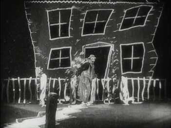
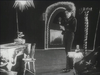
Early German Expressionist films often used jagged, abstract sets, more like paintings than like actual buildings or landscapes. Caligari is the most familiar instance, but here are a couple of examples from Von Morgens bis Mitternachts (1921, Karlheinz Martin).
The second image demonstrates particularly well how light was often represented by streaks of paint. The overhead hanging lamp at the upper left is a fringe of spikes, and the flames on the huge candlestick at the left are five wisps of paint. Highlights from these “lights” are painted on the desk and chair at the lower left.
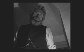
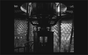
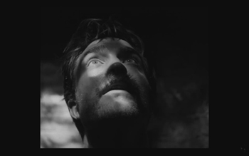
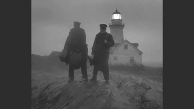
Hollywood films have seldom used distorted sets of this kind. They appear occasionally, as in Son of Frankenstein (1939, Rowland V. Lee) and Beetlejuice (1988, Tim Burton). Most of the time, though, when people speak of expressionist style in films noir or horror films, they’re talking about graphic effects created by lighting. That lighting is not created by streaks of paint but by fancy lighting effects. That’s mostly the case in The Lighthouse. The lighthouse tower and the service buildings around it were designed to be authentic copies of features in real historical lighthouses. The distorted stylization comes from lighting effects, from simple underlighting to patterns created by patterned holes in the lighthouse interior.
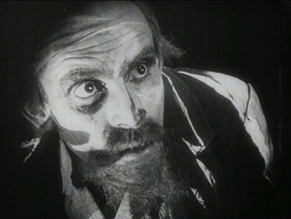
The same is true of acting. In German Expressionist films, actors’ faces were often painted, especially with dark patches around the eyes and pasty white skin. Compare this close-up of Ernst Deutsch’s face, as the Cashier in Von Morgens bis Mitternachts, with that of Robert Pattinson, where the distortions are created by light and shadow.
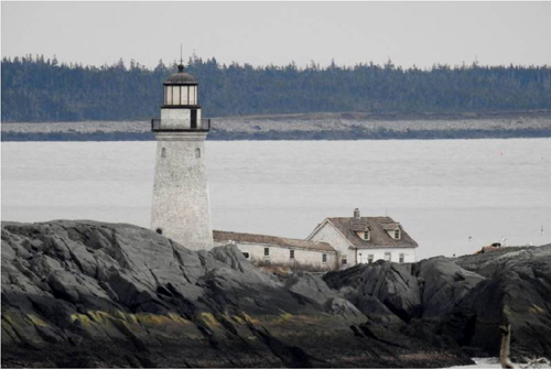
Most of the classic German Expressionist and Kammerspiel films were studio-created. Sets were built either in studios or on extensive backlots. In contrast, Eggers wanted to use an authentic lighthouse. Scouting failed to turn up one with adequate access roads, so the lighthouse and service buildings were built, with faithful adherence to period locales, near the tip of the Cape Forchu Lighthouse peninsula (down the road from a modern lighthouse).
This location is far from from isolated, but the film manages to create a sense of loneliness and dread nonetheless. The huge crashing waves and storms were not generated digitally but were practical effects. According to the Kodak story, “Most of the water work was shot in a large, emergency-responder’s training pool, capable of generating waves in varying sizes and patterns, located near Halifax.” The film contains a few digital effects, mainly to turn the peninsula into an island.
Eggers seems to share the sensibility of the German silent directors: “In a perfect world, I would have liked to have built every single building, for control, control, control, control, control.” (From the DGA interview)
As to Kammerspiel films, The Lighthouse reminds me most of Scherben, which deals with a man who works as a linesman for a railroad. He, his wife, and their daughter live in isolation in some woods and live a stultifyingly dull existence. The intrusion of a railroad inspector who seduces the daughter leads to drama as the linesman gradually becomes enraged and kills him. The style of the film is quite different from that of The Lighthouse, but the dynamics of conflict and gradual deterioration of the central character are somewhat similar–if more restrained in his slow burn and stolid demeanor.
Scherben only became generally available earlier this year, when I wrote about its Filmmuseum Edition DVD release. I have no idea whether Eggers ever saw it at an archive screening or in somewhere else. He more likely saw Hintertreppe, which has long been the only one of the classic Kammerspiele commonly accessible.
Bringing back orthochromatic, sort of
In the DGA interview, Eggers discusses the choice of film stocks:
We thought orthochromatic film stock would really be the way to go, which, among other things, the main thing about orthochromatic film stock is that it’s not sensitive to red, so red is rendered black. So the rosy skin tones on a Caucasian renders darker. So Eisenstein, that’s why all those Russian faces look so tan, and in Hollywood they’re wearing white pancake makeup to compensate for the orthochromatic stock [….] So we liked Double-X negative. The blacks bottom out suddenly in a way that’s very satisfying, as we remember it from watching old movies.
Apparently Eggers and Blaschke investigated having orthochromatic 35mm stock custom-manufactured for them, but the expense was too great. A cheaper way had to be found.
In the American Cinematographer interview, Blaschke describes testing Kodak’s Double-X 5222 35mm film, color 35mm negative film, and digital capture with an Arri Alexa: “In addition to much larger grain, the Double-X has more ‘tooth.’ Even if you match the overall contrast in the DI [digital intermediate], the Double-X had more ‘local’ or ‘micro’ contrast, which emphasizes texture and better differentiates similar tones” [p. 61]. (Double-X 5222 was introduced in 1959 and has been used on such films as Raging Bull [1980] and Schindler’s List [1993].)
Despite these advantages, however, Double-X is a panchromatic stock, with sensitivity to the entire visible spectrum. To solve this “problem,” Blaschke ordered a custom-made filter that would eliminate the red-to-mid-yellow end of the spectrum, thus simulating orthochromatic film effectively [AC, pp. 66-7].
The choice of lenses was also done with an eye to maintaining the artificial orthochromatic look. Blaschke tested many vintage lenses and settled on Baltars, designed in 1930s. The two used in the film were made in 1941 and 1944. In the Kodak interview, he says, “The vintage Baltars were the most shimmery of the bunch I tested, and really were the most stunning portrait lenses I have ever seen,” he says. “The highlights really glowed, but stopped just short of heavy-handedness. Optics like these could add a layer of complexity on top of our hard, orthochromatic look to pull people into the world of the film.” A rehoused 1905 50mm lens was used for some flashback images, and some replicas of 1840 Petzval lens designs were used in flashbacks and “heightened moments”[AC, p. 64]. Blaschke describes the effect in an interview on the Motion Picture Association website: “Blaschke says that for those more “out there sequences,” he had a special lens designed—called a petzval—that contains a lot of aberrations. “It creates a very squirrely look. The background almost falls out of focus, like a globe, and you get this very swirly effect.”
Lighting The Lighthouse
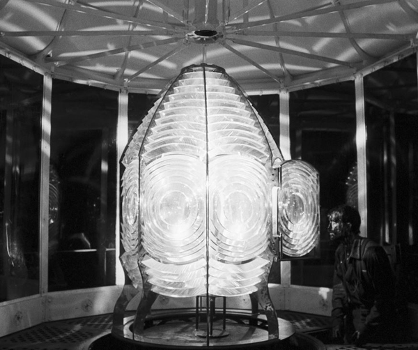
Those swirling light patterns you see on Pattinson’s face in the movie are a real phenomenon—we found ourselves just wanting to gaze into the Fresnel lens. We could have stayed all night staring into the light.
Robert Eggers, Cannes Press Release
Apparently the decision to set the film in the 1890s arose during the search for the ideal lighthouse. In an interview with Eggers in Architectural Digest, he remarks, “‘I wanted there to be a mystery in the light. Inside the beacon. So we knew we needed to set it in a period where we would have a Fresnel lens,’ he explains. Not many lighthouses still have functional ones today. ‘They look like Art Deco spaceships, and they are very magical and jewel-like. So we knew that was going to place us in the second half of the 19th century.'” (See the bottom for an image of the film’s custom-made Fresnel lens mesmerizing Winslow in the climactic scene.)
The decision to imitate orthochromatic film had a considerable impact on the lighting used. Ironically, it meant that a great deal of light from modern lamps, had to be used. Eggers admits as much in the DGA interview.
Obviously we weren’t lighting it like an old movie. We were lighting it using our practical fixtures, but of course, if this were an old movie, you would see the flame of the kerosene lamp and there would be a movie light lighting the scene. But what we did was we had a 600W halogen bulb on a flicker dimmer in all those scenes. And it was really, coming from Alexa and fast film stock, it was so bright. People were wearing sunglasses when we were doing night interiors.
Double-X is slow, even slower than color negative stocks. Modern digital cameras can typically shoot with less light than shooting on film requires. Putting together slow film stock, a filter (albeit one that cut down the light availability by less than one stop), and older, slower lenses meant that the cinematography crew had to use huge amounts of light, as a Variety interview with Blaschke explains:
Blaschke says he prefers to model his lighting in a real-life way, which was tricky on “The Lighthouse.” He and gaffer Ken Leblanc worked with Kodak Double-X stock — Blaschke calls it the only practical black-and-white film left after Plus-X was discontinued in 2011 — which is much less sensitive to light than even color film stock. Between the optics, the film stock and the filtration, Blaschke and Leblanc had to use about 15 to 20 times more light on set to get the look they wanted than on “The Witch,” which was shot on an Alexa.
“Even though it’s a very dark movie, the sets were actually blindingly bright,” says Blaschke. “We’d put 500- to 800-watt halogen bulbs in the lanterns that would flicker and were only a few feet from an actor’s face. The way we make movies now, people have gotten used to a very low light level; it’s trendy to shoot wide open, digitally at 800 or even 2,000 ASA. Our actors talked about how they couldn’t see each other sometimes, which I felt bad about.”
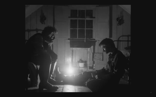
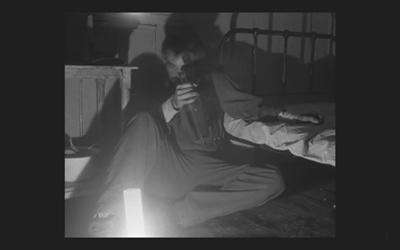
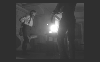
This halogen light is used in the night interiors, such as the scene of the drunken dance, below, and the later scene of the pair drinking in their shared bedroom, at the top of this section and the entry.
This combination of a very bright lamp with slow film and a filter cutting down part of the spectrum of light entering the lens meant that the light fell off very quickly away from the lantern. That effect is also very evident in these scenes. Backgrounds are dimly visible, and the actors often become silhouettes.
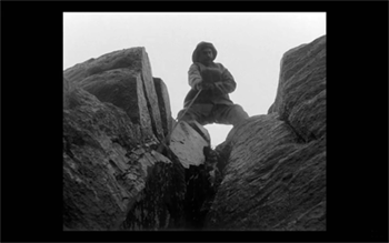
The result is a heightened sense of the two main characters being trapped together in small islands of light surrounded by blackness. We have no sense of how many lanterns the house contains, but we never see more than one at a time. At one point Winslow is seen in bed with a book, and the dim light from the window above him makes it hard to believe that he can see well enough to read. Even the daytime scenes are gloomy and gray. A low angle with the blank, light sky as rendered by the “orthochromatic” film makes Winslow and the dark rocks around him look nearly black.
Few silent films shot on orthochromatic film look this consistently dark, and it’s clear that the filmmakers were not simply trying to replicate the look of an old film. Blaschke admits as much in yet another of the many interviews on the film’s techniques: “It wasn’t about trying to make it look like older films but rather choosing a frame that lends itself to the tall and narrow sets and helps you visually withhold information from the audience. It also had a secondary effect of evoking compositions of 20th century modernist photography,”
In the DGA interview, after describing the various technical details of design, setting, and cinematography, Eggers explains:
This is fussy and it’s nerdy and it’s fun to talk about in this forum, but why do this? One, it says the movie’s old; it takes place in a time when black-and-white photography existed. But two, this is a bleak, austere story, and I feel like black-and-white is the best way to tell this story, and color is only going to mar things. Again, with this orthochromatic filter, it knocks our blue skies, which if we have them—which we really did—into something white and bleak and stark and harsh.
To get really nerdy about it, panchromatic film stock had largely replaced orthochromatic by the late 1920s and early 1930s, the only period in which a nearly square aspect ratio was standardly used. Moreover, the Baltar lenses were invented in the 1930s. Halogen lamps are a comparatively recent innovation in film lighting. So the combination of the ortho and the boxy look and the rest of it aren’t “authentic” in any strict sense. The filmmakers were not using lighting equipment of the 1920s or any modern equivalent. In short, they weren’t trying to replicate the look of any one specific type of old film. As a way of creating the illusion of an old film, as well as an appropriately grim tone, it works better than anything else I’ve seen.
A few final notes
First, I have seen The Lighthouse’s budget given as $4 million. That’s in the film’s Wikipedia entry, which cites an AP release from May 2019 that says only that the film’s budget was larger than that of The Witch but still modest. The New York Times ran a story about the film’s trailer in July, noting that the budget for The Witch had been $4 million, which Box Office Mojo also gives as the cost of the earlier film.
I have not been able to find a reliable figure for The Lighthouse’s budget, but clearly it was distinctly more than $4 million.
Second, according to Eggers in the DGA interview linked above, that’s real dirt (sifted to rid it of the odd pebble) that Winslow shovels down onto Wake in the climactic scene–not some namby-pamby ground chocolate. Not to mention that the puddle he’s lying in was frigid. Even the Expressionist actors didn’t go so far. The Academy should give Dafoe his Oscar already.
Third, watching The Lighthouse with a sell-out crowd in the biggest venue at the Vancouver International Film Festival, The Centre for the Performing Arts, was one thing. There people were eager to see this film, which had premiered in the Directors’ Fortnight thread at Cannes in May. It won the International Federation of Film Critics (FIPRESCI)’s prize for best film. It was quite another thing to watch it by myself during its run at a local multiplex.
The Lighthouse played at three multiplexes in Madison, with full-day schedules at each. It’s still playing at one of them, twice a day. I was alone when I saw it a few days ago at a 10:25 am screening. After being in a crowded festival audience, the second experience made me wonder how in the world such a challenging film made it into such wide release and how a more mainstream audience would react to it. (It maxed out at 958 theaters November 1-6 and has been falling since. Its gross through November 10 is $8,915,216 domestically; Box Office Mojo so far has no figures for foreign markets.)
The frames from The Lighthouse have mostly been taken from trailers. I have not cropped the frames reproduced above to their 1.19:1 format, since on theatrical screens, the audience sees the image as window-boxed, with black stretches on either side. (The exception is the bottom image, a press image released by distributor A24; it is either a frame with the black sides cropped or possibly a production still.) Perhaps Eggers and Blaschke’s idea would have been for theaters to move the screen’s masking to the edges of their images. Given the realities of modern exhibition, however, such versatility is not part of the screening technology. I found that the window-boxing on the big screen was a constant, subtle way to call attention to the unusual compositional results. What The Lighthouse will look like on various formats for streaming is hard to imagine.
Speaking of the aspect ratio, a number of critics have called 1.19:1 a silent-film format. In fact it was only used in the early sound era, when room had to be made on the filmstrip for the optical soundtrack; later the image was shrunk slightly into the classic Academy ratio of roughly 4:3. During the silent period there was no absolute standard ratio, though the image was in usually not far from the Academy ratio.
The American Cinematographer article cited is Patricia Thomson, “Stormy Isle,” AC (Nov 2019): 60-67.
In one of the quotations above, Blaschke says that Man of Aran (1934) was shot on orthochromatic film. This seems unlikely, given that Flaherty had made one of the first American features to use the new panchromatic film stock, Moana (1926). Kodak stopped making ortho in 1930. Possibly Flaherty, who started work on the film in 1931, did revert to ortho for it, but it seems unlikely.
Ernst Deutsch, who plays the Cashier in Von Morgens bis Mitternachts, was one of the great Expressionist actors of stage and screen. I have mentioned him before, for his role in Der Golem; when Von Morgens bis Mitternachts was released on DVD; and for his role in the non-Expressionist Das alte Gesetz, released on Blu-ray by Flicker Alley last year.
On horror and fantasy in German silent films, see my “Im Angang war …: Some Links between German Fantasy Films of the Teens and the Twenties,” in Paolo Cherchi Usai and Lorenzo Codelli, eds., Before Caligari: German Cinema, 1895-1920 (Pordenone: Edizioni Biblioteca dell-Immagine, 1990), pp. 138-161.
Baschke mentions Eisenstein as an influence in the editing, but presumably neither he nor Eggers had read Eisenstein’s essay arguing in favor of a square aspect ratio. His belief was that such a frame would give equal compositional weight to the horizontal and vertical dimensions of the screen. (“The Dynamic Square,” Jay Leyda, ed., Film Essays and a Lecture [New York: Praeger, 1970], pp. 48-65.
The photograph of the lighthouse set on Cape Forchu is by Dan Robichaud and appears in Carla Allen’s story on the filming in the local Digby Courier. A search for “Cape Forchu Lighthouse” on Google Maps yields many photos of the area and reveals the very rocky terrain over which Winslow pushed his wheelbarrow. The modern lighthouse is a popular tourist attraction, in case you ever visit Yarmouth in Nova Scotia. There is even a restaurant inside it. (Appropriately enough, “The grilled lobster and cheese sandwich was amazing,” according to one visitor.)
[January 13, 2020. Blaschke has been nominated for an Oscar in the Best Cinematography category. Unfortunately the film was not nominated in any other category, as it deserved to be.
February 8, 2020. Blaschke has won a number of awards for the film, most notably the American Society of Cinematographers Spotlight Award, and, just today, the Film Independent Spirit Award for best cinematography.]
Vancouver 2019: Some final observations
It Must Be Heaven (2019).
We wrap up our coverage of this year’s Vancouver International Film Festival with a joint entry on movies from around the world.
Kristin here:
Out of Tune (2019)
Danish director Frederikke Aspöck has created a prison film with a seamless combination of humor, social commentary, and a subtly disturbing undertone.
Markus Føns arrives in jail, awaiting trial for corporate fraud. As a result of his popular financial advice books, he is notorious for having caused many to face financial ruin. He runs into the thuggish brother of a man who has lost a huge amount through Markus’ advice. The brother insists that Markus is owes the brother the full amount he lost. He dismisses Markus’ point that all investments are a gamble and, along with his gang, beat Markus up.
Terrified of further violence, Markus voluntarily transfers to the solitary-confinement wing, joining rapists, child molesters, and others who fear being attacked by other inmates. The prisoners in this wing are not really isolated, however. They’re let out to do chores, to sing in a choir, and to earn a bit of money by making pom-poms for local schools and celebrations.
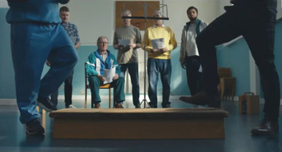
The choir members (above), led by Niels, prove an engaging bunch, and much humor is generated by their disagreements about which songs from a collection of Danish classics they should sing. Markus initially sticks to his cell but finally joins the group. In one of the film’s funniest scenes, Niels insists that Markus is not a tenor but a bass, forcing him to sing in a range that clearly is not natural to him.
One of the rules of solitary is that the prisoners are not allowed to reveal or discuss their crimes–though Markus is famous enough that all the others know what he did. Simon, a genial young black man, admires Markus and increasingly becomes his ally against the dictatorial Niels.
Gradually the tone darkens, however, as it is revealed that two of the main characters, including Niels, are pedophiles. Markus declares that his white-collar crimes are less heinous than child molestation. The others, however, including Simon, declare Markus’ crimes worse. At that point he decides to take his revenge on the group and especially Niels, by seizing the leadership of the choir.
This balancing act between humor and drama works well, with Aspöck managing to make the pedophiles somewhat sympathetic and amusing characters without excusing their crimes. The satire on how upper-class celebrity criminals like Markus manage to become objects of fascination is effective without becoming heavy-handed.
It Must Be Heaven (2019)
I am a fan of the Palestinian director Elia Suleiman, who manages to make autobiographical feature films at wide intervals. I am particularly fond of Divine Intervention (2002) and I also like The Time That Remains: Chronicle of a Present Absentee, which we saw in Vancouver in 2009.
It Must Be Heaven does not quite achieve the excellence of those earlier two films, being a bit uneven. Still, it contains many excellent scenes and gags, and it was among the best films I saw at this year’s festival.
The earlier portion sets up Suleiman’s sense of unease about the events that surround him in his native Nazareth. A running motif has him peeping timidly over his back wall as his neighbor’s son without permission picks lemons from his trees. Gradually the man takes over the care of the whole orchard.
Eventually Suleiman goes abroad, and we soon learn that he is seeking funding for his next film, presumably the film we are now watching.
Two of the funniest scenes take place in the offices of the producers Suleiman visits in Paris and New York. Both end in failure, but the huge number of international companies and funding agencies listed in the credits suggests that the director’s efforts must have been complex, lengthy, and, in some cases successful. The scene in New York involves a cameo by Gael García Bernal, who has an offer on a Mexican project of his own, but he obviously has little control of that project, let alone the ability to aid his friend Suleilman. The one in Paris has Vincent Maraval, of Wild Bunch (one backer of the film) playing a producer who rejects the project as not Palestinian enough.
Other than visiting producers, Suleiman wanders the streets of Paris and New York, observing incongruous events around him. Some of these are very amusing, others simply odd.
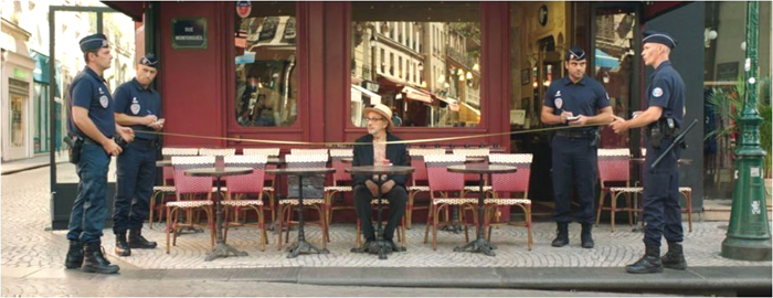
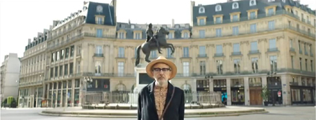
Comparing It Must Be Heaven to Suleiman’s earlier “autobiographical” films, the basic problem here becomes apparent. While Suleiman (or an actor playing him as a child) wove in and out of the action, participating in it, here many scenes involve him as a largely passive observer of events that have little or nothing to do with him. In one such scene, he sits at a cafe table, watching as four police officers carefully measure the spaces of the outdoor tables before pronouncing them compliant with regulations (see top). In Palestine he walks in the country and observes a Bedouin woman with a novel way of transporting two large vats of liquid. In Paris he observes police on Segways performing a search in the street below in perfectly choreographed loops. At times he is more affected by the action, as when a tattooed muscle-man stares at him threateningly in an otherwise empty Métro car.
Suleiman is an engaging performer, but watching him stare in bemusement at the odd behavior that he encounters in each place he visits grows a bit old. Nevertheless, there are many funny or just bizarre scenes in the film, including a lengthy tussle between Suleiman and an invading sparrow determined to perch on his keyboard. The visit to Paris, in which Suleiman somehow got the streets emptied so that he wanders completely alone through them is both impressive and somewhat disconcerting (above).
Suleiman is routinely compared to Tati and Keaton, but his work is similar to that of Roy Andersson too, is equally apt, although Andersson does not assign a single character to be an observer. Here to a considerable extent Suleiman keeps to the long-shot framings that are familiar from his other films, but there are also more close-ups, in particular of his face as his reacts to what he sees.
It Must Be Heaven suggests that wherever Suleiman goes once he leaves his Palestinian home, he sees the same sorts of odd behavior, especially the violence that has become endemic everywhere. (A particularly hilarious episode shows Suleiman shopping in New York and noticing that everyone around him, including babies, is carrying some sort of weapon, from pistol to bazooka.) I suspect, however, that most viewers would fail to catch the political points Suleiman claims in interviews to be making.
DB here:
Oh Mercy (Roubaix, une lumière)(2019)
Arnaud Desplechin regards his previous films (Esther Kahn, Kings and Queen, A Christmas Tale) as “a fireworks of fiction,” as he explained in a Q & A session. His latest, Oh Mercy, is based on fact. The screenplay dramatizes criminal cases that took place in Roubaix, the impoverished town Desplechin grew up in. The result is an unusual policier, which twists some crime-movie conventions in intriguing ways.
As we expect, the cops form a team. The emphasis is divided between the young and eager Louis Coterelle and the experienced chief Daoud. But Coterelle is an ascetic young man, reminiscent of Bresson’s country priest. Daoud, rather than being the tough boss who has to make his staff shape up, is an eerily quiet and sympathetic professional. Cast out by his family, he devotes his life to his work (and the occasional horse race). These characters keep surprising us. It’s the pious Coterelle who, pushing to make his mark, bullies suspects, while Daoud’s gentle ways eventually tease the truth out of them.
The police procedural typically shows several cases worked at once, with some minor ones and others explored in more detail. Desplechin’s film does the same, as an automobile fire and a petty robbery introduce us to the main cops. To help a friend, Daoud must also investigate a runaway teenager. Soon there’s a building fire, and then a murder on the same block. Gradually it becomes clear that these two crimes are connected–another convention of the genre.
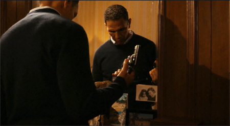
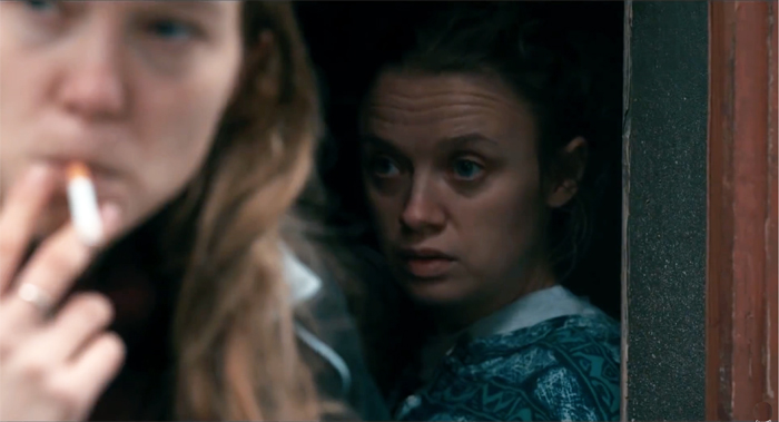
It’s the nature of the connection, though, that reveals Desplechin’s originality. About halfway through the film the police commit their energies to questioning two women, Claude and Marie, who share an apartment. In a string of riveting interrogations, the film shows Coterelle and Daoud, each in their own way, peeling back layers of the women’s relationship. It’s a tour de force relying on the Prisoner’s Dilemma, and it reveals as much about the cops as it does about the sad, confused lovers. Even the reenactment of the crime, another staple of the genre, avoids sensationalism and achieves a mournful gravity.
Most cop movies make justice a matter of vengeance (“This time it’s personal”), so it’s rare to find one about pity. The lies and mistaken memories that prolong the investigation are accepted by Daoud with quiet compassion. A gradual-revelation film like this, impeccably plotted and directed though it is, depends crucially on performances, and the principals (Roschdy Zem as the patient Daoud, Léa Seydoux as Claude, Antoine Reinartz as Coterelle) are extraordinary. Above all I will remember Sara Forestier as the skittish Marie, perpetually corrugating her forehead, always a beat behind in appraising how much the woman she loves loves her.
Once more we thank Alan Franey, PoChu Auyeung, Jenny Lee Craig, Mikaela Joy Asfour, and their colleagues at VIFF for all their kind assistance. Thanks as well to Bob Davis, Shelly Kraicer, Maggie Lee, and Tom Charity for invigorating conversations about movies. In addition, we appreciate the generosity of Arnaud Desplechin in answering questions about his film.
Oh Mercy (2019).
Vancouver 2019: Happy endings, art-film style
Tehran: City of Love (2018).
Kristin here:
The Vancouver International Film Festival has several strong threads running through it: world art cinema, documentaries, Canadian cinema, and films about art and artists. Sticking to any one or two of these would make for a rich viewing experience. I gravitate toward the “Panorama” program of mostly fiction films from around the world.
At one of these films, Tehran: City of Love, the Iranian director, Ali Jaberansari, and scriptwriter, Maryam Najafi, were present for a Q&A session. Clearly the audience has been charmed by their tale of three remotely connected characters all seeking love. One questioner asked what the pair’s next project was, which must always be cheering to the filmmakers. Another audience member simply thanked them for the film, saying that after seeing several grim movies, it was a pleasant experience to find one so funny and entertaining.
[Spoilers to come]
Certainly Tehran: City of Love is an entertaining film, but its ending is bittersweet at best. All three protagonists, after brushes with romance, end up alone. All may have learned something along the way, but they are all saddened by their failures. This year I have seen a couple of other films where the happy ending consists mainly of the central character letting go of bitterness and becoming reconciled to his fate. It seems as though grim storylines with unhappy endings are a staple of the festival film, and even comedies often avoid sending their audiences out on an entirely cheery note. Perhaps there is an assumption that an art film that is too entertaining risks not being taken seriously by festival programmers. Luckily, these three were included in the VIFF program.
Tehran: City of Love (2018)
Tehran: City of Love presents three central characters who are looking for love. Each has a problem to overcome. Mina is an overweight receptionist who, apparently resigned to her single status, targets attractive men who visit the cosmetic surgeon. She calls each, speaking seductively and arranging a date. She shows up for the date but does not identify herself, instead watching the man from a nearby restaurant table until he gives up in annoyance and leaves. At a class on the “geometry” of love, she meets a pudgy man who begins a courtship
Hessam is a body-builder with three championship titles in his past, now working as a trainer. He receives a part in a dubious film project and at the same time begins training an attractive young man who aspires to a championship. Hessam’s attraction to his trainee is subtly conveyed (above), and the young man seems friendly and seems possibly to reciprocate Hessam’s feelings.
Vahid, a talented mosque singer specializing in funerals, is dumped by his fiancée. A friend counsels him to become more lively and cheerful by singing at weddings. Vahid quickly makes the transition, which seems to improve his mood. He becomes friends with Niloufar, a female wedding photographer, who likes him but–as we know and Vahid doesn’t–she is awaiting a visa to allow her to emigrate to Australia.
Disappointments result. Mina’s beau is a married man in the lengthy process of divorcing his wife. The young man notices Hessam’s interest in him and switches to a new trainer. Niloufar reveals her imminent departure from Iran.
Tehran: City of Love is an impressive film for a second feature. The script by Jaberansari and Najafi weave the three stories together skillfully, keeping each story and the thematic connections among them perfectly clear. One might expect the three protagonists’ plotlines to come together. Hessam does at once point come to Mina’s office to get Botox treatments (presumably motivated by the film he is supposed to act in or to make himself more attractive to the young trainee), but nothing comes of that. Mina is close friends with Niloufar, but although the two talk about Vahid casually, Mina never meets him. The three characters are by chance in the same space by the final shot, but they remain unaware of each other. The title, unless we take it to be ironic, suggests that each may try again to find a partner, but the ending only hints that each has at least gained something from his or her brush with love.
It is also beautifully shot in widescreen, often employing what David has termed the planimetric shot, with the camera axis perpendicular to the background (see above and top). During the Q&A Jaberansari mentioned some of his film influences. (He was trained abroad in Vancouver and in London, where he now lives.) These included Roy Andersson, Elia Sulieman, Jim Jarmusch, Aki Kaurismäki, Jacques Tati, Fassbender, and Buster Keaton. Although Tehran: City of Love does not resemble any of these directors’ films closely–there are few long-take scenes or physical comedy played out in long shots–the list makes sense, mostly in the tone of the film.
Jaberansari and Najafi provided some helpful cultural context. They shot the film with official permission and also have permission to release the film in Iran, though no date for that has yet been determined. Despite the implied homosexuality of one character, only two minutes of cuts were required for the domestic distribution permit.
The emphasis on body-building, both in the gym and the scenes of men exercising in a mosque, reflects the fact that without bars, night-clubs, and other forbidden gathering-places, gyms and body-building are one milieu in which men can come together, including gay men.
At one point Vahid is arrested while singing at a “private” wedding. The phrase seems harmless enough, but private weddings often include men and women mixing in ways forbidden in the public weddings at which Vahid had previously performed.
Australia, they note, is the new destination of choice for Iranians seeking to move abroad, replacing Canada to some extent.
Sometimes Always Never (2018)
This film is largely a vehicle for Bill Nighy, contributing a mix of comically self-centeredness and pathos as Alan, a retired tailor. Years before his elder son Michael walked out of the house during a game of Scrabble and has never been heard from again. Alan has since been looking for him, neglecting his younger son, Peter, as well as his daughter-in-law and grandson.
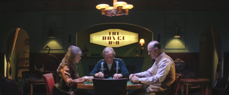
Scrabble looms large in the plot. In one extended series of scenes, Alan and Peter show up in a small town to view the body of a young man who might be the missing son. During an evening in a bed-and-breakfast, Alan hustles the husband of a couple staying there, pretending to be an ordinary Scrabble player and winning £200 off the henpecked husband (above). Only later is it revealed that they, too, are there to examine the same corpse. Alan goes first emerges tactlessly and cheerily saying that the body is not Michael, despite the fact that the couple is about to perform the same grim task.
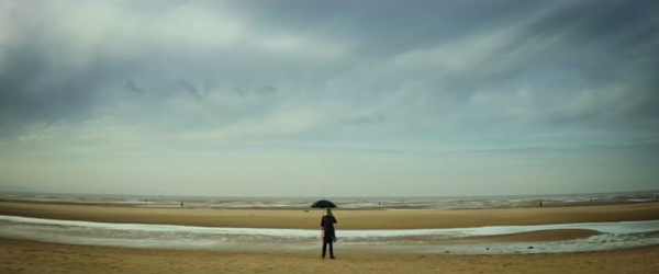
First-time feature director Carl Hunter adopts a playful style which at times resembles that of Wes Anderson. As with Tehran: City of Love, there are the planimetric shots(on a beach in Crosby otherwise populated by Anthony Gomley’s life-size statues, at bottom, and above, in the bed-and-breakfast Scrabble game). The characters drive in cars with blatantly obvious back-projected motion, and there are black-and-white inserts and brief animations. All these stylistic touches help lighten the tone of the underlying misery of the characters, though they also stand apart from the fairly straightforward presentation of most of the scenes.
The growing closeness between Alan and his shy grandson helps add a positive side to Alan and prepares the way for the inevitable outcome, as he learns to value the son he has over the one who clearly will never return.
A White, White Day (2019)
Most small producing countries have managed throughout the history of cinema to make films, and Iceland has been no exception. It was not until the 1990s that its films started attracting attention on the festival and awards circuit, but only now and then. Even today the local feature production hovers around only four a year. Still, we have learned to consider Icelandic films must-sees when they show up on festival programs.
Benedikt Erlingsson’s films have shown here in Vancouver, and we reported on Of Horses and Men in 2014 and Woman at War last year.
This year the contribution from Iceland is Hlynur Pálmason’s A White, White Day, his second feature. (His previous feature, Winter Brothers, played at our 2018 Wisconsin Film Festival, but we were in the process of buying a new house and missed it.)
“A white, white day” is a local phrase describing weather conditions that cause land and sky to become indistinguishable. It’s a perfect metaphor for confusion, for loss of bearings. We see it both literally and figuratively in the film. The protagonist, Igimundur, is a middle-aged policeman on leave for depression following a car accident that killed his wife. The film opens with the accident, although we don’t yet know who the driver is, occurring on a white, white day.
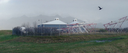
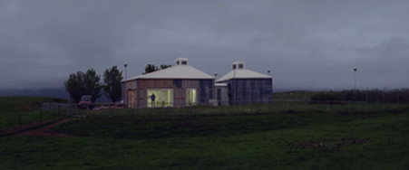
There follows a mesmerizing series of shots from the same vantagepoint, showing a lengthy series of shots of a pair of small buildings in a rural landscape, including these two.
All atmospheres and times of day area shown, from the light fog of the top shot to the heavier fog of the lower one, from bright sunny days to dark nights. Horses wander through in some, cars drive up in others, and gradually the ramshackle yard and structures become a home. We first glimpse Igimundur in the lower shot, though we don’t yet know who he is. The renovation of the buildings to make a home for his daughter and son-in-law, along with his beloved granddaughter Salka. Where Igimundur will go once they move in is never mentioned. Clearly the project is his way of coping with his grief, while he increasingly scorns the lack of help he receives from his psychologist.
Soon, however, he comes to believe that his wife had been having an affair, and he becomes increasingly abusive and violent, even toward his police colleagues and in front of Salka. The happy ending, which seems a trifle abrupt, sees him finally reconciling himself to the past and regaining his loving memories of his wife.
A White, White Day depends less on humor than the other two films, despite its occasional comic touches. Instead it is an absorbing family melodrama that most audiences would find entertaining.
For a useful brief history of Icelandic cinema, see here. So far it doesn’t include Palmason, but I expect he will soon be added.
We thank Alan Franey, PoChu Auyeung, Jenny Lee Craig, Mikaela Joy Asfour, and their colleagues at VIFF for all their kind assistance. Thanks as well to Bob Davis, Shelly Kraicer, Maggie Lee, and Tom Charity for invigorating conversations about movies.
Sometimes Always Never (2018).


