Archive for the 'Festivals: Vancouver' Category
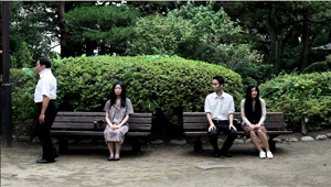
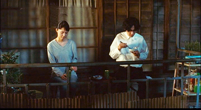
Where did the two-shot go? Here.
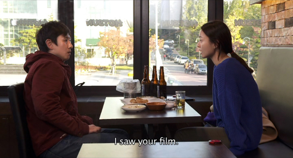
Our Sunhi (Hong Sangsoo, 2013).
DB here:
I’ve complained here and there about the rudimentary staging of scenes in mainstream American movies. (Short version of common practice: Cut a lot and move the camera instead of moving the actors.) But just as rare as complex staging, in the age of intensified continuity cutting, is the sustained and stable two-shot.
Two actors exchanging lines in a continuous, unmoving take was one building block of mature sound cinema. Today’s directors almost never resort to it. Their face-offs are “given energy” by a drifting or arcing camera, or lots of cuts, or, if they feel like moving the actors around, the Steadicam walk-and-talk.
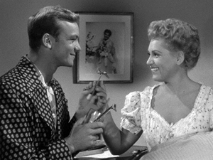
But the prolonged, balanced two-shot can yield remarkable results. A medium-shot or medium-long-shot framing can work to a human dimension, giving prominence to the actors’ bodies. It doesn’t let their surroundings swamp them, and it doesn’t reduce them merely to faces. It lets the actors act with not just facial expression but with their posture and their upper bodies. And it nicely balances dialogue with the flow of pictorial information. We can watch both actors, with one reacting to the other, as in The Marrying Kind (1951).
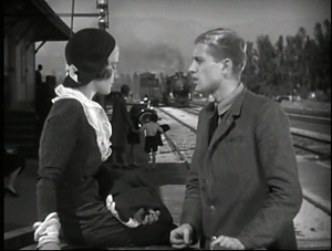
Sometimes the two-shot is played with the faces in profile, as in early sound pictures like The Criminal Code (1931).
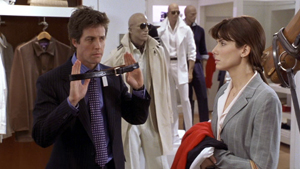
But directors quickly understood that if you prefer, you can angle the actors so that we get a 3/4 view of one or both. The tactic sacrifices realism (who stands in such ways in real life?) but it’s a piece of artifice we gladly accept. It’s visible in my Marrying Kind example, as well as here in Two Weeks Notice (2002).
Of course two-shots are still with us, but they usually serve to set up passages of shot/ reverse-shot cutting. The sustained two-shot carrying long stretches of dialogue is increasingly rare in Hollywood cinema. It surfaces more often, I think, in indie works (Jarmusch, Linklater, and Hartley, for instance), European films (Garrel, for instance), and perhaps most notably some Asian films.
For reasons not yet well understood, during the 1980s stylistically ambitious directors in Japan, Taiwan, and China began building scenes out of long, static takes. Sometimes those are distant framings, unfolding in elaborate blocking; to my mind Hou Hsiao-hsien is the great master of this. But no less prominent are those films that present simply staged shots of two or more characters in which action and reaction are captured by a fixed camera. Often these shots avoid 3/4 views. That is, we may get two characters in profile, or two characters facing the camera directly. The result is a more abstract, even ceremonial look and feel.
I was remembering this tendency while watching several of the films on display here at the Vancouver International Film Festival. I saw one film very largely made of two-shots. I saw a couple in which the two-shots serve mostly as points of punctuation, breathing space between scenes that are cut up in more orthodox ways. And I saw one film that climaxed in a two-shot showing the actors holding their ground for about fourteen minutes. All were from Asia.
Both visual and plot-based information follows; in other words, as often happens hereabouts, there are spoilers.
The Return of Kids Return
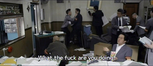
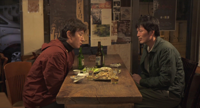
Kids Return: The Reunion, directed by Shimizu Hiroshi, is a sequel to Kitano Takeshi’s 1996 film. The disaffected high-school buddies Shinji and Masaru were last seen riding a bike and declaring that they would show the world what they’ve got. Now, many years later, they haven’t shown much. Masaru is a low-level gangster who has lost the use of his left arm in a jailhouse brawl. Shinji holds a boring job as a security guard, and he’s about to give up boxing. The two meet by accident and resume a more distant version of their friendship. Masaru gets more deeply embroiled in the yakuza world, but he does convince Shinji to stick with prizefighting. As Shinji struggles to improve his skill, Masaru sets out to avenge his betrayed boss, with murderous results.
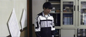
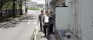
The new version doesn’t have the dry, laconic quality of Kids Return, and the film doesn’t employ Kitano’s characteristic planimetric framing and compass-point editing. But the incessant over-the-shoulder framings of most movies are avoided; when we cut to a character, he or she is usually isolated in the frame. And some moments recall the cartoon-panel cutting of Kitano. One scene shifts from the yakuza boss, Masaru, and the thug Yuji in a coffee shop to a soundless shot of their young subordinate at the office simply staring off into space. Cut to the three men strolling back to the office, with Yuji commenting that the kid never keeps the sidewalk clean.
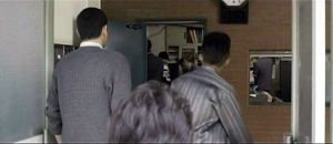
A pan following the men into their building shows the office open and men inside. Yuji bolts past his boss and flings himself at a policeman, who is one of several ransacking the place for evidence.
Most directors wouldn’t include the enigmatic shot of the functionary, but it yields a little question–what is he reacting to?–that the next shots gradually answer.
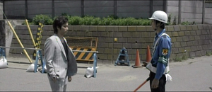
So cutting plays an important part in building up many scenes. But occasionally Shimizu pauses to draw a moment out. When Murasu and Shinji meet after many years, a nearly thirty-second shot squares them off.
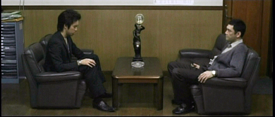
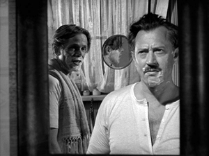
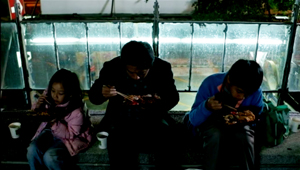
Instead of embracing and pounding each other’s back in the American fashion, they stand awkwardly opposite each other, and the anamorphic widescreen image stresses the tentativeness of their reunion. Later, when Murasu’s boss suggests he leave town and work for another boss, a poised two-shot (at the top of this section) lets us watch the interplay between them across two minutes. Again, the ‘Scope ratio helps, and the fixed frame adds a comic touch by setting at frame center the hideous, ticking clock that Yuji has bought the boss.
I don’t want to suggest that there’s anything particularly radical about Shimizu’s two-shots. Kids Return: The Reunion simply reminds us that a two-shot can usefully vary the film’s pace and lend gravity to moments of character reflection.
Absurdist anatomy
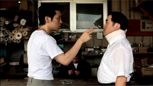
Something stranger goes on in Anatomy of a Paperclip, the winner of the Dragons and Tigers Award here at VIFF. The story is an exercise in grotesque nonsense, a sort of Japanese Theatre of the Absurd.
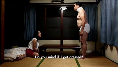
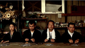
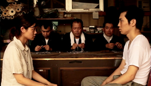
In an undefined town outside time (no cars, videos, or cellphones), a harsh boss rules over a crude cottage industry. Three, sometimes four, workers sit along a bench and make paper clips by snipping and twisting wire. The most hapless is Kogure, a lumpish loser wearing a neck brace. Bullied by two outlaws who constantly make him surrender his money and take off his clothes, eating with painstaking regularity in the same cheap restaurant, he returns home every night to sleep. A butterfly visits him and apparently leaves a pupa behind. As Kogure trudges through his days of petty humiliations, the pupa swells to human size, even bigger than the pods in Invasion of the Body Snatchers.
Director Ikeda Akira shot the film in fifteen days over weekends and holidays. It’s partly in the planimetric mode, with the camera lined up perpendicular to a back wall or lines in the setting.
Even more than Kids Return, the mug-shot and police-lineup staging recall linear, minimalist manga. A great deal of the film’s feel, that of a frozen, almost robotic world, derives from this deliberately “flat” look.
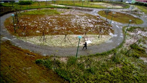
In Anatomy of a Paperclip, the profiled two-shot functions as part of the overall visual pattern. Although some conversations show 3/4 views of the characters, and even yield occasional OTS (over-the-shoulder) framings, many two-shots preserve the geometrical right angles of the master shots.
Another function of our two-shot, then: To play its part in a film’s overall pictorial design, suggesting expressive qualities like rigidity, automatism, and deadpan humor.
Two’s company, four’s a crowd
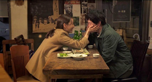
Hong Sangsoo has made the two-shot–usually profiled and showing characters drinking heavily at a restaurant table–into a central formal device. His films are conversation-driven, and he has rung an ingenious series of variations on duologues. They are typically presented in ways that stress similarities and contrasts among characters, often to mildly satiric effect. We see A and B in one setting, then perhaps B and C in another setting, then A and C in the first setting, and so on. For examples, see this entry.
In the more formally complex Hong films, these variants may be played out as intermingled points of view (The Power of Kangwon Province) or as alternative versions of the same events (The Virgin Stripped Bare by Her Bachelors) or just weird déja-vu (Turning Gate). In an earlier entry, I suggested that Hong exploits our inability to remember certain things precisely, so that we may forget when we first heard a recurring line of dialogue or saw a shot that is echoed by the shot we’re now seeing.
Our Sunhi is about a hugely momentous event that hasn’t, to my knowledge, been dramatized on film before: a professor writing a grad-school recommendation. Sunhi approaches Professor Choi for a reference that will help her study in the States. As she coaxes him into revising his initially cool letter, he becomes attracted to her, as does another university employee Jaehak. Meanwhile Sunhi meets her old lover Munsu, and he becomes attracted to her all over again.
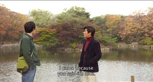
Here the formal rondelay that mocks male vanity–a Hong specialty–doesn’t involve fancy tricks with time or parallel viewpoints.Instead, what circulates are comments about Sunhi, pulled from the professor’s letter (“She has artistic sense,” “She’s honest and brave”) and passed from man to man. The points of circulation come in eleven duologues, each shot in one or two symmetrical long takes. Sunhi meets Jaehak, then Choi, then Jaehak again, then Munsu. Soon Munsu is going out drinking with Jaehak, with whom the prof has coffee before having a rendezvous with Sunhi. Connecting these nodal scenes are brief shots of characters walking through streets, meeting one another by accident, and at the finale, converging in a palace park. As you’d expect, these connecting bits are typically made parallel to each other through framing, situation, music, or other devices.
The two-shots are very long; the longest runs over eleven minutes. It presents a sort of climax, in which a drunken Sunhi reaches out to clutch Jaehak–a gesture of greater intimacy than she has shown any other man.
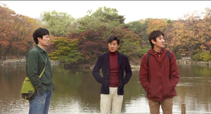
But soon enough she is meeting the professor for a date in the park. In the very last scene, when she goes off to the toilet, Hong gives us a tiny joke. All three of the men finally meet, waiting for her, and at last a two-shot becomes a three-shot.
This sheerly formal gag is pretty esoteric, I grant you, but it’s typical of Hong’s urge to tweak the simplest materials. In his hands, the lowly two-shot becomes a structuring constraint, a way of deliberately limiting his choices to show us what he can do with it–not least, comic variation.
Two heads, better than one?
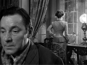
During the 1940s, directors in various countries began to rethink the layout of their two-shots. Instead of giving us matching profiled or 3/4 views, they began to arrange their players so that one figure was significantly closer to the camera, yielding what I’ve called a big-foreground composition. In America, the most flamboyant early versions came from Orson Welles (Citizen Kane and The Magnificent Ambersons) and William Wyler (The Little Foxes, below). This strategy encouraged staging in depth and even letting players turn their backs to one another.
Tsai Ming-liang’s Stray Dogs is the most elliptical and visually variegated film of this VIFF bunch. It’s less a story than a situation: A father, mother, and two children try to survive on the streets. The father picks up odd jobs, while the mother finds work in a supermarket. They wash in public restrooms and scrounge castoff food, sometimes thanks to the mother’s rescuing market goods past their sell-by date. At night, the father and the kids huddle in a makeshift hut, until the mother finds a somewhat better squat in a ruined office building.
Every scene except one consists of a single take, but the connections between scenes are far more oblique than in the other films in this entry. For instance, the mother is seen weeping beside her sleeping children in the opening shot, but then she vanishes from the plot for a while before reappearing in the supermarket, now with her hair cut shorter. The clear and continuous duration of the scenes is offset by a narrative organization that skips over a lot of time and refuses to explain everything that happens in the interim.
Tsai’s visual strategies are quite diverse. Unlike Hong Sangsoo and others in this trend, he doesn’t always keep his camera within a mid-range zone. A scene’s single take can be a striking extreme long-shot or a tight close-up, often of the father (played by the still remarkably waif-like Lee kang-sheng) eating, drinking, or just reciting a poem.
Stray Dogs makes little use of two-shots, and his “clothesline” layouts aren’t quite as frieze-like as those in Anatomy of a Paper Clip.
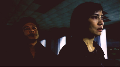
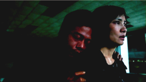
He saves his devastating two-shot for what is, in this quiet and melancholy drama, as close as we get to an intimate climax. The image at the top of this section shows the husband and wife, her face looming in the foreground while he stands behind her.
Why is this shot, only three minutes longer than one in Our Sunhi, so fiercely hard to take? Hong Sangsoo fills his restaurant shot with gab and plot development. Tsai’s shot, reminiscent of the big-foreground compositions of Welles and Wyler and many afterward, is almost completely unchanging. Neither husband nor wife speaks for fourteen minutes; the only action we see in most of the shot consists of him occasionally swigging alcohol from the bottles he’s stolen and some tears running down her cheek. And we have no idea of when the shot will end because there’s no obvious trajectory set up for it. Like the fixed close-up of a weeping face that ends Tsai’s Vive l’amour, this shot could go on forever.
About thirteen minutes in, the husband grasps his wife’s shoulders and leans his head wearily against her neck.
In a context scoured of what we normally think of as drama, such tiny movements become major events. The father seems at once apologizing for his drinking and trying for a reconciliation.
Tsai has reserved his two-shot for his climax. Instead of becoming a resource judiciously salted through the film (Kids Return: The Reunion) or a stylized extension of a cartoonish world (Anatomy of a Paper Clip) or a core schema for the film’s visual design (Our Sunhi), the two-shot here, rendered as an aggressive image of faces close to the camera, becomes the marker of a mysterious turning point in two lives.
All the films are very much worth seeing for their own reasons. Treating them together, though, reminded me of the power lurking within one very basic cinematic resource.
Last year I considered long-take shooting and staging techniques in that edition of Dragons and Tigers, with comments on Tsai Ming-liang’s Walker.
Just in case this occurred to you: No, Wes Anderson didn’t invent these techniques. This entry and some others explain.
For more on varieties of staging, see On the History of Film Style and Figures Traced in Light: On Cinematic Staging. On this site, you can visit the supplement to Figures here, and the categories Film Technique: Staging and Tableau Staging.
Stray Dogs.
Film-industry pros share secrets in Vancouver
Kristin here:
Even while tempting us with many, many films, the Vancouver International Film Festival runs an event that could all too easily lure us away from viewing and into the world of film-industry gurus: the Film and Television Forum. Its website describes it as “four days of professional development for senior and emerging professionals, from financing to production, to marketing and distribution, to storytelling and engagement.”
In an ideal world, we would attend all of the sessions, but they run concurrently with as many as eight films showing elsewhere. Two talks were particularly appealing, though, given our interest in the 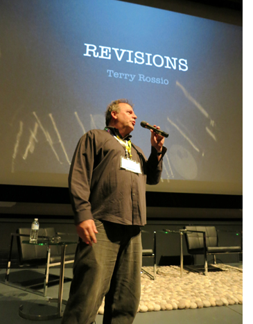 practice of making films within the mainstream American industry. I slipped away to hear master-classes by Terry Rossio (screenwriter for all of the Pirates of the Caribbean films) and Walter Murch (editor of Particle Fever, shown at the festival, and sound designer on many films, including Apocalypse Now).
Terry Rossio
Rossio’s modest title was “Revisions,” though his discussion ranged far beyond advice on how to rewrite a script. He immediately won over the audience, clearly many of them professional or aspiring screenwriters, by passing around a flash-drive and inviting anyone with a script-in-progress on their laptop to put some pages on it. He would end the session by making some impromptu revisions of those pages.
I’m not secretly working on a screenplay or even aspiring to write one, but if I were, I think I would have gleaned some valuable tips from Rossio’s talk.
Most panels and seminars tend to be too general, he said. They “focus on the business side, tell personal anecdotes,” and so on. He feels that it is probably impossible to teach screenwriting: “No, the better question is, can writing be learned?” Yes, but people must teach themselves.
Writing and revising
To Rossio, one crucial thing to learn is that finishing a story is not the end. One should have both doubt and faith: doubt that a story or scene is good enough, and faith that it can be better.
Revision, according to Rossi, is “talent reapplied.” One may have a limited amount of talent for writing, but it can be stretched by reapplying it over and over during the revision process.
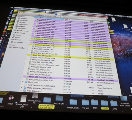
Rossio is a big advocate of succinctly creating a strong visual sense in each scene. Even on Rossio’s desktop he comes up with a distinctive icon for each folder (see top): a Rubik’s cube for “Screenwriting,” a little gramophone for “Music,” and so on.
For Rossio, each scene should consist of:
- Opening image
- Key moment (character revelations, reversals, etc.)
- Throw (i.e., the setup for the next scene)
Apart from visual imagery, writing should be situation-based: “Every scene you write must be an obvious situation.” A screenplay is a string of situations, which creates a compelling interest in the scene. His example was two people discussing an important deal in a car on the way to a meeting. The dialogue might become boring because of the static setting, but the writer could make them experience car trouble and have their discussion outside the car while worrying whether they will make it to the meeting: “The easiest way to create interest is through some sort of dilemma.”
One important technique of revision is what Rossio calls “performance dialogue.” Writers tend to compose speeches in full, grammatical sentences, but that doesn’t sound natural in spoken dialogue. Rossio takes these complete sentences and starts to eliminate words: “Less words allows for performance the actor will be performing in between the syllables.” He adds, “If you give an actor a very long line, they can’t manipulate that into an emotion. But a shorter line allows them to express the subtext or nuance of what’s going on.”
This advice led to a question from the audience about how a writer can convey to the director and actors what he or she intended the nuances of a scene to be. Rossio suggested three possibilities:
- Become a director. The director is the one who puts things on the screen. The writer makes suggestions about what to put on the screen.
- Negotiate having the power to be on set during shooting.
- Annotate the screenplay.
The third point caused quite a bit of interest and is an unusual approach that Rossio himself has recently adopted. He writes a normal script, fairly compact and easy to read. But he includes endnote numbers that refer to a separate document, a list of annotations. These might be something like an indication that a certain moment in the film is a reference to the opening of Raiders of the Lost Ark or suggestions about special camera angles. Rossio has not used this tactic often enough to gauge whether directors in general would appreciate it, but he did have a good response to the first annotated script he provided.
Rossio dislikes all the screenwriting software on the market, but he showed off a system that he devised himself. The screen below shows the list of scenes for his current project, Masters of the Universe. Each scene is identified by a single word, such as “Vengeance” or “Snake.” The ones that are finished are highlighted in color. (I don’t believe Rossio mentioned the difference between the purple and the yellow highlighting.) The scenes can be switched in order with their labels automatically re-numbered.
One advantage of this system is that the author opens only one scene rather than the whole script. Dealing with something that may be about four pages long is less overwhelming. Rossio also finds that his system facilitates sharing drafts of scenes with a collaborator.
Tips for pitching
In keeping with his emphasis on the visual aspects of a screenplay, Rossio recommends that writers make up a brief pre-viz that captures the essence of the script’s premise. Increasingly, software is becoming available that would allow technically adept writers to create demo clips on their own. For writers unable to do this, Rossio suggests that in a highly competitive market, they should get an effects house to do the job for them. These days even some directors are using this approach in trying to get a job.
Rossio was asked a question about pitching to get a job revising an existing script. He had four suggestions.
First, read the script that is to be revised. Surprisingly, not all writers do that. If it’s based on a literary property, read that, too. A lot of writers just wing such pitch meetings.
Second, take along a presentation board. It can be used for breaking down the script or drawing images.
Third, write a recap of the script as it exists and be ready to discuss specific possible changes.
Fourth, go to the trouble of having two or three specific images ready to show. If the VIPs like the images, they can get access to them only by hiring the writer.
I think if I were a scriptwriter, aspiring or otherwise, I would consider that Rossio packed a lot of useful information into his 75-minute presentation. He also chose two of the script excerpts submitted by audience members and gave their authors some quick and helpful suggestions for revisions.
Walter Murch
As far as I could tell, Murch’s talk had no title, but the concept he threw out early on was “fungibility,” one meaning of which is being capable of changing easily. The example he gave was a caterpillar changing into a butterfly. Murch was referring to the digital revolution in film editing. This was not so much a how-to talk as an attempt to demonstrate the dramatic changes that have come about as a result of rapidly changing technologies.
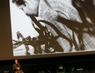
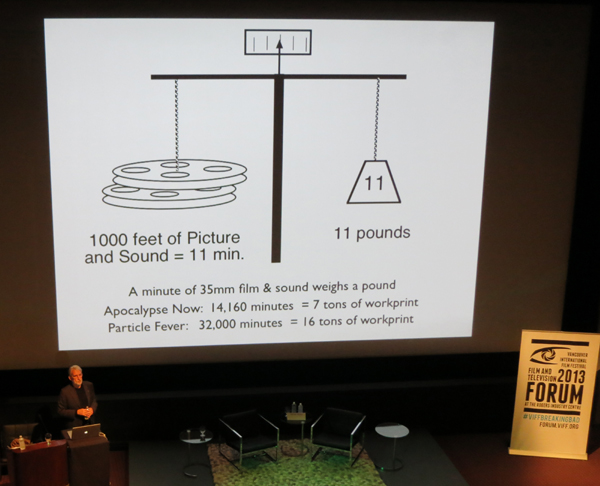
Murch showed a photo of himself struggling with 35mm film strips in editing Apocalypse Now in the 1970s (above). Now, of course, there would be no such physical sorting and splicing. He then pointed out the sheer weight of film, which has been entirely eliminated:
As the graphic shows, a single 1000-foot reel of 35mm film weighs 11 pounds. The strips of Apocalypse Now in the photo above were part of workprint material totaling 7 tons. If Murch’s latest film, Particle Fever, had been edited on 35mm, he would have had to deal with far more, 16 tons of film. It simply would have been impossible to edit such a quantity of footage. (Would a hard-drive with a complete feature film on it weight measurably more than a blank one? he wondered.)
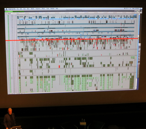
For Particle Fever, Murch used Final Cut Pro 7–an announcement that led to scattered applause from the audience. Like Murch, users of that program are loyal to it, but as he pointed out, a 32-bit program simply can’t keep up with modern demands for memory. While editing, he kept running into situations where there was no memory left, and he had to use elaborate and time-consuming methods to free up storage space. (The film ended up with 18 terabytes of material stored.) On his current project, Tomorrowland, he is using a 64-bit Avid program and has had no problem running out of memory.
(Tomorrowland is being made here in Vancouver, which is presumably why we had the privilege of Murch’s participation in the forum.)
Murch showed a timeline graphic for Particle Fever, with multiple image track, dialogue tracks, effects tracks, musical tracks, and so on. Each small horizontal line represents a separate track:
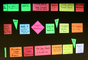
Even while working on this level of complex technology, however, Murch sticks to simple methods for some of his planning. He creates a “scene board” using cards coded with colors, sizes, and shapes . The little green triangles create a chronology, giving the years covered by each set of scenes:
As with Rossio’s system of storing his scenes in a way that allows him to change their order, Murch can move the cards around if the structure of the film changes. Murch put it this way: “I would suggest reversion to kindergarten.”
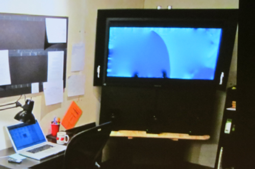
He also showed some photos of his workspaces for various projects. One was intriguing for indicating how important perspective is for editing. One workroom contained a 50-inch monitor for playing back scenes as he edits them. (See bottom.) Note the little white figures of a man and a woman at the bottom corners of the screen. Murch wanted to keep scale in mind, and the figures represent normal-sized people at the proportionate size they would appear if the monitor were a forty-foot theatrical screen.
This photo inspired someone during the question session to ask whether the increasing tendency for people to watch movies on very small digital screens has influenced Murch’s editing decisions. He replied that it has to some extent, though from the beginning of his career at the end of the 1960s he has had to keep the smaller television screen in mind. Yet he does not edit primarily for the tiny images on mobile devices: “If you cut for the big screen, it will work for the small screen. If you cut for the small screen, it won’t work as well for the big screen.” The Master speaks. So far, the theatrical experience remains the basis for moviemaking.
The Guardian has a video interview with Walter Murch discussing Particle Fever.
A monitor in Walter Murch’s workspace, with two white human figures at the lower corners to indicate scale.
VIFF: Maps, math, madness, and more
Camille Claudel, 1915.
Kristin here:
We’re halfway through the Vancouver International Film Festival, as we continue to catch up on world cinema in one dizzying ten-day swoop. Here’s a handful of worthwhile films I’ve seen so far.
Another “brave” performance
Critics speak of “brave” performances as those in which the role calls for an actress (seldom, for some reason, an actor) to allow herself to look ugly and awkward or to participate in explicit set scenes. The word got tossed around a lot this year in regard to the two young actresses in Blue Is the Warmest Color, this year’s Palm d’Or winner at Cannes. David and I saw it here and found it disappointingly conventional.
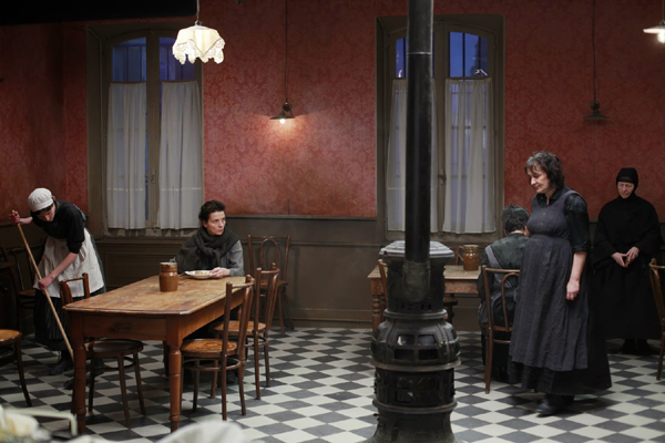
Juliette Binoche’s performance in Bruno Dumont’s Camille Claudel, 1915 (2013) has her eschewing makeup and playing the haggard, aging inmate of an insane asylum. Historically, Claudel was a sculptress and Augut Rodin’s lover before being placed in the asylum by her family. As the title suggests, we see only a small slice of her life, after she has already spent a good deal of time in the asylum, a laudably humane one set in a Catholic nunnery in the mountains.
For much of the film, we stay with her, registering both her annoyance at the antics of her fellow inmates and her compassion for them. She seems to suffer from a persecution complex, cooking all her own food and eating apart from the others (above) through a fear of being poisoned. She attributes her incarceration to Rodin’s and his colleagues’ schemes to steal her studio and sculptures. We have no way of knowing how much of this is true, and hence no way of knowing whether she is really unbalanced enough to be in an institution with incurable cases. Her occasional visits to the complex’s church and her communing with nature help to sustain her.
Well into the film, there is an abrupt point-of-view switch to her brother, the author Paul Claudel, as he pauses en route to the asylum in order to pray. We soon realize that he is a religious zealot, utterly devoted to his own view of Catholicism. The contrast between his dogmatism and Camille’s simple religious sincerity bodes ill for her hopes that he will arrange for her release.
Camille Claudel, 1915 is currently available only on unsubtitled French DVD and Blu-ray.
Math and maps
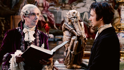
I am a fan of maps and of scientific exploration of exotic places, and Detlev Buck’s Measuring the World (2012) promised to deal with both in 3D. It weaves together fictionalized accounts of the exploits of two contemporaneous geniuses of the early 19th century: world explorer Alexander von Humboldt and mathematical genius Carl Friedrich Gauss.
I had high hopes for the 3D, imagining scenes a bit like the scene where Michael Fassbender plays with dazzling holograms of space maps in Prometheus–toned down a bit and more scientifically grounded, of course. Unfortunately there was nothing of the sort, with the 3D being used more conventionally for creating depth in the playing space, with branches in the foreground of shots in the Amazonian jungle and that sort of thing.
The film turned out to be a rather rollicking depiction of the two careers. The conceit is set up that Karl Wilhelm Ferdinand, Herzog von Braunschweig provided financing for both Gauss and Humboldt. He is caricatured (above) as a frivolous, silly man who reacts in utter incomprehension when handed Gauss’s first book on mathematics–as who would not at the time, given that it introduced startling new insights that revolutionized the field? Ferdinand was in fact a highly educated military man, and he never supported von Humboldt’s work.
Still, the eccentricities of the two seekers of knowledge are entertaining, the scenes of von Humboldt seeking specimens in the Amazon and on into the Andes are exotic, and the whole thing conveys something of the enthusiasm lingering as the Age of Enlightenment was coming to its end.
Measuring the World is available as a region-coded import with English subtitles under its original title Die Vermessung der Welt on DVD, Blu-ray, and Blu-ray 3D.
An African Charmer
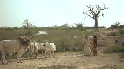
The Senegalese film, Tall as the Baobab Tree (2012), is the first feature of a young white filmmaker, Jeremy Teicher, who first visited the village in which the film is set when he was 19 and making a documentary about it. Based on stories of village life he was told at that time by young students, he made Tall as the Baobab Tree at age 22. The local people helped with the script and acted in the film.
As with many African films, the subject relates to a traditional custom which has come in modern times to be viewed as a problem. It reminds me of Ousmane Sembene’s last feature, Mooladé (2004), which dealt with how a village’s women began to resist the practice of genital mutilation. Tall as the Baobab Tree concerns the practice of selling young daughters into marriage.
The story centers around Coumba, a teenager who has just passed her school exams. Her older brother falls from a baobab tree (the one seen looming above the scene above), and to pay for his medical costs, the father decides to sell Debo, the younger sister, into marriage. Coumba secretly works as a maid in a nearby resort to pay the costs, but although she succeeds in raising most of the money, the local village elder insists that custom dictates that the promised marriage must go through.
Although the father and village elder are clearly seen as in the wrong, they are not made into villains but are seen as stuck in the patterns of outdated traditions. Much emphasis is put on the education that Coumba has benefited from and that Debo will never experience. A touching scene near the film’s beginning shows Coumba among the students waiting in a group as the names of those who have passed their exams are read out. Clearly this was an actual event captured by the filmmaker, and the joy of the successful students effectively emphasizes education as the means to defeat the more oppressive remnants of tribal traditions.
Teicher describes his experiences and approach in collaborating with the villagers on the film in an interview on the BFI website.
Beyond Ghibli
The films of Miyazaki Hayao (Kiki’s Delivery Service, Spirited Away) and his colleagues at the Ghibli animation studio are the heights of Japanese animation. Beyond them, we in the west tend to know of other Japanese animated films as more simply made anime, with lots of violent action. But, as the program notes state, “it’s time to expand your horizons.” Hosoda Mamoru’s Wolf Children (2012) somewhat resembles the Ghibli films in genre, being a fairy-tale-like fantasy set in the present day.
Hana, a student, is attracted to a young man, Ookami, who decides to sit in on one of her classes. She offers to share her textbook, and as a romance develops, she discovers that Ookami is a shape-shifter, able to change into a wolf. After they have two children, Ookami is killed while in his wolf form. His children have inherited his ability, and Hana moves to a house in the countryside to hide their peculiarities from prying eyes.
The story follows the daughter, Yuki, as she decides to go to school and follow the human half of her nature, and the son, Ame, as he prowls the surrounding forests and mountains, communing with wolves he discovers there. The result has an environmental theme similar to that underlying some of Miyazaki’s films, with particular sympathy for the perpetually hunted wolves.
While the figure animation here is not as subtle as that of the Ghibli films, the settings are beautiful and detailed, with highly textured portrayals of the roiling movements of large cumulus clouds and the rustling of countless leaves in a forest.
Wolf Children looks great on the big screen, but if you can’t catch it in a theater, it’s due out in the USA on November 26, available on DVD or a combination Blu-ray/DVD set.
Wolf Children.
VIFF extremes
The Missing Picture (2013).
DB here:
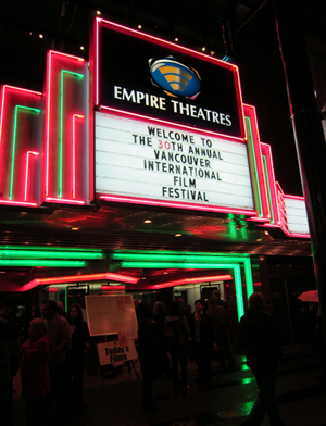
The Vancouver International Film Festival, known to all as VIFF, has been undergoing some big changes. It lost its primary venue, an ageing but cozy multiplex surrounded by pubs, creperies, music clubs, and other marks of downtown culture. Alas, the Empire Granville 7 is now shuttered, to be renovated as a retail space. VIFF must spread its bounty more widely.
As before, films are shown at the Cinematheque and the Vancity media center. The new venues include the Vancouver Playhouse, the Rio Theatre, three screens at the Cineplex Odeon International Village, the Vancouver Centre for the Performing Arts, and the Goldcorp Centre for the Arts at Simon Frazer University. All the ones we’ve visited have been excellent screening spaces.
Everything we’ve seen has been on some form of video—excuse me, “digital cinema.” Apart from the occasional 35mm or HDCam show, DCP projection, after a couple of years of teething pains, is the norm. Not that this guarantees uniformity. Albert Serra’s Story of My Death, a peculiar portrait of the elderly Casanova, still looked (probably intentionally) like it was shot on VHS. The furor about festivals’ conversion to digital formats, discussed in this 2012 blog entry and extended in my little e-book, belongs firmly to history. Henceforth film festivals will be file festivals.
Genres plain and fancy
El Mudo.
As usual at VIFF, the range is wide. At one end of the scale is a feel-good dramedy like The Great Passage, Japan’s Academy Award entry. The central character is Majime, a shy and unworldly young linguist who is drafted to help create a dictionary of Japanese as a living language. An otaku when it comes to words, he soon devotes his life to fulfilling the mission. Over the years he manages to find a girlfriend and earn the respect of the elders steering the project and the friendship of a ne’er-do-well colleague who prefers alcohol to etymologies. The dweeb Majime, despite his sweater-vests and sleeve protectors, becomes moderately sociable, while his pal acknowledges that his own commitment to a geeky endeavor shows he’s not as cool as he thought.
The English title is misleading; a better one might be Crossing the Sea of Language, since the central metaphor is that of charting the ebb and flow of usage. The process is dramatized by setting the start of the project in 1995, before Internet 2.0. The professor overseeing the project points out that the arrival of the Web speeds up language change. The Net works its way into the plot, as card-based research gets replaced by algorithms and word searches. A lot of the film’s humor arises when sequestered scholars, like those in Ball of Fire, have to figure out what this younger generation means when it calls something bad (i.e., good).
Ishii Yuya, who brought to VIFF Sawako Decides (2010) and Mitsuko Delivers (2011), tells his heart-warming story in a trim, efficient manner. His composure could teach our Hollywood directors a thing or two. I didn’t see a wasted shot or gratuitous camera movement, and you might miss Ishii’s virtuoso handling of a crowded office space as volunteers pack in to beat the deadline.
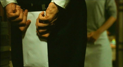
You can often spot a director’s skill in delicate touches. Here, I admired a gentle hook between two scenes. Majime has written a florid, anachronistic letter to Kaguya declaring his fondness for her. At the end of one scene he walks away from the camera clutching the note, which the framing centers on. Cut to a distant shot of him with Kaguya, the letter a small detail alongside his left leg.
Most viewers, I’m convinced, scan to find the letter and then wait with an amused tension for Majime to awkwardly offer it. It’s a good example of gradation of emphasis: No need for a close-up at the start of the second scene. This sort of unforced, easygoing presentation of a plot with a serious point—the quiet heroism of committing yourself to something of value to your community—makes The Great Passage as much worth exporting to North America as Departures and Shall We Dance? have proved in years past.
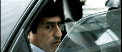
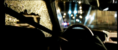
A more offbeat genre film is El Mudo, a Peruvian quasi-thriller, quasi-comedy from Daniel Vega and Diego Vega. After a day of dreary complaints and insults, the magistrate Constantino finds his car window smashed. What else is new? Soon after, he’s driving through traffic and is apparently wounded by a sniper. He loses his voice but becomes doggedly determined to uncover what he thinks is a conspiracy.
Constantino is not your raging rogue investigator. His muteness only increases a fixed, slightly scowling demeanor that suggests stoicism, boredom, or emotional vacuity. He refuses to perform the exercises that might strengthen his voice, as if he welcomes the loss of one more channel of expression. Everyone else seems normal, but Constantino (played superbly by Fernando Bacilio) might have walked out of an Aki Kaurismaki movie. The filming is in tune with the protagonist–static and prolonged shots, shrewd but unemphatic angles that simply wait for something to happen.
The result is an anti-action film. The assassination attempt, if that’s indeed what it is, is merely a bump in what is otherwise a drab long take filmed from the back seat of Constantino’s car. After waiting for a traffic light to change, he proceeds and suddenly slumps sideways as we hear four faint cracking sounds and watch the car drift onto the curb.
When the case is solved (perhaps) during a police raid, poor Constantino waits outside and so merely glimpses the stunt that would get visceral treatment in another movie. By the end, he finally smiles with pleasure, revealing himself as at a memory of maternal affection; he’s a mama’s boy after all. Il Mudo is a continuous pleasure throughout and is to be recommended to any fan of deadpan grotesque.
Many missing images
We’ve suggested, in both Film Art and elsewhere on this site, that a documentary film can be highly artificial. As long as it purports to make claims about the nonfictional world, the film can stage scenes and even use animation to support its points. A new test of this idea has come along in the form of Rithy Panh’s muted but powerful memoir of Khmer Rouge atrocities, The Missing Picture.
It employs some documentary conventions, like newsreel footage and voice-over commentary, but it seeks to present what was never put on film at the time. Panh’s family is shipped out of Phnom Penh, sent to forced labor and starvation in the countryside. Medical experiments are conducted with humans. Children are forced to pound out fertilizer and haul bodies to burial pits. The Party cadres, of course, eat well. Western intellectuals may have praised the Khmer Rouge as disciplined Communist idealists, but “the revolution they promised exists only on film.” How do you show what was never shown, not even widely known?
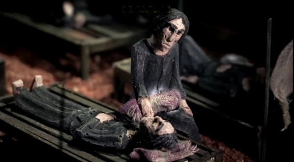
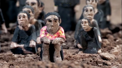
To provide a counter-film, Panh fills tabletop tableaus with carved clay figures. By the hundreds, these little effigies populate toy settings of work camps, hospitals that are merely storehouses for the dying, and landscapes that call forth children’s fantasies of escape and memories of happy family life. The figures themselves, squat and chunky, wear emblematic clothes–most often, gray work pajamas–and bear hollow-eyed expressions hinting at sullen fear or merely numbness. Panh’s childhood self is clothed, against all orders, in a pink shirt with yellow dots, which not only lets us identify him but suggests his yearning for the world of color that the Khmer stamped out.
As The Missing Picture proceeds, it becomes more reflexive. The Khmer officials show their propaganda films to the camp audiences, and Panh takes the opportunity to show his figures gathered and obediently watching. At the end, he reminds us that those who resisted are still wandering among us, like ghosts. Some things, he grants, should not be seen or known. “But should any of us see or know them, then he must live to tell of them.”
VIFF may be living in many new houses, but it’s definitely living, and as splendidly as ever.
The Empire Granville 7 was the last remaining movie house on Vancouver’s Theatre Row, which at one time had over twenty theatres. On the Granville 7’s future as retail space, a story is here. This article mentions that the Granville 7 originally absorbed a theatre called the Coronet. Cinema Treasures supplies more details of Granville 7 history. Images of the interior demolition of the house are here.


