Archive for the 'Festivals: Vancouver' Category
Animation in Vancouver
Kristin here:
I didn’t manage to see all the animated films at the Vancouver International Film Festival, but I saw three. That is, I saw two animated features and one documentary about an ambitious and lengthy project that never saw the light of day except in butchered form. The films differ widely in subject and will probably appeal to quite different audiences.
The young
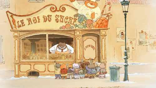
Ernest et Célestine (2012, co-directors Benjamin Renner, Vincent Patar, and Stéphane Aubier) is one of those irresistible cartoons based on a well-loved children’s book series. From 1982 to 2004 , Belgian artist Gabrielle Vincent (1928-2004) created this series, based on the unlikely friendship of a little-girl mouse and an adult bear. The film’s imagery replicates the style of the books’ water-color illustrations (see above). Although the series is not well known in the English-language markets, a few translations have appeared. Most are out of print and apparently very collectible, though there is an English-language volume coming out on November 1. This film version might well foster the popularity of the books internationally.
Bears and mice are here assumed to be dire enemies, a premise set up in the opening as Célestine and her fellow orphans are told a cautionary tale by an elderly lady supervisor. It turns out, however, that mice are Tooth Fairies, and that occasionally involves their visiting bear families to exchange coins for the baby teeth of cubs. Such a mission leads to Célestine visiting a bear family (in the candy shop pictured above) and meeting Ernest, a large bear who vainly attempts to make a living as a street musician. The pair become unlikely friends, and as a result become outcasts living together in Ernest’s cottage in the forest. Eventually each is tried in court for having transgressed the natural boundaries between their species.
Visually the film is charming, though narratively it clearly is intended for small children. Unfortunately the screening I attended had an audience mainly made up of adults, only a few of whom brought children with them. Children accustomed to the break-neck pace of anime and contemporary television cartoons may not have the patience for the calm, leisurely narrative pace in Ernest et Célestine. Young children and those with more appreciation for traditional narratives will delight in it however, and it would be worth seeking it out in art-house screenings and, with luck, in video release. Its message of tolerance and understanding among widely different sorts of “people” is simple but effective.
A book of the art of the film, with illustrations by Vincent, is soon to be released in France.
The old
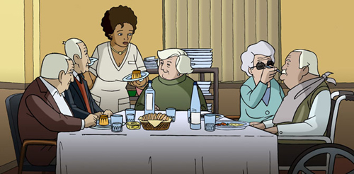
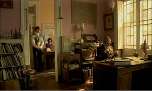
At the opposite end of the age range is Wrinkles (2012, Ignacio Ferreras), a Spanish animated feature about an elderly gentleman, Emilio, whose adult children become fed up with caring for him as he slips into the early stages of Alzheimer’s. They consign him to a slick, soulless care facility and visit him only rarely at holidays. Discouraged and unhappy at first, Emilio gradually comes to appreciate the small pleasures and support the other “clients” at the home can bring each other (see bottom). His roommate, a cynical long-term resident who practices minor con tricks on vulnerable, disoriented neighbors, nevertheless provides humor and support. A still-healthy wife who has nevertheless come to the facility to take care of her husband, an advanced Alzheimer’s patient, shows that love can bring a trace of reaction even from a seemingly unresponsive person.
The story is touching, and the opening provides a surprise moment that conveys Emilio’s encroaching confusion well. The animation, though fairly limited, is well designed and attractive. The endings for the various patients seem to put a distinctly cheerier spin on the grim advance of Alzheimer’s than one would imagine to be appropriate to the subject. Still, the film looks at the subject compassionately and manages several touching scenes.
The ghost
Vancouver was the venue for the world premiere of Kevin Schreck’s documentary, Persistence of Vision (2012). It deals with animator Richard Williams, who made a successful career running a studio primarily making animated commercials and credit sequences. Back in the 1980s and 1990s I must have passed it on London’s Soho Square dozens of times completely unawares.) One of Williams’ employees also devised the technique for merging live-action and cartoons that was used for Robert Zemeckis’ Who Framed Roger Rabbit? (1988), and perhaps the best-known achievement of Williams’ studio was the animation in that film.
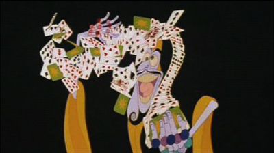
Schreck does a good job of presenting an overview of Williams’ career, but his real fascination is with the one doomed project that Williams pursued for about twenty-five years: a feature-length, absurdly technically complex feature to be called The Thief and the Cobbler. The scene above showing one of the characters performing an elaborate card trick is dazzling to behold. It takes place against a neutral background, but a battle scene, a substantial portion of which is shown in Persistence of Vision, goes much further, combining dizzying shifts through convoluted settings with mind-boggling movements of figures.
Williams’ studio worked on the film from 1964 to 1992, but only part-time, fitting it in among their various commissions. Schreck has tracked down several of the main animators who worked for Williams during substantial stretches of this period, and they give invaluable information about what became a legendary epic. Williams refused to participate, but there is quite a bit of historical documentary footage of him. Much of the original material from the film was destroyed, but Schreck, often with the help of his interviewees and others, tracked down original material in various degrees of completion. Several shivery animated sequences consisting of simple pencil tests are included, as are other scenes in later stages of animation. The result is a precious glimpse into the film that might have been.
Ultimately Warner Bros. committed to finance and release the film. This might possibly have worked, but by one piece of misfortune, design elements for The Thief and the Cobbler made their way to Disney and were, putatively (and plausibly) used for the Genie and other components of Aladdin (1992). This was a blow to the commercial viability of Williams’ film. That, in combination with Williams’ failure to complete it by the contractual deadline meant that The Thief and the Cobbler was turned over to a completion insurer. Somehow (in a deal not explained in Persistence of Vision), Miramax ended up with the project. They stitched together the existing sequences using new footage, including Disney-style musical numbers, something that Williams had been determined to avoid. In 1993 Miramax released a highly revised version of The Thief and the Cobbler.
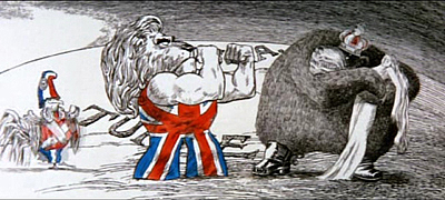
Williams seems to have been one of those artists who works best when kept on a very tight leash. The man was brilliant when it came to making TV commercials, some of which are shown in Persistence of Vision. He created some memorable credits sequences, also shown. I vividly remember seeing Tony Richardson’s The Charge of the Light Brigade in 1968. That was two years before I took my first film course, but even then I realized that the credits were better than the film they graced:
Williams did some of the late Pink Panther ones, too. Clearly, given a short, immutable length, he could come up with a gem. Similarly, when he worked as a collaborator on another director’s film, as with Roger Rabbit, he apparently didn’t become overly ambitious and unrealistic in his goals. It was apparently this one mad vision that slowly drew him to overstep the bounds of feasibility.
Williams’ legacy will not rest simply in these credit sequences and ads. Nor will it reside only in the images in Persistence of Vision, ranging from jumpy pencil tests to semi-finished sequences (and the sequences included in the unfortunate Miramax version). Williams wrote a book, The Animator’s Survival Kit, initially published in 2002, and, coincidentally, released in an expanded edition just last month. It is considered one of the basis books in the field and is used by amateurs and pros alike. Williams discusses the new edition in a brief clip, and one can see his sincere enthusiasm and also his restless energy. He also gives master-classes in animation.
Whether Williams could ever have created a narrative structure to pull together the brilliant set-pieces on display in Persistence of Vision is another question. Clearly his colleagues still regard him with a mix of admiration, devotion, and exasperation. Schreck’s film hints at a masterpiece that was mutilated and yet also suggests that the masterpiece itself was a elusive vision that was problematic from the start.
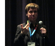 We enjoyed meeting Kevin and line producer Sarah Timberlake Taylor at the festival. During the introduction to the second of three screenings, Kevin expressed his surprise at the fact that the first and second screenings were both better attended than he expected. From the Q & A, I gathered that the audience included some animation buffs well acquainted with Williams’ career. The Thief and the Cobbler is clearly well known in the world of academic animation history. Buffs will be delighted that Schreck has pulled together so much material and given us as full a look at this lost film, masterpiece or not, as we are ever likely to have.
One problem that Kevin explained is that he cannot release the film into theaters (or presumably on DVD or VOD). It contains extensive clips of copyrighted material, including the various credits sequences and ads by Williams’ studio, short segments from Aladdin and other Hollywood films, as well as The Thief and the Cobbler in its version released by Miramax. This seems a tremendous pity. Given the historical and critical nature of Kevin’s film, it seems possible that such clips could be justified as fair use.
Much has been made of Room 237, the analytical documentary about Kubrick’s The Shining, which was also shown at Vancouver and other festivals. It has a theatrical release in the USA through IFC. Apparently no permissions were obtained from the owners of the copyrights for The Shining and other Kubrick films excerpted in the documentary, with fair use being claimed. As usual, no court cases have so far been filed, and so it is not clear whether fair use actually applies to such extensive uses of clips in historical and analytical studies. Persistence of Vision seems another clear-cut case of fair use, and it would be encouraging to see a distributor courageous enough to release it outside the festival circuit without “permissions” being sought.
October 21: David Cairns has kindly written to point out that there is an epic fan edit of the original footage of The Thief and the Cobbler. It’s incomplete, of course, but it’s 96 minutes long–and obviously a labor of love on the part of Garrett Gilchrist.
Got those death-of-film/movies/cinema blues?
Night Across the Street (2011).
DB here:
The cinema-is-dead complaint, Richard Brody helpfully points out, is now an established genre of movie journalism. In the last few weeks David Denby, David Thomson, Andrew O’Hehir, and Jason Bailey have in different registers sought to revive this quintessentially empty polemic. I’ve gone on about the tired conventions of film reviewing about once every year on this soapbox. (Try here and here and here and here; Kristin got in some licks too). For now I’ll just say that I’m convinced that the Death of Cinema (or Hollywood, or the Intelligent Foreign Film, or Popular Movie Culture, or Elite Film Culture) is simply a journalistic trope, like Sequels Betray a Lack of Imagination or This Movie Reflects Our Anxieties. In short: an easy way to fill column inches.
These squibs seemed especially damp this time around because while these guys were knocking Hollywood and/or art movies I was enjoying the Vancouver International Film Festival. If you’re willing to watch mainstream entertainments from outside Hollywood, or films that aren’t the bland arthouse fare full of stately homes and British accents, or even films that don’t chop every scene to splintery images, Dr. Bordwell has a cure in mind for you.
Had you been looking for breezy or outlandish entertainment, for example, the Dragons and Tigers wing didn’t disappoint. Helpless, from South Korea, is a thriller built around identity theft. I thought it was clumsily plotted, but it sustains curiousity through the apparently bottomless series of discoveries a man makes about his missing fiancée. Jeff Lau’s East Meets West is a Hong Kong farrago of rapid-fire gags, weird haircuts, references to old Cantopop, and nonchalantly wacko storytelling. Granted, the central idea of making the Eight Immortals of legend into modern superheroes (and one supervillain) is smothered by Scott Pilgrim-style SPFX. Still, I will watch Karen Mok Man-wai and Kenny Bee in anything, albeit for different reasons. Closer to mainstream Hollywood tastes was Nameless Gangster, in which a restless flashback structure traces the rise of a flabby brute from customs agent to top drug smuggler. Yoon Jongbin’s slickly-made film ends with an abruptness that recalls the conclusion of The Sopranos.
Of all the pop-entertainment movies I saw at VIFF, the audience favorite was doubtless Key of Life, a nifty Japanese crime comedy. An amnesiac hitman and a shambolic slacker swap identities in a cunning series of coincidences that brings on some satisfyingly menacing underworld types. Intersecting the men’s misadventures is a hyperorganized OL, or office lady, who determines to find herself a husband within a month. Everything sorts itself out, of course, with one nice wrapup saved for the middle of the closing credits. This is the kind of Japanese diversion I’ve recorded a liking for earlier (Uchoten Hotel and Happy Flight). Hampered by a wretched title, Key of Life probably won’t get US theatrical distribution, although it may make some headway on VOD. Aussie movie maven Geoff Gardner and I agreed that if we had the money, we’d buy the remake rights.
Everything new is old (again)
Tabu (2012).
Form is the new content, they say. (Too simple, but some do say it.) No surprise, then, that part of what appeals in contemporary cinema is its overt reworking of previous styles. Neo-noir is perhaps the most common current example, but ingratiating retro-stylings were on display in more rarefied forms at VIFF.
Part of the appeal is the rediscovery of the glory of the 4:3 aspect ratio. Kristin has already talked about how Pablo Larrain’s No appropriates a seedy U-matic look to tell its tale of 1970s Chilean politics. A similar pastiche effect emerged from Mine Goichi’s All Day, a short that used even grubbier video to parody Japanese family dramas. May we expect to see more VHS-looking movies? I wouldn’t mind.
Silent cinema pastiches are usually lame, as witness The Artist, which scrambles history and treats old films as oddly soft-minded. (No Hollywood drama of the late 1920s would have been built around a protagonist so feeble he tries to commit suicide twice.) Jean Dujardin, and contemporary audiences that adore his film, should catch up with Hayashi Kaizo’s To Sleep As If to Dream (1986), in which the contemporary story is played as a silent film and the rediscovered (fake) old film is accompanied by benshi commentary and music. The “forged” footage in Forgotten Silver also shows how good filmmakers can create convincing, pleasantly anachronistic imagery.
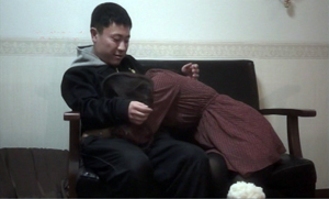
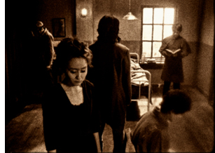 At VIFF, another D & T short, Yun Kinam’s black-and-white Metamorphosis (right) tried to replicate the look of silent cinema. While a family crowds around a deathbed, we get disruptive editing, aggressive depth, and even static flashes (those vein-like seepages into the image caused in old films by cold temperatures). As a retro exercise, Metamorphosis is better-informed and more evocative than what we get in The Artist. Suggestions of Maya Deren and Menilmontant gives these images the aura of having been exhumed from the archive.
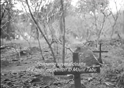
More celebrated since its Berlin triumph (two awards) is another 4:3 exercise, Miguel Gomes’ Tabu. A vaguely 1920s prologue shows a brooding tropical explorer who has seen his ex-wife as a ghost. Then Part 1 (“Lost Paradise”) takes us to stately black and white imagery of contemporary Lisbon. It’s late in December, and Pilar is concerned about her elderly neighbor Aurora. The old woman is taken to a hospital and asks Pilar to find Aurora’s old lover, Ventura. By the time Pilar discovers him, it’s too late. After Aurora’s funeral, Ventura starts to explain how they met in Africa. Here starts Part II (“Paradise”).
Now the film becomes hypnotic. In Africa, Aurora is married to a sturdy, good-natured colonist, and she can hunt and shoot with the best of them. Ventura and his friend Mario, who’s becoming a pop crooner, are taken into the household. He and Aurora begin a torrid affair. Part II is rendered without onscreen dialogue, but not in exact mimicry of silent cinema. There is piano music, it’s true, and much of the action is carried by letters, as in a lot of silent movies. But there are no intertitles; instead, all the action is played out with the support of Ventura’s voice-over, occasionally supplemented by the young Aurora reciting letters she wrote. Moreover, Mario’s band and his singing are rendered in full lip-synch. More eerily, as Ventura explains the rise and collapse of the love affair, we get highly selective bits of noise—not everything audible in a scene, but perhaps the tinkle of glasses or a faint wind. These become the aural equivalent of glimpses.
“Paradise” gives us silent cinema not replicated, but refracted through memory and romantic longing. In a film paying homage to Murnau (a forbidden romance as in Tabu, the name Aurora recalling Sunrise), Gomes has apparently also sought to give us something like the “part-talkies” of 1928-1929. Those films had full-blown dialogue scenes (as in Part I) and other scenes containing only music and effects (Part II), relieved by synchronized musical numbers (a sequence showing Mario’s band performing by the pool). Tabu recovers something of the strangeness of those transitional films, notably Sunrise itself, while remaining highly contemporary. It knows that we can turn to tradition when we want to rekindle a romanticism that would look high-flown today.
Long live the long take
Beyond the Hills (2012).
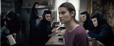
At about 16 seconds per shot, Tabu has the same cutting rhythm as some early talkies, like The Black Watch and Hearts in Dixie. Today, as we’ve seen, the long take is increasingly the province of movies that play chiefly at festivals. All other things being equal, a movie with around 1200 shots, like the very popular Danish import The Hunt, will be an easier sell on the arthouse circuit than, say, Beyond the Hills, with only about 110 shots in 148 minutes. It’s a pity. Although The Hunt is a solidly crafted drama in the Nordic enemy-of-the-people tradition, it moves rather predictably across the combustible subject of false accusations of child molestation. Beyond the Hills, by Cristian Mungiu, director of Four Months, Three Weeks, and Two Days, is more enigmatic and demanding.
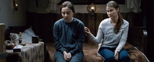
Voichita is a nun in a rural Orthodox enclave in Romania. She’s visited by her friend Alina. The two grew up as best friends in an orphanage, but Alina went to Germany to work, and now she insists that they must run off together. Voichita resists. Alina claims that Voichita once agreed to this plan. Has the young nun changed her mind and committed to the church? Or is Alina’s plan an idée fixe that Voichita has simply humored, without ever intending to join her? Were they perhaps lovers? Alina’s endless staring at Voichita and her lunges at suicide suggest deep passions at stake.
The refusal to supply full exposition makes characterization enticingly uncertain. Voichita’s wide-eyed sympathy for her friend can be seen as both pliable and stubborn, while Alina’s nearly wordless reprimands imply that Voichita has betrayed her. But perhaps Alina is just asking too much, or Voichita is being too unbending. The couple’s drama is played out against the stringent background of a female community ruled by a priest. Alina is incorrigible, not responding to the gestures of salvation extended to her, and agreeing, stone-faced, that she has committed every sin on a list of over 400. Eventually the pious souls decide that Alina is possessed, and her demons must be exorcised. In a simple gesture of solidarity, Voichita declares something like love for Alina, but too late.
Alternating discreet handheld takes with fixed shots staged in depth, making no concessions to impatience or easy responses, Beyond the Hills recalls the sobriety of Dreyer’s Day of Wrath and Bresson’s Les anges du péché. It plays out in a rougher-textured, muddier world, but it’s no less concerned with the dynamics of compassion and cruelty, dogmatism and eroticism. In each, a woman is ready to sacrifice herself for love. As Romania’s Oscar submission, Mungiu’s film deserves to find an audience in the US.
Long takes were also a specialty of the late Raúl Ruiz, whose penultimate film, Mysteries of Lisbon, won him probably the widest audience of his career. That film displayed his fascination with proliferating stories, but its adherence to a single plane of reality was exceptional in the career of a fabulist who enjoyed confounding all types of realism. In that regard, Night across the Street, his last fully completed work, is more characteristic.
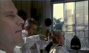
An old office worker is about to retire and is convinced that someone is coming to kill him. While Don Celso awaits his assassin, he fraternizes with his co-workers, with schoolteacher and author Jean Giono, and with others in the hotel where he resides. He also recalls his childhood, when he talked to Long John Silver and went to movies with Beethoven. Eventually the plot shifts levels of reality even more radically, as one séance blends into another, characters shot down in a massacre return to life, and eventually Celso takes credit for inventing the people around him.
Mungiu’s handheld shots have no place here. As in Mysteries of Lisbon and his Proust film, Time Regained, the camera glides through this world with velvety assurance. Sometimes the characters do too, as they seem to ride the dolly or saunter in front of a blatantly unreal backdrop. Ruiz subverts academic cinema by using its well-upholstered technique, but he also mines film history. He revisits tableau staging in the shrewdly split set of Don Celso’s office, and he continues to exploit his more-Wellesian-than-Welles big-foreground technique.
Above all, the boy’s trip to the movies, in an awkwardly tilted image in which the usher usually blocks the screen, pays typically skewed homage to the medium’s enchantment. The mock film of Ruiz’s Life Is a Dream has given way to The Foxes of Harrow, the Hollywood cinema of Ruiz’s childhood.
Land, sea, and sky
small roads (2012).
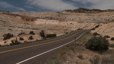
When one thinks of the long take, James Benning comes quickly to mind, and small roads is true to form—in more ways than one. Forty-seven fixed shots in 102 minutes take us from the Far West to the South and to the Midwest before shifting westward again. The roads are indeed small, far from superhighways and traffic circles. As usual, landscape is the protagonist and slight shifts in image or sound arrest our attention. There are plenty of perceptual teasers. When a distant truck descends the distant sloping road above, it vanishes. Will it re-emerge in the nearer road? At another point, we wonder when, or if a car we hear will appear in the frame.
Hogarth spoke of art that leads the eye “on a wanton kind of chase,” and Benning’s roads—almost never seen from dead center, so we’re not given central perspective—carve oblique or sinuous paths into fields, plains, deserts, and forests. Road signs reenact the curve of the roadway, with carets and squiggles providing spare geometric “readings” of the piled-up surfaces of color and mass. There’s also some synesthesia. In one shot, I thought I heard mist rolling in. The topographies are real but through Benning’s strict scrutiny they become as fantastical as Ruiz’s dreamscapes.
That’s why I suspect that roads aren’t the real subject of the film. They serve as a pretext for Benning’s recurring interests in how wind curls clouds and makes branches tremble, how light outlines trees, how shapes like squat black oil derricks and the textures of fat snowflakes and soggy leaves can command the frame. Now that Benning has moved to digital filming, he has discreetly inserted some CGI. I couldn’t spot any, though one partial moon in daylight looks suspicious to me. No matter. Painterly beauty, along with a certain placid mystery, is enough for any movie nowadays.
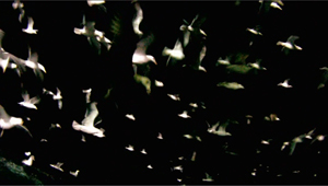
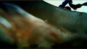
At the other extreme lies the bustle of Leviathan, a poetic, quasi-abstract documentary by Lucien Castaing-Taylor and Véréna Paravel. The filmmakers capture a New Bedford fishing trip through GoPro digital mini-cameras worn by fishermen, tossed into a netful of fish, or dragged through the water. Long takes abound here too, but it’s hard to say how many. As in The Man with a Movie Camera, the very boundary between one shot and another is put into question. So is the boundary between us and the space onscreen, as we’re weirdly wrapped in the extreme wide-angle yielded by this lens.
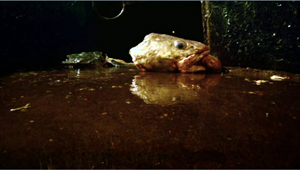
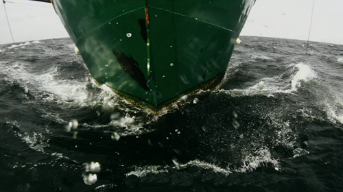
This is what you get when no human eye is looking through the camera. Often, in fact, nobody could look through the lens. No head, let alone human body, could occupy the space of some of these shots. Chains roll out past us from churning greenish darkness, while fish drift and slither on all sides. We’re right next to a gull trying to use its beak to lift itself to another area of the hold. Here the fish-eye lens lives up to its name. The camera bobs in a tank as fish are tossed in and spin aimlessly past. Coasting along the edge of the craft, we dip abruptly in and out of the heaving water, our plunge accentuated by brutal sound cuts. We chase starfish and ride waves, spinning up to watch gulls blotting out the sky. Accelerations of speed (again, Man with a Movie Camera comes to mind) render the action hallucinatory, especially since the shutter can capture foam with strobe-like precision.
One result is a disembodied, dehumanized vision of sea and sky: The camera as flotsam. But we also get bumpy, skittish visions of human labor definitely tied to bodies that harvest the ocean. Work activities are filmed from cameras lashed to the fishermen’s heads or lying on the deck among scallops to be shucked. Most documentary close-ups of artisans’ tasks are taken from far back and with long lenses; here the very wide-angle GoPro lenses not only show tasks from the inside, but their distortions exaggerate each gesture, sometimes heroically, sometimes grotesquely. Either way, human activity has been defamiliarized no less than undersea life.
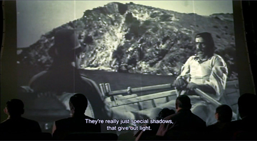
We start the movie immersed in a welter of details and stay enmeshed for nearly an hour. Only then do we get an “establishing shot” showing the boat deck and mapping the overall process of filling and emptying the nets. And fairly soon after that, as if to parody the usual documentary about fisher folk, we get a four-minute shot of the captain dozing off while watching a TV show (apparently The Deadliest Catch). Leviathan ends with a sequence that brackets the chiaroscuro of the opening, but we no longer see a clam’s-eye-view of being snagged. Instead, we get barely illuminated darkness with whiffs of crimson teasingly darting to the edge of the frame, as if to signal the end, before swerving back to the center, then heading offscreen. Again, Ruiz has the line: Special shadows that give off light.
Ready to declare cinema dead? There is a cure for your malaise. We call it a film festival.
More of my thoughts on Ruiz can be found here and here. His widow Valeria Sarmiento completed his very last project, The Lines of Wellington.
On small roads and digital manipulation, see Michal Oleszczyk’s discussion at Slant and Robert Koehler’s informative review in Variety. In correspondence Benning confirms:
Yes, lots of compositing, but no speed changing, although the border cops are going around 100 mph. . . . Shot 26 has a sky that was filmed the next day about 100 miles away. And yes the moon was out, but that shot is pointing north so I filmed the moon in the southern sky during the day, and put it into the northern sky. All the compositing was done with shots I made; always somewhere nearby. (100 miles is nearby when you circle 2/3 of the US.)
You can learn more about Leviathan from Dennis Lim’s article on the filmmakers in the New York Times. The New York Film Festival provides a lengthy Q & A on its website. See also Phil Coldiron’s “Blood and Thunder: Enter the Leviathan“ in the latest Cinema Scope, with some superb frame enlargements. Above all, don’t miss the extract on vimeo, which gives you a good sample of the splendor of this film.
Leviathan (2012).
More of the world in a multiplex: another dispatch from Vancouver
Kristin here:
Latin America
In my first report, I mentioned that the Iranian film A Respectable Family was an unexpected gem. I’ve come across another, the Brazilian film, Neighboring Sounds (2012). It has a remarkable formal device that unfortunately I can’t disclose without ruining the film for those who haven’t seen it. It’s a technique that takes a while to figure out, since it’s cumulative. (Fortunately, unlike with A Respectable Family, I have yet to find a review or program note that mentions it.)
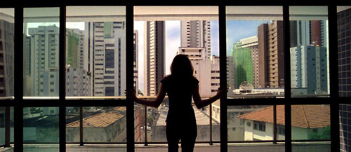
The film is set in Recife, the fifth largest city in Brazil. It centers around members of two families living in a complex of smaller, older houses surrounded by new condo high-rises that will eventually swallow the entire area. (The image above vividly shows the juxtaposition.) The divide between rich and poor is extreme, however, and the residents live in fear of crime, with elaborate gates and with grilles over their windows. Suspense is generated when a small group of men offer their services to provide security for the block, and once they are hired, we are left for a long time to wonder whether this is a cover for some other devious purpose.
The film is beautifully shot, taking advantage of the abstract compositions created by the modern apartment blocks and their glass windows and doors. As director Kleber Mendonça Filho says in the online press kit, “Architecture gone wrong is a nuisance, but extremely photogenic.”
The film’s title is taken literally, with many layers of offscreen sounds from nearby houses and streets forming much of the soundtrack. The complex use of Dolby Surround makes it especially desirable to view and listen to this film in a theater.
Neighboring Sounds has been picked up for US distribution by the Cinema Guild, which has handled other films we’ve enjoyed here in Vancouver , most notably Once upon a Time in Anatolia and The Strange Case of Angelica (and written about here and here, both available on DVD and Blu-ray.)
The Chilean film No (2012), starring Gael Garcia Bernal, has already gained a high reputation on the festival scene. (Like A Respectable Family, it was shown in the Directors’ Fortnight at Cannes.) David and I both thought it lived up to its buzz.
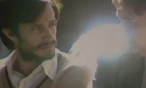
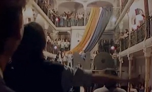
The plot deals with the 1988 referendum as to whether dictator Augusto Pinochet would remain in power. The side campaigning for the “no” vote was allowed a single 15-minute TV commercial each evening. Bernal plays a successful director of TV ads, Rene, who is lured into devising this commerical; he’s introduced showing off his latest spot for “Free” cola. He conceives of a campaign based on breezy optimism, with musical numbers (below right) and shots of cheerful workers acting as if Pinochet is already out of office. His tactics disgust several of the left-wing party leaders, as well as Rene’s estranged wife.
Technically the film is cleverly done. It was shot on old-fashioned U-matic video and shown in Academy ratio (not exactly reflected in these frames from the online trailer). Fuzzy images with occasional overexposure and other video artifacts not only suggest a period piece, but they also allow director Pablo Larraín (Tony Manero, Post Mortem) to seamlessly edit in historical footage of Pinochet and street clashes from 1988. No generates considerable suspense as well, whether or not one knows how the referendum turned out.
Sony Pictures Classics picked up No at Cannes and currently lists its release date as to be announced; according to IMDB, it will have a limited release in the USA on February 15.
Europe
A Royal Affair (2012, Nikolaj Arcel) has been chosen as Denmark’s entry for the Best Foreign Language Film Oscar. Of course, the long list of entries from various countries will be reduced to five before the voting occurs. Still, I wouldn’t be surprised if A Royal Affair ended up on the final list and even took the top award. In a way, it’s just what the Academy members like: a big, glossy costume drama based on uplifting historical events.
But I was relieved to discover that this is no Merchant-and-Ivory-style middle-brow adaptation. It’s a fascinating example of what happens when a bunch of leftist, cutting-edge filmmakers get their hands on a budget to make an historical epic. Although the film’s title and publicity center on the illicit romance that provides part of the drama, A Royal Affair focuses largely on politics. Its plot is loosely based on historical events during the Age of Enlightenment, during which Denmark initially remained a backward country based on serfdom, summary arrest, torture, and execution, and grinding poverty for the lower classes.
The opening shows the heroine, Caroline, born an English princess and wed to Danish King Christian VII, writing the story of her life for her children. A flashback then begins the story proper, with Caroline optimistically setting out for Denmark and quickly discovering that her husband is an impetuous, rude and possibly insane young man who cares nothing for her. Her loneliness and the backward situation in Denmark are gradually established. Eventually a young doctor, Struensee, who believes in the ideas of the Enlightenment philosophers, comes to court and befriends the king, helping him to behave in a more restrained fashion.
Caroline, too, is a devotee of Rousseau, Voltaire, and other authors whose works are banned in Denmark. Nearly an hour 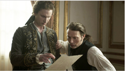 into the film, she discovers that Struensee is of like mind, and a friendship gradually moves into love and a sexual affair. The couple manipulate Christian into passing laws to benefit the peasants, earning the ire of the nobility. The narrative continues to center more on the social struggle that the three carry out than it does on the romance plotline.
When I heard that the Silver Bear for Best Actor was awarded to the film at Berlin, I assumed it went to Mads Mikkelsen, who plays Struensee–and seems to star in half the films coming out of Denmark these days (such as Thomas Vinterberg’s The Hunt, also shown this year in the festival). But the role of Christian VII actually seemed to me more challenging. Mikkel Boe Følsgaard has to play a character who begins as border-line insane, crude, and obnoxious, but who also must gain our sympathy when he becomes part of the plot to reform Denmark’s laws. I was delighted to learn upon further inquiry that is was in fact Følsgaard (on the left, with Mikkelsen, in the photo) who won the award. Well deserved.
As the image suggests, the film is shot in muted tones that tend to play down the costumes and sets more than historical dramas usually do. This approach helps direct our attention to the plot and politics rather than the pageantry. In short, I ended up liking the film much more than I expected to.
A Royal Affair will be released in the USA on November 9 by Magnolia Pictures.
At the other end of the budgetary scale is the Portuguese feature The Last Time I Saw Macao (2012, co-directed by João Pedro Rodrigues and João Rui Guerra da Mata). A common impulse among critics seems to be to compare this mysterious, lyrical film to some of Chris Marker’s works. There is little information available on it, but my impression was that the filmmakers shot a lot of lyrical footage of Macau and then concocted a story to fit it. There are shots of buildings, from skyscrapers to disreputable-looking back streets, as well as ephemeral items like some big, gaudy, cartoony balloons of tigers that decorated the streets for a local festival.
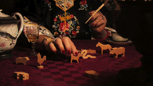
The plot has something to do with a mysterious gang, the Chinese zodiac (see image at the bottom), and the end of the world. The hero is barely glimpsed, narrating the story in voiceover (provided by both of the directors). The plot centers on his search for a transvestite named Candy, perhaps the “woman” seen performing a musical number in front of a cage containing live tigers in the sultry opening scene. The song, “You Kill Me,” is among several references to Josef von Sternberg’s Macao.
Despite the shoestring budget, the filmmakers manage convincingly to portray an apocalyptic destruction of the city, followed by bleak shots of deserted, early-morning Macao buildings that effectively suggest the aftermath. It reminded me of Godard’s depiction of a futuristic city in Alphaville, using contemporary buildings and highways.
No US release is planned, but The Last Time I Saw Macao is worth seeking out at upcoming festivals.
A Filmmaker of the World
I’ve mentioned some films that pleasantly surprised me, but almost certainly the best film we saw at Vancouver came as no surprise at all. We both loved Abbas Kiarostami’s Like Someone in Love, but we’re not going to write anything substantive about it, at least not now. It deserves another viewing or two before we could say anything worthwhile–and it hardly needs us to publicize it. The opening scene is fabulous, the subsequent rambling plot absorbing and intriguing, and the end, as so often happens with Kiarostami, puzzling and frustrating. Possibly the man can do no wrong.
IFC has theatrical rights for the USA. Currently its webpage announces “Coming in 2013.” This may mean primarily On Demand, though it would be a pity not to see Like Someone in Love on the big screen.
The end of one multiplex
Rumors circulated almost from the start of the festival, and on October 8 the festival’s director, Alan Franey, revealed officially that the Empire Granville will soon be closing down. A detailed story on the history of the Granville and its closing, with quotations from Franey and representatives of other film festivals that have used the venue, can be found here. Ideally next year’s festival will house most of its screenings in another of the city’s multiplexes, but the new venue is yet to be determined. We hope it will be someplace where we can bounce around the world from screen to screen as easily. The Granville has served us all well and will be missed.
Stretching the shot
Walker (2012).
It’s the editor’s job to think about coverage, and mistakes at this stage can have a very high price. Without that shot of the murderous feet walking slowly down the stairs, it’s impossible to build suspense. Inexperienced directors are often drawn to shooting important dramatic scenes in a single take—a “macho” style that leaves no way of changing pacing or helping unsteady performances.
Christine Vachon
DB here:
Go to any ambitious film festival, such as the Vancouver one Kristin and I are attending at the moment, and you’ll see several films made up of unusually sustained shots. Some Asian and European films may even be made entirely of long takes; in a few instances, none of the scenes may employ any editing at all. Movies made wholly of one-take scenes, or sequence-shots (plans-séquences) are probably more common today than they have been since 1920.
Why so many long takes? In the 1990s, when Vachon was writing, imitation and competition probably did come into play. The Movie Brats were sometimes up-front about their boy-on-boy rivalry. Here’s De Palma after seeing the shots following Jake into the ring in Raging Bull:
I thought I was pretty good at doing those kind of shots, but when I saw that I said, “Whoa!” And that’s when I started using those very complicated shots with the Steadicam.
Something similar may have been going on in earlier times. It seems to me that in 1940s Hollywood, directors came to a new consciousness of the long take. Preminger, Ophuls, Sturges, and Welles became famous for their sustained shots, and even Hitchcock, a long-time proponent of editing, switched sides, making some of the longest-take films of the era. Sometimes an action scene might be played out in one flamboyant take, as in The Killers and Gun Crazy. It does seem that these big boys appearing to compete to see how long they could hold their shots and how complicated they could make them. One scene in Welles’ Macbeth runs a full camera reel, or about ten minutes; Hitchcock’s Rope contains only eleven shots.
Yet I don’t think that macho showoffishness or competition can completely explain the urge to shoot long takes. Watching the Vancouver Dragons and Tigers series leads me to consider some other options.
Long view of the long take
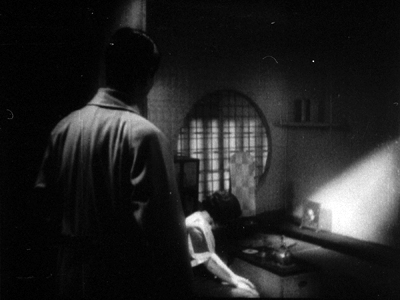
Naniwa Elegy (1936).
Of course there were single-take movies at the beginning of cinema, as in Lumière’s documentary shorts. And in the period 1908-1920, as I’ve argued in many entries on this site, some great films were made relying on single-shot scenes. They operated with a staging-driven aesthetic that’s come to be known as the “tableau” style.
But with the rise of American cinema to international prominence, and worldwide directors’ willingness to create scenes in the process of editing, the long take became relatively uncommon. In the 1920s, a rapidly-cut film might make occasional use of a long take, often as a fairly intricate traveling shot, as in Murnau’s Sunrise and Vidor’s The Crowd. Early talkies sometimes began with a long tracking shot (e.g., Sunny Side Up, Scarface) before settling into a more editing-driven style. And a few directors in Western cinema, like Max Ophuls, Jean Renoir, and John Stahl, handled extended dialogue passages in a single shot. A long-take approach was somewhat more common in Japanese cinema, with of course Mizoguchi Kenji being a prime exponent in films like Naniwa Elegy, Sisters of Gion, and Genroku Chushingura.
Citizen Kane probably helped popularize the long take in the 1940s, but so did the development of new camera supports. Dollies that could move through a set in tight turns encouraged directors to try out more sustained shots. For such reasons, most long takes of the period involved camera movement. Although Welles had his share of flashy tracking shots, he was one of the few directors who also let the camera stay fixed in place throughout a scene, in both Citizen Kane (Toland emphasized its “single, non-dollying” shots) and the extraordinary kitchen scene of The Magnificent Ambersons.
Occasional long-take shots have been with us ever since, some of them highlighting balletic camera-actor staging, as in Antonioni’s bridge encounter in Story of a Love Affair and many interior shots of Le amiche. By the 1960s, and 1970s, some directors became identified with long takes and even single-shot sequences: Tarkovsky most famously, but also Straub and Huillet, Miklós Jancsó, and Theo Angelopoulos. Fassbinder tried it out occasionally (Katzelmacher) as did Wenders (Kings of the Road). And of course in the avant-garde, devastating half-hour shots marked some works by Andy Warhol, not your most macho filmmaker.
There are still long-take films being made in the mainstream—not only those motivated as scavenged recordings like Cloverfield or Paranormal Activity, but also ambitious experiments like Children of Men. On the whole, however, long-take technique has become a hallmark of festival cinema. As commercial directors (not just in Hollywood) has embraced ever-faster cutting, other filmmakers have pushed toward ever-longer takes. It’s as if the rise of what I’ve called intensified continuity has provoked filmmakers to go to the other extreme. This impulse is thrown into still sharper relief by the fact that many of these festival films use little camera movement. And today’s shooting on video lets you hold shots a lot longer than shooting on camera reels.
But what does long-take cinema buy you?
Dragons, tigers, and stillness
A Mere Life (2012).
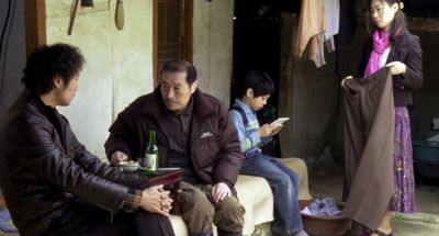
This year’s Dragons and Tigers series, the festival’s panorama of recent Asian cinema, had its usual quota of young people’s films about young people, not unlike America’s Mumblecore. The kids hang out, smoke, drink, flirt, berate each other, sometimes humiliate one another, occasionally come to a crisis in their lives. Other films were a bit more unusual. Several of all types, though, pointed up the virtues and limitations of current approaches to long-take shooting.
Most low-budget directors employing long takes don’t do so out of bravado or competitiveness. The reasons are more mundane: the tactic saves time and money. If you have rehearsed your actors, or if you want spontaneity and improvisation, you can get through a lot of your film more efficiently if you simply record the action. Editing in post-production comes down to choosing your best takes and finding the best arrangement of them.
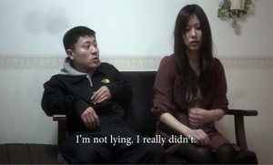
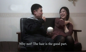
For instance, Ninomiya Ryutaro’s The Charm of Others has about fifty shots in its eight-five minutes. Most scenes consist of only one or two shots. One seven-minute shot shows a young layabout Sakata trying to jolly his girlfriend out of dumping him. She’s seen him with another girl and tells him, “Eat first, then we’re through.” Instead, he pokes and tickles her, makes faces and jokes about liking to eat hair, and eventually wins her back. It’s a nice little examination of how men turn boyish, even babyish, when they’re trying to avoid a woman’s wrath.
Ninomiya, who plays Sakata, explains that although he had each scene’s core action fully scripted, he let actors improvise a fair amount during shooting. (Some specific words, however, had to be used.) The girlfriend scene was shot four times, the first three developing one approach to the action and the fourth take trying a totally different approach. Ninomiya wound up using the third take.
The Charm of Others is shot in a loose handheld style, with panning and tracking to follow its characters. This “free camera” technique is probably the most common way off-Hollywood directors employ the long take. The approach was on display as well in Mine Goichi’s The Kumamoto Dormitory. The plot follows a pair of slackers who want to work in films but lack ambition and anything approaching realistic expectations. More editing-driven, and somewhat more slickly made than The Charm of Others, it still averaged about eleven seconds per shot, a far cry from contemporary Hollywood’s average of five seconds or less.
For the most part, The Kumamoto Dormitory uses long takes in traditional ways–to record a scene’s interactions, and sometimes to create parallel story situations. In the beginning a lengthy shot drifts along dorm corridors as kids are moving in. One later in the semester shows boys in each room masturbating, playing mahjongg or computer games, and otherwise goofing off. Near the end another traveling shot shows the boys packing to leave as we hear an admistrator’s public speech describing how dorm life brings beginning students and graduating ones closer together. His inspiring line, “You were brought into the world because you were needed,” becomes ironic in the light of the dead-end hopes of a would-be movie director and his pal, an aspiring stunt man.
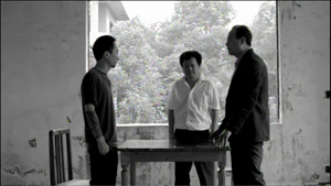
More rarely, the camera can be locked off during the long take, creating a static setup that may be refreshed by slight pans and reframings. Two of the films I’ve discussed earlier, Romance Joe and In Another Country, exemplify this approach; the former has fewer than 200 shots, the latter fewer than seventy. A similar approach, with a little more emphasis on dramatic compositions, is taken in Park Sanghun’s A Mere Life, a movie not about twentysomething crises but about the failure of a man to provide security for his wife and child. In a somewhat Mizoguchian tale of misery, most scenes are covered in only one or two fixed shots. There’s a striking scene in a café which obliges us to scan the background when a con artist bilks the husband and flees with his money. At another point, the camera’s refusal to budge and the director’s refusal to cut create considerable tension. Soon after the husband has lost the family’s savings, walls block our view of his desperate attempt to kill his wife and child.
The static long take is used in a more transparent way in Luo Li’s Emperor Visits the Hell, the winner of the Dragons and Tigers competition. The curious premise is that characters in present-day China are reenacting an episode in the classic saga Journey to the West. The reenactment, moreover, isn’t an affair of costumes or combat. It’s more abstract. For instance, the Dragon King is decapitated in the original story, but the Triadish character playing him in this film strolls around with his head firmly in place.
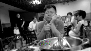
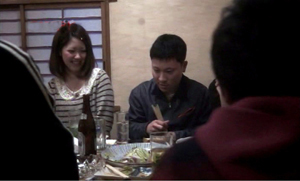
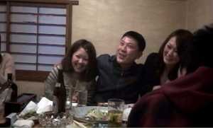
There are few single-take scenes, but the starkness of the décor and the fact that characters tend to be planted in a single spot give the film a sense of ceremonial gravity enhanced by the precise choices of camera position. Only in an epilogue, during the production’s wrap party in a restaurant, do the cast and crew assume their everyday identities. Then the camera goes handheld and roams bumpily around the table.
By the end Emperor Visits the Hell becomes a collection of contemporary long-take options: fixed versus moving, rock-solid framing versus shakycam.
Time on our hands
The long take has, we’re often told, another purpose: to capture real duration. Editing, it’s said, fragments not only space but also time. Whenever you cut, you have the opportunity to skip over dead moments. With a long take, especially a static one, the filmmaker is in effect asking us to register all the dead time between more important gestures, expressions, or lines of dialogue. This happens again and again in The Charm of Others, The Kumamoto Dormitory, and most of the movies I’ve already mentioned.
But the assumption of that “real time” flows through the shot can be questioned. The most common counterexample is slow- or fast-motion, which doesn’t respect the actual duration of the action the camera records. A rarer instance is offered by Tsai Ming-liang’s episode Walker in the portmanteau project Beautiful 2012, sponsored by the Hong Kong International Film Festival Society.
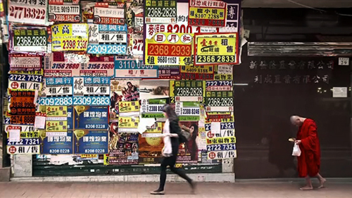
The action is bare-bones: A Buddhist monk walks through Hong Kong bearing a crinkly plastic bag in one hand and a sweet bun in the other. Across twenty-four minutes, twenty-one shots trace his progress through the city. In most the camera never movies, capturing the monk’s movement in static, sometimes abstract compositions. The catch is that the monk, played by Tsai regular Lee Kang-sheng, is advancing with preternatural slowness.
Sometimes we have to play a sort of Where’s-Waldo game with the compositions, searching for his stooped head or brilliant red robe or bare feet in a crowded shot. Most often, the emphasis falls simply on the monk’s movement. Hands lifted, head bent, he makes his way as if walking underwater. We watch each foot lift, shift weight, and descend in excruciatingly small changes of position. The movement proceeds not from camera trickery or CGI gimmicks; Lee’s performance presents a “temporal close-up” of humble, unstoppable walking. Meanwhile traffic, passersby, and other parts of his surroundings bustle along as usual. This is really stretching the shot–making the long take seem even longer.
One effect of these shots is to unroll an image of pure spiritual discipline, a sort of Zen exercise showing how microscopically an adept can control his body. Pedestrian yoga, you might say. Another effect Tsai creates is to summon up two times in one shot: that of normal activity and that of a spiritual tempo nestled within, but also opposed to, ordinary life. Eventually, when the monk bites into the bun, even that is rendered with the clarity of stop-motion photography. Here the long take exercises an almost scientific force, letting us see a simple act pulverized, as if a Muybridge image were translated into live action.
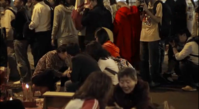
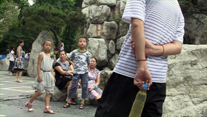
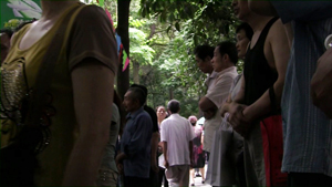
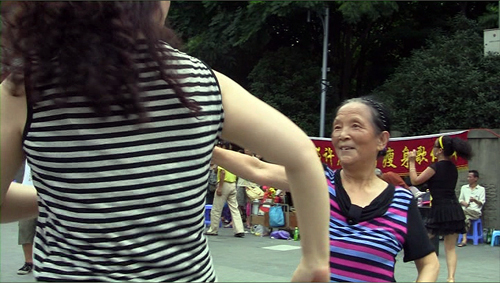
At the opposite extreme is the action-packed long take, running about seventy-five minutes, that comprises J. P. Sniadecki and Libbie D. Cohn’s People’s Park. The filmmakers had the good idea of taking us through a day’s pleasure in the city park of Chengdu, China, by means of a single traveling shot. A modern version of People on Sunday, the film unrolls a pageant of the everyday. People snack, trot past, make cellphone calls, rest on benches, sketch calligraphy on the paving stones, and above all make music. We see band concerts, karaoke performances, traditional opera, and spontaneous dancing to pop beats. The film starts with couples dancing and ends with an exuberant display of bouncy soloists who, we learned from Libbie Cohn after the screening, come often to perform for the sheer fun of it.
Just as important, instead of shooting at eye level, Sniadecki and Cohn filmed from a wheelchair. The lower-than-normal framing emphasizes kids, fills the frame with torsos, and yields unexpected revelations of figures in depth. We also get to watch a choreography of politeness as people subtly adjust to the camera as it squeezes through crowds or sidles among couples on a dance floor. Far from being the weightless, invisible camera of most Hollywood films, this camera and its carriage occupy actual space as the whole unit carves a sinuous path through the park. How, we sometimes wonder, will it get through here?
Many of the most famous long takes in film history are, we might say, teleological: They build toward a climax. Think of the tracking shot that opens Touch of Evil, beginning with a bomb set ticking and ending with an explosion. In a quieter way, the tableau aesthetic of the 1910s often gave the shot a distinct curve of interest, building to an expressive peak. (See here and here.)
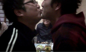
And occasionally in today’s cinema, a shot that seems casual will subtly prepare us for a payoff. In The Charm of Others, a drinking game allows Sakata to tell others around the table what they must do. He orders two boys to kiss, and the girls join him in chanting, “Kiss! Kiss!” Those boys have already been present from the start of the shot, but now they become more than a pair of framing shoulders. Their obeying the order close to us furnishes an enjoyable topper for the take.
One problem facing the makers of People’s Park was the need to provide such a climax. As in Russian Ark, a single-shot feature film can’t simply stop; it needs to draw to a close, preferably on a striking note. In my view, Sniadecki and Cohn manage it. It would be unfair to tip you off–can there be such a thing as a stylistic spoiler?–but let’s just say it’s a moment of abrupt change within what is otherwise continuous, evenly-paced unfolding. Yes, dancing is involved.
In certain contexts, a long-take trend can, as Vachon mentions, exude a certain bragadoccio. Competition among artists, though, even with some bravado, isn’t necessarily a bad thing, as 1940s and 1980s Hollywood suggests. Sometimes as well the long take is an exigency demanded by time and money. It can yield artistic advantages, too, by building suspense (as in A Mere Life) or surprise (as in The Charm of Others) or both (as in People’s Park). It can also be a mark of virtuosity, a quality prized in most artistic traditions. A well-done long take can be like a sustained aria in an opera; its confident audacity can make you smile.
The epigraph quotation is from Christine Vachon’s Shooting to Kill (Morrow, 1998); the passage is available here. My quotation from Brian De Palma comes from “Emotion Pictures: Quentin Tarantino Talks to Brian De Palma,” in Brian De Palma Interviews, ed. Lawrence F. Knapp (Jackson: University Press of Mississippi, 2003), 148. I discuss stylistic competition in contemporary American film in The Way Hollywood Tells It.
I consider Mizoguchi’s use of the long take in Chapter 3 of Figures Traced in Light. Some elaboration of that chapter is on this site.
Toland’s explanation for avoiding cutting is explained in his essay “Realism for Citizen Kane,” available here. For more on his decision-making, see our book, The Classical Hollywood Cinema: Film Style and Mode of Production to 1960, as well as this blog entry. For more on 1940s “fluid camera” technique, go here.
The segments of the film Beautiful 2012 began life as online videos. They are linked at Hong Kong Cinemagic. They play rather jerkily on my laptop, but the motion in projection is completely smooth.
My thanks to Tony Rayns and Shelly Kraicer, programmers of the Dragons and Tigers series, for their acumen and assistance.
People’s Park (2012).


