Archive for the 'Film and other media' Category
More work for the eyes
DB here:
While in NYC I’ve been catching up with old friends, eating too much, and seeing movies. In my next entry I hope to write about movies and some venues showing same.
In an earlier blog, I wrote about research into the ways our eyes scan pictures. In his blockbuster follow-up Tim Smith shared his current research into tracking viewers’ eye movements when they watch a movie scene. Today, I go back to still images, inspired by a couple of visits to the place where Kristin is finishing up her fellowship, the Metropolitan Museum of Art.
3D or 2D?
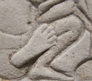
Sculpture, we say, is three-dimensional and painting is two-dimensional. That’s mostly true, but in the case of relief carving we have something in between. Consider the above nifty Egyptian shallow relief from the mid-fourteenth century BCE, the Amarna period, discovered in Memphis. A servant is force-feeding some cattle. As an effect of the lighting and the carving, his foot protrudes a bit from the overlapping surfaces behind him.
On a lesser scale, the same thing can happen with paintings. We commonly say that paintings are flat, relying on pictorial cues to suggest depth. But paint applied to a surface has its own thickness, a quality that is largely lost in reproductions. One of the virtues of seeing a painting in the flesh is that you can study (at least as closely as the guard ropes allow) the subtle ways in which even a little dab of paint can give the painting a tangible depth, sort of 2D plus.
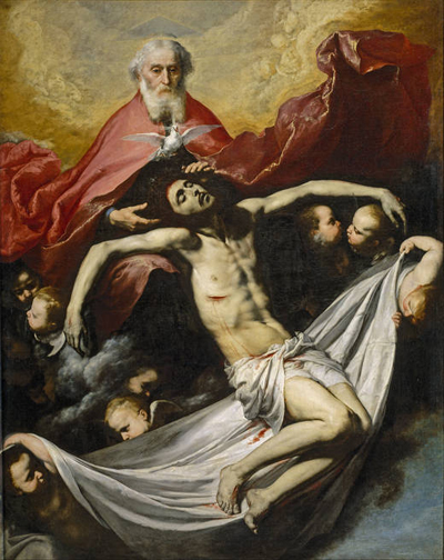
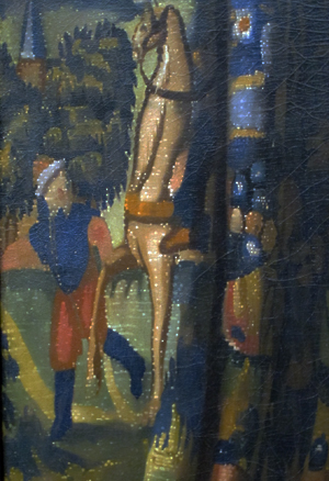
I first noticed this, I think, when I saw José de Ribera’s Holy Trinity (1636) in the Prado many years ago.
The painting wasn’t under glass, so I could see that Ribera had made Christ’s wound horrifying by laying a scab of paint on the picture surface. It was as if the canvas itself were bleeding. (More generally, that trip to the Prado convinced me that Dali’s work, and the Andalusian Dog film, made a lot more sense after you saw Spanish baroque art.)
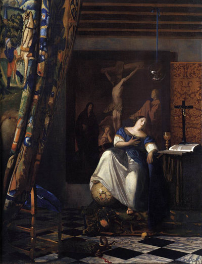
So at the Met last week I was inclined to keep my eye out for bits of paint that seem to lie on top of other patches. I was rewarded initially when I visited Vermeer’s great Allegory of the Faith (1670-1672). This has provoked many questions as to whether Vermeer used a camera obscura in planning, drawing, or even painting his images. Some claim to find the camera booth reflected in the crystal ball hanging over the lady’s head.
Peering at the tapestry curtain on the far left edge, I was gratified to find white speckles dappling it.
Some scholars propose that these stipples are the specular reflections that an optical instrument like the camera obscura create. Robert Huerta proposes, though, that these signature devices are used in a variety of ways in Vermeer’s paintings, often suggesting surface texture. Here, they are present only on the fabric, not in other areas of the painting; they stop at the curtain’s edge. Are they then Vermeer’s effort to represent needlework, slight bumps on the surface of the curtain? I have to leave it to experts.
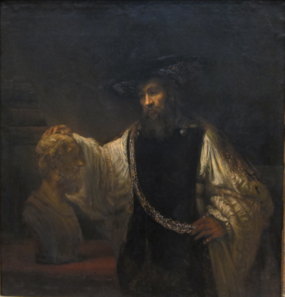
I’m more confident about what I saw in looking at Rembrandt’s Aristotle with a Bust of Homer (1653).
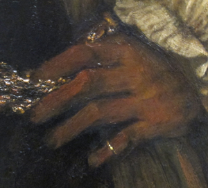
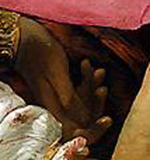
It’s a very big picture, nearly six feet high, but again my eye was caught by a detail. While Aristotle’s left hand rests against his elaborate belt, his pinky ring, a sharp, highlighted strip of paint, seems to protrude from the canvas.
The slight pop-out effect probably comes partly from the hard-edged ring set against the sketchy hand. Still, as far as I could tell, the dabs of paint sit on top, a thin layer of golden light. The ring’s gleam lights up the bottom corner of the picture. It works better than many 3D movie effects I’ve seen.
Misdirection
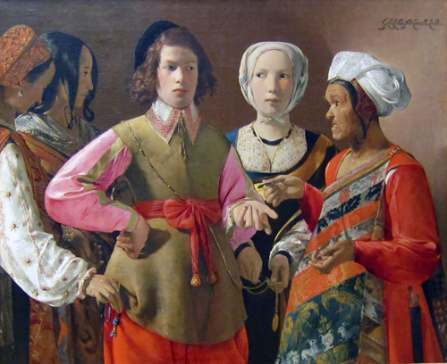
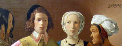
More amateur art appreciation, this time tied to our earlier theme of where you look in an image. There’s plenty of detail to study in Georges de La Tour’s The Fortune Teller (probably 1630s). 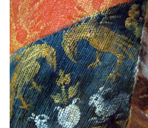 For one thing, we get a powerfully illusionistic representation of brocade in the sash of the wizened fortune-teller (right). However, what grabbed me was the composition of the drama. A somewhat condescending young man is paying the old woman, stereotyped as a gypsy, to have his fortune told. But the women surrounding him are her confederates. One woman is stealing his purse, the other is snipping off a medallion. The theft might be more evident to you looking at this tiny image, but the picture is so large (about 40 inches by 48 inches) that a gallery visitor must scan it in great saccadic sweeps. So I’d hypothesize that in front of the picture you don’t spot the grift right away.
I think that the painter has engineered a pretty game of misdirection. He has used cues that draw our eyes to one area of the frame and so one aspect of the drama, the exchange of glances, before letting us explore the frame to detect the pocket-picking. Several bottom-up, stimulus-driven cues work together to draw us toward the top half of the picture.
Framing is a major cue. When a picture cuts off the human body at the thigh or crotch we’re steered to the upper area of the frame. That’s where the action is likely to be; knees aren’t usually as expressive as heads.
Faces, as Tim’s analysis shows, are magnets for our attention, and the painter exploits this. The two women’s heads on the far left are played down: one is turned away, the other, with a neutral expression, is in profile and semidarkness. Her glance directs us to study the slightly suspicious expression of the youth and the edgy gaze of the central woman, and then imagine a drama played out. The head positions of the two central figures represent a compromise between readability (frontality is a strong attention-getter) and realism (people do share gazes). But the painter profits from the compromise by letting man and woman, facing front, move their eyes shiftily, raising the atmosphere of suspicion. The almost grotesque face of the fortune teller, a richer brown than those near her, also attracts our notice.
Another powerful cue is horizon-line isocephaly. The term is a mouthful, but the idea is worth knowing about. This common Renaissance technique places several heads, regardless of their distance from us or one another, along the same plane. It’s especially marked here because even the eyes of three figures fall almost exactly on the same line.
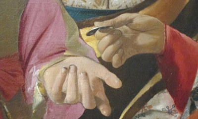
Centering in the picture format works to make the gesture of exchanging money very important. With the expressive hand gestures, we seem to have a complete story: The skeptical youth, dirt under his fingernails, has just paid the fortune-teller, who may be crossing his palm with silver in the course of her predictions.
There are other cues that keep our eyes exploring the upper half of the frame, such as the streak highlighting the hot-pink blouse. But all are merely decoys delaying our noticing the covert action in the bottom half of the image, the activity carried out entirely by hands.
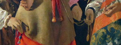
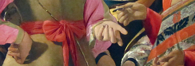
Hands are normally areas of high information content, second only to faces, I suppose. But the michievous hands of the pickpockets are low in the frame, one is in shadow, and both are subordinated not only to the faces but also to the more expressive hands just above: one on a hip, two gesturing around the coin.
It’s as if there are three layers: the heads, the hands executing the business transaction, and the hands underneath doing the real business. The third level harbors something still more covert. Only on several passes did I notice that the second, profiled woman on the left has her hand ready to receive the purse from the woman lifting it.
There’s a lot else to admire here, not least the way that the two women on the left seem to merge into one two-headed pickpocket, thanks to the shared contours, their orange vests, and the angle of the first woman’s arm.
I wish Tim or someone would try eye-scanning on this picture. In what order do viewers sample the layout? Do some viewers never look below and realize what’s going on?
In any case, my example shows the importance of top-down thinking. Recently preoccupied with eyes (in The Social Network) and visual scanning, I’d naturally be drawn to this image. I wouldn’t even care if it was the fake it’s sometimes claimed to be. But even that speculation involves top-down conceptual testing! If we entertain the prospect that The Fortune Teller was painted in the 1920s, then we might be inclined to see its cunning misdirection, and perhaps even the “cubistic” merger of the two women on the left, as influenced by modern art’s spatial ambiguities.
Bottom-up and top-down perception work smoothly together. The eye is sensitive to both stimuli and stored concepts; it’s driven by the environment and by the brain. The interplay of the two should fascinate anyone interested in cinema, which is at least partly a visual art.
PS 1 March: Tim Smith, our guest blogger last month, writes to remind me that the book I discussed in an earlier post, Land and Tatler’s Looking and Acting, makes reference to another famous de La Tour painting, The Cheat, and an eyescan study of it by Iain Gilchrist. The zigzag pattern of fixations suggests that people did indeed start with the faces of the players before discovering the cheating that’s going on. Eyescans of the painting are analyzed in John M. Findlay and Iain Gilchrist’s Active Vision: The Psychology of Looking and Seeing. Gilchrist discusses the painting in a fascinating illustrated lecture.
Some readers of my entry above have wondered if eyescan experiments could study how magicians misdirect us. Tim recommends Gustav Kuhn’s work on this problem, to which I can add this article: Peter Lamont, John M. Henderson, and Tim J. Smith, “Where Science and Magic Meet: The Illusion of a ‘Science of Magic,'” Review of General Psychology 14, 10 (2010), 16-21.
Time piece
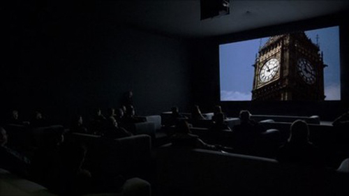
Christian Marclay, The Clock (2010).
DB here:
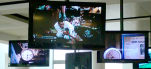
Normally I wouldn’t comment on a movie after seeing only 10.4 % of it, but there are always exceptions. The Clock, which played at the Paula Cooper Gallery during our stay in Manhattan, runs 24 hours. It’s a compilation of over 3000 film clips, mostly from Hollywood but also from Europe and Asia. Some of the footage is easily recognized, but a lot of it I couldn’t identify.
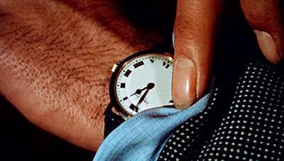
The premise, or gimmick, is that every snippet of a scene is purportedly connected in some way to the passing of time measured on a clock. Characters check their watches, or the camera shows a wall clock or digital alarm clock or countdown device. There are tiny clocks and gigantic ones. If the whole thing has a star, it might be Big Ben, who reappears surprisingly often.
A nice idea, but why stretch it over twenty-four hours? So that the creator Christian Marclay can assemble scenes that synchronize perfectly with the passage of time in projection. A shot shows a watch at 11:55 AM; you look at your watch; it’s 11:55 AM. Wherever the piece is screened, it must start precisely at the corresponding local time. The Clock isn’t just about clocks; it is a clock.
The project teases you into lame puns, which I’ve been unable to resist. But my visits set me thinking about what makes The Clock unique and pleasant. Maybe it’s a little too pleasant.
Collage without closure
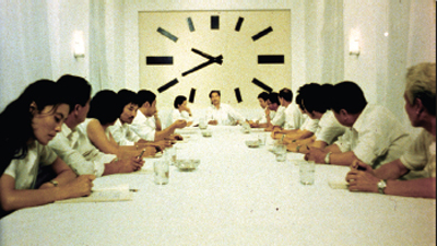
The Black Cannon Incident (1986).
In its collage of compiled material, what The Clock does is quite familiar to cinephiles. For a long time, experimental filmmakers have built works out of footage from mainstream movies. One of the most famous, Joseph Cornell’s Rose Hobart (1935), powerfully illustrates how the collage principle can pry images from their narrative context and call attention to their poetic or graphic qualities. The assemblage artist Bruce Conner did something similar in A Movie (1958), which creates anassociational form out of newsreels and old Hollywood sequences. Although both Rose Hobart and A Movie still evoke vague narrative expectations, Craig Baldwin whipped together found footage to create a hallucinatory narrative in Tribulation 99: Alien Anomalies under America (1991). An urgent, hard-bitten voice-over tells of CIA conspiracies and interplanetary conquest while we see images scavenged from cheap science-fiction films.
Nowadays plenty of filmmakers, especially on the Web, have snipped footage from old films to develop a theme. Jim Emerson has done it with close-ups, and Matt Zoller Seitz, Aaron Aridillas, and Steven Santos have created a video essay around guns in American film. Last summer, at the new facility of the Cinematek in Brussels, I found thematic loops running on their video monitors. Sometimes there was an interplay among them, so that characters one screen seemed to be looking at those in another. Some of the Cinematek loops in fact centered on clocks.
So the principle of compilation collage didn’t seem new to me. But Marclay refreshes it by the other central premise of The Clock: its time structure, which syncs moments indicated onscreen with moments of viewing.
Some fiction films (e.g., Cleo from 5 to 7, Nick of Time) and TV shows (e.g., 24) have played with the conceit of making the duration of the piece (“real time”) correspond to the amount of time covered in the plot. (Usually, however, the film fudges it.) But in The Clock, there’s no overarching plot, so the duration of that action can’t be determined. Marclay gives us real time with a vengeance, in the relentless correspondence between screen clocks and audience clocks.
Without this exact synchronization, The Clock would be an enjoyable but unexceptional found-footage movie. The onscreen clocks check the flow of the images like centers of magnetic force. They form nodes around which each set of shots revolves, like a musical key that a melody can drift from and return to.
 This patterning too has parallels in the experimental film tradition, I think. What P. Adams Sitney famously called Structural film was a 1960s-1970s trend that often built the awareness of time into a film’s overall pattern. A simple example is Robert Nelson’s Bleu Shut (1970). A clock runs in the right corner of the frame to measure the time consumed by a film that is, we’re promised by a woman’s breathless voice-over, “exactly thirty minutes long.” (She lies.)
A less explicit instance is Hollis Frampton’s Zorns Lemma (1970). In its central section, one by one a string of images replaces one-second shots of signs marking the letters of the Latin alphabet. The shot-changes set up a steady beat, and the pattern locks in a sense of momentum. Although we’re surprised by what images replace the letters, our expectations get focused on the inevitability of all the alphabet shots being deleted. There’s no literal clock, but we can sense this event slowly fulfilling itself. In addition, some of the replacement images show processes moving toward completion, such as dried beans steadily filling up a container. I’m tempted to say that in many Structural films, an actual or tacit clock tracing the film’s movement toward closure becomes a sort of non-narrative equivalent of a deadline in a storytelling movie.
The Clock doesn’t provide exactly that sense of closure, since it has no end point. It’s on a loop and, like a real clock, can be reset according to the time zone of the venue. But the nodal clock images make us aware of the film’s relentless unfolding, and its sync principle has affinities with the Structural tradition’s commitment to a precise time-based architecture. That tradition had its own sources, of course, including the experiments of the Fluxus movement, a trend that also influenced Marclay.
Top-down time
Tracing parallels shouldn’t lead us away from the unique qualities that make The Clock so appealing. For one thing, the fact that there isn’t a continually running readout, as in Bleu Shut or in an iPod slider, enables the film to test our feeling for passing time. Not every shot shows a clock; indeed, most shots in the portions I saw don’t. As we get captivated by clock-less images and follow their development within a scene, the arrival of a timepiece reminds us of the structuring principle. The appearance of a clock creates something like a punchline, while also letting us realize how loose our sense of duration in a movie usually is.
This test-like quality of the film, an important aspect of Structural film that Sitney points out, is reinforced by Marclay’s central idea. We are primed to scan the shots for clocks. Indeed, the search for the clock can reshift our sense of what is important about the scene. In an earlier entry, I discussed how Alfred Yarbus’ experiments in tracking eye movements assigned people tasks, such as estimating the social status of people in a painting. This created “top-down,” concept-driven search behavior. The Clock does the same thing, with the only explicit instruction being the title and our background knowledge of the piece’s procedures.
The result of our top-down search that we pay attention to clocks in the corners of shots or out of focus in the background, in scenes in which time isn’t really at stake. Normally we probably wouldn’t notice these items, but spotting them gives us a reward and allows us to admire Marclay’s cleverness. Some scenes seem to lack clocks altogether, but that doesn’t make them filler; a stretch of clockless footage only sharpens the fun when one shows up.
With shots pried free of narrative demands, you start to discriminate details, like the designs of numerals and brand identities. As you see the names Bulova, GE, Tissot, Hamilton Beach, and all the rest, you realize that it isn’t only James Bond films that use watches for product placement.
I’ve said that the film isn’t narrative in the same way that Craig Baldwin’s fantasy collages are. Yet it does tease us with some narrative expectations. If you recognize the footage, then you can summon up your memory of the story. If you don’t recognize the footage, you might still recognize the generic situation (investigation, pursuit, lovers’ confrontation, awakening in the morning). And the whole shebang does get you thinking about the role of time in narrative.
In this regard, the film makes an almost didactic point: Stories, at least those we’ve become used to, need clocks. They set the story world in motion, they measure its changes, and above all they provide deadlines that generate suspense, surprise, and satisfaction. The Clock makes deadlines especially apparent as we approach noon, when we get not only images from High Noon but also a flurry of other 12:00 PM shots (Titanic, for one). Noon is a really important moment in Central Standard Movie Time. I didn’t see the midnight stretch of The Clock, but I bet it’s a hell of a show.
Perfect timing
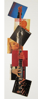 Like the compilation filmmakers, Marclay wants crosstalk among his bits, but the stretches of The Clock I saw don’t create much friction. There’s a lot of continuity from shot to shot: One character in one movie walks out a door, and we cut to another character from another movie entering a new locale. Music links scenes smoothly. Although Marclay was influenced by the diffuse, chance organizations promoted by John Cage, some of his earlier work emphasized through-line linkages and blending as well. Marclay’s famous record-album collages allow a unified figure to emerge as a gestalt binding together disparate images. On the right, you can see this happening in Guitar Neck (1992), which virtually diagrams the sort of smooth juxtapositions we get in The Clock.
The result has a fairly slick texture. It goes down easily. I admire the way that Marclay and his assistants have rummaged through a vast archive and pulled together a majestic, utterly entertaining assembly. But emotionally it’s mostly cold. The year-end obituary tributes on Turner Classic Movies, reminding us that the perfect faces and bodies gliding past us are definitively gone, are more throat-catching than anything I saw here. Along another dimension, so are Conner’s A Movie and his dissection of the JFK assassination, Report (1963-67). Just as important, none of what I saw seemed to me particularly challenging or discordant, and in this regard The Clock parts company with the comparable film traditions.
Structural film was notoriously demanding, ruffling viewers’ perceptions and trying their patience. And experimental compilations were often seeking to shake us up, sometimes in absurd ways. An earlier blog entry of ours illustrates how Baldwin’s Mock Up on Mu (2008) builds disconcerting scenes out of bits taken from other movies. A man and woman constantly shift their identities and positions while their conversation continues without missing a beat.
Crucial to the classic compilation films is the central innovation of collage: the fragments do not blend into a smooth whole. There are clashes between one shot or clutch of shots and the next. There’s also a sense of material differences. Each piece of scuffed or distressed footage retains something of its own integrity. In his sound work, Marclay too claimed an interest in the “sound patina” of vinyl LPs:
When a record skips or pops or we hear the surface noise, we try very hard to make an abstraction of it so it doesn’t disrupt the musical flow. I try to make people aware of these imperfections and accept them as music; the recording is a sort of illusion, while the scratch on the record is more real.
But the shots in The Clock are mostly scrubbed clean of imperfections, presenting a sleek surface that facilitates the flow across shots. The movie is a pure product of the DVD era, with all those gleaming images so easily appropriated. At times Marclay manages to match weather conditions, with rain in one scene carrying over into the next. This tactic creates an intriguing sense that the two movies are set in a shared world, but it makes the gaps between the images even narrower.
For about twenty years there has been a controversy in the gallery world about whether the burgeoning tradition of “artists’ films” owes anything to avant-garde film traditions. It’s often summarized as the difference between the white cube of the gallery and the black box of the movie theatre. By setting The Clock alongside collage compilation films, am I guilty of comparing apples and oranges? For instance, the films have fixed beginnings and endings, whereas The Clock is an installation that can be entered at any point. It’s not a film but rather, to use a current phrase, a “time-based audiovisual work.” Moreover, some will argue that Marclay’s lineage doesn’t consist of Cornell, Conner, Baldwin, and Structural Film but rather Fluxus, Minimalism, Punk, and Scratch-and-Mix. (Marclay has devised a turntable he can play like a guitar.)
All of which carries some weight, but I see enough common features between the two traditions to make my main point: Based on what I sampled, this is an ingratiating work, virtuosic in a Postmodernist way. But it doesn’t risk the roughness, the boring patches, and the confusions of the film traditions I’ve invoked. Perhaps the most condemnatory thing you can say about The Clock is that it runs like clockwork.
But maybe things get more disruptive in the 89.6 % I wasn’t able to see.
This entry was written fairly early in The Clock‘s Manhattan run. (Thanks to James Schamus for tipping me to it.) I had no trouble getting in at 10:40 AM and staying until about 1:15. But it quickly became a sensation. A friend and I tried to visit on a chilly Friday night and confronted a long line. I heard from others that the line was just as forbidding at 5:00 AM. The problem, of course, is that you could wait a very long time, since there’s no set point when many are likely to leave. (Nobody will say, “This is where we came in.”) This New York Times article traces the rise of the Clock cult. The article also confirms that midnight is a high point of the video.
Yet another Times piece discusses The Clock as akin to recorded music, making some points related to mine above. Here is a loving account by Jerry Saltz, who logged nineteen hours on duty. Easy to enjoy and admire, Marclay’s piece probably deserves to be added to Christian Lander’s list of Stuff White People Like.
A good overview of the artist’s earlier work can be found in Jennifer Gonzalez et al., Christian Marclay (London: Phaidon, 2005). My quotation comes from p. 33.
On the experimental compilation film, see William C. Wees, Recycled Images: The Art and Politics of Found Footage Films (New York: Anthology Film Archives, 1993). See also Stefano Basilico, ed., Cut: Film as Found Object in Contemporary Video (Milwaukee Art Museum, 2004). P. Adams Sitney’s Visionary Film, second edition and thereafter, provides the most influential account of the Structural tradition. Scott MacDonald discusses Zorns Lemma at length in Avant-Garde Film: Motion Studies. For incisive analyses of how compilation and Structural films elicit particular activities from their viewers, see James Peterson’s Dreams of Chaos, Visions of Order.
Thanks to Jim Kreul and Jonathan Walley for guidance in the controversy about artworld and filmworld traditions. Jonathan’s essay “Modes of Film Practice in the Avant-Garde,” in Tanya Leighton’s collection Art and the Moving Image: A Critical Reader, is a useful guide to these and other trends. I advance some notions about the user-friendliness of another artist’s film project in this entry on Matthew Barney’s Cremaster cycle. Kristin and I have written about associational form in Conner’s A Movie in our book Film Art: An Introduction.
The eye’s mind
Sasha Archibald, after Alfred Yarbus, after Ilya Repin, They Did Not Expect Him (aka An Unexpected Visitor, 1884).
DB here again:
One blog about eyes deserves another–actually a couple more. These entries, however, won’t be about actors’ or characters’ eyes. They’re about yours and mine.
We use them when we watch movies, but there’s been surprisingly little talk about how we do it. Even film theorists who talk about the Gaze or Visual Culture have not devoted much time to studying how we actually see movies. The whole business is pretty complicated, I grant. But if you’re willing to start by thinking about how we use our eyes in getting through the world, and then move to thinking about how we look at pictures, we can pretty quickly gain some understanding about how we watch films. That’s the business of this entry and the next one.
Bottom-up or top-down?
Unless you’re reading this in a cyclotron or on a roller coaster (always a possibility in these days of mobile media), your surroundings seem pretty stable, no? Look up from your screen and you’ll register the continuous space of a room, or a city vista, or a landscape. What’s remarkable is that this sense of a visual environment that’s all of a piece is composed of thousands of probes. Our eyes sample our surroundings, and the pieces that we snatch somehow melt into a solid, coherent world.
Surprisingly, our eyes have a very limited ability to focus precisely. The fovea, that compact scoop of cells that registers fine detail, is very tiny (about a millimenter in diameter) and has an angular coverage of less than two degrees. Yet it’s a key conduit of information. About 50% of visual nerve fibers are dedicated to the fovea, and acuity falls off very fast beyond it. Other areas of the eye can detect grosser changes in the environment, but in order to see anything clearly, we must constantly shift our eyes to bring the fovea to bear on it. When we follow a moving object, our eyes execute what are called smooth pursuit movements. In viewing a more or less static visual array, we execute saccades, very fast jumps from one fixation to another. Vision is a matter of saccades and fixations, scanning and sampling. A striking fact about saccades is that from one fixation to the next we are mostly blind to what’s happening in the visual field.
But what guides that scanning and sampling? We usually think it’s a matter of attention, and that’s probably not far off. It’s hard to pay visual attention to something that isn’t the target of foveal fixation. When we examine something in detail, we’re clearly devoting mental resources to it, whether it’s a streaky tulip or a misplaced comma. But what triggers our attention, and thus our foveal activity, in the first place?
Commonly we say that something catches our eye, cries out to be noticed, grabs our attention. That is, something out there becomes salient, so we send a saccade to it and fixate on it to get information. This is what psychologists call a bottom-up account. A stimulus triggers our visual system, which in turn recruits our mind to make sense of what has popped out.
An example: Looking straight ahead, you’re starting to cross a street. Something registered on the periphery of your vision seems to be suddenly bearing down on you. You turn your head and look: a car isn’t slowing down for the stoplight and you involuntarily jerk yourself back out of harm’s way. The errant car was salient, your visual system kicked in, and your body obeyed—all in a flash. You might not even be able to identify the car or driver as it runs the light, and you might say: “I didn’t even have time to think about it.” This is bottom-up, stimulus-driven seeing and acting.
Contrast another way to use your eyes. You’ve parked your car outside the Mall of America. Hours later you come out, a little uncertain about where the car is. Once you get to the general vicinity you recall, you use your knowledge of the vehicle to search it out. Let’s see, silvery Toyota sedan. Hell, too many Toyata sedans, all silvery. Wait, mine has a faded Obama-Biden sticker on the bumper and a rabbit with glowing eyes in the back window. Aha, there it is. This is a mode of looking guided by ideas and prior knowledge. Here perception is top-down, idea-driven; vision is informed by what you expect, recall, or believe about the world.
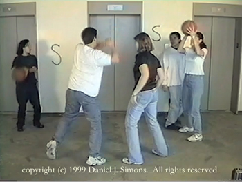
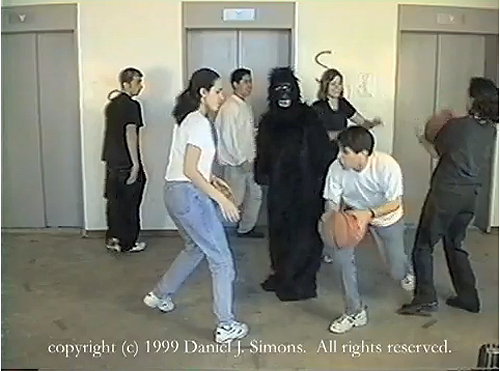
Top-down perception can focus our attention so drastically that we miss some glaringly obvious things. Consider Dan Simons and Chris Chabris’s famous basketball video experiment. If you’re not aware of this demonstration, proceed immediately to this page and take the test yourself.
Using a video of several players passing basketballs to one another, Simons and Chabris asked volunteers to silently count the passes made by players in white. But what Simons and Chabris were really testing was the extent to which people display “inattentional blindness.” About half the viewers were so preoccupied with the task assigned that they missed a rather salient item in the display: a gorilla that walks onto the court, thumps its chest, and walks off.
Simons and Chabris weren’t concerned with tracking eye movements (though later researchers have tried with the video; see the end of this piece). What the gorilla experiment indicates, however, is that top-down control has the drawback of narrowing our attentive focus so drastically that we miss the obvious. The curious phenomenon of inattentional blindness has become a robust area of research in cognitive psychology.
They did not expect…what?
We might think that visual search like the one demanded by the gorilla experiment is a special case. Isn’t most looking, including those saccades we execute all the time, bottom-up? After all, we are fairly passive, and we must take what we’re given by the world around us. Our attention is drawn to what pops out. There are a lot of features of the world that seem salient—bright colors, movement, strong contrasts, things coming toward us, and so on.
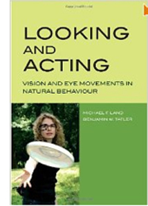 There’s another school of thought, though, and it’s articulated carefully in Michael F. Land and Benjamin W. Tatler’s Looking and Acting: Vision and Eye Movements in Natural Behavior (Oxford University Press, 2009). In ordinary life, they argue, we don’t just float though the world. We’re taken up with tasks. We walk, read, and make sandwiches. The tasks we undertake tacitly shape how and where we look and what we see. Land and Tatler want us to remember the top-down guidance of vision—the mind in the eye, so to speak.
Their central chapters trace how our acts of looking serve two basic functions: “finding and identifying the objects needed for the various tasks and guiding the actions that make use of these objects” (p. 59). In reading and drawing, or even walking or hitting a ball, the authors show, our eyes serve our brain’s sense of what must be done moment by moment. Wearing a nifty lightweight eyepiece or pair of spectacles, the experimental subject can act quite naturally and allow her point of gaze to be tracked and recorded to video. The results show that the tasks we launch, from crossing a street to reading a piece of music, create a series of phases that our eyes recognize and help us through, all without much conscious effort.
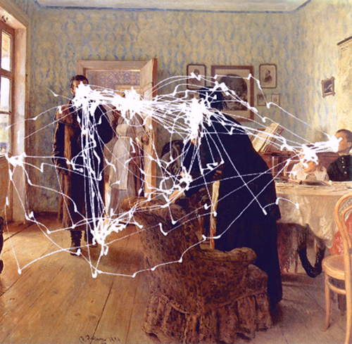
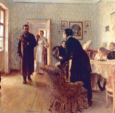
What about pictures? We aren’t interacting with them in the way we interact with teacups and steering wheels; we can’t affect their unfolding. Do our eyes behave as they do in our ordinary activities? In 1965 the Russian psychologist Alfred Yarbus reported the results of experiments that tracked eye movements. In some of them, he used Ilya Repin’s classic painting They Did Not Expect Him (aka An Unexpected Visitor, 1884). The dramatic image depicts a hollow-eyed man, gaunt and wrapped in a patchy coat, striding into a comfortable middle-class parlor.
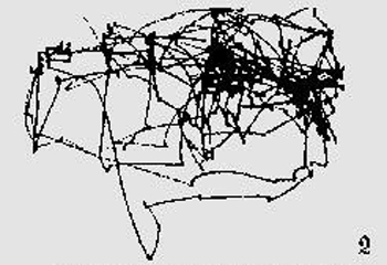
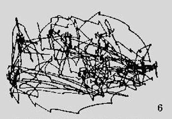
First Yarbus simply let his subjects view the picture without any instructions from him. Their saccadic patterns were typified by this subject’s result.
Each line represents the fast movement of the eyes from one location to another (saccades) and clusters of lines are the traces of fixations. The denser the lines, the longer and more often a point was fixated. Sasha Archibald’s reconstruction at the top of this entry superimposes this pattern on the original picture.
Then Yarbus tried asking his subjects questions about the image. Here is the result of his asking one subject to estimate the material circumstances of the family.
A very different trajectory of attention emerges. Now the scanning was more purposeful, and it focused on the areas most likely to fulfill the task of identifying the family’s social class–clothes, the piano, the children, and other items. Moreover, when given more time to examine the picture, subjects did not roam around every cranny of the frame but returned constantly to the areas they had already examined, the ones that were most relevant to the task. Hence the blotchy areas, which are nodes where the eyes fixated very often.
Artists often claim that color, composition, and other features attract a viewer’s attention. But Yarbus concluded that while some sorts of visual material, chiefly faces and bodies, were targeted during the undirected scanning, many other features, such as color, edges, light or dark regions, and so on were not. “The character of the eye movements is either completely independent of or only very slightly dependent on the material of the picture and how it was made. . . . Depending on the task in which a person is engaged, i.e., depending on the character of the information which he must obtain, the distribution of the points of fixation on an object will vary correspondingly” (pp. 190, 192).
Your mission in watching a movie
Generally speaking, in blocking and framing a shot, the most important thing is to make sure the audience is looking where you want them to look.
Robert Zemeckis
Like painters, film directors talk of guiding our attention, isolating this actor, throwing one plane out of focus in order to emphasize another one. And we commonly say that the movie is designed to grab our eyes and guide them through each shot. As Zemeckis’ remark suggests, directors direct actors but they also direct us; they direct our attention, and they do it by making certain things salient in each shot.
Or so we think. If Yarbus and Land and Tatler are right, are we deeply wrong about how movies work? I don’t think so, but convincing you requires that I unpack some assumptions.
First, the world doesn’t come to us in a frame. A film shot, like a still photo or a painting, is bounded by edges, and as Rudolf Arnheim and Jean Mitry have pointed out, the very existence of the frame inevitably organizes what is put inside it. It makes little sense to say that something is in the center of your visual environment—that depends on where you’re looking—but everyone will agree what is in the center of a picture. And we are very likely to look at that central area of a frame or screen; Land and Tatler call it a “bias” (p. 39).
Repin took advantage of this bias by composing the primary action around a central region. It’s not the geometrical center of the image, which falls on a fairly innocuous patch of gray near the elbow of the woman seated at the piano. But there is a cluster of heads and shoulders just above that center. Fans of the “rule of thirds” will point out the glances of the man, the women in the background, the woman at the piano, and the rising woman lie along a line marking off the top third of the picture. The frame, by being a certain shape, creates lines of force within the image, and these can attract our scrutiny.
Second, human faces are a special case. We are sublimely sensitive to them. Faces are recognized even in low-resolution images, they are detected faster than other configurations, and we readily project them into ambiguous patterns. Hence we see the Man in the Moon and the Savior on a Cheeto. Naturally, artists realize the power of faces and gestures to attract our attention. Repin’s compositional design facilitates our pickup of the human drama he presents.
Filmmakers follow suit. Knowing that faces and movements are zones of high information, directors light, frame, compose, and edit their shots so that these zones get highlighted. Indeed, we might say that today’s “intensified continuity” style of filmmaking, emphasizing singles and facial close-ups, goes with the flow, giving us a full dose of what we’d look for anyway.
Yarbus stresses the all-over quality of undirected vision, at least when compared with more specific tasks. But I’d say that the scanpaths we find in his free version line up pretty well with Repin’s compositional pattern and the pictorial roles he gave to faces, bodies, and gestures. True, there is a lot of visual search in unrewarding areas. Nonetheless, that high, slightly sloping area above the geometrical center attracts heavy traffic, as does the daringly edge-centered children on the far right. It is simply the line of least resistance, at least when all other considerations are equal.
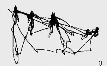
Yarbus made other things unequal. He asked questions, which created more guided paths. Still, regardless of what task they were assigned, Yarbus’ informants seem largely to have followed the compositional path Repin laid down. Asked to estimate the ages of the people in the picture, viewers gave a tighter, simplified version of the default, undirected path. To determine ages, face and height matter; the left window and furniture didn’t have to be explored much. Here is one subject’s pattern of scanning for signs of age.
Asked to memorize the costumes, the subjects also stuck to the program, with more searching of the body areas. Here is one example.
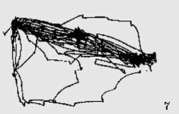
And asked to estimate how long the visitor had been away from the family, another viewer’s gaze traces a comparably tight slope, dwelling especially on the children at the far right.
In short, Yarbus’s questions about age, clothing, and years of separation were best answered by the faces and bodies on display–exactly the areas highlighted by Repin’s composition, color, and ensemble staging. Unsurprisingly, however, if your task is to estimate the family’s wealth, you’ll probably roam to the periphery of the action, as one subject did.
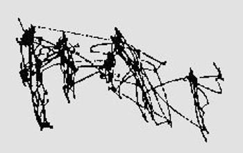
And if you’re told to memorize the spatial layout–a very unusual task that you’d seldom impose on yourself–you will spread your net quite widely, as one viewer did.
Yarbus’ results suggest to me that representational pictures elicit a set of default strategies: Start from the approximate center of the format. Watch for faces and gestures and an exchange of looks. Then launch further exploration of the picture space, anchoring that to the main compositional vectors and human signals. And of course take the title into account. The “they” of They Did Not Expect Him (virtually a literal translation of the original Russian title) prompts us to look for the reactions of onlookers.
With film, of course, we have additional pointers: sound, especially dialogue; camera movement, which is constantly redirecting our attention; and figure movement, which is a powerful eye-catcher. All things being equal, these channels of information will usually work in tandem with composition and the human signal patterns at work in a scene. Most films can be thought of as massively redundant systems for drawing our visual attention to certain items in the frame, second by second.
Story as task
One more point. Most of the factors I’ve mentioned involve bottom-up cueing. If in ordinary life our saccadic probes are governed by top-down task assignment, what about still images or moving pictures? Are there no task dictates at work? I think there are.
Recall most of the questions that Yarbus asked his viewers: the figures’ ages and clothing, their activities before the man entered, the family’s material circumstances. These are relevant to the tale the painting tells. It’s what we call a narrative painting, and most of Yarbus’ pointers are addressed to filling out the story.
The story may not be obvious to us today, but most commentators seem to agree that image represents a political exile returning from a labor camp to his family. The woman rising in the foreground is his mother, while his wife can be seen stirring from her place at the piano. His children are on the right, and many commentators interpret the somewhat fearful or puzzled expression on the little girl to indicate that she is too young to remember him. The image developed out of Repin’s sympathy for Russian radical movements of the time, and it was widely circulated by the later Bolshevik regime. Very likely Yarbus’s subjects would have seen the picture before and known the story behind it.
The point I want to make is that we do take on tasks when we watch a film image. Perhaps the most basic one is maintaining our interest, seeking out something that will keep our attention engaged at a basic level. But one major way to achieve interest is to make an effort to grasp how what’s happening onscreen develops the story.
Once the movie has started, we know who the main characters are and thus whom to watch most closely in ensuing scenes. We know something of their minds and motives, and we are sensitive to anything that impinges on those matters. So our top-down hypotheses about what’s going on and what will happen next shape what we look at and when we look at it.
Since story comprehension is one of our primary tasks in watching a mainstream movie, we will tend to ignore other things. We will miss changes in objects’ position across cuts (“cheats”) and disparities of lighting from shot to shot (e.g., the opening office scenes of The Godfather). These would seem to provide equivalents for the invisible-gorilla effect, although bottom-up factors are at play in such cases as well. Alternatively, when we don’t have any narrative expectations, as when we’re confronted with a lyrical avant-garde film by Stan Brakhage or Nathaniel Dorsky, perhaps we will let our eyes roam around the images more freely. Confronted by a film that denies us a narrative, we attend to composition, color, and other qualities that we may not notice in most storytelling cinema.
I’m convinced that research into vision is important to understanding film, but I’m a duffer at this. Next time, we hear from Tim Smith, a sort of modern-day Yarbus who monitors how we watch movies. An early example of his work is here, but next time we’ll catch up with his recent efforts.
Yarbus’s book is Eye Movements and Vision (New York: Plenum, 1967). It is rare and expensive, but a pdf is available online here. Google “Yarbus” and “Repin” together and you will find a great many research articles on eye movements and imagery. I’m grateful to amonseuldesir’s sitefor providing sharper diagrams of Yarbus’ result than I could squeeze out of my copy of his book.
Sasha Archibald has made a valiant effort to map Yarbus’ reported results onto the painting, as indicated in the image at the top of this entry. I thank Cabinet magazine for permission to reprint her schema. Thanks as well to Maria Belodubrovskaya for confirming the correct translation of the painting’s title. She recalls that in school she and other children were asked to discuss the reactions of the family portrayed in the painting.
For more on Dan Simons and Chris Chabris’ work, see The Invisible Gorilla and Other Ways Our Intuitions Deceive Us. Daniel Memmert has performed eye-tracking experiments with children watching the gorilla video. (See “The Effects of Eye Movements, Age, and Expertise on Inattentional Blindness,” Consciousness and Cognition 15 [2006], pp. 620-627.) Surprisingly, Memmert found that many subjects who fixated on the gorilla during the video still didn’t claim to notice it! Simons and Chabris use this finding to suggest that even fixations don’t guarantee awareness. It seems that fixation is a necessary but not sufficient condition for noticing something; once more, the task at hand can block out even things that we can see clearly.
Related to inattentional blindness is “change blindness.” As I mentioned in an earlier blog, Dan Levin, who worked with Simons, has explored how our inability to detect changes in images or in the real world can affect our understanding of edited scenes in films. Tim Smith has further studied “edit-blindness” as a cinematic parallel to change blindness.
Robert Zemeckis’ remark about guiding the viewer’s eye is quoted in Jay Holben, “Sole Survivor,” American Cinematographer 82, 1 (January 2001), p. 40. For more on that idea, see the opening chapter of my Figures Traced in Light: On Cinematic Staging. More broadly, I discuss cinematic experience, and especially story comprehension, as an interaction of top-down and bottom-up factors in Narration in the Fiction Film and the first chapter of Poetics of Cinema.
Still cheating on video games
KT here:
Since I got back from England a month ago, I’ve been catching up with all the magazines that accumulated during the three weeks I was gone. Recently I read the November 15 issue of Newsweek. Initially I was happy to see the “Back Story,” the one-page article that comes at the end of each issue. It’s called “How Super Is Mario?” and compares the income of the video games and move industries. (It’s not available online complete unless you agree to a free trial of the online magazine. If you do, it’s here.)
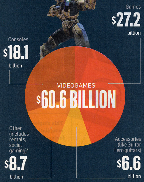
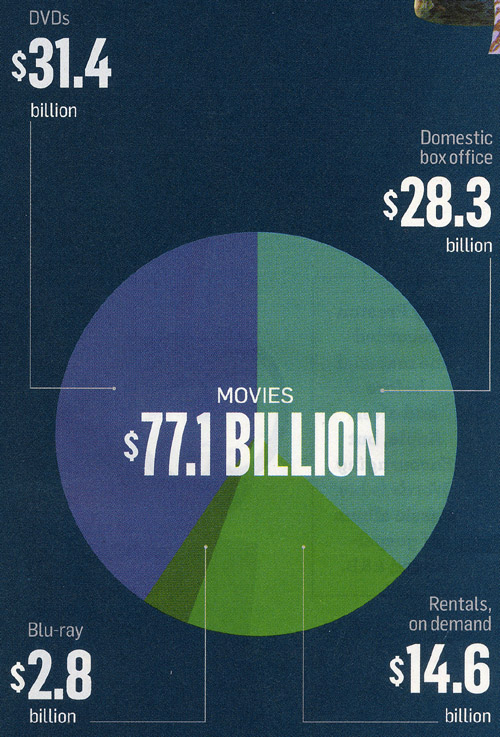
The article consists of two pie charts (above and below) and a brief text. At first the text sounded promising: “A big game—take September’s release of Halo Reach, for example—can sell millions of copies at about $50 a pop. That’s far pricier than any movie ticket, of course. But despite the conventional wisdom, the silver screen still rakes in more cash overall than the gaming industry, according to an analysis of recent revenue.” Great, I thought, at last a publication that makes an accurate comparison between the amounts of money brought in by games and by movies.
But in fact the Newsweek analysis just repeats the conventional wisdom it claims to overturn and makes the same old invalid comparison that entertainment-business journalism has been making since video games started making real money. A cursory glance at the pie charts makes it seem as if the gaming industry is not all that far behind films: the games total is $60.6 billion vs. $77.1 billion for movies. But let’s take a glance that isn’t cursory.
I’ll make the same point that I made in Chapter 8 of The Frodo Franchise (2007), where I deal with video games. There, too, I quoted a Newsweek article (from June 3, 2002): “In 2001, consumers snapped up $9.4 billion worth of game software and hardware—up 43 percent from the previous year—led by Sony’s world-beating PlayStation 2. Noting that the game industry had once again outstripped Hollywood’s box-office revenues, the head of Sony’s U.S. computer-entertainment division, Kaz Hirai, says his next target is the $18 billion home-video industry.” (225-26)
Note that reference to “software and hardware.” The figure includes the consoles and other equipment people buy in order to play games. But the pie chart of movie-industry income doesn’t include hardware. What would happen if the sales of theater and home projectors, DVD and Blu-ray Players, iTouches, and all the other gadgets used to watch movies were factored into the film-income figures? As we know, there have been a lot of digital theater projectors and 3D systems sold in recent years, not to mention all those portable media players. The games industry would fall farther behind than it already is. (And let’s not forget that most of those gaming consoles also play movies, so an indeterminate part of their income should go into the movies column. Since last January, the Wii even comes with a Netflix connection installed.)
As of 2004, the most recent year I could get figures for when I was writing my book, games software brought in $6.2 billion. That same year all forms of film distribution (including home-video and broadcast and cable television) grossed $45 billion.
Yes, games are gaining, but they’re not nearly as close to catching up with movies as media coverage would lead you to believe. The good thing about Newsweek’s recent pie chart is that it allows us easily to factor out the hardware income from the games’ side.
Consoles are listed at $18.1 billion and accessories at $6.6. Take them away, and games software brought in $35.9 billion in the period covered (January 1, 2008 to September 30, 2010). There’s nothing to take away from the film pie, since it consists entirely of software rentals and sales. So film still brings in more than twice as much, $35.9 billion vs. $77.1. DVD and Blu-ray sales, at $34.2 billion, make nearly as much as all games.
True, the games revenue has risen considerably in proportion to films since 2004. In that year, games made 13.8% of what films did. In the 21-month period covered by the Newsweek analysis, they made 46.6% as much. Will there be as big a jump proportionately in the next five years? Maybe. It’s possible that the move into streaming downloads as a distribution basis for home video will mean that movies simply cost less per view and hence will lose ground against games in terms of total income, if not in terms of popularity. Still, methods of distributing games might end up making them cheaper as well.
None of this takes into account that most mainstream blockbusters spawn a lot more ancillary products than do comparable video games.
I don’t know why entertainment journalists keep making this basic and pretty obvious mistake of continuing to include hardware sales only for games when they compare the success of these two media. It is after all their job to research the figures and analyze them in the way most useful to their readers. Giving those readers the erroneous impression that video-game sales have nearly caught up with film income doesn’t seem useful. The myth is probably something that the gaming industry fostered years ago to give the impression that it was more successful than more balanced comparisons would reveal. Journalists kept making the same kind of misleading comparison, which became the “conventional wisdom” that Newsweek only thinks it’s correcting.
As I point out in the same chapter of my book, game companies and film studios are not entirely in competition with each other. They cooperate to a considerable extent, since movies and games are often part of the same franchises. Some of the same people work on both. Often similar or identical technology is used in creating both. Increasingly film studios big and little have their own game-production units, and gaming companies are seeing more value in creating intellectual property that can be used across platforms. Some of the top film directors have been involved in creating games. Films routinely get adapted into games as part of their overall franchises, and some games get adapted as films. A successful film usually makes for a successful game, though the opposite isn’t yet as common. Though the industries do compete for leisure time and money, neither is out to kill the other. In many cases they’re out to boost each other’s success.


