Archive for the 'Film and other media' Category
Light is a law
DB here:
What do we see when we look around us? A world teeming with creatures and things. We tend to ignore what enables us to see all that: light. To a great extent, that bias is wired into our perceptual systems. An orange looks the same color to us in sunshine and in shade. But photograph it, and you’ll see that actually it throws off very different wavelengths in the two situations. We evolved, it seems, to mute all the variations in light we encounter. Psychologists call this “the primacy of object perception.”
It takes an artist to shift from the what to the how, to notice how different patterns of illumination can alter the shape and texture of an object. A painter, a photographer, and a cinematographer must learn to see light itself.
This was the core message of Steven Poster, an outstanding Director of Photography who came to visit Madison last weekend. Steven is probably most famous for working with Richard Kelly on Donnie Darko, Southland Tales, and The Box, but he has shot dozens of feature films, shorts, television movies, and pilots. He also has several Madison connections; he hung around the campus in his college years, saw Jules and Jim for the first time in the Memorial Union, and built a production house in Chicago with Mik Derks, who now works for Wisconsin Public Television.
Steven gave a workshop on cinematography that bristled with energy (five hours with only a brief break) and followed that with a screening of The Box, accompanied by a Q & A. Across a single packed Saturday, he took students and faculty on an adventure in seeing.
Seeing the light
Steven started as a still photographer at about age ten, and his ideas of visual design are very much allied with classic image-making. (He carried a Leica with him on his visit, and a display of his photos is currently mounted in a campus gallery.) He has a modernist bent too. He credits his years as a student at Southern Illinois University with introducing him to the ideas of the Bauhaus. He plunged more deeply into Bauhaus ideas at the Illinois Institute of Technology, where Mies van der Rohe and Moholy-Nagy taught.
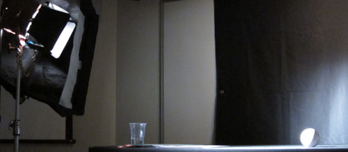
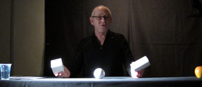
Later in his career, he studied at the Los Angeles Art Center College of Design. A turning point in his understanding came in Charles Potts’ photography course, when Potts began the semester by announcing softly, “Light is a law.” Steven’s talk for us, he explained modestly, was a “profoundly simple subset” of Potts’ course. Put it another way: In the Bauhaus spirit, he showed how simple principles yield subtle results. Armed with only a white ball, a white cube, and a white cylinder, he gave us a tutorial in the delicate modulations of vision.
 There are, Steven suggested, basically only two kinds of light: direct and indirect (or diffuse). Sunshine yields direct light; a cloudy day yields diffuse light. And when light falls on an object, the encounter has five components. The object gains a highlight, the bright region that suggests the direction of the light source. The object also acquires a shadow area. Between the highlight and the shadow is the boundary, or core—an important hint about the quality of the source light. (If the core has a crisp edge, the light is hard; if the core is a mild transition, the light is softer.) The fourth component is the shadow that the object casts on another surface. Finally, there is the specular or incident highlight, a spot of reflected light within the lit region. A specular highlight is a cue for texture as well as shape and light source. As Steven spoke, I kept thinking about Hollis Frampton’s Lemon (1969), a masterfully simple demonstration of many of these principles: slightly changing light reveals a prototypical shape (what other things have the outline of a lemon?) and a surface that is both shiny and bumpy.
By varying the type of light (direct or indirect) and the angle and distance of the source, Steven showed how these five components can be manipulated to bring out expressive qualities of the object. The cube, for example, can gain sharper contours through sidelong lighting, and illuminating the background can bring out its volume. Likewise, an object’s shadow area can be controlled through fill light—though Steven warned about over-filling, which can work against the precision provided by the key light. Another example is the way in which shooting glass or metal with pinpoint sources yields a scatter of specular reflections. If those aren’t wanted, as in some car commercials, the DP can use broad, diffuse illumination. This “liquid light” brings out contours through a softer gleam.
Of course a shot typically combines many objects, so the task of controlling how light hits them, and how they are arranged in relation to each other, becomes much more complicated. The shapes, textures, and emotional qualities of the elements have to be harmonized. “Elegant” was a word Steven used frequently: the composition, like the light, should be clear and well-defined. Needless to say, the result on screen can be grasped at a glance, but achieving such clarity needs painstaking control.
So seeing the light involves grasping everything around you, from landscapes and furniture to people’s faces and clothing, within the framework of highlights, shadow, core, and the like. This alone is enough to change your visual habits. But there’s more. By and large Steven made his adjustments without checking the monitor displaying what the camera was taking in. Standing almost anywhere, he could shift the light, tune the fill, and “wrap” the object, and on the monitor we could see the effect click into place. That skill demands more than a change in how to look at things. It’s an eye-body coordination that takes years of expert practice, an acquiescence to the law of light.
Behind the scenes
The discussion following this demo ranged across many aspects of cinematography, and Steven filled in abstract points with examples from his experience. My notes run to eleven pages, but this sampling should give you an idea of his stimulating presence.
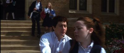
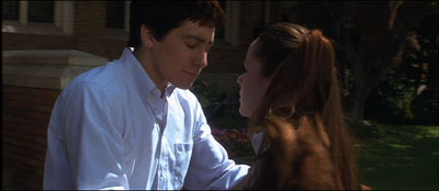
*A problem-solution dynamic emerged in one shot in Donnie Darko, above. We need to see Donnie’s face when he catches up with Gretchen, but the day was sunny and at first the faces display somewhat harsh shadows. But when the couple move toward a kiss, the solution came from their clothes: Donnie’s shirt and Gretchen’s blouse provide softer bounce light on his face.
*Steven stressed the need for complete trust and frankness between director and DP. “I won’t take a job if the director won’t look me in the eye.” Once that bond is established, the DP’s job is to protect the director and work to fulfill his or her vision. “My job is to protect the director.”
*Filmmaking is an intensely physical job, and so two concerns have to be paramount: safety and health. “No film is worth getting somebody hurt,” Steven remarked, so he insists that every crew member is a safety officer, looking out for everyone’s well-being. At the same time, filmmaking demands stamina, discipline, and a clear head, so everyone needs to have a healthy regimen and cultivate a certain “inner life” that keeps job pressures in perspective.
*Steven had much to say about the video assist. He suggested that it has led to directors using more close views, because such shots read better on small monitors. (I made a similar suggestion in The Way Hollywood Tells It.) Steven fights what he calls the “loss of scope” on video displays by presenting the digital dailies in full-size projection, as in the film-based days. “It reminds everybody that we’re making a big movie,” and it encourages directors not to overuse close-ups.
*Steven is happy with the digital intermediate process. As a cinematographer who wants to control all aspects of the image, he welcomes all the adjustments he can make in postproduction, especially thanks to the Lustre grading program. “It’s like being back in the darkroom again.”
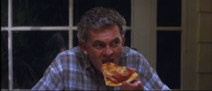
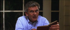
*On Donnie, a low-budget film, Kelly and Steven were forced to shoot the family dinner scenes in a single night. To save time, they used “block shooting.” For each actor, a basic setup was established and all the actor’s lines from both scenes were taken at one time. It was faster to have the actor change clothes for the later scene than to shift the camera position and relight the setups.
*Speaking of table scenes, they pose a lot of problems. Even Steven finds such scenes “the hardest.” “Where’s the [180-degree] line in this situation? I’ve seen fights break out on sets about it.”
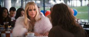
*At one point Steven talked about prominent objects in a scene, such as candelabra and ketchup bottles. If you use symmetrical reverse shots, those objects can jump distractingly from one side of the screen to the other. Steven tries to make sure that such eye-catchers appear in only one of the setups, not both. The coffee cup in this scene of Southland Tales is hidden in the reverse angles.
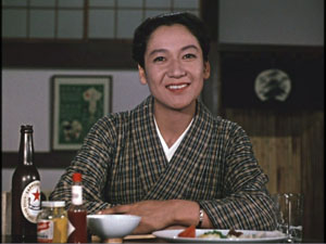
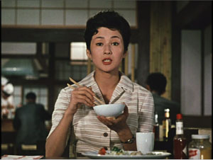
Steven’s point reminded me that Ozu breaks this rule of thumb and playfully lets his objects jump around the frame from cut to cut. Indeed, he often rearranged the props to heighten this peripheral dance. In one scene of Late Autumn, the tabasco sauce bottle pivots consistently, but the French’s mustard jar changes position.
*Steven thinks that 3-D will succeed this time, chiefly because of the push for 3-D television. The technique probably won’t work for all stories, and the format poses some technical problems. But the software is getting better, and filmmakers, such as Cameron in Avatar, are starting to avoid the gimmick of obects thrusting out of the screen. It’s better, Steven thinks, to let the depth recede into the movie’s world, making the screen a window. I recalled that this was the strategy used in Coraline, Up, and other films of last year, so perhaps this will become the dominant way that 3-D will be used.
*Steven urged students to get broad general educations and not become movie nerds. They should study history, political science, art, and literature. He pointed out that Werner Herzog, his friend and neighbor, insists in his Rogue Film School that literary classics are the basis of a film education.
*Steven has long been an advocate of unionization. As President of Local 600 of the International Cinematographers Guild, he explained how the Guild now welcomes members, especially women and people of color. I thought it was salutary to give students a taste of the practicalities of professional life by explaining what the Guild had accomplished.
*Steven did additional photography on Blade Runner, and he learned a great deal while gaining deep respect for Jordan Cronenweth, DP on the movie. Steven rewatches the film often, and each time he finds something new. On the last pass, he saw that in the search of Kowalski’s apartment, flickering streaks of light coming from inside the desk drawer call attention to the newspaper that Deckard finds there.
Back in 1980-1982, when Kristin and I were doing research on The Classical Hollywood Cinema, we found that Charles G. Clarke, Linwood Dunn, William Hornbeck, Stanley Cortez, and other professionals whom we interviewed were intellectuals, eager to explain the ideas informing their creative decisions. Steven Poster’s career is another outstanding example of how theory and practice work together, often unobtrusively, to conjure up the enthralling world on screen. I can’t imagine a film researcher, or just a movie lover, not wanting to know filmmakers’ craft and the principles informing it. Once you’ve visit the kitchen, movies gain a whole new flavor.
This blog has intersected with primary Bauhaus shapes before. I discuss “the dinner-table conundrum” in the first few pages of Figures Traced in Light. One of the best analyses I’ve read on illumination in the visual arts is E. H. Gombrich’s “Light, Form and Texture in Fifteenth-Century Painting North and South of the Alps,” in The Heritage of Apelles: Studies in the Art of the Renaissance (Ithaca: Cornell University Pres, 1976), 19-35. For more on Ozu’s penchant for letting brightly lit objects jump around the composition, see this chapter of my Ozu and the Poetics of Cinema. The Lustre program was devised for The Lord of the Rings, and Kristin discusses its origins and influence in The Frodo Franchise, pp. 280-281.
Special thanks to Steven for his visit, the Wisconsin Union Directorate for arranging it, and Erik Gunneson, Joel Ninmann, Justin Daering, and J. J. Murphy for setting up the workshop.
Blade Runner.
Paris-Berlin-Brussels express
Doktor Satansohn.
Our trip to Europe has come to an end, and so we finish with a post scanning some highlights.
The magic lantern learns new tricks
DB here:
What am I seeing? Many avant-garde films pose this question. Mainstream fiction film and documentary cinema have mostly relied on the idea that the image should be recognizable as “what it is.” But one strain of experimental film has worked to delay or even prevent us from making out what’s in front of the camera.
Sometimes we lose our bearings only briefly, as when we eventually identify pot lids in Ballet Mécanique or bits of sunlit linoleum in Brakhage films. Sometimes language points out what’s really there. The titles of Joris Ivens’ Rain and the Eames’ Blacktop: The Washing of a School Play Yard allow us to enjoy the ways that ordinary sights can yield unexpected abstraction. Sometimes we toggle back and forth, as when in Ken Jacobs’ Tom, Tom, the Piper’s Son recognizable human figures, however grainy, jump into sheer blotchiness and then back into something like legibility. But other times we can’t ever tell what we’re seeing. Brakhage’s Fire of Waters offers one of the best examples I know, with its jagged bursts of light in a smoky void.
What am I seeing? The uncertainty was doubled during my visit to Ken Jacobs’ Nervous Magic Lantern performance at the Cinémathèque Française. I say “doubled” because at least with Fire of Waters and Tom, Tom I knew I was watching a film. With this display, What am I seeing? started as a question about the format itself. Was it a film, a video, or something else?
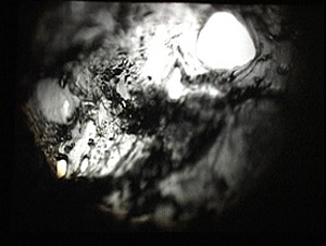
Then the question became the customary one. Off-white textures—pebbly, dribbly, stalagmite-like—swim in and out of focus. Some are viscous and globular, some are like tangled foliage. They seem to spiral, but actually (I put up a finger to measure) they barely move. The effect of movement is given by pulsations of pure black, breaking the lyrical effect of the surfaces with a harshness that becomes aggressive. Aggressive as well is the soundtrack, blocks of sound from subway platforms and traffic and kitsch Latin percussion, all played at high volume. The surfaces just keep shifting and not shifting, sort of rotating while jabbing out at us, lovely and anxiety-inducing at the same time.
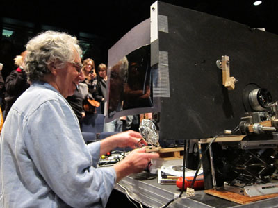
At the end of the performance, people crowded around the cardboard booth in the middle of the theatre. As Ken and Flo Jacobs packed up, they showed how they had generated the effects. What had I been seeing? Neither a film nor a video but a true magic-lantern display, assembled on the spot. But what had I been seeing? Something created with home-made equipment of a startling simplicity. (Strapping tape was involved.) Our magicians explained their tricks, like magic-lantern operators of earlier centuries explaining the science behind their shows. But I think it’s best that you not know until after you have a chance to see what they create.
In earlier entries (here and here) Kristin and I have praised Jacobs’ films for showing how very slight adjustments in technique or technology can create disturbing cinematic illusions. In this vein, the first item on the Cinémathèque program, a video called Gift of Fire, turned Louis Le Prince’s brief 1888 street scene into a 3D movie. (The homage was appropriate because Le Prince experimented with multiple-lens cameras.) The Nervous Magic Lantern performance generated a different sort of illusion, one conjuring up micro-landscapes and otherworldly vortices. In all, Jacobs makes us realize how many evocative effects are still to be discovered by tinkering with images thrown on a screen.
Detour to Berlin
KT here:
As David mentioned in last week’s entry, I took a week in the middle of our visit to Europe for research at the Ägyptisches Museum in Berlin. The staff there welcomed me into their storerooms, and I spent the days looking at fragments and the records of their discovery and the nights downloading and backing up my photos. No time for filmgoing. The most I managed was a trip to the well-stocked arts bookshop Bücherbogen, which has one of the best selections of film books to be found in Germany. Our old friend, experimental filmmaker Carlos Bustamente, met me there, and we had a quick cup of tea–most welcome on a cold morning when the results of the biggest snowfall in decades were still blanketing many sidewalks and roads.
I did note one film-related phenomenon, however. Every day I took the S-Bahn from Savignyplatz to Friedrichstrasse. The tracks pass directly across the street from the Theater des Westens (that is, the western part of Berlin). It was playing Der Schuh des Manitu, a musical version of the 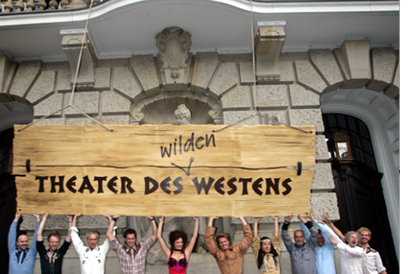 highly successful 2001 German film of the same name. (I hope the publicity photo at the left was taken in warmer weather than I experienced.) I mentioned the film here, in reference to the fact that every major producing country, and some minor ones as well, turn out their own local comedies, films that don’t travel well but are very popular locally.
By now it’s a familiar phenomenon in the U.S. for successful Hollywood films to be turned into stage musicals. It wasn’t always so. Back in the 1950s and 1960s, films were made of popular musicals, sometimes successfully, as with My Fair Lady, and sometimes not, as with Mame. But now the trend is the other way, with everything from Shrek to Hairspray getting the Broadway treatment.
It’s interesting to know that the same thing goes on abroad, though I’m not sure how prevalent such adaptations are. Der Schuh des Manitu, directed by Michael “Bully” Herbig, remains the highest grossing German film. Herbig doesn’t act in the stage play, as he did in the film, but he served as a creative advisor. The musical is a hit, having premiered on December 7, 2008 and it is expected to continue until at least the autumn of this year. There are several clips from both the film and the musical on YouTube. This one, at 8 minutes, gives a generous dose of the show. There are no subtitles.
I had only a couple of days back in Paris before we headed for Brussels for the final week of our trip. The German theme continued, since a few of the 1910s films David needed to see at the Cinematek here were German. The one I most wanted to see was Edmund Edel’s 1916 feature, Doktor Satansohn. Its main claim to fame is probably the fact that Ernst Lubitsch plays the title role. My book with Lubitsch started with his 1918 move to features, when he began to concentrate more on directing and less on acting. By 1920, with Sumurun, he appeared onscreen for the last time; being discontented with his performance as the tragic clown, he decided it was time to move behind the camera for good.
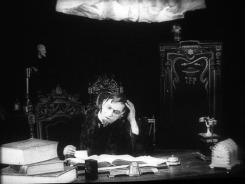
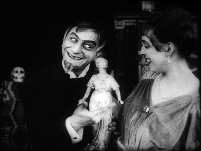
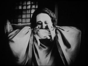
In the short films he starred in before 1918, Lubitsch often played a brash, ambitious Jewish youth, as in Der Stoltz der Firma (“The Pride of the Firm,” 1914). In Doktor Satansohn he’s a physician with a magical machine that transforms older women into beautiful young ones. We’re first introduced to a couple and the wife’s mother. When the latter makes a pass at her son-in-law and is rejected, she seeks the doctor’s help. His machine works by capturing the wife’s essence in a statuette and making the mother look like her daughter. Problem is, every time she’s about to kiss the husband, the doctor pops up with his devilish leer, visible only to the “wife.” David and I decided that the film is a comedy, though perhaps one only Germans of the day would find truly amusing. For one thing, the title character is clearly a Jewish caricature, one played to the hilt by Lubitsch. He decorates his machine with the Star of David and a Hebrew inscription (not to mention vipers and an image of Saturn).
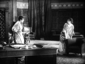
Stylistically it’s a fairly conventional film for its day, though the black background of the doctor’s office, with its stylized youth machine and satyr-like bust, gives a hint of Expressionism to come. (See our topmost image.) Inevitably near the end there comes the moment beloved of historians of pre-World War II German cinema. The real daughter, released from her imprisonment in the statuette, confronts her double in the doctor’s waiting room. The Doppelgänger motif strikes again.
I wonder if German films actually have more Doppelgängers in them than appear in other national cinemas. Do they really reflect the disturbed soul of the nation? Or did the possibilities of filmic special effects draw moviemakers to try and multiply single figures? Georges Méliès and Buster Keaton used in-camera techniques to multiple their own figures in virtuoso displays. I recall being impressed by The Parent Trap‘s duplication of Hayley Mills when I saw it as a kid, and the whole notion of a single actor playing twins and other lookalike relations is a common enough convention. In Doktor Satanssohn, the doubled figure appears only in this one shot, and it’s the leering Lubitsch, delighted with his own nastiness, who walks off with the picture.
The 1910s, again, and still
DB again:
We saw Doktor Satansohn while I was studying staging and cutting strategies of the 1910s, thanks to the remarkable holdings of the Royal Film Archive of Belgium, also known as the Cinematek. My comments on last summer’s visit are here.
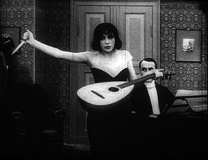
Another German film, in a choppy Russian print, vouchsafed a new glimpse of Asta Nielsen. In Totentanz (Urban Gad, 1912), she plays a guitarist-dancer who must take to the stage to support her infirm husband. She attracts the devotion of a composer, and soon she feels attracted to him. Torn between desire and duty, she snaps during a rehearsal of his latest piece, “Totentanz.” In a chilling gesture, she uses his dagger to slice her lute strings.
Soon the two are locked in a violent erotic struggle, and a stabbing ensues. In all, melodrama as ripe as one could want.
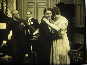
As ever, I was happy to have my hypotheses about tableau staging confirmed by several of the titles I saw. A minor French bedroom farce, Le Paradis (M. G. Leprieur, 1914 or 1915), had a brief passage of the sort of blocking and revealing we find in many films of the period. The painter Raphael Delacroix (no kidding) is pretending to be the lover of Claire Taupin to deflect the advances of randy M. Pontbichot. But Claire is actually the mistress of M. Grésillon. . . .
First, very frontal staging strings out Pontbichot, Raphael, and Claire. The older man relents in his pursuit of her.
In the vivid depth characteristic of the tableau tradition, Pontbichot withdraws. But his position accentuates that central door, which starts to open.
Most remarkably, Pontbichot ducks almost entirely behind the couple, giving pride of place to M. Grésillon’s arrival in the center of the shot.
Pontbichot slides out in time to register Grésillon’s outraged reaction to finding his mistress in another man’s arms.
Grésillon rushes to the frontal plane, furious. As ever, a thrust to the foreground creates a major spatial/ dramatic event.
Although the Le Paradis passage is ABC compared to the emotionally powerful patterns of staging we find in Ingeborg Holm (1913), it illustrates how even average films could resort to the blocking/ revealing tactic within the deep-space geometry of the tableau.
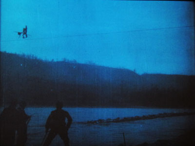
More flamboyant was Il Jockey della Morte (1915), an Italian circus film made by the Dane Alfred Lind. Its bold lighting and varied angles on the Big Top recalled the Danish films of a few years before. Halfway through, Lind launches a dazzling chase that features leaps from a tall bridge and bicycling stunts on a cable stretched across a river.
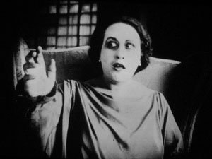
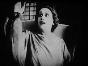
Another Italian film, this time a diva vehicle, suggests that by 1917 1923 (see below) the tableau style was already giving way had given way to scenes organized around close shots. (See below.) L’Ombra (Mario Almirante) starred Italia Almirante Manzini as a lively, trusting wife who becomes paralyzed. While her husband betrays her with her younger protégée, she gradually recovers bodily movement. Yes, a paralyzed diva seems a contradiction in terms, but one small-scale scene shows a remarkable range of emotions. Berta’s hands start twitching, one lifts up, and she stares wildly, as if it were an alien being.
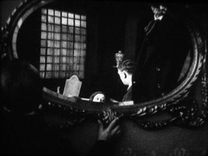
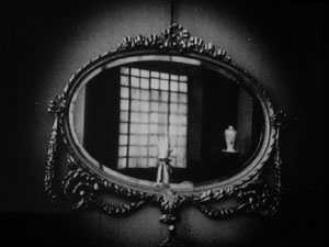
In an earlier scene, Berta had asked that a mirror facing her be tipped upward so that she would never see herself sitting immobile. This shot pays off now, when the hand ascends almost magically into the bit of reflection she can see.
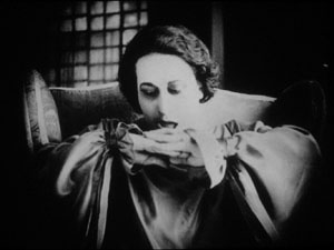
When the hand descends, her astonishment turns into joy. She experimentally shoves the hands together, as if asserting her control.
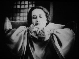
In the end, she kisses her hands as if they were pampered children.
Manzini runs through many more micro-emotions than I’ve indicated here, but this sample is typical of the ways in which L’Ombra avoides the long-shot choreography of only a few years before and builds a performance out of face, body, and arms in a close framing. The mirror-shot motif shows that fairly careful filmic construction was emerging at this point too.
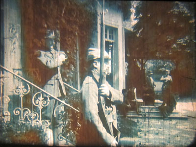
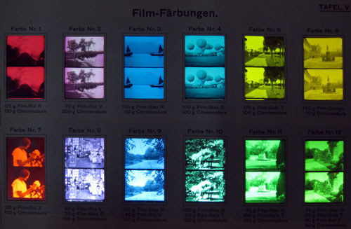
During my stay, I learned more about tinting and toning from the ever-helpful Noël Desmet. On the seldom-seen World War I drama L’Empreinte de la patrie (M. Dumeny, 1915), some images had curious oscillating patches of rusty brown. Noël explained that when Prussian Blue toning was combined with rose tinting, the chemicals eventually reacted to alter the pink cast. An example is shown at the top of this section, though the blue is more saturated in the original.
Once we get back to Madison, I’ll have to sort out all that I’ve learned from these movies. Onward and upward with the 1910s!
For more on Jacobs’ Nervous Magic Lantern, see Scott Foundas’ interview here. The Youtube clip doesn’t do the spectacle justice. If you must know something of Jacobs’ tools, the Dailymotion video from the performance I saw offers some clues. My notions about 1910s staging are laid out in On the History of Film Style and Figures Traced in Light. You can also find several discussions in earlier entries on this site. Just execute a search on tableau.
Now is a good time to thank Noël Desmet and Marianne Winderickx, both of whom are retiring from the archive in March. The research that Kristin and I have done over the years owes an enormous lot to them, and of course to the Director of the Cinematek Gabrielle Claes.
P.S. 15 November 2013: Ivo Blom has pointed out that the version of L’Ombra I saw wasn’t from 1917 but rather from 1923. Hence the corrections above. Thanks very much to Ivo! Go here for his blog and information about his newest publication on silent Italian cinema.
A tinting and toning sample card from the early 1920s. Courtesy Noël Desmet.
Tell, don’t show
Exodus.
DB here:
Watching the film adaptation of Stieg Larsson’s Girl with the Dragon Tattoo reminded me how common fragmentary flashbacks have become. Granted, we’re living in a period of flashback frenzy, one comparable to the delirious 1940s and 1960s. But the format of the flashbacks has changed a bit. The Girl with the Dragon Tattoo, like many other films, gives us mere glimpses of earlier events–literally, flashes back to the past.
The technique is actually quite old. American films of the 1910s often interrupted present-time scenes to remind us of actions we’ve already seen or been told about. But the fragmentary flashback waned during the heyday of sound cinema. There conversations did nearly all the work. Of course there were flashbacks, as I’ve discussed in an earlier entry. But those flashbacks tended to be extended scenes, not the jagged bursts we get now.
A cynic might say that today’s audiences are so thick-headed and impatient that simply mentioning what happened earlier isn’t enough. Viewers now would chafe at the long interrogations in The Maltese Falcon and The Big Sleep. The scenes would need to be split up by images showing what the characters were explaining. The new rule: Add redundancy, but dress it up in whipcrack visuals.
So are the flurries of mini-flashbacks there just because filmmakers doubt that viewers can follow a twisty intrigue given in dialogue? Not necessarily. I suspect that these flourishes are traceable to a piece of current screenwriting advice. It’s usually formulated as Show, don’t tell.
The very distinction has some ancient ancestry. Plato and Aristotle both distinguished between verbal narration, as in the Homeric epics, and theatrical presentation. Aristotle, always more interested in craft than Plato, went on to point out that the distinction couldn’t be absolute. Epic narration could include simulated conversations, for example. Aristotle did not, so far as I can tell, urge composers of epics to avoid “showing” or dramatists to avoid having characters report offstage action.
Today’s bias in favor of “showing” is probably traceable to the emergence of the modern novel. “Dramatize, dramatize!” Henry James (a failed playwright) advised the novelist. That is, make the action on the page seem vivid and palpable. It was Joseph Conrad, not D. W. Griffith, who first claimed that his purpose was “to make you see.” A major trend in the theory of prose fiction ca. 1900 was the effort to turn words on the page into a surrogate for visual storytelling; hence the very term “point of view” and James’ comparison of unfolding narrative to a “corridor” that we traverse. It remained for Percy Lubbock, in The Craft of Fiction (1921) to sum up this trend. “A novel is a picture,” he claimed, and he suggested that novels, either “panoramic” ones like Vanity Fair or “dramatic” ones like The Awkward Age, can make us forget that they are actually verbal contraptions:
The art of fiction does not begin until the novelist thinks of his story as a matter to be shown, to be so exhibited that it will tell itself.
Screenplay manuals have picked up on the general advice, even while modifying it to suit the particularities of film. Novices are advised to reduce dialogue to the minimum. Even a novel committed to “showing” will rely on conversation, but in cinema long stretches of dialogue, and especially, God forbid, monologue are uncinematic and run the risk of boring the audience. Cinema, the reasoning goes, is a visual medium, and whenever you can replace a word, or a string of them, by images you should try to do so. The aim is what we now call visual storytelling.
Now I’m all for presenting the story through pictures. Show, don’t tell can challenge the screenwriter and director to get story points across through imagery and character behavior rather than expository dialogue. One mark of filmmaking skill is to guide the audience to make inferences rather than simply take in bald information.The question is: How far to go?
In their urge to picture every bit of action, contemporary filmmakers may be missing a chance to exploit another resource of cinema: the sustained scene in which a character talks about a past event without any visual supplement. A long verbal account of the past has unique virtues.
In other words: Filmmakers, consider telling and not showing what’s told.
Talking it through
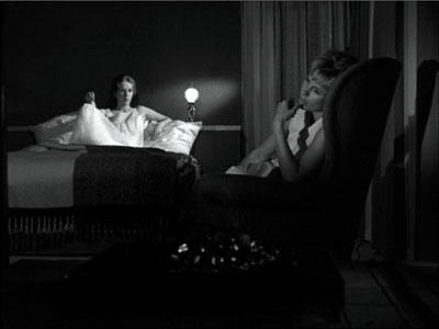
In Persona, the nurse Alma has grown more intimate with her patient Elisabeth, a famous actress who has frozen on stage and now refuses to speak. During their time together, Elisabeth’s treatment becomes therapy for Alma. Compelled to fill the silences, she gradually reveals more about herself. Tonight, a little drunk, Alma confesses something shocking. Once, while her lover was away, she and a girlfriend had sex with a couple of young men. Her telling of it makes her more and more distraught, until she breaks down weeping in Elisabeth’s arms.
In this nearly seven-minute monologue, Alma describes the incident. She mentions a few details, such as the weather on the isolated beach and the blue ribbon on her straw hat. Mostly, though, she simply describes what happened, in laconic but vivid sentences. The result is an anecdote of absorbing eroticism. Lacking any images of the events, we get to imagine the scene of sexual exchange. Bergman releases us from what James once called “weak specificity”: perhaps no imagery this side of pornography could be as arousing as this bare-bones account.
But the fairly neutral words are given emotional coloration through Alma’s manner of telling. Her reaction mixes astonishment at the pleasure, guilt at betraying her lover, and shame in telling it to Elisabeth. By the end, she collapses into weeping confusion; the incident has made her doubt what sort of person she is. Here Bibi Andersson’s performance is crucial, with trembling sincerity giving way to anguish and self-reproach.
In sum, by presenting this monologue wholly in the present, Bergman gives us two layers of action simultaneously, a charged sex scene and its long-range emotional consequences. But there’s more. Had he given us flashbacks, he could not preserve the flow of the present-time action. The staging and cutting during Alma’s confession use simple film techniques, but they add another layer to the scene.
The master shot, seen above, gives us the two women as Alma begins her tale. Then straightforward analytical editing isolates each woman.
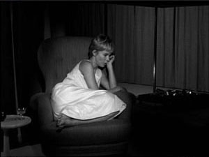
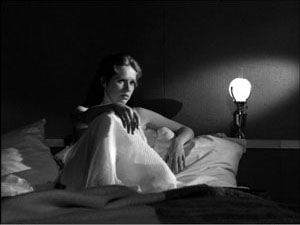
In a classic gesture of intensification, the next shots of Alma and Elisabeth are closer than the earlier ones. This pair of shots accompanies the highest point of what Alma is telling us—the first couplings.
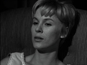
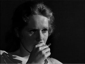
The tight shot of Alma, in which she describes achieving orgasm, lasts almost two minutes and is the lengthiest shot in the sequence. Then the action pauses as Alma nervously curls over to grab a cigarette, goes toward a distant window to light it, then settles on the sill to resume her story.
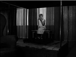
The earlier close shot of Elisabeth had hidden her reaction behind her hand. Now she watches Alma in a sort of enjoyment. Friendly empathy or triumph at eliciting a damaging admission? It’s hard to say. Alma retreats to another window and turns away, as if responding to Elisabeth’s smile.
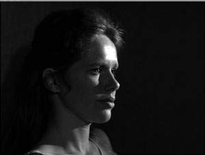
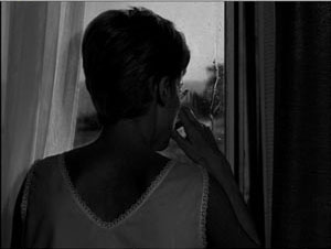
Alma finishes her tale by saying that that night, reunited with her lover, she had the most pleasurable sex of their relationship. Turning from the window, her face is angled in such a way that her confession seems at once indifferent to Elisabeth (the eyeline doesn’t seem angled toward the bed) and challenging to her: “Can you understand that?”
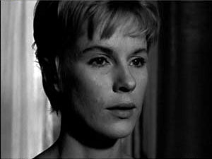
The next line of dialogue—“And I got pregnant of course”—introduces a rupture in the action’s space and time.
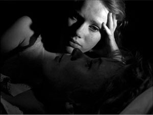
Now Alma is in bed with Elisabeth, as if her question had impelled her to the closest physical contact yet. As Alma twists in pathetic uncertainty, weeping, Elisabeth’s reaction is again initially suppressed (Alma’s arm blocks her patient’s eyes) before finally revealing Elizabeth’s face during the embrace. Yet the expression remains ambiguous—sympathetic, or victorious in having exposed her nurse’s inner life.
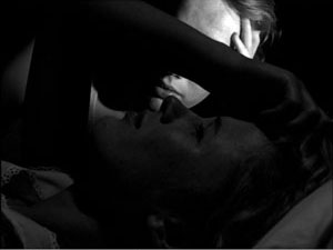
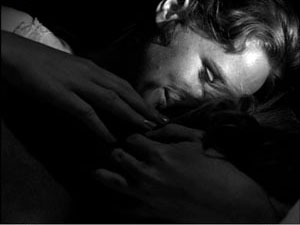
Later we will learn that Elisabeth’s caresses aren’t as affectionate as they might first appear. In any event, given the tenor of Alma’s revelation, it is hard not to see them as erotic gestures in the present, parallel to those Alma recounted.
By telling rather than showing, then, Bergman has been able to tell and show. Bergman lets Alma’s telling provide a sort of virtual flashback, while he also creates a ripening interchange between characters in the present. Instead of simply sandwiching fragments of the past into the present action, he has built up two smooth arcs of action, one that we imagine and one that is set before us in precise detail, with its own emotional modulation. The bliss of the past events is refracted through the pain of telling them.
Telling as therapy
Part of the rationale for telling rather than showing the beach orgy is, of course, the fact that much of it couldn’t be presented so literally on film; censors would object. More important is the fact that showing a heavy-breathing sexual encounter would be likely to undercut the developing revelation of Alma’s present feelings, the tension between the memory of uninhibited pleasure and the lingering shame and confusion.
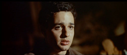
The issue of what should be shown comes up in another classic scene of confession, the moment in Exodus when the Jewish teenager Dov Landau admits that he was an accomplice in running a concentration camp. Again the result is a tearful breakdown. Here, however, a conversational partner coaxes out the truth by quietly corrosive questions.
Dov is trying to join the Irgun, a guerrilla band seeking to drive the British out of Palestine. The senior officer, Akiva Ben Canaan, lets the cocky youth expand on his boast that he began fighting Nazis in the Warsaw ghetto but then was captured and sent to Auschwitz. At first Akiva probes gently. How did the camp officials decide who would live? And what did the Nazis do to the girls? Dov starts to shift uneasily. How was the killing accomplished?
Like Bergman, Preminger employs the standard method of providing closer views as the tension rises. Dov starts to relax as Akiva provides softball questions, but then he has to confess that the bodies were dumped in mass graves. Who dug the graves? Dov admits that demolition squads used dynamite to blow out trenches. Akiva induces him to admit that this was Dov’s job.
In the course of all this, Akiva moves around the room and leans closer to Dov, but the boy remains motionless in the same setup. The fixed framing accentuates his subtly changing expressions across the scene.
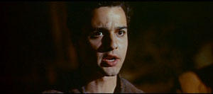
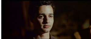
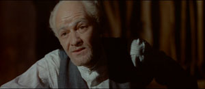
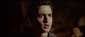
Akiva retells what Dov must have done: shave heads, collect bodies, harvest gold fillings. Dov crumples like a child under the admission (see the frame surmounting this entry), and like Alma at key points in her monologue hides his face in shame. “What could I do?”
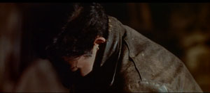
What else has he to confess? Dov won’t say, until he collapses again: “They used me . . . like you use a woman.”
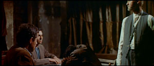
The distant framing here prepares for the scene’s final phase: the men rise and swear Dov into their group.
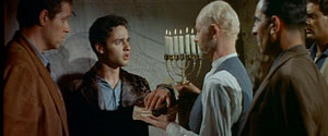
Today a filmmaker would be tempted to show at least some of what Dov tells us. We could get glimpses of life in the camp, along with subjectively distorted imagery of sexual abuse, perhaps from Dov’s point of view. But this could turn out to be James’ “weak specificity.” “Let the reader think the evil,” James advised. Accordingly, Preminger sticks obstinately to what Dov says and how Akiva’s softly voiced but damning interrogation brings out the truth.
Again, the scene’s power comes from the character’s emotional development during the telling. We can imagine the horrors that Dov faced as a boy, and our pity comes from empathizing with his changing expressions–bravado, ruffled concern, realization that he has been caught lying, revulsion at his betrayal and the sexual assault. That is, we sympathize through his response now, rather than through direct vision of what he encountered. We react to his reactions.
By the end, Dov seems dazed that his confession has been accepted. Partly this is surprise that he isn’t being rejected, but also it’s as if he has awakened from a dream–that of himself as a resistance hero. Akiva Ben Canaan forces him to confront what he had not faced. Once more, the confession becomes a talking cure.
As in Persona, the confession also characterizes the interlocutor. Akiva ‘s gentle manner fuses wisdom and severity, making him a quietly stern father confessor. He’s also a shrewd exponent of psychology, one who picks the moment of the boy’s greatest self-revulsion to declare that Dov is accepted into the Irgun. The confession has broken him; the Irgun will remake him. Having surrendered himself utterly he will prove a more loyal soldier than any recruit with an innocent past.
Again, the scene of telling has given us two continuous emotional arcs in two time frames, one concrete and one virtual: a past event we’re cued to imagine and a present stripping away of the teller’s defenses. People who complain that the dialogue scenes in Inglourious Basterds are overlong should consider the tradition of movies like Exodus and Persona.
Psycho babble
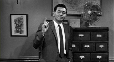
Persona and Exodus suggest two virtues of sustained recounting: arousing the viewer’s imagination, and providing an unbroken arc of present-time action that can generate sympathy through face, gesture, and voice. There’s one more advantage that isn’t perhaps so evident nowadays.
Current films give us “lying flashbacks” fairly often. But in the old days, with very few exceptions like courtroom films and tales like Rashomon, a flashback was veridical. In recounting a story action, a character might lie or make mistakes, but if the film’s narration showed us that action, we could trust that as the truth. As a result, many detective stories presented suspects’ versions of events through question and answer but climaxed in a flashback that showed us what really happened.
If, however, you want to induce doubt about what really happened, you might have the detective’s climactic explanation pricked by inconsistencies. This is what seems to me to be happening at the finale of Psycho. (Do I really have to warn about spoilers here?)
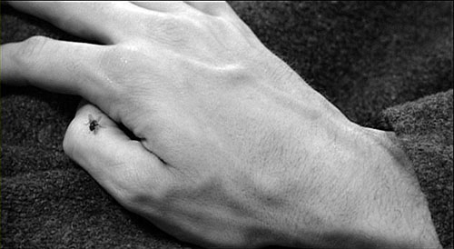
After Norman Bates has been captured, halted in another murder attempt, the psychiatrist Dr Richmond explains the young man’s split personality—part Norman, part Mrs. Bates, his mother. Richmond claims to have gotten the truth “from the mother.” At this point, he says, the Mom part of Norman has taken over wholly, a claim confirmed when we hear Norman speak in an old lady’s voice in the epilogue. Richmond goes on to claim that his questioning determined that Mother “killed the girl.” To get literal, it was as Mother that Norman murdered Marion Crane.
A contemporary film would very likely replay the murder so as to validate the psychiatrist’s analysis: Norman dressing up as his mother, assuming a cackling old-bat accent, killing Marion in images that fill in the silhouette that we saw in the shower sequence. We would see that Norman-as-Mother is the culprit.
But this visual confirmation of Richmond’s diagnosis would be made problematic by the epilogue that Hitchcock includes. In the final sequence we see Norman, staring out at the camera, and hear Mother’s voice declaring that her son committed the murders. According to her, Norman is the culprit; she wouldn’t hurt a fly. How then can Richmond declare that Mother told him that she killed the girl?
We might say that the doctor is extrapolating: the truth he took from the mother is that she is dissembling, shifting the guilt to Norman. But Richmond could have stated that was his reasoning, and he doesn’t. The incompatibility between his explanation and Mother’s soliloquy opens up the possibility that he has not probed to the depths of Norman’s madness.
Despite the fact that the psychiatrist’s analysis arrives at the moment when a conventional movie delivers the whole truth, the very last minutes of the film incline me to doubt Richmond’s ability to grasp the whole situation. It’s as if our parting vision of the character disturbs the smug certainties of the diagnosis.
I haven’t dived deeply into the Talmudic sea of Psycho commentary, so it’s likely that this issue has been hashed out extensively. Perhaps my construal won’t stand up. Take it, then, as a possible instance of the ways in which a verbal recounting, “unconfirmed” by a tangible flashback, can stand as only a candidate explanation rather than the whole truth. In general, telling and refusing to show can induce what Meir Sternberg calls “anticipatory caution,” a warning that the telling is only one, and not necessarily the most truthful, version of events.
Show, don’t tell is usually good advice. But I’m suggesting a codicil. Consider showing the telling. Fill it out. Pack it with actorly detail and psychological implication. Stage and shoot and cut it so as to create an engrossing, unfolding rhythm. That’s visual storytelling too, and it requires fine judgment. Who knows? More scenes relying on telling might also teach audiences to be a little patient.
The best modern account I know of the subtle differences between showing and telling, and the cases when the categories blur and fracture, can be found in Meir Sternberg’s Expositional Modes and Temporal Ordering in Fiction. I talk a little about the distinction in Chapter Two of Narration in the Fiction Film. See also The Way Hollywood Tells It for some comments on today’s vogue for unreliable flashbacks. And way back in 2006 Matt Zoller Seitz wrote a passionate attack on the idea of “Show, don’t tell” while defending the value of voice-over narration.
N. B. I’m not ignoring the possibility that film can present showing and telling in two simultaneous streams: imagery of the present situation accompanied, perhaps alongside, by continuing imagery of the past scene, as in Suddenly Last Summer. This can be a fruitful option, but it relieves the spectator of the obligation to imagine the past—an important advantage of the pure telling. There’s also the tricky matter of giving the two streams of information enough density. The past event needs to gain enough body to be more than a simple illustration, while the present-time telling could become merely a prop for the flashback. In the dual-presentation mode, the filmmaker risks dividing our attention and thinning the texture of each time frame, with the result that both lose vividness. That seems to me to happen in Suddenly Last Summer.
Psycho.
Projections on glass
Christa Bothwell, While You Are Sleeping (2007).
Db here:
I must be obsessive. Whenever I get into a museum, I see movies hovering over the exhibits. You want proof? Go here or here or here. Kristin has dabbled in such speculation too, here.
The most recent example came last week. My sister Darlene is recovering from surgery, and as an excursion she, Kristin, and I visited the magnificent Corning Glass Museum in the southeastern tier of New York state. I hadn’t been there since the 1950s, when I was a kid. The museum was flooded in 1972, but after successive, ever more ambitious restorations, it is now a landmark. Its dignified modernist façade houses a sensory extravaganza.
Glass as an artistic medium is usually associated with either well-designed practical objects, like bottles and glassware, or sculpture, as in the Studio Glass movement founded by Harvey Littleton, who worked right here at the University of Wisconsin—Madison. Beyond that, what I know about glass you can put in—well, a shot glass. So I was pleased to learn how glass art connects to some issues that interest me about the visual arts generally and film in particular.
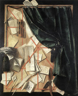
Take illusionism. We’re familiar with the ways that the paintings of Dalí and Magritte use the rules of perspective to create hallucinatory landscapes. And we know about classic trompe l’oeil pictures like this seventeenth-century painted letterboard by Cornelis Gijbrechts.
But I didn’t expect to find trompe l’oeil in glass.

This is Cup in Cup (1986) by Ann (Wärff) Wolff . The spectral little cup is inscribed in the surface. Like all good trompe l’oeil, this is best seen from a single standpoint.
Glass is literally all around us, as the stuff of our windows. In a 1976 image, Richard Posner (no, not the judge) creates a film-like scene by leaving crucial information out of frame. Another Look at My Beef with the Government, from the “Picture Window” series, shows him in traction while cattle, and the artist himself outside the window, look on.
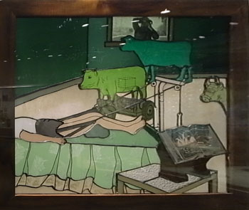
This is part of a series called “Picture Window.” The image pictures a window, and it gives us a window onto the scene, but the phrase also suggests that a window can itself be a picture. In this case, it’s Posner’s comment on serving as a conscientious objector during the Vietnam War.
There’s an ongoing debate about whether to consider glass a solid or a very viscous liquid, sort of the ultimate maple syrup. Its fluid qualities make it ideal for evoking movement. Swirls, waves, bursts, and sprouting capillaries are everywhere in the Corning collections. One of the best examples is Littleton’s now-classic Red/Amber Sliced Descending Form (1984).

The slickness of the surfaces lends a palpable wriggling to the snakelike forms of Dale Chihuly’s Cadmium Yellow-Orange Venetian #398 (1990).
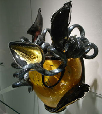
Glass makes these coils glisten.

Chihuly was another Madisonian; a more cheerful twisty work graces our campus’s Kohl Center.
Another sort of movement: Silvia Levinson’s It’s Raining Knives (1996-2004) shows stalactite-like daggers bearing down on a suburban landscape. The slender wires suggest danger hanging by a thread, but they also evoke speed lines, as if the knives are caught in mid-flight.
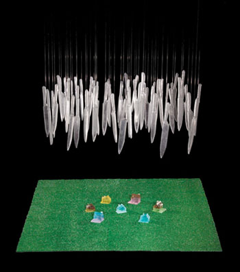
Levinson is Argentine, and the piece responds to the dictatorship that displaced Juan Perón—during which many of her family vanished or were imprisoned. You can read more about the background to the piece here.
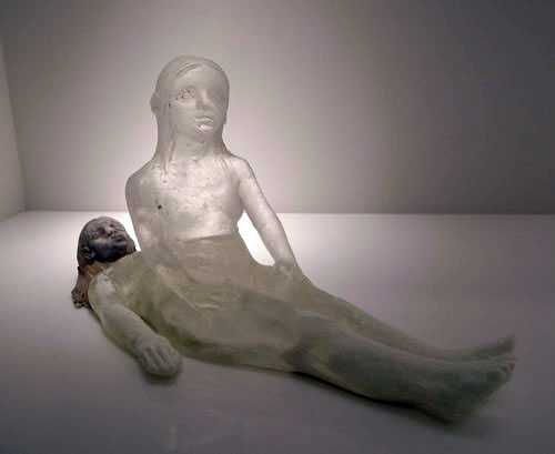
Finally, probably the most filmlike thing I saw: An impression of interrupted movement is combined with an old-fashioned superimposition in Christina Bothwell’s While You Are Sleeping, which surmounts this entry.
After four hours of dazzlement, I was re-persuaded that Eisenstein was right: All the arts are connected, in devious ways, to film.
The Museum has listed many of the items on exhibit, including illustrations, in various pages and pdf files here. Most of the shots here were taken by me, but the Littleton and the Levinson images come from the Museum website.
Coming soon: Our list of the best films of 1919.
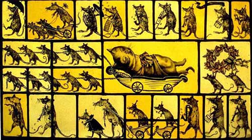
Judith Schaechter, Jazz Funeral for Didi (1994). Not in the Corning collection, but proto-cinematic in a Marey-and-Muybridge way. (And, I admit, reminiscent of Chris Ware.) See other lively Schaechter stained-glass work here and in her book Extra Virgin.


