Archive for the 'Film and other media' Category
La main droite de M. Hulot
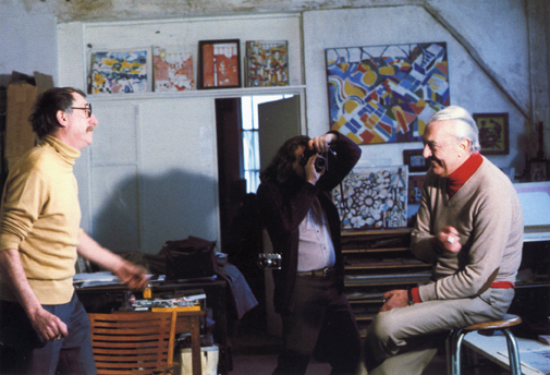
Jacques Lagrange and Jacques Tati, with artworks by the former in the background
Kristin here–
David and I have occasionally mentioned the listserve of students and faculty, past and present, of the film studies area here at the University of Wisconsin-Madison. Apart from job listings and inquiries for information about obscure films, the listserve offers a chance to discuss information and ideas-some of which have inspired blog entries for us.
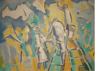
Back in March, dissertator Charles Michael informed us that he had inherited a 1953 French painting by Jacques Lagrange (Les jardiniers, below). Seeking more information, he discovered that Lagrange had been a close friend and collaborator of Jacques Tati, working on all his films from Les Vacances de Monsieur Hulot onward. Naturally, as big Tati fans (the first essay I ever wrote for publication was on Les Vacances), we were intrigued.
Lagrange’s work with Tati
Lagrange (1917-1995) is best known as a painter and designer of tapestries, though he did a few theatrical sets. (The fullest online biographical sketch, in tortuous English, is available here.) He met Tati in 1947. The two hit it off, and they would spend afternoons or evenings bouncing ideas off each other. The film credits read “Avec la collaboration artistique de Jacques Lagrange,” a general phrase that reflects how the artist contributed at several stages of filmmaking. He worked on all the scripts as well as sketching settings and gags. He described their working method: “With Tati, the script usually started from a general idea. His second film grew out of the idea of a vacation, with the railway station, suitcases, trunks, trains. MON ONCLE is a more ‘social’ film. At Pecq, Alexandre Dumas’ villa has been carefully preserved, but in Saint-Germain, everything has been demolished. Like me, Tati favored the preservation of our heritage, as well as alluring modern buildings . . . . In writing a script, he started with sketches, not fully worked-out designs. Tati had trouble explaining what he wanted, so I had to interpret. I did thousands of sketches on restaurant napkins.”
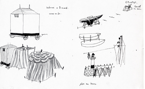
Here’s his drawing of the bathing cabines that lead to M. Hulot being mistaken for a peeping tom, as well as the boat being painted that slides into the sea. Whether it was made on a napkin, I don’t know, but I doubt it:
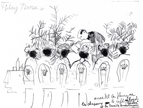
And the gag of the waiter “watering” the ladies’ hats in Play Time. At this early stage the idea was evidently that the waiter would use a watering can for the plants in the background. In the final gag, he appears to pour champagne onto the flowery hats (a funny framing that David illustrated here):
This sketch, by the way, provides pretty strong evidence supporting my claim that Tati intended the film’s title to be written as two separate words.
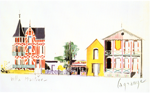
Lagrange went beyond such rough gag sketches. He also worked on the sets of Tati’s films, as this elegant painting for the “Hôtel de la Plage” and the guest-house where Martine stays in Les Vacances:
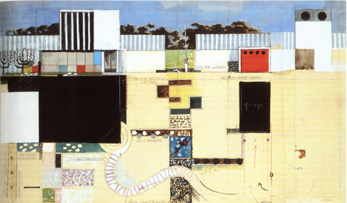
He designed the famous modern house in Mon oncle, including this combination bird’s-eye and profile view of the entire yard:
Tracking down Lagrange
Obviously Lagrange was a crucial collaborator of Tati’s, and yet he seems to be virtually unknown in the U.S. He has received more attention in Europe. In 2005, a slim coffee-table volume, Jacques Lagrange: Les couleurs de la vie: Peinture et tapisserie, by Robert Guinot, was published. It does not reproduce any of Lagrange’s work for Tati, but a four-page chronology (pp. 77-80) gives the best summary of Lagrange’s friendship and work with Tati that I have found.
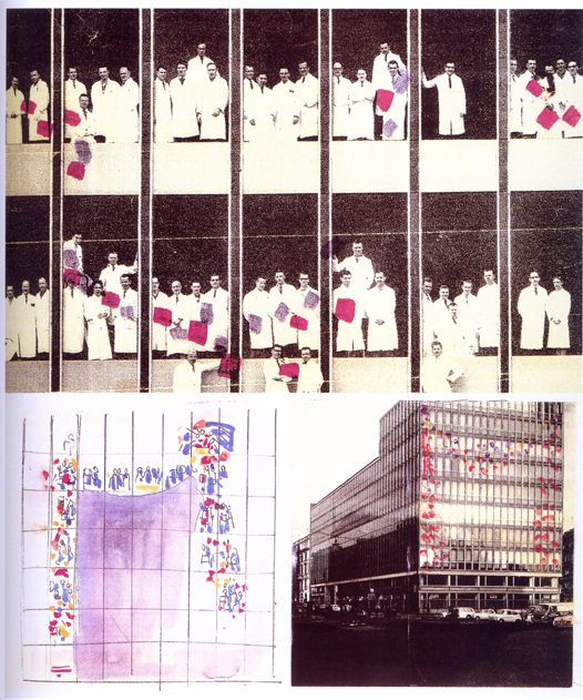
French books on Tati make reference to Lagrange. François Ede and Stephane Goudet’s book, Play Time (Cahiers du cinéma, 2002), quotes him on the construction of the film’s sets (p. 42) and includes some sketches for gags: the crown-topped chairs that leave impressions on the clothes and backs of those who sit in them (p. 57) and the scene of waiters carrying a placard shaped like a chef past diners who seem to be reminded of a corpse (p. 128). There’s also quite an intriguing graphic experiment with an unused gag for the film. Apparently somehow colored objects (folders?) held by people inside one of the glass-sided buildings would have formed a shape as seen from outside:
Marc Dondey’s Tati (Ramsey, 2002) reproduces some drawings for Les Vacances, including the beach scenes above, on pages 90-91, as well as the hat-watering sketch and the quotation above. (A book published in April under the same name, by the same author, but with a different cover is presumably a re-edition of this sumptuous volume; the number of pages is identical.)
Within the past several years there have been a few exhibitions devoted to Tati. One, La ville en Tatirama/La Città di Monsieur Hulot, was held at the University of Bologna. Devoted to three of Tati’s films, Les Vacances, Mon oncle, and Play Time, it produced a marvelous catalogue of the same name (Mazzotta, 2003) with a series of essays in French and Italian. This catalogue includes what may be the largest number of Lagrange’s Tati designs yet published, juxtaposing each with a selection of production photos from the relevant scene. The color painting of the Les Vacances buildings and the plan of the Mon oncle set are from this volume. Unfortunately the catalogue is now out of print and hard to find.
I say “perhaps” because I haven’t had a chance to see the catalogue for the Cinémathèque française’s current major exhibition, “Jacques Tati: Deux temps, trois mouvements,” running in Paris until August 8. David and I may get a chance to see it during our upcoming European travels. If so, we’ll report back. One Lagrange painting is visible in the photos on the Cinémathèque’s website, and no doubt there are other items by him as well.
(Books and exhibitions that include Lagrange’s work all credit the collection of Hyacinthe Moreau-Lalande, about whom I have been unable to find any information.)
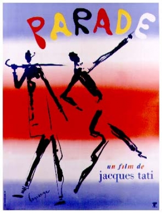
Despite the length of Lagrange’s collaboration with Tati, he designed a poster for only one of the films, the last one Tati completed:
A word on Pierre Étaix
As I was looking around at Amazon France for Lagrange material, I ran across a beautiful, fairly recent art book on the work of another Tati collaborator, Pierre Étaix. The book is Étaix dessine Tati (ACR Édition, 2007), by Francis Ramirez and Christian Rolot.
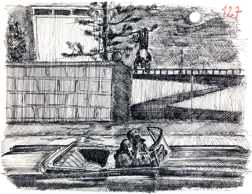
Étaix’s relationship with Tati’s differed considerably from Lagrange’s. It lasted only from 1954 to 1958, the period of the production of Mon oncle. An aspiring actor and filmmaker, Étaix was credited as an assistant director, though he also worked as a gagman. He produced thousands of drawings, collages, and paintings. Some, like those of Lagrange, were ideas for gags. This one involved Hulot getting himself into a fix where he is hanging upside down in a tree as two young lovers in a car pull up and stop underneath:
The gag ended up not being used, though Tati fans will recognize it as having appeared considerably later in Traffic. It’s amusing here to see it being played out by the gate of the Arpel household.
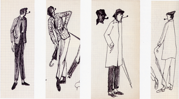
A fascinating set of drawings resulted from an assignment that Tati handed Étaix: to sketch visualizations of Hulot. Of course, M. Hulot had appeared in Les Vacances already, but only in his vacation clothing. His familiar short trenchcoat, umbrella, skull-fitting hat, and suede shoes hadn’t figured in that film. Only the pipe was already iconic of the character. Today it seems odd that there was some consideration of making Hulot distinctly more fashionable than he ended up being:
Tati’s influence is quite evident in the short films and the features that Étaix directed and starred in during the 1960s. He had some success with these, including an Oscar for his 1962 short, Happy Anniversary. He has continued to work as an actor, mostly in small roles (including in his friend Jerry Lewis’ still unreleased The Day the Clown Cried). Unfortunately legal problems have kept his 1960s films entirely out of circulation, as is explained on his official website.
David and I saw a couple of them in the early 1970s. I recall them as being charming comedies, definitely worth seeing. As of now, though, Étaix’s main presence on the screen is as one of Michel’s silent, sinister accomplices in Bresson’s Pickpocket.
The work of both Lagrange and Étaix reveals a great deal about Tati’s artistic methods. Perhaps the new burst of publishing that continues in the wake of the centenary of his birth (1907) will bring more such revelations.
Thanks to various Filmies: Charlie Michael, Colin Burnett, Tim Youngs, and Ben Brewster.
The postman has rung more than twice
Optical Vacuum.
DB here:
While I try to whip up seven lectures for the Bruges Summer Film College and a couple more for the University of Copenhagen and our June Society for Cognitive Studies of the Moving Image confab, I offer some quick notes on notable DVDs and books lugged to our door by our mailman.
When machines film better than they know
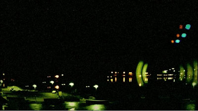
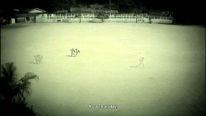
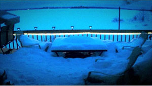
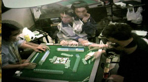
Snow blankets a terrace and the furniture on it. A bottle jerks back and forth on a pavement. Christmas lights blink on and off. Everything looks desolate. What people we see scuttle across washed-out landscapes, play mahjongg in stammering gestures, and toil in computer labs under glaring fluorescent lights. What planet are we on?
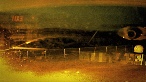
These images are available to any of us. For two years Dariusz Kowalski trawled through sites like www.opentopia.com for surveillance-camera footage. He chose only material from hidden cameras. He added nothing except some slow motion (“otherwise it would be too fast”) and a voice-over commentary from artist Stephen Mathewson reading passages from a year’s diary. The result was a fifty-five minute assemblage film called Optical Vacuum (2008), which I saw and admired in Hong Kong back in April.
Sometimes the diary account intersects with what we see: Mathewson talks of washing his laundry/ shots of a Laundromat. More often, the voice drifts off on its own. Optical Vacuum isn’t an effort to make a film essay or to create a complex audiovisual dynamic. Mathewson’s diary provides an intimacy that the footage lacks, but I think the film would stand up strongly without it.
As a flow of impersonal views, usually from a distant perch, the footage creates a bleak beauty.
Occasionally a human operator has commanded the camera to focus on something, usually a woman.
But most often the camera is just mindlessly recording.
In the process, the surveillance camera reinvents avant-garde film—not just the barely inflected fields of Structural cinema, but also the time compression and melting glimpses, the reflections and superimpositions, the transient ghosts and brutal geometry we find in silent experimental work by Richter, Vertov, and others. These stupid cameras can’t help turning reality into something else. They don’t know any better.
Optical Vacuum, along with other pieces by Kowalski, can be found on a PAL uncoded DVD from the extraordinary Austrian collective sixpack. The handsomely mounted Index release is available here, and elsewhere on the Net.
Dragons and tigers in the Udine sun
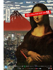 Italian festivals of specialized cinema are mounted with incomparable flair–lots of screenings, panels, interviews, book sales, and of course outstanding food. Most famous are Pordenone’s festival of silent cinema and Bologna’s Cinema Ritrovato. But for admirers of Asian cinema, just as important is the Udine Far East Film event, which completed its eleventh installment on 2 May.
Alas, I’ve never been. In its earliest years it overlapped with the Hong Kong film festival; more recently, my commitments elsewhere, such as Ebertfest, have kept me away. But I have followed this celebration of Asian cinema at a distance through its remarkable publications.
The Udine event concentrates on popular cinema, mostly recent releases that are unlikely to come to US theatres or video stores. You can see films from Japan, Korea, and China but also from Thailand, Malaysia, and the Philippines. This year’s highlights include regional hits like Cape no. 7, Beast Stalker, Departures, and Ip Man as well as obscure and delirious items like Love Exposure and The Forbidden Legend: Sex and Chopsticks. Many screenings are European premieres.
The programmers also mount adventurous retrospectives of rare items. One year it was a survey of the work of Patrick Tam, still too little known among Asian aficionados. This year the retrospective was devoted to Ann Hui’s TV films, which are among her best work. These films, shot in 16mm and broadcast in the 1970s, were strong meat for a culture unused to social criticism in its popular media. Hui’s dramas showed police corruption, the sex trade, abandoned children, and drug addiction. The episodes were researched and scripted under great time pressure, and Hui was allotted two weeks for shooting and post-production. “We were experts at shooting in the streets on the sly.” The stories’ concern for ordinary people and their problems has resurfaced again in The Way We Are (2008) and Night and Fog (2009).
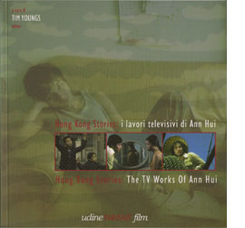 The Hui volume is a model of the profuse documentation the Far East festival provides. Several concise essays, all in both English and Italian, enhance appreciation of the films. Contributors Law Kar, Shu Kei, and editor Tim Youngs do a fine job of situating Hui’s TV work in its context, and a lengthy interview with the director explores her working methods and intentions. There’s also valuable filmographic information about the episodes (four of them available on DVD).
As if this weren’t enough, the Udine event publishes a mammoth catalogue called Nickelodeon. Each year it’s a treasure chest of enthusiastically presented information. This time around, surveys of 2008 developments in all the major countries are accompanied by Roger Garcia‘s special section on the history of Thai action cinema. A vast section of reviews of the films to be shown rounds out this gift to the Asian cinephile. (A little of this material is available at the Udine site.) There is no coordinated effort to sell the books to the public, but if you want to purchase them, try writing to the festival directors at cec@cecudine.org.
So a tip of the hat to the dedicated Udine team, headed by Sabrina Baracetti, and a signal to you that if you have the time and the money to go, you would surely have a hell of a week. (Note that professors and students are offered lodging for some nights.) Who knows? A director might show up to put the audience in a movie, as Johnnie To once did. Even if you can’t make the trip, the quality of the publications makes them indispensible for research and enjoyable reading.
Rabbits from a hat
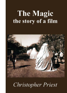 It’s tiresome to hear novelists kvetching that film adaptations mangle their work. So it’s a pleasure to read Christopher Priest’s brisk account of how his novel The Prestige became a film. In The Magic: The Story of a Film Priest takes us through the whole process, but this isn’t the usual behind-the-scenes tour. He never visited the set or met the principals. Instead we get the viewpoint of a writer living in East Sussex, following the production through agents’ correspondence and the gossip frothing up on Google Alerts.
Priest is a lively writer, and he is frank about the ups and downs of the process. Initially he is happy that Nolan acquired the rights because the novel, a cunningly designed piece of misdirection, seems ideal for the director of Memento. But he confesses disappointment when the Prestige project is sidetracked by Batman Begins (“overlong, simplistic, and dull”). When the production gets under way, there are more swerves in the road. Given an early script, Priest admires the craftsmanship of Jonathan Nolan. But then he’s baffled that Christopher Nolan is saying two inconsistent things: that the film is completely different from the book, and that reading the book will spoil the film. Then again, during a press preview in Leicester Square, Priest succumbs to the film’s intricacies. “It has one of the most complicated and sophisticated narrative structures ever seen in an entertainment film.”
The story of the production ends here, but Priest goes on for about fifty pages to analyze the film in considerable detail. He dwells on the opening, which has no equivalent in his novel, and praises it for its fluent shifts among different points in story time. He appraises various aspects of the film, and he doesn’t stint criticisms. He notes that the Nolans stripped off his contemporary story, crucially altered the roles of the women, and turned his elusive mysteries into plot-driven secrets. Yet he concludes:
There is hardly a line of dialogue or moment of action in the film that can be traced back word-for-word, yet the whole thing is faithful to the novel in spirit, in story and in effect. I have differences with the screenplay in places, but none of those detracts from my general impression that it is a classic film adaptation of an existing novel, one which intending screenwriters would do well to study alongside the novel. (157).
Priest is a former movie critic (for the sturdy old British Film Institute publication Film) and an astute observer of what happens in a shot and on a soundtrack. He contacted me after my March blog entry discussing micro-repetitions in The Prestige and told me of The Magic. I ordered a copy pronto, and I’m glad I did. If you want to give your mail carrier a bit more job security, go to this page and click on GrimGrin Studio.
The eyeline match goes way, way back
Kristin here—
It’s late January as I write this entry, and in about a month, I’m due in Egypt for my annual three weeks of volunteer work on the Amarna Project at Tell el-Amarna, in Middle Egypt. (For the project’s website, see here, and for my part in it, click on “Recent Projects,” then “Material Culture,” and finally “Statuary.”) So as not to leave David with the entire blogging burden during that period, I’m writing this to be posted during my absence.
Given the occasion, I decided to write about a topic that has popped into my mind now and then: a little connection I observed between techniques of ancient Egyptian art and those of continuity film editing. In their reliefs, Egyptian artists were very conscious of the directions of figures’ gazes, and their strove in most cases to match the orientation of the accompanying hieroglyphs to those directions. This topic is not only appropriate, but it gives me a chance to show off my new hieroglyphic font—and to practice composing texts with it.
The connection between eyelines in reliefs and in film editing first occurred to me several years ago when our colleague Noël Carroll was giving a talk in the film-studies colloquium in the Dept. of Communication Arts here at the University of Wisconsin-Madison. He dealt with eyeline matches, or glance/object editing and took a cognitive-studies approach.
Noël’s argument was that such editing is not an arbitrary convention and that it draws upon an “innate perceptual behavior” shared by humans to look not just at other people but also at what those people are looking at. (I’m quoting here from the publication of his talk as “Toward a Theory of Point-of-View Editing: Communication, Emotion, and the Movies,” in his 1996 collection, Theorizing the Moving Image, from Cambridge University Press.) This tendency naturally manifests itself when babies begin at two to three months to follow the directions of their parents’ gazes. He claims that eyeline matching “can function communicatively because it is a representational elaboration of a natural information-gathering behavior” and also that such a link to our everyday perception helps make continuity editing easy to grasp.
If we can find comparable sorts of devices in art of a different era and culture, those devices help support claims about “cultural universals.” These are patterns of perception that all cultures share, though they will manifest themselves in art in different ways. Let’s take a look at a sort of eyeline matching that’s used in Egyptian reliefs. Only here it’s not an eyeline and a seen object being matched. It’s a match between an eyeline and the direction its accompanying hieroglyphs face.
Hieroglyphs and their orientation
First, let me get a pet peeve out of the way. A lot of people these days call hieroglyphs “hieroglyphics.” There is no such word, or shouldn’t be. “Hieroglyphic” is an adjective, as in “hieroglyphic text” or “hieroglyphic inscription.” But don’t just take my word for it; look under Etymology in the Wikipedia entry on hieroglyphs. (I note with annoyance that my spell-checker doesn’t highlight “hieroglyphics,” but it does think “eyeline” is wrong.)
Now, about directions. Egyptian hieroglyphs can be written horizontally or vertically, facing left or right. The default orientation is facing right, to be read right to left. How do you know which direction they’re facing? Even if you can’t read hieroglyphs, just look at the signs representing living things. Birds, people, animals, bugs, with rare exceptions they all face the front of the text.
There are all sorts of complicated exceptions to the rightward orientation. The late Henry George Fischer, curator of Egyptology at the Metropolitan Museum of Art, wrote a large book on the subject: The Orientation of Hieroglyphs, Part 1. Reversals (Alas, he never wrote Part 2.)
As Fischer says at the outset, “It is essential to stress the fact that Egyptian art and writing are interrelated to a degree that is unparalleled in any other culture. For it is from this fact that the orientation of hieroglyphic texts derives its logic.” And Egyptian art, despite its strangeness to many eyes, is intensely logical. Each person, creature, and object portrayed in relief will be shown from its most characteristic, recognizable view, whether that be in profile (such as a person’s face, legs, and stomach) or frontal (that person’s eye and shoulders).
In reliefs, the hieroglyphic texts in reliefs function as labels and descriptions of the things depicted or to quote the words of the people present. Hence, logically, the particular inscription relating to one person, creature, or object depicted will face the same direction as it does.
Two straightforward examples
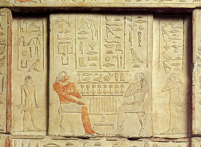
The image below is a detail from a false door (the entrance and exit for the dead person’s soul in a tomb). It comes from an Old Kingdom tomb at Saqqara (5th Dynasty, roughly 2453 BCE). The relief depicts a husband, Nikaure, and wife, Ihat, along with two of their children.
Egyptian Museum, Cairo, inventory CG 1414
The pair sit opposite each other across a table full of offerings: long loaves of bread, portrayed vertically even though they are assumed to lie on the table. The two columns above Nikaure face rightward, as does he. They give his official titles and name. The two above Ihat face left and do the same for her. The son at the left faces right, as does the text above him, and his sister, at the right, faces leftward, as do her hieroglyphs. Despite the fact that this particular door belongs to Ihat, there is a slight male bias here, since the list of offerings above the table face right, as he and his son do—the favored, “stronger” orientation for hieroglyphs and people.
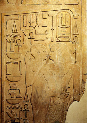 The basic conventions of Egyptian art were amazingly stable for a period of about three thousand years. We find the same principles in the Middle Kingdom. This relief (Egyptian Museum, Cairo, inventory JE 36809) on a column shows Senwosret I (12th Dynasty, reigned 1971-1929 BCE) being embraced by a statue of the god Ptah in its shrine. You wouldn’t think that statues embrace people, but pharaohs were considered divine and could communicate with gods’ statues in temples. The king is at the right, facing left. His name is in the oval cartouche above his head, and the columns of signs at either side of it give some of his titles. All face left.
The rest of the signs face right. They identify Ptah and describe all the things he’s giving the king: life, dominion, stability, health, and happiness. The column at the far left is a direct quotation of the god’s words. As in these two examples, almost any relief where figures are present facing different directions, the orientation of the hieroglyphs will be determined by which one they refer to. Obviously the Egyptians considered this sort of directional consistency very important.
Facing one way, looking the other
Indeed, the directions in which figures’ faces and eyes were turned seems to have been of particular importance. It’s not uncommon for a figure to be facing one way and looking back. In that case, that figure’s hieroglyphs will face backward as well.
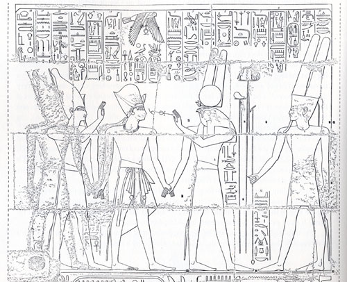
The relief below reveals the logic of this device very well. Two gods, Atum at the right and Montu with the falcon head (not all falcon-headed gods are Horus) are leading Rameses III to the king of the gods, Amen. (I copied this from Fischer’s book, and unfortunately he doesn’t specify where this relief is.) As they proceed, Montu turns back to hold the signs for “life” and “dominion” to the king’s face. The five right-most columns of text above refer to Amen and mimic him in facing leftward; they represent his speech to the king. The next five represent Montu’s speech and, because his eyes look leftward, so do the hieroglyphs. But not the little column of text in front of his stomach and kilt. That describes his action of leading the pharaoh to Amen, so those signs, written beside the part of his body facing right, also face right. Charmingly logical.
That sort of thing is one small part of what makes Egyptian art so appealing to me. Perhaps it gives you a better feel for why Fischer claimed that Egyptian art integrates writing and pictorial representation more thoroughly than that of any other culture. It also bolsters David’s recent entry about how studying the techniques and conventions of an artform enhances one’s enjoyment of individual artworks.
Amarna examples
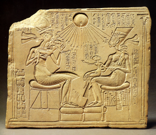
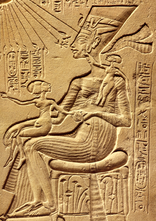
My favorite examples of head-turning reversed hieroglyphs come, not surprisingly, from the period I study, the Amarna era (18th Dynasty, New Kingdom, roughly 1350 BCE). One trait of Amarna art is its relatively casual depiction of the royal family. Previously the king had not been shown “behind the scenes,” playing with his children. Compare the Old Kingdom relief of Nikaure and Ihat, seated stiffly with their children at attention behind them, with the stela at the top of this entry. There the pharaoh Akhenaten lifts his eldest daughter, Meritaten, to kiss her. Opposite him sits his wife Nefertiti, holding the second daughter, Meketaten, on her lap, and balancing her third, Ankhesenpaaten, who stands on her arm or hip, playing with the decoration on Nefertiti’s familiar tall, flat crown. (A repaired crack has destroyed the child’s feet and some other elements of the relief). There’s a similar relief in the Louvre, by the way, where Nefertiti and at least two of the daughters sit on Akhenaten’s lap, but unfortunately only the lower part survives.
This stela is my favorite piece of Amarna art. I must confess that standing back in 1992 in the Ägyptisches Museum in Berlin and studying this sentimental little image (inventory 14145) was what finally suckered me into an obsession with the art of the era. It’s not just the appeal of the family scene, though. There’s an underlying complexity and innovativeness about this piece that makes it unique in the history of Egyptian art. It’s also not just sentimental. Such a stela would have stood in a private chapel in the garden of a rich family. The fecundity and nurturing shown in the image would be seen as indicative of the pharaoh’s protective role toward his country.
As is typical of Egyptian art, each figure has a label identifying him or her. Akhenaten’s and Nefertiti’s names and titles are in the vertical columns at the top, alongside the name and titles of their sole god, the Aten, or globe of the sun, which casts its life-giving rays down upon the group. Literally life-giving, since two of the rays’ little hands hold ankh-signs to the king’s face, and another two do the same for Nefertiti. Each daughter, though, has a label identifying her, all in the very formulaic phrases used on endless reliefs for this purpose.
Here’s a detail of the part of the relief I want to focus on:
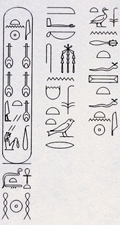
In contrast to the beautiful carving of the figures, the hieroglyphs here are rendered very badly, and it’s partly because they are so formulaic that one can read them all. I’ve used my new font program to lay them out legibly so you can see which way the inscriptions face. (The font couldn’t cram the four nfr-signs that appear side-by-side in Nefertiti’s name into the cartouche, so I settled for putting them on two lines.)
In the text running down the side, the youngest daughter is described: “King’s daughter, Ankhesenpaaten [i.e., “She who lives for the Aten”] of his body [i.e., Akhenaten’s biological offspring], whom he loves, born to the Great Royal Wife, Nefertiti, may she live forever and continuously.” The two other daughters have the same texts with their names substituted.
I’ve analyzed this stela in print, suggesting an interpretation of the brief narrative action that is going on in the scene (“Frontal Shoulders in Amarna Royal Reliefs: Solutions to an Aesthetic Problem,” The Journal of the Society for the Study of Egyptian Antiquities Vol. XXVII [1997, published 2000]: 79-98 and Pls. IV-VII). All I’m concerned with here is the fact that Meketaten has turned her head to look at her mother while pointing across at her father and sister. The short columns of text above her have been reversed accordingly:
There are other Amarna reliefs where a daughter turns her head, including one where the upper part of the princess is missing, and we can only tell she was turning to look at her mother because the few surviving hieroglyphs face the opposite direction from her feet. The reversal isn’t used in every case where a princess turns her head. In more formal offering scenes, where the princesses stand in a group behind their parents, a continuous row of short vertical columns above them gives the name and title for each. With all the rows lined up this way, the reversing of one daughter’s signs would look odd, and so the Egyptian artist kept all the columns facing the same direction. That’s another convention of Egyptian art: keep the graphic layout of the signs neat and pictorially appealing. They’re an important part of the overall image.
Reversed hieroglyphs and eyeline matches
I’m not trying to claim that Egyptian reliefs are just like film because the hieroglyphs are oriented by which was the figures are facing. There’s nothing comparable to an eyeline match in such images, since we see all the figures of a scene present at the same time, always depicted from head to toe. There is no need to match a figure’s eyeline to what he or she is looking at, since that, too, is present in the scene. There is no “offscreen space” in Egyptian reliefs.
Still, the Egyptians matched the orientation of hieroglyphs not just to the general direction a figure was facing but also to the specific eyeline created by head position. There was a logic to this, based on the fact that the direction of the gaze was deemed important and hence could be used to organize important elements of the composition of a scene—a static one in this case rather than one unrolling temporally across separate shots. That a culture so different from our own could come up with an artistic convention reminiscent of a technique in classical filmmaking suggests to me that claims about the naturalistic basis of eyeline matching and shot/reverse shot have merit.
Coraline, cornered
DB here:
It’s common for academics in one field to borrow ideas from other domains of research. But people outside academe sometimes object when a film scholar talks about movies using a term or idea originating elsewhere. These people usually think of themselves as hard-headed pros. Everything we need to understand film, they think, can be derived from the concepts already used by practitioners.
No doubt, we should be attentive to the ways in which filmmakers think and talk about their work. There’s a lot to be learned from shop talk and insider information–hence the enduring value of interviews, DVD commentaries, and the like. Yet no activity explains itself. Often practitioners do things intuitively, without making their background ideas explicit. We can often illuminate a filmmaker’s creative choices by spelling out the unspoken premises behind the work.
Further, filmmakers themselves have traditionally drawn ideas from other arts and sciences. For example, storytelling techniques referred to as exposition, point of view, or motivation have their origin in theories of literature and drama. Filmmakers have been quite pluralistic in their creative practices; why can’t critics and historians be open to outside influences?
Back in the 1980s I began speculating on how the film image represented space, and I adopted the then-current terminology of perceptual psychology. Researchers spoke of depth cues, those features of the real world that prompt our visual system to make fast inferences about a three-dimensional layout. Classic depth cues are the Gestalters’ figure/ ground relation, da Vinci’s “atmospheric perspective” (the haze that envelops more distant planes), and Helmholtz’s “kinetic depth effect,” the way that when you’re moving, closer objects change at a different rate than more distant ones.
These features can also be invoked in two-dimensional images, as I tried to show in Narration in the Fiction Film. Nowadays, deeper explanations of these effects are available using geometrical or computational approaches to perception. But depth cues remain a useful informal way of studying how artists manipulate images. For this reason, in Film Art: An Introduction, we’ve continued to itemize some depth cues that are important in cinema. These concepts furnish analytical tools for understanding things that filmmakers do spontaneously when they compose or light a shot.
So imagine my happiness when I hear filmmakers talk directly about depth cues.
In a fascinating article in American Cinematographer, Pete Kozachik, Director of Photography on Coraline, explains that the filmmakers were very conscious of perceptual factors throughout, and not just in creating the stereoscopic effect. For example, they designed and filmed our heroine’s alternative world in normal perspective, but her boring normal world was designed to seem off-kilter and flat by means of inconsistent depth cues within the shots. “The compositions match in 2-D, but the 3-D depth cues evoke a different feel for each room.”
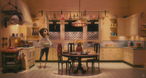
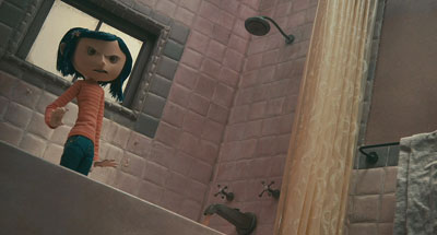
This is hard to illustrate in a two-dimensional medium, but the Coraline trailer offers some examples. Consider this image.
The tiles in the family shower don’t recede into the distance, either across or upward. They are more or less the same size, just arrayed along a diagonal. A degree of recession is supplied by tonality and lighting, but the corner of the shower stall remains somewhat ambiguous. If you try to do a Gestalt flip, you can see the corner as a chimney poking out at you rather than one receding inward. (To see this, try covering the rest of the shot with your hands.)
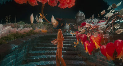
In the garden of the “Good Household,” however, the bricks recede naturalistically in shape and size. The lighting and tonal gradients create a strong sense of depth.
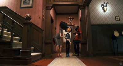
Here is the Good Family’s hallway.
It displays central perspective, with everything receding as it should (as if seen by a wide-angle lens).
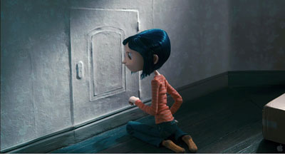
By contrast, here is an oblique shot of Coraline’s real-world bedroom. The doorway’s edges recede pretty steeply, but the baseboard doesn’t taper as it moves toward and past the corner. Instead, it moves in parallel lines. The same thing is happening with the floor planks.
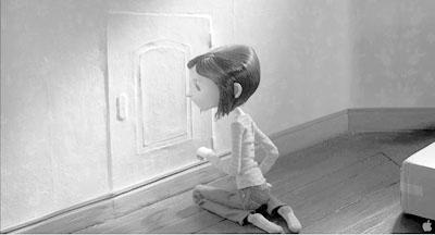
You can see the effect more clearly if we drain the color and lower the contrast. (Sorry, Messrs. Selick and Kozachik.)
Now you can also see the weird, almost cubistic edges of floorboards poking up just behind the carton. Again, lighting and tonality create a sense of depth that the geometry of the edges denies. The depth cues within Coraline’s normal life are inconsistent.
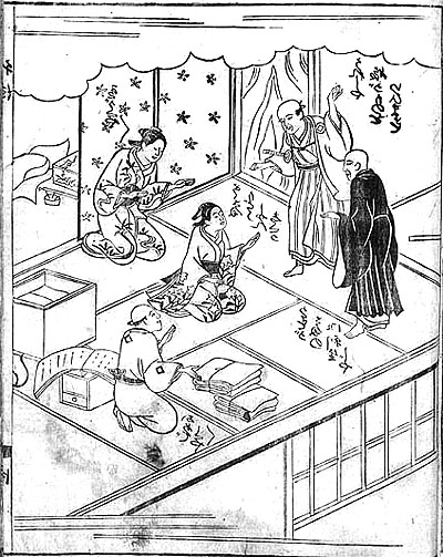
Stare at the rear stretch of the baseboard awhile, and you’ll find that its contours may look a bit wider than those in the foreground. This sort of “parallel perspective” can be found throughout Asian art. Here is a Japanese book illustration from 1713, in which many of the edges run in parallel perspective. Again, instead of meeting in the distance, diagonals seem to be converging out in front of the picture plane, making some areas appear wider in the rear than in the front.
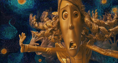
If my invocation of other artistic traditions seems a highfalutin way of talking about an animated movie, check the Van Gogh joke in the Coraline frame at the bottom of this entry.
Kozachik also explains how he spent a lot of time trying to vary the two images’ interocular distance, the distance between our two eyes, in order to give a greater sense of volume. The care paid off, at least for me. Coraline is the best 3D film I’ve seen, as well as the scariest. (For our take on Beowulf see this entry.)
In addition, Coraline helps me push a general point: Cinema is at least partly an affair of perception. Filmmakers are practical psychologists, artists who have mastered the skill of playing with our senses. We can open up their secrets a little by using tools borrowed from the sciences of mind.
For more on Coraline, see Bill Desowitz’s Animation World interview with Tadahiro Uesugi and his interview with Henry Selick. Background on the production is supplied by Thomas J. McLean’s article from last year.
For an overview of spatial perception, see Maurice Hershenson, Visual Space Perception (MIT Press, 1999). A more detailed account is Stephen E. Palmer, Vision Science: Photons to Phenomenology (MIT Press, 1999). A geometrical explanation of the kinetic depth effect is offered in James E. Cutting, Perception with an Eye for Motion (MIT Press, 1986).


