Archive for the 'Film and other media' Category
Our voyage to Italy
“You’d better get going on a blog entry.”
“Aw, you write it.”
“No, you do it.”
“No, you do it.”
“Okay, let’s both do it.”
KT:
In keeping with our attempts to bring you information on cinema and the arts from around the world, we offer this entry from Naples, Italy. Our old friend Vito Zaggario invited us to present papers at a conference in Rome, “Una narrazione esplosa?” December 17 and 18.
We decided to take advantage of the opportunity to go early and visit Pompeii and Herculaneum, two of the spots on our must-see list. We based ourselves in Naples because the sites are a short train ride away.
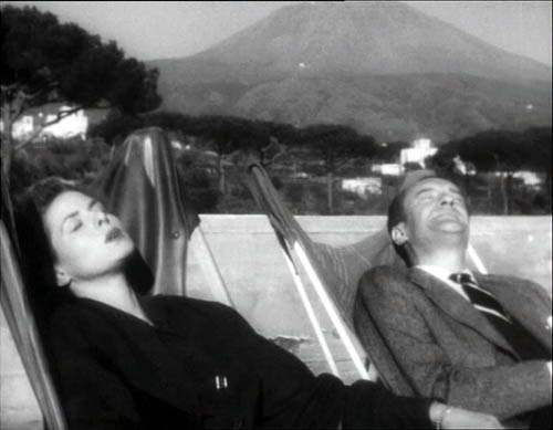
How could we go to Naples and not think of cinema? An early great Neopolitan movie is Assunta Spina (1915), starring one of the foremost Italian divas of the era, Francesca Bertini. Naturally, though, the first one that came to mind was Rossellini’s Voyage to Italy (1954). Some of the places that Catherine (Ingrid Bergman) and Alexander (George Sanders) visit in the film still exist, so we went looking for them. Fortunately, we had no quarrels or plans for divorce, but we didn’t encounter any miracles during a street procession either. About all we saw on the sidewalks were piles of trash, a recurrent problem because of strikes and the camorra’s role in the waste-removal business.
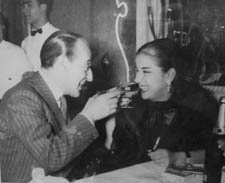
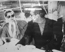
The restaurant Bersagliera, where Catherine watches Alexander flirt with another woman, is still there, a Naples landmark. It’s been somewhat redesigned, but is still very recognizable. In one corner a display of photos of luminaries who have dined at the Bersagliera includes snaps of Claudia Cardinale, Monica Vitti, and the wonderful local comedian Totò (below). Of course there’s also a signed two-shot of Ingrid and Roberto.
The seafood pasta, veal, and pepper steak were delicious, and not horribly expensive, even with the American dollar so low against the Euro.
Reminders of current cinema were evident in two billboards across from our hotel. As you know, American movie stars who would not compromise their dignity by appearing in ads in the U.S. routinely endorse products in other countries. Here a smiling Nicholas Cage publicizes a Mont Blanc watch.
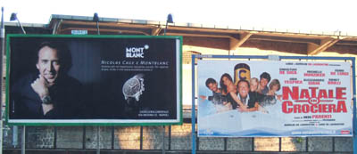
Right next to him was a billboard touting a new Italian comedy, Natale in crociera (“Christmas on a Cruise”). As I mentioned in an earlier entry, there are popular comedies made in a lot of foreign markets that we never hear of in the U.S. This is one of them. It’s the sixth in the popular Natale series, which, as the name suggests, are released in the Christmas season. Its director, Neri Parenti, also directed the ten Fantozzi comedies. Who says only Hollywood makes sequels and series?
We didn’t try to go to any movies while we were there. For one thing, we were busy in the evenings reading up on Pompeii and Herculaneum. For another, virtually all films shown in Italy are dubbed, and we don’t speak Italian.
Many of the artifacts found in the two ancient cities are on display in Naples’ National Museum of Archaeology. We decided to devote our first day to a visit there, hoping that seeing the decoration and artifacts found at the sites would give us a better sense of what the cities would have been like before 79 A.D., when a huge eruption of Vesuvius buried and preserved them.
Some more or less non-moving pictures
DB:
Not all the objects in the museum came from Pompeii and Herculaneum. I was especially eager to check on the statue of Hercules in the Farnese Collection. It appears in one of the finest scenes in Voyage to Italy, and though I couldn’t get Rossellini’s high angle, evidently made with a crane, it was possible to approximate his shot.
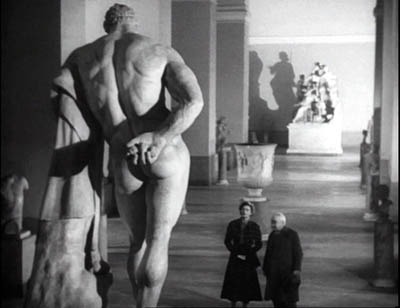
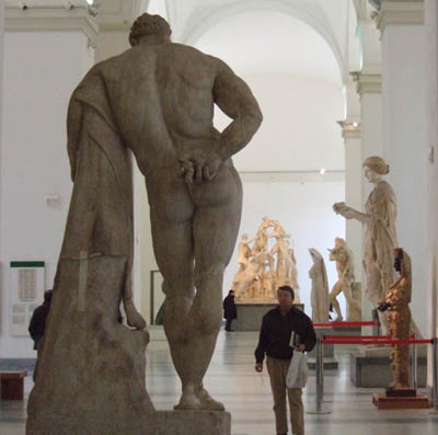
The collections at the two museums we visited, the archeological museum and the Capodimonte Museum, were spectacular and induced me, as museum trips do, to think about images, both still and moving. (Here and here are previous musings on the subject.)
Since I’m planning a book touching on relations between cinema and the pictorial arts, these come under the heading of Research as well as that of Fun. I got several ideas, but I’ll mention just two images that grabbed me.
While devoted mostly to ancient art, the Archaeological Museum was holding an exhibition of more recent painting and sculpture that dealt with classic themes, Pompeii among others. There were several quite interesting nineteenth-century narrative paintings there, but I saw nothing bolder in its compositional design than this 1896 piece by Giulio Bargolini on the Pygmalion story.
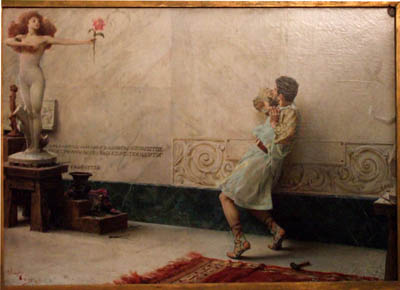
I like the way Galatea comes to life in the upper left cranny of the frame, while Pygmalion, recoiling from what he has created, is daringly off-center. His staggering is emphasized by all the space behind him that he can fall into.
Still, the National Museum’s showpieces are from antiquity, and one of its masterpieces is the Pompeii floor mosaic showing Alexander’s victory over Darius. Made around 200 BC, it’s presumed to be a copy of a Greek painting.
I’ve been keen to see it since first encountering it in E. H. Gombrich’s magisterial Art and Illusion, a book that decisively shaped my thinking about film. Gombrich discusses the image as an example of the Greek discovery of the “eyewitness” principle, the strategy of representing a scene as it might look to an observer.
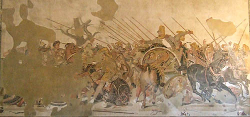
It certainly does that. Scanning the mosaic, I was reminded of the almost snapshot quality of its rendition of the battle. The left half is mostly gone, with the profile of Alexander the most intact bit. The right half, showing Darius’ forces at once resisting and fleeing, is a dazzling image.

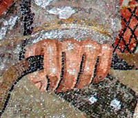 The thrusting spears and Darius’ outflung hand create a vivid thrust to the center, but the wheeling horses and plunging chariots counter this as they retreat to the right. There’s a remarkable amount of foreshortening, as with the horse’s rump in the center. We find shading and wrinkles on sleeves, and even Darius’ knuckles seem white with fear. I had never realized the amount of detail that could be captured in the mosaic medium.
Critics have long noted the small vivid touches, such as the shocked expression on Darius’ face, the grim charioteer beside him, and the fallen soldier who glimpses his own doleful face reflected in a shield.

What struck me just as much as the freeze-frame action was the ways that the figures get tangled up. Later academic paintings of battles, of which the Capodimonte museum seems to have thousands, tend to separate out each important face and figure, with empty air framing them. Not this mosaic, which in certain parts creates a sense of frenzied panic by piling up gestures and body parts.
Clearly the artist knew how to pull a figure out of the melée. Darius is starkly isolated, by virtue of his height in the format and the empty space surrounding him. But behind and beneath him and his whip-cracking charioteer, his forces are in tumult. To look at just one bit: Here the snapshot quality is evident—the whip curls in mid-air—but in the lower right there’s also a collage of hands, heads, and single eyes of men and horses, cued by simple overlap.

The sheer pressure of the confusion, the tension between retreating and standing fast, is rendered by these tightly stacked planes, crisscrossed by the diagonals of spears and the charioteer’s arm. I can imagine Eisenstein calling this an early case of montage, the colliding stimuli that create a synthetic, expressive image.
Sights and sites
KT:
Pompeii did not disappoint. December in Italy can be cold and rainy, but we were lucky and had sunny cool weather for our visit. Going during the off-season is definitely a good idea.
We were alone in some parts of the site, including the beautifully preserved amphitheater. It took us about six hours to walk from one end of the excavated portion to the other, though one could easily spend two days going slowly and savoring the bits of wall paintings and mosaics that have not been taken away to the museum, as well as the marble-tiled counters in the many bars and cafes, the steep, curving bleachers in the small and large theaters, and the many faint graffiti written by the ancient citizens. Almost everywhere one goes, the vast, looming presence of Vesuvius dominates the view.

The next day it turned much colder and very windy, though still sunny. The fact that the excavated portion of Herculaneum is in a vast pit helped protect us from the wind. Vesuvius’ mud and ashes buried the city 65 feet under current ground level. Again we encountered only a few other tourists as we strolled up and down the sidewalks of the town, looking into the houses, the taverns, and the temples. Again much of the wall decoration had been removed, but there were enough tile floors, mosaics, painted panels, and furniture to give a better sense of what the place must have looked like.
More on the Rome part of the trip later.

Godard comes in many shapes and sizes
DB here:
James Quandt started it.
The indefatigable Senior Programmer of the Cinémathèque Ontario emailed me in early 2004 to ask if I had any thoughts on the aspect ratios of Godard films. He attached an essay which eventually appeared in the gorgeous anthology, For Ever Godard. Reading a Quandt essay is like eating a ripe nectarine, tangy and nourishing. So you should find the original and indulge yourself. (1)
You might be asking what the term aspect ratio means. It refers to the ratio of the width to the height of the film image. The image was fairly square in the early silent era, then became roughly standardized at 4 x 3, or as the pros say, 1.33:1. Sound filming made the format a tad more horizontal, at 1.37. Anamorphic widescreen (CinemaScope and its brethren) was more or less standardized at 2.35 (more recently 2.40). Various non-anamorphic, or “flat” aspect ratios have appeared since the early 1950s. The US has favored 1.85, Europe has been known to use the squarer 1.66, and some films, like E. T., are designed for 1.75. Widescreen TVs are set at 16:9, or about 1.78:1, so that’s likely to be a common proportion in the future. We discuss aspect ratios at more length in Film Art: An Introduction (pp. 183-185 in the newest edition).
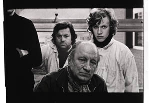
Filmies care about aspect ratios because shot composition matters. Sometimes the print is “hard-matted,” with the correct proportions given as black bars at the top and bottom of the frame, like video letterboxing. Here’s an example, from a 16mm print of Godard’s 1972 Tout va bien. It is hard-matted to 1.66. (The original film is in color.)
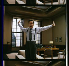
If the image isn’t hard-matted, the projectionist must insert an aperture plate that will mask the image properly. But what plate? Should she set it for 1.37? That’s a very rare option nowadays, and many theatres aren’t really designed to show it. Typically, if the print doesn’t indicate, the US projectionist will fall back on 1.85. Nowadays, if a Hollywood film isn’t in Scope, the projectionist is expected to use that ratio. Some shots will be problematic if the projectionist includes more than the 1.85 format allows. Here’s a full-frame film strip from The Hudsucker Proxy, where you can see that a chunk of the set is blocked or missing in the bottom area, and a microphone peeks into the frame from the top. (2)
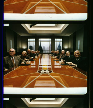
Like many other movies, the films made by Godard since the mid-1970s show up at the projection booth without hard matteing. So at what ratio do we show them?
A great many careful viewers have voiced their views on the Internets, and I’ve learned a lot from the discussions here and here. In part this blog entry is an effort to introduce readers to this debate.
Moreover, this apparently film-wonkish question has wider implications. It can teach us a fair amount about how film images work, and the implications of any masking, matteing, or cropping of an image—especially on DVD. So if you’re interested in Godard, keep reading. If not, skip to the final section, “Relationships: The fundamental question,” where I talk about some artistic effects of cropping any film image.
It’s a just image, not just an image
James Q was mounting one of his typically ambitious retrospectives, this time on JLG, and so his essay posed a question that had long been ignored.
A disturbing discovery of the retrospective was how frequently the full-frame compositions of Godard’s late films have been ignored and overruled. Many of the prints are clearly marked by the lab with the widescreen ratios of 1.66 or (the almost standard) 1.85, and their subtitles are printed in the frame at the height indicated by those standards. Our meticulous projectionist Kate Mackay experimented with whole reels of films, showing them first in 1.33 and then in the prescribed wider screen ratio, revealing the violence done to the compositions when shown the latter way.
James found that several films, including Passion, Je vous salue Marie (Hail Mary), Nouvelle Vague, Hélas pour moi, and For Ever Mozart, looked “abjectly constricted” in 1.85. So James wrote the man himself.
Disturbed by some oddly cropped compositions in Éloge de l’amour, which result in seemingly unintentional beheadings and concretions, I consulted Godard by fax about the aspect ratio and he confirmed that it was indeed, as stated, 1.66 (rather old-fashioned in its own way). That he occasionally still seems to be jamming a 1.33 composition into a frame that cannot accommodate it suggests his instinctual preference for the open image.
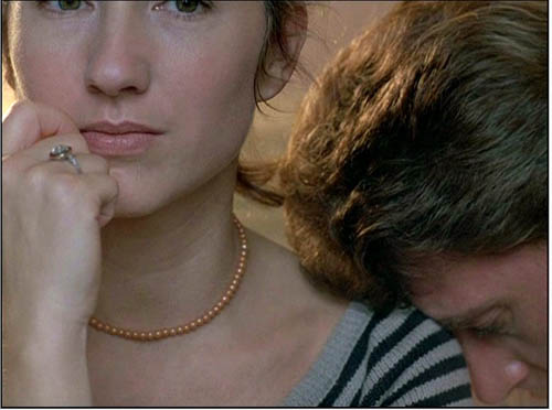
I couldn’t help James much at the time, but I did send him a couple of frames that favored squareish compositions and that came from 35mm prints. Other frames we reproduced, at 1.37, in both editions of Film History: An Introduction. The still that pretty much settles the matter for me is the gorgeous shot of Nathalie Baye and Johnny Hallyday at the top of this entry. Here’s the image as it is on a 35mm print.
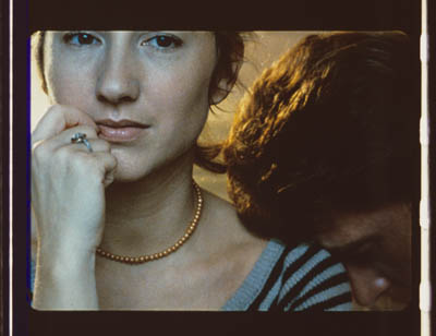
Downsize that to 1.66 without losing those eyes!
Later I sent James another killer example, drawn also from a 35mm print of Detective. (It’s in the new Film Art, p. 46.)
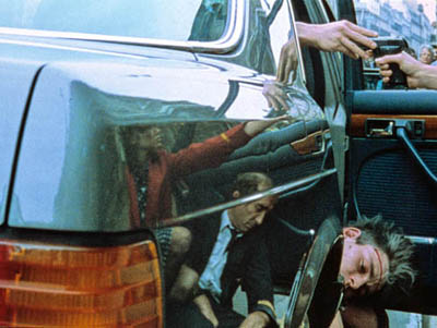
Here’s what it would look like in one try at 1.66 matteing.
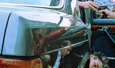
I say “one try” at a matted version because I didn’t take as much off the top as a normal aperture plate would; I didn’t want to slice into the hands and the gun. Not only is the 1.37 image preferable (we get to see Claude Brasseur’s slumping posture) but 1.66 looks, as James says, jammed. The 1.37 ratio lets Godard load information in the very top of the shot, as we’ll see often in the examples to come. And, needless to say, at 1.85 the shot would make no sense.
Soon after James and I had our exchange, Godard—perhaps prodded by James’ query—sent a diagram to Cahiers du cinéma. (3) (Thank you, Craig Keller, aka evillights, who called attention to it on this thread.) The Cahiers editors report that Godard has asked that Notre musique be shown in 1.37. His photomontage lines up two shots from the film and arranges them according to the three major “flat” ratios, and for each one he supplies a tart annotation.
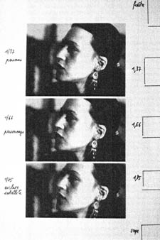
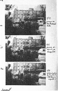
For the close-up of the woman, the captions translate as: 1.37 person. 1.66 character. 1.85 satellite slave. For the long shot of the street, we get: 1.37 Proof of Serbian bombing. 1.66 Proof diminished by Europe/ USA. 1.85 Extermination of proof (Milosovec acquitted).
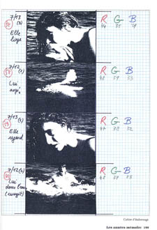
Pretty strong evidence that JLG doesn’t like cropping the classic format. But these remarks are about Notre musique. What about the other films? Apart from the evidence onscreen and on the film strip, we can add one thing. Evidently he shoots at 1.37, but there’s also evidence that in the late stages of postproduction he seems to preserve that ratio. Here, for example, is a sheet of color timing instructions for Nouvelle Vague. (4) Godard has pasted in a frame for each shot in the sequence, and alongside he notes how much red, green, and blue he wants. The frames he mounted are 1.37.
Recently our Cinematheque has been holding a Godard retrospective, and I’ve taken the opportunity to revisit the aspect ratio issue. As an archival venue, we can screen at any ratio, even the squarish silent and early-sound ones. Our projectionist Jared Lewis has run the Godards at 1.37. They look fine.
Jared pointed out to me that one other factor leans toward screening them in the 1.37 format: the thickness of the spaces between frames. In a modern “full-frame” film like Hudsucker Proxy, there is very little space between the frames. The line separating one from another is quite thin. That tends to make the frames squarer, closer to 1: 1.2, as I mention in endnote 2.
In a classic sound film, there is often more space between the frames. Usually that space is black, but I can’t resist showing what it looked like in Technicolor.
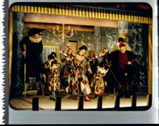
This frame, from Renoir’s Golden Coach, shows the characteristic silver frame surround (and silver soundtrack) of a true Tech print. Nifty, huh?
Anyhow, the sort of thick spacing between frames that we get usually find in Godard prints, and that’s visible in the Baye/Hallyday frame above, favors the classic ratio. The thickness of these spacers is similar to what we find in a modern film that was explicitly designed for 1.37 screening, Hans-Jürgen Syberberg’s Parsifal (1982).
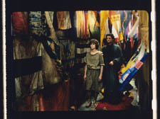
This array, Jared points out, gives different frame proportions than one would find in a print hard-matted to 1.66 or 1.85.
One more wrinkle. On the film strip, Godard’s frames aren’t all the same dimensions. Here are two from Je vous salue Marie; note that the first is taller, with narrower spacers, than the second.
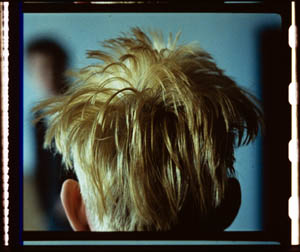
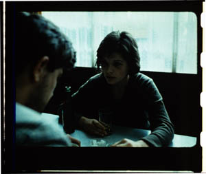
Both, however, would be appropriately shown at 1.37.
How then are we to explain Godard’s saying the films should run at 1.66? Perhaps, as one of the online commentators has suggested, Godard assumed that 1.66 is the closest that most commercial venues can come to 1.37. Perhaps too he was just being contrary–that is, just being Godard.
Fortunately, some DVD producers seem to recognize his full-frame aesthetic. The UK version of Detective is full-frame and preserves my nifty shots. Also, the Cahiers du cinéma discs for Prénom Carmen, Hélas, and so on are at 1.37. Bowing to Godard’s wishes, Wellspring’s version of Notre Musique announces that it is presented “in its original theatrical aspect ratio of 1.33.” Although purists may say that virtually no theatres showed it that way, we should appreciate the gesture.
Relationships: The fundamental question
Even if you’re not that interested in Godard, everybody should be aware of what video cropping can do to the film image. I’m not talking about panning and scanning, that process which begins with a widescreen film, typically one of an aspect ratio 1:2.40, and extracts a 1.37 frame out of it for video purposes. This is deplorable, but most of us are alert to it. What’s more interesting is the sort of thing that happened when a film is cropped inaccurately, either in projection or for DVD.
My example will be from the first reel of Godard’s Éloge de l’amour/ In Praise of Love, which is available on DVD in a full frame version from Optimum in the UK and in a cropped version from New Yorker in the US. I won’t be focusing on the quality of each transfer, though the Optimum one looks superior to me.
Nor will I do a detailed narrative account, because I find the characters and their interactions still fairly baffling. I’m always amazed that critics can praise a Godard film without ever getting down to explicating what’s literally happening in a scene. They write as if these films were telling their stories straightforwardly. Without help from the presskits, could journalists discern even the sketchy plots they refer to? A great deal of the fascination of Godard’s late works comes from his refusal of the most elementary forms of exposition–picking out characters, explaining their relations, and the like. There is always a story, but it’s about three-quarters hidden, and this seems to me to require a lot more analysis than people tend to give it.
Anyhow, in studying Éloge de l’amour‘s video versions, I learned that there can be a big difference between tiny numbers. For instance, the Optimum version is prepared at 1.35:1. No big deal between this and 1.37:1, surely? Except that the New Yorker version seems to have started from a 1.37 frame. Even though it’s cropped on the top and bottom, it consistently supplies a tad more information on the right and left edges, and these extra bits are visible in side-by-side comparison. First, a 35mm frame.
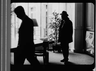
Needless to say, the projector’s aperture plate won’t preserve everything in the physical frame; at a minimum it masks off the curved corners. But if we look at the two video versions, there are some surprises.
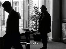
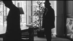
The 1.37 version of this shot is of course much closer to the overall composition of the original. But more areas of the window frame (on the left) and the painting (on the right) are visible in the widescreen version than in the full-frame one. Did going for 1.35 shave off those areas? Moreover, New Yorker’s cropping is at 1.77, for all intents and purposes the same as 1.75. But to achieve this wide frame, the transfer of some shots seems to have been optically stretched a little. In some upcoming examples the faces are a bit plumper and the surroundings a bit more horizontally spacious.
Okay, maybe I’m splitting hairs. So let me assume that the UK DVD preserves a reasonable amount of the 35mm original. I want to consider some effects of the cropping we get in the US DVD. Some are obvious, some more subtle, and all go beyond this individual case to suggest the results of overcropping any movie.
(1) Of course we lose the top and bottom. In the full-frame shots from Hudsucker Proxy, no problem; the filmmakers are counting on the projectionist to mask the frame. But in Godard the cropping makes us lose stuff. Godard likes to frame heads pretty high in the shot, and this means that we often lose part of them.
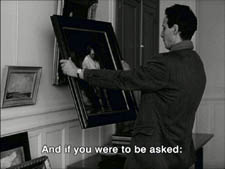
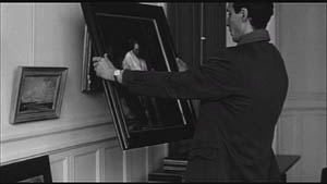
Heads are trimmed in movies all the time, and it doesn’t much matter in close views. But in Éloge, Godard is composing long shots with heads quite high up. He will even daringly chop off heads himself. This is partly a strategy to conceal who is present, to block our recognizing characters by their faces. It also has the effect of activating areas of the frame that aren’t usually so important. We have to strain to see partially visible things, tucked away in bits of the shot.
In the example below, I submit, the original composition creates a tension among three centers of interest: the two very visible paintings and the almost indiscernible face of the art dealer standing by the rear window. That tension is lost when the 1.77 cropping lops off the head in the background. Significantly, the man offscreen left is talking about how classic painting displayed “relationships” (rapports)–presumably both personal and pictorial. “That’s the fundamental question.”
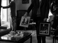
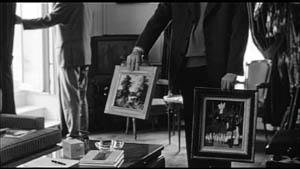
The framing of the assistant in the foreground, incidentally, shows that spotting a decapitation in a video version doesn’t necessarily mean that Godard wanted every head to be seen.
In a later scene, we strain to see the older man’s face as he bends over Bruno. As he speaks Picasso’s immortal line, his profile scrapes the very top of the shot, but not in the cropped version.
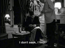
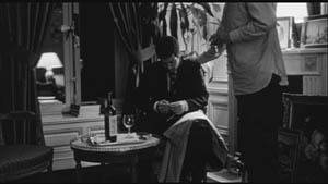
In most film shots, the upper half of the frame harbors what we look at first, so we’re probably most likely to notice when something goes missing there. But actually, the area at the bottom of the frame is important too, especially as part of Godard’s all-over approach to composition.
Throughout early scenes of the film, Godard’s compositions favor the art works and minimize the humans trafficking in them. So the picture (by Delacroix? Matisse?) on the coffee table is foregrounded when the art collector signs the papers proffered by a mostly unseen woman, but it vanishes in the cropped version.
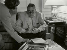
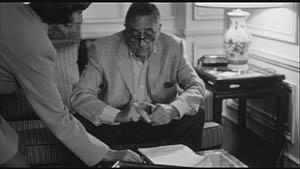
Likewise, the old man on the bed can rub his glasses fretfully at the very bottom of the 1.37 format, but that performance detail goes for naught in the 1.77 format.
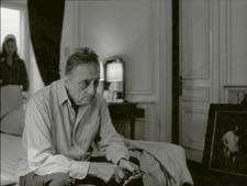
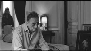
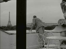
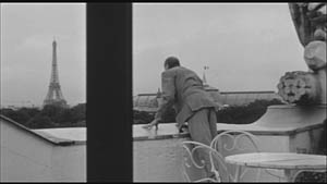
More generally, even when we scan the top half of the frame for major information, we tend to take for granted that people are anchored to a ground plane, the earth or the floor or whatever. Often, of course, film shots don’t show us this ground. But the material at the bottom of a distant view can weight the shot, providing a sense of gravity. Here, the dealer peering over his balcony is minimally tied to the patio ground (as minimally as he was visible in the earlier shots when his head grazed the upper edge, I suppose). But in the 1.77 version he floats free.
(2) The top and bottom zones include the corners of the frame as well, but I single them out for special mention because I like them so much. Again, we don’t expect key information to be tucked there, but it can happen—in Godard, in Tati (a big influence on the late Godard), and even in one remarkable shot in Lumet’s recent Before the Devil Knows You’re Dead. In the first reel of Éloge de l’amour, the best example I can find comes with the long-shot of the woman, turned from us, standing at the window. In the lower right corner of the shot sits a woman’s photograph on a table. The 1.77 frameline chops it off and makes it less segregated for our notice: we lose the spacing that separates it from the other objects on the table. Since the voice-over is meditating on memory, the photo adds an overtone to the shot, but less clearly in the cropped version.
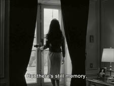
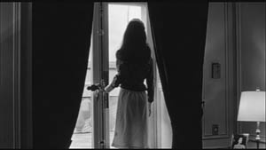
Maybe it matters, maybe not; but it’s a lot harder to see in 1.77 than in the 1.37 transfer. Something similar happens with the businessman’s hand in the lower left of this shot.
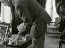
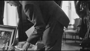
(3) Cutting off top and bottom alters the shot scale. All other things being equal, cropping not only eliminates; it enlarges. Figures come closer to us. A medium shot becomes a medium close-up. All of the examples so far indicate this to some degree, but it comes across clearly in these variants.
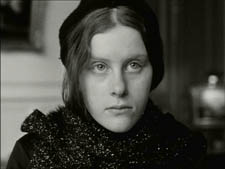
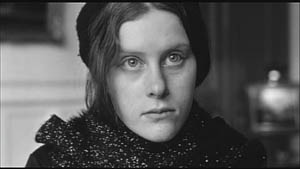
Again, note the stretching. It seems that someone decided that the image had to be 1.75 and instead of cropping it, stretched the 1.66 one. Yikes!
(4) Overambitious cropping changes the compositional dynamics. In reducing information, it reorganizes the composition. Rudolf Arnheim (I blogged about his achievements here) suggested that we consider a picture as a field of vectors and forces, pushes and pulls, balance and imbalance, rival centers of attention. By changing the framing we change the relation of the figures to the edges, and this can alter the composition.
The clearest examples come from the sort of reframings we find when a Super-35mm film is rendered in home video versions in both 2.40 and 1.37.
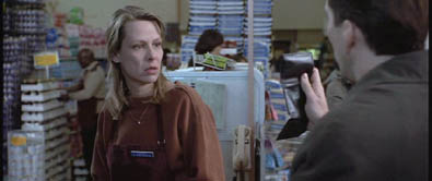
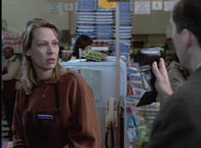
In this shot from 8mm (the movie, not the gauge), the cashier questioned by Cage looks more isolated in the Scope framing, while in the full frame they seem closer together and he seems to press in on her. Cropping can change a lot.
Now consider this comparison.
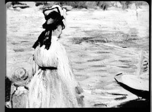
Godard’s original shot (here from 35mm) keeps the painting’s upper horizon, the darker, frothy waterline as a kind of backboard, halting the water’s recession into the distance. Graphically, the water on the right center becomes a negative space for the two figures, with the boy counterbalanced by the tip of the skiff.
But the cropped version loses the distant waterline, creating an infinite stretch of space top to bottom, and the boy’s head seems to float more freely. Most starkly, the skiff, by losing its shadow, seems to have swung more toward us.
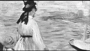
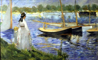
It’s worth noting that Godard himself is a mean hand at radical cropping. I’ll forebear from rambling on about what his original framing above does to the original, Manet’s Seine at Argenteuil (1874), but it could constitute a lesson in how framing changes effect and meaning.
Several factors come into play when we look at this shot from the two DVD versions.
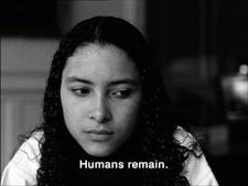
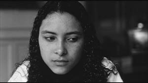
The woman’s face is off-center in both images, but it looks more off-center in the 1.77 transfer. In fact, despite the extra bits on left and right, it is measurably more off-center, because of this transfer’s optical stretching. Yet I’d argue in addition that the cropping of the frame has squeezed the pictorial elements into a stronger horizontal to-and-fro, giving a sense that she has been pushed more out of the middle. You can see it more markedly if we crop it more drastically, and it may help to hide the others when you look at this.
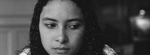
This effect is akin to what happens in the cropping of the 8mm example: the spatial relations have reorganized in relation to the frame edges. Rapports again.
(5) Overcropping can affect the way we experience the time of the shot. Before you call the men in the white coats, I hasten to say that cropping is purely a spatial effect, but in cinema space is bound up with time.
We’ve seen that Godard manipulates the vertical dimension of the frame to an unusual degree, and the effect on time becomes apparent in one scene of Éloge in which Bruno talks with an older man, in a sort of casting session for his project. First we see Bruno alone, and as he walks to the window the old man comes in, his back to us. We presume it’s a man by the bulk, the gait, and the fedora, making its appearance in the upper right corner.
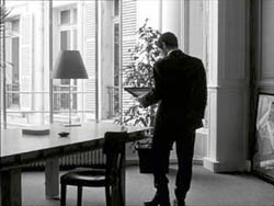
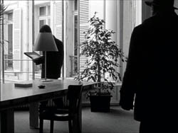
Or does a man come in? In the 1.77 version, at the corresponding point in the shot, we can’t tell it’s a man until the figure comes further into the room.
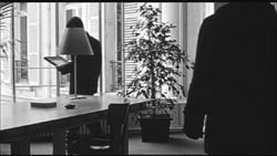
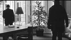
Godard’s reliance on the upper part of the frame allows us to discern the caller sooner in the 1.35 version. Seconds, even split-seconds, matter in cinema. Insofar as cropping affects the timing of a shot’s unfolding, it affects our experience.
( 6) Cropping affects perspective, the perceived distances and volumes of objects in the visual array. Blowing up the center of an image creates a flatter, more friezelike space than we discern in the original. This becomes evident in a later phase of the scene I just mentioned. After Bruno leaves the shot, the old man is left standing in the office.
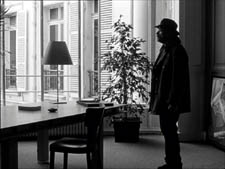
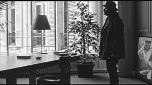
The 1.77 image looks more like it was shot with a long lens than does the full-frame version. The result recalls the sort of perpendicular telephoto framings so common in the 1970s, in films like The Parallax View and The Conversation (below).
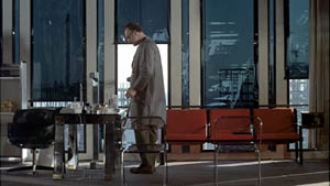
Godard has said that he preferred 30-40mm lenses for much of Sauve qui peut (la vie) because a focal length of 50mm (and presumably one longer than that) will “destroy perspective.” (5)
Many of these differences wouldn’t matter in most films, which aren’t composed as meticulously or as daringly. Hollywood images aren’t typically as dense as those in late Godard. (I must do a blog some day on fussbudget filmmakers like him.) But even if these niceties seem negligible, I think you’ll grant that the film would be much more compromised by being shown in a 1.85 ratio, the squarest option available in most commercial theatres today.
Critical discussions of Godard’s late films have treated them as poetic meditations, and that seems partly right to me. Yet few critics ask how they manage to create their lyrical, associative quality. I think, as I hope to show in a future blog, this has to do with his treatment of narrative (naturally) and his layout of scenes. But even before we get there, I think that we find in the very texture of his images (let alone his sounds) a daring decentering of faces and bodies—the usual nodes of our attention. If he often blocks the flow of our glance, it’s in order to rechannel it to unexpected areas and textures, crannies and gaps, within the image. And so we want all those areas and textures, along with the crannies and gaps, available to our eyes and minds.
(1) James Quandt, “Here and Elsewhere: Projecting Godard,” in For Ever Godard, ed. Michael Temple, James S. Williams, and Michael Witt (London: Black Dog, 2004), 126-139.
(2) Geek note: You may notice that this “full-frame” image isn’t itself in the 1.37 ratio. It’s very square. The reason is that many 1.85 frames will be exposed in the camera at a ratio of 1: 1.2! I believe this was standardized for the Panavision cameras of the 1970s and afterward, though I’d appreciate more information about this. See the entry on Panavision cameras in American Cinematographer Manual, fifth ed., ed. Charles G. Clarke (Hollywood: American Society of Cinematographers, 1980), 104. See also Rob Hummel, “Comparison of 1.85, Anamorphic and Super 35 Film Formats,” American Cinematographer Manual, eighth ed., ed. Rob Hummel (Hollywood: ASC Press, 2001), 24-29.
(3) Jean-Luc Godard, “Formats,” Cahiers du cinéma no. 591 (May 2004), 78.
(4) This image is taken from Jean-Luc Godard par Jean-Luc Godard, vol. 2: 1984-1998, ed. Alain Bergala (Paris: Cahiers du cinéma, 1998), 199.
(5) Jean-Luc Godard, “Propos rompus,” in Godard par Godard vol. 2, 466.
Thanks to Suzy Buenger and Nancy Marshall for identifying the Manet painting for me.
PS 15 Dec: And thanks to James Quandt, Michael Kerpan, and Yogesh Raut for a name correction I’m too embarrassed to specify further.
PS 7 April 2008: The issue is raised anew with Gus van Sant’s Paranoid Park. It’s designed to be shown at 1.37, with more than a few shots reminiscent of Godard. Joe Beres explains here.
PPS 25 January 2009: Ranjit Sandhu provides a lively and detailed discussion of aspect ratios and matteing strategies, along with remarks on Godard’s frames.
PPPS 21 Sept 2009: Thanks to editor John Olivio for a correction on the 1.78 aspect ratio.
JLG par JLG (1995).
Things to like about looking
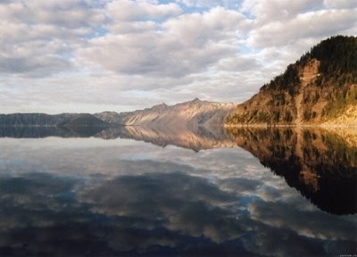
13 Lakes.
“What I like about looking is how many ways there are to see the same thing.”
Sadie Benning
DB here. Today no extended essay, just some jottings.
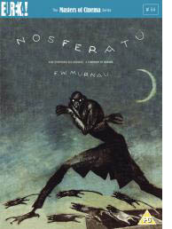 Some day I really must do an extended tribute to the Eureka/ Masters of Cinema DVD line. To call it the UK Criterion is partly right, given the painstaking transfers and the ample supplementary material. But Eureka ventures into some very fresh territory. A company that puts out the terminally peculiar Funeral Parade of Roses (Toshio Matsumoto, 1969) as well as a double-disc set of Mizoguchi’s Sansho the Bailiff and Gion Bayashi deserves points for audacity.
A recent batch of Eureka releases:
*Two cult animation items by René Laloux, Gandahar and Les maitres du temps. Fans of Fantastic Planet and the bande dessinée artist Moebius will snap these up, as much for the large booklets as for the discs.
*Then there’s Nosferatu. You say we’ve already got enough? Nope. First, we can never have too many of this, one of the greatest of silent films. Second, this version looks scarily definitive: a two-DVD set with the Murnau-Stifung restoration and the original score, plus a documentary, plus a book including some primary material along with essays by Enno Patalas, Gil Perez, Thomas Elsaesser, and Craig Keller.
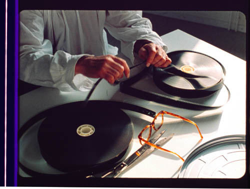
*Sticking with Murnau (who directed, some say, in a white lab coat), Eureka offers a double-disc set of Tabu, also from the Murnau-Stiftung and with previously unseen scenes and title cards.
*Finally, there’s Peter Watkins’ Edvard Munch in its long version, with a booklet including a Watkins “self-interview.”
Unbelievably, many more great movies are on the way. Check the catalogue and preview lineup here.
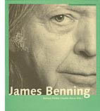 Also from overseas, the Austrian Filmmuseum adds a new title to its Synema book series, alongside Alexander Horwath’s remarkable dossier on Sternberg’s Case of Lena Smith (discussed in an earlier entry here) and many other books on experimental cinema. It’s the first book devoted to James Benning.
I have a personal interest. I met Jim when I came to Madison in 1973. He was working on his MFA in film and art, and he was one of four teaching assistants assigned to me. There was Doug Gomery, already an impressive film historian, soon to go on to fame for his work on the US film industry. There was Brian Rose, one of the most alert cinephiles I ever met, and one of the funniest. There was Frank Scheide, already an expert on Chaplin, Keaton, and their peers. And there was Jim, a master mathematician (helpful for computing grade curves) and the only filmmaker in the bunch. Jim and Frank, both serene, had a calming influence on the rather hyper Rose, Gomery, and Bordwell. It was a great team, my Dirty 1/3 Dozen, and I remember our collective grading sessions fondly.
Jim had already made Time and a Half, but his most famous works, starting with 81/2 x 11 (1974), were yet to come. He left Madison and went on to teach filmmaking at several places, settling finally at Cal Arts. I kept in occasional touch with him and his work. He visited our Wisconsin Film Festival with his remarkable, politically charged Four Corners, El Valley Central, and Los. I’ve seen him more frequently in the last few years because turn up at the same film festivals—me as an observer, him showing gorgeous and provocative films like 13 Lakes, 10 Skies, and One Way Boogie Woogie/ 27 Years Later.
So the book, edited by Claudia Slanar and Barbara Pichler, is very welcome. It just arrived, so I haven’t had a chance to read it through, but I signal it to all those interested in a filmmaker who has been enthralling and surprising us for thirty-five years. Apart from a career chronology and a complete filmography, it features essays by Julie Ault, Sharon Lockhart, Volker Pantenburg, Dick Hebdige, Amanda Yates, Scott MacDonald, Allan Sekula, Michael Pisaro, Nils Plath, and of course Sadie Benning, a mean hand with Pixelvision. Lockhart supplies lustrous shots of some Wisconsin beer bottles in Jim’s collection.
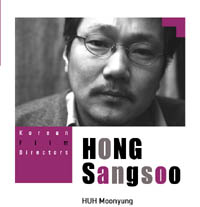 Speaking of books, not beer, the Korean Film Council has just published a series of trim books on major directors, both classic and contemporary. Each volume includes a detailed filmography and a lengthy interview. Some volumes are through-written by a single author, others consist of analyses and appreciations by various hands, including major Korean critics and Asian cinema expert Chris Berry.
The directors honored are Kim Dong-on, Im Kwon-taek, Lee Chang-dong, Kim Ki-young, Park Chan-wook, and Hong Sang-soo. This last volume, edited by Huh Moonyung, includes an homage by Claire Denis and a small essay by me, “Beyond Asian Minimalism: Hong Sang-soo’s Geometry Lesson.”
Books in the series may be ordered here.
Speaking, again, of books. . . The paper edition of Phillip Lopate‘s American Movie Critics: An Anthology from the Silents until Now (The Library of America) has just come out. I found reading the first edition addictive, like eating peanuts and M & Ms. Now we need a second volume including Frank Woods (a critic close to Griffith), Welford Beaton, and other less-known early writers.
In the meantime, the new edition has grown to include an essay on Fincher’s fine Zodiac by Nathan Lee and internet pieces from Stephanie Zacharek (Salon.com) and your obedient servant. I’ve never imagined an essay of mine in a collection that includes my teenage idols Mencken, Macdonald, Sontag, and Sarris, so this volume amounts to a swell early Christmas present. Thanks to Mr. Lopate and Geoffrey O’Brien for all their help.
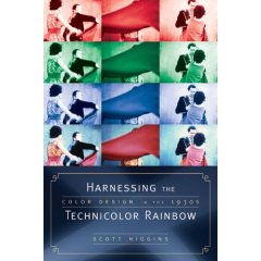
Speaking, yet again, of books. . . A plug is in order for Scott Higgins’ meticulous, engagingly written Harnessing the Technicolor Rainbow: Color Design in the 1930s, just out from Texas. I sat on Scott’s dissertation committee, and I was impressed by his imaginative research methods (e.g., using Pantone swatches as an objective measure of color hues in movies) and his sensitive attention to the way the movies look. Nobody before Scott has analyzed color in film so carefully. Scott is also attentive to production practices, so filmmakers interested in the history of technology should find a lot to chew on here. Several pages of original Technicolor frames support Scott’s case in graceful detail. No beer bottles, however.
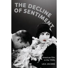
More books from Wisconsin scholars: The above-mentioned Doug Gomery has a new book due out early next year, A History of Broadcasting in the United States. Lea Jacobs’ The Decline of Sentiment: American Film in the 1920s should follow soon. I’ve read the latter already, but both are without doubt worthy of your attention. If you like your American film history at once informationally solid and intellectually daring, you will like these items. Neither Doug nor Lea is a fan of conventional wisdom.
Finally, for fans of Hong Kong cinema: Johnnie To and Wai Ka-fai‘s Mad Detective (I filed a note on it from Vancouver) has been a hit in Hong Kong, beating Beowulf. An analog Lau Ching-wan can thrash a digital Ray Winstone any day of the week. Milkyway Image’s boundlessly energetic Shan Ding has set up a Facebook page as a place to chat about movies and, one hopes, to keep us apprised of developments in Mr T’s upcoming remake of Melville’s Cercle Rouge.
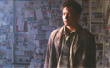
Mad Detective.
PS: Just learned about an informative interview with Jim Benning here, with more ravishing shots from 13 Lakes. This entry also includes several other links to web discussions of Jim’s films.
The adolescent window
DB here:
Last month I visited the University of Texas at Austin. I had a great time, with wonderful people and conversation. The food was tasty too. There was a lot of talk, and one question in particular set me thinking.
In his Film History seminar, Professor Charles Ramirez Berg asked me what movie made me decide to study film. Before I knew what I was saying, I admitted that unlike most people who write about movies, no single movie, nor even a handful of movies, pushed me in this direction. I had no cinematic epiphany.
Nor did I have the sort of childhood that seems archetypal for film geeks. You know the tale. I grew up in New York/ Chicago/ LA and went to the movies every day, sometimes twice or more. I practically lived at the [insert colorful but rundown movie house here]. When I wasn’t at the movies I was watching little-known film noirs/ Monograms/ Budd Boettichers on TV into the night. By the time I could vote, I’d seen thousands of movies, and King Kong at least five times.
This wasn’t me. I grew up on a farm. I saw at most one or two movies a week on those Saturday afternoons when my family went to the town ten miles away. I saw what every kid saw—Disney, Martin and Lewis, Francis the Talking Mule. I did sometimes watch Charlie Chan and Mr. Moto movies on the couple of TV channels we could pull in, but I didn’t saturate myself. About age thirteen I started to get interested in film by reading about it, in books like Arthur Knight’s The Liveliest Art and Paul Rotha’s The Film Till Now. These were my guides to what to watch on TV. So yes, I did stay up late occasionally, but to see bona fide classics like Citizen Kane and The Magnificent Ambersons. The joys of Joseph H. Lewis and Robert Siodmak had to wait until in 1963 my hands closed around the Film Culture issue devoted to Andrew Sarris’ American Directors survey.
So I became a film wonk through years of accretion, gradually seeing more and more in high school (once I could drive a car) and college (running the film society) and then deciding to go to graduate school.
But I did find an answer to Charles’ question. I said that my childhood was far more steeped in TV and radio than in movies. Afterward I realized that certain books and magazines had a big influence on me as well.
What follows may seem narcissistic nostalgia, but I do have a general point. It’s the Law of the Adolescent Window:
Between the ages of 13 and 18, a window opens for each of us. The cultural pastimes that attract us then, the ones we find ourselves drawn to and even obsessive about, will always have a powerful hold. We may broaden our tastes as we grow out of those years—we should, anyhow—but the sports, hobbies, books, TV, movies, and music that we loved then we will always love.
The corollary is the Law of the Midlife/ Latelife Return:
As we age, and especially after we hit 40, we find it worthwhile to return to the adolescent window. Despite all the changes you’ve undergone, those things are usually as enjoyable as they were then. You may even see more in them than you realized was there. Just as important, you start to realize how the ways you passed your idle hours shaped your view of the world—the way you think and feel, important parts of your very identity.
Let me get specific.
The view from my window
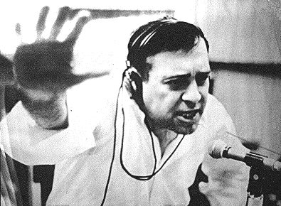
Jean Shepherd. Photo by Fred W. McDarrah.
I was born in 1947 and graduated from high school in 1965. What was my angle of view onto the pop-culture landscape in 1960-1965?
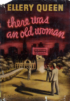
Reading: I read a lot of classic and contemporary American literature, especially Twain and Faulkner. Also a lot of nonfiction, especially Barzun, Orwell, and Kenneth Burke. But more eagerly I soaked up detective stories. Not the hardboiled ones, though I loved Hammett’s Red Harvest. My favorites were Sherlock Holmes, Wilkie Collins, and the Golden Age classics: Agatha Christie, Margery Allingham, John Dickson Carr/ Carter Dickson, Ellery Queen, and Rex Stout. I now realize that from these skilful storytellers I was absorbing lessons in narrative construction, as well as a taste for artifice.
More specifically, I was learning something I could only much later make explicit: Popular culture undertakes formal experimentation as intriguing as anything in the official avant-garde. Ellery Queen’s openly fabulist novels take a central motif—a nursery rhyme, a pun, the Ten Commandments—and then show how it informs action, character psychology, even chapter breaks. John Dickson Carr’s books are like conjuring tricks, with the magician brandishing the clues and steering you away from the trap doors and collapsable top hats. Who else but Carr would call a novel The Reader Is Warned? Among the moderns, perhaps only Ed McBain has the Golden Age flair for creating a multilayered plot based on a central image like ice or a wedge, and he does it within the frame of the most purportedly realistic mode, the police procedural.
Or take a book I’ve probably read twenty times, Anthony Berkeley’s The Poisoned Chocolates Case (1929). Six eminent lawyers, writers, and amateur sleuths have formed a club, the Crimes Circle. They’re presented with a current murder case and challenged to crack it. At six nights of Circle meetings, each one fields a solution, only to have it shot down. Sort of a grad seminar in homicide.
Admirers of film noir and the hardboiled school, who are in the majority now, would complain that this is just the sort of airless exercise that turned the detective story into a crossword puzzle. Yet there is tension whenever we play off competing answers to a question; anyone who thinks that empirical reasoning is bloodless should read a scientist’s biography. Out of a handful of clues and three or four suspects, The Poisoned Chocolates Case conjures up six detailed but mutually exclusive solutions. At the end, there’s a purely aesthetic pleasure in watching the puzzle snap into a surprising whole that integrates aspects of all the failed answers. As a cherry on the sundae, we’re rewarded with one of the niftiest last lines in crime fiction: “Nobody enlightened him.”
My tastes in the genre have broadened. Now I read and reread Le Carré, Rendell, Hillerman, Westlake/ Stark, Bloch, and the procedurals, especially Rankin. Of course I like Highsmith and Elmore Leonard. Robert Barnard and Peter Dickinson can sometimes evoke Golden Age knottiness. But when I want formal highjinks, I pack a classic in my carry-on and I’m seldom disappointed.
On the Austin trip it was Stout’s The Rubber Band, an elegant adventure of Archie Goodwin and Nero Wolfe.
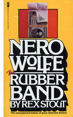 I’ve registered my admiration for Stout elsewhere on this blog; I consider him one of the great masters of American vernacular prose. The Rubber Band is one of his best, and not just because every page boasts at least one of Archie’s irresistible sentences about Wolfe.
Since he only went outdoors for things like earthquakes and holocausts, he was rarely guilty of movement except when he was up on the roof with Horstmann and the orchids, from nine to eleven in the morning and four to six in the afternoon, and there was no provision there for pole vaulting.
That’s writing.
TV, I now realize, tutored me further in the unbridled audacity of popular culture. Granted, in certain circles I’ve been known to say unenthusiastic things about TV. Nowadays I don’t watch anything but The Simpsons and Keith Olbermann. But who can deny the past? I’m a creature of the box.
My parents got TV early, in the early 1950s, and my sisters and I spent many a winter afternoon in front of cartoons, the Disney show, and Roy Rogers. But I didn’t like the official hits, like Gunsmoke and Bonanza. As I got older, I was snagged by grownup shows like Jackie Cooper’s Hennessey and the short-lived It’s a Man’s World. Why? I don’t know. Perhaps they showed how badinage could mingle with serious drama. No mystery about Ernie Kovacs, though, whose nuttiness delighted me in the way that Monty Python would capture the kids of the 1970s. And like everybody else, I was haunted by a weekly visit to the Twilight Zone.
 But above all stood George and Gracie. When I started to get what they were about, their program was ripening into its baroque phase. More than individual shows, I remember the brilliant central conceit. Gracie would hatch a wacko scheme, usually recruiting the hapless Harry von Zell as her minion. George would get suspicious and retire to his den to tune in the very show we were watching. He was then in a position to block her maneuvers, usually by tormenting von Zell. The idea that George could simply watch his own program still seems a stroke of genius. Artistic form, I must have realized subconsciously, can always be turned into a dizzy game. M. Godard, Ozu-san, meet Burns and Allen.
The radio was constantly on in our house, with my mother listening to Arthur Godfrey or Art Linkletter. These geezers were intolerable to my teenage tastes. Give me my two main sources of aural pleasure: WKBW radio and Jean Shepherd.
 WKBW was a radio station out of Buffalo. At 50,000 watts it was so powerful it tended to seep into any blank spot on the dial. Actually, the DJs probably didn’t need an antenna, since they conducted their shows at ear-splitting volume. They indulged in all the profound things that characterized radio in the 1950s: cute sound effects (car crashes, always good), music clips (audio tape made it easy), jingles and station IDs that quickly became earworms, and nonstop patter sustained by whinnies, table-pounding, and laughter at feeble jokes. KB’s promotional efforts were no less strenuous. Once the station asked the public’s help in finding a missing DJ, only to reveal that he’d gone into hiding to drum up publicity.
In my day, the loudest mouth belonged to Joey Reynolds, who brayed over records and satirized rock and roll with an appalling ditty called “Rats in My Room.” When he was fired, he nailed his shoes to his boss’s door, adding a note: “Fill These.” I was happy to learn that this piece of teenage lore seems to be true, or at least so a fanatical WKBW website indicates. Joey continues on the airwaves, albeit more sedately.
Speaking of music, KB opened the adolescent window to the tunes that still move me. I was too young to like Elvis and had an affectionate but distant relation to the Beatles. My favorites came mostly from what I’ve learned to call the Brill Building sound. On 24 December every year, Kristin folds her arms in weary patience as the Drifters, Gene Pitney, Connie Francis, and Paul Anka pour forth into our living room.
Jean Shepherd was a wholly different story. The WOR signal couldn’t creep into upstate New York by day, so my bedside tube radio crackled and hissed as 11:15 p. m. approached. Would the signal pull through? It usually did. In fact it seemed to get stronger as, lying in the dark, I heard the familiar trumpet call and galloping music that announced Shep’s show. Another difference from Top 40: Here was an adult talking to a kid as if I were an adult. And an adult who lived in Manhattan! I discovered then that the media aim downward, age-wise: a teenage TV show is actually watched by pre-teens, a college show (like Shep’s) appeals most to highschoolers (like me).
Shep was one of the pioneers of long-form talk radio. He didn’t take phone calls and he seldom had guests. He claimed to be a social commentator, and he did point out the foibles of contemporary media and society. Mostly, though, he was a yarn spinner in the Twain tradition. As he told stories from his life, especially his childhood in Indiana, digressions would split off unexpectedly. Somehow, though, everything wound back to make a point–usually about the vainglory of being human. What made the stories fascinating was not only the delivery (poetic turns of phrase, a smooth, earnest voice that could sink to an urgent whisper) but their fundamental ordinariness. He told of midwestern air shows, enamel table tops, summer baseball, and disastrous Valentine’s Day parties. He celebrated the commonplace and advised his listeners to simply watch everything closely, to find the poetry and absurdity that pervade our lives. I think that my sense of humor owes a lot to him. Perhaps also my tendency to yakkiness.
Shepherd is best-known today for A Christmas Story, the movie based on some of his stories. If you’ve seen it, you’ve heard his unique voice as the narrator. But I first heard the tales of the BB gun and the Old Man’s fetishistic leg-lamp while hunched under the blankets, long after my family had gone to sleep, and Shep’s words put a movie in my head. After my nightly WOR adventures, Garrison Keillor seemed labored and condescending.
From Eugene Bergmann’s capacious book on Shepherd (1), I realize that my nighttime communion with this adult voice was shared by thousands of other kids. He fused the nonconformist sensibility of the Beats and the Hips with a Midwestern distaste for airs and pomposity. He called his fans the Night People. The enemies were the Meatballs, the Slobs, or, in a reference to a Pepsi tagline, the Sociables. He spurred his listeners to send Cassavetes money to fund Shadows; a credit to the Night People appears on the movie. Shep’s motto was “Excelsior” (sometimes, “Excelsior, you fathead”), which encapsulated both his optimism (onward and upward, keep striving) and his fatalism (remember the boy with the banner lying frozen in the snow).
Urged on by Bergmann’s book, I recently discovered a wonderful Shepherd website and a vast podcast vault of his shows, which are also available free on iTunes. (2) Broadcast a little before I started listening, the 1960 “Molded Food” episode was a great iPod companion as I wandered around the UT—Austin campus.
Put not aside childish things
I could mention more items seen through my window, such as the Village Voice, Esquire, and, inevitably, Mad magazine. But the moral should be clear. Whatever called out to you when your window opened—Grease, Patti Smith, Buckaroo Banzai, Sassy, David Bowie, Columbo, Godspell, Lord of the Rings (the book), Penn and Teller, National Lampoon, Pavement, John Hughes movies, Kurt Vonnegut, the B-52s, Earth Girls Are Easy, Beat Street, Master of Puppets, Boondock Saints, Sam Kinison, They Might Be Giants, you name it—is likely to retain its bright purity throughout your days. What’s kitsch or cheesy or retro to others is precious to you.
Make no apologies. It’s not mere nostalgia or guilty pleasure to revisit these creations. You can return to them as to old friends. Encountering them again, you remember when you took it for granted that anything was possible in your life. Their sharp, shining lines fitted your range of vision, and mostly they still do.
Your taste was unerring. These teenage passions represent a big chunk of the finest part of you. In some secret place you are still as uncomplicated as you were then.
(1) Eugene B. Bergmann, Excelsior, You Fathead! The Art and Enigma of Jean Shepherd (New York: Applause, 2005).
(2) In the iTunes store, go to “The Brass Figlagee” under Podcasts.
Thanks to Jeff Smith, Jonah Horwitz, and Dan Morgan for suggesting some things they saw through their adolescent window.

Zippy the Pinhead, by Bill Griffith.


