Archive for the 'Film and other media' Category
Virtually true, or maybe not
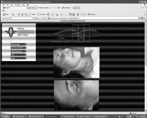
From DB, for once a brief blog:
Perhaps the most enduring legacy of The Blair Witch Project was the idea of promoting the film through a faux website that treated the lore around the Witch as genuine. Later, the promotion for Spielberg’s A.I. created an alternate reality game (ARG) by scattering clues to a murder among many websites. The murder wasn’t part of A.I.‘s plot, but it did take place in the film’s fictional world, and online participants pursued an elaborate para-narrative that connected obliquely to the movie. A key character in the ARG, researcher Jeanine Salla, was listed as an actor in the film’s final credits. Ms. Salla evidently died a grisly death herself, as the autopsy report above indicates. She led other lives in fanfiction and online comic strips.
Now, for The Great World of Sound, director Craig Zobel has created a website. Nothing new in that. But Zobel also provides a website for a fictional company in the film. Here’s Screen International’s take (19-25 January 2007, print ed., p. 36):
It’s the 21st century equivalent of the film within the film—the fictional website of the shark-like record company in the movie. It’s everything you’d expect from a shady music company—flashing primary colors, bad clip art, typos and scrolling fonts, all to the sound of a soul-killing MIDI song file.
It starts well (banner reading, “You’re ad here”) but I found it not as wild as the SI description implies. Still, the idea is good, the execution diverting. Visit it here.
In a parallel thrust from Bookland, Jacquelyn Mitchard’s forthcoming young adult novel Now You See Her is being promoted by a series of YouTube video diaries purportedly made by the heroine, Hope Shay. The first one is up, and already at least one viewer thinks it’s the McCoy. (1)
We can probably expect to see more extensions of fictional worlds to the webworld. Are Hannibal Lecter podcasts next? Or an online university for which reading Special Topics in Calamity Physics is a prerequisite? See Henry Jenkins’ fine Convergence Culture for more on the A. I. puzzle ARG (pp. 123-128) and reflections on cross-media storytelling in general.
(1) Full disclosure: Hope is played by Lauren Peterson, the daughter of old friends Sue Collins and Jim Peterson. They also live down the street from us. Jim, now an attorney, took a Ph. D. in film studies here at UW. He’s the author of Dreams of Chaos, Visions of Order, an outstanding study of American avant-garde film.
PS Monday morning: I don’t watch much TV; The Simpsons, Olbermann, Ebert & Roeper, and the movie channels are pretty much it. So I’m grateful to Olli Sulopuisto for telling me that Lost has created its own ARG, The Lost Experience and that there’s a website for the fictional Hanso corporation. Much, much more can be found on the fansite.
Uncle Walt the artist
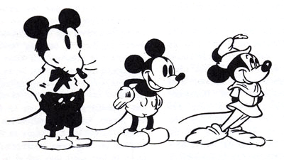
From Robert Benayoun, Le Dessin animé après Walt Disney.
The epos of Chaplin is the Paradise Lost of today. The epos of Disney is Paradise Regained.
Sergei Eisenstein
DB here:
 I’m not qualified to write a comprehensive or penetrating review of Neal Gabler’s biography Walt Disney: The Triumph of the American Imagination. For that you can go to Mike Barrier, one of our finest historians of US animation. Barrier’s own Disney biography will come out this spring, with apparently little overlap with Gabler’s.
I found Gabler’s book a thorough, somewhat cautious bio, even-handed about Disney and judicious about such controversial matters as Walt’s reputation as an anti-Semite. A lot of it reads like a notecard book, with quotes, paraphrases, and commentary dutifully snipped and pasted in, packing each paragraph. Chronology, not concept, rules. Still, I learned a lot.
Gabler’s book reminded me how much I admire Disney films. The attachment started–as for most of us–in childhood. Peter Pan (1953) was the first one I remember seeing in a theatre, but when I saw a reissue of Snow White later, parts looked so familiar that it must have impressed itself on me at an earlier time. Of course it still scared the hell out of me.
In 1973, when I was doing dissertation research in New York City, I attended a massive Disney retrospective at MoMA. As a twenty-five-year-old bearded guy among moms and kids, I felt obscurely criminal just being there, like a character in a Patricia Highsmith novel. But what I saw, in excellent prints, showed me that Disney was important on both cultural and artistic levels. So I designed a Disney unit into my first Introduction to Film course, taught here at University of Wisconsin–Madison to 300-400 souls whom fate cast my way.
I wanted to talk about film’s relation to society, and Disney was a touchstone for all my students. No matter where they came from, they knew Mickey, Donald, Snow White, Fantasia, and the rest. I showed early films, like Flowers and Trees, The Band Concert, and The Old Mill, as well as a True-Life Adventure nature doc, and the extraordinary Trip through the Disney Studio which was originally attached to The Reluctant Dragon. Students were able to see, I hope, how the ideology at work in Disney films could shape a conception of the world, of American life, and of their childhood.
Our assigned reading was Richard Schickel’s The Disney Version (1969); it’s a coruscating study, perfectly crystallizing that era’s feelings about Disney’s debasement of popular culture. At about the same time, Armand Mattelart’s Marxist critique How to Read Donald Duck was informing most film academics’ study of Disney. As Gabler indicates, intellectuals fell out of love with Disney in the 1940s. He handled labor disputes at the studio in a high-handed, paranoid way. He also seemed to personify the blandness of postwar consensus culture, and Disneyland became the theme-park equivalent of Norman Rockwell Americana. Even though hippies were turning on to re-releases of Alice in Wonderland and Fantasia, most cultural critics treated Disney pretty roughly. My friends and I goggled at Wally Wood’s 1967 Realist cartoon showing Walt’s whole gang engaging in a panoply of naughty sexual encounters.
Today the academic study of Disney is well-established, producing far too much for me to keep up with. A lot of it is cultural critique. For something funnier and even more scurrilous, see Carl Hiaasen’s Team Rodent. Despite all there is to read about Walt’s empire and its cultural consequences, I want something else as well.
Even when I was conducting my Disney Demystification Exercise, I tried to point out that these cartoons were artistically very strong. I still admire the powerfully emotional storytelling that, like that found in other fairy tales, preys so mercilessly on childhood fears. Schickel claims that after screenings of Snow White at Radio City Music Hall, the seats had to be cleaned because the Witch had scared kids into emptying their bladders.
Then too there’s the dynamism and grace of the animation, which remains unsurpassed. For Sergei Eisenstein Disney exemplified the contagious power of expressive movement on the screen. Many have disdained “Mickey-Mousing,” the close matchup between a film image and the accompanying music. But Eisenstein saw this as “synchronization of senses,” a primal, visceral unity that could move the spectator involuntarily. He sought this subconscious synchronization in his own sound films, and Alexander Nevsky and Ivan the Terrible show the strong influence of Disney.
Eisenstein was well aware of the delusional aspects of Disney, claiming that the cartoons lulled people into forgetting the harm done by capitalism. But as an artist, Disney was unique:
I’m sometimes frightened when I watch his films. Frightened because of some absolute perfection in what he does. This man seems to know not only the magic of all technical means, but also all the most secret strands of human thought, images, ideas, feelings…. He creates somewhere in the realm of the very purest and most primal depths.[1]
Disney’s art seems magical, but if it’s not a miracle, we ought to be able to study it systematically. How?
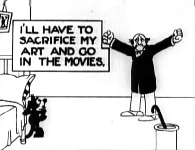 Felix in Hollywood (1923)
For the Jung at heart
Gabler’s is a sturdy, readable volume teeming with fascinating background material. As an EEG of the ups and downs of the studio, it’s extremely valuable. Gabler also aims to give a portrait of Disney the visionary, a man of boundless Protestant energy who sought to take animated film to ever higher levels. I think the portrait is disappointing, though, in its reliance on conventional psychobiography and Zeitgeist explanations.
Disney, Gabler claims, was dominated by a psychological drive to create a world wholly of his own. He was a control freak. “It had always been about control, about crafting a better reality than the one outside the studio, and about demonstrating that one had the capacity to do so. That was what Walt Disney provided to America–not escape, as so many analysts would surmise, but control and the vicarious empowerment that accompanied it.”
Commentators have long noted that Disney expanded the films’ fantasy world in his theme park. Just as films idealized reality, “so would Disneyland, the creation of a wounded man who expunged what he saw as the darker passages of his past by devising a better world of his imagination, though one that was obviously colored by the images of Hollywood.”
One has to wonder whether this characterization is particular to Uncle Walt. Lots of artists, from architects and topiary gardeners to designers of world’s fairs, have sought to create imaginary worlds over which they rule. Balzac, Faulkner, Lewis Carroll, and J. R. R. Tolkien conjured up imaginary realms populated by dozens of their own creatures. Graphic artist Ho Che Anderson writes:
For the control freak, there are few places better than comics. . . . Pick up a pen and piece of paper and you too can effectively play God. I suspect this love of God-play is the blood that keeps the hearts of many a cartoonist beating.[2]
Moreover, is the desire to build a parallel world necessarily a sign of a wounded past, or dark imaginings? Maybe it’s just one awesome creative challenge for ambitious artists. Granted, Disney took this impulse in a particular direction, toward a vision of life combining technical progress (the multiplane camera, Tomorrowland) with idealized notions of small-town community. But then we have to explain those idiosyncratic factors too.
Gabler goes the psychological route, but we could balance this account with cultural factors in Disney’s immediate milieu. There was the rise of the Technocracy movement. There was Hollywood’s belief that filmmaking would progress through new technologies. There was growing evidence during and after World War II that America’s might would be built on new machines. (One of the most hair-raising movies I saw at the 1973 MoMA Disney fest was Victory through Air Power, an educational short arguing for investment in airborne warfare.) Disney was, along many dimensions, a techie impresario, the Steve Jobs of his day, complete with his unique reality-distortion field.
The other big-picture explanation Gabler offers is a Zeitgeist model. Disney represents the American imagination. By tapping into Jungian archetypes, his 1930s films could both “capture and then soothe the national malaise.” More generally: “In both Disney’s imagination and the American imagination, one could assert one’s will on the world . . . . Indeed, in a typically American formulation, nothing but goodness and will mattered.” Disney’s desire to retreat into a controlled world echoes his country’s self-absorped conception of itself.
Despite these claims, Gabler doesn’t dwell much on the ways the studio seized what he calls “the American psyche,” perhaps because he senses that such explanations tend to be uninformative. One can grab almost any cluster of traits, find them in American popular art, and assert them as quintessentially American. This is how mainstream journalists make current Hollywood releases worth writing about: treating them not as artworks with distinctive appeals and a place in traditions and histories, but as reflections of whatever immediate social trends the writer chooses to pick out.
I won’t extend my criticism of Zeitgeist explanations here; it’s developed in the first essay in my forthcoming Poetics of Cinema. I’ll just say that I think we need more precise explanations than we get from easy juxtapositions of this or that film and some collective mood, sentiment, fantasy, or anxiety that we postulate as existing out there. Is there an American psyche? I’m not convinced.
An alternative to psychological speculation and Zeitgeist thinking is to look for more immediate causal connections. For example, Gabler traces how, around 1932, Disney began a new division of labor among his staff. He created a fairly strict set of specialties (story, gags, continuity sketches) and a chain of command in which head animators would become directors, overseeing particular projects. What’s the explanation of this change of policy? For Gabler, the new rationalization reflects not only the need to manage a bigger staff but also Walt’s effort in “reinventing and perfecting the system under which animations were produced.”
Gabler doesn’t mention that reorganizing the division of labor was going on throughout Hollywood at the same time. Most major studios were moving from a central producer system (this parallels the previous Disney lineup, with Walt at the top) to what Janet Staiger has called the producer-unit system, in which each man was charged with several productions.[3] Mentioning this doesn’t take away from Disney’s resourcefulness, but it does indicate that models for organizing his company were emerging right under his nose.
Similar issues could be examined by looking at Disney’s place in the overall ecology of Hollywood, as the premiere supplier of short subjects. His firm, Douglas Gomery argues, kept RKO afloat for many years. Gomery’s Hollywood Studio System: A History gives a cogent account of Disney’s role in the industry, and he goes somewhat beyond Gabler in tracing the studio’s emergence as in the 1950s as the prototype of modern conglomerate filmmaking.
Life in the cel
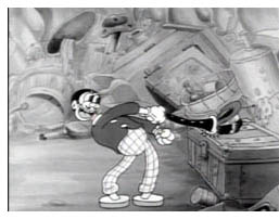 For Gabler, what made Walt reorganize production, and indeed what made him do nearly everything, was his obsessive pursuit of “quality” animation. But this quality itself remains fairly mysterious.
Gabler indicates that Disney moved away from the “rubber-hose” style of most cartoons, with their balloon heads, swollen paunches, and elastic arms and legs. (Even the clarinet goes limp in Harman-Ising’s A Great Big Bunch of You, from 1932, shown here.) Floppy limbs were fairly easy to animate. Gabler briskly summarizes Team Disney’s well-known innovations in naturalism, such as the studio’s emphasis on anatomy and life drawing, the breakdown of gestures, complex perspectives, and the rotoscoping of human figures.
Yet Gabler, a former movie critic for television, oddly doesn’t engage with the result of the technical innovations. He summarizes how journalists, critics, and academics have interpreted the movies’ cultural impact, but what he thinks about them as movies, rather than social or psychological symptoms, is almost completely suppressed. Does he admire Snow White or Dumbo or Pinocchio? Does he hate them? Has he studied them in preparation for the book? You will find more sensitive appreciation and critique in Leonard Maltin’s The Disney Films than in all of Gabler’s doorstop tome.
Gabler implicitly acknowledges the technical achievements of Snow White, Pinocchio, Fantasia, Dumbo, and Bambi, but after that he merely chronicles release after release with deadpan indifference. For example, he offers us nothing on the brilliant character animation of Song of the South (1946)–a film no longer in circulation because of its racial stereotyping.
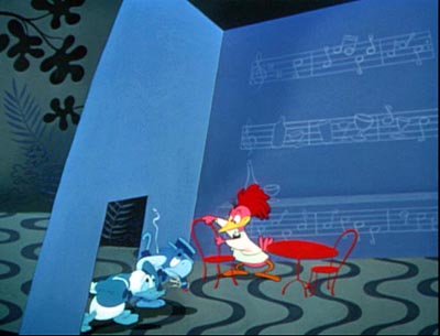
Gabler follows tradition in suggesting that the UPA studio movies challenged Disney’s hyperrealism, but Disney was already moving toward something quite stylized. Gabler doesn’t observe the zesty play with color and line of Melody Time‘s “Blame It on the Samba” episode (1948). Eisenstein would have been pleased to see that the handling of Donald and Jose literalizes the metaphor feeling blue.
Working with lower budgets in the 1940s, the animators let their imaginations run wild. What a pleasure it must have been for Ward Kimball to come up with the funhouse nuttiness of the Serape song in The Three Caballeros (1945).
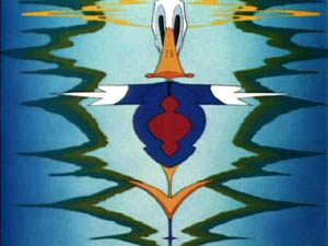

Kimball must have been quite a character; his parody book Art Afterpieces doesn’t spare the studio’s creatures. More generally, when Disney animators turned to illustrating pop music, they didn’t abandon the wilder sides of Fantasia.
There would be several fruitful ways to study the Art of Uncle Walt. One would require what I call rhapsodic criticism, writing that tries to evoke the movie’s look and feel through energetic, sensuous description. (This is, I think, what Susan Sontag meant in calling for “an erotics of art.”) Here is Don Crafton on the Felix the Cat cartoons:
Perhaps the most appealing aspect of Felix was his use of expressive body parts–a tail that forms gratuitous curlicues when he walks, or ears that click together like scissors. . . . He can mold himself into a mantel clock and have his nose mistakenly wound up; his tail can be an umbrella, a sword, or a clarinet, or Chaplin’s cane. He can use the tail as a bow to play a tune on his whiskers, then take one of the rising notes and use it for a doorkey. His skin is detachable. In Felix Trifles with Time (1925), a tailor flays him, then outfits a client with his pelt. When the man goes swimming, “naked” Felix retrieves his hide from the beach. [4]
In brief compass Crafton brings Felix alive for us. You don’t have to love Disney to write this way about his films; you do need a good eye, some pluck and gusto, plus a gift for language. Nothing like this is to be found in Gabler’s book.
Another way to get closer to Disney’s art is to just look at things more analytically. How does Disney create that expressive movement that Eisenstein admired? Partly, it seems, through having his figures move all over, and at the same instant. Reacting to a line of dialogue, a character can twist his waist, arch his back, swivel his shoulders, lift his head, arch his eyebrows, and raise a forefinger–all in a second or two. Two successive frames from Melody Time show Johnny Appleseed’s guardian angel in action, working his legs, arms, shoulders, jaw, and eyeballs simultaneously.
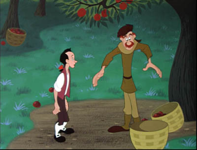
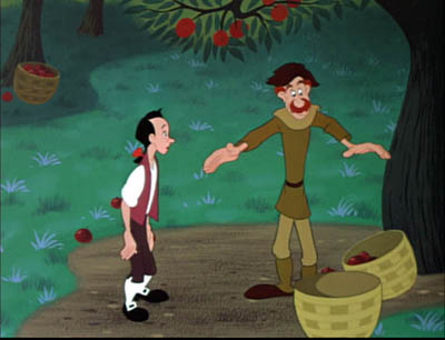
This is far from the minimal animation to which we became accustomed in the TV era. Treating gesture as a taut, rolling movement helps give Disney characters their unique volume and springiness, so different from the flabby postures of the rubber-hose style.
Or consider pacing, at which the Disney cartoons excel. Most studio animation of the period, constrained by smaller budgets than Disney had, speeded up production by filming each frame twice. That way only 12 cel drawings were needed for the 24 frames that consumed a second of film. One way Disney achieved expressive action, and the high quality to which Gabler refers, was to devote single frames–and cels–to details of particular movements. This choice, though expensive, allowed for exact adjustments in rhythm.
Sometimes there’s more than one movement per frame. You can occasionally find this strategy at work in other studios’ cartoons too, as Kristin has explained in an essay she mentions elsewhere in our blog. But Disney’s animators certainly used the technique with great panache. When Johnny, balancing on a branch, is caught in a rain of apples, he sweeps them up with lighting speed–a deft swirl made possible by multiplying character poses on each cel. If that means giving Johnny many arms and even detaching his hands, so be it.
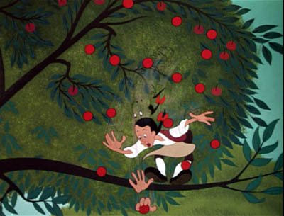
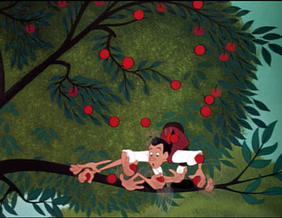
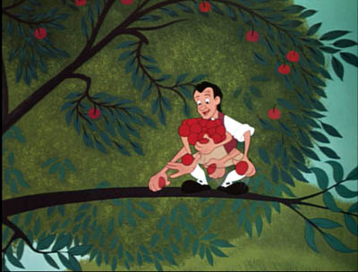
Johnny’s arms and hands proliferate more quickly and widely as he scoops up the apples, but their number is reduced as he gathers them in to his chest, so the rhythm accelerates and decelerates. Through trial and error Disney’s animators learned that rather strange single images will look exactly right on the screen; these men were practical perceptual psychologists.
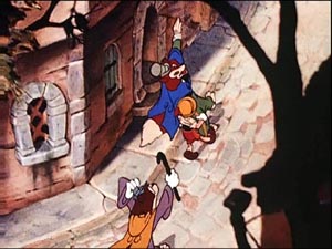
There are so many aspects of Disney’s art that need attention: the skill with line and contour; the sort of soft caricature that some consider cutesy but has enormous bounce and vibrancy; the ingenious use of color; and of course, Eisenstein’s “synchronization of senses” between image and music. There’s also Disney’s appropriation of developing live-action techniques, as in the proto-Wellesian crane shot in Pinocchio
One could also study the studio’s borrowing of high-art motifs and styles. Instead of dismissing the 1940s and early 1950s Disneys as greeting-card kitsch, we can note that they evidently borrowed from the likes of WPA landscape art, American regionalist painting, and the naive-art look of Grandma Moses. (Her painting A Beautiful World, 1948 resembles Disney’s Johnny Appleseed of the same year.)
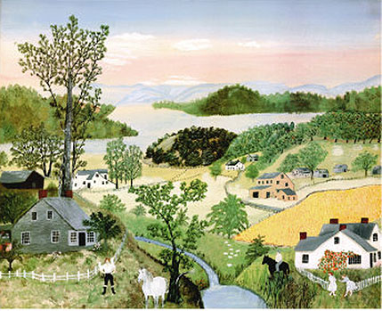
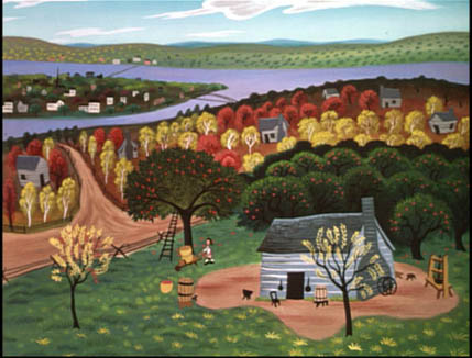
I’m a duffer in animation matters, so I’ve merely indicated some areas that intrigue me. The key source on the studio’s craft practice remains the gorgeous book The Illusion of Life: Disney Animation (1981, rev. 1995), by two of the great Nine Old Men, Frank Thomas and Ollie Johnson. And I expect lots of discoveries in years to come from experts like Barrier, Maureen Furness, Paul Welles, Norman M. Klein, and many others. Since Gabler draws heavily on the research of others, often without naming names, he might have borrowed a bit more from scholars of animation aesthetics.
In fact, you could argue that without the artistic imagination displayed by Disney and his brilliant staff, these films couldn’t have captivated the American imagination. Whatever that is.
[1] Eisenstein on Disney, ed. Jay Leyda, trans. Alan Upchurch (Calcutta: Seagull, 1986), 2.
[2] “Career Tips for Control Freaks,” in The Education of a Comics Artist, ed. Michael Dooley and Steven Heller (New York: Allworth, 2005), 124-125.
[3] Janet Staiger, “The Producer-Unit System: Management by Specialization after 1931, in David Bordwell, Janet Staiger, and Kristin Thompson, The Classical Hollywood Cinema: Film Style and Mode of Production to 1960 (New York: Columbia University Press, 1985), 320.
[4] Donald Crafton, Before Mickey: The Animated Film 1898-1928 (Chicago: University of Chicago Press, 1993; orig. 1982), 327, 328.
An appetite for artifice

Offscreen (Christoffer Boe)
DB here (no, not above):
Catching up with several of the fall’s films, I was struck by how often they played quite self-consciously with the overall shape of their plots. Here are some examples.
Network narratives. This is the label I applied in The Way Hollywood Tells It to those films highlighting several protagonists inhabiting distinct, but intermingling, story lines. In Poetics of Cinema, I have an essay examining the conventions of this format. Several films I saw this fall continued this tradition.
*Bobby used the familiar device of gathering everyone in a single spot–a hotel–within a short time frame and interweaving personal stories with a fateful climax. I thought the film was fairly clumsy, but I was still moved. In 1964 I filmed RFK when he stumped our town for the presidential nomination, and in college, though leaning toward Gene McCarthy I thought Bobby was the only candidate who could beat the Republicans. “Dump the Hump!” (Hubert Humphrey) was the rallying cry.) His assassination, during the same year Martin Luther King was killed, was very traumatic to young idealists. Estevez’s film becomes most powerful, I think, by simply replaying footage and speeches, reminding us that there was once a rich politician who talked incessantly about helping the poor. Just as Stone’s JFK positioned Jack as the man who could have averted the Vietnam War, Bobby makes RFK the anti-Bush.
*Fast Food Nation was for me a more satisfying use of the network narrative format. Here the time scheme is more diffuse because Linklater is tracing a large-scale process, the burger from the hoof to the Happy Meal. By starting with the middle-management character (Greg Kinnear) and then easing us into the harsh working life facing Mexican illegals, the film builds sympathy for the immigrants. Gradually, the illegals’ stories take over, and the social conscience of one of the burger chain’s teenage workers is ignited.
The plotting makes some thoughtful moves. A more literal approach would have shown us the meat-processing plant’s killing floor early, as part of the step-by-step process. But here the shocking material isn’t presented until the very climax of the film, as the fate to which the immigrant working woman must submit. Likewise, the film drops the Kinnear character about halfway through, a ploy that conceals from us how he’ll act on his new knowledge. Will he blow the whistle on the plant, and endanger his job? A European film might have left his whole line of action open, but Linklater adheres to the tendency of American films to resolve a plotline one way or another. He does it, however, in an epilogue which leaves us with a sharpened sense of the acute problems of the system.
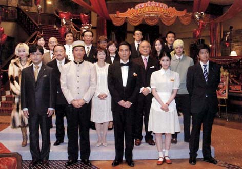
*The Uchoten Hotel (aka Suite Dreams, Japan, 2006). In the vein of Tampopo and Shall We Dance?, Mitani Koki offers gentle humor mixed with satiric social observation. Confusion reigns at the Avanti Hotel on New Year’s Eve, as a philandering professor, a corrupt Senator, low-end showbiz types, and the hotel staff become embroiled in one another’s lives. Lively long takes display subtle staging, and there’s a ventriloquist’s duck. A tribute to Grand Hotel, Billy Wilder, and Jacques Tati, this good-hearted survey of human aspirations was the most uncynical movie I saw all year.
Many critics seem to feel that the network format is tired out. At indieWire, Nick Schager calls for “a moratorium on second-rate Nashville-style ensemble pieces that seem increasingly to be the province of every Tom, Dick, and Emilio.” The key words are “second-rate”: Like any storytelling pattern, the network option can be used well or badly. Linklater and Mitani use it with flair.
The point I’d stress is that although the network model can claim to be a realistic device (in our world, our projects commingle), it’s almost always presented through a series of conventions–traffic accidents, people brushing past each other, narration that holds back information about the characters’ relationships, and so on. We recognize these as part of the artifice in this tradition of storytelling.
Broken Timelines. During his DVD commentary for Basic, John McTiernan uses this phrase to explain the film’s flashbacks and replays. In the terms we use in Film Art, the linear story action is scrambled or rearranged in the plot that that the film presents to us.
Screenwriters used to urge novices to avoid breaking up the timeline, but in the 1940s through the mid-1950s, films began to play around with story order. Citizen Kane (1941) probably encouraged the flashback form, as did film noir’s emphasis on mystery and crime detection. Siodmak’s fine The Killers offers a prototype. (I discuss its plot maneuvers in Narration in the Fiction Film.)
We don’t lack for flashbacks in contemporary films, but things are getting complicated. Today a film may open with a quite mystifying sequence, before backtracking to acquaint us with the situation. In itself, this isn’t very unusual, since flashback-based films have often opened at a point of crisis and then taken us back to the beginning of the action. The Big Clock and Written on the Wind are instances. The new wrinkle is to actually replay the opening situation or just the images from it in a new context.
*The Fountain by Darren Aronofsky offers one example. Using three time layers, it can keep replaying the opening portions in ways that recontextualize the material we saw at first. In its out-of-this-world realm, as well as its suggestion that the story is in some sense being written as we see it, it reminded me of Slaughterhouse-Five (1972)–another indication that these innovations aren’t brand new.
*Another instance: The opening image of Christoffer Boe’s Offscreen (2006), with a bloody Nicolas Bro in close-up advancing to the camera, gets explained only at the grisly climax.
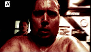
*The recontextualizing replay isn’t an avant-garde device. Tony Scott’s well-done thriller Déjà Vu uses it in the context of a time-travel plot. It replays the opening sequence in a way that suggests both a branching or alternative future and a deeper understanding of what we saw initially. A similar pattern is found in Flags of Our Fathers, in which we reinterpret the opening differently now that we know the characters more fully. I suppose that Pulp Fiction‘s opening became a powerful influence on this formal choice.
When an action is replayed, it can be shown from different characters’ perspectives. Again, this was explored a lot in the 1940s, as in Mildred Pierce (a replay of the opening) and Crossfire (a replay of the crucial incident). The device is on display in The Killing and The Man Who Shot Liberty Valance as well. Kurosawa’s Rashomon made the technique more ambiguous, by not confirming which version of events is accurate. The same idea guides the money exchange in Tarantino’s Jackie Brown, which we discuss in the new edition of Film Art.
*The broken timeline of Three Burials of Melquiades Estrada uses multiple points of attachment mildly, in the murder scene. The replays are more significant and fragmentary in The Prestige. More films in this vein are in preparation, including Vantage Point, which shows an assassination attempt on a US president as seen from five characters’ points of view, “unfolding in 15-minute increments.”
Companion films. Back in the 1960s, Fox announced that it wanted to make Tora! Tora! Tora! with two directors, one Japanese and one American. My friends and I indulged in a game: Whom should they pick? (I favored Ozu and Samuel Fuller.) As you probably know, Kurosawa’s collaboration came to naught (though he did shoot some footage, discussed by Richard Fleischer in his book and his DVD commentary on the film). Fukasaku Kinji and evidently some other directors contributed to the Japan-based footage.
Now, instead of one film with two directors, Clint Eastwood gave us two complementary films from a single hand. I haven’t yet seen Letters from Iwo Jima, but the very idea of showing the same battle from opposite sides in two movies acknowledges a level of artifice.
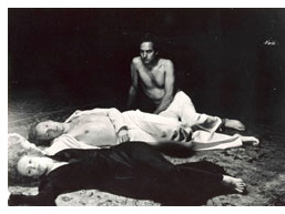 The French got here first, I think. Marguerite Duras made a companion film to her mesmerizing India Song (on right) called Son nom de Venise dans Calcutta desert. Son nom had exactly the same soundtrack as India Song but a wholly different image track–only landscapes around the site of action, empty (as I recall) of all human presence. A comparable instance is the alternate-worlds pairing by Alain Resnais, Smoking/ No Smoking, adapted from a cylce of Alan Ayckbourn plays.
The companion-film concept seems to be expanding. Red Road, directed by Andrea Arnold, is launching a series of films to based in Scotland and all featuring the same group of characters, but filmed by different directors. The characters are conceived by filmmakers Lone Scherfig (Wilbur Wants to Kill Himself) and Anders Thomas Jensen (Brothers). In a way, a sort of episodic-television idea applied to feature films.
What’s behind this? Why are today’s movies using such self-conscious artifice in their plotting? Is form the new content, the way gray is the new black?
Complex storytelling can be found in a lot of other media today. It’s common to point to Hill Street Blues and later TV shows as reinforcing tendencies toward network narratives in film. Jason Mittell discusses the tendency in Velvet Light Trap no. 58. His article “Narrative Complexity in Contemporary American Television” (available here), makes the case that shows like 24, Arrested Development, Buffy, Malcolm in the Middle, and so on have offered viewers ways “to be actively engaged in the story and successfully surprised through the storytelling’s manipulations”–a good way to describe some of the strategies I’ve been sketching.
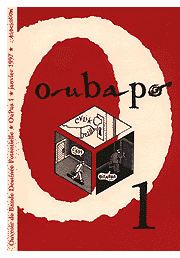 In graphic novels and comic art we’re seeing the same tendencies. Daniel Clowes and Chris Ware manipulate time and space in virtuoso ways, as does the highly formalized movement known as OuBaPo. You can check out an American version of OuBaPo in Matt Madden’s 99 Ways to Tell a Story.
In Everything Bad Is Good for You, Steven Johnson argues that people are just getting smarter, and so popular culture is pitched at a more sophisticated level. But quite complex artifice can be found in mass media of earlier eras. As I mention in The Way, we can find backward-told stories in popular fiction long before Memento, and Grand Hotel is an early prototype of the network narrative. Our ancestors weren’t necessarily dumber than we are, and popular art has long harbored experimental impulses.
I’d hypothesize some other causes. Regardless of IQ, more members of the audience have been to college today than in early eras. More of the creators have studied modern art and literature and are ready to borrow experimental devices they’ve encountered in other media. This process has a familiar ring. American filmmaking has often renewed itself by absorbing all manner of experiment, from German Expressionism (for 1930s horror films) to serial music (for 1950s psychological dramas). Usually, I feel compelled to add, the experimental devices are absorbed into existing forms, like classical script structure, genres, or stylistic principles.
I suspect as well that the new genre hierarchy that emerged in the last couple of decades cranked up the artifice level. The rise of science fiction, mystery, fantasy, horror, and comic-book movies probably encouraged clever juggling with story order, point of view, and states of knowledge. So did the rise of indie cinema, which needs narrative innovation to set itself apart from the mainstream. Again, Pulp Fiction fuses the two strands: an indie neo-noir that attracted attention through its bold manipulation of story/ plot relations.
At the same time, filmmakers in other countries have been eager to push the boundaries. Many of the broken-timeline devices have their sources in art cinema of the 1950s and 1960s. Younger European directors like Boe and Tom Tykwer (Run Lola Run) have revived this adventurous attitude toward storytelling, putting them somewhat in sync with American directors. Asian experimentalists like Wong Kar-wai and Hou Hsiao-hsien continue to exercise a comparable influence.
We need to think more about where this impulse toward innovation comes from and how it shows itself, but it seems likely that the flourishing trade in self-conscious storytelling will be with us for some time yet. Hollywood cinema has long been self-consciously, almost fussily formal, and it has a vast appetite for artifice.
Lotsa pictures, lotsa fun
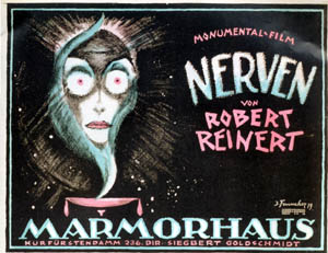
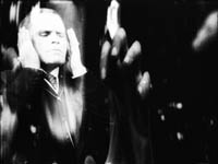
1. “It hypnotizes the viewer,” writes Paul van Yperen of the Nerven poster he printed in the new issue of the Dutch journal Skrien. Paul sent it to me because I wrote about Robert Reinert’s film in my forthcoming collection of essays, Poetics of Cinema. Nerven is a disorienting, highly experimental work. Released in 1919, before The Cabinet of Dr. Caligari (early 1920), it might have become a prototype of German Expressionist cinema if it had been widely seen and preserved by archives. Nerven, along with Reinert’s other major film Opium (1919) would make a wonderful twofer on a DVD release.
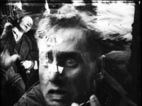
2. We’ve set up an archival supplement to our textbook, Film Art: An Introduction elsewhere on this site. It includes analyses that appeared in earlier editions but were cut for reasons of space or film availability.
The pieces discuss Stagecoach, Hannah and Her Sisters, Desperately Seeking Susan, Day of Wrath, Last Year at Marienbad, Innocence Unprotected, Disney’s Clock Cleaners, Tout va bien, High School, and Hitchcock’s first Man Who Knew Too Much. DVD has made nearly all of these films easily accessible, so we hope reviving the essays will be of use to students and free-ranging viewers.
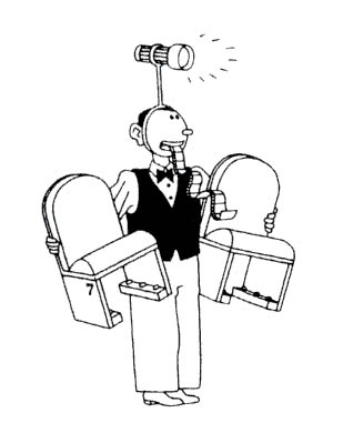
3. Check out the nifty interview with Joost Swarte in the new issue of The Comics Journal. Excerpts are here.
Swarte is the greatest heir to the Belgian-Dutch “clear-line” style, and his witty cartoons have become worldwide classics. Kristin and I have been collecting Swarte books and posters since the 1980s, although as his projects have expanded to building design his output of images has waned (except for the occasional item for The New Yorker).
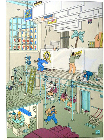 Swarte has much to say about Hergé’s mastery of visual storytelling, claiming that the Tintin tales are like little movies.
He was very much influenced by cinematographic laws. Where do you place your camera? Is the hero always coming from the left? What’s the relation between foreground and background? All sorts of terms that he used come from cinema.
Swarte too has an affinity for film. One of his best pictures, Comic Factory, treats cartooning as if it were moviemaking. Our cartoonist labors in lower left, the girder of a deadline hanging above him, while a producer (with cigar) seems to be telling the photographer how to shoot the panels. Jopo de Pojo gets spruced up for his close-up while his doubles (or clones) lounge around. Set designers and scene painters labor over the panels.
Swarte’s teeming street scenes, usually including dog turds, are filled with glimpsed gags in the manner of Tati. Not surprising, then, that under the skilful questioning of David Peniston, he confesses his admiration for Play Time. New collections of Swarte’s comics are apparently forthcoming, in several languages, in 2007. By the way, the same issue of the Journal has a nice appreciation of Cliff Sterrett, another comics genius, creator of the amiable, lovely, and quite nuts Polly and Her Pals. Click here for a nice blow-up sample.
4. Speaking of cinema in still images: One of Eisenstein’s favorite pastimes was to find anticipations of film in earlier media. He loved the fact that Myron’s discus thrower was portrayed in an impossible position, with the limbs indicating different phases of the action.
This and similar items were inspirations for the plate-smashing scene in Potemkin.
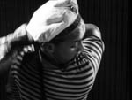
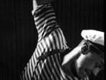
So in a holiday spirit, I’d ask: what would Eisenstein have made of this painting, which I saw again last summer in London’s National Gallery–Botticelli’s Mystic Nativity of 1501?
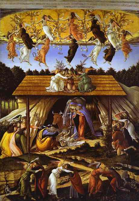
Reproduction, especially this tiny, doesn’t do the picture justice, but you should be able to see how the symmetry of the composition is broken by the slope up to the central scene of Mary and the mule bending over the baby. As with Swarte cityscapes, there’s a lot to dig for. Angels on left and right of the manger direct the Magi to the main action, and in the lower section angels kiss men while devils dive into the fissures of the earth.
Key for students of cinema, though, is the whirling dance of the angels in the upper third of the picture. Strictly speaking, they all seem out of step, no two in sync. But then you notice that each is executing a slightly different phase of one continuous movement, as if Muybridge had captured a single dancer’s circling trajectory with his early stop-motion photography. Angel Locomotion, he might have called it; but Botticelli got there before him.


