Archive for the 'Film and other media' Category
Who will match the Watchmen?
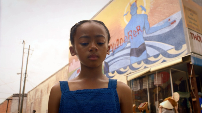
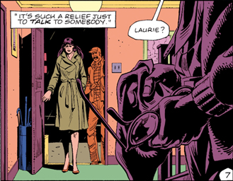
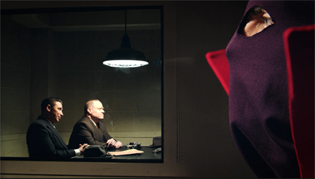
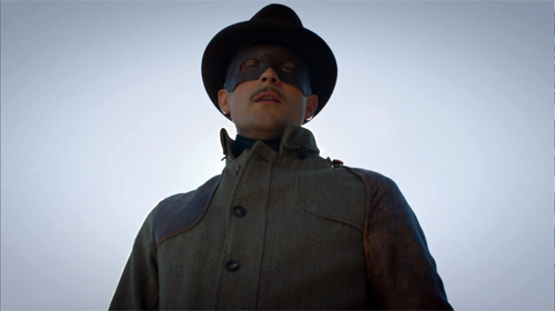
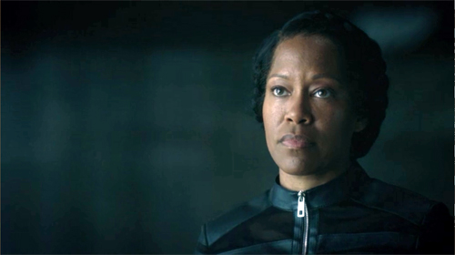
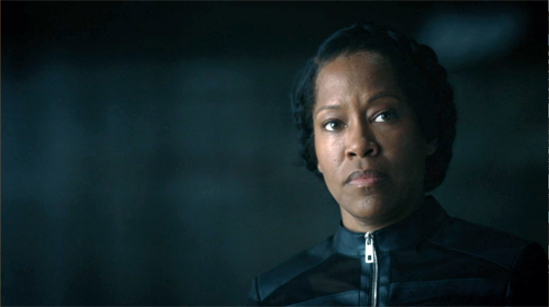
Watchmen (2019), Episode 7.
DB here:
If we want to understand the craft of filmmaking, we should pay attention to what filmmakers say about their technique. Sometimes we have to confirm what they tell us with other evidence and the onscreen results, but practitioners usually offer unique angles on their creative choices. For this reason I found it fascinating to come upon what Director of Photography Gregory Middleton had to say about his work on HBO’s limited-series Watchmen.
I had read the comic back in the 1980s and was intrigued by its experiments in pictorial storytelling. I’d also seen the movie, which I thought not as adventurous as the book and vitiated by the book’s adolescent nihilism. (Your mileage may vary.) But Middleton’s interview made me watch the series. So I thought I’d use this anxious pause in normal activities to share some ideas with you.
Middleton has a lot to say about the visual design, such as the sort of lenses he used to get startling depth effects. These echo some common graphic-novel compositions.
But I got more interested in other questions. How does the show adapt some classical cutting techniques? And how do those techniques square with the “editing” techniques we get in the original comic?
Here’s the relevant passage:
And transitions are the biggest tell when you cut from a beat of one thing to a beat of something else. In the case of the comics, one of the transitional devices we wanted to use to echo the graphic novel is the match cut. In the comic you’ve got one panel with a character in the foreground and someone in the background. The next panel is the same character in the foreground, but they are somewhere else — or somewhere else in a different outfit. And the background is something similar, but it’s something else, and you’re basically just jumping time because you’re really with the character and where their state of mind is, so the intervening time between how they went from here to there is irrelevant.
There is a great one in episode two where Angela walks back after they just sat down, and she sort of disagrees with the idea of going to rustle up the people at Nixonville, and she walks away, and she’s pacing as a match cut to her pacing at the police lineup at Nixonville. You go right where she’s thinking, like Okay, I don’t want to be here, but now I’m gonna be here, and suddenly you’re right there.
The match cut is also a way to instantly transport the audience without introducing a lot of other extraneous visual information. In episode four, we did her opening and closing her trunk when she is going to just get rid of the wheelchair she’s cut apart. She chucks it in the trunk, slams the trunk, and it’s a match cut to her opening the trunk, and she’s already somewhere else. And that just works — you don’t need to see her driving and parking and all that. The point is you just know she is dumping this thing, and it’s a nice, clever way to keep you on point with where she is with her intent.
Afterward, it’s like he’s just jumped ahead again — both places, same time. So it’s a way to sort of double-use that technique. It just takes a lot of planning and preparation. Nicole [Kassell, director/producer] and I worked hard on all the transitions in that episode to try and achieve that effect and make it interesting.
The transitions between scenes that Middleton is discussing are, I think, what have been since the 1940s called “hooks.” His comments open up some ideas about how editing works with them.
There are some spoilers, but not my usual quota.
Matchmaking
We can enhance our understanding of filmmakers’ creative options if we systematize a little bit the choices they face and the terms they use. That’s what I try to do in the online essay on hooks between scenes. There I suggest that we can have four sorts of palpable hooks from shot to shot: sound/sound, sound/image, image/sound, image/image. My examples come from National Treasure (2004), a movie that revels in tricky transitions.
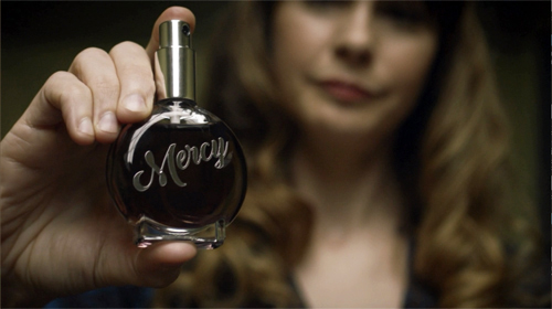
For example, one transition in Watchmen creates a sound/ image hook. The Game Warden tells Adrian, “No Mercy” and we cut to a close-up of a Mercy perfume being tested on a focus group.
Middleton calls the cuts that create image/ image hooks “matches.” “Match” is a broad term that points up a general principle of cutting for continuity. In a match shot-change, which might be a cut or a dissolve, something in shot B picks up something that was in shot A. Without distinguishing different types of matching, Middleton is stressing how continuity editing techniques, normally applied within scenes, can be used as transitions between scenes as well.
So let’s create an initial menu of possibilities. Within scenes, there’s the eyeline match, which shows a single character looking, followed by a shot of what the character sees (not necessarily from their optical viewpoint).
Shot/reverse exchanges like this one often rely on the eyeline match, but need not; you can have a shot/reverse pattern if the characters aren’t looking at each other. (Imagine two people talking with their backs to each other.) The eyeline match can link more than two characters within story space.
There’s also the match on action, where a bit of movement in A is carried over into B, despite the change of camera position. The scene between Wade and Angela continues with a combination of the eyeline match and the match on action.
Another sort of match plays upon the sheer pictorial qualities of the two shots. As Middleton says, shapes and color patches can be carried over from the background or foreground or both. Filmmakers don’t seem to have developed a specific term for this type of shot change, although they were clearly using it from at least the 1920s onward. (Eisenstein was the most explicit.) In Film Art: An Introduction, Kristin and I proposed calling the lining-up of compositional features from A to B a graphic match.
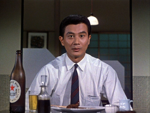
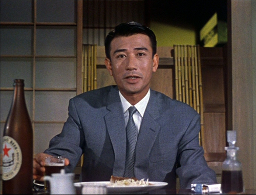
Precise graphic matches are common in experimental films, but they seldom show up within scenes of narrative films. Still, Eisenstein, Lang, Ozu (here, from An Autumn Afternoon), and a few other directors made bold use of them. And they’re obviously a matter of degree: Ozu can match an overall shot in some detail, as above, or just one portion of the frame.
We might add the possibility of the “category match,” as when a prop in shot A is followed by something comparable in shot B. Imagine cuts among wanted posters inside a sheriff’s office.
When we move beyond the individual scene, what are the possibilities? Clearly, all types of match-cutting can be used for transitions.
In Watchmen, an eyeline match shifts us from Angela, lying wounded on her living room floor, to a view of Judd looking down at her in the hospital when she awakens. Here the eyeline yields an optical POV.
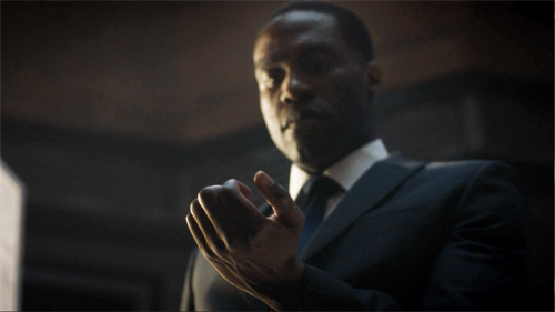
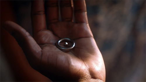
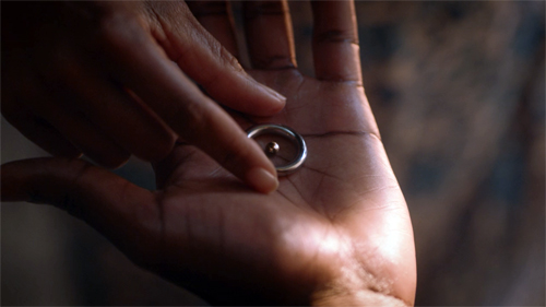
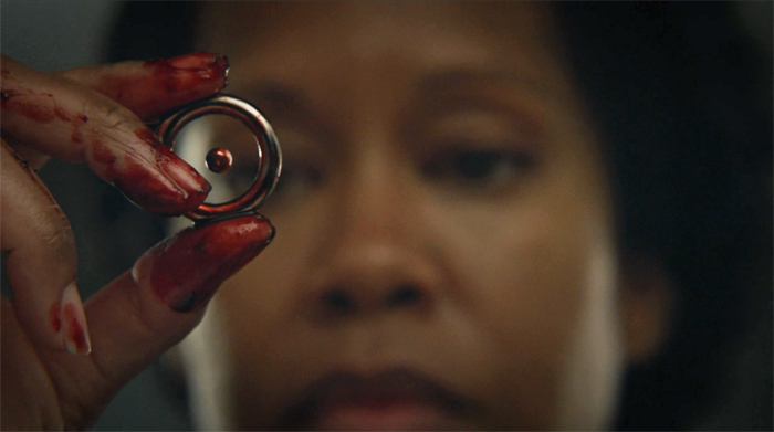
A match on action takes us from one scene of Cal opening his hand to another as Angela reaches for the hydrogen-atom ring.
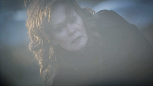
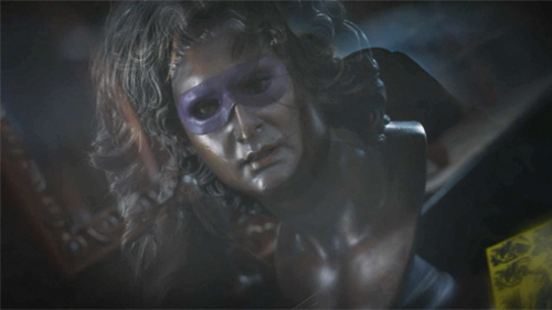
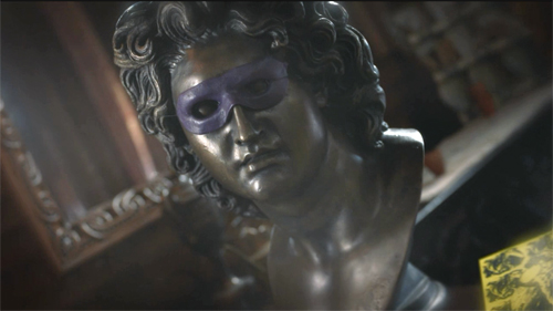
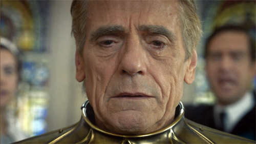
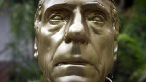
A hook can also exploit a graphic match. As Laurie lies sideways after a bomb blast, the image dissolves to a similar composition, a twisting view of a masked bust.
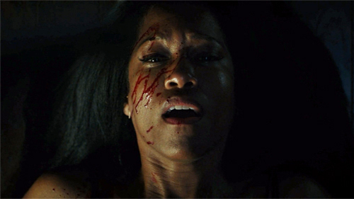
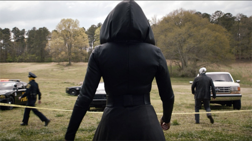
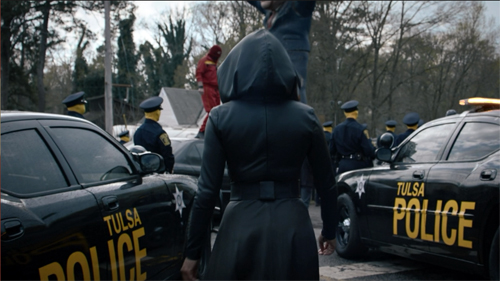
Middleton points to one striking moment that viewers are likely to notice: a match on action that’s also a bold graphic match. Angela strides away from one scene and continues her movement, and her compositional thrust, in a new location, Nixonville.
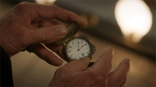
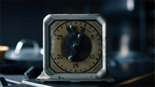
The “category match” is at work on occasion too, as when one scene ends on a pocket watch and the next starts on a clock face.
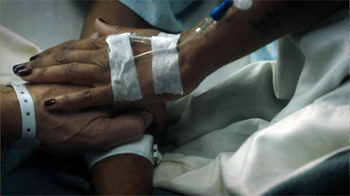
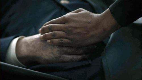
The category match blends with the graphic match when hands links scenes.
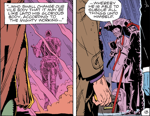
What seems to have sensitized the show’s creators to the possibilities of hooks is the fact that the Moore/Gibbons comic makes punchy use of graphic matches between panels. These are often used to signal character memories by opening and closing flashbacks.
Vivid as these examples and others are, the hook, even the graphically matched one, has a long lineage, as my essay tries to show. The creators of Watchmen are working in a distinct tradition of classic filmmaking.
Showing and showing off
More broadly, that classic tradition favors speed and quick pickup. The new Watchmen is essentially a police procedural, unlike the comic and the feature film. Accordingly, the investigation of a crime is interwoven with the personal lives of the police, the “cop soap opera” that brings in friends, family, lovers, and secrets from the investigators’ pasts.
The crucial backstory involves Angela Abar, who knits together many threads. The child of a US black soldier and a Vietnamese woman, she became a policewoman in Tulsa and underwent the new militarization of the force in response to white supremacy. Some of the earlier Watchmen team, notably Adrian Veidt and Dr. Manhattan, are still exercising their power, while Laurie Blake, the daughter of Silk Spectre, is now working for the FBI.
Like the comic, the series must move the plot swiftly between past and present. The comic splinters time more audaciously, jumping back and forth across its grid of nine vertical panels. But in a classical film, where you don’t normally pause or go back, the story must unwind linearly, and so other strategies come forward to impose a felt pattern.
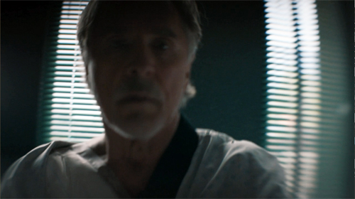
Older films might dwell on the aftermath of a scene, letting the tension relax a little, and provide a cadence that marks off a distinct section. Modern films, especially if they’re presented in the distracting environment of home viewing, display a need to maintain a rapid pace. So scenes push to a high point, then provide a “button” like that close-up of Laurie, and then move swiftly to the next. Among other advantages, this tactic keeps people from pausing or changing the input. Still, the scene shifts need to be clear fairly quickly.
Hooks can help on both fronts. They snap up the pace, keep us alert, maintain interest from moment to moment. A less clear-cut hook can provide a bump of surprise that teases us into the next scene. Soon, though, we will get imagery, and especially dialogue, that anchors us in the ongoing action.
Hooks also provide motifs that can cascade through the film. Adrian’s ambitions to be the new Alexander the Great are provided by cuts that mock his pretentions.
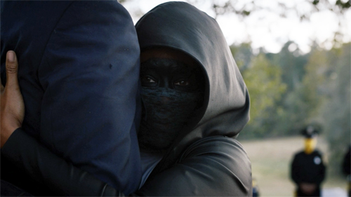
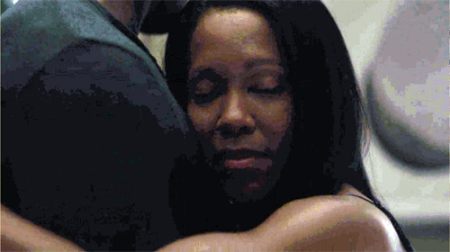
And, as in the comic, the cinematic hooks facilitate subjectivity. The most common way classical storytelling justifies unrealistic or nonlinear narration is through getting into characters’ heads. (Middleton: “You’re really with the character and where their state of mind is.”) Abrupt and startling cuts can be motivated if what we see is a memory, a dream, or a hallucination. This is what we get when Angela embraces Judd’s legs: a match-on-action hook to a flashback of her slow-dancing with Cal.
The most elaborate hooks can provide something more: a certain elation in virtuosity. The precise matching of Angela’s stride across those two scenes above is a stylistic flourish that asks us to appreciate the care and bravado of the filmmakers.
Watchmen‘s hooks, however flamboyant, stand out against a pervasive backdrop of classically constructed scenes. We get lots of over-the-shoulder reverse angles, properly timed reaction shots, now-standard cuts to extreme distant shots that provide a “beat” for the scene, and other devices that have been around for decades. Plenty of other traditional strategies for narrative coherence are on display, from goal-oriented protagonists and deadlines to newspaper headlines and TV broadcasts as sources of impersonal narration. There’s even the inevitable Hollywood line: “What are you doing here?” As usual, striking moments emerge out of a familiar flow of narrative cause and effect, with some mysterious gaps eventually filled.
Paging the Watchmen
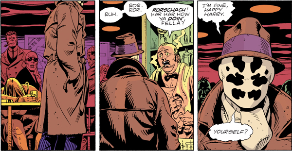
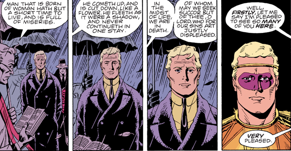
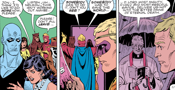
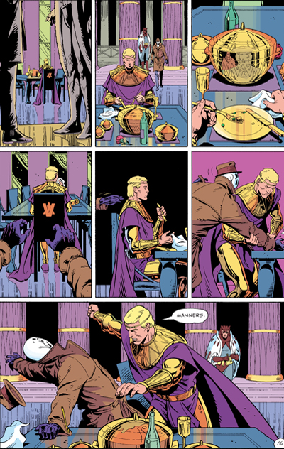
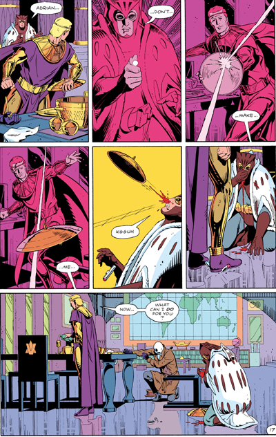
Comics artists absorbed the lessons of continuity filmmaking. If the hooks in films stand out by contrast with the overall smoothness and linearity of classic construction, something similar happens in comics. Here are three “continuity shots” from the Watchmen graphic novel, complete with obedience to the axis of action, reverse-angle cutting, and a “single” for emphasis on Rorschach’s reaction.
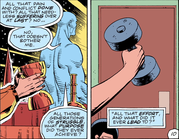
Even a match-on-action hook can be suggested, as when Laurie’s lifting a goblet on Mars “cuts” to her as a teenager lifting a dumbbell.
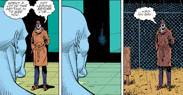
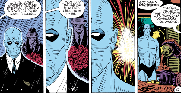
Graphic continuities and discontinuities can be motivated by science-fiction premises, as when Dr. Manhattan teleports Rorschach out of the facility. The sense of instantaneous change wouldn’t be so strong if Rorschach’s size and placement in the format weren’t kept constant.
In a way, the graphic continuities are almost needed for the time-shifting transitions. A new angle on Adrian at the start of the funeral flashback below would be more confusing than the frontal close-up that completes a gradual enlargement of his face. The new costume and the “offscreen” dialogue cue us to a new scene.
To keep things tidy, the flashback ends with a foreground graphic match on Adrian, leading us back to the funeral.
As ever, popular narrative maintains symmetry and redundancy to keep the action clear. Here’s a more “staggered” but no less symmetrical foreground graphic match–used, again, for subjectivity.
The rectilinear staging evokes either a track-in (the first two panels) and a track-back (the last two) or axial cuts in to and back from Dr. Manhattan. (The Soviets called these in-and-out edits “accordion” cuts.)
So there are some rough equivalents between film editing and the principles binding comic panels, especially ones this jammed with information. But comics have unique resources too–ones that Watchmen‘s creators were well aware of. Dave Gibbons notes that he exploited techniques articulated by the great Will Eisner, “where you could, say, hold the camera’s point of view and have characters walk past it, or follow the characters through a scene acrosss a changing background, where you could echo panel compositions . . . .”
The echoes Gibbons mentions depend on the fact that the book page and its role in a two-page spread create a force-field that displays the story both as a timeline and a spatial array. Panels are at once phases of action and a simultaneous order of images, and the interplay of story information and pictorial pattern can become quite rich, even baroque.
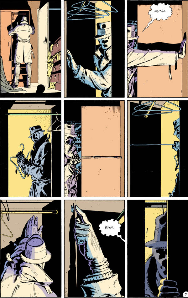
Consider when Rorschach rummages in the Comedian’s closet. Even if we could replicate the panels in a movie shot by shot, the page’s severe structure couldn’t be grasped as a simultaneous whole onscreen.
The echoes are striking. Panel 1, the establishing shot, is enlarged in panel 7 on the bottom row, as is panel 2 in panel 8. Each lower-tier mate is markedly closer than the top one, emphasizing the growing sense of discovery. Panel 2, with its sidelong strips of solid black, is echoed in panel 4 and panel 6 (a slight “pan” left from 4) and, with another enlargement, in panel 9, the climax. The color slabs (yellow/black, grey/purple) accentuate the repetitions and variations. The middle stretch, panels 3-6, forms a suite of variations as well (5 picks up 3, 6 picks up 4), while Eisensteinian cuts flip us back and forth across the axis formed by the straightened coat hanger. All the cuts are compass-point shifts, moving us in 90-degree multiples. The crisp geometry of the découpage renders the unhurried professionalism of Rorschach’s search, an effect accentuated by the snapshot imagery (no motion lines).
The effect depends in large part on the presence of all these images on the page at once. The alternation of shot scale and color fields can be discerned only by seeing the overall architecture of the page.
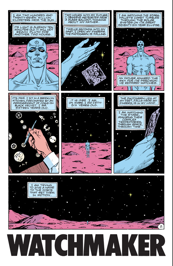
Panels 1, 3, and 5 build to the climax of the wide framing on the bottom as we pull farther back from Dr. Manhattan during his soliloquy. Panels 2 and 6, echoes of a close-up of the photograph, provide a sharp contrast to the landscape and emphasize the power of memory. That power is enacted in another variant of the hand image, as the young Jon Osterman arranges watch parts, like stars, on a velvet ground.
The page is one standard mid-size unit for the comics story, but the two-page spread is the next phase up. A continuous action can be spread across the open book, with echoes emerging. In the big fight scene, the shifting POV (occasionally objective, but also bouncing us among Rorschach, Adrian, and Daniel) is capped by symmetrical wide panels at the bottom of each page. The rose-tinted panels on the right page add their own fillip of pattern.
In a film such symmetries and variations unfold over time. We can make them apparent only through a “spatialized” analysis, spread out on the page like a comic-album layout. (Such were those pioneered by Raymond Bellour in the 1960s and 1970s.) In comics, these patterns strike us immediately, as a primary and palpable expressive vehicle. One-off devices like the graphic match can be sustained both on the screen and on the page, but each medium stamps its own structures on the flow of time.
There’s a lot more chop and change in the space-time continuum of the Watchmen comic than I can do justice to here. (Some pages run three time periods simultaneously.) But my main point should be clear. As usual, when we start to pay attention to the films and media artifacts that fascinate us, we always find more going on than we realized. Both movies and comics work on us so directly that their design subtleties can easily pass unnoticed. We can keep reverse-engineering them as long as we like, and we’ll learn a lot. And the creators can be very helpful guides about what to pay attention to.
I first became aware of Gregory Middleton’s comments by reading the review essay by Namwali Serpell, “In the Time of Monsters,” New York Review of Books (9 April 2020). I’m grateful to Serpell for calling my attention to the problem of cutting in the Watchmen series.
The essay is somewhat misleading in its account of match cutting, which is said to create “‘jumps’ rather than flows from shot to shot.” It’s actually just the opposite. The match cut creates continuity of time, space, and graphics between shots. It need not, as the essay claims, link two settings, and it’s not an alternative to a “splice cut,” which is a term with no currency I’m aware of. (A splice is simply the physical join between film strips, and it can govern any type of cut. Splices are increasingly rare with the dominance of digital editing.) The alternative to match cutting would be discontinuity cutting.
Serpell’s essay is worth reading for its interpretive dimension. She argues that for all the creators’ efforts to create strong images of minority heroes fighting white supremacy, there is a critical, antiheroic aspect to the original comic that isn’t picked up in the series. The sanctioned violence of Angela, Wade, and others is treated as unproblematically righteous.
I’d largely agree. Yet I’m not sure that the original book’s portrayal of superhero trauma (the result of the go-to source, childhood abuse) elevates these caped crusaders much. They seem to me best understood as part of that cycle of debunked superheroes we find in other 80s comics, notably The Dark Knight. Why would someone put on a mask to fight crime alone? What dignifies vigilantism? Are these “the heroes we need now”? These, we’re told, are deep questions, but they seem to me the tropes of a quickly standardized set of conventions. They signal a “new complexity” and “adult attitude” comparable to the romanticism of film noir and the cynicism about samurai ideals we find in Japanese swordplay movies. Bringing heroic genres low is itself a genre convention.
More broadly, I’d propose that the the storytelling strategy Serpell highlights is part of the common move within thematically ambitious mass-market movies to be strategically ambiguous. Creators, I’ve suggested here, often throw many things against the wall to see what will stick. They can then point to contradictory aspects which show balance. So yes, Angela tortures members of the Seventh Kavalry, but (a) they’d do the same to her; and (b) she’s driven by righteous vengeance for ancient wrongs; and (c) we want to make you a little uncomfortable with her vigilantism anyhow. Nowadays, it may be that what seem involuntary contradictions are deliberate efforts to have things many ways at once. This maximizes viewer outreach and gives critics fodder for debate. For another recent instance, see the previous entry on The Hunt.
The Dave Gibbons quotation comes from the supplement “The Phenomenon: The Comic That Changed Comics” available on the DVD of the Director’s Cut of Watchmen, 9:35-10:14.
Raymond Bellour’s “spatialized” analyses of repetition and variation can be found collected in The Analysis of Film (Indiana University Press, 2001). Some efforts of mine are in On the History of Film Style and in Ozu and the Poetics of Cinema (available for free, if patient download here), as well as in other material on this site.
Watchmen (2019).
When media become manageable: Streaming, film research, and the Celestial Multiplex
Never coming to the Celestial Multiplex: Liberty Belles (Del Henderson, 1916).
DB here:
A directors’ roundtable in The Hollywood Reporter says a lot in a little.
Fernando Meirelles: This June, The Two Popes was in 35 festivals. Then we were going to have two or three weeks of theaters. And then the [Netflix] platform. I mean, it couldn’t be better.
Martin Scorsese: We are in more than an evolution. We are in a revolution of communication and cinema or movies or whatever you want to call it.
Meirelles casually omits DVDs, at one point the most rapidly adopted format of consumer media. Yeah, what ever happened to discs? And in what follows, I’ll take issue with Scorsese’s claim that streaming has triggered a revolution. It’s more a case of evolution that issued in a sweeping change, like Engels’ transformation of quantity into quality, or Hemingway’s claim that he went broke slowly, then quickly.
More important, I’ll try to assess the impact streaming has had on what Kristin and I and other researchers and teachers try to do–study film as an art form in its historical dimensions.
Managing your time, and your movies
If we’re looking for a revolutionary turning point, I’d suggest the moment that movies no longer became appointment viewing. When they played theaters you had limited access. The film was there for only a while (even The Sound of Music eventually left) and you had to watch it at specified times. On broadcast TV and cable, the same conditions applied. But with the arrival of consumer home videotape in the 1970s, the viewer was given greater control.
Akio Morita of Sony called it “time-shifting.” The phrase, shrewdly positioned as a defense of off-air copying, captures a fundamental appeal of physical media. You could watch a film at home, and whenever you wanted to. Yes, VHS and even Beta yielded shabby images and even worse sound, but (a) theatres were often not much better, and (b) a video rental was cheaper than a movie ticket. Most important was a general rule of media technology: For the mass market, convenience trumps quality.
Videotape swept the world in the 1980s and gave films an aftermarket. Many an indie filmmaker could get financing for a project on anticipated tape sales. The laserdisc gained some attention in the 1990s, becoming a sort of transitional format. It improved quality (better analog picture, digital sound) but had drawbacks too. A movie wouldn’t fit on a single disc side, and a laserdisc was pricier than tape. LD remained a niche format, chiefly for educators and home-theatre enthusiasts.
The laserdisc was superseded by the DVD, introduced in 1996. Journalists claimed that it enjoyed the fastest consumer takeup in electronics history. Discs were more convenient than tapes, and proof of concept had been provided by the success of CDs for music. To compete, cable companies introduced “video on demand,” a time-shifting compromise between scheduled cable delivery and rental of tape or disc. People still use cable VOD, and for some purposes it’s a cheaper alternative to committing to subscription services.
Reviewing The Irishman, a critic suggested that most people will skip seeing it in theatres and watch it on Netflix, where it’s “more manageable.” With tape and disc, either analog or digital, consumers became accustomed to a huge degree of manageability. They could pause, skip ahead or skip back, race fast-forward or –back, play slowly, and above all play the movie over and over. DVDs made all these options quicker and more convenient than tape had. The market boomed. Video stores made discs available for rental, as tapes had been, and retail stores offered them for sale, at increasingly low prices.
But there were problems. In the 2000s there was a glut of DVDs, and consumers began to realize that a few weeks after release many titles would end up in the bargain racks. A brisk secondary market developed thanks to the US “first sale” doctrine, most virtuosically exploited by Redbox. Worse, there was piracy. Pirating analog tapes degraded quality across generations, but with digital discs you could rip perfect clones. Any teenager could hack past region coding and anticopying software.
The Blu-ray disc was an improvement on the first-generation DVDs, and it came along as more people were buying widescreen and high-definition home monitors. Properly mastered, Blu-ray discs looked good, and they had bigger storage capacity. Some consumers got excited, but the improved format couldn’t arrest the headlong decline of disc sales. In addition, the industry’s rationale for Blu-ray was its resistance to rippng, but hackers breached the codes with ludicrous speed.
From this angle, streaming is parallel to digital theatre projection : a new phase in the war against piracy. Likewise, as in theatrical screenings, you’re paying for an experience, not an item. You’re not buying an object you can copy or resell. If a movie is available only on streaming, you’re renting something, not owning it legally. One aspect of manageability—personally possessing a movie—is traded away for convenience and, ultimately, for limited access, as I’ll try to show.
Not so gently down the stream
With streaming, the age of appointment viewing seems more or less over. And the infinite vista of the Internet has encouraged tech-heads to imagine something like the Celestial Jukebox, a vast virtual multiplex in which all movies will be available. If iTunes and Spotify did something like this for music, why not cinema?
Let’s consider the pluses and minuses of streaming for ordinary consumers and for filmmakers.
Obviously, there’s convenience. After the monstrous tape cassettes, DVDs looked adorably slim. Now, gathering in slippery stacks, they have their own sinister aura. With streaming, there’s no need to run out to the video store or to buy new shelving to support a bulging library of discs.
There’s also price, compared to either theater tickets or cable fees. From $6.99 per month (Disney+) to $12.99 (Netflix), streaming services promise to provide TV and movies quite cheaply. And there’s the range of choice, which even on second-tier streamers exceeds the capacity of most towns’ video stores back in the day. Finally, there are many obscure films lurking in the corners of most streamers, so the joy of discovery is still there to a degree.
On the minus side, there’s one that gets the most press—the further erosion of “the theatrical experience.” Critics emphasize the pleasures that come from being in an audience, but this always seems to me overrated. More valuable to me are the scale of image and sound you get in a theatre. I like my movies to loom.
Above all, there’s a virtue in the lack of manageability. In the theatre you can’t pause the movie or run back or skip ahead. You can close your eyes, look away, or leave, but at bottom you’re there to turn your sensorium over to the filmmaker, to go through an experience you don’t control. This unshakeable grip on your attention yields some of cinema’s most powerful effects.
The condition of privatized viewing isn’t unique to streaming, of course. Nor is another drawback, that of the cyclical expiration and refreshing of “content” on streaming platforms. Admittedly, we’re warned. Newspapers and websites run alerts notifying us when a title is leaving a service—perhaps for a little while, perhaps longer, perhaps forever. And this situation is a bit like DVDs’ going out of print. But at least some disc copies exist to be sold second-hand or cloned as files. In working on my book on the 1940s, I was pleasantly surprised to learn that I could track down arcane titles on out-of-print discs, and at fair prices. When something not on disc leaves streaming, how do you access it?
I think there will be some pushback when subscribers learn about the costs that more and more services are tacking on. Yes, with Amazon Prime for $119 per year you get access to many films, along with other services. But for a great many films Amazon demands an extra rental fee and very short-term access. Within Amazon, there are channels (Britbox, HBO Now, Starz, Cinemax et al.), all of which demand further subscription payments. As people start to realize that streamers will have exclusive licenses for titles, they’ll feel pressure to subscribe to many services. Here, as elsewhere, the total streaming price tag starts to look like cable fees. Even the New York Times has noticed.
Another problem won’t bother most consumers, but it does matter. A streamed title will occasionally be in an incorrect aspect ratio. Most commonly, a Scope (2.39 or so) image will be cropped to 1.85. I noted this some years back, relying on a website showing faulty Netflix transfers, but that site seems to have been taken over by … Netflix itself.
Netflix will say, with all “content providers,” that they get the best material they can from their licensors. I don’t watch streaming enough to know how common wrong aspect ratios are, but if you know of examples, I’d like to hear.
Finally, even streaming companies can collapse. Unless Apple buys a studio (Lionsgate? MGM? Columbia?), it must rely on original content, and it could well flop. On the day I’m writing this, one hedge fund manager predicts we have reached peak Netflix. Given greater competition, slower growth, and accelerating cancellations, he maintains that Netflix is on the wane. If it scales back or fails (it currently carries $12.43 billion in debt), what will happen to its licensed material and its original content?
What about creators? Filmmakers, especially screenwriters, have enjoyed boom times. It may be a bubble, with over 500 scripted series available on broadcast, cable, and streaming. Still, it has given everyone a lot of opportunities. Documentary filmmaking in particular has enjoyed a shot in the arm.
And features are still doing quite well, at least on Netflix. Of the streamer’s top 10 releases in 2019, seven were features. But those proportions may change. Aside from big theatrical movies licensed from the studios, the impact of proprietary “event” programming (War Machine, Bird Box) has been fairly ephemeral. (Obviously Roma and The Irishman are exceptions.) The strength of streaming, it seems to me, is the same thing that sustained broadcast TV: serial narratives. Hence the popularity of Friends and The Office, as well as House of Cards and Orange Is the New Black.
Like network TV, a streamer needs a reliable, constant flow of content—not only many shows, but many episodes. The model of the series, if only in six or eight parts, secures the loyalty of the viewer for the long term. Even if all episodes are dumped at once, the promise of continuation after an interval of a year or several months keeps the viewer willing to hang on till the next season.
The pressure on the creators is predictable. Since form follows format, writers and producers will be pushed to come up with series ideas. A friend of mine pitched a feature-length movie to a streaming service. The suits loved the idea but wanted it as a series and were already scanning the script outline for a plot point that could launch a second season. Some of the streaming series I’ve seen, notably Errol Morris’s Wormwood, seemed to me stretched.
If a filmmaker lands a feature film on a streaming platform, other problems could follow. We’re well aware that independent filmmakers gain few royalties from streaming; their big check tends to be the initial acquisition. At the same time, they can’t be sure that people are watching their entire movie. My barber couldn’t stick with The Irishman, even with pee breaks.
Streamers seem to have accepted grazing as basic to the viewing experience. For purposes of measuring total viewership, Netflix counts a “viewing” of a film or program as a minimum of two minutes. In the light of the two-minute rule, we might expect filmmakers to crowd their opening scenes with plenty to grab us. That goes back to TV and TV-influenced films, of course, which tried to have a strong teaser even before the credits. Now, it turns out, streaming pop songs are being crafted with shorter intros and earlier choruses “to get to the good stuff sooner.” Maybe filmmakers will be trying the same thing. Maybe they already are.
Streaming and film research
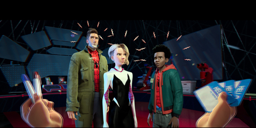
Spider-Man: Into the Spider-Verse (2018).
Finally, what are some consequences of streaming for researchers, educators, and your all-around obsessive cinephile?
I think it’s fair to say that home video, in the form of tape, laserdisc, and digital disc, democratized film study. From the late 1960s on, I traveled to archives and film distributors to watch films for my research. It was troublesome, time-consuming, and costly. As a grad student I took a bus from Iowa City to Chicago to watch 16mm prints of Dreyer and Sontag films. I drove to Eastman House to see films in projection. I stayed in Paris a couple of months to work at the Cinémathèque Française on Marie Epstein’s visionneuse.
As a prof here at Madison I spent hundreds of hours watching prints in our Center for Film and Theater Research. Over the decades I trekked to Denmark for Dreyer and 1910s films, to Japan for silent films, to Paris and Munich and the BFI and MoMA and UCLA and Eastman House and the Library of Congress, and above all Brussels for many, many projects. Collectors, from Manhattan, Tokyo, and Milwaukee helped as well. Kristin and I owe archivists everything.
The terrible quality of films on tape didn’t help me study visual style, but laserdiscs were a big improvement. (Hong Kong films tended not to be in Scope on tape but were on LD.) And one LD format, CAV, was frame-accurate; you could study a shot frame by frame, something not possible with many DVDs. There’s always a trade-off with any technology.
Even after even after DVDs arrived I kept up my travels. I could use discs for bulk background viewing, but often I still had to rely on prints. Sometimes I wanted to count frames (handy in looking at Soviet montage and Hong Kong action). Moreover, looking at film prints revealed that the color palettes on DVDs could be quite different, and soundtracks were often cleaned up for the home market. And of course thousands of films, especially from outside Hollywood or in the first decades of cinema, were never going to be available on consumer video. My most recent extended archive stay, in Washington in 2017 thanks to a Kluge Professorship, showed me the glories of the 1910s in prints that are mostly accessible only to researchers.
What do scholars of an analytical bent need? Entire films that can be paused. Frame stills, made photographically or through software. Clips as evidence for our claims. Stills and clips are our equivalents to quotation for literary scholars and illustrations for art historians.
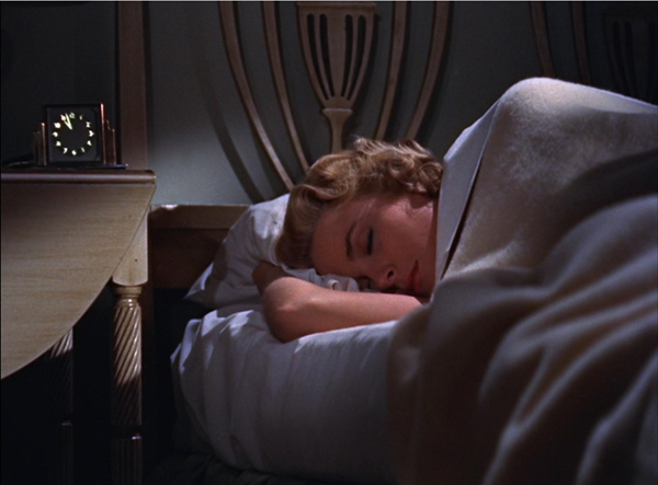
Apart from convenience and cost savings, the disc revolution yielded something I couldn’t get otherwise. In an archive, it’s impossible to study film-based 3D cinema. But thanks to Blu-ray, I can stop on a 3D frame. (. . . And, for instance, spot the way Hitchcock makes the clock quietly pop out in Dial M for Murder, below). This is a unique benefit—but a waning one, as 3D discs are increasingly hard to find and 3D monitors scarcely exist any more. As I said, trade-offs.
From this standpoint, Netflix and its counterparts offer a step down from DVD and Blu-ray. In terms of choice, many films aren’t currently available on streaming, and many more never will be. You can pull a DVD off a shelf whether you’re online or not, but for streaming you need a good connection. The controls of a streaming view aren’t as precise as those on a DVD player; slow forward and back to study cuts and gestures aren’t feasible, it seems.

When cable cropped films, as it frequently did, you had recourse to DVDs, perhaps even from foreign sources. But as exclusive licensing increases, only one service will have a title. Frame grabs are possible with some software, but clips are more difficult.
Worst of all, many worthwhile films will apparently never find their way to disc. I first noticed this in 2017 when I wanted to buy a copy of I Don’t Feel at Home in This World Anymore, a Netflix release of a Sundance title. As far as I can tell, it’s not available on DVD. The same fate has befallen one of my favorite films of 2018, The Ballad of Buster Scruggs. Only a few years ago it would be unthinkable for a Coen Brothers film not to find DVD release. Even Roma has had to wait for a Criterion deal to make it to disc. Clearly Netflix, and perhaps other streamers, believe that putting films on disc damages the business plan. So Meirelles doesn’t include DVDs in the lifespan of The Two Popes.
Without DVDs, some cinephiliac consumers are lamenting, rightly, the loss of bonus materials. The Criterion Channel has been exceptionally generous in shifting over its supplements to the streaming platform, but other companies haven’t been. Scholars and teachers rely on the best bonus items, including filmmaker commentaries, to give students behind-the scenes information on the creative process. There are, I understand, rights issues around supplements, and bandwidth is at a premium, but there’s no point in pretending that the loss of disc versions hasn’t been important.
In 2013 Spielberg and Lucas declared that “Internet TV is the future of entertainment.” They predicted that theatrical moviegoing would become something like the Broadway stage or a football game. The multiplexes would host spectacular productions at big ticket prices, while all other films would be sent to homes. Lucas put forth the question debated in the directors’ roundtable I mentioned: “The question will be: ‘Do you want people to see it, or do you want people to see it on a big screen?’”
Still, the big changeover hasn’t happened quite yet. Every year has its failed blockbusters, and films big and middling and little (Blumhouse, for instance) still continue. Arthouse theatres, which rely on midrange items, indie production, and foreign fare, are putting up a vigorous fight, emphasizing live events and community engagement.
Meanwhile, streaming makes film festivals and film archives more important. Festivals may host the few plays that a movie gets (as in the 35 fests which ran The Two Popes), and filmmakers, as Kent Jones remarks, are eager for their films to play on the big screen in those venues. Archives will need not only to preserve films but also make classics and current movies available in theatrical circumstances. Smart film clubs like the Chicago Film Society and our Cinematheque keep film-based screenings alive.
Before home video, few film scholars undertook the scrutiny of form and style. Those who did had to use editing machines like these. (One scholar called my study of Dreyer, not admiringly, the first Steenbeck book.) Ironically, just as an avalanche of films became available for academic study, and as tools for studying them closely became available for everyone, most researchers turned away from cinema’s aesthetic history and a film’s specific design in order to interpret their cultural contexts. There were exceptions, like Yuri Tsivian’s efforts to systematically study patterns of shot length, but they were rare.
Whatever the value of cultural critique, one result was to leave aesthetic film analysis largely to cinephiles and fans. Thankfully, the emergence of the visual essay, in the hands of tech-savvy filmmakers like kogonada and Tony Zhao and Taylor Ramos, eventually attracted academic attention. Film analysis has returned in the vehicle of the video essay, which is a stimulating, teaching-friendly format. Kristin, Jeff Smith, and I have participated in this trend through our work with Criterion and occasional video lectures linked to this site.
All this was made possible through the digital revolution, or evolution, and we should be grateful. Still, streaming filters out a lot of what we want to study. It’s clear that, for all their shortcomings, physical media were our best compromise for keeping alive the heritage of critical and historical analysis of cinema. We’ve largely lost physical motion pictures as a contemporary medium. (How many young scholars, or filmmakers for that matter, have handled a 35mm print?) Now, to lose DVDs and Blu-rays is to lose precious opportunities to understand how films work and work on us.
Thanks to all the archivists, collectors, and fellow researchers who made our research so fruitful and enjoyable in the pre-digital age.
A good overview of the streaming business at this point is “The future of entertainment,” in The Economist.
Kristin discusses the fantasy of the Celestial Multiplex with archivists Schawn Belston and Mike Pogorzelski. For examples of how to watch a film on film slowly, go here. Samples of editing-table discoveries are here and especially in the Library of Congress series that starts here. In another entry, I discuss the use of 3D in Dial M for Murder.
P.S. 24 January 2020: Then there’s this, from Facebook.
Dial M for Murder (1954).
Torino images, preparing for the festival
DB here:
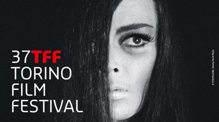
If you’re not a hardcore horror fan, you may not recognize the image that adorns this year’s Torino Film Festival publicity, but I bet you’re fascinated by it anyway. Barbara Steele, the diva supreme of 1960s scary cinema, is a fitting emblem for this year’s broad and deep retrospective of the horror genre. From The Cabinet of Dr. Caligari (1920) to Dr. Jekyll and Sister Hyde (1971), thirty-six films are on display, often in 35mm prints. Emanuela Martin, the curator of the series and director of the festival, has created a book devoted to her program. And the festival has welcomed the iconic Ms Steele as a guest.
In-depth commitment to a retrospective is typical of this enterprising festival. Kristin and I had been hearing about it for years from our friend, Wisconsin Cinematheque honcho Jim Healy, who has long been a contributing programmer here. Previous editions focused on “Amerikana,” De Palma, dystopian SF, Powell & Pressburger, and Miike Takashi.
Still, at Torino as elsewhere, the emphasis falls on new work. Dozens of films are screened both in and out of competition. Kristin and I are still assimilating items to report on in forthcoming blog entries. But we’ve already sampled the charms of this city, not least its monumental temple to film, its Museo del Cinema. But first, another municipal tribute to picture-making.
Pictures, some puzzling
The Galleria Sabauda in the Palazzo Reale teems with masterpieces, mostly from the collection of the Savoy dynasty. The non-masterpieces are worth studying too, and some, even in their weirdness, can prompt thinking about cinema (of course).
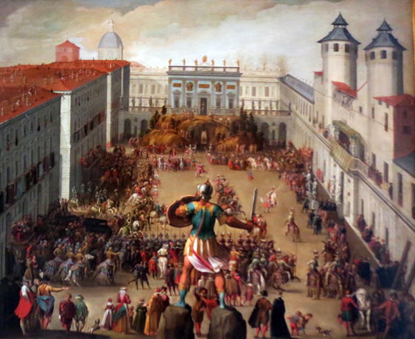
For instance, there’s this Antonio Tempesta painting, Torneo nella Piazza del Castello (1620), showing an aristocratic wedding procession in a Turin plaza. I liked its steep perspective with the commanding figure of the warrior in the foreground. Close observation, which the Sabauda permits, reveals tiny figures on the rooftop at the left.
Evidently the paining yields a lot of information about architectural projects of the day. All I could think of is what a swell film shot it would be.
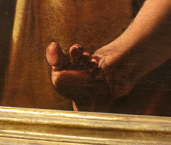
Instead of Testa’s high angle, which yields a centered and stable composition, consider Varallo’s punchier Saints Peter and Mark, from the same period (1626).
The low viewing angle on the two saints makes their muscular gestures dominate the middle of the format. That axis calls to their incredibly distended fingers caught in the act of dictating and writing. The angle also lets us enjoy the casually crossed leg of Mark and his tense, splayed toes, which seem to poke against the picture surface.
Angles again: This unidentified painting of the savage martyrdom of Saint Bartholomew (ca. 1635) grabbed me because of its even steeper low angle.
Apart from the Caravaggio spotlight effect (overexposed in my shot; I can’t find an image online), it reminded me of one of my fussier concerns.
Cinema lets us separate planes because of constant overlap, one layer of space moving against another. Painting can’t let us detect contours from movement, so when painters want to shove figures together they need to mark off overlapping planes in other ways, such as color or edge lighting.
Alternatively, painters can pack figures but leave little holes that let bits of background show through but still give a sense of movement. In the St. Bartholomew painting, the contours that specify the figures nearly graze each other.
I especially like the way that the brow and nose of Bartholomew’s tormentor fit like a puzzle-piece into the twist of the saint’s shoulder. Good old figure/ground technique, but pushed to a kind of minimal limit.
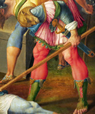
When these little gaps aren’t left, and only overlap and colors pick out planes, you can get some striking effects. The most mind-bending thing of this sort I saw at the Galleria was this Resurrection, perhaps by Antonio Campi, from around 1660. At the bottom of the picture a soldier is prodding a sleeping guard beside the sepulcher.
The soldier on the right is one strange creature. You can work it out that he’s wearing a thick, ribbed yellow doublet with a beast’s head attached at the shoulder. But the effect of the overlapping planes and the compositional contours is of a duck/rabbit shift, as if the beast is bent over the soldier.
The effect is enhanced by the sinewy leg of the soldier behind, which seems at first glance to be the right arm of the stooped beast. The absence of spacing between the foot and the spear helps the effect of a limb continuing the arc of the bent back.
Enough of amateur art appreciation. Turin houses another magnificent repository of artifacts, this one dedicated to our own obsessions.
Film history on a grand scale
Mole Antonelliana, Turin.
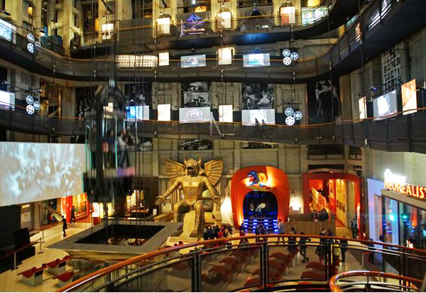
The Museo Nazionale di Cinema is housed in the Mole Antonelliana, a fascinating elongated building that towers over the city. An elevator shoots people up to a fancy spire with a panoramic view.
Pictures can’t do justice to the Museo inside. You enter through the biggest and most engaging collection of pre-cinema materials I’ve ever seen. Nearly every gadget, from the magic lantern to Edison’s Kinetoscope, is offered for you to tinker with. (An interactive sampling is here.) Once you’ve seen the entire archaeology of film, you step into a gigantic hall with a spiral ramp leading to level after level.
Nearly the first thing you meet is the god Moloch from Cabiria (1914), a film made when Turin was a major national production center. Not quite as big as in the film, he was enough to intimidate me.
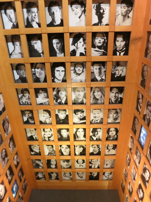
Various floors take you to theme areas. There’s one on film production with some classic cameras, another displaying a vast gallery of posters, and several devoted to changing exhibitions. (The current one was on facial expression in cinema, hooking to a big show of Lombroso’s physiognomic studies.) You can see a script page from Psycho or Citizen Kane, and stare in awe at a two-story display of star portraits.
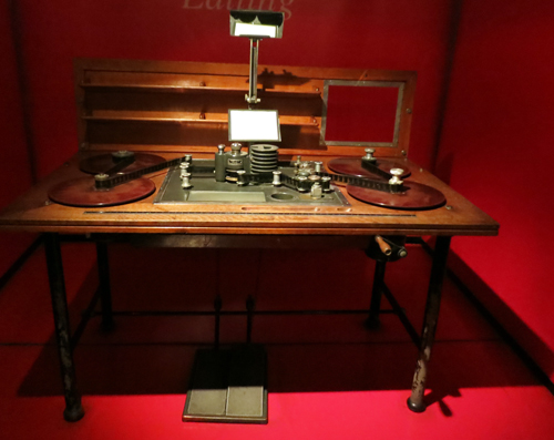
Kristin and I visited a shrine to the beautiful Prevost editing table. (This is a 1930s one.)
There’s so much here that more than one visit is probably demanded. In all, the Museo makes a splendid anchoring point for the film festival. We’ll tell you more about that in upcoming entries.
We wish to thank Jim Healy, Emanuela Martini, Giaime Alonge, Silvia Saitta, Lucrezia Viti, Helleana Grussu, and all their colleagues for their kind help with our visit.
For more Torino images, visit our Instagram page.
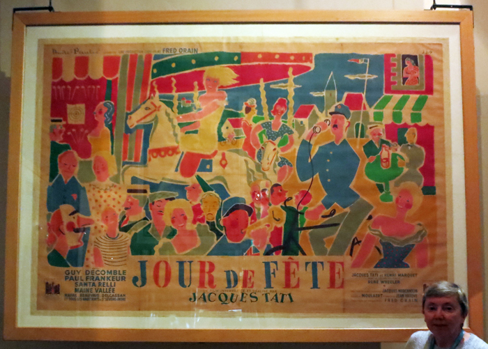
Kristin and a big poster for Tati’s Jour de fête.
Beach blanket ballads: SUN & SEA (MARINA)
Sun & Sea (Marina) (Rugilė Barzdžiukaitė, Vaiva Grainytė, and Lina Lapelytė, 2019).
DB here:
Excitement, shock, tension, maudlin sentiment–these and other emotional qualities are pretty common in artworks. But how often do we get what I’m forced to call anxious languor? That seems to me the dominant expressive quality of the remarkable Lithuanian opera Sun & Sea (Marina), which won the Golden Lion for Best National Participation at the Venice Biennale.
It’s not a film, but having read about it before going to the Mostra, I was keen to see it. Kristin and I were not disappointed. It’s the work of director Rugilė Barzdžiukaitė, writer Vaiva Grainytė, and composer Lina Lapelytė. You can watch extracts here and here and here.
Video clips, or indeed a full-length record, can’t capture this unique spectacle. And of course it set me thinking about film.
Duet in the sun
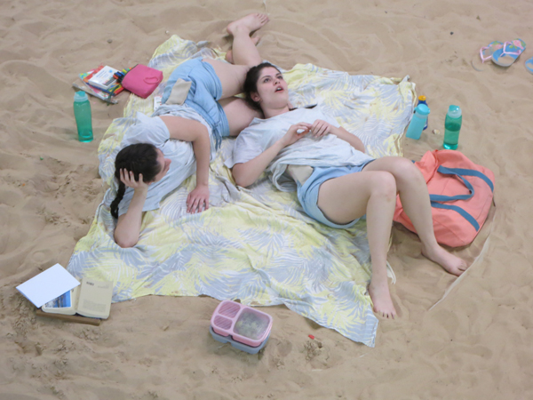
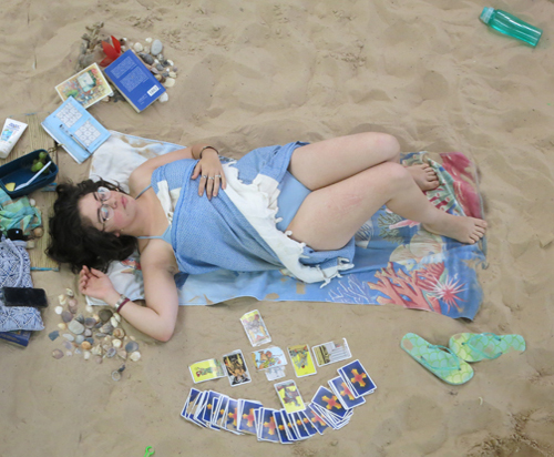
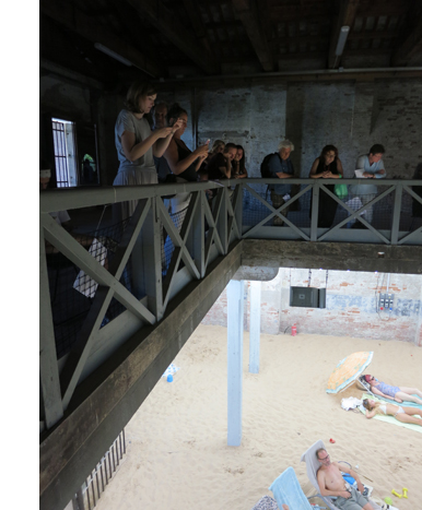
Sun & Sea: Marina portrays a group of people at the beach. Instead of being mounted on a stage, the action, such as it is, takes place on a ground floor of a warehouse. You view the ensemble from catwalks above. On the sand below are pastel beach blankets, personal belongings, and some litter. Thirteen singers and some civilians lie reading or snoozing or listening to cellphones. A woman deals out Tarot cards. There’s a little boy playing in the sand, dudes tossing a frisbee or playing badminton, and occasionally a couple’s dog needs walking. The dog barks from time to time.
The piece lasts about seventy minutes, recycled so you can enter at any point. At the Biennale, it was initially open only one day a week, but later you could attend on either Wednesday or Saturday. The queue wasn’t impossible; I think we waited about half an hour.
The looped nature of the presentation works against there being a plot, and there’s scarcely any characterization. The libretto identifies the Wealthy Mommy, the Volcano Couple, the Workaholic, the 3D Sisters (twins), and others, but when you’re watching it, you’re much more aware that this is about particular bodies in a specific space.
The music, in the lyrical minimalist vein, consists mostly of arias, characters’ soliloquies backed up choral passages. There’s an organ ostinato recalling Philip Glass and tunes that reminded me of the lilting faux-naīveté of Meredith Monk. The rhythm is alternately solemn and bouncy, the phrases are brief, and the mood of the whole score seems summed up in the soaring Chanson of Too Much Sun:
My eyelids are heavy,/ My head is dizzy,/ Light and empty body./ There’s no water left in the bottle.
Some of the arias, like this one, report thoughts caught in the moment. The first and last songs are Sunscreen Bossa Novas, sung by a middle-aged woman worrying about protecting her skin. Another woman complains about dogshit and spilled beer in the sand. One of the most moving passages is the Chanson of Admiration, a breathy soprano solo:
What a sky, just look, so clear!/ Not a single cloud,/ What is there?–seagulls or terns?/ I can never tell./ O la vida/ La vida…
 Other characters provide dramatic monologues. The Workaholic sings the Song of Exhaustion, an admission that even relaxing, he can’t slow down. (“My colleagues will look down on me. . . . I’ll become a loser in my own eyes.”) Still others tell stories. A woman recalls her husband’s death while swimming with his girlfriend. A house guest learns that his host has a brain tumor. A couple talks about catching an early-morning flight. Most abstractly, the Philosopher thinks about globalization: how strange to play chess (a game of Indian origin) on the beach while eating dates from Iran and wearing a swimsuit made in China.
Sun & Sea (Marina) has been considered a commentary about our poisoning the planet, and the booklet included with the LP of the score includes essays about climate change. But the opera as staged invokes the crisis obliquely and poetically. One passage notes that the seasons are out of joint at Grandma’s farmhouse, with frost and snow in May and Easter weather during Christmas. It’s presented not as a warning but as a puzzling development. A recurring line in the songs is “Not a single climatologist predicted/ A scenario like this,” and it’s applied to love affairs as well as volcanic eruptions. The crises of the Anthropocene era are refracted through personal relationships.
Environmental degradation is registered through the sensibility of drowsy vacationers. The twin sisters are distressed to learn that coral and fish will perish, but they console themselves that a 3D printer will produce enduring copies of everything, including the girls themselves. (“3D Me lives forever.”) Even pollution right under your nose is filtered through the dazzling torpor of a day at the beach. One of the loveliest songs invites us to imagine that the sea is acquiring new beauty.
Rose-colored dresses flutter;/ Jellyfish dance along in pairs–/ With emerald-colored bags,/ Bottles and red bottle-caps./ O the sea never had so much color!
In all, though you might register some perturbations in the ecosystem, you come away from lolling on the sand feeling pretty good.
After vacation,/ Your hair shines,/ Your eyes glitter,/ Everything is fine.
Eisenstein on the beach
What about cinema? Seeing something so resolutely presentational makes you think about what film can’t do. The online videos only hint at the decentered, dispersed quality of the opera. Some of the action takes place directly under the catwalks, so you can’t take in the ensemble at a single glance. We had to move around to get a sense of what had been happening underneath us.
Just as important, nobody in the audience is significantly closer to the stage than anybody else. Cinema of course has what Noël Carroll has called variable framing, the ability to change the scale of the material in the image (through cutting, camera movement, zooming, optical effects, digital postproduction). Even in proscenium theatre, the people in the orchestra see more details than those in the balcony. But Sun & Sea (Marina) keeps everybody pretty much at the same distance from the spectacle. We can fixate on some figures rather than others, and we can enlarge them artificially via the zoom on our cellphones, but the naked eye has to take in the whole thing at once, all the time. And even that’s not really the whole thing.
The sense of dispersed action is strengthened by the surround-sound speakers. They delocalize each voice. You have to search the array of bodies to find the soloist, and when a song is tossed from singer to singer it scrambles your attention. This might remind a cinéphile of Jacques Tati’s compositional strategies, particularly in Play Time, where long shots coax us to scan the image to find a sound’s source. But at least Tati had a more restrictive frame. Sun & Sea (Marina) plants us in a three-dimensional field with only partial access to the entire scene.
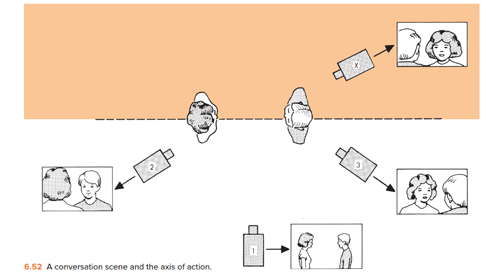
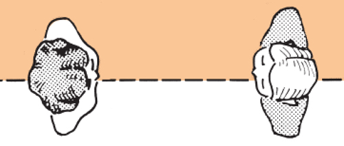
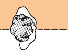
That access is, of course, a very unusual one. When I was first studying classic continuity editing, with the 180-degree rule and matches on action and all the rest, I wondered: Would that system work if the camera were pointing straight down at the actors? That is, what if we constructed a whole story from variants of the bird’s-eye view we use to diagram spatial layouts? Instead of this:
We’d have movies with shots like this.
We’d apparently lose the eyeline match, at least! We’d also have to distinguish characters in unusual ways, by hats and hairstyles and maybe boutonnieres. But I was assuming a drama in which people moved around on foot and had face-to-face encounters. Sun & Sea (Marina) suggests that another way to build a vertically viewed spectacle is to show people sprawled out on belly, back, or side–postures motivated by the beach setting.
Then perhaps we could, through editing, create “reverse angles” from straight down. Or couldn’t we?
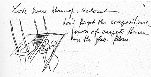
Actually, as usual, Eisenstein was there ahead of us, in his plans for The Glass House, a film set in a skyscraper made of glass. The transparent walls would let us see what’s happening next door, while the floors would create a stacked space, presenting actions from more or less straight down. Naughty as he was, he even conceived a “Love scene through a water closet.”
In one note, he called the film’s view “A Hovering Space”–not a bad description of what we see in Sun & Sea (Marina).
I’m still thinking about this remarkable piece of work, about the anxious languor it projects and its ways of building a scattered scene out of microactions. But I’m also enjoying remembering the sheer sensuous pleasure of it. I hope that somehow I get to see it again. I hope you can too.
Our visit to the Biennale was made possible by the generous invitation of Peter Cowie, Savina Neirotti, Paolo Baratta, and Alberto Barbera. As ever, we appreciate the kind assistance of Michela Lazzarin and Jasna Zoranovich. Michael Philips of the Chicago Tribune and Keith Simanton, Senior Film Editor and Content Manager of IMDB, accompanied us to the show and proved fine company.
There’s a very informative interview with the artists (who have been friends since childhood) here at BarbART. It includes footage from their earlier collaboration, Have a Good Day! Background on the artists can be found at Neon Realism. The score is available as an LP. It includes a custom code for downloading an mp3 file. Beware: Many earworms wriggle within.
Of course Sun & Sea (Marina) reminds you of another Tati masterpiece, M. Hulot’s Holiday. Kristin long ago wrote a careful analysis of that film with a title I might have borrowed for this: “Boredom at the Beach.” It’s in her collection Breaking the Glass Armor: Neoformalist Film Analysis. Also on Tati: Watch for Malcolm Turvey’s excellent forthcoming study Play Time: Jacques Tati and Comic Modernism.
The diagram of the 180-degree editing system comes from Film Art: An Introduction. Photos in this entry by DB.
P.S. 15 September 2021: Sun & Sea (Marina) is coming to the Brooklyn Academy of Music.
Sun & Sea (Marina) (2019).


