Archive for the 'Film archives' Category
An old-fashioned, sentimental avant-garde film
Kristin here–
A great many silent films that were almost impossible to see when David and I were in graduate school are now available on DVD. And it’s not just a matter of titles becoming available. In those days we might be able to see a classic film, but it was likely to be a shortened, fuzzy version made from a worn distribution print. Now government support for film archives and revenues from home video have promoted many more restorations. There are still companies releasing poor-quality DVDs of silent films, but beautiful prints, complete with tinting, toning, hand-coloring, and specially composed musical tracks, as well as supplementary material, are becoming more common.
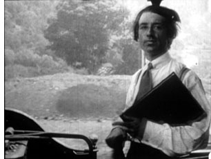
A case in point is the new DVD version of Abel Gance’s 1922 epic, La roue (“The Wheel”), which the enterprising company Flicker Alley released last year. In its short existence since 2002, Flicker Alley has done exciting work. Its recent “A Modern Musketeer” collection finally makes a selection of Douglas Fairbanks’ pre-swashbuckler comedies and dramas available. I personally prefer these lively, witty, imaginative films to Fairbanks’ 1920s costume pictures. Flicker Alley’s George Méliès set is one of the great achievements of DVD production and deservedly won last year’s prize for the best silent DVD set at Il Cinema Ritrovato. Other highlights include F. W. Murnau’s rare psychological drama Phantom (1922) and Louis Feuillade’s serial, Judex (1917). I wrote about Flicker Alley’s release of Discovering Cinema, on early sound and color.
David and I first saw La roue in 1973, in a 16mm print at George Eastman House. It lasted around two hours projected at sound speed. We had another chance to see it at a 1979 screening of a 35mm nitrate print at the Museum of Modern Art. Again, it was a truncated version. In short, you had to see La roue at an archive.
The restoration
The original 32-reel version would have run between seven and eight hours. That doesn’t survive, but versions longer than the ones we had seen survived in various collections. A more common release version made in the 1920s reduced the film to 12 reels, or about three hours. Other still shorter versions also circulated.
Flicker Alley’s version is none of these. The liner notes say that it’s 20 reels, and it runs about 260 minutes. (The total time given on the box is 270 minutes, which I assume includes an eight-minute making-of supplement.) So what we have here is not an approximation of one of the release prints, but an attempt to reassemble as much footage as possible.
Here’s what Flicker Alley’s press release said about the restoration:
La Roue was originally shown in France over three days, in 32 reels, with a running time of almost eight hours, but was soon shortened to 12 reels, the maximum length for a typical feature film at the time. This new restoration, produced by Eric Lange, David Shepard and Jeff Masino with invaluable support from Turner Classic Movies, began with a 35mm master positive of this 12-reel version, a Russian print of an 8-reel version, two incomplete tinted nitrate prints of a longer French version, and finally, for two short but critical scenes, a 4-reel abridged version released by Pathe on 9.5mm for home movie screening. Conflating all of this material, the Lobster Film Studios restoration team headed by Eric Lange was able to prepare and digitally restore a 20-reel version, by far the most complete edition of La Roue seen anywhere since 1923. This release possesses exceptional pictorial quality and English titles that use the type font and moving photographic backgrounds of the original film.
The notes call this restoration “the fullest presentation of La Roue to reach the public since 1923,” which may or may not be true. I have seen a print of La roue of roughly the same length which has a significant number of scenes that aren’t present in the Flicker Alley release-and lacks several of the scenes included here. That was at the Royal Film Archive of Belgium, though they don’t hold the original material on it; that’s in a French archive. That version runs 287 minutes at 18 frames per second; I can’t find an indication of projection speed on the DVD, though I would guess that it’s comparable.
I definitely don’t want to suggest that the Flicker Alley DVD is not worth buying or viewing. Quite the contrary, it’s a valuable release of an extremely influential and important film. Perhaps a longer version will eventually be assembled, but I doubt that will happen any time soon. Those who have been waiting for years to see La roue should pounce on this, and it’s ideal for instructors who want to show clips of highly influential sequences in classes.
The visual quality of the print is mostly excellent, apart from a few passages where the restorers had to use a 9.5 mm print to fill in a few scenes–and even those look pretty good. Blue tinting is used in the night scenes, and the film is accompanied by Robert Israel’s effective score.
Gance’s innovations
[SPOILER ALERT]
Gance has many ardent admirers, to judge by the effusive reviews of the DVD on Amazon. But I find his major silent features a maddening blend of exciting stylistic innovation and old-fashioned, maudlin storytelling. La roue was, as far as we know, the first film to use rapid, rhythmic editing, at times going down to single-frame images. It’s also full of the subjective camera techniques typical of French Impressionist filmmaking: out-of-focus shots, white masks, superimpositions, and so on.
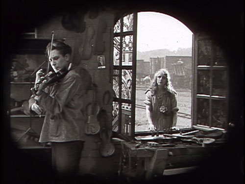
The plot, however, is simple and melodramatic; it centers on Sisif, a train engineer, and his secret adopting of a little girl who survives a train wreck in the opening scene. Norma grows up assuming herself to be his daughter, and Sisif’s son Elie, a sensitive violin-maker, believes her to be his sister. Sisif falls in love with her but stifles his feelings, giving her in marriage to a rich man whom she doesn’t love. When Elie learns the truth, he comes to love her as well but also hides his secret. A great deal of suffering ensues, over which Gance lingers lovingly with many shots of agonized faces.
Most famous are three scenes. The film’s action begins dramatically with the train crash, vividly rendered in many fairly quick shots. In the second, Sisif decides to crash the train in which Norma is traveling to her marriage. Even faster, accelerating editing conveys both Sisif’s anguish and Norma’s growing alarm. It’s a bold and suspenseful scene, and required viewing for anyone interested in silent cinema and the history of film style. The second passage comes after a fight between Elie and Norma’s husband that ends with Elie dangling from a tree root over a cliff. As he hears Norma approaching in an attempt to save him, their life 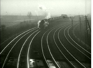 together literally flashes before his eyes in a series of shorter and shorter shots that end with a flurry of single-frame images that end with his fall.
Much of the imagery is also beautiful, in particular the shots of trains passing sinuously along rails, a motif that punctuates the film.
These innovative scenes and other flashy techniques tended to be retained as distributors cut out more and more footage. What got trimmed seems to have been details of the quadruple romance plot. Scenes in the Belgian print that aren’t on the DVD include two brief ones indicating that the husband’s fortunes are declining. This sets up for the moment when Norma is revealed to have been left destitute after his death, a development that comes abruptly in the DVD version. The Belgian print also contains a rather silly scene in which Sisif talks to his train engine and imagines it replying to him.
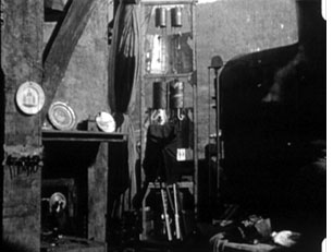
Modern viewers may find it a bit disconcerting that the interior scenes of Sisif’s small house, built between the rails in a real train-yard, are lit with bright sunlight. Immediately after World War I the French film industry was short on studios and lighting equipment. Using open-air sets and full sunlight was not uncommon there or in countries with small film industries.
A brief but valuable bonus
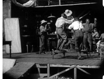
Most films of this era did not have making-of documentaries. In this case, though, poet Blaise Cendrars, a great cinema enthusiast, filmed some scenes of Gance and his team at work and put together a fascinating short. A couple of shots show the camera used to film the tavern scene mounted on a dolly.
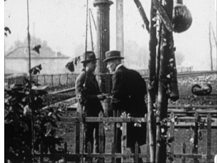
One view reveals just how close to the rails the sets for Sisif’s house were built. Trains passed so close to them that someone had to be stationed nearby to warn the crew of oncoming trains. Cendrars also recorded a visit Charles Pathé paid to the location, and there’s a heroic view of the director in the cab of a moving locomotive. This film has hitherto been très rare, so we are lucky to have it now.
The booklet accompanying the discs has an excellent essay on the history of the production by William M. Drew and notes by Israel on his score.
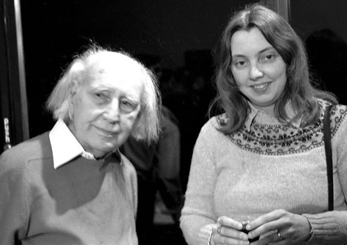
David insisted on having the photo at the bottom included among the illustrations. Gance appeared at the Walker Art Center in Minneapolis when he was 91 years old, which means that must have been in 1980. He had come to introduce a screening of Bonaparte and the Revolution, an early attempt to restore Napoléon vu par Abel Gance. At a reception afterwards, M. Gance was gracious enough to inscribe a photo and our copy of a book he had published in the 1920s, purchased back in the days when one could still find such things fairly readily in Parisian used bookshops. He also let David take a picture of him and me. He died the following year.
Note: Filmmaker and blogger Kevin Lee has created two more of his “Shooting Down Pictures” video analyses, with me speaking about La roue (five minutes) and Variety (six minutes) to clips Kevin has edited.
Preserving two masters
Kristin here—
This past weekend the University of Wisconsin-Madison’s Cinematheque played host to Stefan Drössler, the head of the Filmmuseum in Munich. The Filmmuseum is a major force in film restoration, and on Saturday we were treated to a much longer print of Ernst Lubitsch’s 1922 epic, Das Weib des Pharao, than had previously been available.
Lubitsch on the verge of going Hollywood
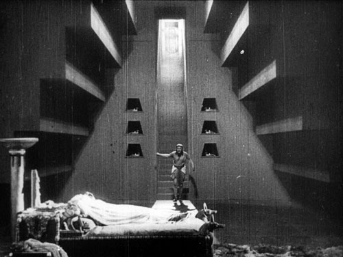
This restoration came too late for me to see it before my book on the director’s silent features, Herr Lubitsch Goes to Hollywood (2005), was published. Not that that was a problem. I was dealing largely with style in that book, and the old version furnished plenty of examples to support my point. I argued that Das Weib was a turning point in Lubitsch’s career. It was the first film he made after the German ban on film imports was lifted and he was able to see recent Hollywood films for the first time since the war. It was also made with American financing, offering him the chance to work with American cameras and lighting equipment—an opportunity that gave him much more stylistic flexibility.
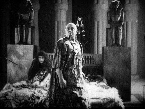
As a result, Lubitsch goes from using mostly flat, frontal light to employing the recently developed three-point lighting system. The frame above shows a very Hollywood-style lighting layout, and that’s fairly typical of this film.
Of course, it was a treat to see the film with so much new material. As I recall, the old version ran about 40 minutes, while this one is 110 minutes. There’s still footage missing, replaced in this print by still photographs and summary intertitles. Still, the plot makes a lot more sense. For the most part, the visual quality is better. The restoration depended on footage supplied by a number of archives, however, and the occasional inferior shot indicates that a less well-preserved print had to be used as source material.
The story, set in ancient Egypt, is rather clichéd and the characters little more than ciphers. The interest lies mainly in the style and the majestic scale of the production. Given a much larger budget than usual and a longer shooting schedule, Lubitsch distinctly outdid his own earlier historical dramas, Madame Dubarry (1919) and Anna Boleyn (1921). Reportedly 8000 extras participated in the battle and crowd scenes, and the sets were erected on a colossal scale. Designer Ernst Stern was a serious Egyptology buff, and despite occasional lapses, the sets, props, and hieroglyphs are a lot more authentic than those in most movies set in this era. The film’s cast also includes a remarkable line-up of some of the most prominent actors of its day: Paul Wegener, Albert Bassermann, Harry Liedtke, and Emil Jannings (above).
Perhaps, as happened recently with Metropolis, a new, complete version of Das Weib des Pharao will someday be found. As Stefan said, however, more footage from Lubitsch’s last German film, Die Flamme (1922) would be even more welcome. An intimate drama starring Pola Negri, it survives in only one tantalizing reel. That footage reveals the director’s rapidly growing grasp of continuity editing as well as three-point lighting. Clearly he was ready to make the move to Hollywood and to even further development as a filmmaker. (My own dream film to be rediscovered would be Kiss Me Again, a completely lost 1925 Warner Bros. feature. Odds are pretty good that the one film Lubitsch made between The Marriage Circle and Lady Windermere’s Fan would be a masterpiece.)
A new Walter Ruttmann DVD
Seeing a 35mm print of such a restoration well projected is the ideal, of course, especially with an expert pianist like the Cinematheque’s David Drazin providing the accompaniment. For those who can’t get to such screenings or who want to study its restorations, the Filmmuseum also makes many of its restorations, as well as art and avant-garde films, available on DVD.
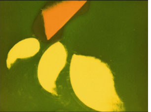 Stefan gave us a copy of one of the latest of these, a Walther (or Walter, as he sometimes spelled it) Ruttmann disc entitled “Berlin, die Sinfonie der Grossstadt & Melodie der Welt.” Actually, that’s a bit misleading, since the DVD actually contains a great deal more than those two features. All of Ruttmann’s surviving films up to 1931 are included. He was on the forefront of abstract animation, and the full series, Lichtspiel Opus I (1921), Opus II (1922), Opus III (1924), and Opus IV (1925), is included here. All have musical accompaniment, including Hanns Eisler’s 1927 score for Opus III. (That’s a frame from Opus I on the left.)
In addition, there’s a group of charming advertising films, all animated. These tend to be abstract and only bring in the product near the end. In doing the short for Excelsior tires, however, Ruttmann obviously found a round, nearly abstract shape that he could play with. A 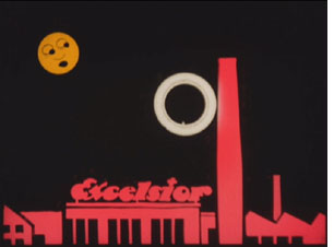 tire rolls around in a flat landscape, having adventures that include going up and down the Excelsior factory smokestack and being threatened by spiky shapes that fail to puncture it.
Apart from these shorts, the two-disc set includes as bonuses a series of 22 paintings and drawings by Ruttmann, a number of texts by and about him, photographs, and so on. There’s also a CD-ROM section with additional documentation, plus a small booklet.
The two features are restorations. If you’ve only seen Berlin on a mediocre 16mm copy, this version should be a revelation. Its visual quality is gorgeous, and it has the original Edmund Meisel score, well played and well synched. The “symphony” aspect of the film makes a lot more sense with this accompaniment.
Melodie der Welt is credited with being the first German sound feature. It’s a lot simpler than Berlin. Financed 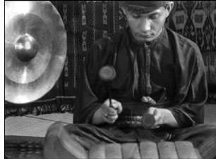 by a steamship company, it purports to follow a sailor on a huge liner around the world to exotic countries. Ruttmann takes footage from English, Greek, Japanese, and other cultures and cuts them together by topic to emphasize the similarities. Religious ceremonies are compared, military exercises intercut, children’s games assembled into a montage, people playing music (right), and so on. The laudable goal is to make customs of “exotic” peoples seem less remote and strange by showing them doing things that are not all that different from what Europeans do. A pity this was happening just before the Nazis sought to eradicate such notions of universal humanity.
This set is just about ideal as a presentation of Ruttmann’s work in this period. I hope that someday a print of his 1933 fiction feature, Acciaio, will become available. It was made in Italy, and although it has been many years since I’ve seen it, I remember it as a very good film with spectacular documentary-style scenes shot in a steel mill—and as a forerunner of Neorealism.
David and I look forward to seeing Stefan at next summer’s Il Cinema Ritrovato festival in Bologna and to whatever new treasures he and his fellow archivists have restored.
Fast forward, now pause
DB here:
Since Kristin got back from Petra (glimpses of her trip are here), we’ve been busy checking the page proofs of the third edition of Film History: An Introduction. It’s due out in February and we have to go over the whole enormous thing, since we’ve made adjustments to almost every chapter. There will be updates of several chapters, as well as two new chapters taking into account developments since our last edition (written in the fall of 2001). We’re also expanding our Notes and Queries supplements, which will appear online. Already our new introduction, discussing some approaches to historical research, is available elsewhere on this site.
This task hasn’t given us much time for blogging. Now, though, we are in a small hiatus before the final push, so each of us hopes to finish a blog entry this week. Kristin will write about a recent visit to Madison of Stefan Droessler, head of the Munich Film Archive. He gave lectures and screened a reconstructed Lubitsch film, The Wife of the Pharaoh (1922). My entry will focus on Wong Kar-wai’s Ashes of Time Redux. I hope to point out some interesting differences among the versions of this remarkable movie.
But to keep your eyes warm, three quick items of note.
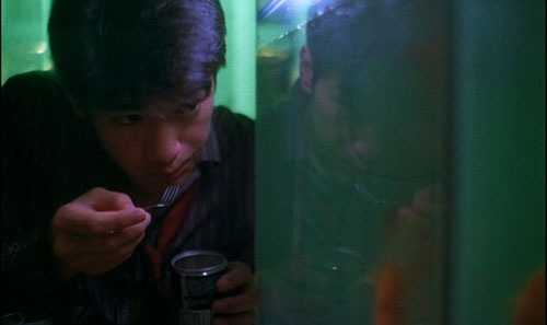
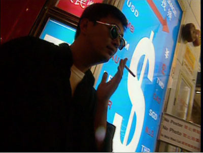
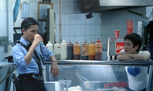
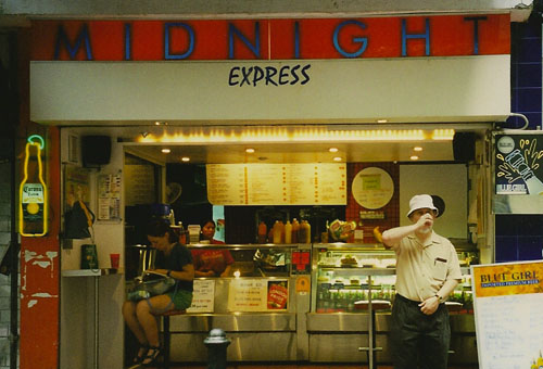
I probably don’t have to urge you to see the new Criterion edition of Chungking Express, out in both standard and Blu-ray editions. It’s the Miramax/ Rolling Thunder version, in a crisp transfer with a nice range of color and detail. (I don’t have Blu-ray and so can’t report on that disc.) There’s also a precious 1996 British TV episode in which WKW and a beer-guzzling Chris Doyle tour some Hong Kong locales we see in the movie, tossing out technical information along the way. The show also supplies a more or less documentary record of the Midnight Express fast-food counter a couple of years after the film. Still later, the success of Wong’s film led the owner to upgrade it, with results you can see at the end of this entry.
In the supplementary short, Chris Doyle catches himself talking like a critic and says it’s because “I’ve been reading Tony Rayns.” Not by chance, the Criterion set includes a superb commentary track by Tony, who has worked closely with Wong and Doyle for years. Tony’s fluent discussion anticipates practically every question you might ask about the movie, including why Faye Wong wears a United Airlines uniform.
Chungking Express is my favorite of Wong’s work, but that’s not the main reason I devoted a chapter to it in Planet Hong Kong. I think it’s an important film historically. In the context of Hong Kong cinema, it was as much a breakthrough as was Days of Being Wild, but its offhandedness made it seem more innocuous. Wong makes daring use of plot structure: two stories, barely linked, that connect thematically rather than causally. (We also examine this aspect in one section of Film Art.) Further, Chungking Express is an exhilarating instance of a type of storytelling that fascinates me, what I call “network narrative” and that I analyze in one essay in Poetics of Cinema. Finally, because this film was more widely seen than Wong’s earlier work, it identified him with a particular style: dazzlingly composed shots alternating with smeared and rushed ones, pulsations of saturated color, precise matching of image to music, and a tone of wistful romanticism. Who else could make such an engaging movie about two guys whose girlfriends have left them?
Across his career, Wong’s technique has been more varied than the flash-and-grab breeziness of Chungking Express, Fallen Angels, and Happy Together suggests. The blurred imagery and stuttering slow motion proved easy to mimic and even parody (in Wong Jing’s Whatever You Want, 1994). In the Mood for Love and 2046 returned to the more precise and controlled staging, the nearly abstract use of setting, and the tight close-ups of Wong’s earliest films. For all their virtues, though, these late movies lack the sheer ingratiating zest of Chungking Express. If My Blueberry Nights disappointed you (as it did me), revisit the original and watch it jump off the screen. Keep an eye peeled for those reflections.
Speaking of new DVDs, today the UPS man lugged a Fox Murnau/ Borzage box to our door. This cost more than my first car (and weighs about the same), but it’s a better bargain. My oil-leaking ‘62 Impala did not come fully loaded with Sunrise and City Girl and Seventh Heaven. Dedicated Fox archivist Schawn Belston has labored hard to create this remarkable collection, as robust a contribution to our understanding of film history as his Ford at Fox box a year ago. Tucked inside the chocolate-colored case are twelve films and two handsome books with texts by Janet Bergstrom. An entire book is devoted to the lost Four Devils, and one disc houses a lengthy documentary on the two directors.
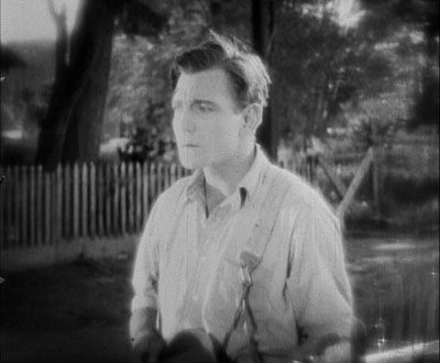
Many of the early thirties Borzages are new to me, and I can’t wait to see them. But Kristin and I are very happy to have two lesser-known titles that we love, Lucky Star (1929) and Lazybones (1925). The latter is a striking example of the trend toward the “soft style” of cinematography that swept Hollywood in the 1920s (and that Kristin analyzes in The Classical Hollywood Cinema). Even men were shot with filters, gauzes, and selective focus, creating lyrical images like the one of our hero above. The soft style was about as popular then as the dark, earth-and-steel tonalities we find in so many films today. When our travails with Film History are ended, we look forward to digging into this new Fox treasure chest.
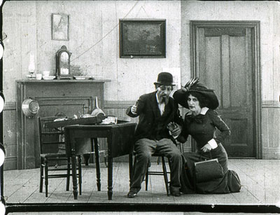
Finally, why not try to identify a mystery movie like the one above? In an email Joe Lindner, archivist at the Academy of Motion Picture Arts and Sciences, writes:
The Nitrate Film Interest Group of the Association of Moving Image Archivists has put together a page on flickr where archivists can post images of unidentified films. The submissions have tended towards silent films and nitrate prints, but sound films and safety elements are welcome as well. The page is also set up for short video clips, and the first video post has just been uploaded from a new scan of a 28mm print in the Academy Film Archive’s collection. This is also a good resource for anyone out there seeking help in identifying film elements, and you do not have to be a member of AMIA to submit images.
This is a remarkable site, and the images are tantalizing. As of this writing, several films have already been identified.
So, three snacks to tide us all over. Check in later this week for some new stuff, when our eyes will focus again.
Rio Jim, in discrete fragments
The first moving-pictures, as I remember them thirty years ago, presented more or less continuous scenes. They were played like ordinary plays, and so one could follow them lazily and at ease. But the modern movie is no such organic whole; it is simply a maddening chaos of discrete fragments. The average scene, if the two shows I attempted were typical, cannot run for more than six or seven seconds. Many are far shorter, and very few are appreciably longer. The result is confusion horribly confounded. How can one work up any rational interest in a fable that changes its locale and its characters ten times a minute?
H. L. Mencken, 1927
DB here:
Between about 1913 and 1920, the way movies looked changed, and we are still living with the results. What were the changes? What brought them about?
I’m just back from Brussels, after a two-week visit to the archive. During earlier trips, I’ve concentrated on examining films from the 1910s that exemplify the tableau tradition. That’s what we might call the stylistic approach that tells the story and achieves its other effects predominantly through staging—by arranging the actors within the frame, forming patterns that reflect what is important at a given moment.
The tableau tradition dominated European cinema of the early and mid-1910s, and it was also on display in the U. S. It is sometimes considered “theatrical” and “uncinematic,” but that’s a shortsighted view. The tableau tradition is one of the great artistic triumphs of film history. For backup on this, consult Ben Brewster and Lea Jacobs’ Theatre to Cinema and my On the History of Film Style and Figures Traced in Light. And you can go here and here on this site.
As the 1910s moved on, the staging-driven approach gave way to one dominated by editing. Roughly speaking, this strategy surfaced at two levels. Directors began to use crosscutting, aka parallel editing, more strenuously. By alternating shots, you could show events taking place at two or more locations. This technique was not used only for last-minute rescues; it was a way of keeping track of all the characters in nearly every sequence, whether they were going to converge or not.
Second, within a single strand of action, 1910s directors exploited analytical editing, breaking down a scene’s space into a host of details. Griffith often gets the credit for this tactic (and he happily claimed to have invented it), but it’s probably most fairly understood as a collective innovation.
Directors in the tableau tradition didn’t entirely avoid crosscutting or analytical editing, but there was a measurable shift of gravity in the second half of the 1910s. In the U.S., many filmmakers pushed editing techniques very hard. You can sense their exhilaration in discovering how editing lets them control pacing, make story points concisely, build suspense, and force the viewer to keep up.
During the 1910s, American movies became breathless. The hurtling pace of Speed Racer or The Dark Knight has its origins here; seen today, The Battle at Elderbush Gulch (1913) and Wild and Woolly (1917) still look mighty rapid-fire. And then as now some observers, like Mencken, complained that it was all too fast and furious.
Over the last thirty years, many scholars have studied this change, but for a glimpse of some supporting data, you can visit the remarkable website Cinemetrics. Yuri Tsivian, Barry Salt, and a corps of volunteer scholars have been measuring Average Shot Lengths in films from all eras. The data from the 1910s are pretty unequivocal. In the US around 1916-1918, movies became editing-dominated, shifting from an ASL of over 10 seconds, sometimes as much as 30 seconds, to 5-6 seconds or less. A 4-6 second average per shot persists in Hollywood through the 1920s, so Mencken’s guess about the “scenes” (as shots were then known) changing ten times a minute was more or less right.
Back in the 1980s, Salt and others, including Kristin and me, picked 1917 as a plausible point of reference for the consolidation of the continuity style. That was the point at which virtually every US film we watched contained at least one example of specific continuity techniques. (Most contained many more instances, of course.) We talk about that magical year in this entry, which you might want to read as an introduction to what follows today.
In just a few years, continuity editing became a coherent, supple means of expression, and it has defined Hollywood film style up to the present. What brought this about? Kristin and Janet Staiger offered an explanation in our 1985 book, The Classical Hollywood Cinema: Film Style and Mode of Production to 1960. They traced out several factors that encouraged and sustained this style. Especially important were the development of longer films, a conception of filmic quality, and the emergence of a specific division of labor.
Lately I’ve been revisiting these early years, chiefly to watch how directors pick up and refine the stylistic schemas that were coming into broader use. I want to know more about the little touches that directors had to control in creating this style. I’ve also been interested in to what extent these techniques were picked up by directors in Europe and Asia. The evidence is pretty clear that continuity cinema became a lingua franca of film style.
So if last year I pondered the minute compositional adjustments of Evgenii Bauer, this year it was all cutting. I focused on three filmmakers, but I’ll save discussion of two of them for a rainy day, or a book. In all, it was a thrill, as ever, to watch a stylistic system coalesce across a batch of films that are seldom mentioned in the history books.
The trail to continuity
The extraordinary films starring William S. Hart typify early American continuity techniques. After a distinguished career on the stage, Hart began as a film actor in 1914, when he was nearly fifty. He was intent on bringing realism to the newly burgeoning Western genre. His films were at first made under the auspices of Thomas Ince, a pioneer of rationalized production techniques, and with his Ince pictures Hart found worldwide success. He followed a rousing feature debut (On the Night Stage, 1915) with many shorter films. In 1917—mark the year—Hart broke with Ince and set up his own firm for The Narrow Trail. He continued to make films into the early 1920s, with Tumbleweeds (1925) marking his farewell to cinema.
Hart often directed his own pictures, though he also had the services of strong directors like Reginald Barker. The films have an assured brio, thanks to careful cutting and some felicitous touches.
They are fast-moving: In the five 1915 Hart films I watched, the ASL ranged from 8 to 11 seconds, but in 1916, the average jumped to 5-6 seconds per shot. The Narrow Trail seems to have an ASL of 3.7 seconds, but I can hardly believe it and I must verify it with another viewing. The 1918 and 1920 films I viewed average between 4.9 and 5.4 seconds per shot.
Just as important as the speed of cutting, naturally, is what Hart does with his cuts. In one scene from Between Men (1916), you can see the tableau aesthetic undermined by analytical editing. Gregg is a shifty stock trader, a species we still nurture. He’s trying to destroy Hampton’s fortune because he thinks that when the old man is destitute he’ll force his daughter to marry Gregg. Hampton has asked Bob White (Hart) to help get the goods on the suitor.
In one scene, the master shot approximates a tableau setup: Bob and Gregg stand in the middle ground, with a room visible behind them.
As the men swap increasingly tense challenges, Margaret Hampton enters the adjacent room and stands behind them as they talk. A director in the tableau tradition would have sustained the master shot and shown Margaret approaching in the background and drawing closer, reacting to what the men say. She could easily have been stationed hovering at the curtain on the right.
Instead, director C. Gardiner Sullivan has her arrive from another doorway in the adjacent room, one not visible in the master shot of the two men. He then cuts back and forth between the men and Margaret, and he positions her at the left curtain–so that the men block her from our view! The blockage motivates cutting to Margaret for her reactions to what Bob and Gregg say.
Only when she wants to challenge Bob’s suggestion that he might marry her does Margaret come into the same frame as the men, who part to make room for her.
It turns out that this sequence is but a rehearsal for a lengthier passage in which Hampton will come in from the adjacent room (via the door we do see in the background). As with Margaret’s entrance, his arrival will be blocked by Gregg’s body, and Sullivan will cut among the trio in the foreground and Hampton’s approach behind them. That passage, which could also have been handled in a single framing in the tableau style, consists of four distinct setups and eighteen shots!
So even depth-based scenes can be recast as rapid découpage. The passage is probably overcut, but you can sense the filmmakers’ exhilaration in their power to chop up the world into separate, slightly jolting bits, forcing the audience to keep abreast of each item of information.
Managing details
The variety of setups is worth noticing in another film, for here we can see the filmmakers taking pains to show each bit of action most clearly and emphatically. In The Return of Draw Egan (1916), when Egan sees the mayor’s daughter Myrtle he decides to stay on as marshal of Yellow Dog. The first shots show them looking at each other.
The next pair of shots shows the two looking at each other in close-up.
This gradual enlargement of the figures in a reverse-shot sequence would of course become a staple of analytical editing—perhaps it already was in 1916. Cut back to another framing of Egan, as the mayor signals Myrtle to join them. The slightly off-center composition reiterates her position off left.
Cut back to Myrtle, exiting her close-up. The next shot shows her joining the men, to be introduced to Egan.
But this is a different camera position than the one showing the men just previously. The daughter’s entrance has motivated a slightly changed composition. In the 1910s, cutting began to dictate staging, so that each composition had to fit smoothly into the flow of shots.
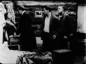
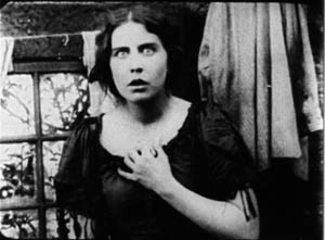
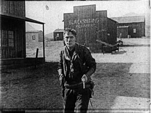
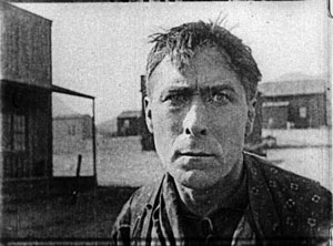
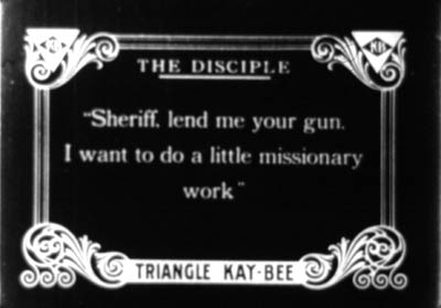
This sequence from Draw Egan doesn’t utilize axial cuts, those cuts that keep to the same angle and move straight in or out. Here the actors are angled to suggest that we are to some degree in between them. Indeed, sometimes the camera will put us directly between the characters. Here is a climactic confrontation from The Disciple (1915). A doctor has cuckolded Hart, but Hart brings him to save his daughter. As the doctor enters, the wife’s shameful look is met by Doc’s anxious expression, with a furious Hart pressing a pistol to his back.
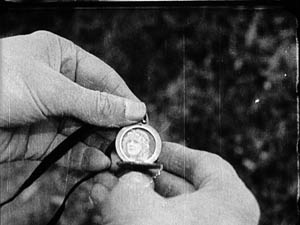
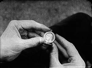
This freedom of camera placement extends to point-of-view cutting. Again, this is an old technique, but like other old techniques, it was revived and refined as part of the synthesis that became the continuity style. So Keno Bates, Liar (1915; a splendid title) can make use of a cameo picture that captivates Bates after a shootout with the man who robbed him.
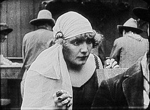
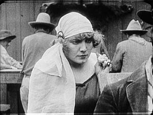
Later, the dance-hall girl catches sight of her rival when Bates muses on the cameo.
The pov framings don’t change much, but the angle chosen easily approximates both Bates’ view and her view over his shoulder. Moreover, the shot of Bates’ hands isn’t the sort of vacuous insert we often see at the period, with a letter or an object isolated against a blank ground. Here, the backgrounds change, so that the first shot is situated naturally in the wild, while the second is consistent with the barroom locale.
Putting the pieces together
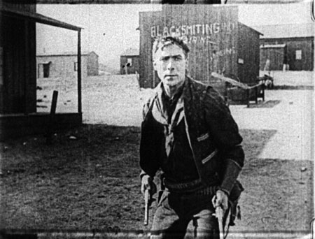
From very early in the history of Westerns, the main street shootout seems to have been a solid convention. Already in The Return of Draw Egan, it’s treated with a vitality and ingenuity that suggests creative reworking of a staple. The climactic shootout also shows just how flexible the new technique could be.
Egan has told his enemy, Arizona Joe, that he’ll meet him when the setting sun’s rays hit the saloon window. So the film crosscuts Egan in his marshal’s office with a nervous Joe, seen in close-up, eyeing the window.
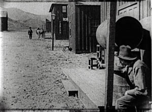
When Joe gets up the nerve to leave, he hides behind a barrel and waits to ambush Egan. When Egan leaves his office, a reverse tracking shot follows him striding toward us.
Then we get an orienting long shot with Joe in the foreground and Egan approaching.
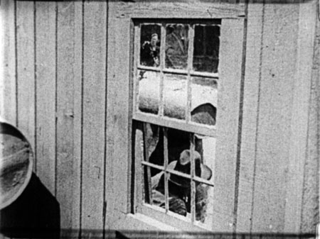
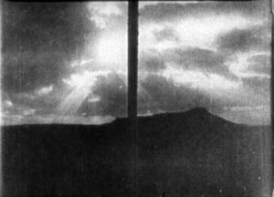
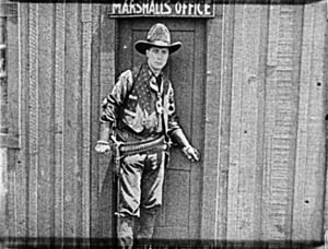
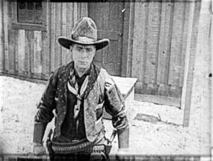
Edging sideways, Egan spots a reflection of Joe’s head in a window. These shots surmount today’s blog entry. You can see Egan’s reflection in the upper left pane.
Now aware of Joe’s tactic, Egan steps diagonally forward, coming ominously right up to the camera.
He fires and dispatches Joe. The townsfolk, who have been huddled in a house watching, declare they want Egan to stay on as marshal, despite his outlaw past. Myrtle chimes in, and we get a happy ending. Chaotic fragments? Mencken couldn’t have been more wrong. Or maybe he was just being grumpy.
The trail to Hollywood
There’s plenty more in these films—beautiful, sometimes minuscule matches on action; subtle timing of frame entrances and exits; and even proto-over-the-shoulder reverse shots. And we don’t have to claim that Hart’s films are the only innovative ones. They take their place within a broader, collective achievement that we still haven’t fully grasped.
Editing permitted everyone to act at small scale; the bargirl who sees Bates’ cameo need only lower one fist, tighten the other, and narrow her eyes to express her jealousy. The new style nurtured laconic stars like Hart. His films are full of pathetic situations that demand he display stoicism but also sensitivity. The long shots could emphasize his gestures and stances, while close-ups could display his worn, haunted face and pale eyes. He acts with those eyes, glancing aside to recall a traumatic event or looking downward as he hesitates to break bad news. Often the plot demands that he conceal his feelings or hide the truth behind an event, and the changing shots could penetrate the surface drama and highlight his slightest reactions. Hart could underplay his role because the editing shows us everything he might have said.
Known in France as Rio Jim, Hart was very influential on the Europeans. His pictures, along with De Mille’s The Cheat (1915) and the films of Chaplin and Fairbanks and many others, offered tutorials in the new style. Arguably, the cumulative force of these mainstream releases was greater than the influence of Griffith’s more prestigious output of the moment. There was only one Intolerance (1916), the film by which Griffith was most widely known abroad, but week by week the Westerns and comedies and dramas pouring out of Hollywood flaunted a new, almost frighteningly energetic approach to cinema.
Timing favored the Americans. The style emerged at around the start of World War I, when hostilities gave U. S. films a chance to displace the big French and Danish companies in many markets. Kristin explains how this happened in Exporting Entertainment, and she talks about the exceptional case of Germany in Herr Lubitsch Goes to Hollywood.
Some European directors picked up the new style immediately, others took a bit longer, and a few, like Feuillade, never fully adjusted to it. The principles of the older tableau style never utterly died out, as I try to show in Figures Traced in Light. But the future belonged to the editing-based aesthetic. Canonized, tweaked, updated, dismantled, undermined—however filmmakers reacted to classical continuity, it became the basis of international cinematic storytelling.
My epigraph comes from H. L. Mencken, “Appendix from Moronia: Note on Technic,” from Prejudices: Sixth Series (New York: Alfred A. Knopf, 1927), rep. in Phillip Lopate, ed., American Movie Critics: An Anthology From the Silents Until Now, expanded edition (New York: The Library of America, 2006), 35-36.
Silent film speeds can vary, so shot counts can yield different averages. I saw some of the Harts I mention in projection at last year’s Il Cinema Ritrovato, and they were projected at 18 or 19 frames per second, a common speed for the period. My ASLs are based on the running time. For the titles I saw in Brussels on a flatbed viewer, my basis was the length in meters. From that I’ve calculated running times and averages, assuming 18 frames per second. Projectionists of the time had freedom to screen at different speeds, so it’s possible that late 1910s Hart films were sometimes shown at 20 frames per second, which of course would make their cutting pace even faster.
For more on Hart’s career, see Diane Kaiser Koszarski, The Complete Films of William S. Hart: A Pictorial Record (New York: Dover, 1980). Koszarski devotes space to each film, with credits, excerpts from contemporary reviews, and excellent production stills. She also provides a sensitive critical overview. In William S. Hart: Projecting the American West (Norman: University of Oklahoma Press, 2003) Ronald L. Davis has given us a brief, engrossing biography based on interviews and extensive archival research. Hart’s memoir, My Life East and West (1929, reprint 1994) is of course indispensable.


