Archive for the 'FILM ART (the book)' Category
The boy in the Black Hole
PTU.
DB here:
Films from Hong Kong’s Milkyway company earn a lot of praise for their visual qualities. Shooting in Technovision, Johnnie To Kei-fung and other directors have created some of the most vivid and fluid imagery in contemporary cinema. But the movies have soundtracks too. What about them?
When I saw Tsui Hark’s Time and Tide (2000), I staggered out exhausted. I was overwhelmed not only by the delirious plot and its cascade of feverish imagery—who else puts the camera inside a dryer at a laundromat?—but also by what seemed to me the most elaborate soundtrack I’d ever heard in a Hong Kong film.
Shortly after seeing the movie, I visited the Milkyway headquarters and met Martin Chappell, the sound designer of Time and Tide. (For his credits and his company information, go here.) I figured that he could help me hear more in all movies, not just his own.
Years later, during my spring visit to Hong Kong, I got my wish. Martin gave me an interview and sent me several information-packed emails. As I’d hoped, he taught me to listen better.
At the console
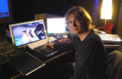
Martin Chappell is a concussive burst of enthusiastic energy, an impression aided by the fact that he looks about sixteen. He loves moviemaking and sound design. Growing up in England, he started as a bass guitarist and audio fan, and he studied music and acoustics. When he graduated he worked in sound studios and became a roadie. After a year in Australia, he moved to Hong Kong and got a job in a radio station.
Soon he was working at TNT, creating sound effects for cartoons and dubbing American movies into Mandarin. Hired briefly away by MGM, Martin then shifted to Milkyway. His first effort there was helping on the mix for The Intruder (1996).
Now, with over fourteen years of audio engineering experience, he is sovereign of sound at Milkyway. Ensconced at the heart of Milkyway’s facility, Martin presides over what he calls the Black Hole. The company’s sound studio consists of several rooms, including a Foley studio that is a black hole within the Black Hole.
By Hollywood standards, these studios are minuscule. (Compare the mixing theatre I visited last year for 3:10 to Yuma.) As usual in Hong Kong cinema, work must be fast and tight. Martin typically has a sound crew of three, sometimes including Foley artists. Postproduction sound is usually allotted three weeks, sometimes a little longer. Often he has to prepare a mix on short notice so that visiting critics, festival programmers, or backers can preview a work in progress. As a result, Martin can be found in the Black Hole far into the night, blasting through reel after reel.
Waiting for no man
Most Hong Kong films have a bare-bones approach to sound: dialogue, music, and minimal effects. The sort of detailing that Hollywood offers, especially in Foley techniques, has not been common. There simply isn’t the time and money for a densely mixed track. A lot of time has to be allotted for dubbing the film twice, once in Cantonese and once in Mandarin for the mainland and overseas Chinese market. As a result, even the best Hong Kong films often have a dry, vacant ambiance, which is commonly masked by music. (Perhaps the wall-to-wall music in Wong Kar-wai’s films is an effort to supply a rich sound texture in the absence of other options.)
But Time and Tide had more resources. As part of a Sony initiative to expand into Asian production, which also yielded Crouching Tiger and Kitano’s Brother, it had a large budget by Hong Kong standards. Martin had three months for sound postproduction, “the longest schedule I’ve had in my life,” and a sound crew of eight.
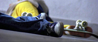
Martin found Time and Tide “a beautiful learning experience.” Working around the clock under the tutelage of veteran postproduction supervisor Hui Koan (The Blade, The Legend of Zu), Martin was encouraged to take chances. He could create rich Foley tracks—remember the tinny ricochet of the little boy’s abandoned skateboard?—and he borrowed ideas from Fight Club, Gladiator, and The Matrix. He was layering sound in the Hollywood manner, albeit on a smaller scale. And he pushed toward wilder possibilities. He recalls the pleasure of putting jungle bird calls under early shots of clubbers wandering through nighttime traffic.
Out and about
Hong Kong looks lovely, but Martin thinks that it’s just as breathtaking in its noise—“a rich sonic soup.” Virtually every chance he gets, he heads out to record in the field.
I pretty much never leave home without my Edirol R-09, and I have a Zoom HR for portable hard disc recording.
It’s important to have a recorder with you all the time. You never know when some drunk is going to burst into song whilst lying in the gutter. In Sparrow, Simon Yam challenges Ka Dung to steal the cop’s handcuffs when they’re outside a bar late at night. So I just pulled the recording I’d made earlier of some drunk guys singing karaoke. It was late one night, I was walking back from the pub, and I heard it echoing out an alleyway.
I feel I’m incredibly lucky. I went out one night to get fresh recordings of a minibus for Linger. I’d scouted the spot, but when I got there the heavens opened and I didn’t have an umbrella. I ran to a nearby bridge—serendipity. I realize it’s next to a tram road, so I recorded buses and trams in the rain, and these sounds feature prominently in Sparrow.
Martin’s wife Marisha often comes with him, either operating or providing effects herself. Recording on the fly freshens up his library, and keeps him alert to new possibilities.
I’m always hoping for a gift from the Ear in the Sky. I’m actually trying to type quietly now, but there’s a band playing downstairs and it’s coming through the walls. They sound terrible, but I think it could be used for a bar scene—late night outside somewhere? . . .
You can see Martin on location in a two-part TV show here.
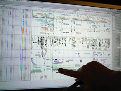
Back in the studio, Martin revels in software like his Digital Performer and Propellerhead Reason programs. His setup isn’t a Mercedes, like ProTools, he says, more of a Lexus—but in some ways it’s more flexible than the more famous option. Johnnie To wants rich tracks, so “Now I spend almost all my time on Foley and ambience.” Martin “finds the flavor” of the sound through his synthesizer.
I load a recording into Reason and I can play with it in real time on my keyboard—pitching it up or down, sweeping the filters, tweaking the equalization. I do so much with ambiance like this. Sometimes I tie it to the picture, other times I just play on a whim. . . . It’s almost fun.
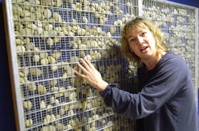
Alongside his high-tech equipment, Martin employs some home-made items, such as his gobo panel, an upright mesh of stones that is virtually a sculpture (above). The gobo can muffle or redirect sound. Placed between two sources, it can allow clean recording of each track.
Every gun makes its own music
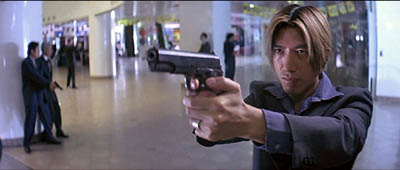
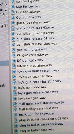
In The Mission, each of the five bodyguards gets a different pistol. Martin gave each one a different sound, labeled in his files by the actor’s name. Here “Roy’s gun” is sometimes coded as “loy’s gun,” and there are plenty of other discrete sound bits on file.
I asked Martin about the mall shootout, which has become a classic in the genre.
There seemed to be so much space in there, and we were adding artificial reverbs, but none of them seemed to work real well. That’s when we decided to experiment a bit, developing things we’d tried in A Hero Never Dies. We just put in the tail of a cannon firing. So that phrase “Bring out the big guns” is literally true here.
There was also a really long gap between some gunshots. We tried adding more, but it felt too busy. So we tried lengthening each gunshot, with the cannon tail reverberating. But that still wasn’t long enough, so we started playing with it, almost jamming with the music. We time-stretched the cannon tails, not just a bit like you’re supposed to. It gave a very artificial but tense sound. If you think it’s music, it might well be.
But even then it wasn’t long enough. So before the next pistol shot, we actually reversed the cannon sound. We get the reversed echo first, then we hear the shot itself! It feels like time has slowed down, then speeded up.
Martin might also have mentioned that these wavering gun reports swoop across left and right channels, creating a dynamic acoustic space for cinema’s most static static gunfight.
Martin also shared his thoughts on the role of sound in fleshing out characterization. After reading Walter Murch’s book In the Blink of an Eye he began to think about how to use sound subjectively. The result was the PTU scene in which Lam Suet, head bandaged, smoking in his car, suffers auditory hallucinations.
Martin acknowledges that there are plenty of conventions that audiences would miss if they weren’t present. When a character hangs up the phone on another character, the disconnected line is signaled through a beep or hum, even though this seldom happens in real life. Martin would also like to hear mobile phone calls in that “headphone bleed-through” effect. He’d also like to handle dialogue like that, “half-overheard, not fully comprehended.”
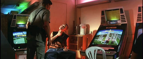
Still, he finds ways to bypass conventions. In PTU, when the officer played by Simon Yam is abusing the suspect in the video arcade, Martin avoided the library whacking sound, what he calls “the Foley kung-fu cloth flap.” Simon’s slaps are synched to explosions, whizzing missiles, and other arcade sounds. (I offer a visual analysis of one scene in PTU here.)
Ear in the sky
Martin believes that in most films, there’s an immediate need to establish the setting, the placement of the characters, and the scene’s mood. This is done through images, of course, but sound plays an important role. Often a wide shot orients us generally, while sound focuses on one zone of action in that space. “I would guess if you watch TV with no sound, it would be very difficult to really focus. Sound can bring out the visual and guide the eye.”
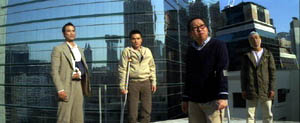
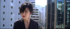
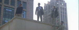
As an example, Martin walked me through a few moments in Sparrow. The elusive Chun Lei has gulled a quartet of pickpockets, and they pursue her to a rooftop. As the men explore it, we hear traffic and a distant plane, which evokes Chun Lei’s plan to flee Hong Kong.
They spot her on the roof. The suggestion that she might jump is underscored by distant traffic horns.
As the men approach Chun Lei, Martin added distant sirens and a soft wind.
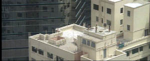
An extreme long-shot provides a still broader sound canvas, with traffic sounds predominating.
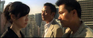
In a much tighter shot, as the actors come closer to the camera, the ambiance thins and softens. “Now we time the traffic to underline the dialogue.” Chun Lei leans forward to kiss Bo, trying to provoke the leader Kei to jealousy. We hear echoes of a passing truck, almost as a warning.
Only professionals would probably notice these maneuvers, and there’s a reason. Martin thinks that sound can bypass the conscious mind, working directly on our most visceral impulses (fight or flight?). In this he echoes Gary Rydstrom, quoted in an earlier blog of ours: “Film sound is the side door to people’s brains.”
I’m grateful to Martin for all the time and effort he put into our interview. Next time I see a Milkyway film, or any movie, I’ll listen harder. You too?
Photo by Martin Chappell.
What happens between shots happens between your ears
DB here:
In Number, Please? (1920) Harold Lloyd plays a lovesick boy who’s been jilted by his girl. Moping at an amusement park, he sees her arrive with a new beau.
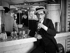
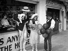
He shifts to another spot to watch them. When she notices him, she scorns him, and he reacts.
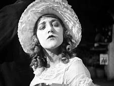
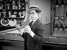
She and the escort stroll past, then she turns and cuddles up to him, making sure Harold notices.
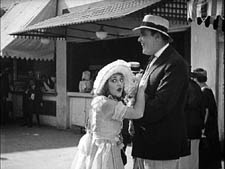
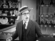
Her flirting precipitates the rest of the action in this very funny short.
In this scene from Number, Please? Harold and the couple aren’t shown in the same frame. The action is built entirely out of singles of Harold and two-shots of the couple, with an especially emphasized close-up of the girl’s snooty reaction. The sequence is rapidly paced and carefully matched in angle; note the shift in eyelines as the girl and her beau walk a little way and then she looks back at Harold.
This approach to building a scene was consolidated in American studio cinema in the late 1910s, as we noted recently, and it soon spread around the world. One of the places it caught on most fervently was Soviet Russia.
Kuleshov glories in the gaps
The great director and theorist Lev Kuleshov always claimed that he and his associates learned the power of editing from American cinema. Russian films were slowly paced, consisting of long tableaus occasionally broken by an inserted closer view of an actor. (For examples, see my Bauer blog entry from the summer.) Kuleshov noted that the Hollywood films brought into Russia grabbed audiences’ interest more intently, and Kuleshov attributed this effect to the fact that the Americans exploited editing more fully, creating the scene out of many shots.
Kuleshov’s example was the formulaic scene of a man sitting at his desk and deciding to commit suicide. The Russians, Kuleshov claimed, would handle this all in one distant framing, with the result that the key actions were just part of the overall view. By contrast, Americans would shoot the scene in a series of close-ups: the man’s face, his hand taking a pistol out of a desk drawer, his finger tightening on the trigger, and so on. This gave the scene a powerful concreteness, and was cheaper to film besides (no need to have a full set).
But most American filmmakers didn’t create the scene wholly out of close-ups. Typically there would be an establishing shot before the action was broken down into detail shots. The process has come to be called analytical editing. (We discuss it in Chapter 6 of Film Art.) As the label implies, the cutting analyzes an orienting view into its important details.
Less commonly, as in our Number, Please? example, American directors could create a scene entirely out of separate areas of space, without ever showing a master framing. This technique, usually called constructive editing, remains common today as well, especially in action scenes.
While praising analytical editing, Kuleshov was particularly taken with constructive editing, because that shows that cinema can call on the spectator’s tacit understanding to assemble the separate shots. Kuleshov realized that we will build a sense of the scene’s space and action out of separate shots without need for the comprehensive view supplied by an establishing shot.
What the Americans developed, the Soviets thought seriously about. Around 1921, Kuleshov and his students mounted some experiments, several of which he discusses in his books and essays. He probably didn’t need to experiment; the American films were full of examples. Indeed, the Number Please? passage is more intricate than any experiment Kuleshov seems to have mounted. But he had a bit of the engineer about him, and he sought to break the technique into its simplest components.
For one thing, constructive editing offered production efficiencies. You could film two actors separately, at different times, and then cut them together. Further, Kuleshov saw that editing could abolish real-world constraints. It created events that existed only on the screen, with an assist from the viewer’s mind.
This is perhaps best seen in his experiment involving an “artificial person.” Evidently it wasn’t a case of constructive editing, because it seems to have begun with an establishing shot. The first shot shows a girl sitting at her vanity table putting on makeup and slippers. A series of close-ups of lips, hands, legs, and the like were derived from different women, and they were edited together to create the impression of a single woman. (Something of this effect survives in the idea of a body double in contemporary films and TV commercials.) But the point is that the woman on screen, made out of different parts, doesn’t exist in the real world.
The same possibility could apply to geography, if we delete the establishing shot. As Kuleshov describes his experiment, we initially get a shot of a woman walking along a Moscow street. She stops and waves, looking offscreen. Cut to a man on a street that is in actuality two miles away. He smiles at her and they meet in yet a third location, shaking hands. Then together they look offscreen; cut to the Capitol in Washington DC. Kuleshov saw the potential for imaginary geography as both a useful production procedure and a demonstration that editing could create a purely cinematic space, one not beholden to reality.
Kuleshov’s most famous experiment, the one he identified with the “Kuleshov effect” proper, involves a stock shot of the actor Ivan Mosjoukin, taken from an existing film. In his writing he’s rather vague and laconic about the results.
I alternated the same shot of Mosjoukin with various other shots (a plate of soup, a girl, a child’s coffin), and these shots acquired a different meaning. The discovery stunned me—so convinced was I of the enormous power of montage. (1)
Kuleshov’s pupil the great director V. I. Pudovkin offers a different description of the shots: a plate of soup, a dead woman in a coffin, a little girl playing with a teddy bear. He also goes farther in reporting how the audience responded. People read emotions into the neutral expression on Mosjoukin’s face.
The audience raved about the actor’s refined acting. They pointed out his weighted pensiveness over the forgotten soup. They were touched by the profound sorrow in his eyes as he looked upon the dead woman, and admired the light, happy smile with which he feasted his eyes upon the girl at play. But we knew that in all three cases the face was exactly the same. (2)
Now it isn’t only geography or a human body that has been created by editing; it’s an emotion.
These experiments have been poorly documented, and only a couple have survived. One consists of fragments of the imaginary geography exercise. Here is Alexandra Khokhlova waving, but we don’t have the answering shot of the male actor responding. The two meet at the foot of a statue.
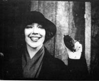
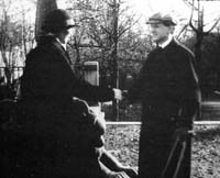
After the two shake hands, they look up and out of the frame, but unfortunately we lack the shot of the Capitol.
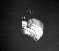
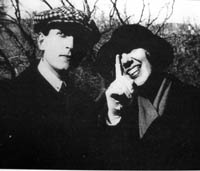
Kristin and other scholars have written more about these surviving fragments, and their essays are published along with Kuleshov’s proposal for funding the experiments and his wife Khokhlova’s memoir of filming them. (3)
It’s worth taking these prototypes of constructive editing apart a little bit. Clearly, there are several cues that prompt us to see the shots as continuous.
One cue is a common background, or at least a consistent one. Kuleshov thought that sometimes a neutral black background worked best, especially for close shots, as you can see with the handshake shot. Another cue is roughly consistent lighting from shot to shot. Yet another is the presumption of temporal continuity; no moments seem to be omitted in the cut from shot A to shot B. It never occurs to us to consider that Kuleshov’s man is looking at something hours or days before the soup is laid on the table in the second shot.
One of the most important cues goes unmentioned by Kuleshov: the very act of looking. Like most commentators, he seems to take it for granted. Yet it’s crucial in prompting us to imagine an overall space in which the actions take place. Knowing the real world as we do, we can infer that if you’re close enough to watch someone, both people are probably in a shared space, such as the arcade strip in the amusement park in Number, Please?
Another cue is facial expression. In his soup/girl/coffin sequence, Kuleshov supposedly picked a shot of Mosjoukin that doesn’t have a clearly identifiable expression. If Mosjoukin was smiling in his interpolated shot, he would presumably seem not grieving but wicked. Normally, though, performers seen in the single shot are expected to express the appropriate emotion more fully, in order to specify what we take the characters’ mental states to be. Our sequence from Number, Please? makes sure we understand the drama by giving the actors unambiguous expressions.
Finally, in the Kuleshov prototypes each shot should be simple. Its action can be stated in a brief sentence. A woman waves. A man responds. A man looks. A plate of soup sits on a table. Even in Number, Please? we can summarize each shot: Harold looks off. His former girlfriend disdains him. That’s to say that the shots are composed to present only one, quickly grasped point of interest.
Filmmakers don’t need to tease apart all these cues; they use them intuitively. Soon after Number, Please?, Hollywood filmmakers were creating amazing passages of eyeline-match editing—the most virtuoso being probably the racetrack sequence in Lubitsch’s Lady Windermere’s Fan (1926). Within a few years of Kuleshov’s experiments, Soviet filmmakers were creating their own masterworks, like Battleship Potemkin (1925) and Kuleshov’s By the Law (1926). Benefiting from a very compressed learning curve, filmmakers took constructive editing to new heights.
Constructive editing, dissolved relationships
Sometimes constructive editing is used to save a scene when production goes astray. When Doug Liman reshot the climax of The Bourne Identity, Julia Stiles couldn’t be on set, so singles of her taken from the first version were wedged in among the retakes, to create the impression that she was watching Jason confront his controller. More positively, a carefully calibrated constructive editing is central to a sequence I analyzed a while back in In the City of Sylvia. For over 100 shots, the spatial relations are built up without an overall establishing shot. (4)
Constructive editing can be used systematically throughout a film. A good example is Alan J. Pakula’s thriller Presumed Innocent (1990). Spoilers coming up!
Harrison Ford plays Rusty Sabitch, a prosecutor in the District Attorney’s office who becomes infatuated with a new woman on the staff. He has a brief affair with her, but after she’s broken it off she’s found brutally murdered. He has to investigate the crime without involving himself, but eventually he becomes the prime suspect.
At the start of the film before Rusty learns of the murder, Rusty and his wife Barbara are shown at breakfast, and establishing shots bring them together.
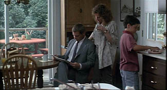
At the office Rusty learns of Carolyn’s death, and after he comes home, the conversation between Rusty and Barbara is treated without an establishing shot. Barbara knows about the past affair, and Rusty is wracked by guilt and shame. The cutting seems to reflect the fact that Carolyn’s death has revived the pain in their marriage.
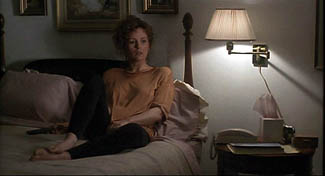
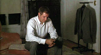
In a series of flashbacks, Rusty relives his affair with Carolyn. Pakula treats their early encounters by means of constructive editing. The common-background cue is especially helpful in this scene in a kindergarten.
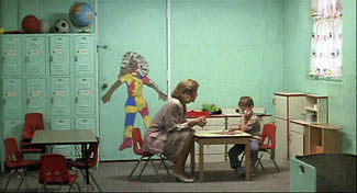
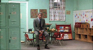
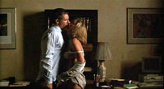
Only after Carolyn and Rusty cooperate and win a child-abuse case does the cutting’s rationale become clear. Pakula has saved the traditional two-shot framing for their moment of passion, as they make furious love in the office.
But soon their affair wanes and Rusty is reduced to watching Carolyn from across the street in point-of-view shots.
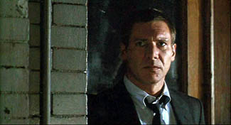
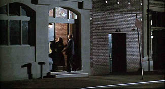
After the flashbacks end, Rusty is investigated and eventually charged with Carolyn’s murder. In these scenes Pakula often situates Rusty and Barbara in the same frame, as if the threat to him has healed the breach between them.
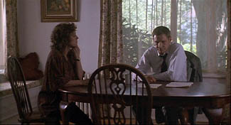
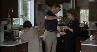
Yet in the film’s climax—and here is the big spoiler—they are pulled apart again. The last scene is a sustained monologue by Barbara. As Rusty listens, across twenty-six shots the two are never shown in an establishing shot.
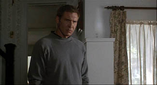
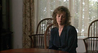
Contrary to the standard Hollywood ending, in which the loving couple embrace in reunion, here they are left divided.
Pakula’s use of constructive editing has effectively traced two arcs: the growth and dissolution of Rusty’s affair, and the reuniting and dissolution of his marriage. In such ways, what might seem a purely local effect, confined to a handful of shots, can create stylistic patterning across a film. The judicious use of constructive editing matches the dramatic development.
Godard of the gaps
Robert Bresson has made more varied and complex uses of constructive editing across a film, as I tried to show in Narration in the Fiction Film and in an Artforum essay. (5) A more radical approach, somewhat in the purely Kuleshovian spirit, can be seen in Godard’s films since the late 1970s. In presenting a scene, Godard often omits an establishing shot, so constructive editing takes over. But he makes the technique quite abrasive and ambivalent.
In watching films like Number, Please? and Presumed Innocent, we fill in the gaps between shots with ease. Godard, however, makes his images and sounds more fragmentary by equivocating about the Kuleshovian cues. The background elements and lighting don’t match entirely; time seems to be skipped over; glances and facial expressions are ambivalent. Adding to these factors, lines of dialogue slip in from offscreen. Godard does present a dramatic scene taking place, but he also creates a sense that images and sounds have been pried loose from their place in an ongoing action, floating somewhat free and functioning as objects of contemplation for their own sake. The cues that Lloyd insists on and that Kuleshov plays with are ones that Godard suppresses or makes ambiguous.
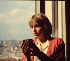
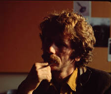
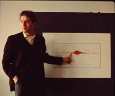
I’ve mentioned this tendency in a recent entry, but to elaborate a little, consider the science lecture in Hail Mary (Je vous salue Marie, 1985). A professor who has emigrated from an Eastern bloc country is explaining his theory that life on earth began and evolved because it was directed by extraterrestrials. No establishing shot of the classroom shows us where he, Eva, and two male students are located, so we have to construct a rough sense of their positions on the basis of a few cues. As Eva, perched on a windowsill, toys with a Rubik’s cube, we hear the professor’s lecture begin to speculate on whether life could have evolved spontaneously. His remarks about sunlight coincide with a burst of sun on her face.
After the Biblical title, “In those days,” we get a series of shots that allow us to apply our mental schema of a classroom lecture: attentive students looking off, a professor at the blackboard.
Lacking an establishing shot, we can’t specify how many people are in the class, nor indeed where Eva and her classmate are sitting—since the professor looks off in several directions during his talk.
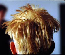
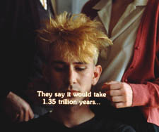
At the end of his talk he remarks, still scanning the room, that we can presume that life exists in space. “We come from there.” At that point Godard cuts to the head of another student, seen from behind. The sproingy haircut is a little explosion of yellow, and it’s accompanied by a burst of choral music. And as the shot goes on, we start to notice that the professor is pacing in the background, out of focus.
The student, whom we’ll learn is named Pascal, asks a question (at least the slight head movement suggests that it comes from him), and the professor replies. Pascal scratches his head as the professor continues, still out of focus. If I had to choose one shot that condenses Godard’s strategy of suppression in this sequence, this shot would be my candidate.
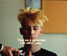
At the end of the shot, the professor asks Eva to stand behind Pascal. Cut 180 degrees and somewhat farther back to Pascal, now seen from the front. The professor’s hand brings the Rubik’s cube into the shot and Eva comes up behind Pascal as the professor passes.
Later she and the prof will become lovers, but Godard lets them meet first as simply two torsos intersecting behind Pascal. The purpose is a demonstration that a “blind” agent can be steered toward a goal through simple yes/no commands. This models the professor’s theory that an alien intelligence could have guided evolution.
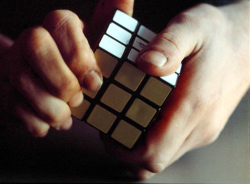
Pascal will twist the facets of the cube under Eva’s hints. Godard makes this a tactile, even erotic exchange, with the close-up of her by his ear and Eva saying, “Yes,” more urgently as Pascal’s hands arrive at a solution, in the close-up surmounting this blog entry.
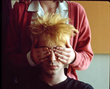
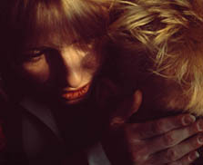
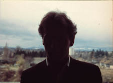
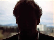
The next two shots of the sequence center on the prof, who has exited frame right from the “three-shot.” Now he’s at the window, recalling the initial shot of Eva; but unlike her he’s little more than a silhouette. As crashing organ music is heard, he seems to be watching the experiment from afar. The second shot, an axial cut-in, coincides with the offscreen voice of a male student: “Were you exiled for these ideas?”
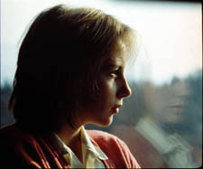
“These ideas, and others,” the prof replies. He says he’ll see the class on Monday, evoking the idea that he’s dismissing the offscreen students, and he turns his head slightly, though we can’t be sure they’re on his right. This shot will be held for some time as students quiz him more about his theory, and Eva asks him if he’d like to come over for a drink some evening. But we don’t see her say it. Godard cuts to a shot of Eva at the window, bathed in sunlight, opening and shutting her eyes as she slightly lifts and lowers her head.
As we see her, we hear the rustling of people leaving (so the class was evidently larger than three). And we hear him reply to her invitation, “That’s another story [scénario].” Are Eva and the prof looking at each other? We’re inclined to say yes, but her closed eyes and tilting head suggests someone lost in contemplation rather than engaged in conversation. Here the classic facial-expression cue is made indeterminate. We have no way of knowing if the prof’s line comes from offscreen, or is displaced from another point in time; maybe he has left the room. Such displaced diegetic sound occurs elsewhere in the film.
We don’t have to decide; our indecision is the point. By pruning away the most reliable cues, Godard wins both ways. We’re kept somewhat oriented to an intelligible action: a prof sets forth his far-fetched theory of human origins and a woman in his class invites him for coffee. This side of the balance allows us to feel that a story, however sketchy, is moving forward.
But the moment-by-moment texture of the scene allows the individual shots, gestures, and sounds to drift somewhat free. Each image takes on a more intrinsic weight, and the juxtaposition of picture and sound acquires a resonance that we usually call poetic. A shot of Eva in the sun playing with the Rubik’s cube, unanchored in time (during class? before class started?), invites us to apply metaphors, especially once we learn her name. Pascal’s thorny hair suggests not only extraterrestrials but the explosion of a nova. The silhouetted prof, detached from the mechanism he has set in motion, hints at an unknown deity watching the game play out according to his rules. Why do Godard films spawn long essays built out of erudite associations? Because the narrative progression relaxes and we can weave our own connotations out of what we see and hear.
If you don’t want to go down the expanding-association route, there’s another one open. When individual moments no longer accumulate ordinary dramatic pressure, we can savor the fugitive pleasures of the separate shots (light on face, lips by ear) and the patterns they form: flipover cuts, yellow hair and yellow facets, bookended shots of Eva at the window.
Those patterns, it should be clear, depend on our sensing a bump at every shot change, looking for a way to skip across the gap that Godard creates. The same belief that meaning and effect are born of gaps impelled Kuleshov too, and perhaps even Lloyd. If we pay attention to those gaps we can feel minds—both the filmmaker’s and ours—at work in them.
(1) Lev Kuleshov, “’50’: In Maloi Gznezdinokovsky Lane,” Kuleshov on Film, trans. and ed, Ronald Levaco (Berkeley: University of California Press, 1974), 200.
(2) V. I. Pudovkin, “The Naturschchik instead of the Actor,” Selected Essays, ed. and trans. Richard Taylor (Oxford: Seagull, 2006), 160.
(3) See Kristin Thompson, Yuri Tsivian, and Ekaterina Khokhlova, “The Rediscovery of a Kuleshov Experiment: A Dossier,” Film History 8, 3 (1996), 357-367.
(4) The sequence does begin with a long shot of the café, but it is so distant, crowded, and brief that it can’t really be said to establish the spatial relationships among the several characters we see.
(5) “Sounds of Silence,” Artforum International (April 2000): 123.
A behemoth from the Dead Zone
DB here:
The first quarter of the year is the biggest slump time for movie theatres. (1) Holiday fatigue, thin budgets, bad weather, the Super Bowl, and the distractions of the awards season depress admissions. If people go to the movies, they tend to catch up on Oscar nominees, and studios don’t want to release high-end films that might suffer from the competition. But screens need fresh product every week, so most of what gets released at this time of the year might charitably be called second-tier.
Ambitious filmmakers fight to keep out of this zone of death. You could argue that the January release slot of Idiocracy told Mike Judge exactly what Fox thought of that ripe exercise in misanthropy. Zodiac, one of the best films of 2007, opened on 1 March, and even ecstatic reviews couldn’t push it toward Oscar nominations. You can imagine what chances for success Columbia has assigned to Vantage Point (a 22 February bow). [But see my 4 Feb. PPPS below.]
Yet this is a flush period for those of us who like to explore low-budget genre pieces. I have to admit I enjoy checking on those quickie action fests and romantic comedies that float up early in the year. They’re today’s equivalent of the old studios’ program pictures, those routine releases that allowed theatres to change bills often. In their budgets, relative to blockbusters, today’s program pix are often the modern equivalent of the studios’ B films.
More important, these winter orphans are often more experimental, imaginative, and peculiar than the summer blockbusters. On low budgets, people take chances. Some examples, not all good but still intriguing, would be Wild Things (1998), Dark City (1998), Romeo Must Die (2000), Reindeer Games (2000), Monkeybone (2001), Equilibrium (2002), Spun (2003), Torque (2004), Butterfly Effect (2004), Constantine (2005), Running Scared (2006), Crank (2006), and Smokin’ Aces (2007). The mutant B can be found in other seasons too—one of my favorites in this vein, Cellular (2004), was released in September—but they’re abundant in the year’s early months.
By all odds, Cloverfield ought to have been another low-end release. A monster movie with unknown players, running a spare 72 minutes sans credits, budgeted at a reputed $25 million, it’s a paradigm of the winter throwaway. Except that it pulled in $46 million over a four-day weekend and became the highest-grossing film (in unadjusted dollars) ever to be released in January. Here the B in “B-movie” stands for Blockbuster.
I enjoyed Cloverfield. It starts with a sharp premise, but as ever, execution is everything. I see it as a nifty digital update of some classic Hollywood conventions. Needless to say, many spoilers loom ahead.
If you find this tape, you probably know more about this than I do
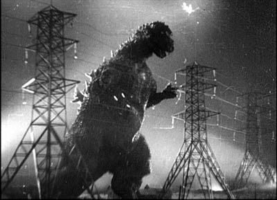
Everybody knows by now that Cloverfield is essentially Godzilla Meets Handicam. A covey of twentysomethings are partying when a monster attacks Manhattan, and they try to escape. One, Rob, gets a phone call from his off-again lover Beth, who’s trapped in a high-rise. He vows to rescue her. He brings along some friends, one of whom documents their search with a video camera. It’s a shooting-gallery plot. One by one, the characters are eliminated until we’re down to two, and then. . . .
Cloverfield exemplifies what narrative theorists call restricted narration. (Kristin and I discuss this in Chapter 3 of Film Art.) In the narrowest case of restricted narration, the film confines the audience’s range of knowledge to what one character knows. Alternatively, as when the characters are clustered in the same space, we’re restricted to what they collectively know. In other words, you deny the viewer a wider-ranging body of story information. By contrast, the usual Godzilla installment is presented from an omniscient perspective, skipping among scenes of scientists, journalists, government officials, Godzilla’s free-range ramblings, and other lines of action. Instead, Cloverfield imagines what Godzilla’s attack would look and feel like on the ground, as observed by one group of victims.
Horror and science fiction films have used both unrestricted and restricted narration. A film like Cat People (1942) crosscuts what happens to Irena (the putative monster) with scenes involving other characters. Jurassic Park and The Host likewise trace out several plot strands among a variety of characters. The advantage of giving the audience so much information is that it can feel apprehension and suspense about what the characters don’t know is happening. Our superior knowledge can make us worry about those poor victims oblivious to their fate.
But these genres have relied on restricted narration as well. Invasion of the Body Snatchers (1956) is a good example; we are at Miles’s side in almost every scene, learning of the gradual takeover of his town as he does. Night of the Living Dead (1968), Signs (2002), and War of the Worlds (2005) do much the same with a confined group, attaching us to one or the other momentarily but never straying from their situation.
The advantages of restricted narration are pretty apparent. You can build up uncertainty and suspense if we know no more than the character(s) being attacked by a monster. You can also delay full revelation of the creature, a big deal in these genres, by giving us only the glimpses of it that our characters get. Arguably as well, by focusing on the characters’ responses to their peril, you have a chance to build audience involvement. We can feel empathy and loss if we’ve come to know the people more intimately than we know the anonymous hordes stomped by Godzilla. Finally, if you need to give more wide-ranging information about what’s happening outside the characters’ immediate situation, you can always have them encounter newspaper reports, radio bulletins, and TV coverage of action occurring elsewhere.
People sometimes think that theoretical distinctions like this overintellectualize things. Do filmmakers really think along these lines? Yes. Matt Reeves, the director of Cloverfield, remarks:
The point of view was so restricted, it felt really fresh. It was one of the things that attracted me [to this project]. You are with this group of people and then this event happens and they do their best to understand it and survive it, and that’s all they know.
For your eyes only
Restricted narration doesn’t demand optical point-of-view shots. There aren’t that many in Invasion of the Body Snatchers or the other examples I’ve indicated. Still, for quite a while and across a range of genres, filmmakers have imagined entire films recording a character’s optical/ auditory experience directly, in “first-person,” so to speak.
Again, it’s useful to recognize two variants of this narrational strategy. One we can call immediate—experiencing the action as if we stood in the character’s shoes. In the late 1920s, the great documentary filmmaker Joris Ivens tried to make what he called his I-film, which would record exactly what a character saw when riding a bike, drinking a glass of beer, and the like. He was dismayed to find that bouncing and swiveling the camera as if it were a human eye ignored the fact that in real life, our perceptual systems correct for the instabilities of sensation. Ivens abandoned the project, but evidently he couldn’t get the notion out of his head; he called his autobiography The Camera and I. (2)
Hollywood’s most strict and most notorious example of directly subjective narration is Robert Montgomery’s Lady in the Lake (1947). Its strangeness reminds us of some inherent challenges in this approach. How do you show the viewer what your protagonist looks like? (Have him pass in front of mirrors.) How do you skip over the boring bits? (Have your hero knocked unconscious from time to time.) How do you hide the inevitable cuts? (Try your best.) Even Montgomery had to treat the subjective sequences as long flashbacks, sandwiched within scenes of the hero in his office in the present telling us what he did next.
Because of these problems, a sustained first-person immediate narration is pretty rare. The best compromise, exploited by Hitchcock in many pictures and especially in Rear Window (1954), is to confine us to a single character’s experience by alternating “objective” shots of the character’s action with optical point-of-view shots of what s/he sees.
What I’m calling immediate optical point of view is just that: sight (and sounds) picked up directly, without a recording mechanism between the story action and the character’s experience. But we can also have mediated first-person point of view. The character uses a recording technology to give us the story events.
In a brilliant essay on the documentary Kon-Tiki (1950), André Bazin shows that our knowledge of how Thor Heyerdahl filmed his raft voyage lends an unparalleled authenticity to the action. Heyerdahl and his crew weren’t experienced photographers and seem to have taken along the 16mm camera as an afterthought, but the very amateurishness of the enterprise guaranteed its realism. Its imperfections, often the result of hazardous conditions, were themselves testimony to the adventure. When the men had to fight storms, they had no time to film; so Bazin is able to argue, with his inimitable sense of paradox, that the absence of footage during the storm is further proof of the event. If we were given such footage, we might wonder if it was staged afterward.
How much more moving is this flotsam, snatched from the tempest, than would have been the faultless and complete report offered by an organized film. . . . The missing documents are the negative imprints of the expedition. (3)
What about fictional events? In the 1960s we started to see fiction films that presented themselves as recordings of the events as the camera operator experienced them. One early example is Stanton Kaye’s Georg (1964). The first shot follows some infantrymen into battle, but then the framing wobbles and the camera falls to earth. We see a tipped angle on a fallen solider and another infantryman approaches.

He bends toward us; the frame starts to wobble and we are lifted up. On the soundtrack we hear, “I found my camera then.”
The emergence of portable equipment and cinema-verite documentary seems to have pushed filmmakers to pursue this narrational mode in fiction. One result was the pseudo-documentary, which usually doesn’t present the story as a single person’s experience but rather as a compilation of first-person observations. Peter Watkins’ The War Game (1967) presents itself as a documentary shot during a nuclear war, and it contains many of the visual devices that would come to be associated with the mediated format—not only the flailing camera but the face-on interview and the chaotic presentation of violent action. There’s also the pseudo-memoir film, pioneered in David Holzman’s Diary (1967). Later examples of the pseudo-documentary are Norman Mailer’s Maidstone (1971) and the combat movie 84 Charlie MoPic (1989). (4)
As lightweight 16mm cameras made filming easier, directors adapted that look and feel to fictional storytelling. The arrival of ultra-portable digital cameras and cellphones has launched a similar cycle. Brian DePalma’s Redacted (2007), yet another war film, has exploited the technology for docudrama. A digital equivalent of David Holzman’s Diary, apart from Webcam and YouTube material, is Christoffer Boe’s Offscreen (2006), which I discussed here.
Interestingly, Orson Welles pioneered both the immediate and the mediated subjective formats. One of his earliest projects for RKO was an adaptation of Heart of Darkness, in which the camera was to represent the narrator Marlowe’s optical perspective throughout. (5) Welles had more success with the mediated alternative, though in audio form. His “War of the Worlds” radio broadcast mimicked the flow of programming and interrupted it with reports of the aliens’ attack. The device was updated for television in the 1983 drama Special Bulletin.
Sticking to the rules
Cloverfield, then, draws on a tradition of using technologically mediated point-of-view to restrict our knowledge. Like The Blair Witch Project (1999), it does this with a horror tale. But it’s also a Hollywood movie, and it follows the norms of that moviemaking mode. So the task of Reeves, producer J. J. Abrams, and the other creators is to fit the premise of video recording to the demands of classical narrative structure and narration. How is this done?
First, exposition. The film is framed as a government SD video card (watermarked DO NOT DUPLICATE), the remains of a tape recovered from an area “formerly known as Central Park.” This is a modern version of the discovered-manuscript convention familiar from the nineteenth-century novel. When the tape starts, showing Rob with Beth in happy times, its read-out date of April plays the role of an omniscient opening title. In the course of the film, the read-outs (which come and go at strategic moments) will tell us when we’re in the earlier phase of their love affair and when we’re seeing the traumatic events of May.
Likewise, the need for exposition about characters and relationships at the start of the film is given through a basic premise. Jason wants to record Rob’s going-away-party and he presses Rob’s friend Hud into service as the cameraman. Off the bat, Hud picks out our main characters in video portraits addressed to Rob. What follows indicates that Hud will be amazingly prescient: His camera dwells on the characters who will be important in the ensuing action.
Next, overall structure. The Cloverfield tape conforms to the overarching principles that Kristin outlines in Storytelling in the New Hollywood and that I restated in The Way Hollywood Tells It. (Another example can be found here.) A 72-minute film won’t have four large-scale parts, most likely two or three. As a first approximation, I think that Cloverfield breaks into:
*A setup lasting about 30 minutes. We are introduced to all the characters before the monster attacks. Our protagonists flee to the bridge, where Jason dies. Near the end of this portion, Rob gets a call from Beth, and he formulates the dual goals of the film: to escape from the creature, and to rescue Beth. Along the way, Hud declares he’s going to record it all: “People are gonna know how it all went down. . . . It’s gonna be important.”
*A development section lasting about 22 minutes. This is principally a series of delays. Rob, Hud, Lily, and Marlena encounter obstacles. Marlena falls by the wayside. They are given a deadline: At 0600 they must meet the last helicopters leaving Manhattan.
*A climax lasting about 20 minutes. The group rescues Beth and meets the choppers, but the one carrying Rob, Hud, and Beth falls afoul of the beast. They crash in Central Park, and Hud is killed, his camera recording his death at the jaws of the monster. Huddled under a bridge, Rob and Beth record a final video testimonial before an explosion cuts them off.
*An epilogue of one shot lasting less than a minute: Rob and Beth in happier times on the Ferris wheel at Coney Island—a shot left over from the earlier use of the tape in April.
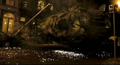
Next, local structure and texture. It takes a lot of artifice to make something look this artless. The imagery is rich and vivid, the sharpest home video you ever saw. The sound is pure shock-and-awe, bone-rattling, with a full surround ambience one never finds on a handicam. (6) Moreover, Hud is remarkably lucky in catching the turning points of the action. All the characters’ intimate dramas are captured, and Hud happens to be on hand when the head of Miss Liberty hurtles down the street.
Bazin points out that in fictional films the ellipses are cunning gaps, carefully designed to fulfill narrative ends—not portions left out because of the physical conditions of the shoot. Here the cunning gaps are justified as constrained by the physical circumstances of filming. When Hud doesn’t show something, it’s usually because it’s what the genre considers too gross, so the worst stretches take place in darkness, or offscreen, or strategically shielded by a prop when the camera is set down.
Mostly, though, Hud just shows us the interesting stuff. He turns on the camera just before something big happens, or he captures a disquieting image like that of the empty Central Park carriage.
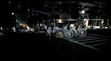
At least once, the semi-documentary premise does yield something evocative of the Kon-Tiki film. Hud has to leap from one building to another, many stories above the street. He turns the camera on himself: “If this is the last thing you see, then I died.” He hops across, still running the camera, but when a rocket goes off nearby, a sudden cut registers his flinch. For an instant out of sheer reflex, he turned off the camera.
Overall, Hud’s tape respects the flow of classical film style. Unlike the Lady in the Lake approach, the mediated POV format doesn’t have a problem with cuts; any jump or gap is explained as a moment when the operator switched off the camera. Most of Hud’s “in-camera” cuts are conventional ones, skipping over a few inconsequential stretches of time. There are as well plenty of hooks between scenes. (For more on hooks, go here.) Hud says: “I’ll walk in the tunnels.” Cut to characters walking in the tunnels. More interestingly, visible cuts are rare, which again respects the purported conditions of filming. Cloverfield has much longer takes than any recent Hollywood film I know. I counted only about 180 shots, yielding an average of 24 seconds per shot (in a genre in which today’s films average 2-5 seconds per shot).
The digital palimpsest
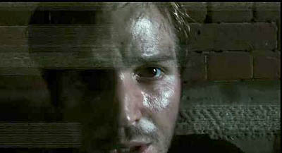
We could find plenty of other ways in which Cloverfield adapts the handicam premise to the Hollywood storytelling idiom. There are the product placements that just happen to be part of these dim yuppies’ milieu. There are the character types, notably the sultry Marlena and the hero’s weak friend who’s comically a little slow. There’s the developing motif of the to-camera addresses, with Rob and Beth’s final monologues to the camera counterbalancing the party testimonials in the opening. There’s the final romantice exchange: “I love you.” “I love you.” The very last shot even includes a detail that invites us to re-view the entire movie, at the theatre or on DVD. But let me close by noting how some specific features of digital video hardware get used imaginatively.
I’ve already mentioned how the viewfinder date readout allows us to keep the time structure clear. There’s also the use of a night-vision camera feature to light up those spidery parasites shucked off by the big guy. Which scares you more—to glimpse the pinpoint eyes of critters skittering around you in the dark, or to see them up close in a sickly green light?
More teasing is the fact, set up in the first part, that this video is being recorded over an old tape of Rob’s. That’s what turns the opening sequence of Rob and Beth in May into a prologue: the tape wasn’t rewound completely for recording the party. Later, at intervals, fragments of that April footage reappear, apparently through Hud’s inadvertently advancing the tape. The snippets functions as flashbacks, showing Rob and Beth going to Coney Island and juxtaposing their enjoyable day with this horrendous night.
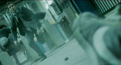
Cleverly, on the tape that’s recording the May disaster something always prepares the audience for the shift. For instance, when Jason hands the camera over, we hear Hud say, “I don’t even know how to work this thing.” Cut to an April shot of Beth on the subway, suggesting that he’s advanced fast forward without shooting. Likewise, when Rob says, “I had a tape in there,” we cut to another April shot of Beth. As a final fillip, the footage taken in May halts before the tape ends, so we get the epilogue showing Rob and Beth on the Ferris wheel in April, emerging like figures in a palimpsest.
No less clever, but also a little poignant, is the use of the fallen-camera convention. It appears once when Beth has to be extricated from her bed. Hud sets the camera down by a concrete block in her bedroom, which conceals her agony. More striking is the shot when the camera, dropped from Hud’s hand, lies in the grass, and the autofocus device oscillates endlessly, straining to hold on his lifeless face.
In sum, the filmmakers have found imaginative ways of fulfilling traditional purposes. They show that the look and feel of digital video can refresh genre conventions and storytelling norms. So why not for the sequel show the behemoth’s attack from still other characters’ perspectives? This would mobilize the current conventions of the narrative replay and the companion film (e.g., Eastwood’s Iwo Jima diptych). Reeves says:
The fun of this movie was that it might not have been the only movie being made that night, there might be another movie! In today’s day and age of people filming their lives on their iPhones and Handycams, uploading it to YouTube. . . .
So the Dead Zone of January through March yields another hopeful monster. What about next month’s Vantage Point? The tagline is: 8 Strangers. 8 Points of View. 1 Truth. Hmmm. . . . Combining the network narrative with Rashomon and a presidential assassination. . . . Bet you video recording is involved . . . . See you there?
PS: At my local multiplex, you’re greeted by a sign: WARNING: CLOVERFIELD MAY INDUCE MOTION SICKNESS. I thought this was just the theatre covering itself, but I’ve learned that no recent movie, not even The Bourne Ultimatum, has had more viewers going giddy and losing their lunch. You can read about the phenomenon here, and Dr. Gupta weighs in here. My gorge can rise when a train jolts, but I had no problems with two viewings of Cloverfield, both from third row center.
Anyhow, it will be perfectly easy to watch on your cellphone. But we should expect to see at least one pirate version shot in a theatre by someone who’s fighting back the Technicolor yawn, giving us more Queasicam than we bargained for.
(1) The only period that rivals this slow winter stretch is mid-August to October, when genre fare gets pushed out to pick up on late summer business. [Added 26 January:] There are, I should add, two desirable weekends in the first quarter, those around Martin Luther King’s birthday and Presidents’ Day. Studios typically aim their highest-profile winter releases (e.g., Black Hawk Down, 2001) for those weekends.
(2) Joris Ivens, The Camera and I (New York: International Publishers, 1969), 42.
(3) André Bazin, “Cinema and Exploration,” What Is Cinema? Vol. 1, trans. and ed. Hugh Gray (Berkeley: University of California Press, 1967), 162.
(4) Not all pseudodocumentaries present themselves as records of a person’s observation. Milton Moses Ginsberg’s Coming Apart (1969) presents itself as an objective record, by a hidden camera, of a psychiatrist’s dealings with his patients. Like a surveillance camera, it doesn’t purport to embody anybody’s point of view.
(5) Jonathan Rosenbaum, Discovering Orson Welles (Berkeley: University of California Press, 2007), 28-48.
(6) For Kevin Martin’s informative account of the film’s polished lighting and high-definition video capture, go here (and scroll down a bit). For discussions of contemporary sound practices in this genre, see William Whittington’s Sound Design in Science Fiction (Austin: University of Texas Press, 2007).
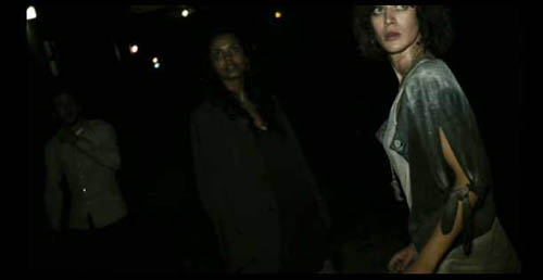
PS: Thanks to Corey Creekmur for correcting two slips in my initial post!
PPS 28 January: Lots of Internet buzz about the film since I wrote this. Thanks to everyone who linked to this post, and special thanks for feedback from John Damer and James Fiumara.
Some people have asked me to comment on the social and cultural implications of Cloverfield’s references to 9/11. At this point I think that genre cinema has dealt more honestly and vividly with the traumas and questioning around this horrendous event than the more portentous serious dramas like United 93, World Trade Center, and the TV show The Road to 9/11.
The two most intriguing post-9/11 films I know are by Spielberg. The War of the Worlds gives a really concrete sense of what a hysterical America under attack might be like, warts and all. (It reminded me of a TV show I saw as a kid, Alas, Babylon (1960), a surprisingly brutal account of nuclear-war panic in suburbia.) Spielberg’s underrated The Terminal reminds us, despite its Frank Capra optimism, that the new Security State is run by bureaucrats with fixed agendas and staffed by overworked people of color, some themselves exiles and immigrants.
I think that Cloverfield adds its own dynamic sense of how easily the entitlement culture of upwardly mobile twentysomethings can be shattered. Genre films carry well-established patterns and triggers for feelings, and a shrewd filmmaker can channel them for comment on current events—as we see in the changing face of Westerns and war films in earlier phases of Hollywood history.
On this point, Cinebeats offers some shrewd responses to criticisms of Cloverfield here.
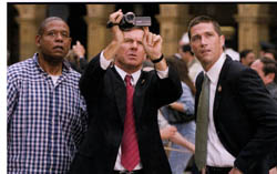 Finally: In the new Creative Screenwriting an informative piece (not available online) indicates that the initial logline for Vantage Point on imdb is misleading. Screenwriter Barry Levy planned to present the assassination from seven points of view, but reduced that to six. As for my speculation that video recording/replay would be involved, a production still seems to offer some evidence. Shall we call it the Cloverfield effect? The same issue of CS has a brief piece on the script for Cloverfield.
PPS 30 January: Shan Ding brings me another story about the making of Cloverfield, and Reeves is already in talks for a sequel, says Variety.
PPPS 4 February: A recent story in The Hollywood Reporter offers a nuanced account of how Hollywood is rethinking its first-quarter strategies. Across the last 4-5 years, a few big releases have done fairly well between January and April; a high-end film looks bigger when there is less competition. The author, Steven Zeitchik, suggests that the heavy packing of the May-August period and the need for a strong first weekend are among the factors that will encourage executives to spread releases through the less-trafficked months. I hope, though, that tonier fare won’t crowd out the more edgy, low-end genre pieces that bring me in.
PPPPS 8 February: How often has a wounded Statue of Liberty featured in the apocalyptic scenarios of comics and the movies? Lots, it turns out. Gerry Canavan explains here.
Happy birthday, classical cinema!, or The ten best films of … 1917
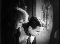
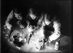
Wild and Woolly (1917).
KT:
Periodization is a tricky task for historians, and there are a lot of disputes about how to divide up the 110-plus years of the cinema’s existence. We all have to deal with it, though, if we want to organize our studies of the past into meaningful units. How to do that?
Do we divide the periods of film history according to major historical events? World War I had a huge impact on the film industry, to be sure, and we might say that one significant period for cinema is 1914-1918. Yet 1919 didn’t mark the start of a new period. The major European post-war film movements didn’t start then. French Impressionism arguably began in 1918, German Expressionism in 1920, and Soviet Montage in 1924 or 1925.
Carving up film history partly depends on what questions the historian is asking. If you’re studying wartime propaganda, 1914 and 1918 would provide significant beginning and end points. If you want to trace the development of significant film styles, it doesn’t seem very useful.
While historians have difficulties agreeing on periodization, just about everyone concurs that there were two amazing years during the 1910s when filmmaking practice somehow coalesced and produced a burst of creativity: 1913 and 1917.
One can point to stylistically significant films made before 1913. Somehow, though, that year seemed to be when filmmakers in several countries simultaneously seized upon what they had already learned of technique and pushed their knowledge to higher levels of expressivity. “Le Gionate del Cinema Muto” (“The Days of Silent Cinema”), the major annual festival, devoted its 1993 event to “The Year 1913.” The program included The Student of Prague (Stellan Rye), Suspense (Phillips Smalley and Lois Weber), Atlantis (August Blom), Raja Harischandra (D. G. Phalke), Juve contre Fantomas (Louis Feuillade), Quo Vadis? (Enrico Guazzoni), Ingeborg Holm (Victor Sjöström), The Mothering Heart (D. W. Griffith), Ma l’amor mio non muore! (Mario Caserini), L’enfant de Paris (Léonce Perret), and Twilight of a Woman’s Soul (Yevgenii Bauer). .
1917, by contrast, was primarily an American landmark. As 2007 closes, we thought it appropriate to wish happy birthday to the most powerful and pervasive approach to filmic storytelling the world has yet seen. That would be classical continuity cinema, synthesized in what was coming to be known as Hollywood.
DB:
In The Classical Hollywood Cinema and work we’ve done since, we’ve maintained that 1917 is the year in which we can see the consolidation of Hollywood’s characteristic approach to visual storytelling. This idea was first floated by Barry Salt, and our research confirms his claim. Over the ninety years since 1917 the style has changed, but its basic premises have remained in force.
Before classical continuity emerged, the dominant approach to shooting a scene might be called the tableau technique. Action was played out in a full shot, using staging to vary the composition and express dramatic relationships. Elsewhere on this site I’ve mentioned two major exponents of this approach, Feuillade and Bauer.
When there was cutting within the tableau setup, it usually consisted of inserted close-ups of important details, especially printed matter, like a letter or telegram. Occasionally the close-up of an actor could be inserted, usually filmed from the same angle as the master shot. The tableau approach was more prominent in scenes taking place in interiors; filmmakers were freer about cutting action occurring outdoors.
We shouldn’t think of the tableau as purely “theatrical.” For one thing, the master shot was typically closer and more tightly organized than a scene on the stage would be. Moreover, for reasons I discuss in Figures Traced in Light, the playing space of the cinematic frame is quite different from the playing area of the proscenium theatre. The filmmaker can manipulate composition, depth, and blocking in ways not available on the stage.
The tableau approach was the default premise of US filmmaking through the early 1910s. You can see it at work, for example, in this shot from At the Eleventh Hour (W. V. Ranous, 1912). Mr. and Mrs. Richards are in the study of Mr. Daley. After Richards has refused to sell his railroad bonds, Daley’s wife shows off her diamond necklace to the visitors.
At first the two couples are separated in depth, the men in the foreground and the women further back. In the first frame below, a new necklace has just been delivered, and a servant gives it to Mrs. Daley. Only the servant’s hand is visible, as she is blocked by Richards in the foreground. In the second frame, the two women come forward. Mrs. Daley holds the necklace up and Mrs. Richards oohs and ahhs over it, while her husband glances at Daley as if to wonder how he could afford it.
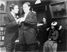
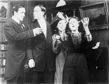
Instead of breaking the scene into closer views, spreading the characters’ reactions across separate shots, Ranous squeezes all of their actions and expressions into a tight space across the center of the shot. Nor does he provide a close-up of the necklace, which will be important in the plot. (1) We might be inclined to say that this is a “theatrical” shot, but on a stage the actions in depth (the women chatting, the servant handing over the parcel) wouldn’t be visible to everyone in the auditorium. Likewise, on a stage the packed faces in the later phase of the scene wouldn’t be visible to people sitting on the sides.
As films became longer, American filmmakers were starting to organize their plots around characters with firm goals. Conflicting goals would set the characters in opposition to one another, and at a climax, usually under the pressure of a deadline, the protagonist achieves or fails to achieve the goals. The plot also tends to build up two lines of action, at least one involving romance.
There’s no reason this conception of narrative could not have been applied to the tableau style; in many cases it was. But hand in hand with the rise of goal-driven plotting came a new approach to filming. Sporadically before 1917, filmmakers in many countries were exploring ways to build scene out of many shots. (If you want to know the process in the US in more detail, check out Early American Cinema in Transition by Charlie Keil.) By 1917, American filmmakers had synthesized these tactics into an overall strategy, a system for staging, shooting, and cutting dramatic action.
We know the result as the 180-degree system. This encourages the filmmaker to break a scene into several shots, taken from different distances and angles, all from one side of an imaginary line slicing through the space. Around 1917, this stylistic approach comes to dominate US feature films, in the sense that every film made will tend to display all the devices at least once. The system remains in place to this day, and it came to form the basis of popular cinemas across the world. (2)
Once you break a scene into several shots, some characters won’t be onscreen all the time. So you need to be clear about where offscreen characters are; you need to supply cues that allow the audience to infer their positions. So 1910s filmmakers developed various ways of “matching” shots.
Shots can be connected by character looks, thanks to the eyeline match. Here’s an instance from Victor Schertzinger’s The Clodhopper (1917). First there is a master shot of the mother and son in their farm kitchen.
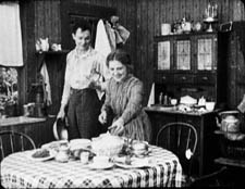
This is followed by a separate shot of each one. Their bodily positions and eyelines remind us that the other is just out of frame.
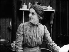
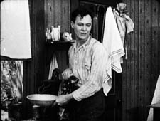
Although over-the-shoulder shooting hadn’t yet been developed, a conception of the reverse angle is at work here too. Schertzinger’s camera doesn’t shoot the actors perpendicularly, but takes up an angle on one that becomes an echo of that filming the other. Here’s another example of reverse angles from The Devil’s Bait (1917, director Harry Harvey).
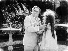
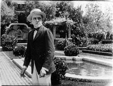
The camera doesn’t just enlarge a portion of the space, as in the inserted shot in a tableau scene. The angle of view has changed significantly.
Changes of angle within the scene have become fairly complex by 1917. This strategy is apparent when the action takes place in a theatre, a courtroom, a church, or some other large-scale gathering point. The camera position changes often in this scene from The Girl without a Soul (director John Collins).
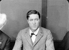
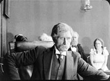
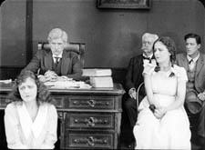
The concept of matching extends to physical movement too, through the match on action. This device allows the director to highlight a new bit of space while preserving the continuity of time. In Roscoe Arbuckle’s The Butcher Boy, the cut-in to Fatty (with a change of angle) also matches his gesture of putting his hands on his hips.
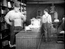
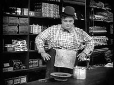
Interestingly, even this early, directors have learned to leave a little bit of overlapping action across the cut. If you move frame by frame, you’ll see that Fatty’s gesture is repeated a bit at the start of the second shot.
When a character leaves one frame, he or she can come into another space, from the side of the frame consistent with the 180-degree premise. This is matching screen direction. A cut of this sort lets us know that the next portion of the locale that we see is more or less adjacent to the previous one. In Field of Honor (director Allen Holuban), Wade crosses to Laura, who’s waiting in a carriage. A few years earlier, the director might have presented his greeting in a single deep-space long shot. Instead, Wade exits one shot and enters the next.
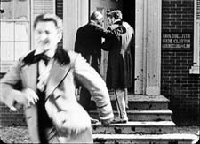
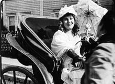
Again, the reverse-angle principle governs the camera setups. Wade moves along a diagonal toward the camera and away from it.
More generally, Field of Honor exhibits a polished handling of the new style: lots of reverse shots and eyeline matches, fades that bracket flashbacks, binocular points of view, rack-focus shots, and rapid cutting (there’s even a ten-frame shot). The point is not to claim Field of Honor as an undiscovered masterpiece but rather to indicate that by 1917 a director could handle all the devices with assurance.
Match-cutting devices had been used occasionally before 1917, but by that year filmmmakers melded them into a consistent and somewhat redundant method of guiding the audience through each scene.
The continuity system not only creates a basic clarity about characters’ positions. It can as well generate a speed and accentuation not easily achieved within a single shot. For example, Wade’s frame exit and entrance above is cut so as to skip over moments that he consumes crossing the driveway. Continuity editing enhances the rapid pace of US films, a quality immediately noted by foreign observers in the 1910s and 1920s.
Two of the best films of 1917 exploit the dynamism of continuity cutting. The Doug Fairbanks comedy western, Wild and Woolly, seems designed to prove that American films could proceed at breakneck speed. In climactic scenes, we’re caught in a whirlwind of fast cutting, with the pace set by the hyperactive protagonist, a financier’s son who longs to prove himself as a cowboy.
John Ford’s Straight Shooting proceeds at a more measured pace, but in its final shootout we see a prototype of all the main-street gundowns that will define the Western. Ford provides alternating shots of the cowboys advancing toward each other, framing each man more tightly and concluding with suffocating close-ups of each man’s face, highlighting the eyes.
Sergio Leone, eat your heart out.
Propelled by goal-driven characters and a linear arc of action, films like Wild and Woolly and Straight Shooting are completely understandable and enjoyable today. (But when will we have them on DVD?) Their stories are engrossing and their performances are engaging, but just as important their storytelling technique has become second nature to us. The narrative strategies that coalesced in 1917 remain fundamental to mainstream cinema.(2)
The Mystery of the Belgian Print
KT:
For decades now we have been visiting Brussels and working at the Cinémathèque Royale de Belgique/Koninklijk Belgisch Filmarchief. Sometimes I feel that we would know half as much about the cinema were it not for the unfailing hospitality we have been shown, initially by the great archivist Jacques Ledoux and now by his successor Gabrielle Claes. Our indebtedness to this institution and its staff are reflected in David’s named professorship; he is the Jacques Ledoux Professor of Film Studies. We dedicated our Film History: An Introduction, to Gabrielle.
We do whatever favors we can in return for such wonderful help. David lectures regularly at the biannual summer school run by the Flemish Service for Film Culture in partnership with the Royal Film Archive. (David wrote about the 2007 event in an earlier entry.) I try to identify silent films. I am not always successful, but I suppose over the years I have been able to put names to thirty-some mystery prints.
Silent films are more likely to be unidentified than sound ones because it was standard practice to splice in intertitles in the local language. Sometimes too the film’s title was changed. The film’s actors may be forgotten today, or the print may be incomplete, lacking the opening title and credits. Sometimes even the country of origin is unknown.
Back in the early 1990s I was asked to identify a five-reel nitrate print with the title Père et fils. It was an original distribution copy from the silent era. The information on the archival record card listed some possible identifications: Father and Son, a 1913 Vitagraph film or Father and Son, produced by Mica in 1915. It was tentatively thought to be American.
As I watched the film, it quickly became apparent that it was indeed American. It centered on the rivalry between a small dime store owned by the heroine’s father and a modern dime store being built in the same town. The hero is charged with the mission of driving the older store out of business.
So we had our typical goal-driven plot. The style was what David has described as typical of 1917, so that was my tentative dating. I felt almost certain that the reels I was watching were not from a 1913 or 1915 movie. The film was a fairly modest item, done on a relatively low budget and not starring any actors that would be familiar to most modern viewers. I had seen the actor playing the hero before, however, and I thought he might be Herbert Rawlinson. By the time I finished the film, those were my clues: a medium-budget American film of c. 1917 concerning dime stores and perhaps starring Rawlinson.
My task turned out to be fairly simple. A little research after we returned home confirmed the Rawlinson guess. In preparing the write The Classical Hollywood Cinema, I had seen him in The Coming of Columbus (a 1912 Selig film) and in Damon and Pythias (Universal, 1914).
My next step was to consult the monumental, indispensible reference book, The American Film Institute Catalog. This multi-volume set, many years in the making, was originally published as books. It is now online, but available only to AFI members or through libraries. The catalogues were published by decade—thus obviating the problem of periodization. Each decade gets two volumes, one of entries on all the films, listed in alphabetical order. Credits, production companies, release dates, plot synopses, and other information are included. A second volume indexes the films by chronology, personal names, corporate names, subject, genre, and geography (i.e., where the films were shot).
Until now I had found little use for the subject index, but now it came to my aid. I turned to the Ds to see if there was an entry for dime stores. The AFI indexers were thorough, and sure enough, there was one entry: Like Wildfire. A check of the personal names index under Rawlinson, Herbert revealed that he had acted in a film called Like Wildfire, made in 1917 by Universal. Once I had the title, I checked its catalog entry and found that its plot description matched the film I had seen. Case closed.
Admittedly, in this instance the date wasn’t a crucial clue. Still, determining a film’s year of release can narrow down the possibilities. Thanks as well to the development of classical cutting, a close view of an actor helps in identifying him.
The Best of 1917
DB:
This is the season when everybody makes a list of best pictures. We have stopped playing that game. For one thing, we haven’t seen all the films that deserve to be included. For another, the excellence of a film often dawns gradually, after you’ve had years to reflect on it. And critical tastes are as shifting as the sirocco. Never forget that in 1965 the Cannes palme d’or was won by The Knack . . . and How to Get It.
Still, enough time has elapsed to make us feel confident of this, our list of the best (surviving) films of 1917, both US and “foreign-language.” Titles are in alphabetical order.
The Clown (Denmark, A. W. Sandberg)
Easy Street (U.S., Charles Chaplin)
The Girl from Stormycroft (Sweden, Victor Sjöström)
The Immigrant (U.S., Charles Chaplin)
Judex (France, Louis Feuillade)
The Mysterious Night of the 25th (Sweden, Georg af Klercker)
The Narrow Trail (U.S., Lambert Hillyer)
The Revolutionary (Russia, Yevgenii Bauer)
Romance of the Redwoods (U.S., Cecil B. De Mille)
Terje Vigen (Sweden, Victor Sjöström)
Straight Shooting (US, John Ford)
Thomas Graal’s Best Film (Sweden, Mauritz Stiller)
Wild and Woolly (US, John Emerson)
Next year, maybe we’ll draw up our list for 1918.
(1) For more on this scene and the film as a whole, see Kristin Thompson, “Narration Early in the Transition to Classical Filmmaking: Three Vitagraph Shorts,” Film History 9, 4 (1997), 410-434.
(2) Beyond The Classical Hollywood Cinema, see Kristin’s Herr Lubitsch Goes to Hollywood and Storytelling in the New Hollywood. I’ve talked about these issues in On the History of Film Style, Planet Hong Kong, Figures Traced in Light, The Way Hollywood Tells It, and essays included in Poetics of Cinema. The basics of classical continuity are presented in Chapter 6 of Film Art: An Introduction, and we trace some historical implications of it in Film History: An Introduction.


