Archive for the 'FILM ART (the book)' Category
Godard comes in many shapes and sizes
DB here:
James Quandt started it.
The indefatigable Senior Programmer of the Cinémathèque Ontario emailed me in early 2004 to ask if I had any thoughts on the aspect ratios of Godard films. He attached an essay which eventually appeared in the gorgeous anthology, For Ever Godard. Reading a Quandt essay is like eating a ripe nectarine, tangy and nourishing. So you should find the original and indulge yourself. (1)
You might be asking what the term aspect ratio means. It refers to the ratio of the width to the height of the film image. The image was fairly square in the early silent era, then became roughly standardized at 4 x 3, or as the pros say, 1.33:1. Sound filming made the format a tad more horizontal, at 1.37. Anamorphic widescreen (CinemaScope and its brethren) was more or less standardized at 2.35 (more recently 2.40). Various non-anamorphic, or “flat” aspect ratios have appeared since the early 1950s. The US has favored 1.85, Europe has been known to use the squarer 1.66, and some films, like E. T., are designed for 1.75. Widescreen TVs are set at 16:9, or about 1.78:1, so that’s likely to be a common proportion in the future. We discuss aspect ratios at more length in Film Art: An Introduction (pp. 183-185 in the newest edition).
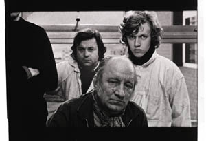
Filmies care about aspect ratios because shot composition matters. Sometimes the print is “hard-matted,” with the correct proportions given as black bars at the top and bottom of the frame, like video letterboxing. Here’s an example, from a 16mm print of Godard’s 1972 Tout va bien. It is hard-matted to 1.66. (The original film is in color.)
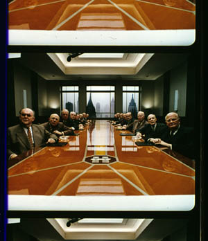
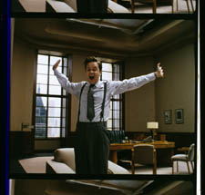
If the image isn’t hard-matted, the projectionist must insert an aperture plate that will mask the image properly. But what plate? Should she set it for 1.37? That’s a very rare option nowadays, and many theatres aren’t really designed to show it. Typically, if the print doesn’t indicate, the US projectionist will fall back on 1.85. Nowadays, if a Hollywood film isn’t in Scope, the projectionist is expected to use that ratio. Some shots will be problematic if the projectionist includes more than the 1.85 format allows. Here’s a full-frame film strip from The Hudsucker Proxy, where you can see that a chunk of the set is blocked or missing in the bottom area, and a microphone peeks into the frame from the top. (2)
Like many other movies, the films made by Godard since the mid-1970s show up at the projection booth without hard matteing. So at what ratio do we show them?
A great many careful viewers have voiced their views on the Internets, and I’ve learned a lot from the discussions here and here. In part this blog entry is an effort to introduce readers to this debate.
Moreover, this apparently film-wonkish question has wider implications. It can teach us a fair amount about how film images work, and the implications of any masking, matteing, or cropping of an image—especially on DVD. So if you’re interested in Godard, keep reading. If not, skip to the final section, “Relationships: The fundamental question,” where I talk about some artistic effects of cropping any film image.
It’s a just image, not just an image
James Q was mounting one of his typically ambitious retrospectives, this time on JLG, and so his essay posed a question that had long been ignored.
A disturbing discovery of the retrospective was how frequently the full-frame compositions of Godard’s late films have been ignored and overruled. Many of the prints are clearly marked by the lab with the widescreen ratios of 1.66 or (the almost standard) 1.85, and their subtitles are printed in the frame at the height indicated by those standards. Our meticulous projectionist Kate Mackay experimented with whole reels of films, showing them first in 1.33 and then in the prescribed wider screen ratio, revealing the violence done to the compositions when shown the latter way.
James found that several films, including Passion, Je vous salue Marie (Hail Mary), Nouvelle Vague, Hélas pour moi, and For Ever Mozart, looked “abjectly constricted” in 1.85. So James wrote the man himself.
Disturbed by some oddly cropped compositions in Éloge de l’amour, which result in seemingly unintentional beheadings and concretions, I consulted Godard by fax about the aspect ratio and he confirmed that it was indeed, as stated, 1.66 (rather old-fashioned in its own way). That he occasionally still seems to be jamming a 1.33 composition into a frame that cannot accommodate it suggests his instinctual preference for the open image.
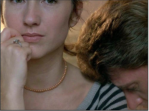
I couldn’t help James much at the time, but I did send him a couple of frames that favored squareish compositions and that came from 35mm prints. Other frames we reproduced, at 1.37, in both editions of Film History: An Introduction. The still that pretty much settles the matter for me is the gorgeous shot of Nathalie Baye and Johnny Hallyday at the top of this entry. Here’s the image as it is on a 35mm print.
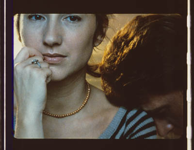
Downsize that to 1.66 without losing those eyes!
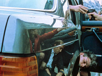
Later I sent James another killer example, drawn also from a 35mm print of Detective. (It’s in the new Film Art, p. 46.)
Here’s what it would look like in one try at 1.66 matteing.
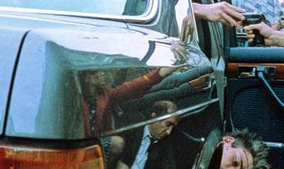
I say “one try” at a matted version because I didn’t take as much off the top as a normal aperture plate would; I didn’t want to slice into the hands and the gun. Not only is the 1.37 image preferable (we get to see Claude Brasseur’s slumping posture) but 1.66 looks, as James says, jammed. The 1.37 ratio lets Godard load information in the very top of the shot, as we’ll see often in the examples to come. And, needless to say, at 1.85 the shot would make no sense.
Soon after James and I had our exchange, Godard—perhaps prodded by James’ query—sent a diagram to Cahiers du cinéma. (3) (Thank you, Craig Keller, aka evillights, who called attention to it on this thread.) The Cahiers editors report that Godard has asked that Notre musique be shown in 1.37. His photomontage lines up two shots from the film and arranges them according to the three major “flat” ratios, and for each one he supplies a tart annotation.
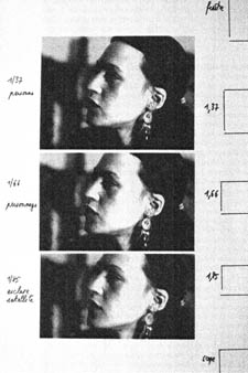
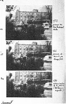
For the close-up of the woman, the captions translate as: 1.37 person. 1.66 character. 1.85 satellite slave. For the long shot of the street, we get: 1.37 Proof of Serbian bombing. 1.66 Proof diminished by Europe/ USA. 1.85 Extermination of proof (Milosovec acquitted).
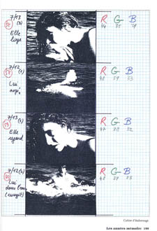
Pretty strong evidence that JLG doesn’t like cropping the classic format. But these remarks are about Notre musique. What about the other films? Apart from the evidence onscreen and on the film strip, we can add one thing. Evidently he shoots at 1.37, but there’s also evidence that in the late stages of postproduction he seems to preserve that ratio. Here, for example, is a sheet of color timing instructions for Nouvelle Vague. (4) Godard has pasted in a frame for each shot in the sequence, and alongside he notes how much red, green, and blue he wants. The frames he mounted are 1.37.
Recently our Cinematheque has been holding a Godard retrospective, and I’ve taken the opportunity to revisit the aspect ratio issue. As an archival venue, we can screen at any ratio, even the squarish silent and early-sound ones. Our projectionist Jared Lewis has run the Godards at 1.37. They look fine.
Jared pointed out to me that one other factor leans toward screening them in the 1.37 format: the thickness of the spaces between frames. In a modern “full-frame” film like Hudsucker Proxy, there is very little space between the frames. The line separating one from another is quite thin. That tends to make the frames squarer, closer to 1: 1.2, as I mention in endnote 2.
In a classic sound film, there is often more space between the frames. Usually that space is black, but I can’t resist showing what it looked like in Technicolor.
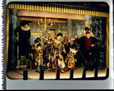
This frame, from Renoir’s Golden Coach, shows the characteristic silver frame surround (and silver soundtrack) of a true Tech print. Nifty, huh?
Anyhow, the sort of thick spacing between frames that we get usually find in Godard prints, and that’s visible in the Baye/Hallyday frame above, favors the classic ratio. The thickness of these spacers is similar to what we find in a modern film that was explicitly designed for 1.37 screening, Hans-Jürgen Syberberg’s Parsifal (1982).
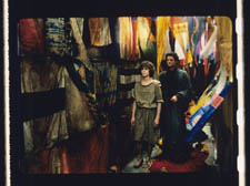
This array, Jared points out, gives different frame proportions than one would find in a print hard-matted to 1.66 or 1.85.
One more wrinkle. On the film strip, Godard’s frames aren’t all the same dimensions. Here are two from Je vous salue Marie; note that the first is taller, with narrower spacers, than the second.
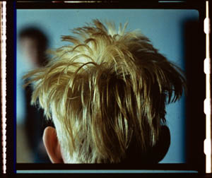
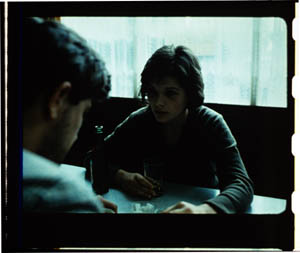
Both, however, would be appropriately shown at 1.37.
How then are we to explain Godard’s saying the films should run at 1.66? Perhaps, as one of the online commentators has suggested, Godard assumed that 1.66 is the closest that most commercial venues can come to 1.37. Perhaps too he was just being contrary–that is, just being Godard.
Fortunately, some DVD producers seem to recognize his full-frame aesthetic. The UK version of Detective is full-frame and preserves my nifty shots. Also, the Cahiers du cinéma discs for Prénom Carmen, Hélas, and so on are at 1.37. Bowing to Godard’s wishes, Wellspring’s version of Notre Musique announces that it is presented “in its original theatrical aspect ratio of 1.33.” Although purists may say that virtually no theatres showed it that way, we should appreciate the gesture.
Relationships: The fundamental question
Even if you’re not that interested in Godard, everybody should be aware of what video cropping can do to the film image. I’m not talking about panning and scanning, that process which begins with a widescreen film, typically one of an aspect ratio 1:2.40, and extracts a 1.37 frame out of it for video purposes. This is deplorable, but most of us are alert to it. What’s more interesting is the sort of thing that happened when a film is cropped inaccurately, either in projection or for DVD.
My example will be from the first reel of Godard’s Éloge de l’amour/ In Praise of Love, which is available on DVD in a full frame version from Optimum in the UK and in a cropped version from New Yorker in the US. I won’t be focusing on the quality of each transfer, though the Optimum one looks superior to me.
Nor will I do a detailed narrative account, because I find the characters and their interactions still fairly baffling. I’m always amazed that critics can praise a Godard film without ever getting down to explicating what’s literally happening in a scene. They write as if these films were telling their stories straightforwardly. Without help from the presskits, could journalists discern even the sketchy plots they refer to? A great deal of the fascination of Godard’s late works comes from his refusal of the most elementary forms of exposition–picking out characters, explaining their relations, and the like. There is always a story, but it’s about three-quarters hidden, and this seems to me to require a lot more analysis than people tend to give it.
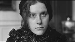
Anyhow, in studying Éloge de l’amour‘s video versions, I learned that there can be a big difference between tiny numbers. For instance, the Optimum version is prepared at 1.35:1. No big deal between this and 1.37:1, surely? Except that the New Yorker version seems to have started from a 1.37 frame. Even though it’s cropped on the top and bottom, it consistently supplies a tad more information on the right and left edges, and these extra bits are visible in side-by-side comparison. First, a 35mm frame.
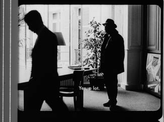
Needless to say, the projector’s aperture plate won’t preserve everything in the physical frame; at a minimum it masks off the curved corners. But if we look at the two video versions, there are some surprises.
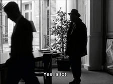
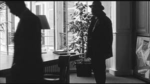
The 1.37 version of this shot is of course much closer to the overall composition of the original. But more areas of the window frame (on the left) and the painting (on the right) are visible in the widescreen version than in the full-frame one. Did going for 1.35 shave off those areas? Moreover, New Yorker’s cropping is at 1.77, for all intents and purposes the same as 1.75. But to achieve this wide frame, the transfer of some shots seems to have been optically stretched a little. In some upcoming examples the faces are a bit plumper and the surroundings a bit more horizontally spacious.
Okay, maybe I’m splitting hairs. So let me assume that the UK DVD preserves a reasonable amount of the 35mm original. I want to consider some effects of the cropping we get in the US DVD. Some are obvious, some more subtle, and all go beyond this individual case to suggest the results of overcropping any movie.
(1) Of course we lose the top and bottom. In the full-frame shots from Hudsucker Proxy, no problem; the filmmakers are counting on the projectionist to mask the frame. But in Godard the cropping makes us lose stuff. Godard likes to frame heads pretty high in the shot, and this means that we often lose part of them.
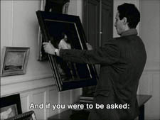
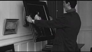
Heads are trimmed in movies all the time, and it doesn’t much matter in close views. But in Éloge, Godard is composing long shots with heads quite high up. He will even daringly chop off heads himself. This is partly a strategy to conceal who is present, to block our recognizing characters by their faces. It also has the effect of activating areas of the frame that aren’t usually so important. We have to strain to see partially visible things, tucked away in bits of the shot.
In the example below, I submit, the original composition creates a tension among three centers of interest: the two very visible paintings and the almost indiscernible face of the art dealer standing by the rear window. That tension is lost when the 1.77 cropping lops off the head in the background. Significantly, the man offscreen left is talking about how classic painting displayed “relationships” (rapports)–presumably both personal and pictorial. “That’s the fundamental question.”
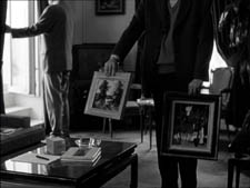
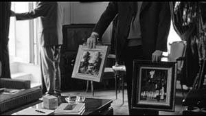
The framing of the assistant in the foreground, incidentally, shows that spotting a decapitation in a video version doesn’t necessarily mean that Godard wanted every head to be seen.
In a later scene, we strain to see the older man’s face as he bends over Bruno. As he speaks Picasso’s immortal line, his profile scrapes the very top of the shot, but not in the cropped version.
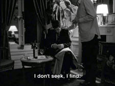
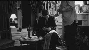
In most film shots, the upper half of the frame harbors what we look at first, so we’re probably most likely to notice when something goes missing there. But actually, the area at the bottom of the frame is important too, especially as part of Godard’s all-over approach to composition.
Throughout early scenes of the film, Godard’s compositions favor the art works and minimize the humans trafficking in them. So the picture (by Delacroix? Matisse?) on the coffee table is foregrounded when the art collector signs the papers proffered by a mostly unseen woman, but it vanishes in the cropped version.
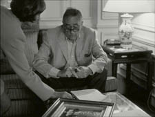
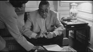
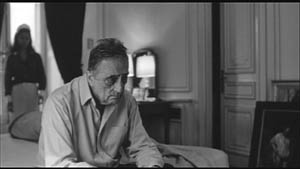
Likewise, the old man on the bed can rub his glasses fretfully at the very bottom of the 1.37 format, but that performance detail goes for naught in the 1.77 format.
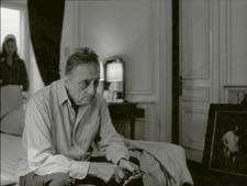
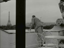
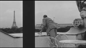
More generally, even when we scan the top half of the frame for major information, we tend to take for granted that people are anchored to a ground plane, the earth or the floor or whatever. Often, of course, film shots don’t show us this ground. But the material at the bottom of a distant view can weight the shot, providing a sense of gravity. Here, the dealer peering over his balcony is minimally tied to the patio ground (as minimally as he was visible in the earlier shots when his head grazed the upper edge, I suppose). But in the 1.77 version he floats free.
(2) The top and bottom zones include the corners of the frame as well, but I single them out for special mention because I like them so much. Again, we don’t expect key information to be tucked there, but it can happen—in Godard, in Tati (a big influence on the late Godard), and even in one remarkable shot in Lumet’s recent Before the Devil Knows You’re Dead. In the first reel of Éloge de l’amour, the best example I can find comes with the long-shot of the woman, turned from us, standing at the window. In the lower right corner of the shot sits a woman’s photograph on a table. The 1.77 frameline chops it off and makes it less segregated for our notice: we lose the spacing that separates it from the other objects on the table. Since the voice-over is meditating on memory, the photo adds an overtone to the shot, but less clearly in the cropped version.
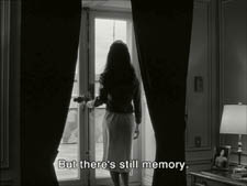
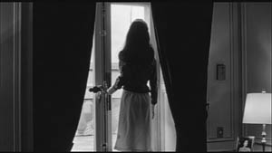
Maybe it matters, maybe not; but it’s a lot harder to see in 1.77 than in the 1.37 transfer. Something similar happens with the businessman’s hand in the lower left of this shot.
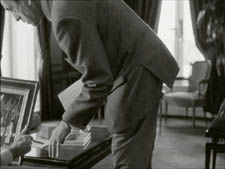
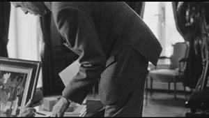
(3) Cutting off top and bottom alters the shot scale. All other things being equal, cropping not only eliminates; it enlarges. Figures come closer to us. A medium shot becomes a medium close-up. All of the examples so far indicate this to some degree, but it comes across clearly in these variants.
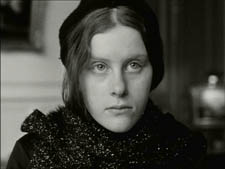
Again, note the stretching. It seems that someone decided that the image had to be 1.75 and instead of cropping it, stretched the 1.66 one. Yikes!
(4) Overambitious cropping changes the compositional dynamics. In reducing information, it reorganizes the composition. Rudolf Arnheim (I blogged about his achievements here) suggested that we consider a picture as a field of vectors and forces, pushes and pulls, balance and imbalance, rival centers of attention. By changing the framing we change the relation of the figures to the edges, and this can alter the composition.
The clearest examples come from the sort of reframings we find when a Super-35mm film is rendered in home video versions in both 2.40 and 1.37.
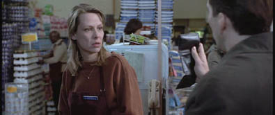
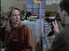
In this shot from 8mm (the movie, not the gauge), the cashier questioned by Cage looks more isolated in the Scope framing, while in the full frame they seem closer together and he seems to press in on her. Cropping can change a lot.
Now consider this comparison.
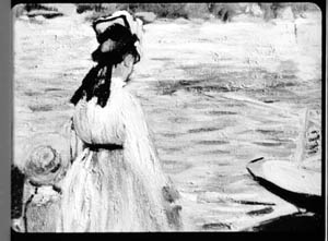
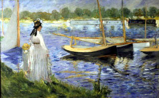
Godard’s original shot (here from 35mm) keeps the painting’s upper horizon, the darker, frothy waterline as a kind of backboard, halting the water’s recession into the distance. Graphically, the water on the right center becomes a negative space for the two figures, with the boy counterbalanced by the tip of the skiff.
But the cropped version loses the distant waterline, creating an infinite stretch of space top to bottom, and the boy’s head seems to float more freely. Most starkly, the skiff, by losing its shadow, seems to have swung more toward us.
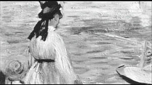
It’s worth noting that Godard himself is a mean hand at radical cropping. I’ll forebear from rambling on about what his original framing above does to the original, Manet’s Seine at Argenteuil (1874), but it could constitute a lesson in how framing changes effect and meaning.
Several factors come into play when we look at this shot from the two DVD versions.
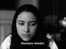
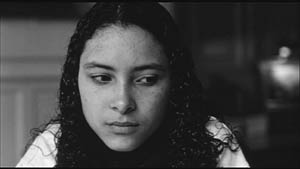
The woman’s face is off-center in both images, but it looks more off-center in the 1.77 transfer. In fact, despite the extra bits on left and right, it is measurably more off-center, because of this transfer’s optical stretching. Yet I’d argue in addition that the cropping of the frame has squeezed the pictorial elements into a stronger horizontal to-and-fro, giving a sense that she has been pushed more out of the middle. You can see it more markedly if we crop it more drastically, and it may help to hide the others when you look at this.
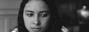
This effect is akin to what happens in the cropping of the 8mm example: the spatial relations have reorganized in relation to the frame edges. Rapports again.
(5) Overcropping can affect the way we experience the time of the shot. Before you call the men in the white coats, I hasten to say that cropping is purely a spatial effect, but in cinema space is bound up with time.
We’ve seen that Godard manipulates the vertical dimension of the frame to an unusual degree, and the effect on time becomes apparent in one scene of Éloge in which Bruno talks with an older man, in a sort of casting session for his project. First we see Bruno alone, and as he walks to the window the old man comes in, his back to us. We presume it’s a man by the bulk, the gait, and the fedora, making its appearance in the upper right corner.
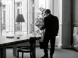
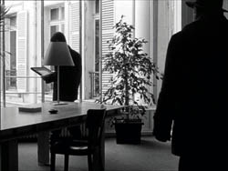
Or does a man come in? In the 1.77 version, at the corresponding point in the shot, we can’t tell it’s a man until the figure comes further into the room.
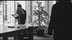
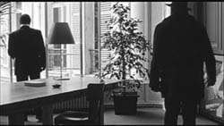
Godard’s reliance on the upper part of the frame allows us to discern the caller sooner in the 1.35 version. Seconds, even split-seconds, matter in cinema. Insofar as cropping affects the timing of a shot’s unfolding, it affects our experience.
( 6) Cropping affects perspective, the perceived distances and volumes of objects in the visual array. Blowing up the center of an image creates a flatter, more friezelike space than we discern in the original. This becomes evident in a later phase of the scene I just mentioned. After Bruno leaves the shot, the old man is left standing in the office.
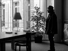
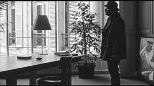
The 1.77 image looks more like it was shot with a long lens than does the full-frame version. The result recalls the sort of perpendicular telephoto framings so common in the 1970s, in films like The Parallax View and The Conversation (below).
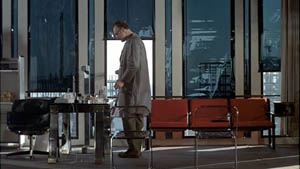
Godard has said that he preferred 30-40mm lenses for much of Sauve qui peut (la vie) because a focal length of 50mm (and presumably one longer than that) will “destroy perspective.” (5)
Many of these differences wouldn’t matter in most films, which aren’t composed as meticulously or as daringly. Hollywood images aren’t typically as dense as those in late Godard. (I must do a blog some day on fussbudget filmmakers like him.) But even if these niceties seem negligible, I think you’ll grant that the film would be much more compromised by being shown in a 1.85 ratio, the squarest option available in most commercial theatres today.
Critical discussions of Godard’s late films have treated them as poetic meditations, and that seems partly right to me. Yet few critics ask how they manage to create their lyrical, associative quality. I think, as I hope to show in a future blog, this has to do with his treatment of narrative (naturally) and his layout of scenes. But even before we get there, I think that we find in the very texture of his images (let alone his sounds) a daring decentering of faces and bodies—the usual nodes of our attention. If he often blocks the flow of our glance, it’s in order to rechannel it to unexpected areas and textures, crannies and gaps, within the image. And so we want all those areas and textures, along with the crannies and gaps, available to our eyes and minds.
(1) James Quandt, “Here and Elsewhere: Projecting Godard,” in For Ever Godard, ed. Michael Temple, James S. Williams, and Michael Witt (London: Black Dog, 2004), 126-139.
(2) Geek note: You may notice that this “full-frame” image isn’t itself in the 1.37 ratio. It’s very square. The reason is that many 1.85 frames will be exposed in the camera at a ratio of 1: 1.2! I believe this was standardized for the Panavision cameras of the 1970s and afterward, though I’d appreciate more information about this. See the entry on Panavision cameras in American Cinematographer Manual, fifth ed., ed. Charles G. Clarke (Hollywood: American Society of Cinematographers, 1980), 104. See also Rob Hummel, “Comparison of 1.85, Anamorphic and Super 35 Film Formats,” American Cinematographer Manual, eighth ed., ed. Rob Hummel (Hollywood: ASC Press, 2001), 24-29.
(3) Jean-Luc Godard, “Formats,” Cahiers du cinéma no. 591 (May 2004), 78.
(4) This image is taken from Jean-Luc Godard par Jean-Luc Godard, vol. 2: 1984-1998, ed. Alain Bergala (Paris: Cahiers du cinéma, 1998), 199.
(5) Jean-Luc Godard, “Propos rompus,” in Godard par Godard vol. 2, 466.
Thanks to Suzy Buenger and Nancy Marshall for identifying the Manet painting for me.
PS 15 Dec: And thanks to James Quandt, Michael Kerpan, and Yogesh Raut for a name correction I’m too embarrassed to specify further.
PS 7 April 2008: The issue is raised anew with Gus van Sant’s Paranoid Park. It’s designed to be shown at 1.37, with more than a few shots reminiscent of Godard. Joe Beres explains here.
PPS 25 January 2009: Ranjit Sandhu provides a lively and detailed discussion of aspect ratios and matteing strategies, along with remarks on Godard’s frames.
PPPS 21 Sept 2009: Thanks to editor John Olivio for a correction on the 1.78 aspect ratio.
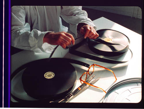
JLG par JLG (1995).
Three nights of a dreamer
DB here:
The close-up blogathon launched by Matt Zoller Seitz is over, but it contains enough specimens and analyses for a hefty book. It also inspired Jim Emerson to devote a cine-lyric to the close-up. I missed the deadline, so I suppose that this constitutes my sideways contribution to Matt’s enterprise.
Sideways, because a full-blown analysis of In the City of Sylvia (En la ciudad de Sylvia; Dans la ville de Sylvie) would be a breach of decorum. Most people haven’t heard of this new film by José Luis Guerin, let alone seen it. I saw it at the Vancouver festival in September, and it will make its way through the festival circuit over the coming months and should show up on cable or DVD thereafter. But apart from calling attention to it as a remarkable film, I want to look at one of its most absorbing sequences and suggest some of its originality. Lee Marshall has already pointed out one of Sylvia‘s arresting features:
Guerin seems to have created pure drama without recourse to story. We’re always taught that story is the engine of drama. Not here: somehow Guerin has created an almost plotless film that has the dramatic tension of vintage Hitchcock. (1)
Although the story situation is slight, the tension we feel springs partly from vivid stylistic patterns. In other words: Minimal and uncertain story action is heightened by engaging visual narration. This narration in turn derives its power from one of the most traditional devices of filmic storytelling.
Consider the other person’s point of view
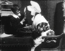
The point-of-view shot is a mainstay of cinematic storytelling, and its history is an intriguing one. Many of the earliest examples we have are motivated as views through optical gadgets. Two films by the Englishman G. A. Smith, both from 1900, handily show the options. Grandma’s Reading Glass justifies the point-of-view image as what the boy sees when he peers at granny through her big magnifier.
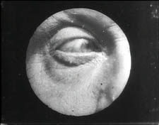
Smith’s As Seen through a Telescope motivates the cut-in POV shot as what our dirty old man in the foreground has an eye for.
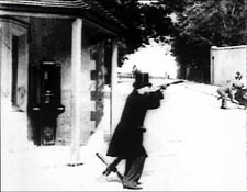
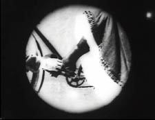
Fairly soon, this use of the magnifying POV shot was mingling with more straightforward ones. In The Birth of a Nation (1915), D. W. Griffith offers a rough-edged example. When the Stoneman brother and sister visit Ford’s Theatre on the night of Lincoln’s assassination, we see Elsie pointing out the famous actor John Wilkes Booth.
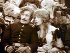
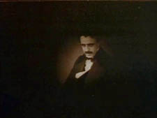
Booth is framed in an iris, which Griffith often uses to underscore an important image. But when Elsie studies Booth through her opera glasses, Griffith, usually not fastidious about such things, supplies the same irised image, now doing duty for the sort of magnifier-masking we get in the Smith films.
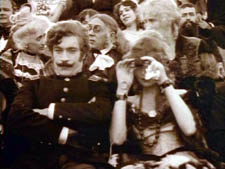
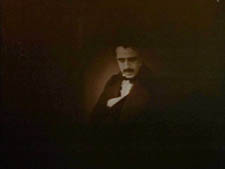
Presumably a more consistent technique would show Booth in long shot first, without the iris, and reserve the optical masking for replicating the view through the opera glasses. This is what happens in Ernst Lubitsch’s Lady Windermere’s Fan (1926), which contains a sequence built entirely around crisscrossed character looks. (1)
The woman of the world Mrs. Erlynne arrives at the racetrack and creates a stir, causing many men to watch her from all over the grandstand.
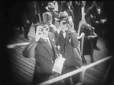
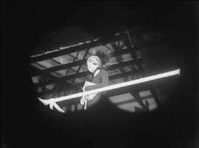
Note that Lubitsch has gone beyond Griffith by fitting the angle of Shot B to the viewer’s orientation, looking up. There are so many POV shots that at one point Lubitsch simply shows her from different angles and deletes the shots of each watching man.
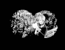
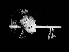
This is a fascinating example of a process we often see in stylistic history. An “overlearned” visual convention can be treated elliptically; the filmmaker can leave out bits and we’ll fill them in. The binocular masking suffices to let us know that Mrs. Erlynne is being studied from afar. Moreover, Lubitsch gets an expressive bonus from being so concise. Now it doesn’t matter who’s watching, just that somebody is—actually, a lot of somebodies.
Later, after much more byplay with people looking at one another and misunderstanding what they see, Mrs. Erlynne sits down. Three gossips have been studying her, but now their view is blocked. So one gossip has to twist around to spy on her, and Lubitsch obligingly gives us a slightly tipped point-of-view framing—a full shot, without masking.
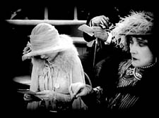
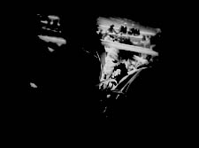
Adjusting her binoculars, the gossip is able to get a bigger view of Mrs. Erlynne, and she racks focus gleefully to catch a gray hair peeping out.
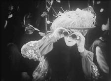
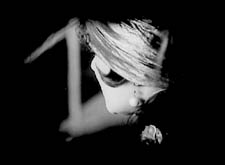
The visual narration in this sequence, already perfectly modulated, supplies the stylistic premise for Hitchcock’s Rear Window and all of its progeny, most recently Disturbia (2007). What might be overlooked is that by the 1920s the view through a device—field glasses, a microscope, a surveillance camera—had become a special, marked case. From then till now, the default POV pattern is the simple shot of a character looking, followed by an unadorned shot of what that person sees, from more or less the correct standpoint. Lubitsch’s sideways shot of the gossip’s view of Mrs. Erlynne, casually introduced, exemplifies the modern norm for presenting a character’s vision, and it’s so common that we seldom notice it.
POV shots: The basics
In his book Point of View in the Cinema, Edward Branigan itemizes the cues that the filmmaker can manipulate in creating a POV construction. (2) To simplify somewhat: Shot A shows a point in space and a character glance from that point. Shot B is taken from a camera position more or less approximating the point in A, and it shows an object. The shot-change presumes temporal continuity between A and B, and we assume as well that the character is aware of the object shown in B.
This seems like a complicated way of stating the obvious, but by teasing these elements apart, Branigan shows that each one can be manipulated in intriguing ways. For example, you can create a disorienting moment by violating the condition of temporal continuity. Ozu does this in Early Summer (1951), when Noriko and Aya decide to peek in at the man Noriko almost married. The two women tiptoe down a hall toward us as the camera tracks slowly backward. Ozu cuts to a forward-tracking shot that momentarily suggests a reverse angle POV on the corridor.
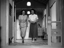
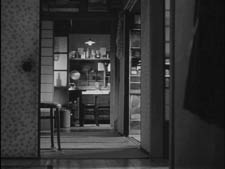
In fact, however, the camera movement is revealed to be the first shot of a new scene, among different characters, and we won’t ever see the man the two women went to spy on.
Here’s another interesting case, not cited by Branigan. In Halloween (1978), John Carpenter shows Laurie looking out a window and seeing Michael Myers in his mask, standing between fluttering washlines.
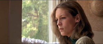
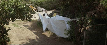
Cut back to Laurie, now frowning slightly.
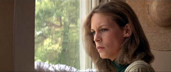
Cut to a second POV shot; but now Michael has vanished.
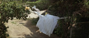
This simple change in shot B’s object, Michael himself, has an uncanny effect. Did Michael just walk away from the washline? If so, this is an odd way to present it. Why not show him walking away? Alternatively, did he just disappear? Surely not; Laurie would be shocked. Carpenter wins twice over. Without obviously violating realism or directly showing that Michael has supernatural powers, he gives Michael the ability to come and go in a ghostly fashion. By the end of the film, when he miraculously disappears after a fall that would kill an ordinary person, we are prepared to believe that he is indeed, as Dr. Sam Loomis says, the Boogyman.
Who is Sylvia? What is she that all the swains commend her?
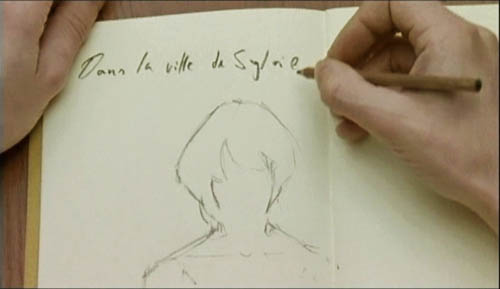
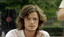
In the City of Sylvia centers on a young man staying at a hotel. We’re given no reason why he’s visiting the city, and no backstory about him. One day he’s sitting at a café. Now, across nearly twenty minutes of screen time he watches women and idly sketches them.
The sequence is a pleasure to watch, partly because of the constant refreshing of the image with faces, nearly all of them gorgeous, most of them female. Either Strasbourg has an extraordinary gene pool, or this café attracts only Ralph Lauren models. Yet the scene builds curiosity and suspense too, thanks to Guerin’s sustained and varied use of optical POV. He gives us an almost dialogue-free exploration of a cinematic space through one character’s optical viewpoint. (Stop reading here if you don’t want to know anything more about the film before you see it.)
The young man, known in Guerin’s companion film Unas fotos en la ciudad del Sylvia as the Dreamer, is almost expressionless as he scans the women’s faces. Slight shifts of his glance are accentuated by his habit of turning his head but keeping his eyes fixed. In over a hundred shots, Guerin uses some ingenious cinematic means to tease us into ever-greater absorption in the Dreamer’s visual grazing.
Fairly far into the sequence, Guerin gives us more or less the orthodox POV construction. The Dreamer looks at one woman at a table, and we see her return his look.
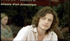
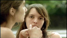
But here shot B isn’t really clean: the hands of the woman on the left sometimes block our view of the principal woman. This obtrusiveness is one of Guerin’s most basic strategies in the sequence. Inevitably, in passages before and after the cut I just showed, what the Dreamer is looking at is partially hidden in layers of faces and body parts.
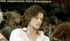
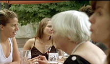
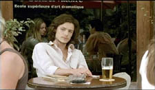
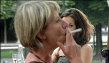
Our prototype of the POV cut presumes a more or less single ‘point’ we are watching in shot B, but throughout this scene Guerin plays with this cue. He tantalizes us with several points to be observed, and he often obscures the most important ones. He also creates some startling juxtapositions. Near the very start we get this shot, which may or may not be the Dreamer’s POV.
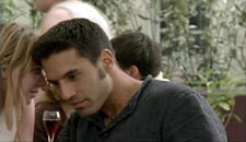
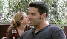
By making the background girl seem to kiss the foreground guy, Guerin, as Eisenstein would say, “christens” his sequence. In effect, the image says: Watch out! Layered space will become important! When I saw this shot, I nearly jumped out of my seat.
The Dreamer is treated no differently, at least at the start. In most movies, the POV construction is set up with a clear, clean framing of our looker in shot A. Here, though, at the start of the scene Guerin peels away layers to get to our man. For the first six shots of the café, we don’t know he’s on the scene. Then he’s shown out of focus, in the background of more prominent action. The woman in the foreground has been primed to be the shot’s subject. At the moment she shifts her gaze and we try to read her expression, a second woman on the distant right shifts aside to reveal the Dreamer behind her.
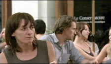
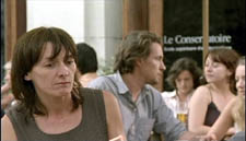
Surely this is the most unemphatic entry of a protagonist we’ve seen in a while! Guerin is able to add planes to block the main ‘point’ of shot B because he’s working with long lenses, a crowded space, and careful choreography. Even focus plays a role, as in this case; our Dreamer is pretty hazy.
One upshot of this strategy is that we’re plunged into a “cubistic” space, in which slightly varied camera angles pick up bits of space we’ve seen in earlier combinations and oblige us to assemble it all in our head. Be thankful for the guy in the blue shirt above, for he plays an anchoring role in several setups that would otherwise float free.
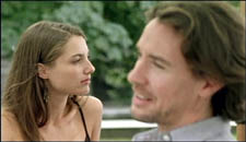
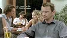
It’s hard to convey in stills how much fascination and frustration that this teasing style creates. Like the Dreamer, we’re given only glimpses of the women, and even though we don’t know his purposes—is he just an artist in search of beauty? a serial killer picking out victims?—the partial views lure us at several levels. We try to complete the faces. We try to infer the women’s state of mind from their expressions and gestures, which are far more animated than our Dreamer’s.
And a search for story plays a part here. We’re primed for some action to start, and we browse through these shots looking for anything that might initiate it. Each face the Dreamer spots promises to kick-start a plot: when the Dreamer gets a full view of one of these women, perhaps things will get going.
Without giving away every detail, I’ll just say that the sequence has a strong visual arc as the Dreamer starts paying more and more attention to certain women. And just as he finally gets a full view of one fabulous face, his attention wanders to . . . another layer, this time one inside the café.
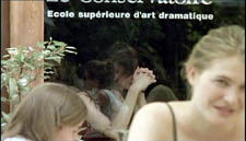
As he gapes at the woman inside, layers pile up, creating a cubistic climax of all the optical obstructions we’ve encountered.
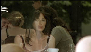
The motif of reflections will take over the rest of the film’s visual design, and eventually we’ll see that some of the Dreamer’s drawings evoke the piled-up and sliced-up faces in the café shots.
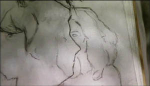
Later in the film, the Dreamer will explain why he’s in the city and why he’s scanning women. We’ll have a tram ride that Guerin compares with Sunrise, and a scene in a music club that not only parallels the café sequence but evokes Manet. We’ll also have occasion to compare this film with Bresson’s Four Nights of a Dreamer, a citation signaled from the outset.
All that is to come. Even if the later scenes weren’t as compelling as they are, this café sequence would make Sylvia one of the most adventurous films I’ve seen this year. By revising the simple, long-lived POV schema, Guerin has made it yield fresh feelings and implications. Like Lubitsch’s racetrack scene, this imaginative sequence provokes the jubilation you feel in the presence of calm, precise artistry.
(1) Lee Marshall, “Past Perfect,” Screen International (19 October 2007): 27. The web version is here, but it may require a subscription.
(2) I analyze the visual narration of Lady Windermere, which I think deserves to be ranked with Potemkin and Sunrise, in Narration in the Fiction Film (Madison: University of Wisconsin Press, 1985), 178-186.
(3) Edward R. Branigan, Point of View in the Cinema: A Theory of Narration and Subjectivity in Classical Film (The Hague: Mouton, 1985), 102-121.
Scribble, scribble, scribble

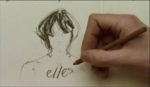
Detective (Godard, 1985).
Another damned, thick, square book! Always scribble, scribble, scribble, eh, Mr. Gibbon?
William Henry, Duke of Gloucester, 1781.
David here:
Kristin kept the blogfires burning while I traveled last week and did UW duties this one. I had a great time at the University of Georgia in Athens (but didn’t see Stipe) and at Emory in Atlanta (but didn’t see Scarlett). At both places I met sharp, energetic students and faculty. I have a couple of blog entries backlogged for posting, but now recent items relating to publications get the pole position.
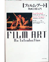 First, a Japanese translation of our Film Art: An Introduction has just appeared. It’s a very handsome version of the seventh edition, rendered by Fujiki Hideaki and Kitamura Hiroshi. We’re grateful to them and to Nagoya University Press for publishing it.
Second, the University of California Press is having a big sale on many outstanding media titles, from Richard Abel’s books on French silent cinema and André Bazin’s classics of film theory to Michele Hilmes’ study of NBC television and Mike Barrier’s new Disney biography, The Animated Man. To get the discount you must sign up for an e-newsletter, but it’s not intrusive.
Among the books of mine on sale, the biggest bargain is the hardcover edition of Figures Traced in Light (2005), originally priced at $65, now going for $7.95 plus postage. (No, apparently I don’t get the full-price royalties.) You can find this item here. There are also paperback copies of Figures (going for $12.95) and of The Way Hollywood Tells It ($15.95). If you’re inclined, hurry: the sale ends on 31 October.
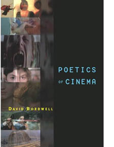 The biggest news, though, is that I just got my author’s copies of Poetics of Cinema, published last week. For a while Amazon was telling some people who pre-ordered it that copies won’t be available until 27 December, but now, despite what it says here, the book seems ready to ship.
Bad news first. Poetics of Cinema is priced at $45 in paperback, with no sellers I know offering it at discount. Go ahead, say it: Very expensive. If you haven’t published a book, you may not know that authors have no say in the pricing of their work. Publishers would never set a price or price ceiling in a contract, and calculations about pricing are based on many factors, including what comparable books sell for. A high cost isn’t my preference, of course; every writer wants to reach as many readers as possible. But unless you blog or self-publish your work, the publisher sets the price.
There are some good reasons for the cost. Running to 500 fairly dense pages and containing over 500 photographs, Poetics of Cinema was a complicated book to produce. I peddled it to other publishers, but they ruled it out as too whopping an investment for them. So Routledge has priced it along lines of comparable books, reckoning in the size of the likely audience (I hope, more than 118.3 readers). I have to thank Bill Germano, then Publishing Director at Routledge, for taking a chance on this project.
From age fifteen or so I’ve been a compulsive writer. Scribble, scribble, scribble. I’ve been at work on one book or another for over thirty years. I’ve got several projects in mind for my next effort, but I’ve held back committing. Is there any point in publishing more books, at least as books?
I mean this as a serious question. Would it have made any difference to me or my readers if Poetics of Cinema appeared as pdfs, available at a price considerably less than $45? Wouldn’t I find more readers? What about variable pricing? If Radiohead can do it, why can’t I? Somebody in film studies should try putting a digital book for sale online; maybe I will. But for a few years at least, this last baggy monster will be available only in dead-tree format.
Poetics: Some puzzles


Gentlemen Marry Brunettes (Richard Sale, 1955).
If you’ve read this far, you may be interested in what the book is about. Most basically, it’s predicated on the belief that we make progress in research by asking questions. Some questions are too deep to be answered—call them mysteries—but others can be answered with a fair degree of precision and reliability. We can turn mysteries into puzzles and puzzles into plausible answers.
Here’s a fairly common sort of composition in Hollywood cinema of the 1940s. This shot from The Killers (1946) displays the sort of steep depth I’ve talked about at various points on this blog and in my other books.
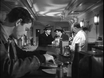
But now here’s an equally tense confrontation at a counter, from Bad Day at Black Rock (1955), made in early CinemaScope.
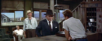
It doesn’t look much like the 1940s shot. The characters stand far from us, and the figure in the foreground doesn’t loom over the background. The shot is more open, the composition more porous. And unlike The Killers, Bad Day doesn’t contain close-ups of the actors in any scenes.
So questions come to mind. Did John Sturges have to stage the scene in Bad Day this way? Did other filmmakers resort to the same choice? What factors created pressures toward this more spacious format? Could more resourceful filmmakers have done something different? And given that such shots are rare today, what changes made it possible for filmmakers in later years to create the tight anamorphic widescreen close-ups we have now (as here in Cellular)?
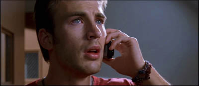
Despite all that has been written about CinemaScope and other early widescreen processes, no one has explored, shot by shot, what staging options were used by filmmakers. A chapter in Poetics of Cinema called “CinemaScope: The Modern Miracle You See Without Glasses” tries to show how filmmakers used the new format to tell their stories. This led them, I propose, to experiment with some staging strategies that, surprisingly, had precedents as far back as the 1910s.
Take another instance. We’re all familiar with recent films that present alternative futures, like Run Lola Run. A story line runs along and then is interrupted, and we switch to the same characters living a different storyline in a parallel universe. The emergence of such “forking path” movies arouses my curiosity. How do they work? How do they make their alternative-reality stories intelligible to the audience? How is it that we’re able to understand them? (After all, the notion of an infinite number of alternative universes to ours is pretty hard to get your head around.) Are such stories a brand-new innovation, or do they have precedents? (Clue: Remember A Christmas Carol?) Why do we see a cluster of these emerging in recent filmmaking?
I tackle these questions in another essay, called “Film Futures.” There I look at several such movies and try to spell out the tacit rules that filmmakers follow and that audiences pick up on. While this story format probably doesn’t constitute a genre, it does obey certain conventions, and I try to chart those. Some films also make some clever innovations in the format, which I also try to trace. The essay as well suggests how the conventions are handled differently in mass-market films like Sliding Doors and in art films like Kieślowski’s Blind Chance.
These two essays, along with the others in the book, try to explain and illustrate an approach to film studies I call film poetics. At bottom, this is an effort to explain why films are designed the way they are: how filmmakers have made certain choices in order to shape our response to their films. How do movies work? How do movies work on us?
Poetics: The project
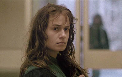
Vagabond (Varda, 1985).
As a kind of reverse engineering, film poetics looks at both structure and texture. I argue that we ought to study how films are constructed architecturally, as revealed for instance in plot structure or narration. Poetics also concentrates on stylistic patterning, the way filmmakers organize the techniques available to the medium. Poetics traditionally deals as well with thematics, the subjects and ideas that are mobilized by filmmakers and reworked by large-scale form and cinematic style.
Put it this way: I want to know how filmmakers have confronted problems set by others, or created problems for themselves to solve. I want to know how they draw on the past to borrow or modify or reject creative strategies. I want to know filmmakers’ secrets, including the ones they don’t know they know. And I want to know how all this creative activity is shaped to the uptake of spectators in different times and places.
Some of what I’ve written on this blog could illustrate how the poetics-driven perspective works in particular cases. The book offers more such instances, probed in more detail than is possible here. Using a comparative method, I also trace out some general principles of film form and style as they have developed over history.
The book consists of fifteen essays. Some have been published before; those have been revised for this collection. Other essays are newly written. After a somewhat polemical introduction, the first part concentrates on some theoretical problems. The anchoring essay offers a general introduction to the idea of a film poetics, with several examples. (An earlier version is on pdfs here.) In the same essay, I float a model of how film viewers respond to various aspects of films. I distinguish activities of perception, comprehension, and appropriation, and I suggest that a cognitive perspective sheds light on them.
Part I also contains an essay considering how cinematic conventions work. A poetics-based approach will spend a lot of time on norms, traditions, and received routines, for these are often the basis of filmmakers’ creative choices. This essay argues that some conventions are local and require a lot of cultural knowledge, while others are cross-cultural, compelling us to study why certain cinematic strategies seem to crop up across the world.
The second part of Poetics of Cinema considers narrative, one of the most common ways in which films are organized to affect viewers. I wrote a new essay to launch this section, a wide-ranging study called “Three Dimensions of Film Narrative.” The three dimensions I consider are narration, plot structure, and the narrative world. The essay considers how each of these shapes our understanding of a film’s story. This essay ends with a discussion called “Narrators, Implied Authors, and Other Superfluities.”
Some more tightly-focused pieces follow. One is devoted to forking-path plots. Another concentrates on an odd question: What role does forgetting play in our watching a film? Cognitive theory can offer some answers, and I take Mildred Pierce as an example. There’s an update of an essay that has been something of a golden oldie in film courses, “The Art Cinema as a Mode of Film Practice.” In a supplement to that piece I suggest some new avenues of inquiry and draw on more examples, notably Varda’s Vagabond (Sans toit ni loi).
The longest piece in Part II is devoted to what I call network narratives. Prototypes of this would be Grand Hotel, Short Cuts, Crash, and Babel. This essay tries to show how a poetics of cinema shed light on this format, currently a very popular one. When I started looking at these movies, I was surprised to discover how many filmmaking traditions work in this vein; I append a filmography with nearly 250 items, and today I could update it with several more. (1) I consider how this option has developed distinctive strategies of narration, plotting, and worldmaking. I also survey some common themes running across network tales, such as the role of chance and fate. The essay finishes with more in-depth analyses of four films: Altman’s Nashville, Iosseliani’s Favoris de la lune, Anderson’s Magnolia, and Jean-Claude Guiget’s Les Passagers.
Poetics: More problems
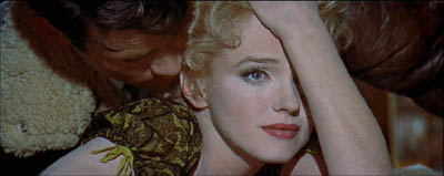
Bus Stop (Logan, 1955).
Part III moves from questions of narrative to questions of film style, no stranger to this blog. The opening essay is a tribute to Andrew Sarris that appraises his role in making readers of my generation style-conscious. It’s the most personal piece in the book. There follows a study of Robert Reinert, a director in the German silent cinema who might have become much better known if his quite demented Nerven and Opium had been as widely seen as Caligari. The essay “Who Blinked First?” considers how our reaction to films is affected by the ways in which actors use their eyes, including how and when they blink. Big deal, huh? Actually, yes.
The monster essay in this section is the CinemaScope piece, of which I’ve given versions in lecture form over the last couple of years. I argue that some directors responded to the new widescreen technology by adapting certain norms of staging and shooting to the new format, while other filmmakers moved in more adventurous directions. The piece uses the model of problem/solution as a way to understand stylistic continuity and change, a framework I’ve floated in On the History of Film Style as well.
The last four studies in Part III are devoted to style in Asian cinema. There are two essays on Japanese film of the 1920s and 1930s, both expanded somewhat from their original versions. There I argue that we can see Japanese directors as building upon, as well as adventurously departing from, stylistic norms shared by most filmmaking countries of the period. This brace of essays fills out some ideas that I fielded in Ozu and the Poetics of Cinema, and they should appeal to that growing body of viewers who have developed a passion for Naruse Mikio and Uchida Tomio. It’s gratifying that several of the films I discuss, which I had to study in archives, are now circulating in touring programs.
Poetics of Cinema concludes with two studies of Hong Kong film, one surveying the stylistic tactics by which that very lively tradition excites its audience, the other analyzing the unique innovations of King Hu. The articles are companion pieces to Planet Hong Kong.
Poetics: The mysteries
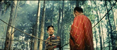
A Touch of Zen (King Hu, 1970).
As an approach to answering questions about cinema, poetics blends history, criticism, and theory. It requires that we do research into the artistic history of film, looking at styles, genres, narrative modes, and other traditions. It asks for close analysis and interpretation of films. At the same time, it asks broader questions about what principles govern narrative, stylistic patterning, and the like. I’d say it obliges a historian to concentrate on aesthetics; it makes criticism more historical and theoretical; it ties theory to concrete historical conditions and the fine-grain workings of individual films.
Kenneth Burke used to say that you could get a sense of a book by looking at its first and last sentences. My book’s first essay opens this way:
Sometimes our routines seem transparent, and we forget that they have a history.
I think that this captures my concern to look closely at familiar things in film and try to make their principles a little more evident. Yet in trying to make filmmakers’ choices explicit and tracing out the principles undergirding how we make sense of movies, I’m sometimes criticized for simply stating common sense. Poetics can look bland alongside the skywriting swoops of most academic film theory. But skywriting is blurry and dissolves while you look at it. By contrast, clearly setting out some basics of filmic construction and comprehension offers a firmer place to start answering questions about how movies work and work on us.
Poetics tries to produce concrete, approximately true claims about cinema. Most film theory operates as an application, borrowing big theories of culture, identity, nationhood, and the like and then mapping them onto films. The results are usually thin. It seems to me that most film theory today is not carefully thought through or persuasively argued. For examples, see my essay in Post-Theory, the last chapter of Figures, and my comments here and here on this site.
In trying to establish reliable knowledge about cinema, we won’t answer every question and we will make false steps, but we can make progress. Film poetics is one way we film enthusiasts can join that tradition of rational and empirical inquiry which remains our most dependable path to knowledge. My introduction, though peppered with some pokes at Big Theory, has the serious purpose of making a plea for film scholars to join that tradition.
The final line of the book concludes the essay on King Hu:
The mainstream [Hong Kong] style has given us many beautiful and stirring films, but Hu’s eccentric explorations evoke something that other directors’ works seldom arouse: a sense that extraordinary physical achievement, if caught through precisely adjusted imperfections, becomes marvelous.
To get the full point you need to read the essay, but what should come through here is my concern to highlight filmmakers’ originality when I find it, and to locate it by means of a comparative method. In addition, I hope that what comes through is an appreciation of the sheer exhilaration we feel when a filmmaker has made the right, bold choice. A poetics-based approach probably can’t fully explain this feeling—it may fall under the heading of mysteries rather than puzzles—but at least it can reveal how some forces contribute to it.
My summary, and the size of the book, may leave the impression that I think that I’ve answered these questions fully. Of course I don’t. I try only to make some progress, realizing that offering answers is also an invitation to disagree, to refine the questions and tackle new ones. Nor do I think that these are the only questions that matter. We’re just starting to understand how films work and work on us, and there are a great many areas we haven’t charted. (Performance, to take a big one.) We have to start somewhere, though. I’d hope that by posing some questions and proposing some answers, Poetics of Cinema offers fruitful points of departure.
(1) Some candidates are 25 Fireman Street (1973, Hungary, István Szabó), Feast of Love (2007, US, Robert Benton), Continental—A Film without Guns (2007, Canada/ Stephane Lafleur), The Edge of Heaven (2007, Germany/ Turkey, Fatih Akin), Unfinished Stories (2007, Iran, Pourya Azarbayjani), God Man Dog (2007, Taiwan, Singing Chen [Chen Hsin-hsuan]), A Century’s End (2000, Korea, Song Neung-han), and Why Did I Get Married? (2007, US Tyler Perry).
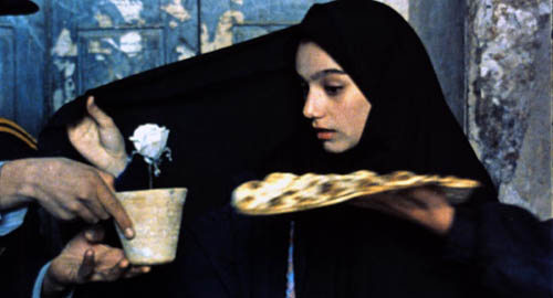
A Moment of Innocence (Mohsen Makhmalbaf, 1996).
Do filmmakers deserve the last word?
DB here:
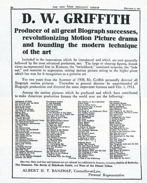
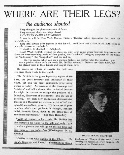
On 3 December 1913, the above advertisement appeared in the New York Dramatic Mirror. D. W. Griffith had left the American Biograph company and set out on an independent path that would lead to The Birth of a Nation and beyond. Because Biograph never credited directors, casts, or crews, he wanted to make sure that the professional community was aware of his contributions. Not only did he point out that he had made several of the most noteworthy Biograph films; he also took credit for new techniques. He introduced, he claims, the close-up, sustained suspense, restrained acting, “distant views” (presumably picturesque long-shots of the action), and the “switchback,” his term for crosscutting—that editing tactic that alternates shots of different actions occurring at the same time.
Griffith’s bid for credit was a shrewd move for his career, and it had repercussions after the stunning success of The Birth of a Nation two years later. Many historians took Griffith at his word and credited him with the breakthroughs he listed. He became known as the father of “film grammar” or “film language.” The idea hung on for decades. Here’s the normally perceptive Dwight Macdonald, criticizing Dreyer’s Gertrud for being anachronistic:
He just sets up his camera and photographs people talking to each other, usually sitting down, just the way it used to be done before Griffith made a few technical innovations. (1)
Filmmakers believed the Griffith story too. Orson Welles wrote of the “founding father” in 1960:
Every filmmaker who has followed him has done just that: followed him. He made the first close-up and moved the first camera. (2)
In the late 1970s a new generation of early-cinema scholars gave us a more nuanced account of Griffith’s place in history. They pointed out that most of the innovations he claimed either predated his Biograph work, (3) or appeared simultaneously and independently in Europe and in other American films. Some Griffith partisans had already conceded this, but they maintained that he was the great synthesizer of these devices, and that he used them with a vigor and vividness that surpassed the sources.
That judgment seems right in part, but Eileen Bowser, Tom Gunning, Barry Salt, Kristin Thompson, Joyce Jesniowski, and other early-cinema researchers have drawn a more complicated picture. (4) Griffith did speed up cutting and devote an unusual number of shots to characters entering and leaving locales. But these innovations weren’t usually recognized as original by previous historians. More interestingly, much of what Griffith did was not taken up by his successors. His technique was idiosyncratic in many respects. By 1915 younger directors like Walsh, Dwan, and DeMille were forging a smoother style that would be more characteristic of mainstream storytelling cinema than Griffith’s somewhat eccentric scene breakdowns. Instead of creating film language, he spoke a forceful but often unique dialect.
The New York Dramatic Mirror ad coaxes me to reflect on how filmmakers have shaped critics’ and historians’ responses to their work. Hawks and Hitchcock developed a repertory of ideas, opinions, and anecdotes to be trotted out on any occasion. Today, directors write books, give interviews, appear on infotainment shows, and provide DVD commentary. We know that many of the talking points are planned as part of the film’s publicity campaign, and journalists dutifully follow the lead. (In Chapter 4 of The Frodo Franchise, Kristin discusses how this happened with Lord of the Rings.) For many decades, in short, filmmakers have been steering critics and viewers toward certain ways of understanding their films. How much should we be bound by the way the filmmaker positions the film?
Deep focus and deep analysis
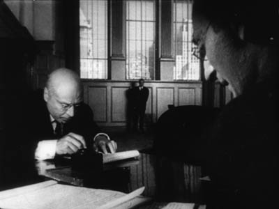
Citizen Kane (1941).
Determining intentions is tricky, of course. Still, I think that in many cases we can reconstruct a plausible sense of an artist’s purposes on the basis of the artwork, the historical context, surviving evidence, and other information. (5) This may or may not correspond to what the artist says on a particular occasion. For now, I want simply to point to one instance in which filmmakers have shaped critical uptake, with results that are both illuminating and limiting.
In the late 1940s and early 1950s, André Bazin, one of the great theorists and critics of cinema, argued that Orson Welles and William Wyler created a sort of revolution in filmmaking. They staged a shot’s action in several planes, some quite close to the camera, and maintained more or less sharp focus in all of them. Bazin claimed that Welles’ Citizen Kane and The Magnificent Ambersons and Wyler’s The Little Foxes and The Best Years of Our Lives constituted “a dialectical step forward in film language.”
Their “deep-focus” style, he claimed, produced a more profound realism than had been seen before because they respected the integrity of physical space and time. According to Bazin, traditional cutting breaks the world into bits, a series of close-ups and long shots. But Welles and Wyler give us the world as a seamless whole. The scene unfolds in all its actual duration and depth. Moreover, their style captured the way we see the world; given deep compositions, we must choose what to look at, foreground or background, just as we must choose in reality. Bazin wrote of Wyler:
Thanks to depth of field, at times augmented by action taking place simultaneously on several plane, the viewer is at least given the opportunity in the end to edit the scene himself, to select the aspects of it to which he will attend. (6)
While granting differences between the directors, Bazin said much the same about Welles, whose depth of field “forces the spectator to participate in the meaning of the film by distinguishing the implicit relations” and creates “a psychological realism which brings the spectator back to the real conditions of perception” (7).
In addition, Bazin pointed out, this sort of composition was artistically efficient. The deep shot could supply both a close-up and a long-shot in the same framing—a synthesis of what traditional editing had given in separate shots. Bazin wove all these ideas into a larger theory that cinema was inherently a realistic medium, bound to photographic recording, and Welles and Wyler had discovered one path to artistic expression without violating the medium’s biases.
There are many objections to Bazin’s argument, some of which I’ve rehearsed in On the History of Film Style. My point here is that Bazin was presenting analytical points that stemmed from publicity put out by Welles, Wyler, and especially their talented cinematographer Gregg Toland.
In a 1941 article in American Cinematographer, Toland talked freely about how he sought “realism” in Citizen Kane. The audience must feel it is “looking at reality, rather than merely a movie.” Key to this was avoiding cuts by means of long takes and great depth of field, combining “what would conventionally be made as two separate shots—a close-up and an insert—into a single, non-dollying shot.”(8) Toland defended his sometimes extreme stylistic experimentation on grounds of realism and production efficiency, criteria that carried some weight in his professional community of cinematographers and technicians. (9)
Toland’s campaign for his style addressed the general public too. For Popular Photography he wrote an article (10) explaining again that his “pan-focus” technique captured the conditions of real-life vision, in which everything appears in sharp focus. A still broader audience encountered a Life feature in the same year (11), explaining Toland’s approach with specially-made illustrations. Two samples show selective focus, one focused on the background, the other on the foreground.
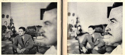
An accompanying photo shows pan-focus at work, with Toland in frame center, an actor in the background, and Toland’s camera assistant in the foreground.
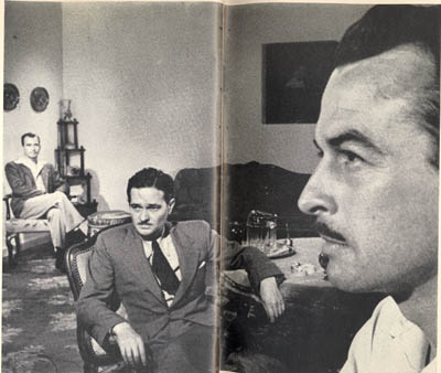
In sum, Toland’s publicity prepared viewers, both professional and nonprofessional, for an odd-looking movie.
Throughout the 1940s, Welles and Wyler wrote and gave more interviews, often insisting that their films invited greater participation on the part of spectators. In a crucial 1947 statement, Wyler noted:
Gregg Toland’s remarkable facility for handling background and foreground action has enabled me over a period of six pictures he has photographed to develop a better technique for staging my scenes. For example, I can have action and reaction in the same shot, without having to cut back and forth from individual cuts of the characters. This makes for smooth continuity, an almost effortless flow of the scene, for much more interesting composition in each shot, and lets the spectator look from one to the other character at his own will, do his own cutting. (12)
Some of this publicity material made its way into French translation after the liberation of Paris, just as Kane, The Little Foxes, and other films were arriving too. Bazin and his contemporaries picked up the claims that these films broke the rules. Deep-focus cinematography became, in the hands of critics, a revolutionary new technique. They presented it as their discovery, not something laid out in the films’ publicity.
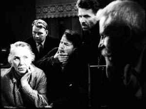
But the case involved, as Huck Finn might say, some stretchers. Watching the baroque and expressionist Kane, it’s hard to square it with normal notions of realism, and we may suspect Toland of special pleading. Some of Toland’s purported innovations, such as low-angle shots showing ceilings, had been seen before. Even the signature Toland look, with cramped, deep compositions shot from below, can be found across the history of cinema before Kane. Here is a shot from the 1939 Russian film, The Great Citizen, Part 2 by Friedrich Ermler.
More seriously, some of Toland’s accounts of Kane swerve close to deception. For decades people presupposed that dazzling shots like these were made with wide-angle lenses.
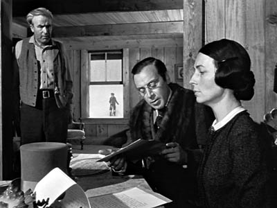
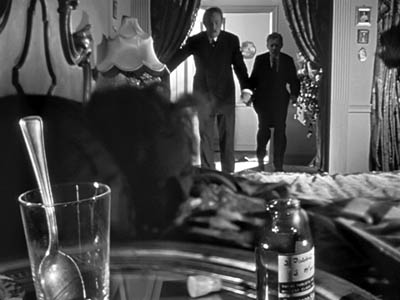
Yet the deep focus in the first image was accomplished by means of a back-projected film showing the boy Kane in the window, while the second image is a multiple exposure. The glass and medicine bottle were shot separately against a black background, then the film was wound back and the action in the middle ground and background were shot. (And even the middle-ground material, Susan in bed, is notably out of focus.) I suspect that the flashy deep-focus illustration in Life, shot with a still camera, is a multiple exposure too. In any event, much of the depth of field on display in Kane couldn’t have been achieved by straight photography. (13)
RKO’s special-effects department had years of experience with back projection and optical printing, notably in the handling of the leopard in Bringing Up Baby, so many of Kane‘s boldest depth shots were assigned to them. But here is all that Toland has to say on the subject:
RKO special-effects expert Vernon Walker, ASC, and his staff handled their part of the production—a by no means inconsiderable assignment—with ability and fine understanding. (14)
Kane’s reliance on rephotography deals a blow to Bazin’s commitment to film as a medium committed to recording an event in front the camera. Instead, the film becomes an ancestor of the sort of extreme artificiality we now associate with computer-generated imagery.
Despite these difficulties, Toland’s ideas sensitized filmmakers and critics to deep space as an expressive cinematic device. Modified forms of the deep-focus style became a major creative tradition in black-and-white cinema, lasting well into the 1960s. Bazin’s analysis certainly developed Toland’s ideas in original directions, and he creatively assimilated what Toland and his directors said into an illuminating general account of the history of film style. None of these creators and critics were probably aware of the remarkable depth apparent in pre-1920 cinema, or in Japanese and Soviet film of the 1930s. Their claims taught us to notice depth, even though we could then go on to discover examples that undercut Toland’s claims to originality.
Some little things to grasp at
I assume that Toland and his directors were sincerely trying to experiment, however much they may have packaged their efforts to appeal to viewers’ and critics’ tastes. But sometimes artists aren’t so sincere. By the 1950s, we have directors who started out as film critics, and they realized that they could guide the agenda. Here is Claude Chabrol:
I need a degree of critical support for my films to succeed: without that they can fall flat on their faces. So, what do you have to do? You have to help the critics over their notices, right? So, I give them a hand. “Try with Eliot and see if you find me there.” Or “How do you fancy Racine?” I give them some little things to grasp at. In Le Boucher I stuck Balzac there in the middle, and they threw themselves on it like poverty upon the world. It’s not good to leave them staring at a blank sheet of paper, no knowing how to begin. . . . “This film is definitely Balzacian,” and there you are; after that they can go on to say whatever they want. (15)
Chabrol is unusually cynical, but surely some filmmakers are strategic in this way. I’d guess that a good number of independent directors pick up on currents in the culture and more or less self-consciously link those to their film.
Today, in press junkets directors can feed the same talking points to reporters over and over again. An example I discuss in the forthcoming Poetics of Cinema is the way that Chaos theory has been invoked to give weight to films centering on networks and fortuitous connections. As I read interview after interview, I thought I’d scream if I encountered one more reference to a butterfly flapping its wings.
More recently, Paul Greengrass gave critics some help when he suggested that the jumpy cutting and spasmodic handheld camera of The Bourne Ultimatum suggested the protagonist’s subjective point of view–presumably, Jason’s psychological disorientation and frantic scanning of his surroundings. I expressed skepticism about this on an earlier blog entry, Anne Thompson replied on her blog, and I returned to the subject again. Any director’s statement of purpose is interesting in itself, but it should be assessed in relation to the evidence we detect onscreen.
Another recent instance: the new Taschen book on Michael Mann. The luscious pictures, mainly from Mann’s archive, are the volume’s raison d’etre, but the filmmaker seems to have placed unusual demands on the text. F. X. Feeney writes:
An earlier version of this book completed by another writer attempted (in a spirit of sincere praise) to treat Mann’s films as reactions against film traditions, as subversions of genre. This fetched a rebuke from Mann: “It’s irrelevant and neither accurate nor authentic to compare my films to other films because they don’t proceed from genre conventions and then deviate from those conventions. They proceed from life. For better or worse, what I’ve seen and heard and learned on my own is the origin of this material. Maybe the film medium by nature spawns conventions, because we all built on what’s gone before, but the content and themes of my films are not facile and derivative. They are drawn from life experience.” (16)
We have to wonder if Mann’s objection played a role in eliminating the earlier writer’s version. If that happened, it’s an unusually strong instance of a director’s holding sway over critical commentary. (17)
In the text we have, Feeney provides a chronological account of Mann’s career: plot synopses, thematic commentary, production background. There’s no discussion of broader historical trends, such as the migration of TV directors into film, the creative options available in 1980s-1990s Hollywood, the development of self-conscious pictorialism in modern film, the possibility of genre films becoming art-films or prestige pictures, or the changes in media culture or American society. All of these lines of inquiry would require comparing Mann with other filmmakers. It remains for other writers, perhaps without the director’s cooperation, to put Mann’s achievement into such contexts.
It’s always vital to listen to filmmakers, but we shouldn’t limit our analysis to what they highlight. We can detect things that they didn’t deliberately put into their films, and we can sometimes find traces of things they don’t know they know. For example, virtually no director has explained in detail his or her preferred mechanics for staging a scene, indicating choices about blocking, entrances and exits, actors’ business, and the like. Such craft skills are presumably so intuitive that they aren’t easy to spell out. Often we must reconstruct the director’s intuitive purposes from the regularities of what we find onscreen. (For examples, see this site here, here, and here.) And it doesn’t hurt, especially in this age of hype, to be a little skeptical and pursue what we think is interesting, whether or not a director has flagged it as worth noticing.
(1) Macdonald, “Gertrud,” Esquire (December 1965), 86.
(2) Quoted in Orson Welles and Peter Bogdanovich, ed. Jonathan Rosenbaum, This is Orson Welles (New York: HarperCollins, 1992), 21).
(3) Such would seem to be the case of the close-up, which of course is found very early in film history. But Griffith’s idea of a close-up may not correspond to ours. More on this in a later blog, perhaps.
(4) I give an overview of this rich body of research in Chapter 5 of On the History of Film Style. See also various entries in the Encyclopedia of Early Cinema, ed. Richard Abel (New York: Routledge, 2005).
(5) The most detailed argument for this view I know is Paisley Livingston’s book Art and Intention: A Philosophical Study.
(6) “William Wyler, or the Jansenist of Directing,” in Bazin at Work: Major Essays and Reviews from the Forties and Fifties, ed. Bert Cardullo (New York: Routledge, 1997), 8.
(7) Orson Welles: A Critical View, trans. Jonathan Rosenbaum (New York: Harper and Row, 1978) 80).
(8) Toland, “Realism for Citizen Kane,” American Cinematographer 22, 2 (February 1941), 54, 80.
(9) See the discussion in Bordwell, Janet Staiger, and Kristin Thompson, The Classical Hollywood Cinema: Film Style and Mode of Production to 1960 (New York: Columbia University Press, 1985), 345-349.
(10) Toland, “How I Broke the Rules in Citizen Kane,” Popular Photography (June 1941), 55, 90-91.
(11) “Orson Welles: Once a Child Prodigy, He Has Never Quite Grown Up,” Life (May 26, 1941), 110-111.
(12) Wyler, “No Magic Wand,” The Screen Writer (February 1947), 10.
(13) Peter Bogdanovich was to my knowledge the first person to publish some of this information; see “The Kane Mutiny,” Esquire 77, 4 (October 1972), 99-105, 180-90.
(14) Toland, “Realism,” 80.
(15) “Chabrol Talks to Rui Noguera and Nicoletta Zalaffi,” Sight and Sound 40, 1 (Winter 1970-1971), 6.
(16) F. X. Feeney, Michael Mann (Cologne: Taschen, 2006), 21.
(17) Mann’s reasoning puzzles me. He insists that his films can’t be compared to others along any dimensions, especially thematic ones. Yet in saying that his films are lifelike, he suggests that other films aren’t as realistic as his. Moreover, what about comparisons on grounds of technique, surely one of the most striking and admired features of Mann’s work? For reasons that are obscure, the director discourages any critical consideration of style; Feeney tells us that Mann hates the very word (p. 20).
Ad in Wid’s Year Book 1918.
PS: 15 October: I’ve received a clarification from Paul Duncan, editor of F. X. Feeney’s Michael Mann book for Taschen. He expresses general agreement with my suggestions about how directors shape the uptake of their work, but he explains that the Mann book isn’t an instance of it. Here are the comments bearing on my blog entry.
In reply to my suggestion of other avenues to explore about Mann’s career:
In fairness to F.X. Feeney, he only had 25,000 words to cover Mann’s career, and all the subjects you write about are really outside the scope of the book. It sounds as though these are subjects that you would like to explore, and I can’t wait to read them in a future book or blog.
As for whether Mann exercised some control over the book’s final form, which I float as one possible explanation for its compass:
First, you speculate whether Mann caused the first version of the book to be scrapped, i.e. He exerted editorial control/censorship over the book. This is not the case, and if it was, do you think that he would have allowed F.X. to write that in the published version of the book?
In Note 17 appended to Feeney’s quote, you write: “Yet in saying that his films are lifelike, he suggests that other films aren’t as realistic as his.” If you had continued Mann’s quote, you would have reported the following: “I don’t look at the excellent French director Jean-Pierre Melville to decide how to tell the story in Thief. I meet thieves. And I guarantee you the reason Melville’s Le Samourai 1967) has authenticity, the reason Raoul Walsh’s White Heat (1949) has authenticity, is because those film-makers knew thieves, too.” I do not see any evidence here that Mann suggests that his films are more lifelike than other directors’. Only that his films stem from life like other films stem from life.
Also, in Note 17, you write: “For reasons that are obscure, the director discourages any critical consideration of style; Feeney tells us that Mann hates the very word (p. 20).” The reason Mann hates the word “style”—and I apologize for not making this clear in the book—is because after producing the Miami Vice TV show, he was forever referred to as a stylist, and the “style” of the show was all anybody ever talked about. The implication was that Mann is a director of style without substance. Subsequently, Mann has been very wary of the word, and discussion of it, because it puts undue weight on one aspect of his work.
Finally, I would like to explain a little of the working method with Mann on the book. The book was researched and written during rehearsal, filming and editing of Collateral. F.X. wrote the text and was given full access to everything that Mann had said in interviews. Mann then read and annotated the text, and this was discussed face-to-face with F.X. Most of these annotations were of a factual nature, correcting dates, being precise about the sequence of events, and to correct misinterpretations of his comments in previous interviews. However, they would also bring up new comments from Mann about his work. F.X. then rewrote some texts to include Mann’s comments, and then F.X. wrote his replies. In this way, the book became more of a dialogue between Mann and F.X. and is stronger for it I feel. So, in this case, the filmmaker did not get the last word.
I thank Paul for his clarifications, which should be of interest to all the book’s readers. On only two matters do we disagree.
First, Feeney’s book achieves what it set out to achieve, and it deserves credit for giving us valuable information about Mann in a clear, pungent style. And no one expects a Taschen book to be an in-depth monograph covering all aspects of a director’s career. But I still think that length limits don’t prevent an author from raising the contextual issues I mention. Many articles manage to address matters that go beyond the sort of career survey that Feeney provides, so there are ways to sketch such issues in an abbreviated way. I inferred, erroneously, that the choice not to tackle them could have been related to Mann’s own views on the comparative dimension that such issues tend to rely on.
Secondly, a minor matter: The fact that Mann can invoke Melville and Walsh on films about thieves suggests that a comparative perspective is valuable; he’s including himself in the company of directors who know their subjects from life, in explicit contrast to those who don’t. I didn’t include the extra sentences because I thought that they simply provided further signs of the contradiction I found in Mann’s own position—that his films can’t be compared to other directors’ works.


