Archive for the 'FILM ART (the book)' Category
[insert your favorite Bourne pun here]
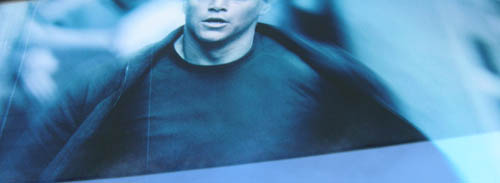
DB here:
You may be tired of hearing about The Bourne Ultimatum, but the world isn’t.
It’s leading in the international market ($52 million as of 29 August) and has yet to open in thirty territories. It’s expected, as per this Variety story, to surpass the overseas total of $112 for the previous installment, The Bourne Supremacy. According to boxofficemojo.com, worldwide theatrical grosses for the trilogy are at $721 million and counting. Add in DVD and other ancillaries, and we have what’s likely to be a $2-$3 billion franchise.
There’s every reason to believe that the success of the series, plus the critical buzz surrounding the third installment, will encourage others to imitate Paul Greengrass’s run-and-gun style. In an earlier blog, I tried to show that despite Greengrass’s claims and those of critics:
(1) The style isn’t original or unique. It’s a familiar approach to filmmaking on display in many theatrical releases and in plenty of television. The run-and-gun look is one option within today’s dominant Hollywood style, intensified continuity.
(2) The style achieves its effect through particular techniques, chiefly camerawork, editing, and sound.
(3) The style isn’t best justified as being a reflection of Jason Bourne’s momentary mental states (desperation, panic) or his longer-term mental state (amnesia).
(4) In this case the style achieves a visceral impact, but at the cost of coherence and spatial orientation. It may also serve to hide plot holes and make preposterous stunts seem less so.
I got so many emails and Web responses, both pro and con, that I began to worry. Did I do Ultimatum an injustice? So I decided to look into things a little more. I rewatched The Bourne Identity, directed by Doug Liman, and Greengrass’s The Bourne Supremacy on DVD and rewatched Ultimatum in my local multiplex. My opinions have remained unchanged, but that’s not a good reason to write this followup. I found that looking at all three films together taught me new things and let me nuance some earlier ideas. What follows is the result.
For the record: I never said that I got dizzy or nauseated. The blog entry did, however, try to speculate on why Greengrass’s choices made some viewers feel queasy. Some of those unfortunates registered their experiences at Roger Ebert’s site. For further info, check Jim Emerson’s update on one guy who became an unwilling receptacle.
Another disclaimer: For any movie, I prefer to sit close to the screen. In many theatres, that means the front row, but in today’s multiplexes sitting in the front row forces me to tip back my head for 134 minutes. So then I prefer the third or fourth row, center. From such vantages I’ve watched recent shakycam classics like Breaking the Waves and Dogville, as well as lesser-known handheld items like Julie Delpy’s Looking for Jimmy. My first viewing of Ultimatum was from the fifth row, my second from the third. (1)
Finally: There are spoilers ahead, pertaining to all three films.
How original?
Someone who didn’t like the films would claim that they’re almost comically clichéd. We get titles announcing “Moscow, Russia” and “Paris, France.” You can poke fun at lines of dialogue like “What connects the dots?” and “You better get yourself a good lawyer” and the old standby “What are you doing here?” But these are easy to forgive. Good films can have clunky dialogue, and you don’t expect Oscar Wilde backchat in an action movie.
More significantly, all three films are quite conventionally plotted. We have our old friend the amnesiac hero who must search for his identity. Neatly, the word bourne means a goal or destination. It also means a boundary, such as the line between two fields of crops–just as our hero is caught between everyday civil law and the extralegal machinery of espionage.
The film’s plot consists of a series of steps in the hero’s quest. Each major chunk yields a clue, usually a physical token, that leads to the next step. Add in blocking figures to create delays, a hierarchy of villains (from swarthy and unshaven snipers to jowly, white-haired bureaucrats), a few helpers (principally Nicky and Pam), and a string of deadlines, and you have the ingredients of each film. (Elsewhere on this site I talk about action plotting.) The last two entries in the series are pretty dour pictures as well; the loss of Franka Potente eliminates the occasional light touch that enlivened Bourne Identity right up to her nifty final line
All three films rely on crosscutting Bourne’s quest with the CIA’s efforts to find him, usually just one step behind. Within that structure most scenes feature stalking, pursuits, and fights. In the context of film history, this reliance on crosscutting and chases is a very old strategy, going back to the 1910s; it yields one of the most venerable pleasures of cinematic storytelling.
Mixed into the films is another long-standing device, the protagonist plagued by a nagging suppressed memory. Developing in tandem with the external action, the fragmentary flashbacks tease us and him until at a climactic moment we learn the source: in Supremacy, Bourne’s murder of a Russian couple; in Ultimatum, his first kill and his recognition of how he came to be an assassin. The device of gradually filling in the central trauma goes back to film noir, I think, and provides the central mysteries in Hitchcock’s Spellbound and Marnie.
By suggesting that the films are conventional, I don’t mean to insult them. I agree with David Koepp, screenwriter of Jurassic Park and Carlito’s Way, who remarks:
There are rules and expectations of each genre, which is nice because you can go in and consciously meet them, or upend them, and we like it either way. Upend our expectations and we love it—though it’s harder—or meet them and we’re cool with it because that’s all we really wanted that night at the movies anyway. (2)
There can be genuine fun in seeing the conventions replayed once more.
The series makes some original use of recurring motifs, the most obvious being water. The first shot of the first film shows Jason floating underwater; in the second film he bids farewell to the drowned Marie underwater; and in the last shot of no. 3, we see him submerged in the East River, closing the loop, as if the entire series were ready to start again. There’s also a weird parallel-universe moment when Pam tells Jason his real name and birthdate. She does it in 2, and then, as if she hasn’t done it before, tells him again in 3, in what seem to be exactly the same words. In 3, though, it has a fresh significance as a coded message, and a new corps of CIA staff is listening in, so probably the second occurrence is a deliberate harking-back. Or maybe Bourne’s amnesia has set in again. [Note of 9 Sept: Oops! Something that’s going on here is more interesting than I thought. See this later entry.]
The look of the movies
The big arguments about Ultimatum center on visual style. The filmmakers and some critics, notably Anne Thompson, have presented the style as a breakthrough. But again, the movie is more traditional than it might first appear.
In a film of physical action, the audience needs to be firmly oriented to the space and the people present. The usual tactic is to present transitional shots showing people entering or leaving the arena of action. What might be filler material in a comedy or drama—characters driving up, getting out of their vehicles, striding along the pavement, entering the building—is necessary groundwork in an action sequence. So we see Bourne arriving on the scene, then his adversaries arriving and deploying themselves, in the alternation pattern typical of crosscutting. Surprisingly, for all the claims made about the originality of Greengrass’s style in 2 and 3, he is careful to follow tradition and give us lots of shots of people coming and going, setting up the arena of confrontation.
Then the director’s job is just beginning. Traditionally, once the scene gets going, the positions and movement of the figures in the action arena should be clearly maintained. Likewise, it’s considered sturdy craftsmanship to delineate the overall space of the scene and quietly prepare the audience for key areas—possible exits, hiding places, relations among landmarks. (See this entry for how one modern director primes spaces in an action scene.) I claimed in the earlier entry that such basic orienting tasks aren’t handled cogently in Ultimatum, and a second viewing of the scene in Waterloo Station and the chase across the Tangier rooftops hasn’t made me change that opinion. Later I’ll discuss how Greengrass and some commentators have defended the loss of orientation in such scenes.
All the films in the trilogy employ traditional strategies of setting up the action sequences, but the series displays an interesting stylistic progression. In Identity, Liman gives us mostly stable framings and reserves handheld bits for moments of tension and point-of-view shots. He saves his fastest cutting for fights and chases.
Supremacy displays a more mixed style. It contains passages of wobbly, decentered framing, but those exist alongside more traditionally shot scenes—stable framing, with smooth lateral dollying and standard establishing shots. There are some aggressive cuts, as in the crisp emphasis on the sniper at the start of the first pursuit, but on the whole the editing isn’t more jarring than usual these days. We also get, as I mentioned in the earlier entry, some almost willfully obscure over-the-shoulder shots, and occasionally we get the eye-in-the-corner technique that would become more prominent in Ultimatum.
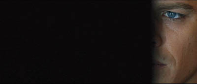
As we’d expect, in Supremacy the bounciest camerawork and choppiest editing are found in the sequences of the most energetic physical action. Most of the surveillance scenes get a little bumpy, while the chases are wilder. The most extreme instance, I think, is the very last chase in the tunnel, when Bourne avenges the death of Marie and slams the sniper’s vehicle into an abutment. As in Identity, Supremacy arrays its technique along a continuum, saving the most visceral techniques for the most brusing action sequences.
So Ultimatum raises the stakes by applying the run-and-gun style more in a more thoroughgoing way. Everything is dialed up a notch. The flashbacks are more expressionistic than those of Supremacy: instead of dark hallucinations we get blinding, bleached-out glimpses of torture and execution, in staggered and smeared stop-frames. The conversation scenes are bumpier and more disjointed; the cat-and-mouse trailings are more disorienting, with jerky zooms and distracted framings; the full-bore action scenes are even more elliptical and defocused. It’s as if the visual texture of Supremacy’s tunnel chase has become the touchstone for the whole movie.
That texture I tried to describe in the earlier entry. Greengrass relies on camerawork, cutting, and sound to convey the visceral impact of action, rather than showing the action itself. The most idiosyncratic choices include framing that drifts away from the subject of the shot, oddly offcenter compositions, and a rate of cutting that masks rather than reveals the overall arc of the action. Some critics have liked the film’s technique, some have hated it, but I think my account stands as a fair account of the destabilizing tactics on the screen, and a likely source of some spectators’ vertigo.
Run-and-gun, with a gun
The style of Ultimatum is a version of what filmmakers call run-and-gun: shot-snatching in a pseudo-documentary manner. This approach has a long history in American film. The bumpy handheld camera, I tried to show in The Way Hollywood Tells It, has been repeatedly rediscovered, and every time it’s declared brand new. I have to admit I’m startled that critics, who probably have seen Body and Soul, A Hard Day’s Night, The War Game, Seven Days in May, or Medium Cool, continue to hail it as an innovation. Today it’s a standard resource for fictional filmmaking, to be used well or badly.
What’s at issue here are the role it plays and the effects it achieves. In Lars von Trier’s The Idiots, I’d argue that handheld work becomes genuinely disorienting because the camera is scanning the scene spontaneously to grab what emerges. But von Trier’s roaming camera yields rather long takes compared to what we find in the Bourne series. Greengrass is practicing what I called, in Film Art and The Way Hollywood Tells It, intensified continuity.
This approach breaks down a scene so that each shot yields one, fairly straightforward piece of information. The hero arrives at the station. Car pulls up; cut to him getting out; cut to him walking in. Traditional rules of continuity—matching screen direction, eyelines, overall positions in the set—are still obeyed, but the dialogue or physical action tends to be pulverized into dozens of shots, each one telling us one simple thing, or simply reiterating what a previous shot has shown. (Oddly, sometimes intensified continuity seems more, rather than less, redundant than traditional continuity cutting.)
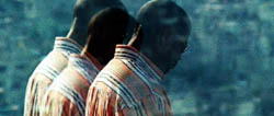
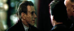
Within the intensified continuity approach, we can find considerable variation. I argued that one highly mannered version can be found in Tony Scott’s later work, where the shots are fragmented to near-illegibility and treated as decorative bits. You can find Scott’s signature look tawdry and overwrought, but Liman and Greengrass belong in the same tradition. All three directors rely on telephoto lenses, for example, and they have recourse to well-proven techniques for rendering hallucinatory states of mind, as in these multiple-exposure shots, one from Man on Fire and the second from Bourne Supremacy.
Despite the stylistic differences among the three Bourne films, the basic one-point-per-shot premises remain in place. Here’s a passage from Supremacy. Jason gets off the train in Moscow. We get an establishing shot of the station as the train pulls in, followed by a shot of him getting off, moving left to right. The establishing shot is a smooth craning movement down, but the following shot is a little shaky.


Then we get a blurry shot of him walking, taken with a very long lens. A head-on shot like this traditionally creates a transition allowing the filmmaker to cross the axis of action, letting Jason walk right to left in the next shot.


Cut to closer view: Jason turns his head slightly. Cut to what he sees, in a shaky pov: Cops.


The answering handheld shot shows Jason reacting. As he strides on purposefully, a still closer shot accentuates his eye movement and adds a beat of tension.


Jason turns and goes to the pay phones, followed by the unsteadicam, then turns his head watchfully. A smooth match-on-action cut brings us closer.


But then Jason turns back to his task, and suddenly a passerby blots out the frame.


When the frame clears, a jouncy shot shows Jason’s hands thumbing a phone book. This might be a continuation of the same shot, or the result of a hidden cut. I suggest in The Way Hollywood Tells It that such stratagems are common in intensified continuity: blotting out the frame, flashing strobe lights, and other devices can create a pulsating rhythm akin to that of cutting. Jason turns the pages, and a jump cut shows him on another page.


Cut back to him scanning the pages. He writes down an address, in a very shaky framing.


Cut back again to Jason, and another smooth match-on action brings us back to the slightly fuller framing we’ve seen already. Greengrass shoots with at least two cameras simultaneously, which can facilitate match-cutting like this.


Jason strides toward us, going out of focus. Then a stable long shot pans with him, moving left as before. He leaves the station.


A very simple piece of action has been broken into many shots, some of them restating what we’ve already seen. In the days of classic studio filming, most directors wouldn’t have given us so many shots of Bourne leaving the train platform; a single tracking shot would have done the trick. A single shot could have shown us Jason at the phone, scribbling down the address. As a result, the whole passage is cut faster than in the classic era. The sequence lasts only forty-one seconds but shows sixteen shots. Two to three seconds per shot is a common overall average for an action picture today. The rapid cutting helps create that bustle that Hollywood values in all its genres.
It’s clear, I think, that here the run-and-gun technique is laid over the premises of intensified continuity, letting each shot isolate a bit of narrative information to make sure we understand, even at the risk of reiterating some bits. Jason has arrived in Moscow, he has to be careful because cops are everywhere, now he needs an address, he finds it, he’s writing it down . . . . All of this action is bookended by long shots that pointedly show us the character arriving at the station and leaving it.
I suggested in the earlier entry that in Ultimatum, Greengrass takes more risks than in the previous film. He still assigns one piece of information per shot, but now that piece is sometimes not in focus, or slips out of the center of the frame, or is glimpsed in a brief close-up. The September issue of American Cinematographer, which arrived as I was completing this entry, explains that he encouraged his camera operators to follow their own instincts about focus and composition. (3) Seeing Ultimatum again, I realized that the film can get away with this sideswiping technique by virtue of certain conventions of genre and style.
A telltale clue, like the charred label left over from a car bomb, can be given a fleeting close-up because physical tokens are carrying us from scene to scene throughout the film and we’re on the lookout for them. A sniper racing away out of focus in the distance is a character we’ve seen before, and he’s spotted in frame center before he dodges away. The larger patterning of shots relies on crosscutting or point-of-view alternation (Jason looks/ what he sees/ Jason reacts), and so the framing of any shot can be a little less emphatic. Given intensified continuity’s emphasis on tight close-ups for dialogue, faces can be framed a little loosely, trusting us to pick up on what matters most—changes in facial expression.
In short, because there’s only one thing to see, and it’s rather simple, and it’s the sort of thing we’ve seen before in other films and in this film, it can be whisked past us. This tactic crops up from time to time in Liman’s first installment, when a shot seems to fumble for a moment before surrendering the key piece of data. For example, Jason is striding through the hotel and a wobbly point-of-view shot brings the hotel’s evacuation map only partly into view.
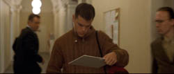
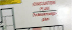
Again, Greengrass takes a visual device that was used occasionally in Identity and extends it through an entire film.
Realism, another word for artifice
Finally, what’s the purpose behind Ultimatum’s thoroughgoing exploitation of run-and-gun? I quoted Greengrass’s claim that it conveys Bourne’s mental states, and some critics have rung variations on this. Of course the cutting is choppy and the framing is uncertain. The guy’s constantly scanning his environment, hypersensitive to tiny stimuli. Besides, he’s lost his memory! Yet the same treatment is applied to scenes in which Bourne isn’t present—notably the scenes in CIA offices. Is Nicky constantly alert? Is Pam suffering from amnesia?
Alternatively, this style is said to be more immersive, putting us in Bourne’s immediate situation. This is a puzzling claim because cinema has done this very successfully for many years, through editing and shot scale and camera movement. Don’t Rear Window and the Odessa Steps sequence in Potemkin and the great racetrack scene in Lubitsch’s Lady Windermere’s Fan thrust us squarely into the space and demand that we follow developing action as a side-participant? I think that defenders need to show more concretely how Greengrass’s technique is “immersive” in some sense that other approaches are not. My guess is that that defense will go back to the handheld camera, distractive framing, and choppy cutting . . . all of which do yield visceral impact. But why should we think that they yield greater immersion?
I think we get a clue by recalling that Supremacy and Ultimatum display the run-and-gun strategy that Greengrass employed in Bloody Sunday and United 93. This approach implies something like this: If several camera operators had been present for these historic events, this is something like the way it would have been recorded. We get a reality reconstructed as if it were recorded by movie cameras. I say cameras because we’re telling a story and need to change our angles constantly; a scene couldn’t approximate a record of the event as experienced by a single participant or eyewitness. In movies, the camera is almost always ubiquitous.
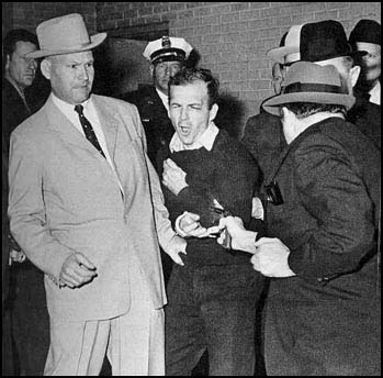
Recall the famous TV footage of Jack Ruby shooting Lee Harvey Oswald. There the lone camera lost some of the most important information by being caught in the crowd’s confusion and swinging wildly away from the action. But in a fiction film, we can’t be permitted to miss key information. So with run-and-gun, the filmmakers in effect cover the action through a troupe of invisible, highly mobile camera operators. That’s to say, another brand of artifice.
In general, the run-and-gun look says, I’m realer than what you normally see. In the DVD supplement to Supremacy, “Keeping It Real,” the producers claimed that they hired Greengrass because they wanted a “documentary feel” for Bourne’s second outing. Greengrass in turn affirms that he wanted to shoot it “like a live event.” And he justifies it, as directors have been justifying camera flourishes and fast cutting for fifty years, as yielding “energy. When you get it, you get magic.” (4)
I’d say that the style achieves visceral disorientation pretty effectively, but some claims for it are exaggerated. So far Greengrass has matched the style to hospitable genres, either historical drama or fast-paced espionage. But isn’t immersion something we should try for in all genres? Wouldn’t High School Musical 2 gain energy and magic if it were shot run-and-gun? If a director tried that, some critics might say that it added intensity and realism, and suggest that it puts us in the minds and hearts of those peppy kids in a way that nothing else could.
I finish this overlong post by invoking Andrew Davis, director of The Fugitive (which back in 1993 gave us fragmentary flashbacks à la Bourne Ultimatum) and the admirable Holes.
When you think about the beginnings: everything was very formal and staged and composed, and then years later people said, “We want it shaky and out of focus and have some kind of honest energy to it.” And then it became a phony energy, because it was like commercials, where they would make everything have a documentary feel when they were selling perfume, you know? (5)
Whether you agree with me or not, I’m glad that The Bourne Ultimatum raised issues of film style that audiences really care about. I’m eager to look more closely at the movie when the DVD is released, but don’t worry–I don’t expect to mount another epic blog entry.However, I do have an item coming up that talks about how we assess what filmmakers say about their movies….
(1) I’m aware that this can be an uncomfortable option, but not as bad as with music. Many years ago I sat in the front row of a John Zorn concert, and I don’t think my ears ever recovered.
(2) Quoted in Rob Feld, “Q & A with David Koepp,” in Josh Friedman and David Koepp, War of the Worlds: The Shooting Script (New York: Newmarket Press, 2005), 136-137.)
(3) See Jon Silberg, “Bourne Again,” American Cinematographer (September 2007), 34-35, available here.
(4) Oddly, though, in the DVD supplement to The Bourne Identity, Frank Oz says that Liman brought “a rough-edged, very energetic” feel to the project, thanks to his indie roots. Interestingly, the energy is attributed to Liman’s abilities as a camera operator, a skill that enables him to shoot things quickly. The same supplement offers a familiar motivation for the film’s purportedly jittery style: the hero is trying to figure out who he is, and so is the viewer. Just as the films revamp a basic plot structure each time, perhaps the producers’ rationales get recycled too.
(5) Quoted in The Director’s Cut: Picturing Hollywood in the 21st Century, ed. Stephan Littger (NY: Continuum, 2006), 96.
PS: On a wholly unrelated subject Kristin answers a question on Roger Ebert’s Movie Answer Man column: What was the first movie?
PPS 5 January 2008: Steven Spielberg weighs in on the Bourne style here, confirming that he’s a more traditional filmmaker. Thanks to Fred Holliday and Brad Schauer for calling my attention to his remarks.
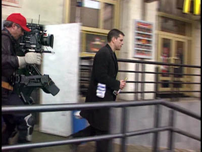
Unsteadicam chronicles
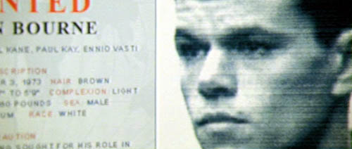
DB again:
A spectre is haunting contemporary cinema: the shaky shot.
Viewers have been protesting for some years now. I recall friends asking me why the images were so bumpy in Woody Allen’s Husbands and Wives and Lars von Trier’s Dancer in the Dark. The Bourne Ultimatum, this summer’s wildest excursion into Unsteadicam, has put the matter back on the agenda.
If you drop in at Roger Ebert’s website, you’ll find many annoyed comments from readers about what one calls the Queasicam. The writers make shrewd points about the purpose and effects of director Paul Greengrass’s technique. I’ll try to add some historical perspective and a little analysis.
From whose Bourne no traveling shot returneth
First, what exactly are we talking about? Some viewers and critics think the jarring quality of the movie proceeds from rapid editing. The cutting in Bourne Ultimatum is indeed very fast; there are about 3200 shots in 105 minutes, yielding an average of about 2 seconds per shot. But there are other fast-cut films that don’t yield the same dizzy effects, such as Sky Captain and the World of Tomorrow (1.6 seconds average), Batman Begins (1.9 seconds), Idiocracy (1.9 seconds), and the Transporter movies (less than 2 seconds).
As for the series itself, The Bourne Identity, directed by Doug Liman, was edited a tad slower, averaging 3 seconds per shot. The second entry, The Bourne Supremacy, also signed by Greengrass, was as fast-cut as this, coming in at 1.9 seconds. People noticed the rough texture of the second one, but it didn’t arouse the protests that this last installment does. Something else is up.
Partly, it’s not the pace of the editing but the spasmodic quality of it. Cuts here seem abrasive because they interrupt actions and camera movements. Pans, zooms, and movements of the actors are seldom allowed to come to rest before the shot changes. This creates a strong sense of jerkiness and visual imbalance.
Still, a lot of the film’s effect has to be laid at the handheld camera. The technique in itself, however, shouldn’t shock us. The handheld aesthetic has been with us a long time. There were silent-era experiments with the technique by E. A. Dupont (Variety, 1925) and Abel Gance (Napoleon, 1927). It recurred sporadically after that, but in mainstream cinema handheld shooting became common in 1960s films as different as The Miracle Worker, Seven Days in May, Dr. Strangelove, and the dramas of John Cassavetes. Today, many films from Asia and Europe as well as the US rely on the device all the way through. The Danes call it the “free camera,” and I write about it here. The trend is so widespread that it’s been satirized: In the Danish comedy Clash of Egos (2006), when an ordinary workman gets a chance to direct a movie, he insists that the camera be put on a tripod, and the cinematographer complains that he hasn’t done this since film school. Directors nowadays tell us that they are in search of energy, a moment-by-moment spiking of audience interest. You can get it through fast cutting, arcing camera movements, sudden frame entrances, the nervousness of the handheld shot, or all of the above.
Roughhouse
I think the upsetting qualities of the visuals in The Bourne Ultimatum derive principally from the particular way the handheld camera is used. Several of Ebert’s writers complain that the camerawork made them nauseated, and there seems little doubt that the shots are bouncier and jerkier than in much handheld work. Adding to the effect is the fact that Greengrass often doesn’t try to center or contain the main action. Sometimes, as in a fight scene, the camera is just too close to the action to show everything, so it tries to grab what it can. At other times Greengrass pans away from the subject, or shoves it to the edge of the 2.40:1 frame. In the standard technique of over-the-shoulder reverse angles, we see one character’s shoulders in the foreground and the primary character’s face clearly. Greengrass likes to let a neck or shoulder overwhelm the composition as a dark mass, so that only a bit of the face, perhaps even just a single eye, is tucked into a corner of the shot. This visual idea was already on offer in The Bourne Supremacy.


In The Way Hollywood Tells It, I described contemporary films as employing “intensified continuity,” an amplification and exaggeration of tradition methods of staging, shooting, and cutting. (I explain a little about it in this blog entry.) What Greengrass has done is to roughen up intensified continuity, making its conventions a little less easy to take in. Normally, for instance, rack-focus smoothly guides our attention from one plane to another. But in The Bourne Ultimatum, when Jason bursts into a corridor close to the camera, the camera tries but fails to rack focus on his pursuer darting off in the distance. The man never comes into sharp focus. Likewise, most directors fill their scenes with close-ups, and so does Greengrass, but he lets the main figure bounce around the frame or go blurry or slip briefly out of view.
Essentially, intensified continuity is about using brief shots to maintain the audience’s interest but also making each shot yield a single point, a bit of information. Got it? On to the next shot. Greengrass’s camera technique makes the shot’s point a little harder to get at first sight. Instead of a glance, he gives us a glimpse.
Although this strategy is more aggressive in this third Bourne installment, we can find it as well in Supremacy. An agent pulls a document out of a carryon bag, and for an instant we can see the government seal. In the next shot the agent bobs in and out of the frame, as if the camera can’t anticipate his next move.


Later in Supremacy, the camera jerks across a computer display and suddenly focuses itself, evoking the jumpy saccadic flicks with which we scan our world.


Greengrass claims that his creative choices were influenced by the cinema-vérité documentary school and cites as well The Battle of Algiers, which helped popularize the handheld look in the 1960s. At other times he says that the style is subjective: “Your p.o.v. is limited to the eye of the character, instead of the camera being a godlike instrument choreographed to be in the right place at the right time.” But our point of view isn’t confined to what Bourne or anybody else sees and knows. The whole movie relies on crosscutting to create an omniscient awareness of various CIA maneuvers to trap him. And if Bourne saw his enemies in the flashes we get, he couldn’t wreck them so thoroughly.
The Bourne Ultimatum belongs to a trend of rough-edged stylization sometimes called run-and-gun. The film has been described as bare-bones but it’s actually quite flashy. All the crashing zooms (accompanied by whams on the soundtrack), jittery shots, drifting framings, uncompleted pans, freeze-frame flashbacks, and other extroverted devices call attention to themselves. You can find earlier instances in Oliver Stone’s Natural Born Killers and U-Turn, along with stretches in Michael Mann’s latest films. In milder form you find the style on display in TV crime shows, as well as in the notorious docudrama The Road to 9/11.
The most extreme practitioner of this style is probably Tony Scott. From Spy Game through Man on Fire, Domino, and Déjà vu, he has taken this aesthetic in delirious directions. His framing is often restless, as if groping for the right composition. In this shot from Domino, the camera starts a bit too far to the right, shifts left to frame Frances a little better, zooms back hesitantly, then finally stabilizes itself as he grins at the Motor Vehicles worker.


A single shot may give us not only changes of focus but jumps in exposure, lighting, and color; sometimes it’s hard to say whether we have one shot or several. The result is a series of visual jolts, as in Man on Fire.


Scott, trained as a painter, pushes toward a mannered, decorative abstraction, aided by long-lens compositions and a burning, high-contrast palette. For Supremacy, Greengrass adopted a toned-down version of Scott’s approach, while in Ultimatum, he favors drab surroundings and steely colors. Still, both men’s approaches to run-and-gun are frankly artificial, and both remain within the premises of intensified continuity. Of the Waterloo Station sequence Greengrass says: “It has got a sense of energy.”
The Bourne coverup
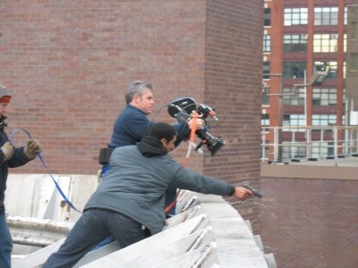
There’s one more function of Bourne’s style I want to consider. In an earlier post, I quoted Hong Kong cinematographers’ saying about the shaky camera. The handheld camera covers three mistakes: Bad acting, bad set design, and bad directing. It’s worth considering, as some of Ebert’s correspondents do, what Greengrass’s style may serve to camouflage. One suggests that because the cutting doesn’t let the viewer reconstruct the fights blow by blow, anybody can seem to be a superhero if the filming is flurried enough.
Just as important, the director who is just (apparently) snatching shots doesn’t have to worry about building up performances slowly; s/he can simply give us the most minimal, stereotyped signals in facial close-ups. Lengthier shots let the actor develop the character’s reactions in detail, and force us to follow them. Classic studio cinema, with its more distant framings and longer takes, lets you follow the evolution of a feeling or idea through the actor’s blocking and behavior. The villain in the average Charlie Chan movie displays more psychological continuity than the nasty agents in Bourne Ultimatum.
Moreover, run-and-gun technique doesn’t demand that you develop an ongoing sense of the figures within a spatial whole. The bodies, fragmented and smeared across the frame, don’t dwell within these locales. They exist in an architectural vacuum. In United 93, the technique could work because we’re all minimally familiar with the geography of a passenger jet. But in The Bourne Ultimatum, could anybody reconstruct any of these stations, streets, or apartment blocks on the strength of what we see? Of course, some will say, that’s the point. Jason himself is dizzyingly preoccupied by the immediacy of the action, and so are we. Yet Jason must know the layout in detail, if he’s able to pursue others and escape so efficiently. Moreover, we can justify any fuzziness in any piece of storytelling as reflecting a confused protagonist. This rationale puts us close to Poe’s suggestion that we shouldn’t confuse obscurity of expression with the expression of obscurity.
The run-and-gun style is indeed visceral, but let’s be aware of how it achieves its impact. I’ve argued in Planet Hong Kong that the clean, hard-edged technique of classic Hong Kong films allows extravagant action to affect us viscerally; by following the action effortlessly, we can feel its bodily impact. We’re shown bodies in sleek, efficient movement that gets amplified by cogent framing and smooth matches on action. But in the fancy run-and-gun style, cinematography and sound do most of the work. Instead of arousing us through kinetic figures, the film makes bouncy and blurry movement do the job. Rather than exciting us by what we see, Greengrass tries to arouse us by how he shows it. The resulting visual texture is so of a piece, so persistently hammering, that to give it flow and high points, Greengrass must rely on sound effects and music. As a friend points out, we understand that Bourne is wielding a razor at one point chiefly because we hear its whoosh.
What else does the handheld style conceal? Since the 1980s, in many action pictures the cutting has become so fast, and often capricious, that we can’t clearly see the physical action that’s being executed. That complaint is justified in Bourne Ultimatum, certainly, but here the style also seeks to make the stunts seem less preposterous. Instead of showing cars crashing and flipping balletically, Greengrass barely lets us see the crash. All the conventions of the action film are smudged in Bourne Identity, as if a sketchy rendering made them seem less outlandish. In a Hong Kong film, Bourne in striding flight, grabbing objects to use as weapons without missing a beat, would be presented crisply, showing him executing feats of resourceful grace. But many viewers seem to find this sort of choreography outlandish or cartoony. So when Bourne plucks up pieces of laundry and wraps them around his hands to protect them when he vaults a glass-strewn wall, Greengrass’s shot-snatching conceals the flamboyance of the stunt.
Finally, I’d argue that the style camouflages something else: plot problems. I’m not talking about the hero’s indestructibility, which is a given in this genre. John McClane in Die Hard 4.0 survives about as much mayhem as does Jason Bourne. But there are some howlers here that, because of the rapid pace and the just-barely-visible action, are somewhat muffled. By whisking the action past us and forcing us to keep up, the film doesn’t allow us to dwell on its holes and thin patches.
The plot, praised by so many, is actually a very simple one: Find Guy A, but when he’s killed, locate the clues that will lead you to Guy B, etc. until you get to Mr. Big. The mechanics of how the clues are pursued remain obscure. (Skip ahead to the next paragraph if you haven’t seen the movie.) Why would an all-powerful CIA operation house its key players in offices that can easily be watched from a neighboring building? How does Bourne get into Noah Vosen’s office, past all the security? Is the revelation of Bourne’s identity and his training regimen really much of a surprise? The wrapup, showing the bad guys exposed by the press and punished by government investigation, seemed risible, not only because of the current inability of either press or congress to right any wrongs, but because I had no idea to whom Pamela Landy has faxed the incriminating documents. “You can’t make stuff like this up,” remarks one sinister agency boss, but many, many films have done so.
I’m not against handheld styles as such, and even Late Tony Scott Rococo can have its virtues. Yet I find the style as practiced by Greengrass to be pretty incoherent and nowhere near as engaging as most critics claim. It just seems too easy. But then, I think that certain standards of filmmaking craftsmanship have pretty much vanished, and the run-and-gun trend is one more symptom of that. Given the praise heaped on The Bourne Ultimatum, however, things are unlikely to change. Next time you head to the movies, you might want to bring your Dramamine.
Thanks to Vance Kepley and Jeff Smith for engaging discussion about The Bourne Ultimatum.
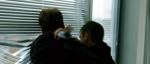
The Bourne Supremacy.
PS: I’ve done a followup entry on the Bourne series, elaborating on these points and adding some new ones.
PPS: One more, I hope final, cluster of comments on Ultimatum, this time on the plotting.
PPPS 5 January 2008: Spielberg weighs in on the Bourne style; thanks to Fred Holliday and Brad Schauer for calling my attention to this.
PPPPS 22 September 2008: This blog post and its mates have stimulated critical discussion in Spain. Manuel Garin has a lengthy piece on the Unsteadicam style in Contrapicado.
Len Lye, Renaissance Kiwi
Kristin here–
David and I have many pleasant memories from our May visit to New Zealand, where as Hood Fellows we were resident at Auckland University for a month. Among these memories is meeting Roger and Shirley Horrocks. Roger has been a major figure in the development of film studies and culture in New Zealand. He founded the Department of Film, Television and Media Studies at Auckland University and was its head until his retirement in 2004. He co-founded the Auckland International Film Festival and has written on television and film in New Zealand.
Shirley is a producer and director of documentary films, many of them about Kiwi art and culture, made primarily for TVNZ and NZ On Air. In 1984 she founded her own production company, Point of View Films.
Retrieving Len Lye
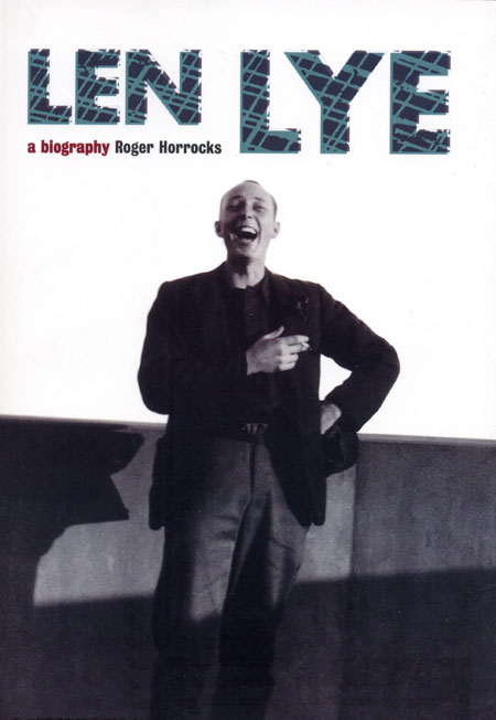
Among the Horrocks’ accomplishments has been to aid in the preservation of the work of filmmaker/ sculptor/ painter/ poet/ theorist Len Lye (1901-1980) and to disseminate information about this undeservedly overlooked figure. Roger generously gave us a copy of his impressive book, Len Lye: A Biography, and Shirley presented us with a DVD of her documentary on Lye, Flip & Two Twisters, named for one of the artist’s sculptures.
I remember seeing a few Len Lye films long ago and thinking they were delightful and innovative. In working on our textbooks, I had the privilege of sitting in one of the British Film Institute’s refrigerated viewing rooms and seeing a gorgeous nitrate copy of his 1936 film Rainbow Dance. Color frames from it appear in Film Art (8th edition, p. 164) and Film History (2nd edition, p. 321). I had also seen Lye’s strange and evocative first film, Tusalava (1929), an animated film with abstract shapes much influenced by Maori and Australian Aboriginal art (illustrated on p. 176 of Film History).
Lye was born and grew up in New Zealand, lived for stretches in Samoa and Sydney, moved to London as a young man, and moved permanently to New York in 1944. He was extraordinarily attuned to sensory perception and rhythm and was drawn to the indigenous art of the southwest Pacific area. From an early age he studied modern art and especially abstraction.
Lye belonged to a generation of innovative animators who began working in the 1920s and 1930s: Oskar Fischinger in Germany and later the U.S., and Alexandre Alexeïeff and Claire Parker in France and later Canada. Although their styles differed considerably, all sought to find alternatives to Hollywood cel animation and to explore the relationship between music and cinema.
Roger and Shirley’s gifts inspired me to renew my acquaintance with Lye’s work and take a closer look at his career. “I’ll just order a DVD of Lye’s films,” I thought to myself. Back in the late 1980s Pioneer had issued a marvelous though brief series called “Visual Pioneers.” David and I had bought “The World of Oskar Fischinger” and “The World of Alexandre Alexeïeff.” I figured that these had probably been re-issued on DVD, along with the rest of this short-lived series. It turns out, no. Lucky we held onto those laserdiscs!
Unfortunately, there was never a “Visual Pioneers” disc devoted to Lye.
The age of DVDs has not served these filmmakers well, either. One has to be doggedly determined in finding and acquiring their work. The bountiful “Unseen Cinema” set from Image contains Oskar Fischinger’s An Optical Poem (1938), an abstract short film made for MGM (!) after the filmmaker moved from Germany to the U.S. It’s on the disc titled “Viva la Dance: The Beginnings of Ciné-Dance.” Although the set claims to deal with the American avant-garde up to 1941, Alexeïeff and Parker’s 1934 masterpiece Une nuit sur le Mont Chauve (Night on Bald Mountain) is included. I suppose the logic there is that Parker was an American, though she and Alexeïeff (born in Russia) made the film in Paris and worked thereafter in Europe and Canada. (A few other émigré directors’ European works are in the set, though I can’t see why Anémic cinéma by Marcel Duchamp [aka Rrose Sélavy] should be there.)
There is a French region 2 DVD of the pair’s work available. I found it for sale online at fnac and Cinedoc. A DVD of ten Fischinger films is available from the Center for Visual Music’s shop; it actually sells the disc through Amazon, which might make it relatively easy for some to acquire.
The Center’s shop carries a variety of experimental cinema, and there I found a collection of Lye’s films—on VHS. “Rhythms” contains twelve of Lye’s major works, including A Colour Box (1935) and Rainbow Dance. It was brought out by Re: Voir, a major distributor of avant-garde cinema. One can buy it from that company, though in the U.S. the Center is a convenient source. My copy from the latter came quite quickly.
The cassette does not include Tusalava. The only place that seems to be available is on YouTube, and I hesitate to recommend it, given the fuzziness of the image. (Poor copies of some other Lye films are there as well, but since the tape contains far better versions there is no good reason to link to them.) Tusalava survives in beautiful condition, and I hope it eventually could be added to an expanded Lye collection on DVD.
Don’t be misled by the collection “The Experimental Avant-garde Series Number 19–The Serious, the Silly, and the Absurd.” There the short Lambeth Walk Nazi Style is wrongly attributed to Lye–a fairly common mistake. Lye’s short, Swinging the Lambeth Walk (1939), is an abstract film using the same pop song as a soundtrack; it’s on the “Rhythms” tape.
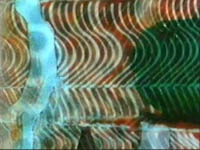
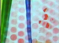
The Filmmaker
Perhaps one reason why Lye’s films command less attention today than they should is simply because they are so short. All twelve films on the “Rhythms” tape add up to a mere 47 minutes, and even the seven-minute Tusalava would fail to bring the total to one hour.
This paucity of footage results in part from the painstaking labor involved in making them. Some of Lye’s films depended on elaborate painting and scratching directly on 35mm film stock. This kind of animation was Lye’s innovation and not, as is widely assumed, that of Norman McLaren. A Colour Box looks remarkably like a McLaren film. The resemblance is not coincidental. One of the few periods during which Lye had institutional support was when he worked for the GPO Film Unit in London. McLaren was freshly out of art school and working at the same unit. He freely acknowledges his amazement at seeing and hearing A Colour Box and its influence on him: “Apart from the sheer exhilaration of the film, which intrigued me was that it was a kinetic abstraction of the spirit of the music, and that it was painted directly onto the film. On both these counts it was for me like a dream come true.” (pages 144-45 of Len Lye: A Biography.)
An equally revolutionary technique Lye used was no less time-consuming. The new color film stocks of the 1930s fascinated him, especially the three-strip processes. These recorded each of the three primary colors on a separate strip of black-and-white film, with the color of the final film being achieved by adding color dyes to the matrices and combining them. Technicolor is the most famous of these systems, though Lye drew upon European processes, including Gasparcolor. Lye seems to have been alone in his realization that one could use the three-strip technique on film shot originally in black-and-white.
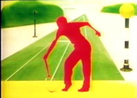
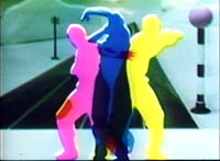
Rainbow Dance was made by shooting, in black-and-white, a human figure leaping, playing tennis, and executing other actions against a white screen and then using the result as a silhouette filled with vivid, saturated colors. Abstract and semi-abstract shapes surrounding the figure, constantly moving and changing, create a dazzling effect. The film ends abruptly with the message, “The Post Office Savings Bank puts a pot of gold at the end of the rainbow.” As advertisements, some of Lye’s films of the 1930s played in theaters, though viewers often perceived them as experimental shorts.
Another reason for the lack of attention paid to Lye is that he was always very much an eccentric loner, working on the periphery of Surrealism, Abstract Expressionism, and kinetic art. Works by him were included in exhibitions devoted to these trends, but Lye always refused the prominence that allegiance with fashionable movements might have given him. He was also highly impractical about money and not adept at explaining his projects to potential grant-bestowing foundations.
The Legacy
Roger Horrocks met Lye late in the artist’s life and worked as his assistant in his final months. Roger and Shirley were involved in setting up the Len Lye Foudation, housed at the Govett-Brewster Art Gallery in New Plymouth, New Zealand. (Its website is the best online source of information on Lye.) The foundation’s collection include extensive unpublished writings by Lye, to which Roger had complete access. He also interviewed a wide range of people who had known Lye in various capacities. The result is not only thorough, but it also gives a lively sense of a profoundly eccentric artist.
As part of Lye’s fascination with the senses, he deliberately cultivated a sort of stream-of-consciousness language, both for speech and writing. The result often suggests someone communicating in poetry rather than prose, and the quotations are not always easy to understand. One note scribbled after Lye had seen a film reads, “The knobbly cast of the star Elliott Gould, bemused, his mouth full of marbles, finally flapping his foot-flippers enrout insouciantly to some horizon or other” (p. 294). Roger, however, has waded through a large, difficult set of notes and journals. As he puts it, “It took my years to find my way round this chaotic collection of fragments and drafts, but ultimately it proved a goldmine.” One early reader of the biography remarked that “the book felt at times more like an autobiography than a biography” (p. 3). This is an astute observation, for Roger has woven many quotations into his own prose and thus given a structure to the chaos. By the end one feels that one understands not just the facts of Lye’s life but also his personality.
(Unfortunately the biography, published by Auckland University Press in 2001, is already out of print. With luck there’s a copy in your local library.)
The Sculptor
For film fans and scholars with at least a passing knowledge of Lye’s shorts, the real news here will be his versatility as an artist. Before he started making films, he was already an accomplished painter. Because painting was a relatively inexpensive activity, Lye often did not promote his own work and simply gave the paintings to friends. He sought buyers and patrons for his kinetic sculpture, though, because he needed funding to build these ambitious projects.
A few museums, like the Museum of Modern Art and the Whitney, own Lye pieces, but on the whole his kinetic sculptures, many of which are large and difficult to maintain in working order, are not widely or continuously displayed. Indeed, much of Lye’s later life was devoted to designing huge pieces, only some of which have been realized even now. The Len Lye Foundation is committed to realizing posthumously the plans he left behind, though no doubt some of his more grandiose schemes will remain too impractical to render.
Shirley’s documentary Flip and Two Twisters (1995) helps fill in that side of the artist’s career for those who cannot travel to New Plymouth. Although she sketches Lye’s career and shows clips from some of the films, the real revelation is footage of Lye at work on some of the main pieces, like “Blade” (1954) and “Flip and Two Twisters” (1965). The dates, by the way, are a little misleading, as Lye continued to modify his sculptures after their initial versions were finished—usually making them larger.
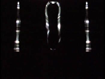
“Flip and Two Twisters” is a casual name for a formidable piece, though Lye eventually took to calling it “Trilogy.” The sculpture consists of a large looped ribbon of flexible steel suspended from the ceiling, flanked by two vertical strips of similar steel. Once set in motion, the thrashing and twisting movements of these three elements gradually become quite loud and violent. Onlookers declare that it is frightening to be in the same room with the sculpture, as even just watching it on video makes plausible.
This documentary would be a terrific teaching supplement for a course on avant-garde cinema. Copies are available direct from Point of View Films.
Shirley gave us three of her other documentaries. Kiwiana (1996), as its name suggests, explores some of the icons of New Zealand’s popular culture. Kiwis were beginning to appreciate these neglected everyday objects, which were becoming collectibles in the 1990s: the buzzy-bee, the gumboot, and, yes, the kiwi fruit. Peter Jackson even makes a brief appearance as a talking head. Marti: The passionate eye (2004) chronicles the extraordinary life of Marti Friedlander, who was raised in a Jewish orphanage during the 1930s and 1940s in London. She was trained as a photography laboratory technician but also became a photographer. Emigrating to New Zealand, she worked on a series of Maori portraits and documented such moments of political ferment as the Women’s Movement. Finally, The New Oceania (2005) is a portrait of the Samoan-born writer Albert Wendt and his fostering of a new Pacific culture based on local traditions but embracing modernism. All of these films are available from Point of View.
We are grateful to Roger and Shirley for being among the many who made us feel so welcome in Auckland. I’m particularly grateful for being led to revisit and explore a director who deserves to be far better known.
Summer camp for cinephiles
Bruges, Belgium is a tourist haven. This reconstructed medieval city boasts museums, canals, cafes, an impressive town square, and other attractions guaranteed to keep credit cards flowing through. It’s a wonderful place to stroll in the sunshine, shop, or watch windmills slowly spin.
In alternating summers, though, Bruges plays host to people who prefer to sit in the dark. This strange cult includes professors, students, and cinephiles from all walks of life. For a small fee Belgians and Netherlanders can plunge into eight intensive days of viewing, lectures, and discussions. While tourists shuttle by unsuspecting, the devout are gathered to watch such items as Rebel without a Cause, the entire Niebelungen, and Destroy All Monsters.
It’s the Zomerfilmcollege, funded by the Flemish side of the Belgian government and run by the Flemish Service for Film Culture in partnership with the Royal Film Archive. In English we’d call it Film Summer Camp. There are no papers or grades. It’s a college in the original sense, a gathering of minds for purposes of deepening knowledge and expanding ideas.
It’s held in the Lumière cinema, a central three-screen moviehouse specializing in arthouse fare (and, for part of our stay, The Simpsons Movie). On the ground floor is a cozy bar, which also serves the lunches and dinners for the collegians. The whole building, like the atmosphere of the event, is unpretentious and welcoming.
Typically there are two principal courses and a sidebar. This year, one course was on Fritz Lang, the other was on widescreen film, and the sidebar was devoted to the French cinematographer Henri Alékan (La Belle et la Bête, Wings of Desire). The schedule is fairly full. At 9:00 AM there’s a lecture, followed by a film screening, then lunch. After lunch, another lecture and another screening. Dinner follows at about 6:30, and evening events follow, with a film or special presentation at 8:00 and then at least one more film afterward. All films are in 35mm prints.
A real workout
Kristin and I had been lecturers here several times, but this year I came alone. The Lang cycle was to have been handled by Tom Paulus, who gave us Hawks last time, but illness kept him away. He was replaced by several other fine Flemish scholars: Hilde D’haeyere, Steven Jacobs, and Roel Vande Winkel. They supplied lectures on Lang and architecture, on his relationship to the German “street film,” on his relation to the Nazi regime, and on his American work. The retrospective gave a good sampling, running from the Dr. Mabuse films (1922) to Moonfleet (1955; very nice print). For Alékan, there was the filmmaker/ archivist/ novelist Eric DeKuyper, for whom Alékan shot A Strange Love Affair (1984), and the Belgian professor Muriel Andrin, who incisively introduced us to visual influences on Alékan’s aesthetic.
Most lectures are in Dutch, but fortunately for me some are conducted in English. In previous years I’ve lectured on modern Asian film, Hollywood in the 1970s, and the history of film staging. This year my topic was anamorphic widescreen. The talks grew out of my research for an essay to appear this fall in my collection Poetics of Cinema.
The week is now about three-quarters done, and I’ve had a great time. Using clips and slides, I started with a block tracing CinemaScope in the US, with my main examples being Rebel, River of No Return, Moonfleet (intersecting with Lang), The Girl Can’t Help It, and Compulsion. Tonight we’ll get our example of modern usage of the widescreen with a showing of Three Kings.
The next three sessions concentrate on non-US usage of the anamorphic format. Le mépris screened today and will be discussed tomorrow. Oshima’s The Catch will represent a Japanese approach. On Sunday, we end with Johnnie To Kei-fun’s The Mission as illustrating one Hong Kong approach. By nice synergy, To’s Election and Election 2 are playing on other Lumière screens, so collegians can sneak off for some extracurricular viewing.
I enjoy visiting the college, and not just because I like to lecture. A schedule of screenings negotiated by what’s available in a good print from the archive or a distributor forces me to confront films I haven’t studied before. Even for those I know pretty well, seeing them big and beautiful can stimulate new musings. And as any teacher will tell you, even going back over familiar material shows you something fresh.
No lack of scope
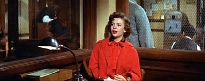
For example, I had always loved the way Nicholas Ray used deep space to link his young protagonists in the police station at the start of Rebel. But this time I noticed how Dean’s performance was fitted to the wide frame: He begins the movie prone and pretty much ends there.
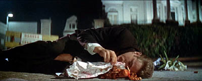
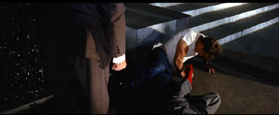
I also noticed how Jim’s gesture of covering the toy monkey at the start is echoed by his and Judy’s protective covering of Plato, and by the climax when Jim’s father covers him.
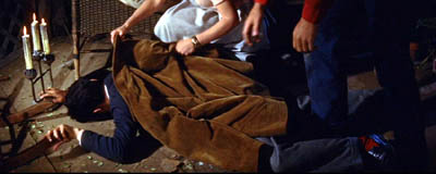
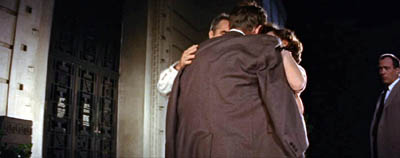
Viewers more familiar with Rebel than me have probably noticed these rhyming gestures and attitudes, but finding them on my own, innocently if you like, fueled my interest in teaching a film I had never studied closely.
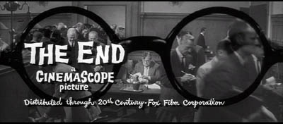
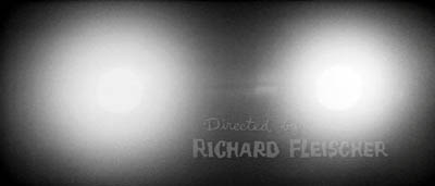
Likewise, I wasn’t aware that the glasses motif in Compulsion is linked to imagery of blinding light, a kind of supernatural authority that not only points to the guilty party but also leads the monstrous, pathetic Judd to mercy. The dynamic is given diagrammatically in the closing and opening credits.
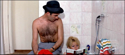
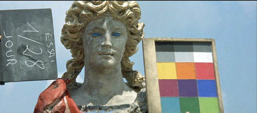
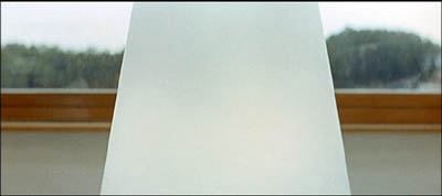
My previous post was about watching movies small and super-slow; now I’m reaping the advantage of watching films big and normally. Today, watching Godard’s Contempt on the screen I was able to enjoy those motifs of color, light, and composition that move almost musically through every Godard film (See top of entry.) I was able to identify some more citations (the novel adorning BB’s fanny is John Godey’s noir Frapper sans entrer) and feel the full force of the bold geometry of the framings. I hadn’t noticed before that the first image of the table lamp in the apartment sequence prepares, inversely, for the villa steps in Capri.
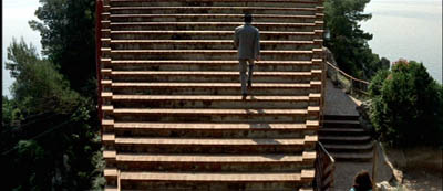
And I’d never noticed before how the last time Paul sees Camille, at the rocky outcropping that overlooks the seascape, she becomes that nymph seen in Lang’s rushes and identified as Penelope of the Odyssey.
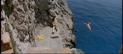
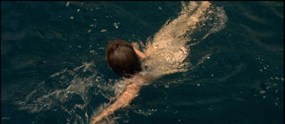
Perhaps Camille is Penelope for Paul, but not necessarily for us. One task of the film is surely to make us suspicious of neat parallels between contemporary and classical culture; what Godard gives us graphically he often qualifies or negates elsewhere in the film. (1)
I expect to have some further fun with The Catch and The Mission, both of which will look splendid on the Lumière screen.
I turned sixty on the day I showed Rebel. Being here, though, I don’t feel so old. I have to keep up with the collegians and the dedicated archive team–Stef, Tim, Vico, Esther, and Joost. Their energy turns a medieval city into an exuberant adventure in cinema.
(1) After preparing my lecture, I discovered a wonderful website on citations in Godard, with special focus on Le mépris.
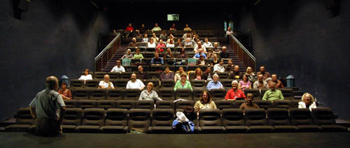
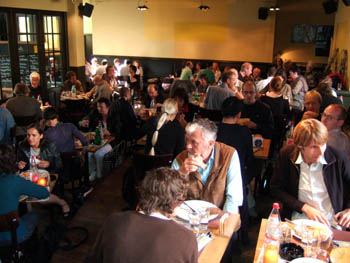
The Zommerfilmcollege gang, in 2.35 Scope. Photo by Esther Dijkstra.


