Archive for the 'FILM ART (the book)' Category
Intensified continuity revisited
DB here:
We’re just beginning to understand the history of film forms, but some trends in Hollywood already seem clear. During the late 1910s American filmmakers synthesized an approach to cinematic storytelling that relied on continuity editing, the practice of breaking a scene into matched shots in order to highlight character action and reaction. In the years that followed, this editing strategy became the dominant approach to mass-market filmmaking across the world. Many historians and theorists believed that editing was the essence of cinema itself.
When sound arrived in the late 1920s, the technology was difficult to master and consumed a lot of production time. It would have been easy for American filmmakers to shoot every scene from a single position, but instead they used multiple cameras to cover the action, much as three-camera TV handles sitcoms now. This made filming cumbersome and limited the lighting choices, but filmmakers wanted to preserve the option of cutting to closer views and fresh angles as the scene developed. Continuity editing continued through the 1930s and well beyond, with filmmakers refining it in various ways.
The strategy has proven remarkably robust. Today’s mass-audience films, from all over the world, adhere to the principles and particulars of continuity editing. Not many artistic styles, in any medium, have had such a long run.
These ideas are developed in more detail in things that Kristin and I have written. (1) Most recently my book The Way Hollywood Tells It tries to track shorter-term changes in the continuity style. I found that one handy way to do this was to look at remakes. Remakes allow us to keep story factors somewhat constant and focus on differences in visual technique. Today’s blog looks at parallel scenes from two films, an original and a remake, in order to illustrate what I’ve called “intensified continuity”—the editing style that comes to dominate American films after 1960 or thereabouts.
Dear friend….
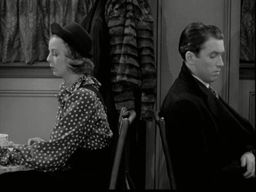
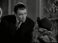
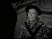
In Ernst Lubitsch’s wonderful Shop around the Corner (1940) Kralik (James Stewart) works in a Budapest gift shop with Klara (Margaret Sullivan). They quarrel constantly. But each has an anonymous pen pal, and the relationship is growing into love. Unfortunately, we learn early on, they’re writing to each other.
On the day they’ve agreed to meet face to face, Kralik is fired. He and another salesman Pirovitch (Felix Bressart) trudge to the café where Kralik is to meet his secret friend. Kralik can’t bear to face her now that he has no job, so he wants Pirovitch to deliver a note saying he can’t come. Still, his curiosity makes him ask Pirovitch to look in the window and describe her. Pirovitch tries to soften the blow, but he has to admit that the young woman waiting with a copy of Anna Karenina and a red carnation is Klara.
Angry, Kralik takes back the note and decides to let her wait. But after Pirovitch is gone, he returns to the café and meets her—not divulging his identity, but trying some conciliatory moves.
In the silent era, Lubitsch was one of the greatest exponents of continuity editing. You need only look at The Marriage Circle or Lady Windermere’s Fan to see his quiet virtuosity. (Kristin’s Herr Lubitsch Goes to Hollywood devotes a chapter to his cutting.) But in Shop around the Corner Lubitsch uses only two shots to present Kralik’s and Pirovitch’s conversation outside the café. A fairly distant tracking shot follows the two men to the window, then we get a very lengthy shot of the two men outside. It starts with Kralik instructing Pirovitch to check on what his correspondent looks like.
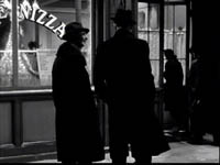
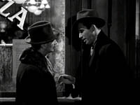
Another director would have given us point-of-view shots showing what Pirovitch sees, along with his reactions. Instead, Lubitsch keeps the emphasis on Kralik, who’s responding to Pirovitch’s reports. Consequently, Kralik’s reactions aren’t given in cut-in close-ups but rather in the prolonged two shot.
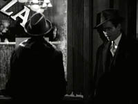
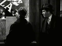
This allows both performers to act with their bodies. Bessart’s shoulders relax, for instance, when he spots Klara, as if he’s slightly recoiling. Stewart’s reactions are more varied; he leans forward eagerly and nods as Pirovitch finds the woman. He slumps, then tugs his hat when Pirovitch mentions Klara.
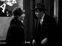
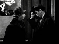
Kralik looks in to see for himself, and collapses a bit. He eventually relaxes when he wryly accepts the fact that his pen pal is his quarrelsome coworker.
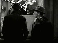
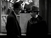
Visually, it’s a simple scene, but it shows the power of the unvarnished two-shot.
After the two men separate, Lubitsch shifts the scene inside and gives us another sustained shot as the anxious Klara talks with a waiter. Instead of crosscutting to Kralik returning outside, Lubitsch creates a humorous shot by letting his head drift into the window behind Klara.
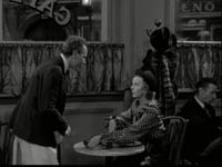
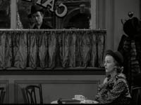
When Kralik goes in to meet Klara, he doesn’t tell her that he’s her pen pal, so narrationally speaking, the knowledge is unbalanced. He and we know more than Klara does, which makes her unhappiness more pathetic. It’s a wonderfully textured scene, partly because we know that each one’s annoyance with the other masks disappointment and anxiety. As the action develops, there’s somewhat more cutting, but even Lubitsch’s closer views often keep both in the frame. He saves his closest shots for the most intense exchange, when Klara mockingly refuses Kralik’s efforts at friendship. The scene will end on a painful note, with each wounding the other with hurtful remarks.
AOL buddies
As you probably know, The Shop around the Corner was remade as You’ve Got Mail. There are some important story differences. The two protagonists have other partners, and Joe Fox owns a bookstore chain that is crushing the children’s bookstore owned by Kathleen Kelly (Meg Ryan). But the parallel scene in You’ve Got Mail is remarkably similar to the one we’ve just been examining.
The sequence starts with Joe and his assistant Kevin (Dave Chappelle) approaching the coffee shop, and Joe is apprehensive—not because like Kralik he’s out of a job but because of the upheaval that meeting his email correspondent could cause in his personal life. Like Kralik, he asks his friend to peer in the window to check her out.
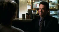
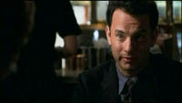
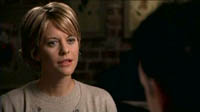
But Nora Ephron handles the scene quite differently than Lubitsch did. She breaks all the dialogue into several shots, mostly favoring one actor (either over-the-shoulder shots or what are called singles). The process starts during the men’s approach to the café.
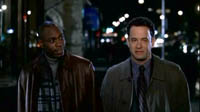
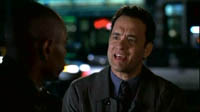
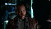
Once they arrive, the staging stations Joe at the foot of a flight of stairs and Kevin at the top, so a sustained two-shot isn’t really in the cards. The pattern is that Kevin reports what he sees, and in reaction shots we see Joe’s response.
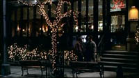
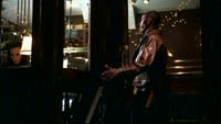
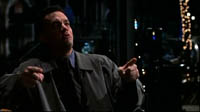
When each man looks inside, unlike Lubitsch Ephron supplies point-of-view shots of Kathleen.
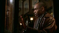
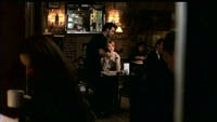
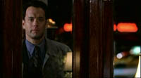
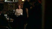
Joe reacts vindictively when he learns his email correspondent is his adversary, and he returns to punish her, but not before we’re taken inside the café and watch Kathleen wait for her correspondent. Even her encounter with another customer, somewhat similar to Klara’s chat with the waiter, is broken into three shots.
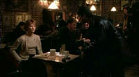
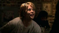
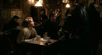
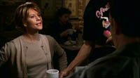
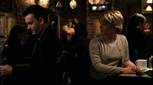
When Joe arrives, his conversation with Kathleen is handled in variations of shot-reverse shot, often in fairly tight framings. Again, the closer framings accentuate the bitter insults the characters exchange.
You’ve got cutting
Both scenes run almost exactly the same length: 8:48 in Shop, 8:42 in You’ve Got. But the initial portion, showing the two men on the sidewalk, consumes only two shots in the Lubitsch and 41 shots in the Ephron. That means that Lubitsch’s average shot in the scene runs about 82 seconds, while Ephron’s runs about 4.1 seconds!
The same disparity arises in the section of the scene taking place in the café. In Shop, 14 shots treat the action inside, but in You’ve Got there are 84! Lubitsch’s shots in this portion average about 21 seconds, still very lengthy, while Ephron’s are almost exactly the same as in the earlier portion, coming in at 4.3 seconds. We tend to think that only high-octane action sequences are cut quickly, but today’s dialogue scenes are cut fast too.
In both films, actors’ line readings are very important, but in Shop, the performances include sustained passages of body language. In You’ve Got, actors act mostly with their faces. Whereas Ephron gives us singles from the start (Kevin and Joe’s approach), Lubitsch saves his close shots for the encounter between his squabbling romantic couple. There’s an effect of gradation, with the cutting building the scene visually toward a high point, that isn’t provided by Ephron.
Oddly, the modern film is less subtle than the older one. Lubitsch uses no nondiegetic music in the scene, but Ephron inserts conventionally comic music as Kevin and Joe approach and we get sorrowful music when Kathleen leaves the café in tears. Although many people think that old movies are hammy and overplayed, here it’s just the opposite. Stewart performs subtly, but Hanks, whom many take as today’s Jimmy Stewart, plays broadly, gesturing in extremis and at one point shaking the brownstone’s railing. The Lubitsch scene also makes use of dramatic pauses to a greater extent than Ephron does.
The redundancy is seen as well in Ephron’s reliance on cutting and singles. Nearly every line or reaction in the You’ve Got sequence gets a shot to itself. This isn’t unique to this film; every remake I’ve examined is cut faster than its original. Fast cutting, down to 2 or 3 seconds per shot on average, and a reliance on OTS’s and singles typify today’s intensified brand of continuity.
Silent films were cut quite fast—in America, around five seconds per shot was common—but the arrival of sound slowed down the editing pace. The good people at Cinemetrics are building a database tracking this trend, among others. But since the 1960s, things picked up in American cinema, and today it isn’t uncommon to find films with average shot lengths of 2-4 seconds….and not just action movies. Likewise, such cutting operates in conversation scenes, making it more likely that the shots are singles rather than two-shots or ensemble framings.
This “intensification” of traditional continuity tactics, I’d argue, dominates mainstream moviemaking today, and not just in the US. Such cutting can sometimes be found in the 1930s and 1940s too, but then it was one possibility within a broader range. The Lubitsch example adheres to the principles of continuity editing, but it allows for more variety of camera distance and pacing.
I don’t denounce intensified continuity as such; some films, most recently David Fincher’s fine Zodiac, make intelligent use of it. Still, with this as the dominant approach, the director’s range of choice has narrowed. When contemporary directors lengthen a take, it’s usually to create a virtuoso traveling shot. A simple framing like the one outside the cafe in Shop is very unusual nowadays. The sustained two shot is practically an endangered species.
Why? What led to these changes between the studio era and contemporary cinema? A cynic would say that, contrary to Steven Johnson, audiences have gotten dumber and need more emphasis on character action and reaction to follow what’s going on. But in The Way Hollywood Tells It I suggest that there are many factors at work in this stylistic change. The book also provides more details of other techniques characteristic of today’s intensified continuity.
(1) In particular Kristin’s Breaking the Glass Armor: Neoformalist Film Analysis, our sections of The Classical Hollywood Cinema: Film Style and Mode of Production to 1960 (written with Janet Staiger), and our Film Art: An Introduction.
New media and old storytelling

DB asks: To what extent has the DVD changed viewing habits and movie storytelling?
As everybody knows, a DVD offers more interactivity than a movie you watch in a multiplex. In a theatre, the movie rolls on, unaffected by anything you may do. But with a DVD you can pause the film, run fast forward, skip to a particular second, shuffle chapters, even play the thing in reverse.
Most minimally, the DVD offers greater convenience. You can halt the film so you can answer a phone call or zip back to replay a bit you might have missed. But some of us wonder if this new interactivity harbors more radical implications. Does the new flexibility of use allow us to experience the film in new ways?
In a mystery film, say there’s a clue at the half-hour mark. In a theatrical screening, we’re pressed forward with no time to ponder it. Watching the film on DVD lets us halt the film, ponder the clue as long as we like, and maybe track patiently back to earlier scenes to test our suspicions about what that clue means. Or suppose you decide to sample the film, browsing through the opening bits of several chapters? More radically, suppose we decide to watch the DVD in reverse? Nothing stops us, and we’d have an experience of the story very different from that of someone who watched the film in the normal order. Doesn’t this all suggest that it’s hard to generalize about what the “ordinary” viewer’s experience of a movie might be nowadays?
Now consider the craft of fictional filmmaking. The movie’s creators make choices about what story information to impart, when to impart it, and how to impart it. They assume that the viewer follows the story in the order mandated by theatrical projection, scene 1, then 2, 3 and onward. Likewise, the pace of uptake is set by the film—no slowing down or speeding up at the viewer’s will. But given the new conditions of digital consumption, these assumptions may be wrong. So shouldn’t the filmmakers take those conditions into account? And more specifically, haven’t some filmmakers already taken them into account? In other words, hasn’t the DVD transformed cinematic storytelling?
This question is important to me. I’ve long argued, along with Kristin, that mainstream US filmmaking, dubbed long ago “classical Hollywood cinema,” has cultivated a sturdy and pervasive tradition of storytelling. (1) That tradition depends on clearly defined characters pursuing well-defined goals. This commitment in turn creates a plot that displays linear cause and effect: In pursuing goals, the protagonist makes one thing happen, and that makes something else happen, which in turn triggers something else. Moreover, the mainstream tradition lays these actions and reactions along a fairly rigid structural layout. And this tradition depends on a system of narration that constantly reiterates the characters’ traits, their goals, important motifs, and the overall circumstances of the action. This is a fairly abstract description, I know; go to my analysis of Mission: Impossible III for a specific example of how the system can work.
But now home video allows our consumption to be highly nonlinear. By skipping or skimming DVD chapters, we may not register the plot or narration as the makers intended. Doesn’t this make hash of goal-directed action, character arcs, and all the other features of classical storytelling? Might we not be moving toward a “post-classical” cinema?
Movie as book
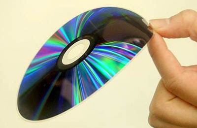
Let’s tackle the question first from the standpoint of the viewer. I think we can get help by recognizing this basic point: The DVD made a movie more like a book.
This sounds odd, because we think of digital media as replacing print. Yet consider the similarities. You can read a book any way you please, skimming or skipping, forward or backward. You can read the chapters, or even the sentences, in any order you choose. You can dwell on a particular page, paragraph, or phrase for as long as you like. You can go back and reread passages you’ve read before, and you can jump ahead to the ending. You can put the book down at a particular point and return to it an hour or a year later; the bookmark is the ultimate pause command.
We tacitly acknowledge the resemblance between the DVD and the book when we call the segments on a DVD its chapters, the list of chapters an index, and the process of composing the DVD its authoring.
With these similarities in mind, we can ask: How many people, on first contact, would sit down to watch a film in a nonlinear way?
My hunch: Just about as many who would buy or borrow a book and then proceed to read it in a nonlinear way. Now we can grant that if you have a nonfiction book in hand, you might pick out certain chapters as more interesting than others and move straight to those. Similarly, with a DVD documentary on penguins, some viewers might want to move straight to the chapter labeled Mating Habits.
With a fictional film, though, we’re much less inclined to graze and browse, just as with a novel. True, we might sample the novel before buying or borrowing it, but I’d bet the portion we’re most likely to sample is the opening chapter. With a fiction film on DVD, some viewers might skip to a chapter opening or two, but I expect that soon they’d settle down to watching the show at the order and pace of a theatrical screening. This is more or less what happens with literary fiction. The person who starts a novel will proceed in linear order in order to follow the story. It’s a revealing phrase: we’re following a path laid down for us, not racing ahead or falling back.
This isn’t to say that all consumers of fiction move at the same pace or read the same way. I’m just indicating that following the mandated order, page by page or shot by shot, is the default that people adhere to in the overwhelming majority of cases.
This suggests that pausing is the most common way we play an interactive role. When reading a book you might call out to your friend and reread a particularly striking description or funny dialogue exchange. When watching a film, you might stop and replay some images to enjoy them again. Another common act is probably quickly “paging back”—rereading or re-viewing a bit that just preceded the pause to remind ourselves of what’s going on at the moment.
Our purpose in starting a book or film at the beginning is to get into the story world and start to think and feel in relation to the information we get about it. But we don’t have to take that as our primary purpose. More extreme acts of “creative” spectatorship are tied to different purposes than learning about the story world. I suppose that teenage boys might well rent 300 when it comes out on DVD and fast-forward looking only for the scenes showing carnage or naked ladies….the same way that my high-school contemporaries rummaged through Terry Southern’s Candy digging out the good parts. (2) But this doesn’t seem to be a radically new way of using any medium, because the purpose—scanning a text for immediate gratification rather than narrative involvement—was common well before DVD.
Of course we students of cinema use the DVD commands in order to study a film, spooling back and forth to analyze it. But that usage isn’t a radical reworking of consumption either. Typically before we start to analyze a movie, we’ve already experienced it in the ordinary beginning-to-end way. Students of literature execute the same sort of back-and-forth moves studying a text that they’ve read before.
Finally, I’d suggest that a highly unorthodox mode of consumption, like setting out to watch a film in reverse at 8x speed, would become quite boring fast. As with so many things in life, just because you can do something doesn’t mean you’d enjoy it.
Speculation 1: The actual uses that people make of DVD interactivity are limited; traditional beginning-to-end consumption is the default.
Speculation 2: Pausing, paging back, and scanning for the good bits suggest that the most frequent DVD interactivity is familiar from other media, particularly books.
Guided interactivity
Let’s now consider things from the side of the creators. Knowing that films are seen on DVD, don’t filmmakers adjust their art and craft to this new medium? Of course they can provide revised versions, or directors’ cuts, along with alternative endings, deleted scenes, and other material that shed light on the film and the production process. But does the DVD format change the very act of conceiving and executing the story presented by the film?
Yes, in certain respects. In The Way Hollywood Tells It, I argue that the possibility of rewatching a film with little fuss encourages ambitious filmmakers to “load every rift with ore,” to pack in details that might not be noticed on a single viewing. One of my examples is the 8/2 motif in Magnolia. Likewise, the looping plotlines of Donnie Darko and the reverse-order one of Memento are amenable to being picked apart after several viewings. But before home video, you as a viewer could scrutinize such movies by just going back to the theatre and watching the film over and over, very attentively.
Clumsy as it seems, film nerds of my generation did this. I remember my thrill as a junior in college when I discovered, after rerunning a 16mm print of Citizen Kane on my apartment wall, the snowstorm paperweight that Kane clutches on his deathbed sitting on Susan’s vanity table the night he first meets her. Welles had, as it were, planted this clue for attentive viewers to spot. When we were lucky, we might get a film on a flatbed viewer and go through it reel by reel. Granted, the random-access aspect of DVD allows this sort of micro-analysis to be done much more easily, but it’s not different in kind from rolling up your sleeves and threading up a Films Incorporated print one more time.
I’d add that this sort of scrutiny enriches the film in a very traditional way. Films that sustain this sort of attention, from Buster Keaton silent movies to Hiroshima mon amour and The Silence of the Lambs, long predate the arrival of DVD. Throughout Play Time Tati sprinkled details and gags that reward many viewings. When Paul Thomas Anderson and Christopher Nolan bury details in their films, or when The Simpsons flashes a jokey sign past us, they’re practicing a time-honored strategy of teasing the viewer to return to the work to get something more out of it. Having the DVD at your disposal makes it easier to find half-hidden motifs, jokes, ironies, and the like, but all of these are traditional elements of films both classical and non-classical.
There are, though, more radical cases. The experimental novelist Michel Butor pointed out that the fact that the book is an object to be manipulated at will harbored the possibilities of innovative storytelling. He pursued those in works like La Modification (1957) and Degrés (1960) and theorized about them in an essay, “The Book as Object.” (3) Along the same lines, once a film becomes a booklike object, it can be composed to encourage multiple replays not merely to appreciate little touches but just to make bare sense of what’s going on in it.
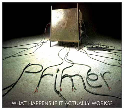
Memento and Primer would seem to be instances. Their makers seem to have designed the films to encourage admirers’ extensive, not to say obsessive, re-viewings. (For analyses of Primer, go here and here.) Again, however, the DVD serves not as a unique format for the film but as a tool that makes analyzing the plots a lot easier than would several visits to the theatre. (4)
There are other possibilities tied to the format itself. The DVD of Max Allan Collins’ Real Time: Siege at Lucas Street Market was designed to permit the viewer some choice of camera angle in certain scenes. At a few points we’re permitted to enlarge the monitors of different surveillance cameras in order to follow one or another strand of action. (Actually, I couldn’t get this feature to work on my players.) Still, in Real Time, the plot action is clear and redundant in the classical manner, so even if you don’t enlarge the screens, maybe you won’t miss much.
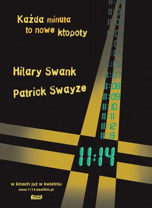
Butor suggested that since a book is an object, all in hand at once, a plot could be composed to permit many, equally valid points of entry and exit. Such seems to have been achieved by the DVD version of Greg Marcks’ 11:14. The film is a network narrative, following five characters in a small town as their lives intertwine. The plot is broken into five segments, each one following a character up to the critical moment given in the title. It’s a clever and enjoyable piece of work. In carrying it to DVD, Marcks chaptered it so that you could skip among storylines at will. He explains in an email to me:
It’s a feature on the DVD that I called “character jump,” which allows you to jump to what another character is doing at that same moment in time. Theoretically you could watch the film in an endless circuitous loop because the end is simultaneous with the beginning.
During some scenes of 11:14, a JUMP icon appears and if you press Enter, the scene switches to another character’s storyline—either earlier or later in the theatrical version’s running time. Once in that story, the icon stays on for a bit so that you can return to your point of departure if you want. (4) Presumably for reasons of engineering and disc space, the number of JUMP options remains fairly limited. Still, it’s a fascinating prospect, and it does seem to offer the possibility of your restructuring the plot in fresh ways.
Even in 11:14, however, the story possibilities are closed. As in a Choose Your Own Adventure book, you’re hopping among trajectories that are already designed. The opening remains the opening for every option; no Butor-style starting in the middle. Furthermore, the trajectories themselves are linear, running along a cause-effect pattern very familiar to us from classically constructed stories. (5) We find this often in branching or multiple-draft narratives. I argue in The Way that even the reverse-order disjunctions of Memento sort out along lines to be found in film noir.
Let’s also recall a simple point. Even though the book format offers the sort of mind-bending manipulations Butor celebrates, most literary fiction remains traditionally plotted and narrated. Likewise, we should expect that the arrival of the DVD permits filmmakers who want to tell orthodox stories in orthodox ways keep on doing so. The line of least resistance is straightforward linear presentation.
Speculation 3: The ease of DVD replay can encourage filmmakers to pack their films with more details that repay rewatching. The result might be films that are more “hyperclassical,” to use a term I suggest in The Way Hollywood Tells It –films that are even more tightly woven than we tend to find in the studio years.
Speculation 4: Some filmmakers have made their storylines harder to follow on a single viewing, encouraging DVD replays so we can figure out what’s going on. This strategy makes the films less classical in construction, to a greater or lesser extent.
Speculation 5: A few filmmakers have utilized DVD features to allow greater interactivity than a theatrical screening would grant. In most cases, however, this interactivity rests upon classical guidelines—protagonists with goals, confronting obstacles, conflicting with others, and arriving at a definite conclusion along a linear path.
A stubborn structure
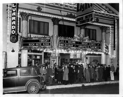
Once upon a time, roughly between the 1920s and the 1960s, movie theatres had a policy of continuous admissions. Metropolitan theatres were sometimes very crowded and patrons had to wait in line outside for seats to be freed up. (Hence the need for ushers to find vacant seats during the screening.) As a result, you might enter in the middle of the movie and watch the film through to the end, sit through shorts and perhaps another feature, and then stay for the opening of the initial film. Hence the expression “This is where we came in.” Doubtless many people planned to see films from beginning to end, but a lot also arrived in medias res.
Someone might speculate that this manner of viewing would encourage filmmakers to indulge in slack plotting. After all, if viewers can come in at any point, a vaudeville-like cascade of acts and incidents—what people are now calling a “cinema of attractions”—would be best. In fact, however, Hollywood feature filmmakers told complex, linear stories of the sort I’ve already mentioned. They didn’t seem to care if viewers were entering midway.
But they really had no choice. If the filmmakers wanted to tell a fairly coherent story, how could they cater to a viewer who might enter at any moment? The only feasible plan, then and now, is just to go ahead and present a story in the linear way, but make sure that it’s presented so clearly that even a viewer entering in the middle can pick up what’s happening. That was, and still is, the default practice. The redundancy of Hollywood storytelling, bent on clear and cogent presentation of the action, is the most effective response to fragmentary viewing.
Hollywood films have been shown in picture palaces, rural playhouses, college classrooms, churches, military bases, and submarines. They’ve appeared on TV, in drive-in theatres, on airline screens, on computer monitors, and now on iPods. In design and execution, the films have stayed remarkably stable. They have relied on our understanding of general principles of storytelling and more specific ones typical of Hollywood. In most cases, this default will stay in place. It works very well, and there’s no alternative that can anticipate all the different ways in which viewers can consume the movie.
Speculation 6: Odd as it sounds, fragmented viewing conditions can encourage coherent storytelling.
Speculation 7: We can’t easily draw conclusions about how films are constructed on the basis of how they’re presented and consumed. Changes in viewing practices don’t automatically entail changes in storytelling.
I’d just add that even in the age of digital media, spectators enjoy greatest freedom not in the way that they manipulate films but in the ways they can interpret them. But even an epic blog has to stop somewhere, so I’ll leave that matter for another time. (6)
(1) You can find the details of our case in Film Art, in Narration in the Fiction Film, in The Classical Hollywood Cinema, in Storytelling in the New Hollywood, in Storytelling in Film and Television, in The Way Hollywood Tells It, and in my forthcoming Poetics of Cinema. Also, see Kristin’s “contrarian” blog entry here.
(2) In high school I loaned Candy to a friend and it made its way among my peers with remarkable speed. When I got it back, the pages were falling out. Somehow, our principal Mr. Brown learned that I was the culprit. He gave me a starchy lecture and announced over the homeroom PA system that I was being reprimanded for “bringing a certain book” to school. Mr. Brown was unmoved by my defense that Candy had gotten fairly good reviews.
(3) Translated in his English-language collection Inventory (New York: Simon and Schuster, 1968), pp 39-56. The essay doesn’t seem to be available on the Net. So off to the library with you!
(4) Thanks to Colin Burnett, who tested the 11:14 DVD for me while I’ve been away.
(5) Marcks’ DVD version has allowed us to create a Griffith-style crosscutting of plot strands. Interestingly, network narratives are constructed in two main ways: crosscutting the storylines (as in SHORT CUTS) or presenting them in blocks that we must synchronize in our heads (as in PULP FICTION and GO). Marks’ theatrical version gives us the block version of 11:14, while the DVD reveals one possibility of an intercut one.
(6) I’ve discussed film interpretation in a book (Making Meaning) and in chunks of a forthcoming collection (Poetics of Cinema),
PS, 16 May (New Zealand time): Jason Mittell has a fascinating commentary on this topic at his site, Just TV (which isn’t actually just about TV). Jason argues that television narrative has become more complex in recent years and that videotape and DVD technologies have affected that in some unexpected ways. A must-read!
Funny framings
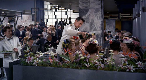
DB asks: Can a film shot be amusing in itself?
Of course a shot can show us a gag that’s funny. If Jerry Lewis or Adam Sandler is going to fall off a ladder into a Dumpster, we want to see everything clearly. Here the framing can be modestly functional. But can the very choice of lens, angle, scale, or composition play a stronger role? Can camerawork itself provide the gag?
Barry Sonnenfeld, cinematographer for the Coens and now a prominent director, thinks so. He’s remarked that an extreme wide-angle lens is inherently funny. In the commentary for the DVD of RV, he explains, “You just put a big 21mm lens really close to [Will Arnett’s] face and you get comedy without him having to do anything.” I don’t have an RV frame handy, but here’s an example from Big Trouble, with both the wide lens and the low-angle creating the sort of grotesque disproportions that Sonnenfeld finds funny.
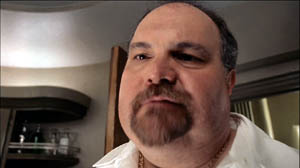
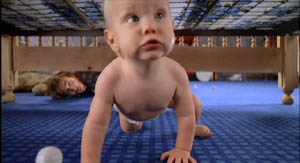
Sonnenfeld got this idea, he claims, by working on the Coens’ early films, which used wide-angle shots for cartoonish exaggeration. In Raising Arizona, the angle and lens length make the wandering baby loom; we’re not used to seeing an infant rampant.
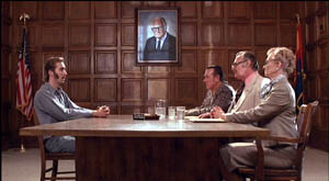
But the Coens had a broader approach to funny framings than Sonnenfeld acknowledges. For instance, they created humor by means of geometrical tableaus. In H. I.’s parole hearing in Raising Arizona, an absurd solemnity is set up by the symmetrical layout of actors. At the apex of the triangle, a portrait of Senator Barry Goldwater blesses the occasion.
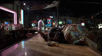
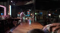
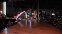
Even more memorable is the forward tracking shot down the bar top in Blood Simple. The camera, encountering a drunk sprawled in its path, simply crawls over him.
The silent comedians knew how to use camera position to build up their gags. Long ago Rudolf Arnheim praised the opening scene of Chaplin’s The Immigrant. As a ship rocks treacherously, we see Charlie from the rear heaving and kicking on the railing. As Arnheim puts it, “Everyone thinks the poor devil is paying his toll to the sea.” (1)
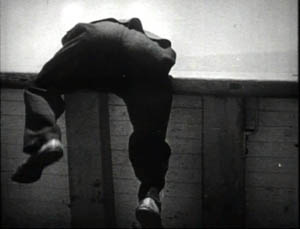
But then Charlie turns toward the camera to reveal he’s been struggling to reel in a fish.
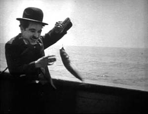
Here the framing creates the gag by what it doesn’t show. “The element of surprise,” Arnheim notes, “exists only when the scene is watched from one particular position.” The camera setup also makes an expressive analogy; we probably never noticed the similarity between vomiting and wrestling a fish.
One of my favorite comic framings occurs in The General. Buster’s train is hurtling along, and a cannon on one car is suddenly trained on him. The first shot gives us the situation with maximum clarity, in a profiled shot. But then Keaton cuts to another angle, showing the cannon in the foreground and Buster trying to escape it.
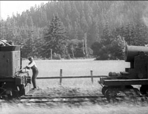
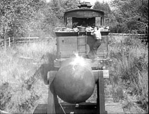
Nothing much has changed in the scene’s action, just the camera setup. But now we get to watch the cannon draw a bead on Buster. Audiences invariably laugh at this shooting-gallery image.
Jacques Tati is in many ways the modern heir of Keaton, and humor in his sequences often stems simply from a juxtaposition of elements in a single frame. An older man ogling a pretty woman on the beach is funny in a standard way, but in M. Hulot’s Holiday, we get more.
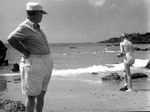
No words are spoken, but Tati’s staging and framing juxtapose the very different bodies in telling ways. We’re invited to note the difference between age and youth, paunchiness and health, passing yearning and its likelihood of fulfillment.
Play Time, Tati’s masterpiece and one of the greatest films ever made, offers an abundance of subtly comic framings. The shot below promotes the film’s theme that modern architecture has homogenized the world. The posters present the same building in different locales, with only stereotyped add-ons to distinguish the US, Hawaii, Mexico, and Stockholm. As one of the ladies on Barbara’s tour says, “I feel at home everywhere I go.”
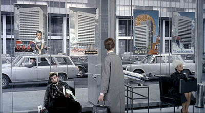
Again, though, a juxtaposition adds to the humor. Throughout Play Time, Tati suggests the disparity between the joy of travel as promoted by our culture and the stress of hustling from place to place. The promise of the posters is undercut by the dazed traveler who’s flopped underneath them, clutching maps and flightplans. And he in turn contrasts with the no-nonsense businesswoman on the far right.
Tati can create comedy by the exact placement of the camera; a foot to the left or right and the gag would vanish. In the image at the start of this entry, the waiter is pouring champagne, but he seems to be watering the ladies’ flowery hats, which mask their champagne glasses. The same sort of exactitude of placement occurs in a shot we use as an illustration in Film Art (p. 195). M. Hulot is leaving an office building when it’s closing. As a guard locks down a doorway, his cap falls off and Hulot is startled: the guard seems to have grown horns.
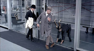
Can we find funny framings in current films? Yes! I was prompted to write this blog while rewatching Shaun of the Dead. Zombies have overrun London, and two groups of human survivors meet. Shaun is leading one, Yvonne is leading the other. Instead of being presented as a mingling of the two groups, the scene plays out along two lines of people. Have a look.
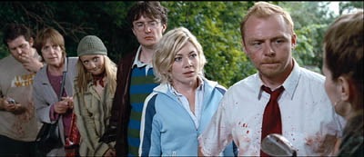
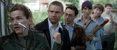
The gag’s premise is that each survivor has a counterpart in the other line. There are two posers in brown leather jackets, two can-do girls, two matrons, and two distracted videogame geeks. I wonder how many first-time viewers catch this? (Kristin did, I didn’t.)
These mirror-image depth shots set up the real gag, which pays off in another clever composition. When the two groups set off on separate paths, each member passes and smiles awkwardly at her/his lookalike, while the framing underscores their likenesses.
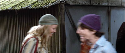
As they walk through the frames, the similarities increase.
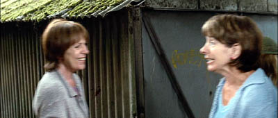
The framing makes a clever point about conformity and social stereotypes. Ending the procession with the two gamers, oblivious to the danger and to one another, tops the topper, as gag writers would say.
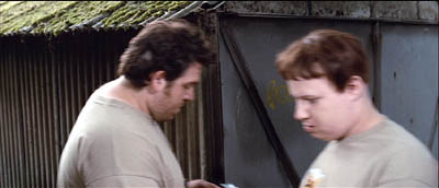
Tati would have loved these shots.
Of course I’ve simplified things for the sake of making my point. It’s not that the camera is somehow capturing a free-standing event by selecting the most amusing view. In all these examples, the staging is calculated to match the camera position. Staging, like camerawork and other film techniques, creates filmic narration. I’m only suggesting that in these scenes, the staging wouldn’t work on its own to create humor, nor would a simply functional framing. Choices of lens, camera position, and the like seem to be critical in making the gags work.
Finally, a borderline case that intrigues me. In last year’s Crank, our hero is in overdrive thanks to a constant intake of drugs. Stepping into an elevator, he faces a man who starts speaking Japanese. Naturally, his line is subtitled.
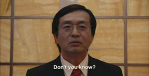
But then we get this:
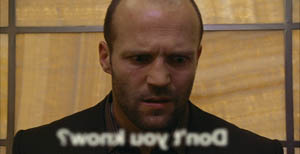
The idea of the head-on reverse angle is carried to comic extremes by reversing the subtitle as well (and blurring it to reaffirm the hero’s muzzy mental state).
I think that aspiring filmmakers can learn a lot from this tradition. Our films need more pictorial creativity, which often doesn’t require fancy CGI. Stylistic handling can add fresh layers to a basic story situation, and astute filmmakers can be alert to the possibilities of comic compositions and funny framings.
(1) Rudolf Arnheim, Film as Art (Berkeley: University of California Press, 1957), p. 36.
PS 4 May: Owen Williams writes to point out that the gag in Crank depends not just on a reverse framing but a play on the idea of lens focus. “The subtitle is fuzzy because it’s supposed to exist in real space (at least in this character’s head), with the letters hanging in mid-air in front of the Japanese man. Therefore in the reverse angle they appear out of focus (fuzzy) because they are closer to the camera. It’s a great gag.” Thanks, Owen.
PPS 8 May: I’ve gotten a lot of correspondence about this blog entry. Here are some nifty supplements:
Kent Jones was reminded of the shot in High Anxiety in which the camera moves to a picture window, with people dining behind it, and then crashes through the glass.
Sam Adams recalled a shot in Killer of Sheep that had something of the same effect, showing men trying to load a car engine onto the bed of a pickup truck. But the context isn’t itself comic. Sam reflects: “Based on the examples you choose, it seems that ‘comic framing’ invariably involves a level of self-consciousness, a feeling that the audience is being deliberately toyed with by the figure behind the camera. We get a sense that the scene has been staged for our amusement, rather than feeling that we must identify emotionally with whatever the characters are going through (which even in comedies is often quite sad).”
Stew Fyfe found a host of in-jokes in the Shaun of the Dead shots:
“Viewers of British television might notice an extra parallel between the shots. The actors playing each of the group leaders, Simon Pegg (Shaun) and Jessica Stevenson (Yvonne), were the leads in the sitcom Spaced (also directed by Edgar Wright, the TV predecessor to Shaun). Also split between the two groups are Lucy Davis (Shaun’s Group, hat) and Tim Freeman (Yvonne’s group, second in line), from original The Office and Dylan Moran (Shaun’s group, glasses) and Tamsin Greig (Yvonne’s group, hat), the leads of the sitcom Black Book. Yvonne’s mum (second matron) is played by Julie Deakin, who played the drunk and desperately lonely/horny landlady in Spaced.”
Thanks also to Bryan Wolf for a note on the same subject.
Finally, this from Jeremy Butler:
“I like your example from The General, but my favorite example of comic framing from Keaton’s work (and one I use in class to illustrate how he was more “cinematic” than Chaplin) is in Sherlock, Jr. Buster runs along the top of a freight train, and is then flushed to the tracks by a spout from a water tank. What makes it funny, I’d suggest, is the choice to frame it from the side, at a right angle to the tracks (much like the first General frame in your example). It minimizes the size of Buster’s body and contrasts him with the size of the train cars. Plus, it emphasizes the movements in opposite directions of his body and the train.
All these elements make it visually funny in a way that would not be apparent if it were filmed from an oblique angle or from behind the train.
But then, maybe I just like to show it because it’s the scene in which Buster literally broke his neck–which he didn’t realize until decades later when being x-rayed for something completely different!”
Thanks to everyone who wrote in with comments and who linked to this entry.
But what kind of art?
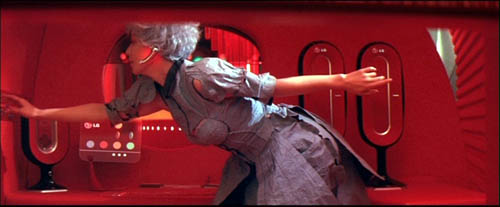
2046.
From DB:
We don’t have to think of film as an art form. A historian can treat a movie as a document of its time and place. A war buff could scrutinize Eastwood’s Iwo Jima movies for their accuracy, and a chess expert could sieve through Looking for Bobby Fischer to discover, move by move, what matches were dramatized. But most of the time we assume that cinema is an art of some sort.
Not necessarily high art. Cinema is often a popular art, or in Noël Carroll’s phrase, a mass art. From this angle, there’s no split between art and entertainment. Popular songs are undeniably music, and best-selling novels are instances of literature. Similarly, megaplex movies are as much a part of the art of film as are the most esoteric experiments. Whether those movies, or the experiments, are good cinema is another story, but cinema they remain.
So, at least, is our position in Film Art: An Introduction. We draw our examples from documentaries, animated films, avant-garde films, mainstream entertainment vehicles, and films aimed at narrower audiences. In other writing, Kristin has done research on high-art movements like German Expressionism and Soviet Montage (she wrote her dissertation on Ivan the Terrible), but she’s also written about popular cinema from Doug Fairbanks to The Lord of the Rings. I’ve indulged my admiration for Hou and Dreyer but also I’ve tried to tease out the aesthetics of Hong Kong action pictures and contemporary Hollywood blockbusters. Ozu gives us the best of both worlds: one of cinema’s most accomplished artists, he was also a popular commercial filmmaker.
Still, people who look upon cinema as an art don’t necessarily share the same conceptions of what kind of art it is. We have different conceptions of cinema’s artistic dimensions, and we won’t find unanimity of opinion among filmmakers, critics, academics, or audiences.
When we study film theory, this sort of question comes to the fore, and so today’s blog will be a bit more theoretical than most. Don’t let that scare you off, though; I’m trying for clarity, not murk.
Dimensions
People have tended to think of cinema as an art by means of rough analogies to the other arts. After all, film came along at a point when virtually all the other arts had been around for milennia. It’s commonly said that film is the only artform whose historical origins we can determine. So it’s been natural for people to compare this new medium with older arts.
Here are the dimensions that come to my mind:
*Film is a photographic art.
*Film is a narrative art.
*Film is a performing art.
*Film is a pictorial art.
*Film is an audiovisual art.
Let me say off the bat that I think that film is a synthetic medium, in the sense that all these features and more can be found in it. It’s like opera, which is at once narrative, performative, musical, and even pictorial. I mark out these dimensions simply to show some emphases in people’s thinking about cinema. As we’ll see, these ideas can be mixed together in various ways.
Film as a photographic art.
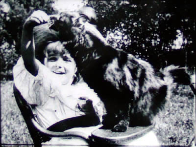
La petite fille et son chat (1900).
For many early filmmakers, such as the Lumière brothers (above), cinema was a means of capturing reality, documenting the visible world. Movies were moving photographs. Naturally, this conception of cinema leads us to treat documentary as the central mode of filmmaking.
It’s an appealing idea. G.W. Bush reading “My Pet Goat” wouldn’t be as revelatory presented as a painting or a theatre performance. On film we can see the event as it occurred and judge it as if we were in the same room. Even in fictional cinema, you can argue, the physicality of the actors, the tangibility of the setting, and the details–a train’s pistons, wind rustling through grass–could not be rendered, or even imagined, so powerfully in a non-photographic medium. In addition, consider Jackie Chan. His stunts are astonishing partly because we know he really did them and the camera photographed them. In an animated film, or a CGI-based one, a character’s acrobatics or brushes with death aren’t so thrilling.
The great film theorist André Bazin claimed that cinema’s photographic basis made it very different from the more traditional arts. By recording the world in all its immediacy, giving us slices of actual space and true duration, film puts us in a position to discover our link to primordial experience. Other arts rely on conventions, Bazin thought, but cinema goes beyond convention to reacquaint us with the concrete reality that surrounds us but that we seldom notice.
I think that Bazin’s idea lies behind our sense that long takes and a static camera are putting us in touch with reality and inviting us to notice details that we usually overlook in everyday life. (I try out this line of argument in relation to the tactility of Sátántangó here.) Moreover, you can argue that in treating cinema as a photographic art the filmmaker surrenders a degree of control over what we see and how we see it. Bazin made this claim about the Italian neorealists and Jean Renoir: creation becomes a matter of an existential collaboration between humans and the concrete world around us.
An example I used in my book Figures Traced in Light pertains to a moment in Hou Hsiao-hsien’s Summer at Grandfather’s, when a tiny toy fan falls between railroad tracks as a locomotive roars past. The fan’s blades stop, then spin in the opposite direction as the train thunders over it. The blades reverse again when the train has gone. (This detail might not be visible on video.) Did Hou know how the fan would behave? Isn’t it just as likely he simply discovered it after the fact, making his shot a kind of experiment in the behavior of things? Conceived as a species of photography, cinema can yield visual discoveries that no other art can.
Interestingly, cinema didn’t have to be photographic. Many early experiments with moving images were made with strips of drawings, such as the Belgian Émile Reynaud’s Praxinoscope. You can argue that recording glimpses of the world photographically simply proved to be the easiest way to obtain a long string of slightly different images that could generate the illusion of movement. Some filmmakers, such as George Lucas, hold that filmmakers are no longer tied to photography, and that the digital revolution will allow cinema to finally realize itself as a painterly art. More on that below.
Film as a narrative art.
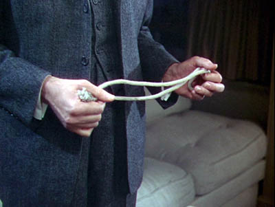
Rope.
This is at the core of Hollywood’s explicit concerns. Producers, directors, crew, and of course screenwriters will agree that Without a good story, the movie fails. Our Indie and Indiewood filmmakers say they’re trying to find fresh stories, the ones that “haven’t been told yet.” Overseas filmmakers dominated by Hollywood tell us, “We have our own stories to tell.” Even the most celebrated arthouse filmmakers often say they’re interested in character as revealed through action. Resnais, Rivette, Fassbinder, Haneke, and all the rest may have told unusual stories, but still they told ’em.
Likewise, many viewers will say that they go to the movies to experience a story. Reviewers online and in the popular press, if they do nothing else, are obliged to sketch out the film’s plot, though they mustn’t give away the ending. Even in academia, most discussions of films focus on what happens in the narrative.
When we consider film genres, we’re usually concentrating on the narrative aspects of them. Most genres display typical characters and plot patterns. The backstage musical features aging stars and young hopefuls, caught up in the process of putting on a show. The horror film typically centers on a monster’s attack on humans, who must fight back. One type of science fiction shows us an overweening scientist striving to go beyond “what is proper for humans to know.” Both fans and scholars discuss other aspects of genre films, but narrative is often central to their concerns.
Historians have traced in great detail how filmmakers employed cinema as a narrative art, but we’re making more discoveries all the time. How, for instance, have films signaled flashbacks? How do they let us know we’re in a character’s mind, or attached to his or her optical point of view? How have they structured their plots? Can we pick out distinct approaches to narrative–in various periods, or genres, or national cinemas? How have narrative conventions changed over the years? Some of the answers Kristin and I have proposed can be found elsewhere on this site, and in our books and articles.
Film as a performing art.
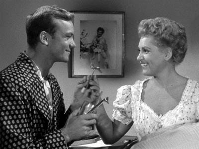
The Marrying Kind.
In the West, since Plato and Aristotle we’ve distinguished between verbal storytelling and dramatic presentation, or performance. Films may be stories, but they’re not exactly told: they’re enacted. At Oscar time, we’re especially conscious of this analogy, for the Actor/ Actress nominees usually garner the most public attention.
Hollywood acknowledged cinema as a performing art in the 1910s, when it created the star system. The Star reminds us that film acting isn’t exactly the same as theatre acting, since an elusive charisma puts the performance across. John Wayne, Marilyn Monroe, Keanu Reeves, and many other “axioms of the cinema” aren’t good actors by stagebound standards, but once they show up on screen, you can’t take your eyes off them. This notion intersects with the photographic premise: we say that the camera seems to love them.
You can argue that Andy Warhol revamped this idea. His superstars weren’t photogenic by ordinary standards but their almost clinical narcissism and exhibitionism, captured by the camera, made them as mesmerizing as any matinee idols. Warhol films like Paul Swann create rather disturbing emotions by putting us in the presence of an awkward performer.
Reviewers place a premium on a movie’s performance dimension. After they’ve told us a bit of the plot , they appraise the job the actors did. Some ambitious critics have written wonderful appreciative essays on acting, as in Andrew Sarris’s “You Ain’t Heard Nothin’ Yet” and the collection OK You Mugs. See also the two collections of articles by Gary Giddins, which I discuss in an earlier blog.
Academic film studies has been slow to study acting systematically, partly because of a bias against considering cinema as a theatrical art, and partly because acting is very hard to analyze. But Charles Affron, Jim Naremore, Roberta Pearson, and Ben Brewster and Lea Jacobs have greatly helped us understand performance practices. They show, among other things, that it isn’t just a matter of the face or the voice: a fluttered hand or a willowy stance can be as powerful as a frown or a line reading.
Film as a pictorial art.
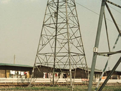
Ohayu (Good Morning).
Progressive opinion in the silent era tended to deny that film was a performing art, since that would make it a form of theatre. No, film had unique capacities. Cinema was essentially moving pictures.
It was a visual art that unfolded in time, so a movie was neither quite the same as a painting (frozen in time) or as a stage play (not pictures but three-dimensional reality). The coming of sound somewhat reduced the appeal of this line of argument, but to a very great extent, students of film technique still emphasize cinema as a visual art.
Theorists argued that the film frame was a pictorial field, not a proscenium stage. Action unfolded in the frame in ways that dynamized space. The choice of angle, camera distance, camera movement, and the like created a visual fluidity that had no equivalent on stage or in other graphic arts. Even cinematic staging was quite different from blocking in a theatrical space. Add to this the ability to join one strip of pictures to another via editing, and we have a unique pictorial artform.
The theorists of the silent era, like Rudolf Arnheim and the Russian montagists, gave us a vocabulary and an orientation to studying visual style, but their legacy hasn’t been fully developed. Journalistic reviewers typically don’t pay that much attention to the way movies look. Nor, surprisingly, do academics. Film studies departments seldom pursue research into visual style and structure.
Here the professors are out of sync with the people whose work they study. Manuals and film schools teach composition, lighting, cutting, camera placement and the like. Professional filmmakers all over the world often think in pictures; they prepare shot lists and storyboards and care very much about the color values and editing patterns of the finished work. We can see their interest in visuals in DVD commentaries and supplements, and as viewers start to absorb bonus materials, perhaps their interest will be whetted too.
Needless to say, a number of avant-garde filmmakers, from Viking Eggeling and Walter Ruttmann to Deren, Brakhage, Ernie Gehr, James Benning, and Nathaniel Dorsky, have also thought of cinema as having the power to refresh, even redeem, our vision. But many of the most important directors aiming at broader audiences are also renowned for their visual styles. To mention just a few: Griffith, Feuillade, Sjostrom, Keaton, De Mille, Murnau, Lang, Dreyer, Lubitsch, and Dovzhenko; Ford, Hitchcock, and von Sternberg; Renoir, Ozu (above), Mizoguchi, and Ophuls; early Bergman, Antonioni, Jancsó, Resnais, Angelopoulos, Tarr, Tarkovsky, Kieślowski, Kiarostami, and Makhmalbaf; Scorsese, Spielberg, Michael Mann, and Tim Burton. Some, like Oshima, Sokurov, and Johnnie To, have been polystylistic, exploring many different visual pathways.
Film as an audiovisual art.
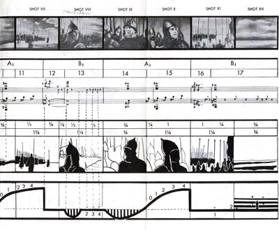
In the 1920s, many theorists feared the coming of synchronized sound, since that would thrust film back toward theatre. The “talkies” would sacrifice visual artistry to Broadway dialogue. This worry was mistaken, but I can sympathize. Probably the mandatory silence of early film pushed filmmakers to find means of visual expression. Would we have Chaplin and the other clowns if they could have spoken at the start?
Yet a great deal of sound cinema wasn’t canned theatre. Film became a synthetic medium blending imagery, the spoken word, sound effects, and music into something that was neither painting nor theatre nor illustrated radio.
Though he’s thought of as the premiere theorist of editing, Eisenstein actually developed this idea of audio-visual synthesis. He was fascinated by the ways in which images and music worked together, creating an idea or feeling that couldn’t be expressed by either one. If shot A followed by shot B gave us something that wasn’t present in either one, then why couldn’t shot A and sound B yield the same results? He believed that Disney’s 1930s films were the strongest efforts in this direction, as when a peacock fanned out his tail to a rippling melody. Eisenstein called it “synchronization of senses.”
Eisenstein sometimes pushed this idea pretty far. His remarkable analysis of one sequence in Alexander Nevsky (sample above) tried to show how the movement of the viewer’s eye across a suite of shots actually mimicked the movement of the music. He made the case tough for himself because the shots contain almost no movement within them: Eisenstein claimed that we read the compositions from left to right, in time with the musical chords!
Not only Disney but many filmmakers of the 1930s experimented with audiovisual fusion–Kozintsev and Trauberg in Alone, Pudovkin in Deserter, Mamoulian in Love Me Tonight, Renoir in the final danse macabre of Rules of the Game, and Busby Berkeley’s Warners and MGM musicals. Welles made Citizen Kane a feast of audio-visual echoes, as when the wobbly descent of Susan’s singing voice is matched by the flickering of a stage light that finally goes out.
With magnetic and multichannel recording in the 1940s and 1950s, filmmakers could compose very complex sound mixes, and later improvements offered still more possibilities. After Star Wars and Close Encounters of the Third Kind, we expected a movie to be an immersive audiovisual experience, like the light show at a rock concert. Scorsese, especially in Raging Bull and Goodfellas, created powerful mergers of music, sound effects, camera movement, and character movement. So did the Hong Kong kung-fu films of the 1970s and early 1980s. The spellbinding languor of Wong Kar-wai’s films stems largely, I think, from their synchronization of color, slow motion, drifting camerawork, and evocative music.
The avant-garde has pursued more elusive synchronizations of sense modes.The idea of synthesis was floated in the silent era, when experimenters like Oskar Fischinger used musical pieces to anchor their abstract imagery. This tendency has resurfaced in music videos, some of which (Michel Gondry’s in particular) have clear links to the experimental tradition. So too do the shorts and features of Peter Greenaway, especially in his collaborations with composer Michael Nyman. In a film like Prospero’s Books, Greenaway seems to follow Eisenstein in imagining a Wagnerian synthesis of writing, image, and sound.
By contrast, Godard explores all manner of unpredictable junctures between image and sound, with the tracks teasing us but always avoiding a complete coordination. Somewhat similar are the disjunctive image/sound juxtapositions in Peter Kubelka’s Unsere Afrikareise and Bruce Connor’s Report, or the inverse and retrograde organizations of Structural Film soundtracks like Michael Snow’s Wavelength and J. J. Murphy’s Print Generation.
Film academics have begun to analyze image/ sound juxtapositions, studying the development of early talkies and more recent Dolby technology. Arguably, film researchers now pay more attention to music than they pay to imagery. By contrast, most journalistic critics ignore a film’s soundtrack, except occasionally to comment on line readings and pop tunes. As for ordinary audiences, perhaps DVD and home theatre technology have made people more aware of how movies can saturate our senses with audiovisual correspondences.
Three waivers
1. Once I floated these distinctions in a seminar discussion, and a participant mentioned that cinema was also an emotional art. I’d agree that a lot of cinema aims at arousing feelings, but this idea can be found in all the dimensions I traced. Each conception of film favors different means of stirring up emotion.
For example, the photographic approach holds that recording and revealing the world is the most effective way to move spectators, while the narrative approach favors stories as the means to that end. The performance-based approach trusts that we’ll react empathetically to the emotional states displayed by our fellow humans, but the visual-art approach says that cinema can arouse feeling by manipulating pictures in time and space, perhaps even pictures that don’t show any people at all. Eisenstein argued that synchronization of senses was the most powerful form of emotional stimulation, creating in the viewer an “ecstasy” comparable to religious fervor. Beyond these general considerations, it would be worthwhile to tease out the different sorts of emotion that each perspective tends to emphasize.
2. Someone else might ask: What about other analogies? Filmmakers and critics have sometimes compared cinema to music or poetry. Shouldn’t those arts be added to the list?
I think that these comparisons show up principally within the broad idea of film as a pictorial art. The French Impressionist directors of the silent era thought that they were making “visual music,” and Brakhage and Deren’s conceptions of the “film lyric” were mainly pictorial. (See girishshambu for thoughts on the latter.) I’d suggest that filmmakers in the pictorial-art camp have looked to these adjacent arts for models of patterning (meter, rhythm, motif development) and imagery (metaphor and subjective states in lyric verse). Filmmakers are also attracted to the idea that music and poetry tend to be suggestive rather than explicit, conveying powerful feelings in elusive and open-ended ways.
Polemically, filmmakers often conjure up these musical and literary analogies to counter the mainstream cinema’s emphasis on narrative and performance. If we think of film as lyric or rhapsody, story seems less important. The same thing goes, I think, for thinking of film as moving architecture or kinetic sculpture; the analogy again targets film’s pictorial dimension and its non-narrative potential.
3. To think of film as having an affinity with another art form isn’t to say that they’re identical. Thinking of cinema as a performance-based art, for example, doesn’t commit you to saying that film acting is the same as theatrical acting. Instead, thinking along these lines seems to create a first approximation, an initial comparison that lets you move on to notice differences. Once you consider film as a pictorial art, you can then ask in what ways it differs from other pictorial arts, or in what ways this particular movie transforms or reworks the techniques of painting. Ballet Mécanique, which we analyze in Film Art (pp. 358-366), owes a lot to cubism, but its imagery isn’t identical to what Picasso, Braque, and Gris came up with on canvas. All of these analogies seem to work best as frameworks for sensitizing us to both similarities and differences between film and other arts.
And . . . so?
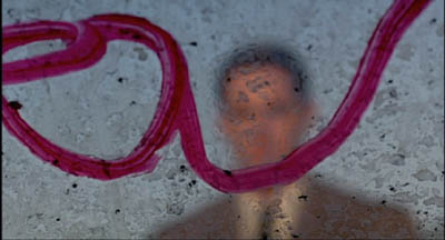
Twin Peaks: Fire Walk with Me.
Each conception of film art harbors a good portion of truth. Each may fail to cover all of cinema, but for certain types of film, or particular movies, some are likely to be more helpful than others.
For example, it’s useful to consider David Lynch as making audiovisual works, in which blinking lights or grooves in pine planks seem uncannily synchronized with throbs and hums and Julee Cruise vibrato. Very often story and acting seem to precipitate out of an enveloping pictorial/auditory atmosphere. This isn’t to say that you couldn’t study narrative or performance in Lynch films; it’s just that taking up the audiovisual-mix perspective will throw certain aspects into sharper relief.
You could also argue that the Hollywood studio era blended many of these appeals into a single strong tradition. Story was important, but so was performance. Visual style was often striking, but so too was an expressive soundtrack that went beyond simply recording the dialogue. Sound effects, musical scores, and verbal hooks between scenes created imaginative resonances with the image track. Contrariwise, we can see some avant-garde traditions as taking a purist tack. In several of his films, Brakhage reduces narrative, purges performance, and bans sound: we have to engage wholly and solely with a pictorial experience.
Just as we can distinguish film traditions along these dimensions, we can contrast writers and thinkers. Some critics are very good in pinning down performance qualities, others excel at plot dissection or visual analysis. Arnheim is sensitive to pictorial values but he has little to contribute to understanding storytelling.
Bazin and Eisenstein are attuned to several of the dimensions I’ve traced out. Bazin’s interest in cinema’s photographic basis also alerted him to pictorial possibilities, like deep-focus and camera movement. Eisenstein, famous for his ideas on cinema’s visual dimension, was as I’ve said interested in sound as well. He was no less concerned with film performance, which he conceived as expressive movement (to be synchronized with properties of the image and the soundtrack). But he voiced almost no interest in narrative or photography.
I warned you that this blog would be theoretical, but I hope the takeaway message is clear. Cinema is teeming with artistic possibilities, and each of these frameworks can illuminate certain areas of choice and control. We don’t need to pick a single creed to live by, but we deepen our understanding of film by being sensitive to as many as we can manage.
