Archive for the 'FILM ART (the book)' Category
Uncle Walt the artist
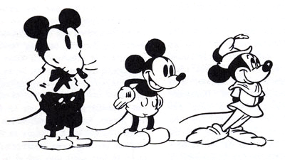
From Robert Benayoun, Le Dessin animé après Walt Disney.
The epos of Chaplin is the Paradise Lost of today. The epos of Disney is Paradise Regained.
Sergei Eisenstein
DB here:
 I’m not qualified to write a comprehensive or penetrating review of Neal Gabler’s biography Walt Disney: The Triumph of the American Imagination. For that you can go to Mike Barrier, one of our finest historians of US animation. Barrier’s own Disney biography will come out this spring, with apparently little overlap with Gabler’s.
I found Gabler’s book a thorough, somewhat cautious bio, even-handed about Disney and judicious about such controversial matters as Walt’s reputation as an anti-Semite. A lot of it reads like a notecard book, with quotes, paraphrases, and commentary dutifully snipped and pasted in, packing each paragraph. Chronology, not concept, rules. Still, I learned a lot.
Gabler’s book reminded me how much I admire Disney films. The attachment started–as for most of us–in childhood. Peter Pan (1953) was the first one I remember seeing in a theatre, but when I saw a reissue of Snow White later, parts looked so familiar that it must have impressed itself on me at an earlier time. Of course it still scared the hell out of me.
In 1973, when I was doing dissertation research in New York City, I attended a massive Disney retrospective at MoMA. As a twenty-five-year-old bearded guy among moms and kids, I felt obscurely criminal just being there, like a character in a Patricia Highsmith novel. But what I saw, in excellent prints, showed me that Disney was important on both cultural and artistic levels. So I designed a Disney unit into my first Introduction to Film course, taught here at University of Wisconsin–Madison to 300-400 souls whom fate cast my way.
I wanted to talk about film’s relation to society, and Disney was a touchstone for all my students. No matter where they came from, they knew Mickey, Donald, Snow White, Fantasia, and the rest. I showed early films, like Flowers and Trees, The Band Concert, and The Old Mill, as well as a True-Life Adventure nature doc, and the extraordinary Trip through the Disney Studio which was originally attached to The Reluctant Dragon. Students were able to see, I hope, how the ideology at work in Disney films could shape a conception of the world, of American life, and of their childhood.
Our assigned reading was Richard Schickel’s The Disney Version (1969); it’s a coruscating study, perfectly crystallizing that era’s feelings about Disney’s debasement of popular culture. At about the same time, Armand Mattelart’s Marxist critique How to Read Donald Duck was informing most film academics’ study of Disney. As Gabler indicates, intellectuals fell out of love with Disney in the 1940s. He handled labor disputes at the studio in a high-handed, paranoid way. He also seemed to personify the blandness of postwar consensus culture, and Disneyland became the theme-park equivalent of Norman Rockwell Americana. Even though hippies were turning on to re-releases of Alice in Wonderland and Fantasia, most cultural critics treated Disney pretty roughly. My friends and I goggled at Wally Wood’s 1967 Realist cartoon showing Walt’s whole gang engaging in a panoply of naughty sexual encounters.
Today the academic study of Disney is well-established, producing far too much for me to keep up with. A lot of it is cultural critique. For something funnier and even more scurrilous, see Carl Hiaasen’s Team Rodent. Despite all there is to read about Walt’s empire and its cultural consequences, I want something else as well.
Even when I was conducting my Disney Demystification Exercise, I tried to point out that these cartoons were artistically very strong. I still admire the powerfully emotional storytelling that, like that found in other fairy tales, preys so mercilessly on childhood fears. Schickel claims that after screenings of Snow White at Radio City Music Hall, the seats had to be cleaned because the Witch had scared kids into emptying their bladders.
Then too there’s the dynamism and grace of the animation, which remains unsurpassed. For Sergei Eisenstein Disney exemplified the contagious power of expressive movement on the screen. Many have disdained “Mickey-Mousing,” the close matchup between a film image and the accompanying music. But Eisenstein saw this as “synchronization of senses,” a primal, visceral unity that could move the spectator involuntarily. He sought this subconscious synchronization in his own sound films, and Alexander Nevsky and Ivan the Terrible show the strong influence of Disney.
Eisenstein was well aware of the delusional aspects of Disney, claiming that the cartoons lulled people into forgetting the harm done by capitalism. But as an artist, Disney was unique:
I’m sometimes frightened when I watch his films. Frightened because of some absolute perfection in what he does. This man seems to know not only the magic of all technical means, but also all the most secret strands of human thought, images, ideas, feelings…. He creates somewhere in the realm of the very purest and most primal depths.[1]
Disney’s art seems magical, but if it’s not a miracle, we ought to be able to study it systematically. How?
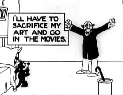 Felix in Hollywood (1923)
For the Jung at heart
Gabler’s is a sturdy, readable volume teeming with fascinating background material. As an EEG of the ups and downs of the studio, it’s extremely valuable. Gabler also aims to give a portrait of Disney the visionary, a man of boundless Protestant energy who sought to take animated film to ever higher levels. I think the portrait is disappointing, though, in its reliance on conventional psychobiography and Zeitgeist explanations.
Disney, Gabler claims, was dominated by a psychological drive to create a world wholly of his own. He was a control freak. “It had always been about control, about crafting a better reality than the one outside the studio, and about demonstrating that one had the capacity to do so. That was what Walt Disney provided to America–not escape, as so many analysts would surmise, but control and the vicarious empowerment that accompanied it.”
Commentators have long noted that Disney expanded the films’ fantasy world in his theme park. Just as films idealized reality, “so would Disneyland, the creation of a wounded man who expunged what he saw as the darker passages of his past by devising a better world of his imagination, though one that was obviously colored by the images of Hollywood.”
One has to wonder whether this characterization is particular to Uncle Walt. Lots of artists, from architects and topiary gardeners to designers of world’s fairs, have sought to create imaginary worlds over which they rule. Balzac, Faulkner, Lewis Carroll, and J. R. R. Tolkien conjured up imaginary realms populated by dozens of their own creatures. Graphic artist Ho Che Anderson writes:
For the control freak, there are few places better than comics. . . . Pick up a pen and piece of paper and you too can effectively play God. I suspect this love of God-play is the blood that keeps the hearts of many a cartoonist beating.[2]
Moreover, is the desire to build a parallel world necessarily a sign of a wounded past, or dark imaginings? Maybe it’s just one awesome creative challenge for ambitious artists. Granted, Disney took this impulse in a particular direction, toward a vision of life combining technical progress (the multiplane camera, Tomorrowland) with idealized notions of small-town community. But then we have to explain those idiosyncratic factors too.
Gabler goes the psychological route, but we could balance this account with cultural factors in Disney’s immediate milieu. There was the rise of the Technocracy movement. There was Hollywood’s belief that filmmaking would progress through new technologies. There was growing evidence during and after World War II that America’s might would be built on new machines. (One of the most hair-raising movies I saw at the 1973 MoMA Disney fest was Victory through Air Power, an educational short arguing for investment in airborne warfare.) Disney was, along many dimensions, a techie impresario, the Steve Jobs of his day, complete with his unique reality-distortion field.
The other big-picture explanation Gabler offers is a Zeitgeist model. Disney represents the American imagination. By tapping into Jungian archetypes, his 1930s films could both “capture and then soothe the national malaise.” More generally: “In both Disney’s imagination and the American imagination, one could assert one’s will on the world . . . . Indeed, in a typically American formulation, nothing but goodness and will mattered.” Disney’s desire to retreat into a controlled world echoes his country’s self-absorped conception of itself.
Despite these claims, Gabler doesn’t dwell much on the ways the studio seized what he calls “the American psyche,” perhaps because he senses that such explanations tend to be uninformative. One can grab almost any cluster of traits, find them in American popular art, and assert them as quintessentially American. This is how mainstream journalists make current Hollywood releases worth writing about: treating them not as artworks with distinctive appeals and a place in traditions and histories, but as reflections of whatever immediate social trends the writer chooses to pick out.
I won’t extend my criticism of Zeitgeist explanations here; it’s developed in the first essay in my forthcoming Poetics of Cinema. I’ll just say that I think we need more precise explanations than we get from easy juxtapositions of this or that film and some collective mood, sentiment, fantasy, or anxiety that we postulate as existing out there. Is there an American psyche? I’m not convinced.
An alternative to psychological speculation and Zeitgeist thinking is to look for more immediate causal connections. For example, Gabler traces how, around 1932, Disney began a new division of labor among his staff. He created a fairly strict set of specialties (story, gags, continuity sketches) and a chain of command in which head animators would become directors, overseeing particular projects. What’s the explanation of this change of policy? For Gabler, the new rationalization reflects not only the need to manage a bigger staff but also Walt’s effort in “reinventing and perfecting the system under which animations were produced.”
Gabler doesn’t mention that reorganizing the division of labor was going on throughout Hollywood at the same time. Most major studios were moving from a central producer system (this parallels the previous Disney lineup, with Walt at the top) to what Janet Staiger has called the producer-unit system, in which each man was charged with several productions.[3] Mentioning this doesn’t take away from Disney’s resourcefulness, but it does indicate that models for organizing his company were emerging right under his nose.
Similar issues could be examined by looking at Disney’s place in the overall ecology of Hollywood, as the premiere supplier of short subjects. His firm, Douglas Gomery argues, kept RKO afloat for many years. Gomery’s Hollywood Studio System: A History gives a cogent account of Disney’s role in the industry, and he goes somewhat beyond Gabler in tracing the studio’s emergence as in the 1950s as the prototype of modern conglomerate filmmaking.
Life in the cel
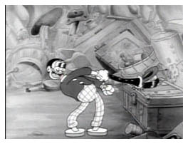 For Gabler, what made Walt reorganize production, and indeed what made him do nearly everything, was his obsessive pursuit of “quality” animation. But this quality itself remains fairly mysterious.
Gabler indicates that Disney moved away from the “rubber-hose” style of most cartoons, with their balloon heads, swollen paunches, and elastic arms and legs. (Even the clarinet goes limp in Harman-Ising’s A Great Big Bunch of You, from 1932, shown here.) Floppy limbs were fairly easy to animate. Gabler briskly summarizes Team Disney’s well-known innovations in naturalism, such as the studio’s emphasis on anatomy and life drawing, the breakdown of gestures, complex perspectives, and the rotoscoping of human figures.
Yet Gabler, a former movie critic for television, oddly doesn’t engage with the result of the technical innovations. He summarizes how journalists, critics, and academics have interpreted the movies’ cultural impact, but what he thinks about them as movies, rather than social or psychological symptoms, is almost completely suppressed. Does he admire Snow White or Dumbo or Pinocchio? Does he hate them? Has he studied them in preparation for the book? You will find more sensitive appreciation and critique in Leonard Maltin’s The Disney Films than in all of Gabler’s doorstop tome.
Gabler implicitly acknowledges the technical achievements of Snow White, Pinocchio, Fantasia, Dumbo, and Bambi, but after that he merely chronicles release after release with deadpan indifference. For example, he offers us nothing on the brilliant character animation of Song of the South (1946)–a film no longer in circulation because of its racial stereotyping.
Gabler follows tradition in suggesting that the UPA studio movies challenged Disney’s hyperrealism, but Disney was already moving toward something quite stylized. Gabler doesn’t observe the zesty play with color and line of Melody Time‘s “Blame It on the Samba” episode (1948). Eisenstein would have been pleased to see that the handling of Donald and Jose literalizes the metaphor feeling blue.
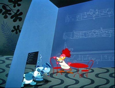
Working with lower budgets in the 1940s, the animators let their imaginations run wild. What a pleasure it must have been for Ward Kimball to come up with the funhouse nuttiness of the Serape song in The Three Caballeros (1945).
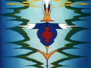

Kimball must have been quite a character; his parody book Art Afterpieces doesn’t spare the studio’s creatures. More generally, when Disney animators turned to illustrating pop music, they didn’t abandon the wilder sides of Fantasia.
There would be several fruitful ways to study the Art of Uncle Walt. One would require what I call rhapsodic criticism, writing that tries to evoke the movie’s look and feel through energetic, sensuous description. (This is, I think, what Susan Sontag meant in calling for “an erotics of art.”) Here is Don Crafton on the Felix the Cat cartoons:
Perhaps the most appealing aspect of Felix was his use of expressive body parts–a tail that forms gratuitous curlicues when he walks, or ears that click together like scissors. . . . He can mold himself into a mantel clock and have his nose mistakenly wound up; his tail can be an umbrella, a sword, or a clarinet, or Chaplin’s cane. He can use the tail as a bow to play a tune on his whiskers, then take one of the rising notes and use it for a doorkey. His skin is detachable. In Felix Trifles with Time (1925), a tailor flays him, then outfits a client with his pelt. When the man goes swimming, “naked” Felix retrieves his hide from the beach. [4]
In brief compass Crafton brings Felix alive for us. You don’t have to love Disney to write this way about his films; you do need a good eye, some pluck and gusto, plus a gift for language. Nothing like this is to be found in Gabler’s book.
Another way to get closer to Disney’s art is to just look at things more analytically. How does Disney create that expressive movement that Eisenstein admired? Partly, it seems, through having his figures move all over, and at the same instant. Reacting to a line of dialogue, a character can twist his waist, arch his back, swivel his shoulders, lift his head, arch his eyebrows, and raise a forefinger–all in a second or two. Two successive frames from Melody Time show Johnny Appleseed’s guardian angel in action, working his legs, arms, shoulders, jaw, and eyeballs simultaneously.
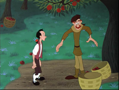
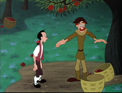
This is far from the minimal animation to which we became accustomed in the TV era. Treating gesture as a taut, rolling movement helps give Disney characters their unique volume and springiness, so different from the flabby postures of the rubber-hose style.
Or consider pacing, at which the Disney cartoons excel. Most studio animation of the period, constrained by smaller budgets than Disney had, speeded up production by filming each frame twice. That way only 12 cel drawings were needed for the 24 frames that consumed a second of film. One way Disney achieved expressive action, and the high quality to which Gabler refers, was to devote single frames–and cels–to details of particular movements. This choice, though expensive, allowed for exact adjustments in rhythm.
Sometimes there’s more than one movement per frame. You can occasionally find this strategy at work in other studios’ cartoons too, as Kristin has explained in an essay she mentions elsewhere in our blog. But Disney’s animators certainly used the technique with great panache. When Johnny, balancing on a branch, is caught in a rain of apples, he sweeps them up with lighting speed–a deft swirl made possible by multiplying character poses on each cel. If that means giving Johnny many arms and even detaching his hands, so be it.
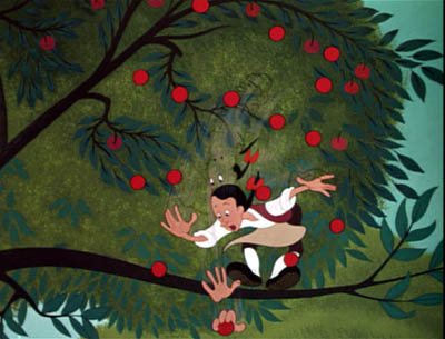
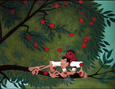
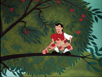
Johnny’s arms and hands proliferate more quickly and widely as he scoops up the apples, but their number is reduced as he gathers them in to his chest, so the rhythm accelerates and decelerates. Through trial and error Disney’s animators learned that rather strange single images will look exactly right on the screen; these men were practical perceptual psychologists.
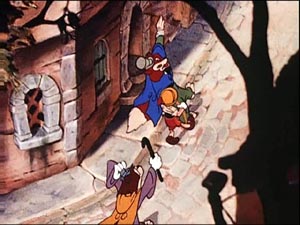
There are so many aspects of Disney’s art that need attention: the skill with line and contour; the sort of soft caricature that some consider cutesy but has enormous bounce and vibrancy; the ingenious use of color; and of course, Eisenstein’s “synchronization of senses” between image and music. There’s also Disney’s appropriation of developing live-action techniques, as in the proto-Wellesian crane shot in Pinocchio
One could also study the studio’s borrowing of high-art motifs and styles. Instead of dismissing the 1940s and early 1950s Disneys as greeting-card kitsch, we can note that they evidently borrowed from the likes of WPA landscape art, American regionalist painting, and the naive-art look of Grandma Moses. (Her painting A Beautiful World, 1948 resembles Disney’s Johnny Appleseed of the same year.)


I’m a duffer in animation matters, so I’ve merely indicated some areas that intrigue me. The key source on the studio’s craft practice remains the gorgeous book The Illusion of Life: Disney Animation (1981, rev. 1995), by two of the great Nine Old Men, Frank Thomas and Ollie Johnson. And I expect lots of discoveries in years to come from experts like Barrier, Maureen Furness, Paul Welles, Norman M. Klein, and many others. Since Gabler draws heavily on the research of others, often without naming names, he might have borrowed a bit more from scholars of animation aesthetics.
In fact, you could argue that without the artistic imagination displayed by Disney and his brilliant staff, these films couldn’t have captivated the American imagination. Whatever that is.
[1] Eisenstein on Disney, ed. Jay Leyda, trans. Alan Upchurch (Calcutta: Seagull, 1986), 2.
[2] “Career Tips for Control Freaks,” in The Education of a Comics Artist, ed. Michael Dooley and Steven Heller (New York: Allworth, 2005), 124-125.
[3] Janet Staiger, “The Producer-Unit System: Management by Specialization after 1931, in David Bordwell, Janet Staiger, and Kristin Thompson, The Classical Hollywood Cinema: Film Style and Mode of Production to 1960 (New York: Columbia University Press, 1985), 320.
[4] Donald Crafton, Before Mickey: The Animated Film 1898-1928 (Chicago: University of Chicago Press, 1993; orig. 1982), 327, 328.
Another little DA VINCI CODE mystery
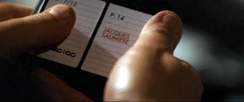
Kristin here—
First, a little background. In the new edition of Film Art, we have added a new feature. At the end of each chapter we recommend DVD supplements that tie in with the respective subject matter. The task of watching lots of supplements—around 60 films’ worth—devolved upon me. That wasn’t always as fun as it might sound. There were some informative sets of extras, but all too many were mutually congratulatory fests, with directors praising actors, actors praising directors, actors praising other actors, and so on. “X was just perfect for that role. I can’t imagine anyone else playing the part.” You know the kind.
Film Art’s new edition is finished, but I keep looking for supplements we can recommend here or in the ninth edition. One promising-sounding DVD set was the recent “Special Edition” of The Da Vinci Code, with 90 minutes worth of extras.
I know The Da Vinci Code has a so-so reputation based on the reviewers’ responses. I went to it during its first run and was pleasantly surprised. It’s no masterpiece, but the idea that it is dull or slow seems very odd. It was entertaining and reasonably well-made, and I enjoyed it. It’s certainly miles above the overly long Dan Brown novel, which has a tendency to have information revealed in the dialogue and then redundantly summarized in the third-person narration. It also has those thudding cliff-hanger sentences at the end of just about every one of its choppy little chapters. The movie positively races along in comparison. And the washed-out historical flashbacks during the Grail explanations have a loony, experimental feel to them that appeals to me. It’s startling to see such epic scenes tossed in briefly in the midst of a modern thriller. I can see, though, where others might dismiss them as silly.
I don’t know how it happens, but sometimes a film comes along that all the critics simultaneously decide to trash, whether it deserves it or not. Some sort of telepathic thing, maybe, or perhaps in this case they all consulted each other during the famous long press junket on a special chartered train traveling from London to Cannes this past spring. (Ian McKellen has posted an amusing account of answering the same questions over and over during this journey.) The Da Vinci Code was the opening-night film at Cannes, and that’s where the lukewarm critical response began. The reviews were completely ignored by moviegoers, who made The Da Vinci Code the second highest grossing film of 2006 internationally.
Anyway, having enjoyed the film and knowing that its DVD was laden with supplements, I set out to purchase it. Investigation on the internet turned up the surprising news that there was an “extended version” available. That was news to me, and no wonder. When I searched further, I discovered that this longer cut was not available in the U.S. While the familiar 149-minute theatrical version can be had here—complete with a replica cryptex if you buy the deluxe version—the unknown 168-minute version cannot. Not only that, but though I Googled as hard as I could, I could find no explanation as to why there would be an extended version at all and why we Yanks have no access to it.
There’s a Region 2 French edition, as advertised on Amazon’s French site. The Germans seem to have the best selection, with the extended version available on a simple two-disc set, a deluxe edition that throws in a cryptex, and a boxed set of the two DVDs with six CDs containing the audiobook. The long version is also available on Region 4 DVDs in New Zealand and Australia. I have not been able to locate any Region 1 (U.S. standard) DVDs of this version. By the way, all the DVDs, regular, extended, fullscreen, and widescreen seem to have an identical set of supplements.
Perhaps an extended Da Vinci Code is not at the top of everyone’s Christmas list, but the lack of availability or even knowledge of this version in the States is puzzling. Was there something in this longer version that would bore, offend, or otherwise put off American viewers? Which version would one write about in doing some sort of analytical essay on The Da Vinci Code? Aided by eBay and a multi-standard DVD player, I set out to investigate.
The copy I bought, an Australian one, doesn’t have a list of where the extra footage comes. I didn’t sit down with two DVD players and two monitors side-by-side, so I can’t pinpoint every single difference. I had seen the film in a theater in June, and upon watching the extended version, I was able to spot ten additions, ranging from a couple of shots at the beginning of a scene to five new sequences. I don’t think these add up to an extra 26 minutes, so there are presumably some I missed. Those who are interested can have the pleasure of ferreting out all the details of the extra footage for themselves. (It does make one appreciate the Lord of the Rings extended-edition menus, where changes are marked with asterisks.)
One can understand why a longish film would be trimmed by 25 minutes. It’s enough to reduce by one the number of times it could be screened per day, which is clearly a significant obstacle. 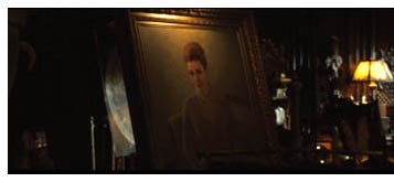 Still, the extra scenes and bits do make a difference, though it’s often minor. In the scene at Teabing’s (Ian McKellen) country house where the group moves from the kitchen to the study to look at the Last Supper slides, the establishing shot of the new setting has an oil painting of a woman framed prominently in the foreground. It presumably was meant to hint at a backstory for Teabing, some great lost love whose absence may have contributed to the man’s obsession with the Grail. The painting is clearly visible in one shot of the shortened version, but since it comes during the invasion of the house by Silas (Paul Bettany), the viewer is not likely to notice it.
Later, in the conversation between Fache (Jean Reno) and his assistant at the airport, Fache asks whom he has betrayed in using his ruthless means to pursue Langdon. In the release print, the assistant simply tells Fache that Teabing’s plane has changed course and is going to London. In the longer version, he goes on to say that he will bribe the airport official that Fache has beaten up. Thus rather than simply doing his duty and giving Fache information, the assistant firmly allies himself with his boss in his illegal doings.
Another brief extra moment comes in the second scene of Silas flagellating himself. The theatrical version cuts away from the action rather abruptly. In the extended version we see a quick series of flashbacks to previous murders that he has committed, presumably all at the behest of Bishop Aringarosa. Not really necessary to the plot, but it does make it clear that Silas realizes that his actions are reprehensible.
These are mere nuances, but the longer added scenes contribute more significant material. Two brief conversations show Aringarosa alone with the head of the Opus Dei council, basically establishing their collusion outside the council meeting itself.
Another new scene takes place aboard Teabing’s plane. It is a conversation in shot/reverse shot, with Sophie (Audrey Tautou) despairing and telling Langdon (Tom Hanks) to go to the U.S. embassy once they reach London, ending his efforts to help her. She suggests that she will simply throw the cryptex away. His insistence that he will stick with her creates one of the most emotionally charged moments between the two. Many critics complained that the Sophie-Langdon relationship lacks chemistry, but this scene’s restoration helps by showing a warm exchange between them. (Not that a lack of chemistry is a problem, given that the two are not supposed to be forming a romantic couple, just a friendship born of necessity.)
The second added sequence comes after the scene in the Temple Church, with a cut back to Teabing’s château. Fache’s assistant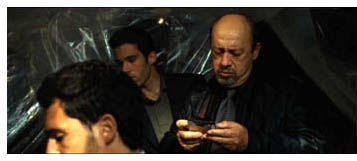 inspects an elaborate surveillance post in the barn, including recordings marked with the names of the four men killed by Silas. This event makes it quite clear why in the climactic scene at Westminster Abbey Fache arrests Teabing rather than Langdon and Sophie. In the shorter version, his change of quarry is rather fuzzily motivated by his realization that Aringarosa has duped him. (Maybe I missed some other plot point, but the surveillance-post scene certainly makes things clearer.)
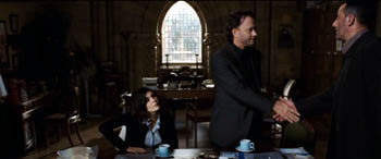
Finally, a new scene follows Fache’s arrest of Teabing. The detective meets with Langdon and Sophie in an office and expresses his regret over having wrongly pursued them: “I should have been smarter.” Although not necessary to the plot, this scene does give more prominence to Fache’s character, making him a more sympathetic figure.
It presumably made sense to cut these sections to allow for more screenings in theaters, but the question remains, why was the extended version not released in the U.S.? Along with all the commentaries and supplements that the studio added on, surely the words “extended edition” would have added some appeal to the DVD set. After all, the longer version was made and released elsewhere, so presumably the added expense wasn’t an issue.
The only reason I can think of is that the added scenes weren’t considered obvious or flashy enough for American audiences. Extended editions on the Lord of the Rings model tend to be done for fantasy and sci-fi films or other genre pictures that might be assumed to have a fan audience eager for any little extras they can get. Maybe that’s not assumed to be the case for other types of films. But then why bother to do such a version for the rest of the world? I’m baffled.
For those living in Region 1 territory who like The Da Vinci Code and who have a multi-standard DVD player, you might want to take the extra trouble to track down the extended version. There always seem to be a few on eBay (though watch out for the bootleg copies someone in Asia is selling there!), and they can be had through the big internet sellers in Europe and Australia.
Can they make ’em like they used to? continued

DB here:
In the wake of discussions of The Good German, on this site and elsewhere, the idea of a retro-looking movie has surfaced again. American Cinematographer‘s coverage of Casino Royale is very intriguing.
Phil Méheux, the cinematographer, decided that the opening sequence, a black-and-white passage showing Bond earning his 00 status, would pay homage to 1960s Techniscope. Techniscope was an optical process that produced 2.35:1 images without anamorphic lenses. It allowed great depth of field because it could take advantage of the wide-angle lenses available for non-anamorphic cinematography. The most familiar Techniscope images are probably those in Sergio Leone’s westerns.
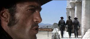 For a Few Dollars More.
Mehaux explains what he wanted for Casino Royale:
With Techniscope, the increased depth of field meant they were able to put things like lampshades and telephone boxes in the foreground, and they didn’t appear amoebic–you could actually see depth in them. In The Ipcress File, there’s a shot where a table lamp is huge in the frame and a man’s face is in the top right-hand corner. I really like that look. Part of the dialogue in our opening sequence was done with very carefully controlled shots that have huge things in the foreground and faces pushed to the corners of the frame. Little things like that echo the Cold War period of spy films.
But, but….
1. In the print of Casino Royale I saw in my local, the opening office scene didn’t really exploit sharp-focus foregrounds. There weren’t that many objects in the foreground, and they weren’t in discernible focus. Of course the cutting was so rapid that it was hard to concentrate on foreground/ background relations.
2. It’s fall of 1965, in Albany, New York. A film geek literally fresh off the farm is in his freshman year of college and goes to every movie in town. He sees The Ipcress File not once but three times. He’s fascinated by its flamboyant technique. He’s just seen Citizen Kane, so he’s impressed by deep staging and big foregrounds in this unheralded spy pic.
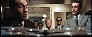
There’s even wilder stuff: a murder victim seen through a hanging lamp, for example.
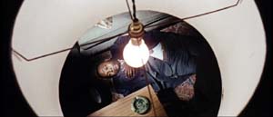
The Geek reads up on long lenses, wide-angle lenses, and so on. Knowing nothing about Techniscope, he wonders how these extravagant shots got made. Just as important, why are they here (apart from looking cool)?
(Spoilers coming up. Skip to 3 if want to retain your innocence.)
After a couple viewings, the Geek begins to get a hunch about what those lampshades are doing there. Throughout the movie, actors are shot in juxtaposition to looming shapes–doors, lecterns, tabletops–which mask large stretches of the set.
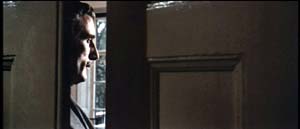
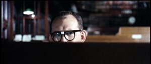
And sometimes those blocking objects are lampshades.
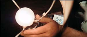
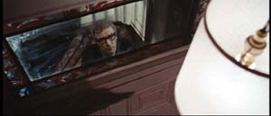
At a climactic moment, our hero escapes from torture and calls his superior officer, who’s framed in the usual off-center way, with a lampshade dominating the shot. It works as a sheer (and pretty) block of solid color.
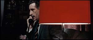
Turns out, however, that this time the shade actually conceals something important. The officer withdraws behind the shade and out pops a guest sitting alongside him.
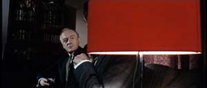
The guest is the arch-villain. Now we know the officer is a traitor.
The Geek dimly realizes three things.
*A movie sets up visual “rules” it will follow or violate. (Later the Geek will call these intrinsic norms.)
*Visual motifs build up across a film, sometimes asking the viewer to notice them.
*A motif can seem gratuitous but that very gratuitousness can be exploited for storytelling purposes. When we see the red lampshade, we assume that it’s another decorative flourish, not a way of hiding information. Earlier sequences suggest that the device is a mannered tic but at the climax it helps spring a surprise. Motifs, the Geek would realize eventually, can fulfill narrational functions–that is, motifs can shape the ongoing flow of story information.
3. Sidney J. Furie was considered a showoffish filmmaker. Michael Caine said he belonged to the look-Ma-I’m-directing school. Certainly the outrageous compositions involving Marlon Brando’s sombrero in The Appaloosa back up that charge.
But like Richard Lester, Ken Russell, and other fancy-pants pictorialists, Furie can at least get us to notice technique. Not bad to cut your cinephile teeth on. Or at least so the Geek thinks, forty years afterward.
4. The AC article also talks about the problem of making poker games interesting. Hong Kong filmmakers figured this out long ago. Martin Campbell, director of the new 007 adventure, should study the crisp card sequences in Wong Jing’s God of Gamblers series. Filmed on a minuscule budget, they put the strained and blandly shot poker scenes of Casino Royale to shame. Incidentally, Wong’s use of diopters yields the sort of nifty depth that Meheux liked in Ipcress.
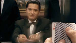 God of Gamblers.
PS: Casino Royale didn’t learn the lessons of the 1960s well enough, in my view. After the sparkling opening credits, it was all downhill. The usual problems: overcut scenes, overcloseupped acting, incoherent chases and fights, uninspired dialogue you recite just before the actor says the line. One landing-strip truck fracas amalgamates Road Warrior, Raiders of the Lost Ark, and Die Hard 2. The makers have indeed updated the Bond franchise. After a series of lame 1970s-looking movies, the franchise has given us a lame contemporary-looking movie.
Granted, I never cared much for the Bond pictures. The Geek liked From Russia and Goldfinger, and Diamonds Are Forever is enjoyable in its wacko way. But for Machiavellian intrigue, Fritz Lang’s Spies remains the gold standard. No one can make ’em like he used to.
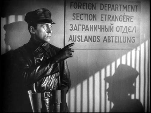 Spies
Spies
Another pebble in your shoe
DB here:
“Life is a Dogme film. It’s hard to hear, but the words are still important.” This is one of the many in-jokes peppering Lars von Trier’s The Boss of It All, his newest feature. I watched it while preparing an essay for the Danish Film Institute, which superbly promotes Danish cinema to the world. But I wasn’t ready for what I saw.
It’s a comedy, of course, with a classic bait-and-switch premise. For shadowy motives, a corporate lawyer entices an idle actor to pretend to be the superboss whom the IT staff has never met. Unfortunately, through emails to the staff, the lawyer has constructed a persona for the boss–in fact, several personae, a different one for every worker. Our actor must play many parts before finally, in a series of reversals, he gets to “find” the real character.
In tone, the film is as mixed as most von Trier works, hovering between sympathy for idealistic underdogs and a sour realization that they will always be victims. It reminded me somewhat of Kaurismaki and the Fassbinder of Fox and His Friends. But the film is a breezy piece of work; nothing really serious faces his innocent here. There’s a lively satire of the corporate world, mocking management catchphrases du jour (not outsourcing, we’re told, but offshoring) and touchy-feely hugging. The hostile incomprehension between Denmark and Iceland provides some good gags too. Von Trier also pokes fun at actors, perhaps invoking his well-publicized feuding with divas like Kidman and Björk. Our hero/loser Kristoffer is a sort of Method man, but he learns that he gets the best results through shameless sentiment.
Here the words are important–it’s a very talky movie–but so are the pictures. Shot in 16mm in available light, The Boss breaks with von Trier’s normal commitment to handheld camerawork. Except for some interpolated crane shots outside the office building, the camera never moves, not even panning. But the image is constantly being refreshed through incessant cutting (there are over 1500 shots). The film boasts more jump cuts than Breathless or Matchstick Men, and each one creates a bump. There’s very little sound overlap between shots–the ambient noise usually drops out for a fraction of a second–and there are often visual mismatches, so (as in The Idiots), nearly every cut feels like an ellipsis. A film, von Trier has said, should be as irritating as a pebble in your shoe, and his abrasive tempo gives his comedy an anxious edge.
Then there are the very peculiar framings. Here’s a string of three brief shots from the first scene, with continuous dialogue (in gappy duration). The lawyer is trying to persuade the actor to perform as the boss.
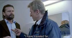
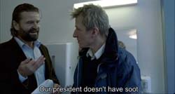
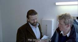
(Yes, these are three separate shots, not three stages of one wobbly shot.)
These cuts break the so-called 30-degree rule, which mandates that if you’re cutting to different angles on the same subject, your second angle should vary by at least 30 degrees from the first. In addition, the later off-center compositions seem gratuitous; why not just sustain the first shot, since the next two hardly vary from it? Sometimes you get results like this.
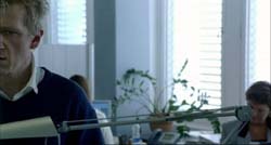

It turns out that there is method to the madness, although the method, granted, is a bit mad. You can read about Automavision here, if you want to know in advance why the movie looks this way. But if you want to be as startled as I was, refrain. Let’s just say that von Trier’s famous 100-camera technique of Dancer in the Dark has been repurposed in a pretty unexpected way. And don’t believe what he says about surrendering to chance; the cuts are often very careful.
Whether you do your homework in advance or not, you’ll probably enjoy The Boss of It All. After my criticisms of editing in The Departed (which made me seem to be raining on the Scorsese parade) and my comments about classical principles of coverage, I’m happy to report on a film which offers something new and strange. The vivacious Danish film culture makes a space for von Trier to set up creative obstructions, for both himself and his viewers.
Postscript: Since I wrote this, von Trier announced that he’s added more tricks to his bag. Turns out that The Boss of It All employs Lookey, a game that challenges the viewers to spot objects that don’t belong in a scene. “For the casual observer it’s just a glitch or mistake,” he says, “but for the initiated it’s a riddle to be solved.” The purpose is to keep viewers alert and active. Film’s great flaw, he claims, is that “it’s a one-way medium with a passive audience.” Lookey, however whimsical, fits well with the agitating effects of the cut and sound dropouts.
The first viewer in Denmark to identify all the Lookeys correctly wins a cash prize and a chance to be an extra in von Trier’s next film.
PPS: Thanks to Vicki Synott of the Danish Film Institute.
PPPS 28 December: I just discovered a frisky website devoted to Nordic filmmaking, where Mirja Julia Minjares has gathered some interesting quotes from von Trier and his sound recordist Ad Stoop. Von Trier says that the computer program also selects for sound gain and filter. Adds Stoop: “When a computer program chooses the settings for the sound and cinematography between each shot, every edit gets underlined in the finished film.”
PPPS 31 December: Check perceptual psychologist Tim Smith’s blog for more insights into von Trier’s games with continuity editing.
–dB


