Archive for the 'FILM ART (the book)' Category
Lessons from BABEL
Whatever its faults or virtues, Babel seems to me to typify several trends in current cinema.
1) Network Narratives
Variety‘s critics call them criss-crossers, others call them thread structures or interwoven stories. I call them network narratives. In an essay called “Mutual Friends and Chronologies of Chance,” forthcoming in the book Poetics of Cinema, I tried to lay out the conventions of this increasingly common (maybe too common) storytelling strategy.
The central formal principle is that several protagonists are given more or less the same weight as they participate in intertwining plotlines. Usually these lines affect one another to some degree. The characters might be strangers, slight acquaintances, friends, or kinfolk. The film aims to show a larger pattern underlying their individual trajectories.
Several directors have specialized in this structure, from Altman and Claude Lelouch to Iosseliani and Rodrigo Garcia (most recently, Nine Lives). I found over a hundred such films, some going back quite far (e.g., Grand Hotel) but most made since the 1980s. Do they reflect some social Zeitgeist? Are we seeking connections with one another? Nope, I don’t think so. The most proximate and pertinent causes lie elsewhere. (Where? Check out the book!)
Alejandro González Iñárritu has made the network idea a signature element of his films. The first feature, Amores Perros, used a common convention, the traffic accident, to tie together three characters. We follow their story lines leading up to or away from the car crash. 21 Grams had a smaller cast but a more scrambled structure. Now, with Babel, we have something easier to follow than the previous films. But it compensates by filling a broader canvas: action on several continents, themes heavy with significance about what Pico Iyer calls the Global Soul.
We know how to read criss-crossers now, and so directors can push the boundaries on several fronts–more intricate plotting, portentous themes, spatial distance (critics called Babel an “epic”). Yet to keep audiences on track, filmmakers remain committed to the basic conventions as well, such as the notion of chance as hidden fate, or the Chaos idea that the flapping of a butterfly’s wings in Chile can . . .
Lesson 1: Once a formal tradition gets established, artists compete within that, seeking out ways to innovate…within tested boundaries. Fresh narrative strategies push the filmmaker to balance the novelty with familiarity.
2) Trilogies
The arthouse cinema has long traded on the appeal of a series of films, more or less loosely joined. Satayajit Ray had his Apu trilogy, which was at least about the same character, but at about the same period there was Antonioni’s tryptich L’Avventura, La Notte, and L’Eclisse. Not to be outdone, Bergman gave us two trilogies, one on the crisis of faith (Through a Glass Darkly, Winter Light, and The Silence), the other on, perhaps, the failure of human relationships under pressure (Persona, Shame, and Hour of the Wolf). More recently we’ve had Fassbinder’s BRD trilogy and Kiarostami’s threesome centered on the village of Koker.
Labeling a trio of films a trilogy plays an important role in the festival-arthouse market. Art films often lack established stars and don’t belong to clear-cut genres (though most turn out to be melodramas or historical dramas). The big selling point is usually the director, whose body of work promises something of interest. If the body of work falls into neat periods or groupings, then that automatically creates opportunities for long-term funding and “product differentiation” from film to film. This may seem a crass way to talk about what many people regard as personal expressions of artists, but filmmakers who want to keep making films know that funding and festivals rely on marketable components like the stature of the director and her or his broader creative ambitions.
So it’s not surprising that now directors are explicitly conceiving trilogies. Most of the earlier trilogies I mentioned were created ex post facto, by critics recognizing thematic links among works. It’s not clear that Antonioni or Bergman or Kiarostami planned to make trilogies from the start. Often the idea of a trilogy hits the director after the first film (von Trier’s Dogville) or the second. But now directors can launch a trilogy, as Kieslowski did with Blue. Angelopoulos has announced that The Weeping Meadow is the first film in a trilogy that will survey the troubled history of the twentieth century. Lucas Belvaux took the step of simultaneously making three features centered on one batch of characters, calling the overall result, of course, Trilogy.
On the festival circuit filmmakers have to explain themselves to critics, and Iñárritu has understood this well. He tells us that he decided to create a trilogy while making 21 Grams, and he points out how the films are similar (network structure, overlapping time schemes) and different (degrees of linearity, changes in theme). He helps critics and viewers understand his work–at least, in the way he prefers it to be understood.
Lesson 2: Festival cinema discovered the trilogy before Hollywood did (Star Wars, The Godfather, Pirates of the Caribbean), and the three-movie cluster may well be the art movies’ answer to a franchise.
3) Hyperrefined technique
In The Way Hollywood Tells It, I comment on the tendency of contemporary American filmmakers to develop subtle, maybe unnoticeable patterns of technique that run alongside the film’s story. So the three acts of Ron Howard’s The Paper were planned to employ three different sorts of camera movement. The same tendency can be found in independent filmmaking; Darren Aronofsky’s Requiem for a Dream coordinated its color scheme and seasons to mirror the film’s act structure.
Such refinement is especially tempting in network narratives, in which every line of action can be given its signature look. The obvious example is Soderbergh’s Traffic, which flaunts vivid color and texture differences among the plotlines.
Iñárritu has taken this tactic to a new level of complexity, as revealed in an article in the November American Cinematographer (Rachel K. Bosley, “Forging Connections,” AC 87, 11, 36-49). For this project Iñárritu and his cinematographer Rodrigo Prieto distinguished different story threads through color, grain, film stock, film gauge, lab processing, and even aspect ratio. (They shot the Japanese sequences in anamorphic but then extracted a 1.85:1 frame out of them.) For example we’re supposed to register, albeit unconsciously, a shift when the Morocco story, shot in 16mm shifts to 35mm when the helicopter arrives to rescue the wounded wife.
A harsher critic might claim that the ingenuity expended on these minutiae might better have been spent sharpening and deepening the plotlines themselves. But put evaluation aside. I just want to note that this commitment to “visual arcs” and subliminal tonal shifts echoing the drama shows that Hollywood is as committed to an aesthetic of unity as it ever was–maybe even more committed. This is a level of fanatical detail that supreme fussbudgets like Hitchcock, Sternberg, and (outside Hollywood), Ozu never sought to reach.
I also have to wonder: Does anybody register, let alone notice, such hyperrefinements? In my multiplex, and primed by having read the AC article, I could spot almost none of this finesse on the screen. In the release print I saw, all the stories looked pretty much the same, and most images had the consistency of oatmeal. Prieto says that “the grain was the most important visual element of the story” (p. 42). In this respect, he got his wish; grain was about all I could see.
Lesson 3: Those who think that modern Hollywood has entered a mannerist phase can find confirmation in Babel.

Postscript: It would be worthwhile building a symptomatic interpretation of Babel. My hunch is that despite Iñárritu’s claim that the film is about family and personal communication, something else is going on. After all, the drama is fundamentally about how prosperous white people have to suffer because Asian, Mexican, and North African men have guns.
But that’s a whole other blog.
Good Actors spell Good Acting
Kristin here–
I suppose all movie-lovers have favorite quotations that become part of their everyday conversation. Norman Bates’s “One by one you drop the formalities” fits a surprising number of situations. The film-studies professors here in Madison often communicate with each other using lines from Howard Hawks films, especially Rio Bravo. “Let’s take a turn around the town,” “We’ll remember you said that,” and, of course, “It’s nice to see a smart kid for a change.” Any time David or I get a particularly small royalty check, we echo Hildie Johnson’s sour “Buy yourself an annuity.”
One of our favorite everyday-life quotations comes not from a movie but from the endlessly hilarious SCTV series. It’s a skit in which Steve Roman (played by John Candy) promotes his new TV show, Juan Cortez, Courtroom Judge. He explains part of its appeal: “It’s got good actors, and that spells good acting.” (Fifth season, episode 110, for you SCTV buffs.)
Almost invariably we use this line when we come across one of those films that receive highly positive reviews largely because of one great performance. You know the kind: Charlize Theron in Monster, Halle Berry in Monster’s Ball, Hillary Swank in Boys Don’t Cry, and more recently Forest Whitaker in The Last King of Scotland and Helen Mirren in The Queen.
Usually I avoid such films, because the reviews tend to plant the idea that they are primarily actors’ vehicles. I enjoy good acting as much as the next person, but I want the rest of the film to be interesting as well.
Are there any film classics that are truly great solely for the acting? It’s hard to think of any. Maybe The Gold Rush, which is stylistically fairly pedestrian but which is redeemed by Chaplin’s inspired performance. Maybe Duck Soup, also quite undistinguished for much of anything other than the Marx Brothers cutting loose without being saddled with the sort of plots involving young, singing lovers that MGM would soon foist upon them. Maybe a few others. Usually, though, we tend not to think of a performance, however dazzling, as adding up to a great film.
Still, when I think of some of the finest performances ever put on film, I think of Falconetti in La Passion de Jeanne d’Arc by Carl Dreyer. There her luminous portrayal of determination and religious devotion is embedded in an equally extraordinary film, with its minimalist sets by Herman Warm, its insistently tight framings on faces, and its vertiginous camera movements. Similarly, Nicolai Cherkasov as Ivan the Terrible in Eisenstein’s film poses against the shapes of the settings, moves to the music of Prokofiev, and casts great shadows on the walls. Buster Keaton, though not as popular in his day as Chaplin, had an instinctive feel for both the flat space of the screen and the depth of the represented image, and his films are exciting in themselves and not simply as backgrounds to his clowning.
We’re now well into the time of year when the studios bring out the films they hope will garner Oscar nominations and even wins. Journalists covering film, reviewers and feature writers alike, can get some copy out of speculating about the Oscars. That speculation seems to start earlier and earlier each year, like Christmas shopping. Given that the public is a lot more interested in acting than cinematography or screenwriting, perhaps it’s not surprising that reviewers focus so much on star turns. But in doing so, do they slight other aspects of those films? Do they unfairly scare off those of us who are wary of Oscar bait?
I decided to do my part for the good of the blog and see The Queen. I’m not a huge fan of Stephen Frears, but My Beautiful Launderette is a good film, with an early sympathetic, non-sensationalized view of homosexuality in London. Mary Reilly is not exactly a masterpiece, but it’s worth watching and has been underrated. Its failure may have been due in part to the fact that most reviewers focused in on whether Julia Roberts could handle a dramatic role in a thriller and then found her wanting.
Anyway, The Queen turned out to be an entertaining, well-made film. Yes, Helen Mirren is remarkable as Queen Elizabeth II, and she may well win an Oscar for her performance. Yet equally interesting is the fact that Frears almost entirely avoids the “intensified continuity” style that David has analysed in The Way Hollywood Tells It.
The film is basically pretty simple, moving back and forth between the royal family and the newly elected Tony Blair surrounded by his wife and staff. The royals notoriously reacted to the death of ex-Princess Diana with stony silence despite the huge outpouring of public grief. It’s clear from the indifference and even hostility toward Diana that the members of family’s older generations voice in private, they do not feel a comparable grief. But Blair strives to maneuver the Queen into going public and expressing a sense of loss.
Frears set out to contrast the two worlds stylistically. The scenes with the royals are shot in a classical, non-intensified style. Distant shots to establish space, two shots for face-to-face conversations, over-the-shoulder shot/reverse shots as the dialogue unfolds. The framing seldom goes in for the tight close-up but stays in medium shot or medium close-up. The cutting is slow relative to the current norm, as befits both the subject and the style. One reason people are so impressed with Mirren’s performance may be that it is not made up of a bunch of different shots stitched together. She has shots that allow her to develop a reaction or attitude slowly.
And best of all, the camera doesn’t glide toward or around the characters. It stays put unless it needs to perform one of its traditional roles: reframing to keep characters balanced, and following the characters as they move from one room to another or walk along a country track. The lighting is suitably subdued and directional, another reversion to a more classical age.
A great deal is currently being made of Steven Soderbergh’s reversion to 1940s Hollywood style in The Good German. Frears isn’t quite as systematic, perhaps, but the royal-family scenes in The Queen look very 1950s to me.
In contrast, the Tony Blair scenes were shot with a handheld camera, to convey the bustle of his staff and the more casual situation. Even so, the camera movement is not obtrusive, and Frears still doesn’t constantly cut in for the tight close-up. Here, too, he keeps his camera back a bit, framing groups as they talk. The lighting tends to be brighter and more diffuse. The contrast works well, and yet Frears never pushes it in our faces and asks us to be impressed.
The narrative seems a little thin, mostly because, unlike most classical films, The Queen has only one plot line. There’s no subsidiary crisis, no romance, no other conflict. It’s just the royals versus the liberal prime minister’s team until one side cracks. Even the potential conflict that could have easily arisen from Blair’s wife’s anti-royalty position never goes anywhere. She’s mainly there as a sounding-board for him. And if the plot is thin, it is also refreshingly elegant in its simplicity.
One remarkable aspect of the plot is that none of the characters is treated as a villain. Blair’s position is held up as the wise one, yet the film goes to great lengths to suggest that the Queen and her family have reasons for behaving the way they do. Not excuses, but reasons. Fittingly, the film concludes with the Queen and her new prime minister walking out into the palace gardens for a stroll and a chat.
At the end, I didn’t feel that I had sat through a great performance. I had seen a good, entertaining, somewhat unusual, and skillfully made film that had a great performance in it. Indeed, it has a second from Michael Sheen as Blair, and the supporting players are fine as well.
But good directors spell good directing, and good cinematographers spell … You get the idea. Variety’s reviewers, it must be said, seem to have a mandate to mention style, since ever review comments at least briefly on the film’s techniques. But most critics give you no sense of the film as a whole—its narrative construction (apart from a plot synopsis) or its stylistic texture. It would be nice to see more rounded reviews.
First shots
DB here:
Over at the Scanners site, Jim Emerson is running a fascinating thread. He invites readers to write about their favorite first shots.
I haven’t joined in, largely because, as with all lists, I have too many favorites and I get tangled up in comparisons. What intrigues me is the idea behind Jim’s proposal.
We all accept that first shots are important. We often analyze films by comparing the beginning to the end, and I routinely ask my students to note the first and last shots of a movie we’ll discuss. But were first shots always as important as we now take them to be? The historian in me thinks that this is a fruitful question.
Consider the films most frequently listed on Sight and Sound magazine’s Ten Best lists from 1952 to 2002. All are classics. But can you recall the first shot of very many of them?
Battleship Potemkin, The Rules of the Game, Citizen Kane, L’Avventura, 8 1/2, The Passion of Joan of Arc, Vertigo, L’Atalante, The Bicycle Thief, The General, Greed, The Magnificent Ambersons, The Searchers, Singin’ in the Rain, Tokyo Story, 2001: A Space Odyssey, and Ugetsu Monogatari.
Now if you’re a keen fan of any of these, you doubtless know the first shots well. But for most of those you’ve seen but not fetishized, I have the hunch that the first shot may not be particularly memorable.
Yet what about the first shot of A Hard Day’s Night or The Conversation or The Player? You’re likely to recall those first shots after a single viewing, and they will stay with you. Nowadays we may even remember the first shots of certain movies that we don’t particularly like.
If you recall only one curtain-raiser on the Sight and Sound list, I suspect it will be that of 2001. As my friend said as we walked out of a Manhattan screening back in 1968, “The sun rises like you’ve never seen it before!” This makes me wonder if there’s a historical breaking point somewhere here.
Was there a moment when directors started to feel that they had to weight the first shot heavily, to treat it as a dense moment that the viewer should savor? The first shot of a film could be as vivid and bristling with implication as the first sentence of a novel. When might directors have begun to think along these lines? Did it start, like so much else in cinema, in the 1960s, and Kubrick entered the first-shot sweepstakes?
Historically, it seems that many first shots serve simply to set up the locale for the first scene. This might be the central function of opening shots inr many classics I just mentioned. No larger implications may hover around the first image.
Sometimes, though, the first shot cunningly plants a story element that seems unimportant at the moment but will become crucial later. My favorite example is the first shot of Harold Lloyd’s wonderful The Kid Brother (1927). (If you haven’t seen this film, go rent it immediately. Better yet, buy the box set, because everything on it is very fine; Lloyd is one of the great, underrated American filmmakers.)
Before I suggest a possible answer to the question of when first shots became attention-getters, here are some speculations about what such shots can do.
*The first shot can present a sort of Ultimate Cause, the basis for everything that follows. In The Birth of a Nation, the first shot shows black slaves brought to America from Africa.
*Sometimes the first shot, however brief, has emblematic significance. The first shot of Battleship Potemkin portrays waves breaking on shore, symbolizing the force of revolutionary consciousness. Eisenstein’s Ivan the Terrible starts with a shot of the tsar’s crown as the coronation is about to start: the whole film will be about the struggle for power. The “No Trespassing” sign at the start of Kane has been widely interpreted as urging us not to judge Kane too simplistically.
*Several of Jim’s contributors have pointed out how thematic elements get set up in an opening shot. Rules of the Game might be another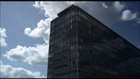 instance: The long tracking shot that follows a radio cable plunges us into a world in which the naïve pilot is a celebrity, and it sets up a mechanical world (radio broadcast, the plane) that will be echoed in the Marquis’s music boxes later. In Play Time, it’s impossible to know what sort of building we see in the first shot–establishing not only the looming anonymity of modern architecture but the sort of games Tati intends to play with our perception. It also introduces the motif of reflections, an important source of the film’s themes of how old Paris has been spoiled by modern technology.
*Likewise, the First Shot Project contributors have mentioned how the initial image can establish the film’s tone. A good example is the direct-address prologues of The Girl Can’t Help It and Will Success Spoil Rock Hunter? Another is the dissolve from the Paramount logo to the jungle mountaintop in Raiders of the Lost Ark, which signals the sort of tongue-in-cheek homage we’re about to get.
*Sometimes a fairly mundane initial shot becomes salient not in the film that follows but in the context of the director’s other works. In the case of The Passion of Joan of Arc, the book that is opened in the first shot links to all the other books that feature so prominently in Dreyer’s films. Long ago I argued that the book, and the act of writing in it, become important structural principles of how his films tell their stories.
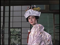
*The first shot can set up a visual-design motif that will get developed in the course of the film. The most famous example is probably the opening door that starts The Searchers. As with Kane‘s “No Trespassing” this motif will serve to bookend the film, recurring not only at intervals but also in the very last shot. Ozu’s Autumn Afternoon opening–surely one of the greatest first shots in cinema–sets up red, white, and silver color elements that will be picked up in the daughter’s wedding dress at the climax.
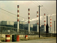
Nowadays, many directors seem to think that they have to start the film with a dazzling long take with complicated camera movements. One example is De Palma’s Bonfire of the Vanities, which he seemed to try to top in Snake Eyes. P. T. Anderson goes all out for virtuoso camera movement at the start of Boogie Nights but then settles on a static long take for Punch-Drunk Love. As in the early sound era, a fancy opening shot can crop up in a more or less ordinary film too, such as the SkyCam- and CGI-driven introduction of the nightclub in The Birdcage. The convention of the flashy first shot is so widespread that The Player‘s opening can satirize it.
Actually, it isn’t that new an idea. Fairly far back in film history, directors seem to have realized that first shots should be freighted with implication. There probably isn’t only one moment when this strategy arises, but I’d suggest looking first at the period when synchronized sound comes in. Most films at the time were pretty static and theatrical in their reliance on dialogue, so a flashy opening shot or sequence could reassert “This is cinema.” The bravura tracking shot was a common way directors chose to draw the viewer into the film’s world, as at the start of Threepenny Opera or of Scarface. Maybe this is a key moment in which filmmakers began to realize that the opening shot of a film should grab or puzzle the viewer and let us reflect a little on the fact that it’s doing so.
Things that seem to us to be current innovations can go pretty far back. There’s a more general implication too. As critics and cinéphiles, we tend to notice particulars–this sequence, this film. But we can also study the history of film forms and styles. We can try to map out the broader principles and patterns, the sources and trends–the items on the menu, we might say–that shape filmmakers’ individual choices.
Cutting remarks: On THE GOOD GERMAN, classical style, and the Police Tactical Unit
DB herer:
For about ten days Kristin and I are off the grid, unable to check email, let alone blog.
In the meantime we’ll backlog some blogs (backblogs) to be posted at intervals. When we get back, we’ll probably divulge where we went.
This is a followup to my entry on The Good German of some days back. I want to talk a bit about editing technique in classical and contemporary film.
Recall that Dave Kehr’s fine reportage on Soderbergh’s Good German appeared in the New York Times. The film is set in postwar Berlin during the late 1940s, and Soderbergh is trying to film it with the production procedures of the time. He’s using boom microphones and incandescent lights, and he’s asking actors to deliver the lines in the forthright manner characteristic of classic studio acting. He’s using prime lenses of fixed focal length (as opposed to today’s zoom lenses with minutely adjustable focal length). Those prime lenses will often be wide-angle ones (e.g., 32mm), the sort that Soderbergh discovered that Michael Curtiz employed at Warners.
Soderbergh will also avoid multiple-camera shooting, which is common for most scenes nowadays; he will shoot single-camera. This has fascinating implications for staging and editing choices. Dave Kehr explains:
If there is a single word that sums up the difference between filmmaking at the middle of the 20th century and the filmmaking of today, it is “coverage.” Derived from television, it refers to the increasingly common practice of using multiple cameras for a scene (just as television would cover a football game) and having the actors run through a complete sequence in a few different registers. The lighting tends to be bright and diffused, without shadows, which makes it easier for the different cameras to capture matching images.
The advantage for directors is that they no longer need to make hard and fast decisions about where the camera will go for a particular scene or how the performances will be pitched. The idea is to pump as much coverage as possible into the editing room, where the final decisions about what goes where will be made.
The danger for a director is that with so much material available, the original vision may be drowned or never really defined; and the sheer amount of exposed film makes it possible for executives to step in (after the director has completed his union-mandated first cut) and rearrange the material to follow the latest market-research reports.
During the studio era it was more typical for directors to arrive on the set, block out their shots and light them with the use of stand-ins; the actors were then summoned from their dressing rooms and, after a brief rehearsal, they would film the lines needed in the individual shot. The crew would then break down the camera and move it to the next setup, as determined by the director.
“That kind of staging is a lost art,” Mr. Soderbergh said, “which is too bad. The reason they no longer work that way is because it means making choices, real choices, and sticking to them. It means shooting things in a way that basically only cut together in one order. That’s not what people do now. They want all the options they can get in the editing room.”
While the editing process now routinely takes months, “I had a pretty polished cut of ‘The Good German’ two days after we wrapped,” Mr. Soderbergh said. “It was shot to go together very, very specifically.”
Let’s start with the concept of coverage.
Shooting to Protect
Consider a traditional conversation scene.
In the classical Hollywood style, most such scenes were shot with a single camera. (In the silent years, big films would be shot with a second camera to provide a negative for foreign markets. This means that in some films, the overseas versions were slightly different, shot for shot, from their US counterparts.)
Your conversation scene will be edited. So how do you film it? Working with only one camera, directors developed procedures for “covering” a scene.
Here’s the default. The entire scene would be played out in a single, distant take, usually called the master shot (sometimes “master scene”–for a long time, filmmakers confusingly called shots “scenes”). The master shot provided an uninterrupted record of the whole scene, and thus served as a reference point for overall set geography, where actors were standing, and so on.
Once the master shot was finished, the filmmakers went on to break the scene down into closer positions. That meant repeating portions of the scene already played in the master. They shot the medium two-shots of the actors talking, the shots of each actor taken from over the shoulder of the other actor, the singles of each player–which might be medium-shots, medium close-ups, or close-ups.
(Sometimes the filmmakers also shot inserts, the detail shots of objects or printed matter that would be inserted into the action, but usually they were filmed another time, or by an entirely different crew under the supervision of an assistant or second-unit director. Often the hands we see in an insert close-up aren’t those of the actor.)
For each different camera position, the actor would have to repeat the relevant bit of dialogue, gesture, or whatever that had already been played out in the master. Must have gotten boring, no?
The question arises: How much coverage do you shoot? Do you have to film from all those angles, and do you have to repeat everything to the max?
One answer says yes. Overshoot. This is the shoot and protect option. Film lots more footage than you can possibly ever use. Film is cheap, and you want lots of options in the editing room. Since in the studio system, directors rarely supervised the editing of their films, the editor worked with the producer, and the producer wanted to readjust the film in the cutting phase–inserting a close-up of the star, tightening the pace, and so on.
Shoot and protect is an insurance policy, and producers still insist on it. In The Way Hollywood Tells It, I quote Swedish cinematographer Sven Nykvist’s remark that American directors shot a lot more coverage than European ones. “I believe that comes from the fact that producers usually have the final cut and they want to have all the material they can get.” In the studio era, producers might want changes and demand reshoots of portions of scenes so the sequence would cut together better.
During the studio era, the most famous director who relied on overshooting is George Stevens. In an interview with Kristin and me, William Hornbeck talked about how Stevens was maniacal about reshooting the scene from every angle he could think of. Then he would run the footage over and over, trying to decide what takes to use. One result of this is a fairly choppy style. The barroom fight in Shane is almost wholly created in the editing room, and some of the cuts are downright clumsy.
Or take the barbecue scene of Giant, where the cuts struggle to extract a throughline of action. Elizabeth Taylor stands on the edge of the crowd, and abruptly Stevens dissolves to an extreme long shot of the festivities.

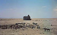
So is the scene ending, as such a reestablishing shot might suggest? No, because we dissolve again to her, now walking to the tree in the foreground, captured in a high angle from a crane.
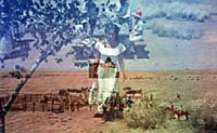
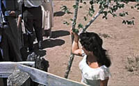
Most directors would have moved Elizabeth Taylor away from the crowd in a single tracking shot, letting the camera follow her approach to the tree. Stevens apparently hadn’t planned or filmed such a shot, so he had to use two dissolves, although there doesn’t seem to be a time lapse. Once Liz gets to the tree, the high angle obscures her face and gesture, so a cut tries to clarify:
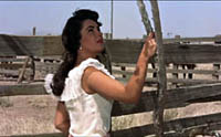
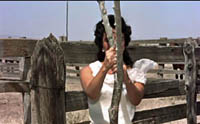
Stevens cuts to a head-on shot of her starting to swing around the tree. But she doesn’t get a chance to complete this gesture because the tree blocks her face and arms. So Stevens cuts away to James Dean, already walking leftward to the car–another interrupted action.
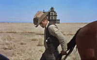
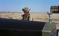
Dean settles down to watch the barbecue from a distance, but instead of getting anything resembling a point-of-view shot, we go back to the uninformative high angle, in which a cowpoke offers Taylor a drink.
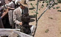
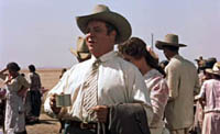
We can’t really see the first man’s gesture, or her reaction, so the dialogue has to carry the whole scene. And this action is interrupted again by another man proposing a toast to the couple. The high angle adds nothing to the scene. Didn’t Stevens film this bit of action from a more straightforward setup? If not, maybe he didn’t protect himself. Whatever happened, this passage seems to be very awkward filmmaking.
Granted, the cuts between Taylor and Dean do parallel them as outsiders and prefigure their alliance later in the film. But the same points could be made with smoother cuts and greater integrity of gesture. The scene’s fragmentation prefigures today’s interruptive editing.
Someone might argue that the jumpy cutting conveys something expressive about the scene (maybe Taylor’s anxiety about making a mistake in front of her new husband’s friends). But this is an all-purpose alibi, which can be invoked to defend any case of poor craftsmanship. My shot’s out of focus because…um…the hero’s uncertain of his identity. Moreover, if we defend the cutting as projecting Taylor’s anxiety, we’re tacitly granting that the scene has failed to convey that through performance, staging, and other techniques.
Lest it seem I’m being too mean to Stevens, I’ll just point out that occasionally he took some chances, even using single-shot high-angle staging reminiscent of Mizoguchi. Here’s an example from A Place in the Sun.
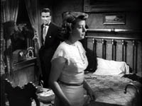
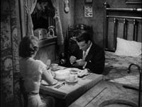
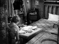
Shooting Cut to Cut
“Shooting for protection” sounds a bit defensive and wussy, like you’re afraid to make a choice. Suppose you try another tactic. Suppose you shoot only what you think you will finally cut together.
You might still shoot the master shot for insurance, but maybe not. On the whole, you’d shoot only the angles you’d decided on in advance, or perhaps you would add a few pieces for protection. Basically there would be only one way to cut the scene together. This was called filming “cut to cut” or “cutting in the camera.”
Hitchcock is the most famous exponent of this tactic, thanks largely to his claims that he preplanned everything that appeared on screen. After working out the script, shot lists, and storyboards, he knew exactly what he wanted, he said, and so the actual filming was a little tedious. I think he once remarked that he wished he could phone a film in. In truth, Sir Alfred exaggerated the precision of his planning. Bill Krohn’s excellent book Hitchcock at Work debunks “the myth of the storyboard” (which were often made after filming, to show reporters) and Krohn offers several examples of set improvisation, last-minute changes, tightening during editing, and so on (pp. 9-16). Nevertheless, on the whole Hitch probably shot significantly less coverage than most directors.
So too, evidently, did John Ford. Ford didn’t pre-plan his films to the minute degree Hitchcock claimed, but he achieved enough power in the system to avoid the shoot-and-protect method. According to editor Elmo Williams, whom I once asked about this, Ford had the reputation of giving his cutters almost no range of setups to choose from. If you give ’em a close-up, he supposedly said, they’ll use it. Ford apparently kept track of all the shots he wanted in his head, which may explain some of the mismatches that we find in his films. But it did mean that when the shooting was finished, he could hand the footage over to an editor and go out on his boat.
Another director who filmed coverage sparingly was W. S. Van Dyke, known as Wun-Shot Woody. You can read more about him here.
So there are degrees of coverage, from the maximal coverage of shoot-and-protect to the minimalism of cutting in the camera. Of course you can avoid coverage altogether by shooting your scene in a single take, from a single position (as Hou Hsiao-hsien often does) or with a moving camera. Producers hate this. Christine Vachon calls it “a ‘macho’ style that leaves no way of changing pacing or helping unsteady performances” (The Way Hollywood Tells It, 153). The director who doesn’t provide extensive coverage is a producer’s nightmare.
Camera A + Camera B + Camera C…+Camera N = ?
What about shooting the scene with more than one camera? Before the 1970s, multiple cameras were used chiefly for action sequences, and especially for things that couldn’t be repeated, like an explosion or cars hurtling off a cliff. Multiple cameras were also used for a brief period when sound first came in; watch nearly any film from 1929-1931 on Turner Classic Movies, and you’ll see scenes filmed much as TV sitcoms and soaps are filmed today, with several cameras. (For more on this, see The Classical Hollywood Cinema, Chapter 23.)
On the whole, though, multiple cameras were rarely used until some time in the early 1980s, when shooting schedules were accelerated. Faced with the need to turn out more footage quickly, directors began using “B” cameras to pick up alternate angles. Now a big picture may have “C” camera plus a Steadicam roaming around to grab details. One of my favorite quotes (in The Way, p. 154) is from John Mathieson, DP for Gladiator, who after explaining that by using seven cameras for some scenes, “I was thinking, ‘Someone has got to be getting something good.'” The old Hollywood directors, thinking through the scene shot by shot, knew when they were getting something good; now everybody just hopes.
In effect, as Dave Kehr’s article implies, multiple-camera shooting is today’s equivalent of classic coverage. Soderbergh is right to note that this practice postpones decisions until the editing stage. But it has other knock-on effects on the way the movie looks. I’ll consider just two, which I expand on in The Way.
1) Having reams of footage tends to speed up the cutting rate. Rather than sticking with a few angles, directors offered many choices tend to like a little bit of angle 1, the middle part of angle 2, another stretch of angle 3, and the last bit of angle 4. Four shots arise in the editing process, when maybe a single well-chosen one would do the job.
There are many sources of the fast cutting that rules contemporary cinema, but probably the practice of shooting with A, B, C, and N cameras is one.
2) Multiple camera shooting limits the freedom of camera position that single-camera shooting allows. Obviously, you can’t put Camera B in a position where it will be seen by camera A. In fact, you tend to keep all the cameras at a fair distance from the scene, using long lenses to enlarge the actors.
The implication is that the cameras really don’t work their way into the space as much as they do in single-camera shooting. You can’t put the camera between characters as easily, so Ozu’s characteristic frontal framings aren’t as feasible. Or, going back to Soderbergh’s beloved 1940s, take the variety of angles we find in the conversations between Spade and Gutman in The Maltese Falcon. These can’t easily be replicated with multi-cam staging.
Medium two-shots are also problematic with multiple cameras. (Hence perhaps all the singles and close-ups we get in contemporary films.) And all cinematographers grant that lighting an overall scene so that it looks right from several camera angles requires many compromises.
So I look forward to seeing how, in an age when single-camera coverage is rare, Soderbergh will handle these matters. Will The Good German‘s cutting rate be slower than is common nowadays? (The 1940s and early 1950s saw the widest disparity in average shot lengths in Hollywood’s history, from very short shots to ASLs over thirty seconds.) Will the camera penetrate the space in the manner of the ubiquitous setups of the studio years?
Finally, I’d just like to note that Soderbergh didn’t have to return to the 1940s for inspiration. Classic techniques of coverage, even cutting in the camera, are amply on display in other cinemas.
Mackendrick’s Axiom
Today’s choppy editing style is interruptive rather than integrative. A typical director today doesn’t let a shot ripen to full implication. The cut interrupts the shot rather than coming at the moment that will carry forward what’s been developing in the image.
The British director Alexander Mackendrick once suggested that at each moment the director must prepare the audience for what is going to happen next. If you’re really good, shot A prepares not only for B but for C and D as well. You can study this process in Lang, Ford, Hawks, and other classical directors, but it’s still visible today, I think, if we know where to look.
Yes, the answer is Asian cinema again. Hong Kong, no less.
Johnnie To Kei-fung began his career in television in the 1970s, made a feature in 1980, and returned to shooting TV series in the early 1980s. He shot single-camera cop shows, martial-arts shows, and other dramatic shows. No shot lists, no storyboards–no time! Given the brisk schedules of TV shooting, To mastered the ability to film one shot while thinking about the next three, the way a chess master conceives a string of moves. He makes the determining decisions about the sequence in the flow of production, then fine-tuning them in editing.
Johnnie To shifted to feature filmmaking in 1986, and he has turned out more than forty films since. Sometimes he finishes three films in a single year. His output includes many extraordinary achievements, such as Lifeline (1997), The Longest Nite (1998), Expect the Unexpected (1998), A Hero Never Dies (1998), The Mission (1999), Throw Down (2004) and several others. His two films about Triad life, Election 1 (2005) and Election 2 (2006) have received wide attention, as has his most recent release, Exiled. These last three have been picked up for US theatrical release.
His style can vary a lot from film to film, from the frenetic action of A Hero Never Dies to the hairtrigger poise of The Mission. But in each case you detect a director who makes his stylistic choices and sticks to them. He can structure a scene in his head and he can shoot the result efficiently. He is, we might say, today’s Woody Van Dyke. Except he’s quite a bit better.
Here’s a sequence that exemplifies Mackendrick’s axiom.
During the climactic gunfight of PTU (2003), a female police officer fires at a gunman. He fires back, and she drops her pistol as she dives back into her car. Then the cop Lo, the hapless slob we’ve been following, seeing the gunman about to fire, dashes out of the shot. This is followed by a shot of the gunman swiveling and firing.
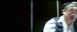
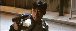
The next shot is the crucial one. Through a rain-speckled car windshield we see Lo fleeing.
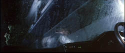
Why shoot from this fancy angle? It does two things at once. It tells us about the fleeing cop’s progress, continuing the action of the earlier shot of him, but it also puts us in the car, implying that the next phase of the action will take place here, rather than on the street. And so it does:
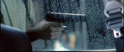
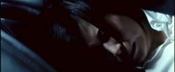
The wounded gunman staggers against the car, and again, instead of seeing his progress from the outside, we’re in the car. We don’t need to see his face, only the gun: director To films the danger. This shot expands on the previous one, keeping us in the front seat, and then gives us new information. The camera tilts diagonally to the policewoman crouching below the window.
The suspense is heightened when To cuts back to the pistol, bumping along the glass.
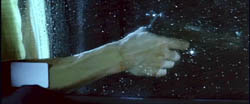
Will the gunman look inside the car? The movement of his arm is continued smoothly in a new angle:
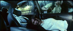
….as he rushes off to the right in pursuit of Lo. Director To gives us both action and reaction in the same concise shot. The policewoman sobs in relief, and this sub-sequence ends with a pause on her.
The sequence has broader implications as well, since this officer has been suspecting all along that Lo has lost his pistol (which he has). Now she has lost hers. After the smoke has cleared, Lo strolls back to her, and the shot echoes the earlier shots taken through the windshield.
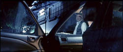
The irony dawns on her–in the heat of battle, it’s easy to lose your weapon–as she glances down at her discarded gun and retrieves it.
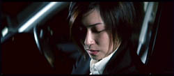
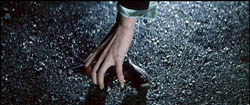
This sequence couldn’t have attained such precision if it were filmed with several cameras snatching shots, hoping to get something; nor with shoot-and-protect coverage. The passage is conceived cut to cut, in the director’s head. Each shot makes one or more points succinctly and leads us crisply to the next bit of action. When I asked Mr. To about the shot of Lo fleeing, seen through the windshield, he seemed surprised that I’d wonder. “Of course! You have to let people know they’ll see her in the car.”


