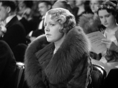
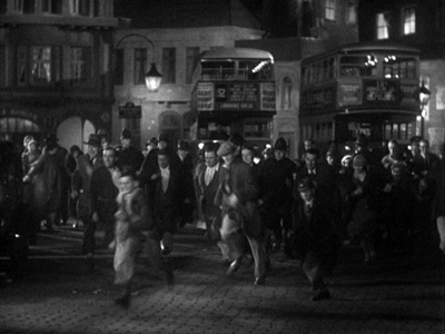
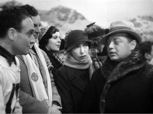
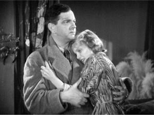
Archive for the 'FILM ART (the book)' Category
Sweet 16
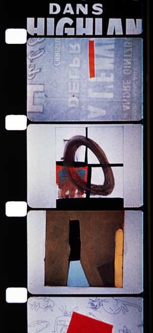
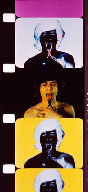
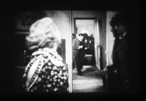
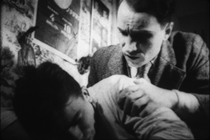
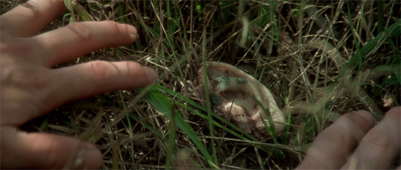
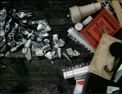
REcreation (Robert Breer, 1956); T.O.U.C.H.I.N.G (Paul Sharits, 1969).
DB here:
Snows and thaws and refreezing, amplified by a torrential rain, gave water a new path into our basement. We’ve spent about two weeks emptying bookshelves, drying them out, and shifting books to other places. No volumes were damaged, but we had to make space in the dry areas for the migrant titles.
That meant facing up to the problem of 16mm.
The solution was drastic.
Narrow-gauge movies
My film collecting started with 8mm. Not super-8; that was invented later. (Imagine how old I am.) I made my own movies in 8, but I also bought, from the venerable Blackhawk Films of Davenport, Iowa, copies of films in that format. Most memorable was the Odessa Steps reel from Battleship Potemkin, which I projected often on my bedroom wall.
Not until I went to college and joined a film club did I lay my hands on 16mm. I suppose if you start out handling 35mm, 16 looks skinny and 8 looks like a toy. But moving from 8 to 16, I could see only improvement. You could, with the sharp eyes of the teenage geek, actually see the image on the strip. I projected many films on our JAN surplus projectors, and one weekend I hauled a print of Citizen Kane to my apartment to watch several times. Do I need to add that all this was in the 1960s, long before films became available on videotape?
Arriving in Madison in 1973, Kristin and I bought a Kodak Pageant, the 16mm workhorse. Not as good as a Bell & Howell, most aficionados would tell you, but fairly cheap and easy to handle. When we moved from apartment to apartment, the Pageant went with us.
In 1977 we bought a house, and I set up a jerry-rigged projection room in the unfinished basement. In our second house, where we still live, I was able to set up something more permanent. Now there were two projectors encased in a booth and mounted on a platform.
We spent many hours watching movies in that currently soggy basement, with its burgundy carpet and dark wood paneling. Although the room lacked the comforts of what we think of as a home theatre, we sometimes screened things for big groups, either a party or once in a while students in a seminar.
In both venues, we previewed movies we were showing in courses and revisited some of our growing collection: The Shop Around the Corner, High and Low, True Stories (must blog about that some time), You Only Live Once, and so on. I’ve already expounded on the key role of His Girl Friday in our mini-cinémathèque.
By then Kristin and I had also started working with 35mm prints in archives and with 35mm trailers we scavenged to make slides for lectures. For a brief while we even had 35mm in our screening space, but with only one projector, shows stretched too long. Although home video had taken off, Betavision, VHS, and even laserdiscs couldn’t compare to a good 16 copy. We continued to collect and show on film, as did our department.
In the last decade, improvements in digital projection, along with the arrival of Blu-ray, led to the decline of 16 in our local media ecosystem. Our department still shows a lot of 35, but 16 seems mostly the province of our experimental and documentary courses. As for us, we hadn’t screened 16 at home for some years. Then came the February leak, and we had to face the problem.
We’d already given many of our 16mm titles to the department, keeping our most fond treasures at home, thinking we’d watch them some day. Now we needed the space that those cans and cases occupied. Anyhow, it was probably time to let go. So we decided to surrender the features, the shorts, the cartoons, the splicers and the rewinds and the six Pageants—everything.
Our house is a museum of defunct technology. Just recently I surrendered my lovely Teac reel-to-reel tape recorder. Packed away are hundreds of Beta and VHS tapes. On groaning shelves sit hundreds of laserdiscs, mostly Asian. Yet under a roof that houses no fewer than six laserdisc players, there is no trace of the predominant nontheatrical film format of the twentieth century.
FOOFs
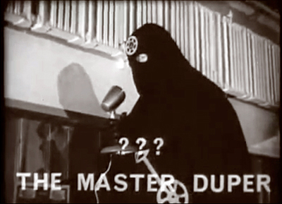
Captain Celluloid vs. the Film Pirates (1966).
Nowadays it’s easy to own a “film”—or rather a disc or file or stream of pixels fed to your display. (Though I wonder what it means to “own” something sitting on the Cloud in your virtual locker.) Back in the day, joining the ranks of 16mm collectors meant a real commitment. You needed to buy gear, you needed to clean and inspect the films, and you needed to learn a little projector maintenance. You probably subscribed to The Big Reel and Classic Film Collector, tabloids that ran ads selling or swapping prints and equipment. And you usually went to film collectors’ conventions, jamborees of selling, trading, and movie watching. The three biggest events, Cinecon (Los Angeles), Cinefest (Syracuse), and Cinevent (Columbus, Ohio), brought together the overwhelmingly male tribe of FOOFs: Fans of Old Films.
FOOF collectors had good hunting in those days. There were plenty of 16mm prints floating around, but quality varied. The best were those cast off from legit distributors. Made from internegatives drawn from 35mm positives, they usually had good tonal values. At the other end of the scale were the dupes, copies pulled from 16mm distribution prints. These ranged from acceptable to awful; but if you wanted a rarity, you might have to spring for a dupe.
In the middle zone were TV prints, probably the majority of copies in circulation. When studios licensed their pre-1948 libraries to television, go-between companies like C & C put together packages of prints to be sold to local stations around America. Small stations in the hinterlands harbored scores of 16mm copies, to be trimmed, filled out with commercials, and broadcast outside prime time, and sometimes within it as “Million Dollar Movie” or whatever. It’s still not fully appreciated, I think, how many baby-boomer auteurists around the country caught classics in the pre-dawn hours on local television.
But as network and syndicated programming expanded, there was less room for old movies. Why run a 1936 Paramount picture when you could show color re-runs of Bewitched or The Six Million Dollar Man? The stations’ 16mm prints were headed for landfill when enterprising collectors and entrepreneurs salvaged them. You could tell when you got a TV print. It might carry a packager’s logo; it would have low contrast; and splices between scenes would signal where the commercials had been jammed in.
FOOFs had their demons and demigods. Principal among the demons was one colorful character, who had the habit of bothering collectors circulating versions of old classics to which he claimed current rights. In The Sneeze, FOOFs made fun of the man who, releasing recovered prints of Birth of a Nation and Keaton films, made sure his own name featured prominently in the credits.
Among the demigods were Kevin Brownlow, he who had rescued Napoleon, and David Shepard, who started out at Blackhawk and eventually founded Film Preservation Associates. Most legendary of collectors was William K. Everson, who died in 1996. Thousands of prints were squeezed into his two Manhattan apartments and spilled over into the storage areas of NYU’s film department. He acquired many of his films in exchange for services he rendered to Hollywood studios. His gems were screened in his courses, in sessions of the Theodore Huff Memorial Film Society, and in lectures he presented around the world. I remember his excellent presentation on Joseph H. Lewis at Chicago’s Art Institute Film Center, where he showed clips from Lewis’ Poverty Row productions and even some credit sequences Lewis had crafted.
Bill brought a magnificent selection of titles to Madison in the early 80s, and many of them, such as Bulldog Drummond (1929) and Justin de Marseille (1935), remain rarities. Generous beyond measure, he also let NYU faculty and students borrow his movies. When Annette Michelson needed to see East of Borneo (1931) for her essay on Joseph Cornell’s Rose Hobart (1936), she turned to Bill. All of this largesse was made possible by the portable, user-friendly format of 16mm.
Freezing the frame
Teachers, filmmakers, and collectors had a special relation to 16mm. In addition, as researchers, we developed an unusually intimate rapport with the format. When I started teaching, I felt the need to illustrate my lectures with images from the films. My first efforts involved setting up a 35mm still camera on a tripod and photographing from the screen. If the projector could stop on a frame, so much the better; but even if not, you might snag an acceptable shot. The projected image would be surrounded by darkness. Today I wince at the results, as with this shot from Crime of M. Lange, one of the few old slides we haven’t cast out.
You could get sharper slides with a gadget called a Duplicon, but it cropped the 4 x 3 image to something like 3 x 2.
When Kristin and I decided to write Film Art: An Introduction, the few introductory textbooks relied almost entirely on production stills, those images shot on the set and circulated to promote the film. The Museum of Modern Art had an archive of production stills, and then as now, publishers turned to such collections for illustrations. As part of the first generation of university-trained film researchers, we doggedly insisted that all our examples would be actual film frames.
Today, digital video has made grabbing frames easy. But before the late 1990s, it was hard. Videotape frames looked terrible, as some books from the 1980s attest. To get decent quality, you needed access to prints. You needed a way to put a reel onto rewinds or, ideally, a flatbed editor like a Steenbeck. And you needed a camera with an enlarging attachment. When you’d copied your frames, you took the exposed film to a lab, where you hoped for a passable result. Black-and-white shots were easier than color, which required blinding lamps of a color temperature matched to Ektachrome or Fujichrome or Agfachrome.
 When we could get access to 35mm prints, they were our prime sources for stills. I went to Copenhagen to copy frames from Dreyer films for my first book, and for her dissertation and first book Kristin made frames from 35mm copies of Ivan the Terrible loaned her by Janus Films. Before that, for the first edition of Film Art (1979), we took our color shots from 35mm prints, most of them in the New Yorker Films library. Dan Talbot and José Lopez kindly granted us permission to go to Bonded Storage in Fort Lee. There in the tall aisles of shipping cases we set up a rewind and patiently hunted for the frames we needed.
But most of the films we wanted to illustrate we could find only on 16. We rented prints and then took stills on a rickety gadget built for us by our friend David Allen. David bolted a pair of rewinds to a plank of plywood. That plank rested on a little table. Into the plank was cut a square slot for an upright light box. The box contained a bulb and was surmounted by a square of translucent plexiglass. The bulb could be put at the bottom of the box, for a photoflood lamp, or near the top with a cooler and dimmer appliance bulb for black-and-white. You positioned the film on the plexiglass and aimed the camera down at the film. A crude zoom lens allowed us to photograph a couple of frames of 16mm and one of 35.
We took the light box on our travels. Archivists certainly looked at us oddly when we brought the thing in, but they usually gave us permission to use it. We’d watch the film on a flatbed and bring the light box over alongside it. Laying the film gently on the surface, we’d poise the camera above it.
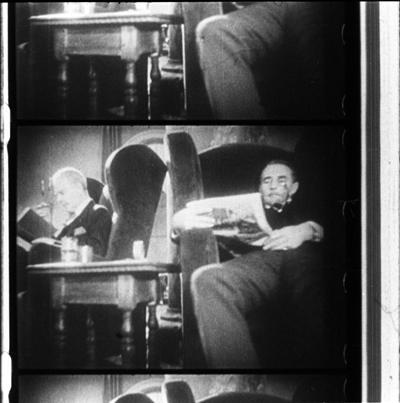
Here’s an example of what we got with our plywood setup, from Bill Everson’s print of Bulldog Drummond.
Over the years we improved our system. We bought better cameras, with sharper lenses. We found purpose-built attachments that hold the film strip firmly in place. (Alas, Canon and Nikon seem to have discontinued these rigs.) We used smaller lighting units rather than our curious box. For the last few decades we’ve shot horizontally rather than vertically.
Even in this age of video grabs, we make many frame enlargements on analog stock with 35mm cameras. Even if a film is available on DVD, some of the things we study aren’t preserved in that format. Of course many films aren’t available on video at all, and a great many of those were made to be seen on 16mm.
Format churn catches up with us
Notebook (Marie Menken, 1962).
Super-16 lives as a production format, but its older brother is nearly dead. True, a few die-hards like Ben Rivers continue to shoot on 16mm, but its future is mostly all used up. James Benning could make 16mm look like 35; when I asked him how he did it, he answered: “I use a light meter.” But even Jim has switched to digital. As for projection, many colleges and art centers have pitched out their 16 equipment.
Since our earliest editions, Film Art included discussions of two remarkable films: Bruce Conner’s A Movie (1958) and Robert Breer’s Fuji (1974). These have not been, and might never be, released on digital disc. Yet by the end of the 2000s, we found that virtually none of the users of our book screened these films for their classes, and curious readers without access to 16mm projection couldn’t easily see them. Reluctantly we cut them from the tenth edition of last year. We replaced A Movie with Koyanisqaatsi to illustrate associational form, and Fuji was replaced by Švankmajer’s Dimensions of Dialogue as an instance of experimental animation. Both titles are available on DVD.
Thanks to the Internet we’ve been able to revive our original discussions of the Conner and Breer films on our site here. We hope that will help the few loyal chevaliers who told me that they did indeed use the films in their courses. But our choice points up a larger problem.
So many documentary and avant-garde films were made and circulated on 16mm that we are at risk of losing a very large slice of film history. We’re lucky to have some Stan Brakhage and Hollis Frampton films on DVD, but what about all the other titles that were distributed by Canyon Cinema, the Film-Makers’ Coop, and other groups? We can get DVDs of Frederick Wiseman documentaries, and some classic ones have been made available on archival collections; but there are many more that depended on 16mm platforms. Even bigger is the set of everyday 16mm movies: amateur films, home movies, and hundreds of miles of newsfilm, from both big TV networks and local affiliates. A great many of the “orphan films” championed by Dan Streible and his colleagues are in this narrow-gauge format.
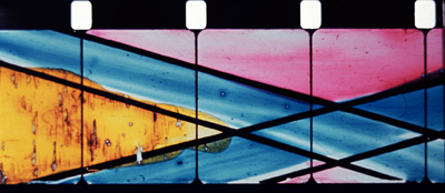
Recall too that the films of those animators and experimentalists who work frame by frame, such as Breer and Paul Sharits and Paolo Gioli, cannot be studied closely on DVD. How could DVD reveal to us the nifty paintwork of Marie Menken’s Notebook? For that you need a light table, or someone able to photograph it and show you.
Archives will retain 16mm projectors and viewing tables as long as they can. They will preserve prints, perhaps migrating the most sought-after ones to digital formats. Passionate collectors like Tim Romano, who zealously pursues lost films and then donates them to the AFI, will find a way to use our cast-off gear. Our Film Studies department will hang onto the format until the last aperture plate cracks.
16mm was so much a part of our work, our play, our education—in short, our lives—that the separation was inevitably poignant. Pinned to the bulletin board in my basement booth was Ellen Levy’s poem, “Rec Room.” It is, I think, about the fragility and faultiness of the 16mm image, as made palpable in home screenings, and about how that fragility nonetheless carries a pulse of vitality. It begins:
The film assumes the texture of its screen
on the first projection. Audrey Hepburn’s face
creases where the rec room paneling once
took exception to it for the sake of
rephrasing it slightly—a lesson
these late viewings have brought home. Home
screen or revival house . . . .
Thanks to Erik Gunneson and Tim Romano for helping us recycle our 16mm stuff.
Media historian Eric Hoyt, in our Communication Arts Department, studies among other things how the American studios disposed of their film libraries. He talks about his research and his book project, Hollywood Vault, here.
The FOOF contingent was unequivocally a force for good. To sample some of its wonkish hijinks, watch Captain Celluloid vs. the Film Pirates.
New York University’s Cinema Studies Department has created an extensive online collection of William K. Everson materials. For more on Bulldog Drummond, see this entry and this essay on the great William Cameron Menzies. Annette Michelson’s essay on Joseph Cornell, “Rose Hobart and Monsier Phot: Early Films from Utopia Parkway,” was published in Artforum 11 (June 1973), 47-57.
Bonded Storage in Fort Lee is part of the history of American cinema, as this article shows.
Paradoxically, you can study films frame by original frame on some laserdiscs, and on VHS tapes too if you are aware of the 3:2 pulldown. See my entry here. As so often happens, progress along one dimension means regression on another. So I cling to my rotting laserdiscs and demagnetizing old tapes.
James Benning discusses how digital cinema changed his artistic practice at Bombsite. An earlier entry of ours showcases the efforts of the Academy of Motion Picture Arts and Sciences to preserve experimental cinema.
Ellen Levy’s fine “Rec Room” is available in its entirety in The New York Review of Books (9 October 1986).
To watch a video about our Film Studies program, go here.
Sir Alfred simply must have his set pieces: THE MAN WHO KNEW TOO MUCH (1934)
The Man Who Knew Too Much (1934).
DB here:
Hitchcock made six remarkable thrillers from 1934 through 1938, and I have long believed that the first one was the best. I think very well of Sabotage, and both The Lady Vanishes and The 39 Steps are strong contenders. But for me, The Man Who Knew Too Much has got damn near everything going for it.
I came to it a little late. It wasn’t the first Hitchcock I wrote about; that was Notorious, in a 1969 piece that nakedly reveals the limitations of a college senior’s knowledge. Nor was it the first Hitchcock I saw; that was Vertigo, when I was about ten. Inauspiciously for me, when Vertigo was revived for national television broadcast in 1972, I was flying to a job interview in Madison, Wisconsin.
I got that job, though, and soon The Man Who Knew Too Much became very important for me. Seeing it at a film society screening, I was bowled over. Then I discovered that it was available for purchase in a cheap 16mm print. I bought a print and began teaching the film as a model of narrative construction. It worked its way into the first edition of Film Art, in 1979 and hung around there for several editions.
That sample analysis has been available as a pdf on our site, but check it out at the Criterion site, where it’s enhanced with nice frame enlargements and a major extract. The essay makes my case for the movie as an extremely well-constructed piece in the classical storytelling tradition.
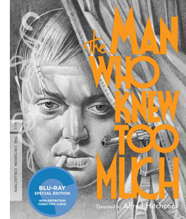 So I was the ideal consumer for a spruced-up DVD/ Blu-ray release, and as usual Criterion doesn’t disappoint. It’s a handsome version, with some fine supplements. We get two rare interviews with Sir Alfred from CBS’s arts program Camera Three (featuring Pia Lindstrom and William K. Everson) and a perceptive discussion with Guillermo del Toro, who makes a vigorous case for the film. So does Philip Kemp in his commentary, which is strong on production background. Kemp offers valuable information on script versions and on Hitchcock’s niche in the English industry. The accompanying booklet includes a lively appreciation by The Self-Styled Siren, aka Farran Smith Nehme.
Interest in Hitchcock seems to be the one constant in the whirligig of tastes in film culture. He is a mainstay of home video and cable television; apparently the films can be re-released in perpetuity. Professors love to teach his films. The techniques are obvious and vivid, and the films offer a manageable complexity that encourages interpretation. Class, gender, power, the law—whatever your favorite themes, they’re all on the surface, yet enticingly ambivalent. Not to mention how much fun these movies are to watch. I’ve always enjoyed introducing “lesser Hitchcock” like Stage Fright and Dial M for Murder and then watching the audience fall under their spell.
Critics navigate by Hitchcock as a fixed pole star. Reviewers compare every new thriller to the classics of The Master of Suspense. Just look at what people write about Soderbergh’s Side Effects. And for those who promoted the auteur approach to Hollywood cinema, Hitchcock was a beachhead. Who could doubt that this man turned out personal projects within the impersonal machine known as Hollywood? And if he could do it, why not Ford, Hawks, Sternberg, Ray, and all the rest? Hitchcock nudged skeptics down the slippery slope toward auteurism.
Even if Hitchcock isn’t to your taste, you can’t avoid his influence. That became obvious around the 1970s, when directors began borrowing from him more or less overtly: Spielberg’s Vertigo track-and-zoom in Jaws (now itself a convention), De Palma’s homages/pastiches, Polanski’s use of point-of-view in Repulsion and Rosemary’s Baby, the endless Psycho sequels and the van Sant remake, and the rest. But Hitch was no less influential in his own day; I’d argue that filmmakers of the 1940s had to raise their game if they wanted to meet the challenge of Rebecca, Foreign Correspondent, Suspicion, Shadow of a Doubt, Spellbound, and Notorious. Billy Wilder told a reporter that Double Indemnity was his effort to “out-Hitch Hitch.”
What was so special? Obviously, the throwaway humor—sometimes airy, sometimes slapstick, sometimes sardonic. And obviously a gift for switching situations around, playing them against cliché, setting us up for a jolt. But I think there’s something else afoot. Part of the Master’s repute rests on virtuosity of film technique. Hitchcock makes movie movies, even when, like Rope or Dial M, they seem “theatrical.” And this movieness is best seen, I think, by considering a term that always comes up with Lord Alfred: the set piece.
Maintaining a tradition
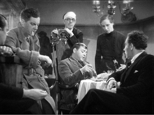
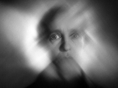
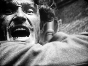
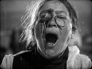
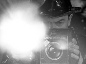
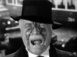
Hitchcock held onto the flamboyant expressive devices of silent and early sound cinema far longer than any other director. For decades he kept alive techniques that many directors thought were old hat: abrupt cuts to details of gestures and objects; blurry point-of-view images to suggest distraught or befuddled states of mind (as above); very brief insert shots to accentuate violence. Compare Battleship Potemkin with Foreign Correspondent’s assassination scene.
Hitchcock built entire films around classic silent techniques. The Kuleshov effect governs Rear Window; the German “entfesselte” or “unchained” camera dominates Rope and Under Capricorn. Rope and Dial M revive the aesthetics of the German kammerspielfilm, or “chamber play.” The Germanic look was alive and well in the spiderweb shadow-work of Suspicion, while both French Impressionism and German Expressionism inform the dream sequences of Spellbound and Vertigo. He also preserved the “creative use of sound” that was the hallmark of directors like Clair and Milestone. While others had pretty much given up the expressionistic use of music and effects, Hitchcock was always ready to draw on them. The hallucinatory Merry Widow Waltz haunts Shadow of a Doubt, while Hitchcock’s penchant for giving us two pieces of information simultaneously, one in the image and another on the soundtrack, let him design scenes visually and push a lot of dialogue offscreen.
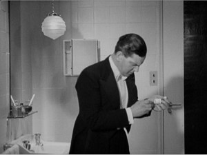
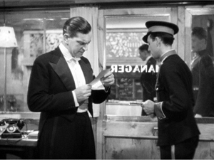
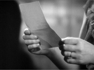
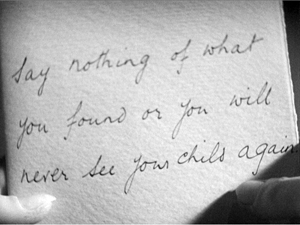
This flexibility of technique modulates from scene to scene. In The Man Who Knew Too Much, note-reading is presented in three ways, in rapid succession. First, Bob finds Louis’ note in the hairbrush.
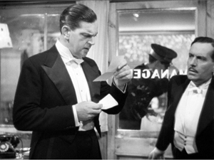
Soon Bob gets a message from the front desk. What does it say? Hitchcock hides that by, for once, not supplying subjective point of view.
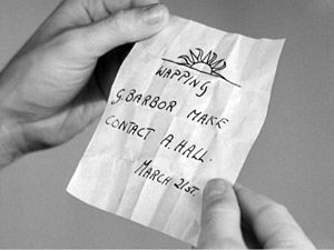
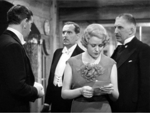
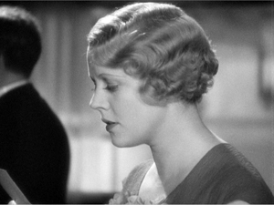
Only when the note is passed to Jill do we get to see it, but with a twist. Nobody but Hitchcock would add an extra shot that cuts to the note in her hand without revealing what it says.
That extra shot is what Eisenstein called a primer; as with dynamite, you need a little charge to trigger the blast.
We often forget that classic silent directors used their pictorial techniques for suspense. Lang’s Mabuse films and Spione furnish plenty of instances, but so do the Soviet montage films. The scene in which the police wait for the worker to return to his wife in The End of St. Petersburg now looks like pure Hitchcock, and of course the Odessa Steps sequence was the Psycho shower of its day. So it isn’t surprising that Hitchcock would turn his silent-film virtuosity toward creating scenes of high tension and threatened violence. Nor is it surprising that his skills would crystallize in “set pieces.”
Everybody talks about Hitchcock’s fondness for set pieces. It’s part of his brand. We have the Statue of Liberty climax in Saboteur, the milk carried up the staircase in Suspicion, the milk-and-razor scene and the final suicide in Spellbound, the spectacular rescue of Alicia at the end of Notorious, and the efforts of Bruno to retrieve the lighter in Strangers on a Train.
But, come to think of it, what makes something a set piece?
Game, set piece, match
Foreign Correspondent (1940).
As commonly understood in the arts, a set piece is a fairly self-contained portion of a larger work. It has a distinct beginning and end, and it’s understandable and impressive if extracted from its original. It’s designed to be a bravura display of concentrated virtuosity. In music, an example would be an operatic aria like the Queen of the Night’s in The Magic Flute: it is so flashy and complete in itself that it can enjoyed on its own, in a concert setting.
Two early uses of the term shed light on its implications. In stage parlance, a “set piece” is an item of the set that can stand alone, like a gate or fake tree. In pyrotechnics, a “set piece” is a carefully patterned arrangement of fireworks; here again, it implies a display that dazzles the audience.
In the silent era, I’d suggest, the clearest exponent of set pieces is Eisenstein, who became known as “the master of the episode.” Many of his big scenes, like the Odessa Steps massacre, are developed at such length that they function as mini-films. But you can consider passages in Chaplin and Keaton as set pieces—the dance of the breadrolls in The Gold Rush perhaps, or the windstorm in Steambout Bill, Jr. The musical would seem to be a natural home of the set piece, with numbers standing out against more mundane scenes. In modern cinema, again under the aegis of Hitchcock: De Palma offers plenty, and perhaps the prize fights in Raging Bull constitute a string of them. Today the home of the set piece is the action picture; the chases and fights are the main attraction, and the genre challenges directors and crew to find new ways to intoxicate us.
The aesthetic of the set piece implies that some scenes function as filler while others get the whipped-up treatment. If that’s right, many great directors don’t favor mounting set pieces. Ozu, Mizoguchi, Dreyer, Hawks, and others present what we might call “through-composed” films. Just as Wagnerian opera and its successors minimized set pieces, these filmmakers create a surface texture that doesn’t create self-contained high points. (I grant you that the immolation of Herlofs Marthe in Dreyer’s Day of Wrath might count.)
Given the detachable quality of set pieces, it’s true that some of Hitchcock’s can seem implausible or gratuitous. How essential is Guy’s lighter to any plausible scheme of Bruno’s? If you want to kill Roger Thornhill, why send him to a crossroads in Midwest corn country? (A knife in the back on the Greyhound is more reliable.) It was this tendency to sacrifice story logic for stunning anthology bits that Raymond Chandler deplored:
The thing that amuses me about Hitchcock is the way he directs a film in his head before he knows what the story is. You find yourself trying to rationalize the shots he wants to make rather than the story. Every time you get set he jabs you off balance by wanting to do a love scene on top of the Jefferson Memorial or something like that.
Chandler has a point. How do you integrate a set piece into a whole movie? (I’ll make some suggestions shortly.) But first, give Hitch his due. For him, I think a set piece was a compact repository of inherently cinematic ideas carried to a limit within a sequence. A set piece is a challenge: How much can you squeeze out of a situation?
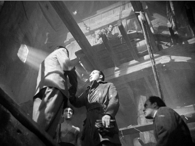
Go back to Foreign Correspondent. Setting an assassination in Amsterdam allowed Hitchcock to integrate the idea of a clue based on a waywardly turning windmill. So far, Chandler’s objection seems tenable: The windmill is just a gimmick. But once Hitchcock sets his hero exploring the lair, he can create a set piece that answers a question that no one ever thought to ask before: How do you eavesdrop in a windmill?
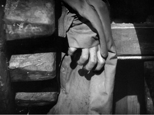
Johnny Jones has to evade the killers by crawling up alongside the giant gears, then down, then up again. At each step he barely escapes being spotted. When he seems safe, his topcoat gets snagged in the grinding gears, so he has to slip his arm out of it—just in time to avoid being crushed.
Yet once Jones is freed from the coat, it’s carried around the gearwork and might be spotted by the gang. And the old diplomat upstairs, mind hazed by drugs, is likely to reveal Jones’ presence. Hitchcock squeezes seven minutes of suspense out of all this, with a casual air that suggests: Of course, dear chap, any director worth his salary can see that a windmill harbors all kinds of excruciating menace. All in a day’s work, you know.
A whispered terror on the breeze
If anything is a set piece, the Albert Hall sequence in The Man Who Knew Too Much is. Philip Kemp’s commentary for the Criterion DVD considers it Hitch’s first, although aficionados would probably consider the “knife” sound montage of Blackmail at the very least a rough sketch for what would come. Lucky you: The entire Albert Hall sequence is excerpted on the Criterion site.
A set piece benefits from a simple premise. Here, Jill’s child is being held hostage, which keeps her from informing the police of what little she knows about the plot. We know that during the concert an assassin will try to shoot a diplomat.
You can imagine Chandler asking: Why plug Ropa during a concert, with all those witnesses? Why not when the target is on the sidewalk, shot from a rooftop for easy escape? You can hear that bland replying murmur: Raaaymond, it’s only a moovie…
So we have some conditions for a set piece: a compact piece of action limited in time and space. But there’s also a strong time marker. Ramon the assassin is to wait for a dramatic pause in the score; it’s followed by a shattering choral outburst that will muffle the pistol shot. We’ve been given a rehearsal of the passage in a gramophone record, but since we don’t hear the whole piece then, we can’t predict exactly when the chorus will hit its peak.
Hitchcock magnifies this uncertainty by letting the piece, Arthur Benjamin’s Storm Clouds Cantata, play out in its entirety. Its combination of lyrical and dramatic passages blend into a stream of music that coincides with the emotional action onscreen. I suspect that the piece, composed specifically for the film, glances at the most celebrated new choral piece of the era, William Walton’s Belshazzar’s Feast (1931). It too has a charged dramatic pause followed by a tremendous choral blast: “Slain!” You can listen to it here, and you can hear some of the musical affinities at 27:11 and after.
So the self-contained quality of the sequence is enhanced by the unfolding soundtrack, as well as its “bookend” structure: Jill arrives at the Albert Hall/ Jill leaves. (Hitchcock was very fond of this coming-and-going bracketing; many scenes of The Birds are built out of this.) But to be a set piece we need virtuosity too, right?
As our Film Art essay indicates, Hitchcock structures the scene using nearly every technique in the silent-cinema playbook. We get dynamically accentuated compositions, crisp point-of-view editing, subjective vision (even blurring as Jill drifts into a panicky reverie), and suspenseful crosscutting back to the gang holding Bob and Betty prisoner. The techniques build to their own crescendo, with more and shorter shots of Jill, the orchestra players, and the curtain concealing Ramon. As the climax approaches, details of the players’ performance pass in a flash. As another layer, though, all these visual techniques are synchronized with the musical structure of the piece. Most obvious is the slow tracking shot back from Jill as the female soloist launches in:
There came a whispered terror on the breeze./ And the dark forest shook.
The text has always teased me, because in my early years of studying the film I couldn’t hear everything there. Now that the Storm Clouds Cantata has become a minor concert piece, we have a full version of the text. It’s the description of an especially ominous storm, one that drives birds away and makes trees tremble in fear. The only creature left, vulnerable to the gale, is a child:
Around whose head screaming/ The night-birds wheeled and shot away.
The orchestral and choral forces mount on the line that has always come through the sound mix:
All save the child—all save the child.
The line is ambiguous. Its literal sense is that all the creatures have fled the oncoming storm except the child (“all save the child”). But Hitchcock’s cutting and the film’s overall context leave it as an imperative: the child must be rescued. Thus the musical dynamics and the text stress, for us and presumably for Jill, that Betty’s safety depends on what she does.
Soon the cantata’s text finds another analog in the concert hall. The choir sings of the storm clouds finally breaking and “finding release.” That phrase, repeated with rising intensity, yields the dramatic pause and then the final outburst that is to cover Ramon’s pistol shot. But now we have to see this phrase as prophecy and comment: Jill’s scream during the pause is the release of her tightened anxiety. And of course the line slyly signals the release of the suspense built up through the whole sequence.
With Hitchcock, you always get more.
In all, the sequence becomes exactly what a set piece ought to be: compact, with sharp boundaries and a strongly profiled arc of interest, elaborated with a great variety of technical resources and a thrusting emotional impact. But is it too much of an independent sequence? One can imagine Chandler worrying that Hitch doesn’t care much about how to hook it up with everything else. Let’s see.
This scepter’d isle
There’s no doubt that a plot driven by set pieces can seem episodic, just a matter of pretty clothes clipped to a slender line. In action movies it’s a classic problem, which, say, Speed doesn’t fully solve but Die Hard does.
You can mask an episodic plot, though, through some stratagems. First, make your filler material charming. The Man Who Knew Too Much gives us comedy in the dentist office and in the Tabernacle, with Bob and Clive mumbling messages through hymnody. You can also whisk the audience from scene to scene so quickly that the viewer has to concentrate on local connections. This is one purpose of what I’ve called the hook, the transition that smoothly links the end of one scene with the beginning of the next. If you’ve got some plot holes, strengthen your hooks–especially those that hide your gaps.
The Man Who Knew Too Much has some nifty hooks. I especially like the way the fingers pointing to the bullet hole are followed by a shot of Ramon’s head: effect and cause neatly given by a straight cut. Then there’s the contrast of the fire in the fireplace dissolving to the skier pin, a sort of thermal hook. But probably the most memorable one is Betty’s line about Ramon’s brilliantined hair.
This hook is a motif as well, and recurring images or sounds like this can help knit together your movie. In Foreign Correspondent, we get hats and birds in various scenes. Here, as our Film Art essay indicates, teeth, the skier pin, sharpshooting, the cantata’s main theme, and other motifs weave through the overall structure of the film.
You can as well knit your big scenes together through certain narrative patterns, such as a trip or a search, both strategies that Hitchcock employs in many movies. In The Man Who Knew Too Much, Bob’s investigation of the gang follows the menu set out in Louis’ note: the sun emblem, Wapping, G. Barbour, and A. Hall. This serves as a sort of map for the middle act of the film. Once Bob has cracked the message, though, the film shifts into a new register. Jill, who has been waiting passively at home, takes over the role of protagonist. And her actions will fulfill another motif: that of interruption and distraction.
The film begins with Betty’s dog disrupting Louis’ ski jump. That’s an innocent accident, as is the moment when Jill nearly spoils Roman’s skeet shooting. But soon afterward Abbott’s chiming watch deliberately breaks Jill’s concentration, making her lose the shooting match. In effect the Albert Hall sequence offers payback: With her scream Jill not only disrupts the performance but spoils Ramon’s aim as Abbott had spoiled hers.
The Albert Hall sequence fits into the film in a less obvious way, one that plays along the thematic dualities that marble the movie. Throughout the film contrasts “Englishness” with “foreignness,” the latter split between allies (Louis, Ropa) and enemies. The Storm Cloud Cantata and what follows represent a sort of triumph of England over her adversaries.
At the St. Moritz resort, the Lawrence family is set off from Louis, their French friend, and two men: Abbott the German and Ramon the Latin. (He’s handily fudged; he has a Spanish name but calls the English “extraordinaire.” And his hair is greasy.) “Sworn enemies, eh?” Jill says half-humorously to Ramon before losing the skeet shoot. After Louis’ death Bob is at a loss in the hotel, unable to speak German or Italian, and distracted while Betty is kidnapped. The English aren’t at home in this world.
Once Bob and Jill have returned to London, they join the family friend Clive, a Wodehousian upper-class twit but gifted with loyalty and tenacity. Bob and Clive have learned from Gibson of the Foreign Office that the gang intends to assassinate the diplomat Ropa. They must tell what they know; the killing could prove as catastrophic as the assassination that triggered the war of 1914-1918. Yet Bob keeps mum. He might be enacting E. M. Forster’s dictum: “If I had to choose between betraying my friend and betraying my country, I hope I would have the guts to betray my country.”
The conflict between family love and civic duty is played out in the rest of the second act, when the men’s investigation takes them to a working-class neighborhood of Wapping. There, we learn that behind respectable English institutions—a dentist, eccentric religion—foreign elements lurk. Bob has solved Louis’ riddle, but at the cost of becoming another hostage. Bob and Betty re-meet, in a characteristically subdued stiff-upper-lip encounter that denies Abbott the tearful scene he expected. The dignity with which Bob conducts himself, asking about Betty’s dressing gown and her school grades while staring defiantly at the gang, leaves the others abashed.
Clive has escaped, though, and has managed to send Jill to the Albert Hall. That musical set piece initiates the film’s climax dramatically but also thematically. For one thing, Benjamin’s cantata reaffirms another bit of Englishness. A national choral tradition runs back to Purcell and Handel, was sharpened in Mendelssohn’s Elijah, and was revived in the early twentieth century by Elgar’s Dream of Gerontius and Vaughan Williams’ Sea Symphony. Hitchcock and screenwriter Charles Bennett could have used Bach or Beethoven, but the choice of this brooding, mildly modernistic piece reminiscent of Walton is a nice bit of propaganda for British musical culture of the interwar years.
More importantly, the concert sequence solves the film’s ideological problem: How to save the world without destroying your family? Jill’s impulsive scream doesn’t divulge what she and Bob know about the gang, but it does serve to derail the gang’s plan and save Ropa. And by leading the police to follow Ramon to the hideout, she in effect chooses to risk Betty and Bob for the capture of the gang. Here, perhaps, the sheer drive of the action muffles the significance of her choice; Chandler complains that Hitchcock tended to take refuge from plot problems in “wild chases.”
What follows, in the middle of some violence that remains shocking today, is a vigorous reassertion of Englishness. The vignettes during the siege display stalwart national virtues. A postman insists on making his rounds during the gunplay. An inspector swipes sweets and pauses for a cup of tea. The police reluctantly take up arms, only after several of their unarmed number are mowed down. Slipping into adjacent buildings, snipers move a piano while its fussy owner rescues his potted plant. And a cop who was slated to go off duty finds a warm mattress to die on. This unassuming valor, so different from Ramon’s petulant swagger and Abbott’s self-congratulatory sadism, will win out. The victory is announced by the pent-up crowd rushing jubilantly forward as the siege ends.
In any other movie the mother would have been huddling with the child and the man would grab a rifle to pick off his enemy on the roof. But making Jill the crack shot reasserts another quintessentially English image: the hunting, shooting, riding mistress of the estate. She gets her second chance to fire, bringing down Ramon when even the police sniper hesitates. It’s also a bit of guilty revenge for the death of Louis, whom Jill danced into the line of fire. Hitchcock, as usual, renders it elliptically: we see Jill grab the gun but not fire it. As she and Bob and Betty are reunited, the movie that began with the line, “Are you all right, sir?” ends with a mother reassuring her weeping daughter, “It’s all right.”
This, we might say, is how you integrate set pieces into your movie—narratively, stylistically, and thematically. Others would disagree with me, but nearly forty years of living with this film hasn’t made me change my mind. The Man Who Knew Too Much is Hitchcock’s first thoroughgoing masterpiece.
Thanks to Abbey Lustgarten, UW-Madison alum, for her excellent production job on the Criterion disc. Thanks also to Peter Becker and Casey Moore for coordinating the posting of our Film Art piece with this blog entry.
For more on Chandler and Hitchcock, see William Luhr, Raymond Chandler and Film (New York: Unger, 1982), 81-93. My quotation comes from Raymond Chandler Speaking, ed. by Dorothy Gardiner and Kathrine Sorley Walker (Books for Libraries Press, 1971), 132.
Hitchcock probably doesn’t deserve 100% of the credit for the Foreign Correspondent windmill scene; it was designed by the great William Cameron Menzies.
When I wrote the Film Art analysis back in the 1970s, Kristin hadn’t elaborated her ideas about how large-scale parts, or acts, can shape a film. Yet I think that the three parts that the analysis mentions constitute pretty well-articulated acts. The first part has as its turning point Bob’s realization that when Gibson traces Betty’s call, police will converge on Wapping and endanger her. So Bob and Clive set out to save her. That decision comes about twenty-six minutes into the movie. I’d mark the end of the second act with Abbott’s sending Ramon on his mission after playing the cantata recording; that comes at about fifty-three minutes into the film. At this point we know everything we need to know, so the premises can play out. The last act is shorter, as climaxes tend to be. The Albert Hall sequence and the final shootout and rescue take up the final twenty-three minutes, capped by a very brief epilogue of the reunited family. For more on act structure, see Kristin’s entry here, mine here, and my essay on action movies, as well as Kristin’s Storytelling in the New Hollywood and my The Way Hollywood Tells It.
A final note: Frank Vosper, who plays Ramon, was a well-known stage actor and playwright. His most famous play is Love from a Stranger (1936); the film version was released in 1937. Another successful Vosper play was the fantasy comedy Murder on the Second Floor (1929), in which a writer devises a play consisting of all the clichés of sensational mystery fiction. But the Vosper play that piques my curiosity most is his 1927 drama called—I’m not kidding—Spellbound.
See? With Hitchcock you always get more.
The Man Who Knew Too Much.
Is there a blog in this class? 2012
From the xkcd webcomic
Kristin here:
August is here, and many film teachers are back from summer research trips and starting to prepare syllabi for the fall. Those who are using the new tenth edition of Film Art will have noticed that tucked away in its margins are references to blog entries relevant to the topics of each chapter. But since the new edition went to press, we’ve kept blogging. As has become our tradition, we offer an update on blogs from the past year that teachers might want to consult as they work on their lectures or assign their classes to read. Even if you’re not a teacher, perhaps you’d be interested in seeing some threads that tie together some recent entries.
For past entries in this series, see 2007, 2008, 2009, 2010, and 2011.
First, some general entries about the blog itself and the new edition of Film Art. On our blog’s fifth anniversary last year, we posted a brief historical overview of it. That entry contains some links to some of our most popular items. If you’re new to the blog and want some orientation, it could prove useful. Maybe students would be interested as well. At least the photos reveal our penchant for Polynesian adventure and shameless pursuit of celebrities.
In case you haven’t heard about the changes we made for the new Film Art, including our groundbreaking new partnership with the Criterion Collection to provide online examples with clips from classic movies, there’s a summary post available.
And here’s another entry on the new edition, discussing a new emphasis on filmmakers’ decisions and choices.
Now for chapter-by-chapter links.
Chapter 1
Understanding the movie business often means being skeptical of broad claims about supposed trends. We explained why the widespread “slump” of the movies in 2011 was no such thing in “One summer does not a slump make.”
Trying to keep one step ahead of students (or just keep up with them, period) on the conversion to digital projection and its many implications? Our series “Pandora’s Digital Box” explores many aspects:
In multiplexes: “Pandora’s digital box: In the multiplex”
In small-town theaters: “Pandora’s digital box: The last 35 picture show”
At film festivals: “Pandora’s digital box: At the festival”
On home video: “Pandora’s digital box: From the periphery to the center or the one of many centers”
In art-houses: “Pandora’s digital box: Art house, smart house”
Challenges to film archives: “Pandora’s digital box: Pix and pixels”
How projection is controlled from afar: “Pandora’s digital box: Notes on NOCs”
Problems introduced by digital: “Pandora’s digital box: From films to files”
Another case study of a small-town theater: “Pandora’s digital box: Harmony”
Or you can pay $3.99 and get the whole series, updated and with more information and illustrations, as a pdf file.
3D is a technological aspect of cinematography, but it’s also a business strategy. We explore how powerful forces within the industry used it as a stalking horse for digital projection in “It’s good to be the King of the World” and “The Gearheads.”
Independent films can be the basis for blockbuster franchises. “Indie” doesn’t always equal “small,” as we show in “Indie blockbuster franchise is not an oxymoron.”
One of the top American producers and screenwriters of independent films is James Schamus, head of Focus Features. We profile him in “A man and his focus.”
3D is probably here to stay, but it may have already passed its peak of popularity, as we suggest in “As the summer winds down, is 3D doing the same?”
The late Andrew Sarris played a crucial role in shaping the “auteur” theory of cinema. We talk about his work in “Octave’s hop.”
Chapter 2 The Significance of Film Form
“You are my density” is an analysis of motifs in Hollywood cinema, including a detailed look at a scene from Fritz Lang’s Hangmen Also Die.
Chapter 3 Narrative Form
We offer a narrative analysis of a Tinker Tailor Soldier Spy, a film many viewers found difficult to follow on first viewing, “TINKER TAILOR: A guide for the perplexed.” A follow-up, “TINKER TAILOR once more: Tradecraft,” concentrates on the adaptation of Le Carré’s novel.
A tricky narrative structure in Johnnie To’s Life without Principle called forth our entry, “Principle, with interest.”
In “John Ford and the Citizen Kane assumption,” we consider the possibility that Kane, analyzed in this chapter, might not be the greatest movie ever made.
Chapter 4 The Shot: Mise-en-scene
For some reason teachers (and apparently students) always want more, more, more on acting, the most difficult technique of mise-en-scene to pin down. “Hand jive” talks about hand gestures, which in the past were used a lot more than they are now. “Bette Davis eyelids” takes a close look at the subtleties of Bette Davis’ use of her eyes.
“You are my density,” already mentioned, offers several examples of dynamic staging in depth.
Chapter 8 Summary: Style as a Formal System
We have posted two entries dealing with form and style, specifically experimental artifice in 1940s Hollywood. These could be of interest to advanced students. “Puppetry and ventriloquism” deals in general with the topic, while “Play it again, Joan” looks at scenes that replay the same action or situation. The latter contains an analysis of a lengthy scene of Joan Crawford performing that could be useful in discussing staging and acting for Chapter 4.
Chapter 9 Film Genres
If you teach a unit on genre and choose to focus on mysteries, “I love a mystery: Extra-credit reading” gives some historical background information on the genre in popular literature and cinema.
Chapter 10 Documentary, Experimental, and Animated Films
“Solomonic judgments” centers on the gorgeous experimental films of Phil Solomon.
Chapter 11 Film Criticism: Sample Analyses
Our discussion of Tokyo Story in Film Art could be supplemented by this brief birthday tribute: “A modest extravagance: Four looks at Ozu.”
Chapter 12 Historical Change in Film Art: Conventions and Choices, Traditions and Trends
Last September I found an extraordinary little piece of formal and stylistic analysis using video, Variation: The Sunbeam, David W. Griffith, 1912. A Spanish film student, Aitor Gametxo, had displayed the staging and cutting patterns of Griffith’s Biograph short, The Sunbeam, by laying out the shots in a grid reflecting the actual spatial relations among the sets and running the action in real time. If you teach a history unit or just want an elegant, clear example of how editing of contiguous spaces works, this is a wonderful teaching tool. Classes may be particularly intrigued that a student was able to put together something this insightful. Plus The Sunbeam is a charming film that would probably appeal to students more than a lot of early cinema would. See “Variations on a Sunbeam: Exploring a Griffith Biograph film.” Gametxo’s film also provides an elegant example of how editing of adjacent spaces works and could be a useful teaching tool for Chapter 6.
Teachers showing a Georges Méliès film might have their students read “HUGO: Scorsese’s birthday present to George Méliès,” which has some background information on the career of this cinematic conjurer.
German silent film was the focus of “Not-quite-lost shadows.”
Not strictly on the blog, but alongside it, is a survey of how developments in film history generated changes in film theory. The essay is “The Viewer’s Share: Models of Mind in Explaining Film.”
Further general suggestions
Looking for some new and interesting films to add to your syllabus? We cover quite a few in our dispatches from the Vancouver International Film Festival 2011: “Reasons for cinephile optimism,” “Son of seduced by structure,” “Ponds and performers: Two experimental documentaries,” “Middle-Eastern crowd-pleasers in Vancouver,” and “More VIFF vitality, plain and fancy.”
Or if you seek information on historical films newly available on DVD, we occasionally post wrap-ups of recent releases, including a cornucopia of international silent films. See “Silents nights: DVD stocking-stuffers for those long winter evenings.”
We have also carried on our tradition of a year-end ten-best list—but of films from 90 years ago. Not all the films on our list for 1921 are on DVD, but most are: “The ten best films of … 1921.”
Every now and then we post an entry pointing to informative DVD supplements that might be useful teaching tools. It’s surprising how few of them go beyond a superficial level where the actors and filmmakers sit around praising each other: “Beyond praise 5: Still more supplements that really tell you something.”
You the filmmaker: Control, choice, and constraint
DB here:
The tenth edition of our textbook, Film Art: An Introduction will be available in early July. It has so many new features that it’s our most extensive revision in at least a decade.
Kristin has already written about one of our major additions: supplemental film extracts from the Criterion Collection, with voice-over commentary and other sorts of analysis. (Go here for a sample.) These will be accessible to professors for incorporation into their syllabi. More of them may also become generally available on the Criterion website.
The text has been extensively rewritten, aiming at maximal clarity and freshness. There are many local changes too, with updated examples from a variety of films both old and new. Regular readers will notice that we have made two replacements: Koyaanisqatsi is now our example of associational form, and Švankmajer’s Dimensions of Dialogue is our example of experimental animation. Regretfully, we had to drop our earlier examples, Bruce Conner’s A Movie and Robert Breer’s Fuji, because they are available only in 16mm, and most teachers and readers don’t have access to them. On the other hand, we enjoyed analyzing the new items and think that they serve their purpose very well.
Today I’m going to point out some of the broader changes, while also considering the book’s overall approach.
Parts and wholes
When Film Art appeared in 1979, it was the first textbook in English written by people who had received Ph.D.s in film studies. Specifically, FA emerged from my teaching a lecture-and-discussion course called “Introduction to Film” to several hundred students each semester for many years.
In the mid-seventies, there were almost no film studies textbooks, and none of them seemed to us to reflect the directions of current research. As a result, the first edition of FA included topics that were emerging in the field, such as narrative theory and conceptions of ideology. It also suggested a coherent, comprehensive view of cinematic art, from avant-garde and documentary cinema to mainstream film and “art cinema.”
The book has changed since then, but its approach has remained consistent in two primary respects. For one thing, it tries to survey the basic techniques of the medium in a systematic fashion. Here the key word is “systematic.” It seemed to us that we might go beyond simple mentioning this or that technique—editing, or acting, or sound—and instead treat each technique in a more logical and thorough way. But film aesthetics wasn’t yet conceived in this way, so to a considerable extent the textbook had to offer some original ideas.
For example, most people thought of editing primarily as a means of advancing the film’s story. That’s certainly accurate up to a point, but we tried to go up a level of abstraction. We suggested that the change from shot to shot had implications for what was represented (the space shown in the shots, the time of the action presented), as well as for the sheer graphic and rhythmic qualities onscreen, independent of what was shown. That created four dimensions that the filmmaker could control, and we illustrated how Hitchcock shaped all of them in a sequence from The Birds.
Nobody before had surveyed editing’s possibilities in this multidimensional way. The result was that we were able to trace out several expressive options. We analyzed the 180-degree system for presenting story space, and Film Art became the first film appreciation textbook to explain this. We also laid out ways in which shots could manipulate the order, duration, and frequency of story action. We also considered sheerly graphic and rhythmic possibilities of editing, not all of which are tied to narrative purposes. Similarly, we tried to show that sound, another familiar technique, could be understood as a bundle of systematic options relating to sound quality, locations in space, relation to time, and other factors.
In sum, very often the array technical options had an inner logic. This urge to cover all bases helped us notice options that usually escaped critics. So by concentrating on the graphic dimension of editing, we noticed that some filmmakers tried to create pictorial carryovers from shot to shot, a device we called the “graphic match.”
A second core principle of the book was the idea that we ought to think about films as wholes. There’s a strong tendency in film criticism, in both print and the net, to fasten on memorable single sequences for study. There’s nothing wrong with this, of course, but we think it needs to be balanced by considering how all the sequences in a film fit together. That led us to consider various types of large-scale form, both narrative and non-narrative.
Again, this was new to the field. We showed students how to divide films into parts and then trace patterns of progression and coherence across them. This is a valuable skill for both intelligent viewers and people who might want to work in filmmaking. We showed how the distinction between story and plot could help explain large-scale narrative construction. We suggested that issues of point-of-view and range of character knowledge exemplified broader principles of narration, the ways films pass information along on a moment-by-moment basis. And although most film courses show narrative films (mine did too), we wanted students to think about other large-scale organizational principles too, such as rhetorical argument and associational form. Again, thinking about these more general possibilities led us to consider creative options that hadn’t been the province of introductory texts, such as rhetorical documentary and poetic experimental cinema.
These two efforts—comprehensive study of techniques and a holistic emphasis on total form—weren’t FA’s only salient points. We tried to incorporate more familiar elements from genre studies and historical research. But they did set the book apart, and do still. I believe that we made contributions to our understanding of film aesthetics. One measure of these contributions is the extent to which FA has been regarded as not only a textbook but an original contribution to film aesthetics. Another sign is the fact that other textbooks have relied, sometimes to a startling degree, upon FA for concepts, organization, and examples.
Categories, categories
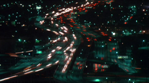
Associational form: Koyaanisqatsi.
Still, we did encounter objections.
Some readers worried that FA’s layout of logical categories took away some of the magic and mystery: Art dies under dissection. Some also protested that filmmakers didn’t use the categories and terms we invoked. These concerns have, I think, waned a bit over the years, but I’ll address them anyhow.
First, as to the need for categories. As a genre, the textbook in art theory has a very old ancestry. Aristotle’s Poetics, a survey of what we’d now call literary art, bristles with categories—drama vs. epic, comedy vs. tragedy, types of plots, etc. In the visual and musical arts, from the Middle Ages into the Renaissance, writers tried to systematically understand the principles of artists’ practice. Leon Battista Alberti’s treatise on painting tried to show that as an activity, painting had many “parts,” such as drawing, color, and light.
This classificatory urge continued through the centuries, and it continues today. Pick up a book on the visual arts today and you’ll see chapters on composition, color, texture, and the like. The same goes for music; an introductory book will survey rhythm, harmony, melody, musical forms, and so on. There’s no escaping some sort of categorizing if we want to understand any subject, and this goes as well for art traditions.
The categories governing centuries-old arts are largely taken for granted. But film is a newish medium, and film studies a still-young academic discipline, so there remains a lot of exploratory thinking to be done. In the late 1970s, Film Art undertook some of that exploration.
A lot of thinking about film employs categories that are very abstract and general (say, “realism” versus “non-realism”). Our frame of reference tries to be more concrete, more fitted to the particularity of what films actually look and sound like. Whenever we could, we incorporated filmmakers’ explicit concepts into our analyses. FA, for instance, was the first appreciation textbook to introduce the principles of continuity editing that were craft routines among directors and cinematographers.
At other times, we tried to synthesize ideas that were circulating in the filmmaking community. For example, for several decades filmmakers and critics have been saying that editing is getting faster, close-ups are getting more prominent, and camera movements are becoming more salient, even aggressive. From studying hundreds of films, we came to the conclusion that these trends are part of a new approach to film style, and we dubbed that “intensified continuity.” That term aims to capture the idea that for the most part these techniques are in accord with traditional continuity editing, but they sharpen and heighten its effect.
Occasionally we tried to clarify concepts. Most notoriously, we borrowed from French film theory the distinction between “diegetic” and “nondiegetic” sound because all the other terms (“source music,” “narrative music,” etc.) seemed to us ambiguous or inexact. As with most categories, individual films can play with or override this distinction, but it’s a plausible point of departure because traditionally the distinction is respected.
Contrary to some objections, then, we often worked with ideas used by practicing filmmakers. Where traditional terminology seemed inadequate to those ideas, we created our own. And some effects we may notice in movies may have no currently accepted names. In some cases, as in the graphic match, the phenomenon may not even have been identified. We haven’t tried to conjure up fancy labels; we’ve just tried to point to the ways some films work. Anyhow, the term doesn’t matter much, but the concept does.
So one way to think about the categories of form and style in FA is to see them as bringing out principles underlying filmmakers’ practical decisions. A director may choose to do something on the basis of intuition, but we can backtrack and reconstruct the choice situation she faced. If we want to survey the possibilities of the medium, one way to do it is to build categories that show the expressive options available, even if filmmakers don’t sit down and brood on each one.
Thinking like a filmmaker
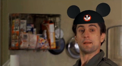
Walt Disney’s Taxi Driver (Bryan Boyce).
Categories are inevitable, and they allow us to consider creative choices systematically. Making this second point explicit is the most important overall revision in the new version of Film Art.
Previous editions took the perspective of the film viewer. This is reasonable: Teachers want to enhance their students’ skills in noticing and appreciating things in the movies. But from the start FA also indicated that the things we discussed also mattered to filmmakers. As the years went by, we incorporated more comments and ideas from screenwriters, cinematographers, sound designers, directors, and other artisans—often as marginal quotes that, we hoped, would reinforce or counter something in the main text.
Now, though, we’ve shifted the perspective more strongly toward the filmmaker—or rather, toward getting the viewer to think like a filmmaker.
Until recently, most of our readers hadn’t tried their hand at making movies. But with the rise of digital media, a great many young people have begun making their own films. Some of these are variants of home movies, records of concerts or parties or a night out. But many of these DIY films are more thoroughly worked over. They’re planned, shot, and cut with considerable care. Posted on YouTube or Vimeo, they exist as creative efforts in cinema no less than the films that get released to theatres or TV. If you doubt it, look at lipdubs, or meticulous mashups like Bryan Boyce’s.
So, we thought, many students are now able to consider film art as practicing filmmakers. For one thing, that means they’re more aware of the techniques we explain. (Probably nothing in Film Art is as tough as mastering Final Cut Pro.) Moreover, the very act of making films has made students sensitive to alternative ways of doing anything. Accordingly, this edition emphasizes that the resources of the film medium that we survey constitute potential creative choices which yield different effects.
Take an example. We can explain the idea of restricted versus unrestricted narration abstractly. Restricted narration ties you to a limited range of knowledge about the story action; unrestricted narration expands that range, often presenting action that no single character could know about. Filmmakers intuitively make choices along this spectrum even if they don’t use the terminology. Then again, sometimes they do. A while back we quoted the director of Cloverfield:
The point of view was so restricted, it felt really fresh. It was one of the things that attracted me [to this project]. You are with this group of people and then this event happens and they do their best to understand it and survive it, and that’s all they know.
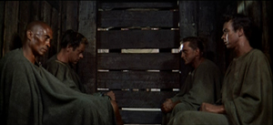
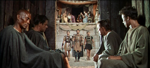
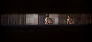
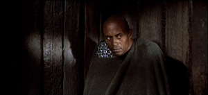
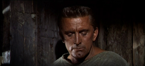
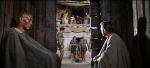
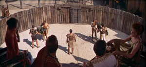
In Stanley Kubrick’s Spartacus, the hero and three other captives are chosen to fight in the arena. They sit sealed in the holding pen while we hear Crassus and his elite colleagues chatting pleasantly about their trivial affairs.
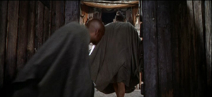
When the combat starts, we’re still confined to the shed. Crixus and Galeno are summoned out, and the door slides shut, leaving Spartacus and Draba alone.
The director has already made several important choices, notably contrasting the carefree chatter of the rulers with the grim prospects of the gladiators (the latter underscored by relentless music). But now there’s a big fork in the road: To show the first combat, or not?
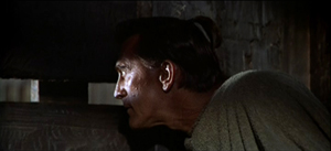
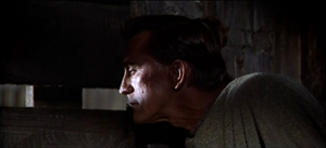
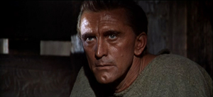
Kubrick chooses not to. We hear the call, “Those who are about to die salute you!” We hear swords clashing, and Spartacus peers outside through the slats. We see only what he sees.
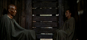
Draba studies Spartacus, who closes his eyes to shut out the spectacle outside.
The two men share a look, but Spartacus turns his gaze away, as if unwilling to confront the cost of killing this man who has done him no harm.
This stretch of the scene is too detailed and varied for me to replay in full, but it’s all confined to the two men in the shed—their reactions to what they hear and what Spartacus sees, and the development of a mix of wary appraisal and desperation. No words are spoken.
The fight outside concludes, and at the climactic moment Kubrick cuts to a new angle that puts Draba and Spartacus in the same frame, realizing that their time has come. The door slides open again, and the men step out.
The exchange of glances has been just ambiguous enough to make us wonder whether the two will really try to kill one another. Restricting us to the holding pen gives us a moment to watch them pondering their fates and enhances the suspense about the outcome of their fight.
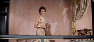
Every instant presents the director with a choice that can shape the viewer’s experience. When the men go out, Kubrick must decide on what to show us next. Most daringly, he could keep us in the shed and let us glimpse the fight from there. But that would be a very unusual option in American commercial cinema. Instead, the next shots expand our range of knowledge by shifting us to a different character’s reaction. Before showing us the arena, we get a shot of Virinia, the slave just bought by Crassus. As a result, she is marked as important before we get a general shot of the arena.
Eventally, a master shot ties together all the characters before we move to the next phase of the scene.
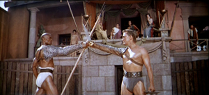
As Darba and Spartacus start their fight, you can argue that the effect of it is even stronger because we haven’t seen the earlier match. Restricted presentation of the first combat, seen only through Spartacus’s eyes, throws the emphasis on this one.
By shifting our attention to filmmakers’ areas of choice, we haven’t really abandoned thinking from the standpoint of the spectator. The two views complement each other. In effect, we’re reverse-engineering: thinking like a filmmaker sharpens our sense of how the spectator’s experience can be shaped. From either perspective, we need concepts, categories, and terminology.
To futz or not to futz?
Undercover Man (1949).
Once we notice the concrete results of creative choices by director, cinematographer, editor, and others, we’re inclined to compare how filmmakers have pursued different options, and how these decisions yield different effects. So you might contrast Kubrick’s treatment of the combat with the free-for-all in Ridley Scott’s Gladiator. There the period of waiting is short, and all the emphasis is put on the bloody combat.
Film Art uses the comparative method often, again to illustrate the range of choice available to the filmmaker. Let’s take some instances that have implications for both narration and sound. Telephone conversations are a staple of filmic storytelling. In such a scene, you as a director face a decision tree. Whatever you choose leads to other choices.
Should you show both characters in the conversation, or only one? A passage from The Big Clock presents both options, one after the other.
This illustration suggests that if the character on the other line plays a significant role in the story, you may want to show him or her. Max isn’t as important as Stroud’s wife and son. Once you’ve decided to cut back and forth, you’ll still have to decide when to cut—at what points to show us characters’ reactions. You might want to replay this clip to see how the cutting pattern highlights certain responses.
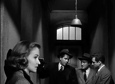
Alternatively, you can stick with one character and conceal the other party, even if that character is important. Here’s an example from Joseph H. Lewis’s Undercover Man.
Unlike Max in the Big Clock scene, this caller is an important character, a prospective snitch. By not showing him on the other end of the line, Lewis concentrates our attention on the federal agents and builds a little suspense. He goes even further: By not cutting in to Warren as he talks, the direction emphasizes the reactions of Judy, Warren’s wife. Her response is highlighted when she turns slightly into profile, registering her realization that her husband has to leave her on a dangerous mission sooner than she expected.
Sticking with one character triggers another choice about telephone talk: Do you let us hear the other party or not? So far, all our examples have suppressed the voice of the person on the other end of the line. But of course you could let the viewer hear that.
There’s a new problem coming up, though. You need to make it clear that the voice is coming through the receiver, not from someone outside the frame. So a convention has arisen: Words coming through the phone line are distorted, in a process called “futzing.” Here’s an example of subdued futzing from I Walk Alone.
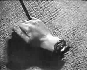
And here’s a case from The Blue Dahlia illustrating the difference between the two sorts of sound even more sharply. Here it’s especially important to let the audience know that what’s being heard is a recording.
This isn’t to say that every choice is absolutely fixed. You can experiment. This is what King Vidor did in H. M. Pulham, Esq. Pulham gets a call, and though we stay with him, the voice isn’t futzed; the effect is a bit unnerving.
Vidor explains:
We were breaking with tradition. When the sound men took over, it became the cliché to put all telephone voices through some sort of filtering device. This made it sound distorted and weird. It occurred to me, why should the audience strain to listen? The person with the receiver up there on the screen doesn’t strain to hear the voice. There isn’t any kind of mechanical distortion. I thought we should just direct it to sound the way it sounded to the person.
The film’s plot concerns Pulham’s regrets about the missed opportunities of his youth. When he gets calls from old friends, their voices seem unusually immediate, more vital and “present” for him than the people in the life he’s leading now.
These creative options show how even small stylistic decisions affect narration and the viewer’s response. Presenting both characters on the phone creates more unrestricted narration, and this allows us to gauge reactions to the action. By showing only one character, you concentrate on that person and the people around them.
If you suppress the words spoken on the other end of the line, you maintain some uncertainty about what’s happening, and you don’t share with us what the listener knows. In contrast, if you let us hear what the listener hears, you tie us to their range of knowledge and perhaps create a bond with them. And as Vidor suggests, you can try to create a deeper subjectivity by letting us hear the speaker as the listener does.
Although Vidor’s experiment wasn’t taken up, directors have continued to try different ways of rendering phone conversations. It would be fun to compare Larry Cohen’s two “phone” scripts, Cellular and Phone Booth, in these terms—not least because of the eerie sound design applied to the mysterious caller harassing the hero of Phone Booth.
Choice and change in history
Un Chien andalou (1928); Blue Velvet (1986).
In such ways, the categories we survey can be thought of as a range of possible options facing filmmakers. But all of them aren’t available to every filmmaker. As every filmmaker knows, you choose within constraints, and some of those constraints are the result of history.
As in earlier editions, Film Art concludes with a chapter surveying artistic trends across film history. But now we’ve tried to integrate the idea of thinking like a filmmaker into that section, emphasizing the interplay of choice and constraint. Most obviously, budgets limit choices. Other constraints might be technological; not all filmmakers have been able to film in color, or to use advanced special effects. Some constraints involve matters of fashion: some acting styles and staging methods aren’t widely acceptable today. In our final chapter we show how certain traditions and schools of filmmaking confronted the constraints of their period and place. Sometimes filmmakers worked within those constraints, and sometimes they overcame them by trying something different.
At the same time, we break with our previous editions by weaving recent films into the history chapter. We try to show that the expressive choices made by filmmakers long ago have returned in our time. The earliest short films, based on novelty and surprise events, have successors in YouTube videos. Contemporary filmmakers draw on techniques favored by German Expressionism and French Impressionism. (Recent examples on the blog are here and here.) Current Iranian films owe a good deal to Italian Neorealism, while the Dogme filmmakers tried to revive some of the insolent force of the French New Wave. It isn’t just a matter of influence, either. Contemporary filmmakers face problems of storytelling and style that others have faced before. The choices our filmmakers make often recall those made in the past.
We’re very proud of this edition of Film Art. We hope that the changes will whet the interests of teachers, students, film lovers, and that generic “curious general reader”—who, we persist in believing, isn’t mythical.
Just to be clear: Our Spartacus example doesn’t appear in the book. Our layout of choices about handling phone conversations does, but with different examples. Thanks to Kevin Lee and Jim Emerson for advice on video embedding.
King Vidor’s remarks about H. M. Pulham, Esq. are taken from Nancy Dowd and David Shepard, King Vidor: A Directors Guild of America Oral History (Scarecrow, 1988), 188. A library of futzed sound clips is here. For a more detailed study of how phone conversations may be presented through both sound and image, see Michel Chion’s Film, A Sound Art, trans. Claudia Gorbman (New York: Columbia University Press, 2009), 365-371. (An outline of his typology is here, in French.) Chion’s research is a good example of showing how a systematic set of principles can underlie the practical decisions facing filmmakers.
Alert reader Chris Freitag has steered me to a recent and fine lipdub here. It exemplifies how competition within a genre can spur innovation. More specifically, how to create a new sort of lipdub? Well, how about proposing marriage?
Instructors interested in obtaining a desk copy of Film Art: An Introduction can visit this website.
Dimensions of Dialogue (1982).
P.S. 27 June: Some correspondence I’ve just gotten reminds me of two things I neglected to mention in the entry. First, this edition of Film Art contains a great deal more material on digital cinema, from production and postproduction through to distribution and exhibition. We’ve woven digital technology into sections on various techniques, particularly cinematography, and we’ve added material on 3D cinema.
Second, our decision to replace our sections on A Movie and Fuji doesn’t mean that those discussions will vanish forever. For some years we’ve been putting up older Film Art material as pdf files on this wing of the site. Later this summer we’ll be doing the same with the Movie and Fuji sections of the book. Instructors who want their students to read that material are welcome to send them there, where the essays can be downloaded.


