Archive for the 'FILM ART (the book)' Category
FILM ART: AN INTRODUCTION reaches a milestone, with help from the Criterion Collection
[UPDATE, March 8, 2016: Film Art has now appeared in its eleventh edition, which, among other things, includes additional online Connect Film examples based on the partnership with the Criterion Collection mentioned below. For more information, see here.]
Somehow round numbers seem significant. This summer, Film Art: An Introduction is due to be published in its tenth edition.
We first set out to write the book in 1977, and it appeared in 1979. We’ve been gratified that it has retained an audience of teachers, students, and general readers over the ensuing decades. During that period, we’ve revised it to keep up with changes in filmmaking, in film studies, and in our own sense of what makes cinema a distinct artistic medium. At the outset we wanted to represent many eras of film history, a wide range of international films, and such important categories as documentary, experimental, and animated films. Our revisions over the years have tried to keep these goals in mind. At the same time, we realize that one way to engage students with ideas about film is to pay some attention to films they know, to enable them to look and listen to familiar movies in new ways.
We think we’ve stayed loyal to these purposes across nine editions. But with the fateful number ten we think we’ve stepped up to a new level. We’ve made many changes to the book that we find exciting; more about these below. The most dramatic development, however, comes through our new online partnership with The Criterion Collection.
Most teachers are familiar with Criterion and its high-end series of DVD and Blu-ray releases of classic and important contemporary films. In 1984, Criterion pioneered the genre of supplements, working at the time with laserdiscs. The team are 100% cinephiles, and they continue to set the standard for a rich array of bonus materials, all the making-of films, interviews, and documents that are of such interest to fans, scholars, students, and aspiring filmmakers. Now, with Criterion’s kind cooperation, we have produced a series of online examples tied to Film Art that will use scenes from several of their classics.
Film Art was the first introductory film textbook to use frame enlargements rather than publicity photographs as illustrations. Other textbooks have since imitated this approach, since it’s a vital tool when teaching students to analyze films. Nevertheless, even whole pages full of frames can’t fully convey the effects of techniques such as camera movement, graphic matches, staging in depth, and sound. The next logical step would be to use examples with scenes from movies, adding graphics and voiceover commentaries to clarify the points being made.
Problems of clearing rights and questions concerning the limits of fair use have made it difficult for textbook authors to supply adequate, high-quality moving-image examples on DVDs or online. The Criterion Collection has allowed us to make this big next step. We’re extremely proud of this new partnership, and we’re grateful to Peter Becker, Kim Hendrikson, Tyson Kubota, Giles Sherwood, and the rest of the Criterion Collection team for their generosity and help. Peter has written a blog about the new arrangement.
Online examples using clips from Criterion Collection films
The result is an hour-long set of twenty examples called Connect Film. Seventeen of these center around excerpts from film classics from the 1930s to the 1980s. David and I wrote the scripts and recorded the commentary tracks. The production, direction, editing, and special graphics were done professionally by Erik Gunneson, a filmmaker and Faculty Associate here at the University of Wisconsin-Madison.The Criterion scenes are presented as moving images rather than still frames; it’s as if the sort of examples we use in Film Art have sprung to life. Erik has also produced three original demonstration videos laying out basics of lighting, camera lens length and movement, and continuity editing.
So why not check out one of our examples? Criterion has posted “”Elliptical Editing in Vagabond (1985),” in its entirety, on its YouTube page. Go here or watch it at the bottom of this post.
Chapter 4 Mise-en-scene
Film Lighting Demonstration This video clearly contrasts the results of side-, back-, and other types of light, as well as the principles of the three-point lighting system.
Light sources in Ashes and Diamonds (1958) The three sources of the light in the opening of the famous church scene are described and also indicated by colored arrows.
Available Lighting in Breathless (1960) This example starts with an extract from an interview with cinematographer Raoul Coutard, produced by the Criterion Collection. Coutard describes shooting without supplemental light in the lengthy bedroom scene, followed by an illustrative clip.
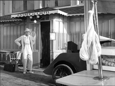
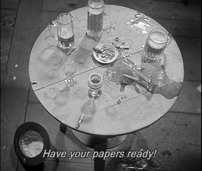
Staging in Depth in M. Hulot’s Holiday (1953; above) A scene of M. Hulot nervously watching a descending lump of saltwater taffy. The clip is run, then repeated with commentary discussing the comic possibilities of deep-space staging.
Color Motifs in The Spirit of the Beehive (1973) Yellow is associated with the bees in this film, but also with the malaise of Spain in the wake of its Civil War. The scene in which the color comes to be associated with the bees is shown, with still frames and commentary discussing other shots where yellow is prominent.
Chapter 5 Cinematography
Lens Length and Camera Movement Demonstration video contrasting the effects of long, medium, and short lenses. Erik also illustrates different types of camera movement.
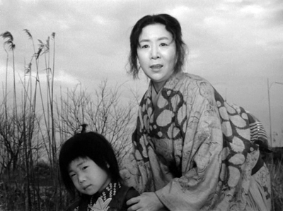
Tracking Shots Structure a Scene in Ugetsu (1953; above) A wife and son bid farewell to a departing boat. Using a split-screen technique, we lay out the shots and show how camera movements are used to add to the ominous, poignant effect of the scene.
Tracking Shot to Reveal in The 400 Blows (1959) While the tracking shots in the Ugetsu example follow the characters’ movements, a scene from The 400 Blows shows how the camera can create other effects by moving on its own.
Style Creates Parallelism in Day of Wrath (1943) Similar camera movements prompt us to compare two scenes.
Staging and Camera Movement in a Long Take from The Rules of the Game (1939) In a scene that is rarely examined in this much-analyzed film, we trace out how a busy scene in a hallway, as guests head for their bedrooms, lays out the setting and highlights minor characters.
Chapter 6 Editing
Editing with Graphic Matches in Seven Samurai (1954) We use this example in discussing graphic matches in Film Art, but it’s hard to get a sense of the patterning from stills, So this clip shows the scene in its context and then replays the series of matches, freezing and laying them out across the screen.
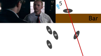
Shifting the Axis of Action in Shaun of the Dead (2004; above) Erik uses stills and overhead diagrams to show how the axis of action can be shifted when characters turn their heads and when new characters join the conversation.
Crossing the Axis of Action in Early Summer (1951) A friendly argument between Noriko and two of her friends employs cuts that consistently move back and forth across the axis of action. An overhead diagram marks the camera positions shot by shot.
Crosscutting in M (1930) Through a first run-through and then a replay with freeze-frames, we study how editing compares gangsters meeting and police meeting.
Elliptical Editing in Vagabond (1985) The enigmatic heroine lives her nomadic life, moving from place to place and meeting a variety of people, rich and poor. In a scene depicting her hitchhiking from near a convent to arrive in a barn, we show how the editing propels our interest but leaves out items of narrative information that increases the mystery of her character.
Jump Cuts in Breathless (1960) Some of the most familiar jump cuts from Breathless are illustrated in Film Art. This example uses a later scene in a cab which uses an unusually large number of such cuts. How many? Let’s count and see.
Chapter 7 Sound
Sound Mixing in Seven Samurai (1954) Our text describes the rich sound mix of the final battle of Seven Samurai, with rain, horses’ hoof-beats, men’s shouts, and other sound effects–all without music. Description, though, goes only so far. Now we can let readers listen for themselves.
Contrasting Rhythms of Sound and Image in M. Hulot’s Holiday (1953) Jacques Tati manages to create a double joke when musical tempo clashes with figure movement.
Offscreen Sound in M (1931; above) Even at the dawn of sound, Fritz Lang found inventive ways to avoid static dialogue scenes. Police raid a basement tavern, and even when there’s little movement onscreen we hear bustling activity outside the frame. Some shots, like this one, recall camera angles from earlier scenes.
Chapter 10 Animation
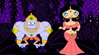
What Comes Out Must Go in: 2D Computer Animation Most of us are curious about computer animation, not least because it offers tools that amateurs and would-be filmmakers can learn to use. We show how independent filmmakers can get high-quality results in My Dog Tulip (Paul and Sandra Fierlinger, 2010) and Sita Sings the Blues (Nina Paley, 2008; above).
Instructors can stream any of these items in their classes, or students can watch them on their own.
Decisions, decisions
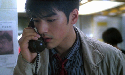
Chungking Express: To hear the voice on the line, or not?
Central as the Criterion extracts are, we’ve made other changes. We’ve done a top-to-bottom rewrite of the text, trying to make it more conversational, more like our blogging. We’ve updated our account of digital filmmaking and we’ve incorporated new information on digital distribution and exhibition–the sort of matters you can find in more detail in David’s Pandora series (which started here).
We’ve tried to make film art tangible for students by asking them to imagine alternative approaches to storytelling and technique. In keeping with this angle of approach, we’ve highlighted decision-making processes: the concrete choices faced by directors, cinematographers, editors, and other creative workers. One of the salient features of Film Art since the beginning has been its effort to blend the point of view of the critic or analyst with the point of view of the filmmaker. Here’s a passage from the first chapter.
Films are designed to create experiences for viewers. To gain an understanding of film as an art, we should ask why a film is designed the way it is. When a scene frightens or excites us, when an ending makes us laugh or cry, we can ask how the filmmakers have achieved those effects.
It helps to imagine that we’re filmmakers too. Throughout this book, we’ll be asking you to put yourself in the filmmaker’s shoes. This shouldn’t be a great stretch. You’ve taken still photos with a camera or a mobile phone. Very likely you’ve made some videos, perhaps just to record a moment in your life—a party, a wedding, your cat creeping into a paper bag. And central to filmmaking is the act of choice. You may not have realized it at the moment, but every time you framed a shot, shifted your position, told people not to blink, or tried to keep up with a dog chasing a Frisbee, you were making choices.
If you take the next step and make a more ambitious, more controlled film, you’re doing the same thing. You might compile clips into a YouTube video, or document your friend’s musical performance. Again, at every stage you make design decisions, based on how you think this image or that sound will affect your viewers’ experience. What if you start your music video with a black screen that gradually brightens as the music fades in? That will have a different effect than starting it with a sudden cut to a bright screen and a blast of music.
At each instant, the filmmaker can’t avoid making creative decisions about how viewers will respond. Every moviemaker is also a movie viewer, and the choices are considered from the standpoint of the end user. Filmmakers constantly ask themselves: If I do this, as opposed to that, how will viewers react?
Even if the reader never makes a movie, we think that getting comfortable with this framework can sensitize us to the power of cinema as an art form.
Of course, we also want to understand the finished film. We need to look at how the choices coalesce into patterns of meaning and effect. This is the holistic bent that the book has always had: we try to understand the choices in the context of the whole film and its purposes. To a large extent film form and film style are the terms we as analysts apply to the patterns of choices that shape our experience.
That emphasis on pattern is something that carries through all of our Film Art editions. It’s valuable to notice techniques or story twists in isolation, but we gain as well from seeing them as parts of larger patterns of organization. Such patterns and processes are highlighted in the case-study analyses in each chapter, as well as in the collection of analyses in Chapter 11. Likewise, Chapter 12 tries to trace some major strategies of form and style across history. The variety of films we consider allows us to spotlight some traditions that are less widely known than the Hollywood one–from France, Italy, Germany, Japan, Hong Kong, and other territories. Cinema is a global art, and we try to recognize that.
Over forty years we’ve learned a great deal about cinema from films and the people who make them. For this reason it’s been stirring to meet many filmmakers from North America, Europe, Asia, and the Middle East who tell us that they have learned something from Film Art. We offer the new edition in that spirit of common learning: to better understand a medium that we all love.
Is there a blog in this class? 2011
Kristin here:
The 2011/12 school year is staring us in the face, and that means it’s time for another summary of which recent blog entries might be useful for teachers who assign Film Art: An Introduction in their classes. We’ve amassed 443 posts since we launched Observations on Film Art in late September, 2006, so browsing through them might seem a daunting prospect. You can also consult previous entries in this annual series for 2007, 2008, 2009, and 2010.
Chapter by chapter
Chapter 3 Narrative as a Formal System
Launching from an anecdote about a three-year-old watching Snow White and the Seven Dwarfs, we speculate about the conventions of narrative closure and how we learn them in “Molly wanted more.”
 In discussing narration, we describe one of its characteristics as the “range of knowledge” the spectator is given. Often we’re limited largely to finding out what one character knows, as with Philip Marlowe in The Big Sleep. We examine this idea in more detail in “Alignment, allegiance, and murder.”
Chapter 3 has a “Closer Look” box that talks about the recent vogue for narratives that play games with time and causality, including the forking-path story. We examine another example in “Forking tracks: Source Code.”
We also discuss parallel plots, which in some cases involve protagonists who never meet. “Julie, Julia, & the house that talked” offers two examples, Julie & Julia and Enchantment.
Our main example in this chapter is Citizen Kane, which helped popularize flashback-based narratives in the 1940s. Some less familiar but equally baroque examples feature in “Chinese boxes, Russian dolls, and Hollywood movies.”
And for more on flashbacks in movies new and old, see “Puppetry and ventriloquism.”
Chapter 4 The Shot: Mise-en-Scene
Louis Feuillade’s silent French serials of the mid-1910s are masterpieces of subtle staging in depth. David analyses the wonderful serial Fantômas in “How to watch Fantômas and why.”
Students are especially keen to talk about acting, but it’s one of the hardest aspects of film to pin down and discuss. The chapter deals with it alongside the three other aspects of mise-en-scene, make-up/costumes, lighting, and setting. For those who want to teach it in more detail, we provide a discussion of the acting in The Social Network, concentrating (as filmmakers tend to) on the eyes and eyebrows of the two main actors. See “The Social Network: Faces behind Facebook.”
Chapter 5 The Shot: Cinematography
We discuss the most common screen ratios (the height of an image compared to its width) in this chapter. Some films have been released in two different ratios, widescreen and Academy. We demonstrate how important  small differences in framing can be in Fritz Lang’s films in “Ratio-cination.” By contrast, “A Matter of ‘Scope” considers how Japanese and Chinese filmmakers use the 2.35 ratio.
The use of 3D has expanded considerably since we revised Film Art for its current edition, the ninth. Whether the technique will continue to expand or will simply be used for blockbusters and inexpensive genre films is still a subject for debate. We have followed the debates and the box-office fortunes of 3D in three entries this year: “Has 3D already failed? The sequel, part 1: RealDlighted,” “Has 3D already failed? The sequel, part 2: RealDsgusted,” and “Do not forget to return your 3D glasses.”
Chapter 6 The Relation of Shot to Shot: Editing
After noticing some incorrect definitions of “graphic match” appearing in print and on the internet (including Wikipedia), we decided to clarify the matter. We devised the term “graphic match” back in the mid-1970s, so we try to explain it in “Graphic content ahead.”
Chapter 8 Style as a Formal System
In “Bond vs. Chan: Jackie shows how it’s done,” we talk about how staging, framing, and editing can be used to make a clear, understandable fight scene (Jackie Chan) or a clumsy one where half the action isn’t there on the screen (Tomorrow Never Dies).
For more on clarity in staging, framing, and editing, see our comparison of Shanghai and Tampopo, “Direction: come in and sit down.”
Wouldn’t you know it? Our most popular entry ever was written by a guest blogger! Tim Smith, who researches how our eyes and minds perceive films, contributed “Watching you watching There Will Be Blood.” He was following up on an earlier entry by David, “Hands and faces across the table,” which analyzed a lengthy take in There Will Be Blood, suggesting how the staging and gestures direct our attention from one point on the screen to another. Tim followed up by using eye-tracking devices to show precisely where eleven viewers were looking from instant to instant. The entry included a video clip of the scene with the eye movements shown with moving circles.
This entry was posted in February and has racked up hundreds of thousands of views, on our site and others. About a hundred people still click on our entry every day. It even helped inspire a story in the New York Times by Manohla Dargis.
 Tim’s post was less directly a follow-up to one we wrote on how eyes move across paintings: “The eye’s mind.”
The rediscovery of the great early silent French director Albert Capellani doesn’t exactly fit into Film Art, but we think everyone should be aware of this important figure. “Capellani trionfante” outlines the basics of his distinctive style. Greater than Griffith? For the pre-World War I period, at least, we think he may be.
Mainstream movies are more fast-paced than ever these days. We celebrate the merits of films with a slower rhythm in “Good and good for you.” Perhaps adventurous students will be intrigued.
Chapter 10 Documentary, Experimental, and Animated Films
Documentarist Errol Morris is an alumnus of the University of Wisconsin-Madison, and this past year he visited for a few days, bringing his new film Tabloid with him. We profile him in “Errol Morris, boy detective.” This entry could be assigned along with the analysis of The Thin Blue Line in Chapter 11.
We were blogging from New York in February, when Christian Marclay’s The Clock was creating a sensation at a downtown gallery. It’s a 24-hour compilation video made up of shots from a huge variety of existing films, all showing clocks that register the time at which the viewer is seeing those shots. We discuss it in “Time piece.”
Animation sometimes turns up in unexpected places. The makers of Harry Potter and the Deathly Hallows Part 1 decided to render the story Hermione Granger reads from The Tales of Beadle the Bard as a short animated film. We discuss this imaginative segment and its director in “Three minutes of ‘Three Brothers.’”
Chapter 12 Film Art and Film History
Film history is a living presence on our blog: We talk about cinema from the silent era onward. So great is our commitment to early film that we don’t post a list of the ten best films of the year. Instead we decided to promote old films by discussing the ten best films of exactly ninety years ago. This time it was “The ten best films of … 1920.” If you teach a unit on film history, this entry and its predecessors might give you some ideas about what to show in class. The most recent one contains links to all the earlier entries. Some titles will be familiar, some less so, and some, alas, are still awaiting release on DVD.
One section of Chapter 12 deals with the development of Hollywood continuity style in the 1910s. We go into more detail concerning editing and staging during this period in “Looking different today?”
Anyone interested in going beyond Chapter 12’s section on Hong Kong film history will find plenty more information in this year’s entries. To celebrate the second edition of David’s Planet Hong Kong: Popular Cinema and the Art of Entertainment, available here, there is a seven-day blogathon about stars, stories, and styles in Hong Kong cinema. That week starts here, with a list of 25 essential movies. There’s also David’s annual report from the Hong Kong International Film Festival, launching, appropriately enough, with an entry called “Bullets from the East.”
The last section of the chapter deals with modern Hollywood cinema. Our review of Sidney Lumet’s career deals with changes in mainstream moviemaking that occurred from the 1950s on, in “Endurance: Survival lessons from Lumet.”
More generally
About once a year we post an entry in our series, “Beyond praise: DVD supplements that really tell you something.” These offer suggestions for supplements that offer substantive information on filmmaking. Our fourth “Beyond praise” post, with links to the first three, is here.
We attend a small number of film festivals regularly and blog about the movies we see there. We’re not linking to every one of our festival reports, but they do contain brief commentaries on recent films and restorations of older ones. Teachers who happen to be screening one of these films might find what we say useful. There are links for festivals in general and specific festivals in the Categories list in the right margin, or try typing specific titles into the search box. We also have added a lot of new categories, including individual filmmakers and festivals.
When we started our blog, we didn’t expect that it would provide the contents for a book. Still, when the University of Chicago Press suggested that we propose a collection bringing together some of our popular entries, we thought it worth a try. The result was published this year as Minding Movies: Observations on the Art, Craft, and Business of Filmmaking. Naturally, in a case of circular synergy, we blogged about it in “A new book, more or less accidental.”
Real products (I think).
Graphic content ahead
Kristin here:
Recently I received the June issue of Empire magazine. After the shock of realizing that, Ack! It really is almost June, I turned to the letters to the editor. I received an even worse shock when I read this one:
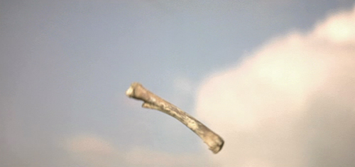
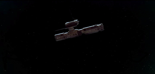
I recently discussed 2001: A Space Odyssey with my Film Studies teacher (I’m an A-level student), and mentioned (what the back of the DVD case says): “One of the most mind-blowing jump cuts ever conceived.” He told me the bone to satellite scene is actually a match cut. I then read issue 262 of Empire, and was very happy to see a Stanley Kubrick special. I noticed you also called it a “stunning jump cut”. After being told what a jump cut and what a match cut is and seeing a few examples (the jump cut at the start of Don’t Look Now, and then the match cut in 2001: A Space Odyssey), I am now confused as to why the DVD and Empire would call it a jump cut when it is a match cut.
Robby Burke, via email
It is a match cut. The offending writer has been put into a small room with only Eisenstein films for company. The moral of this story is always listen to your teachers, kids. And good luck to Owen Robinson on your Kubrick Film Studies unit. This is turning into hospital radio.
No wonder Mr. Burke is confused. His teacher and Empire both gave him answers that I would consider wrong, or at best imprecise to the point of vagueness. This rather surprised me. I enjoy reading Empire, which has somehow managed to keep itself fat and glossy when magazines like Entertainment Weekly have shrunk to the size of brochures. It even has occasional useful articles, like its retrospective section on Back to the Future in the April, 2010 issue. (As far as I can tell, this section has never made its way to the Empire website.)
The term “match cut” is, out of context, virtually meaningless. There are different kinds of match cuts, and not specifying which type one is referring to will leave Mr. Burke and the rest of us clueless as to what the teacher and the unnamed staff member for Empire mean.
Thinking I was missing something about the term “match cut,” I looked it up on Wikipedia and discovered that the teacher and the Empire staff member might have gotten their misinformation from the entry on that phrase. Its definition of a “match cut” is:
A match cut, also called a graphic match, is a cut in film editing between either two different objects, two different spaces, or two different compositions in which an object in the two shots graphically match, often helping to establish a strong continuity of action and linking the two shots metaphorically.
While the Empire use of “match cut” was only vague, this definition is simply inaccurate. The author goes on to say:
Match cuts form the basis for continuity editing, such as the ubiquitous use of match on action. Continuity editing smoothes over the inherent discontinuity of shot changes to establish a logical coherence between shots. Even within continuity editing, though, the match cut is a contrast both with cross-cutting between actions in two different locations that are occurring simultaneously, and with parallel editing, which draws parallels or contrasts between two different time-space locations.
I’ll agree that continuity editing is designed to smooth over the potentially disruptive quality of cuts. Matching anything within a scene is definitely different from cutting from an action in one place to a different action in a different place. But graphic matches are neither synonymous with “match cuts” nor the basis for continuity editing.
I also discovered that the “Further Reading” list at the bottom included two items, one of which was Film Art: An Introduction. One of those good news/bad news situations. The good news is, if you read the book, you will find out what graphic matches, and matches in general, really are. The bad news is, if you don’t, you might blame us for the contents of the Wikipedia entry.
A little detour into history
Most people don’t realize this, but David and I invented the term “graphic match.” As we recall, this happened in 1975. David was teaching a course that involved screening Yasujiro Ozu’s second color film, Ohayu (1959), a wonderful comedy about television, farting, and small talk. We had never seen the film before and were watching a 16mm print of it.
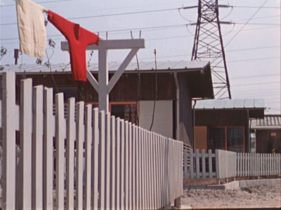
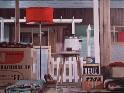
When the two shots below passed before our eyes, we both gasped and lunged for the projector. We ran the film back and watched the cut again. There was no doubt that Ozu had deliberately placed a bright red sweater in the upper left quadrant of the frame in one shot and a bright red lamp in the same basic position in the next shot. We didn’t know what to call this technique, so we dubbed it a “graphic match.” Two years later, when we started writing Film Art: An Introduction, we included the term as one technique of film editing and used Ozu’s match on red as one example. By now “graphic match” has been picked up to the point where we occasionally see it used in print.
If people, however, are tossing that term and “match cut” around so inaccurately–and even equating the two–then some definitions and examples seem in order.
Matcharama
“Match” as applied to editing simply means that some element is carried over from one shot to the next. That doesn’t necessarily mean that this element creates a sense of continuity.
In general, “continuity” means that a coherent space and time are continuing over the cut, so that the spectator’s understanding of a story isn’t disturbed by a sense that bits of time have been left out or that characters have changed positions at the cut. Most people watching a mainstream narrative film probably aren’t even aware of the editing, especially in conventional conversation scenes.
More specifically, “continuity” means a set of guidelines or loose “rules” that American filmmakers devised, mostly during the 1910s, to allow them to help create that clarity of narrative action in time and space. Within a scene, the most basic of these is the 180-degree rule or “axis of action,” the invisible line that runs through the scene perpendicular to the camera. If the camera stays on one side of that line, characters will stay in a consistent spatial relation to each other. Character A will be on the left in every shot, Character B on the right—unless one of them walks to a different part of the setting. In other words, the axis creates consistent screen direction.
The most basic kinds of matches are on appearance, position, action, and eyelines. Everyone knows that if a character is wearing a blue hat, showing her wearing a red one after the cut is a continuity error. Her appearance has not been matched. The same is true if she is resting her cheek on her hand in one shot, but has both hands flat on the table after the cut. If she is walking in one shot, she should not be running or standing still in the next. Even if the shots are made with a single camera and the actress repeats her actions, her position and movement should ideally be repeated so precisely that her action appears continuous. That’s a match on action, one of the most common continuity devices.
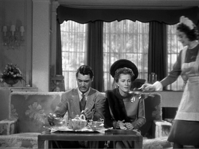
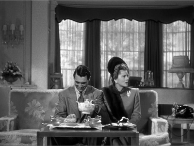
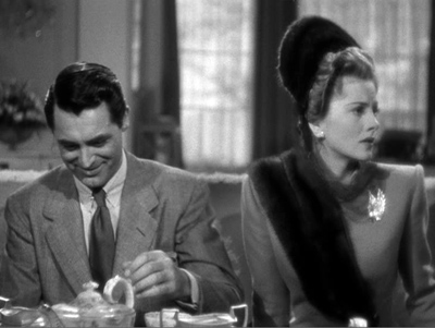
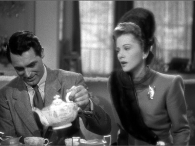
Smooth matches on action are difficult, especially if, as often happened in classic studio filmmaking, the two shots are made hours or even days apart. Even a supreme technician like Hitchcock can err. Here is a flagrantly mismatched passage from Suspicion. In the long shot, Johnnie (Cary Grant) reaches for the teapot with his left hand and starts to pour.
But then Hitchcock cuts in axially, the teapot is back where it was, and Johnnie once more reaches for it. By the time he’s pouring now, Lina has turned to watch him.
Editors traditionally like an overlap of 2-4 frames when they’re matching action on cuts, but this is a much longer overlap, something on the order of four seconds. Why we don’t usually notice such things is a source of considerable discussion in film circles.
The eyeline match is also very common. If a character looks at something offscreen, a cut shows us something in a different space, and we tend to assume that the character is looking at what we now see. Screen direction is important here, since if the character looks off right, when the next shot appears, we assume he is now offscreen left.
Not all continuity devices involve matches of these kinds. Crosscutting and flashbacks may move the action away from the space and even the time of a scene, but there are other cues that help us keep track of the ways in which these new spaces relate to the storyline.
None of this requires what we would consider a graphic match. Of course, if we see the same characters in the same setting from shot to shot, there will be an overall graphic consistency. They’re wearing the same costumes, and the background colors probably won’t shift greatly. But precisely because of that general consistency, we probably won’t notice the graphic qualities of the scene as being that important as elements of the editing. We’re busy following the story.
Graphic matches precise enough to be noticed as such tend to jolt us a little out of our smooth concentration on the story action. They are not the basic of continuity, as the Wikipedia definition claims. On the contrary, they often appear in films outside the continuity tradition. Abstract films often play on the graphic similarities (matches) or contrasts (mismatches) among shapes from shot to shot. Such abstract play is, in effect, their subject, and we pay attention to the pictorial flow as we would pay attention to story in a conventional narrative film.
When close graphic matches or jolting graphic contrasts appear in narrative films, they may or may not play a narrative role. The famous bone/spaceship cut in 2001 is a graphic match. It’s not a match on action, since two different objects in completely different times and places are shown. It’s not a jump cut for the same reasons.
Here the graphic match is not really very close. The sky is bright and blue behind the bone, while it is dark behind the spaceship. Similarly, the bone is light in color, while the spaceship is initially dark, though it does brighten slightly as it moves. The only graphic element matched is the general shape and motion of the two objects.
The function, I assume, is to jolt the audience with the dramatic transition across millions of years and from earth into space. Thus here the graphic match has a narrative function, though it does not create the smooth movement from one scene to another that classical films tend to have. It’s more like what is sometimes called a “shock cut,” one which startles the viewer. The cut to the screeching cockatoo in Citizen Kane is one of the most famous examples, though it primarily involves sound and a strong graphic contrast.
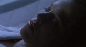
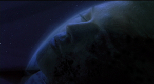
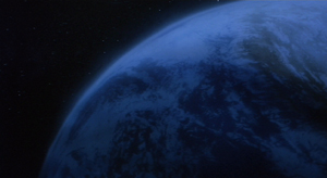
A transition somewhat similar to the one in 2001 occurs early in Aliens, an example which we use in recent editions of Film Art. A dissolve moves from a close-up of Ripley’s sleeping face to a view of part of the earth seen from space. Again there is a passage through time and space, though the interval is presumably only a few months. Here the graphic match is much closer than in the 2001 transition, with the colors as well as the shapes being kept fairly consistent. This graphic similarity and the dissolve that emphasizes it ease us from one scene to another rather than jolting and surprising us.
In the hands of an experimental filmmaker or of an unconventional director like Ozu, who avoids obeying Hollywood’s continuity guidelines, graphic matches don’t necessarily play a narrative role. They are included as an extra layer of engagement for the viewer. We don’t, or at least shouldn’t, expect to be able to interpret them. I would contend that the link between the red sweater and the red lampshade is there for pure pleasure. You can come up with an interpretation of the graphic match if you try hard enough—but if you do, please don’t tell me about it. I suspect it would interfere with my enjoyment of that scene when I next watch Ohayu.
I don’t think the cut serves even so modest a function as establishing space at the beginning of a scene. Here’s the shot that actually begins the scene and leads to the sweater and lampshade shots:
And here’s the one that follows the lampshade shot:
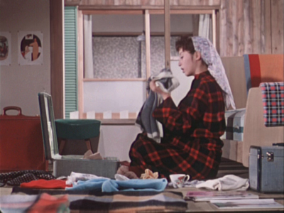
The woman is a minor character. She and her husband live in the suburban housing complex where the much of the action is set. They are more modern in their habits than their neighbors, wearing western clothes rather than kimonos and owning the only TV in the complex. They function primarily to introduce the two young boys in the central family of the story to TV, since they hospitably let the local kids visit them to watch it. The scene following the graphic match shows the wife packing to move. Their absence will precipitate a crisis when the boys demand that their parents buy them a television. The strife among the family members forms the basis for much of the rest of the action.
So the packing scene is important. Yet Ozu uses two shots that he wouldn’t need, thus delaying the scene’s beginning. The extreme long shot of the housing complex doesn’t tell us which house will form the setting for the upcoming scene. The red sweater is in the distance, but barely visible. We certainly wouldn’t notice it or get any clues about the narrative from it. Yet Ozu cuts to a closer view of the sweater and a towel. The houses in the background are all identical, and we don’t know which one belongs to which characters or which we will enter in the next shot.
The first interior view would be a logical establishing shot for the scene. The modern furnishings and especially the television box let us know where we are, and the boxes might hint that the inhabitants are packing to leave. So we are not surprised when we see the modern wife in the subsequent shot. But Ozu puts in the other two as part of his typical series of transitional shots that show the spaces between locales where action occurs.
The graphic match, I would suggest, is simply part of Ozu’s distinctive style. It’s playful and fits in with the general graphic beauty of his films, which includes bright splashes of color, careful compositions using the lines of the sets, and precise placements of props.
Returning to the Wikipedia entry for “match cut,” there is a section that mentions several examples, including the one that inspired Mr. Burke’s letter:
Stanley Kubrick’s 2001: A Space Odyssey contains a famous example of a match cut. After an ape discovers the use of bones as a tool and a weapon, there is a match cut to a spacecraft or satellite in orbit. The match cut helps draw a connection between the two objects as exemplars of primitive and advanced tools respectively.
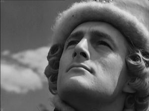
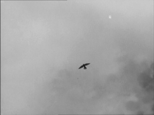
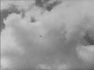
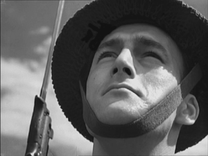
Michael Powell and Emeric Pressburger’s A Canterbury Tale contains the influence for the 2001: A Space Odyssey match cut in which a fourteenth century falcon cuts to a World War II aeroplane. The sense of time passing but nothing changing is emphasised by having the same actor, in different costumes, looking at both the falcon and the aeroplane.
An early example comes from Orson Welles’s Citizen Kane which opens with a series of match dissolves that keeps the lit window of C.F. Kane’s in the same part of the frame while the cuts take us around his dilapidated Xanadu estate, before a final match dissolve takes us from the outside to the inside where Kane is about to die.
Another match cut comes from Lawrence of Arabia (David Lean, 1962) where an edit cuts together Lawrence blowing out a lit match with the desert sun rising from the horizon. Director David Lean credits inspiration for the edit to the experimental French New Wave. The edit was later praised by Steven Spielberg as inspiration for his own work.
How the author knows that A Canterbury Tale (see below) influenced 2001 is not clear. The site footnoted (here) simply says that the cut (below) “anticipated” Kubrick’s scene in 2001. The film was released in the U.S. in early 1949, so possibly Kubrick saw it and remembered the scene nearly twenty years later. By the way, Powell and Pressburger create a double graphic echo, roughly matching the two similar dark objects against a light sky and making the two shots of the men looking upward strongly resemble each other as well.
The Citizen Kane opening, with its precise placements of the one lit window from shot to shot, is a good example of graphic matches. I am not going to touch the question of what a “match dissolve” is.
The cut from the match to the Jordanian desert horizon in Lawrence of Arabia is a trickier case. The match is placed in the left half of the anamorphic widescreen frame, while the sun rises in the right half. Moreover, the match shot is very bright, while the desert scene is fairly dark, with the sun only beginning to glow above the horizon a short way into the shot. Graphically there is not much to link them, though I think the spectator does get a strong sense of a connection between the match and sun. I’d say it’s a conceptual link, not a graphic one. It’s a link that we make on the basis of two bright objects that are not compositionally or spatially matched but simply juxtaposed.
Mr. Burke, your inquiry was perfectly reasonable, and I hope I have helped clear up your confusion.
We supply two flagrant examples of mismatched action, figure placement, and setting in Bringing Up Baby in this blog entry. Interestingly, probably no one but a professional notices them, because the relative positions of the major figures are consistent, as are the overall compositions of the shots. But then, as Dan Levin points out, we are not that sensitive to continuity disruptions in the real world either!
A Canterbury Tale.
Is there a blog in this class? 2010
Kristin here:
Update: Back in the spring we announced that the University of Chicago Press will be publishing a collection of our blog entries. Now that volume is in press and has a title: Minding Movies: Observations on the Art, Craft, and Business of Filmmaking. We’re due to see page proofs soon, and the plan is for the book to appear in April.
Every now and then our editors at McGraw-Hill, the publisher of Film Art: An Introduction, pass along some interesting feedback from users of the textbook. Recently we learned that a professor started using Film Art as a result of reading our blog. One person mentioned having the students follow the blog’s current offerings during the semester. Some recommend specific entries to their classes. Still others use the information we supply in creating their lectures. A few say they don’t incorporate the blog into their courses but would like to start doing so. That’s all good news to us. Although “Observations on Film Art” aims at a general readership, we also hope that our writings about the art, the industry, and the technology of cinema provide a resource for teachers in high schools, colleges, and universities.
Now it’s that time of year again, when professors polish up their syllabi for the beginning of a new semester. It has been a year since the last version of our series “Is there a blog in this class?” appeared. Here we offer some  suggestions as to how the entries of the past twelve months might be useful in teaching. And for those of you general readers who have just discovered the blog, the following could serve as a handy guide in exploring more of its riches. Past entries can be found here, here, and here.It’s a huge site by now, though. This is our 356th entry! We’ve recently added a lot of categories to the menu on the right-hand column, but a lot of entries don’t fit neatly into a single category. So, as usual, I’ll go through chapter by chapter and point out entries from the past year that might be relevant.
Chapter 1 Film as Art: Creativity, Technology, and Business
Nearly everybody over 20 complains about Hollywood’s summer blockbusters with their multi-hundred-million-dollar budgets. But should they? Patriotic filmgoers might be surprised to learn that few products do so much good for our country’s lackluster balance of trade. See “Don’t knock the blockbusters.”
The release of Godard’s challenging Film socialisme on the festival circuit gave us an occasion to discuss the variety of venues in which different sorts of films are exhibited in “It takes all kinds.”
Chapter 2 The Significance of Film Form
This is the chapter where we talk about the kinds of meaning that we can attribute to films, including symbolic meanings. Whether you want to encourage or discourage your students from hunting for them in films, “Between you, me, and the bedpost” offers one take on the subject. Warning: it’s risqué—though in this day and age, only slightly.
It’s not an entry for beginning students, but grad students might be interested in “Now you see it, now you can’t.” It’s a report on how scholars are studying the ways in which we perceive movies and react to them emotionally.
Chapter 3 Narrative as a Formal System
“Watching a movie, page by page” examines the novels The Girl with the Dragon Tattoo and The Ghost Writer to see whether the “acts” (or large-scale parts) of films can be found in the literary version. Of interest for teaching large-scale segmentation or if your course has a unit on adaptations.
“No coincidence, no story.” The title pretty much tells it all. Coincidences supposedly have no place in tight storytelling, and yet there are more of them in films than one might think. How do filmmakers get away with them?
Even as summer ends, discussion and disputation concerning Inception is still all over the internet. Our own entry on the subject was “Inception: Dream a Little Dream within a Dream with Me.” We didn’t try to do a neat, unified essay on the film, so it doesn’t fit well with Film Art‘s Chapter 11, our collection of film analyses. But we discuss topics that relate to this chapter: exposition, motivation, and embedded plotlines. We wrote a follow-up, “Revisiting Inception,” commenting on what Christopher Nolan had said about the film in interviews. This entry also compares Inception‘s narrative strategies with those informing Memento and The Prestige; the latter film receives several pages of analysis in the ninth edition of Film Art.
Chapter 4 The Shot: Mise-en-Scene
We don’t often get a chance to write about set design, but art director William Cameron Menzies didn’t just design sets. He designed shots. He especially liked to create environments that almost forced the director to stage  in depth. (This entry is also pertinent to the deep-focus section of Chapter 5.) See “Foreground, background, playground,” which is a teaser for a longer essay, “William Cameron Menzies: One Forceful, Impressive, Idea.”
Every now and then an actor who has provided the motion capture for a digital film character is praised highly and mentioned as a possible candidate for an Oscar nomination. But where do the actor’s performance leave off and the special effects begins? We consider the question in “Motion-capturing an Oscar.”
We often find Film Art users saying they want more on acting. Our entry “The Cross” is about a kind of staging which seems to have been forgotten in this era of rapid cutting and close framing. This analysis provides a way of studying acting, since staging is one important component of performance.
Speaking of staging, we have long urged people to study the resourceful blocking of actors in the supposedly “boringly theatrical” films of the 1910s. “Nordisk and the Tableau Aesthetic” argues that the great Danish studio of the period harbored several directors who made subtle use of staging within the single fixed shot.
Master cinematographer Steven Box (Donnie Darko) lectured in Madison, and we blogged on his discussion of various aspects of film lighting, many of which tie in beautifully with what we say on the subject in Film Art. See “Light is a law.”
Chapter 5 The Shot: Cinematography
Looking for a way to get students interested in the long take? Maybe show them the films discussed in “2-4-6-8, whose lipdub do we appreciate?” Not only are they amazing pieces of amateur filmmaking by high-school kids, but they actually fit into a proud old tradition of cinematic technique.
Most feature films nowadays are wide-screen productions, and it’s useful to consider how compositions can be handled in the wide format. Some possibilities are discussed in the second half of the web essay, “Another Shaw Production: Anamorphic Adventures in Hong Kong.”
Chapter 6 The Relation of Shot to Shot: Editing
“Seed-beds of style” takes a close look at a technique called “axial cutting,” that is, editing that moves straight to a closer view—and often to a third, even closer one—without a shift of camera angle. The survey covers the history of the cinema and reveals that a technique that started in the 1910s is used a lot for The Simpsons. This entry also makes some pedagogical points about teaching a course on the history of film style.
Chapter 7 Sound in the Cinema
Film is a visual art, so filmmakers should try to make the images carry the story, right? Not necessarily. Lengthy monologues can be cinematic, too, as we argue in “Tell, don’t show.” This entry could be used for studying dialogue, but it provides some good examples of sustained acting as well. Moreover, although the scenes involved aren’t long takes, they provide good examples of very slow editing rhythms.
Chapter 8 Summary: Style as a Formal System
Interesting style is where you find it. In “Daisies in the crevices,” we take the occasion of Turner Classic Movies’ screening a bunch of restored Columbia low-budget films of the 1930s to reveal some unexpectedly  sophisticated stylistic touches.
The Akira Kurosawa centenary has come and gone, but it has left nearly all of his films available on DVD. In “Kurosawa’s Early Spring,” we talk about some distinctive traits of his early style. Handy for teaching style in general or as an example of an auteur’s characteristic traits.
We’ve run across some teachers who make comparisons between graphic novels and movies in their classes. If you’re one of them, have a look at “Tintinopolis,” an analysis of the cinema-like style of Hergé.
Chapter 9 Film Genres
Several of the entries already mentioned comment on genre conventions. The most extended discussion involves romantic comedy but touches on melodrama too (“No coincidence, no story“).
Chapter 10 Documentary, Experimental, and Animated Films
“Sticky splices and hairy palms” does double duty. We talk about the stylistic traits of experimental films that offer challenges to archival restoration and also about some worthy but little-known films from the Los Angeles avant-garde of the 1960s and 1970s.
Animated features are becoming ever more popular, given their financial success and broad appeal. 2009 was a particularly good year for such films, and we survey the best in “The other expanded Oscar category.”
Chapter 11 Film Criticism: Sample Analyses
The last year has seen a lot of teeth-gnashing about the supposed decline of serious film criticism caused by the internet. We have weighed in on this controversial topic in “Film criticism: Always declining, never quite falling” and “Glancing backward, mostly at critics.”
Chapter 12 Film Art and Film History
Historically, film styles have influenced much later filmmakers. Two of the movements we discuss in this chapter, German Expressionism and French Impressionism, have had a big impact of the style of one of the New Hollywood directors, Martin Scorsese. We demonstrate how in “Scorsese, ‘pressionist.”
Speaking of German Expressionism, the new, nearly complete version of Metropolis gave us an opportunity discuss how the latest restored footage affects this familiar classic, “Metropolis unbound.” We also examine an old warhorse and point out what’s interesting about it in “Der Golem: Revisiting a classic.”
Looking for good silent films that might actually convince your students that old films are worth watching? Every year we avoid posting a 10-best list of current films and instead concoct one for the year ninety years before. Our latest is “The best ten-plus films of …1919.” Most of this batch are available on DVD.
Some of the greatest silent filmmakers have recently been given the royal treatment on DVD. For information on new discs of Méliès, Lubitsch, and Vertov films, see “DVDs for these long winter evenings.” More recently, Von Sternberg got similar attention, as related in “Never too late silents.”
General
Teachers who use DVD commentaries in class or in preparing lectures may waste time sorting out the good from the bad. In “I am not Carl Dreyer, and I should shut up,” we recommend a particularly good one: director Guillermo del Toro (Pan’s Labyrinth, Hellboy) talking cogently about Carl Dreyer’s great horror film, Vampyr. He has some things to say that fit in well with Film Art’s analytical approach, such as “It is foolish to try to decode the symbols in Vampyr. It is important to understand the rhythm and the repetition of them.”
DVD making-of supplements can provide excellent teaching tools. On the other hand, those supplements can be mostly mutual praise-fests for the people involved in the film. Every now and then we write about the ones that seem solidly useful, the latest entry being “Beyond praise 3: yet more DVDs that really tell you something.” (We don’t include commentary tracks or we would be spending our entire lives on these entries.) We also warn about a few supplements that aren’t worth checking out.
Have a great school year!


