Archive for the 'FILM ART (the book)' Category
Beyond praise 3: Yet more DVD supplements that really tell you something
Darby O’Gill and the Little People (1959)
Kristin here–
Every now and then I discuss a few DVD supplements that teachers might find useful for their classes, though they might be of interest to others as well. Previous installments can be read here and here.
Darby O’Gill and the Little People (Walt Disney Video)
Yes, you read that right. I can’t claim credit for having discovered this disc’s excellent supplement, “Little People, Big Effects.” Shortly after the second “Beyond praise” entry, Dan Reynolds, who teaches at the University of California Santa Barbara, wrote to recommend it.
Darby O’Gill was one of the few Disney live-action films I missed when I was growing up in the 1950s. I acquired the disc and started by watching the feature. I must say that this is one weird movie.
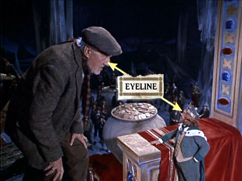
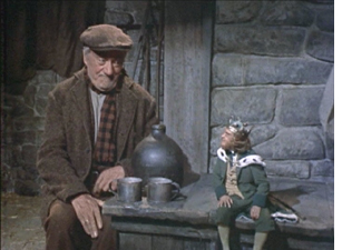
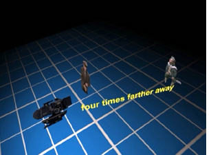
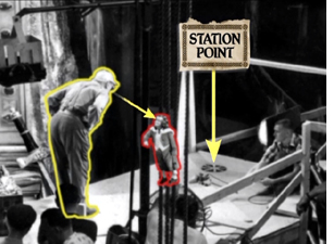
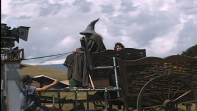
The “little people” of the title are leprechauns, and the special effects used to make them look small are mostly achieved through forced- perspective techniques. In less than eleven minutes, this supplement demonstrates the use of glass paintings, mattes, false perspective, and even a revived Schüfftan process, most famously used for Metropolis, where scale is manipulated by shooting into an angled, partially transparent mirror. Careful calculations allow for over-sized sets in the background to be lined up precisely with normal-scale ones in the foreground, so that the foreground person looks much larger then the background one. Since the two characters, here Darby and King Brian, are supposed to be conversing face-to-face, a manipulation of eyelines, a term we use a lot in Film Art, is necessary. (Despite what my spell-check keeps trying to tell me, “eyeline” is one word in the movie business, as demonstrated above.) In explaining how the actors knew where to look in the shot illustrated at the top, the film shows that “station points” were placed on the floor so that the characters’ eyelines would seem to match up (below). These days actors alone against blue or green screens often have to look at tennis balls to make the direction of their gaze match correctly.)
Clearly some behind-the-scenes footage was made during the production of Darby O’Gill, and this is incorporated into a documentary that includes interviews with master effects expert Peter Ellenshaw, who died in 2007. Ellenshaw worked as a matte painter on half the British classics of the 1930s and 1940s, including Black Narcissus (which has perhaps the greatest matte paintings ever). He then moved to Hollywood in 1950 and began a string of films with Disney that won him an Oscar for Mary Poppins. It’s good to have even these short clips of him demonstrating and discussing his work.
“Little People, Big Effects” should give students (and just about anyone else) a better grasp of perspective and its importance in the representation of depth on a flat screen. I would definitely show it as part of a study of cinematography. If a fifty-year-old film seems a bit out of date, point out to students that, as the narrator mentions, exactly the same techniques were used in many scenes of The Lord of the Rings to make the hobbits and dwarves look small. Similar demonstrations are provided in the supplements to the extended DVD version of The Fellowship of the Ring (Disc 1, “Visual Effects: Scale”).
Elijah Wood sits further from the camera than Ian McKellen in order to make him appear as small as a hobbit
Zodiac (“2-Disc Director’s Cut,” Paramount)
At the end of my first “Beyond praise” entry, I complained about the lack of supplements on the initial DVD release of Zodiac. Then, after the two-disc set with the supplements appeared in early 2008, I forgot to include it in the second entry. Better late than never, so I’m tackling it here. (The supplements are apparently the same for the Blu-ray set.)
As the “DVD Talk” review says. “The self-congratulatory praise is kept to a minimum.”
The main supplement is a 53-minute film called “Deciphering Zodiac.” It’s a good, objective, chronological summary of the film’s production. A lot of talking heads are included, such as the producer, scriptwriter, set decorator. That’s usually a good sign, since it shows that care was taken with the making-of and that enough of the crew members are participating that the account will probably be rounded. There’s a 15-minute making-of specifically on “The Visual Effects of Zodiac.”
Zodiac was primarily shot on professional-level digital cameras, apart from the slow-motion shots, which still need to be done on 35mm due to limitations of the digital technology. Hence there’s a lot of information here on digital techniques. Most of these techniques are used in ways that aren’t necessarily obvious to the viewer. If you want to show students some material on digital effects, this might be a good choice, since it avoids the flashy, obvious effects that so many fantasy and sci-fi DVD supplements concentrate on.
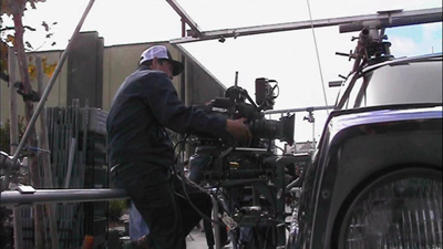
“Deciphering Zodiac” has shots showing the digital camera attached to an elaborate rig around a car, which was used to follow moving cars, including the famous opening tracking shot along a suburban street. The video-assist monitor is often visible in the shots.
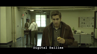
One change that digital filming has made in production has been the frequent use of “digital dailies” rather than dailies on film. (Dailies are the unedited takes just as they come from the camera(s); directors and other key creative people typically watch them at the end of each day.) Several scenes of the “Deciphering” documentary show raw shots and are labeled as digital dailies, something which doesn’t seem to be a common feature of supplements. It’s pretty obvious that the shot of Jake Gyllenhaal below would need to be manipulated in post-production. There’s also informative coverage of the methods used to match location and studio-shot footage, particularly for the scene where the killer shoots a taxi driver.
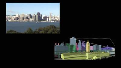
The visual effects documentary has good explanations of the early shot of a rapid move across the bay toward San Francisco as it looked in the period when the film’s action begins, a shot that was done entirely digitally.
Now that so many best-lists for the decade have included Zodiac, it seems to be an official modern classic. Perhaps a somewhat more dignified way of teaching special effects than using a Transformers movie.
The Dark Knight (Two-Disc Special Edition, Warner Home Video)
The supplements for The Dark Knight make a nice contrast with those for Zodiac. Here the makers of a spectacular action movie avoided digital special effects to a surprising extent. Instead they used practical effects, that is, effects accomplished via physical means while shooting rather than those done in post-production via laboratory or digital manipulation. Digital technology was used, of course, but often for rather modest tasks in planning and in erasure of unwanted elements. It’s also interesting as the first 35mm fiction feature to be shot partially on Imax cameras.
The main supplement is “Gotham Uncovered.” It begins by showing how the Imax camera was initially tested on a single action scene shot on location in Chicago. The results led to additional Imax scenes being added to the film. The advantages of Imax—primarily a huge gain in visual quality due to the larger size of the individual frames—are shown to be balanced against the camera’s limitations. The camera is much larger, making handheld shots difficult. It holds only three minutes of film and has a shallower depth of field. While interesting, this first section is surprisingly lacking in actual footage of the filming, often depending on still photos. We tend to assume that in this day and age, the making-of is taken into account from early on in a production. It’s surprising how often that turns out not to be the case.
A five-minute segment, “The Sound of Anarchy,” shows Hans Zimmer sitting at a computer and talking about the modernist, dissonant music for the Joker character. It’s mildly informative.
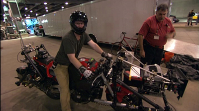
“The Chase” is perhaps the most useful section of the making-of. The decision was made to shoot the scene on Lower Wacker in Chicago. Here digital effects were kept to a minimum, with multiple cameras mounted on vehicles like the motorcycle below. These were special smaller Imax cameras. Only four such cameras existed at the time, though an accident reduced that to three!
One big moment in the chase has the Batmobile crashing into a garbage truck. Again, rather than resorting to digital effects, the crew built miniatures of the two vehicles and the set. The decision was also made to shoot a crash of an 18-wheeler on LaSalle Street using a real truck on location, and the scenes showing the practice sessions for this reveal the kind of planning that goes into the big action scenes that are so common in films these days.
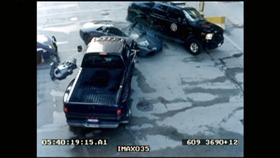
A multi-vehicle crash scene was done with several cameras, which is common practice for unrepeatable actions. (Even on a big-budget film like this, no one would want to crash more than one Lamborghini.) The cameras often show up in each other’s shots, and the supplement shows the resulting footage and how CGI is later used to erase them—again, a very common use of digital tools. Here a camera on a crane is visible at the center left in the original footage of the crash:
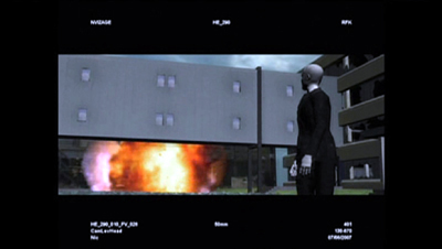
In one scene, the Joker walks out of a hospital, which explodes behind him. A prime candidate for digital effects, one would think. Instead, the filmmakers opted to have a demolition company destroy a real building. CGI was used to plan the scene:
A shorter supplement, “The Evolution of the Knight,” deals mostly with the design process for Batman’s suit and the Batpod. Again the emphasis is on bringing reality into the filming. It’s pointed out that while much of Batman Returns was shot on sound stages, the team decided to try and shoot the sequel in the city streets as much as possible.
Beware of these
I have to admit, one reason that this series appears so rarely is that for every DVD with useful supplements that I find, there are two or three uninformative ones that I have to sit through–or at least sample. In addition to recommendations, let me warn you away from some of the ones I switched off.
I had expected the Slumdog Millionaire DVD extras to be interesting, given the mixture of digital and 35mm shooting, the location work, and so on. But obviously the filmmakers had no idea that the film would be a success, so they seem to have done little behind-the-scenes shooting as they made it. The result is a not terribly informative, bare-bones 18-minute making-of.
Supplements as praise-fests have not gone away. Musicals seem especially to bring them out. “Get Aboard! The Band Wagon” provides 36 minutes of mutual admiration. In “From Stage to Screen: The History of Chicago,” Chita Rivera unintentionally achieves a parody of the gushing movie star who lauds everyone she worked with.
David and I just watched Cloudy with a Chance of Meatballs. I had liked it when I saw it in first run, and predictably, David enjoyed it, too. It’s a clever, well-scripted, well-animated film. We hoped to learn something from its supplements, but the making-of seems to be aimed at children, and young ones at that. The co-directors and some of the other filmmakers look distinctly embarrassed to be participating, partly because a lame comparison of making a film to mashing food together forms a running motif. A pity, since the movie deserves better. As reviewers keep pointing out, the best animated films these days are made for adults as much as for children.
Watching a movie, page by page
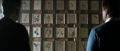
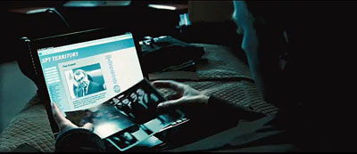
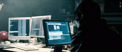
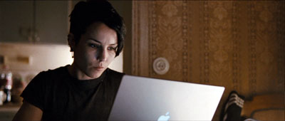
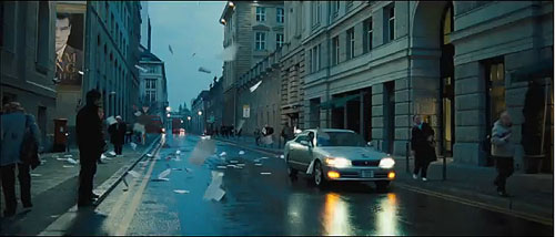
The Ghost Writer (above); The Girl with the Dragon Tattoo (below).
DB here:
Aristotle said, quite reasonably, that every plot has a beginning, a middle, and an end. But that doesn’t mean that every plot consists of three acts. Aristotle doesn’t mention act divisions in the Poetics for the good reason that classical Greek plays didn’t have them. The three-act play is just one convention that emerged in the history of storytelling.
As early as 20 BCE Horace was suggesting, “Let no play be either shorter or longer than five acts.” Influenced by this edict, Renaissance editors and playwrights adhered to five acts for many years. We have, of course, plays in two acts (Alan Ayckbourn’s Norman Conquest cycle) and four acts (Pygmalion, The Admirable Crichton, many of Chekhov’s). TV dramas are routinely divided into a teaser and four acts, broken up by commercials. All of those plots have beginnings, middles, and ends, so it’s silly to think that only the three-act structure can fulfill Aristotle’s dictum.
As early as the seventeenth century, the Spanish playwright Lope de Vega recommended three acts as best. In Europe, the format came into its own during the nineteenth century, evidently dislodging the five-act one. One reason may have been that three parts are architecturally simple, sturdy, and easily visualized. Around 1820 Hegel remarked: “Three such acts for every kind of drama is the number that will adapt itself most readily to intelligible theory.” What such a theory might look like was sketched by Lope, who anticipates modern advice manuals.
In the first act set forth the case. In the second weave together the events, in such wise that until the middle of the third act one may hardly guess the outcome. Always trick expectancy.
So proponents of the three-act screenplay formula should revise their pedigree. They’re actually pushing the Lope-Hegel tradition—which admittedly sounds less impressive than dropping the name of Aristotle.
Three acts, more or less
Despite the historical misunderstandings, there’s some reason to think that Hollywood screenwriters, and now filmmakers across the world, have followed a rough three-“act” scheme. Where they got this idea and when it started is still hard to say, but it’s been at the core of nearly every screenplay manual since the 1980s. Kristin and I have looked at this format from an academic perspective, and our views are outlined briefly on this site here and here and here. For more detailed arguments you can read her Storytelling in the New Hollywood and Storytelling in Film and Television and my The Way Hollywood Tells It.
In those places we’ve argued that Hollywood feature films tend to fall into chunks of 20-30 minutes. As a result a movie may display three parts, or four, or more (if the film is very long) or even two (if it’s unusually short). When the film has four parts, it tends to split the long second act that the manuals recommend into two.
A four-parter usually goes like this. A Setup lays down the circumstances and establishes the primary characters’ goals. The Complicating Action is a sort of counter-setup, modifying the original goals or creating new ones. At about the midpoint, there emerges a Development section characterized by delays, subplots, and backstory. There follows the Climax, which resolves the action by decisively achieving or failing to achieve the protagonist’s goals. The film typically ends with a brief Epilogue that establishes a settled state, happy or unhappy. Each of these sections is demarcated by a turning point—a moment of crisis, usually involving an unforeseen twist or a major decision by the protagonist.
Two recent films, The Girl with the Dragon Tattoo and The Ghost Writer, offer good examples of how the four-part template governs plot structure. I won’t walk through each one here, but both seem to me to adhere quite closely to this model. Today I’m more curious about the original novels. We know that books are routinely reshaped for movie treatment. Is there a sense in which the plot structure of the originals fits the film formula?
Fiction as film
I ask because some fiction writers have come to believe in the enduring power of the three-act structure for all narratives. In The Weekend Novelist (1994), Robert J. Ray recommends that aspiring writers use it (although he breaks Act II into two parts around the midpoint). He finds the pattern enacted in his book’s primary model, the novel The Accidental Tourist. “We’re working with the structure of [Anne] Tyler’s Tourist because it is classical, three acts” (142). This, Ray claims, follows “Aristotle’s dictum of beginning, middle, and end” (141). Ray makes a comparable suggestion in The Weekend Novelist Writes a Mystery (1998), naming the three parts Setup, Complication, and Resolution; a midpoint again splits “Act II.1” from “Act II.2.”
Ray’s are the earliest instances I’ve found of explicitly applying screenwriting structure to prose fiction. Later ones would include Stephen Greenleaf’s 1996 article “A Mystery in Three Acts” and James Scott Bell’s 2004 book Plot and Structure. Bell argues somewhat grimly that life itself has three acts: childhood, “the middle where we spend most of our time,” and “a last act that wraps everything up” (23). Ridley Pearson, in the 2007 article “Getting Your Act(s) Together,” tells us that the “three-act structure, handed down to us from the ancient Greeks [!], is one that’s proven successful for thousands of years” (67). “Name a film or book you think rises above others, and chances are, if you go back and study it, the story line will fit into this form” (85). Brenda Janowitz recommends plotting a Harlequin romance as if it were a movie like Mean Girls.
But screenwriting adepts will notice one thing that these advisors neglect: the lengths of the parts. The book that popularized the three-act structure in film circles was Syd Field’s Screenplay of 1979. Not only did he lay out the template, but he indicated running times for each section. Act 1 should last about thirty minutes, Act 2 sixty minutes, and act three about thirty. Assuming that one minute of screen time equals a page of the screenplay, that means that a two-hour movie should run about 120 pages. Field’s metric proved very influential, with script readers, producers, and writers all striving to find plot points at twenty-five minutes and ninety minutes.
To be strictly parallel, then, a “three-act novel” should be divisible into parts having a page ratio of 1:2:1. The only manual I know that is willing to bite this bullet is Writing Fiction for Dummies (2009). (The title has a catchy ambiguity, no?) According to the authors, Act 1 takes up the first quarter of the book, Act 2 the middle half, and Act 3 the last quarter (p. 147).
In the film versions of The Girl with the Dragon Tattoo and The Ghost Writer, the segments and timings fit the four-part model fairly neatly. (Try it yourself, in the theatre or when the films come out on DVD.) But what happens when we look at published books? Will we find what Ray found in The Accidental Tourist—conformity to the formula? Are practicing novelists using the template? Are the timings, or rather the page-counts, of the books congruent with the film model?
First I’ll consider Robert Harris’ novel The Ghost, the source of The Ghost Writer. The next section looks at Stieg Larsson’s The Girl with the Dragon Tattoo. If you want to avoid spoilers, skim and skip accordingly.
Ghost writers in the sky
The opening chapters of The Ghost introduce the unnamed narrator, a professional writer who is on the verge of breaking up with his girlfriend. Hired to ghost-write ex-Prime Minister Adam Lang’s memoirs, he is replacing Lang’s aide McAra, who drowned under mysterious circumstances. The Ghost takes the job just as news media are floating the charge that Lang helped the US ship British citizens to black sites to be tortured. The Ghost travels to join Lang, who is staying in America with his secretary Amelia and his wife Ruth. At his hotel, the Ghost encounters a surly British man who asks him pointed questions about Lang. This setup lays out the affair between Amelia and Lang, Ruth’s sexual jealousy, and the mounting political pressure on Lang, along with the sinister Brit in the bar. The section ends on p. 83 of the 335-page Gallery paperback edition, almost exactly one-quarter of the book.
The complicating action arrives when the Ghost’s first sit-down with Lang the next day is interrupted by the announcement that Rycart, former Foreign Secretary in Lang’s government, has asked the Hague to investigate the PM for war crimes. Under pressure from protestors, Lang decides to go to Washington for appearances’ sake. In the meantime, the Ghost discovers a set of clues McAra has left behind: photos of Adam in his Cambridge days, records and news reports of his party activities, and a mysterious phone number that turns out to be Rycart’s. All this creates a counter-setup. There is something foul afoot.
The Ghost ruminates constantly on McAra, a writer who has become something of a ghost haunting his successor. Soon the digital file of McAra’s draft of the memoir vanishes from the Ghost’s email. Most fundamentally, he discovers that in the first interview Lang has lied to him about how he got into politics.
That was when I realized I had a fundamental problem with our former prime minister. He was not a psychologically credible character. In the flesh, or on the screen, playing the part of a statesman, he seemed to have a strong personality. But somehow, when one sat down to think about him, he vanished. This made it impossible for me to do my job. . . . I simply couldn’t make him up (162).
At this point the protagonist decides on a new goal: to investigate on his own. This transforms his official assignment, and it happens on p. 163—quite close to the midpont of the book.
The development section is filled out with the usual delays, false leads, counter-maneuvers, and backstory. The Ghost’s investigation brings him to an interrogation of an old man who suspects foul play in McAra’s death, a sexual encounter with Ruth, a meeting with a professor with apparent CIA connections, and a suspicious vehicle in the vicinity. The turning point comes with another decision. “The more I considered it, the more obvious it seemed that there was only one course of action open to me.” The Ghost phones Rycart and flies to New York to meet him. This passage concludes on p. 256.
The climax sporadically unravels the clues McAra has left behind. In their meeting Rycart and the Ghost conclude that Lang was recruited by Professor Emmett during their Cambridge days and became a US puppet. Rycart has taped his exchange with the Ghost and uses that to force him to return to confront Lang. On Lang’s private plane, the Ghost accuses him but Lang’s denials are disconcertingly sincere. On disembarking, he is killed by a suicide bomber—the crusty Brit who blames Lang for the death of his son in Iraq. Although he’s haunted by dreams of a drowning McAra (“You go on without me. . .”), the Ghost plows ahead with Lang’s now-posthumous memoirs. All seems to have been settled until the book launch, when the Ghost discovers another way to interpret the evidence. He returns home to check McAra’s manuscript, where he finds a coded message identifying Ruth as the one recruited by Emmett; she was the mole. This revelation that the first solution was wrong, a detective-story device going back at least to Trent’s Last Case of 1913, arrives on p. 330.
An epilogue of only five pages reports that the Ghost is on the run. If anything happens to him, his former girlfriend will publish his story. “Am I supposed to be pleased that you are reading this, or not? Pleased, of course, to speak at last in my own voice. Disappointed, obviously, that it probably means I’m dead.”
The result conforms fairly strongly to the triple ratio: Act 1 runs 83 pages, Act 2 runs 173 pages, Act 3 runs 79 pages. Using the four-part template, we get 83/80/93/74, with a five-page epilogue.
Not perfect symmetry, but that’s hardly to be expected. Novelists stretch or compress as needed, and they can make scene boundaries a little fuzzier than what we find in films. For such reasons, other analysts might shift my breakpoints a few pages fore or aft. In addition, many films make the climax section somewhat shorter than the others, so we won’t always get perfect symmetry in novels either. Still, The Ghost offers a reasonably close approximation to the sort of plot template that we find in many commercial movies.
Double duty
Stieg Larsson’s The Girl Who Played with Fire provides a somewhat different sort of plot. We have two protagonists and three lines of action—two mysteries plus a search for revenge—or rather four, if you count the prospect of a romance between the protagonists. The book is also much longer than The Ghost, running 644 pages in the Vintage paperback edition I have. You might therefore expect more large-scale parts. But . . . .
The setup lays out the three major lines of action. Journalist Mikael Blomkvist, misled by an informant, publishes a false news story about the dealings of the businessman Wennerström. After Blomkvist is sentenced to prison, the second line of action kicks in: Henrik Vanger asks him to find what happened to his brother’s granddaughter Harriet. Meanwhile the neopunk hacker Lisbeth Salander is introduced as a security analyst researching Blomkvist for Vanger. By p. 138 Blomkvist has decided to accept the Vanger assignment. This section is not far from being a quarter of the text, and it corresponds to a major break, the end of Part 1 (“Incentive”).
The next large-scale section complicates things on two levels. It plunges Blomkvist into the details of Vanger family history and Harriet’s disappearance, and it brings Lisbeth Salander’s life to a point of crisis. We learn her past as an orphan and a denizen of the streets and hacker subculture, living under the thumb of her guardian Bjurman. This section is rather long, about 150 pages, because it has to establish Lisbeth as a dual protagonist and show her stratagems for escaping Bjurman’s sexual exploitation. Blomkvist must also serve his short prison time in this segment.
I’d argue that the plot’s midpoint occurs on page 323, halfway through the book. Chapter 16 begins:
After six months of fruitless cogitation, the case of Harriet Vanger cracked open. In the first week of June, Blomkvist uncovered three totally new pieces of the puzzle. Two of them he found himself. The third he had help with.
These revelations propel Blomkvist into a lengthy investigation of serial murders, which requires him to hire Lisbeth as his research assistant. While the two follow up clues, they start an affair.
On p. 477, it seems to me, the climax begins. The investigation has cast suspicion on Martin Vanger, Harriet’s brother. Blomkvist hears Martin returning home. “That somehow brought matters to a head.” Blomkvist goes out to confront him. Two pages later Martin shows him into the basement. “Blomkvist had opened the door to hell.” Now scenes of Lisbeth’s research and return to the village alternate with scenes showing Blomkvist at the mercy of Martin in his torture chamber.
Because the central plot involves two mysteries, the climax is extended. I’d argue that the two mysteries, the serial killings and Harriet’s disappearance, are solved by page 560 or so. But there remains the matter of Blomkvist’s revenge on the plutocrat Wennerström, who had tricked him into printing a phony story.
That dangling plotline is tied up in the next chunk (pp. 562-628), which forms in effect a second climax. Thanks to Lisbeth’s research, Blomkvist and his partners prepare to publish an expose of Wennerström’s crimes in Millennium. The evening that Blomkvist goes on TV, public opinion shifts decisively in his favor, and as the translation has it, “Blomkvist’s appearance marked a turning point.” He has won, and so has Lisbeth, who has drained money from Wennerström’s offshore accounts.
The sixteen-page epilogue tells us that Wennerström, facing disgrace and jail, kills himself. By now the two protagonists have struggled up from below. Blomkvist redeems his reputation and becomes the toast of journalism. Lisbeth, poor and victimized by men, becomes independent and enjoys her stolen fortune. There remains only the question: Will the two unite romantically? A final scene replies with a very old plot devices that’s one of Larsson’s favorites: a chance encounter that triggers a misunderstanding.
So I’m proposing a 138-page setup, a 150-page Complicating Action, and a 154-page Development. If you consider my two climaxes a single stretch, you have a 149-page climax section. That makes the big parts roughly equal, with a tailpiece of 16 pages. Even though The Girl with the Dragon Tattoo has nearly twice the page-count of The Ghost and crams in two protagonists and several plotlines, it displays the symmetry we find in the more compact book. The chief difference is between a comparatively short climax and a protracted one—the same difference we often find in classically constructed films. For these novels, and I suspect many others, the three-act/ four-part template provides a solid architecture for the plot.
Miracles, critical fantasies, or just tradition?
I won’t try to align the parts articulated in the novels with those we find in the finished films. The congruences are fairly close, once you grant that both films compress scenes and lop off characters and plotlines that are developed in the novels. Instead, I want to close by asking some questions.
Would novelists admit to consciously adopting this structure? If they don’t, or if we think it’s implausible that they would, we’re confronted with the charge that we’re simply projecting this structure onto the books. Are we and the writers of manuals shoehorning these plots into the three-act/ four-part format? Could we come up with equally persuasive patterns if we set out looking for seven or seventeen or seventy “acts”?
To take the last question first: Probably not. I think my analyses carve the films and books at the joints, more or less. One reason I like Kristin’s analytical method is that it hinges on characters’ goals and their pivotal decisions or reactions. These tend to be emphatic, well-articulated moments in the plot; a lot, as we say, depends on them.
True, there is some room to argue about which ones might be most far-reaching. You can propose alternatives, and I can change my mind. But the rival candidates for goals and decisions and major turning points aren’t likely to be radically different. We agree on most structural conventions, and our differences tend to be fine-grained, not gross.
Still, this sort of analysis arouses skepticism, and rightly so. How can writers and filmmakers achieve this neat structure without conscious planning? Can you follow the rules without doing so deliberately? Kristin offers an explanation that emphasizes the intuitive search for proportion in the creative process. She invokes Vivaldi concerti, medieval altarpieces, daily comic strips, and even the Great Pyramid at Giza as examples of balance among parts in both high and popular arts.
The evident use of proportions in many narrative films provides one more indication of the enduring classicism of the mainstream Hollywood system. Presumably what practitioners have intuitively assumed to be the optimum range of lengths for each part was discovered early on. It has been passed down the generations of filmmakers as a result of the simple fact that most practitioners gain their basic skills by watching a great number of movies (Storytelling in the New Hollywood, 44).
I think that there’s still a lot to learn about these templates. How are they disseminated among filmmakers? Why are we unaware of these parts while watching the film? They don’t stand out like chapter divisions in a novel. Or do we sense them subliminally? And how widespread are they? Do we find them in classic studio cinema of the 1920s through the 1950s? (Kristin thinks so, as do most writers of screenplay manuals.) Do we find them in films from other cultures and periods? If so, perhaps filmmakers elsewhere have found them to be reliable ways to engage viewers. Possibly these models were spread with the circulation of American movies.
I’ll provide my own epilogue by noting that the novelists’ borrowing of screenplay structures is a recent instance of a long-term process: the “cinefication” of other media. Today we call successful novels “tentpoles” or “blockbusters” or “locomotives,” and we say they’re “released” rather than “published.” What used to be called a series of novels is now likely to be called a franchise. It may be that many novelists have absorbed the lessons of screenplay manuals. If you wanted your book to be bought by a producer, why not make it like a film beforehand?
More abstractly, we have artistic transfer and technical influence. For a long time critics have argued that literary modernists like Faulkner and Hemingway, along with more popular genre writers, have tried for “cinematic” styles and have sought to imitate the “camera eye” in their narration. Today perhaps we see a structural influence as well: rules of film plotting mapped onto prose fiction. The next page-turner you read may have been engineered to flow across your eyes at the brisk pace of a Hollywood movie.
Several of my references to classical theorizing about act divisions are taken from Oscar Lee Brownstein and Darlene M. Daubert, eds., Analytical Sourcebook of Concepts in Dramatic Theory (Westport, CT: Greenwood, 1981). For more on classical Greek drama’s structure, go here. You can read a brief summary of the history of act divisions in western drama here.
On the three-act screenplay structure as applied to independent films, see J. J. Murphy’s You and Me and Memento and Fargo. See also J. J.’s independent cinema blog.
Stephen Greenleaf’s “A Mystery in Three Acts” appeared in The Writer 109, 4 (April 1996). Ridley Pearson’s article “Getting Your Act(s) Together” appeared in Writer’s Digest 87, 2 (April 2007), 67-69, 85. For another application of three-act structure to the novel, go here. The author claims that “movies rather than books are easier to analyze in that the main plot points are visual.”
On The Ghost Writer, a useful interview with Robert Harris is here. An entry on Creative Loafing points out ambiguities and vague spots in the movie’s plot. A January 2008 draft of the script, which incorporates voice-over narration, is available here.
The most influential account of how American novelists adapted cinematic techniques is Claude-Edmonde Magny’s Age of the American Novel: The Film Aesthetic of Fiction between the Two Wars. See also Keith Cohen’s Film and Fiction: The Dynamics of Exchange.
The Ghost Writer.
Propinquities
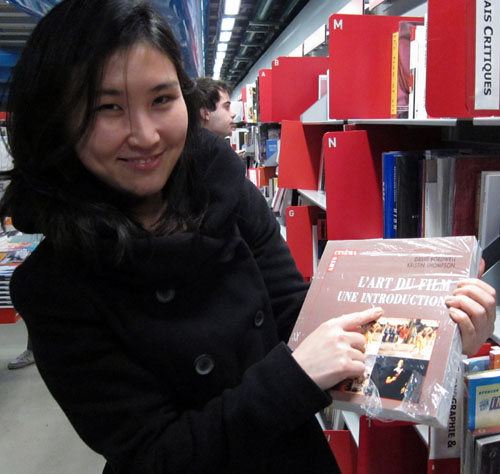
Jinhee Choi, Centre Pompidou, January 2010.
Propinquity: Nearness, closeness, proximity: a. in space: Neighborhood 1460. b. in blood or relationship: Near or close kinship, late ME. c. in nature, belief, etc.: Similarity, affinity 1586. In time: Near approach, nearness 1646. —Oxford Universal Dictionary
DB here:
In any art, tools and tasks matter. From the first edition of Film Art (1979) to the present, our introduction to film aesthetics starts with an overview of film production. How is production organized within the commercial industry, or within a more artisanal mode? What freedom and constraints are afforded within the institutions of filmmaking? How does current technology support or limit what the filmmaker can do? And how do filmmakers explain what they’re doing—not just as personal proclivities but as rhetorical “framings” that lead us to think of their work in a particular way?
Some would call this approach “formalism,” but that label doesn’t capture it. Traditionally formalism refers to studying an artwork intrinsically, as a self-sufficient object. In this sense, our perspective is anti-formalist: We look outside the movie to the proximate conditions that shape its form, style, subjects, and themes.
More literary-minded film scholars have sometimes been impatient with this perspective. Yet in the history of painting and music, it has yielded real advances in our knowledge. It continues to do so in film studies too, as I learned when we came back from Yurrrp to find some books awaiting us. (Kristin has already remarked on the stacks of DVDs that had accumulated.) Among these were books that illustrate the continuing value of situating film artistry in its most immediate context: the creative circumstances, the norms and preferred practices operating within traditions, the rationales that artists offer for their choices. Even better, the books were written by friends, so we have both intellectual and personal propinquity. I have always wanted to use the word propinquity in a piece of writing.
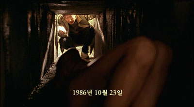
Memories of Murder (Bong Joon-ho).
Jinhee Choi’s The South Korean Film Renaissance: Local Hitmakers, Gobal Provocateurs is a wide-ranging survey of what some have called the “next Hong Kong”–a popular cinema of brash impact and technical polish, on display in JSA, Beat, Dirty Carnival, My Sassy Girl, and the like. But unlike Hong Kong, South Korea has a strong arthouse presence too, typified by Hong Sang-soo’s exercises in parallel narratives and thirtysomething social awkwardness. Between these poles stands what local critics called the “well-made” commercial film, as exemplified by Bong Joon-ho’s Memories of Murder.
Choi, a professor at the University of Kent, mixes analysis of cultural and industrial trends with consideration of crucial genres (notably the “high school film”) and major auteurs. She is the first scholar I know to explain changes in the Korean film industry as emerging from a dynamic among critics, filmmakers, private funding, and government sponsorship. A must, I would say, for anyone interested in current Asian film.
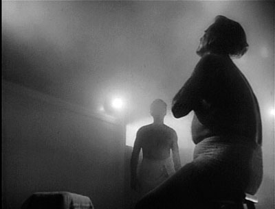
T-Men (Anthony Mann, cinematographer John Alton).
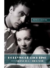 The South Korean Film Renaissance is matched by a work of equal subtlety, Patrick Keating’s Hollywood Lighting: From the Silent Era to Film Noir. Keating has an MFA in cinematography from USC, and his Ph. D. work concentrated on classical American cinema. His book captures the craft of the great studio cameramen, following not only what they said they were doing (in interviews and in the trade papers) but also what they actually did. He homes in on the contradictory demands facing artists who, they claimed over and over, had to serve the story. How do you claim artistry if your contribution is unnoticeable? This problem becomes acute with film noir, where the style is expected to come forward to a significant degree.
Keating scrutinizes the films with unprecedented care, tracing not only cameramen’s distinctive styles but showing that originality was always in tension with the conventional lighting demands of various genres and situtations. Many big names are here—John Seitz, Gregg Toland, John Alton—but the book also examines innovations coming from solid craftsmen like Arthur Lundin, who lit Girl Shy and other Harold Lloyd films. You won’t look at a studio movie the same way after you’ve digested Keating’s richly illustrated analyses.
Both Jinhee and Patrick were students here, and I directed the dissertations that eventually became these books. So of course I’m biased. But I think that any outside observer would agree that these monographs show the value of studying how film artistry and the film industry intertwine.
Blue (Krzysztof Kieslowski).
No less sensitive to the interplay of art and business is Patrick McGilligan’s Backstory 5: Interviews with Screenwriters of the 1990s. The collection is as illuminating as earlier installments have been. How could it not be, with career ruminations from Nora Ephron, John Hughes, David Koepp, Barry Levinson, John Sayles, et al.?
I’ve long found Pat’s Backstory volumes a treasury of information about Hollywood’s craft practices. Every conversation yields ideas about structure, style, and working methods. In this volume, for instance, Richard Lagravanese points out that scenes have become very short; with slower pacing in the studio days, scenes had time to breathe. And after claiming over and over that cinematic narration comes down to patterning story information, I was happy to read Tom Stoppard:
The whole art of movies and in plays is in the control of the flow of information to the audience. . . . how much information, when, how fast it comes. Certain things maybe have to be there three times.
In the studio days this last condition was called the Rule of Three: Say it once for the smart people, once for the average people, and once more for Slow Joe in the Back Row. Some things don’t change.
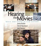 Pat McGilligan is also a Wisconsin alumnus, so to keep these notes from getting too incestuous, I’ll just mention that I know the distinguished musicologist David Neumeyer chiefly from his writing (though I have to confess I first met him when he visited . . . Madison). Along with coauthors James Buhler and Rob Deemer, David has published an excellent introduction to film sound. Hearing the Movies: Music and Sound in Film History is designed as a textbook, but it’s so well written that every movie lover would find it a pleasure to read.
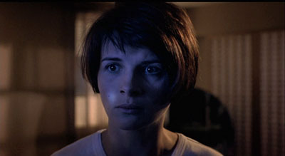
The examples run from the silent era (including Lady Windermere’s Fan, a favorite of this site) to Shadowlands, and while music is at the center of concern, speech and effects aren’t neglected. There’s a powerful analysis of the noises during one sequence of The Birds, and the authors pick a vivid example from Kieslowski’s Blue (above), in which Julie is shown listening to a man running through her apartment building; we never see the action that triggers her apprehension.
The authors provide a compact history of sound film technology, including many seldom-discussed topics. For instance, 1950s stereophonic film demanded bigger orchestras and more swelling scores, while separation among channels permitted scoring to be heavier, without muffling dialogue. Throughout, Neumayer and his coauthors balance concerns of form and style with business initiatives, such as the growth of the market for soundtrack albums and CDs (a topic first explored by another Wisconsite, Jeff Smith, in his dissertation book). Once more we can arrive at fine-grained explanations of why films look and sound as they do by examining the craft practices and industrial trends that bring movies into being.
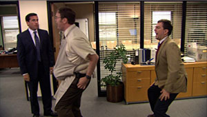
Watching back episodes of the American version of The Office recently, I’ve been struck by the premise it takes over from the UK original. This comedy of humors in Cubicle World is supposedly recorded in its entirety by an unseen film crew. I enjoy the clever way in which the show bends documentary techniques to the benefit of traditional fictional storytelling. The slightly rough handheld framings suggest authenticity, and the to-camera interviews permit maximal exposition by giving backstory or developing character or filling in missing action. The premise that an A and a B camera are capturing the doings at the Dunder Mifflin paper company permits classic shot/ reverse-shot cutting and matches on action.
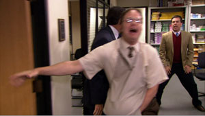
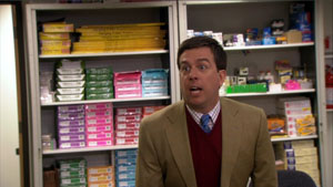
The camera is uncannily prescient, always catching every gag and reaction shot; even private moments, like employees having sex, are glimpsed by these agile filmmakers. Above all, the camera coverage is more comprehensive than we can usually find in fly-on-the-wall filming. For instance, Dwight is preparing Michael for childbirth by mimicking a pregnant woman and Andy, behind him, tries to compete. Here are four successive shots, each one pretty funny.
Somehow the cameramen manage to supply a smooth cut-in to Andy, and that’s followed by a reaction shot, from a fresh angle, showing Jim watching. The range of viewpoints, implausible in a real filming situations, is often smoothed over by sound that overlaps the cuts, as in both documentary and fictional moviemaking. (See our essay on High School here to see how a genuine documentary uses these techniques.)
Of course I’m not faulting the makers of The Office for not rigidly imitating documentary conditions. Any such blend of fictional and nonfictional techniques will involve judgments about how far to go, as I indicate in an earlier post on Cloverfield. It’s just to acknowledge that TV visuals have their own conventions, and these can be creatively shaped for particular effects. We ought to expect that those conventions would encourage close analysis as easily as film traditions do. Jeremy Butler’s new book Television Style offers the best case I know for the claim that there is a distinct, and valuable, aesthetic of television.
Following his own study Television: Critical Methods and Applications (third edition, 2007) and paying homage to John Caldwell’s pioneering Televisuality, Butler gets down to the details of how various TV genres use sound and image. Butler’s conception of genres is admirably broad, considering dramas, sitcoms, soap operas, and commercials, each with its own range of audiovisual conventions and production practices. His discussion of types of television lighting complements Keating’s analysis; put these together and you have some real advances in our understanding of key differences and overlaps between film and video.
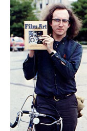 Kristin has met Jeremy, but I haven’t yet. In any case, Television Style shows that he’s a kindred spirit who’s made original contributions to this research tradition. Like Jinhee, Patrick, Pat, and David, he demonstrates that we can better grasp how media work if we study, patiently and in detail, the creative options open to film artists at specific points in history. He began thinking about these matters in 1979, as the photo attests.
None of this is to say that artistic norms or industrial processes are cut off from the wider culture. Rather, as becomes very clear in all of these books, cultural developments are often filtered through just those norms and institutions.
For example, everybody knows that in classical studio cinema, women were usually lit differently from men. But Keating notices that often women’s lighting varies across a movie, depending on story situations. He goes on to make a subtler point: there was a greater range in lighting men’s faces. Men could be lit in more varied ways according to the changing mood of the action, while lighting on women was a compromise between two craft norms: let the lighting suit the story’s mood, and endow women with a glamorous look. The fluctuations in the imagery stem from adjusting cultural stereotypes to the demands of Hollywood’s stylistic conventions.
Careful studies like these, alert to fine-grained qualities in the films and the conditions that create them, can advance our understanding of how movies work. Pursuing these matters takes us beyond both the movie in isolation and generalizations about the broader culture; we’re led to examine the filmmaker’s tasks and tools.
Resurrection of the Little Match Girl (Jang Sun-woo, 2002).
Is there a blog in this class? 2009
Kristin here—
We’re coming up on the third anniversary of our blog’s debut in cyberspace. In previous years, as a new school season starts, I’ve written up a summary of entries that might prove useful to teachers using our textbook, Film Art: An Introduction. By now, “Observations on Film Art” has accumulated almost 290 entries, adding up to an enormous amount of verbiage and images. We realize that it’s a real chore to search it for relevant entries. That chore will only get harder as we post new pieces.
To help teachers, we’re innovating a feature in the ninth edition of Film Art, due out in December. We’ve sifted the entire set of entries and matched relevant ones to specific passages. You’ll find brief descriptions, titles, and URLs for those entries in the margins beside the text.
That doesn’t mean that the “Is there a blog in this class?” series will end. Three years go by between editions of Film Art, so we’ll keep updating. For the 2007 entry, go here, and here for the one from 2008.
Most of our entries include links to other online sources for alternative information and opinions.
General entries
Looking for a classic film to show your students? In “Class of 1960,” David discusses eight that he programmed for a Belgian summer school. He also describes the work of the master Japanese filmmaker, Shimizu Hiroshi, now being rediscovered on DVD, in “Pierced by poetry.”
“Slumdogged by the past” takes such a broad look at the play with “forms and formulas drawn from across film history” in Slumdog Millionaire that the entry might be used in conjunction with several chapters. The discussion of the film’s narrative structure, stylistic choices, genre conventions, and ideology draws upon many concepts and terms used in Film Art.
Chapter 1 Film Art and Filmmaking
The questions asked in “Has 3-D already failed?” are going to remain relevant for years. This entry looks at issues that reflect how the film industry introduces new technology. Students most likely have their own opinions on this particular subject and might find learning about the historical background intriguing.
A little-known aspect of filmmaking, free military assistance to commercial productions, is discussed in “Your tax dollars at work for Michael Bay.” For some big action films, the savings can be considerable.
Jacques Tati is one of our favorite filmmakers, as the examples in Film Art show. We discuss his little-known but important collaborator, artist and designer Jacques Lagrange, in “La main droite de M. Hulot.”
DVD supplements can be handy for teaching—if they’re substantive. We offer more recommendations for meaty ones in “Beyond praise 2: More DVD supplements that really tell you something.” (For the earlier round, see here.)
In the section on exhibition, you can send students to see some beautiful pictures of a restored movie palace in “A tale of 2—make that 1 and 1/3—screens.”
At the end of the chapter, we complain about what showing films on television can do to their images. “Bugs: The secret history” tackles another annoyance: the superimposed logos that intrude into TV screenings, as well as their more charming ancestors, the little logos inserted into silent-film scenes for copyright purposes.
Chapter 2 The Significance of Film Form
A film’s title can give us clues to its subject and themes—or baffle us. We consider the various kinds in “Title wave.”
Chapter 3 Narrative as a Formal System
Flashbacks are a key concept in this chapter, particularly with Citizen Kane serving as our major example. In “Grandmaster flashback,” we go into depth concerning the rise of the flashback-based film in the 1920s and 1930s, dwelling particularly on The Power and the Glory, a film that influenced Welles. For advanced students, this entry could provide contextual background as a lead-in or follow-up to viewing Kane.
Some students find it difficult to grasp the chapter’s distinctions between perceptual and mental subjectivity. We’ve modified that section slightly for the new edition. Our entry “Categorical coherence: A closer look at character subjectivity” goes more deeply into the subject than space allows in Film Art, adding some examples that may help clarify this concept.
“Archie types meet archetypes” is an analysis of comic books rather than film, but it discusses narrative tactics very similar to the “what if” plots we write about in the “Closer Look” box, “Playing Games with Story Time.”
“Now leaving from platform 1” examines the phenomenon of “transmedia storytelling,” where a film or series of films may have continuations of their narratives in videogames, novels, and other formats. This entry is challenging, but advanced students might enjoy it, and again, this phenomenon is one that some of them will have encountered already.
The new edition of Film Art has added a “Closer Look” box on credits sequences and how they often relate to the narrative. In “Color, shape, movement … and talk” we give some background about Saul Bass. Some of the illustrations will be familiar, since the blog entry inspired the new box.
Chapter 4 The Shot: Mise-en-scene
Teachers always want more material on acting. “Acting up” offers some discussion and examples, as well as links to useful online pieces by other authors.
Acting includes staging, and we examine some ways filmmakers place actors in the frame, including in depth, to guide the viewer’s eye in “Gradations of emphasis, starring Glenn Ford.”
Our entry “Coraline, cornered” provides some fascinating examples of depth cues. Quite apart from the fact that the film was made in 3D, it uses differences in perspective to contrast the two worlds between which the heroine moves.
Chapter 6 The Relation of Shot to Shot: Editing
One standard function of continuity cutting is to show us shots of characters reacting to what’s going on in the scene. In “They’re looking for us,” we argue that characters’ expressions and gestures can cue how we’re supposed to react.
Chapter 8 Summary: Style as a Formal System
“Searching for surprises, and frites,” illustrates many striking stylistic moments from films of the 1910s era.
“Niceties: how classical filmmaking can be at once simple and precise” examines motifs of framing, gesture, and screen direction in The Prestige. (The ninth edition of Film Art uses The Prestige as its major example of sound techniques. “Niceties” could form a follow-up.)
Chapter 10 Documentary, Experimental, and Animated Films
Nina Paley’s computer-animated feature Sita Sings the Blues demonstrates how visually striking and imaginative an essentially home-made film can be. Students can download and watch Sita for free on the film’s official site. “Take my film, please” is the transcript of an onstage Q&A I conducted with the filmmaker after a festival screening. Her unusual decision to give the film away in order to publicize and later make money from it also relates to do-it-yourself filmmaking and distribution as mentioned in Chapter 1.
The new edition uses Waltz with Bashir as an example of an animated documentary. For more discussion on the boundary between fiction and documentary in animation, see “Showing what can’t be filmed.”
Chapter 11 Film Criticism: Sample Analyses
We offer some thoughts on the nature and history of movie criticism in “Love isn’t all you need.”
“(50) Days of summer (movies), Part 2” is a discussion of three films from the 2009 summer season: The Taking of Pelham 123, Public Enemies, and Inglourious Basterds. The analysis of the first two is relatively brief, but the discussion of the Tarantino film goes into detail concerning narrative, style, and genre conventions. It could be used as an example of a critical essay or in relation to Chapters 3, 8, and 9.
Chapter 12 Film Art and Film History
New collections of historically important films are increasingly appearing on DVD. We review a collection of Lotte Reiniger’s silhouette animated films and one of Belgian experimental movies in “Forgotten but not gone: more archival gems on DVD” (both also useful for Chapter 10). There’s also a lengthy version of Gance’s La roue. That film provided a few of our illustrations in Film Art, and it belongs to the French Impressionist movement chronicled here. “An old-fashioned, sentimental avant-garde film” provides information on the restored print and comments on Gance’s place in history.
Douglas Fairbanks’ career before he went over to swashbuckling epics is too little known. In “His majesty the American, reaching for the moon” we review that early career on the occasion of the release of a new DVD set with a group of his comic features, films that skillfully used the emerging classical Hollywood style to hilarious effect.
“Preserving two masters” details the good work of the Munich Filmmuseum in releasing two DVDs of restored prints. One is a longer version of the still incomplete 1922 Ernst Lubitsch epic Das Weib des Pharao, the second a disc containing the complete surviving work of Walther Ruttmann up to Melodie der Welt. That includes his abstract animated films and the classic Berlin.
Our blog avoids 10-best lists at the end of each year. Instead, we’ve fallen into an annual habit of listing the 10 best films of 90 years ago. Last year it was “The 10 best films of the year … 1918.” Stay tuned for our 1919 list.
“It’s the 80s, stupid” examines the attractions of a decade usually thought of as less productive of significant films than the 1970s had been. The entry proved surprisingly controversial. It could be used in conjunction with the New Hollywood part of this chapter.
Chapter 12 ends with a section on Hong Kong cinema. “Happy birthday, Film Workshop!” updates it and comments on Tsui Hark’s career.
In March of this year, the third edition of our other McGraw-Hill textbook, Film History: An Introduction, appeared. In “Around the world in 750 pages,” we discuss the state of film-historical studies in the late 1980s, when we set out to write the book, as well as how we went about researching and organizing it. About a year ago, David added an essay, “Doing Film History,” to his website. Among other insights, this essay might help students better grasp why people think watching old movies is worthwhile!
By the way, once our web czarina Meg gets back from the Toronto Film Festival, we’ll be asking her to change the name of the blog from “Observations on film art and Film Art” to the simpler “Observations on Film Art.” When we started out, we thought we needed to signal that the blog would be about both matters relating directly to the textbook and those that lie outside its scope. We think that’s pretty well established by now, so we’re simplifying our title.


