


Archive for the 'Film comments' Category
Merrily he rolls along: A belated birthday tribute to Stephen Sondheim
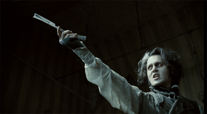
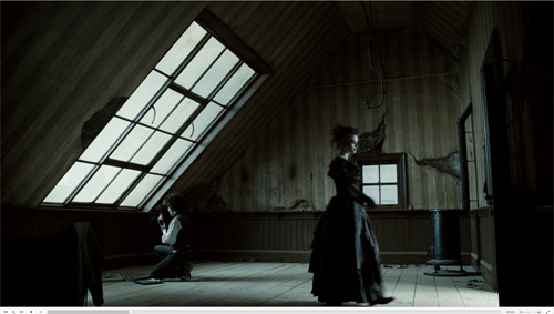
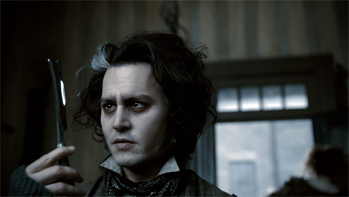
Sweeney Todd: The Demon Barber of Fleet Street (Tim Burton, 2007).
DB here:
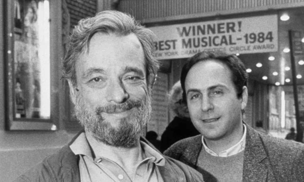
Last month Stephen Sondheim celebrated his ninety-first birthday. By coincidence, I just finished a section on him in my current book on popular storytelling.
The argument there is that art at all levels, high and low, mass and elite, depends on novelty. That demanded accelerated in the twentieth century, with the explosion of book publishing, magazines, film, radio, theatre, and television. I see this process as a vast energy of crossover. Popular and “middlebrow” storytelling picked up on avant-garde innovations. But it seems to me that modernism, even the High Modernism of Joyce, Woolf, and Faulkner borrow more than is usually noted from conventions of popular storytelling. I hazard the view that it’s enlightening to look at how experimentation, innovations that open new avenues of artistic expression, emerge in mass-audience art.
Nowadays, most intellectuals have found something to love in mass culture. (“We are all nerds now.”) It wasn’t always so. In England and America, the “battle of the brows” had as one consequence the idea that true art, usually typified by High Modernism or the more radical avant-garde, was being squeezed. On one side was mass culture, manufactured as a commodity designed to sooth the masses. On the other was “middlebrow” art, which mimicked the techniques of modernism but made them simple enough for suburbanites to follow. By the 1960s, the people who believed in this trinity were in the minority, partly because they began to realize that centering on the most difficult side of modernism created too austere a prototype of all ambitious art. Irving Howe called this “The Decline of the New.”
Not that everything is a mashup. But I think now we all realize that crossover is a valid expressive option, probably the most pervasive one. The mass media make room for a huge amount of creativity that can’t simply be dismissed as lowbrow or middlebrow. And one reason it can’t is because we can still be excited by unexpected innovations.
Hence the importance of the nearly seventy-year career of a man who confessed a “taste for experiment in the commercial theatre.”
Experiments that are fun
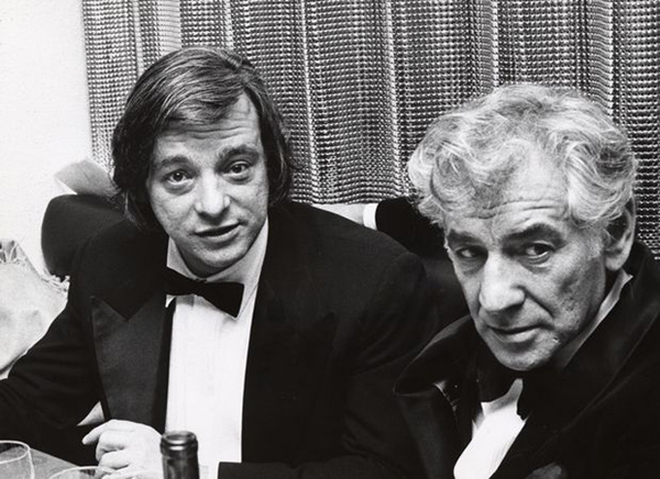
Stephen Sondheim and Leonard Bernstein.
You couldn’t, I think, find a better case for the prospects for experiment in popular culture than his work. His fondness for stage games is part of a theatre tradition we might call “light modernism,” a merging of avant-garde strategies with traditions of popular entertainment. It stretches back to Cocteau’s Parade (1917) and includes the work of Pirandello. Similarly, a trend in British theatre fused aspects of modern theatre (Pinter, Beckett, Ionesco) with the comedy of P. G. Wodehouse and The Goon Show. Tom Stoppard’s Rosencrantz and Guildenstern Are Dead (1966) showed that what was “offstage” in one story could constitute the amusingly doom-laden plot of another.
Alan Ayckbourn dedicated his career to formal experimentation with space (three bedrooms as one in Bedroom Farce, 1975) and time (simultaneous action in How the Other Half Loves, 1969). Intimate Exchanges (1983) spreads forking-path plots across eight separate plays and sixteen possible endings. (Two of the variants are on display in Resnais’ films Smoking/ No Smoking of 1993.) House and Garden (1999) consists of two plays performed simultaneously in two auditoriums, with actors dashing between them. Ayckbourn’s most famous cycle, The Norman Conquests (1973) displays a “stacked” structure; each play gathers all the action taking place in one location and skips over scenes elsewhere, which are assembled in the other plays. The audience must construct the overall story, remembering what has happened just before the scene we see now.
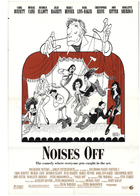 Michael Frayn’s virtuoso Noises Off (1982) probably owes something to Stoppard and Ayckbourn, but it offers its own switcheroo. The opening scene of a sex farce is rehearsed in our first act, is performed skillfully in our second, and collapses in our third view. Crucially, the smooth show of the second act is presented to us in a backstage view displaying the intricate timing involved. Again, an abstract formal concept is mapped onto a conventional scenario, the comedy of a bungled stage production.
Mystery plots make useful targets for this sort of popular experiment. Ayckbourn plotted some plays as quasi-thrillers, and Stoppard’s The Real Inspector Hound (1968) is a parody of the country-house murder. Stoppard undercuts the mystery by a Pirandellian device: two critics down in front are commenting as the performance unfolds. This gives Stoppard a chance to mock pretentious reviewing language. The standard whodunit device of reenacting the murder transforms into a replay of the opening act, but now with the critics taking the roles of detective and victim.
Also not surprisingly, both Ayckbourn and Stoppard declared themselves influenced by cinema, a reliable marker of crossover in modern media. Ayckbourn plays were adapted, with ingratiating wit, to film, while Stoppard wrote several scripts, most famously Shakespeare in Love (1998), which if the term means anything must count as defiantly middlebrow entertainment.
Sondheim is on the same frequency as these masters, but has, I think, greater bandwidth. He plunged into cinephilia more deeply. His early musical influences were Hollywood scores, notably that for Hangover Square (1945); Sweeney Todd, The Demon Barber of Fleet Street (1979) was his tribute to Bernard Herrmann. A Little Night Music (1973) and Passion (1994) were adapted from films. Many of his songs refer to movies, and he composed music for Stavisky (1974), Dick Tracy (1990), and other projects. He was even a clapper boy for John Huston on Beat the Devil (1953).
Instead of parodying mysteries, he has been deeply committed to them. Detective fiction is his favorite reading, and as a puzzle addict he has spent hours devising murder games. “I have always taken murder mysteries rather seriously.” Both Company (1970) and Follies (1971) were initially planned as mysteries, with the latter concerned not with “whodunit?” but “who’ll do it?” Sweeney Todd is a paradigmatic revenge thriller. Asked by Herbert Ross to write a film, Sondheim and Anthony Perkins (another admirer of “the trick kind” of mystery practiced by John Dickson Carr) came up with The Last of Sheila (1973).With George Furth, Sondheim wrote a play, Getting Away with Murder (1996), and with Perkins he planned the unproduced Chorus Girl Murder Case, an homage to 1940s Bob Hope movies. The clues would be hidden in the songs.
Fiddling with formula
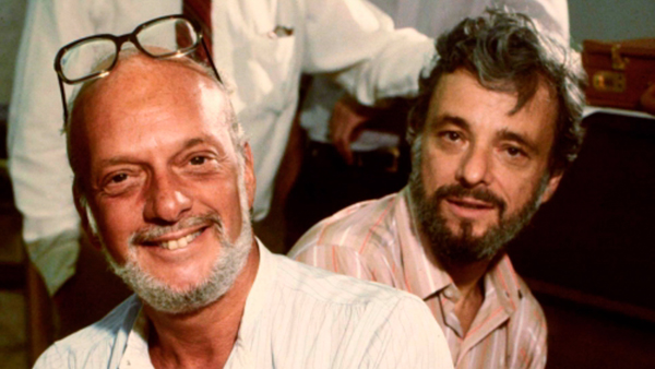
Sondheim and producer/director Hal Prince (left) during rehearsals for Merrily We Roll Along.
Sondheim’s zest for film and mystery fiction reflects a deep admiration for popular culture. It’s one thing to enjoy it, as Ayckbourn and Stoppard clearly do, while also poking fun at its silly side. It’s something else to appreciate its artistry in depth and try to master the conventions yourself. Despite learning “tautness” from the austere avant-gardist Milton Babbitt, Sondheim took as his mentor Oscar Hammerstein II. Tin Pan Alley, with its finger-snap rhythms and suave wordplay, pushed him toward a brisk cleverness. The virtuoso rhymes in his bouncy “Comedy Tonight” (A Funny Thing Happened on the Way to the Forum, 1962) inevitably bring a grin: Panderers! Philanderers! Cupidity! Timidity! . . . Tumblers, grumblers, bumblers, fumblers!
While executing these pirouettes, the song provides a Cliffs Notes guide to Roman New Comedy by contrasting it with tragedy. Tonight, weighty affairs will just have to wait. Sondheim similarly lays bare a convention in his script for the unproduced movie Singing Out Loud, where the couple gradually learn that it’s okay to express emotion in song. “They have to learn to overcome the unreality of it and break into song in the conventional manner of all musicals.”
By taking fun seriously, Sondheim ransacks culture high and low for occasions for experimentation. He was crucially influenced by Allegro (1947), an ambitious Rodgers and Hammerstein musical he considered “startlingly experimental in form and style.” Its use of sliding screens to create “cinematic staging” would become standard in later musicals. He calls Hammerstein “the great experimenter” who used the verse sections of songs to explore possibilities of structure, melody, and harmony.
Sondhim’s breakthrough experiment was Company (1970). It consists of flashbacks framed by the protagonist Robert’s thirty-fifth birthday party. Sondheim claimed it offered “a story without a plot.” The flashbacks don’t supply a goal-directed character arc and instead sample Robert’s bachelor lifestyle and its effects on his three girlfriends and the five married couples in his circle. The result is a compare-and-contrast pattern of parallels. Complicating things further, bits of action are accompanied by a chorus-like commentary from characters not in the scene. Still, there is a certain progression to the whole, indicated by Robert’s disillusioned but faintly hopeful final song, “Being Alive.”
The nonlinearity of Company poimts up Sondheim’s impulse to play with time, viewpoint, and other techniques. Assassins (1990) moves freely back and forth across a hundred years. In Follies characters argue with their former selves. Sunday in the Park with George (1984), built on parallels between two painters, assigns inner monologues to artist and model; characteristically, Sondheim expresses jumbled thoughts by avoiding rhymes. Another duplex structure (Before/ After) shapes Into the Woods (1987), s a virtuoso braiding of classic folktales into a single plot.
Several plays utilize a narrator, who may take a role or converse with the characters. The Narrator of Into the Woods is killed fairly early in the action. Alternatively, Sondheim conceived Passion as an epistolary musical. Characters writing or reading letters operate “somewhere between aria and recitative,” rendering the emotional climaxes as “read rather than acted.” In this excerpt, Giorgio goes to bed with Clara while Fosca is reading his letter breaking up with her. This is a concert performance; in a full production the couple undress on one side of the stage, while Fosca reads the letter. Time floats uncertainly
Working in musical theatre gave Sondheim a layer of implication beyond what Stoppard and Ayckbourn had available with spoken dialogue. A score can evoke earlier scenes through leitmotifs and can enhance characterization. Starting with Anyone Can Whistle (1964) Sondheim created pastiche songs that vary from the show’s overall style. Merrily We Roll Along incorporates cabaret acts (“Bobby and Jackie and Jack”) while Assassins integrates various popular musical traditions, from vaudeville to melodrama. We might think of these pastiches as akin to the “polystylism” of the chapters of Ulysses, which Sondheim strongly admires.
Pacific Overtures (1976), a chronicle of Japan’s early engagements with the west, has the structure of a “portmanteau” film composed of exemplary episodes. It too has a narrator, the Reciter, and its experiments include turning renga linked verse into a passed-along song. The most formally daring scene, “Someone in a Tree,” stages the March 1854 signing of the treaty opening up ports to American ships. We do not see the ceremony, which is held in a secure house.
The Reciter questions an old man who claims that as a boy he watched the negotiations from a tree. During their dialogue, a boy clambers up the tree, and he and his older self collaborate in reporting the event he sees but cannot hear. Then the Reciter discovers a samurai guard hiding beneath the floorboards. He reports what he hears but cannot see. (Beware the YouTube ad at the start.)
As the singers’ accounts intertwine, a moment is assembled through partial perceptions. In a gesture reminiscent of Joseph Conrad’s novels, the event is broken up, made accessible only through partial viewpoints. And only the witnesses attest to the event; without them, we have no access to history. “I’m a fragment of the day./ If I weren’t, who’s to say/ Things would happen here the way/ That they’re happening?” In adapting novelistic techniques for relativistic point of view to the stage, Sondheim, as an experimental storyteller, is ready to plunder any tradition that can yield something fresh.
Form, “content,” and everything in between
Sondheim and collaborator James Lapine.
In his invaluable creative memoirs, Finishing the Hat (2010) and Look, I Made a Hat (2011), Sondheim claims as a basic creative principle “Content dictates form.” But his puzzle-addict efforts to seek out difficulties to be overcome makes me think that this is more alibi than axiom.
I’d rather think that like many experimental artists, Sondheim uses “content” (whatever that is: subject matter, theme, bare-bones story) as at best one ingredient and often as a handy excuse. Sometimes audiences need help when faced with radical novelty. People may have been more receptive to Debussy’s daring pieces because of the “atmospheric” connotations of their titles. The stratagem of labeling one movement of “La Mer” as “From Dawn to Noon on the Sea” was pointed out by Erik Satie: “I liked the part at quarter to eleven best.”
Granted that Sondheim tries to suit his words and music to the genre and story he has selected, he often seems to take “content” as a pretext for solving problems he sets himself. Who else would decide to write all the songs for A Little Night Music in waltz tempo, not least for the challenge of avoiding monotony?
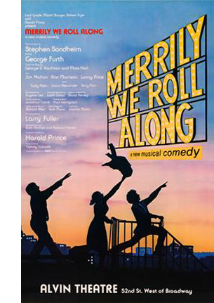 I think Merrily We Roll Along is a good example of how, accepting an initial problem, Sondheim complicates matters “unnecessarily.” This largely forgotten 1934 Kaufman and Hart comedy was formally daring: its scenes play out in reverse chronology, so the last scenes we see in the plot are the first events of the story. In adapting the play to a musical, Sondheim created a story of three twentysomethings trying to break into show business.
The purported rationale for telling their story backward is that it poignantly traces the loss of youthful idealism. But that arc could be just as poignant laid out in chronological order–or, if you want advance knowledge of how the struggles will turn out, via chronological flashbacks wrapped in a contemporary time frame. The reverse chronology seems both an experiment in whether audiences can follow the string of events and an effort to end a sad story in an upbeat way, with the characters still vigorous and hopeful–while we know what awaits them.
Sondheim faced an initial task of making the time scheme clear. He came up with transitional choral passages by the whole company that signal the shift to an earlier block of time. Different productions experimented with ways of reinforcing these musical tags, such as a synoptic slide show reminiscent of the “News on the March” sequence of Citizen Kane.
But the inverted chronology of Merrily We Roll Along also justifies experiments in musical texture. Because the play is about friendship, melodic motifs are swapped among the characters in their soliloquy songs. Moreover, in a 1-2-3 plot, Sondheim explains in Finishing the Hat, fully vocalized melodies are given reprises, shorter versions of the original number. Sondheim could have followed this convention. Instead, in relentless adherence to the reverse chronology, he made the reprises come first, as appetizers for songs yet to be fully heard. The puzzle addict will try to fit everything together in surprising ways, whether the audience realizes the fine points or not.
Solving one problem can launch a cascade of further problems. To introduce a 1980s audience to the musical ambience of Broadway’s heyday, Sondheim opted to revive the thirty-two bar song that he and his generation had “stretched out of recognition.” But then his penchant for pastiche posed a new problem. How to use that schmaltzy song form not just to satirize superficial characters like Joe the producer but to sustain connection to the sympathetic characters when they express authentic emotion?
Sometimes the problem is set not by “content” but by genre, tradition, or purely practical contingencies. Sondheim embraces show-biz conventions to discover what he can do with them. Hammerstein told him that the opening number can make or break a show, so Sondheim strives for a grabber when he can. The eleven o’clock number, a hangover from the days when shows began at eight-thirty, demands a show-stopping vehicle for the stars–e.g. “Anything You Can Do” in Annie, Get Your Gun. For Anyone Can Whistle, Sondheim wrote “There’s Always a Woman,” a rapid-fire comic confrontation between the two stars Angela Lansbury and Lee Remick, dressed identically. He conceived it as “the eleven o’clock number to end all eleven o’clock numbers.” It didn’t achieve what he wanted (“more like a ten-fifteen”) but it indicates his inclination to display virtuosity in response to purely formal demands.
Look, he made a show
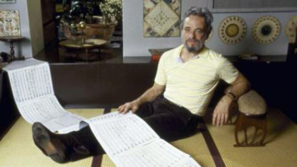
Finishing the Hat and Look, I Made a Hat take us into the artisan’s kitchen–not only the studio or the stage where a team comes together but also the kitchen that’s the mind of the creator, who sweats out as much as possible beforehand. Sondheim shares with us the “choices, decisions and mistakes in every attempt to make something that wasn’t there before.”
This is a rarer accomplishment than you might think. Relatively few artists in any medium have the wish or ability to probe their creative process in detail, from conception to minutiae of execution. There are plenty of artists who talk of story sources and bursts of inspiration, but they seldom get down to the compromises, workarounds, and failed efforts. The best such books on popular storytelling, Sidney Lumet’s Making Movies and Patricia Highsmith’s Plotting and Writing Suspense Fiction, are illuminating, but nothing compared to the multilayered self-consciousness Sondheim brings to the task. He notes: “The explication of any craft, when articulated by an experienced practitioner, can be not only intriguing but also valuable.”
It helps when the artist works in brief, segmented forms, such as the songs that make up a musical. They can be analyzed line by line, and can illustrate the challenges of word choice, rhythm, and rhyme as they relate to the ongoing story, the portrayal of character, and of course the score. This engineering side of construction, basic to popular art, is attractive to a practitioner who happens to be a puzzle fiend. He makes every choice a challenge to his ingenuity.
Take one example, “A Little Priest” from Sweeney Todd. Sweeney has decided to turn his lust for personal vengeance into random barber-chair homicide. This scheme suits Mrs. Lovett’s need to produce better meat pies. The result is a list song, a Sondheim favorite. Here’s the rendition of the Broadway original with Len Cariou and Angela Lansbury, for most of us the definitive version.
The couple deliriously catalogue what citizens might furnish appropriate ingredients. Sondheim’s founding choice: the list will consist not of individuals, who would need naming, but of social types whose titles can rhyme more easily. Sweeney role-plays a customer checking Mrs. Lovett’s imaginary wares.
Todd: What is that?
Mrs. Lovett: It’s priest./ Have a little priest.
Todd: Is it really good?
Mrs, Lovett: Sir, it’s too good, at least./ Then again, they don’t commit sins of the flesh./ So it’s pretty fresh.
Todd: Awful lot of fat.
Mrs. Lovett: Only where it sat.
Todd: Haven’t you got poet/ Or something like that?
Mrs. Lovett: No, you see the trouble with poet/ Is how do you know it’s/ Deceased?/ Try the priest.
Second choice: the song must be constructed so that the rhyming emphasis falls on the types, so the lines end on the name of the profession, as above. Third choice, new constraint: Throughout the play, Sondheim tries for triple rhymes, so one- or two-syllable professions (priest, poet) will allow for that. Fourth choice: the need to build the song out of short lines, which will permit “an increasingly intricate rhyme scheme.” That’s on display here, with priest–least–deceased–priest threaded with flesh–fresh and fat–sat–that and poet–know it.
The song surveys a range of social types, while reminding us of Sweeney’s main target Judge Turpin (“I’ll come again/ When you have judge on the menu”). The climax of the song declares a perverse commitment to equity. “We’ll not discriminate great from small/ No, we’ll serve anyone/ Meaning anyone–/ And to anyone/ At all.” The catalogue culminates in a sprightly celebration of mass murder.
Finicky as ever, Sondheim confesses that he never liked the line “Meaning anyone,” which is a place-filler, but now he says he knows how to improve it.
Why probe the artist’s craft in such detail? Sondheim notes that journalistic reviewers aren’t trained in technique or don’t know the trade secrets; they’re just declaring what they like or dislike. More intellectual and academic critics are inclined to write broad overviews, usually about the cultural sources and effects of the music. A practitioner who explains the cascade of decisions, freely made or imposed from without, can provide something rare. Just as the sports fan enjoys learning the fine points, learning the tricks of the artist’s trade can boost our appreciation. We can learn to enjoy “the spectacle of skill.”
No surprise: I was reminded of the historical poetics of cinema. This approach to film studies tries to analyze how filmmakers draw on the menus of options normalized in particular times and places. In trying to discover principles of craft practice, we seek out any information we can glean from artisans. For this purpose, we’ll not discriminate great from small.
At the movies
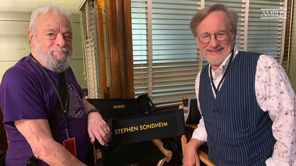
Sondheim with Steven Spielberg on the set of the remake of West Side Story.
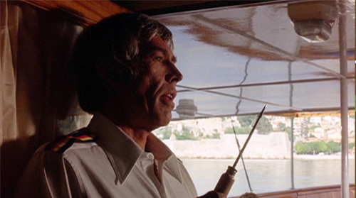
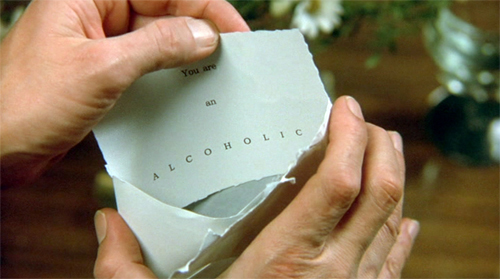
The Last of Sheila is a brittle, cynical satire on the film industry while being a well-designed classic mystery. Sheila Greene is struck down by a hit-and-run driver after she storms out of a party she and her husband Clinton have been holding. Under the promise of a potential movie deal, Clinton gathers six suspects on a pleasure cruise on the French Riviera. Once they’re are aboard, Clinton announces the entertainment: a mystery game. Each guest receives a card declaring a secret, such as “You are a homosexual” and “You are an alcoholic.” Clinton assures them that each is simply “a pretend piece of gossip,” but it becomes clear that the game is designed to expose someone, not necessarily the recipient, as guilty of the card’s charge. Meanwhile, Clinton tries to discover Sheila’s killer.
Every night, at the port they visit, the guests must follow clues to link one of them to a past transgression. The game is interrupted when one of the travelers is killed, and so the survivors embark on their own investigation. As in an Agatha Christie novel, the characters are stock types. There’s the vapid star, her hanger-on husband, the over-the-hill director, the rapacious talent agent, the second-tier screenwriter, and his heiress wife. Again, as in Christie novels like Death on the Nile and Murder on the Orient Express, the yacht cruise isolates the suspects and allows them to debate the identity of the culprit but also also to reveal Clinton’s scheme. In response, the killer has conceived a counterplot for baffling the other guests. Instead of these Christie novels, there is no designated Great Detective to take Hercule Poirot’s place. Any of the people hazarding solutions could be guilty.
In the spirit of the “fair play” detective novel, the audience is provided some clues that flit by, but can be checked on a replay. It’s not a spoiler to note the casual early appearance of an icepick, or the glimpses of some–but not all–of the clue cards.
By contrast, as John Dickson Carr points out, the really skillful mystery writer rubs your nose in the clues. It’s not a matter of a passing mention of the color of a man’s tie, or the way a character pronounced a word.
The masterpiece of detection is not constructed from “a” clue, or “a” circumstance. . . . It is not at all necessary to mislead the reader. Merely state your evidence, and the reader will mislead himself. Therefore, the craftsman will do more than mention his clues: he will stress them, dangle them like a watch in front of a baby, and turn them over lovingly in his hands.
The best example of this tactic in the film is the photograph at the bottom of this entry. The shot lets us dwell on Clinton’s apparently innocuous photo of his guests. Elsewhere the script plays up that old favorite, the discarded cigarette butt.
Sondheim and Perkins’ passion for classic detection is revealed in a long sequence of pure ratiocination. Across twenty-one minutes in the yacht’s lounge, one guest reconstructs the scenario behind Clinton’s game. The layout of space, in both long shots and shot/reverse shot, is quite precise and varied. Of course there are clues in the behavior of certain characters.
Part of the reconstruction turns out to be erroneous, as in the detective-novel convention positing an initial, faulty solution. In all, The Last of Sheila, while memorializing the sort of scavenger hunts and elaborate games Sondheim put his friends through, remains a rare example of an updating of the classic whodunit.
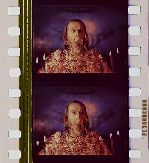
By contrast, the film adaptation of Sweeney Todd is a suspense thriller. The plot doesn’t hinge on an investigation but a pursuit (although that does yield a surprise revelation). Sondheim considers it the only satisfactory film version of one of his shows. “This is not the movie of a stage show. This is a movie based on a stage show.” But then what was the show? Opera? Operetta? No. “What Sweeney Todd really is is a movie for the stage.”
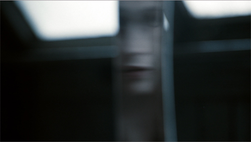
And a grim, brutal one at that. Tim Burton has developed Sondheim’s original through several cinematic strategies. One emphasizes Sweeney’s willed estrangement from humanity. If the stage Sweeney, often played by a large man, has a certain sweeping bravado, Sweeney on film scowls in soft-spoken fury. His puckered brows and pinched lips are set in a face as unearthly pale as a cadaver’s, or a clown’s. This seething little man is presented as virtually locked in his quarters, peering out at the world on which he will wreak vengeance.
Sweeney’s isolation is given a narcissistic cast when he unpacks his razors. He who has no human ties croons to “my faithful friends.”
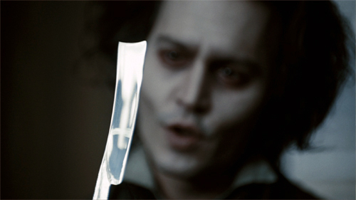
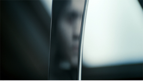
Mrs. Lovett looks on, trying to secure a connection: “I’m your friend, too.” But he ignores her. Burton provides POV shots of Sweeney’s face reflected in his razor blade, a neat way of showing his self-absorption passing into violence.
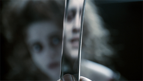
At one point, he seems to register Mrs. Lovett’s gestures of affection, and Burton neatly shows the POV reflection shifting to her.
His contemplation of her as an ally can, it seems, only see her as another reflection of himself and an instrument of his vengeance–a tool, not a lover.
He rejects her affection (“Leave me”) and he twists the razor, turning the reflection back to him. He’s still locked in his solitary obsession.

He finishes the song alone, now even more committed to his mission. A final shot shows him gleefully peering out the window at the city he and his faithful friends will ravage.

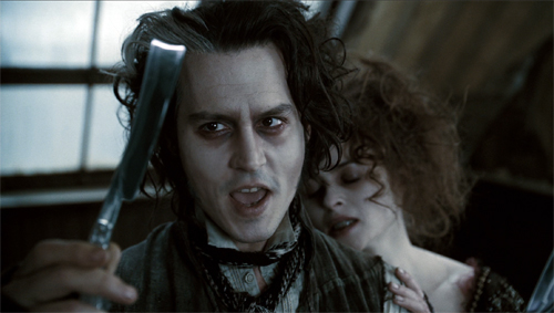
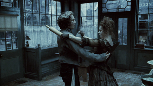
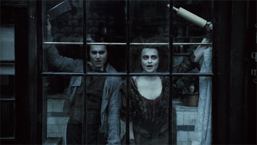
Mrs. Lovett becomes his genuine accomplice in the song, “A Little Priest.” In the stage directions, Sondheim asks that Sweeney and Mrs. Lovett use pantomime to evoke the meat pies they want to harvest from Sweeney’s customers. In the film, however, the pies she has already made are surrogates for the ones she proposes.
Given the more tangible setting, Burton returns to the window motif; Mrs. Lovett’s shop becomes an extension of Sweeney’s enclosed world. The couple’s list-song takes place with the two of them at the windows, scanning the street for victims. As you’d expect, they spot a priest first.
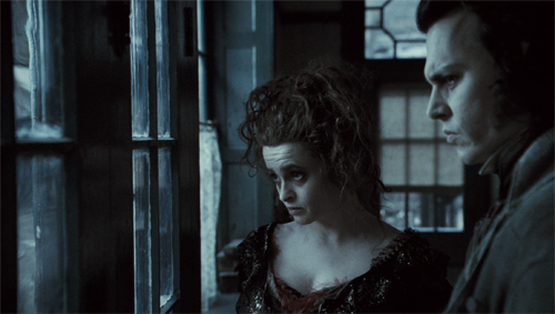
If the barber shop upstairs is Sweeney’s mission control, the pie shop becomes his supply center. Mrs. Lovett realizes that she can get his friendship only by joining his plan for vengeance, and once he realizes her commitment, she becomes an attractive partner. They pledge their partnership in a rolling-pin waltz, and the sequence ends with a shot that echoes the earlier capstone, but including Mrs. Lovett.
There’s a lot more to be said about The Last of Sheila and Sweeney Todd, but I invoke them just to show that Sondheim’s talents can create robust, innovative, sometimes disturbing cinema.
I could imagine someone criticizing Sondheim as the ultimate middlebrow artist. Adapting foreign films (Smiles of a Summer Night, Scola’s Passion) and Grand Guignol to the American musical; turning Seurat’s Grande jatte into a living tableau (and naming the painter’s model Dot!); imposing games with time and viewpoint on a showgirls’ reunion; investing fairy-tale optimism with sinister implication–all can seem too clever by half. An objector might say that a Sondheim show doses schmaltz and hokum with just enough formal ingenuity to let audiences feel clever. But I think that sort of having-it-both-ways defines a great deal of popular entertainment, and it has its own value. Bergman and Seurat and Little Red Riding Hood remain unharmed by plays that take them as pretexts for ravishing music and cunning theatrical games. Formal ingenuity is not a small thing.
Sondheim opened new vistas for the musical to explore. I suppose you can call Lin-Manuel Miranda’s Hamilton middlebrow too, making rap and hip-hop safe for people who can afford a Broadway ticket. But if you think Miranda opened new paths, note that he thinks that Sondheim pointed the way. He took advice from Sondheim while writing the show, and he paid tribute in a preface to an interview:
He is musical theater’s greatest lyricist, full stop. The days of competition with other musical theater songwriters are done: We now talk about his work the way we talk about Shakespeare or Dickens or Picasso.
You don’t have to go that far to see that artists at all levels of taste innovate, and their efforts sometimes oblige us to see fresh expressive possibilities in their artforms. If we are all nerds now, we can become connoisseurs of the experimentation–sometimes subtle, sometimes bodacious–that pervades popular entertainment. Sondheim, meticulous and generous and tirelessly exploring, coaxes us to do that.
I’ve drawn most of my Sondheim quotations from Finishing the Hat: Collected Lyrics (1954-1981) with Attendant Comments, Principles, Heresies, Grudges, Whines and Anecdotes (Knopf, 2010) and Look, I Made a Hat: Collected Lyrics (1981-2011) with Attendant Comments, Amplifications, Dogmas, Harangues, Digressions, Anecdotes and Miscellany (Knopf, 2011). Other remarks come from Craig Zadan, Sondheim & Company (Harper & Row, 1994) and Meryl Secrest, Stephen Sondheim (Knopf, 1998). Google Book Search should help you locate my citations by phrase. Steve Swayne provides a thorough analysis of the role of cinema in his career in How Sondheim Found His Sound (University of Michigan Press, 2005), 159-213.
More general books about the craft traditions Sondheim adopts and revises are Philip Furia’s The Poets of Tin Pan Alley: A History of America’s Great Lyricists (Oxford, 1992) and Jack Viertel, The Secret Life of the American Musical: How Broadway Shows Are Built (Farrar Straus Giroux, 2016. I’ve praised and applied Viertel’s account in this earlier entry.
Sondheim discusses the composition of “Someone in a Tree” in this interview with Frank Rich. The second part is especially revealing about Sondheim’s combining music and lyrics through a vamping figure. That accompaniment, detached from the sung melodies, depends on a “gradual change” principle that reminds me of the minimalist music of Glass (Einstein on the Beach, 1975) and Reich (Music for 18 Musicians, 1976) at the same period. A musicologist would probably correct me, but if the affinity holds good it would further show Sondheim’s pluralistic appropriation of many traditions. Thanks to Jeff Smith for discussions of this and for help with other musical matters.
The John Dickson Carr quotation comes from his 1946 essay, “The Grandest Game in the World.” The most complete version of it is in The Door to Doom and Other Detections, ed. Douglas G. Greene (Harper, 1980), 334-335.
Many fine appreciations of Sondheim appeared around his birthday, but I especially like this one by Jennie Singer, packed with clips.
For a long time Kristin and I have studied innovations in popular storytelling, as in her analysis of narrative in the New Hollywood, my book on the same area, her monograph on P. G. Wodehouse, our book on Christopher Nolan, my studies of Hong Kong cinema and 1940s Hollywood, and comments over the years on this blog (e.g., Paranormal Activity and Happy Death Day). For more on Into the Woods, go here.
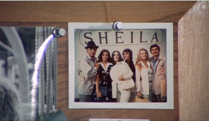
The Last of Sheila (Herbert Ross, 1973). This shot harbors a clue–actually, more than one.
P. S. 18 April 2021: Sondheim has been extraordinarily generous in sitting for interviews describing his creative process, and many are stimulating. Alert reader and master interviewer Brian Rose kindly sent me a link to the remarkable 2020 interview with Adam Guettel that you might enjoy.
Let’s play God, imperfectly: BLOOD SIMPLE on the Criterion Channel
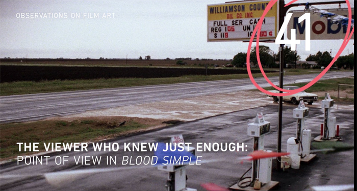
Blood Simple (1984).
DB here:
Over the last couple of years I’ve been writing a book on common strategies of popular storytelling in film and other media. I go on to trace how those strategies get worked out in detective stories and thrillers. If you follow this blog, you know that these genres are ones I enjoy and like studying.
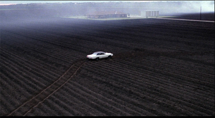
So I was happy to offer as one installment of our Criterion Channel series, Observations on Film Art, a short analysis of storytelling strategies in Blood Simple. In it I suggest that although the film has the trappings of a neo-noir–the somewhat downmarket characters, the seedy milieu, the chiaroscuro lighting–in its narrative techniques it’s closer to a Hitchcock thriller. That’s because its manipulation of point of view, one of the resources of popular storytelling, is close to the “partial and misleading omniscience” of the thriller genre and Hitchcock’s narration in particular.
Put it another way. We aren’t restricted to what only one character knows, as in a detective story like The Big Sleep (1946). Instead, Blood Simple steers us selectively from one character to another. So we always know more than any one of them does. That creative choice increases suspense–knowing the dangers that lurk ahead–but it also summons up an ironic detachment from them, as we watch them make their foolish mistakes. In a word, if you know the film: fish. Here’s another: lighter.
This shifting viewpoint doesn’t give us absolute knowledge, though. There is still some information that slips through the cracks. So we can enjoy superior knowledge in long stretches, while still getting some sudden surprises, or even shocks. (Consider the climax with the perforated wall and the knife at the window.) In their first feature, the Coens prove themselves already fully in control of finely-tuned cinematic storytelling. We’re a step ahead of the characters, but the film is a step ahead of us.
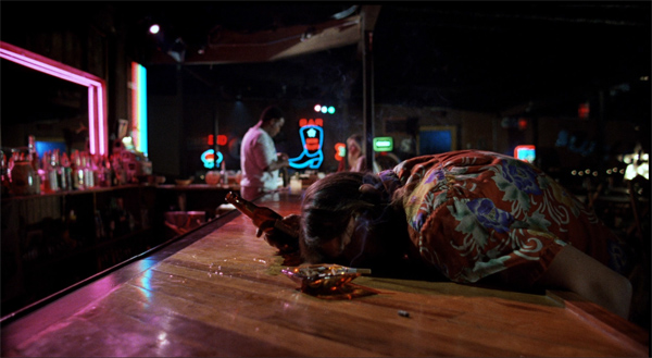
The Coens are also aware of our pleasure in their control. The characteristic Coen awareness, a sly recognition of letting the audience share their power over our access to the story world, is everywhere in evidence. I didn’t have time to mention the shot that everybody remembers, the tracking shot down the bar that simply lifts over the drunk sprawled on the bar top. We become aware of how the movie’s unfolding narration is absolutely ruling how we see this world, and the Coens make a gag out of it. Even the camera-god has a sense of humor.
If you have a chance to watch it, Jeff Smith, Kristin, and I hope you enjoy it–and, of course, the film, which is endlessly rewatchable.
As usual, thanks to the team at Criterion: Peter Becker, Kim Hendrickson, Penelope Bartlett, and their superb postproduction boffins. We recorded the commentary under Covid conditions, with the expert guidance of Erik Gunneson, Meg Hamel, and James Runde.
For more on the Coens’ mastery of storytelling technique, check out the analysis of their fine The Ballad of Buster Scruggs.
You can sample other blog entries on mysteries and thrillers in several entries, in particular our discussions of Hitchcock (of course), and the genre as a whole (here and here and here). An early version of one chapter of my book in progress is devoted to the great Rex Stout. Another chapter will revise what I said about Gone Girl. I also discuss Hollywood’s approach to crime and mysteries in the book Reinventing Hollywood: How 1940s Filmmakers Changed Movie Storytelling.
Blood Simple (1984).
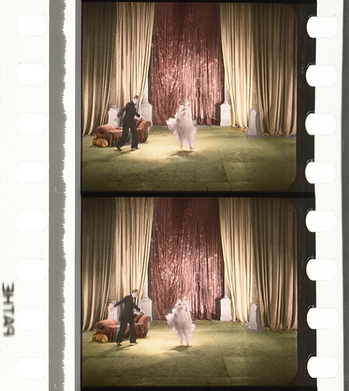
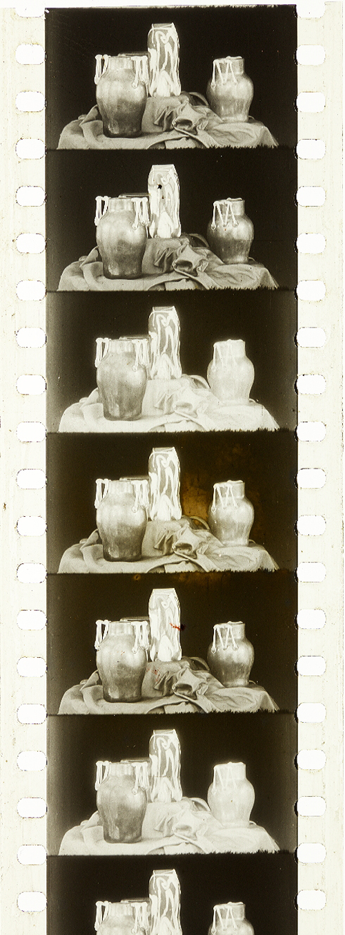
Historical film colors: A guest entry from Barbara Flueckiger
Trois couleurs: Bleu (France/Poland/Switzerland 1993, Krzysztof Kieślowski). Credit: Library of Congress. Photograph of the Agfa Gevaert safety print by Barbara Flueckiger.
Kristin here:
To the general film-going public, old films are in black-and-white. They may be vaguely aware that before The Wizard of Oz and Gone with the Wind, color film was invented.
The history of film color, however, is vastly more complicated than that. Prof. Barbara Flueckiger, of the University of Zurich, has devoted much of her career to studying that history. With Eva Hielscher and Nadine Wieylisbach, she co-edited the 2020 collection, Color Mania: The Material of Color in Photography and Film (Zurich: Eds. Lars Müller/ Fotomuseum Winterthur). Barbara has also spent the past decade leading a team who have created a recently inaugurated and invaluable website that acts as a boundless resource for information on color processes.
We are delighted that Barbara has accepted our invitation to write a guest blog entry for us. She describes the website and gives a succinct outline of the history of film color, loaded with beautiful illustrative frames. Most of these were taken from original archival prints that reveal how seldom–especially in this age of digital home video–we see color films as they looked when they were released.
Barbara Flueckiger
From their earliest days, films were colored. During the first three decades, most color imagery was obtained by applying dyes to black and white prints, either by hand, through stencils, or as tinting and toning of the filmstrips. From the beginning, however, many ideas emerged to capture colors directly on film as so-called mimetic colors. That could be done either by optical and mechanical means, such as colored rotary filters, or by chemical interventions, often in combination with optical configurations of cameras. Several hundred analog color processes and film stocks were invented in the first 100 years of film history. Many of them were never successful commercially.
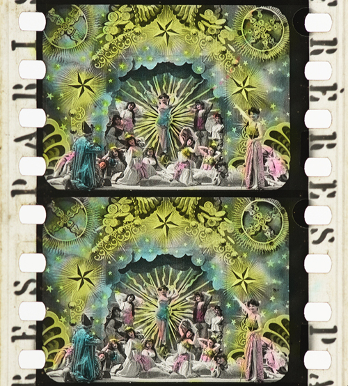
Ali Baba et les quarante voleurs (France 1902, Ferdinand Zecca). Credit: BFI National Archive. Photograph of the stencil-colored nitrate print by Olivia Kristina Stutz.
This history is largely unknown to the general audience as well as to many film scholars and historians.
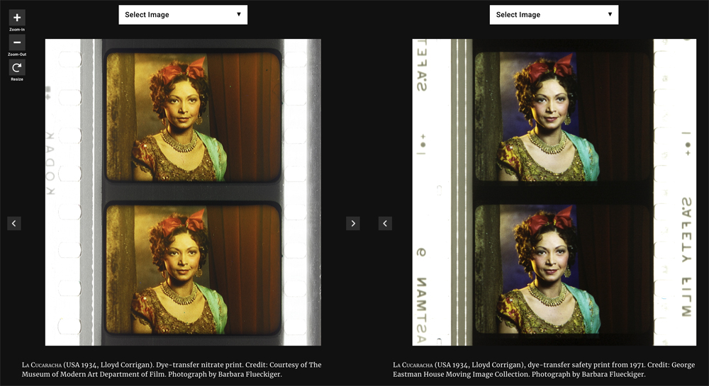
To close this gap in our knowledge, in 2011 I started to develop the Timeline of Historical Film Colors, a comprehensive web resource. I wanted to document the development of film colors from their prehistory in still photography in the 19th century to the latest developments in the analog domain. As of 2021, the platform contains hundreds of primary and secondary sources, patents, links, selected analyses, physical measurements and downloads, as well as more than 23,000 photographs of historical film prints and negatives. These items provide film historians, researchers, archivists, curators, film restorers and students easy access to a vast array of information. A tagging system connects the entries, galleries, photos and quotes to an underlying thesaurus containing certain topics, persons, aesthetic concepts, technologies, archives, genres, persons or companies. A comparison function allows side-by-side inspection of different prints of the same film.
Why film color?
The comparison function allows the side-by-side inspection of different prints of the same film.
High-resolution photographs displayed in galleries are a central part of the Timeline of Historical Film Colors. Early on I developed a method to photographically capture and document historical film materials in a standardized way. It uses a modular and calibrated camera set-up based on a DSLR camera with a macro lens and remote control from the computer to adjust all the parameters. It is crucial to show the full range of color processes in an aesthetically pleasing way, one that aims at recreating the visual impression on the bench, including the edge information and color distribution in the perforation area. These elements are vital for the identification of film stocks and the genealogy of prints.
These photos allow researchers and students to examine individual historical prints, since they often have to work with less-than-ideal digitizations on DVDs and Blu-rays that are just a faint echo of the historical source material. In recent years this photographic method has been adopted by my teams in the current research projects. Some archives, such as the Academy Film Archive, have started to use the method, and the BFI National Archive and the George Eastman Museum plan to do so soon.
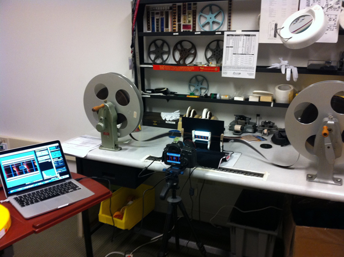
Our modular camera set-up in use at the bench.
During the last years my teams and I visited many archives in Europe, the US and Japan to take these photographs, such as the Harvard Film Archive, EYE Filmmuseum Amsterdam, National Film Archive Prague, Deutsche Kinemathek Berlin, the Academy Film Archive, the Library of Congress, George Eastman Museum, the BFI National Archive, Cinémathèque française Paris, the UCLA Film & Television Archive, Bundesarchiv Filmarchiv Berlin, Museum of Modern Art, DFF Deutsches Filminstitut & Filmmuseum Frankfurt, the National Film Archive of Japan and others.
On the Timeline of Historical Film Colors each contributing archive is represented with a header slide that gives access to the film elements from their collection.
The lost colors of film history
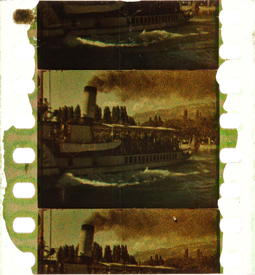
Most films produced before the mid-1930s have been passed on in black-and-white prints. It was not until the famous FIAF conference in Brighton 1978 that the colors of the first decades of film history began to attract some attention from insider circles focusing on silent film.
To this day, the lack of awareness of film’s colorful past has persisted. Early applied colors such as tinting, toning, hand-coloring, and stencil-coloring are ephemeral by nature, since each exhibition print was dyed separately, in a variety of shades and hues. Moreover, these prints were produced with highly flammable nitrate cellulose as a base. Many deadly cinema fires in the early decades of the 20th century demonstrated the dangers of nitrate stock. Therefore, many original colored film prints have been hidden in cans sitting on the shelves in archives’ nitrate vaults. These facilities are fitted with special safety measures such as break-off walls and earth dams.
Eventually in the 1950s safety celluloid film stocks replaced nitrate. From that point on, new prints of colored early films were made on safety stock from the black-and-white camera negatives, intermediate negatives, or positive distribution prints. When colored distribution prints were used, the new copies were usually made only in black-and-white.
In the early 1980s a second threat to the history of colors in film became apparent. Martin Scorsese was among the prominent filmmakers and scholars who rang the alarm bell over the fading of so-called chromogenic stocks produced from the late 1930s to the 1980s. Due to the physical decay of mainly the cyan dye in these film stocks, original prints become nearly monochromatic, retaining mainly colors in the magenta to red spectrum. To this day, dye fading has remained one of the most pervasive problems for the search of authentic film colors.
Color fading. Blade Runner (USA 1982, Ridley Scott). Credit: Library of Congress. Photograph of the Eastman Color Print Film by Joëlle Kost.
Applied colors
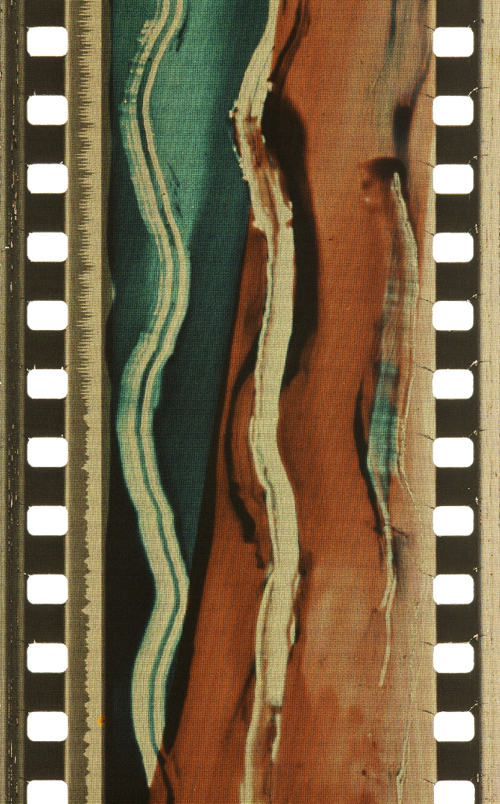
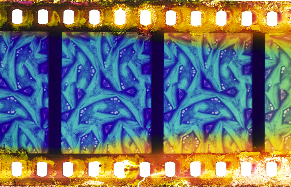
During the first three decades, so-called applied colors dominated. Historians estimate that about 80% of film prints were colored by tinting, toning, or hand- and stencil-coloring.
Tinting means submerging black-and-white film positives into dye baths, so that the prints’ gelatin emulsion acquired a more or less uniform, mostly monochrome color. Tinting can be identified by the inspection of the perforation area that is also uniformly colored. Toning, on the other hand, is a complementary process whereby the silver image is replaced by colored metallic pigments (metallic toning) or dyes (mordant or dye toning). In contrast to tinting, toning leaves the perforation area mostly colorless.
Tinting. Malombra (ITA 1917, Carmine Gallone). Credit: Cineteca di Bologna. Photograph of the tinted and toned nitrate print by Barbara Flueckiger.
Toning. Voyage autour d’une étoile (France 1906, Gaston Velle). Credit: Cineteca di Bologna. Photograph of the toned nitrate print by Barbara Flueckiger.
For these coloring processes the individual prints had to be cut into segments that were then dyed in batches and reassembled into the final distribution print. As a result, individual prints can vary considerably in their color schemes.
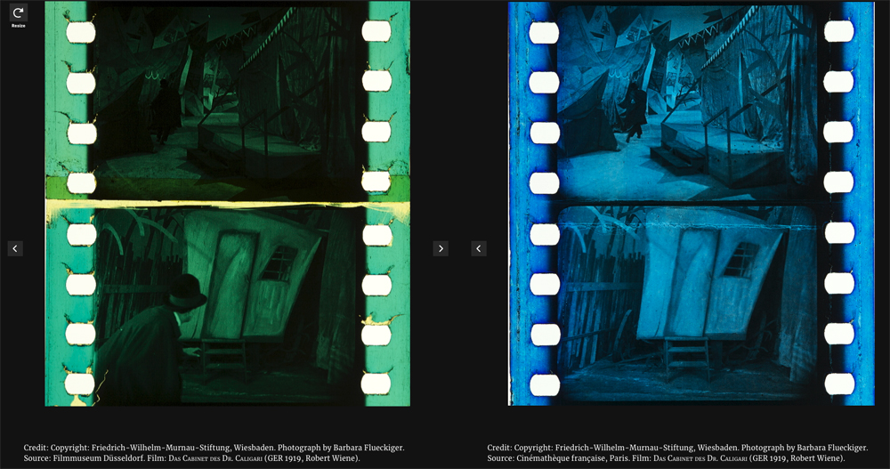
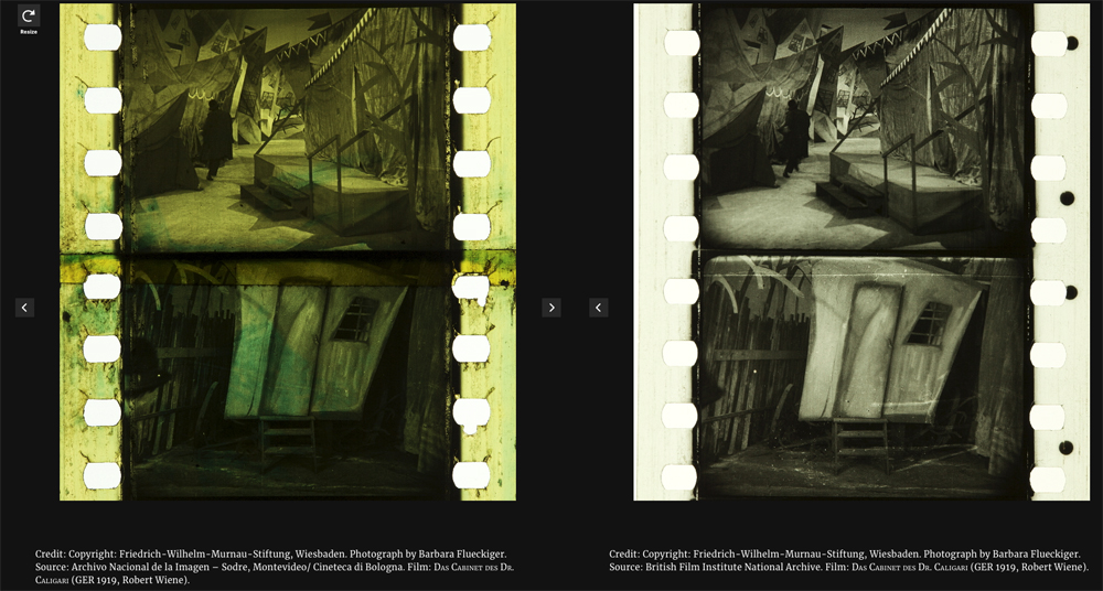
Comparison of four differently tinted and toned distribution prints of Das Cabinet des Dr. Caligari (Germany 1919, Robert Wiene). Copyright: Friedrich Wilhelm Murnau Foundation. Photographs by Barbara Flueckiger.
Whether tinting and toning schemes vary due to cultural norms and tastes has remained a topic of debate. To a high degree it is also uncertain who made the decisions about the coloring, except for cases where scripts, production notes, or film negatives indicate the attribution of colors. In addition to colored prints there were so-called copyright books that show the color scheme by single frames attached to the pages of the booklets, deposited at the Library of Congress by distributor George Kleine. Subtle shades emerged that often make it difficult to distinguish between the two, because the black silver image gives way to nuanced interactions with the tinting dyes in middle tones.
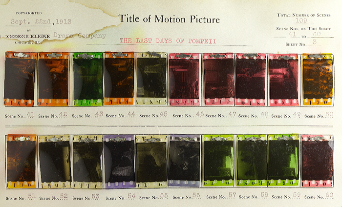
Copyright book from George Kleine: Gli ultimi giorni di Pompei (Italy 1913, Eleuterio Rodolfi). Credit: Library of Congress. Photograph Barbara Flueckiger.
In some cases, combining tinting and toning allowed for two colors to appear within a single image.
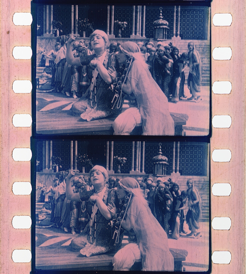
Tinting and toning combined. Sumurun (Germany 1920, Ernst Lubitsch). Credit: Bundesarchiv-Filmarchiv. Photograph of the tinted and toned nitrate print by Olivia Kristina Stutz.
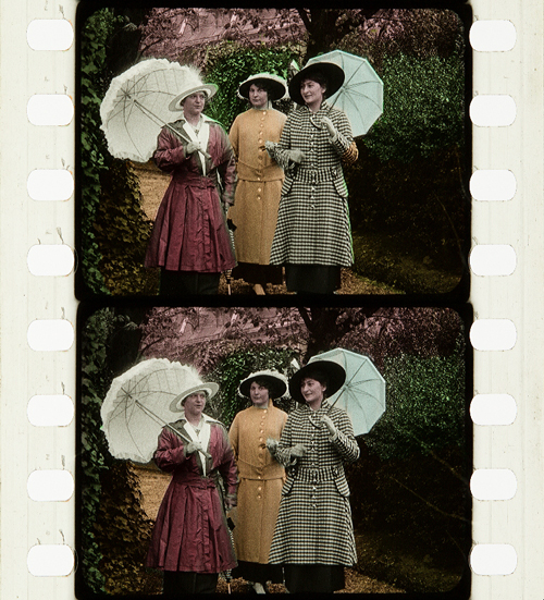
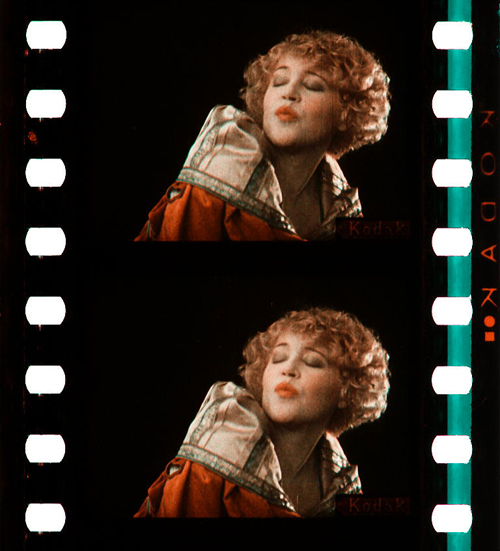
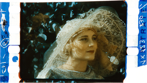
The range and variety are even greater in the case of hand and stencil coloring. These techniques generally required the application of up to six dyes on each individual frame, either by hand through tiny brushes or by cut-out stencils. These laborious processes were demanding, given the small image area and the huge number of frames, generally 16 to 18 per second of running time. Hand-colored films show an uneven application of dyes with soft transitions between individual colors. For stencil coloring, each dye necessitated a separate, colorless print from which the stencils were cut out by needles or metallic styluses. As a result, shapes appear more or less sharp-edged. It was a mechanized version of hand coloring that allowed the coloring of feature-length films and higher numbers of distribution prints. Over the years, improved techniques were introduced to transfer the shapes from projected magnifications onto the film prints with the help of pantographs.
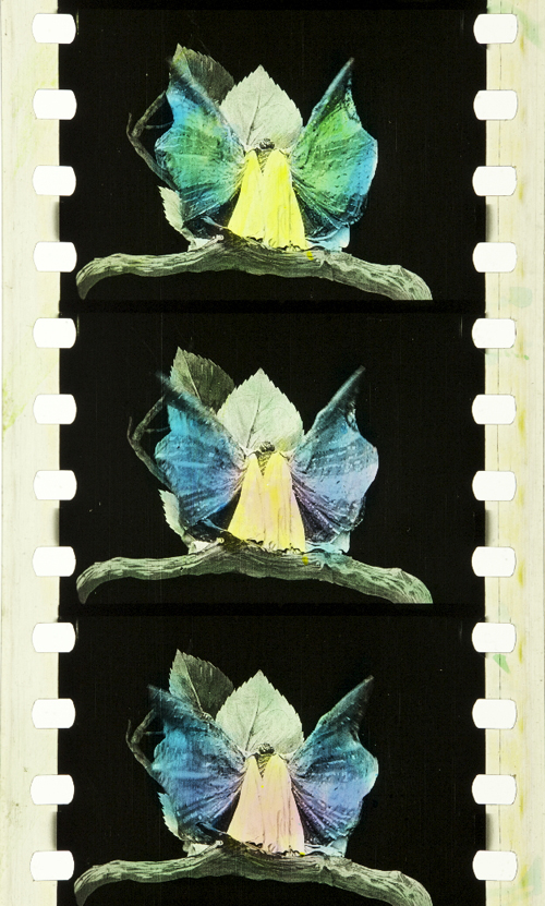
Hand coloring: Métamorphoses du papillon (France 1904, Gaston Velle). Credit: Library of Congress. Photograph of the hand-colored nitrate print by Barbara Flueckiger.
Stencil coloring. Cyrano de Bergerac (Italy/France 1923, Augusto Genina). Credit: EYE Filmmuseum Amsterdam. Photograph of the tinted, toned and stencil colored nitrate film by Barbara Flueckiger.
Needless to say, stencil and hand coloring were reserved for more ambitious or luxurious films. However, they also allowed for the creation of a higher reality effect in documentaries, travelogues, or fashion films by anticipating the development of mimetic colors. Exotic places, ethnicities, or historical settings were among the prevailing topics of stencil-colored films.

Documentary. La mangouste ou rat des pharaons (France 1914). Credit: Cineteca di Bologna. Photograph of the stencil-colored nitrate print by Noemi Daugaard.
Fashion film. Modeflitsen (France 1918). Credit: EYE Filmmuseum Amsterdam. Photograph of the stencil-colored nitrate print by Bregt Lameris.
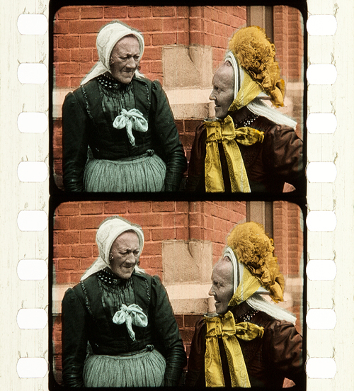
Travelogue. Coiffures et types de Hollande (France 1910, Alfred Machin). Credit: Cineteca di Bologna. Photograph of the stencil-colored nitrate film by Barbara Flueckiger.
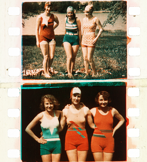
In fact, the richness and scope of stencil-colored films can be fascinating to the modern viewer. That holds true for both the bolder color in the first decade of the 20th century or the more nuanced pastel shades that became increasingly prevalent in the 1920s.
Bold colors in early film. L’Amour d’esclave (France 1907, Albert Capellani). Credit: Library of Congress. Photograph of the stencil colored nitrate film by Barbara Flueckiger.
Subtle pastel shades in the 1930s. Elstree Calling (Great Britain 1930, André Charlot; Jack Hubert; Paul Murray; Alfred Hitchcock ). Credit: BFI National Archive. Photograph of the stencil colored nitrate print by Olivia Kristina Stutz.
A special case of applied colors is the Handschiegl process, a printing process developed by Max Handschiegl and Alvin Wyckoff, often used in Cecil B. DeMille’s films, especially for title cards. It produces highly detailed and precise colors with stunning effects.
Handschiegl. Joan the Woman (USA 1916, Cecil B. DeMille). Credit: George Eastman Museum. Photograph of the tinted, toned and Handschiegl nitrate print by Olivia Kristina Stutz.
Mimetic colors
Already in France in the 1860s, Charles Cros and Louis Ducos du Hauron separately wrote descriptions of many of the principles for achieving mimetic colors in still photography. As it turned out, however, it was a much more demanding task to develop solutions for moving pictures. Some of the problems related to the high throughput during projection of 16 or more single frames per second. Other problems resulted from much higher requirements for image size on the big cinema screen, where resolution and registration were paramount. Due to the rapid succession of frames necessary for the illusion of movement, minute deviations occurring between frames created disturbing amounts of flicker or color fringing. Contemporary commentators often labeled the result as “color bombardment” that caused “eye strain”.
To this day, mimetic colors combine two to four color components either in additive or subtractive admixtures. In the 19th century their development followed psychophysical insights into the human visual system by Thomas Young and Hermann von Helmholtz. They showed that color impressions are the result of physiological sensors in the human retina sensitive to three different spectral ranges of the visible light.
Additive colors
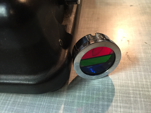
Additive admixtures operate with colored light where the sum of the three additive primaries red, green and blue results in white light. The earliest attempts to create colors on the screen by optical means employed additive principles by rotary filters in front of the camera and projector respectively. These included the three-color Turner Lee and the most successful additive two-color process Kinemacolor.
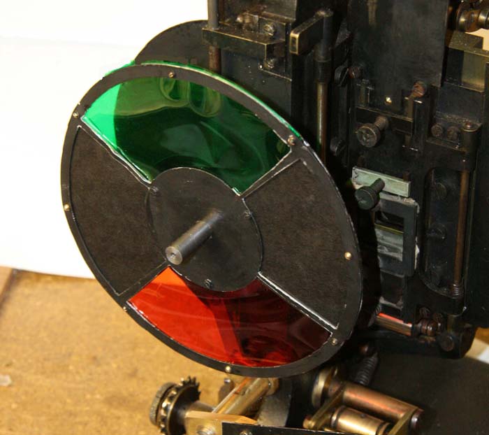
Rotary filter in front of the Kinemacolor projector used for David Cleveland’s and Brian Pritchard’s reconstruction. Credit: Brian Pritchard.
Kinemacolor positive from the Kodak Film Samples Collection. Credit: National Science and Media Museum Bradford. Photograph by Barbara Flueckiger in collaboration with Noemi Daugaard.
In Kinemacolor, rotary filters in red and green spinning in front of camera and projector recorded and transmitted the color information by temporal synthesis. The impression of color was created in the eyes of the spectators. Based on contemporary reports and digital reconstructions, the poor quality and limited color spectrum were readily apparent. Due to the temporal shift between the two successive frames with the red and green color separations, Kinemacolor and all processes operating by the same principle created color fringes and a headache-inducing amount of flicker.
Mroz Farbenfilm. Urlaubfarbenfilm F. Apfelthaler (AUT 1932, Friedrich Apfelthaler). Credit: Österreichisches Filmmuseum. Video and reconstruction by Giorgio Trumpy, David Pfluger and Martin Weiss.
Attempts with temporal synthesis were followed by additive processes that employed spatial synthesis by the application of beam splitters. In this configuration, up to three color records were taken through filters simultaneously to eliminate temporal parallax. But this approach introduced spatial parallax instead, and this arrangement could also create color fringes by poor registration. Gaumont’s Chronochrome process was certainly the most convincing attempt to combine three color separations with this principle.
Gaumont Chronochrome positive from the Kodak Film Samples Collection. Credit: National Science and Media Museum Bradford. Photograph by Barbara Flueckiger in collaboration with Noemi Daugaard.
A third type operating with additive admixtures of light are the so-called screen processes. Additive colors are mixed, either by random, small-scale mosaic image elements or by organization into lines. Color impressions in these systems result from the fusion of the individual dots or lines into red, green and blue in visual perception. The effect resembles that of pointillist paintings where colors are divided into small dots.
Lenticular screen processes, by contrast, combine tiny lenses imprinted onto a black-and-white film strip with colored filters in front of the camera and projector.
Kodacolor lenticular filter for the projector. Lichtspiel/Kinemathek Bern.
Mosaic screens created by colored potato starch were popular in still photography with the Lumière brothers’ Autochromes, introduced in 1907 and widely used by professionals and advanced amateurs. The principle was later adopted in the Cinécolor process for color film but failed due to the uneven distribution of the starch particles. Among the line screen processes, Dufaycolor was the most successful one, widely used in documentaries and famously in Len Lye’s experimental films with direct animation painted directly onto the film strip and then captured and distributed on Dufaycolor film stock. Apparently, Lye was not convinced by the somewhat muted color palettes of the process.
Stereoscopic Autochrome Lumière. Exhibition Color Mania – Materiality of Color in Photography and Film, Fotomuseum Winterthur, September 7 to November 24, 2019. Photo by Barbara Flueckiger.
Photomicrograph of Cinécolor (20x). Credit: Photomicrograph by Silvana Konermann.
Cinécolor sample. Credit: Gert Koshofer Collection. Photograph by Barbara Flueckiger.
Photomicrograph of Spicer-Dufay, early Dufaycolor (20x). Credit: Photomicrograph by Silvana Konermann.
Dufaycolor. A Colour Box (Great Britain 1935, Len Lye). Credit: BFI. Photograph of the Dufaycolor di-acetate print by Barbara Flueckiger.
Lenticular films such as Kodacolor were also mostly used for home movies with the exception of Thomson color for Jacques Tati’s Jour de fête (France, 1949).
None of the additive principles proved to be successful for the long term. Many of them required special installations in the cinema, and most delivered poor results, most notably dim images.
Subtractive colors
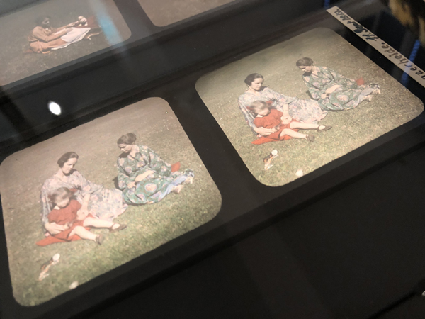
Finally, subtractive admixtures became the norm. The three primaries cyan, yellow and magenta filtered the light, with black being the sum of these three subtractive colors. Two or three differently colored emulsion layers are attached to the film base, on one side or both sides of the film.
Most early two-color films were using double coated film stock. The earliest one was Kodachrome Two-color developed in 1915, presented in 1916 with the short film Concerning $1000, but mostly in use in the 1920s for fashion films, for the dance film The Flute of Krishna (USA 1926) by choreographer Martha Graham and for the experimental film [Kaleidoscope] by Loyd A. Jones. Kodachrome Two-color film was shot through a beam splitter and combined two emulsions in orange-red and bluish green on either side of the film carrier, with beige, brown and golden tones in the spectrum between the two color components.
Kodachrome Two-color Test Shoot No. III (USA 1922, Anonymous). Credit: George Eastman Museum. Photograph of the Kodachrome two-color double coated stock by Olivia Kristina Stutz.
Kodachrome Two-color. [Kaleidoscope] (USA ca. 1927, Loyd A. Jones). Credit: George Eastman Museum. Photograph of the Kodachrome two-color double coated stock by Barbara Flueckiger.
Sirius Farbenfilm. [Farbfilmversuche] (Germany 1920s or 1930, Ludwig Horst; Hans Horst). Credit: Deutsches Filminstitut DFF. Photograph of the Sirius color nitrate print by Barbara Flueckiger.
Multicolor. Credit: Gert Koshofer Collection. Photograph by Barbara Flueckiger.
Prizma II. The Glorious Adventure (Great Britain 1922, J. Stuart Blackton). Credit: BFI National Archive. Photograph of the tinted and Prizma II nitrate print by Olivia Kristina Stutz.
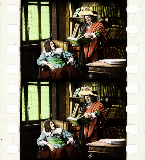
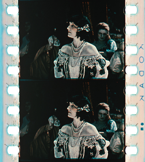
In the 1930s subtractive processes turned to three colors, most famously with Technicolor No. IV and the subsequent Technicolor No. V, which was printed from chromogenic camera negatives. Founded in 1915, the Technicolor Company went through many failures and set-backs, with the exception of a short color rush in the late 1920s with the two-color dye-transfer process Technicolor No. III. Following the series Great Events with 12 short films produced by the Technicolor company to establish the process, mostly musicals and a few other genres exploited the two-color process during this short boom. But some of them are highly remarkable, with sophisticated camerawork by Technicolor’s own cinematographer Ray Rennahan, including the musical Whoopee! (USA 1930, Thornton Freeland) choreographed by Busby Berkeley, King of Jazz (USA 1930, John Murray Anderson, Pál Fejös), Doctor X (USA 1932, Michael Curtiz), and Mystery of the Wax Museum (USA 1933, Michael Curtiz).
Technicolor No. III. Doctor X (USA 1932, Michael Curtiz). Credit: UCLA Film & Television Archive. Photograph of the Technicolor No. III dye-tranfer nitrate print by Barbara Flueckiger.
Technicolor No. III. King of Jazz (USA 1930, John Murray Anderson; Pál Fejös). Credit: Library of Congress. Photograph of the Technicolor No. III dye-tranfer nitrate print by Olivia Kristina Stutz.
While the technologies applied in Technicolor’s various processes changed considerably over the years, the beam splitter was one of the few constants. Both in Technicolor No. II and III, a beam splitter separated the two color records and captured them mirrored upside down on one black-and-white negative. The bulky and heavy Technicolor No. IV camera recorded the color separations on three black-and-white 35 mm negatives. From these three negatives matrices were produced as wash-off reliefs, ready for the dye-transfer of the three primaries onto the positive print. The result was a series of color images, along with the frame lines and the soundtrack as silver images.
For almost two decades Technicolor dominated the market for high-quality color films. Part of its success was due to a comprehensive package that included the camera, specialized cinematographers, and all the lab works executed exclusively in Technicolor’s own plants. One of the building blocks of Technicolor’s long-term dominance, however, was the so-called Color Advisory Service, famously led by color consultant Natalie M. Kalmus. She defined aesthetic guidelines for film productions shot with the process, informed by color norms related to concepts of “elevated taste,” located in a broader cultural context with references to the concept of “color consciousness.”
Technicolor No. IV. The Life and Death of Colonel Blimp (Great Britain 1943, Michael Powell; Emeric Pressburger). Credit: BFI. Photograph of the dye-transfer nitrate print by Barbara Flueckiger.
Technicolor No. IV. Blood and Sand (USA 1941, Rouben Mamoulian). Credit: BFI. Photograph of the dye-transfer nitrate print by Barbara Flueckiger.
Technicolor No. IV. Gentlemen Prefer Blondes (USA 1953, Howard Hawks). Credit: Library of Congress. Photograph of the dye-transfer safety print by Barbara Flueckiger.
Despite all the efforts to control the color schemes, people often associate Technicolor with highly saturated, deep colors. On close inspection in our detailed analyses of color films, however, we have observed that many films adhere to the rules with mostly restrained color schemes and unsaturated backgrounds to guarantee optimal figure/ground separation. But there are also deviations from these self-imposed norms, surprisingly clashing hues even in films produced with Natalie M. Kalmus as color consultant.
Moreover, there is a great variability of different looks and color applications during the almost two decades. Individual color aesthetics were related to personal styles of cinematographers, directors or production companies, genres or changing preferences in fashion and design, and changing color compounds and recipes employed in the process. Technicolor’s idiosyncrasies – what we perceive as typical “Technicolor look” – are mostly due to the dye-transfer process itself. Pasty, dense colors in patchy structures create an almost opaque appearance on the screen, an effect somewhat like oil paint. When we work with the film elements on the bench in archives, we not only have to increase exposure considerably due to the density of the film stock, but we also notice the color layer’s almost sticky viscosity, often visible as a relief on the surface.
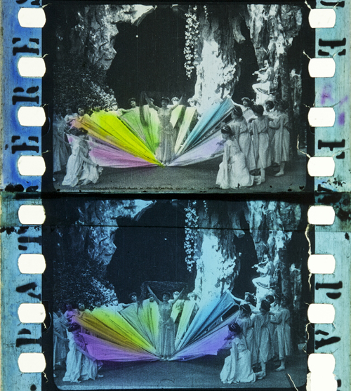
Compared to Technicolor, Gasparcolor produced much more saturated, brilliant and luminous colors. In fact, the process, developed in the early 1930s by Hungarian emigré Béla Gaspar in Germany, was possibly the most advanced and complex process at the time. In its principle–the silver dye-bleach process described by Raphaël E. Liesegang in the late 1890s – the silver acted as a catalyst for the local destruction of the dyes embedded in the three emulsion layers on the two sides of a reversal positive. It is thus a chromolytic reversal process. Due to the political circumstances during the Third Reich in Germany, Gaspar eventually had to flee.
Like Technicolor Gasparcolor required the recording of three color separations on black-and-white negatives. Since most of the Gasparcolor films were animations, these separations were captured in succession on adjacent film frames but could of course also have been shot through a beam splitter similar to Technicolor No. IV. In fact, only one documentary is widely known, Colour on the Thames (Great Britain, 1936), shot by Adrian Cornwell-Clyne. Among the films produced with Gasparcolor are famous avant-garde experimental films by Oskar Fischinger, Hans Fischinger, and Len Lye. Gasparcolor prints can easily be identified by the black perforation area and the colored soundtrack.
Gasparcolor. The Ship of the Ether (Netherlands 1934, George Pal). Credit: BFI National Archive. Photograph of the Gasparcolor nitrate print by Barbara Flueckiger.
Gasparcolor. Colour on the Thames (Great Britain 1935, Adrian Klein). Credit: BFI National Film Archive. Photograph of the Gaspar color nitrate print by Barbara Flueckiger.
Gasparcolor. Rainbow Dance (Great Britain 1936, Len Lye). Credit: Museum of Modern Art. Photograph of the Gaspar color nitrate print by Barbara Flueckiger.
Both Technicolor and Gasparcolor prints stored in archives are in remarkably good shape, due to their stable colors. Ironically, chromogenic film stocks, the technical principle that ultimately won the competition and became the new standard, had the least stable dyes. Chromogenic means that the dyes need to be developed after exposure. Embedded in the emulsion of a single strip of film stock are three or more layers. These layers are sensitive to different spectra. All contain silver halides and the color-forming substances, so-called dye couplers that are subsequently developed into dyes. In a second stage the silver is bleached out and leaves the color information in the form of finely dispersed dye clouds in the three or more emulsion layers in cyan, magenta and yellow. The result is a highly translucent, glowing image whose fine-grain structure depends on the speed of the film stock. The slower the speed, the finer the grain.
In contrast to Technicolor the shooting of the chromogenic film could be done with normal cameras on one negative or camera reversal. Chromogenic films increasingly became the norm, starting with Agfa’s first negative-positive process Agfacolor. Emerging in the late 1930s, Agfacolor was promoted by German propaganda in a bid to counteract Technicolor’s dominance. Agfacolor had particularly soft colors in the pastel range with a typical, slightly darkened orange-tomato red. Difficulties in the blue range produced turquoise shades that become quite apparent in skies. Greens had a tendency to look brownish or blackened; shadows had a greenish tinge. Chromogenic multilayer film stocks were incredibly difficult to balance and to produce, requiring a high level of knowledge in physics and chemistry.
Agfacolor. Münchhausen (Germany 1943, Josef von Báky). Credit: Copyright Friedrich Wilhelm Murnau Foundation. Bundesarchiv Filmarchiv. Photograph of the Agfacolor safety print (acetate) by Barbara Flueckiger.
Agfacolor. Opfergang (Germany 1944, Veit Harlan). Credit: Copyright Friedrich Wilhelm Murnau Foundation. Filmmuseum Düsseldorf. Photograph of the Agfacolor Safety Print by Barbara Flueckiger.
Agfacolor. Grosse Freiheit Nr. 7 (Germany 1944, Helmut Käutner). Credit: Copyright Friedrich Wilhelm Murnau Foundation. Bundesarchiv Filmarchiv. Photograph of the Agfacolor nitrate print by Michelle Beutler.
Agfacolor. Der schweigende Stern (German Democratic Republic 1960, Kurt Maetzig). Credit: Bundesarchiv Filmarchiv. Photograph of the Agfacolor safety print by Josephine Diecke.
After World War II ended, the Allies were able to exploit German color-film patents. The result was the appearance of Fujicolor, Eastman Color, and many derivatives, such as Ferraniacolor, Ansco Color, and Sovcolor. The worldwide adoption of color in film production soon followed.
Sovcolor. Ivan the Terrible, Part II (Russia 1958, Sergei M. Eisenstein). Credit: Museum of Modern Art. Photograph of the Sovcolor safety print by Barbara Flueckiger. (The film was shot in the 1940s on captured Agfacolor stock, but the delay in the release of the film until 1958 meant that distribution prints were on Sovcolor stock.)
Fujicolor. Matador (Spain 1986, Pedro Almodóvar). Credit: Library of Congress. Photograph of the Fujicolor safety print by Barbara Flueckiger.
Eastman Color. Aliens (USA/Great Britain 1986, James Cameron). Credit: Academy Film Archive. Photograph of the Eastman Color Print Film Type 5384 by Joëlle Kost.
Eastman Color. Gattaca (USA 1997, Andrew Niccol). Credit: Library of Congress. Photograph of the Eastman EXR Color Print Film Type 5386 reference print by Barbara Flueckiger.
A plurality of styles emerged, less defined by technical limitations than by cultural contexts and individual preferences of filmmakers, art directors, costume designers, and cinematographers. Color aesthetics in film are not only created by hues, color schemes, and color contrasts, but also by lighting styles, by material properties of surfaces and textures, by depth of field, image composition, and by movement. The combination of these factors influences the image’s figure-ground relationships.
In the course of our research, we investigated a large corpus of more than 400 films – mainly from 1895 to 1995 – with a computer assisted workflow. A video annotation software has been developed based on our approach since 2017, when we figured out that tools available then were not well suited to the detailed annotation and visual analysis of film (color) aesthetics. The visual analysis and annotation software VIAN has been created by Gaudenz Halter in collaboration with the Visualization and MultiMedia Lab of the University of Zurich. The tools enable researchers to create detailed analyses including figure/ground separation and a large range of visualizations that make diachronic developments immediately evident or support the testing of new hypotheses.
Video analysis and annotation software VIAN, developed by Gaudenz Halter. User interface.
A deepened understanding of color film technologies and aesthetics is an essential prerequisite for the scientifically sound digitization and restoration of color films, which is one of the most pressing topics today and therefore remains at the center of our research activities.
Acknowledgements
I would like to express my immense gratitude to Kristin Thompson and David Bordwell for publishing this blog post and for all the inspiration that guided my research.
A huge thank you to my teams ERC Advanced Grant FilmColors, SNSF Film Colors. Technology, Cultures, Institutions, ERC Proof-of-Concept VeCoScan.
Special gratitude is dedicated to all the film archives with their wonderful collections.
This project has received funding from the European Research Council (ERC) under the European Union’s Horizon 2020 research and innovation programme, grant agreement No 670446 FilmColors.
Madalena, Rosalind, and Suzanna: More Rotterdam revelations
Madalena (2021).
DB here:
A mixure of moods and tones for our final communiqué from the International Film Festival Rotterdam. Its fiftieth year has been a lively one.
The Madalena mystery
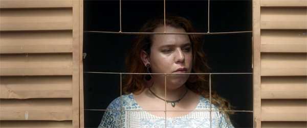
Madalena (2021).
In earlier entries (especially here) I’ve noted that the thriller genre is well-adapted to festival circulation. It doesn’t require the budget of a blockbuster. It can attract major actors who want tricky parts to play. It can be shot on contemporary locations. And the appeal to suspense and surprise fits comfortably with edgy narrative strategies favored by art cinema. At the limit, a filmmaker can arouse our thriller appetites and then try a bait-and-switch that not only warps the genre’s conventions but sets us thinking.
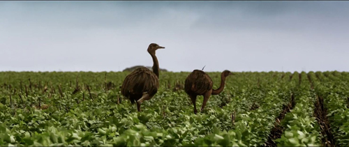
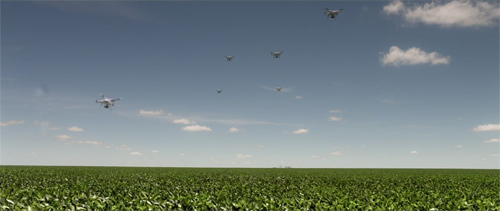
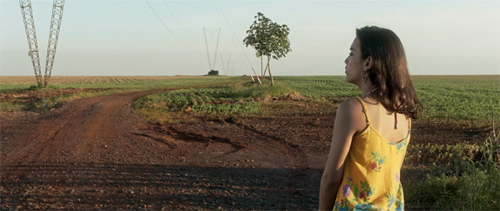
The Brazilian film Madalena, by Madiano Marcheti, starts as a classic mystery. In a vast field of soy, reas stalk gracefully as a monstrous pesticide-sprayer grinds toward them. But among the rows lies a corpse.
What follows is more fractured and prismatic. A first section attaches us to Luci, a friend of Madalena’s who works as manager of a club. She also picks up work dancing for TV commercials, one set in that very acreage. Then we follow Cristiano, whose father owns the land and demands he hustle to harvest. A third section takes us with trans woman Bianca and her girlfriends, who sort through Madalena’s belongings before setting out for a day of driving, swimming, gossiping, and teasing one another, the memory of Madalena never far from their thoughts.
Marcheti skips some of the standard scenes. We never see the police investigation, or even the discovery of the body. The crime plot has been a pretext to reveal a cross-section of life in the community, from the wealthy farmers to the cottages where the staff live. The resolution shifts the question of who did it to the broader impact of the death, and how it stands for a horrifying statistic: Brazil has the world’s biggest murder rate of transgendered people.
Throughout, sexualization of bodies is a central motif. Luci and her posse hang out at curbside, Bianca and her posse turn tricks and find boyfriends, and Cristiano, after sizing up the crowd at Luci’s bar, winds up dancing with himself in mirror reflection.
To say much more would spoil things, so I’ll just note that this story is filmed with a pictorial intelligence that one seldom sees these days. The imagery of the soy fields is at once magnificent and ominous. Drones hover over it like birds of prey, and its horizon haunts the people’s lives.
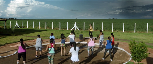
Overwhelming as the landscape is, it doesn’t blot out the characters’ routines and the crises that disrupt them. Moving from Luci’s aimless days and nights to Cristiano’s panic to Nadia’s quiet tribute to Madalena, a locket set adrift in the stream that runs along the field, the film pauses for intimate moments. It reminded me a bit of Varda’s great Vagabond (Sans toit ni loi), in which an enigmatic figure’s fate charts the range of human indifference, but also affords glimpses of sympathy.
An informative discussion of the film with Marcheti is provided by IFFR here.
As we too like it
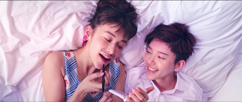
As We Like It (2021).
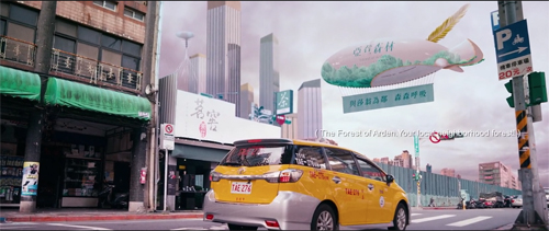
This movie saw me coming a mile away. It does for As You Like It what Lurhmann did for Romeo and Juliet, but to an Asia-pop beat. Four romantic couples lose and rediscover one another in a magical milieu–not the Forest of Arden (currently under corporate development) but a district of Taipei with no Web connections. In Heaven, a sign informs us, there is no Internet.
Accordingly, people must deliver messages in person, seek out each other by dint of shoe leather and motorbikes, and actually meet face to face. So Rosalind’s quest to find her father the Duke (a genial tycoon) intertwines with Orlando’s search for her. But of course she’s disguised as a boy and aided by Celia, a fortune-teller who’s the dream girl of Orlando’s sidekick Dope.
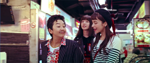
The film’s world is maximum kawai, pushing beyond camp to a fangirl fantasy of irresponsible sweetness. This candy-colored city, with its pink blimps and anime posters, spills over with tweens, teens, and twentysomethings shopping in malls, flirting at stalls, and sipping bubble tea.
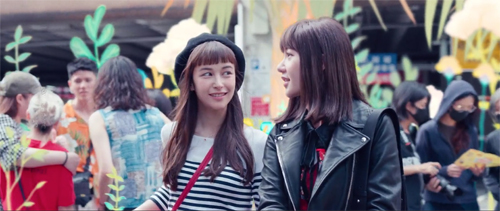
In the process, old stuff becomes cool. Tradition, in the form of calligraphy and handmade paper, is a retro decorator choice, while letting your date clean your ears old-style makes him a friend with benefits.
It might all seem sappy, but like Tati’s Play Time and Wong Kar-wai’s Chungking Express, the film seeks to distill authentic poignancy out of kitsch, schlock, consumer clichés, lethal cuteness, and the detritus of urban lives. Frivolity must be good for something; why else would God give us giggles? Comic form, as Shakespeare acknowledged, redeems a lot of silliness, especially if the gags are hurled at us with the ruthless conviction that anything goes.
Did I mention that all the roles are played by female performers?
In a switcheroo on Elizabethan theatre, globalization inverts the Globe. The film, a final title tells us, is dedicated to Shakespeare “but also to the patriarchy who would not allow female actors upon the stage.” The frisson is akin to that of Tsui Hark’s Peking Opera Blues and The East Is Red, where gender-blurring yields both humor and genuine feeling. From instant to instant, you see a character go male or female or something in between; a painted-on mustache and a swaggering gait become cosplay, not deep definitions of you. Unless you want it to be.
Identities are fluid. Okay, says Orlando, so he falls in love with Rosalind, then Roosevelt, and refinds him/her as Rose. What’s in a name? You get to call yourself, and be, what you wish, and love whoever.
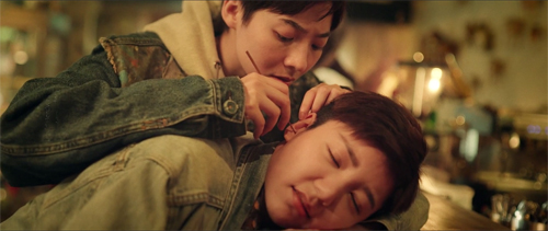
Not a fresh-minted message these days, but the sparkle comes with how it’s all carried off. Every scene finds a clever way to amuse or bemuse. When Rosalind as Roosevelt slips into a trim suit, she pads out the crotch with a towel, and teeny gull-like waves waft out. That’s soft power, the equivalent of a mystic ring. Eventually she has to go along when Orlando visits the men’s room. While he stands at the pissoir, she ducks into a toilet pretending to take a dump, her groans covering the sound of peeling open a maxi-pad.
The project was co-directed. Wei Ying-chuan, a graduate of NYU’s Educational Theatre division, is a founder of Shakespeare’s Wild Sisters Group in Taiwan. Chen Hung-yi’s feature The Last Painting was chosen for IFFR in 2017 and won a best feature award at Cines del Sur. The pair bring an unflagging energy to the task of creating a paradise of easy living and loving–bereft of villains, open to any piece of harmless fun and heartbreak. As We Like It is a must for every LBGTQ film event, but its hella dirty fun for any festival whatsoever. Couples welcome.
Again, the IFFR provides a fine discussion of the film with the directors, moderated by our old friend Shelly Kraicer.
St. Tropez, mon amour
Suzanna Andler (2020).
Eric Bentley once described great serious literature as “soap opera plus.” Anna Karenina, Othello, and the rest offer us tormented love affairs, sexual jealousy, hidden schemes, and forced confessions of betrayal, but it’s all endowed with wider significance through characterization, implication, style. But can we have soap opera minus?
In Daisy Kenyon, Anatomy of a Murder, and other films, Preminger moves in this direction, banking the fires of conflicts drawn from lurid bestsellers, but other filmmakers have gone further in de-dramatizing melodrama. Dreyer’s Gertrud and some of Oliveira’s adaptations offer examples. Here we have the classic fraught situations, but muffled and fragmented and punctured through long pauses and wayward, looping, maddeningly banal conversations.
Marguerite Duras made this artistic strategy peculiarly her own, notably in her masterpiece India Song (1974) and its counterpart Son nom de Venise en Calcutta désert (1976). In a curious reversal, she often prepared the film first and then published the text as a quasi-play, as if scraping away the luscious imagery and ripe sound would create something even purer, soap opera distilled to Racinian starkness.
Suzanna Andler, a Duras theatre piece from 1968, has now been adapted to film featuring Charlotte Gainsbourg and three other players. The result isn’t as severe as the play reads, since director Benoît Jacquot has filmed it in a gorgeous villa overlooking the Mediterranean. It remains, however, in the tradition of kammerspiel. The bulk of the action takes place in a salon and the terrace outside, with one sequence, also in the play, set on a rocky beach.
The situation is sheer bourgeois melodrama. Suzanna is in a loveless marriage with the philandering Jean. She has apparently stayed with him for the sake of their children and the wealthy life they lead. Now Michel, a young journalist, has tempted her into a love affair, and she has for the first time cheated on Jean–who seems okay with it. Today’s crisis, if this counts as one, is her need to decide: Will she lease this villa for the summer with the kids? Or will she accept Michel’s invitation to go to Cannes? In the course of about four hours, she may make up her mind.
If some of my synopsis seems hazy, it’s partly because the exposition comes out in bits as Suzanna and others chat about her past, and partly because what she says may not be wholly truthful. She sometimes admits to lying. And what was her relation to the never-seen Bernard Fontaine, who has just been killed in a car crash? The blurry backstory is one strategy Duras uses to tamp down the melodrama, which usually gives its plots clear-cut contours and definite revelations.
In filming the play, Jacquot has taken an approach that approximates the rigor of Duras’s aesthetic. He has shot the blocks of action using slightly different techniques. Not for him obvious alternatives like color/ black-and-white or a range of tonalities. The differences are made harder to spot because Jacquot has not given us separate chapters corresponding to the act divisions; the scenes blend, punctuated only by long shots. So there are stylistic spoilers coming up.
At the start, Suzanna is shown the house by the real estate agent de Rivière. This segment is filmed in distant shots that emphasize the landscape and straight-on views of the sitting room opening out onto the terrace and the sea. The agent is seen from behind or at a distance, while the few close views we get concentrate on Susanna.
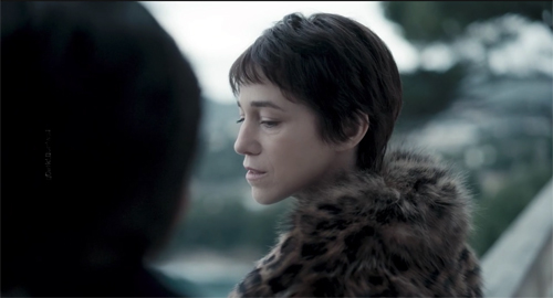
Staying behind alone, she falls asleep and awakes when Michel enters. This is a second phase of the play’s first act, and now Jacquot’s camera setups take a more oblique view of the room. The full-length windows dominate again, but now at an angle that recalls the magic mirror of India Song (on which Jacquot was an assistant).
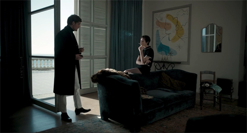
The couple is often seen at a distance, but now closer views of Suzanna emphasize the mirror motif.
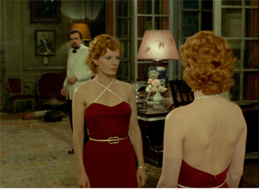
At a high point, the camera celebrates a momentary reconciliation with a track in to their embrace (the first such florid move in the film, I think).
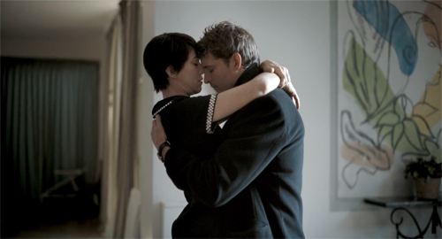
In the sequence corresponding to the second act, Suzanna meets her friend (and Jean’s ex-lover) Monique. On the beach they talk of their pasts. Now the conversation is rendered in many rapid, tight shots of the two women. The orthodox shot/ reverse shot setups are sometimes given a strange emphasis when instead of A/B alternation we get two (but only two) variants of a view of each one as she speaks (A1/A2, then B1/B2). So a cut like this::
. . . is followed by ones like these:
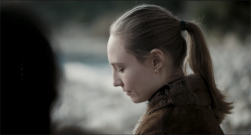
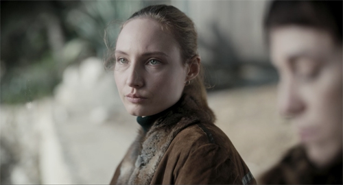
Back at the villa, Suzanna answers a phone call from Jean, and they discuss their plans, with the uncertainty typical of all the film’s conversations. This scene is handled in circular tracking shots around Suzanna, from a moderately close distance.
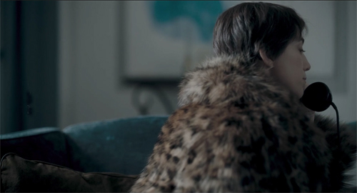
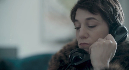
As the conversation ends, Michel returns. After he reveals some key information about his relation to Jean, he stretches out on the sofa. In a long take running several minutes, the camera swings around them in a half-circle, clockwise and counterclockwise, often adjusting to her shifts in position.
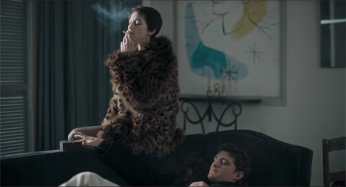
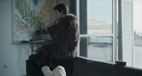
The changing angle also captures Suzanna perched against a painting of very 60s boomerang shapes that echo the camera’s trajectory.
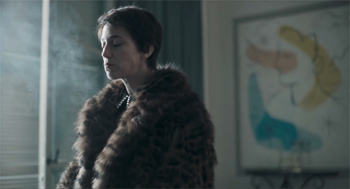
As the action approaches what might be a climax, Michel drifts out to the terrace and sits on the balustrade above the sea. Suzanna approaches.
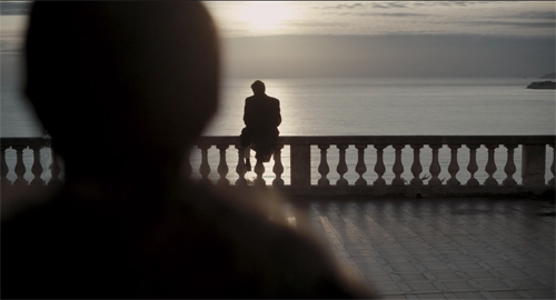
Telling you what happens next would truly be a spoiler. On seeing it, I thought it was something that Jacquot added to the play, but nope . . . it’s there in the text, and he’s perfectly faithful to it.
As if all this patterning doesn’t look finicky enough, the scene on the beach is punctuated by a single shot of the Quai de Passy with a Métro train rumbling by.
This bump comes exactly halfway through the film, at the moment Suzanna mentions the surge of attraction she felt when Michel looked at her on their first encounter. Believe it or not, the line in the play also comes midway through the text. This alien shot functions expressively, I think. It underscores the epiphany Susanna felt upon learning she might be loved. Another filmmaker might have stressed the moment with music under her monologue, but Jacquot goes for a formal bonus: breaking the visual texture just here further articulates the design of his film.
The rigorous geometry Jacquot has clamped down on the play is interesting in itself, and the abstract array of options adds, I think, to the hieratic quality Duras is after. Yet each style matches the tenor of the action it carries and doesn’t conceal the subdued feelings rippling through the scenes. This dimension depends on Gainsbourg–her slim silhouette, her microdress, and especially her face, with her alert chin and hard mouth. Her vacillations have nothing of the diva about them, but still she stands forth as a new avatar of The Confused Woman so beloved of art cinema (Voyage to Italy, L’Avventura, The Headless Woman). Without those closer shots, the film might fall flat.
Once asked what would be his ideal final shot, Jacquot replied: “A distinctive glance [un certain regard] in close-up.” His ending delivers that.
Duras is doing something similar to what Wei and Chen do in As We Like It. She is seeking genuine emotion in clichés (unfaithful husband, wrung-out wife, surly rescuer). But she hasn’t exempted her characters from social critique. Hiroshima, mon amour renders the meeting of two lovers as an intertwining of two national histories. The colonialists of India Song, drifting through their sparsely attended embassy parties, trying to replicate salon society in the tropics, cannot hear the voices offscreen of the people they subjugate. Likewise, Suzanna’s anxiety may or may not register some distant tremors. In summer of 1968 her world is sliding into something she isn’t prepared for. Far away from St. Tropez, in Paris students are hoping to find their own beach, but they’re doing it by tearing up the pavement.
Again, thanks to Gerwin Tamsma, Monika Hyatt, Frédérique Nijman, and their colleagues at the International Film Festival Rotterdam for allowing us to visit their event virtually. Here’s to another fifty years of ambitious programming!
A very helpful edition of Suzanna Andler has been published in conjunction with the film’s release. It contains a lot of stimulating background information and critical commentary. Bentley’s comment about “soap opera plus” comes from The Life of the Drama (Applause, 1991), 14. Thanks to Kelley Conway for sharing with me the Jacquot interview in “Réponses à tout,” Libération (14 May 2004), 1.
Jacqout’s rendition of Duras’s play exemplifies what I called in Narration in the Fiction Film “parametric narration.” This rare approach consists of playing out a range of expressive possibilities, scene by scene, in ways that both shape the ongoing plot and “anthologize” sharply contrasting cinematic techniques. Noël Burch first proposed this idea in his enduring Theory of Film Practice (1973), although Eisenstein and Bazin envisioned it. But then they envisioned everything.
P. S. later: The Rotterdam prize winners have been announced (per Variety).
As We Like It (2021).