Archive for the 'Film comments' Category
Gone but far from forgotten
Kristin here:
The speed with which the news of David’s death, early on the morning of February 29, 2024, spread has amazed me. I expected many responses: condolences, tributes, and most of all stories of how he had affected people’s lives. I didn’t expect the tidal wave of messages and posts and emails that followed. The authors range from his students and colleagues to casual acquaintances met at film festivals to filmmakers whose work was influenced by his writings. His legacy will clearly be vast and lasting, which to me provides the best consolation for his loss.
David was ill for two and a half years, starting with a cancer diagnosis in June, 2021. Treatment got rid of the cancer, but his chronic degenerative lung disease very slowly progressed. He went into hospice treatment at home last September. Hospice is supposed to last for six months, with an option to renew for another six. He lived almost exactly six months. Though growing weaker toward the end, he remained lucid. We watched a movie together every evening. In the last few days he did not feel up to a complex feature film, so on the night before he died, we rewatched two episodes of The West Wing. His fingers have grown stiff in recent months, but he managed to post a blog entry three days before his death. It was a re-post of an old entry on Hou Hsiao-hsien, with a short new introduction. It was relevant, because the Criterion Collection is streaming some of Hou’s early films, which David loved.
He wanted to die at home rather than spending his last days at a hospice facility, and he did. I was with him. It was brief, and I don’t think he suffered. It happened within a few months of the fiftieth anniversary of when we moved in together in the summer of 1974. He was as wonderful a spouse as he was a scholar and a friend.
His writings live on, of course. Some of them are available free online, linked on the left margin of his website’s main page. He leaves behind video analyses and lectures, too. Some are part of our series “Observations on Film Art” on The Criterion Channel. Others are supplements on Criterion video releases. Less well-known are the five full-length lectures he recorded and posted on Vimeo. Their topics give a sense of his breadth of interests.
What will happen to the blog? Recently we decided that re-posting older entries that seemed relevant to something happening at the time seemed a good plan. With over 1100 entries since our launch in 2006, there are plenty that few know about. I probably won’t blog as often as I used to, but no doubt inspiration will hit once in a while. I promise not to give up the year-end, inexplicably popular lists of the ten best films of ninety years ago. I suspect that 1934 will yield an impressive crop of titles.
This obituary, written by David’s colleagues and valued friends, was first posted on the website of the Department of Communication Arts the the University of Wisconsin-Madison on March 1.
David Bordwell, the Jacques Ledoux Professor Emeritus of Film Studies at the University of Wisconsin-Madison, died on February 29, 2024, at the age of 76 after a lengthy illness. A prolific researcher, dedicated teacher, and passionate cinephile, he guided countless colleagues, students, and film lovers to heightened awareness of the medium’s artistic possibilities. “One thing that I loved and greatly admired about Bordwell was how – with passion, analytic precision and boundless enthusiasm for the medium – he carved out an inviting, sui generis intellectual space that could be enjoyed by scholars and general readers alike,” wrote New York Times film critic Manohla Dargis upon learning of his passing. “He was a paragon of scholarly achievement, yes and of course, but he was also a lot of fun to read – which isn’t something you can say of most academics.”
Bordwell joined the faculty of UW-Madison’s Department of Communication Arts in 1973 immediately after completing his graduate coursework at the University of Iowa (PhD, 1974). He remained at Wisconsin throughout his illustrious career, retiring in 2004, and he continued contributing to the Department’s mission after retirement through emeritus teaching and other activities. He also held visiting faculty appointments at New York University (1979) and the University of Iowa (1980), and in spring 2017 he held the Kluge Chair in Modern Culture at the Library of Congress.
When Bordwell launched his career in the 1970s, film studies was just entering academia, and over the course of three decades at the UW-Madison, as well as a remarkably productive post-retirement, he helped the still-young discipline achieve new levels of respectability and intellectual rigor. Indeed, his scholarly productivity reset the bar for the discipline of film studies. He authored, coauthored, or edited some 22 books and monographs. These included two foundational film studies textbooks written with his spouse and intellectual partner, Dr. Kristin Thompson (Ph.D. UW-Madison, 1977), a multi-talented scholar who has made major contributions to film studies, literary studies, and Egyptology. Bordwell also authored more than 140 journal articles, book chapters, introductions to collections, and review essays.
Later in his career he produced equally valuable material for wider audiences including a lively, wide-ranging blog Observations on Film Art, also in partnership with Thompson, as well as video essays and informative DVD commentaries for The Criterion Collection. And he made himself available at numerous film festivals and public movie screenings as a commentator, sharing his knowledge and enthusiasm with fellow movie lovers. In fact, Bordwell remained a productive scholar until the very end of his life, just a year ago publishing Perplexing Plots: Popular Storytelling and the Poetics of Murder. This exhaustively researched and elegantly written book has been nominated for an Agatha Award and for the Edgar Award, given by the Mystery Writers of America, in the Best Critical/Biographical category.
An inspiring teacher, Bordwell’s classroom skills were acknowledged with the UW-Madison’s Chancellor’s Teaching Award (1984) and a Phi Beta Kappa Teaching Award (2004). He was known for his energized lectures and for his lively, probing graduate seminars. His pedagogical strategy was not so much to impart knowledge as to draw it out from students, yielding fresh insights on whatever film, director, or theoretical issue was on the agenda for that day. Professor Maria Belodubrovskaya (University of Chicago) speaks for generations of former Bordwell students in recalling the sense of participation available to all members of a Bordwell class. “What struck me about David’s teaching was that in the classroom he did not behave as a big-time scholar but as more of a leader,” she recalled. “Everyone was treated as no less curious and observant than the instructor himself.”
Bordwell also provided a professional model that benefitted many of the Communication Arts graduate students who eventually entered higher education. UW-Madison Professor Emeritus Vance Kepley’s memory of his very first experience in a Bordwell graduate course is indicative: “It was something of an epiphany. By the end of the first class, I thought, ‘This is exactly how film studies should be taught. It’s what I want to do, and I want to do it just as well.’ Of course, I never came close to duplicating David’s casual brilliance, but years of trying made me a better teacher.”
The impact of Bordwell’s graduate mentoring can be suggested by both the quantity and quality of the doctoral dissertations he supervised. At UW-Madison, he directed 33 dissertations, each of which helped launch a productive career, and 17 dissertations were published as career-enhancing monographs. Bordwell’s dissertators could count on him to provide exacting but encouraging guidance through the always-arduous process of bringing forth a polished manuscript. “David pounced on every chapter as soon as I submitted it for review,” remembers Professor Richard Neupert (University of Georgia). “Within days he returned the manuscript covered with detailed and often witty commentary, along with a thoughtful, typed summary with warnings, suggestions, and praise. More than a great mentor, he was a fellow traveler.”
Bordwell’s research program consisted of three principal strands. The first is composed of stylistic analyses of individual films or directors, most notably The Films of Carl-Theodor Dreyer (1980), the monumental Ozu and the Poetics of Cinema (1988), The Cinema of Eisenstein (1993), and detailed essays on Louis Feuillade, Kenji Mizoguchi, Theodoros Angelopoulos and Hou Hsiao-Hsien grouped in the volume Figures Traced in Light: On Cinematic Staging (2005). The introductory college textbook Film Art: An Introduction, written with Thompson, also contributes to this strand. First published in 1979, it is now in its thirteenth edition and will continue under the authorship of Professor Jeff Smith (UW-Madison). It has been translated into ten other languages, with additional translations forthcoming.
The analysis of national film styles and modes of film production constitutes the second strand of Bordwell’s research. These studies incorporate primary-level documentary research on the structure of film industries, film technology, and the conditions of production. The most important work in this category is The Classical Hollywood Cinema: Film Style and Mode of Production to 1960 (1985), written with Thompson and Janet Staiger (William P. Hobby Centennial Professor Emerita, University of Texas at Austin). A massive research undertaking, it incorporates stylistic analyses of a random sample of one hundred films, interviews with veteran cinematographers and other craft workers, and careful reading of film industry trade papers and industry technical reports. It seeks to define the group style of classical Hollywood in terms of a range of stylistic options which were delimited by the state of filmmaking technology at any given point, as well as by the craft practices and conventions internalized by filmmakers. The methodology was later used in another widely successful textbook, Film History: An Introduction, also coauthored with Thompson and designed to introduce students to a broad spectrum of national cinemas. The sole-authored Planet Hong Kong: Popular Cinema and the Art of Entertainment (2000) examined a small but hugely successful film industry from the 1970s through the 1990s, focusing on stylistic norms and narrative strategies that distinguished Hong Kong cinema from Hollywood.
The third strand of Bordwell’s research involved theorizing the role of the film spectator in the movie-viewing experience. Bordwell’s ground-breaking Narration in the Fiction Film (1985) proposed the idea that viewers integrated perceptual information with higher order cognition to construct the film’s story. For Bordwell, spectators were active makers of meaning who drew on their understanding of cinematic conventions, their knowledge of different types of stories, and their real-life experience to comprehend the various visual and audio cues given to them by the film. With this and several subsequent publications, Bordwell helped encourage a robust line of scholarship in cognitive film studies, an approach that brought together analytic philosophers and psychologists in developing a model of spectatorship that amalgamates aspects of art, culture, and even biology.
Bordwell’s many professional honors attest to the respect he earned in the international scholarly community. He was awarded honorary doctorates from the University of Copenhagen (1997) and from Lingnan University in Hong Kong (2023). Other major international awards include a University of Auckland Hood Fellowship (New Zealand), an Anthology Film Archives Award (United States), an Excellence in Asian Film Scholarship Award (Asian Film Society, Hong Kong), and the aforementioned Kluge Chair. At UW-Madison, Bordwell was selected for a prestigious Wisconsin Alumni Research Foundation Professorship (1990) and for a Hilldale Distinguished Professorship (2001), as well as a Hilldale Award in the Humanities (2001) and a senior fellowship at the Institute for Research in the Humanities (1993-98).
Bordwell’s love of cinema emerged when he was a child, living on a remote farm in upstate New York, far from any movie theater. In his rare moments away from school and chores, he nourished his cinephilia by watching films on TV and reading books about film starting at the age of 12. Bordwell made his way to the State University of New York at Albany, where he studied English literature. He then did his graduate studies in Speech and Dramatic Arts, with a concentration in Film at the University of Iowa.
Notice of his passing prompted glowing tributes for Bordwell from prominent filmmakers and intellectuals outside the academy who valued his myriad contributions to world film culture.
David Koepp, critically acclaimed screenwriter and director (Jurassic Park, Mission Impossible, Premium Rush)
“David’s genius for analyzing Hollywood narrative was an inspiration and a goal for me in my own work, and it reflected in the work of anyone who read him. He had a boundless generosity toward the medium and found value in everything he saw, at all levels of artistic accomplishment.”
Damien Chazelle, Oscar-winning writer and director (La La Land):
“I learned more about film from reading David Bordwell than from any other writer. To me he was America’s André Bazin, a thinker and historian who massively expanded the field and found a way to marry theory and criticism in a wholly new way. Narration in the Fiction Film changed how I think about storytelling in film. Figures Traced in Light changed how I think about framing. The Way Hollywood Tells It changed how I think about Hollywood. He was a giant, and multiple generations of filmmakers, critics and theorists (for ultimately we are all in this together) owe him a huge debt.”
Kim Hendrickson, Executive Producer, Criterion:
“David and I spent many hours together recording his analyses for the fifty episode Observations on Film Art series we created for the Criterion Channel. He was a champion for movies not because he was superb at analyzing form – he was the best – but because movies were his life force. I, and so many colleagues at Janus and Criterion, are indebted to him for his brilliance, generosity, and friendship.”
James Schamus, award-winning screenwriter, producer, director, and professor (Crouching Tiger, Hidden Dragon; Brokeback Mountain):
“As a filmmaker, I can describe David’s friendship as unnervingly generous. His astonishing critical intelligence never got in the way of his enthusiasms, and his enthusiasms never dampened his analytic regard; they were functions of each other. This meant that when talk came around to one’s own work, the effect was something akin to getting a loving bear hug from a nuclear-powered microscope. There will never be another like David again.”
To an international community of filmmakers, film students, and cinephiles, David Bordwell was the most respected film scholar of his generation. But to his very wide and ever-widening circle of friends, he also was a warm, witty, unaffected companion. To the thousands of students, colleagues, and movie-lovers who sought his counsel outside of the classroom, he was generous with his time and knowledge, and in social gatherings he graciously cultivated new friendships with individuals he was meeting for the first time while also reconfirming his appreciation for friends of long-standing. He could tailor his one-on-one conversations to whatever topics were of interest to the other party, and one usually came away from such chats with the feeling that, besides being a keen conversationalist, he was also a wonderfully attentive and appreciative listener. All who knew David Bordwell personally will miss his kindness, goodwill, and boundless congeniality, as well as his professional wisdom.
Survivors include his wife, Kristin Thompson; his sisters, Diane Bordwell Verma and Darlene Bordwell; his nephew, Sanjeev Verma, and his niece, Kamini Verma.
News about PERPLEXING PLOTS
Edgar Award© Mystery Writers of America.
DB here:
Some good news for Perplexing Plots. It’s gotten positive reviews in various places; they’re sampled on its Amazon page. Most recently, Geoffrey O’Brien has written a very generous review for the New York Review of Books (February 8, 2024). He has, needless to say, kind words for Martin Edwards’ monumental Life of Crime as well. More broadly, he shares his insights into the appeals of mystery fiction as a genre.
Meanwhile, Perplexing Plots has been nominated for two awards. One is for a 2023 Edgar, given by the Mystery Writers of America, in the Best Critical/Biographical category. This honor is one I had scarcely dreamed of. The MWA is the most famous and influential organization of practitioners of the craft. The book is up against high-quality competition: biographies of Mickey Spillane, James Ellroy, and Edgar Allan Poe, all by esteemed experts. The awards will be presented on 1 May.
Perplexing Plots has also been nominated for an Agatha, to be awarded at the annual Malice Domestic conference of fans of classic whodunits (26-28 April). This is especially gratifying to me, since one theme of the book is the enduring significance of the traditional puzzle mystery, even in an era when noir fiction and suspense thrillers garner so much attention.
In all, I appreciate the recognition that the book has received and hope that readers find it worth exploring. Thanks as well to the staff of Columbia University Press for publishing the book.
The ten best films of … 1933
Dragnet Girl (1933).
Kristin here –
Due to health problems, we have been reposting older entries lately and will continue to do so. Still, I could not skip this year’s contribution to the inexplicably popular series of ten-best lists for ninety years ago. Previous lists can be found here: 1917, 1918, 1919, 1920, 1921, 1922, 1923, 1924, 1925, 1926, 1927, 1928, 1929, 1930, 1931,and 1932.
Last year’s list was easy to fill with marvelous films. Surprisingly, 1933 proved to be a thin year for masterpieces. The major auteurs of Hollywood and France created relatively minor films and German filmmakers were busy finding safe places to live and work. In short, there were some obvious films to head the list, but there are some titles here that I would include in a stronger year.
Fortunately one of the greatest filmmakers hit his stride in 1933. Yasujiro Ozu made three films that could be among the top ten. I usually don’t put two films by the same director on these lists, but I’m including two of his (sorry, Woman of Tokyo). Earlier Ozu films that featured on these lists can be found in the 1930, 1931, and 1932.
Dragnet Girl
2023 has been the 120th anniversary of Ozu’s birth and the 60th anniversary of his death. Retrospectives and exhibitions internationally have no doubt widened fans’ awareness of his earlier films. For decades almost none of his films made before Late Spring (1949) were much known outside Japan. Ozu’s gentle family dramas were so familiar that few would have believed that he began with genre films: student comedies, family comedies, salaryman comedies, and even gangster films. Now, fortunately, his entire surviving output is available on DVDs and Blu-rays, though sometimes not in versions with English subtitles.
The Criterion Collection’s Eclipse series brought the best of the very early films to DVD, including the two Ozu films on this list.
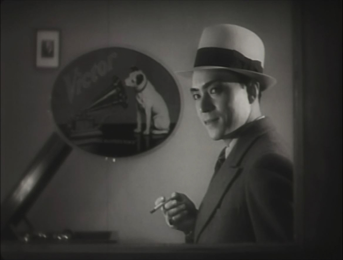
Film buffs familiar only with Ozu’s late films might well ask, could Ozu make a good gangster film? Actually, he could make a great one. Dragnet Girl is one of his early masterpieces.
Ex-boxer Joji is a small-time thug, living of his mistress, Tokiko. An aspiring young boxer and wannabe gangster, Hiroshi, idolizes Joji and spurns his sister Kazuko’s pleas to stay in school. Joji falls for Kazuko, and Tokiko finds that she likes the girl and wants to emulate her by persuading Joji that they should leave their lives of crime. But there’s one last job …
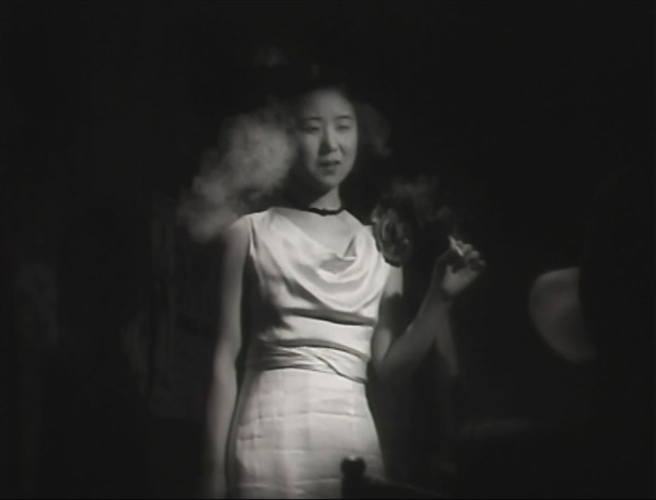
The style is quite noir, and Ozu has fun playing with the various Nipper figures and decals in the music shop where Kazuko works (see top). And Kinuyo Tanaka, best known in the West for tragic roles in Mizoguchi films, does quite well as a gangster’s moll (above).
Dragnet Girl is available on DVD in the Criterion Collection’s “Silent Ozu–Three Crime Dramas” and streams on The Criterion Channel.
Passing Fancy
As part of the slow discovery of Ozu’s work outside Japan, Western audiences finally got a glimpse of his early work when I Was Born, But … became available. As wrote last year, it “may be the one where he achieved the perfect balance of humor and poignancy that characterizes so many of his best films.” Or maybe it was Passing Fancy that struck that balance perfectly.
In a way, Passing Fancy reverses the premise of I Was Born, But …. In the earlier film, two boys become petulant and rebellious when they realize that their respected father is a mediocre salaryman taking orders from a wealthy boss and even playing the clown to entertain party guests for the boss. The parents realize the sadness of their situation but manage to handle the boys with understanding.
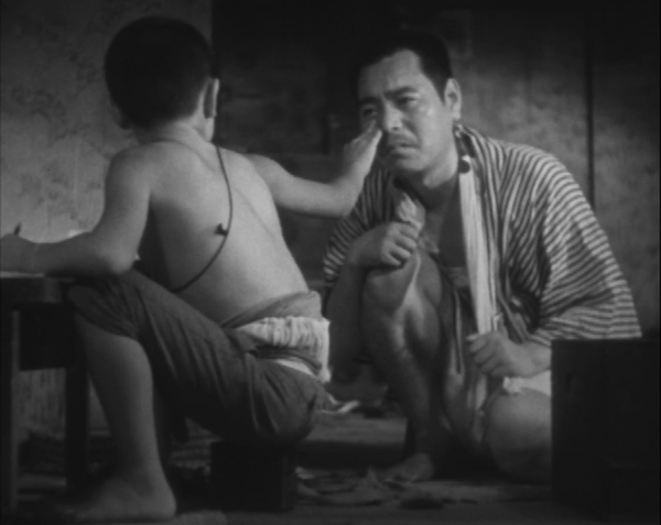
In Passing Fancy, the father, Kihachi, is an illiterature, carefree worker who approaches his duties as a single father to his bright son Tomio. Tomio acts as the parent, dragging his father out of bed, dressing him, and seeing him off to work. Tomio strives for an education, insisting on doing his homework when Kihachi tells him to go out and play. The two get into a serious argument, and their reconciliation (above) is one of Ozu’s most poignant of many poignant scenes.
As David says in his book on Ozu, Passing Fancy is more focused around complex characterization than his other early films. The secondary characters include Harue, an unemployed young woman, whom Kihachi briefly believes he can woo despite being considerably older (the “passing fancy” of the title). There is Kihachi’s cynical friend Jiro, who accuses Harue of being a gold-digger and rejects her growing love for him. The plot focuses on the characters and their changing attitudes, especially Kihachi’s alternation between fits of fatherly responsibility and selfishly neglectful behavior.
Passing Fancy is available on DVD in the Criterion Collection’s “Silent Ozu-Three Family Comedies” and streams on The Criterion Channel. The same link leads to David’s discussion on editing in Passing Fancy in our “Observations on Film Art” series. A PDF of his book, Ozu and the Poetics of Cinema, is available for free here.
Design for Living
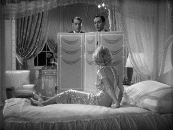
Ernst Lubitsch’s Trouble in Paradise (1932) is generally considered one of his very best films. It tends to put Design for Living in its shadow. Still, this Ben Hecht adaptation of a Noel Coward romantic comedy is nearly as good, with three marvelous stars–Gary Cooper, Frederic March, and Miriam Hopkins–and enough witty dialogue for three features.
It’s also as risqué as anything Lubitsch did, narrowly missing the introduction of the Code in 1934. The three leads, Tom Chambers, a painter (Cooper), George Curtis, a playwright (March), and Gilda Farrell, a commercial artist (Hopkins) meet on a train in France and soon move in together. They swear a gentlemen’s agreement that there will be, as Gilda forthrightly says, “No sex.” This doesn’t work out, as Gilda has affairs with both, one after the other. Eventually they reunite and swear another gentlemen’s agreement–which clearly is leading to a menage à trois.
Design for Living is interesting to contemplate in relation to the Code’s dictates that characters who transgress moral or legal strictures must be punished by the film’s end. Most obviously here the three characters end up settling into a comfy romantic trio. Beyond that, though, Gilda’s desire to become a mother of the arts by guiding the pair’s unsuccessful careers has paid off spectacularly by the end. Her pitiless criticisms of their work (“Rotten!”) goad both of them to fame and fortune. The only one punished by the end is the wealthy advertising executive Max Plunkett (Edward Everett Horton), whose brief, straitlaced marriage to Gilda ends disastrously. The Lubitsch Touch indeed.
Design for Living is available on DVD or Blu-ray from The Criterion Collection and streams on the Channel.
The Testament of Dr. Mabuse
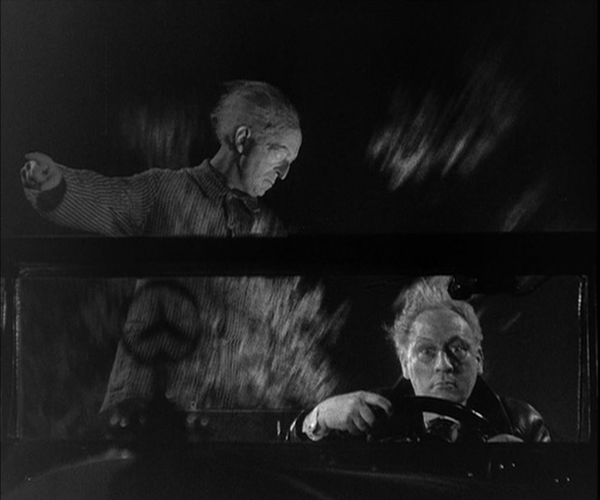
As is well known, Fritz Lang, despite not being Jewish, left Germany for France and ultimately Hollywood in 1933 when Hitler came to power. His last German film until he returned in the late 1950s was The Testament of Dr. Mabuse. The film was banned immediately, with the German version having its premiere in Budapest. A French version, also directed by Lang but with different actors, circulated in Europe and the US, and various recut versions were circulated thereafter.
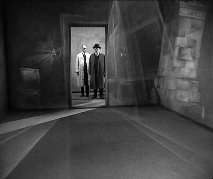
A sequel to the two-part serial Dr. Mabuse, der Spieler (which was on my top-ten list for 1922), Testament took a very different approach to its titular villain. Now Mabuse has become insane and is incarcerated in a mental institution. There he obsessively scribbles down plans for a universal reign of crime. To escape the institution, his spirit enters the body of Dr. Baum, his psychiatrist (above), who becomes his surrogate in leading the gangsters who carry out Mabuse’s plans.
The sequel is not quite up to the original, in large part because the menacing Rudolph Klein-Rogge, who played Mabuse in that film, is barely present here. We see him briefly in his cell and occasional in some sort of spirit form, but Dr. Baum is not nearly as fascinating as a surrogate Mabuse.
Stylistically, however, Testament is pure Lang, with high long shots along dark, deserted streets, art-deco interiors, and a spectacular fire at a gas factory. There’s also a justly famous scene of an assassination from one car to another on a crowded street. Lang also seems to bid good-bye to Expressionism, with a subjective shot from the point of view of an asylum patient (see bottom).
The Testament of Dr. Mabuse is available on DVD from The Criterion Collection and streams on the Channel. The DVD set includes the French version and a restoration of the German version missing three minutes of the original running time.
Zero for Conduct
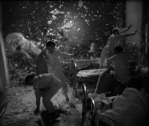
Zero for Conduct has been another victim of censorship. Jean Vigo’s depiction of the miseries in a school for mainly working-class boys and especially the rebellion that some of the foment was too much for the authorities. It was only discovered after World War II, being released in the USA in 1947 and being taken up by cinephiles and the New Wave filmmakers in France.
I first saw the film as a graduate student. It was a muddy, gray print that did not reveal to me what all the fuss was about. Modern restoration has revealed the details and the luminosity of the cinematography by Boris Kaufman, as in the nighttime dormitory rebellion (above).
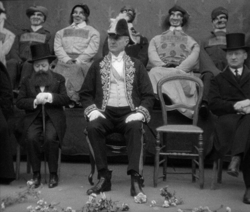
Vigo is sometimes referred to as a surrealist director. There are moments in Zero for Conduct that could be described as surrealist, as when the one kind teacher Huguet, draws a carticature while doing a hand-stand or the life-sized dummies that represent the attendees at the school fête where the rebellion breaks out. On the whole, however, the odd touches seem more to represent the way the children see the world, for the film is told largely from their vantage points.
Zero for Conduct is available in its restored version on DVD or Blu-ray in the set “The Complete Jean Vigo” from The Criterion Collection and streams on the Criterion Channel.
A Night on Bald Mountain
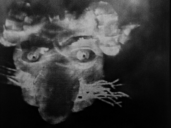
It’s not often that a completely new animation technique is introduced, but it happened in 1933. Claire Parker and Alexander Alexeieff had invented the pin board or pin screen method. It involved a perforated board three by four feet, with hundreds of thousands of headless pins stuck through it. By pushing pins forward selectively and casting a raking light across the board, they could create images that resemble moving engravings.
A Night on Bald Mountain is set to Mussorgsky’s tone poem. There is no narrative, only a series of unconnected, disturbing images pass quickly across the screen, often morphing from one shape to the next. The result, as the above images suggests, is eerie indeed.
Given the labor-intensive work required on each film, the pair produced a small number of animated shorts across decades, supporting themselves by making many advertising shorts. The Wikipedia entry on Alexeieff has an excellent summary of the couple’s career and an extensive filmography.
Most prints of A Night on Bald Mountain are too dark. A restored version is included in Flicker Alley’s essential DVD/Blu-ray collection, “Early Women Filmmakers: An International Anthology.” It streams on The Criterion Channel.
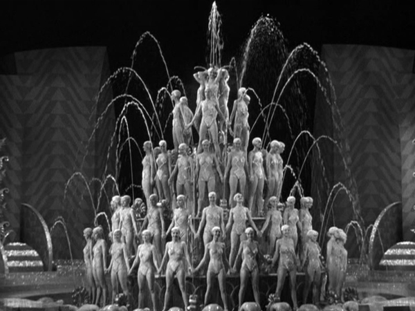
Footlight Parade
1933 was a remarkable year for the series of Warner Bros. musicals famous for their numbers staged and choreographed by Busby Berkeley. No fewer than three major titles were released that year: 42nd Street, Gold Diggers of 1933, and Footlight Parade. I can’t put all three on the list, and I suspect the general opinion is that Footlight Parade is the best of the entire series.
It’s far livelier than the others, with the crazy premise that a company forms a service delivering live stage prologues to movie theaters. The result is a frantic race to get from one theater to the next. It has James Cagney, whose fast patter and unique, jittery dancing style injects an energy that offsets the bland Dick Powell. It has a string of big numbers, from “Honeymoon Hotel” to “By a Waterfall” to “Shanghai Lil,” all showing Berkeley at his flamboyant best.
Footlight Parade is available in Blu-ray and other formats from Warner Bros. The image above was taken from a DVD in “The Busby Berkeley Collection,” a bargain boxed setwith five films and a documentary.
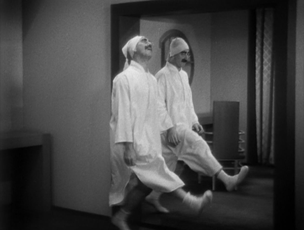
Duck Soup
Speaking of surrealism, the Marx Brothers ended their five-film contract at Paramount with what is widely considered their best film, Duck Soup, directed by Leo McCarey.
At Paramount, the brothers were allowed to create messy scenarios without the logic and unity dictated for most Hollywood films–including those made at MGM under the dictates of Irving Thalberg. The result is a series of comic set pieces loosely held together by a plot involving the tensions between two Ruritanian countiries, Fredonia and Sylvania.
The most famous of these set pieces is the mirror scene, where Pinky (Harpo), dressed as Firefly (Groucho), struggles to hide the absence of a broken mirror by mimicking his actions perfectly. Rather than confronting Pinky, Firefly devises ever more elaborate movements to reveal the ruse, inevitably copied flawlessly by Pinky (above). Other comic highlights that have nothing to do with the plot involve Pinky and Chicolini (Chico) running a peanut stand and carrying on a feud with the neighboring lemonade stand run by the master of the slow-burn, Edgar Kennedy.
This feud foreshadows the battle scene at the climax of the film. Staged entirely in the Fredonia headquarters, the action becomes increasingly nonsensical, with Firefly’s military outfits changing at frequent intervals and madcap dispatches coming in from the front.
Duck Soup also has the advantage of not including either of the hitherto obligatory harp and piano solos by Harpo and Chico. There are no such “serious” interludes or subplots involving young lovers, as there would be in A Night at the Opera and other later films. It’s the Marxes’ only film with unadulterated crazy humor throughout.
Duck Soup is available on Blu-ray and other formats here. The same range of formats are available for “The Marx Brothers Silver Screen Collection,” which contains their five Paramount films.
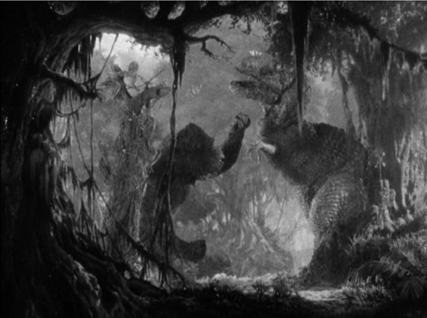
King Kong
King Kong was released only a few years after Universal had seemingly identified ed the horror genre with vampires, sub-human monsters, and old dark haunted houses. Kong was different, a monster that could be sympathized with. Viewers could attribute human feelings to Kong as he saves Ann Darrow from a tyrannosaurus (above). As documentary filmmaker Carl Denham remarks, the giant gorilla’s affection for Ann turns the plot into a beauty-and-the-beast tale.
The film also added a touch of novelty by having Kong climb the Empire State Building, which had been opened to the public only two years earlier.
The impact of the film was no doubt enhanced by Max Steiner’s revolutionary musical track. It used leit motifs and a large orchestra, and the music played for a larger portion of the film than was usual in early sound films.
King Kong also expanded the methods of special effects available to filmmakers with its extensive use of Willis H. O’Brien’s puppet animation for Kong and the dinosaurs of Scull Island. (As I discussed in a previous post, O’Brien’s puppet animation was used extensively eight years earlier in the 1925 version of The Lost World.)
King Kong is available on Blu-ray from Warners. My image is from the out-of-print “Two-disc Special Edition” on DVD.
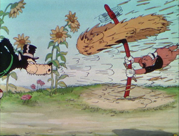
The Three Little Pigs
Despite being a major force in the American film industry by this point, Walt Disney has been little-represented in my lists. So far only The Skeleton Dance (1929), the first of the Silly Symphonies, has represented his output. The Three Little Pigs wasn’t a technical milestone in Hollywood animation. The first three-strip Technicolor short was Disney’s bland Flowers and Trees, which won the 1932 Oscar for an animated film (the first years this category was included). The Three Little Pigs won for 1933. In 1994 a large group of professional animators voted it number eleven on a list of the fifty greatest animated shorts. (An interesting list available here.)
Obviously people like the film a lot. It grossed ten times its production cost. It’s considered a classic. It has all the advantages of the best Disney shorts–beautiful color, fast action, and a catchy song, “Who’s Afraid of the Big Bad Wolf?” It’s also quite funny. The framed pictures on the walls of the three pigs’ houses are easy to miss, but they characterize each pig cleverly.
The Three Little Pigs is available from multiple sources. My frame was taken from the “Walt Disney Treasures: Silly Symphonies” DVD set. The “Treasures” series, recognizable by its aluminum cases, is out of print and hard to find, though there are a few copies available on eBay. (The same version has been posted on YouTube, but beware, it is distinctly out of focus.)
The Testament of Dr. Mabuse (1933).
DIE HARD revived: An entry revisited
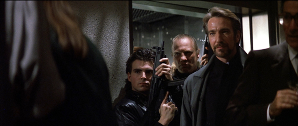
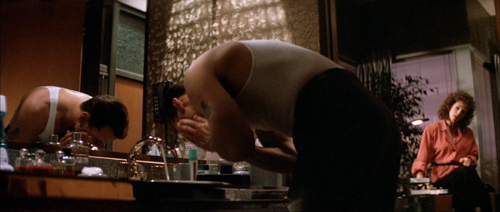
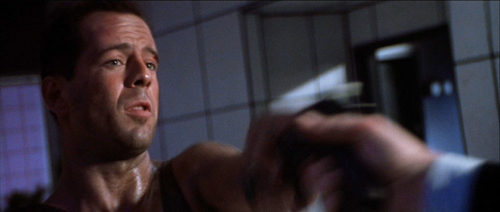
Die Hard (1988).
David’s health situation has made it difficult for our household to maintain this blog. We don’t want it to fade away, though, so we’ve decided to select previous entries from our backlist to republish. These are items that chime with current developments or that we think might languish undiscovered among our 1094 entries over now 17 years (!). We hope that we will introduce new readers to our efforts and remind loyal readers of entries they may have once enjoyed.
Today’s revival responds to the return of Die Hard to theater screens in time for Christmas. Since our original posting in 2019 (“Not just a Christmas movie”), this supreme action picture has further cemented its reputation as a yuletide favorite (although it was originally released in July). Happy holidays from the Nakatomi Corporation!
DB here:
It’s been quite a fall season for UW–Madison film culture. There were visits from avant-garde legend Larry Gottheim, New York Times co-chief film critic Manohla Dargis, Schawn Belston (Senior VP of Mastering at Disney), and Julia Reichert, whose American Factory is now routinely turning up on ten-best lists. The semester’s first screening at our Cinematheque was Kiril Mkhanosvsky’s Give Me Liberty, a Milwaukee movie also gracing year-end best lists. Our programs included restored films by African pioneer Paulin Soumanou Vieyra, retrospectives of Reichert and Kiarostami, a 3D double feature of Revenge of the Creature and Parasite (no, the other one), a program of early women directors in America, a selection of films conserved by the Chicago Film Society, and a miscellany ranging from Olivia and Near Dark to Tropical Malady and Red Rock West.
Travels to festivals, partly covered in our blog entries, forced us to miss too many of these shows. But we couldn’t miss the final one: Die Hard (1988).
It’s a film I’ve admired since I first saw it in summer of 1988. I’ve taught it in many classes, but never written about it. Seeing it again, in a pretty 35mm print from the Chicago Film Society, has made me want to say a few things as my final blog entry for this busy year.
The man between
Think-piece pundits like to say that Hollywood movies are about good guys versus bad guys. But usually things are more complicated. Very often the good guy is an outsider caught between two large-scale forces, good or bad or both–the cattle ranchers versus the townspeople, or the mob versus the cops. Often the protagonist is an outlier, forced to solve the problem using means that respectable social forces can’t.
Call it the problem of the House Democrats. When the lawbreaker can’t be brought to justice, how do you make him pay? The answer is one that William S. Hart movies provided in the 1910s. We need a “good bad man,” a rogue agent who knows the scheme from the inside but is willing to do the right thing. Which means that he has to be flawed too, a little or a lot, and that he can eventually reform.
In Die Hard, the forces of law and order line up as the Los Angeles police and the FBI. The threat is Hans Gruber’s gang, posing as terrorists but actually planning to rob the Nakatomi Corporation of $640 million in bearer bonds and kill lots of hostages in the process. The naive TV broadcasters support both, recycling official scenarios of how hostage-taking works and reinforcing the gang’s masquerade as a terrorist group.
The contrasts are marked. The forces of order are American, in alliance with a Japanese company, while the attackers are Europeans. At the start, we hear American music (the rap played by the limo driver Argyle), but Hans hums Beethoven. The cops’ technology notably fails, as when the assault vehicle and a helicopter are consumed by firepower. But the gang’s hi-tech expert Theo can crack the vault, assisted by Hans’ plan to push the Feds to cut the building power.
Above all, the forces of social order are strikingly inept, while the gang is ruthlessly efficient. Unlike the police, who “run the terrorist playbook,” Hans boasts that he has left nothing to chance. The cops can’t imagine an adversary that exploits the official by-the-book procedures. As for the business types, Takagi’s calm bluff and Ellis’s freewheeling jargon can’t cope with a gang leader who doesn’t get the Art of the Deal.
Clearly, America and Japan need help. That appears in the form of John McClane, the cop from the East Coast trapped in Nakatomi Plaza.
McClane is the man between, spatially and strategically. He witnesses the action from inside the skyscraper, and bit by bit he figures out the gang’s real scenario. And he’s caught between both forces. The gang tries to find and kill him, while the cops refuse to recognize him as an ally. Confronting Karl’s brother early on teaches McClane that he can’t play by procedure. (“There are rules for policemen,” says a thug who doesn’t believe in rules.) The LAPD’s ineptitude shows that McClane can’t expect help on that front. So he must become almost as reckless as his adversary, though in a virtuous cause. This principally means blowing stuff up.
McClane isn’t totally without resources. He has as helpers Al, the desk cop who comes on the scene and sustains his morale, and Argyle, who’s there to play a crucial role at the climax. But mostly he’s alone in facing problems. He needs weapons. He needs shoes. He needs to protect the hostages, most of all his wife Holly, who has climbed up the corporate ladder. (In another movie, she would be the in-between protagonist.) To keep Holly from becoming a bargaining chip, McClane needs to hide his identity. And he needs to figure out the gang’s ultimate plan, of seeding the rooftop with explosives that will destroy the building and cover their escape.
John’s solutions are notably low-tech. While the police and the gang depend on advanced firepower and computer finagling, McClane lashes an explosive to a desk chair and uses a fire hose as a rope. He has to improvise shoes by taping a maxi-pad to a bleeding foot. No holster for your automatic? How about some Christmas wrapping tape? And don’t forget to taunt your adversaries with Yankee wisecracks.
In the course of this drama, the very physical McClane becomes a model for his allies. Holly punches the reporter who revealed John’s identity, and Argyle cold-cocks Theo at the point of getaway. Most dramatically Al kills the revived Karl when he’s about to plug McClane. The people in between take up arms.
McClane and his allies solve the House Democrats’ problem. Law can’t be lawless, even in protecting itself. Business, always aiming at the bottom line, has to give up principles. (“Pearl Harbor didn’t work out, so we got you with tape decks.”) These forces of social order are inefficient, trusting, and superficial. They can’t stand up to sheer brutal onslaught. In a crisis they will fold, or simply choose the nuclear option: agents Johnson and Johnson are ready to lose a big chunk of hostages.
McClane is a mediating figure that permits the film to show you can be strategically lawless for the sake of lawfulness. The fly in the ointment, the monkey in the wrench, screws up plans on both sides, but for the benefit of everyone else.
The Big Dumb Action Picture isn’t so dumb
This thick array of thematic parallels would be interesting in itself, but it gets worked out through precise storytelling. There was a time when critics knocked action movies as simply ragbag assortments of fights, chases, and explosions. Die Hard, I think, changed ideas of just how well-wrought an action picture could be. About 53 minutes of it consist of physical action (including people sneaking around), leaving almost 70 minutes for other stuff: suspense, changing goals, surprise information, attention to parallel plotlines, and little moments like the thief pilfering candy just before an ambush.
The film typifies tidy classical Hollywood construction, beginning with an arrival (the jet) and ending with a departure (the McClanes in a limo). In between we get a big dose of the classic double plotline, romance and work. Holly’s job at Nakatomi threatens their marriage, and John takes on a temp job, that of fighting the gang, which also endangers the couple’s efforts to reconcile.
For every Superman, there’s a Kryptonite, and here the protagonist’s flaws include his fear of heights (set up in the second shot, reiterated throughout) and, more importantly, his resistance to Holly’s independence. By the end, he’s learned a lesson. The film’s streak of male sentimentality allows John to ask his wife’s forgiveness for blocking her career ambition. She’s ready to compromise too, reassuming his last name when she meets Al. The characters we care about change, at least a little. That could be the motto of most classical Hollywood plots.
As usual, we get crosscutting among several lines of action. John’s arrival is crosscut with Holly at work fending off Ellis, and in the rest of the film the gang’s stratagems are intercut with the cops’ plans and McClane’s efforts. At various points, five or six actions are alternating with one another.
All these escalating situations cluster into distinct parts, the four that Kristin has argued for as typical of Hollywood architecture.
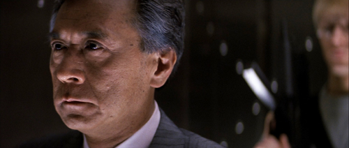
The Setup runs about 33 minutes, culminating in the murder of Takagi and Hans’s promise that he can open the vault.
The Complicating Action, a counter-setup, coalesces around John’s goals of communicating with outsiders, avoiding capture, and attacking the thieves when he can. Through many chases and fights, the gang seeks to block all these efforts. The lines converge when John shoots Marco and tosses his body onto Al’s car. He gains the bag with the detonators, giving him the upper hand. Then the TV reporter gets involved, the cops arrive, and John is ordered to wait. Things seem to be stabilized.
After this midpoint, the Development supplies what Kristin calls “action, suspense, and delay.” Officer Dwayne Robinson arrives, pitting himself against Al and McClane. We can regard the police assault, Ellis’s clumsy attempt to broker a deal, and the arrival of the FBI men as a series of delays that endanger the stability of the standoff. At the end of this section, John meets Hans (posing as an escaped hostage): now both men know each other. And in the firefight that follows, John loses the detonators. Hans declares, “We’re back in business,” and the original plan can go forward.
The last twenty-five minutes constitute the Climax, launched by McClane’s “darkest moment.” He seems utterly beaten. Picking glass shards out of his feet, he gives Al a message for Holly over the CB radio. Al tells of his own burden, the accidental shooting of a child. The stakes are now very high.
Rapid crosscutting shows John finding the bombs on the roof and fighting with Karl, while the FBI helicopter attacks the building and Hans discovers that Holly is John’s wife. John stampedes the hostages down the stairs off the roof and escapes the strafing from the chopper before it blows. Argyle dispatches Theo, while John finds the surviving gang members in the atrium and shoots Hans, who falls to his death.
In the Epilogue, Al and John meet, Al dispatches Karl, Holly socks the newsman, and John and Holly drive off with Argyle.
These parts present a tight, logically building plot composed of swiftly changing situations. Along the way we encounter a great many motifs that create echoes or contrasts. Everyone notices the Rolex, at first a symbol of Holly’s talents but also of corporate swagger; only by unfastening it can they let Hans drop from the window. When Argyle floats the possibility that Holly will rush back into John’s arms for a movie ending, John murmurs: “I can live with that.” Agent Johnson speaks the same line, but for him it means an acceptable level of civilian casualties.
Holly’s unmarried name, Gennero, shows how a motif can develop in relation to the drama. At first it’s a sign of pride in her own identity (typical corporation, Nakatomi has misspelled it on the touch screen). Her name-change triggers the couple’s quarrel, but it has another narrative use: It conceals John’s identity from Hans. And at the end he introduces her to Al as Gennero but she reasserts her love by correcting him: “Holly McClane.”
Then there are differences of class and country. Hans reads Forbes, but McClane the US boomer references Roy Rogers and Jeopardy. (Hans is so unplugged from pop culture he thinks John Wayne was in High Noon.) Argyle the former cab driver and Al the cop know the downside of city life, but so does John the New York detective, who adapts Roy’s trademark phrase to the mean streets: “Yippee-ki-yay, motherfucker.”
Even a conventional Hollywood gesture, that of attacking a picture of a loved one, acquires a nifty plot function. Annoyed at John, Holly slaps down the family portrait on her shelf. Good thing too, because otherwise Hans would have seen it during the invasion. We’re reminded of that picture when in a moment of quiet John looks at the same snapshot in his wallet. Only after Hans has encountered John is he able to flip the portrait back up and realize that Holly is the “someone you do care about.”
There are lots more felicities like these–so many that I’d consider Die Hard a “hyperclassical film,” a movie that’s more classically constructed than it needs to be. It spills out all these links and echoes in a fever of virtuosity. Hard to believe that the makers started shooting without a finished script.
Intensified continuity, personalized
Die Hard is a good example of a stylistic approach I’ve called “intensified continuity.” It’s a modification of the classical method of staging, shooting, and cutting scenes. Here director John McTiernan and DP Jan de Bont tweak that approach in distinctive and powerful ways. You can find examples all the way through the movie, but I’ll draw most of my illustrations from the first hour, when the stylistic premises get laid out for us.
Cutting speeds accelerated sharply in Hollywood films from the 1960s onward, and for its time, Die Hard was a rapidly-cut movie. The average shot runs just under five seconds, about what you’d get in a 1920s silent film. By today’s standards, which fall more in the 3-4 second range (even for movies outside the action genre), it’s a bit sedate.
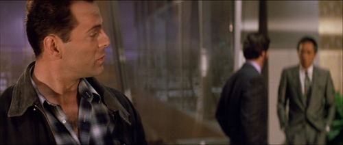
One factor that increases the cutting pace is a greater reliance on singles and close-ups. These are tighter than we’d expect in most studio films of the classic era.
Even in close-up, the shots aren’t snipped free of their surroundings, thanks to the wide frame and layers of focus–both important in the film’s overall style, as we’ll see.
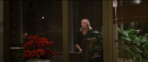
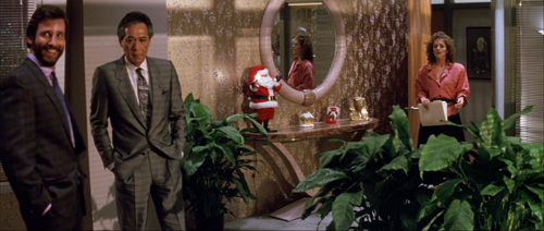
Likewise, intensified continuity exploits a greater range of lens lengths than we’d find in studio films of the classic era. We get wide-angle shots like those above along with telephoto shots throughout. Here the long lens is used to pile up people around Holly, and an even longer lens shows her optical viewpoint on the bandits in the office.
And there’s a free-roaming camera, thanks chiefly to Steadicam technology. But interestingly, Die Hard avoids some of today’s most common camera movements, such as shooting a fixed conversation with a sidewise or circular tracking shot. These would become more common in the 1990s.
McTiernan thought a lot about his camera movements, as he explains in interviews and the commentary track on the DVD. He wanted to shape spectators’ attention, to use camera movement to nudge things into view. “The audience’s eye wants to go with you.” Accordingly, more than in many contemporary films, Die Hard‘s camera movements have a shape: they end on a point of information.
Sometimes it’s just a quick pan, doing duty for a cut. At other times, the reframing is a gentle nudge that prepares for a new scenic element, as when Holly enters her office.
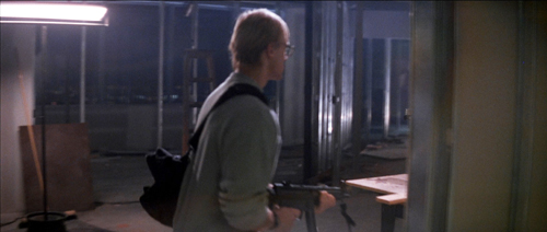
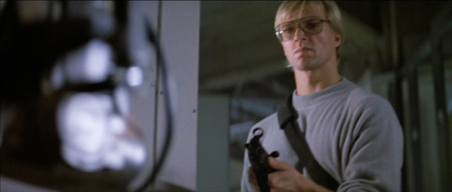
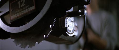
In shooting Predator (1987), McTiernan wanted to cut moving shots together, but his editor resisted. For Die Hard, he refilmed his camera movements at different rates so that two would match. A good example is when Karl’s brother strides carefully into an area under construction. The camera tracks with him, but when he turns to find the source of a whining noise, the arcing movement at the end of one shot is picked up in the next as the framing circles to reveal the saw.
That reveal is given, characteristically, in rack focus. I could have added rack focus as another featured technique of intensified continuity. McTiernan and de Bont take it very far, making Die Hard one of the great rack-focus movies. The image is constantly shifting focus to guide our attention to the changing layers of the scene.
This neat, compact presentation not only preserves the commitment to long-lens close-ups we find in intensified continuity. The technique also gives each rack focus the snapping force of a cut. (And you don’t need to build big sets.) Needless to say, the rack-focusing wouldn’t work if McTiernan hadn’t committed himself to staging his action in depth. More on this below.
Staging in ‘Scope
Die Hard finds ingenious ways to “let the audience’s eye go with you” in the widescreen format. Sometimes it’s a matter of classic edge framing. Thanks to a low angle, John and Holly converse along a wide-angle diagonal.
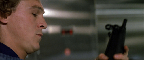
Sometimes McTiernan reverts to a technique not enough directors use nowadays: blocking and revealing. In classic cinema that was usually a technique reserved for long shots, when actors could move aside as part of ensemble. Die Hard applies blocking and revealing to the tight framings of intensified continuity.
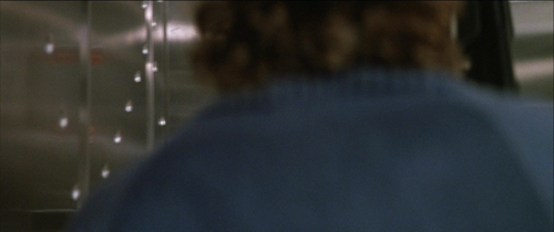
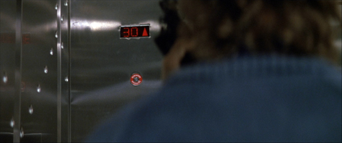
A thug in an elevator checks his weapon, pivots for an instant, and then moves aside to show the elevator arriving at the target floor.
Here again a rack focus helps. The moment reiterates the importance of the thirtieth floor in the skyscraper’s geography.
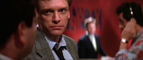
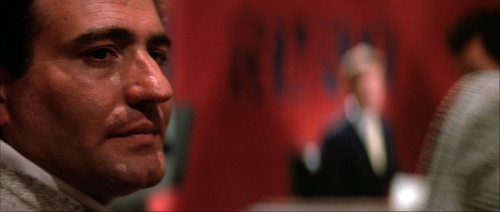
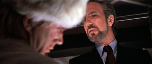
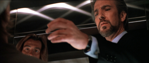
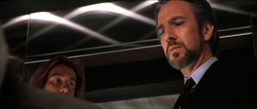
When Hans finds the body of Karl’s brother, we can study his expression. He flips the victim’s head to reveal a gunman, who looks to Hans before he says his line.
In a neat touch, the thug’s mouth isn’t shown. Today a director would probably show his whole face, but, really, who cares? The careful framing keeps him a secondary character, and a future target of McClane. And no need to rack focus on him, which would give him unwonted importance. All we need to remember him is that he’s the thug with long hair.
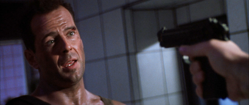
I can’t refrain from using one audacious example from late in the film. John and Hans have met, and Hans has revealed himself by targeting John with the pistol McClane has given him. In reverse shot, John reveals that it has no bullets and grabs it away from Hans.
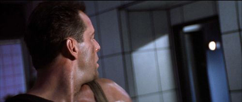
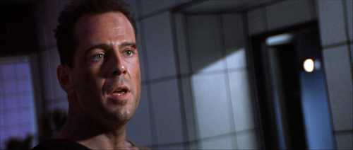
But the pistol, and that gesture, have concealed the elevator behind them. When the pistol is knocked down, the elevator light pops on in the background. Our attention snaps to it, aided by that characteristic ping we hear throughout the movie (another motif).
The crisp turn of events, given visually and sonically, gets ampified by the acting. McClane’s cockiness turns to panic and Hans gets the upper hand. (“Think I’m fucking stupid, Hans?” Ping. “You vere saying?”)
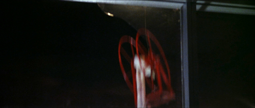
The most bravura rack-focus comes during the climax, when the firehose reel whizzes down behind McClane and he realizes that he’s being dragged through the shattered window.
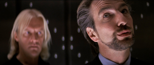
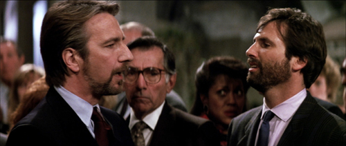
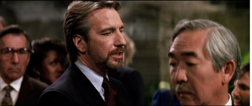
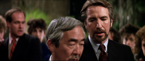
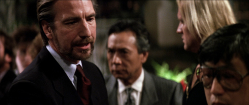
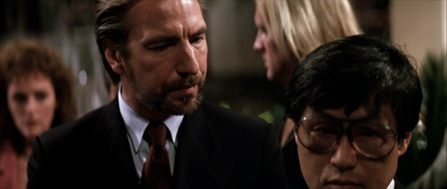
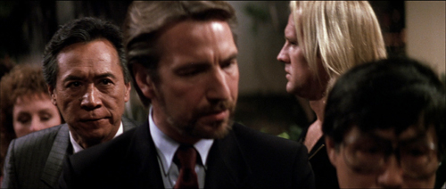
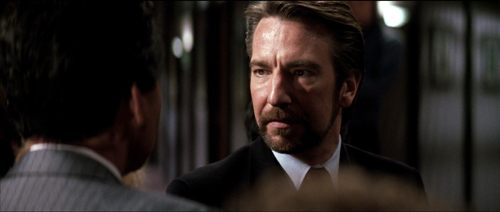
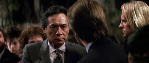
The coordination of the long lens, camera movement, staging, and racking focus is especially rich when Hans drifts among the hostages searching for the man in charge. He recites Takagi’s life history as he passes from one possibility to another (including, comically, Ellis).
At the climax of the passage, McTiernan’s staging-in-layers sets up Takagi, Karl, and Holly before Takagi takes charge. Briefly blocked by Hans, he admits his identity by stepping out from behind and into focus.
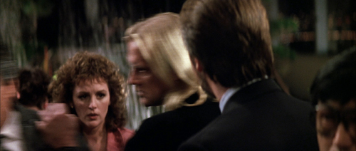
McTiernan isn’t done. A reverse shot of Hans finishing his spiel (“…and father of five”) punctuates the suspense. McTiernan buttons up this passage by returning to his “moving master” shot and having Karl shove Takagi out.
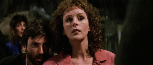
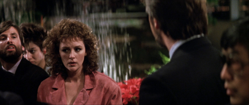
That clears the way for us to see Holly’s reaction. A beat dwells on her as she shifts her eyes to Hans, foreshadowing her conflict with him at the climax.
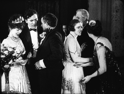
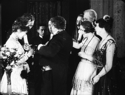
This sort of layering of faces popping in and out of visibility has precedents in earlier cinema, chiefly of the “tableau” period of the 1910s. McTiernan has, I think, spontaneously rediscovered for modern times what William C. de Mille was up to in the party scene in The Heir to the Hoorah (1916). (For more on that, go here.)
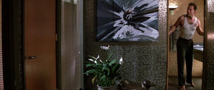
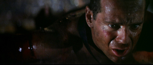
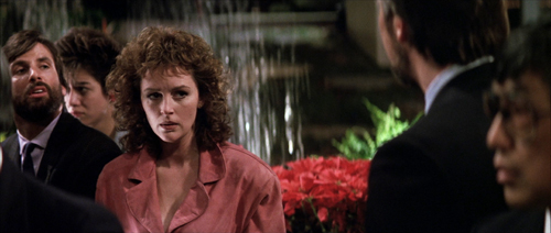
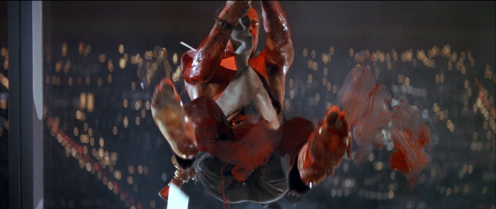
Of course McTiernan also has to work with the 2.35:1 anamorphic format, which enables him to spread his layers out more. That format also allows some remarkable compositions, such as the one surmounting today’s entry. The cut to the shot of John in Holly’s office uses the abstract splash painting (seen here for the first time) as a visual analogy for the explosion of gunfire offscreen at the same time.
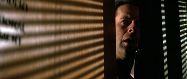
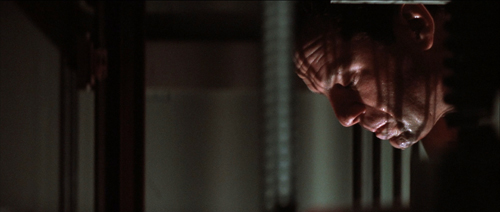
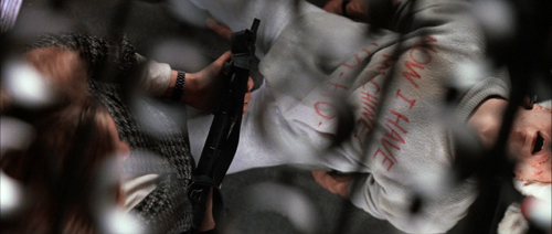
McTiernan and de Bont constantly find striking but cogent images, thanks to lighting as well as color and format. Here’s McClane on top of an elevator peering through the perforated grille; his POV is a striking but still informative composition. the cut between the two provides a little punch of contrasting light and shade.
There are felicities like these feathered all through this remarkable movie, but the momentum of storytelling never flags. This remains a masterpiece of Hollywood filmmaking.
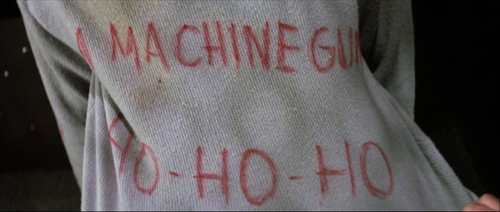
Thanks to our readers for following us this year. Kristin will be weighing in soon with her annual list of best films from ninety years ago. In the meantime, HO-HO-HO.
Madison owes an enormous debt to our Cinematheque team: programmers Jim Healy, Mike King, Ben Reiser, and Zach Zahos, as well as veteran projectionist Roch Gersbach. Santa should reward them. You can too by visiting the Cinematheque’s Podcast, Cinematalk. There you’ll find conversations with Manohla Dargis, Schawn Belston, and James Runde.
For lots of background on the making of this film and the four sequels, there’s Die Hard: The Ultimate Visual History by Ronald Mottram and David S. Cohen. At rogerebert.com, Matt Zoller Seitz has a discerning appreciation on the occasion of the film’s twenty-fifth anniversary.
Jake Tapper has provided the definitive analysis of Die Hard as a bona fide Christmas movie.
McTiernan (with whom I share an alma mater) provides very good DVD commentaries (even for Basic). Prison also seems to have given him some pronounced political views. Alas, the website he created as a platform for them is apparently no longer available. Word is that McTiernan is preparing a new film, Tau Ceti 4, with Uma Thurman. A videogame promo is purportedly signed by him.
Of other McTiernan films, I also much admire The Hunt for Red October (1990). The Thomas Crown Affair (1999) seems to me better directed than the original, and The 13th Warrior (1999), despite being taken out of his hands, remains a pretty interesting film. (Name another Hollywood movie in which a Muslim poet visiting Northern Europe is justly appalled at its barbarism.) Nomads (1986) also has its good points.
I discuss the issues of narrative and style raised here at greater length in The Way Hollywood Tells It: Story and Style in Modern Movies. You can also search “intensified continuity” for blog entries hereabouts. On CinemaScope aesthetics, see this entry and this video.
Die Hard (1988).


