Archive for the 'Film history' Category
Bringing to book
Artists and Models.
Blushing from Bryce Renninger’s generous article about us and the new edition of Film Art can’t keep us from offering another of our occasional entries devoted to new books we like. Get ready for lots of peekaboo links.
The rise of the Soviet Montage film movement of the 1920s and western countries’ knowledge of those films came about largely because of Germany. After pre-revolutionary film companies fled the Soviet Union, taking much of the country’s film equipment with
 them, the re-equipment of studios with lighting equipment, cameras, and raw stock was made possible largely through imports from Germany. Once Eisenstein and other directors began making films, they were exported to Germany, where their theatrical success led to further circulation in France, the United Kingdom, the USA, and elsewhere.
There was a direct link between Soviet and German socialist film production and distribution that is too little-known today. In 1921, Willi Münzenberg forms the Internationalen Arbeiterhilfe (the IAH, known in Russia as Meschrabpom), based in Berlin. In 1924, the organization founded a film studio in Moscow, Rus. A year later, a sister company, Prometheus, was formed in Berlin. Both produced films, and they cooperated in distributing each other’s output.
Meschrabpom-Russ produced many of the familair Soviet classics: early on, Polikuschka and Aelita, and later the films of Pudovkin (including Mother and The End of St. Petersburg) and Boris Barnet (including Miss Mend and House on Trubnoya). Prometheus produced films highly influenced by the Soviet exports, both in terms of style and subject matter. These included Leo Mittler and Albrech V. Blum’s Jenseits der Strasse, Phil Jutzi’s Mutter Krausens Fahrt ins Glück, and, mostly famously, Bertolt Brecht and Ernst Ottwald’s Kuhle Wampe oder wem gehört die Welt.
Prometheus, not surprisingly, disappeared in 1933. Meschrabpom-Russ continued until 1936.
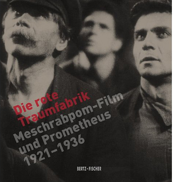
A retrospective at the Internationale Filmfestspiele in Berlin in 2012 has occasioned a comprehensive, beautifully designed catalogue, Die rote Traumfabrik: Meschrabpom-Film und Promethueus 1921-1936. With numerous expert essays and beautifully reproduced illustrations, both in color and black and white, of posters, production photos, film frames, and documents, this is the definitive publication on the subject. Even those who don’t read German will be able to use the extensive filmography and the biographical entries on the directors and other people involved in the making of the films. The illustrations make this the perfect combination of academic study and coffee-table art book. (KT)
Closer to home, our friends have been very busy. From Leger Grindon, a deeply knowledgeable specialist in American film, comes Knockout: The Boxer and Boxing in American Cinema. The prizefight movie isn’t usually discussed as a distinct genre, but after reading this comprehensive and subtle study, you’ll likely be convinced that it’s been remarkably important. While discussing movies as famous as Raging Bull and as little-known as Iron Man (no, not that one; this one comes from 1931), Leger also introduces you to the finer points of genre criticism. The way he traces basic plot structures, key iconography, and historical patterns of change is a model of how thinking in genre terms can illuminate individual films.
Then there’s Tashlinesque: The Hollywood Comedies of Frank Tashlin. Ethan de Seife goes beyond the usual recounting of peculiar, often lewd gag moments to treat Tashlin as not only a gifted director but a representative figure in 1940s-1950s American cinema. Ethan traces how Tashlin became a program-picture director who never acquired the status of auteur, at least in the eyes of the studio system. The book situates Tashlin in the context of the Hollywood industry, both the cartoon shops (Tashlin did animation work for both Disney and Warners, among others) and the live-action production units. There’s as well a fascinating chapter on Tashlin’s influence on directors as different as Joe Dante and Jean-Luc Godard, who coined the adjective “Tashlinesque.” A blend of critical analysis, cultural commentary, and industry history, Tashlinesque is surely the definitive book on this cheerfully dirty-minded moviemaker. Ethan maintains a lively blog here.
Not strictly about cinema, but a book that’s indispensible for film researchers, is James Cortada’s History Hunting: A Guide for Fellow Adventurers. A founding member of the Irvington Way Institute, Jim is at once an IT guru, a historian of computer technology, and a scholar of Spanish history, particularly of the Civil War. History Hunting, the fruit of forty years of spelunking in archives, museums, and the world at large, is an enjoyable handbook on doing historical research. It ranges from help with genealogy (case study: the colorful Cortadas, from Spain to the US) to suggestions about how to frame a doctoral thesis. Jim reminds us that the historian must turn into an archivist: the materials you collect are documents for future historians to use. You are, to use the new buzzword, a curator. Jim provides a welter of practical suggestions along with his own tales of the hunt. Jim devotes part of a chapter to Kristin and me, which just goes to show his impeccable taste in neighbors.
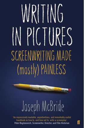 Joseph McBride is known as a film historian—his biographical books on Ford, Welles, and Spielberg are scrupulous and insightful—but he also teaches screenwriting. Why not? He wrote the cult classic Rock and Roll High School. Writing in Pictures: Screenwriting Made (Mostly) Painless is a unique manual in that it minimizes how-to instructions. Joe acknowledges the centrality of the three-act structure, but he takes a step back and asks what engages us about stories to begin with. His advice is clear-sighted. Don’t follow trends; don’t worry about “high-concept” ideas or “character arcs” or “plot points.” Closely study the masters of storytelling in fiction and drama and film, and absorb not formulas but a feeling for the flexibility of narrative technique.
One of the most original aspects of Writing in Pictures is Joe’s emphasis on adaptation. This is sensible because (a) a great many films are adapted from other sources (today, even comic books); (b) a professional screenwriter is often called upon to reshape an earlier script draft by another writer; and (c) adapting a preexisting source swiftly gets the novice screenwriter thinking about the relative strengths of verbal and visual storytelling. Joe takes us through the script-building process step by step, each time reworking London’s story “To Build a Fire.” Somewhat like the European “conservatory” approach to film education, McBride’s emphasis on organic interaction with classic traditions is something new, even radical, in the world of American screenplay education.
Then there’s Film and Risk, edited by the boundlessly prolific and enthusiastic Mette Hjort. Probably the most conceptually bold cinema book of the year, it assembles several scholars and filmmakers to assess how films and filmmakers deal with risk. The subject is of course broad. There’s risk in performance; risk in breaking stylistic boundaries; risk within film institutions (such as producing); risk in social and political contexts such as facing censorship; environmental risks, as in the costs that filmmaking exacts from the natural world; and even the risks of viewing movies—exposing yourself to horrifying or depressing stories and images. Film scholars like Hjort, Paisley Livingston, and Jinhee Choi mingle with film producers and industry observers to reflect on how cinema takes chances.
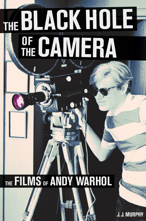
Our colleague J. J. Murphy has been researching and teaching the films of Andy Warhol for years, and today–literally, today–his monograph The Black Hole of the Camera: The Films of Andy Warhol comes out from the University of California Press. This is the most comprehensive, in-depth study of Warhol’s filmmaking that has ever been published, and of course a must-have for anyone interested in experimental film or the American art scene.
The ideas are fresh, especially the explorations of Warhol’s debt to psychodrama. At the same time, The Black Hole of the Camera clears away many misconceptions about Warhol (no, Sleep and Empire are not single-shot films) while also offering detailed information about and analysis of little-known stunners like Outer and Inner Space. There are several pages of color frames, which remind you that Warhol was as good at color as Tashlin was. JJ maintains a remarkable blog on independent cinema and is a leading figure in the Screenwriting Research Network.
Not a book, but a publication of great value: Three major researchers have collaborated on a cogent, nontechnical review of experimental investigations into film perception. All of the authors have had face time on this site. Dan Levin has executed breakthrough experiments on “change blindness”–how we miss discontinuities and anomalies in everyday life. (On another dimension, Dan’s film Filthy Theatre is coming up at our Wisconsin Film Festival.) James Cutting, a venerable figure in visual perception research, has ranged across many key areas in his consideration of cinema. He also wrote a wonderful book, available free here, on Impressionist painting. And Tim Smith, virtuoso eye-tracker, is author of one of our all-time most popular blog entries, “Watching you watch There Will Be Blood.”
With three top talents, you’d expect the collaborative paper to be a triumph of synthesis, and so it is. It supplies the best case I know for why we cinephiles should welcome psychologists who test the ways we watch movies. It should be required reading in every film theory course in the land. Access to the published paper requires a purchase or a library subscription, but you can read the preprint version here. Check in at Tim’s blog Continuity Boy for plenty of videos exploring his research (DB).
Finally, we’re sometimes asked why we don’t allow comments on our blog. The simple answer is that we’re not nearly as good at responding to comments as John Cleese is.
The cover of Joe McBride’s book pictured above is from the Faber & Faber edition, which makes a better still than the US edition from Vintage. Same good stuff inside, though.
Talks, pictures, and more
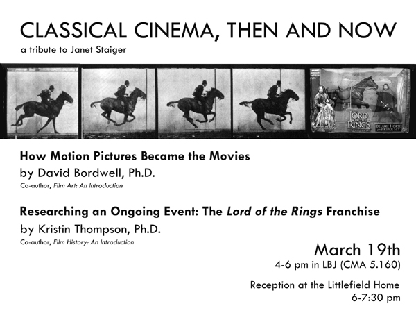
Hard though it is to believe, our dear friend and colleague Janet Staiger is retiring this year from her post as the William P. Hobby Centennial Professor of Communication at the University of Texas. About a year and a half ago, Janet joined us in writing an essay celebrating the twenty-fifth anniversary of the publication of our collaborative volume, The Classical Hollywood Cinema. Several of our other books have gone out of print, but that one remains available. We’re convinced that its success rests on the fact that the three of us were able to contribute different areas of expertise that meshed seamlessly to cover what turned out to be a far more ambitious topic than we initially envisioned.
We’re delighted to help celebrate Janet’s retirement, since the Department of Radio-Television-Film has invited both of us to lecture at an event to pay tribute to Janet. We’d love to see any of you in the Austin area on March 19. We chose our topics without planning it that way, but they end up book-ending the classical era. David will be speaking on the 1910s, when the early cinema was coalescing into the art of “the movies,” and Kristin deals with the question of how one can deal with a contemporary event that has not yet run its course. (KT)
Short film
The American release of Jafar Panahi’s This Is Not a Film, as well as the first Best Foreign Film Oscar for an Iranian film, A Separation (Asgar Farhadi), have kindled a new interest in Iranian cinema just as some of its most prominent practitioners are dealing with exile, house arrest, and censorship. The International Campaign for Human Rights in Iran has recently posted a short film, Iranian Cinema Under Siege, which lays out the issues succinctly.
Earlier many cinephile sites, including ours, called attention to Panahi’s plight. Anthony Kaufman updates us on his still-undetermined fate. (KT)
Lotsa pictures, lotsa fun (cont’d)
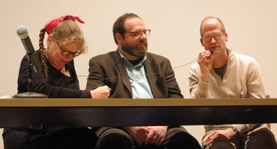
Lynda Barry, Ivan Brunetti, and Chris Ware share a mic.
Our Arts Institute has brought Lynda Barry to campus as an artist in residence this spring, and it’s been a breath of fresh air—actually, make that “blast.” Kristin and I have loved Barry’s work since the 1970s, but only recently did we learn that she was born in Wisconsin and still lives here.
Barry’s UW webpage is a captivating foray into Barryland, and her course, “What It Is: Manually Shifting the Image,” has been open to anyone interested in exploring drawing and/or writing. Convinced that art is a biological phenomenon (“Anybody can make comics,” she says), she encourages people to expand their creative powers without fear of being considered unskillful.
 As part of her visit, Professor Lynda has also scheduled events to introduce people to writers and artists. She hosted Ryan Knighton (“badass blind guy”), gave a talk
 on with guest Matt Groening, and will interview Dan Chaon (3 May). Her first pair of invitees, on 15 February, was Chris Ware and Ivan Brunetti.
You know I was there.
In fact, I came ninety minutes early to get my front row seat, alongside comics guru Jim Danky. Good thing too; by the time the session started, the big lecture hall was packed.
The first part of the session was a brief panel discussion among Barry, Brunetti, and Ware. As if by design, the table mike didn’t work, so Barry’s lavaliere, threaded up through her pants and blouse, had to be yanked out and stretched across the table when her guests wanted to talk. Result shown above.
Barry called Brunetti a master of balancing the verbal and the visual aspects of comics, and she introduced Ware as “the Wright Brothers” of the graphic novel, with Lint as his Kitty Hawk. Then the two guests, who live in Chicago and get together for Mexican lunch once a week, talked about their influence on one another. Brunetti says that seeing Ware’s work in Raw made him rethink comics altogether. Ware finds in Brunetti “an honest critic.”
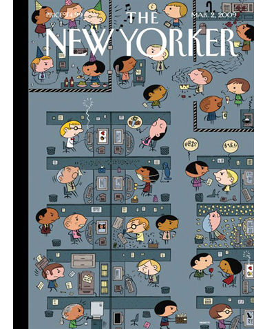
Then Ware left the stage to Brunetti, who took us through his career in PowerPoint. He traced the influence of comics like Nancy and Peanuts on his pretty but edgy big-head style, and he talked about the autobiographical impulse behind much of his work. (“I draw these things to make fun of myself.”) Like many comics artists, he’s fascinated by cinema—be sure to check his “Produced by Val Lewton” page—and some of his New Yorker ensemble panels have the fluid connections we find in network narratives.
In all, it was a lively session that reminded me, among other things, how comic-crazy our town is. Not to mention our state: don’t forget Paul Buhle’s Comics in Wisconsin. That book is filled with work by Crumb, the Sheltons, Spiegelman, etc. It’s as well a tribute to enterprising publisher Denis Kitchen and the now-departed Capital City comics distribution firm. (DB)
Le mot Joost
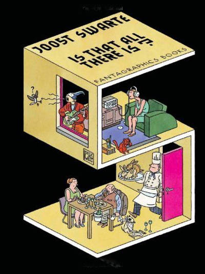
I got a little chance to talk to Ware, and we shared our admiration of Joost Swarte, one of the greats of cartooning. Readers of this blog may recall my shameless promotion of Swarte’s work (here and here and here); one of the big events of my fall was getting to meet him in a Brussels gallery. As chance would have it, a couple of days after Barry’s event, I got my copy of the new Swarte collection Is That All There Is?
The book is a fine introduction to work that has for too long been restricted to French and Dutch publications. You get to meet the infinitely knowledgable Dr. Anton Makassar, the lumpish Pierre van Genderen, and the hip but mysteriously ethnic Jopo de Pojo. You also get the first statement of Swarte’s idea of the “Atom Style” of postwar design, connected to the “clear line” school of cartoon art. The book, done up in gorgeous graphics, is graced by an introduction by none other than Chris Ware.
It’s sort of hard to write an introduction for a cartoonist you can’t completely read. . . . I’ve read plenty of his drawings, however. Studied, copied, and plagiarized them, actually; the precise visual democracy of his approach compelled me as a young cartoonist to consider the meaning of clear and readable or messy and expressive, and it was the former which won out.
Now that he mentions it, there is a line running from Ware’s obsessive schematics of narrative space (and time, as Barry says) straight back to the fluent precision of Swarte’s design. Both artists invite your eye to discover things at all level of scale and visibility, while leading you, in Hogarth’s phrase, “on a wanton kind of chase.” (DB)
Derange your day with Feuillade
Two patient, ambitious researchers have contributed to our knowledge of Louis Feuillade’s work, a central concern of DB’s writing and this blog (here and here, in particular). They also teach us intriguing things about cinematic space.
First, Roland-François Lack of University College, London hosts The Cine-Tourist, a site that traces the use of Paris locations in films. His devotion to Paris equals that of the city’s filmmakers, so he provides a thorough canvassing of areas seen in Les Vampires, Fantômas, and Judex. Beyond Feuillade, you can find the places featured in other movies, including L’Enfant de Paris and Le Samourai. Roland-François has even solved the riddle of what movie house Nana visits in Vivre sa vie.
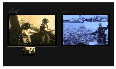
Hector Rodriguez of the City University of Hong Kong has set up a site devoted to Gestus. It’s a program that tracks vectors of movement in a shot and generates abstract versions of them that can be compared with action in other sequences. Gestus can whiz through an entire film–in this case, Judex–and come up with an anatomy of its movement patterns. Hector sees the enterprise as sensitizing us to movement patterns that we don’t normally notice. It also provides a dazzling installation.
Gestus’ ability to generate a matrix of comparable frames recalls Aitor Gametxo’s Sunbeam exploration. But Aitor was interested in how Griffith maps adjacent three-dimensional spaces. Hector’s project focuses on two-dimensional patterning, specifically the deep kinship between different shots when rendered as abstract masses of movement. And while the Sunbeam experiment lays out how spectators mentally construct a locale, Hector is just as interested in friction. “The system invites, confuses, and sometimes frustrates the viewer’s cognitive-perceptual skills.”
That, of course, is part of what cinema is all about. Visit Roland-François’ and Hector’s sites and have a little derangement today. (DB)
If you’re unfamiliar with Chris Ware’s work, a good overview/interview can be found here. Swarte’s stupendously beautiful site is here.
PS 12 March: Because I’ve been immersed in other stuff, I didn’t realize that Matt Groening actually showed up for Barry’s session! And I missed it! Hence the strikeout correction above, initiated by Jim Danky. More on Groening’s visit here.
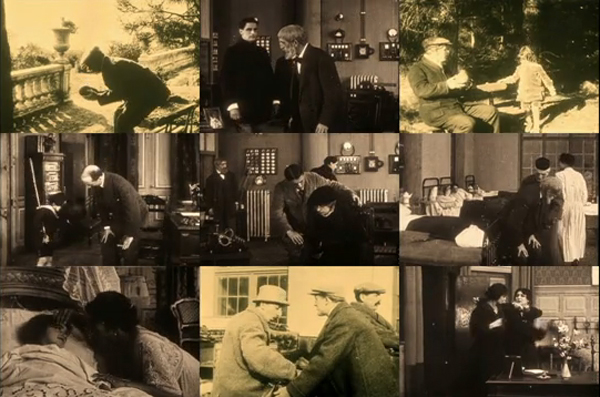
Echoic patterns of stooping in Judex, as revealed by Gestus.
John Ford and the CITIZEN KANE assumption
Kristin here:
A few days ago I was reading the February 24 issue of Entertainment Weekly. I started subscribing to EW during the days when I was working on The Frodo Franchise. Being a Time Warner publication, it tended to feature The Lord of the Rings a lot (Time Warner also owns New Line Cinema). I was trying to keep track of the popular-press coverage of the film, and EW was a helpful source. It also used to be a bit more substantive in those days. In recent years it has become more fluffy. Still, it’s handy for reading over lunch or when brushing one’s teeth.
Turning to page 66, I found Chris Nashawaty’s “The Most Overrated Best Picture Winners.” The double-page spread was slathered with photos of My Fair Lady, Out of Africa, Gandhi, The King’s Speech, and Shakespeare in Love. (The piece is online, but as a gallery rather than an article, lacking the introduction.)
I like putdowns of overrated and/or over-rewarded films as much as anyone, so I settled in to read. I was shocked, however, to find that the first film on the list was How Green Was My Valley.
I happen to think the How Green is one of the very greatest American films. Probably no Best Picture winner in the history of the Oscars has been a more fitting recipient of that award. Why lump it in with Shakespeare in Love?! (I think you know what’s coming.)
Nashawaty gives his reasons. He admits that How Green has three pluses going for it: “It’s got beautiful cinematography, John Ford as a director, and a three-hankie plot about a Welsh mining village.” He goes on: “The minuses: mismatched accents and the still-outrageous fact that it beat Citizen Kane.”
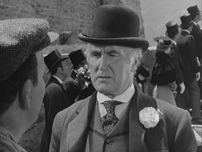
Mismatched accents as a reason not to win Best Picture? The notion belittles the brilliant ensemble acting in Ford’s film, with Donald Crisp, Sarah Allgood, Barry Fitzgerald, Maureen O’Hara, Walter Pigeon, and many others giving fabulous performances, career bests in some cases. It is a joy to watch them interact. Of course most of these people sound more Irish than Welsh, but frankly, who cares?
By the way, I’m assuming Nashawaty means the mismatch of Irish accents to a Welsh setting, not a miscellany of accents among the cast, which is common in Hollywood films. Besides, isn’t accuracy of accents—think Meryl Streep—one of the criteria used to judge the very Oscar-winners that Nashawaty is decrying? I’ve never seen Gandhi, but I’ll bet Ben Kingsley did a heck of an authentic accent. Accents are one of the easiest aspects of performances to notice, so it’s not surprising that they are so often a factor in Oscar-nominated and -winning roles.
But it’s not really the accents that bother people about How Green. No, it’s really the “beat Citizen Kane” part that grates on film fans. Quite possibly it has led them to dismiss or undervalue one of Ford’s greatest films.
I’m going to be heretical and say that How Green deserved to win over Kane.
For years Kane has been sitting atop many lists of the greatest films of all times, including polls of professional film critics. The notion that Kane really is the greatest film of all time has become so engrained that people seem seldom to question it. Back when that idea arose, critics were unaware of the films of Yasujiro Ozu, probably the world’s greatest film director to date. Play Time was for years ignored and only recently has begun to be recognized for the masterpiece it is. With the rise of film restoration in the 1970s and the spread of film festivals and retrospectives, we now know vastly more about world cinema than we did before. Yet Kane has settled into its top slot for many people, including entertainment journalists. I can think of many films I would rank above Kane.
No doubt it’s a great film, with a marvelously tricky plot, another great ensemble of actors, splendidly distinctive cinematography, and innovative special effects masquerading as cinematography. It was hugely influential at the time and remains so to this day. Of course, Welles has declared time and again that he learned filmmaking by watching Stagecoach over and over, so Kane would probably not be as good as it is without Ford’s influence. Not that such influence proves that How Green is better than Kane, but it shows Welles’s respect for Ford. More on that below.
Middlebrow and proud of it
I think another reason why How Green tends to be dismissed as merely the film that cheated Kane out of its best-picture Oscar is that it is resolutely middlebrow. Indeed, in that way it fits in with all the other films Nashawaty writes about. They’re all resolutely middlebrow, too. Middlebrow films are for those people who look down upon popular genres and want to feel they’re seeing something worthwhile.
Despite this attitude, most of the great American films fit into popular genres: Keaton’s The General (or substitute your favorite Keaton film), Kelly and Donen’s Singin’ in the Rain, and Hitchcock’s Rear Window (or, if you will, Shadow of a Doubt or Notorious or Psycho). This is one thing that the auteur theory, somewhat indirectly, taught us. Howard Hawks’s modern reputation rests partly on his ability to waltz into any American genre and make one of its best entries. The Godfather is technically a gangster film, but one could argue that by taking it from a bestseller and making it into a glossy A picture, Coppola pushed his film into the middlebrow range far enough for the Academy to dub it Best Picture—twice. The one Best-Picture winner of recent decades that arguably did thoroughly deserve the prize was a serial-killer thriller, The Silence of the Lambs. I think a lot of people were surprised that the strait-laced Academy members could accept such subject matter in a nominee, let alone a winner.
Like Hawks, Ford moved easily among genres and excelled at least once in every one he touched. He made arguably the greatest war film ever, the underrated They Were Expendable, and the greatest Western, The Man Who Shot Liberty Valance (or Stagecoach or My Darling Clementine). He also pulled the turgid middlebrow genre of the 1930s biopic into greatness with Young Mister Lincoln. There’s no doubt that Ford was an uneven director, and arguably his worst films arose from his attempts to go for middlebrow respectability. The Fugitive is almost unwatchable in its pretentiousness, and the mid-1930s brought forth such items as Mary of Scotland and The Informer. But starting in 1939, he produced an almost unbroken string of masterpieces and near masterpieces, culminating in They Were Expendable and My Darling Clementine.
We should recall also that Welles himself adapted a middlebrow bestseller for the film he made directly after Kane: The Magnificent Ambersons. Had the studio not meddled so extensively with it, it probably would have been one of the American cinema’s great middlebrow classics, fit to sit alongside How Green.
Earned sentimentality
Welles himself probably would have felt honored by that comparison. In a 1967 interview he described his taste in films:
Old masters—by which I mean John Ford, John Ford, and John Ford. With Ford at his best, you feel that the movie has lived and breathed in a real world—even though it may have been written by Mother Machree.
In other words, Welles recognized that sentiment did not take away from the brilliance of Ford’s best work, and How Green is definitely in that category. Welles was too big an egotist not to have been annoyed at losing the Best Picture award to Ford, but he probably understood why How Green won better than most people do today. Today, apart from groups of women who go to see heartwarming female-oriented fare, audiences tend to shy away from sentimentality.
To his credit, Nashawaty lists sentimentality as a plus for How Green. (“Three-hankie plot” has a dismissive ring to it, but I’ll chalk that up to the requirements of infotainment journalese.) But I’m sure that many people who underrate How Green do so because it’s essentially a family melodrama where everything starts out in an Edenic state and the situation slowly goes downhill to a distinctly unhappy ending for all concerned. A lot of people simply dismiss sentimentality in all its manifestations, presumably as too naive, hitting us below the belt for an easy emotional appeal. In this day and age, it is much easier to admire cynicism than unembarrassed emotion. Despite its subject matter of environmental depredation by greedy companies, How Green is resolutely focused on the joys and sorrows of the family. Kane is cynical in a very modern way. Yet I cannot believe that we care nearly as much about the characters in Kane, even Susan, as we do in How Green.
Sentimentality is not a bad thing in itself. Sure, it’s an easy thing to evoke. Easy sentimentality is banal and cloying because there’s so little underpinning it except conventional romance and cute babies and long-suffering mothers and the like. Then there is what I call earned sentimentality. (A similar distinction is often made between sentiment and sentimentality.) Films with this quality are rich with original characters and situations that might make even a viewer who dismisses easy sentimentality pull out a hankie. The sentimentality in Chaplin’s films sometimes achieves this, and his Little Tramp character has been widely praised over the decades for his mastery of this emotion. Even those who dismiss sentimentality can forgive Chaplin, since humor usually undercuts the cloying quality just a bit. In a less obvious way, Harold Lloyd sometimes proves himself a master of sentimentality, as in The Kid Brother. And earned sentiment is not dead. It pervades Big Fish, another film that has been underrated or at least largely forgotten, perhaps in part due to its sentimentality. It has eccentrics galore and an original plot idea, but it doesn’t have that edgy, weird quality that sophisticated viewers treasure in Tim Burton’s work. There’s even sentimentality in the Wallace & Gromit films, though again humor makes the emotion palatable. Art cinema has its own sentimental masterpieces: Bicycle Thieves, Jules et Jim, Tokyo Story, Sansho the Bailiff, Distant Voices, Still Lives, and the list could go on and on. True, all these films are grimmer in part or in whole than the average Hollywood film, but so is How Green.
By the way, Welles himself delivers one of the sublime sentimental passages of world literature in the heartbreakingly nostalgic “chimes at midnight” speech in Falstaff, which has other passages of the same emotion. The Magnificent Ambersons is a sentimental film of a different sort.
For my money, How Green earns its sentimentality as well as any film ever made.
On everyone’s syllabus
You may be asking at this point, if How Green is so fantastic, why didn’t Bordwell and Thompson use it as their central example of a narrative film in Film Art? Why is Kane in that spot? There’s a simple answer to that: Kane is a very teachable film, and How Green, to say the least, is not. Our challenge was to find a film that most teachers used, or would happily start to use, and that demonstrated many concepts about film narrative and style that we wanted to describe.
Some films are just more teachable than others. They use a lot of different techniques, both stylistic and formal, in a way that students can notice. Hitchcock is probably the most teachable director overall, and I would bet that his films show up on introductory-film-class syllabi more often than any other director’s. It’s just that with Hitchcock, there’s no one film that’s self-evidently more useful for teachers than others. I sometimes think that one could almost write an entire introductory textbook using nothing but examples from Lang’s M. There are other classics like that. But Kane beats them all: a complex but clear flashback structure, obvious and varied technique, a complex soundtrack born of Welles’s radio experience, and examples of many things teachers want their students to learn about. It’s a classical Hollywood film, but it has touches of art-cinema ambiguity about it. It’s entertaining, at least to motivated students, so they’re likely to pay attention rather than dismissing it. They may come into the class knowing that it’s a revered classic and hence be interested in seeing it. It may even reconcile them to watching black-and-white films.
How Green, however, is difficult to teach. David has found this to be true. Our colleague Lea Jacobs occasionally offers a seminar on Ford, and How Green is among the most challenging films by a director whom students tend to be slow to warm up to. She attributes this partly to changing tastes and partly to the subtlety of the style of its cinematography. It’s very hard to make students, and indeed almost anyone who isn’t already a believer, see why How Green is a masterpiece.
Kane is not only teachable, but it’s highly conducive to analysis, and no doubt these two traits are closely related. David’s first widely seen article was a study of Kane, and I wrote the sections of chapters in Film Art dealing with it. I don’t mean that it’s simple; Kane is a complex film that has provided material for many different essays and books. But How Green has so many ineffable qualities that it resists cold, precise analysis. It has been one of my favorite films for over three decades, and occasionally I have contemplated writing something in-depth about it. I can’t, however, think what one could possibly write. One would just have to throw up one’s hands and say, “You either get it or you don’t.”
It reminds me of when I was nearing the end of my undergraduate career. I didn’t “get” Godard. I found his work pretentious and boring. But given how many people whose opinions I respected admired Godard, I persisted. I think I suffered through seven features, and at about number eight (Weekend), I got Godard. Maybe Ford, at least for his non-Western films, is somewhat the same sort of challenge. I’ve written analyses of two of Godard’s more difficult films, Tout va bien and Sauve qui peut (la vie). I’m still scared to try to deal with How Green.
(Stagecoach is much easier. For several editions of Film Art we included an analysis of it, which I wrote. Eventually it got replaced, but it’s still available here.)
A few hints
Since I doubt I will ever thoroughly analyze How Green, here I’ll offer just a few hints as to why it deserved to take home Best Picture and leave Kane an also-ran.
Nashawaty mentions the beautiful cinematography. Arthur C. Miller was 20th Century-Fox’s A-list cinematographer, having shot some of the Shirley Temple films in the 1930s, films that kept the studio afloat during the Depression. He teamed with Ford only on Tobacco Road and How Green, though he apparently helped with Young Mr. Lincoln uncredited. Miller won his first Oscar for How Green, his second for Henry King’s The Song of Bernadette (the main virtue of which is it looks a lot like How Green), and his third for Anna and the King of Siam. Few of Miller’s non-Ford films like The Ox-Bow Incident and Gentlemen’s Agreement are watched much today. He did lens somewhat minor films by major directors (Hitchcock’s Lifeboat, Preminger’s Whirlpool), but he is less famous than he deserves.
Just a few examples. How Green contains some of the same techniques that are so admired in Kane, but in a less flamboyant fashion. Deep focus, for example:
Admittedly, the people at the right rear are slightly out of focus, but the shot was done in-camera. No special effects.
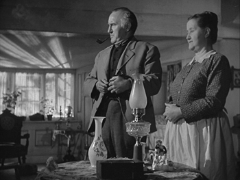
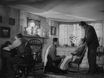
The interiors of How Green have a distinctive touch: patches of light on the ceilings. Implausible, when you start to think about where the light must be coming from, but beautiful nonetheless. Miller (or at least Fox) almost had a patent on this way of lighting a room. With Kane getting so much credit for adding ceilings to sets, we should remember that Ford has done so in Stagecoach and does it here as well. It’s not as in-your-face as Kane’s ceilings, but it’s an example of the subtlety that pervades How Green. The first shot (below) is part of the series of scenes at the beginning setting up the happy home life of the large and relatively prosperous Morgan family; the father is about to dole out allowances to his sons on payday. The second comes much later, as the last two grown sons prepare to depart abroad in search of work after the mine has declined.
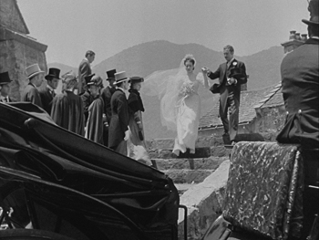
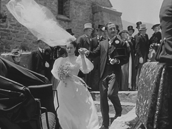
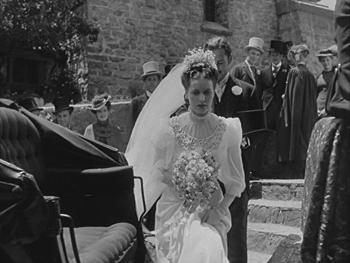
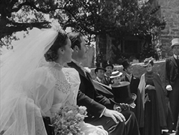
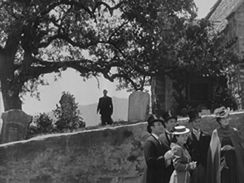
Kane is admired for both its long takes and its dynamic editing. Ford seldom used either. He held a shot long enough to be effective but not long enough to turn into showing-off. Take the scene after Angharad’s marriage to the wealthy mine-owner’s son. Mr. Gruffydd, the minister whom she actually loves, has performed the ceremony. As has been pointed out many times, Ford filmed the final shot without doing any close views to be cut in later. (Indeed, most of How Green was edited in the camera by Ford, so that most of the footage he shot ended up on the final version. It was his way of keeping control over his film.) By happy accident, a breeze caught Angharad’s veil, sending it soaring and twisting through the shot. Perhaps it was a reflex gesture on the part of the actor playing the mine-owner’s son, but he reaches out and holds the veil down as his bride climbs into the coach; it perfectly captures his cold, proper nature. For a split second before the coach pulls away out right, Angharad glances back toward the church, where Gruffydd remains inside. Once the coach is gone, Ford holds, and Gruffydd appears on the hillside at the rear, watching and then turning to go inside. No cut-in mars the perfection of the shot.
There’s one of the hankie moments. I get tears in my eyes during this scene, partly out of sympathy of the sundered couple and partly from aesthetic pleasure. If ever there was a single shot that exemplifies Ford’s combination of sentiment and discretion, this is it.
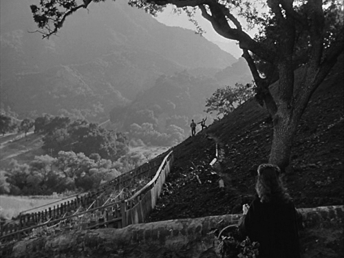
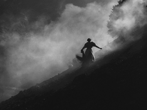
The last of these five frames belongs to the visual motif that appears in the opening sequence, as Angharad waves to her father and Huw on the beautiful distant hillside (see above), as well as in the final scene, where Angharad struggles in her fine clothes across a similar hillside, swathed in smoke, to reach the mine after the disaster that traps her father (see below). Such moments create a quiet measure of the gradual degradation of the valley and the dwindling of the family’s happiness.
Did Ford realize how brilliant this shot was? We can be confident that Welles was well aware of how daring and wonderful his techniques in Kane were. It shows in the film. With Ford, one can only suspect that he knew exactly what he had accomplished here and elsewhere.
Another thing How Green shares with Kane is a flashback structure. It largely consists of one big flashback told by the protagonist, not a series of embedded stories by witnesses. Nevertheless it’s unusual, since we never come out of the flashback. The tale opens with the valley in severe decline, the village nearly deserted, and the hero about to depart for a better life. We witness the decline of his family as he grows, gets educated, and opts to follow his father and brothers into a job in the mine. By the end his elder brothers have scattered all over the world, his father is dead, and we don’t know what has become of his mother and sister. (One plausible assumption is that his mother has recently died, prompting his departure in the opening scene.) Yet the ending gives us a series of shots of the family as they had been in their prime, with the protagonist-narrator declaring, “Men like my father can never die.” Like Kane, it is a film about the power of memory, but in this case the power to comfort rather than to baffle.
One thing that makes How Green stand apart from some of Ford’s other films is that it for once controls the director’s penchant for mixing in broad humor. His stable of supporting actors playing minor characters who love to drink and fight can be trying. There is a particularly ill-advised moment in The Searchers when, after the epiphanic moment when Ethan has lifted Debbie as if to kill her and then embraced her, Ford cuts to the Ward Bond character having a wound on his posterior dressed, to the derision of his comrades. That Ford should undercut such a scene with a vulgar moment of comedy combines with another flaw or two in the film keep if off my list of Ford’s very best films. And much though I love the first three-quarters of The Quiet Man, that climactic brawl just goes on and on.
In How Green, the characters Dai Bando and Cyfartha provide humor, but they are held in check. They play reasonably significant roles in the action, helping Huw deal with the school bullies and his sadistic teacher. Many of the family scenes involve amusing moments as well, moments that arise naturally from the situations and have no air of mere comic relief. In screenwriter Philip Dunne’s introduction to the published version of his screenplay, he finds fault with several scenes and actors. Maybe he’s right that the scene when the mine owner visits the Morgan family is played for broad comedy, but it’s not as broad as elsewhere in Ford’s work. Luckily Ford’s brother Francis does not return for yet another of his bit parts as a drunk.
In 1972, when Ford was dying of cancer, the Directors Guild held an evening gathering to honor him. He was asked to choose one of his films to be projected, and he named How Green. He had consistently said he considered it his finest film.
There’s no budging Kane
I doubt that the notion of Citizen Kane as the Greatest Film of All Time will go away anytime soon. Changing (and unchanging) tastes are reflected in the decadal Sight & Sound poll of critics concerning the ten greatest films of all times. They started in 1952 and have continued to 2002, with another due this year. The lists reflect the fact that apparently critics can somewhat agree on the greatest older classic, though fashions in these come and go, but they cannot agree on much of anything that has been made since 1970:
1952
- 1. Bicycle Thieves (De Sica)
- 2. City Lights (Chaplin)
- 2. The Gold Rush (Chaplin)
- 4. Battleship Potemkin (Eisenstein)
- 5. Intolerance (Griffith)
- 5. Louisiana Story (Flaherty)
- 7. Greed (von Stroheim)
- 7. Le Jour se lève (Carné)
- 7. The Passion of Joan of Arc (Dreyer)
- 10. Brief Encounter (Lean)
- 10. La Règle du jeu (Renoir)
1962
- 1. Citizen Kane (Welles)
- 2. L’avventura (Antonioni)
- 3. La Règle du jeu (Renoir)
- 4. Greed (von Stroheim)
- 4. Ugetsu Monogatari (Mizoguchi)
- 6. Battleship Potemkin (Eisenstein)
- 7. Bicycle Thieves (De Sica)
- 7. Ivan the Terrible (Eisenstein)
- 9. La terra trema (Visconti)
- 10. L’Atalante (Vigo)
1972
- 1. Citizen Kane (Welles)
- 2. La Règle du jeu (Renoir)
- 3. Battleship Potemkin (Eisenstein)
- 4. 8½ (Fellini)
- 5. L’avventura (Antonioni)
- 5. Persona (Bergman)
- 7. The Passion of Joan of Arc (Dreyer)
- 8. The General (Keaton)
- 8. The Magnificent Ambersons (Welles)
- 10. Ugetsu Monogatari (Mizoguchi)
- 10. Wild Strawberries (Bergman)
1982
- 1. Citizen Kane (Welles)
- 2. La Règle du jeu (Renoir)
- 3. Seven Samurai (Kurosawa)
- 3. Singin’ in the Rain (Kelly, Donen)
- 5. 8½ (Fellini)
- 6. Battleship Potemkin (Eisenstein)
- 7. L’avventura (Antonioni)
- 7. The Magnificent Ambersons (Welles)
- 7. Vertigo (Hitchcock)
- 10. The General (Keaton)
- 10. The Searchers (Ford)
1992
- 1. Citizen Kane (Welles)
- 2. La Regle du Jeu (Renoir)
- 3. Tokyo Story (Ozu)
- 4. Vertigo (Hitchcock)
- 5. The Searchers (Ford)
- 6. L’Atalante (Vigo)
- 6. The Passion of Joan of Arc (Dreyer)
- 6. Pather Panchali (Ray)
- 6. Battleship Potemkin (Eisenstein)
- 10. 2001: A Space Odyssey (Kubrick)
2002
- 1. Citizen Kane (Welles)
- 2. Vertigo (Hitchcock)
- 3. La Regle du Jeu (Renoir)
- 4. The Godfather, parts I and II (Coppola)
- 5. Tokyo Story (Ozu)
- 6. 2001: A Space Odyssey (Kubrick)
- 7. Battleship Potemkin (Eisenstein)
- 7. Sunrise (Murnau)
- 9. 8 ½ (Fellini)
- 10. Singin’ in the Rain (Kelly and Donen)
There is much that could be said about these lists. Most readers will probably be astonished to see Bicycle Thieves at the head of the first list, with Kane not even present. Brief Encounter above La Regle du jeu. Louisiana Story, of all things, and Le Jour se léve. By 1962, tastes had changed. Italians won the day, with three films, while Eisenstein, whose Ivan the Terrible, Part 2 had finally been released in 1957, had two films chosen. Two French films and two American. But it was in this year that Kane appeared, immediately bouncing to number one, a position from which it has never budged. I suspect it will sit atop the 2012 list, simply because now so many critics assume it’s the best film ever–and even if they don’t assume that, they won’t be able to agree on an alternative.
Ford has had only one film on the lists, The Searchers, in 1982 and 1992. For a time it was the Ford film du jour, until in 1992 Hitchcock zipped past it with Vertigo, which settled into the second spot after Kane in 2002. Mizoguchi has been on only one list, in 1972 with Ugetsu Monogatari. Ozu’s first film to became well known in the west didn’t make the list until decades later, in 1992, and yet despite the discovery of Late Spring and Early Summer and An Autumn Afternoon, Tokyo Story remains the Ozu film. Tati has never appeared on the list. Neither has Bresson. I’ll buy the idea that critics are out there voting for Bresson like mad, but all for different films. But Play Time, surely one of the very greatest films ever made, should be easy to converge around. Finally, the only post-1970 film on here (and not by much) is the Godfather pair. I was still working on my master’s degree when the first one came out.
I suppose by now, with so many smaller countries starting to make movies and so many festivals making them widely available, it becomes impossible to anoint new classics in the way critics used to. Kiarostami’s Koker Trilogy, in whole or in part, would seem to be such a classic, but there are so many great competing films. Does one have enough perspective to choose more recent films when others, like Sunrise, have stood the test of time? Play Time is 45 years old now, and I think it’s a greater film than most of those on the 2002 list–certainly including the number one. Possibly it will make the list this year.
Why is Kane so fixed at the top, when other films move up and down and ladder, and some appear and disappear? Perhaps the simple assumption that if it has been up there so long, it must really be the greatest film ever made.
I think this business of polls and lists for the greatest films of all times would be much more interesting if each film could only appear once. Having gained the honor of being on the list, each title could be retired, and a whole new set concocted ten years later. The point of such lists, if there is one, is presumably to introduce people who are interested in good films to new ones they may not have seen or even known about.
Such an approach is not wholly unthinkable. Each year the National Film Registry maintained by the Library of Congress chooses 25 films deemed to be national treasures worthy of special priority in preservation. There’s probably some assumption that the best films were on the early lists and that each new 25, especially coming annually rather than at longer intervals, must be of less interest than its predecessors. But on the whole it’s a pretty egalitarian exercise, one that treats all kinds of films as fair game, not just fiction features, and it really does draw attention to obscure films that deserve to be better known. Given how many films have been made in the USA, it will be a long time before the Registry is scraping the bottom of the cinematic barrel. The entire world could supply so many more.
At any rate, I don’t insist that justice will not be done until How Green or some comparable Ford masterpiece appears on Sight & Sound‘s poll, any more than I would say that it’s having won the Best Picture Oscar proves that it’s a great film. I think we all know that the whims of the Academy members are hard to fathom, then and perhaps even more so now. But why call it overrated just because it beat Kane for that dubious honor? If anything, How Green is underrated for that very reason. Had it been made in a different year and won the Oscar against some other films that weren’t Kane, would it be any better or worse?
If you have never seen How Green and are not wholly opposed to earned sentimentality, give it a try. Just make sure you have at least three hankies handy.
PS March 8, 2012. Our friend Antti Alanen points out that Maureen O’Hara said the shot with the veil was carefully planned. She disagrees with Philip Dunne’s claim that the wind catching it was a happy accident, as Joseph McBride recounts in Searching for John Ford:
Dunne thought Ford had “one of the greatest strokes of luck a director ever had” when the wedding veil suddenly caught a gust of wind and billowed behind Mareen O’Hara as she walked down the steps from the church. O’Hara recalled, “Everybody said, ‘Oh, that Ford luck! How wonderful that was! What an effect it has!’ Rubbish! It wasn’t ‘Ford luck.’ It was three wind machines placed by John Ford, and I had to walk up and down those steps many times while he worked out that the wind machine would do exactly that.” As she climbs into the carriage, the ator playing her husband, Marten Lamont, reaches out to catch her veil. Dunne thought, “The man shouldn’t have touched it when the veil spiraled up. My God, what a shot! Luckily, Joe LaShelle, who was the operator, just gave it a little tilt with the camera.” I told Dunne I thought the gesture of restraining the veil (probably planned by Ford, like the rest of this meticulously composed shot) is an eloquent metaphor for the repressiveness of Angharad’s loveless marriage. “Well, I guess so,” the screenwriter responded. “I didn’t think beyond that. I said, ‘My God, you get a break like that, you leave it alone.'” (p. 332)
PPS March 11, 2012. Thanks to Przemek Kantyka for pointing out that Ugetsu actually figured on the 1962 and 1972 lists.
Pandora’s digital box: From films to files
“Up ahead was Pandora. You grew up hearing about it, but I never figured I’d be going there.”
DB here:
Actually it wasn’t originally a box but a jug. And it might not have been filled with all the world’s misfortunes; it might have housed all the virtues. In Greek mythology, the gods create her as the first woman, sort of the ancient Eve. We get our standard idea of her story not from the ancient world, however, but from Erasmus. In 1508 he wrote of her as the most favored maiden, granted beauty, intelligence, and eloquence. Hence one interpretation of her name: “all-gifted.” But to Prometheus she brought a box carrying, Erasmus said, “every kind of calamity.” Prometheus’ brother Epimetheus accepted the box, and either he or Pandora opened it, “so that all the evils flew out.” All that remained inside was Hope. (Don’t think there isn’t a lot of dispute about why hope was cooped up with all those evils.)
The idea of Pandora’s box spread throughout Western culture to denote any imprudent unleashing of a multitude of unhappy consequences. It’s long been associated with an image of an attractive but destructive woman, and we don’t lack examples in films from Pabst to Lewin. But there’s another interpretation of the maiden’s name: not “all-gifted” but “all-giver.” According to this line, Pandora is a kind of earth goddess. In one Greek text she is called “the earth, because she bestows all things necessary for life.”
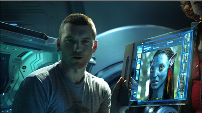
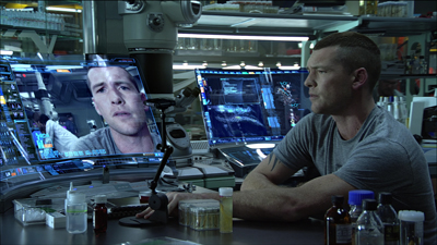
The less-known interpretation seems to dominate in Avatar. Pandora, a moon of the huge planet Polyphemus, is a lush ecosystem in which the humanoid Na’vi live in harmony with the vegetation and the lower animals they tame or hunt. Nourished by a massive tree (they are the ultimate tree-huggers), they have a balanced tribal-clan economy. Their spiritual harmony is encapsulated in the beautiful huntress Neytiri. As the mate for the first Sky-Person-turned-Na’vi, Avatar Jake, she’s also an interplanetary Eve. And by joining the Na’vi on Pandora, Jake does find hope.
The irony of a super-sophisticated technology carrying a modern man to a primal state goes back at least as far as Wells’ Time Machine. But the motif has a special punch in the context of the Great Digital Changeover. Digital projection promises to carry the essence of cinema to us: the movie freed from its material confines. Dirty, scratched, and faded film coiled onto warped reels, varying unpredictably from show to show (new dust, new splices) is now shucked off like a husk. Now images and sounds supposedly bloom in all their purity. The movie emerges butterfly-like, leaving the marks of dirty machines and human toil behind. As Jake returns to Eden, so does cinema.
Avatar or atavism?
Kristin suggested the title for this series of blog entries, and I liked its punning side. For one thing, Avatar was a turning point in digital projection. 3D, as we now know, was the Trojan Horse that gave exhibitors a rationale to convert to digital. Avatar, an overwhelming merger of digital filmmaking (halfway between cartoon and live-action) and 3D digital projection, fulfilled the promise of the mid-2000s hits that had hinted at the rewards of this format.
With its record $2.7 billion worldwide box office, Avatar convinced exhibitors that digital and 3D could be huge moneymakers. In 2009, about 16,000 theatres worldwide were digital; in 2010, after Avatar, the number jumped to 36,000. True, theatre chains also benefited from JP Morgan’s timely infusion of about half a billion dollars in financing in November 2009, a month before the film’s release. Still, this movie that criticized technology’s war on nature accelerated the appearance of a new technology.
Throughout this series, I’ve tried to bring historical analysis to bear on the nature of the change. I’ve also tried not to prejudge what I found, and I’ve presented things as neutrally as I could. But I find it hard to deny that the digital changeover has hurt many things I care about.
The more obvious side of my title’s pun was to suggest that digital projection released a lot of problems, which I’ve traced in earlier entries. From multiplexes to art houses, from festivals to archives, the new technical standards and business policies threaten film culture as we’ve known it. Hollywood distribution companies have gained more power, local exhibitors have lost some control, and the range of films that find theatrical screening is likely to shrink. Movies, whether made on film or digital platforms, have fewer chances of surviving for future viewers. In our transition from packaged-media technology to pay-for-service technology, parts of our film heritage that are already peripheral—current foreign-language films, experimental cinema, topical and personal documentaries, classic cinema that can’t be packaged as an Event—may move even further to the margins.
Moreover, as many as eight thousand of America’s forty thousand screens may close. Their owners will not be able to afford the conversion to digital. Creative destruction, some will call it, playing down the intangible assets that community cinemas offer. But there’s also the obsolescence issue. Equipment installed today and paid for tomorrow may well turn moribund the day after tomorrow. Only the permanently well-funded can keep up with the digital churn. Perhaps unit prices will fall, or satellite and internet transmission will streamline things, but those too will cost money. In any event, there’s no reason to think that the major distributors and the internet service providers will be feeling generous to small venues.
Did this Pandora’s box leave any reason to be optimistic? I haven’t any tidy conclusions to offer. Some criticisms of digital projection seem to me mistaken, just as some praise of it seems to me hype or wishful thinking. In surrendering argument to scattered observations, this final entry in our series is just a series of notes on my thinking right now.
What you mean, celluloid?
First, let’s go fussbudget. It’s not digital projection vs. celluloid projection. 35mm motion picture release prints haven’t had a celluloid base for about fifteen years. Release prints are on mylar, a polyester-based medium.
Mylar was originally used for audio tape and other plastic products. For release prints of movies, it’s thinner than acetate but it’s a lot tougher. If it gets jammed up in a projector, it’s more likely to break the equipment than be torn up. It’s also more heat-resistant, and so able to take the intensity of the Xenon lamps that became common in multiplexes. (Many changes in projection technology were driven by the rise of multiplexes, which demanded that one operator, or even unskilled staff, could handle several screens.)
Projectionists sometimes complain that mylar images aren’t as good as acetate ones. In the 1940s and 1950s, they complained about acetate too, saying that nitrate was sharper and easier to focus. In the 2000s they complained about digital intermediates too. Mostly, I tend to trust projectionists’ complaints.
But acetate-based film stock is still used in shooting films, so I suppose digital vs. celluloid captures the difference if you’re talking about production. Even then, though, there’s a more radical difference. A strip of film stock creates a tangible thing, which exists like other objects in our world. “Digital,” at first referring to another sort of thing (images and sounds on tape or disk), now refers to a non-thing, an abstract configuration of ones and zeroes existing in that intangible entity we call, for simple analogy, a file.
George Dyson: “A Pixar movie is just a very large number, sitting idle on a disc.”
Big and gregarious
Sometimes discussion of the digital revolution gets entangled in irrelevant worries.
First pseudo-worry: “Movies should be seen BIG.” True, scale matters a lot. But (a) many people sit too far back to enjoy the big picture; and (b) in many theatres, 35mm film is projected on a very small screen. Conversely, nothing prevents digital projection from being big, especially once 4K becomes common. Indeed, one thing that delayed the finalizing of a standard was the insistence that so-called 1.3K wasn’t good enough for big-screen theatrical presentation. (At least in Europe and North America: 1.3K took hold in China, India, and elsewhere, as well as on smaller or more specialized screens here.)
Second pseudo-worry: “Movies are a social experience.” For some (not me), the communal experience is valuable. But nothing prevents digital screenings from being rapturous spiritual transfigurations or frenzied bacchanals. More likely, they will be just the sort of communal experiences they are now, with the usual chatting, texting, horseplay, etc.
Of course, image quality and the historical sources and consequences of digital projection are something else again.
Irresolution
It’s a good thing the pros kept pushing. Had filmmakers and cinephiles welcomed the earliest digital systems, we might have something worse. Here’s George Lucas in 2005, talking less about photographic quality than the idea of the sanitary image.
The quality [of digital projection] is so much better. . . . You don’t get weave, you don’t get scratchy prints, you don’t get faded prints, you don’t get tears. . . The technology is definitely there and we projected it. I think it is very hard to tell a film that is projected digitally from a film that is projected on film.
And he’s referring to the 1280-line format in which Star Wars Episode I was projected in 1999.
Probably the widespread skepticism from directors and cinematographers helped push the standard to 2K. (So did the adoption of the Digital Intermediate.) Optimistic observers in the mid-2000s expected the major studios to make 4K the standard right away. Given the constraints of storage at that time, the 2K decision might be justified. But like the 24 frames-per-second frame rate of sound cinema, it was a concession to the just-good-enough camp.
At the same time, George seems to grant that progress will be needed in the area of resolution.
You’ve got to think of this [our current situation] as the movie business in 1901. Go back and look at the films made in 1901, and say, “Gee, they had a long way to go in terms of resolution. . . .”
Actually, in films preserved in good state from 1901, the resolution looks just fine—better than most of what we see at the multiplex today, on film or on digital.
The invisible revolution
Speaking of sound cinema: Is the changeover to talkies the best analogy for what we’re seeing now? Mostly yes, because of the sweeping nature of the transformation. No technological development since 1930 has demanded such a top-to-bottom overhaul of theatres. Assuming a modest $75,000 cost for upgrading a single auditorium, the digital conversion of US screens has cost $1.5 billion.
In an important respect, though, the analogy to sound doesn’t hold good. When people went to talkies, they knew that something new had been added. The same thing happened with color and widescreen. And surely many customers noticed multi-track sound systems. But what moviegoers notice that a theatre is digital rather than analog? Many probably assume that movies come on DVDs or, as one ordinary viewer put it to me, “film tapes.” Anyhow, why should they care?
There was a debate during the 2000s that audiences would pay more for a ticket to a digital screen. But that notion was abandoned. People aren’t that easy to sucker. So we’re back with 3D as the killer app, the justification for an upcharge. Whether 3D survives, dominates, or vanishes isn’t really the point. It’s served its purpose as the wedge into digital installation.
By the way, according to one industry leader, 2D ticket prices are likely to go up this year while 3D prices drop. Is this flattening of the price differential a strategy to get more people to support a fading format?
Mommy, when a pixel dies, does it go to heaven?
Digital was sold to the creative community in part by claiming that at last the filmmaker’s vision would be respected. Every screening would present the film in all its purity, just as the director, cinematographer et al. wanted it to be seen.
Last week I went to see Chronicle with my pal Jim Healy. The projector wasn’t perpendicular to the screen, so there was noticeable keystoning. The masking was set wrong, blocking off about a seventh of the picture area. And two little pink pixels were glowing in the middle of the northwest quadrant throughout the movie. I’m assuming that Chronicle’s director didn’t mandate these variants on his “vision.”
Jim went out to notify the staff, and two cadets came down to fiddle with the masking. The movie had already been playing in that house for several days. Maybe the masking hadn’t been changed for months? And of course the projector couldn’t be realigned on the fly. As for those pixels: There’s nothing to be done except buy a new piece of gear. Chapin Cutler of Boston Light & Sound tells me that replacing the projector’s light engine runs around $12,000. At that price, there may be a lot of dead pixels hanging around a theatre near you.
Video to the max
Not so long ago, the difference was pitched as film versus video. That was the era of movies like The Celebration and Chuck and Buck. Then came high-definition video, which was still video but looking somewhat better (though not like film). But somehow, as if by magic, very-high-definition video, with some ability to mimic photochemical imagery, became digital cinema, or simply digital.
We have to follow that usage if we want to pinpoint what we’re talking about at this point in history. But damn it, let’s remember: We are still talking about video.
The Film Look
Ever since the days of “film vs. video,” we’ve been talking about the “film look.” What is it?
I’m far from offering a good definition. There are many film looks. You have orthochromatic and panchromatic black-and-white, nitrate vs. acetate vs. mylar, two-color and three-color Technicolor, Eastman vs. Fuji, and so on. But let’s stick just with projection. Is there a general quality of film projection that differentiates it from digital displays?
Some argue that flicker and the slight weaving of film in the projector are characteristic of the medium. Others point to qualities specific to photochemistry. Film has a greater color range than digital: billions of color shades rather than millions. Resolution is also different, although there’s a lot of disagreement about how different. A 35mm color negative film is said to approximate about 7000 lines of resolution, but by the time a color print is made, the display yields about 5000 lines—still a bit ahead of 4K digital. But each format has some blind spots. There’s a story that the 70mm camera negative of The Sound of Music recorded a wayward hair sticking straight out on the top of Julie Andrew’s head. It wasn’t visible in release prints of the day, but a 4K scan of the negative revealed it.
Film fans point to the characteristic film shimmer, the sense that even static objects have a little bit of life to them. Roger Ebert writes:
Film carries more color and tone gradations than the eye can perceive. It has characteristics such as a nearly imperceptible jiggle that I suspect makes deep areas of my brain more active in interpreting it. Those characteristics somehow make the movie seem to be going on instead of simply existing.
Watch fluffy clouds or a distant forest in a digital display, and you’ll see them hang there, dead as a postcard vista. In a film, clouds and trees pulsate and shift a little. Partly the film is capturing very slight movements of them in air, or the movement of light and air around them. In addition, the film itself endows them with that “nearly imperceptible jiggle” that our visual system detects.
How? Brian McKernan points out that the fixed array of pixels in a digital camera or projector creates a stable grid of image sites. But the image sites on a film frame are the sub-microscopic crystals embedded in the emulsion and activated by exposure to light. Those crystals are scattered densely throughout the film strip at random, and their arrangement varies from frame to frame. So the finest patterns of light registration tremble ever so slightly in the course of time, creating a soft pictorial vibrato.
Another source of the film look was suggested to me by Jeff Roth, Senior Vice-President of Post-Production at Focus Features. Jeff notes that a video chip is a flat surface, with the pixels activated by light patterns across the grid. (We forget that in the earliest stages, “digital” image capture is “analog”—that is, photographic—before it gets quantized and then digitized.) But a film strip has volume. It seems very thin to us, but light waves find a lot to explore in there. Light penetrates different layers of the emulsion: blue on top, then a yellow filter, then green, then red. The light rays leave traces of their passage through the layers. Joao S. de Oliveira puts it more laconically:
There is a certain aura in film that cannot exist in a digital image. . . . From the capture of a latent image, the micro-imperfections created by light on a perfect crystalline structure—a very three-dimensional process—to its conversion into a visible and permanent artefact, the latitude and resolution of film are incomparable to any other process available today to register moving images.
For example, shadows and highlights are captured “deeply.” Bright areas move into shadow gracefully. Similarly, film is far more tolerant of overexposure than digital recording is; even blown-out areas of the negative can be recovered. (In still photography, darkroom technique allows you to “burn in” an overexposed area.) The blown-out elements are still there, but in digital they’re gone forever.
Film shown on a projector maintains the film look captured on the stock: You’re just shining a light through it. We’ve all heard stories, however, of those DVD transfers that buff the image to enamel brightness and then use a software program to add grain. One archivist tells me of an early digital transfer of Sunset Blvd. that looked like it had been shot for HDTV.
But today carefully done digital transfers can preserve some of the film look. When my local theatres were transitioning, I saw Tinker Tailor Soldier Spy first on film, then on digital, and then again on film. Although the digital looked a little harder, I was surprised how much graininess it preserved. So it seems to me that some qualities of the film look can be retained in digital transfers.
Marching orders
George Lucas, at the 2005 annual convention and trade show of the National Association of Theatre Owners: “I’m sort of the digital penny that shows up every year to say, ‘Why haven’t you got these digital theatres yet?'” (Variety 17 March 2005).
“His point to theater owners was that 3D, which can bring in new audiences and justify higher ticket prices, is only possible after they make the switch to digital projection” (Hollywood Reporter 10 February 2012).
Premonitions
In summer of 1999, Godfrey Cheshire published a two-part article, “The Death of Film/ The Decay of Cinema.” It’s proven remarkably far-sighted.
He predicted that within a decade your multiplex theatre would contain “a glorified version of a home video projection system.” He predicted that the rate of adoption would be held back by costs. He predicted that the changeover would mostly benefit the major distributors, and that exhibitors would have to raise ticket and concession prices to cover investments. He predicted what is now called “alternative content”—sports, concerts, highbrow drama, live events—and correctly identified it as television outside the home. He predicted the preshow attractions that advertise not only products but TV shows and pop music. He predicted what is being seriously discussed in industry circles now: letting viewers snap open their “second screen” and call, text, check email, and surf the net during the show. And he predicted that distractions and bad manners in movie theatres would drive away viewers who want to pay attention.
People who want to watch serious movies that require concentration will do so at home, or perhaps in small, specialty theatres. People who want to hoot, holler, flip the bird and otherwise have a fun communal experience . . . will head down to the local enormoplex.
Godfrey goes on to make provocative points about the effects of digital technology on how movies are made as well. His essay should be prime reading for everyone involved in film culture—e.g., you.
WYSIWYG
I’ve mentioned the postcard effect that makes static objects just hang there. In less-than-2K digital displays, I see other artifacts, most of which I don’t know the terms for. Film has artifacts too, notably graininess, but I find the digital ones more off-putting. There’s a waterfall effect, when ripples rush down uniform surfaces. Sometimes I see diagonal striping from one corner to its opposite, an effect common on home and bar monitors. (I’m told it comes from interference from phones and the like.) On cheap DVDs, or commercial ones played on region-free machines, you can detect a weird pop-out effect, where the surfaces of different planes, usually marked by dark edge contours, detach themselves. The surfaces float up, wobbling out of alignment with their surroundings.
I am not hallucinating these things. When I point them out, others see them, and then, like me, they can’t ignore them. So I’ve stopped pointing them out, especially when a friend wants to show me his (always his) fancy home theatre. Why spoil their pleasure?
Same difference
Various positions on the split between film and digital (for want of a better term): I’ve held nearly all of them at various points, and sometimes simultaneously. I’ll confine myself, as usual, just to film-based projection and digital projection, and assuming minimal competence of staff in each domain. (Just because something’s shown in 35mm, that doesn’t mean it’s shown well.)
1. They’re not the same, just two different media. They’re like oil painting and etching. Both can coexist as vehicles for artists’ work.
2. They’re not the same, and digital is significantly worse than film. This was common in the pre-DCI era.
3. They’re not the same, and digital is significantly better than film. Expressed most vehemently by Robert Rodriguez and with some insistence by Michael Mann.
4. They’re not the same, and digital is mostly worse, but it’s good enough for certain purposes. Espoused by low-budget filmmakers the world over. Also embraced by exhibitors in developing countries, where even 1.3K is considered an improvement over what people have been getting.
5. They’re the same. This is the view held by most audiences. But just because viewers can’t detect differences doesn’t mean that the two platforms are equally good. Digital boosters maintain that we now have very savvy moviegoers who appreciate quality in image and sound. In my experience, people don’t notice when the picture is out of focus, when the lamp is too dim, when the surround channels aren’t turned on, when speakers are broken, and when spill light from EXIT signs washes out edges of the picture. (See Chronicle anecdote above.) As long as they can hear the dialogue and can make out the image, I believe, most viewers are happy.
‘Plex operators are notoriously indifferent to such niceties. In most houses, good enough is good enough. Teenage labor can maintain only so much.
Film/video
“The picture was nice and crisp.” “So much better than film.” “We showed a Blu-ray and it looked fine.”
I don’t trust people’s responses to such things unless the judgment is comparative. Show film and the digital program side by side and then judge. Or even show rival manufacturers’ DCI-compliant projectors side by side. I think you will see differences.
As they develop, new reproductive media improve in some dimensions but degrade on others. As the engineers tell us, there’s always a trade-off.
CD is more convenient than vinyl, but its clean, dry sound isn’t as “warm.” Mp3, even more convenient and portable, packs a sonic punch but is inferior in dynamics and detail to CDs. Similarly, back in the 1990s, laserdiscs had to be handled more carefully than tape cassettes, and in playback they required interruptions as sides were flipped. But aficionados accepted these drawbacks because we believed that our optical discs looked and sounded much better than VHS. One well-known professor urged that classroom screenings could now dispense with film.
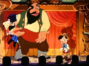
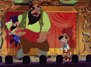
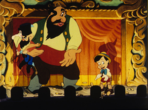
Now those laserdisc images would be laughed out of the room. Have a look at an image from the 1995 restoration of Disney’s Pinocchio. It’s taken from a transfer of the laserdisc to DVD-R. (You can’t grab a frame directly from a laserdisc.) In this and the others, I haven’t adjusted the raw image.
Actually, on a decent monitor, it looks better than this. Since you can’t grab a frame directly from a laserdisc, LD couldn’t stand up to home theatre projection today. The 2009 DVD and Blu-ray (below) are sharper.
Now compare the DVD with a dye-transfer Technicolor image from a 1950s 35mm print. There have been some gains and some losses in color range, shadow, and detail. For example, Stromboli’s trousers and the footlight area go very black, presumably because of the silver “key image” used for greater definition in the dye-transfer process. IB Tech restorations routinely bring out “hidden” color in such areas.
Which is best? You can take your pick, but you’re better able to choose when you’re not seeing one image in isolation.
Live/ Memorex
Of course side-by-side comparisons can fail when most viewers don’t notice even gross differences. In a course, I once showed a 16mm print of Night of the Living Dead, and a faculty friend came to the screening. (Yes, history profs can be horror fans.) In my followup lecture, I showed clips on VHS, dubbed from a VHS master. My friend came to the class for my talk. Afterward he swore that he couldn’t tell any difference between the film and the second-generation VHS tape.
This raises the fascinating question of changing perceptual frames of reference. My friend knew the film very well, and he’d watched it many times on VHS. Did he somehow see the 16 screening as just a bigger tape replay? Did none of its superiority register? Maybe not.
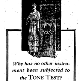 From 1915 to 1925, Thomas Edison demonstrated his Diamond Disc Phonograph by inviting audiences to compare live performances with recordings. His publicists came up with the celebrated Tone Tests. A singer on stage would stand by while the disc began to play. Abruptly the disc would be turned down and the singer would continue without missing a note. Then the singer would stop and the disc, now turned up, would pick up the thread of melody. Greg Milner writes of the first demonstration:
The record continued playing, with [the contralto Christine] Miller onstage dipping in and out of it like a DJ. The audience cheered every time she stopped moving her lips and let the record sing for her.
At one point the lights went out, but the music continued. The audience could not tell when Miller stopped and the playback started.
The Tone Tests toured the world. According the publicity machine run by the Wizard of Menlo Park, millions of people witnessed them and no one could unerringly distinguish the performers from their recording.
Edison’s sound recording was acoustic, not electrical, and so it sounds hopelessly unrealistic to us today. (You can sample some tunes here.) And there’s some evidence, as Milner points out, that singers learned to imitate the squeezed quality of the recordings. But if the audiences were fairly regularly fooled, it suggests that our sense of what sounds, or looks, right, is both untrustworthy and changeable over history.
To some extent, what’s registered in such instances aren’t perceptions but preferences. Wholly inferior recording mechanisms can be favored because of taste. How else to explain the fact that young people prefer mp3 recordings to CDs, let alone vinyl records? It’s not just the convenience; the researcher, Jonathan Berger of Stanford University, hypothesizes that they like the “sizzle” of mp3.
To some extent, we should expect that people who’ve watched DVDs from babyhood onward take the scrubbed, hard-edge imagery of video as the way that movies are supposed to look. Or perhaps still younger people prefer the rawer images they see on Web videos. Do they then see an Imax 70mm screening as just blown-up YouTube?
The epiphanic frame
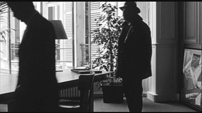
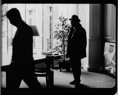
Godard’s Éloge de l’amour: DVD framing vs. original 35mm framing.
Digital projection is already making distributors reluctant to rent films from their libraries, and film archives are likely to restrict circulation of their prints. When 35mm prints are unavailable, it will be difficult for us to perform certain kinds of film analysis. In order to discover things about staging, lighting, color, and cutting in films that originated on film, scholars have in the past worked directly with prints.
For example, I count frames to determine editing rhythms, and working from a digital copy isn’t reliable for such matters. True, fewer than a dozen people in the world probably care about counting frames, so this seems like a trivial problem. But analysts also need to freeze a scene on an exact frame. For live-action film, that’s a record of an actual instant during shooting, a slice of time that really existed and serves to encapsulate something about a character, the situation, or the spatial dynamics of the scene. (Many examples here.) This is why my books, including the recent edition of Planet Hong Kong, rely almost entirely on frame grabs from 35mm prints.
Paolo Cherchi Usai suggests that for every shot there is an “epiphanic frame,” an instant that encapsulates the expressive force of that shot. Working with a film print, you can find it. On video, not necessarily.
Just as important, for films originating in 35mm, we can’t assume that a video copy will respect the color values or aspect ratio of the original. Often the only version available for study will be a DVD with adjusted color (see Pinocchio above) and in a different ratio. I’ve written enough about variations in aspect ratios in Godard and Lang (here and here) to suggest that we need to be able to go back to 35mm for study purposes, at least for photographically-generated films. For digitally-originated films, researchers ought to be able to go back to the DCP as released, but that will be nearly impossible.
The analog cocoon
I began this series after realizing that in Madison I was living in a hothouse. As of this fall, apart from festival projections on DigiBeta or HDCam, I hadn’t seen more than a dozen digital commercial screenings in my life, and I think nearly all were 3D. Between film festivals, our Cinematheque, and screenings in our local movie houses, I was watching 35mm throughout 2011, the year of the big shift.
There are six noncommercial 35mm film venues within walking distance of my office at the corner of University Avenue and Park Street. And two of those venues still use carbon-arc lamps! Go here for a fuller identification of these houses. Moreover, in my office sit two Steenbeck viewing machines, poised to be threaded up with 16mm or 35mm film. (“Ingestion” is not an option.)
But now I’ve woken up. We all conduct our educations in public, I suppose, but preparing this series has taught me a lot. I still don’t know as much as I’d like to, but at least, I now appreciate the riches around me.
I’m very lucky. It’s not over, either. The good news is that the future can’t really be predicted. Like everybody else, I need to adjust to what our digital Pandora has turned loose. But we can still hold on to hope.
This is the final entry in a series on digital film distribution and exhibition.
On the Pandora perplex, see Dora and Erwin Panofsky, Pandora’s Box: The Changing Aspects of a Mythical Symbol (Princeton University Press, 1956). The Wikipedia article on the lady is also admirably detailed.
Godfrey Cheshire’s prophetic essay is apparently lost in the digital labyrinths of the New York Press. Godfrey tells me that he’s exploring ways to post it, so do continue to search for it. Another must-read assessment is on the TCM site. Pablo Kjolseth, Director of the International Film Series at the University of Colorado—Boulder, writes on “The End.” See also Matt Zoller Seitz’s sensible take on the announcement that Panavision has ceased manufacturing cameras. Some wide-ranging reflections are offered in Gerda Cammaer’s “Film: Another Death, Another Life.”
Brian McKernan’s Digital Cinema: The Revolution in Cinematography, Postproduction, and Distribution (MGraw-Hill, 2005) is the source of two of my quotations from George Lucas (pp. 31, 33) and some ideas about the film look (p. 67). My quotation from Greg Milner on the Tone Test comes from his Perfecting Sound Forever: An Aural History of Recorded Music (Faber, 2009), 5.
NPR recently broadcast a discussion of the differences, both acoustic and perceptual, among consumer audio formats. The show includes A/B comparisons. Thanks to Jeff Smith for the tip.
Thanks to Chapin Cutler, Jeff Roth, and Andrea Comiskey, who prepared the projector map of downtown Madison and the east end of the campus.
6 February 2012: This series has aroused some valuable commentary around the Net, just as more journalists are picking up on the broad story of how the conversion is working. Leah Churner has published a useful piece in the Village Voice on digital projection, and Lincoln Spector has posted three essays at his blogsite, the last entry offering some suggestions about how to preserve both film-based and digital-originated material.
“You get soft, Pandora will shit you out dead, with zero warning.”


