


Archive for the 'Film industry' Category
Color, shape, movement . . . and talk

Bonjour Tristesse.
DB here:
Our weekly Film Colloquium is sort of like your old high-school assembly, except that it’s fun. The Film Studies area meets nearly every Thursday afternoon at 4 to hear a paper by a grad student, a faculty member, or a guest. It’s a great forum for ideas and information, and it gives the speaker a chance to try out a talk before taking it to a conference or lecture gig. The local audience is, in my experience, the toughest I’m likely to encounter. And this spring, despite a heavy travel and work schedule, Kristin and I caught two outstanding presentations.
Not in color, but colored

By now we all understand that silent films were most often shown with musical accompaniment, and sometimes sound effects. But we tend to forget that most silent films were in color too.
By the early 1920s, 80% of films were colored in one way or another. There were a few efforts to record the actual colors in a scene, but most often color was added after filming. Areas of the frame might be painted over by stenciling or by freehand. More commonly, the shots were dipped into dyes, yielding images that were tinted (washing over the image and coloring the areas of white, as in the frames below) or toned (coloring the darkest areas and leaving the white areas white). Over the years, film prints were preserved in black and white, partly because color stock was more expensive than today. As a result, even archival prints lost the sense of what audiences actually saw. Today archivists labor to reconstruct what silent films looked like in all their rainbow glory.
 Professor Joshua Yumibe of Oakland University wrote his Ph. D. thesis on early color processes, and his Colloquium talk asked some powerful questions. We know that there was a transition in film artistry from the late 1900s to the early 1910s, a shift toward what Tom Gunning has called the “cinema of narrative integration.” As films became longer and were shown in more or less permanent venues, moviemakers began to tell more complicated stories. How, Josh asks, did this shift away from a cinema of isolated “attractions” affect practices of coloring? Do color processes affect the way stories were told? Do the color processes change how people saw the space on screen? How did the trade press respond to different strategies of coloring?
These are fascinating questions, and Josh’s exploration of them was careful and detailed. He has done enormous research on the various color processes, and he was able to trace several lines of development. For instance, he found that writers of the earliest years thought that color enhanced the sensual and emotional effects of the image, even creating an illusion of 3-D. In a shot like that of the butterfly dancer, people seem to have sensed that her multicolored shape was thrusting out of the screen toward them.
Josh argues that with the growing emphasis on narrative, color became more muted. Filmmakers were no longer aiming at momentary stimulation but at ongoing mood. Now tinting and toning came into their own. Color codes developed: blue for night scenes, yellow for sunlight, red for fire, amber for artificial light. Josh also explored the different ways in which European and US companies conceived of color; there seem to have been different color policies at Pathé and at American companies. But this wasn’t the end of change. In the 1920s, with the feature film now at the center of the theatre program, a wide variety of color practices emerged, including those isolated Technicolor sequences we find in films like The Wedding March.
The Q & A was as lively as the talk itself, and afterward, we repaired to a bar and thence to dinner. Josh’s talk was a model of deep, imaginative research and it kept us thinking and talking for a long time afterward. Not to mention his slide show, which regaled us with gorgeous shots that make you realize how much you’re missing when you see an old movie in black and white.
Bass, o profondo!

Another stimulating Colloq session was presided over by our old friend Jan-Christopher Horak, director of the UCLA Film and Television Archive. Chris was in town because our Cinematheque has been showcasing UCLA archival restorations across the semester, and he introduced our screening of The Dark Mirror. But we also got him to give a talk, and that was quite something.
Chris reminded me that we first met thirty years ago, here in Madison, when he came to do research on his dissertation. Since then Chris has been a top-flight scholar and author of many books. His Lovers of Cinema, published by our series at the UW Press, laid the groundwork for the popular film series Unseen Cinema. He’s also been one of the world’s leading film archivists, having supervised collections at Eastman House, the Munich Film Archive, Universal studios, and most recently UCLA.
Chris has long worked at the intersection of film, photography, and the graphic arts. He is one of the world’s experts on the 1920s German avant-garde; one of his early curatorial coups was a 1979 restaging of the pioneering Film und Foto exhibition of 1929. Chris has also long been fascinated by film publicity, having written a book on the subject. So it’s natural that he would gravitate toward studying the film-related work of Saul Bass, one of America’s greatest graphic designers.
 Chris’s talk focused not so much on Bass’s brilliant credit sequences for films by Preminger and Hitchcock as on Bass’s contributions to poster design. Bass turns out to have had a fascinating career, having worked in Manhattan advertising before moving to Los Angeles in 1948. Chris has found at least one early 1950s poster design that Bass probably executed, but he definitely worked for Preminger on publicity for The Moon Is Blue (1953) and Carmen Jones (1954)—the latter yielding to my mind one of the greatest credit sequences in film history. In 1955 Bass founded his own firm.
Throughout, he carried on the ideals of György Kepes, his teacher and a major conduit for Bauhaus ideas into America. Like his European models, Kepes promoted the idea of art as having cognitive value, teaching us to see the world in a new way. Kepes also emphasized that artworks could be of practical utility—an idea that chimed with Bass’s turn toward commercial design.
Chris was able to show that the Bauhaus tradition powerfully influenced Bass’s design principles. Who would have thought that the credits for The Seven Year Itch replayed Paul Klee? Obvious, though, when Chris showed us the images.
Chris emphasized two further points. First, Bass understood what we now call branding. We have to remember that it up to that time, most film publicity featured images of the stars, either in portraits or caught in typical scenes from the film. Bass’s poster design concealed the stars. Instead, he relied on dynamic geometrical design to capture a film’s mood in a powerful, stylized image. The result was an eye-catching logo, instantly recognizable: the flaming rose of Carmen Jones, the Vertigo whirlpool, the dismembered body of Anatomy of a Murder.
The key image could be repeated in newspaper ads, posters, credits, even the production company’s letterhead. When you saw the teaser trailer for Star Trek (“Under Construction”) dominated by that looming boomerang shape, you saw the heritage of Saul Bass. Who cares who’s in the movie? The very image is intriguing. No accident that Bass also designed many corporate logos, like the ATT bell and the United Way hand.
Chris’s second main point was that Bass was able to flourish because of the rise of independent production in the 1950s. Preminger, Hitchcock, and Wilder, acting as their own producers, could control the publicity for their films to a degree not possible for directors working in the classic studio system. Now films were sold as one-offs, and each film needed to pull itself above the clutter. In addition, Bass’s signature designs could set a director apart. In the 1950s, the Bass look was closely identified with his major clients like Hitchcock and Preminger, to the point that other designers for those directors tried to copy his style. I had always thought that Bass did the title design for Hurry Sundown, but Chris showed that it’s another artist’s pastiche of the master.
 Chris’s talk reminded me that Bass contributed to making the opening credits a major attraction—not merely an overture, but an abstract treatment of the key story idea, a sort of graphic map that teases us into the main story. The opening sequences of Se7en and Catch Me If You Can (left) owe a lot to Bass’s idea that the credits should constitute a little movie, witty or ominous, tantalizing us with sketchy glimpses of what is to come. And Almodóvar’s diverting openings, probably the most sheerly enjoyable credit sequences we have today, are unthinkable without Bass. Synchronized with infectious music, Bass’s credit sequences can be seen as continuing the tradition of Walter Ruttmann and Oskar Fischinger, who back in the 1920s and 1930s made abstract films that advertised consumer goods.
For such reasons, I’m glad I hung around Madison after my retirement. With visiting researchers like Josh and Chris, who wants to go fishing?

Woman on the Verge of a Nervous Breakdown.
Thanks to Joshua Umibe for the silent-film illustrations. The first comes from Gaston Velle, Métamorphoses du Papillon / A Butterfly’s Metamorphosis (Pathé, 1904). Frame enlargement from Discovering Cinema (di. Eric Lange and Serge Bromberg, Lobster Film/Flicker Alley). The second comes from Albert Capellani’s Le Chemineau / The Vagabond (Pathé, 1905; tinted and toned). Frame enlargement Joshua Yumibe, courtesy of the Netherlands Filmmuseum.
Happy birthday, Film Workshop

Tsui Hark is the mad genius of Hong Kong cinema. The problem comes with assigning proportions. 10 % mad, 90% genius? 50-50? 99 % mad, 1 % genius?
Across a career that’s lasted more than thirty years, Tsui has had more ups and downs than the local economy. On the twenty-fifth anniversary of Film Workshop, the company he founded, the Hong Kong International Film Festival mounted a tribute. That provides an occasion to examine what he did and didn’t accomplish.
25 years old, but who’s counting?

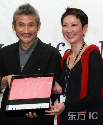
Nansun Shi and Tsui Hark.
At this year’s Asian Film Awards, Film Workshop was given a special prize for outstanding achievement. On another evening there was a party gathering many Workshop alumi, from which the above photo comes. You can see more pictures from that party here. At the agnes b. gallery, a small show featured posters, a looped video documentary, a photocopy of the Better Tomorrow script, and some memorable props.

Nat Olsen has other pictures at his lively Hong Kong Hustle site.
 The catalogue, A Tribute to Romantic Visions: 25th Anniversary of Film Workshop, is a must for all aficionados of Hong Kong film. Consisting largely of interviews, it offers many glimpses of creative choices and business strategies governing the company. Nansun Shi, Tsui’s partner and business manager, recalls how they placed films in overseas markets and won critical acclaim in Europe. She also explains matter-of-factly how frantic the midnight-show system was. In those days, Hong Kong filmmakers test-screened a movie to a midnight audience, and then reedited the film based on perceived reaction. Shi explains:
Cinemas often wondered what could be done to a film in the eight hours between the midnight show and the day-time show the next day. I ran some calculation with the technicians: what is the least amount of time for them to do this and that, and then sent them to the cinemas to do the work. If worse comes to worst, they could do the re-editing when the show was running (80).
There isn’t much sugar-coating in the interviews. Collaborators often found Tsui a harsh taskmaster. At peak pressure, he seldom halted shooting for sleep and instead took cat naps on the set. Those who couldn’t keep up his pace, or adjust to his demands, left the company. There are also some comments on production practices. Herman Yau, for instance, notes: “Directors, in general, use most of the shots to tell the story. Tsui prefers images that look good on their own” (121).
Overall, the catalogue confirms that what started as a “workshop” designed to enable directors to realize individual creative visions became a company built around Tsui’s restless ideas about cinema. This was more or less the premise of the panel on Friday afternoon. Two critics, Keeto Lam and Longtin, discussed the Film Workshop enterprise largely as an extension of Tsui’s interests. Keeto had been a screenwriter at the company and shared information about the making of A Chinese Ghost Story 2, while Longtin speculated on Tsui’s interest in transcending polarities, particularly those between human and demon and male and female. Another scriptwriter was in the audience and contributed information as well.
One of Keeto’s points set me thinking. Having characterized Leslie Cheung as the “Golden Boy” of Film Workshop, he asked who the Golden Girl was, and he and audience members discussed candidates for the honor. (My vote, obviously, would go to Brigitte Lin.) But I began to speculate that one of Film Workshop’s main contributions was in star-making. Tsui has mentioned that his early films with gorgeous women tried to create a “comedy of pretty faces” opposed to the “comedy of ugly faces” that ruled in the 1970s and early 1980s. (Think of Michael and Ricky Hui, Karl Maka, Jackie Chan, and Sammo Hung.) By coaxing Brigitte Lin to Hong Kong and by giving Sally Yeh, Leslie Cheung, Chow Yun-fat, and other younger players big roles, Film Workshop created a new generation of glamorous stars.
A better yesterday

This celebration comes at a parlous period in Tsui’s career. Over the last dozen years Tsui directed some weak, even awful movies. Granted, even a bad Tsui movie is bad in a unique way, but that doesn’t make Tri-Star (1996), the Van Damme outings (Double Team, 1997; Knock Off, 1998), and The Legend of Zu (2001) any better. Some films he has produced, like Era of Vampires (2002) and Xanda (2003), are best forgotten. Today, after the only moderate success of Seven Swords (2008) and the disappointments Missing (2008) and All About Women (2008), many local film professionals consider him a spent force.
I’d argue that Tsui and Jackie Chan were the two most ambitious young filmmakers of 1980s Hong Kong. Tsui was the more daring and mercurial; he seemed to be trying a dozen things at once. He made some bad films, but others changed the face of local film: Shanghai Blues (1984), Peking Opera Blues (1986), A Better Tomorrow III (1989), Once Upon a Time in China I and II (1991, 1992), The East Is Red (1993), and The Chinese Feast and The Blade (both 1995). He also produced, and often co-directed, A Chinese Ghost Story and A Better Tomorrow (both 1986), The Big Heat and Gun Men (1988), The Killer (1989), the demented Wicked City (1992), and Iron Monkey (1993). These films had enormous impact locally, and they made Hong Kong film a major force in world cinema.
The problem is the mad-genius thing. Tsui is uneven, not only from film to film but within each one. Tsui can create a fairly unified tone, as The Blade and Seven Swords show. But more likely a Tsui film will contain something brilliant, something banal, something silly, and something just weird. Labored facetiousness is a virus plaguing Hong Kong film generally, but Tsui seems entirely too fond of bursts of dumb comedy. He replies: “Sometimes it’s fun to be stupid.”
Yet the thrown-together quality of many of his movies also means that even a troublesome one is likely to have a passable sequence. More important, his best films use the lurches in tone to create a grotesque, sweeping verve. Things happen so fast you can’t protest; either go with it or walk out.
Tsui’s strategy is based upon a breathless rhythm. He chops off scenes without warning, and he bustles his actors around the set maniacally; the poor things seldom rest long. Almost never do characters simply sit down and talk to one another, as in those bland American indie films. The beginning of Triangle (2007) shows how nervous, even opaque, Tsui’s style becomes when characters have to sit still.
For Tsui, story action is a matter of physical movement, and the film frame becomes a force-field, with actors popping in and out with abandon. He carries the staccato choreography of martial-arts film down to the most straightforward dramatic scene. He’s not alone in this; you can find it in the 1980s martial-arts films too, but Tsui gives it a special force with his pitched angles, his wide-angle lenses, and his love of comic-book-rococo compositions. Try, for instance, this shot of a woman getting an injection in Missing.

Such images can seem merely cheap flash, but what saves the best ones from preciosity is their constant but disciplined rhythm. In Once Upon a Time in China, Wong Fei-hung is about to be arrested after a clash with local thugs. The shot starts with the police official pointing his pistol to Wong’s head.

Another cop comes in to tell the official that the invaders left something. Any other director would have shown the cop’s face, but why? He’s important only to get the official out of the frame, so he becomes just a red hat poking in from the lower right corner.

The official dodges out, moving rightward across the frame.

There’s a pause, then Wong, now isolated in the shot, snaps his head around to follow what’s happening.

Tsui isn’t usually considered an economical director, but it’s hard to imagine a more crisp way to handle this routine bit of action. The shot takes less than eight seconds.
The same restless energy rules Tsui’s cutting, which has a punch and recoil derived, I think, partly from New Hollywood (Spielberg especially; see the Jaws example here) and partly from the local martial arts tradition. (Some proto-Tsui cutting is on display in Lau Kar-leung’s Legendary Weapons of China, 1982.) Watching Once Upon a Time in China at the retrospective, I was reminded that Tsui not only cooks up sequences that you can’t forget (three words: fight on ladders), but he risks audacious cuts on movement that few contemporary directors could bring off. When he wants to emphasize a moment, he channels Eisenstein. During the final combat of Wong and Iron Robe Yim, the iron weight sliding down the platform gets the Potemkin treatment. Four shots stretch out the instant through overlapping movement.


As we might expect, Tsui goes beyond Eisenstein by accentuating major points of impact with swift camera movements forward.
Tsui thinks visually. True, some sound is important—he is a master at merging music and image—but words are a last resort. He has been known to change dialogue in post-production so radically that the dubbing doesn’t match the actors’ lip movements. Shooting without sound gives Tsui, like other Hong Kong directors, a freedom of camera placement that recalls the silent cinema. And like a silent director, he thinks that every story point needs to be pictured. Kenny Bee is looking for the girl he met years ago (Shanghai Blues)? So let’s have an image that dramatizes the problem.

The inclusion of Kenny’s graduation picture might seem superfluous, but it makes the frame an anticipatory wedding picture, and it gives us a sense of his pure, if naïve, romantic impulses.
Motion plus or minus emotion

Shanghai Blues.
If you disapprove of what Spielberg and Lucas did to the American cinema, you will hate Tsui’s love of remakes, sequels, and spinoffs, his frequent confusion of SPFX with imagination, and his efforts to milk franchises to a point that can be considered cynical. Yet historically, he pushed Hong Kong cinema forward.
Before the star-making efforts I’ve already mentioned, indeed before Film Workshop was created, Tsui’s Dangerous Encounters: First Kind (1980) offered a blistering attack on class disparity in Hong Kong. He updated Cantonese fantasy swordplay in Zu: Warriors from the Magic Mountain (1983), and he tried his hand at a local version of low-budget exploitation in We’re Going to Eat You (1980). Keeto’s catalogue essay argues that Film Workshop pioneered six new genres in Hong Kong film, from comic-book adaptations to science-fiction and animation. And there’s more variety than we might expect. Film Workshop directors might have sometimes mimicked his style, but John Woo’s Workshop projects managed to do something quite different. Despite Tsui’s hands-on involvement, the lyrical Iron Monkey and the more hard-edged Gun Men and The Big Heat avoid the eccentricities of his signed work while maintaining his love of flamboyant set-pieces and visual creativity.
 Tsui’s scripts often seem like patchwork, granted, but I tried to show in Planet Hong Kong that the episodic, additive plotline is a convention of Hong Kong cinema. Tsui—like Wong Kar-wai, though in a different key—took advantage of this formula to explore the power of the arresting image and an infectious rhythm. (You might say that Wong’s rhythm is that of cool jazz, while Tsui’s is closer to the percussiveness of Chinese opera.) Shanghai Blues and Peking Opera Blues, two of Tsui’s most ingratiating movies, jump smartly from one thrusting scene to the next, shifting emotional registers with dazzling speed. These movies can turn on a dime.
Part of what pulls us along is characters we care about—especially strong women. In the old days, we Hong Kong fans used to love the idea that John Woo, carrying on the Chang Cheh tradition, specialized in the sorrows of masculine obligation, while Tsui was much more interested in women. He gave us the comedy of pretty faces, the wide-eyed innocence of Joey Wong, and the severe beauty of Brigitte Lin who, in the final installment of the Swordsman series, becomes a sheer force of nature. (Her bi-gendered role in Ashes of Time stems from Tsui’s creation of her as such in Swordsman II and The East Is Red.) When Tsui took over the Better Tomorrow franchise, his prequel showed that Woo’s ideal hero Mark (Chow Yun-fat) learned his combat crafts from, of all people, a woman. Even the non-stop testosterone fervor of The Blade, all sweaty torsos and clanking weaponry, may be the hallucination of a madwoman.
These were rousing yarns. Yet at some point, I think, Tsui lost interest in telling a story. This tendency can be detected already in the Van Damme projects; the opening of Knock Off revels in visual effects (microscopic close-ups of the ripping fibers inside running shoes) but doesn’t dwell on what we need to know. Tsui’s task in the collaborative film Triangle was to simply to set up the premises of the action, but dialogue-driven exposition seems to bore him, and the opening scene is a frenzy of eccentric angles and barely registered plot points. His SPFX extravaganza The Legend of Zu has a fairly incomprehensible story to begin with, but by swamping it in explosions and magical transformations, Tsui makes a movie that is, like Spinal Tap’s amplifier knob, permanently set at 11.
With the lack of interest in economical storytelling comes a resistance to emotional engagement. Time and Tide has some virtuoso passages—the tenement sniping, the finale in Kowloon Station (with a woman giving birth during a gun battle)—but the film’s jittery momentum and lack of a coherent point of view sacrifice everything to momentary visceral impact. The death of a little boy caught in the crossfire is not a stab of pathos but the pretext for the visual shock of a ricocheting skateboard.
Tsui’s first films often shied away from sustained romantic scenes, a point made by Sylvia Chang in a catalogue interview. Still, he sometimes translated the awkwardness of love into gesture and motion, from the race to the train at the end of Shanghai Blues to the tender exchange of morsels of food between reconciled husband and wife in The Chinese Feast. Even Once Upon a Time in China can pause for a moment to let Aunt Yee reveal her growing affection for Wong Fei-Hong by having her shadow stroke his.


In the early FW films, emotion was translated into movements large or small. Losing her love makes a woman turn abruptly and snap out her cape, underneath a billboard advertising her lover’s song. But more recently Tsui seems to suffocate emotion in a welter of one-off effects. The lustrous HD shots of Missing make it visually striking, but the lacquered technique doesn’t seem to me to serve the story’s core drama of loss.
We can’t write Tsui off. He’s not yet sixty, and his new project, the Tang era mystery Detective Dee, sounds promising. Whatever happens next, his many admirers thank him and the FW team for some of the most radiant moments in modern cinema. Everyone who has seen Shanghai Blues needs only the stills at the top and bottom of this entry to conjure up the scene: Kenny plays his violin on the rooftop, we hear the soaring tune “Shanghai Nights,” and as we see Sally listening on another balcony, a chill goes up your spine. A little mad, but mostly genius.

Thanks to Alvin Tse for the illustration from the Film Workshop party.
A tale of 2–make that 1 and 1/3–screens


DB here:
Last week family affairs took me back to my home area, the Finger Lakes region of New York State. About ten miles from our farm lies the village of Penn Yan (short for Pennsylvania Yankees). When I was growing up there in the 1950s and 1960s, Penn Yan boasted about 3500 people—enough to support one movie theatre. That theatre, the Elmwood on Elm Street, was where I saw most of the movies I didn’t see on TV.

The Elmwood was my introduction to film. When my parents went to town, I was embedded with hundreds of other kids in Saturday afternoon matinees of Tarzan and Lone Ranger movies. On Friday nights, I might catch June Allyson, Donald O’Connor, or Martin and Lewis. When I got older I saw Lawrence of Arabia and From Russia with Love. The Elmwood showed a fair number of art films in the 1960s, including The Servant, The L-Shaped Room, and even 8 ½ (dubbed, I think).
Built in the early 1920s, the Elmwood was acquired by the Schine brothers in 1936. Some towns in our area had two or three Schine theatres. Schine Amusements penetrated Auburn, Bath, Canandaigua, Corning, Cortland, Glens Falls, Gloversville (where it all started), Hamilton, Herkimer, Lockport, Massena, Oneonta, Oswego, Perry, Rochester, Salamanca, Seneca Falls, Syracuse (four houses), Tupper, and Watertown. Clearly, they were leaving the major cities to the big boys. The firm also owned venues in Kentucky and Ohio (none in Cleveland or Cincinnati, but three in Bucyrus). By snapping up screens in the sticks, Meyer and Louie Schine wound up holding nearly a hundred screens in their prime.
Although the brothers went for the smaller markets, they didn’t forget the amenities. They contracted some of the top theatre architects, notably John Eberson, a fantasist with eclectic tastes. The Elmwood didn’t benefit much from the Schines’ largesse as far as I can tell, but it was a sturdy place, with 838 seats, or one for every four people in town.

The Elmwood passed out of the Schines’ hands and eventually closed in the early 1970s. For awhile it was an indoor tennis court. The village offices now sit on the site. (Photo: Darlene Bordwell.)

But Penn Yan still has three screens, which I discovered when my sister Diane Verma and I went to Ken Kwapis’ He’s Just Not That Into You. It’s a network narrative like Kwapis’ earlier Sexual Life, and like that (and his Sisterhood of the Traveling Pants) it has some affecting and clever moments. There’s also a nice handling of shot/ reverse-shot when characters are turned away from each other. Mainly, though, I went to see the town’s multiplex, the Lake Street Plaza Theatres.

Converted from an exercise club, the LSP houses three screens in a bare-bones design typical of many multiplexes.

A young man, whose father owned the complex, sold the tickets and ran the projectors. A young woman handled the concession stand. Both were friendly and talkative. Diane and I, two of four people in the house, left happy, although the sugar in the Dots may have helped raise our mood.

Earlier that day, Diane, my other sister Darlene, and I were driving around our childhood haunts. The towns here are hollowed out by the big-box stores and the recession. Mall parking lots are full, but the main streets are desolate and many storefronts are empty.
Yet in another lake town we came across a surprise. At first I was puzzled. How could the Geneva Theatre have been replaced by a much older and more dignified building, the Smith Opera House?
The door was ajar.
Inside Bruce Purdy, the Technical Director and professional magician, and Sharon Barnes were preparing for a children’s play. They kindly led us on an exploration of this half-hidden jewel. It may have assumed its old name, but the building has regained the delirious splendor that was the Geneva in its heyday.

The Smith Opera House was built in 1894. To its stage came Sousa, Bill Bojangles Robinson, Ellen Terry, and traveling shows mounted by Belasco. The vaudeville programs started including short films during the 1910s, and the Smith was one of thirteen venues in which Edison screened his experiments in talking pictures. The Birth of a Nation played there. Soon the theatre became a movie house, called initially the Strand. It wasn’t the only film theatre in town, and by the late 1920s it had competition. The nearby Regent had already become a picture palace, with about 1000 seats; it screened its first sound picture, John Ford’s Four Sons, in 1928 (presumably in a music-plus-effects version).
Enter, on cue, the Schines. They bought the Smith, and after playing burlesque there for some months, they decided to revamp it as a picture palace. The process took several years. The interior was stripped; opera seats were sold for a dollar each. What emerged was an “atmospheric,” with the dome displaying shifting clouds that would slowly clear to reveal twinkling stars. The architecture was a fanciful mix of Art Deco, Baroque, Art Nouveau, and Moorish influence. The premise was that you were in a courtyard under the heavens, surrounded by facades of buildings that were implausible but vaguely familiar in their exoticism.
With over 1800 seats, the Geneva Movie Theatre was advertised as the largest movie house in central New York. The first film to play there was Keaton’s Parlor, Bedroom, and Bath in March 1931. The manager, Mr. Gerald Fowler, stayed in charge until 1965.
I didn’t go to the Geneva as often as the Elmwood. Not until I got my Learner’s Permit (a life-changing event to country youth) was I able to drive to Geneva on my own. At the Geneva I saw Mary Poppins, What’s New, Pussycat?, and the CinemaScope version of How the West Was Won. I have no memories of the décor, but by all accounts it was decaying.
Like the Elmwood, the Geneva was closed in the 1970s. Today it looks spanking new. It hosts musical acts (Ani DeFranco is coming up), local and touring stage productions, and on weekends films, “mostly foreign and arthouse,” as Bruce Purdy explained. When we were there the theatre was running a package of Academy Award Best-Picture nominees.
My sisters and I first paused in the lobby, with its fine hanging lamps.

Inside, the auditorium area is of course very impressive, flanked by facades with corkscrew columns.

Along the balcony are vaguely ziggurat wall designs.

Just in case there was too much empty space, architect Victor Rigamount added some escutcheons.

In the projection booth, Bruce showed us the Brenkograph, a marvelous old gadget for projecting lantern slides in dissolving views. The Brenkograph provided the milky clouds cast onto the ceiling: light was pumped through a swirling oil mixture.

In 1946, the year before I was born, US movie attendance reached its peak of about 82 million weekly. The industry had receipts of nearly $1.6 billion. It must have looked like filmgoing would never fall off. But it did, and fast. Enjoying Peter Pan, Moby Dick, and Davy Crockett, I was living through the first major decline in the film industry. By the time I left for college in 1965, weekly US attendance had dropped to 20 million, where it would hover for nearly three decades. Hollywood’s annual box-office receipts were then $927 million (about $657 million in 1947 dollars). In the course of my eighteen years the country had lost 5,000 screens and about 50,000 theatre jobs.
 I wish I could go back to see how these old theatres looked then. I wish I could photograph them, inside and out. I wish that I could return to the Elmwood in June 1954 to ask Mr. Norman Williams (unmarried) about the new screen, said to be twenty feet high and 35 feet long—redesigned, of course, for CinemaScope. He was planning to add stereophonic sound, which would, the newspaper story explains, “create the illusion that the sound travels with the movement of actors or objects across the screen.” But until the new system arrived, Mr. Williams said, only Warner Bros’ CinemaScope pictures would be run, because they didn’t require stereo. You mean movies like A Star Is Born and Rebel without a Cause? What wouldn’t I give to see those in their original form, from the front row.
Just before I left the area in 1965, I could have quizzed the managers and staff about the old days. After the war, had they suspected what was coming? What was it like to watch your livelihood shrivel year by year? I didn’t know enough to ask. I didn’t understand what had happened.
In the meantime, we haven’t lost everything. On one screen of the Lake Shore Plaza, you could have seen Watchmen on opening weekend. The projection is very good.
My general information about theatres and attendance is culled from back volumes of The Film Daily Yearbook. The Schine family entered history in another way; see here. Information about CinemaScope at the Elmwood comes from the Penn Yan Chronicle-Express of 10 June 1954, p. 1. My account of the Geneva Theatre is largely derived from two publications, The Smith Opera House (Geneva: n.d.) and Charles McNally’s The Revels in Hand: The First Century of the Smith Opera House, October 1894-October 1994 (Geneva: Finger Lakes Regional Arts Council, 1995). Both are available at the theatre; for contact information go here. The Elmwood photos come from wetlandspy. Check out Darlene’s photo page too.
For a panoramic study of American movie exhibition, see Douglas Gomery’s Shared Pleasures: A History of Movie Presentation in the United States. The first time I met Doug, he asked where I was from. I said Penn Yan. He nodded. “Okay, so you went to a Schine theatre.” The man knows his stuff.
Thanks to Bruce Purdy and Sharon Barnes for their hospitality. And thanks to Ryan Kelly for asking me to clarify the situation with Four Sons.

Bugs: The secret history

DB here:
One of the many penalties of watching movies on TV is the prevalence of bugs.
This is the nickname adopted by media makers for those little channel logos and watermarks that hop onto your screen. Sometimes these translucent signatures surface at intervals, to minimally satisfy FCC channel identification demands. Others let you know the movie you’re watching, or will be later.

But just as often the bugs just squat in a corner forever, teasing your eye away from the movie. Bugs are to the 2000s what editing and time-compressing were to earlier eras. “Movies, uncut,” boasts the IFC bug. But not unspoiled.
Bugs are bad enough when they are hovering in a black vacuum, made forlorn by letterboxing.

But they really jump into competition when they take up part of the image. How can you watch what actors are doing when there’s something faintly readable floating up from below?

I find it impossible not to look at a bug occasionally. In dark shots, sometimes it’s the most visible thing on the screen. Even in bright shots I stare at it. Maybe I’m hoping that it will be different this time. Yet when it changes, as it does on the Lifetime channel, I watch it more attentively, which only makes me more annoyed.


It’s like the mesmeric spell of Time Code, ticking away the movie’s life, and yours.
I’m not the first to complain. An eloquent manifesto, originally called Squash the Bugs, dates back to 2000, when the infestation was starting. Several other souls participated in the movement.
We know why bugs are swarming all over TV. Somebody better dressed than you or me is worried that we will be recording A Christmas Story or Smokey and the Bandit or Stranger in My Bed. We might even try to sell copies, or post a clip online. In principle, the bug is a badge of ownership, warning that we could be prosecuted. In practice, nobody expects to sue every user, so bugs help spread the brand. It’s like putting a designer logo on a shirt, making you a walking ad. Who wouldn’t want their bug, microscopic as it is, all over YouTube (which of course tacks on its own bug)?
But like everything else that we take for granted, bugs aren’t new. In their earlier form, they’re rather likable.
Silent but deadly
Movie bugs go back to the first years of cinema, when producers were no less worried about media piracy than they are today. Between 1895 and 1915, films circulated very freely around the world, and enterprising crooks happily duped originals and passed them off as their own productions. To block this, filmmakers tried to find ways to keep their trademarks on the film.
The obvious step was to put the trademark in the intertitles, and many companies did. Here is one for For His Son, a 1912 Griffith film from American Biograph. (What did the protagonist do for his son? He created a soft drink called Dopocoke, which turns the college boy into a hopeless addict.) Note the handsome AB insignia.

But of course a pirate could simply replace such original titles with ones of his own. The next logical step was to incorporate the trademark into the images, which couldn’t be replaced. Without the technology to create near-invisible superimpositions, the filmmakers took the obvious course.
They put the company logo into the set.
The AB circle typically appeared as a wall decoration. Biograph characters loved to furnish their surroundings to highlight this motif, preferring to put it at eye level and frame center. The logo could be found in unexpected places, like movie theatres (Those Awful Hats, 1908), and it could brighten the dreariest hovel (What Shall We Do with Our Old?, 1911).


The plaque’s popularity stretched back to Civil War days (In the Border States, 1910), and even in medieval times a king might mount the stylish AB on a brick wall (The Sealed Room, 1909).


Not to be outdone, Biograph’s competitor, the Vitagraph company, had a beautiful soaring eagle logo, which conveniently furnished a striking V graphic.

Judging from the evidence of this 1908 film, however, Vitagraph had a sideline in manufacturing safes.

The practice of building the trademark into the mise-en-scene seems to have begun in France. Georges Méliès, whose fantasy films were popular around the world, took measures to counter piracy early. You can see his Star-Film logo on the building stone in the left corner of this frame from La Danseuse microscopique (1902). Shift it to the right corner and we’d have a modern-day bug.


 At the very top of this entry is a frame from Le Voyage de Gulliver à Lilliput et chez les géants (1902). There Méliès attached the Star-Film seal to the barrel sitting just left of center.
But Méliès didn’t always shove his imprimatur to the edge of the frame. In Le Tonnerre de Jupiter (1903) it sits just below the eagle that Zeus bestrides.


In the earlier Diable au convent (1899), Méliès exercised another option, simply signing his image as if it were a painting. To a large extent, it was.


Léon Gaumont had two marques, each enclosed in a chrysanthemum ring. The most famous one is a majestic Gaumont, but an alternative, ELGE (that is, LG), haunts Alice Guy’s Billet de banque (1907). First, in a café, the logo is attached to a table, and later it’s a decorative baseboard in a police station.


In Guy’s Le Frotteur (1907), Gaumont simiply stuck its logo to a chair leg.


Then there’s the Pathé Frères rooster.
Easy enough to embed that, you’d think. Just have a rooster stroll through a shot now and then—not only barnyard scenes, but ones set in a courtroom or a factory. Still, roosters are pretty accessible to any film pirate, so Pathé went the more ordinary route of weaving its logo into the set.
An insistent example comes in The Physician of the Castle (1907), possibly the source for Griffith’s The Lonely Villa (1908) and Lois Weber/ Phillips Smalley’s Suspense (1913). The plot is sort of a 1907 Panic Room. The logo is initially a plaque in the parlor of the castle, visible just behind the kneeling doctor.

An identical plaque is perched in nearly the same spot on the wall of the doctor’s own parlor, as we can tell when his family is besieged by the invading tramps.

The tramps pass through another room, where the trademark stands proudly on another wall, on screen right.

And when the wife tries to phone the husband for help, we get an insert that shows the Pathé cock nearly perched on her shoulder.

Why do I find the old bugs charming and the new ones annoying? I suppose it’s partly because the old ones were hand-crafted, not the result of keyboard twiddling. They are tangible. They are part of the scene’s space. Hard to see on DVD, the embedded marques are striking in 35mm projection, and spotting them is part of the pleasure of early film. Moreover, the filmmakers intended them to be there, or at least they accepted the need for them. But what director today is happy when the Sundance bug creeps into her compositions?
The old bugs seem to have gone extinct around 1912, but they will cling to their films. They bear witness to filmmaking of a specific time, and they anticipate problems that persist today. In tackling the threat of piracy, the old bugs seem at once naïve and intelligent. I see them as a rational solution to a hard problem, narrative consistency be damned. Today’s bugs, floating on top of the story world, seem more like corporate tattoos or graffiti. They don’t exist within the action, so you could argue that they are less disruptive. But they become a different sort of distraction, hovering halfway between the story world and the space of viewing. Bugs are spectres haunting the film.
On rare occasions, a modern add-on can be appropriate. In a Méliès film on the recent Flicker Alley set, L’Oracle de Delphes (1903), some TV agency has clapped its own digital bug into the lower right corner. It really is about beetle-size, and it dares to be a single eye looking back at you. That icon adds a touch of peculiarity not out of keeping with the Méliès aesthetic.


You can argue that this smirch on the image is a minor sacrilege. But I suspect that the Master of Montreuil would have grinned in approval.
For more on bugs, aka DOGS (Digital Onscreen Graphics), see Wikipedia. Thanks to Jason Mittell for helping me name these pests. And all hail Turner Classic Movies for keeping its bugs to a minimum.

The Sunbeam (Griffith, American Biograph, 1912).
PS 19 January 2009: “Subliminal” bugs: I had hoped to include a frame illustrating the anti-piracy stamp used on current 35mm releases, but couldn’t find one quickly. This mark consists of a tight pattern of dots resembling a character in Braille. The stamp would presumably be copied if someone shot off the screen or ran the film through a telecine. How effective these bugs are at tracing pirate copies I can’t say, but you can detect them, especially in bright scenes; I usually notice one every third reel or so, just left of the center of the frame. I’ll keep looking for a frame and try to add one to this entry.
John Powers alerted me to the fact that even Michael Snow’s Région Centrale got the bug treatment when it was telecast on Italy’s RAI 3 TV. Thanks to John for this scary example.

P.P.S. 24 January 2009: On the Internets, ask and ye shall receive. Olli Sulopuisto wrote to link me to the Wikipedia entry explaining the domino dots, known as CAPs. The entry includes an illustration. Olli also contributed to Jim Emerson‘s scanners blog, which contains good commentary on CAPs from Jim and his readers.
P.P.P.S. 29 May 2013: Can anti-piracy bugs be integrated into the movie or TV show? Yes!


